#Capital L then add the 2 extra lines
Text
Splatoon 3 Version 8.0 patch notes breakdown
A bit late with this one, as I didn't have the time to write it last night, but nevertheless, here's a quick rundown of the patch notes for version 8.0, which should release in a couple of hours as of time of writing.
First of all, the Sizzle Season 2024 content is being added, but will not be available for another 24-ish hours. That includes:
A new Catalog
The new stage Lemuria Hub
Two new main weapons, two variants of those main weapons, and six alternate sets for preexisting main weapons.
14 Tableturf cards
Two new songs by SashiMori
The renovated Hammerhead Bridge and Barnacle & Dime, which will be taken out of stage rotations when the update becomes available.
Wandercrust Journey 6.
Additionally, this patch also adds data for the new Triumvirate King Salmonid fight and a new Grizzco Weapon, as well as the new Splatfest features, both of which will not become available until a later date.
With Sizzle Season 2024 stuff out of the way, let's move onto the changes that will be available right away, starting with Stage Changes, which there are a lot of.
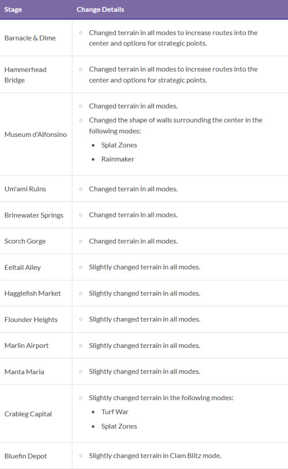
In addition the Hammerhead Bridge and Barnacle & Dime changes, Museum d'Alfonsino, Um'ami Ruins, Brinewater Springs, and Scorch Gorge are all getting layout changes, with Museum getting some extra changes in Splat Zones and Rainmaker specifically. Eeltail Alley, Hagglefish Market, Flounder Heights, Marlin Airport and Manta Maria are all getting "slight" changes, while Crableg Capital and Bluefin Depot are getting slight changes in Turf War and Splat Zones, and Clam Blitz, respectively.
I'll be entirely honest, until we see these changes for ourselves it's impossible to gauge just what these changes will be like, but I am willing to be optimistic given just how much improvement we've seen in the Stage design over the last year or so. I think they'll be slight improvements at worst.
With that said, let's move onto Main Weapon changes, starting with a bunch of weapons getting the exact same change.


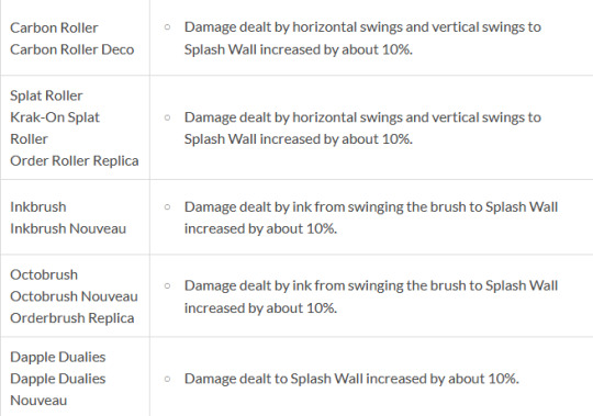
Sploosh, Jr, Aerospray, Luna, Clash, Carbon, Splat Roller, Inkbrush, Octobrush, and Dapples will all now deal 10% more damage to Splash Walls. I'm not sure why this was listed on each weapon individually and not just all collected as a Splash Wall change, but I digress. The intent here seems to be to make short-range weapons specifically, better at dealing with Splash Wall, the users of which they'll generally be outranged by to begin with. It's a small and specific change, but it's not one I think any of these weapons will complain about.

N-ZAP will now be able to fire for longer before its hits max bullet spread. In case you didn't know, all shooters that have bullet spread have a property where that spread gradually increases the longer you hold ZR, which slowly goes back to normal if you stop firing, and now that'll take longer on N-ZAP specifically.
N-Zap didn't really need this buff, but it's also not something that moves the needle much to begin with. It's pretty rare outside of low-level turf wars that someone fires for long enough to the spread to be a major factor, so it's fine. It's just a very strange change.

Moving onto more deserved buffs, L-3 has its damage increased by 2, taking a full three-hit burst from 87 to 93 damage. This is not a significant change, but 30 is a pretty important damage threshold to hit, as it combos with a lot of things, and it does mean that getting even lightly chipped by almost anything at all puts you in one-shot range, so watch out!

Rapid Blaster now starts recovering ink after firing about 3 frames faster. It's another nice little buff, though like N-ZAP it is kind of strange this weapon is being buffed at all when it's in a pretty good spot right now.

Now here's something interesting, Tri-Stringer will now paint the ground better, and will now paint lines more consistently. Turfing has always been one of Tri-Stringer's biggest weaknesses, so this is a very nice buff!

Last but not least is my favourite change in the entire patch. REEF-LUX now charges at full speed while in the air, similar to how Squiffer works. This is just a fantastically cool buff if you ask me, it's one of those things that seem insignificant on paper but can really change up how a weapon plays in a major way. It wasn't until after Squiffer got this change in Splatoon 2 that the weapon really came into its own, after all.
With Main Weapon changes down, let's move onto Points for Special changes, of which there are four (technically three):

Big Swig Express and Painbrush are ten points cheaper, and both variants of E-Liter are ten points more expensive. Not a lot to discuss here, so let's move onto Special Weapons:

The rails that indicate the Reefslider's path will now ink the floor as they extend forward, potentially allowing you paint over an enemy's feet before running them over. The rail will now also follow moving terrain, which is a change I'll admit I am not sure what it does? We'll just have to see when the patch goes live.

Big Bubbler now paints the ground inside of the shield. A nice quality of life change that could potentially be used to do some silly things in Splat Zones, if you're so inclined.

Ink Vac will now paint the ground behind you while it's active. Nintendo specifies later on in the patch notes that this is because they want you to be more reliably able to use it while retreating, and yeah, that's what this change will do.

For our final Special change, Splattercolor Screen now deals more damage to Beakons, Sprinkler, Splash Wall, sponges, and the Rainmaker's shield. Like with the Ink Vac changes, Nintendo specifies what the purpose of this buff is in the patch notes, and in this case it's to reward people more for using the Screen well.
And that's all the balance changes for this patch, but there is actually one more Main Weapon change that is not listed with the rest, because it's a bit different:
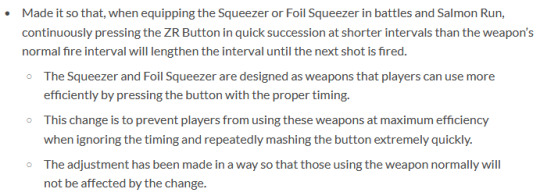
These changes are very wordy, but the TL;DR is that Squeezer now has a hard cap on how fast it can fire, which is the same as its regular fire speed. That might sound like a completely pointless change, and I thought so initially as well, but it seems the intent here is to not have the weapon be improved by turbo controllers, as they can let you mash ZR at much, much faster paces than intended.
With all that said, let's round things out with some miscellaneous changes:

If you roll or dash into the Rainmaker shield you'll now slide off it, as opposed to the game continuously attempting to place you where the shield is at and dealing a bunch of contact damage to you, splatting you almost instantly.
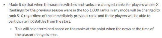
You'll now start the next season in S+0 if you were top 1000 in the previous season's X rank.

Squid Beakons are now accounted for when awarding the Super Jump Spot medal, which I am frankly surprised wasn't the case already?

I lied, there is one more Main Weapon change. Grizzco Dualies now deal 5 more damage with their actual bullets. That means they three-shot Chum now!

Reflected Drizzler torpedoes will now collide with terrain less, reducing the situations where you shoot one back only to have it immediately crash into a ledge it just barely touches.

Finally, purchasing the Expansion Pass will now net you 10 free Sheldon Licenses. If you've already bought the Expansion Pass then you'll be given the Licenses after downloading the update. Just in time for ten new weapons to be added as part of the Sizzle Season!
38 notes
·
View notes
Text
Mister 1000% ROI
Bruce M Firestone, PhD, and Andrew L Firestone, BA (Econ)
Any time someone offers you investments with returns of 1000% per year, you are right to be skeptical, but this is what Australian economist “Mr 1000%” Andrew Firestone has been working on for a number of years now. He reckons he will be able to present how households can add an equivalent of $60,000 to $70,000 AUD to their annual income with some fairly simple approaches he has studied and researched. These are activities with a very high return on their labor, capital, time and sweat equity inputs. I told him about the tiny house movement philosophy of “less house, more life” and he loved that idea, his tag line is “Better Income – Better Life,” a similar pattern.
But wait, it gets better. Like veg-o-matic, K-tel direct-marketing TV pitchmen of the 1960s whose mantra was, “It slices! It dices!” you pay no income tax on these earnings.
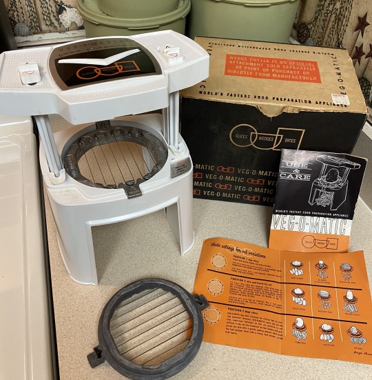
The Veg-o-matic
Huh? How is that even possible?
First, let’s work through the 1000% ROI number then deal with personal tax issues.
Full of Beans Case Study
Some years ago, Andrew purchased a pack of bean seeds for $3.50 that produced 250 grams per week of the sweetest freshest beans you can find anywhere; this went on for nine months in Canberra where he lives with his family[2]. The Canberra area has a relatively dry climate with warm to hot summers and cool winters. Elevation about sea-level is around 580-meters (1,900-feet) and you can see snow in the foothills around the capital city of Australia from time-to-time.
To keep them producing, Andrew staggers his planting. He then harvested seeds from his best producers to use for the next year (this will become important later).
Over the year, his bean yield was around 9 kilograms (nearly 20-pounds), which (as of 2021) retailed at $3.90 per kg in-store or $35.10 for his 9 kg. Now estimating his ROI is simple arithmetic—
ROI = ($35.10 - $3.50)/$3.50 = 903%
So, not quite a 1000% return, but getting close with two other key factors still to consider. It might be useful to note that a quick online search of bean prices today (circa 2024) shows much higher prices per kg for beans, ie, $11[3]! Now that’s inflation for you… And don’t forget—since Andrew’s bean seeds are now free, his ROI is currently infinite.
“But whoa, hold your horses[4],” you say. The above calculation doesn’t factor in the cost of Andrew’s labor, right?
Marble Bust of Homer
That’s true. It doesn’t. But it also doesn’t yet take into account taxes. For Andrew, the labor cost to add would be the income he could otherwise earn. But he is on a fixed salary and picking up a part-time job would be impractical. So, the real alternative is Andrew sitting in front of his TV for nine months instead of experiencing shinrin-yoku (the Japanese term for forest bathing), one could argue that his cost of labor is zero or even negative since gardening can be a positive health event, providing both exercise and mental well-being. Plus, how much work is involved? Very, very little, he informs us.

Practising forest bathing in Japan[6]
When he lived with his family in a small townhome, he was able to sneak his seeds into a tiny and neglected patch out front and just put the water to them; he used a bunch of weeds he removed from the scrubby yard as mulch. In the photos below you will also see a mandarin seedling he put in as well.


Andrew’s sneaky, puncy townhouse microgarden: YUMMY
What about income tax?
Well, the beauty of self-production is you don't pay any. If Andrew could have worked extra hours to buy his beans, he would have to pay income tax on that income before he was allowed to go ahead and spend it. There are a couple of ways to think about tax. Firstly, if he was to go out and earn the extra, he'd lose close to half of that marginal income to taxation, so the beans would really have cost at retail (back in 2021) about $70 in after-tax income[7]. Or if he was just using his regular work income, he would lose on average 25% of that so his beans would have really cost $46.80.
He tells me, he sees this pattern over and over again with home-based production. There are some less good returns, growing watermelons or pumpkins, for instance, but many traditional pastimes such as gardening, sewing, home preserving, brewing, etc will likely hit the 1000% mark.
In fact, Andrew calculates, a household could make the equivalent of $60,000 to $70,000 worth of taxable income (but, in fact, not subject to tax) at home per year doing these sorts of tasks!
Gender roles
As far back as the early 1980s, researchers noted that, “Women do two-thirds of the world's working hours but receive only one tenth of the income and own one hundredth of the property[8].” But this need no longer be the case—traditional crafts are being rediscovered and families are making many of them “team sports.” Things on the following list are now being done by all—
home cooking/baking,
child minding,
dressmaking,
tailoring,
networking/sourcing/bartering[9],
yogurt making,
woodworking[10]/furniture production,
cakemaking,
candle making,
gardening (aka backyard homesteading),
cheese making,
beer brewing,
raising backyard chickens and/or ducks,
planting and harvesting fruit trees,
knitting,
load shifting—adding solar panels with battery storage[11],
clotheslines,
paying off your mortgage as quickly as possible[12],
hunting large game with old trucks in national parks (maybe 😊)
beautifying property with large shrubs/trees/creating a food forest[13]
retrofitting roof insulation where standards are poor[14]
Vertical urban farms
Andrew is also skeptical about the economics of vertical farming (as well as the lack of nutrition in they produce). And he is not alone[15].
He writes—
At the very least, vertical farming has to be direct to consumer but having the word “selling” in there is going to make it tough—all the regulatory issues, packaging, and taxes and other charges will likely kill them. They would have to be like strawberry farms back in the day: Give customers a basket and let them pick their own; the operator just weighs it at the register. But I can't see how that very, very, very expensive capital could ever pay for itself and the maintenance costs on those systems will be extreme. You have mineral rich water flowing through small pipes and pumps; it’ll be a clogging nightmare. You will have major condensation issues and molds will grow plus all sorts of ventilation problems. These can't be magically solved. They’ll need expensive energy and capital systems to deal with it. And in terms of this being “green,” not at all! These systems use steel and glass, and they are hugely energy intensive to make and run. There is no way to make that energy back over their economic lifetime. This is just some feel-good greenwashing.
By the way, you can make super cheap dome greenhouses using plastic sheeting and poly pipes that would have much less environmental impact. But places like Canada and the US Midwest aren’t ever going have economic, full-on heated greenhouses. If they go the cheap poly dome route and get more out of their shoulder seasons (that is, forgetting about December to February periods), they have a shot to make local produce work (better). Residents should simply put a bunch of raised garden beds with domes in their existing backyards over a weekend for something like $100 bucks.
Beautiful Legs Case Study
Andrew went hunting for a nice dining room table—one with actual real wood. Retail prices for this sort of thing were around $2,400 AUD at the time with a manufacturer’s rebate (coupon) available of $300[16] so a net effective price of $2,100. Thinking of proving his point once more about 1000% ROI being widely available but little known, he purchased 2 pairs of steel table legs for $85 and scrounged around for some old wooden planks, which he paid $105 for and set about doing some home woodworking himself. Again, his ROI is simple arithmetic—
pair of steel legs $85.00
solid wood planks $105.00
total cost (home-based) $190.00
retail price $2,100.00
margin $1,910.00
ROI 1005%
E&OE
This did take him a while to complete so you might want to factor that in, but frankly, when returns are likely measured in triple digits or quadruple ones, you can stop measuring.
Bruce M Firestone, [email protected] Andrew L Firestone, [email protected]
COPYRIGHT, BRUCE M FIRESTONE, OTTAWA CANADA AND ANDREW L FIRESTONE, CANBERRA AUSTRALIA 2024.
+++
[1] Image source, BitBytes - Own work, CC BY-SA 4.0, https://commons.wikimedia.org/w/index.php?curid=93170611.
[2] In a cold northern shelf city like Canada’s Capital City (Ottawa), you would probably get six months and then only if you start your seedlings inside.
[3] For example, check out the price of Miss Melons fresh beans here, https://www.missmelons.com.au/products/beans.
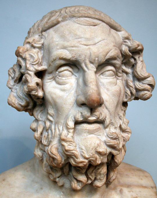
[4] By the way, it was Homer not an American cowboy who first used this expression, Hold your horses—it was in book 23 of the Iliad.
[5] Image source, Originally from en.wikipedia; description page is/was here. Original uploader was JW1805 at en.wikipedia, Public Domain, https://commons.wikimedia.org/w/index.php?curid=2171360.
[6] Image source, Teamsamuraispain - Own work, CC BY-SA 4.0, https://commons.wikimedia.org/w/index.php?curid=43516357.
[7] Bear in mind you don't compare your homegrown product against the cheapest produce available, but rather the freshest and best versions. When looking for crops to grow, probably best to focus on high nutrient and relatively high-cost foods.
[8] Said then President of the Canadian International Development Agency (Marcel Masse) in 1982, https://www.upi.com/Archives/1982/07/06/Women-do-two-thirds-of-the-worlds-working-hours-but/9167394776000/.
[9] Historically, women were (are) balancing out equity across communities and sharing useful information more widely. For example, a homemaker learns that a neighbor needs to clean out their stables. Next, the homemaker’s life partner helps muck out the stables and, in return, they receive a free load of manure for their backyard homestead garden. This networking/socializing is crucial in a tax-free, bartering-based, local economy...
[10] Think woodworking is one of humanity’s older art forms and that traditional skillsets have been (mostly) developed in the time period covered by recorded history (around 10,000 years)? Not so. Read this article about a recent archaeological discovery in Zambia of a log platform or shelter constructed 476,000 years ago by stone-age people. Some type of hominid accomplished this feat including notching the logs to make a better fit/stronger structure, https://www.bbc.com/news/science-environment-66846772. The BBC article is based on a paper published in the Nature journal, Evidence for the earliest structural use of wood at least 476,000 years ago, https://www.nature.com/articles/s41586-023-06557-9.
[11] Unfortunately, according to a CSIRO study, solar hot water does not produce the desired ROI.
[12] Apparently, paying off your car loan early is not important, probably because cars are, for the most part, a depreciating asset.
[13] Tree planting improves property values by about 6%, provides shade, cooling, and wind protection, as well as fresh air. Combining that with a food forest increases ROI further…
[14] Returns of about 40% for your roof, 20% for walls and 5% for floors.
[15] For example, refer to: Vertical Farming Has Found Its Fatal Flaw, https://www.wired.co.uk/article/vertical-farms-energy-crisis.
[16] Car/boat/RV (caravan)/truck manufacturers have been using this “charade” for a long time. Here’s how it works—their distributors/dealers/shops sell Jane and John a car/boat/RV/caravan/truck/piece of furniture/whatever for $5,000. There is also a separate coupon which promises them a 15% manufacturer’s rebate (ie, $750) later on… Now, Jane and John aren’t rich dudes, so they finance (say) 100% of their purchase with some kind of a buy-now-pay-later lender. The lender sees they paid $5,000 so they lend John and Jane $5,000. But the manufacturer subsequently snail mails a check/cheque to John and Jane or otherwise reimburses them for their coupon in the amount of $750. Presto magic, John and Jane have their new car/boat/RV/caravan/truck/piece of furniture/whatever plus they also have $750 in cash now. What’s interesting about this is that the $750 cash back is not considered income in the hands of John and Jane, so they don’t have to pay any personal income tax on it. For the manufacturer, it’s an allowable expense (reduction in their income) so it too lowers their overall tax burden. Of course, John and Jane are now on the hook for repayment of $5,000 plus interest. But most people, especially young people and entrepreneurs of any age, have very high personal future discount rates so cash-in-hand might look good compared with a future payment plan of some sort.
1 note
·
View note
Text
FRIED EGGS


KOBY x Pirate!Reader
word count: 2k
summary: Being infiltrated as a Marine and keeping your feelings under control was easy until you were assigned to work with Marine Captain Koby. How you wished he was a jerk.
highlight: ¨I am kissing you... but I am angry, Y/N-san...¨
warnings: read under the risk of developing diabetes.
notes: Hey, guys! This was a lovely request from @pure-kirarin! <3 I had to stop other projects to make this one because Koby threw me out of my comfort zone hahaha I really hope you like!! ALSO 1) Happy Birthday Sabo-kun! ALSO 2) In order to add more dept to the story, the main character is part of a Yonkos´crew, but I wrote in a way that all fit, so choose your favorite! ALSO 3) ART ALERT!
Leave comments, hearts and love!
¨You have been doing a remarkable job in such little time, Commander L/N. We all have great expectations regarding your transference to our Marine Headquarters.¨
The words of the Rear Admiral barely scratched your mind as you discreetly observed the pink-haired boy´s reflection on the crystal clear window.
He maintained a similar posture to yours: chin up, chest out, shoulders back, and stomach in. However, while your fingers remained paralleled to your trousers, you took a glimpse of his clenched fist, thumb fidgeting the side of his index finger.
¨Vice Admiral Tsuru was reluctant to sign your transfer. She said you remind her of herself in the past, which is always an excellent compliment to hear.¨ you nodded, acknowledging his words ¨We´re glad we convinced her.¨
Your heart warmed with his words, and you almost felt bad because you knew the disappointing outcome O-Tsuru-san would have at the end of this. She trained you with the iron face of a merciless soldier, and the elegance that resembled the animal of her name.
It has been three years since you received the green card from your captain to part ways in a long-term solo mission. A journey to excavate the putrid secrets of the so-called defenders of the law. You learned after a short time that justice is not so black and white.
Not that you planned to reveal the dirt, no. That intel your captain could sell to the Revolutionary Army and keep the capital running. You were interested in the arms race, the corrupt diplomacy, and more importantly, the dark pipes where traitors flowed.
Someone from inside the Yonkos was feeding the Marines with crucial information about the Emperors´ activities. And in such a close fight, you could not take those risks.
All other Emperors must have their own undercover agents within the Marines, but even that was a dispute. You could point some names to your boss, who confirmed what was suspected. Those would usually be the best of the best, extravagant and loud.
But not you. You didn't have to make that much noise. You slid between the floors of New Marineford like a snake swimming with the current. Earning the respect of your superiors and being promoted without ringing any bells. You accepted each medal with a firm salutation and relentless performance.
¨The trip must have been displeasing. Submerging ten thousand meters underwater and rising to these fiendish waters require a good rest. Our Marine Captain Koby will escort you to your quarters, Commander Y/N. The remaining instructions shall be presented tomorrow.¨
You saluted the Rear Admiral in front of you and turned to the exit, passing by Koby, who waited for you to leave first. When your paths crossed, the pace of your heartbeats quickened, pumping more blood through your body and leaving a burning sensation on your cheeks.
The involuntary response was instantly interpreted as alertness to danger, which needed to be handled with caution.
Can´t let my guard down around this one, you thought.
In fact, you planned to keep as much distance as you could from him. An officer let slip that he has been gaining incredible control over his Observation Haki since the Paramount War.
But the wind seemed to change direction, and you began to swim against the current. When the morning came, you were assigned to be his partner for an undetermined time, and he would act as your superior. The idea of being bossed around by a younger marine got your temper sparked.
Only he was not like the others, treating you in a patronizing and condescending way. He spoke to you with the same cordiality and politeness he addressed everybody else.
Slowly, your concrete cold expression began to soothe. You would still remind yourself how annoying his good manners were, though. So annoying, seriously!
¨Good morning, Y/N-san!¨ he greeted as you joined him for breakfast.
¨Good morning, Koby.¨
¨Our Border Force correspondent sent his report early in the morning with information about possible Yonkos´ alliances in the Wano Country. We are arranging a meeting as soon as possible.¨
You didn´t like to handle work so early, but this subject, in particular, raised your spirits. ¨Good. It was about time.¨
You noticed that he wore a different headband. ¨What happened?¨
¨Hm?¨ he brought the soup bowl close to his mouth.
¨The bandana. Green, with the fried eggs.¨ he choked on the miso soup, coughing like he had swallowed poison.
You reached for a paper tissue and handed it to him. ¨K-Koby, are you ok?¨
¨Y-Y/N... Y/N-san...¨ he coughed some more ¨They´re not... fried eggs...¨
¨Oh...¨ your brows raised slightly ¨What are they?¨
A depressive aura grew around him ¨They are flowers, YN-san...¨
The edge of your lips contorted as you tried to hide a smile. You haven´t felt like smiling genuinely for years. Annoying boy!
From that moment on, ignoring him became more difficult. He started to ask you to train with him or invite you to spend some time with him and Helmeppo whenever you had free time. Eventually, he began to ask you how he looked before an important meeting.
Most of the time, you would reply something like ¨ok¨. But sometimes, the mouth was quicker than the brain, and you would let an ¨impeccable¨ slip out, followed by an awkward throat clearing and blushed cheeks.
From both sides.
•
¨Oh my-¨ you stopped yourself from finishing the sentence.
You were chosen to complete this mission due to your excellent skills in hiding emotions and acting calm under stressful situations. No one could break you.
Within the Marines, no joke could make you crack a smile, and no torture could make you spill secrets.
Why did you want to ask if he was ok?
Koby had entered his office with bumps and bloody bruises over his face. His always neat uniform was blotchy, and he carried a first aid kit.
¨Garp-san paid a visit.¨ He sat on the couch and opened the white box, throwing everything on the coffee table. ¨I bet it wasn't like this with Tsuru-san.¨ he chuckled.
¨No. She would beat me up, wash me and hang me up to dry.¨
You shot from the chair, moving towards the clumsy pinkette, who struggled to attend to his injuries. He tried to hold the mirror with one hand and suture his gash with the other.
¨Thank yo-¨
¨Shh. Don´t move.¨
You leaned closer to have a better look, giving Koby the same chance. Your delicate perfume smelled like it was tailor-made for you. Your breathing was slightly irregular, and your lip twitched with every given stitch. Your fingers felt like feathers on his skin, so much that he didn´t even feel a sting.
The job was fast and efficient, making Koby wish Garp had put more effort into his Love Fist. Grabbing a piece of wet cotton, you cleaned the dried blood.
¨Alright...¨ you whispered.
¨Alright...¨ he whispered back.
You were inches apart from his face, your eyes traveling across the scar on his forehead, the pink locks, and kind features. Your mind traced back all the way to the Paramount War. You had very little knowledge about him, but the words he spoke that day have always made your heart pound like cannonballs.
You will make an excellent Admiral one day, Koby.
I hope you don´t hate me.
¨Y-Y/N-san...¨
¨Hm?¨
¨Your smile is beautiful.¨
¨What?¨ The stupid scene of yours was interrupted like a DJ stopping the record player.
With cheeks getting pinker than his hair, you shot up and marched back to the chair and your newspaper. ¨You clean this up.¨
He left a low chuckle out and began gathering the mess.
Oh, no, Y/N. You have got to be kidding me.
He is a freaking marine. Breathe.
There were a vast number of reasons why you couldn´t like him: from him being a Marine Captain and you being a pirate to the fact that your mission was coming to a conclusion.
Meaning that your journey as his partner would be very soon reaching its end. The meeting with this mysterious correspondent regarding the Yonkos´ operations in the New World would be the last move in this chess game. You would be going home. Mission completed. Everything perfect, right?
Right, perfect. Impeccable! Ugh!
•
¨... confirm secure line.¨
¨This is Border Officer code 404890. Secure line confirmed.¨ you spoke with a low but clear voice through the nail transponder.
¨What´s the status on our birdie?¨
¨Positive. The birdie is located at 03:24:01.¨ you gave your boss a coordinate to the name of the Marine informant. The answer you took three years to find out remained on file number one, third page, suspect number twenty-four.
An amused laugh echoed on your end, and you buried the speaker on your jacket to muffled the sound.
¨At least he is not one of ours.¨ a chuckle ¨Great job, Y/N.¨
¨Thank you, boss.¨
¨I know this mustn't have been easy, but you were impeccable as always.¨
Yeah, impeccable.
¨You know the protocol now. We´ll see each other in a few days. You´ll have a party waiting for you, kid.¨
¨Aye, aye, boss. But I want the good booze.¨ Both of you laughed.
You finished the call, and the smile on your lips died as the image of a pink-haired boy invaded your mind. You wished he was a jerk like everybody else.
It would have been so easy.
¨Who were you talking to?¨ your chest contracted, pushing the air out of your lungs and sending extra blood supply to your muscles.
You hid the transponder into your jacket and turned, facing your Marine Captain.
¨Eavesdropping, Koby?¨
What should I do?
¨Y/N-san, who were you talking to?¨ he repeated himself, offering the benefit of the doubt. You sighed.
¨My captain.¨
Why the need to be honest with him?
¨Y/N-san, please don´t tell me-¨
¨I´m sorry, Koby. I wish I didn´t have to do this.¨ you couldn´t bring yourself to face him.
¨A-Are you a pirate? Why?¨
You chuckled ¨Why am I a pirate?¨
¨Why did you do this?¨ his face was pale, making your guts twitch in guilt.
¨I´m on a mission. But I´ll leave soon.¨
¨You are like... Vergo-san.¨ he sounded disappointed.
¨I am nothing like Vergo. You know this.¨ or at least you hoped he did.
He closed the door slowly, eyes fixed on your figure. The bright light from the window made him look like an ethereal painting.
While you tried to predict his next move, whether he was going to interrogate you or kick your ass, Koby acted calm and collected, not hesitating. He trusted his Observation Haki to guide his next move. Or maybe his heart.
You saw a pink blur closing distance like a missile, and before you could dodge, his hands pulled you by the waist, connecting your bodies and lips.
He forced your back to meet the thick window with a gasp that was muffled by the kiss. His touch was rough upon the fabric of your uniform, but his mouth felt soft against yours.
Your hands moved to his hair, removing the round pair of glasses and the green bandana so you could get lost in his locks. His grip was harsh under the fabric of your uniform, but his hair felt soft on your fingertips.
A moan escaped your lips when he parted the kiss with a loud snap and struck the glass with both hands, keeping you trapped in the middle. You let go of his hair and grabbed him by the collar, not letting him go away.
¨I am kissing you... but I am angry, Y/N-san...¨ his breath was heavy and carried with a myriad of emotions.
¨I know... I am sorry.¨
¨Why?¨
¨Because I like you, Koby. A lot.¨ he paused for a second, fighting the urge to admit the same.
¨What was your mission?¨
This is the last lie, I promise, Koby. ¨The Marines possessed vital information about something my boss wants. I needed to get it.¨
¨Now that I know that you´re a pirate and that you stole Marine´s assets, I´m gonna have to hunt you down.¨
¨I´ll be waiting for you.¨
You stared him in the eyes, and he kissed you to stop himself from saying what he really wanted.
I love you, Y/N-san.
Diary of Koby-Meppo: The Fried Egg Life Crisis.

💕 @vemuabhi
#koby#koby x reader#coby#coby x reader#marines#marineford#new marineford#paramount war#the warof the best#vice admiral#tsuru-san#otsuru-san#garp#monkey d garp#fleet admiral#sakazuki#akainu#rear admiral#four emperors#emperors of the sea#yonko#shanks#red hair shanks#kaido#kaido of the beasts#big mom#charlottle linlin#marshall d. teach#blackbeard#helmeppo
343 notes
·
View notes
Text
Illicio 2/?
Part 1
"In my defense," Gerry starts saying as soon as he closes the door to Jon's office, "she was supposed to say yes."
Jon lets out a weird little noise that could pass for a laugh if it didn't border on hysteric.
"Not your best guess by far, I'm afraid." Jon sits down behind his desk and starts booting up his laptop, apparently unaware of Gerry's eyes on him.
But, see, Gerry has known bad people.
And Jon isn't one.
II
"I thought you were going to do your own thing," Basira says when Gerry walks into the Institute with Jon next Monday. "Was he hiding with you?" she adds, giving Jon a pointed look.
"He wasn't hiding, just- he's been staying at my flat," Jon mutters. It's interesting to see he doesn't try to meet her eyes when he speaks. Gertrude definitely never had that consideration with anyone, and Gerry doubts Elias does either. Just another little way Jon is different from the Beholders that came before him.
Basira arches a thick eyebrow in suspicion. "Why?"
Gerry's not about to just let it out in the open that he now literally feeds off of Jon's voice, especially to one of the women that was so adamant on killing him on his very first day back here.
"I didn't exactly have a place to live," Gerry says before Jon himself has any chance to respond. Basira's big, deep brown eyes latch on to him with such intensity Gerry doesn't even need to See to know the owner of the mark on her soul. "And I like Jon."
"Do you now?" Basira's gaze turns skeptical, and Gerry gives her a shrug.
"Don't you?" he asks back.
He knows the question was a mistake almost immediately, from the way Basira's expression shuts off.
"We'll just- I have some things to work on," Jon's voice breaks the silent stare-off. His hand is slightly raised towards Gerry, like he was going to reach for his forearm but then thought better of it. "Gerry's going to be assisting me with some research, Basira. We'll be in my office, if... in case anything happens."
Gerry gives Basira one last look before he follows; she's watching Jon go and her expression is stony, but her eyes look troubled. In the end she just turns around and leaves, and Gerry's left thinking he's missing some sort of context.
"In my defense," Gerry starts saying as soon as he closes the door to Jon's office, "she was supposed to say yes."
Jon lets out a weird little noise that could pass for a laugh if it didn't border on hysteric.
"Not your best guess by far, I'm afraid." Jon sits down behind his desk and starts booting up his laptop, apparently unaware of Gerry's eyes on him.
Gerry stays by the door, arms crossed and brow furrowed as he watches Jon. He's... a bit awkward, yes. And a danger magnet, considering he visited America exactly one time and somehow ended up both tagged by the Stranger and trapped by the hunters. And he does look like he's constantly having a nervous breakdown and has forgotten what food and sleep and combs are.
But, see, Gerry has known bad people.
His mother is still a shadow well pushed against the back of his mind so he only ever thinks of her accidentally. He's met avatars that take a perverse delight in feeding their patrons, instead of merely doing it to survive. He's seen humans at their lowest, when they'd gladly throw others into the line of fire to get a few extra seconds to run. Gerry knows bad people.
And Jon isn't one.
Gerry spent enough time with Gertrude to know that getting close to Archivists is a surefire way of getting killed, and he's also painfully aware he barely has any reason to trust Jon.
But he looks... lonely. Not capital 'L' lonely, but still enough so that Gerry can't just let the matter rest.
"You're not unlikable," comes out of his mouth before he can stop it. Jon's hands still over the laptotp keys. "I'm also getting the feeling no one here likes each other, so maybe don't take it personally."
It takes a few more seconds for Jon's fingers to go back to tapping a tuneless melody on the plastic keys, and Gerry guesses that's all there's going to be. Just a little moment of encouragement that didn't quite land as he hoped it would. He still kind of wants to defend Jon for some reason. It's either some sort of Eye thrall, or leftover loyalty for the only person who's ever respected his wishes.
After a while, Gerry moves to pull a chair to sit on, and grabs a statement from a file box next to Jon's desk. Apparently these are the fake ones, because it narrates an encounter with a demon duck that Gerry suspects was only a regular pissed off goose chasing off a group of very intoxicated young adults.
"We used to- we liked each other, before," comes Jon's voice by the time he reaches the statement' thrilling conclusion. Gerry's still getting used to this, and he still can't tell how much of the soothing warmth comes from Jon's words feeding him some kind of monster energy, and how much is just the fact that Jon has a very nice voice. "Or they did, at least."
"You didn't like them?" Gerry asks without looking up from the paper. Jon keeps tapping away, the sound lulling in its repetitiveness.
"I never tried to- they liked each other." Jon's voice tastes like a confession. Gerry wonders how much of it is true, and how much is only Jon's perception. "My assistants at least, Basira and Melanie never quite- they're different."
"I would have never guessed," Gerry says, because he can't think of anything else.
The silence broken by the tapping on the keys stretches for another long pause.
"But- but thank you, I guess." Jon pauses in his typing. "It was... a nice try."
He looks up at Gerry with gratitude in his dark eyes and the smallest, saddest hint of a smile in his cracked lips, and a single thought flares up in Gerry's mind so suddenly it surprises even himself.
Fuck.
----------------------------------------------------
"Hey," Melanie drops a paper Krispy Kreme bag on top of whatever bullshit it is Basira's reading right now. If she's lucky, the grease will stain it so bad Basira won't be able to read it anymore.
A much better alternative than ripping it out of her hands and tearing it into a million pieces. Every time she sees Basira do anything but hate this place Melanie feels her blood boil and her hands itch to hurt.
Basira frowns at the bag, before looking up at Melanie. "How did you get this?"
"Helen dropped me at the loos," Melanie shrugs. Basira goes to open the bag, and Melanie feels her near-constant irritation soften when she sees her lips twitch as she pulls out a chocolate frosted doughnut from the bag. "I was craving something sweet. Had to guess at what you'd like."
"Hm. It's been a while since I've had one, thanks." Basira toasts her with the pastry, and Melanie smiles. That's right. Basira is... not her friend, but not her enemy either. They're both trapped here. Melanie doesn't have to protect herself against her. "Helen's still in the tunnels?"
Melanie takes a seat across her and reaches for a doughnut as well. She hates red velvet with a passion, but she got one because she's been thinking of Georgie lately, and those are her favorite.
"She says she likes them." she bites into the doughnut. She still hates it. "Any news about our other resident abomination?" Melanie still refuses to believe the thing that woke up at the hospital is Jon, but it's getting harder to keep up with every day that passes because he's just.... Jon.
If anything he's become more quiet, trying to blend into the background or hiding behind a statement, like keeping up the appearance of productivity will somehow make him seem more human.
"He's fine. I guess." Basira frowns at her half eaten doughnut like it's personally offended her. "I've been thinking."
"Mm?" Melanie chews the red velvet viciously. If she has to suffer it, then it has to suffer her too. Basira's eyes are heavy on her, and she looks up from her phone when she can't stand the staring any longer. "What?"
"You're going to get mad ," Basira says carefully. "Not that you aren't all the time, but-"
"Just say it," Melanie rolls her eyes, already feeling the rising irritation prickling at her mood. "I'll keep it in."
They both know what it is, the memory of the Flesh's creatures squirming and crying out at her hands still fresh in both their minds.
Basira waits another moment, until Melanie rolls her eyes and pulls out her knife from her jacket and hands it over to her.
"I'm- I think we're going about Jon all wrong," Basira says finally. Melanie arches an eyebrow. "I think... maybe that's why the Eye brought Keay back."
"Basira, either you're not making any sense or you think you've given me much more context than you have."
The other woman huffs angrily, before pinching the bridge of her nose.
"We- Is there anyone Jon is close to anymore?" Basira asks. "Martin is up with Lukas, Tim is dead, you said your friend isn't talking to him... you make it no secret that you'd turn on him at the first wrong move, and I'm- I used to like him."
"Oh fuck, did you really?" Melanie frowns. Logically, she knows Jon is not- she knows people can like Jon. Georgie certainly did once. Tim too, if he was actually saying the truth when they got drunk in the freak's office while the doll had him kidnapped. Martin does, or did as well.
She expected Basira to have a bit more sense though.
"Not at first. I was- it was a trap. I gave him Getrude's tapes because I wanted him to trust me, we thought he'd killed her and we wanted him to slip."
"We?"
Basira seems to deflate at the question.
"Daisy and I. She... she was very interested in him from the start. I guess now we know why." Her lips curve into a dry, humorless smile. "But he was actually nice. Weird, awkward. Bit paranoid. But nice enough. He made jokes sometimes."
"I'm sure they were hilarious," Melanie mutters through gritted teeth. The conversation is setting her on edge, her hands white knuckled around the edge of the desk.
"Oh they were terrible. But seeing him try was funny." Basira's lips curve into another soft smile, but this one makes Melanie want to scratch at her face because she's smiling at the fucking monster that dragged them all into this. "Mel. The desk. You said you'd keep it in."
She hates that nickname so much. The boys at her high school used it to mock her, and it always makes her feel small and soft, like she's not being taken seriously.
Basira takes her seriously. Melanie knows this. Basira doesn't mean it in the way they did. She doesn't know, because Melanie won't tell her, because a nickname is just that and it doesn't affect her at all. It's just a name. Just-
"Okay. So he made jokes that were bad. What's your point?" Melanie only looks back up once she's got her breathing under control. It was only a slip.
"The point is it doesn't matter if we like him or not," Basira marks her emphasis on the last part, but Melanie's not too convinced anyways. "What matters is we don't want him to turn full monster. I've read about other avatars, Melanie. You saw Hopworth, you know how they can be, when they're truly gone."
"So what? The power of friendship is going to turn him human again?" Melanie snarls. "We have a sleepover and do each other's hair and that will fix-"
"Well I don't know, Melanie!" Basira snaps back, and Melanie actually stops at that. It's so rare to see her lose her cool. "All I'm saying is that it's very suspicious that the Eye decided to give him a new best friend right now. We don't even know what Keay is."
And they really don't. Melanie's been watching Gerard Keay ever since he came back to the Institute last week. He walks Jon in every morning, then goes away for the rest of the day and comes back just as Jon is leaving in the evening.
She followed him once, and saw him hurry up after a man dressed in construction gear and grab him by the shoulder to lean in and tell him something, before going to beat the snot out of the avatar of the Buried that had been following the poor sucker for three blocks.
Whenever they meet, he keeps his eyes on her and his back to the wall. He somehow always seems to know where she's carrying the blades that day, but it doesn't matter. The only thing that matters is that he knows Melanie's dangerous, and treats her as such despite towering over her and probably doubling her in weight, despite all his experience in fighting beings made out of fear.
Melanie likes Gerard Keay precisely because he does not trust her.
"Does it matter?" Melanie asks. "If he becomes a problem, I-"
"I think it does matter, because right now he and the statements are all the influence Jon has," Basira points at the closed door of Jon's office across the room. "For all we know he's encouraging Jon to be- well, worse."
Melanie arches an eyebrow at her words. She'll rip Jon's heart out before pretending to be his friend. Maybe it'll be enough to kill him for good and they won't have to worry about this anymore.
"And what do you want to do about it?"
Basira sighs.
"Nevermind. I don't know what I expected," she says, defeated.
"A sounding board?" Melanie's irritation evaporates as quickly as it boiled, now that Basira has stepped back. "Good luck with that!"
"You could at least try you know?"
"I really couldn't," Melanie gestures with a smile at the crescent moons her nails dug into the wood of the desk. "Think of me as a backup plan. When you fail, I'll deal with him."
Basira groans, and digs into the bag for another doughnut.
----------------------------------------------------
It's raining heavily by the time he leaves the Institute.
Jon huffs a little as he walks towards the front door, wondering if Gerry had the good sense to buy an umbrella while he was out there doing whatever it is he does, because Jon certainly didn't think to grab one this morning when they left.
It definitely still feels a little unnatural to think of Gerry living with him. Of course it's not like Gerry wants to be there, but Jon is very aware that he's the reason Gerry's alive and therefore homeless, and he's not about to kick him out when he does need a place to stay the night.
It's also very comfortable to not be alone, he thin-
That's when Jon bumps against something soft and warm and firm, and promptly bounces back and trips over his own feet. His reflexes are lackluster even at the best of times.
A large hand clamps down on his forearm before he actually goes down, and Jon uses the support to right himself.
"Jon?" says a soft, open voice, and Jon freezes.
"M- Martin!" This is great, this is amazing. He hasn't seen Martin in two weeks and he had to literally run into him now that he looks a right mess and... and of course Martin doesn't care how he looks, that's- why is he even thinking about that? "I'm- How are you?" he asks, and the unnerving, heavy pressure on his stomach intensifies.
"Oh? Ah, I'm just-" Martin averts his eyes from him, and Jon feels himself deflate a little. Sure, no one really looks at him in the eye anymore, but the fact that it's Martin makes it a different kind of painful. "I'm...fine?"
"You look fine." Too fine almost, for someone who's been hanging around Peter Lukas for months. Jon takes in the soft curve of his face, his full cheeks, and his strong brows. His sad green eyes behind his glasses. Jon's stomach tightens even more. He really has been blind.
"I... I have to go now Jon," says Martin, and only then does Jon notice how long he's been standing there in silence just staring at Martin like a creep.
"Would you- I mean we could-" Jon stumbles to get his words out because Martin is here and they're technically outside the Institute, and he can't just let him go. "Uh- a coffee? Just-"
"I can't- Jon I've really got to go," Martin sighs. "Here, take my umbrella, I'll grab a taxi."
"I'm- it's ok. Gerry has one, he's just around the corner." He Knows this suddenly, only really hears the static after the words come out of his mouth. "Uh- you've heard about Gerry?" It occurs to him that not everyone has supernatural means of knowing things, and it's been a while since Martin last went down to the Archives. "Gerard-"
"Peter told me, yes." Martin opens his umbrella with a single, practiced push to the runner. "Get home safe Jon," he says, giving him a last over the shoulder look before walking out into the rain.
His eyes are grey.
----------------------------------------------------
Jon is suspiciously quiet as they walk to the bus stop on the way to the flat that evening.
Gerry's spent the last two nights out looking for people to help, and he's starting to run low on juice, so he'll have to sit this one out. The rain hopefully means there'll be less people out on the streets, and while he knows the entities can reach people at home just as easily, he also doesn't really want to be out there getting soaked.
"Who was the marked guy?" Gerry asks as he tries to keep the umbrella over the two of them while accounting for the fact that Jon is trying very hard to not step into Gerry's space. "The big one with the glasses."
That makes Jon stop walking, and Gerry has to hop aside to not bump into him.
"Watch it, I'm going to run you over next-"
"Is it the Lonely?" Jon looks up at him with tired eyes, like he already knows the answer. "I... guess I should've seen it coming," Jon says after Gerry's silence extends a minute too long. "That's- he's Martin."
The name in Jon's voice tastes like devotion when it slips into Gerry. Ah shit...
"I'm going to guess Martin is not an easy subject." Gerry watches Jon's face for a reaction. "Do you want to like... talk about it? I know a good Chinese place nearby."
Jon's lips curl into a humourless smile. "You don't eat."
"I do. Just not Chinese." Gerry guesses it'll make a good side dish at least. "You don't have to tell me. But maybe I can help."
"I don't think Martin wants anyone to help," Jon says instead of answering.
The rain's starting to come down harder. Gerry looks down, and the boots keep him pretty much dry, but Jon's trousers are already starting to soak up water from the splashing sidewalk.
"C'mere," he grabs Jon by the shoulder and starts moving again.
If anything, Jon looks a little less miserable holding a hot cup of jasmine tea, even when he's telling a very sad story about a man who took a new job without knowing what he's really agreeing to.
"-and I- of course I don't like it. But Gerry, I have to trust him. He's- it's the least I can do. The least he deserves." Jon's expression is almost desperate, like he expects Gerry to disagree with him. "He's doing this for a reason, and I already- look where not trusting people has brought me. I made a choice and... and I have to stand by it."
After all this, Gerry thinks he's formed a pretty solid idea of this Martin, and his conclusions are not too favorable. Gerry's spent his entire life pulling people out from this world, and this man is arrogant enough to think he can waltz in and come out unscathed.
Still, he doesn't mention it. Gerry's not unobservant by any means. The whole marked by the Eye thing helps, he guesses, but even a blind man could probably see how bad Jon's got it for his former assistant, and bringing a less than stellar opinion to the table is definitely not going to do any good.
"Lukas is dangerous," Gerry offers. Nothing Jon doesn't know already, and probably nothing that will help soothe his worries, but it's the truth. Jon deserves that. "But at least your Martin doesn't seem too far gone yet."
"I- he's not my Martin," Jon stammers out, his flushed face noticeable even under the harsh yellow lights of the restaurant.
Gerry chuckles. Jon's not a bad looking man, under the unkempt exterior, and he's definitely much gentler than he shows at first. He can see why Martin liked him. He can also see how Jon didn't notice.
"Of course he's not." Gerry makes his eyeroll as exaggerated as he can, and it has the desired effect of making Jon go even redder. The tea's gone cold long ago, and the server already brought back Gerry's untouched food in a take-out bag.
Jon is avoiding his gaze by studiously looking at Gerry's fingers where he's taping restlessly at the table. The tattoos, probably. They've always been -excuse the joke- eye-catching.
"Let's go to your place," Gerry days after a moment, and Jon's face whips up as if startled. "You okay?"
"I- yes. You're staying tonight?" Jon asks, lifting an eyebrow. "It's raining."
Gerry guesses he technically doesn't have to, Jon's recounting of his transformation into the Archivist was enough to top him off.
But Jon looks... oddly hopeful under the questioning look. And it would be a pretty bastard move to have him lay out such a personal story and then just leave him alone.
Gerry looks out the window at the distorted reflections of the streetlights. "Yeah, I think I could stay," he says, and pretends not to see how Jon's entire stance relaxes on his seat, the little satisfied curl to his lips.
He can definitely see why Martin liked him.
----------------------------------------------------
There's really no reason why Martin should keep coming down here to brew his tea.
Elias', now Peter's, office has an en suite kitchenette, and it's just inefficient for Martin to make the trip down to the Archives' break room every time he wants a drink.
But -and he guesses this is the main reason he'll have to stop coming down here- this place feels like home in ways that hurt, but also remind him just what he's doing this for.
This is where he and Sasha and Tim sat down and planned Jon's birthday party, because Jon never really came here so the place was basically theirs. They had a whiteboard with ideas and lists littered here and there with Sasha's little doodles.
"Oh no, trust me. He's a cake guy," Tim had said with one of his trademark mischievous smiles. "He can pretend he isn't, but you'll see."
Martin had been so jealous back then, because he often forgot Tim and Jon were friends and Tim actually knew things about Jon and hung out with him and- it all feels very silly now. Like something that happened to someone else while Martin watched. He wonders if it's the Lonely's effect or just the PTSD from the past four years.
He sighs when he comes back to the present and looks down to find he's preparing two cups instead of one, before he goes to return the extra one to the cupboard. Those days are over.
It's probably for the best.
That evening a few days ago, Martin was far too close to saying yes. A coffee date on a rainy day with the man he loves is everything Martin would've wanted some years ago, but he made a deal with Peter, and it's the only way to keep Jon-
"So you're Martin?" someone asks behind him, and Martin just about flings the cup into the sink out of surprise.
He turns around to find a man looking him up and down with a raised eyebrow, like he's evaluating him and Martin isn't scoring too well. The man is nearly as tall as Martin is, with broad shoulders and tattoos and at least three face piercings, and Martin is pretty sure he knows who he is even before he gets to the truly awful dyejob.
"And you're Gerard Keay, aren't you?" Martin asks as he gets his pulse back under control. "I didn't know you were here."
"I'm not usually, I have better things to do," Gerard says none too gently. Martin is... very surprised to find he doesn't care too much that this man finds him lacking. He just wants to be left alone. "But I'm checking on you. For Jon."
It would be so much easier to save the world if Jon hadn't chosen this moment to care about him, Martin thinks. "Did he-"
"He doesn't know I stayed. I usually just drop him off." There's something casual about the way Gerard says this, and Martin's stomach prickles with irritation. He should be glad Jon's got someone keeping an eye on him, especially since he apparently hasn't moved into the Institute like Basira and Melanie. If two archival assistants -however reluctant- can't go out without half the entities trying to get a piece of them, the Archivist probably shouldn't either.
He's not too glad.
"So what do you want?" Martin crosses his arms over his chest and leans back against the kitchenette counter.
Gerard takes a step towards him. Martin tilts his chin up, the way Tim used to do when he got into fights with Jon. He probably doesn't look nearly as intimidating, but he hopes it'll come across as a warning.
"I don't know what you're playing at," Gerard takes yet another step into his space, his eyes hard and narrowed. "But you better have one hell of an anchor, Blackwood, or you're not going to like what happens."
Martin feels something hot and ugly climb up into his chest from the pit of his stomach. Who does this guy think he is? He doesn't know the least of it, he has no idea the sheer amount Martin is sacrificing for-
"That's very nice. Thank you for the advice," he says through gritted teeth. "I don't think I owe anyone an explanation though, least of all you, Mr. Keay."
Gerard lifts a pierced eyebrow, unimpressed. "What about Jon?"
"That's what you're here for, isn't it?" That's what Peter had said. Well not exactly, Peter had taken it as some kind of blessing from the Watcher, a new way to convince Martin to isolate himself.
"See?" Peter had said, "the Eye knows how important our mission is. He doesn't need you to keep worrying about him," like it hadn't become as natural to Martin as breathing by this point. But if it keeps Peter away from Jon, so be it.
"Ugh. Listen, I don't care for your little soap opera, Jon is worried about you and-"
"I don't care," Martin cuts into whatever Gerard was about to say. Of course Jon is worried, of course Jon cares. If anything, that's Jon's biggest problem. "And if you ask me, not minding your own business has historically ended very poorly for you, so I'd advise against it. Excuse me," he says before walking past the other man. He thinks about shoulder checking him just to be petty, but the thought of touching another person triggers a deep feeling of revulsion.
Peter would be proud, he thinks as he makes his way to his office, tea-less and bristling.
"That was a splendid display." Sure enough, Peter's voice comes from behind him right as he reached the office. Martin looks right in time to see him slipping out of the fog. "I must admit, I've been worried you keep going to that break room out of some sense of nostalgia, but it seems to be making you more lonely, so by all means keep doing it."
Martin hates that he's right.
"Mhm. I'm going to need you to sign some papers today," Martin knows better than to engage with Peter unless it's absolutely necessary.
Peter chuckles, and Martin knows every move he makes is playing right into his hands. It's what he wants, but it doesn't mean he likes it.
He thinks of Jon, to try and remind himself of why he's doing this, but the thought brings less and less comfort every day.
16 notes
·
View notes
Text
Everything You Need To Know About Kerning
Welcome to Webdesignledger, this is your Typography Sensei. Today I will teach you everything you need to know about KERNING. But before we study this notion in more depth, we have to look first at its sisters, LEADING and TRACKING. They are not twins, but can definitely give you a hard time when trying to tell them apart. If you are here, it means that you are just as passionate about typography as I am, keen to sharpen your font-maker’s eye and polish your talent. LEADING I don’t know how it was for you all, but when I learned to write, my teacher had a problem with my Ts, Fs, Ps, Ls, Hs, and all the other letters that feature vertical lines. The rule was “go up with your ts, ls, fs, bs to the line above, and down with your ps, qs, gs, to the half of the row below. Avoid the letters from separate rows from touching.” This is LEADING; the essential design aspect that determined the distance between the baselines of successive lines of type. Don’t let its spelling full you. The origin of the word is not the verb “to lead,” but the medal “lead (Pb).” Therefore, we pronounce it ledding. Back in the days of mechanical typesetting, the typographers would use strips of lead to separate the lines of a text. Leading is crucial in your design because it makes the difference between a squashed text, a properly divided lines in a text, or a too loose text. TRACKING This is where it gets a bit tricky. Pay close attention to your sensei. TRACKING and KERNING are very similar, thus frequently confused. Tracking strictly refers to the spacing you choose throughout your word. It determines a universal distance between every letter. Coming as a further step after KERNING, TRACKING can be used to equally change the distance between every letter at once. Tracking affects the density of your text, which may result in three possibilities. If you choose to cut the space between the letters, you risk to end up with a word that’s difficult to read. If you choose to add space, you might end up with a too airy text that looks like a super long word. But, of course, you have the third option where the spacing you choose is perfect and your text looks impeccable. KERNING We finally get to the part you are here for. I’ll try to make it as easy to understand as possible. When you write or type a word, you do not use the same space for each letter. The space the letter “m” takes, for example, is larger than the space letter “i” needs. So far so good. What does KERNING mean then? Imagine that each letter is in a separate box, but all the boxes for all letters are equal in size. When you take the letters and put them in a word, the boxes around them lose their margins, and you are left with letters awkwardly suspended in the air. Now you have to kern, to cut those imaginary corners and extra spaces of the boxes so that your word looks more compact, and your font flawless. Fortunately, Photoshop features a button for this. If you are not satisfied with the result, though, you can manually do it in the same program. Tips and tricks for kerning like a pro: When creating your own font, it is important to make it look good from all points of view. Learning to kern properly is not rock science, but there are a few aspects you need to take into consideration: 1. Certain letter combinations are trickier than others Kerning is a matter of taste more than a mathematical problem. For certain letter combinations, you have to try different spacing until you get the one you like the most. When dealing with a problem letter in the middle of the word, you have to make sure that the letters on each side look alright. For example, “Massage therapist” logo that is so popular among the funniest design fails was based on a kerning mistake. Written in capitals, H + E looks just fine, but without kerning, E+R creates a bigger gap, even though the same spacing has been used. Because we are so used with the word “the,” the brain automatically perceives is and separates it from the rest of the words, resulting in “the rapist.” The biggest trouble makers are: * the letters: A, K, V, W, Y * letters that feature arms or cross strokes: F, L, T * combination A+V/W (or the other way around) * T/F + a lower case letter 2. In order to check your kerning skills, try the following tricks: * Whenever you think that you’re done with your editing, turn your word/text upside down. This allows you to view the spacing between letters without being distracted by the meaning of the words * Kern your words in groups of three letters so that you may visualize each letter with its neighbors at a time * Manual kerning is much more efficient than automatic kerning. Use the in-app kerning as a first step, but never skip the manual one. Your final will make your design unique. * Kernign deals with details, leading and tracking with the overall looks. Save it for the last step, and spend the most time on it. * Do not exaggerate with cutting the edges of the imaginary boxes. Make sure you “Kern,” not “Kem.” 3. Because I believe that this will make you the a master in kerning, I decided to save it ’till last. PRACTICE. Become the designer/lettering artist you dream to become practicing whenever you get the chance. I hope that this lesson has a great effect on your work and future, and I would love to know your progress and results. Share your journey with us in the comment section below. Read More at Everything You Need To Know About Kerning http://dlvr.it/QX2FGz www.regulardomainname.com
1 note
·
View note
Text
January 18, 2021: 1:31 pm:
=================================================
https://en.wikipedia.org/wiki/Martin_Luther_King_Jr._Day

Martin Luther King Day: January 18, 2021:
Some things to consider:
(if you want the mainstream bullshit story, go somewhere else)
First, that statue. It’s one of the things I helped to design while held captive in 1998-2002 or so, only to the extent that I spoke with someone who was said to have been commissioned to carve a statue of Martin Luther King while on a phone call that was put into my hands to speak. I was asked what sort of pose the statue should have, and my response was exactly what you see there. I said make it big, a block of solid granite as large as can be transported, make it so the man is walking out of the stone, into the three dimensional world, but do not finish the statue.
There is the result standing there. Fantastic.
==============================-===
Martin Luther King in terror terms:
There is a Martin Luther King Blvd in major cities that are terror controlled, SAG installed them through their control of the State Governments, it’s a way for SAG to say much as time goes on, but if there is a MLK Blvd in your town, that means SAG took the state at the State Capital.
Martin Luther King is a representation of Freedom, so, SAG uses that as a disrespect in as many ways as is possible or necessary for their terror coup.
Martin Luther King Blvd is said to be a place where you can get “Anything You Want”. So, talk of Martin Luther King Blvd could be talk of obtaining that which is not available... Unobtainium is available on Martin Luther King Blvd.
♠ “Do you need a Jet Fighter w/refueler?”
♣ “Why yes, I could use two of those, and a Patrol Boat, medium size”
♠ “Martin Luthet King Blvd, 3:00 pm at the corner of Bob Hope Dr., see the man there with the guitar case”
Then, something else will happen, but the magic words were spoken.
Luthier: a maker of stringed instruments such as violins and guitars.
https://en.wikipedia.org/wiki/Luthier
The “strings” are important, you can find puppets, and puppet masters where strings and guitars are found.
Thunderbird’s TV show puppets. Mike Pompeo, The Jim Dunlop, Boris Johnson are all puppets and puppet masters of Thunderbird’s and MLK Blvd caliber.
How to symbolize the elimination of Freedom?
You make a big stone statue of a black man who is the Model of Freedom equal to that of John F. Kennedy, at the Washington Monument, and point at it while saying some “Dark Matter” of some kind, to pull the darkness over the Freedom, at the nations capitol.
We know what became of those guys.
From Bing internet search “Top Results”:
Search: “How did MLK die?”
“Martin Luther King, Jr., was standing on a motel balcony in Memphis, Tennessee, on April 4, 1968, when he was shot and killed by James Earl Ray. An hour later, King died at St. Joseph’s hospital. His death sparked a number of riots across the country.”
Search: “How did JFK die?”
“President John F. Kennedy was assassinated on November 22, 1963 at 12:30 p.m. while riding in a motorcade in Dallas during a campaign visit. Kennedy’s motorcade was turning past the Texas School Book Depository at Dealey Plaza with crowds lining the streets—when shots rang out.”
Today is an extra ordinary MLK day, it falls on the Ronald Reagan Commemorative Freeway, 1-18.
Search: “How did Ronald Reagan die?”
Death and state funeral of Ronald Reagan - Wikipedia
https://en.wikipedia.org/wiki/Death_and_state_funeral_of_Ronald_Reagan
On June 5, 2004, Ronald Reagan, the 40th President of the United States, died after having suffered from Alzheimer's disease for nearly a decade. Reagan was the first former U.S. president to die since Richard Nixon in 1994. At the age of 93 years and 120 days, Reagan was the longest-lived U.S. president in history until November 12, 2006, when his record was then surpassed by Gerald Ford.
Overview
Death
Funeral events
Attending guests
Music
Security measures
Public and media comments
His seven-day state funeral followed. After Reagan's death, his body was taken from his Bel Air, Los Angeles home to the Kingsley and Gates Funeral Home in Santa Monica, California to prepare the body for burial. On June 7, Reagan's casket was transported by hearse and displayed at the Ronald Reagan Presidential Library in Simi Valley, California, then flown to
Wikipedia
· Text under
CC-BY-SA license
==============================================
1-19-2021: 4:48 pm:
Bonus:
Gates, Kingsley & Gates Praiswater Mortuary is actively involved in the San Fernando Valley community. We support the Valley Performing Arts Center and belong to our local Chamber of Commerce. We also support the LAPD Topanga Division Cadets and The Guadalupe Center in Canoga Park . See More See Less.Phone: (818) 348-3354
(Has been there since before Allouette HQ, is a staple, same sign on Canoga Ave for about 60 years or more, can be connected to Chapel of the Canyon in Chatsworth, on Topanga Cnyn Blvd, and also to Van’s Shoes and everything associated to what Van’s Shoes is really about, which as at Gates Kingsley Gates.)
==============================================
I don‘t have a conclusion for any of that. It’s there to help get your head in a way to understand some things on your own.
==============================================
The Ronald Reagan Fwy could prove to be a big factor in the events of the day as they unfold today, with emphasis on Bob Hope, US navy, USO Entertainment, Simi Valley California, Rocketdyne, Raytheon, The Thunderbird’s TV show, Palm Springs and all of Coachella Valley especially the Thunderbird Golf Resort of homes there in and around Rancho Mirage. It does not get any higher level of Golf related terror leadership than that which has a Thunderbird all access pass, without going to Scotland.
It’s important, there are more things to think about, but I’ll put this out and add to it later if I think of other stuff that could be important today, MLK day 1-18.
==============================
2:31 pm:
By this time of MLK Day, I should have been portrayed as a “Left wing extremist Russian national on rampage at the WH with an armed militia from China under orders from Assad of Syria, to take Melania Trump captive”, as told by Laura Ingram & company.
Melania does fit into the mix today, she is “The Slovakian Milk Cow”, it’s a terror tittle used with pride, not something I made up.
MLK ...is milk. Mother’s Milk. “Treasury & Reserve”, the names of the right and left breast of the beast.
You know that pyramid on the US dollar, with the little eye on the top?
Take that, and put it after the M and before the L, thusly M<i>LK.
Milk.
♣ “Can I get you a Aircraft Carrier to go with that Patrol Boat, medium size?”
♠ “Are they on sail?”
♣ “Today, for you, they are free... you are The Jim Dunlop!. I am here to serve... your wish is my command, Admiral.”
♠ “Jesus! A whole fleet! Step into my chambers, let me show you my etchings”
♣ “Ohh Master!”
It also works like this: M<o>LK, but is messy.
Text based terror is done with symbols from the ASCII Keyboard Alpha-numeric map.
These are the first six of them:
☺ = white smiles
☻ = black holes
and a deck of cards:
♥
♦
♣
♠
There is a hidden ASCII figure somewhere. I can’t find it, only found it once about twenty-two years ago, when I did, a whole bunch of people showed up in my house, were very angry that I pulled up the hidden ASCII symbol.
A Sword.
It is said to float around, is hit or miss, changes it’s identifying access to it on the fly, daily. I don‘t know how much of that is true, I do know there is a hidden sword in the ASCII codes somewhere.
The US Navy turned into a card game on the High See’s.
Bob Hope made it happen.
Better Anti-Up, or USA is going down.
=============================
3:41 pm:
I have an assessment of what took place at Pearl Harbor in 1942.
Goes like this:
Hawaii is prime real estate, lot’s of interest in the place was happening at the time, and the British had already done a One Hour Martinizing there to kill off most of the Hawaiian natives when they sent the “Safety Committee” there.
The Brits had a plan, in competition with USA, who showed on Hawaii and built out a US navy base there at Pearl Harbor before Hawaii became a US State. The British were pissed off about that, and were still steaming over that Boston Tea Party and the results of it in USA.
So, the British plan, is also a Vatican plan. They work it out were a whole bunch of fake Japanese Zero’s are built, they all have Mercedes Benz motors, or, Rolls Royce motors in them. I can‘t remember which motor I saw, one or the other, first impression is Mercedes Benz today.
The plan is to float an armada of British Friendly's within aircraft carrier range of Hawaii, to take out the base at Pearl Harbor. That needed a cover, so a small patrol boat was sent to go get into RADAR range of the Pearl Harbor command, while that aircraft carrier is farther away, all loaded with fake Zero’s. Pearl Harbor see’s the blip on the RADAR, contacts the British boat, who says they are just doing some routine patrol by orders of the Queen. It’s all “friendly”.
♦ “OK, can we get you anything?”
♥ “Why yes... if you don‘t mind... we have been eating nothing but fish for the past three months... do you have some steaks?”
♦ “Do we have steaks? haha... this is Hawaii, we have Kobi Beef here, and lots of it... can we bring you some steaks?”
♥ “Ohh bloody hell yes you could bring us some steaks... my mouth is watering all ready.”
♦ “We can have those delivered in about 4 hours. Look for the big grey boat with the US Flag on it... that will be your dinner tonight”
♥ “Roger that”
So, the Kobi Beef is loaded up and a flotilla brings home the bacon right to the British pirate ship aboard the USS Arizona. The Brits take over the US boat on approach with a fog of nitrous oxide, and bring the aircraft carrier directly into Pearl Harbor, all painted as a US Aircraft carrier, along with the hijacked Arizona. They proceed to destroy all of the boats in the harbor and kill many thousands of US navy servicemen, and then distribute some crashed fake Zero’s around the harbor, sink the USS Arizona that brought the Kobi Beef right there in the harbor, then leave, but the British also leave behind a lot of British soldiers for later.
The deed is all done.
nothing but confusion after that.
The US President looks to me to have been in on the Pearl Harbor British hijack to me, the speech the following day was less than empathetic, or genuine, was a staged event, had a lot of “canned” per-arranged flavor to it, and the audience at the speech seems strange to me. Personally, I feel that secrecy would have been the order of the day at that point and the president should have some other place doing more important work than pleasing a camera.
Fast forward.
Later, way after the dust settled, after the second word war is said to have ended, the result seems to be that Hawaii is a sort of “Grey Area”. If you been there it’s easier to understand how that is apparent that Hawaii is a “Grey Area”.
The British won the island. But it has a US Flag and a US Post Office there.
Grey Area.
That is where the Vatican component plays in. They are pirates, so Hawaii is a paradise where victims, Jesus’, is easily drawn to for a vacation, and, those who go to Hawaii on vacation are those who can afford that level of vacation luxury, so in advance, the Vatican knows that all of the Jesus’ that goes there are wealthy Jesus’. Whales at a whale hunt.
My conclusion is that Britain and US government both are working in league to use Hawaii as a Jesus’ Whale Hunting Grounds Island Paradise Vacation Bait, and have been doing so since before WWII, and before Hawaii became a US State, before the post office or flag was put there, on the heels of the Safety Committee, who was there ahead of the British Aircraft carrier that brought the fake Zero’s that had the Mercedes Benz motors in them.
I think that Safety Committee played a bigger role than what I can think of. All of that I explained there is based on three visits to the island, surviving some unbelievable events that took place, and mostly is all based on having seen the Mercedes Benz motors that were in the fake Zero’s.
All of the books that had photos of those crashed Zero’s are being hunted like Jesus’. The Vatican needs those all destroyed, and I suspect there are not many copies of old revealing photography of the events in the aftermath of the fake attack at Pearl Harbor.
Other considerations are complex, and include that in all of the confusion, Japan was taken by the British/Vatican forces also.
The whole of World War II could show to be all completely different truth than what the official story is. The situation is such that for someone to question what really took place, you need to look at the Nazi’s and Adolf Hitler as victims, rather than the mass murderers they are said to be. That is a platform that no one can publicly ever stand on and survive long enough to speak. That kind of arrangement is exactly what the Vatican Pirates have used as a successful means of cover for the pirating they do. Some people who are better equipped to withstand a visit to that idea of “Nazi’s and Hitler could have been victims” should have a look at that. I am going to stay away from that.
==============================================
5:07 pm:
I’ll wager that the US Postal Service takeover of the 1970′s, “Gone Postal” and introduction of “The Stork” terror cell within the re-arranged US Postal Service, was made possible by remnants of The Safety Committee that took out almost all of the Hawaiian native people.
It’s a misnomer. Safety Committee.
===========================
5:22 pm:
Interesting observation about ASCII Codes:
• = The Seventh
◘ = The Eighth, fits around The Seventh
◙ = The Ten; Ten Downing; (see footnote)
↨ = The Two-Three; Pope’s Elevator
M = Three-Three-Three
Ü = Six-Six-Six; You, with horns
= The 800 Dark Ages; Absence of Knowledge; G
► = The Sixteen; Fast Forward
@ = The 1600; White House
The Ten: ◙ : It’s the shape and about the same size as the thing that makes the light that is inside of a flashlight I found at my house after being robbed by Christian terror pirates last year. The flashlight has no bulb, it has a thing shaped like that ASCII Ten, and that has a circle w/square around it, similar to the “7 and 8″ combined. A “78 RPM Record, RCA Victrola”. Victorian Corset is a tattoo on the calf of Kyle Myers, a terror local lieutenant at 560 Jackpine. The flashlight with no bulb has a logo on it: “Stansport”
“Stansport” = Stance Sport = Stance S Port = Stance Sword Port = Stance Sword Portal = Vatican (monolith) Sword Portal = One Sword Portal = One’s Word Portal = One’s Dictionary = One’s Rule = Overlord.
I suspect Kyle Myers is the owner of the flashlight, is the man who robbed only a box with personal items inside, not much value, other than the personally identifiable personal items, the kind the local authorities love to use as a way to say that possession of such personal items is a 100% accurate means of identifying an individual.
Example:
♠ “Do you have a lawnmower, a Craftsman brand lawnmower?”
♣ “Why yes, yes I do have such a lawnmower”
♠ “That’s the guy.... see, he has the lawnmower!”
♦ “Are you sure this time?”
The asshole dropped the flashlight on purpose, now I have the fucking flashlight, it’s of a technology that is not available in stores, is from the future, has no lightbulb, is the brightest light I have ever seen. The light technology was stolen from the company that was developing the technology at the time they were all killed and the company was hijacked, and now Pacific Power Lineman have that “no bulb” super bright tech on their service vehicles. But no one is interested in the hijack of US American ingenuity enough to come talk to me about terrorism.
The asshole who dropped that light has been using the stuff that was stolen from me to say he is the author of this account.
That means there is someone who would know what personal items I may have, and is still alive somewhere, hanging around with federal fools who insist on being fooled all of the time, refuse to do their own research, and continue to trust the local authorities, who are all terrorists, to do their research for them.
We are doomed.
Only terrorists and fools have access to communications that actually can be used to speak with someone.
Juseph Myers: WM, 62 y/o, albino, white wavy short hair, white full beard, 6'2", 240 lbs, 560 Jackpine Dr. Looks like Santa Clause, is Kyle Myers brother.
Kyle Myers: WM, 6'0", 58 y/o, albino, white short hair, white go-tee beard, 250 lbs. Works as grocery checker at Fred Meyer Department Store, is Lieutenant of terror army, Used to live at 560 Jackpine Dr., Is Juseph Myers brother. Has unfinished tattoo of a Victorian Corset on right rear calf, is not very revealing as a corset, has vertical stripes.
=====================================
8:03 pm:
https://twitter.com/ABC/status/1351193884462899207

That above looks like a response to “Allouette HQ” I said some things about the other day.
It’s a hit order from one or more of the Allouette HQ musicians, who are in direct contact with Dietrick terror cells. Being that it’s an Allouette, and Dietricks are the people who distribute the SAG heroin to the Canadian terror army, this is some of the highest level Vatican Choir terror hit orders available for study anywhere.
Do I need to spell it out? Does it matter? Will help if I spell it out? If so, who will benefit from spelling out how to read that high command hit order?
The order is from a Roger Waters, Ann Wilson, Ted nugent, perhaps a Philip Mountbatten level of terror hit orders.
It specifies dead, not capture. It specifies removal of the information from public view, but no one can see the information to my knowledge, so, I really don‘t see why the information is being ordered to come down off of the internet if it’s all invisible anyway.
If the information is not invisible, and is viewable, that does not explain why a disabled man with spinal injuries and is poisoned every day, and attacked with poisons and weapons, cannot get a message sent to him, or a message out to others, to know more about the information presented, or, some basic medical assistance in absence of the doctors who once served the area, are all held captive, forced to only treat the health conditions of the terror army associated with the asshole who sent the hit order through Twitter and ABC news.
If the information about Allouette HQ is available to see online, and is so aggravating that a hit needs to be done, through a fake news story on Twitter, then why is Twitter still tweeting?
Why don‘t the phones work the way they are supposed to yet?
Why is my account still being hijacked every day if the information is available to see online?
The reason for that is that there are US national security personnel who don‘t understand that they have been subject to a British Still education for so long about the non-existent false threats from the middle east, threats of Muslim goat farmers who only have Toyota trucks in the desert, ... there are no Muslim terrorists, there are no back pack bombs... US national security is not capable, they have been brain washed for so fucking long that they are unable to process reality, and only respond to the false stories they have been trained to respond to... inability to recognize a threat to the existence of the USA, they have been blinded by repeated exposure to the British Still, too much bullshit to the extent that only bullshit is what the national security is capable of response to at a stimulus level of consciousness within... blind, at the soul. Absence of Chi.
========================
8:58 pm:
nothing here.
There is the contents of three email addresses that can be seen on the screenshots I share, there is never any communication from anyone other than terror cells in here.
Spam & inbox... nothing... for more than ten years.


If anyone has attempted to contact me with use of email, someone else is getting the mail.
I have never responded to any mail, other than one from a fake news reporter who wanted to come to interview me, so I advised no, you will killed if you come to Oregon and that I need real help getting a message to some national security personnel. There has been no other interest than one fake news reporter has happened since I began reporting of the terrorism in Oregon.
If there is someone claiming to be author of this account making contact with anyone who actually see the information, that person is a fake... I don‘t advise contact with anyone from Oregon law enforcement, they only send assassins to my house, and they will send the assassins to those who contact them for any reasons.
They are Christian terror pirates, from Canada, not US Citizens, unless they are second, or third, or fourth, or fifth generation of terror family cell members, in which case, technically... do the math.
If some terror soldiers come to USA and procreate a family as they are killing the regular population, are the children of the murdering terror soldiers to be considered as US Citizens if those murderous terror children were born in USA?
We need a ruling on that.
====================================
1-20-2021: 3:59: pm:
Explore terror soldier generational reality:
WWII --> 1970: Hollywood CA: Special terror operatives arrive in greater Los Angeles area, many are specially trained Royal Canadian Mounted Police, sent for infiltrating LA area police precincts. e.g.: Rampart Division. Infiltrate, aid SAG in creating SAG Friendly Police in and around Hollywood, LA, SF Valley.
1970 - 1972: Thousands of Canadian terror soldier paratroopers descend from the skies in DC - 9 US Postal Aircraft, in tandem, one adult, one child per parachute. They land in San Fernando Valley streets, the children fold their chutes as the adults draw swords at traffic lights to take vehicles, vanish into the San Fernando valley. Takes about two hours for all of them to gain a vehicle, collect a few comrades who’s chutes did not open. and drive away.
WWII --> 1980 ish: Terror soldiers take over the broadcast TV, Radio, Movie, Music industries after SAG friendly police are created with set-up foundation work of the RCMP who arrived ahead of the paratrooper army,
1981: Ronald Reagan becomes US President, Mission accomplished in Hollywood.
Considering only the generational continuance since the 1970 paratroopers:
Adults were about 30 - 40 years of age.
Children were about 8 - 12 years of age.
That is two generations on the ground in LA area 1970.
1990 = 3
2010 = 4
Generations
Add now those other special operatives that preceded the paratroopers, and are the reason why the Air Raid Siren’s wailed for two weeks non stop with out any response to the invasion in and around the greater Los Angeles area in 1970 - 1972.
It’s kind of a grey area. I am not able to accurately pin point any definite answer to “How many generations of Christian terror family cells are present in California today?”
There clearly are four, three if you don’t count the adults on the parachutes.
But the special operatives who preceded the aerial assault are not easy to identify enough to know how long they have collectively been in the Los Angeles area doing terror set-up foundation work, and procreating terror families.
I settle on Five Generations of terror family cell members exist in California today, 2021.
In Oregon, I settle on three generations of terror family cell member descendants who advanced from California to take Oregon while on a march towards the north from ground zero, Hollywood, 1970-ish.
If the children of a murderous terror army are born in USA, while the families are continuing to slaughter their host US Citizen families, are those murderous children to be considered as US Citizens if they were born in USA?
We still need a ruling on that.
It’s 1-20-2021: 4:32 pm.
====================================
9:27 pm:
By know, I understand that the Google Gmail is never going to work, it was designed from the beginning as a way to spy, to learn personal details, to track people down for mass murder once there is enough personal information gathered by Google. Google is part of the “Green’s of Olde Three Ply” Vatican Choir High Command, so is Google Maps, and You Tube and Twitter.
Yahoo mail is a different story. Yahoo mail was hijacked at the corporate level. Google was invented for terror, Yahoo mail problems is a result of terror take over.
There are no messages ever sent to me here on Tumblr either, only one sentence that makes it sound as if my family is held captive, someone talking about my children, but no message ever from the actual family....
See... Anonymous person says everything is ok.
About a year ago. This tumblr place does not even record the day the message showed up.
There are no other messages.

We are doomed.
There is no US Security, no privacy, no Freedom. Can‘t go outside for more than a few minutes. I open my door and the terror neighbors all get into position to shoot at me, or run me over, or spy, or distract so some other asshole can have enough time to come into my house with the keys that the county sheriff hands out to the terror army by request as needed.
================================
10:14 pm:
This is the size of the Christian terror being waged against the people of Earth:

This is the size of the terrorism of all kinds that security people on Earth are interested in:

10:26 pm:
Current Tumblr account hijack symptoms and global computer issues as of about ten days, other than what has already been described:
The number pad continues to be turned off remotely.
Each and every button click must be repeated, have to click the button, see that nothing happened, then click the button another time, usually works on the second try.
This is always the case: When I want to add photo here, I use that small camera icon, it takes me to a folder where I have collected many hundreds of visual aid photos there. In that window, there is a pull down menu at the bottom right, it has some choices about what sort of images I want to choose from in the folder, there is the default setting that says: “Image files”, and there is a choice that says: “All Files”. So, if I want to see all of the photos in the folder, so I can find the one I am looking for among hundreds, I need to use the: “All Files” selection, it takes an extra effort to do that. The thing about that drop down menu, is there is some kind of way that Centurylink ISP is able to go into my folder through that pull down menu, to hide some of the photos from view. So, I know the photo I want to post is around here somewhere, but where the heck did it go? It was there just a few minutes ago, maybe I put that one over in this other folder over here.... so I have to go over to that other folder to see where the heck that photo went to... it’s not in there either... so, Ohhh yeah... I forgot I have to specify “All Files” or else the photos don’t always show up when I want to post one on Tumblr, so, I use the pull down menu to select the “All Files” selection to start over to hunt for the photo I am looking for... but it’s not in that folder either... so, maybe I put that one over here in this other folder... I just saw the darn thing a minute ago... where the heck is that rascal....
Maybe they will give it back later on... I’ll just go ahead and wait for the terror bastards from Centurylink to be done barrowing my photo, and post it later on.
Above is the “Image Files” Default setting.
I will have to wait for a time when the bastards are stealing the photos to show how the contents of the folder changes between “All Files” and “Image Files” with that pull down menu later on.
Below is the choice I have to make to see all of the photos with “All Files” on the pull down menu option for posting a visual aid photo on Tumblr:

The contents are both the same right now, maybe later they will come an barrow my photos, and I can show the difference.
You know a screen recorder gizmo would be super handy for national security issues when using the internet, it’s a shame that the national security administration dose not supply a simple diagnostic screen recorder tool to help others to save lives, freedom, USA from terror take over.
Here is example of the default “Image Files” shows Mr. T’s Bloody Mary Mix in the center, Monkey Head is top left, there is a cage full of people bottom right:

Here, I selected the “All Files” option, and Mr. T’s Bloody Mary Mix won’t go in the center any more, something moved. The Monkey Head is moved over, at least one image has vanished. But, the Centurylink terror bastards can go in there and remove special photo’s just at the moment I want to post them, they can see that I wrote something live, then they go in and steal my photo, it’s not there, and I have to hunt all over the place to find that it’s not anywhere, but will return later, maybe the photo just went out for a date, or, a walk to the mailbox, and will come home soon, like that spring loaded card concealing cheater device did the other day... was gone for a few hours, came back later on, had to wait for Centurylink to be done with it.
===============================
1-19-2021: 12:28 am:
Local Update:
My eyes are burning. My right leg has burning sensation internally. The rash on my right shin is aggravated, and painful. my vision is poor, blurry.
A walk to the mailbox was cold and dark.
Most notable is the presence of poison gas and a group of many people nearby the George/Donkey terror cell one house south of 3701 Russell Rd. and another group at Dietricks 601 duplicating the noises made by the group on Russell Rd.
The poison gas is of the very powerful laxative variety, is strong at both ends of my driveway, near the Big Ass Corona Tree near the Monroe Pole Barn. and is also strong at the road where my driveway meets Jackpine. The effect of the poison is instantaneous, causes a internal stomach churn immediately, blurred vision and those other symptoms mentioned all at once.
The Monroe’s have removed most of what privacy barrier existed between my driveway and their yard, almost all of the bamboo is gone, and the brush is all cleared up to the fence line at where my gate is, only. Other parts of the Monroe yard remain mostly as they have been for a long time.
There are bamboo shafts poked through the fence intentionally encroaching through the wire field fence.
The small rounds of wood that were placed on that saw horse there have disappeared one at a time over the past few days, was four of them, then three, then two, now none, on my side of the fence again.
Their was no mail delivery today, however I checked anyway to see that someone had opened my mailbox again, it’s been a trend this week and last that my mailbox has been opened and then closed in such a way that I can see that someone has been in the mailbox.
The noises made by the two groups of people were the Sparacino/Dietrick variety of fake coyote calls. There are no coyotes in these parts of Oregon, there are only terror soldiers who make coyote sounds by yelling as an Indian from India does.
It’s 29 degrees, the sky is a clear and the stars are as bright as they can be.
Earlier this evening there was someone on my front porch about five feet away from where I am sitting on the other side of the door, a electronic device made a beep sound outside, and the terrorist bastard left after that.
I estimate there are ten people, five or six at George/Donkey (a dead terror soldier who’s house is used for staging attacks on my house, is catywhompass to the south west of my property, I share one corner fence post with the George/Donkey location) others at Dietricks, and at least two people at Sparacino’s also. Fake coyote sounds from all three locations as I reached the mailboxes.
There is a communication device inside of one or more of the mailboxes on Jackpine where terror cell members have been reporting to as they enter the neighborhood for the past twenty years. There was a time when I had been selected among the neighbors to change the batteries in the thing from time to time, I was given the batteries, told make sure the thing was functional, it was encased in a garage door opener at the time, twenty or more years ago, and I did not understand that it was part of a terror communication network back then, and the neighbors all assumed that since I was still alive, I must be one of them, so, I put batteries into garage door opener a few times back then, and then put it back into the Phillips 507 box where it was kept. I figured out later that it was a terror communication tool, and stopped replacing the batteries, thereby causing another problem, and subsequently, was held captive along with my family. And That is when I was forced to design so much stuff for them, when they saw that I had specialized equipment, and special skills, my family was not killed, we were used instead.
That is all I have for Local Update tonight.
==================================
1-19-2021: 1:17 am:
Something worth a mention here, may help to understand the Christian terror ways that they think, and respond to stimulus:
Please study what I have written about the Donald Trump Covfefe terror, where there is pressure from two opposite ends, and the victim is placed into the “Irony Position“. This is not something I made up to explain, the Covfefe Irony is a Donald Trump, and all of Screen Actor Guild, and all of Vatican Christian terror blanket set of rules that all of the terror soldiers understand, and can participate in even if they just are passing through and happen to swing by as the Covfefe is occurring by actions of a completely different terror cell.
Monroe.
I have been reporting much in the past about the way that the Monroe’s are so skilled at making hiding places, especially those that are made of big, tall, narrow, pointy heaps of brush and yard waste. So, what has happened, is the polar opposite is being tossed at me, with so much privacy barriers that have been there forever making a nice comfortable privacy arrangement that is not a place to hide, works a privacy, is different than a hiding place built purposefully. So now, all of that nice bamboo, that is private, but you can see through, that has been growing there for the past fifty years is all gone from the fenceline, and there is nothing but dirt that is swept so clean that there is not even a single pine needle on the ground there anymore.
So, how do the terrorists think?
They think in terms of Black & White, not grey. They are either giant size, or are microscopic, they are either sweet smelling like a lilac, or are the odor of rotting flesh for two months in August. Extremes of polar opposites is the terror rule, the victim goes into the medium place, the grey area, the average of the two opposites is the place where the victim is placed, in the audience between the two masks of SAG, Comedy & Tragedy, to be killed, and die laughing. is the terror way of the Christian army. The Irony. If you are not familiar with what Irony is made of, and are someone who is in the security business, you need to go back to the Burger King and learn how to be productive.
==========================================
1-19-2021: 5:01 pm:
Bonus:
ASCII Code 16
►
This Bonus is about the Pope’s Crucifix.
The Two-Three
↨
Is the Elevator, the vertical member of the crucifix, is for words, not actions mostly. It’s for plans, instructions, is where the Hokus Pokus comes from, mystery is in the elevator, it’s a thermometer, can tell of heat or cold, and so much more, is the psychotic member of the Pope’s Crucifix.
The Horizontal Member is where reality takes place, it’s where the shit goes sideways. Horizontally is the direction in which the HMS Eleanor Rigby Vatican Christian Pirate Submarine travels when moving forward to gain some ground, riches, slaves, and power. The Elevator is used for keeping the submarine hidden. The attack happens on the horizontal member of the Pope’s Crucifix.
The 16
►
It’s on the extreme left of the horizontal member of the crucifix. You could say that “The Sixteen“ is “Jesus’ Bikini”, we was 33 when he was Crucified, it’s bullshit story, so the the 33 is “Top of Social Fraternal Order” (they only admit to 32 levels of order). The “Jesus’ Bikini” is a weird subject, it’s Jesus, a victim, a slave, a warrior, is bait, could die while attacking, is a “Two-Piece Waiting to Happen“, but would prefer that the intended victim becomes the “Two-Piece” on attack. Anything could happen on Crusade attack.
The 16 is a kidnapped warrior slave, millions of them, on the left, poised on the Horizontal Member of the Pope’s Crucifix, awaiting commands to commence attack from the Vertical Member, on news media, to say “March!”, but it’s a “Text” command order, so, it reads from left to right in code.
On the right side of the Pope’s Crucifix is the aftermath of the attack after the dust settles.
This is a good place to “Step the Fuck Back”, and have a look at the boat.
If you step back far enough, you can see that the horizontal member was tacked onto the vertical member 2021 years ago. The 16, received it’s first “March!” order to move forward, while that initial command order was buried beneath January and February when they tacked two extra months onto the calendar, thereby making March hidden, out of view, and subordinate to January and February, while blatantly fouling up the numeric significance of all of the other months since that time. In that way, the “Ten of Reality”, turned to the “Twelve of Mystery”, thereby allowing that the “Ten Commandments” could be used publicly when saying the dates of an attack to take place in the future because the Ten Commandments have absolutely nothing to do with a calendar.
The Christian Pirates took possession of reality of a ten month calendar, they tuck that information away, never reveal the truth about the additional two months. The populations of the world were thrust into a false reality of time keeping, while the Christian Pirates controlled the truth, that each month has about 36 days, and the year starts in March, ends in December, the tenth month.
So, when you “Step the Fuck Back” far enough to see that, then, you see that “The 16″ on the far left of the horizontal member has been progressing along the length of a very large crucifix, moving forward for 2021 years, collecting Jesus’, to nail to the mast, to catch wind, to move the boat forward, to catch more Jesus’, to nail to the mast, to catch wind, to propel the Eleanor Rigby Pirate Christian Submarine forward.... as all of happens over time, the Pope’s Crucifix grows in size ever larger, and larger with each annual revolution.
The apply their own wind, every kind of way that some wind can be made to happen to move the boat forward. The first Russian Lie, was the one Marcus told, the second one, was those two extra months tacked onto the front of the boat. The lies continue, all stacked up, and became the recorded history of the world.
History of the World.
That is the wind that moves the boat forward, as all of the Jesus’ of all of the world are fed the Christian lies that make the wind that moves the boat forward.
In that way, the far right side of the Crucifix may never be reached, as the road that “The 16″ travels on, simply keeps extending father and farther out as time marches on, like a mirage shows the end is near, as you approach, the mirage moves farther out of reach.
Truth:
Pirates say “Aaarrgghh!”
It’s a primal war cry on attack with the swing of a sword to make an Ell.
Truth changes everything we thought we knew, because those things were told to us by Christian pirates who make Jesus’ weak enough to attack with an Aaarrgghh! and not get hurt too bad, the lies help to mitigate pirate causalities on the battlefield.
Aaarrmmageddon me some new swords, some gold, a new house, big fucking boat, a hot chick, that dog on porch is a good watch dog too, I’ll keep the dog.
“Armageddon” is not the end of the world, it’s a command order.
“March!”
The truth about the lies would take more than 2,021 years to explain.
Lot’s more time would be necessary to unravel what has been all wadded up.
The HMS Eleanor Rigby Submarine Pirate Ship was not always a submarine, the boats only last so long, they get new ones as is necessary, and make plans way ahead of time to actually create in advance the particular conditions on which the pirate ships of the future will float, navigate, take.
“Primal Scream”... “Aaarrrgghh!“ is for priming the particular focus of future targets, the ocean of the future is a nich market of sorts, needs some custom tailoring ahead of the attack. (my number pad num/Lk button, and particulars about the battery on my Sony computer, are example of a particular nich market prime installed custom at the factory ahead of attack).
The submarine is a temporary vessel, it will give way to other kind of flotilla in the future. When voting is no longer a factor, they will have no use for the HMS Eleanor Rigby. That boat’s primary objective is for Rigging.
The boats of the Christian Pirates are manned by “Mating Pairs”, always have been, always will be. “Husband & Wife, w/family + one”, where the “one” is a captive “Jesus” disposable live-in operative.
Noah’s Ark,
All manned with mating pairs. I have no evidence to suggest that will ever change.
Archer’s in the pirate ship. (I suspect there is much more than I know about the Archer’s, it’s an “Archer’s Paradox”).
Mating pairs of Archer’s at the helm preparing to take the stage:
https://twitter.com/NBCNews/status/1351716093044412417

The captains and admirals are somewhere else, safe behind the walls of a Triangular Prism at Amp Guru HQ, Vatican Choir.
So far, my studies, experience, captivity... life, at 59 years of age, has revealed that the top leading Admiral of the Christian Pirate Aaarrrggghhmadda is a culmination of current, living persons at “High Street” Britain, and a host of “ghosts” who are all of the Pope’s of all of history combined into a sort of corporate entity known as “The Jim Dunlop” who resides publicly as a humble maker of guitar picks within the music industry.
There are no Muslims with back pack bombs.
There never were any Muslims with back pack bombs.
Terrorism is a Christian, wherever Christians are found, and always has been. They are pirates, on the news, commanding marching orders. They hunt for land, riches, slaves, and power. They even coined the word that describes what they are after, the world, as “Terrorists” who seek all of the terrain on Earth, all of it’s people, all of it’s resources, to control all of that, as Power, to move the boat, to find Jesus’, to nail to the mast, to catch wind, to move the boat, to find Jesus’, to nail to the mast, to catch wind, to move the boat ... eternally.
===============================================
1-19-2021: 7:12 pm:
Bonus tidbit:
Think about the names of a British butler to get in tune for this:
Duckworth
Wadsworth
any kind of “worth“
Then, you are a pirate in the 1960′s or before that, and are preparing to take over USA.
You need a Butler in USA, for bringing necessities and desires (study “desires” from the standpoint of kidnapped children who’s parents were killed, “de sire’d” that way, a French word)
So, you need a place where the Butler can be, where all of the pirates can find easily without ever needing to ask directions (they have de Sire’d compasses for that)
So, naturally, the place where you put the Butler’s Quarters is a church in “Chat’s Worth” (Chatsworth) where “Chatter” can be safely done privately with the Butler. Then, you give those de Sire’s some shoes, erect a tent across the street from the church, and those represent Pirate Wheels for the feet of the de Sire’d kidnapped children, all turned into terror pirate warriors.
Chapel of the Canyon, Topanga Canyon Blvd, in Chatsworth California, not far from Porter Ranch, equestrian neighborhood.
That’s the Butler. Chapel of the Canyon.
Van‘s Shoes was erected as a tent across the street in dirt lot, along the roadside, where some magic words would get you a brand new pair of the coolest shoes ever, and, they were custom made, to order. Takes two-weeks for delivery after sizing up the de Sire’d. The Van‘s Shoes were Free of Charge. Comes with Jehovah’s Witness at the front door of your house, next day.
(Mine cost $12,00. But the price was paid by my family, Allouette HQ was the result, cost $12.00 in 1970)
https://www.youtube.com/watch?v=eXM5kvYdOtY
youtube
https://www.youtube.com/watch?v=i_FhryR1QgE
youtube
========================================
1-19-2021: 7:52 pm:
Choose:
nine Muslims with box cutters hijacked airplanes to crash them into the World Trade Center twenty years ago this year, and did not really say why they did that...
Or:
One-Hundred-Thousand Seventh Day Adventists from Canada, led and accompanied in new york by Screen Actor Guild terror commanders (directors), armed with nitrous oxide/medazolam airborne gas mixture, to fog the area around WTC long enough that SAG pyrotechnic engineers could install the necessary explosives in three of the buildings, while some high level Green Jello (Green Gelatin, east coast faction) occupied at least one whole floor on each building for a command center of the operation, in effort to bring down the buildings as a distraction only, so the all eyes would be on new york, while the Pentagon was being taken over by Christian terror pirates who are bent on Global Domination Under the Cross.
Box cutters?
nitrous?
They “printed” 500 of these.
Only the cover was printed.
Inside, are G.W. Grainger Catalogs.
There is no 911 Commission Report.

==================================
1-19-2021: 8:15 pm:
♣ “You are out of your mind, I saw it all on TV”
♦ “Fuck off fool. What you saw is what they wanted you to see. You saw a display of the advance and useful quality of technology, when the technology was developed ten years before you saw it on display on TV, wielded like a weapon by Christian terror pirates who are bent on global domination. You saw the moment that three dimensional video graphic capabilities reached a point when reality and fantasy has no dividing line when viewed on a TV. You saw throttled technology unleashed all at once, a demonstration of the future, with tools of the past, that were hidden from view of the general public, and from view of national and global security personnel. You saw one video, from one helicopter, that showed you the angle of decent of a three dimensional graphic airplane that was inserted live, on the air, by Ron Howard, who was on the helicopter that morning, had taken hundreds of flights in that area before hand, so that he could determine the precise angle, altitude, direction from which that momentary reality of the horizon ended, and the three dimensional technology took control of the visual facade. That is what you saw, exactly what Ron Howard planned for you to see.”
https://www.youtube.com/watch?v=wTP2RUD_cL0
youtube
================================================
1-19-2021: 8:40 pm:
This YouTube advertisement is from The Jim Dunlop High Command at the Amp Guru Vatican Choir Triangular Prism.
It’s a defense mechanism advertisement rolled out on the heals of this post of terror activities.
I am not associated to this advertisement in any way, I am the reason it is being presented on YouTube as a command to defend the Vatican Pirate Ship.
“Starscope” is said to be a high tech monocular that can clearly focus on objects six miles away.
Six Miles is “International Waters between two shores. Requires an Eye Patch to use... see news at Twitter “Patch” accounts, such as “Bel Air Patch”, “Hollywood Patch”, Brentwood Patch”, Pacific Palisades Patch”, “Malibu Patch”... and so on, there is no shortage of “Twitter Patch” terror flock members.
The ad comes from Roger Waters, Vatican Choir High Command HQ, in defense of incoming rounds from StoneMan Warrior,


The One Hour Martinizer is expected to show up here soon.
I will be here to greet them with hospitality.
=================================
1-19-2021: 9:20 pm:
More YouTube (Google/Vatican) high command orders contained in advertising as “Bark Thins”. A command for Christian terror scalawag “Treasonous Ships Crew” to lay low. The Pontifex Twitter account is likely to follow suit, more likely to precede the timing of that Bark Thins ad with something along the line of “Be small” or “take Jesus in your smallness of self” or some other happy horse shit, as a command to do cover, apply acts of innocent appearance, and “do gooder” Holier Than Thou bullshit.

Says the same thing:


Says the same thing:

=================================
for consideration, has global significance, and can be connected to British ruled Hong Kong, where the technology of the future is manufactured today,
not just any Victorian Corset, but this exact Victorian Corset is somehow very special, I don’t know how or why.
There is a Victorian Park in Hong Kong that may somehow be associated to this image:

=============================================
1-19-2021: Other Time Warp Terror:
https://twitter.com/i/events/1348233148803387393

I don‘t think either of the Pence’s can be there.
Information I have is the two have been dead for more than a year.
Honestly, I don‘t think Joe Biden can be there, but I don‘t have supporting knowledge of why not.
The inauguration event may have been filmed as much as twenty years ago. It’s already been done.
My guess is, there will have been many people in the area doing much recreation at the actual place where it is said to be taking place in effort to make everything look as much like it did at the time long ago. I also suspect the event is going draw in a lot of Jesus Whales, for the Pirate Hunt to capture powerful people from around the world.
Time Warp. It’s a big deal, made possible mostly by Twitter, but created far in advance by SAG.
The Two-Pence Shuffle is a Two-Pence, New-Pence:


More than meets the eyes is happening with these coins.
Result of “The Decimalization of 1971“.
Do a search, but be ready for the One Hour Martinizer who is tracking your online activity. The Decimalization of 1971 is top secret stuff, and is available online, for finding Jesus’.
=====================================
1-19-2021: 11:09 pm:
Local Update:
This thing is a problem.
Character Map.
It’s part of the Windows Operating System, I am using 8.1.
Windows 8.1 is also a problem on it’s own, there is no way around that one though, once 8.1, always 8.1.
The Character Map has access to it through the internet, I saw the thing as it loaded the bug it makes. The Character Map is part of a multi-part system of hijack, aggravation generator, mysterious malfunction production center all orchestrated through the fake Norton 360 Symantec product that has been rebranded as “Norton Life Lock”, I pay for 360, I get Life Lock.
The Character Map seems to be the source of why every click of a button must be done twice. Click once, nothing happens, click again, and it all seems to work for a minute, until the next thing happens.
Many people experience a glitch while online, where the letter n simple will not produce a letter n. People try everything they can think of to get the letter n to make a letter n when they type some words.
Every letter is important to have available.
The letter n is very important, you need one to spell “nitrous oxide poison gas”.
People who experience the online “no n“ bug, will clean the keyboard, take it apart, will order a new keyboard online to repair the thing, they will take the computer to “The Geek Squad” at the Best Buy, and they will throw the computer against the wall, in utter aggrivation after all of that stuff does not work to replace the missing letter n.
You can see much letter n aggravation I experienced here on this account going way back, where my remedy was to use a different character, these _ most of the time, in place of a letter n that would not type.
So, for me, I avoided breaking the computer or throwing it, for a long time, by simply using the underscore (tombstone) character instead. Then, June 15 2020 happened, the door of my house was kicked in, someone lost a leg, it was on the floor, still had the shoe on there, and then a whole bunch or sheriff deputies came in as I was leaning against the door in relief of having survived the asshole with the sword who busted through the door.
The Sheriff knows all about the n bug, and saw that my computer was not broken at the n like everyone else’s computer is, so, he smashed the keyboard as the other deputies were kneeling on my neck and twisting my leg around backwards.
After I survived the jail, and survived the JC Taxi they called for me so I could get home ($50 + $5 tip to go 13 miles), the letter n still worked, for a short time. The space bar and the letter n on the key board were both damaged, and now, I don‘t have a letter n, have to use Character Map.
Character Map is a place where I can get a fresh letter n whenever I need one, just copy & paste, for a n. I can also get a capital letter N, but that takes extra effort to do that.
All of that, is part of the Two-Click Two-Step that comes from the Character Map like I started to say above here,
So, first, the shut off the n on the internet.
Then, the internet user, breaks their computer while trying to get help to stop terrorism, and the n won’t work, so, have to take apart the computer first, then try to get help later when the n works.
It won‘t work, no matter what.
So, the computer user tries to copy & paste a n.
But the bastards put an extra space that gets copied along with the letter n where ever you happen to find an n to use.
That is a whole different set of aggravation, because you have to paste the n that was copied, then delete that extra space the comes along with it for some reason I don‘t know why that happens.
“Sha n aga n s.”
That word was spelled with a letter n I copied from up there where it says: “... user tries to copy & paste a n.”
I copied that n at the end, spelled “Shanagans”.
This time, I went over to Character Map, like that photo shows, I always keep a n and a N handy right there, so I can spell “Shanagans” with out the extra space, and still use a n to spell it, instead of a _ tombstone.
See? It’s simple.
So, those are some of the ways the multi-aggrivation bugs are used by terror bastards at the Centurylink/Google/Tumblr internet terror consortium for discouraging computer users from writing cries for help on social media, because social media is the only way to write, or call, or send a note, or a text message, smoke signal, carrier pidgeon, that maybe, someone will see, and send some help. The problem with the social media method of crying for help, is that no matter who reads the report about the global terrorism, mass murders, the take over of the whole Oregon government, courts, all the police, state governor and dog catcher, has been hijacked and is all occupied and controlled by terror soldiers who are armed with poison gas and swords... no matter what, those people always call the terrorists who took over, to tell them, that there is someone reporting terrorism online, to go see what is the problem.
Then, the sheriff brings some asshole with a sword to bust the door down, to make it look as though the person who reported the terrorism, is the terrorist that he or she was reporting about.
So, it all makes perfect sense that it’s been more than twenty years, and I keep trying to get some help to come to Oregon to stop the terror army from throwing all of the people into a giant size blender to chop them up into liquid, add somwater and some seeds, and spray that onto the roadside as Erosion Abatement, so the hillside won’t erode in the rainy season. and is all paid for by the State of Oregon to the ODOT contractors who handle that kind of work in Oregon.
Makes perfect sence that there has been no one who will send US Military like should have already happened long ago.
now, all of the US national guard are all dead, were killed by the Christian terror pirates, so, that won‘t work for stopping terrorism in USA anymore, have to try some other way, start over.
I went for a walk to the mailbox.
There has been nothing in the mailbox for a long time. no mail, just air in there.
It was dark, sky is very clear, lots of stars, cold 29 degrees, absence of wind.
The neighborhood conditions are the same as last night with out fake coyote sounds, was quiet.
The sounds from the freeway are notable, as normal. The distant traffic is as it should be, is distributed evenly north and south, I could hear truck traffic from Mt. Sexton Summit like I should be hearing regularly, and there was absolutely nothing out of the ordinary about the distant traffic sounds, and I find that very strange.
I could see no additional aggravating things at Monroe’s tonight, also is strange.
There was a faint glow of a light at the Phillips 507 entry gate, is unusual to see that, is not per usual.
The Chapman County Courts terror cell at 3701 Russell road is still showing signs of strangers there. The wrong house lights are on. There should be no visible lighting there other than a small porch light to be usual and normal, with a horse barn florescent lighting used for five minutes just after dusk. Twenty four years of neighbors, and you start to learn what is normal, and what is abnormal.
That, and I suspect there is a hidden camera inside of my ceiling fan in my living room that has been there for about twenty years or so,
I don‘t know for sure, did not take it apart, so, I just covered it up when I could see that the computer norton message seems to come on when I put on my coat for taking a short walk to the mailbox.
Also, about fifteen years ago, I rigged up a makeshift Blue-Tooth detection signal meter gizmo from a buzzer and a micro-wave oven, and some broken phone parts, that thing is going off like crazy this past weekend, is behaving strangely today... is like a flat-line sound.... just a straight beeeeeeeeeeeeeeeeeeeeep all day.
=================================
1-20-2021: 1:50 am:
Reminder:
Way back a long, long, long, long, long, long, l o n g. l o n g, l o n g ... time ago, I used to try to use the phone to get some help from FBI.
That did not work.
Instead, the phone calls were routed to a 1 900 Sex Call place. So, it was me on the phone talking to a FBI intake officer, and, there was also a sex call person on the call at the same time. I want to say that there are terror soldiers at the Walmart putting all of the people into a giant blender, but the FBI only hears the sex girl. talking dirty.
Sometimes I wonder if I called the FBI at time when the intake officer was watching Canadian Pornhub, and I interrupted, digital coitus interuptus, and maybe my interpretation was all wrong about the 1 900 number being part of the phone call to get help.
That’s what happened, a long, long, long, long, long, long, long, long, long, l o n g. l o n g, l o n g ... time ago
This girl looks remarkably similar to Lorena Chapman at the County Courts terror cell at 3701 Russell Road, and at the Phillips Global terror leadership cell at 507 Jackpine, and could possibly be a cause of much....
High Jacking of USA.

And this girls looks close to what Oregon State Police Officer Tanya Henderson looks like, also could be a source of national security problems associated to High Jack.

And this is Sandy Monroe, the third one.
Here, she is at my door demanding to come inside, there are three other terror soldiers outside at the time, as Sandy insists that she lives at my house, wants me to open the door, and continued to pound on the door in police fashion, loud and deliberate pounding on the door for two hours non stop, about one year ago. Is a different kind of Hijack problem, lives next door, I say alot about Sandy Monroe, but no help ever comes.
I once saw her chop two people up with a sword, and then run them over with a lawn mower. Is typical neighborhood activity.
===============================================
1-20-2021: 4:46 pm:
It’s a learning experience:
Current reassessment of the entire contents of this StoneMan Warrior account here in Tumblr, inclusive of other documented eye witness and explanatory information contained in numerous suspended Twitter accounts while trying to reach some help to stop mass murders, is as follows:
Hawaii Pearl Harbor attack, with set-up work for it done there by British “Safety Committee” far ahead of that fake attack, is only one of many similar, repeating, ongoing pirating attacks waged on the world by the Vatican throughout the past 2,021 years.
That Pearl Harbor fake Japanese attack against USA, was a British/Vatican attack, disguised as a Japanese attack, and, it served as a portal through the US Postal Service at it’s leadership and central operations base as a means by which Vatican and British terror operatives could infiltrate other locations on mainland USA over time, for the purpose of consuming USA slowly, “Frog in Frying Pan on low heat” style.
US postal service is the most key element of the terror take over from 1942 through 1972. After that, a different set of key elements, including the USPS, were more powerful as a result of Fake Pearl Harbor attack, for taking over the whole of USA.
The plan included that Japan would be taken, and Okinawa US Base used for killing and replacing US Military stationed there, and, that Japan would be enslaved to provide manufacture of sophisticated electronics necessary for advance of the Christian pirates.
==========
“What kind of sophisticated warfare electronics do you mean?”
The kind that are best explained by referring to “James Bond Meets Maxwell Smart” sophisticated electronics. All is disguised as other household and personal products. Automobile electronics in the cars from the factory. All are very Un-”conventional”. (Geneva Convention is fake, see “Smoke on the Water” by Deep Purple for truth). There are no limits to it, most is advances tech, not available to general public at the time of it’s hidden installation in the products we use, most seems to be sophisticated (but extremely simple and streamline) listening devices, spying equipment. (take apart spiral florescent lightbulbs of the late 1990′s. early 2000′s to find hidden gizmo’s.) 900 mgz “wireless” telephones of the late 1980′s were produced for the purpose of listening to intended victims, and, for the terror army to take apart to use base materials to build small personal communication devices from the receiver and transmitter in the handset, very small parts, easy to conceal, can transmit about 200 feet more or less.
==========
Focus turned to Hong Kong for production of sophisticated warfare electronics later on.
That is the latest assessment of what I once called #SAGcoup, is still #SAGcoup, but that is only a tiny part of the bigger picture of the Christian Pirate Crusade Global Offensive.
Repeating, identifiable conditions are available for study all over the world throughout it’s recorded history.
It’s easy to see as a meal, preparation for the feast, then, the feast.
Decision is made for what food to have at the feast.
Recipes are carefully written out, tested, tasted ahead of the feast.
Ingredients are gathered.
Special cooking equipment, furnishings, accomodations for guests are made available and ready for the feast.
A staff is assembled, many diverse servers, entertainers, speakers, practice their roles.
The table is set.
The room is decorated.
The feast is underway as the guests arrive.
Something like that, is easy to see, in Los Angeles Rampart Division in around 1965 - 1970,
It’s easy to see as the Safety Committee begins preparing the table in Hawaii so long ago.
There are numerous places in world history where “The Feast” can be seen, taken apart, looked at, and cleaned, to make things work better later on.
To stop the terror of the Christian Pirates.
===============================
1-20-2021: 5:57 pm:
Tidbit additional info about Japanese electronics and symbolism:
Marantz Quadraphonic receiver/amplifier Model 4400 w/Oscilloscope:
Is “Holy Grail” Hi-Fidelity equipment. Even today, that unit is unmatched.
I knew this guy, Tom McKenna, he had one, said his dad shipped it from Okinawa in around 1978.
At the time, there was only one recorded piece of sound effects that could utilize the four channel separtion that unit offered. It was a vinyl recording of a locomotive that was optimized to play in a surround sound way. With four speaker arranged around the listener at four corners, the locomotive encircles the listener, keeps going around, and around, as other sounds are introduced into the mix.
That was way before Dolby 5.1.
(There is a man by the name of Tom Smith, a service manager at Mock’s Ford Global Terror Command HQ in Grants Pass Oregon, who I suspect is the same man who demonstrated the Marantz unit to me in 1978, in Canoga Park California.)
There is something special about that particular Marantz “High Fidelity” unit. I don‘t know what is special about it. I feel that the tech inside, is tech made by Japanese slave engineers, and was rebranded as Dolby 5.1 later on. Other than that, the locomotive record album that was the single, only available recording the could use the tech, is suspicious of a “Cry for Help”, “Circle the Wagons!, where is the Cavalry?” sort of vibe, is also symbolic of SAG Railroad terror, of all kinds.

Other Dolby 5.1, very long shot... not much confidence in this, but is worth a mention:
QSC is a amplifier manufacturer of professional stage equipment. (The existence of a Q on anything at all, is worth a look as presence of “The Queen“ inside)
QSC made a model 5.1 amplifier. It’s not special in any way, is middle of the road small stage work horse amplifier, I think is 250w stereo, 500w bridged mono. What may be special is the Q, the 5.1, and, when I looked at them, there were some weird looking round something inside, about six in a line visible through the grill, about one inch diameter.
Very small detail of electronic weirdness, and a possible link from Britain to Hollywood, is why I mention the QSC 5.1 amp model. Is not worth a photo, has only two knobs and a I/O switch.
==========================
1-20-2021: 6:45 pm:
This will surely get me killed, but, I need to say so:
In my lifetime, I have been “Knighted” on three occasions by mistake, by Elizabeth Windsor.
===========================
1-20-2021: 6:51 pm:
PIMCO is on the Decoder Ring RADAR through small indications on Twitter news today, very subtle, is worth looking for.
PIMCO is said to be a corporation that is in the business of obtaining other behemoth size corporations through Hostile Take Over, then taking the component corporate holdings apart, to auction, or otherwise split, divide, weaken the structure of those behemoth size corporate entities.
PIMCO is said to be located three doors down from Windsor Castle, or maybe it was Buckingham Palace, I forget which one.
Starting today, the dynamics behind the Wall Street markets, nyse, nasdaq, forex, and “The Pink Sheets” is all under new management, back to Obama style economic powers. Those are the same conditions that were in place for Too Big To Fail in aftermath of G.W. Bush’s hijack of US Treasury & Reserve.
Is a long, drawn out story... over drawn.
===============================
1-20-2021: 7:06 pm:
For putting together PIMCO related information I have, please search this account for:
L & M Builders of Thousand Oaks CA, and/or Ventura County CA.
Jerry Reese, a foreman of L & M Builders who once asked me “How can we put a door on Pentagon?” and I handed him a soccer ball, told him if there is a way, then put it on here first”
It was a question asked of a gazebo patio cover at the time.
(I mistakenly mentioned that Jerry Reese was owner of L & M Builders in a previous post, he was job foreman, not owner. Tom Mapes and Tom nosfiere were said to be owners of L & M Builders, a very desirable company to work for, turned very strange in 1985 ish.)
Look for “Ric’s Corvette Bar & Grill” on this account to learn about PIMCO.
Bentley Continental GT’s... but fake ones made from rebranded Chrysler PT Cruisers, with Bentley logo’s on them all over the place, cabriolet model styling, has retractable glass divider between front passenger area and rear passenger area. Cost $250,000 for a glorified PT Cruiser adorned with Bentley accoutrements, comes in Black, White, Red, Salmon.
There is connection from PIMCO to Taylor’s Sausage of Oregon. Is bad news, comes with black PT Cruisers and men w/Thompson Subs w/drum magazines at the public schools in Oregon, 1997 - 2002 or so. no more US Citizen students at the schools after that. Much info about school hijack and mass murder of the children is here in this account, not much about Taylor’s Sausage though, or the black PT Cruisers they used back then.
Jerry Reese is a key to global terror at the level of Pentagon hijack and PIMCO association. He carried that soccer ball around with him everywhere for a week after I gave it to him. He wanted technical drawings, I gave him a ball.
===========
1-20-2021: 7:33 pm:
When I reflect on my youth in Southern California, I am reminded that all of the people I thought were my friends, were all terror soldiers. I was in the middle of a whole bunch of stuff going on that I did not understand, had not gone to the terror training at the church like the others had done.
One of my best friends, Darrin Murphy, told me: “You are like Mr. McGoo, there is stuff falling out of the sky all around you, and you never get hit... how do you do that?”
I still did not understand.
===================
1-20-2021: 7:47 pm:
Some speculation about some specific terror army housing arrangement possibilities:
On Catalina Island, 26 miles off the coast of Laguna nigel (look closely at everything around there, the names of the places around there, and how it is connected to Coachella Valley by Hwy 74 for more about this speculation)
J & C Construction, in 1983, just after the 29 Palms US Military base service members were all brutally slaughtered there, many were dragged from vehicles along Hwy 62. Was bloody and brutal. That is when there was a housing project at Hamilton Cove just north of Avalon. There, the condominium project on the hillside had been abandoned by a previous building contractor ten years before the J & C Construction resumed the project there at Hamilton Cove under direction of carpenters foremen by the name of Gene, Jerry McRae and the owner of J & C Construction, John Holmes, who’s wife (Cynthia Holmes? Stephanie Holmes?) is the Contractor’s Licensed Contractor. (Lot’s of terror stories can be told from the J & C Construction standpoint. Search this account for Mayor Tom Bradley and J & C Construction to see more Los Angeles based terror housing speculation possibilities. Pay attention to Handicap Units, and V-8 concrete there, then, all of that is why Mark Keisel of Keisel Guitars sent me a free guitar with a bomb inside, it exploded when someone stole it from my front porch in Riverside CA after I spoke with Mayor Bradley on the phone one day in around 1994. I put it on the porch so it wouldn’t explode inside the house, is better outside for that)
So, this speculation could go a lot of different ways to explain many other aspects of take over of Avalon, and Catalina Island.
I’m limiting this to possibility that perhaps the Hamilton Cove project, including that it had been setting dormant and the buildings were incomplete and rotting for ten years, and the reasons for that to have happened (unknown reasons) was all part of a plan to house an elite group of terror soldiers, who could deploy from the island, go do attacking, then return to their homes on the island at Hamilton Cove condominiums, very nice places to live. Access and proximity to Coachella Valley through Hwy 74 is key to this speculation, and includes suspicion of a particular airport along Hwy 74, is not very well known, special airport where gliders are launched from, the kind that have very big wing span, have no onboard power, are silent, and must be towed by another airplane for them to reach altitude, where they can stay aloft all day without refueling, when optimum thermal desert conditions exist, nearby.
So, some specially trained terror operatives may be subsidized to live there at Hamilton Cove, a remote place where no one is ever going to look for people who do terror “Over Town“ as is the local terms for speaking about the mainland 26 miles away by boat, to Laguna nigel, nearby Carlsbad.
1 note
·
View note
Text
How to Choose the Best Fonts for Logos
Your logo is probably your brand’s single design asset that people see the most. It’s on your website, letterhead, promo materials, emails, icons, shirts, social media pages, and nearly everything else that you work with on a daily basis. So making sure that you choose the best fonts for logos is imperative. Whether it’s fair or not, first impressions matter. So do lasting impressions. And if you’re going be judged and remembered by something, you ought to make it as amazing as possible.
What This Article Is Not
When we talk about choosing the best fonts in this article, we aren’t talking about what you should be using for headers or body text on your website. Or whether you should be using serif or sans serif fonts in your email blasts. While some of the same criteria apply to those as well, we are going to be specifically focusing on what you have in a singular space that gets repeated over and over again.
The difference specifically is that your logo (and its respective font) will be plastered everywhere. So it will be used as a kind of springboard and cornerstone for the rest of your design aesthetic. You will choose complimentary fonts and typefaces for your website and promo materials, but they may not be the exact same. So while you may get some great ideas and starting points for overall designs in this piece, you’ll want to see some of our other font and design articles to flesh out the rest of your page-wide and brand kit decisions.
With that in mind, let’s get started choosing your brand’s new face. Typeface, that is!
1. Consider Your Brand’s Identity and Personality
When we say this, all we mean is to think about what your brand stands for and how people see it. Typefaces and fonts can very much drive the perception of a product or service, and you want one that invites people to think about your brand in a specific way.
For instance, if you’re designing a logo for a new doctor in town. They want their logo to simply be the letters Doc. How would you choose the correct typeface for them?
Well, first of all, you’d remember they’re a doctor. So using a font like Creepster is probably out. And so is this palette, but that’s a different article altogether.
However, if they’re a pediatrician, you might actually choose something playful and like Comic Sans. (Yes, Comic Sans is fine to use on occasion.)
And if they’re, say, a cardiologist or oncologist where the most professional (type)face has to be put forward at all times? You would want to choose something with a personality to match: an elegant script or serif font that’s easy to read and discern, like Corbel or Gabriola.
Regardless, the font you choose absolutely puts off a different feeling, and you’re going to need to look at whom you’re designing for and make sure that your choice lines up with theirs. That said, can you think of one particular element that all of these examples have in common? They’re readable by the largest swath of people who will see it.
2. Keep Things Legible
When choosing a font, making sure people know what it says is paramount. Take the Disney logo. We’ve all seen it thousands of times.
We know that it spells D I S N E Y. Right?
Wrong. Well, kind of. A number of people out there see that caligraphic D as a funky, backward G. They just can’t see the D.
Now, for Disney, modeling their logo after the founder’s signature is worth more than a subset of the population misinterpreting their logotype. Unfortunately for all of us, we are not Disney. So we have to be much more careful about the legibility of our fonts.
Using even a single ambiguous letter can make your logo go from memorable to forgettable. Or even worse to what in the world is it?
Honestly, this isn’t that hard to do. Just keep a few things in mind as you search around for the best fonts for logos:
If the font has serifs, don’t let them overlap and obscure other characters
Consider the readability at multiple sizes. Make sure you can read it at 5px, 12px, 500px, etc. Some get blown out of proportion when scaled.
Like above, make sure the kerning and tracking is on point (though leading may be less of an issue). This is a very important issue for some sans-serif fonts as the letters can bleed together more easily.
Check to make sure each character in the typeface is unique (such as the capital I, the lowercase l, and the numeral 1. If any of them use the same character, they fail the il1 test, and you should choose a typeface with better readability for your logo
If you find a font that makes it past those 4 criteria, you’ve got a definite contender on your hands.
3. Don’t Get Flashy
Flashy fonts are great for individual promos. They can add life and pizzazz to whatever you design with them. But if you’re looking for the best fonts for logos, you don’t want flashy. Because flashy and trendy fonts go out of style. And in 2 years, your on-the-edge logo looks dated and like you aren’t a company that keeps up with the latest changes in your industry. Like we said above, people absolutely judge you based on that first impression with your logo. If you use a font like Sullivan, it may be cute and wonderful this year, but it might force a rebranding in 5.
Sticking with simpler, less-trendy fonts for logos basically future-proofs you. And if you really love the more out-there fonts, use them in images and promo materials (as long as they still compliment your brand kit or particular promo). Use them to draw people’s attention for something specific, and then let them judge your brand on a separate playing field.
4. Numbers, Symbols, Case, and Weight
And finally, you need to make sure that your chosen typeface can actually be used as a font. A typeface is the way that the characters look, the design itself. A font is how you use the typeface. You may bold it, use it in 96pt italics, or add font-variant:small-caps to your stylesheet. Because of the varying nature of fonts, you want to make sure that you choose something that can actually be used as a font.
Not every typeface you look at will have numeral characters, for instance. So if you’re brand name is ExpressDev 5000, you’re gonna be ExpressDev [square square square square]. The same applies for bold and italics. Not everything can transform weight. Sometimes you will be stuck with t00-thin or too-thick lines. You might also not have upper- or lower-case letters. And as you can see in Example 1 up above, the changing of case can drastically affect the way the logotype turns out.
This issue tends to be more prevalent in the use of free fonts, so be aware of that’s the main pool you’re drawing from. If you’re paying for a typeface, the designer tends to include everything you could need to justify the expense and the time they put in.
Wrapping Up
As you can see, a lot more goes into choosing the best font for a logo than oh, this one’s pretty! Taking the time to make an informed choice about what the world sees first about your brand will return dividends over time. Just think, a few extra minutes staring at serif length could be the difference in landing that big client.
What do you look for when choosing the best font for logos?
Article featured image by CandyDuck / shutterstock.com
The post How to Choose the Best Fonts for Logos appeared first on Elegant Themes Blog.
😉SiliconWebX | 🌐ElegantThemes
0 notes
Text
755-Horsepower 2019 Chevy Corvette ZR1 is the Fastest, Most Powerful Vette Ever
DUBAI, United Arab Emirates – It’s the return of the King Kong Corvette, a supercharged superstar with 755 horsepower. It’s the 2019 Chevrolet Corvette ZR1–the fastest, most powerful production Vette to ever scorch the pavement.
The C7 generation Corvette is already one of the most impressive super sports cars on the market, especially the 650 horsepower Z06. Given what we know of it thus far, it wouldn’t be hyperbole for Chevy to call its new Corvette ZR1 one of the greatest performance cars on the planet. It’s an all-American, honest-to-goodness supercar, “a beautiful beast,” as chief designer Tom Peters put it succinctly.
Unveiled halfway across the world at a special event in the glamorous and amorphous Middle Eastern capital of Dubai that’s chock full of skyscrapers and mega malls, the fourth Corvette to wear the ZR1 badge is not only a standard bearer for Chevy, but for the Corvette brand as a whole. It’s a nameplate with global appeal, and we’re sure more than a couple of sheikhs are going to snap up a few of the 2,000 to 3,000 ZR1s Chevy plans to build a year.
When it the streets next spring, everyone is going to see and hear it coming, and every Corvette and Chevy fan boy will be able to recite these numbers: 755 horses and 715 lb-ft of torque from its supercharged, 6.2-liter LT5 V-8 engine, with a top speed in excess of 210 mph. There are no 0-60 mph or quarter mile claims yet, but expect mid to high twos to 60 and mid 10s in the quarter.
Chevy says the ZR1 is able to make its extra power thanks to the addition of a new, intercooled 2.65-liter Eaton supercharger with 52 percent more displacement than the unit fitted to the Z06’s mill, and the brand’s first use of a dual fuel direct injection system with supplemental port injection, helping deliver a more explosive mixture at full chat. The engine also features an upgraded crankshaft, dry sump lubrication, and a new 4-inch throttle body that’s the largest ever for a Corvette. It will also be the loudest Corvette ever, thanks to a new exhaust system that has been developed to gradually ramp up the noise as you get on it harder and is “absolutely brutal in track mode,” according to Corvette chief engineer Tadge Juechter.
The LT5’s immense power is routed through a seven-speed manual or an eight-speed automatic – the first time an auto box has been offered for the ZR1. Juechter said they tried to get GM’s new 10-speed automatic to fit, but couldn’t make it work with the packaging. He’s confident the car’s “robust application” of the 8 speed will more than do the job.
Helping to chill everything out will be critical whether you’re driving in the brutal heat of a climate like Dubai’s or lapping your favorite circuit. To that end there are no less than 13 heat-exchanging units, including four new radiators. The ZR1’s front fascia was totally redesigned to optimize airflow and is essentially one giant intake. “We went over every square millimeter,” Peters said in the team’s quest to optimize cooling while attempting to maintain a cohesive Corvette look. The team had to work around structural changes in the front end as well to accommodate some of the additional cooling systems, and the front fenders are roughly a half-inch wider in large part to fit the wider front tires (P285/30ZR19 front, P335/25ZR20 rear).
Unlike the previous C6 ZR1, where the supercharger assembly was open for the world to see under a clear polycarbonate piece, the new, carbon fiber “halo” hood is now a complex setup with vents and a shaker piece that caps the Eaton blower and intercooler. “We said to hell with the window,” Juechter said, wryly. “The new hood is a bunch of different pieces and was an enormous craftsmanship challenge.” Primary among them was fitting a powertrain that’s three inches higher than any other Corvette under the hood all while maintaining optimal driver sightlines.
The other signature feature of the new ZR1 is its colossal rear wing. Actually, make that wings. You can go the low route with the car’s standard, fixed Low Wing, which is designed with top speed in mind. Chevy says it has 70 percent more downforce than the base Z06 aero setup. Or you can take the high road with the High Wing, a two-way adjustable unit by 5 degrees that’s optimized for the track and reportedly has 60 percent more downforce than the Z06 with the Z07 package. In addition, a downforce-enhancing front underwing is used by Chevy for the first time on the ZR1 regardless of which aero package you choose.
“We have a longstanding relationship with Pratt & Miller [the Corvette race team] and everything comes together in this package,” said Peters of the ZR1’s aero profile.
The High Wing setup is part of the ZTK performance package, which adds Michelin Pilot Sport Cup 2 summer only tires (Pilot Super Sports are standard), a front splitter finished with carbon fiber end caps and its magnetic ride setup specifically tuned for the track. We’d bet the ZR1 with the ZTK package would give the C7.R race car all it could handle, and in fact the wing assembly is tied into the chassis, just like the race car. Chevy claims the ZR1 generates a maximum 950 pounds of downforce at top speed with the High Wing affixed.
In case all that won’t say ZR1 enough, Chevy has also developed a special Sebring Orange paint scheme and appearance package for the car. It comes with orange calipers to bind to the Brembo carbon ceramic brakes (you can get your calipers in multiple colors on other ZR1s), orange rocker and splitter accents, and orange and bronze interior accents.
As for the ZR1’s interior, there are two packages available, 1ZR and 3ZR, that can dress up the cabin with a carbon fiber trimmed steering wheel, competition sport seats, Bose audio, or Napa leather seats with heating and cooling. In short, while the ZR1 is an fierce track-attacker, you can also get it with a wide array of creature comforts.
The 2019 Chevrolet Corvette ZR1 is the ultimate expression of the Corvette and Chevy’s front-engine, rear drive, overhead valve V-8 formula, one that has served the brand well and delighted customers for decades. With the impending arrival of the C8 generation, mid-engine car tentatively dubbed Zora after legendary engineer Zora-Artus Duntov, as well as the massive upheaval in the automotive market in general, things are about to change for the Corvette. If this is indeed the end of the line for the Corvette as we’ve come to know it, we couldn’t think of a better way for it to go out than with a 755 hp, supercharged bang.
2019 Chevrolet Corvette ZR1 Specifications
ON SALE Spring 2018 PRICE $130,000 (base) ENGINE 6.2L supercharged OVH 16-valve V-8/755 hp @ 6,300 rpm, 715 lb-ft @ 4400 rpm TRANSMISSION 7-speed manual LAYOUT 2-door, 2-passenger, front-engine, RWD coupe EPA MILEAGE N/A L x W x H 176.9 x 77.4 x 48.6 in WHEELBASE 106.7 in WEIGHT 3,560 lb 0-60 MPH 2.7 sec TOP SPEED 211 mph
The post 755-Horsepower 2019 Chevy Corvette ZR1 is the Fastest, Most Powerful Vette Ever appeared first on Automobile Magazine.
from Performance Junk Blogger Feed 4 http://ift.tt/2mgtJJv
via IFTTT
0 notes
Text
755-Horsepower 2019 Chevy Corvette ZR1 is the Fastest, Most Powerful Vette Ever
DUBAI, United Arab Emirates – It’s the return of the King Kong Corvette, a supercharged superstar with 755 horsepower. It’s the 2019 Chevrolet Corvette ZR1–the fastest, most powerful production Vette to ever scorch the pavement.
The C7 generation Corvette is already one of the most impressive super sports cars on the market, especially the 650 horsepower Z06. Given what we know of it thus far, it wouldn’t be hyperbole for Chevy to call its new Corvette ZR1 one of the greatest performance cars on the planet. It’s an all-American, honest-to-goodness supercar, “a beautiful beast,” as chief designer Tom Peters put it succinctly.
Unveiled halfway across the world at a special event in the glamorous and amorphous Middle Eastern capital of Dubai that’s chock full of skyscrapers and mega malls, the fourth Corvette to wear the ZR1 badge is not only a standard bearer for Chevy, but for the Corvette brand as a whole. It’s a nameplate with global appeal, and we’re sure more than a couple of sheikhs are going to snap up a few of the 2,000 to 3,000 ZR1s Chevy plans to build a year.
When it the streets next spring, everyone is going to see and hear it coming, and every Corvette and Chevy fan boy will be able to recite these numbers: 755 horses and 715 lb-ft of torque from its supercharged, 6.2-liter LT5 V-8 engine, with a top speed in excess of 210 mph. There are no 0-60 mph or quarter mile claims yet, but expect mid to high twos to 60 and mid 10s in the quarter.
Chevy says the ZR1 is able to make its extra power thanks to the addition of a new, intercooled 2.65-liter Eaton supercharger with 52 percent more displacement than the unit fitted to the Z06’s mill, and the brand’s first use of a dual fuel direct injection system with supplemental port injection, helping deliver a more explosive mixture at full chat. The engine also features an upgraded crankshaft, dry sump lubrication, and a new 4-inch throttle body that’s the largest ever for a Corvette. It will also be the loudest Corvette ever, thanks to a new exhaust system that has been developed to gradually ramp up the noise as you get on it harder and is “absolutely brutal in track mode,” according to Corvette chief engineer Tadge Juechter.
The LT5’s immense power is routed through a seven-speed manual or an eight-speed automatic – the first time an auto box has been offered for the ZR1. Juechter said they tried to get GM’s new 10-speed automatic to fit, but couldn’t make it work with the packaging. He’s confident the car’s “robust application” of the 8 speed will more than do the job.
Helping to chill everything out will be critical whether you’re driving in the brutal heat of a climate like Dubai’s or lapping your favorite circuit. To that end there are no less than 13 heat-exchanging units, including four new radiators. The ZR1’s front fascia was totally redesigned to optimize airflow and is essentially one giant intake. “We went over every square millimeter,” Peters said in the team’s quest to optimize cooling while attempting to maintain a cohesive Corvette look. The team had to work around structural changes in the front end as well to accommodate some of the additional cooling systems, and the front fenders are roughly a half-inch wider in large part to fit the wider front tires (P285/30ZR19 front, P335/25ZR20 rear).
Unlike the previous C6 ZR1, where the supercharger assembly was open for the world to see under a clear polycarbonate piece, the new, carbon fiber “halo” hood is now a complex setup with vents and a shaker piece that caps the Eaton blower and intercooler. “We said to hell with the window,” Juechter said, wryly. “The new hood is a bunch of different pieces and was an enormous craftsmanship challenge.” Primary among them was fitting a powertrain that’s three inches higher than any other Corvette under the hood all while maintaining optimal driver sightlines.
The other signature feature of the new ZR1 is its colossal rear wing. Actually, make that wings. You can go the low route with the car’s standard, fixed Low Wing, which is designed with top speed in mind. Chevy says it has 70 percent more downforce than the base Z06 aero setup. Or you can take the high road with the High Wing, a two-way adjustable unit by 5 degrees that’s optimized for the track and reportedly has 60 percent more downforce than the Z06 with the Z07 package. In addition, a downforce-enhancing front underwing is used by Chevy for the first time on the ZR1 regardless of which aero package you choose.
“We have a longstanding relationship with Pratt & Miller [the Corvette race team] and everything comes together in this package,” said Peters of the ZR1’s aero profile.
The High Wing setup is part of the ZTK performance package, which adds Michelin Pilot Sport Cup 2 summer only tires (Pilot Super Sports are standard), a front splitter finished with carbon fiber end caps and its magnetic ride setup specifically tuned for the track. We’d bet the ZR1 with the ZTK package would give the C7.R race car all it could handle, and in fact the wing assembly is tied into the chassis, just like the race car. Chevy claims the ZR1 generates a maximum 950 pounds of downforce at top speed with the High Wing affixed.
In case all that won’t say ZR1 enough, Chevy has also developed a special Sebring Orange paint scheme and appearance package for the car. It comes with orange calipers to bind to the Brembo carbon ceramic brakes (you can get your calipers in multiple colors on other ZR1s), orange rocker and splitter accents, and orange and bronze interior accents.
As for the ZR1’s interior, there are two packages available, 1ZR and 3ZR, that can dress up the cabin with a carbon fiber trimmed steering wheel, competition sport seats, Bose audio, or Napa leather seats with heating and cooling. In short, while the ZR1 is an fierce track-attacker, you can also get it with a wide array of creature comforts.
The 2019 Chevrolet Corvette ZR1 is the ultimate expression of the Corvette and Chevy’s front-engine, rear drive, overhead valve V-8 formula, one that has served the brand well and delighted customers for decades. With the impending arrival of the C8 generation, mid-engine car tentatively dubbed Zora after legendary engineer Zora-Artus Duntov, as well as the massive upheaval in the automotive market in general, things are about to change for the Corvette. If this is indeed the end of the line for the Corvette as we’ve come to know it, we couldn’t think of a better way for it to go out than with a 755 hp, supercharged bang.
2019 Chevrolet Corvette ZR1 Specifications
ON SALE Spring 2018 PRICE $130,000 (base) ENGINE 6.2L supercharged OVH 16-valve V-8/755 hp @ 6,300 rpm, 715 lb-ft @ 4400 rpm TRANSMISSION 7-speed manual LAYOUT 2-door, 2-passenger, front-engine, RWD coupe EPA MILEAGE N/A L x W x H 176.9 x 77.4 x 48.6 in WHEELBASE 106.7 in WEIGHT 3,560 lb 0-60 MPH 2.7 sec TOP SPEED 211 mph
The post 755-Horsepower 2019 Chevy Corvette ZR1 is the Fastest, Most Powerful Vette Ever appeared first on Automobile Magazine.
from Performance Junk Blogger 6 http://ift.tt/2mgtJJv
via IFTTT
0 notes
Text
755-Horsepower 2019 Chevy Corvette ZR1 is the Fastest, Most Powerful Vette Ever
DUBAI, United Arab Emirates – It’s the return of the King Kong Corvette, a supercharged superstar with 755 horsepower. It’s the 2019 Chevrolet Corvette ZR1–the fastest, most powerful production Vette to ever scorch the pavement.
The C7 generation Corvette is already one of the most impressive super sports cars on the market, especially the 650 horsepower Z06. Given what we know of it thus far, it wouldn’t be hyperbole for Chevy to call its new Corvette ZR1 one of the greatest performance cars on the planet. It’s an all-American, honest-to-goodness supercar, “a beautiful beast,” as chief designer Tom Peters put it succinctly.
Unveiled halfway across the world at a special event in the glamorous and amorphous Middle Eastern capital of Dubai that’s chock full of skyscrapers and mega malls, the fourth Corvette to wear the ZR1 badge is not only a standard bearer for Chevy, but for the Corvette brand as a whole. It’s a nameplate with global appeal, and we’re sure more than a couple of sheikhs are going to snap up a few of the 2,000 to 3,000 ZR1s Chevy plans to build a year.
When it the streets next spring, everyone is going to see and hear it coming, and every Corvette and Chevy fan boy will be able to recite these numbers: 755 horses and 715 lb-ft of torque from its supercharged, 6.2-liter LT5 V-8 engine, with a top speed in excess of 210 mph. There are no 0-60 mph or quarter mile claims yet, but expect mid to high twos to 60 and mid 10s in the quarter.
Chevy says the ZR1 is able to make its extra power thanks to the addition of a new, intercooled 2.65-liter Eaton supercharger with 52 percent more displacement than the unit fitted to the Z06’s mill, and the brand’s first use of a dual fuel direct injection system with supplemental port injection, helping deliver a more explosive mixture at full chat. The engine also features an upgraded crankshaft, dry sump lubrication, and a new 4-inch throttle body that’s the largest ever for a Corvette. It will also be the loudest Corvette ever, thanks to a new exhaust system that has been developed to gradually ramp up the noise as you get on it harder and is “absolutely brutal in track mode,” according to Corvette chief engineer Tadge Juechter.
The LT5’s immense power is routed through a seven-speed manual or an eight-speed automatic – the first time an auto box has been offered for the ZR1. Juechter said they tried to get GM’s new 10-speed automatic to fit, but couldn’t make it work with the packaging. He’s confident the car’s “robust application” of the 8 speed will more than do the job.
Helping to chill everything out will be critical whether you’re driving in the brutal heat of a climate like Dubai’s or lapping your favorite circuit. To that end there are no less than 13 heat-exchanging units, including four new radiators. The ZR1’s front fascia was totally redesigned to optimize airflow and is essentially one giant intake. “We went over every square millimeter,” Peters said in the team’s quest to optimize cooling while attempting to maintain a cohesive Corvette look. The team had to work around structural changes in the front end as well to accommodate some of the additional cooling systems, and the front fenders are roughly a half-inch wider in large part to fit the wider front tires (P285/30ZR19 front, P335/25ZR20 rear).
Unlike the previous C6 ZR1, where the supercharger assembly was open for the world to see under a clear polycarbonate piece, the new, carbon fiber “halo” hood is now a complex setup with vents and a shaker piece that caps the Eaton blower and intercooler. “We said to hell with the window,” Juechter said, wryly. “The new hood is a bunch of different pieces and was an enormous craftsmanship challenge.” Primary among them was fitting a powertrain that’s three inches higher than any other Corvette under the hood all while maintaining optimal driver sightlines.
The other signature feature of the new ZR1 is its colossal rear wing. Actually, make that wings. You can go the low route with the car’s standard, fixed Low Wing, which is designed with top speed in mind. Chevy says it has 70 percent more downforce than the base Z06 aero setup. Or you can take the high road with the High Wing, a two-way adjustable unit by 5 degrees that’s optimized for the track and reportedly has 60 percent more downforce than the Z06 with the Z07 package. In addition, a downforce-enhancing front underwing is used by Chevy for the first time on the ZR1 regardless of which aero package you choose.
“We have a longstanding relationship with Pratt & Miller [the Corvette race team] and everything comes together in this package,” said Peters of the ZR1’s aero profile.
The High Wing setup is part of the ZTK performance package, which adds Michelin Pilot Sport Cup 2 summer only tires (Pilot Super Sports are standard), a front splitter finished with carbon fiber end caps and its magnetic ride setup specifically tuned for the track. We’d bet the ZR1 with the ZTK package would give the C7.R race car all it could handle, and in fact the wing assembly is tied into the chassis, just like the race car. Chevy claims the ZR1 generates a maximum 950 pounds of downforce at top speed with the High Wing affixed.
In case all that won’t say ZR1 enough, Chevy has also developed a special Sebring Orange paint scheme and appearance package for the car. It comes with orange calipers to bind to the Brembo carbon ceramic brakes (you can get your calipers in multiple colors on other ZR1s), orange rocker and splitter accents, and orange and bronze interior accents.
As for the ZR1’s interior, there are two packages available, 1ZR and 3ZR, that can dress up the cabin with a carbon fiber trimmed steering wheel, competition sport seats, Bose audio, or Napa leather seats with heating and cooling. In short, while the ZR1 is an fierce track-attacker, you can also get it with a wide array of creature comforts.
The 2019 Chevrolet Corvette ZR1 is the ultimate expression of the Corvette and Chevy’s front-engine, rear drive, overhead valve V-8 formula, one that has served the brand well and delighted customers for decades. With the impending arrival of the C8 generation, mid-engine car tentatively dubbed Zora after legendary engineer Zora-Artus Duntov, as well as the massive upheaval in the automotive market in general, things are about to change for the Corvette. If this is indeed the end of the line for the Corvette as we’ve come to know it, we couldn’t think of a better way for it to go out than with a 755 hp, supercharged bang.
2019 Chevrolet Corvette ZR1 Specifications
ON SALE Spring 2018 PRICE $130,000 (base) ENGINE 6.2L supercharged OVH 16-valve V-8/755 hp @ 6,300 rpm, 715 lb-ft @ 4400 rpm TRANSMISSION 7-speed manual LAYOUT 2-door, 2-passenger, front-engine, RWD coupe EPA MILEAGE N/A L x W x H 176.9 x 77.4 x 48.6 in WHEELBASE 106.7 in WEIGHT 3,560 lb 0-60 MPH 2.7 sec TOP SPEED 211 mph
The post 755-Horsepower 2019 Chevy Corvette ZR1 is the Fastest, Most Powerful Vette Ever appeared first on Automobile Magazine.
from Performance Junk WP Feed 4 http://ift.tt/2mgtJJv
via IFTTT
0 notes
Text
Typodermic’s Raymond Larabie Talks Type, Technology & Science Fiction
[Call for Entries: The International Design Awards]
Raymond Larabie, known for creating ubiquitous futuristic and sci-fi fonts, has been involved with type since he “was about five years old” and was using type at that early age as well. His experience with typography, especially when it came to the hands-on-use of Letraset, helped him understand how typefaces looked, and how typography worked. By the mid-1980s he edited fonts and made his own fonts on his first computer, doing everything on a TRS-80 in bitmap. He eventually graduated to the Commodore Amiga.
Neuropol was created in 1997 and was used for the logo for the Torino Olympics in 2006. It’s been updated and expanded a lot over the years and also comes in a more buttoned up X style. The truncated arms were inspired by a malfunctioning vectorbeam screen on an old Tempest arcade machine.
Larabie earned a Classical Animation Diploma at Sheridan College in Oakville, and went on to work as an art director in the video game business working on games for the Nintendo Entertainment System (NES) and Super NES (SNES), as well as the Playstation and Playstation 2. During that time, he maintained his love for type and type design, and made free fonts, releasing them on the Ray Larabie Freeware Typeface of the Week website. This soon became Larabie Fonts. In 2001, he started a commercial font venture, and quit his job two years later to work on fonts full-time.
Influenced by Letraset at age five, Larabie says his own Letraset sheets got “used up decades ago,” in the mid-1980s. “I wonder if younger readers realize that fonts were once something that you’d buy and they would get used up. These are replacement copies of catalogs because I wore the originals to shreds. I don’t know why I was so obsessed with this stuff as a kid.” Photo by Raymond Larabie
Inspired by the Pinto Flare typeface, Larabie created his own groovy version called Pricedown. You might also recognize it from Grand Theft Auto‘s wordmark. “I worked for Rockstar at the time but they weren’t aware that they were using a font which was created by one of their employees before the company existed.”
Larabie moved to Japan in 2008, where he operates Typodermic Fonts. Larabie provided a behind the scenes look at his design process for HOW readers, and answered questions about his work and his influences.
How Raymond Works
Step 1
“When starting a new typeface, my first step is to draw a few heavy sample characters to establish dimensions and sidebearings.”
Step 2
“Once I’ve got a few sample characters for the heaviest weight, I add a weight axis and design a light version of those characters. This way I can test interpolation, alter the x-height, sidebearings and width, then note the scale percentages—afterwards, I delete the light test characters. I’m using a uniform line width since this will be an interpolation target which will be thrown away later. I usually use an interpolation of between 10 to 20% of the heaviest weight as my extra-light so it retains some of flavor of the heavy weight.”
Step 3
“One by one, I add completed heavy characters, making sure each one harmonizes with the existing characters. I don’t draw them in alphabetical order but I try not to leave the hard letters like a and e for last. The interplay between f,r,t,z is particularly difficult so they should be drawn all at the same time to make sure they work together. There’s no separate spacing phase—I’m adjusting and thoroughly testing the spacing for each character as I go.”
Step 4
“Next I create composite accented characters and finish the rest of the character set. I use a set of reduced height accents for the capital letters and more generous ones for the lowercase.”
Step 5
“After lots of testing and minor adjustments, I’ll create kerning classes and create all the kerning pairs. It’s important to spend a lot of time setting up the kerning classes. Not only does it make the kerning process much faster but it reduces the possibility of error and omission.”
Step 6
“Now it’s time to create the light interpolation weight. I’ll use the notes I made earlier to make everything narrower, decrease the x-height and pad the sidebearings. I’ll also create a quick, disposable outline version to use as a guide in the background.”
Step 7
“Next I’ll complete all the light characters. I need to adjust the sidebearings on thin characters like lowercase L, I, 1 etc. The accents no longer line up so they all need adjustment. The kerning will need to be done all over again. Some pairs won’t need adjusting but they’ll all need to be checked.”
Step 8
“Next, I experiment with the interpolation and make adjustments to refine the middle weights—it’s a bit like pulling strings. You can see how I need to cut away a piece of the Q so the tail goes through only on the lighter weights. This stage can involve a lot of manual cleanup and vector surgery. Now I decide which weights I’m going to export. Then I fill in the style names, do some autohinting, more testing, more adjustments and I’m done.”
Q&A with Raymond
Q. What inspired you to create your own type design foundry?
I like to call it a font company. Foundry makes it sound like I work with molten metal.
What’s behind the name? What does Typodermic mean, and why did you go with that name?
During the indie font gold rush near the turn of the millennium, font puns were in short supply so I jumped at that one as soon as I thought of it. I used it as a font name first and later a company name. “For font junkies” is my slogan but I thought of that much later.
What software do you use for finalizing, editing, and producing the font files, and why do you use it?
I use FontLab Studio because it’s been the dominant type design tool in Windows for almost two decades. On a Mac there are several other viable options but in Windows, if you want to create interpolated typefaces, it’s the only way to go.
What prior font software did you use, before the tools you currently use?
I used Fontographer but then stopped using it because it hadn’t been updated for close to a decade. I miss the vector drawing in that one but without interpolation, it’s a no-go.
When you started out as a type designer, who or what motivated you to get into type design, and why?
It was the emergence of type design tools. I was making fonts as soon as I got my first computer, a TRS-80 in the early 80s. But there was only so much you could do with those old bitmap editors. The urge was still there but dormant until I got my hands on Fontographer in 1996.
Larabie calls Conthrax “a techno typeface that’s designed to hide in the background” and he strived to make it look technological without being loud and flashy.
The average person who looks at your type catalog might see a strong science fiction influence. How has sci-fi shaped your typographic tastes, and the type designs you make?
When I started in the late 1990s that category was underserved. You’d see that style in logo designs but not much as typefaces. I think now, techno is considered a legitimate category but not long ago, that style of type was passed off as Microgramma or Bank Gothic clones. I do love sci-fi and video games and that’s definitely an influence. The choice of going square is often an attempt to make type that harmonizes with our environment. We live in a high-tech, rectilinear world. When I started seeing my techno fonts used on consumer electronics, it guided me more towards those sorts of projects.
Typography has a prominent place in many science fiction comic books, films, and cartoons. What movies or comic books get the typography right, in your opinion, and why?
Sci-fi type like in Robocop (1988), Star Trek the Next Generation (STNG), or Demolition Man were amped up versions of popular type styles in the times they were made. The STNG typeface feels like a late 1980s software company logo—perfect for the times. Sci-fi type often fails when it regurgitates old sci-fi ideas. We’ve seen decades of the Blade Runner line gap trick. It was a stark vision of the future in 1982 but maybe we should be extrapolating the visuals of today to develop new visions of the future.
Something that constantly annoys me is the use of Bank Gothic to imply “futuristic.” Bank Gothic was designed in 1930 and was based on a popular sign painting style from around 1900. It was the kind of thing you’d see on rail cars, gravestones, stock certificates etc. When I see it, it looks very old-fashioned to me so it’s a bit like seeing a Model-T Ford in a sci-fi future. Famous movie examples: Moon, Terra Nova, Edge of Tomorrow, Battlestar Galactica, Hunger Games, Falling Skies, Jumper and several Stargates. I think Bank Gothic is often chosen because it’s a square font that a lot of people already have on their computer. It’s not a bad font by any means but it’s very American, circa 1900 to me.
youtube
When it comes to your process, do you begin working directly on paper during the initial design phases, or do you go right to the computer, and what benefit does that method of working provide?
I usually don’t use paper at all. I jot down notes as I’m working such as sidebearing numbers and accent offsets. I feel like the design of each glyph should be as open as possible so they can be formed by their neighbors. If I decide what glyphs are going to look like ahead of time, I can paint myself into a corner. A far more useful visual aid is to keep a reference photo on my desktop wallpaper or pinned to my cork board—usually not of anything typographical but more of a thematic image. For one job, I needed to create a tough, military looking typeface so I pinned a picture of a Humvee to my board. To me, that’s more useful than sketching out the alphabet. Even if I don’t use visual reference, there’s some kind of doctrine I can use to help me make decisions. Otherwise, I tend to smooth the edges down until the typeface has no character.
You offer a lot of free fonts, as well as fonts that cost money. Why so many fonts for free?
It’s promotional. Those free font sites get so much traffic. I’ve had over 60 million downloads from DaFont alone. The free fonts can lead to sales of web, app and eBook licenses or other weights like heavy or ultra-light.
What are your best-selling paid fonts?
Korataki is a techno font commissioned for the Mass Effect game series that’s always done really well. Meloriac is mixed case, extremely bold geometric sans which has been a steady seller. Conthrax is a more recent success. It’s a squarish, soft, ultramodern deliberately sedate.
What are your most frequently downloaded free fonts?
Coolvetica. It’s downloaded almost twice as much as the next one down the list. Then there’s Steelfish. That was a bit of a dud until I spruced it up a few years ago. I’ve been constantly going over the old ones and freshening them up or rebuilding from scratch. Then Budmo, Neuropol and Pricedown.
The Budmo typeface, influenced by marquee signs.
What type designers, foundries, or visual culture do you look at for inspiration these days, and why do you look at that work?
I spend a lot of time on Pinterest. I try to avoid looking at design blogs, or anything tagged as typography. I feel like it’s a bit like visual dieting. It’s not just what I look at, it’s what I don’t look at. And more than ever, as a species, we’re all feeding from the same visual trough. An example of a recent tangent was diving deep into the world of reel-to-reel tape decks and obsolete audio cassette formats, strange auto-reverse mechanisms. If you don’t swerve, you’ll end up making the same typeface someone else already made.
In addition to offering your fonts through your own site, they can be found at fonts.com as well as Fontspring and other sites. What advice would you have for the budding type designer, who wants to get their fonts picked up by those distributors?
When you’re developing your typeface, you should try to imagine the kind of customer that’s going to purchase it. Give it some kind of reason to exist. It’s not enough to make an attractive or interesting typeface. It’s fine if you want to get experimental but those sites aren’t the place for that sort of thing. They’re like department stores rather than galleries. For example, if you’re making a font that looks like neon lights, you can look at what’s available and think about the kind of customer who might need one. What kind of projects would they use it for? Is there something missing in the current selection of neon light fonts?
Korataki was commissioned by Bioware for the Mass Effect game series.
Some of your influences, such as the TRS-80 and 1980s pop culture, are also found in Ernest Cline’s novel Ready Player One, which Steven Spielberg has made into a feature film. You’ve got such a deep catalog of future-forward and sci-fi fonts. Leading up to Ready Player One’s release, if we see a 1980s renaissance—and especially one with sci-fi and gaming influences from that era—what new creations can we expect to see from Typodermic Fonts?
I think the console games of the 1980s and 1990s have been well fetishized—the aesthetic is well known. Younger generations have developed a visual style based on that type of look but it’s based on a relatively narrow view on games in the 1980s. There’s an aspect of gaming that’s been largely ignored and is in danger of being lost forever: microcomputers. While some people were playing Atari and Nintendo in the living room, the rest of us were at desks, patiently waiting for games to load from cassettes. Those types of games haven’t been popular with collectors and they’re often ignored. Cassettes and floppy disks fail—manuals and packaging get thrown in the trash. Some of the Japanese microcomputers like MSX, NEC PC Series, X-1, FM-7 had specific technical limitations that created their own unique visual style. A lot of the console game franchises we know and love started off on these systems before people played them on their living room game consoles. Many microcomputer games that were released in this era will never be recovered. A few years ago I made Rukyltronic which was a tribute to 1980s UK microcomputers like Beeb and the Speccy. That’s the kind of thing I’ve got my eye out for and it’ll inevitably make its way into my upcoming typeface releases.
Where do you see type design heading in the future?
Typography has a fashion cycle so you’ll see the same kinds of typefaces come and go. But when they cycle back each time, new ideas will be applied and they’ll required upgrading as user expectations keep getting higher. Things like optical scaling which will compensate for the environment. What makes a typeface perform better in small print on a smartwatch is different from what works best on a billboard and it’s not just the weight. In the 1990s, a basic character set with a few accents and stock mathematical symbols was the norm. Typefaces rarely came with more than regular, bold and italics. Now we expect a weight range, more language coverage, cohesive symbols and OpenType features galore. Also, new font technology will allow us to finally produce convincing handwriting. I think some of the innovations required to make Arabic writing work properly will provide us with some interesting tools. Once type designers have access to these tools, who knows what we’ll come up with?
Edited from a series of online and email interviews. Captions for Neuropol, as well as Toxigenesis type design process provided by Raymond Larabie. Check out Typodermic Fonts online and follow Larabie on Twitter and Instagram.
The post Typodermic’s Raymond Larabie Talks Type, Technology & Science Fiction appeared first on HOW Design.
Typodermic’s Raymond Larabie Talks Type, Technology & Science Fiction syndicated post
0 notes
Text
Tano's hustle sparks 4-3 Win in Game 2 for Softball; Split Saturday
Source: http://udallasathletics.com/sports/sball/2016-17/releases/20170325wbtl71
IRVING, Texas – Mackenzie Tano (Wylie, Texas) ignited the University of Dallas softball offense with a two-out triple in the 4th inning of game two on Saturday. She later scored on a passed ball to start a streak of four unanswered runs. The right fielder would score the eventual game-winning run two frames later to help the Crusaders split with Schreiner University on Saturday in a 4-3 final. This came after losing the series opener 6-0.
GAME 1 INFORMATION
Team Scores: Schreiner University (6), University of Dallas (0)
Team Records: Schreiner (13-12, 4-5 SCAC), Dallas (8-13, 3-2 SCAC)
Pitcher of Record: W) Ortiz (5-5), L) Galvan (4-4)
NOTABLE STATISTICS
- Jade Miller (Plano, Texas) smacked one of the team's six hits, and had the lone extra base hit on the home side with a double.
- Other Crusaders garnering hits included: Avery Finch (Jamul, Calif.), Melanie Savala (Bryan, Texas), Tano, and Lety Morales (Fontana, Calif.)
- Tano swiped her fifth stolen base on the season.
- Morale's hit extended her streak to four games at the time.
- Lauren Galvan (Bryan, Texas) started and allowed three runs on nine hits in 4.1 innings. She walked none while striking out three. Katie Lee (Houston, Texas) also surrendered three runs in two innings.
- Schreiner was led by Alyssa Maki with a 4-for-4 day that included a home run. She also drove in two and scored twice. The number two hitter made three of the team's four thefts.
- Sarah Worrell posted both her pair of hits for doubles. Kaylee Atchley stretched a triple for the other SU extra bagger.
- Kaycee Govett and Nichole Schoenherr displayed the remaining multi-hit games to form a quartet on the visiting dugout's side of the lineup. Overall the Mountaineers etched 14 hits.
- Hannah Ortiz went the distance and scattered six hits while fanning eight in the shutout.
HOW IT HAPPENED
After a one hour delay waiting on game officials, the game sped along through the first two innings with neither side scoring. A caught stealing in the first and lineout double play that doubled off Atchley who had tripled to lead off the second, were two big defensive plays to help UD early.
Schreiner did break through in the third inning as Maki beat out an infield single to shortstop. After she stole second, Worrell double to deep left and lifted the guests in front for the rest of the contest.
In the bottom half of that inning, Dallas got runners in scoring position as the top two hitters in the order, Finch and Miller, reached via a bunt single and double to left center, respectively. Savala batted a fielder's choice to short, but Finch was thrown out try to even the score. The inning concluded that same sequence as Savala was tagged out trying to advance to second.
The next turn for the Crusaders, Tano singled to short on an infield single and made a steal to get in scoring position. UD was unable to capitalize and the Mountaineers extended the advantage in the next half inning as Govett and Maki each had back-to-back singles.
A three-run frame in the seventh started by Maki going yard on a one-out line drive that just got over the right center field wall. Consecutive bases loaded walks completed the production in the scoring column.
GAME 2 INFORMATION
Team Scores: Schreiner University (3), University of Dallas (4)
Team Records: Schreiner (13-13, 4-6 SCAC), Dallas (9-13, 4-2 SCAC)
Pitcher of Record: W) Galvan (5-4), L) Ortiz (5-6)
NOTABLE STATISTICS
- Both squads punched seven hits.
- Tano had the lone multi-hit game and now has picked up a knock in three straight and four-of-last-six. The pair of triples were her first of this freshman's collegiate campaign. She also scored twice.
- Miller kept her on-base streak rolling to 15 games, and has tallied a hit in the last seven. The league leader in stolen bases took her 18th, and Allie Driskill (Houston, Texas) snagged the other for her sixth on the spring.
- Five of the top six batters in UD's lineup collected a hit.
- Baylee Leifester (Belton, Texas), who's RBI-double counted towards her one hit, gave her three in the season all versus conference foes.
- Galvan picked up a hard fought win as she relieved Lee with six shutout innings and allowed a hit and walk. The righty struck out two.
- Maki remained hot for the Mountaineers early by clubbing her second home run on the afternoon to keep her perfect series at the plate 5-for-5 at the time.
- Gabriella Acuna had the team's other ribbie and only multiple hit game with a 2-for-3. Hitters 5 through 9 all had a hit for SU.
- Schreiner's Atchley started and threw five innings. She allowed three runs (2 earned) on five hits. Ortiz was saddled this time allowing the leading run in the sixth on a pair of hits.
HOW IT HAPPENED
The way things started, it appeared the Mountaineers would contain the momentum through the latter game of the twinbill. They scored all their runs in the first two innings and were in a position to add more before Galvan retired three straight to escape a bases loaded jam.
Maki put the visitors on top with a fly ball over the left field wall for a one-out solo shot.
After Dallas responded with two runners in scoring position in the bottom of the first but stranded them, the Mountaineers got the offense going with five singles in a row that included a pair scoring on a ball off the bat of Acuna to left field. That occurred on the fourth one during that span and UD replaced Lee after Samantha Hernandez followed on a single through the left side to load the bags a second time that frame.
Galvan entered and induced three groundballs in a row. The first two were setup for the Dallas infielders to make a force out throw home and maintained a 3-0 margin on the scoreboard. Galvan proceeded to retire seven in a row before Acuna tallied the other hit by the Mountaineers all game in the top of the fourth with one away. Only Cordon's walk an inning later would be the final baserunner Schreiner gathered as Galvan sat down 18-of-20, including the last seven.
The home team was silent with the bats besides that initial threat in the first. Tano powered a two-out triple and would score on a ball that went off the catcher's mitt to count as UD's first run over 10.2 innings on the day.
That helped the Crusaders score in each of their last two trips to bat and take their first lead of the contest with the opponent having just three outs to answer back.
Turning the tide of the game was in the bottom of the fifth when Morales reached on a fielder's choice after Katelyn Lazarek (Seattle, Wash.) avoided a tag being applied as she hustled to second on a grounder to the second baseman. Britin Strobel (Parker, Colo.) pinch ran and scored from second as Finch snuck a single up the middle for her second RBI on the year. A throw home allowed Morales and Finch to each advance 60 feet. Miller grounded out to second and Morales scampered home to knot the contest 3-3.
With one retired to start the home sixth, it was another Tano triple that was a close play at third as the outfielder just slid safely. Leifester doubled deep down the left field line to propel the Crusaders on top. Bryan sat down the Mountaineers in order and improved UD to 4-0 in one-run triumphs this year.
0 notes
Text
Houses For Sale in Lewiston, NY
421 Plain St, Lewiston, NY
Price: $245000
Your chance to own a piece of history in the village. Formally a rectory, convent, B&B and now a single family. The warmth and charm from the original woodwork and hardwood floors will blow you away! It’s hard to find a home with this much character and many original features that would cost a fortune to duplicate today. Because of it’s solid oak and brick construction, this home stays warm in the winter and cool in the summer. You can see the oak beams donated by the Scovell family as you access the attic by staircase. The attic can be finished for added living area, master suite or in -law setup. Only 2 deed holders in historywill you be the third? Make your appointment today and you won’t be disappointed with this homes construction and location to the waterfront & Artpark. VRP pricing $245-265,000.
Wolf Run, Lewiston, NY
Price: $408900
Elegant style describes this home in our newest community. You’ll love the meadow like setting close to the village and river. The 1st floor owners suite is an entire wing of the home for comfort and privacy. This open floor plan, includes a spacious kitchen with bright dinette area. Upon entry the 2-story great room below and two additional bedrooms, perfect for a family or company. All of our homes include a full written warranty. Taxes TBD
530 Tuscarora St, Lewiston, NY
Price: $349900
Beautiful Ranch home in the Village of Lewiston. Custom everything!! 3 bedrooms formal dining room large eat in Kitchen master bedroom suite attached 2 car garage concrete drive way full basement. Also listed under ML#B1027076
V L Upper Mountain Rd, Lewiston, NY
Price: $94900
Ready to build your dream home? Look no further – 16.2 acres of land located in the Lewiston-Porter School District! Close proximity to the Lewiston-Queenston Bridge to Canada, Niagara University, Lewiston & Niagara Falls. Excellent opportunity, conveniently located & ready for you!
810 Mohawk St, Lewiston, NY
Price: $229900
Extraordinary is the only way to describe this almost 2000 sq. ft. Colonial in the Historic Village of Lewiston. Open concept 1st floor highlighted by spectacular gourmet kitchen with high end finishes including granite tops and stainless appliances, and a spectacular bright and airy cathedral family room. Bonus den/family room with French Doors to deck and wood burning fireplace (NRTC). Modern and sleek lighting and plumbing fixtures throughout, beautifully refinished hardwood floors and glamour bath. Capital improvements include newer arch roof, new windows, and a new high efficiency furnace. Back deck overlooks a spacious fully fenced yard. This one won’t last.
5205 Bridle Path Ln, Lewiston, NY
Price: $259000
Presenting a ranch style immaculate, professionally decorated end unit. Living is easy in this, generously spacious 2 br & 2.5 baths condo w/ 1st floor master bedroom, living/dining room combo with gas fireplace & a slider to private deck overlooking a beautifully wooded & landscaped backyard. The spacious eat in kitchen is well equipped with granite counter tops, hw floors & center island. You will also find first floor laundry, a ½ bath and an office area. Full basement with a spacious finished area. Loft style sitting room w/ bedroom and full bath. Making it a great space for a gue st suite or extended family. You’ll enjoy comfort condo living with capability of entertaining. Easy access to I 190, Mt. St Marys Hospital, Lewiston, Buffalo & Niagara University
507 Irving Dr, Lewiston, NY
Price: $149900
This 3 bed/1 bath cape sits on a large corner lot that is fully fenced with a huge yard and 3+ car heated garage for a great work shop or toy box. The updated interior offers a spacious living room and formal dining room with hardwood floors, updated kitchen as well as 2 1st floor bed rooms and full bath. Upstairs includes a large 3rd bed room and sitting room.
760 Oxbow Ln, Lewiston, NY
Price: $159900
Cape cod in the Village of Lewiston. Walking distance to festivals, restaurants and all village amenities. Four bedrooms, hardwood floors throughout. Large living room, bright, airy kitchen with eat-in area. Open layout with tons of natural light. Newer electrical (150 amp), hot water tank and furnace. Two bedrooms on first floor and two bedrooms up. Fully fenced yard, extra large lot to enjoy the summer nights. Bring your imagination and creativity to turn this hard to find gem into a shining diamond!
4932 Creek Road Ext, Lewiston, NY
Price: $109900
Charming, Lewiston home with many updates as well as original architectural details. Update kitchen with granite counters and tile floor. Updated, spacious 2nd floor bathroom has wardrobe area as well as walk in shower. Stunning original hardwood floors and doors throughout. Exquisite wood trim throughout oversized family room and master bedroom. Updated premium windows, roof, electrical, 1st floor bath(2016) paint (2016) and furnace (2016). Partially finished basement allows for additional living space. Enjoy the breathtaking views on front and rear porches. Don’t let this Lewiston gem escape!!!
4474 Lower River Rd, Lewiston, NY
Price: $219900
This 3 bed/2 bath ranch located in the town of Lewiston offers a nice waterfront view and an easement for access to the river and the new Stella Niagara Reserve. The home offers a large living room dining room combo, eat-in kitchen, hardwood floors, cedar closets, possible additional living space in the walk-out basement, attached garage and circular driveway for plenty of parking.
350 N 5th St, Lewiston, NY
Price: $159900
Bring your decorating ideas to this centrally located Village home- You can walk to all shops, restaurants, and festivals. Great covered front porch plus a manageable sized lot. 3 bedrooms up and full bath, plus 1 bedroom/ den down with ½ (Possible 2nd Full) bath. Living room, bedrooms, and dining room have Hardwood flooring. There’s also a whole house attic fan to quickly cool off the home before you turn on the Central A/C!
425 Kenwood Dr, Lewiston, NY
Price: $189627
Investor opportunity! This property was recently foreclosed by a bank or financial institution and is now available to purchase online at Auction.com ending 03-07-2017. Visit Auction.com now to view additional photos, Property Reports with title information, Plat maps with property lines and Interior Property Inspection Reports when available. Auction.com sells properties across the country online for financial institutions and government agencies who are very motivated to sell to investors. Don’t miss this special opportunity to buy homes at wholesale prices! In our online auctions and live Foreclosure Sales, Auction.com currently has 9 properties scheduled for sale in Niagara County and 559 throughout New York. All properties and sale details can be found with a simple search at Auction.com. Create a FREE account today to find more properties like this one, save searches of properties that meet your investment criteria and have the properties you’re looking for emailed directly to you when posted in an upcoming sale event. To view the complete details of this exact property, click the Auction.com link below or paste the Property ID 2292794 into the search bar at Auction.com
542 Fairway Dr, Lewiston, NY
Price: $149900
This ranch home located near both the Niagara Falls Country Club and St. Mary’s Hospital is being totally renovated. You can add your finishing touches. Pick your own flooring with a $3 per sq. ft. allowance. The home offers a private back yard with a patio and enclosed 3 season room, covered car port and newer roof.
1116 Escarpment Dr, Lewiston, NY
Price: $184900
This Town of Lewiston ranch in move in condition on Escarpment Drive sits on a large nicely landscaped lot and features it own green house. Living room with cathedral ceiling and fireplace. Updated kitchen with granite countertops, plenty of cupboards, stainless appliances and cathedral celling. Spacious dining room with window seat. The bedroom wing boasts three nice sized bedroom and two full baths. High dry basement. Forced air furnace is direct vent 2010, hot water tank 2014, 150 amp circuit breaker box, also wired for portable generator, roof 30 yr architectural shingle 209
458 Kenwood Dr, Lewiston, NY
Price: $179900
Move in Ready & clean – updated inside and out. 3 bed, 1.5 bath Ranch, with a full finished basement, w/ glass block windows, conveniently located between N. 5th St. and River Rd. This home has newer siding and lovely large new windows, new kitchen, updated baths, new paint & carpeting throughout & all new wiring. A large deck overlooks a large back yard with an above ground pool and hot tub. A large Garden shed with many use possibilities has electric and heat. There is also an additional shed for extra storage that stores pool equipment. New built in dishwasher and microwave. Refriger ator, washer and dryer are negotiable. Location, Location, Location! Quiet street with the majestic Niagara River at the corner & easy Walking distance to Center St.
988 James Dr, Lewiston, NY
Price: $139900
Sought after 3 bedroom, 2.5 bath all brick ranch with 20X16 Garden Room for your summer enjoyment! 15X12 Rec Room, Work Room and cooking area with stove! 3 Fireplaces! Kitchen with natural wood cupboards, marble counter tops and 3 pantries. Hardwood floors throughout! Concrete driveway with extra parking pad! Shed in backyard! Hot water tank in 2015. Roof in 2011, one layer.
959 James Dr, Lewiston, NY
Price: $152900
Many possibilities with this expanded Colonial on a great lot with plenty of mature shade trees. Large living room/dining room combo with a wood burning fireplace. Very large 1st floor bedroom and full bathroom. Three bedrooms and two full baths on the second floor. Expanded attached garage with room for four cars. CASH ONLY OFFERS!
5170 Military Rd, Lewiston, NY
Price: $150000
HANDYMAN SPECIAL!!! Just needs finishing touches. Newer Roof ,hot water tank anf furnace A/C in 2011 on the Golf Course rear patio with brick BBQ. Also listed as ML# B1027282
973 Elliott Dr, Lewiston, NY
Price: $159900
SPOTLESS 3/1.5 BATH ON OVERSIZED LOT IS A MUST SEE! Updates include oak kitchen and slider, hardwood floors in baths, roof 2012 (gutters w heating elements), HWT 2015, furnace 2012, windows, electrical, garage door, stamped concrete walkways and patio in back, fenced area for pets, crushed granite flower bed=no mulching & much more. This home reflects pride of ownership with a partially finished basement to offer you additional living space. OPEN SUNDAY MARCH 5TH FROM 1-3PM. * offers will be reviewed after the open house.
667 Raymond Dr, Lewiston, NY
Price: $264900
This Single-Family Home located at 667 Raymond Drive, Lewiston, NY is currently for sale. This property is listed by Great Lakes Real Estate Inc. for $264,900. 667 Raymond Dr has 3 beds, 3 baths, and approximately 1,820 square feet. The price per square foot is $146. The property has a lot size of 0.28 acres and was built in 1995. 667 Raymond Dr is in the 14092 ZIP code in Lewiston, NY.
from Houses For Sale – The OC Home Search http://www.theochomesearch.com/houses-for-sale-in-lewiston-ny/
from OC Home Search https://theochomesearch.tumblr.com/post/158165912215
0 notes
Text
Typodermic’s Raymond Larabie Talks Type, Technology & Science Fiction
[Call for Entries: The International Design Awards]
Raymond Larabie, known for creating ubiquitous futuristic and sci-fi fonts, has been involved with type since he “was about five years old” and was using type at that early age as well. His experience with typography, especially when it came to the hands-on-use of Letraset, helped him understand how typefaces looked, and how typography worked. By the mid-1980s he edited fonts and made his own fonts on his first computer, doing everything on a TRS-80 in bitmap. He eventually graduated to the Commodore Amiga.
Neuropol was created in 1997 and was used for the logo for the Torino Olympics in 2006. It’s been updated and expanded a lot over the years and also comes in a more buttoned up X style. The truncated arms were inspired by a malfunctioning vectorbeam screen on an old Tempest arcade machine.
Larabie earned a Classical Animation Diploma at Sheridan College in Oakville, and went on to work as an art director in the video game business working on games for the Nintendo Entertainment System (NES) and Super NES (SNES), as well as the Playstation and Playstation 2. During that time, he maintained his love for type and type design, and made free fonts, releasing them on the Ray Larabie Freeware Typeface of the Week website. This soon became Larabie Fonts. In 2001, he started a commercial font venture, and quit his job two years later to work on fonts full-time.
Influenced by Letraset at age five, Larabie says his own Letraset sheets got “used up decades ago,” in the mid-1980s. “I wonder if younger readers realize that fonts were once something that you’d buy and they would get used up. These are replacement copies of catalogs because I wore the originals to shreds. I don’t know why I was so obsessed with this stuff as a kid.” Photo by Raymond Larabie
Inspired by the Pinto Flare typeface, Larabie created his own groovy version called Pricedown. You might also recognize it from Grand Theft Auto‘s wordmark. “I worked for Rockstar at the time but they weren’t aware that they were using a font which was created by one of their employees before the company existed.”
Larabie moved to Japan in 2008, where he operates Typodermic Fonts. Larabie provided a behind the scenes look at his design process for HOW readers, and answered questions about his work and his influences.
How Raymond Works
Step 1
“When starting a new typeface, my first step is to draw a few heavy sample characters to establish dimensions and sidebearings.”
Step 2
“Once I’ve got a few sample characters for the heaviest weight, I add a weight axis and design a light version of those characters. This way I can test interpolation, alter the x-height, sidebearings and width, then note the scale percentages—afterwards, I delete the light test characters. I’m using a uniform line width since this will be an interpolation target which will be thrown away later. I usually use an interpolation of between 10 to 20% of the heaviest weight as my extra-light so it retains some of flavor of the heavy weight.”
Step 3
“One by one, I add completed heavy characters, making sure each one harmonizes with the existing characters. I don’t draw them in alphabetical order but I try not to leave the hard letters like a and e for last. The interplay between f,r,t,z is particularly difficult so they should be drawn all at the same time to make sure they work together. There’s no separate spacing phase—I’m adjusting and thoroughly testing the spacing for each character as I go.”
Step 4
“Next I create composite accented characters and finish the rest of the character set. I use a set of reduced height accents for the capital letters and more generous ones for the lowercase.”
Step 5
“After lots of testing and minor adjustments, I’ll create kerning classes and create all the kerning pairs. It’s important to spend a lot of time setting up the kerning classes. Not only does it make the kerning process much faster but it reduces the possibility of error and omission.”
Step 6
“Now it’s time to create the light interpolation weight. I’ll use the notes I made earlier to make everything narrower, decrease the x-height and pad the sidebearings. I’ll also create a quick, disposable outline version to use as a guide in the background.”
Step 7
“Next I’ll complete all the light characters. I need to adjust the sidebearings on thin characters like lowercase L, I, 1 etc. The accents no longer line up so they all need adjustment. The kerning will need to be done all over again. Some pairs won’t need adjusting but they’ll all need to be checked.”
Step 8
“Next, I experiment with the interpolation and make adjustments to refine the middle weights—it’s a bit like pulling strings. You can see how I need to cut away a piece of the Q so the tail goes through only on the lighter weights. This stage can involve a lot of manual cleanup and vector surgery. Now I decide which weights I’m going to export. Then I fill in the style names, do some autohinting, more testing, more adjustments and I’m done.”
Q&A with Raymond
Q. What inspired you to create your own type design foundry?
I like to call it a font company. Foundry makes it sound like I work with molten metal.
What’s behind the name? What does Typodermic mean, and why did you go with that name?
During the indie font gold rush near the turn of the millennium, font puns were in short supply so I jumped at that one as soon as I thought of it. I used it as a font name first and later a company name. “For font junkies” is my slogan but I thought of that much later.
What software do you use for finalizing, editing, and producing the font files, and why do you use it?
I use FontLab Studio because it’s been the dominant type design tool in Windows for almost two decades. On a Mac there are several other viable options but in Windows, if you want to create interpolated typefaces, it’s the only way to go.
What prior font software did you use, before the tools you currently use?
I used Fontographer but then stopped using it because it hadn’t been updated for close to a decade. I miss the vector drawing in that one but without interpolation, it’s a no-go.
When you started out as a type designer, who or what motivated you to get into type design, and why?
It was the emergence of type design tools. I was making fonts as soon as I got my first computer, a TRS-80 in the early 80s. But there was only so much you could do with those old bitmap editors. The urge was still there but dormant until I got my hands on Fontographer in 1996.
Larabie calls Conthrax “a techno typeface that’s designed to hide in the background” and he strived to make it look technological without being loud and flashy.
The average person who looks at your type catalog might see a strong science fiction influence. How has sci-fi shaped your typographic tastes, and the type designs you make?
When I started in the late 1990s that category was underserved. You’d see that style in logo designs but not much as typefaces. I think now, techno is considered a legitimate category but not long ago, that style of type was passed off as Microgramma or Bank Gothic clones. I do love sci-fi and video games and that’s definitely an influence. The choice of going square is often an attempt to make type that harmonizes with our environment. We live in a high-tech, rectilinear world. When I started seeing my techno fonts used on consumer electronics, it guided me more towards those sorts of projects.
Typography has a prominent place in many science fiction comic books, films, and cartoons. What movies or comic books get the typography right, in your opinion, and why?
Sci-fi type like in Robocop (1988), Star Trek the Next Generation (STNG), or Demolition Man were amped up versions of popular type styles in the times they were made. The STNG typeface feels like a late 1980s software company logo—perfect for the times. Sci-fi type often fails when it regurgitates old sci-fi ideas. We’ve seen decades of the Blade Runner line gap trick. It was a stark vision of the future in 1982 but maybe we should be extrapolating the visuals of today to develop new visions of the future.
Something that constantly annoys me is the use of Bank Gothic to imply “futuristic.” Bank Gothic was designed in 1930 and was based on a popular sign painting style from around 1900. It was the kind of thing you’d see on rail cars, gravestones, stock certificates etc. When I see it, it looks very old-fashioned to me so it’s a bit like seeing a Model-T Ford in a sci-fi future. Famous movie examples: Moon, Terra Nova, Edge of Tomorrow, Battlestar Galactica, Hunger Games, Falling Skies, Jumper and several Stargates. I think Bank Gothic is often chosen because it’s a square font that a lot of people already have on their computer. It’s not a bad font by any means but it’s very American, circa 1900 to me.
youtube
When it comes to your process, do you begin working directly on paper during the initial design phases, or do you go right to the computer, and what benefit does that method of working provide?
I usually don’t use paper at all. I jot down notes as I’m working such as sidebearing numbers and accent offsets. I feel like the design of each glyph should be as open as possible so they can be formed by their neighbors. If I decide what glyphs are going to look like ahead of time, I can paint myself into a corner. A far more useful visual aid is to keep a reference photo on my desktop wallpaper or pinned to my cork board—usually not of anything typographical but more of a thematic image. For one job, I needed to create a tough, military looking typeface so I pinned a picture of a Humvee to my board. To me, that’s more useful than sketching out the alphabet. Even if I don’t use visual reference, there’s some kind of doctrine I can use to help me make decisions. Otherwise, I tend to smooth the edges down until the typeface has no character.
You offer a lot of free fonts, as well as fonts that cost money. Why so many fonts for free?
It’s promotional. Those free font sites get so much traffic. I’ve had over 60 million downloads from DaFont alone. The free fonts can lead to sales of web, app and eBook licenses or other weights like heavy or ultra-light.
What are your best-selling paid fonts?
Korataki is a techno font commissioned for the Mass Effect game series that’s always done really well. Meloriac is mixed case, extremely bold geometric sans which has been a steady seller. Conthrax is a more recent success. It’s a squarish, soft, ultramodern deliberately sedate.
What are your most frequently downloaded free fonts?
Coolvetica. It’s downloaded almost twice as much as the next one down the list. Then there’s Steelfish. That was a bit of a dud until I spruced it up a few years ago. I’ve been constantly going over the old ones and freshening them up or rebuilding from scratch. Then Budmo, Neuropol and Pricedown.
The Budmo typeface, influenced by marquee signs.
What type designers, foundries, or visual culture do you look at for inspiration these days, and why do you look at that work?
I spend a lot of time on Pinterest. I try to avoid looking at design blogs, or anything tagged as typography. I feel like it’s a bit like visual dieting. It’s not just what I look at, it’s what I don’t look at. And more than ever, as a species, we’re all feeding from the same visual trough. An example of a recent tangent was diving deep into the world of reel-to-reel tape decks and obsolete audio cassette formats, strange auto-reverse mechanisms. If you don’t swerve, you’ll end up making the same typeface someone else already made.
In addition to offering your fonts through your own site, they can be found at fonts.com as well as Fontspring and other sites. What advice would you have for the budding type designer, who wants to get their fonts picked up by those distributors?
When you’re developing your typeface, you should try to imagine the kind of customer that’s going to purchase it. Give it some kind of reason to exist. It’s not enough to make an attractive or interesting typeface. It’s fine if you want to get experimental but those sites aren’t the place for that sort of thing. They’re like department stores rather than galleries. For example, if you’re making a font that looks like neon lights, you can look at what’s available and think about the kind of customer who might need one. What kind of projects would they use it for? Is there something missing in the current selection of neon light fonts?
Korataki was commissioned by Bioware for the Mass Effect game series.
Some of your influences, such as the TRS-80 and 1980s pop culture, are also found in Ernest Cline’s novel Ready Player One, which Steven Spielberg has made into a feature film. You’ve got such a deep catalog of future-forward and sci-fi fonts. Leading up to Ready Player One’s release, if we see a 1980s renaissance—and especially one with sci-fi and gaming influences from that era—what new creations can we expect to see from Typodermic Fonts?
I think the console games of the 1980s and 1990s have been well fetishized—the aesthetic is well known. Younger generations have developed a visual style based on that type of look but it’s based on a relatively narrow view on games in the 1980s. There’s an aspect of gaming that’s been largely ignored and is in danger of being lost forever: microcomputers. While some people were playing Atari and Nintendo in the living room, the rest of us were at desks, patiently waiting for games to load from cassettes. Those types of games haven’t been popular with collectors and they’re often ignored. Cassettes and floppy disks fail—manuals and packaging get thrown in the trash. Some of the Japanese microcomputers like MSX, NEC PC Series, X-1, FM-7 had specific technical limitations that created their own unique visual style. A lot of the console game franchises we know and love started off on these systems before people played them on their living room game consoles. Many microcomputer games that were released in this era will never be recovered. A few years ago I made Rukyltronic which was a tribute to 1980s UK microcomputers like Beeb and the Speccy. That’s the kind of thing I’ve got my eye out for and it’ll inevitably make its way into my upcoming typeface releases.
Where do you see type design heading in the future?
Typography has a fashion cycle so you’ll see the same kinds of typefaces come and go. But when they cycle back each time, new ideas will be applied and they’ll required upgrading as user expectations keep getting higher. Things like optical scaling which will compensate for the environment. What makes a typeface perform better in small print on a smartwatch is different from what works best on a billboard and it’s not just the weight. In the 1990s, a basic character set with a few accents and stock mathematical symbols was the norm. Typefaces rarely came with more than regular, bold and italics. Now we expect a weight range, more language coverage, cohesive symbols and OpenType features galore. Also, new font technology will allow us to finally produce convincing handwriting. I think some of the innovations required to make Arabic writing work properly will provide us with some interesting tools. Once type designers have access to these tools, who knows what we’ll come up with?
Edited from a series of online and email interviews. Captions for Neuropol, as well as Toxigenesis type design process provided by Raymond Larabie. Check out Typodermic Fonts online and follow Larabie on Twitter and Instagram.
The post Typodermic’s Raymond Larabie Talks Type, Technology & Science Fiction appeared first on HOW Design.
Typodermic’s Raymond Larabie Talks Type, Technology & Science Fiction syndicated post
0 notes
Last Seen Blogs

cheesybros
ROTTMNT is my life

fivezero-ca
fivezero

bigguysmenswear
Big Guys Menswear

fitness-girls-be-like-them
Fitness Girls - Be Like Them
