#kerning
Text

This tattoo is very funny when you know that kerning is the fancy term for the space between letters. Very important in text design to get it right.
20K notes
·
View notes
Text
Hey baby, if i was worse at kerning i would put "U" and "I" together.
146 notes
·
View notes

Text
why are the parentheses Doing That
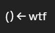
#when i zoom in its normal????#something something uhh#kerning#typography#umm#shitposting#even#tumblr throws a hissy fit when i post untagged smh
11 notes
·
View notes
Text

10 notes
·
View notes
Text

APP 3: PASSAGE
For this design I worked with the manifesto Think different by Apple. I used hierarchy to bring emphasis to the most important parts, by using a bolder typestyle and making some words bigger. I algo played with the alignment to balance the weight of the bold words. Adjusting the tracking and the kerning made the text look different, so I also adjusted the tracking in some words to make them look longer, without having to make them bigger. I learned that the way you stylize the words can give a whole new perspective to a text.
Manifesto:
Apple: think different
Here’s to the crazy ones. The misfits. The rebels. The troublemakers. The round pegs in the square holes. The ones who see things differently. They’re not fond of rules, and they have no respect for the status quo.
You can quote them, disagree with them, glorify, or vilify them. About the only thing you can’t do is ignore them. Because they change things. They push the human race forward.
And while some see them as the crazy ones, we see genius. Because the people who are crazy enough to think they can change the world, are the ones who do.
Keywords:
Hierarchy
Bold
Different sizes
Alignment
Left align
Right align
Important
Important words
Leading
Kerning
Tracking
2 notes
·
View notes

Text
i love being in a design class but sometimes when i have to listen about typography for two hours straight and then my teacher pulls out these pics, i feel like im going a little bit insane

#txt#design#graphic design shit#typography#typography is my nemesis#kerning#kerning fails#i almost started crying#my teachers r so silly and goofy
6 notes
·
View notes
Text
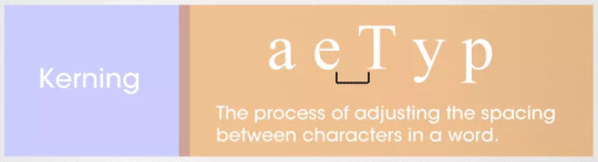
Diagram And Description Of Kerning In Typography Design
#kerning#art theory#typography#fonts#design#designers#graphic design#print design#graphic designers#art
6 notes
·
View notes
Note
Just saw this combo dick/kerning joke on Bluesky, so of course I thought of you!
yo momma’s kerning so bad all her hyperlinks say ‘dick here’
I'll see myself out...
Yes!!!!
7 notes
·
View notes
Photo

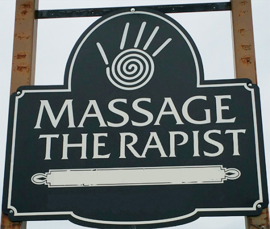
One for the vice squad Letterspacing and kerning are important. Photo by pwapwap on Twitter, used with permission.
15 notes
·
View notes
Text
2 notes
·
View notes
Text
If you're an RPG company looking for a designer, I promise that if you hire me this kind of thing won't happen.

7 notes
·
View notes
Text
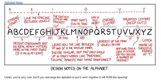
The earliest recorded use of the word “keming” was in 2008. It’s a bit of visual wordplay; kerning is the adjustment of space between letters, and if you kern the word “kerning” improperly, the r and n can merge to form an m. “Kerning” becomes “keming”.
The word has spread widely, and has elevated from an internet joke to a word in common use. It's time Merriam-Webster added it to their dictionary.
Sign the petition here!
Also:

Nice.
20 notes
·
View notes
Photo

Last zone #painting of #SmallPaintingSaturday. . Zone 3. Oil/ paintstick, wax & alkyd; alkyd on panel. 6” x 6” . #art #abstractpainting #abstractart #textart #contemporaryart #contemporarypainting #colorfieldpainting #colorfield #stalker #kerning #Tarkovsky https://www.instagram.com/p/CnH2PfLLbfD/?igshid=NGJjMDIxMWI=
#painting#smallpaintingsaturday#art#abstractpainting#abstractart#textart#contemporaryart#contemporarypainting#colorfieldpainting#colorfield#stalker#kerning#tarkovsky
5 notes
·
View notes
Text
Lunch will be gin at noon.

SPACING IS IMPORTANT
3 notes
·
View notes
Last Seen Blogs
project-khazix
Pierce and Skewer

wonderingstar42
Untitled

starstrucktoadhairdobanana
Untitled

alex1683
Untitled

020528journal
Sem título