#ChartEditing
Explore tagged Tumblr posts
Visit Tumblr Blog
Explore Tumblr blogs with no restrictions, modern design and the best experience.
Last Seen Tumblr Blogs


Fun Fact
1,644 Tumblr posts in 1 second.
Text
Visual Insights: Showing Percentages in Pie Charts for Clearer Data Representation
Data Visualization: Q & A Tutorial
1.Can you change a column chart to a line chart in PowerPoint?
Yes, you can change a column chart to a line chart in PowerPoint. To do this, right-click on the column chart you want to modify, select "Change Chart Type," and then choose "Line" from the options presented. You can further customize the line chart as needed. This feature allows for easy visualization adjustments to better represent your data.
2. How do I edit a pie chart in PPT?
To edit a pie chart in PowerPoint, first, click on the chart to select it. Then, use the "Chart Tools" that appear in the ribbon, which includes "Design" and "Format" tabs. Under the "Design" tab, you can change the chart style, layout, or data. To modify the data, click "Edit Data" to open an Excel sheet where you can update values. For formatting, use the "Format" tab to adjust colors, styles, and labels. Once finished, click outside the chart to see the updates.
3. How to show percentage in pie chart in PPT?
To show percentages in a pie chart in PowerPoint, first create your pie chart by selecting your data and inserting a Pie Chart from the "Insert" tab. Next, click on the chart, then select the "Chart Elements" button (plus icon) to add data labels. Choose "Data Labels" and select "More Options" to customize. In the Format Data Labels pane, check "Percentage" to display the percentages on the chart. You can also adjust the label's position and format for better visibility. Finally, ensure your chart is clear and visually appealing for your audience.
4. How to put a pie chart in PowerPoint?
To insert a pie chart in PowerPoint, go to the slide where you want the chart. Click on the "Insert" tab in the ribbon, then select "Chart." In the Chart dialog box, choose "Pie" from the chart options and click "OK." A chart placeholder will appear, along with an Excel sheet for data input. Enter your data in the Excel sheet, and your pie chart will update automatically. Close the Excel sheet, and you can resize or format the chart as needed using the "Chart Design" and "Format" tabs.
5. How to rotate a pie chart in PowerPoint?
To rotate a pie chart in PowerPoint, click on the chart to select it. Then, click on the "Chart Elements" button (plus icon) next to the chart. Choose "Format Data Series" from the context menu. In the Format Data Series pane, adjust the "Angle of first slice" slider to rotate the pie chart as desired. You can also manually input an angle value. Close the pane when finished. This allows you to reposition the starting point of the pie slices for better visual emphasis.
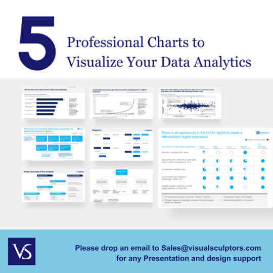
Visit: VS Website See: VS Portfolio
0 notes
Text
Sorting Data in Column Charts: Best Practices in PowerPoint and Excel
Data Visualization: Top Questions Answered
1.How do I edit a column chart in PowerPoint?
To edit a column chart in PowerPoint, click on the chart to select it. Then, use the Chart Tools on the toolbar to modify the design, layout, or format. You can right-click the chart to edit data, change the chart type, or adjust individual elements. Double-click the chart to open Excel for detailed data editing.
2. How do I animate a column chart in PowerPoint?
To animate a column chart in PowerPoint, select the chart, go to the "Animations" tab, and choose an animation effect from the gallery. You can customize the animation settings by clicking on "Animation Pane" and adjusting the timing and order. Use "Add Animation" to layer effects and preview your animation to see how it looks.
3. How do I make columns in Google PowerPoint?
To create columns in Google Slides (often referred to as Google PowerPoint), insert a text box by clicking on "Insert" > "Text box." Then, enter your text. To format it into columns, select the text box, click on "Format" > "Columns," and choose the number of columns you want. Adjust the text box size as needed.
4. What is column chart in PowerPoint?
A column chart in PowerPoint is a graphical representation of data using vertical bars. Each bar represents a category or value, making it easy to compare different data points visually. Column charts are useful for displaying trends over time or comparing quantities across various categories, enhancing the audience's understanding of the information presented.
5. How do I sort a column chart in PowerPoint?
To sort a column chart in PowerPoint, first click on the chart to select it. Then, right-click on the data series or axis you want to sort. Choose “Select Data,” and in the dialog box, adjust the order of the data series or categories. Alternatively, sort the data in Excel before importing it into PowerPoint for a more organized chart.

Visit: VS Website See: VS Portfolio
0 notes