#ComicsJournal
Explore tagged Tumblr posts
Visit Tumblr Blog
Explore Tumblr blogs with no restrictions, modern design and the best experience.
Last Seen Tumblr Blogs


Fun Fact
70% of Tumblr users say the Dashboard is their favorite place to spend time online.
Photo

An online friend (Hi @jeff_ranjo!) recently posted that he wanted to see folks' #Bookshelves because he misses going to #UsedBookstores due to the current #Covid pandemic. Here was the pic I snapped for him along with what I said in the comments, "My #BookCollection is slowly making it's way into the space I am cohabitating with my girlfriend. I had just barely started moving in before the Covid pandemic hit, so it was the gentle, yet aggressive, push needed to just bite the bullet and jump into the frying pan so to speak. That said, #SociallyDistant type visits to my parents place have been few and far in-between- so when I do get a chance to go a few more books come along with me. To end on a happy note and despite this pandemic, I'm the happiest I've ever been shacking up with the girl of my dreams. I really do miss used bookstores and #ComicShops, but I have been ordering off #Amazon and #eBay. #BookCollectorsGonnaCollect ¯\_(ツ)_/¯" Show me what's on your bookshelves too! #LordMinimus #WaltKelly #Pogo #WallyWood #MadMagazine #ComicsJournal #Disney #JoeRanft #JoeGrant #JohnCanemaker #FelixTheCat #CartoonistCookbook #TwoMorrowsPublishing #StarWars #StoryBoards #HarveyKurtzman #JayWard #Peyo #GeneDeitch #CartoonModern #AmidAmidi (at Culver City, California) https://www.instagram.com/p/CExD1EbDTY8/?igshid=18chdxyqvro35
#bookshelves#usedbookstores#covid#bookcollection#sociallydistant#comicshops#amazon#ebay#bookcollectorsgonnacollect#lordminimus#waltkelly#pogo#wallywood#madmagazine#comicsjournal#disney#joeranft#joegrant#johncanemaker#felixthecat#cartoonistcookbook#twomorrowspublishing#starwars#storyboards#harveykurtzman#jayward#peyo#genedeitch#cartoonmodern#amidamidi
0 notes
Photo

Half dollar pick up. #ComicsJournal #billsienkiewicz #elektra #comicbook #comic #comics #comicbooks #igcomics #igcomicbooks #igcomicsfamily #igcomicfamily #comicbookfamily #comicbookcollector #comicbookcollection #comiccollector #comiccollecting #comiccollections #igcomicscommunity https://www.instagram.com/p/B3-jfoIhvZH/?igshid=jx21kyburyn4
#comicsjournal#billsienkiewicz#elektra#comicbook#comic#comics#comicbooks#igcomics#igcomicbooks#igcomicsfamily#igcomicfamily#comicbookfamily#comicbookcollector#comicbookcollection#comiccollector#comiccollecting#comiccollections#igcomicscommunity
0 notes
Text
❌FOUR COLOR FILMS ● THE Comics Film Review Site!: LOGAN, Art by Tym Stevens!
https://www.fourcolorfilms.com/movies/logan
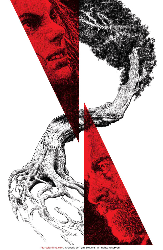
❌ FOUR COLOR FILMS ● THE Comics Film Review Site!: LOGAN, Art by Tym Stevens! 🚀 https://www.fourcolorfilms.com/movies/logan X. Helix. Hourglass. Family tree.
#fourclorfilms.com#MovieReviews#FilmPosters#MarvelStudios#GraphicNovel#Comics#Superhero#ComicsMovie#ExclusiveArt#LoganWolverine#XMen#X23Laura#HughJackman#Mutant#TymStevens#RockSex#SciFi#Mondo#io9#ComicsJournal#CBR#IGN#HuffPost#EW#imdb
0 notes
Text
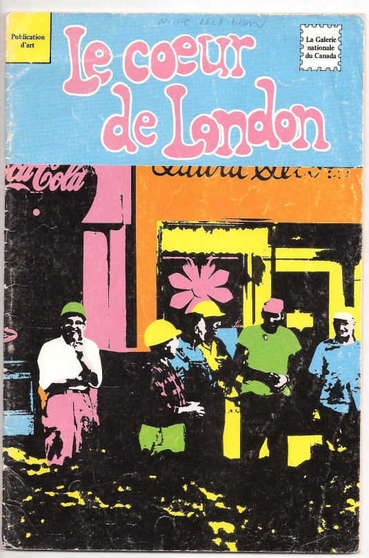
Fine Art Comics of Canada: Sixties to Seventies - Heart of London, Snore & More by Robert Dayton
Part One: The Heart Of London
There was a time where artists were making vast ripples away from Toronto and other outsized hubs. London, Ontario was such a place, all eyes were on it in the late 60’s and not Toronto. The Heart Of London comic book from 1968 was actually an exhibition catalog, an overview of the art that was happening there at the time. Organised by The National Gallery of Canada, this exhibition traveled from London to Toronto, Kingston, Edmonton, Victoria, Charlottetown and, of course, The National Gallery H.Q. itself in Ottawa.
This catalog/comic book consisted of fumetti, comics done using photos for the images. Fumetti was most prominently used in the 60’s by Harvey Kurtzman in Help and Playboy, prolifically in numerous Mexican comic book melodramas, and in Italian comics featuring the masked master criminal Satanik. Heart Of London’s particular fumetti is further stylized by heavily contrasted processing causing colours so bright that they make everything heightened artifice, buzzing as if emanating from a higher plane of being.
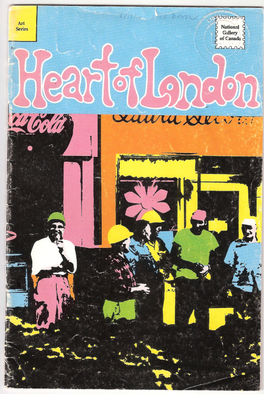
Cover of the Heart Of London catalogue
The Heart of London logo in Pepto-Bismol pink is rendered somewhere between Archie and underground comix titles. Above it, The Comics Code of Authority symbol -a comic book mainstay of the day implying that the work is of safe moral quality- has been altered to “National Gallery of Canada”, the institution that made this comic book and exhibition happen. The cover features what appears to be London public workers, perhaps? These men in yellow hard hats casually stand in front of a store with a Coca-Cola logo also coloured Pepto-Bismol pink, Pop Art style, at the city’s main intersection in what very well may be the heart of London.
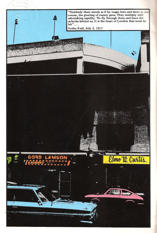
The comic opens with a quote placed above a looming Brutalist parking lot, huddling various small businesses below it. This quote contains the phrase “heart of London” but it is rather self-deprecatingly not about London, Ontario but London, England in World War One. Sharing a name with London, England has often made this Ontario city the butt of many a joke, ie. “I live in London… (long pause) Ontario” with its population being just over 200,000 in 1968. Named in 1793 by Lord Simcoe, Upper Canada’s first Lieutenant-Governor known for starting the abolition of slavery, he was also fervently British, his vision for Canada was for it to be like England which he looooved, desperately (but stiffly) wanting this particular London to become Ontario’s capital. Alas, Toronto was chosen instead. Related, always related to everything: the term “cosmic consciousness”, the higher state of consciousness, was coined in London in 1872 by Richard Bucke, a psychiatrist and head of The Asylum For The Insane, after he received a blinding vision, illuminating him. Besides being active in asylum reform, Bucke was heavily involved in the arts -the vision occurred after an evening spent reading Romantic poetry as well as poems by Walt Whitman, who he later befriended. Yes, London, Ontario is an eccentric place.
The artists involved in the Heart Of London show were part of what was known as “London Regionalism”, a loose-knit movement of artists who were adamant about residing in London, away from Toronto or New York. Artist Greg Curnoe helped establish some of the very first artist-run centres there. He was an early member and huge proponent of CARFAC, a Canadian organisation that fights for artists to get paid and paid fairly for their work. CARFAC was founded in London by Heart Of London artists Jack Chambers and Tony Urquhart -along with Kim Ondaatje.
Besides Curnoe, Chambers, and Urquhart, the eleven artists in Heart Of London included John Boyle, Bev Kelly, Murray Favro, Ron Martin, David Rabinowitch, Royden Rabinowitch, Walter Redinger, and Ed Zelenak. They are all profiled in fumetti form talking about their practice through speech balloons and captions, along with quick biographical details. Many of these artists were known for their inventiveness, they were influenced by a variety of subject matter -including comic art- without falsely delineating these influences into false boxes of high or low art. They didn’t just make work in the visual art field either. Along with a Hart Of London work-on-paper, Chambers made an experimental film with the same name in 1970. This film intensely shows brutal shots of an abattoir in Spain interspersed with London scenes; it has been described by Stan Brakhage as “one of the greatest films ever made.” Both Curnoe’s Heart Of London painting from 1967 and Jack Chambers’ 1968 work-on-paper Hart Of London are in the show.
Noted curator and historian Judith Rodger told me that Curnoe’s Heart Of London piece depicts The Forks Of the Thames downtown, “arguably the heart of London” near many of the artists’ studios with Greg’s studio as the main hub or heart of it all. As for the idea of a comic book catalog, it was a mystery until Rodger guided me to Katie Cholette’s PhD thesis Memory and Mythmaking: the role of autobiography in the works of Jack Chambers and Greg Curnoe which states that it was the idea of William Bragg, assistant to the director of The National Gallery’s extension services. Cholette’s paper quotes Bragg from the Sept 29, 1968 New York Times’ Arts Notes column, “…The idea was to make a kind of scrapbook, to talk as a group, not individuals. Their work is kind of echoed by the comics—it’s really their bag […] Everyone likes to read comics once in a while, anyway.” Due to its uniqueness, the catalog garnered a lot of press for the show. Beverley Lambert (Bev Kelly in the show) says, “I think we all thought it was pretty neat and it was funny. It got people’s attention.”
When I talked to artist John Boyle about this comic book catalog, he said right away, “It’s too bad that Greg Curnoe isn’t with us anymore, because he was really interested in comic books. And he always did comic book or comic-like drawings from the time he was a little kid.” In the book Greg Curnoe Life And Work, author Judith Rodger’s description of his 1963 painting Myself Walking North In the Tweed Coat could be ascribed to many of his works. “The flat, vivid colours; schematic outlines; and text all come from his love of the comic book.” As well as the inclusion of the name of the newspaper strip Mary Worth in the piece. Another colourful painting casually inserts Dick Tracy into the frame as a representative of one of his interests. Curnoe’s series of cut-out collages were often shaped into cartoony and anthropomorphic forms.
Curated by Pierre Théberge at The National Gallery, Boyle readily notes, “Both Curnoe and Chambers talked up all the other artists who were around in London, and ended up persuading Théberge to have a group show to get a sense of the whole London art scene.”
The comic book itself doesn’t give William Bragg’s name at all, nada. The designer is credited: Roger Duhamel, FRSC, Queen’s Printer and Controller of Stationery, a federal government official, as well as the design firm: Eccleston + Glossop International. All of the photos, however, were done by the late Don Vincent, of whom Boyle says, “He was a friend of ours, of all of us. And a really terrific photographer. And he documented the whole London scene as it unfolded taking photographs all the time of everybody in this show and just of London, his whole life was photography.” Vincent’s work also appeared in 20 Cent Magazine, a delightfully scrappy local art magazine started in the mid-60’s with many of the people in the show, including Boyle and Curnoe, contributing writings and drawings. 20 Cent Magazine sold for 25 cents, ha! Vincent also photographed The Nihilist Spasm Band who are regarded as the first noise-rock band; this amazing, mind-blowing, intense and milk-spurtingly funny act was founded by the late Greg Curnoe, with Boyle and Favro (playing unique guitars that he builds himself) as still very active members over fifty years later. They are unique cultural ambassadors bringing such songs as “No Canada” to the world, having performed in Japan and in Vancouver at The Western Front with poet George Bowering guesting on guitar, and have had a documentary made about them by the late noise artist Zev Asher.
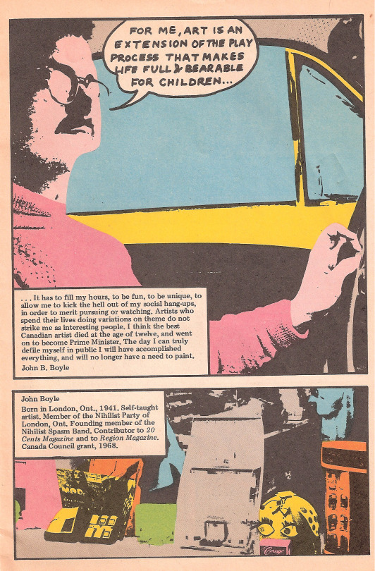
In one of Heart Of London’s comic book panels about Boyle an early issue of the four color MAD sneaks its way in. I asked him if he read MAD, “Yeah. Although that is from the designer. I read MAD, although not madly.”
A very young Boyle states in one of his panels, “The day I can truly defile myself in public, I will have accomplished everything, and I will no longer have a need to paint.” Reflecting today he says, “I still think that actually, and I think I may have succeeded. Because I do still have the need to paint. But I don’t have the need to show it anymore, or to get applause or approval from anyone. And I don’t know how that arose in me. But I kind of had a fair amount of attention and approval and acceptance and shows in fancy places and meeting important people and pleasing art administrators. And I kind of reached the conclusion that most of them aren’t worth pleasing and their opinion was not as good or not as important as the opinions of other people that I happen to know. And I thought they made a lot of mistakes and people that they chose to support. And also, their approval was very fickle. They were very fickle about it because as soon as fashions would change, their eyes were directed elsewhere and the people they thought were geniuses today were no longer geniuses tomorrow. I did kind of lose my enthusiasm for the art world, but not for painting. So, I was mistaken.”
The final pages of this catalog feature a few reproductions of pieces from the show itself, including Bev Kelly’s window paintings which, with its window panels, adapt quite easily to the comic book form, comparable to an ornate and mysterious painted comic page. The layout, however, was a bit fast and loose with one of her works being printed sideways. In her fumetti section she says, “These windows aren’t ‘real’ windows, they are still paintings. They don’t have sashes and you can’t see through them. A real window is to look through, these are to look at.” Painted on canvas, the window pieces used lumber to make the frames of the paintings, carved to look like the ribbed mouldings of window frames.
Bev Kelly was the sole woman in the show and when I asked her about this she said, “I’m very happy that they didn’t concentrate on this issue that I was the only woman. I didn’t want to be known as an artist because I was a woman.” Having recently moved to London from Saskatchewan with her husband, they were warmly welcomed by Curnoe and she would go see The Nihilist Spasm Band play every week at The York Hotel. Her first solo show was at The 20/20 Gallery in London.
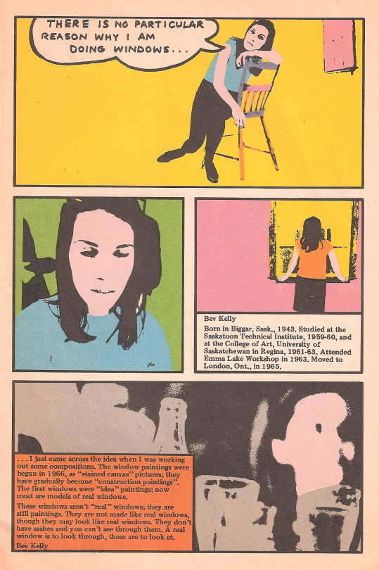
She spent the first two years of her life in Biggar, Saskatchewan where the signs read, “New York Is Big, But This Is Biggar.” Being in London changed her notions of places like New York being the absolute cultural mecca. Beverley says, “There was a really vibrant cultural community there. You know what a regionalist Greg was. He really believed, as a lot of writers do, that you should write about what you know, or you should do your art about what you know, including where you live and so on. And, of course, when I started on the windows that was right out where I was living. The first ones were of my house and then I walked around and took pictures of various houses that I thought looked interesting. When I got a studio in London above one of the businesses downtown I used some of the windows there as inspiration for my works. And then when I went back to Saskatchewan, I was very into that, looking around at what is there where you live. I even got a grant to travel around small-town Saskatchewan and look at the local -in air quotes- ‘folk art’ or untrained artists, let’s say, just painting odd things on their house or their property or whatever. So, I went and I did interviews, took pictures of them, and I imagine I must have produced some kind of a report on it because I probably had to for my grant. So that led me into being more observant and looking more at where it’s from and what is around you and that you don’t have to go to some huge, big place to find art.”
Bev Kelly was her married name and she returned to using her original name, Beverley Lambert in the 1970’s. Lambert did a series of three large lithographs for International Women’s Year in 1975 on women’s issues dealing with real news stories that happened on the prairies. Many of these prints were donated to many women’s centres across the country. She has also worked in clay doing an entire main street based on the fictional Saskatchewan town in the humour book Sarah Binks by Paul Hiebert. Beverley Lambert currently resides in St. John’s, Newfoundland where she makes art and is active as a conservator.
Flip the comic over and it is the same but in either French or English depending on where you first started reading!
Boyle comments, “Last night, my wife and I were looking at the Heart of London catalog. She was amazed that this was a National Gallery touring show with a lot of artists who became major artists in the country. And it looked like they were trying to spend as little money as possible by making this skinny little comic book-like thing on newsprint and I think there’s a large measure of truth in that. Because, again, I remember when Greg Curnoe had a big one-man exhibition retrospective at The National Gallery and the catalogue that they did for him was kind of a minimal thing. It was like a paperback book with one colour reproduction and a number of inferior black and white reproductions and basically a list of artworks in the show. And in the same year, The National Gallery did a big one-man exhibition of Donald Judd, the American sculptor, and his catalogue was a huge coffee table book that weighed about 15 pounds and was three inches thick and loaded with colour from beginning to end. And that just, I think, represented a specifically Canadian problem.” When I mention this to Hairy Who member Art Green he responds, “Well, of course, because they’re trying to impress their betters in New York, so you get a job at The Whitney or The Museum of Modern Art. Canada has been an incubator for museum directors since forever.”
Hairy Who catalog page by Art Green, courtesy of the artist
This style of catalog for Heart Of London corresponds nicely with The Hairy Who, another such grouping of artists around that time who were part of “The Chicago Imagists.” Their three Chicago art shows starting in the mid-60’s were accompanied by comic books that also doubled as exhibition catalogs. The Hairy Who weren’t very aware of the underground comics scene then just barely getting started, they chose this method out of creative necessity, printing a glossy catalog was cost prohibitive. Green explains, “And the printing was expensive and not very good. And we didn’t want to have a show that was called ‘Six Recent Graduates’ or something unexciting like that. And so, we realised we all liked comics and we all knew how to do colour stripping because we’d taken silk-screening courses, we figured out we could do it. And it was cheap.”
Delineating further, The Hairy Who made playful art inspired by a wide range of neat stuff. The London artists were well aware of The Hairy Who. In fact, The Hairy Who were even going to show in London at The 20/20 Gallery. Boyle notes, “20/20 was kind of a precursor to the art in the so-called artist run centres, most of which aren’t run by artists anymore. But anyway, it was one of the first and it was all sponsored by local people in London. And I don’t think it lasted longer than a couple of years, but it was a terrific gallery while it lasted.” Many of the artists in The Heart Of London show were active in 20/20, which lasted from 1966 to 1971. Greg Curnoe discussed the show with Hairy Who artist Karl Wirsum, who in a letter to Art Green wrote, “Well, if they go ahead and publish a comic book, that would be all right.” Green notes, “He may have thought that the 20/20 Gallery was more well-funded than it probably was. But it was on, we all agreed to do it. We were looking forward to it.” Green himself left Chicago for Canada in 1969. The 1968 Democratic Convention had transpired and as Green puts it, “Everybody was angry at everybody.” He was dissatisfied with his teaching job there as well, so when offered a job at NASCAD, the art school in Halifax, he leaped at it.
Alas, the show didn’t happen. In a letter to Art Green, Curnoe writes, “We had to cancel The Hairy Who show and a lot of us were disappointed.” Boyle notes, “I suspect that it got caught up in the death throes of the gallery. And they would have had to cancel whatever exhibitions they had coming up.”
Green notes that both London and Chicago are far enough away from the more major centres that artists can, “…be free to go their own way because there’s not much at stake partly and nobody’s paying attention. And I remember the first time I had been in London, we were driving on our honeymoon to Halifax where I got the job. And I thought, ‘I’m gonna stop here and get a Canada Dry.’ I’m driving down what’s the main street that runs north south and pulled into a corner store. And I said, ‘Do you have Canada Dry?’ ‘No, but we got America Dry.’ I have never before or since seen a bottle of America Dry. I bought it and it wasn’t as good as Canada Dry. And, and that’s not a dream. I mean, I have never seen it ever again. But that made me say, ‘Wow, this is a weird place.’”
While Green was teaching at NASCAD, Curnoe came for what Green calls, “One of his annual excoriations, if that’s a word, he would rip them up one side down the other in public, for being a Canadian art school with no Canadians teaching, hardly any, and all yanks -and it was true! And so anyway, they would invite him and it was almost like a ritual. He would be in the public, there’d be 400 students there and Greg would just rip the place apart. I had known Greg, I heard about the show and so on, and we got along fine. And afterwards he’d come up to me and say, ‘Well, how did I do?’ ‘Greg, you’re doing great, but you do realise I’m a yank’, but I agreed with him 100%.” Both Curnoe and Green commiserated on how Canadian art was neglected at the school. “If he had been in Chicago, Greg would have been a member of The Hairy Who or maybe started it. But he was more political, he had to be, and Chicago, the politics were so acidic that you wouldn’t have wanted to be to be involved in it, unless you went in full immersion. And we were decidedly unpolitical. Although we all agreed on the politics of it. We were a collective in the sense that we wanted people to collect us.” On this, Art Green is a tad glib, having made art responding to and criticizing Secretary of Defense Robert McNamara. Both Art and Greg would visit with each other in various Canadian cities: Halifax, Vancouver, Toronto. “Nobody appreciated Greg in Toronto, they went out of their way to un-appreciate him. And luckily, they did put a put up a pretty nice retrospective after he was safely gone.”
Of London, Green notes, “I think that for a period of time. I don’t know how long it was maybe a few minutes, maybe a few hours, maybe a few months? Maybe a few years. London, Ontario was most interesting art scene and literary scene in the whole world.”
The propensity for great art still ran in the water there, the stream flowed, there was a continuum and a recognizing of that history. London has some great galleries including Forest City Gallery, founded by Jack Chambers and Greg Curnoe, where The Nihilist Spasm Band plays every Monday night.
In 2013 The London Museum held the group show L.O. Today with artists Jason Mclean, Marc Bell, Jamie Q, Billy Bert Young, Amy Lockhart, Peter Thompson, and James Kirkpatrick. Many of these artists are a part of the Canadian Psychedooolic art comic movement that began in the 1990’s, captured and collected in the book Nog A Dod, edited by former Londoner Marc Bell and released by Conundrum/PictureBox. Much of the work in Nog A Dod occurred in Vancouver with a couple of these London artists relocating there, immersing easily, doing a lot of collaborative drawing and art books with other Vancouver based artists. Yes, ‘Canadian Psychedooolic’ was named after the fact by Bell, but we weren’t thinking of ourselves as a movement or a group at the time. Yet all of these art books had an unfettered comic wildness, funny, and expansively playful. And Nog A Dod got out there, impacting and influencing a lot of artists the world over. Furthering the connective tissue, in 2003, The Western Front in Vancouver put on an art show featuring ‘documents and ephemera’ from musical acts The Nihilist Spasm Band, The All Star Schnauzer Band (a somewhat fake band as mail art project involving Bell, Mclean, and Thompson) and July Fourth Toilet, a Vancouver based group that often involves many Nog A Dod and Nog A Dod related artists, including yours truly occasionally wearing outlandish semi-functional semi-nude costumes specially designed by Jason Mclean. The show was curated by Jonathan Middleton, who is now Executive Director at Art Metropole, a Toronto based artist-run centre dealing primarily in artists’ publications.
Getting back to Greg Curnoe. Released in two parts in 1970, The Great Canadian Sonnet contained numerous images by Curnoe. Described as a “Beaver Little Book”, the format was modeled after the popular Big Little Books, distant cousins to comic books so named for being small, square and thick. Big Little Books were marketed to children and featured popular comic, cartoon, radio and film characters of the day in text-based stories with illustrations on every other page. Some Big Little Books had flip-it cartoons in the top corner so one could make the character move. With its second volume The Great Canadian Sonnet does this as well, stating “See ‘em move – just flip the pages” on the cover and, sure enough, in the corner a spot rolls up a hill-like abstract shape transforming into a medley of human faces.
Written by poet David McFadden, Curnoe riffed off lines in his text creating a great many detailed pen-and-ink drawings for the book with titles that included “Proud Possessor Of Meaningful Pain”, “One that will be Truly Loved by the Prime Minister”, and “The Empty Universe” which featured a drawing of a tin of apple juice and a packet of bird seed -the book’s drawings contained many such absurdist pairings. The Great Canadian Sonnet was published by Coach House Press who were -and still are- known for releasing all manner of experimental works including poetry, prose and beyond. Both volumes together weigh in at over 400 pages, with every other page being a drawing by Curnoe.
Many thanks to Jason Mclean, Marc Bell, and Judith Rodger for their immense help with this piece.
Thanks as well to Art Green for use of his respective artworks.
Part Two: Scraptures, Snore and More coming tomorrow, Friday, August 20!
Robert Dayton
www.robertdayton.com
www.patreon.com/CanadianGlam
#comicsjournalism#canadiancomics#theheartoflondon#hairywho#nihilistspasmband#vancaf#vancouvercomicartfestival#robertdayton
9 notes
·
View notes
Photo
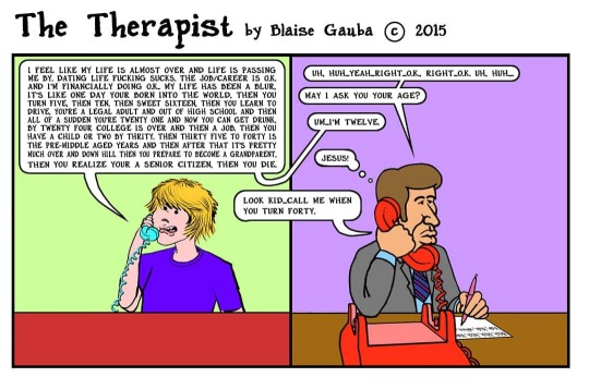
Hahaha! Here's my (so far) one and only The Therapist cartoon I drew way back in 2015. I was perusing Craig's List Rants and Raves one day, you know, for entertainment, of course, and I came across this rant that struck me as funny. So, all I literally had to do was add in #thetherapist 's response and I had myself a cartoon! Enjoy! #comics #comicsartist #comicstriproute #comicswallstudio #comicsjournalism #comicsvo #comicsstudio #comicsofficial #comicshub #comicscafe #comicstorian #comicseries #comicsmonster #comicslove #comicsofinstagram #comicsandchill #comicschool #comicsstuff #truthincomics #comicsmaking #comicstrips #comicsfans #comicsyndicate #readcomics #comicstore #comicstrip #comicspenandink #comicsworld #comicslover (at Torrance, California) https://www.instagram.com/p/CCL9oT6nyL_/?igshid=13sudu4fg2jgr
#thetherapist#comics#comicsartist#comicstriproute#comicswallstudio#comicsjournalism#comicsvo#comicsstudio#comicsofficial#comicshub#comicscafe#comicstorian#comicseries#comicsmonster#comicslove#comicsofinstagram#comicsandchill#comicschool#comicsstuff#truthincomics#comicsmaking#comicstrips#comicsfans#comicsyndicate#readcomics#comicstore#comicstrip#comicspenandink#comicsworld#comicslover
1 note
·
View note
Photo
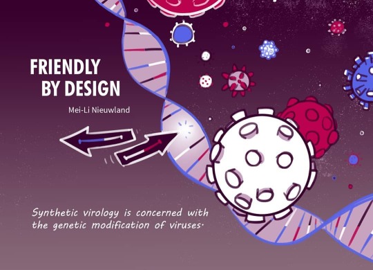
My comic on synthetic virology is out 🎉 It's a relatively short one, just giving a brief introduction to the state of this field, but a lot of love went into it 💜 It's also my first time trying some motion graphics 🎥🍿 This comic is part of Drawing the Times' 'VIRAL' special: six different graphic journalists exploring six different topics related to this theme. You can read my contribution (Dutch and English versions) and Merel Barends' comic on viruses (Dutch) here. The other stories will be added over the coming weeks. Thanks once again to the Fonds Bijzondere Journalistieke Projecten (fund for special journalistic projects) for supporting this work. 🙏
#syntheticvirology#graphicjournalism#synthetischevirologie#beeldjournalist#stripjournalistiek#comic#illustration#motiongraphics#comicsjournalism#oncolyticvirus#oncologischvirus#kanker#cancer
1 note
·
View note
Photo

For context, I’ll post the other two— why not? Pictured here: SHAM. For your consideration #LAAB @beehivebooks #eisnerawards #comicsjournalism (at Central Park) https://www.instagram.com/p/BytJ2lyHZ94/?igshid=1ufavujdm9v5l
7 notes
·
View notes
Photo

PHEW I'm already coming along with my comic for the @kennedycenter based on this year's Arts Summit!✍️The theme this year was storytelling so it's VERY up my alley. 😆It's been a fun challenge to weave all the big ideas of this inspiring event together visually and thematically. Thankfully finishing a 182 page comic was the perfect warm up for producing this new lil' 8 page art baby. 💪⚡️🤞 . . . #artssummit #artssummit2019 #citizenartist #kennedycenter #thekennedycenter #comic #thumbnails #storytelling #visualstorytelling #bluepencil #sketches #layout #comicsjournalism #busybee #keepdrawing #ontothenextproject https://www.instagram.com/p/ByV-IyvlZu5/?igshid=1rm2hdat5v5u7
#artssummit#artssummit2019#citizenartist#kennedycenter#thekennedycenter#comic#thumbnails#storytelling#visualstorytelling#bluepencil#sketches#layout#comicsjournalism#busybee#keepdrawing#ontothenextproject
1 note
·
View note
Photo

The Nib #3: Empire from @thenib, with an @arrogantbastard Ale from Arrogant Consortia. . . . #readingdrinking #thenib #books #comics #journalism #nonfiction #history #politics #empire #comicsjournalism #beer #arrogantbastard #ale #arrogantconsortia #instacomic #instabeer #beerstagram #bookstagram https://www.instagram.com/p/Bwf4f_6hqHU/?utm_source=ig_tumblr_share&igshid=19s7ns0nnbtzm
#3#readingdrinking#thenib#books#comics#journalism#nonfiction#history#politics#empire#comicsjournalism#beer#arrogantbastard#ale#arrogantconsortia#instacomic#instabeer#beerstagram#bookstagram
1 note
·
View note
Photo

A heartbreaking, full-color graphic novel at a European epicentre of the refugee crisis. Veteran political cartoonist Kate Evans released this masterpiece through @versobooks in 2017. Over the past decade, a city within a city arose in the French port town of Calais, famous historically for the production of lace. This new town, known as “the Jungle”, was home to thousands of refugees, mainly from the Middle East and Africa, all hoping, somehow, to get to the UK. By 2018, I feel as though we all must know what refugee camps look like: they are people living for indefinite periods of time in makeshift “temporary” housing like tents and shipping containers. Toilets are scarce and trash is plentiful, as are rats and sickness. People make due with what they have, and Evans captures both the inhuman conditions and humanity of the camp’s reluctant residents. Contrasting this to the message of France’s increasingly belligerent far-right, who take every opportunity to blame the refugees for every conceivable problem, from high unemployment to gas prices, and you can feel the political temperature rising. ‘Threads’ addresses one of the most pressing issues of modern times to make a compelling case, through intimate evidence, for the compassionate treatment of refugees and the free movement of peoples. Evans’s creativity and passion as an artist, activist, and mother shine through in this volume - it should be required reading anywhere we are talking about migration. #sjcomix365 #migrants #refugees #calais #kateevans #migration #migrationcrisis #nooneisillegal #comixreportage #comicsjournalism https://www.instagram.com/p/BsdrM8nnh4o/?utm_source=ig_tumblr_share&igshid=t96yycsto5i1
#sjcomix365#migrants#refugees#calais#kateevans#migration#migrationcrisis#nooneisillegal#comixreportage#comicsjournalism
1 note
·
View note
Photo

A fun project from a couple years ago for @thesequentialist - online comic journalism. Thanks to @theloniousgrimm for the chance to make cool stuff about a cool story about @seemybrotherdance comic work with @repjohnlewis for their book March. #march #comics #comicsjournalism #brushpen #digitalart #comicart
1 note
·
View note
Photo


PRETTY GOOD FOR A MONDAY, By Andrew Greenstone. In this issue: Sleeplust, West Coast Weekend, and Molly Moore play at The Satellite in Los Angeles.
#comics#comicsjournalism#music review#the sattellite#danceyourselfclean#rock art#ROCK REVIEWS#AndrewGreenstone#molly moore#westcoastweekend#sleeplust#existential dread#existential comics#losangeles#los angeles#silverlake#pretty good for a monday#mondays
11 notes
·
View notes
Photo


He was perfectly safe at the refugee camp. But he wanted more. One man’s epic journey to his dream job, illustrated.
Read the full comic here
626 notes
·
View notes
Text
⭕ FOUR COLOR FILMS ⭐ THE Comics Film Review Site! New Reviews every week + Original Poster Art by Tym Stevens!

⭕ FOUR COLOR FILMS ⭐ ● THE Comics Film Review Site! New Reviews every week + Original Poster Art by Tym Stevens! 🚀 https://www.fourcolorfilms.com
#foucolorfilms.com#MovieReviews#FilmPosters#ComicsMovie#Superhero#MarvelStudios#DCUniverse#GreenLantern#DangerDiabolik#BrendaStarr#GemmaBovery#GraphicNovel#SciFi#fumetti#ComicStrip#GemmaArterton#Mondo#io9#ComicsJournal#CBR#IGN#HuffPost#EW#imdb#TymStevens#RockSex
0 notes
Text
BD à BC: An Interview with Melek Zertal by Kim Jooha
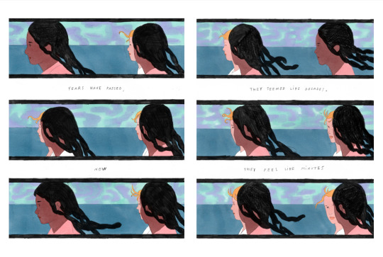
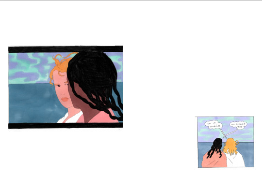
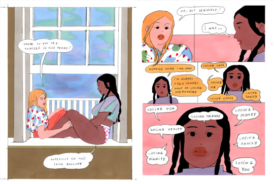
Melek Zertal is an Algerian-French artist based between Paris and Oakland, California. Zertal’s art combines the best of French and North American independent comics, while distancing from both and making its own. Beautifully illustrated and juxtaposed with their own rhythm, Zertal’s comics talk about things that are unfortunately uncommon in both French and North American independent comics-- the plights and life of an immigrant and queer love. Zertal’s latest work is Together, published by Colorama, which I highly recommend.
Kim Jooha (KJ):How did you get into comics? Were you always interested in comics from a young age, or did you get into comics later in your artistic journey/career?
Melek Zertal (MZ): I started reading / copying mangas as a kid! Getting better at drawing was my way of making friends when I got to my new middle school. There, I met someone who became my best friend and was an absolute killer at drawings; her parents were artists (and her mom is a comic artist). I spent years rummaging through their books, CDs, DVDs, and I owe them a huge part of my cultural education, as well as nurturing my drawing journey, from 13 years old and up. They made me discover Ghost World around this age, and it made me understand that you could convey so many different feelings through comics.
KJ: How would you describe your artistic practice?
MZ: I would describe my practice as sporadic and unprofessional at best, my teenager self’s wet dream at worst.
KJ: Your instagram bio says “Oakland <-> Paris <-> Constantine”. Do you live in three cities? That’s so cool!
MZ: I was born and raised in Constantine, Algeria. I moved to Paris with my close family as a kid and have been living / travelling to Oakland for 5 years now. I don’t spend an equal time in each city but need a regular rotation of the three to feel whole.
KJ: Your art is beautiful and the dialogues are witty, but the subject matters often are not. As someone who has personally had difficult experiences with the immigration system in North America, to be honest I was surprised to find this topic, from someone with lived experience, in an indie French/European comic. Because North Americans do not care much about things outside of North America, when we think of Europe we only think about white Europe. We hear “news” about the migration crisis, or “read” post-colonialism, but especially in comics and indie comics it’s rare to face it directly. Do you think art / comics / indie comics in Europe and North America are less perceptive on such critical matters?
MZ: They're definitely less perceptive on these matters due to the fact that people experiencing them rarely pursue careers in this field. Immigration/colonization history is very different in EU and North America, and the place of minorities in society is also very different. In France, art in general and comics are a big part of our education and upbringing. Every big and mid-level city has its own art school, which are all mostly free. There is almost no financial separation between students of different economic backgrounds, but what does separate them is the social background. We were probably a handful of students of colour in my 600 student school, and probably 4 or 5 students from North-African diaspora - the biggest minority in France.
I guess the funny thing is that I wasn’t mentioning my emigrating to France consciously in my work; I’ve been trying to emigrate to the US for a few years now and it’s been a very complicated process. That’s what I have been writing about… even though our immigration process in France also hasn’t been easy at all.
Maybe off topic but I’ll vent : I’m always mad at North American’s obnoxiousness to the rest of the world lol. I found myself having to “prove” my past, heritage, and history to people who have trouble understanding that racism and colonialism are issues that a lot of countries have to deal with.
A funny thing that I often think about is: most of the people reading and embracing my work are from North America and it might be only due to the fact that I’m mimicking image by image, word for word, what we non American think this country is. I’m taking every cliché that we have on American culture and putting them in a nice bow, and everybody seems to like it. Fiction, auto-fiction, assimilating to a new country’s culture… I feel like I have been in a way prepping my immigration to the US as early as possible by showing that I can speak their language and culture. And I feel like every immigrant can relate to this lol.
KJ: As I mentioned, one characteristic of your comics is the contrast of beautiful and meditative art and witty dialogue. How do you approach the relationship between words and images when you create your work?
MZ: I usually try to find the images before the words. I’ll find a string of images that strike me, that resonate together, and build off of that for the whole atmosphere of the story. Each story is actually just an addition of all the images I’ve stumbled on during the making of the book and which makes it go a certain way. For the text, I’m often writing down sentences and situations on notebooks or phone. Once I have found my atmosphere through the images, I’ll appoint a few sentences that match them and build off of that as well.
So, I’m constantly foraging for words and images, and once the mood board is set, just trying to put every puzzle piece where it belongs.
KJ: There is a sense of mystery in your works. Some narratives end in the middle, and even the narratives with resolutions give readers the feeling that there is more to this work than what they have understood so far. Is it intentional? What do you try to convey to the reader when you make your work?
MZ: The first books I've ever read and been a fan of were Agatha Christie’s Hercule Poirot. I’m a huge fan of mystery in general but there’s this dread that, as a reader, you’ll find out who is the culprit before the author tells you, in which case you lose most or all interest. I’m not very interested in having this burden as an “author”, of holding your reader’s breath to give them a bow wrapped ending that would satisfy them (or not).
My favorite part is what comes before that : characters interacting between them and their environment. Like in those 90s movies that we grew up with, with the status quo before anything happens. For example: in Jumanji, when Peter rides his bike through the street, says hi to everybody in his small town then goes to his dad's factory, or in Home Alone, before the family forgets Kevin. Those parts made me dream way more than the actual subject of the movie. I really want all my books to be this precise moment of naive bliss stretched forever.
What I want to convey is a feeling - a moment - an atmosphere - that I experienced once in my life and cannot transcribe with words. Those moments in time do not have a truth, a lie, a reason to be. They’re just here.
There comes a curation and accumulation of colours, frames, dialogues, to try and capture what I am trying to say. I usually don’t really know if I succeeded myself once the work is done, and can see the bigger picture of it way after the book is done, printed and published. I’m just now starting to like some work I’ve done five years ago, so that’s nice.
KJ: Your distinctive style and form seem to be born out of fusing diverse influences from both European and North American comics in addition to traditional media like cinema. You homage them too (for example, Danslecieltoutvabien and Portrait of a Lady on Fire). Could you discuss your artistic influences?
MZ: My influences are 95% of my work! I’d say most of my work is curating the things I want to use, and the actual final drawing bit is just the thing that is going to tie everything together in a coherent manner. I feel like each one of us is a sum of the things that move them, so my work is just a giant mash-up of this.
I’ve always been very fascinated by US pop culture (watching US shows/movies dubbed in French on Algerian TV as a kid). For influence name-drops, there would be: Daniel Clowes, The X-Files, Nick Drake, Real Housewives of Beverly Hills, Ween, Henni Alftan, Daniel Johnston, Verner Panton, Bladee, David Lynch, Elliott Smith, Top Chef (only the French one), Alex Katz, Dans Le Ciel Tout Va Bien, Malibu, Hockney, Sammy Stein, Mary Cassatt, Oneothrix Point Never, Stephen Shore,… 99% of them English speaking depressed men🥰 (I could dive on the why haha)
KJ: I love how you utilize the juxtapositional/serial nature of comics. You often juxtapose different styles, forms, narratives, or diegetic space-time. This juxtaposition is not always drastic. You also incorporate sequences with minuscule differences-- like Eisenstein’s Montage theory, these produce effects that are more than the sum of two images/pages. How do you decide what kind of images/styles/forms to put in a specific place in a story and on a page? How do you approach a page design/layout?
MZ: There’s no formula for the dialogue between two images; it’s all luck and a vague gut feeling. Sometimes I don’t fully consciously know why some images work together, but understand the connections way after the book is published. It’s pretty fun not having 100% of the answers to your own work and discovering subconscious choices that make sense way after.
Since I draw most of my “key images” before knowing what the exact story is, I move them around like I would with a photo book. Images that talk for themselves but go a different direction once put together. And in another direction once you add some text! I love this possibility, because that’s what makes comics amazing: you take an image, you add some text, and the end product is different from the sum of its components.
The layout of the page actually dictates its content. I try to create a layout that will work within the page, within the spread, then within the whole flow of the book - the frame needs to have a meaning in the page, the page in the spread and the spread in the book. Kinda like Russian dolls. Then, I see which sequence of images and sentences would fit in this chosen layout… a giant puzzle.
Creating a rhythm is one of my favourite things in the comic medium. You can create a fast paced reading, then cut it with a long focus of an action that would take a millisecond. You can force the readers to pay attention to what you want them to pay attention to, the important details that they would have missed but are important to your storytelling.
KJ: We should talk about the amazing colour of your works. How do you approach colouring in your work? How important are they for setting the mood of your comics, for example? Are they different depending on the ending printing method? Why are word boxes yellow?
MZ: I’ve actually always had a hard time doing colours ! I started using alcohol markers while in school and it really helped me. They are pretty expensive and I had a very limited choice. Found a couple of colours that worked well together, and used them often. Added some accents here and there, and it kind of worked. I’m still working like this, but with a bigger array of colours. Now, after almost ten years, I feel like I can kind of understand what goes with what, next to which colour !
I don’t change the colour choice for the printing end. I’ve found myself working with a lot of risography printers, but it wasn’t really a deliberate choice - just happy luck. It ended up being absolutely great collaborating with people printing differently, with their own style and gear, and seeing how my take on colour was interpreted by them as I do not give colour matching directives.
As for the boxes, they’re here to achieve a color balance when the image doesn’t work by itself. Or, if the layout demands a box, I’ll work the colours around the yellow of the box.
And they’re definitely yellow because of old US comics. It just works so well, they figured it out perfectly!!!!
KJ: It seems that some of your works you painted digitally and some did not. Do you decide the technology depending on the specifics of the work you are working on?
MZ: Yes, as I said markers are pretty expensive - and my favourite brand are only purchasable in the US (they’re so toxic they’re banned in France), so I’m always rationing them for fear of running out.
For the only long body of work I made, I had to use computer coloring, but also because it fit the story: it was a quick paced, funny little book. It did not particularly need the poetry of smudged pencil and blurring and bleeding ink.
But I really don’t like working digitally. I’m trying to find another analog way of working colour, as markers are really not a long term solution.
KJ: As a queer woman, I am just SO HAPPY to read such great wlw love stories in the alternative comics/self-publishing world. Thinking about it, it is weird that wlw/queer women/lesbian comics are not common in our scene. Yes, this is "not a question and more of a comment" LOL. I cannot think of one in the French scene. Do you have any recommendations?
MZ: I'm so sorry I have no idea! This might be terrible to say but I am trying to be as honest as possible: I haven't read that many comics in the past years I’ve been producing them. Like, at all. (Or, just my friends’). This is so bad!!!!! But I can’t, it’s like, too close to home.
KJ: Your work portrays the typical wlw desire of “yearning” so well. How?!
MZ: Thanks! I think I’ve just really suffered of it most of my life and need an outlet for it haha. I’ve always romanticized romance, and felt like it was not made for me from a young age - not the right body type, look, height, or even ethnicity. I could not even understand how people who had something in their life could not be entranced by this feeling.
Is there something more beautiful than to be mesmerized by someone’s unnoticeable habits? and something sadder than it being unrequited?
BUT ALSO, a big part of this is that I just want to be able to show these little things that can make someone connect to another person. The wlw storytelling is the only one I can create, because writing the exact same story and dialogue in a cis heterosexual relationship would not be perceived the same way, due to societal domination dynamics. If I want to convey an atmosphere, a feeling, through dialogues, I have to do it in an ideal world free of those dynamics-- so, without men.
All in all, yearning and unrequited love are really the only subjects that i like to draw about. So probably all of my works are going to touch on it one way or another.
KJ: Every character in your work is unique and so livable. How do you build your characters? Do you think about their backstories? How do you decide their appearance, their hairstyles and clothes? How do you approach writing each character's dialogue?
MZ: I don’t think of the characters beforehand. I usually write down my own fears of what could happen in a relationship : boredom? guilt? anger? sacrifice? And how it would play out if it was a movie. It’s essentially playing Barbie dolls with relationship insecurities, both and none of them are me. That’s also why from one book to another, the characters are not that different. I don’t feel the need to differentiate them drastically, they’re just created for the sake of the situation and dialogue. The hair, skin tone, clothes, stems from the need to be able to read them as two separate characters (and then I have fun with the choice of clothes, but it’s pretty secondary to the story).
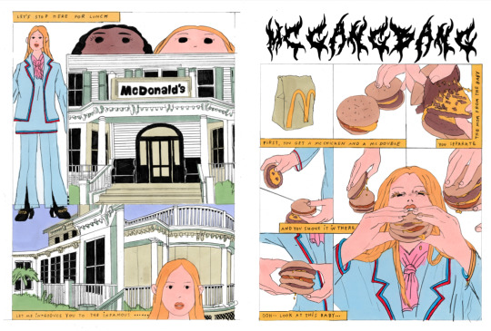
KJ: Do you hate McDonalds? (JK, referring to the above scene in Together) But: I can’t believe that you insulted pizza-flavoured chips! Although it’s not specifically pizza-flavoured, ketchup-flavoured potato chips is an iconic Canadian classic. LOL. Have you heard of poutine, another Canadian classic?
MZ: I wrote the pizza-flavoured chip as a joke, as in “it would be the most disgusting thing I could think of at the moment”; I didn’t know it existed!!! But … I’m sorry if I insulted it without trying. I usually try not to insult anything if I haven’t tried it. After I try it, everything is fair game.
I have eaten quite some poutine and it’s just beyond me; why would you drown perfectly crispy fries in thick gravy? Also, I saw Pizzaghetti in Montreal--then I saw a Pizzaghetti slushie at the couche-tard. I wanted to put it in one of my comics but I didn’t want people to think I was erring on the side of the “funny absurd” because -no one would believe that it exists???
KJ: How was Montreal food? Of course it can't be compared to France, but I remember I randomly went to a bakery and had the best croissant of my life. Actually, what do you think of North American food culture? I do love ketchup chips and poutine, but actually the thing I love the most is the diversity, i.e. food NOT originated from North America. You can have so many different cultures' food in a city, and it's a luxury now that I live in a much less immigrant-populated city. I miss Mexican, Middle Eastern, Greek, Chinese, Italian, etc. food soooo much! The only downside in Toronto was that because it's far away from the ocean, the seafood price was high. But I believe Oakland is close to the Pacific Ocean, right? and I bet California has more diverse food in general... but I also assume that for French and/or Europeans, North American food culture would seem... too much (was gonna say "trash" but it might be too harsh* for the official page? I mean, I can't have poutine everyday!
(*Festival Director note: it isn't)
MZ: For Montreal food well… I have very specific memories of my time there.
The first time I spent a good amount of time in Montreal, I visited my aunt, who I hadn't seen in years, and her husband and kids. We were super close when we were living in Algeria but she moved to Canada when I was a pre-teen, so it was great to see the rest of “her” family. I got there the first day of Ramadan, which I'd been very loosely following the previous years-- I love to fast surrounded by family, but by myself at school, not so much. Her husband was an absolute fat-phobic mansplainer, and was telling my aunt to hide the food before she went to work because he couldn’t believe I was able to refrain from eating 8 hours straight lol. I also got a daily TED talk on how to create the next “ANGRY BIRDS” because for him that was the only way I could ever make money.
Anyhow, I discovered maple butter, which is incredible. I would spread it on kesra or khobz dar (two Algerian breads) that I would have made the day prior with my aunt, baking and hiding from her terrible husband in the kitchen :)
The second striking memory I have from Montreal is when I did a 2-week residency at the Jacuzzi Club, a little apparement/residency held by my now-friend Keren. I was very depressed at that time and remember wanting to binge on whatever was not available to me in France. In front of the apartment: Tim Hortons and the (questionable) joy of 24/7. I would go and buy Timbits at 2 am and sit in bed watching Stranger Things-- which then made me want to try Eggo waffles. I had to leave a whole box untouched because it is quite literally cardboard? The same way Twizzlers are plastic? Anyhow, for people who don’t know what Timbits are, they’re just doughnut holes, but I’d never had them before that so I really thought that was their actual name until a year ago- Timbits. I also ate Domino’s for the first time there! I will not comment on this subject though.
As for food in the US, well… I feel very happy in California for sure. All of the international foods are amazing, but it’s also super funny to see how Americanized they are, or to see how Europeanized ours are. Mexican, Chinese and Japanese are my big three in California. You can just never go wrong, even in their Americanized versions. I discovered so many more Middle Eastern foods than we have in Europe, especially Iranian, Iraqi and Yemenite food. Also let’s talk about soul food! Barbecue ribs, brisket, mac n cheese, collard greens, potato salad? I am HERE for it.
What I am not here for on the other hand are Californian prices! I’m sure that seafood is exquisite but I still unfortunately need my two kidneys. One day I went to the restaurant with my partner and cried (this is not an exaggeration, I had tears rolling down my cheeks) when they ordered a 10$ side salad. Maybe it’s because I’ve never had a Californian income® but I still have a really hard time adjusting to the price, and the tax, and the tip. It just seems so out of touch with reality.
I actually have a favourite game when I’m back in Europe! Every time I eat something I play …. * drumroll * “How much would this cost in California?” :)
The things that I miss the most when I’m not in California are Trader Joe’s seasonal goodies, surf and turf burritos, all of the funky barely-FDA-approved health freak stuff, Chinese mom-and-pop donut shops, specialty neighbourhood coffee shops, seltzer (and hard seltzer), shocking people when I put mayonnaise on my French fries (I look them in the eyes and say that I am French, therefore know better. Anyways, fries are Belgian). Mochi muffins from Third Culture Bakery. But above all, In’n’Out.
When I’m in California, I really miss Algerian food and kebabs. Like, European kebabs: mystery minced meat swimming in its grease pool, grilled for god knows how many moons, accompanied by “salade tomate oignon”, and sauce algérienne - spicy creamy crunchy sauce. Its soft pillowy bread and its more than lovely price of 5 euros - 5.5 with a huge French fry portion, 6 with a soft drink. The best drunk food ever created. I miss it so much.
Cheese tip: Trader Joe’s French cheese is the shit. (And their frozen croissants!!) That’s it, that’s our product. Don’t go spend 200% more at Whole Foods for bleh cakey half-moldy milk.
I do miss bread though. Ah, bread…
And obviously the GREAT and AMAZING and CHEAP food that you find everywhere but everybody knows about this so… I think flaunting the price/quality ratio to my Californian friends visiting Paris/Europe is probably one my most toxic traits 😬
One thing that is for sure is that it would be very hard for me to live in a city that doesn’t have a decent immigrant population. Food is the first bond between people, and in my case and many others a very comforting aspect of life when things get tough. It’s super hard being oceans away from your family and loved ones, and recreating/sharing the food they made you love or you discovered with them can sometimes be the only thing to mend a heartbreak. The joy of finding an ingredient/brand /food item you use back home in a far away place is absolutely unmatched!
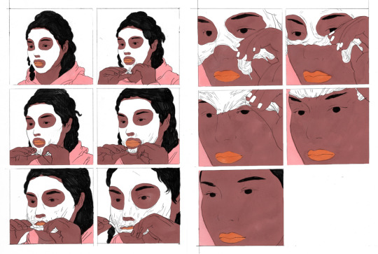
KJ: Do you like facial peel-off masks?
MZ: I like them as much as they unsettle me, but I’m more of a "forgotten-ripe-avocado-mashed-with-a-black-banana-end-of-fridge-mask" kind of person. But peel-offs are definitely funnier to draw.
KJ: Finally, do you have any upcoming projects?
MZ: I’m currently writing a book with poétesse Christina Svenson about *drumroll* a failed relationship, through the scope of food, my very first passion. It will be published by Perfectly Acceptable Press.
I also would like to do a third book with Colorama, that will be the end of the Fragile-Together combo, this time about the looming breakup.
And lastly, steering away from sad relationships, I’m also working on a mystery ethereal book with Studio Fidèle, not too far from what I started with Sleepless. Ideally with a Las Vegas set, but we’ll see how it goes…
And also working on a tiny clothesline with Studio Fidèle :)
*******
Our sincere thanks to Melek Zertal and Kim Jooha for their time and efforts on this interview! You can follow Melek Zertal on Instagram or purchase TOGETHER from Colorama.
Kim Jooha is a critic, curator, editor, and former publisher of comics. You can follow her on Instagram as well!
2 notes
·
View notes
Photo
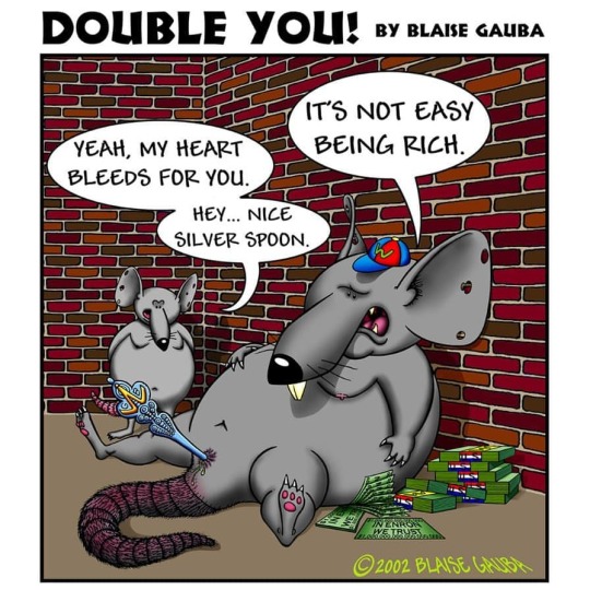
Here's another Double You! cartoon that I drew during the whole ENRON scandal. Pretty much ALL politicians are corrupt. It doesn't matter which of the two corporate-owned political parties we're talking about ... they are ALL multi-millionaires up there on Capitol Shill. Enjoy! #comics #comicsartist #comicstriproute #comicswallstudio #comicsjournalism #comicsvo #comicsstudio #comicsofficial #comicshub #comicscafe #comicstorian #comicseries #comicsmonster #comicslove #comicsofinstagram #comicsandchill #comicschool #comicsstuff #truthincomics #comicsmaking #comicstrips #comicsfans #comicsyndicate #readcomics #comicstore #comicstrip #comicspenandink #comicsworld #comicslover #comicbooks (at Torrance, California) https://www.instagram.com/p/CCL7TMrnfix/?igshid=wdr7x4ziiyc8
#comics#comicsartist#comicstriproute#comicswallstudio#comicsjournalism#comicsvo#comicsstudio#comicsofficial#comicshub#comicscafe#comicstorian#comicseries#comicsmonster#comicslove#comicsofinstagram#comicsandchill#comicschool#comicsstuff#truthincomics#comicsmaking#comicstrips#comicsfans#comicsyndicate#readcomics#comicstore#comicstrip#comicspenandink#comicsworld#comicslover#comicbooks
1 note
·
View note