#Design principles
Explore tagged Tumblr posts
Visit Tumblr Blog
Explore Tumblr blogs with no restrictions, modern design and the best experience.
Last Seen Tumblr Blogs


Fun Fact
Tumblr was attacked by a cross-site scripting worm deployed by the Internet troll group GNAA on Dec 3, 2012.
Text
Use of The 60-30-10 Color Rule in Severance
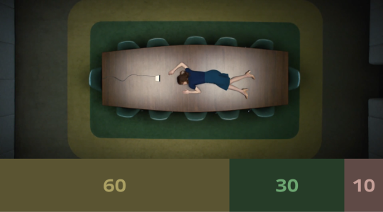
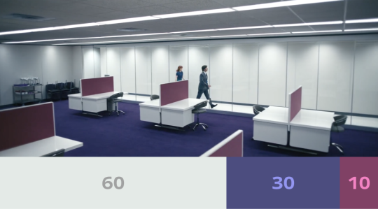
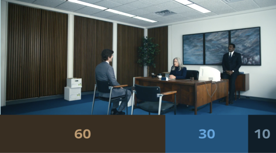

“Perhaps due to the deep symbolism of colors or meticulous aesthetic control, Severance employs an extremely restrained color palette in all its scenes. Most scenes feature only three colors, often presented in a 60:30:10 ratio, following the 60-30-10 color rule in design.
The 60-30-10 color rule is a design principle that creates visual harmony by dividing colors into a balanced ratio: 60% dominant color (main area), 30% secondary color (supporting elements), and 10% accent color (highlights).
This rule works because it naturally establishes hierarchy and contrast, preventing visual clutter while ensuring a cohesive and aesthetically pleasing composition. It is widely used in interior design, graphic design, and branding to create balanced and engaging visuals.”
youtube
#severance color theory#severance design#severance#60-30-10 rule#color theory#graphic design#design principles#set design#color relativity
140 notes
·
View notes
Note
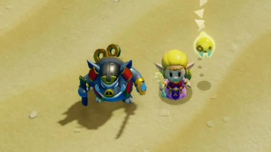
On the topic of horror, how do you make a grim subject matter feel silly spookville experience instead of actually scary? For example, the Luigi Mansion games, the Disney Haunted Mansion ride, the Medevil games, etc?
The counter to anything terrifying, off-putting, or grim is cuteness. This is done by exaggerating certain features that humans typically find endearing and downplaying the features that humans find alarming, while keeping the visual recognizable. This works with animals.

It works with the undead.
It works with just about anything.
Humans tend to look at a few things to determine cuteness - the main two being proportion and the removal or masking of traits that we find scary or off-putting.

In terms of proportion, we tend to look favorably on things with the proportions of children, babies especially. Babies have much larger heads relative to their bodies, arms, and legs. If the scary thing is proportioned like a baby or child, we are much more likely to look at it favorably rather than with fear. Most examples of something cute based off of something scary use body proportions closer to a child's body (or the animal equivalent) than an adult's.
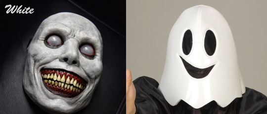
Second, we reduce the "fear" factor by simplifying, downplaying, or removing any elements of body horror or things that make people feel uneasy. This typically means any markers of injury, illness, pain, danger, or just obviously unnatural. Notice the mask on the left has many wrinkles in the skin, the unnatural white eyes, the off-putting shading, the heavy emphasis on the yellow teeth and blood-red gums, and the realistic proportions that intentionally push this mask into the uncanny valley for the unease it causes. Now consider the right mask - everything is simplified, with smooth lines and the only sharp edges being on the smile itself. Bright colors, a stylized happy face, with no features that could be considered off-putting.

Combine the use of proportions with the removal of things that induce unease in the viewer, and you get something cute and less scary. This also works in reverse - take something normally cute, change the proportions, and add in the things that induce unease in the viewer and it becomes scary. Artists take advantage of our inherent mental associations with these things to make things cute or creepy.
[Join us on Discord] and/or [Support us on Patreon]
Got a burning question you want answered?
Short questions: Ask a Game Dev on Twitter
Short questions: Ask a Game Dev on BlueSky
Long questions: Ask a Game Dev on Tumblr
Frequent Questions: The FAQ
51 notes
·
View notes
Text


Calendar Design -2025 (Open for commissions and customisation if u want any digital work like calendar making, posters, memes for your business etc)
#calendar 2025#design#digital art#digital aritst#b&w#film photography#graphic designers#designer#commission#art#digital illustration#painting#crafts#colours#design principles
6 notes
·
View notes
Text

Graphic design principles like balance, contrast, hierarchy, and alignment guide designers in creating visually appealing and effective designs. Mastering these fundamentals ensures cohesive, professional work that communicates clearly and resonates with audiences.
Visit Website:- https://graphicdesignerindia.in/
#brand identity#creative logo#design#designer#graphic art#graphic design#logo#logo design#web graphics#design principles#visual basic
8 notes
·
View notes
Text


🌍 What if pixels could heal instead of drain us? As digital fatigue skyrockets, designers are rewiring interfaces with nature’s blueprint. Here’s how to turn screens into serene spaces:
1️⃣ Paint with Earth’s Palette → Swap neon chaos for sunset gradients. 2️⃣ Shape Shifters → Why rectangles? Think rivers, not rulers. 3️⃣ Breathe Life In → Animate water, wind, or wisps of fog. 4️⃣ Texture Therapy → Make users feel paper grain, not plastic. 5️⃣ Sonic Landscapes → Let birdsong > notification pings. 6️⃣ Digital Sunlight → Code warmth that mimics dawn’s glow.
🔥 The future of UX isn’t just functional—it’s therapeutic. Which principle would you test first? 💬
👇 Drop your pick (or your favorite nature-inspired app!) below!
2 notes
·
View notes
Text


Visual Diary 2: "Kinds of Kindness" film posters
directed by Yorgos Lanthimos
My first impression is how poster artists use strong contrasts and a limited palette in colors: Yellow, Red, and Blue. These colours have dark tones, not as bright as the original colours that can create a sense of tension or unease, reflecting the film's dark themes.
In addition, they use contrast in typography. The bold, aggressive font of the title suggests power or control, meanwhile, a delicate, fragile font is used for subheading that represents vulnerability or manipulation, the message that this film wants to convey.
The last impression might be how to use asymmetrical balance. We can see the faces of the characters are distorted, separated and bigger compared to their body. This looks like the image of masks could represent unreal and fake human relationships.
4 notes
·
View notes
Text
Magnitude, consistency, vigilance, practicality, simplicity, hospitality.
#design#psychology#art#aesthetics#philosophy#quality#craftsmenship#craft#perspective#perspectives#principles#design principles
5 notes
·
View notes
Text


#aesthetic#artists on tumblr#design principles#my work#unity#repetition#contrast#alignment#emphasis#balance
3 notes
·
View notes
Text
youtube
Hiya folks! Long time no see. We've been pumping out videos over on our YouTube channel but haven't really shown any love on our other socials. In our return to Tumblr we'd like to share our video on how to use balance in art.
If you end up making anything inspired from it, don't forget to tag us. We love seeing the work y'all do.
2 notes
·
View notes
Text
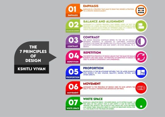
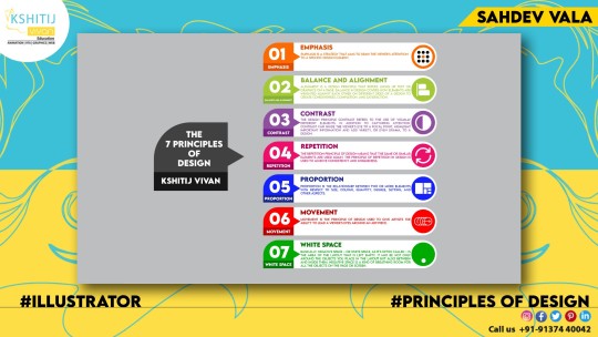
The 7 principles of design
#adobe #adobeillustrator #illustrator #illustration #vector #vectorart #Ai #graphicdesign #graphicdesigner #creative #creativegraphicdesigner #creativegraphic #creativedesigner #sahdevvala #valasahdev #kshitijvivan #kshitij_vivan #educationvala #educationcala.com #event posterillustration #illustrationposter #flatposter #vectorposter #principlesofdesign #7principelsofdesign #designprinciples #cheatsheet #infohraphic #infographicsdesign #infographicdesigb #infographicchart #infographicssheet
#adobe#kshitijvivan#sahdevvala#adobe illustrator#illustration#illustrator#design principles#principles of design#7 principles of design#educationvala
2 notes
·
View notes
Text

DESIGN THE DAZZLES...
4 notes
·
View notes
Note
recently i was watching a youtuber play mario party against 3 other AI controlled characters and it got me thinking. when it comes to games like mario party (Or any other game where you have an AI controlled opponent like XCOM) how do developers even begin to design an AI opponent who isnt automatically faster than you in a mini game of speed, or doesnt automatically know the solution to a puzzle in a room before you do and still has to figure it out, or cant guess the correct solution to a quiz automatically, all while still making it feel like you could actually lose to the AI without it feeling overly unfair?

Whenever we design anything, we usually start from the goal and work our way backwards. Our goal for these AI players is absolutely not for them to try to win - that would actually be quite easy, as you say. If we wanted the AI to win, it would always play optimally and, if we wanted, could cheat via inhuman reactions, frame-perfect inputs, utilize CPU-only knowledge, never take a shot that could miss, never make an execution mistake, and so on. However, this is not fun or engaging for players by any stretch. Most players would not want to play against such AI. Our goal is to make AI that players want to play against. That means our goal is for our AI to lose convincingly, much like how parents feign weakness or ignorance while playing with their children.
How do we do that? Well, we can consider the kind of mistakes we expect human players to make and expand on those. Players often overestimate their own resources and overextend. Perhaps the AI spends everything it has immediately and keeps nothing in reserve, leaving itself open after exhausting all of its resources. Players can also play too cautiously, keeping too much in reserve and only spending the absolute minimum. We could make an AI greedy to stockpile resources but only use them when they're near full. Players often tunnel vision on one target and forget to tend other tasks they need to do. We can make an AI do that as well.

These design choices would make the AI players feel more like human players to play against by embracing human foibles as their own driving directives. Similarly, such directives also give the AI weaknesses that a player can observe and exploit to win. If you take a step back, you're looking at the basis for all of game design. We want the players to have a specific experience (e.g. a match that feels like playing another human player rather than an AI), so we figure out what it would take for the player to have that experience, and we construct those bits to convince the player it is happening.
[Join us on Discord] and/or [Support us on Patreon]
Got a burning question you want answered?
Short questions: Ask a Game Dev on Twitter
Long questions: Ask a Game Dev on Tumblr
Frequent Questions: The FAQ
48 notes
·
View notes
Text
Week 5: Artistic Traditions & Lineages
I discovered that paintings serve as a visual insight into Singapore’s history, and all artists follow a style from a renowned artist as reference, making no art original.
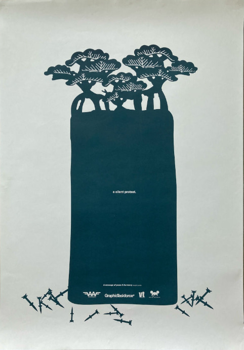
While going through the Singapore Graphic Archives website, the image above caught my attention. As a designer, I like how the use of Adobe Illustrator and Indesign help to create the medium of this poster, which is commercial art. This form of medium is used by Camera Club of the Philippines.
In this poster, repetition, rhythm, and positive-negative space is used to create the Bonsai trees with bombs. Produced in the early 2000s, the creator’s intent is to convey the protest against the American invasion of Iraq in 2003. This advertisement helps to spread awareness of the war, especially if the war is happening in their home country. I appreciate GraphicTaskForce’s efforts in promoting public awareness to garner public support and boost morale.
If I had more time, one thing I would do differently is research further for sources with ample information of its content. This can make my writing more valid with supported evidence of the history. Moreover, I would want to write more about the colour in this poster. For example, the use of 2 colours make the overall visual modern and minimalistic.
In my opinion, knowing artistic traditions helps to create new ideas. Having the knowledge of Singapore’s history serves as an inspiration for the concept of future projects.
(240 words)
Notable references:
Collections”, National Gallery Singapore, 2023,
https://collections.nationalgallery.sg/#/. Accessed 12 Nov. 2023.
Collections”, Roots, 2023,
https://www.roots.gov.sg/Collection-Landing. Accessed 12 Nov. 2023.
2 notes
·
View notes
Text


Ever wonder why some designs just click with people? It’s not just about looks—it’s about how it works and what it means to them.
In this post, we break down the three layers of emotional design—Visceral, Behavioral, and Reflective—and how each one shapes user experience.
Whether you're a designer, marketer, or founder, understanding these levels can help you create products people don’t just use... but love
2 notes
·
View notes
Text
#design#character design#design principles#king arthur#green#TumblrArt#ArtLovers#DarkAesthetic#DecorGoals#UniqueFinds#LuxuryVibes#ArtCollector#GreenKingSkull#SkullArt#LuxuryDesign#UniqueArtwork#SkullAesthetics#GreenElegance#ArtOfStrength#WisdomInDesign#RoyalSkull#TimelessMasterpiece#ModernMeetsAncient#BoldDecor
1 note
·
View note