#visual design
Explore tagged Tumblr posts
Visit Tumblr Blog
Explore Tumblr blogs with no restrictions, modern design and the best experience.
Last Seen Tumblr Blogs


Fun Fact
The average Tumblr user visits about 67 pages every month.
Text
"Oh, great, another game falls prey to Yellow Paint Syndrome" well, gee, my guy, maybe if we didn't demand hyper-photorealism in every game regardless of context, modern platformers might be able to develop a visual language that doesn't require painting a sign on every single interactable feature to render it distinguishable from the clutter.
8K notes
·
View notes
Text

Toshiba Magazine Ad, Adphic Co. Ltd Studio (1987).
IG
#editorial#design#graphic design#designer#graphic designer#typography#print design#typographic#type#graphics#editorial design#magazine#magazine layout design#editorial layout design#magazine design#poster design#visual design#design studio#illustration#flyer design#poster art#art#visual art#retro design#magazine layout
1K notes
·
View notes
Text
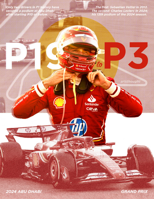
Only two drivers in F1 history have secured a podium at Abu Dhabi after starting P10 or below. The first: Sebastian Vettel in 2012. The second: Charles Leclerc in 2024. x
#hi ill be emotionally processing this race forever thanks! but in the meantime i was inspired to make this#my actual goat fr#charles leclerc#formula one#graphic design#formula one edit#graphic art#visual design#art#graphics#edit#f1 edit#formula 1#f1#abu dhabi gp 2024#j.exe#j.design
359 notes
·
View notes
Text
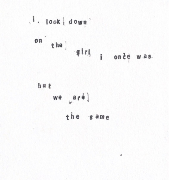
words by me, from a project reflecting on my childhood self + my childhood bedroom
instagram
#art#art journal#artist#collage#my art#poetry#nature poetry#visual poetry#lyrics#words#childhood#nostalgia#emotional#illustration art#visual art#layout design#visual design#my words
545 notes
·
View notes
Note
On the topic of horror, how do you make a grim subject matter feel silly spookville experience instead of actually scary? For example, the Luigi Mansion games, the Disney Haunted Mansion ride, the Medevil games, etc?
The counter to anything terrifying, off-putting, or grim is cuteness. This is done by exaggerating certain features that humans typically find endearing and downplaying the features that humans find alarming, while keeping the visual recognizable. This works with animals.
It works with the undead.
It works with just about anything.
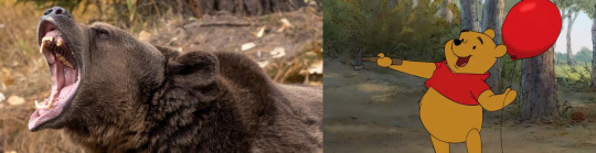
Humans tend to look at a few things to determine cuteness - the main two being proportion and the removal or masking of traits that we find scary or off-putting.

In terms of proportion, we tend to look favorably on things with the proportions of children, babies especially. Babies have much larger heads relative to their bodies, arms, and legs. If the scary thing is proportioned like a baby or child, we are much more likely to look at it favorably rather than with fear. Most examples of something cute based off of something scary use body proportions closer to a child's body (or the animal equivalent) than an adult's.
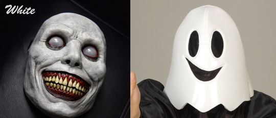
Second, we reduce the "fear" factor by simplifying, downplaying, or removing any elements of body horror or things that make people feel uneasy. This typically means any markers of injury, illness, pain, danger, or just obviously unnatural. Notice the mask on the left has many wrinkles in the skin, the unnatural white eyes, the off-putting shading, the heavy emphasis on the yellow teeth and blood-red gums, and the realistic proportions that intentionally push this mask into the uncanny valley for the unease it causes. Now consider the right mask - everything is simplified, with smooth lines and the only sharp edges being on the smile itself. Bright colors, a stylized happy face, with no features that could be considered off-putting.

Combine the use of proportions with the removal of things that induce unease in the viewer, and you get something cute and less scary. This also works in reverse - take something normally cute, change the proportions, and add in the things that induce unease in the viewer and it becomes scary. Artists take advantage of our inherent mental associations with these things to make things cute or creepy.
[Join us on Discord] and/or [Support us on Patreon]
Got a burning question you want answered?
Short questions: Ask a Game Dev on Twitter
Short questions: Ask a Game Dev on BlueSky
Long questions: Ask a Game Dev on Tumblr
Frequent Questions: The FAQ
51 notes
·
View notes
Text
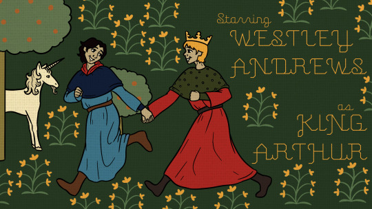

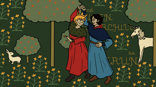
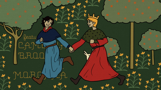
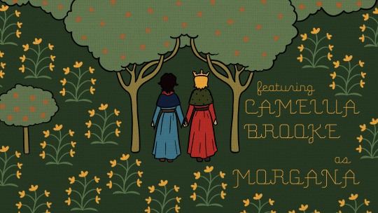
Medieval tapestry illustrations from a title sequence project
1 | 2 | 3 | Colour script | Storyboard
#merlin#arthur pendragon#king arthur#merthur if you squint#arthurian legend#medieval#medieval art#medieval illustration#medieval tapestry#medievalcore#visual development#visual development art#visual development artist#visual design#my art#digital art#artist on tumblr#art student#art school#animation student#vis dev
35 notes
·
View notes
Text

#virtual assistant#visual storytelling#visual design#generative art#black girl magic#black girl moodboard#melanated#melaninmagic#aestheitcs#black woman appreciation#black woman#black tumblr
26 notes
·
View notes
Text
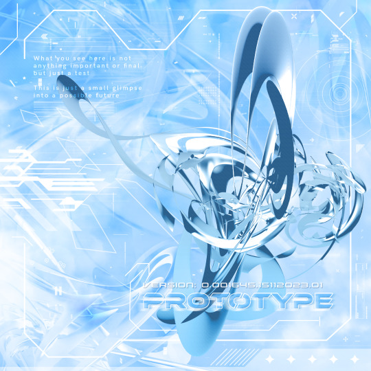
Prototype
Finally decided to make a metalheart piece after getting inspired by desktopgeneration and other artists
#graphic design#metalheart#depthcore#3d art#neoy2k#neo y2k#visual design#abstract art#still got ways to go but im pretty happy with this one#y2k#y2k design#personal work#Credit to paulw on deviantart for the abstract paintkit
313 notes
·
View notes
Text
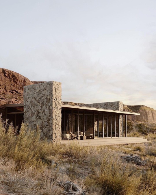
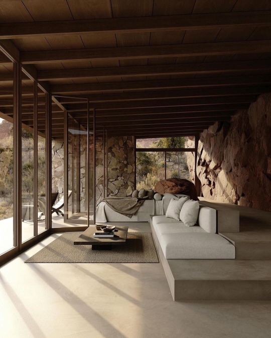

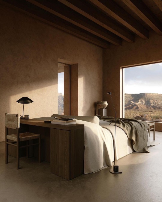
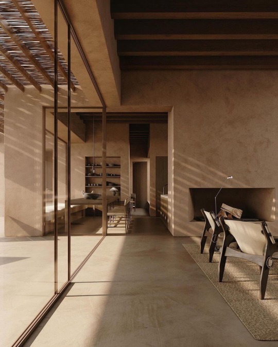
Journey in a palette of earth and stone. Exploring the timeless settings of PARÉA Hotel, designed by Studio Andrew Trotter. Visuals by Klaudia Damiak.
#5style#minimalism#luxury#minimalist#style#minimal#architecture#minimal architecture#minimal interior#modern architecture#visual inspiration#visual design
478 notes
·
View notes
Text

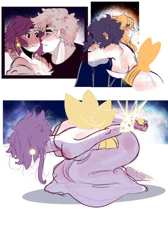
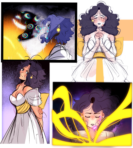
R.E.M Concepte Art *My Dream Project*
#art#illustration#concept art#oc#original character#visual design#visual development#visdev#original art#character art#oc art#procreate#drawing#artists on tumblr
161 notes
·
View notes
Text
I think RWBY missed a trick by never really committing to the "shitty pre-rendered cutscene from a PS2-era JRPG" aesthetic that its early instalments were going for, you know? The cohesive visual identity it never found lives somewhere in that territory. Dial down those poly counts. Dither those textures. Introduce a character who dissolves into a welter of MPEG compression artefacts every time she moves too fast and that's her actual super power.
1K notes
·
View notes
Text

Amélie Lehoux.
IG Y.
#poster#design#graphic design#designer#graphic designer#typography#print design#typographic#type#graphics#editorial design#poster art#poster design#poster designer#art poster#editorial layout design#flyer design#good design#design studio#font#lettering#typo#visual design#creative design#art direction#visual art
122 notes
·
View notes
Text


The Incredibles (2004) color script by Lou Romano, in The Art of the Incredibles
#pixar#the incredibles#brad bird#writeblr#graphic design#composition#geometric#minimalism#design#art of the incredibles#lou romano#pixar animation studios#color script#mark cotta vaz#john lasseter#pixar published a whole artbook of these#visual design#artbook
62 notes
·
View notes
Text


My concept designs for Formula 1 themed playing cards, based on drivers and their 2024 teams ❤️
#i worked so long on this...def a labour of love but it was fun and im happy w how it turned out!#i used illustrator for all the graphics and photoshop for the image editing and final mockups#graphic design#graphic art#visual design#art#f1 edit#formula one#formula 1#f1#formula one edit#charles leclerc#max verstappen#lewis hamilton#valtteri bottas#oscar piastri#j.exe#j.design
177 notes
·
View notes
Text
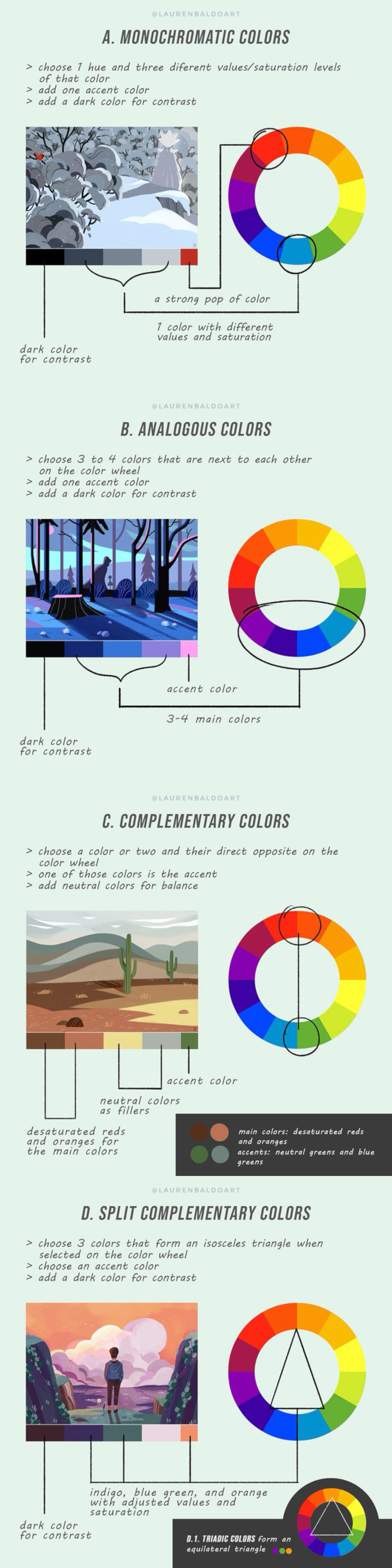
Basic Color Theory Overview Guide With Examples
#color theory#infographic#guide#chart#design#art#art theory#visual design#graphic design#web design#interesting#educational
206 notes
·
View notes