#DesignForImpact
Explore tagged Tumblr posts
Visit Tumblr Blog
Explore Tumblr blogs with no restrictions, modern design and the best experience.
Last Seen Tumblr Blogs


Fun Fact
Women make up for the other 50% of Tumblr’s audience.
Text
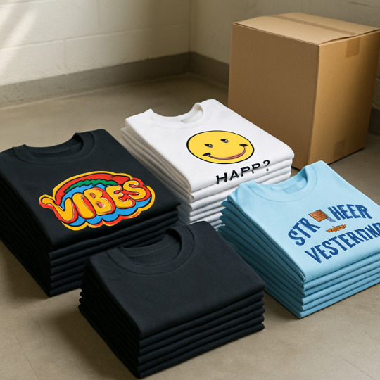
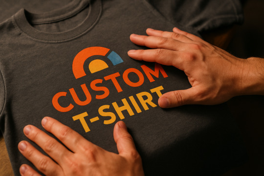
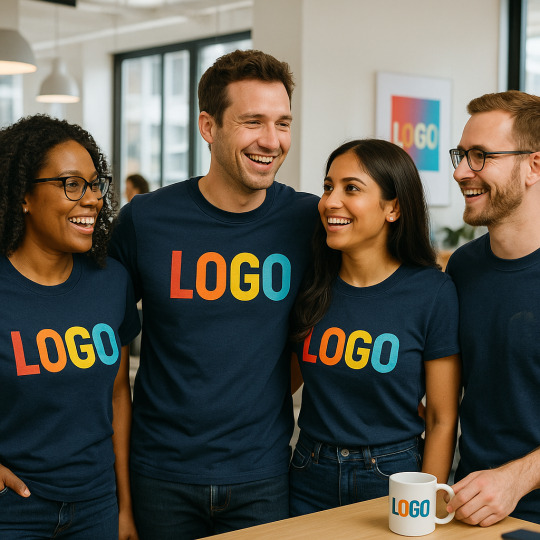
🎨 Wear Your Brand. Everywhere.
Custom T-Shirts for Teams, Events & Brands | Gurgaon & Delhi NCR
Your brand deserves more than just a logo.
At TeeFame, we help you bring it to life — on premium-quality t-shirts that people actually want to wear. Whether you're a small business, creative agency, school, or a team on a mission, we make custom merch that’s bold, meaningful, and made right here in Gurgaon and Delhi.
👕 No minimums 🎨 Custom design support 🚀 Quick turnaround 🌟 Ideal for events, employee gifting, promotions & more
Explore our local services:
📍 T-Shirt Manufacturing in Gurgaon 📍 T-Shirt Manufacturing in Delhi 🌐 Visit our main site
Let your merch tell your story.
1 note
·
View note
Text
Design That Speaks to Your Audience
A great brochure doesn’t just inform—it connects. 👥 The secret? Audience-focused design.
A professional brochure design company knows how to tailor colors, layout, images, and messaging to reflect your ideal customer’s needs and preferences. Whether you're targeting corporate executives or eco-conscious consumers, every design choice should be intentional.
🎨 Make your brochures work harder for your brand—by speaking directly to the right people.
#BrochureDesign#MarketingMaterials#GraphicDesign#PrintMarketing#TargetAudience#DesignForImpact#BrandIdentity#CreativeAgency#BrochureDesignCompany#VisualCommunication#MarketingStrategy#DesignTips
0 notes
Text
youtube
A Blueprint for Design
In this thought-piece, we explore the erosion of design’s perceived value in organizations—and why that’s a business risk, not just a creative one. Design needs to be integrated as a strategic function, accountable for both innovation and impact, that drives competitive advantage in today’s rapidly evolving world of technology.
#DesignLeadership#StrategicDesign#DesignThinking#InnovationStrategy#DesignAsStrategy#DesignMatters#UXDesign#BusinessDesign#ProductDesign#DesignForImpact#FutureOfWork#DesignInTech#CreativeLeadership#HumanCenteredDesign#DesignROI#DesignCulture#OrgDesign#Backcasting#DesignAndBusiness#DesignForChange#Youtube
1 note
·
View note
Text
High impact with low impact
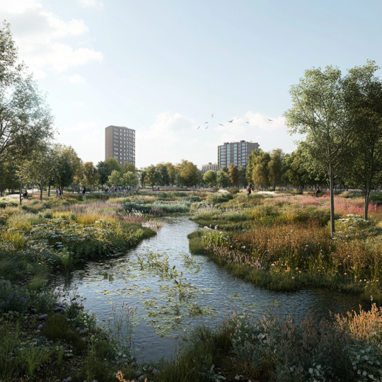
Transforming an eroded lot into a water-catching micro-park is possible. Through low-impact design, we turned neglect into ecological, social, and urban value. Small spaces, big results.
#LowImpactDesign#UrbanRegeneration#NatureBasedSolutions#GreenInfrastructure#LandscapeArchitecture#DesignForImpact#WaterSensitiveDesign#PublicSpace#UrbanRewilding#ResilientCities#arquitectura#evolab#mexicanarchitecture#arquitecturamexicana#paisajismo#architecture
0 notes
Text
Design and Functionality: Feeling Stuck? #startup #productdesign #saas
youtube
Balancing design and functionality can feel like an impossible task, but it’s the key to creating products that truly resonate with users. A design that looks good but doesn’t work won’t deliver results, and functionality alone won’t capture attention.
How do you approach this balance in your projects? Let’s discuss strategies to align form and function to drive success!
#ProductDesign#UXStrategy#DesignThinking#DesignMatters#FunctionalityFirst#UserExperience#UXDesignTips#DesignInspiration#UIUXDesign#ProductStrategy#CreativeDesign#InnovationInDesign#HumanCenteredDesign#DesignForImpact#DigitalProductDesign#MinimalistDesign#DesignLeadership#DesignBalance#Youtube
1 note
·
View note
Photo

Here is the rewritten font description: This handcrafted font duo adds charm to various applications, perfect for enhancing product promotions, crafting logos, and creating distinctive brand personas, enriching headlines, signage, and more.
Link: https://l.dailyfont.com/GLkfS
#aff#Productivity#MarketingTips#DesignInspiration#FontLovers#BrandingExperts#VisualStorytelling#LogoDesign#SignageGoals#TypographyMatters#CreativeResources#MarketingSolutions#DesignForImpact#DigitalMarketing#BrandIdentity#CharmingDesigns#HandcraftedFonts
1 note
·
View note
Text

Great design bridges the gap between brands and people. Together, we’ll create visuals that leave a lasting impact.🎨💻
#CreativeDesign#VisualStorytelling#InspireThroughDesign#GraphicDesignInspiration#DesignToConnect#VisualImpact#BrandVisuals#DesignThatInspires#CreativeConnection#VisualCraftsmanship#EngagingDesign#DesignForImpact#PowerOfDesign#VisualBranding#DesignInnovation#graphic design#graphicart#graphics
0 notes
Text
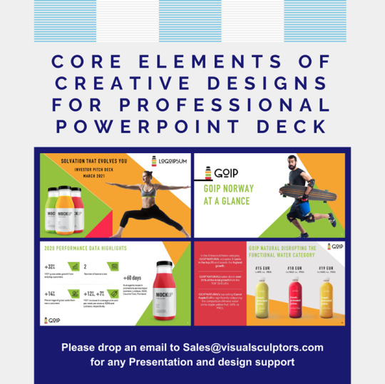
Key Design Elements for Professional PowerPoint Decks
1.What are the elements of design in PowerPoint?
Creating visually appealing and effective PowerPoint presentations requires a thoughtful consideration of various design elements. Colour, typography, layout, imagery, and consistency are all essential in capturing the attention of your audience and effectively conveying your message.
The careful selection of colours can not only enhance the aesthetics of your slides but also evoke specific emotions and draw attention to key information. Typography plays a crucial role in ensuring that your content is easy to read and consistent across all slides, allowing for a seamless flow of information.
The layout of your presentation is fundamental in organizing your content in a logical and easy-to-follow manner, guiding the viewer through the information effortlessly. Incorporating imagery into your PowerPoint presentation can further elevate the visual appeal and engagement level of your slides. Relevant and high-quality images can help reinforce your message, evoke emotions, and make complex concepts more understandable to your audience.
Consistency in design elements, such as fonts, colours, and spacing, is paramount in creating a cohesive and professional look for your presentation. By maintaining a consistent design throughout your slides, you establish a visual identity that reinforces your brand and enhances the overall impact of your message.
By paying attention to these design elements, presenters can craft impressive and visually compelling PowerPoint presentations that effectively communicate their ideas and leave a lasting impression on their audience.
2.How to design a professional PowerPoint presentation?
Designing a professional PowerPoint presentation demands meticulous planning and a keen eye for detail. It is essential to start by outlining the key messages you wish to convey and arranging them in a clear and coherent sequence. Selecting a sleek and professional template that complements your content and is visually appealing is crucial. Ensure that the template is easy to read and does not overshadow the content.
Consistency in font styles, colours, and graphics is imperative for maintaining a cohesive and polished look throughout the presentation. The integration of visual aids such as charts, graphs, and images can significantly enhance the audience's comprehension and engagement with the material. It is advisable to keep the text succinct and use bullet points to emphasize essential information effectively.
Furthermore, practicing the presentation is paramount to guaranteeing smooth transitions and proper timing during the actual delivery. Rehearsing allows you to identify any potential issues and make necessary adjustments, ensuring that your presentation flows seamlessly.
By adhering to these guidelines, you will be able to create a professional and impactful PowerPoint presentation that effectively communicates your message to the audience. Remember, a well-designed presentation not only conveys information effectively but also leaves a lasting impression on the viewers.
3.What do the 7 elements of design explain?
The seven elements of design serve as the essential building blocks for any visual composition, providing structure and coherence to the overall aesthetic. Line, the first element, acts as a fundamental tool in creating definition and guiding the viewer's eye. Shapes, whether geometric or organic, contribute to the visual language and narrative of a design, while form adds dimension and depth, breathing life into the flatness of two-dimensional space.
Colour, a powerful element in design, influences mood, perception, and emotional response, making it a critical component in conveying the intended message. Texture, with its tactile quality, offers a sensory experience that engages the viewer and adds layers of interest to the composition. Space, as another key element, not only defines the boundaries within which the design exists but also plays a crucial role in establishing relationships between the elements. Lastly, value, the contrast between light and dark, enhances the visual hierarchy, adding depth and dimensionality to the composition.
Mastery of these elements is essential for designers to create visually compelling and impactful work that resonates with the audience. By understanding and skilfully incorporating these elements, designers can craft compositions that not only catch the eye but also communicate effectively and evoke emotional responses.
4.How to make a PowerPoint deck?
Creating a professional PowerPoint presentation requires meticulous planning and attention to detail. It is essential to begin by outlining the main points you wish to convey and structuring them in a logical sequence.
Selecting a sleek and professional template that complements your content is crucial to ensuring visual appeal and readability. Maintaining a consistent colour scheme and font style throughout the presentation is key to preserving a cohesive and polished look.
By incorporating visuals such as charts, graphs, and images, you can enhance the message you are trying to convey and keep your audience engaged.
It is important to keep the text concise and to utilize bullet points to emphasize key information effectively. Practicing your presentation beforehand will allow for a smooth delivery and provide the opportunity to make any necessary revisions before the final presentation. By following these steps, you can create a refined and impactful PowerPoint deck that effectively communicates your message to your audience.
In the professional realm, a well-crafted PowerPoint presentation is a powerful tool for conveying complex information in a clear and concise manner.
Careful consideration must be given to the design elements, such as selecting an appropriate template that complements the content and maintains a professional appearance.
Utilizing a consistent colour scheme and font style throughout the presentation helps to create a cohesive visual identity that enhances the overall look and feel.
Visual aids, including charts, graphs, and images, can play a vital role in elucidating key points and capturing the audience's attention. Keeping the text succinct and utilizing bullet points to highlight essential information helps to streamline the message and ensure clarity.
Rehearsing the presentation is essential for refining delivery and making any necessary adjustments to enhance the overall impact. By following these guidelines, you can create a sophisticated and compelling PowerPoint presentation that effectively communicates your message to your intended audience.
5.How many components are there in creative art design?
In the realm of creative art design, there are numerous components that contribute to the overall aesthetic and functionality of a project. These components can range from colour theory and composition to typography and user experience.
Each element plays a crucial role in creating a visually appealing and cohesive design that effectively communicates the intended message. Additionally, factors such as balance, contrast, and scale must be carefully considered to ensure a harmonious and impactful design. By understanding and utilizing these components effectively, designers can create engaging and memorable artwork that resonates with their audience and achieves the desired outcome. Furthermore, in the dynamic world of creative design, staying abreast of current trends and technological advancements is essential for maintaining relevance and competitiveness.
0 notes
Text
Graphic Designing Courses In ProRise
Take advantage of our ProRise Graphic Design Course to turn concepts into breathtaking images. Develop your artistic abilities and learn how to create captivating and motivating designs.

#CreativeMindset#DesignForImpact#DesignTheory#VisualDesign#DesignStudio#DesignSkills#DesignResources#DesignThinking#DesignChallenge#GraphicDesigning#DigitalDesign#DesignLife#VisualIdentity#DesignInspo"
1 note
·
View note
Text
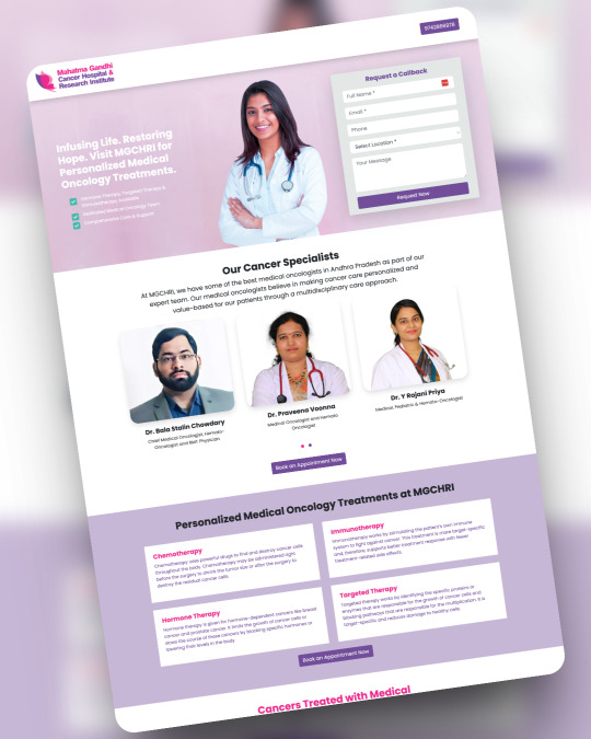
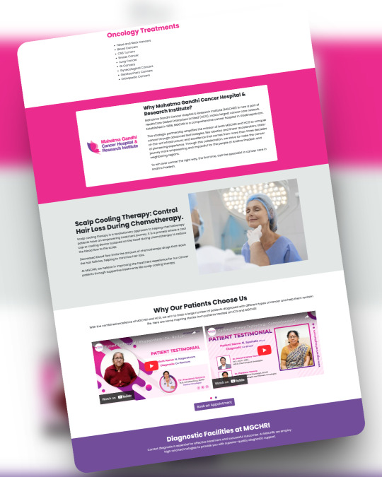
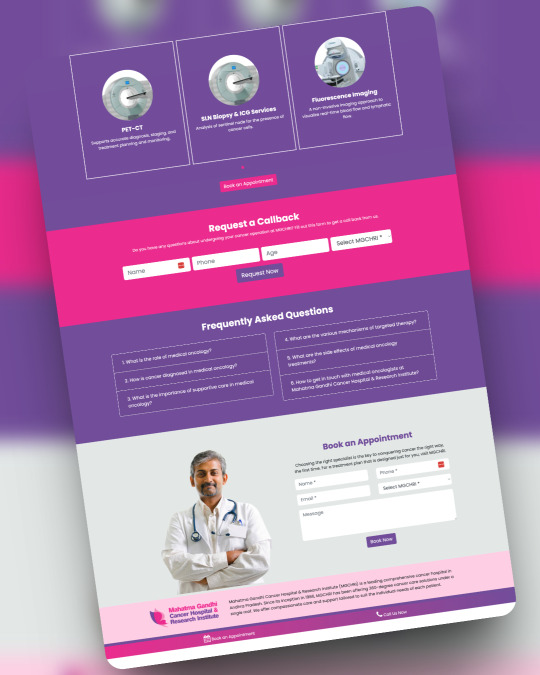
🚀 Just launched 4 clean & powerful landing pages for MG Cancer Hospital, Vizag 💻✨
Crafted with ❤️ for clarity, trust & conversion.
From wireframe to launch – all done with purpose.
Let your website work for you.
👉 DM or connect via shivafeb17.com to elevate your brand online.
#LandingPageDesign #WebDesignInspo #UXUIDesign #FreelanceDeveloper #WebflowDesigner #FigmaDesigns #ResponsiveDesign #HealthcareDesign #WebsiteLaunch #WebDesignIndia #DigitalDesigner #WebDevLife #DesignForImpact #VizagDesign #InstaWebDesign #InstaFreelancer #ShivaDesigns #FreelancerLife #SmallBusinessWebsites #NoCode #FigmaToWeb #BuildWithShiva #WebDeveloperLife #CreativeWebDesign #WebsiteGoals #StartupWebsite #CustomDesigns #VisualDesign #WebDesignerOfIndia #WebDesignLovers #UserExperienceDesign
#web development#freelance#web developers#web developing company#web design#freelancing#php programming#phpdevelopment#php#wordpress
0 notes
Text

Ever wondered what sets 𝗨𝗜 (𝗨𝘀𝗲𝗿 𝗜𝗻𝘁𝗲𝗿𝗳𝗮𝗰𝗲) and 𝗨𝗫 (𝗨𝘀𝗲𝗿 𝗘𝘅𝗽𝗲𝗿𝗶𝗲𝗻𝗰𝗲) apart? While they go hand in hand, each plays a unique role in creating the digital magic you love.
Here’s a quick breakdown: 🔹 𝗨𝗜 (𝗨𝘀𝗲𝗿 𝗜𝗻𝘁𝗲𝗿𝗳𝗮𝗰𝗲): The look and feel. It’s about the colors, buttons, typography, and layouts that make an app or website visually appealing. Think of it as the face of your product. 🔹 𝗨𝗫 (𝗨𝘀𝗲𝗿 𝗘𝘅𝗽𝗲𝗿𝗶𝗲𝗻𝗰𝗲): The journey. It’s all about how a user navigates, interacts, and feels while using your product. A great UX ensures everything works seamlessly and feels intuitive.
💡 𝗘𝘅𝗮𝗺𝗽𝗹𝗲: UI is the beautifully designed steering wheel, while UX ensures the car drives smoothly! 🚗💨
Mastering both = creating unforgettable digital experiences. Let’s design solutions your users will love! ❤️
UIDesign #UXDesign #UIvsUX #newyork #KnowTheDifference #DesignMatters #austin #UserExperienceDesign #F2F #UserInterfaceDesign #DigitalDesign #washinton #CodewebsterCreatives #LasVegas #seatle #CreativeJourney #dallas #UIUXExplained #DesignForImpact #unitedkingdom
0 notes
Text

🌟 Stand Up for Human Rights with piZap! 🌟
This Human Rights Day, make your message loud and clear. With piZap, you can create bold, inspiring posters using thousands of design elements like icons, fonts, stickers, and vibrant backgrounds.
Speak up, spread awareness, and empower your community with visuals that inspire change. Let's create for equality, justice, and freedom!
🖌️ Start designing today at piZap!
#HumanRightsDay #EqualityForAll #JusticeMatters #Freedom #DesignForImpact #piZapCreativity #InspireChange
#pizap#photo editing#photoeditor#create#borders#collage#stickers#photography#photoediting#photo editor#humanrights
0 notes
Text

✨ From a Simple Idea to a Stunning Car Rental Flyer: A Client's Journey ✨
A few weeks ago, I had the pleasure of connecting with a small business owner who was about to launch a car rental service. They had a clear vision for their company but weren’t sure how to translate that into a flyer that would catch the eye of potential customers. They reached out to me through Fiverr, hoping for a simple, professional design.
After our first conversation, I knew this wasn’t just about creating a flyer. It was about crafting a brand identity. We brainstormed together, going over the details of their services, target audience, and overall message. I wanted to make sure every element of the flyer reflected the spirit of their business.
Through careful revisions and constant communication, we created a design that not only looked sleek and professional but also told their story. The client was over the moon! They mentioned how the flyer brought their vision to life and helped them gain more inquiries for rentals in just a few days after launch. 💼🚗
It’s moments like these that remind me why I love what I do — helping clients transform their ideas into designs that make an impact.
If you're looking for a custom flyer design that can do the same for your business, check out my services on Fiverr. Let's create something amazing together! 🎨
#FiverrSeller #GraphicDesignServices #CarRentalBusiness #FlyerDesign #CustomDesigns #FreelanceDesigner #SmallBusinessMarketing #BrandingMatters #EntrepreneurLife #DesignForImpact
0 notes
Text
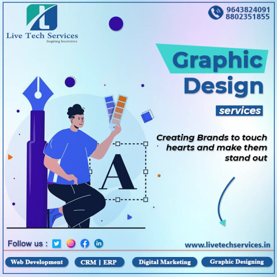
"Transforming visions into captivating designs that leave lasting impressions. Elevate your brand with our graphic design services."
Website-http://www.livetechservices.in
Phone: 9643824091, 8802351855
Email- [email protected]
#livetechservices#graphicdesign#brandelevation#creativesolutions#designinspiration#visualcommunication#brandidentity#designservices#creativedesign#captivating#creativedesigner#visualappeal#graphicartistry#designexcellence#designforimpact#visualstorytelling#creativeexpressions#designinnovation#visualbranding#designmatters
2 notes
·
View notes
Link
A project that we are really proud of. Thanks to the entire team! Worth to be shared again. Climate concept description at our website: https://transsolar.com/de/projects/bayalpata-hospital
#sharon davis design#dezeen#publicarchitecture#designforimpact#naturalventilation#sharonDavisDesign#bayalpatahospital#solarenergy#architectureheals#bayalpata#architectswithoutborders#rammedearth#sustainablearchitecture
1 note
·
View note
Text

Redefining UX: Lessons on Outcome-Driven Design One of the standout sessions for me was one by Itamar Medeiros from SAP. His topic, "Designing for Impact: Focusing on Outcomes and JTBD," was truly insightful! Itamar Medeiros emphasized the importance of shifting our design focus from outputs to outcomes, and how understanding the Jobs To Be Done (JTBD) framework can help UX professionals create real value for users. Instead of simply delivering features, it's about solving meaningful problems and creating impact through thoughtful design. Key Takeaways: 🔑 Focus on outcomes that drive user and business success. 🔑 Leverage the JTBD framework to uncover the real needs of your users. 🔑 Design with purpose and prioritize impact over deliverables. This session left me with a deeper understanding of how we, as UX professionals, can make a meaningful difference by aligning our designs with the true needs and objectives of the people we are designing for. A huge thank you to Itamar Medeiros for the inspiration and uxindiaconf (ux-india.org) for organizing such an enriching event! 🙌
#UXDesign#OutcomeDrivenDesign#JTBD#UserExperience#UXInnovation#DesignForImpact#UXInsights#SAP#UXINAID24#DesignThinking#ProductDesign#CustomerCentricDesign
1 note
·
View note