#Frederic Dorr Steele
Text
#The Adventure of the Lion's Mane#Sherlock Holmes#Frederic Dorr Steele#art#illustration#black and white#brooding#dark academia#Arthur Conan Doyle#1920s
175 notes
·
View notes
Text

"Holmes crouched behind the bush with the dog as the carriage approached." The Adventure of Shoscombe Old Place. Published in Liberty. Frederic Dorr Steele, 1927
Source
66 notes
·
View notes
Text

Cover Illustration for Collier's (February 27, 1904)
By Frederic Dorr Steele
Source
#letters from watson#sherlock holmes#black peter#frederic dorr steele#arthur conan doyle#book cover#art#love the contrast of the dapper suit and the harpoon
125 notes
·
View notes
Text

#Hound of the Baskervilles#Frederic Dorr Steele#illustration#art#dark academia#dark aesthetic#Edwardian#Sherlock Holmes#Arthur Conan Doyle
19 notes
·
View notes
Text
While it is Paget we think of when talking of Holmes illustrations, there were other excellent artists who contributed as the stories were being originally published.
Frederic Dorr Steele illustrated the short stories of The Return of Sherlock Holmes as they were serialised in the American magazine Collier's Weekly.
So enjoy Steele's Holmes musing on the mountains.

(Link along with the image)
54 notes
·
View notes
Text


The Adventure of the Dying Detective illustration by Frederic Dorr Steele (1913)
206 notes
·
View notes
Photo


Collier’s covers featuring Sherlock Holmes stories | S4 skull portrait
In 1903, Arthur Conan Doyle was famously tempted by a hefty fee from Collier’s Weekly magazine to resurrect his fallen hero, in the stories later collected as The Return of Sherlock Holmes. The second of these was The Norwood Builder, which is the story of a man who faked his own murder, and framed his heir for the crime. Above (top left) is the cover of the Collier’s issue where that story appeared. In this Frederic Dorr Steele illustration, Holmes is examining the clue that allowed him to solve the case—a bloody print that appeared on the wall after the crime scene had already been combed for evidence. Holmes reasoned that, rather than proving the guilt of the accused man, the print proved that the “victim” was still alive.
Frederic Dorr Steele continued to illustrate Doyle’s stories for Collier’s for the remainder of Doyle’s career. When The Dying Detective appeared in November 1913, Steele again drew a cover for the magazine (top right), as well as three other illustrations for the story, all of which show scenes that occur before Culverton Smith’s visit to 221B.
The Dying Detective appeared in British magazine The Strand a month later. Walter Paget produced three similar illustrations for the December issue, plus one of a later scene: Watson hiding behind Holmes’s bed as Smith is apprehended.

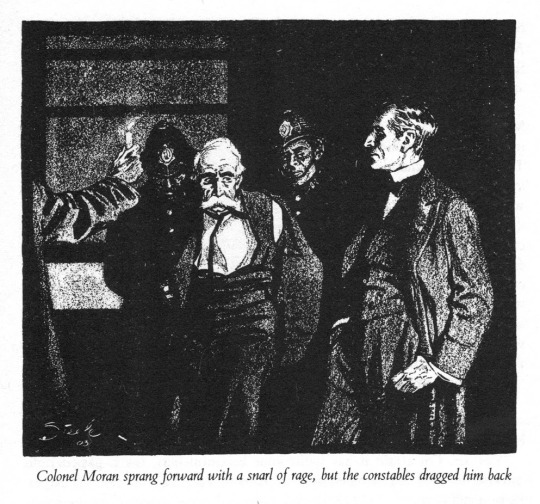
'You'll only get yourself hurt,' said the inspector. 'Stand still, will you?'
In an earlier post, I talked a bit about Walter Paget’s choice of drawing a portrait behind Holmes’s bed that looks so very much like Watson himself. Owen Dudley Edwards (quoted in that post) claimed that this was likely a portrait of Doyle. It remains an open question: Was Walter Paget drawing Watson or Doyle?
In December 1913, Collier’s produced another edition of The Dying Detective, as part of a limited edition boxed set for its advertisers (cover shown above, bottom left). This edition featured a single illustration by Frederic Dorr Steele. However, instead of simply using one of his own illustrations from the magazine version, Steele altered his cover illustration from The Norwood Builder. According to Sherlockian R. Dixon Smith, “In its new incarnation, the bloody handprint had been removed and replaced with a framed painting of Sir Arthur Conan Doyle”.
I haven’t been able to find a reproduction of this rare illustration, so I’m left wondering yet again: was it really a fourth-wall-breaking portrait of Doyle, or was it a portrait of Watson? And further... why did Steele do this? Was it requested by someone else, perhaps Doyle, or someone at Collier’s? Could Steele have been inspired by the portrait in Walter Paget’s illustration? It’s difficult to imagine that Steele would have seen this drawing in time to emulate it, given that the Strand version and the advertisers’ boxed set were both published in December.
If the portrait was meant to be Watson, when did Steele imagine this scene to have taken place? Holmes spends most of the story in the throes of melodrama, acting out exhaustion or wild hallucinations, and by all accounts looks awful, a better match for the Dying Detective cover (top right) than for the Norwood Builder cover (top left). Despite being the only illustration in this edition, this scene can’t have occurred in the story, even “offscreen”. It doesn’t fit.
Also remarkable is the idea that both Steele and Paget decided to put a portrait of Doyle or Watson on the wall in Holmes’s bedroom, given what we’re told by Watson in this very story:
“I had stood for some minutes looking at the silent figure in the bed. His face was almost covered by the clothes and he appeared to be asleep. Then, unable to settle down to reading, I walked slowly round the room, examining the pictures of celebrated criminals with which every wall was adorned. (The Dying Detective)
On reading about this illustration, I couldn’t help but think of our own 221B portrait in S4, which doesn’t fit, is formed of Doyle’s (or Watson’s) words and Doyle’s eyes—and which again replaces another illustration. From a meta point of view, covering the Norwood handprint with a new portrait of the author suggests that the author has hidden evidence... but of a murder? Or of a cover-up?
#Sherlock#S4#TLD#ACD#The Dying Detective#The Norwood Builder#illustration#Frederic Dorr Steele#Walter Paget#canon shorts
28 notes
·
View notes
Text
Not fan of all Frederic Dorr Steele arts but some of them are really fascinating. I really like the textures of it. Look at that skinny nerd.

4 notes
·
View notes
Text
Frederic Dorr Steele

After Sidney Paget, I believe Frederic Dorr Steele is the most well-known early illustrator of the Holmes stories. He worked in the United States and didn’t begin his Sherlockian illustrations until 1901; he started by drawing some rough sketches (never published) for The Hound of the Baskervilles, but really got going in 1903 when the “Return” series of short stories came out.
So he was winding up just as Paget was winding down. Sidney Paget suffered from a rare form of cancer that cut his life tragically short. He died at the age of 48 in the year 1908, but was unable to work for several years before that. His last Holmes illustrations came out in 1904. So these two prolific Holmesian illustrators both created art for the “Return” series (1903-04), but apart from that their eras did not overlap. It might be fair to say that Paget popularly defined the 19th century’s Holmes, while Steele (and William Gillette, on whom he modeled his drawings) defined the 20th century’s.
When I read the Holmes stories as a child, I had an edition that reproduced Paget’s illustrations along with each story, so he put the defining stamp on my imagination early on. I saw a few Steele drawings around the same time, and at the age of twelve I must admit I heartily disliked them. The magazine covers he did, with Holmes in his ubiquitous dressing gowns, looked somehow like advertisements and seemed too square-jawed and dour. His Holmes was always frowning. And his black and white illustrations seemed ghoulish, like Universal horror films.
But as an adult, I was ready to re-evaluate my childish impressions, especially once my friend @sanguinarysanguinity mentioned how much she liked Steele’s work. And I’m glad to report that I’m now much better able to appreciate his dramatic, noir-ish compositions and the beautiful melancholy with which he endows the aging Holmes. He is masterful with shadows and light, he delights in angular poses, his eye for detail is sometimes quite playful, and although I once thought he was incapable of drawing anything that felt cosy, he managed to prove me wrong once or twice! Let me show you some of the drawings that most pleased and entertained me in his archive...
(Fair warning, below is a VERY long and image-heavy post!)
1. THE UNIVERSAL HORROR LOOK IS SOMETIMES A *VERY* GOOD ONE
Okay, let’s start off by coming to grips with one of Steele’s signature styles: noir. There are many Holmes stories which benefit hugely from his eerie, stark, dramatic staging. Look at these gorgeous examples:

This is the discovery of the bloody thumbprint in “The Norwood Builder,” and isn’t it jaw-dropping?! I love Holmes’s silhouette, the shadow of the magnifying glass pointing our eye to the supposedly damning evidence, the beautiful highlights on Watson’s attentive face, and even Lestrade’s Extra French Moustache. And that tiny black dot of a thumb mark that the lighting of the whole composition so carefully highlights; the insignificant speck upon which the life or death of their client hangs?! 10/10, would frame this on my wall.


He makes “Black Peter” look like a Hitchcock film. Well done.

Damn, that is a MILVERTON, y’all! Evil Dickensians for the win.

Aaaaaaaaaaaaaaaaaaaaaa. The nightmare fuel that is “Wisteria Lodge,” ladies and gentlemen.
In summary: for scenes in which the thrill of suspense or horror is key, Steele can’t be beat.
Although he may perhaps occasionally take things a little too far...

????? ...honestly, WTF is going on with Mr. Oldacre!? John Hector McFarlane’s bored neutral face makes this into a delightful Halloween episode of The Office; I am charmed.
2. EVEN WHEN THE UNIVERSAL HORROR LOOK ISN’T THE ONE I PERSONALLY WOULD HAVE CHOSEN, IT’S KIND OF HILARIOUS?
Okay, so while obviously I find Steele’s style wonderful for Dramatic Case Moments, something within me rebels when he draws more intimate scenes between Holmes and Watson the same way? It is perhaps an unreasonable bias on my part, but I can’t help but find Baker Street Gothic a little tone deaf and therefore unintentionally funny...

Yes, dear Hopkins, draw up to Our Very Cosy Hearth(???) and warm your toes by its Cold, Sinister Light(???). Let’s all marinate in some Jane Eyre Ambience before we begin our case. We Have No Mad Wives in the Attic.

Does he stand smiling at Watson though, Frederic? Does he? Hard to tell. This is, granted, the dramatic moment when Holmes returns to life in “The Empty House” (note the wig that he’s dropped on the desk and his arms full of books, still). But this picture does not convey to me happiness or wonder (although I am entertained by Holmes’s coincidental resemblance to Boris Karloff.)

This is from “The Abbey Grange,” when Holmes and Watson call Captain Crocker to Baker Street to decide his fate. It all looks noir-ish as usual, but...look at that copy of Punch on Holmes’s desk! Frederic, you sly thing -- what an irresistible bit of tongue and cheek humor puncturing your own dark atmosphere! You get 100 bonus points from me for this, WELL PLAYED. And just when I thought you couldn’t be cosy!
3. SURPRISE, HE CAN BE COSY WHEN HE WANTS TO BE!!


I misjudged you, Frederic! These are adorable. I love the way he plays with angles, all those messy flurries of newspapers and comfy, lounging postures :)
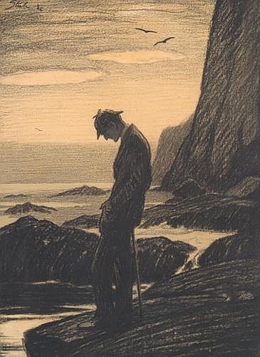
4. HIS AGING HOLMES IS LOVELY AND AT TIMES HEARTBREAKING
His elderly Holmes is the pointiest collection of knees, nose, and elbows I’ve ever seen and I love him with my whole heart.


And the gentle melancholy Steele sketches into his Holmes as he writes his stories for himself in Watson’s absence or stands alone by the seaside...


Why must you hurt me this way, Frederic?
Nevertheless, it’s truly beautiful and emotive art, and a perfect tonal match to the poignancy of the closing tales.
5. LET’S TAKE A LOOK AT SOME OF HIS SECONDARY CHARACTERS, ALWAYS FUN!

This is my girl, Eugenia Ronder, from “The Veiled Lodger.” Lovely to see her, and she’s looking particularly Dread Pirate Roberts. What excellent style.

Violet de Merville and Kitty Winter -- their clothes and hair say so much about the social dynamics in this scene, don’t they?

Isadora Klein has made some tasteful interior decorating decisions and I’m here for them.

Mrs. Lexington is so done.

This is how Holmes dresses up to woo his housemaid. Please note the goatee and beret. I can’t stop laughing.

Abe Slaney’s hat and his entire gangsta ensemble are giving me life, quite honestly.
6. A CUTE SATIRE
If you’ve made it this far, I salute you! I will conclude with a link to the comic illustrations Steele drew for a cute little Holmesian satire, “The Adventure of the Clothes-Line,” written by Carolyn Wells in 1915. This story struck me as the kind of thing that might appeal to @scfrankles, and I was pleased by the final solution to the mystery!
AND COMING UP NEXT FROM YOURS TRULY: some (probably) much shorter posts highlighting lesser known early Holmesian artists. Stay tuned!
63 notes
·
View notes
Photo

“Shall I give this back?” she asked.
Illustration by Frederic Dorr Steele in Liberty Magazine (18 september 1926)
90 notes
·
View notes
Photo

“The queer thing in the kitchen.”
—The Adventure of Wisteria Lodge, illustration by Frederic Dorr Steele.
#there was more than one queer thing in that kitchen#sherlock holmes#wisteria lodge#Frederic Dorr Steele#illustration#op//
328 notes
·
View notes
Text
#The Adventure of the Empty House#Sherlock Holmes#illustration#art#black and white#Frederic Dorr Steele#Edwardian#men's fashion#Arthur Conan Doyle#dark academia
11 notes
·
View notes
Text

Untitled (cover of Collier's 9/26/1903 publication). The Adventure of the Empty House. Frederic Dorr Steele, 1903
Source
40 notes
·
View notes
Text

Without speaking, Holmes examined it with care. Finally he shook one of the dimpled fists which waved in front of him.
“Good-bye, little man. You have made a strange start in life. Nurse, I should wish to have a word with you in private.”
Little art of Holmes and the baby cause I thought it was really cute.
#letters from watson#the sussex vampire#my art#art#sherlock holmes#arthur conan doyle#frederic dorr steele inspired#even picked some colors from his covers
607 notes
·
View notes
Text

#Sherlock Holmes#Frederic Dorr Steele#illustration#art#black and white#dark academia#mystery#horror#Arthur Conan Doyle
6 notes
·
View notes
Text
Steele: Just let me make use of DRAMATIC LIGHTING

(Link given along with image)
35 notes
·
View notes
Last Seen Blogs

aria-rose
The Way You Did Once...

simping-on-the-daily
Problematically Simping over Problematic Faves


nomiking
SKY ISN'T THE LIMIT BUT, MOON

the-abandoned-director
✩ - Cosmo's stuff !!