#Handlebars Templates with Partials
Explore tagged Tumblr posts
Visit Tumblr Blog
Explore Tumblr blogs with no restrictions, modern design and the best experience.
Last Seen Tumblr Blogs


Fun Fact
Tumblr has a low social media market share in South America.
Text
I want to switch from working on fics on Trello to Obsidian (both cost around the same, the difference is that with Obsidian I also have local copy, while Trello is cloud exclusive :/ ) and boy oh boy did I not expect the level of messing with coding I would need for this
The road so far:
got an export from Trello to csv and json (only available for premium but they're offering 2 weeks for free so yay)
added "CSV/JSON Importer" and "Handlebars Template" plugins to Obsidian
partially figured out which data I need to drag out of the export files by reading through what's in there
started to ponder how to make the plugins do what I want them to do
fried my noggin and decided to have some food instead
:')
#yo stuff#it's starting to be one of those “it would take less time to do it manually than to attempt automating it”#But then I think about the fact that the DH workspace ALONE has 83 fics in it with tons of separate cards inside and suddenly#figuring code out sounds significantly more appealing
2 notes
·
View notes
Text
Advertisement :)
pica - high quality and fast image resize in browser.
babelfish - developer friendly i18n with plurals support and easy syntax.
You will like those projects!
h1 Heading 8-)
h2 Heading
h3 Heading
h4 Heading
h5 Heading
h6 Heading
Horizontal Rules
Typographic replacements
Enable typographer option to see result.
(c) (C) (r) (R) (tm) (TM) (p) (P) +-
test.. test... test..... test?..... test!....
!!!!!! ???? ,, -- ---
"Smartypants, double quotes" and 'single quotes'
Emphasis
This is bold text
This is bold text
This is italic text
This is italic text
~~Strikethrough~~
Blockquotes
Blockquotes can also be nested...
...by using additional greater-than signs right next to each other...
...or with spaces between arrows.
Lists
Unordered
Create a list by starting a line with +, -, or *
Sub-lists are made by indenting 2 spaces:
Marker character change forces new list start:
Ac tristique libero volutpat at
Facilisis in pretium nisl aliquet
Nulla volutpat aliquam velit
Very easy!
Ordered
Lorem ipsum dolor sit amet
Consectetur adipiscing elit
Integer molestie lorem at massa
You can use sequential numbers...
...or keep all the numbers as 1.
Start numbering with offset:
foo
bar
Code
Inline code
Indented code
// Some comments line 1 of code line 2 of code line 3 of code
Block code "fences"
Sample text here...
Syntax highlighting
var foo = function (bar) { return bar++; }; console.log(foo(5));
Tables
Option Description data path to data files to supply the data that will be passed into templates. engine engine to be used for processing templates. Handlebars is the default. ext extension to be used for dest files.
Right aligned columns
Option Description data path to data files to supply the data that will be passed into templates. engine engine to be used for processing templates. Handlebars is the default. ext extension to be used for dest files.
Links
link text
link with title
Autoconverted link https://github.com/nodeca/pica (enable linkify to see)
Images
Like links, Images also have a footnote style syntax
With a reference later in the document defining the URL location:
Plugins
The killer feature of markdown-it is very effective support of syntax plugins.
Emojies
Classic markup: :wink: :cry: :laughing: :yum:
Shortcuts (emoticons): :-) :-( 8-) ;)
see how to change output with twemoji.
Subscript / Superscript
19^th^
H~2~O
[](https://github.com/markdown-it/markdown-it-ins)
++Inserted text++
[](https://github.com/markdown-it/markdown-it-mark)
==Marked text==
Footnotes
Footnote 1 link1.
Footnote 2 link2.
Inline footnote^[Text of inline footnote] definition.
Duplicated footnote reference2.
Definition lists
Term 1
Definition 1 with lazy continuation.
Term 2 with inline markup
Definition 2
{ some code, part of Definition 2 }
Third paragraph of definition 2.
Compact style:
Term 1 ~ Definition 1
Term 2 ~ Definition 2a ~ Definition 2b
Abbreviations
This is HTML abbreviation example.
It converts "HTML", but keep intact partial entries like "xxxHTMLyyy" and so on.
Custom containers
::: warning here be dragons :::
Footnote can have markup
and multiple paragraphs. ↩︎
Footnote text. ↩︎ ↩︎
0 notes
Text
Handlebars.js - Partials
Handlebars.js – Partials
Handlebars allows code reuse using Partials. A Partial is a common template that can be included in another template. To create and register a partial, the method Handlebars.registerPartial() can be used as show below : Handlebars.registerPartial("messagePartial","Employee : {{name}}, Age : {{age}}" ); The first parameter to registerPartial() is the name of the partial template and second…
View On WordPress
0 notes
Text
Test markdown post
Advertisement :)
pica - high quality and fast image resize in browser.
babelfish - developer friendly i18n with plurals support and easy syntax.
You will like those projects!
h1 Heading 8-)
h2 Heading
h3 Heading
h4 Heading
h5 Heading
h6 Heading
Horizontal Rules
Typographic replacements
Enable typographer option to see result.
(c) (C) (r) (R) (tm) (TM) (p) (P) +-
test.. test... test..... test?..... test!....
!!!!!! ???? ,, -- ---
"Smartypants, double quotes" and 'single quotes'
Emphasis
This is bold text
This is bold text
This is italic text
This is italic text
~~Strikethrough~~
Blockquotes
Blockquotes can also be nested...
...by using additional greater-than signs right next to each other...
...or with spaces between arrows.
Lists
Unordered
Create a list by starting a line with +, -, or *
Sub-lists are made by indenting 2 spaces:
Marker character change forces new list start:
Ac tristique libero volutpat at
Facilisis in pretium nisl aliquet
Nulla volutpat aliquam velit
Very easy!
Ordered
Lorem ipsum dolor sit amet
Consectetur adipiscing elit
Integer molestie lorem at massa
You can use sequential numbers...
...or keep all the numbers as 1.
Start numbering with offset:
foo
bar
Code
Inline code
Indented code
// Some comments line 1 of code line 2 of code line 3 of code
Block code "fences"
Sample text here...
Syntax highlighting
var foo = function (bar) { return bar++; }; console.log(foo(5));
Tables
Option Description data path to data files to supply the data that will be passed into templates. engine engine to be used for processing templates. Handlebars is the default. ext extension to be used for dest files.
Right aligned columns
Option Description data path to data files to supply the data that will be passed into templates. engine engine to be used for processing templates. Handlebars is the default. ext extension to be used for dest files.
Links
link text
link with title
Autoconverted link https://github.com/nodeca/pica (enable linkify to see)
Images
Like links, Images also have a footnote style syntax
With a reference later in the document defining the URL location:
Plugins
The killer feature of markdown-it is very effective support of syntax plugins.
Emojies
Classic markup: :wink: :crush: :cry: :tear: :laughing: :yum:
Shortcuts (emoticons): :-) :-( 8-) ;)
see how to change output with twemoji.
Subscript / Superscript
19^th^
H~2~O
\
++Inserted text++
\
==Marked text==
Footnotes
Footnote 1 link1.
Footnote 2 link2.
Inline footnote^[Text of inline footnote] definition.
Duplicated footnote reference2.
Definition lists
Term 1
Definition 1 with lazy continuation.
Term 2 with inline markup
Definition 2
{ some code, part of Definition 2 }
Third paragraph of definition 2.
Compact style:
Term 1 ~ Definition 1
Term 2 ~ Definition 2a ~ Definition 2b
Abbreviations
This is HTML abbreviation example.
It converts "HTML", but keep intact partial entries like "xxxHTMLyyy" and so on.
Custom containers
::: warning here be dragons :::
Footnote can have markup
and multiple paragraphs. ↩︎
Footnote text. ↩︎ ↩︎
1 note
·
View note
Text
plugin-prismjs (A README Experience)
A plugin for Micro.blog that injects Prism Javascript and CSS stylesheets to enable syntax highlighting for a sh$t ton of grammars within inline <code> tags and <pre><code> combination code blocks. Its code lives here.
Prism looks for <code class="language-xxx"> tags for inline syntax highlighting and for <pre><code class="language-xxx"> tags for syntax highlighting blocks of code.
For example, the opening tags for the following would be <pre><code class="language-ebnf">:

The configuration for the Javascript that lives at static/assets/js/prism.js is captured by its monster opening comment block:
/* PrismJS 1.25.0 https://prismjs.com/download.html#themes=prism&languages=markup+css+clike+javascript+abap+abnf+actionscript+ada+agda+al+antlr4+apacheconf+apex+apl+applescript+aql+arduino+arff+asciidoc+aspnet+asm6502+asmatmel+autohotkey+autoit+avisynth+avro-idl+bash+basic+batch+bbcode+bicep+birb+bison+bnf+brainfuck+brightscript+bro+bsl+c+csharp+cpp+cfscript+chaiscript+cil+clojure+cmake+cobol+coffeescript+concurnas+csp+coq+crystal+css-extras+csv+cypher+d+dart+dataweave+dax+dhall+diff+django+dns-zone-file+docker+dot+ebnf+editorconfig+eiffel+ejs+elixir+elm+etlua+erb+erlang+excel-formula+fsharp+factor+false+firestore-security-rules+flow+fortran+ftl+gml+gap+gcode+gdscript+gedcom+gherkin+git+glsl+gn+go+graphql+groovy+haml+handlebars+haskell+haxe+hcl+hlsl+hoon+http+hpkp+hsts+ichigojam+icon+icu-message-format+idris+ignore+inform7+ini+io+j+java+javadoc+javadoclike+javastacktrace+jexl+jolie+jq+jsdoc+js-extras+json+json5+jsonp+jsstacktrace+js-templates+julia+keepalived+keyman+kotlin+kumir+kusto+latex+latte+less+lilypond+liquid+lisp+livescript+llvm+log+lolcode+lua+magma+makefile+markdown+markup-templating+matlab+maxscript+mel+mermaid+mizar+mongodb+monkey+moonscript+n1ql+n4js+nand2tetris-hdl+naniscript+nasm+neon+nevod+nginx+nim+nix+nsis+objectivec+ocaml+opencl+openqasm+oz+parigp+parser+pascal+pascaligo+psl+pcaxis+peoplecode+perl+php+phpdoc+php-extras+plsql+powerquery+powershell+processing+prolog+promql+properties+protobuf+pug+puppet+pure+purebasic+purescript+python+qsharp+q+qml+qore+r+racket+cshtml+jsx+tsx+reason+regex+rego+renpy+rest+rip+roboconf+robotframework+ruby+rust+sas+sass+scss+scala+scheme+shell-session+smali+smalltalk+smarty+sml+solidity+solution-file+soy+sparql+splunk-spl+sqf+sql+squirrel+stan+iecst+stylus+swift+systemd+t4-templating+t4-cs+t4-vb+tap+tcl+tt2+textile+toml+tremor+turtle+twig+typescript+typoscript+unrealscript+uri+v+vala+vbnet+velocity+verilog+vhdl+vim+visual-basic+warpscript+wasm+web-idl+wiki+wolfram+wren+xeora+xml-doc+xojo+xquery+yaml+yang+zig&plugins=line-numbers+toolbar+copy-to-clipboard */
The functionality of the page was spotty, but the following link oughta load that monster configuration up there into the Prism Download Page .
I threw in the copy to clipboard plugin (which is dependent on the toolbar plugin) for that little copy button:
I also include the line numbers plugin. It looks for tags that include a line-numbers class.
For example, the opening tags for this code might be <pre><code class="language-json">:
Or, you could toss in the line-numbers class, kinda like <pre class="line-numbers"><code class="language-json">:

I have noticed that the line number appearance can be kinda spotty as far as alignment. The problem seems to lie somewhere in the CSS. The HTML DOM contains the correct number of generated <span> tags to represent the lines.
Let’s check out the plugin parameters, shall we?
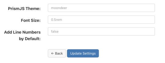
Alrighty, first up is the theme. I rolled my own darcula-esque them and named it moondeer. This what you see above and get by default. I included the stylesheets for all the themes that were available on the download page as well. All the stylesheets live at static/assets/css/prism-STYLE.css. So the out of the box theme lives at static/assets/css/prism-moondeer.css.
If you want to play around with the themes, these would be the supported parameter values: moondeer, default, dark, coy, funky, okaidia, solarized-light, twilight, tomorrow-night.
The stylesheet living at static/assets/css/prism.css addresses a line-number spacing issue I ran into.
So, the Font Size parameter gets inserted into the partial injected into the page <head>. Rather than maintain a bunch of stylesheets (and in order to parameterize it), I chose to set the size here and slap on !important.
I also chose to inject the Javascript here, figuring it would cut down on repainting highlighted text over the original input.
{{ $theme := site.Params.prismjs_theme | default "moondeer" }} <link rel="stylesheet" href="/assets/css/prism-{{ $theme }}.css"> <script src="/assets/js/prism.js"></script> {{ $font_size := site.Params.prismjs_font_size | default "0.5rem" }} <style>code[class*=language-],pre[class*=language-] { font-size: {{ $font_size }} !important; }</style>
Lastly, the Line Numbers parameter. This parameter only makes since for one reason … the cool f$&king shortcode I layed in there. It lives at layouts/shortcodes/language.html.
{{- $language := false -}} {{- if (and (and .IsNamedParams (.Get "language")) .Inner) -}} {{- $language = .Get "language" -}} {{- else if (and (.Get 0) .Inner) -}} {{- $language = .Get 0 -}} {{- end -}} {{ if $language }} {{- $code := .Inner | markdownify | chomp -}} {{- if hasPrefix $code "<pre><code>" -}} {{- $code = strings.TrimPrefix "<pre><code>" $code | strings.TrimSuffix "</code></pre>" -}} {{- $code = htmlUnescape $code -}} {{- $code = replaceRE "<" "<" $code -}} {{- $code = replaceRE "&" "&" $code -}} {{- $pre_class := "code-block" -}} {{- if (and .IsNamedParams (.Get "line-numbers")) -}} {{- $pre_class = printf "%s line-numbers" $pre_class -}} {{ else if (and (not .IsNamedParams) (and site.Params.prismjs_line_numbers (eq "true" site.Params.prismjs_line_numbers))) }} {{- $pre_class = printf "%s line-numbers" $pre_class -}} {{- end -}} <pre class="{{ $pre_class }}"><code class="language-{{ $language }}"> {{ printf "%s" $code | htmlUnescape | safeHTML }} </code></pre> {{ else if hasPrefix $code "<code>" }} {{ $code = strings.TrimPrefix "<code>" $code | strings.TrimSuffix "</code>" }} {{ $code = htmlUnescape $code }} {{ $code = replaceRE "<" "<" $code }} {{ $code = replaceRE "&" "&" $code }} <code class="language-{{ $language }}"> {{ printf "%s" $code | htmlUnescape | safeHTML }} </code> {{ end }} {{ end }}
The paired shortcode works with either a single, unnamed parameter specifying the language … kinda like…
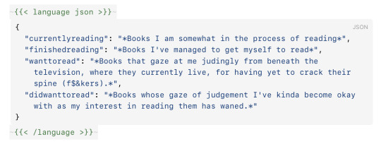
{{< language json >}} { "currentlyreading": "*Books I am somewhat in the process of reading*", "finishedreading": "*Books I've managed to get myself to read*", "wanttoread": "*Books that gaze at me judingly from beneath the television, where they currently live, for having yet to crack their spine (f$&kers).*", "didwanttoread": "*Books whose gaze of judgement I've kinda become okay with as my interest in reading them has waned.*" } {{< /language >}}
or with named parameters … one mandatory and one optional. The mandatory named parameter is language and the optional parameter is line-numbers. This might look something like…
{{< language language="json " line-numbers="true" >}} { "currentlyreading": "*Books I am somewhat in the process of reading*", "finishedreading": "*Books I've managed to get myself to read*", "wanttoread": "*Books that gaze at me judingly from beneath the television, where they currently live, for having yet to crack their spine (f$&kers).*", "didwanttoread": "*Books whose gaze of judgement I've kinda become okay with as my interest in reading them has waned.*" } {{< /language >}}
The Line Numbers plugin parameter contols shortcode behaviour when left unspecified. This value defaults to false. If you set it to "true", than invoking the unnamed parameter shortcode would result in a code block decorated with line numbers. The value set (or not set) for Line Numbers also controls the inclusion of line numbers when the named parameter language is used without supplying a line-numbers parameter to the shortcode. Supplying the value "true" for line-numbers oughta enable line numbers for a block of code being sent through the shortcode. And with that, the over-explanation of the Line Numbers parameter is complete.
Like nearly all my shortcodes these days, I created it as bridge between Ulysses and my Micro.blog content. So, I can be all working up a sheet in Ulysses, and be all:
and then it comes out the other side all:
It’s worth noting that I believe I have found a mobile Safari bug that affects the font-size of the highlighted text on an iPhone when in portrait. Your mileage may vary; but, this was my experience.
0 notes
Text
How to Make a Simple CMS With Cloudflare, GitHub Actions and Metalsmith
Let’s build ourselves a CMS. But rather than build out a UI, we’re going to get that UI for free in the form of GitHub itself! We’ll be leveraging GitHub as the way to manage the content for our static site generator (it could be any static site generator). Here’s the gist of it: GitHub is going to be the place to manage, version control, and store files, and also be the place we’ll do our content editing. When edits occur, a series of automations will test, verify, and ultimately deploy our content to Cloudflare.
You can find the completed code for the project is available on GitHub. I power my own website, jonpauluritis.com, this exact way.
What does the full stack look like?
Here’s the tech stack we’ll be working with in this article:
Any Markdown Editor (Optional. e.g Typora.io)
A Static Site Generator (e.g. Metalsmith)
Github w/ Github Actions (CICD and Deployment)
Cloudflare Workers
Why should you care about about this setup? This setup is potentially the leanest, fastest, cheapest (~$5/month), and easiest way to manage a website (or Jamstack site). It’s awesome both from a technical side and from a user experience perspective. This setup is so awesome I literally went out and bought stock in Microsoft and Cloudflare.
But before we start…
I’m not going to walk you through setting up accounts on these services, I’m sure you can do that yourself. Here are the accounts you need to setup:
GitHub (Sign up for GitHub Actions.)
Cloudflare Workers Sites (This is the one that costs $5/month.)
I would also recommend Typora for an amazing Markdown writing experience, but Markdown editors are a very personal thing, so use which editor feels right for you.
Project structure
To give you a sense of where we’re headed, here’s the structure of the completed project:
├── build.js ├── .github/workflows │ ├── deploy.yml │ └── nodejs.js ├── layouts │ ├── about.hbs │ ├── article.hbs │ ├── index.hbs │ └── partials │ └── navigation.hbs ├── package-lock.json ├── package.json ├── public ├── src │ ├── about.md │ ├── articles │ │ ├── post1.md │ │ └── post2.md │ └── index.md ├── workers-site └── wrangler.toml
Step 1: Command line stuff
In a terminal, change directory to wherever you keep these sorts of projects and type this:
$ mkdir cms && cd cms && npm init -y
That will create a new directory, move into it, and initialize the use of npm.
The next thing we want to do is stand on the shoulders of giants. We’ll be using a number of npm packages that help us do things, the meat of which is using the static site generator Metalsmith:
$ npm install --save-dev metalsmith metalsmith-markdown metalsmith-layouts metalsmith-collections metalsmith-permalinks handlebars jstransformer-handlebars
Along with Metalsmith, there are a couple of other useful bits and bobs. Why Metalsmith? Let’s talk about that.
Step 2: Metalsmith
I’ve been trying out static site generators for 2-3 years now, and I still haven’t found “the one.” All of the big names — like Eleventy, Gatsby, Hugo, Jekyll, Hexo, and Vuepress — are totally badass but I can’t get past Metalsmith’s simplicity and extensibility.
As an example, this will code will actually build you a site:
// EXAMPLE... NOT WHAT WE ARE USING FOR THIS TUTORIAL Metalsmith(__dirname) .source('src') .destination('dest') .use(markdown()) .use(layouts()) .build((err) => if (err) throw err);
Pretty cool right?
For sake of brevity, type this into the terminal and we’ll scaffold out some structure and files to start with.
First, make the directories:
$ mkdir -p src/articles && mkdir -p layouts/partials
Then, create the build file:
$ touch build.js
Next, we’ll create some layout files:
$ touch layouts/index.hbs && touch layouts/about.hbs && touch layouts/article.hbs && touch layouts/partials/navigation.hbt
And, finally, we’ll set up our content resources:
$ touch src/index.md && touch src/about.md && touch src/articles/post1.md && touch src/articles/post1.md touch src/articles/post2.md
The project folder should look something like this:
├── build.js ├── layouts │ ├── about.hbs │ ├── article.hbs │ ├── index.hbs │ └── partials │ └── navigation.hbs ├── package-lock.json ├── package.json └── src ├── about.md ├── articles │ ├── post1.md │ └── post2.md └── index.md
Step 3: Let’s add some code
To save space (and time), you can use the commands below to create the content for our fictional website. Feel free to hop into “articles” and create your own blog posts. The key is that the posts need some meta data (also called “Front Matter”) to be able to generate properly. The files you would want to edit are index.md, post1.md and post2.md.
The meta data should look something like this:
--- title: 'Post1' layout: article.hbs --- ## Post content here....
Or, if you’re lazy like me, use these terminal commands to add mock content from GitHub Gists to your site:
$ curl https://gist.githubusercontent.com/jppope/35dd682f962e311241d2f502e3d8fa25/raw/ec9991fb2d5d2c2095ea9d9161f33290e7d9bb9e/index.md > src/index.md $ curl https://gist.githubusercontent.com/jppope/2f6b3a602a3654b334c4d8df047db846/raw/88d90cec62be6ad0b3ee113ad0e1179dfbbb132b/about.md > src/about.md $ curl https://gist.githubusercontent.com/jppope/98a31761a9e086604897e115548829c4/raw/6fc1a538e62c237f5de01a926865568926f545e1/post1.md > src/articles/post1.md $ curl https://gist.githubusercontent.com/jppope/b686802621853a94a8a7695eb2bc4c84/raw/9dc07085d56953a718aeca40a3f71319d14410e7/post2.md > src/articles/post2.md
Next, we’ll be creating our layouts and partial layouts (“partials”). We’re going to use Handlebars.js for our templating language in this tutorial, but you can use whatever templating language floats your boat. Metalsmith can work with pretty much all of them, and I don’t have any strong opinions about templating languages.
Build the index layout
<!DOCTYPE html> <html lang="en"> <head> <style> /* Keeping it simple for the tutorial */ body { font-family: 'Avenir', Helvetica, Arial, sans-serif; -webkit-font-smoothing: antialiased; -moz-osx-font-smoothing: grayscale; text-align: center; color: #2c3e50; margin-top: 60px; } .navigation { display: flex; justify-content: center; margin: 2rem 1rem; } .button { margin: 1rem; border: solid 1px #ccc; border-radius: 4px; padding: 0.5rem 1rem; text-decoration: none; } </style> </head> <body> <div> <a href=""><h3></h3></a> <p></p> </div> </body> </html>
A couple of notes:
Our “navigation” hasn’t been defined yet, but will ultimately replace the area where resides.
will iterate through the “collection” of articles that metalsmith will generate during its build process.
Metalsmith has lots of plugins you can use for things like stylesheets, tags, etc., but that’s not what this tutorial is about, so we’ll leave that for you to explore.
Build the About page
Add the following to your about.hbs page:
<!DOCTYPE html> <html lang="en"> <head> <style> /* Keeping it simple for the tutorial */ body { font-family: 'Avenir', Helvetica, Arial, sans-serif; -webkit-font-smoothing: antialiased; -moz-osx-font-smoothing: grayscale; text-align: center; color: #2c3e50; margin-top: 60px; } .navigation { display: flex; justify-content: center; margin: 2rem 1rem; } .button { margin: 1rem; border: solid 1px #ccc; border-radius: 4px; padding: 0.5rem 1rem; text-decoration: none; } </style> </head> <body> <div> } </div> </body> </html>
Build the Articles layout
<!DOCTYPE html> <html lang="en"> <head> <style> /* Keeping it simple for the tutorial */ body { font-family: 'Avenir', Helvetica, Arial, sans-serif; -webkit-font-smoothing: antialiased; -moz-osx-font-smoothing: grayscale; text-align: center; color: #2c3e50; margin-top: 60px; } .navigation { display: flex; justify-content: center; margin: 2rem 1rem; } .button { margin: 1rem; border: solid 1px #ccc; border-radius: 4px; padding: 0.5rem 1rem; text-decoration: none; } </style> </head> <body> <div> } </div> </body> </html>
You may have noticed that this is the exact same layout as the About page. It is. I just wanted to cover how to add additional pages so you’d know how to do that. If you want this one to be different, go for it.
Add navigation
Add the following to the layouts/partials/navigation.hbs file
<div class="navigation"> <div> <a class="button" href="/">Home</a> <a class="button" href="/about">About</a> </div> </div>
Sure there’s not much to it… but this really isn’t supposed to be a Metalsmith/SSG tutorial. ¯\_(ツ)_/¯
Step 4: The Build file
The heart and soul of Metalsmith is the build file. For sake of thoroughness, I’m going to go through it line-by-line.
We start by importing the dependencies
Quick note: Metalsmith was created in 2014, and the predominant module system at the time was common.js , so I’m going to stick with require statements as opposed to ES modules. It’s also worth noting that most of the other tutorials are using require statements as well, so skipping a build step with Babel will just make life a little less complex here.
// What we use to glue everything together const Metalsmith = require('metalsmith');
// compile from markdown (you can use targets as well) const markdown = require('metalsmith-markdown');
// compiles layouts const layouts = require('metalsmith-layouts');
// used to build collections of articles const collections = require('metalsmith-collections');
// permalinks to clean up routes const permalinks = require('metalsmith-permalinks');
// templating const handlebars = require('handlebars');
// register the navigation const fs = require('fs'); handlebars.registerPartial('navigation', fs.readFileSync(__dirname + '/layouts/partials/navigation.hbt').toString());
// NOTE: Uncomment if you want a server for development // const serve = require('metalsmith-serve'); // const watch = require('metalsmith-watch');
Next, we’ll be including Metalsmith and telling it where to find its compile targets:
// Metalsmith Metalsmith(__dirname) // where your markdown files are .source('src') // where you want the compliled files to be rendered .destination('public')
So far, so good. After we have the source and target set, we’re going to set up the markdown rendering, the layouts rendering, and let Metalsmith know to use “Collections.” These are a way to group files together. An easy example would be something like “blog posts” but it could really be anything, say recipes, whiskey reviews, or whatever. In the above example, we’re calling the collection “articles.”
// previous code would go here
// collections create groups of similar content .use(collections({ articles: { pattern: 'articles/*.md', }, })) // compile from markdown .use(markdown()) // nicer looking links .use(permalinks({ pattern: ':collection/:title' })) // build layouts using handlebars templates // also tell metalsmith where to find the raw input .use(layouts({ engine: 'handlebars', directory: './layouts', default: 'article.html', pattern: ["*/*/*html", "*/*html", "*html"], partials: { navigation: 'partials/navigation', } }))
// NOTE: Uncomment if you want a server for development // .use(serve({ // port: 8081, // verbose: true // })) // .use(watch({ // paths: { // "${source}/**/*": true, // "layouts/**/*": "**/*", // } // }))
Next, we’re adding the markdown plugin, so we can use markdown for content to compile to HTML.
From there, we’re using the layouts plugin to wrap our raw content in the layout we define in the layouts folder. You can read more about the nuts and bolts of this on the official plugin site but the result is that we can use } in a template and it will just work.
The last addition to our tiny little build script will be the build method:
// Everything else would be above this .build(function(err) { if (err) { console.error(err) } else { console.log('build completed!'); } });
Putting everything together, we should get a build script that looks like this:
const Metalsmith = require('metalsmith'); const markdown = require('metalsmith-markdown'); const layouts = require('metalsmith-layouts'); const collections = require('metalsmith-collections'); const permalinks = require('metalsmith-permalinks'); const handlebars = require('handlebars'); const fs = require('fs');
// Navigation handlebars.registerPartial('navigation', fs.readFileSync(__dirname + '/layouts/partials/navigation.hbt').toString());
Metalsmith(__dirname) .source('src') .destination('public') .use(collections({ articles: { pattern: 'articles/*.md', }, })) .use(markdown()) .use(permalinks({ pattern: ':collection/:title' })) .use(layouts({ engine: 'handlebars', directory: './layouts', default: 'article.html', pattern: ["*/*/*html", "*/*html", "*html"], partials: { navigation: 'partials/navigation', } })) .build(function (err) { if (err) { console.error(err) } else { console.log('build completed!'); } });
I’m a sucker for simple and clean and, in my humble opinion, it doesn’t get any simpler or cleaner than a Metalsmith build. We just need to make one quick update to the package.json file and we’ll be able to give this a run:
"name": "buffaloTraceRoute", "version": "1.0.0", "description": "", "main": "index.js", "scripts": { "build": "node build.js", "test": "echo \"No Tests Yet!\" " }, "keywords": [], "author": "Your Name", "license": "ISC", "devDependencies": { // these should be the current versions // also... comments aren't allowed in JSON } }
If you want to see your handy work, you can uncomment the parts of the build file that will let you serve your project and do things like run npm run build. Just make sure you remove this code before deploying.
Working with Cloudflare
Next, we’re going to work with Cloudflare to get access to their Cloudflare Workers. This is where the $5/month cost comes into play.
Now, you might be asking: “OK, but why Cloudflare? What about using something free like GutHub Pages or Netlify?” It’s a good question. There are lots of ways to deploy a static site, so why choose one method over another?
Well, Cloudflare has a few things going for it…
Speed and performance
One of the biggest reasons to switch to a static site generator is to improve your website performance. Using Cloudflare Workers Site can improve your performance even more.
Here’s a graph that shows Cloudflare compared to two competing alternatives:
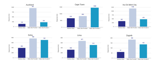
Courtesy of Cloudflare
The simple reason why Cloudflare is the fastest: a site is deployed to 190+ data centers around the world. This reduces latency since users will be served the assets from a location that’s physically closer to them.
Simplicity
Admittedly, the initial configuration of Cloudflare Workers may be a little tricky if you don’t know how to setup environmental variables. But after you setup the basic configurations for your computer, deploying to Cloudflare is as simple as wrangler publish from the site directory. This tutorial is focused on the CI/CD aspect of deploying to Cloudflare which is a little more involved, but it’s still incredibly simple compared to most other deployment processes.
(It’s worth mentioning GitHub Pages, Netlify are also killing it in this area. The developer experience of all three companies is amazing.)
More bang for the buck
While Github Pages and Netlify both have free tiers, your usage is (soft) limited to 100GB of bandwidth a month. Don’t get me wrong, that’s a super generous limit. But after that you’re out of luck. GitHub Pages doesn’t offer anything more than that and Netlify jumps up to $45/month, making Cloudflare’s $5/month price tag very reasonable.
ServiceFree Tier BandwidthPaid Tier PricePaid Tier Requests / BandwidthGitHub Pages100GBN/AN/ANetlify100GB$45~150K / 400 GBCloudflare Workers Sitesnone$510MM / unlimited
Calculations assume a 3MB average website. Cloudflare has additional limits on CPU use. GitHub Pages should not be used for sites that have credit card transactions.
Sure, there’s no free tier for Cloudflare, but $5 for 10 million requests is a steal. I would also be remise if I didn’t mention that GitHub Pages has had a few outages over the last year. That’s totally fine in my book a demo site, but it would be bad news for a business.
Cloudflare offers a ton of additional features for that worth briefly mentioning: free SSL certificates, free (and easy) DNS routing, a custom Workers Sites domain name for your projects (which is great for staging), unlimited environments (e.g. staging), and registering a domain name at cost (as opposed to the markup pricing imposed by other registrars).
Deploying to Cloudflare
Cloudflare provides some great tutorials for how to use their Cloudflare Workers product. We’ll cover the highlights here.
First, make sure the Cloudflare CLI, Wrangler, is installed:
$ npm i @cloudflare/wrangler -g
Next, we’re going to add Cloudflare Sites to the project, like this:
wrangler init --site cms
Assuming I didn’t mess up and forget about a step, here’s what we should have in the terminal at this point:
⬇️ Installing cargo-generate... 🔧 Creating project called `workers-site`... ✨ Done! New project created /Users/<User>/Code/cms/workers-site ✨ Succesfully scaffolded workers site ✨ Succesfully created a `wrangler.toml`
There should also be a generated folder in the project root called /workers-site as well as a config file called wrangler.toml — this is where the magic resides.
name = "cms" type = "webpack" account_id = "" workers_dev = true route = "" zone_id = ""
[site] bucket = "" entry-point = "workers-site"
You might have already guessed what comes next… we need to add some info to the config file! The first key/value pair we’re going to update is the bucket property.
bucket = "./public"
Next, we need to get the Account ID and Zone ID (i.e. the route for your domain name). You can find them in your Cloudflare account all the way at the bottom of the dashboard for your domain:
Stop! Before going any further, don’t forget to click the “Get your API token” button to grab the last config piece that we’ll need. Save it on a notepad or somewhere handy because we’ll need it for the next section.
Phew! Alright, the next task is to add the Account ID and Zone ID we just grabbed to the .toml file:
name = "buffalo-traceroute" type = "webpack" account_id = "d7313702f333457f84f3c648e9d652ff" # Fake... use your account_id workers_dev = true # route = "example.com/*" # zone_id = "805b078ca1294617aead2a1d2a1830b9" # Fake... use your zone_id
[site] bucket = "./public" entry-point = "workers-site" (Again, those IDs are fake.)
Again, those IDs are fake. You may be asked to set up credentials on your computer. If that’s the case, run wrangler config in the terminal.
GitHub Actions
The last piece of the puzzle is to configure GitHub to do automatic deployments for us. Having done previous forays into CI/CD setups, I was ready for the worst on this one but, amazingly, GitHub Actions is very simple for this sort of setup.
So how does this work?
First, let’s make sure that out GitHub account has GitHub Actions activated. It’s technically in beta right now, but I haven’t run into any issues with that so far.
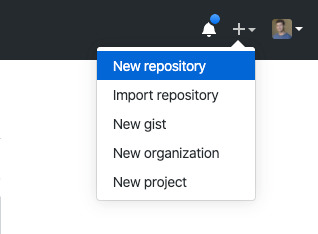
Next, we need to create a repository in GitHub and upload our code to it. Start by going to GitHub and creating a repository.

This tutorial isn’t meant to cover the finer points of Git and/or GitHub, but there’s a great introduction. Or, copy and paste the following commands while in the root directory of the project:
# run commands one after the other $ git init $ touch .gitignore && echo 'node_modules' > .gitignore $ git add . $ git commit -m 'first commit' $ git remote add origin https://github.com/{username}/{repo name} $ git push -u origin master
That should add the project to GitHub. I say that with a little hesitance but this is where everything tends to blow up for me. For example, put too many commands into the terminal and suddenly GitHub has an outage, or the terminal unable to location the path for Python. Tread carefully!
Assuming we’re past that part, our next task is to activate Github Actions and create a directory called .github/workflows in the root of the project directory. (GitHub can also do this automatically by adding the “node” workflow when activating actions. At the time of writing, adding a GitHub Actions Workflow is part of GitHub’s user interface.)
Once we have the directory in the project root, we can add the final two files. Each file is going to handle a different workflow:
A workflow to check that updates can be merged (i.e. the “CI” in CI/CD)
A workflow to deploy changes once they have been merged into master (i.e. the “CD” in CI/CD)
# integration.yml name: Integration
on: pull_request: branches: [ master ]
jobs: build: runs-on: ubuntu-latest strategy: matrix: node-version: [10.x, 12.x] steps: - uses: actions/checkout@v2 - name: Use Node.js $ uses: actions/setup-node@v1 with: node-version: $ - run: npm ci - run: npm run build --if-present - run: npm test env: CI: true
This is a straightforward workflow. So straightforward, in fact, that I copied it straight from the official GitHub Actions docs and barely modified it. Let’s go through what is actually happening in there:
on: Run this workflow only when a pull request is created for the master branch
jobs: Run the below steps for two-node environments (e.g. Node 10, and Node 12 — Node 12 is currently the recommended version). This will build, if a build script is defined. It will also run tests if a test script is defined.
The second file is our deployment script and is a little more involved.
# deploy.yml name: Deploy
on: push: branches: - master
jobs: deploy: runs-on: ubuntu-latest name: Deploy strategy: matrix: node-version: [10.x]
steps: - uses: actions/checkout@v2 - name: Use Node.js $ uses: actions/setup-node@v1 with: node-version: $ - run: npm install - uses: actions/checkout@master - name: Build site run: "npm run build" - name: Publish uses: cloudflare/[email protected] with: apiToken: $
Important! Remember that Cloudflare API token I mentioned way earlier? Now is the time to use it. Go to the project settings and add a secret. Name the secret CF_API_TOKEN and add the API token.
Let’s go through whats going on in this script:
on: Run the steps when code is merged into the master branch
steps: Use Nodejs to install all dependencies, use Nodejs to build the site, then use Cloudflare Wrangler to publish the site
Here’s a quick recap of what the project should look like before running a build (sans node_modules):
├── build.js ├── dist │ └── worker.js ├── layouts │ ├── about.hbs │ ├── article.hbs │ ├── index.hbs │ └── partials │ └── navigation.hbs ├── package-lock.json ├── package.json ├── public ├── src │ ├── about.md │ ├── articles │ │ ├── post1.md │ │ └── post2.md │ └── index.md ├── workers-site │ ├── index.js │ ├── package-lock.json │ ├── package.json │ └── worker │ └── script.js └── wrangler.toml
A GitHub-based CMS
Okay, so I made it this far… I was promised a CMS? Where is the database and my GUI that I log into and stuff?
Don’t worry, you are at the finish line! GitHub is your CMS now and here’s how it works:
Write a markdown file (with front matter).
Open up GitHub and go to the project repository.
Click into the “Articles” directory, and upload the new article. GitHub will ask whether a new branch should be created along with a pull request. The answer is yes.
After the integration is verified, the pull request can be merged, which triggers deployment.
Sit back, relax and wait 10 seconds… the content is being deployed to 164 data centers worldwide.
Congrats! You now have a minimal Git-based CMS that basically anyone can use.
Troubleshooting notes
Metalsmith layouts can sometimes be kinda tricky. Try adding this debug line before the build step to have it kick out something useful: DEBUG=metalsmith-layouts npm run build
Occasionally, Github actions needed me to add node_modules to the commit so it could deploy… this was strange to me (and not a recommended practice) but fixed the deployment.
Please let me know if you run into any trouble and we can add it to this list!
The post How to Make a Simple CMS With Cloudflare, GitHub Actions and Metalsmith appeared first on CSS-Tricks.
How to Make a Simple CMS With Cloudflare, GitHub Actions and Metalsmith published first on https://deskbysnafu.tumblr.com/
0 notes
Text
How to Make a Simple CMS With Cloudflare, GitHub Actions and Metalsmith
Let’s build ourselves a CMS. But rather than build out a UI, we’re going to get that UI for free in the form of GitHub itself! We’ll be leveraging GitHub as the way to manage the content for our static site generator (it could be any static site generator). Here’s the gist of it: GitHub is going to be the place to manage, version control, and store files, and also be the place we’ll do our content editing. When edits occur, a series of automations will test, verify, and ultimately deploy our content to Cloudflare.
You can find the completed code for the project is available on GitHub. I power my own website, jonpauluritis.com, this exact way.
What does the full stack look like?
Here’s the tech stack we’ll be working with in this article:
Any Markdown Editor (Optional. e.g Typora.io)
A Static Site Generator (e.g. Metalsmith)
Github w/ Github Actions (CICD and Deployment)
Cloudflare Workers
Why should you care about about this setup? This setup is potentially the leanest, fastest, cheapest (~$5/month), and easiest way to manage a website (or Jamstack site). It’s awesome both from a technical side and from a user experience perspective. This setup is so awesome I literally went out and bought stock in Microsoft and Cloudflare.
But before we start…
I’m not going to walk you through setting up accounts on these services, I’m sure you can do that yourself. Here are the accounts you need to setup:
GitHub (Sign up for GitHub Actions.)
Cloudflare Workers Sites (This is the one that costs $5/month.)
I would also recommend Typora for an amazing Markdown writing experience, but Markdown editors are a very personal thing, so use which editor feels right for you.
Project structure
To give you a sense of where we’re headed, here’s the structure of the completed project:
├── build.js ├── .github/workflows │ ├── deploy.yml │ └── nodejs.js ├── layouts │ ├── about.hbs │ ├── article.hbs │ ├── index.hbs │ └── partials │ └── navigation.hbs ├── package-lock.json ├── package.json ├── public ├── src │ ├── about.md │ ├── articles │ │ ├── post1.md │ │ └── post2.md │ └── index.md ├── workers-site └── wrangler.toml
Step 1: Command line stuff
In a terminal, change directory to wherever you keep these sorts of projects and type this:
$ mkdir cms && cd cms && npm init -y
That will create a new directory, move into it, and initialize the use of npm.
The next thing we want to do is stand on the shoulders of giants. We’ll be using a number of npm packages that help us do things, the meat of which is using the static site generator Metalsmith:
$ npm install --save-dev metalsmith metalsmith-markdown metalsmith-layouts metalsmith-collections metalsmith-permalinks handlebars jstransformer-handlebars
Along with Metalsmith, there are a couple of other useful bits and bobs. Why Metalsmith? Let’s talk about that.
Step 2: Metalsmith
I’ve been trying out static site generators for 2-3 years now, and I still haven’t found “the one.” All of the big names — like Eleventy, Gatsby, Hugo, Jekyll, Hexo, and Vuepress — are totally badass but I can’t get past Metalsmith’s simplicity and extensibility.
As an example, this will code will actually build you a site:
// EXAMPLE... NOT WHAT WE ARE USING FOR THIS TUTORIAL Metalsmith(__dirname) .source('src') .destination('dest') .use(markdown()) .use(layouts()) .build((err) => if (err) throw err);
Pretty cool right?
For sake of brevity, type this into the terminal and we’ll scaffold out some structure and files to start with.
First, make the directories:
$ mkdir -p src/articles && mkdir -p layouts/partials
Then, create the build file:
$ touch build.js
Next, we’ll create some layout files:
$ touch layouts/index.hbs && touch layouts/about.hbs && touch layouts/article.hbs && touch layouts/partials/navigation.hbt
And, finally, we’ll set up our content resources:
$ touch src/index.md && touch src/about.md && touch src/articles/post1.md && touch src/articles/post1.md touch src/articles/post2.md
The project folder should look something like this:
├── build.js ├── layouts │ ├── about.hbs │ ├── article.hbs │ ├── index.hbs │ └── partials │ └── navigation.hbs ├── package-lock.json ├── package.json └── src ├── about.md ├── articles │ ├── post1.md │ └── post2.md └── index.md
Step 3: Let’s add some code
To save space (and time), you can use the commands below to create the content for our fictional website. Feel free to hop into “articles” and create your own blog posts. The key is that the posts need some meta data (also called “Front Matter”) to be able to generate properly. The files you would want to edit are index.md, post1.md and post2.md.
The meta data should look something like this:
--- title: 'Post1' layout: article.hbs --- ## Post content here....
Or, if you’re lazy like me, use these terminal commands to add mock content from GitHub Gists to your site:
$ curl https://gist.githubusercontent.com/jppope/35dd682f962e311241d2f502e3d8fa25/raw/ec9991fb2d5d2c2095ea9d9161f33290e7d9bb9e/index.md > src/index.md $ curl https://gist.githubusercontent.com/jppope/2f6b3a602a3654b334c4d8df047db846/raw/88d90cec62be6ad0b3ee113ad0e1179dfbbb132b/about.md > src/about.md $ curl https://gist.githubusercontent.com/jppope/98a31761a9e086604897e115548829c4/raw/6fc1a538e62c237f5de01a926865568926f545e1/post1.md > src/articles/post1.md $ curl https://gist.githubusercontent.com/jppope/b686802621853a94a8a7695eb2bc4c84/raw/9dc07085d56953a718aeca40a3f71319d14410e7/post2.md > src/articles/post2.md
Next, we’ll be creating our layouts and partial layouts (“partials”). We’re going to use Handlebars.js for our templating language in this tutorial, but you can use whatever templating language floats your boat. Metalsmith can work with pretty much all of them, and I don’t have any strong opinions about templating languages.
Build the index layout
<!DOCTYPE html> <html lang="en"> <head> <style> /* Keeping it simple for the tutorial */ body { font-family: 'Avenir', Helvetica, Arial, sans-serif; -webkit-font-smoothing: antialiased; -moz-osx-font-smoothing: grayscale; text-align: center; color: #2c3e50; margin-top: 60px; } .navigation { display: flex; justify-content: center; margin: 2rem 1rem; } .button { margin: 1rem; border: solid 1px #ccc; border-radius: 4px; padding: 0.5rem 1rem; text-decoration: none; } </style> </head> <body> <div> <a href=""><h3></h3></a> <p></p> </div> </body> </html>
A couple of notes:
Our “navigation” hasn’t been defined yet, but will ultimately replace the area where resides.
will iterate through the “collection” of articles that metalsmith will generate during its build process.
Metalsmith has lots of plugins you can use for things like stylesheets, tags, etc., but that’s not what this tutorial is about, so we’ll leave that for you to explore.
Build the About page
Add the following to your about.hbs page:
<!DOCTYPE html> <html lang="en"> <head> <style> /* Keeping it simple for the tutorial */ body { font-family: 'Avenir', Helvetica, Arial, sans-serif; -webkit-font-smoothing: antialiased; -moz-osx-font-smoothing: grayscale; text-align: center; color: #2c3e50; margin-top: 60px; } .navigation { display: flex; justify-content: center; margin: 2rem 1rem; } .button { margin: 1rem; border: solid 1px #ccc; border-radius: 4px; padding: 0.5rem 1rem; text-decoration: none; } </style> </head> <body> <div> } </div> </body> </html>
Build the Articles layout
<!DOCTYPE html> <html lang="en"> <head> <style> /* Keeping it simple for the tutorial */ body { font-family: 'Avenir', Helvetica, Arial, sans-serif; -webkit-font-smoothing: antialiased; -moz-osx-font-smoothing: grayscale; text-align: center; color: #2c3e50; margin-top: 60px; } .navigation { display: flex; justify-content: center; margin: 2rem 1rem; } .button { margin: 1rem; border: solid 1px #ccc; border-radius: 4px; padding: 0.5rem 1rem; text-decoration: none; } </style> </head> <body> <div> } </div> </body> </html>
You may have noticed that this is the exact same layout as the About page. It is. I just wanted to cover how to add additional pages so you’d know how to do that. If you want this one to be different, go for it.
Add navigation
Add the following to the layouts/partials/navigation.hbs file
<div class="navigation"> <div> <a class="button" href="/">Home</a> <a class="button" href="/about">About</a> </div> </div>
Sure there’s not much to it… but this really isn’t supposed to be a Metalsmith/SSG tutorial. ¯\_(ツ)_/¯
Step 4: The Build file
The heart and soul of Metalsmith is the build file. For sake of thoroughness, I’m going to go through it line-by-line.
We start by importing the dependencies
Quick note: Metalsmith was created in 2014, and the predominant module system at the time was common.js , so I’m going to stick with require statements as opposed to ES modules. It’s also worth noting that most of the other tutorials are using require statements as well, so skipping a build step with Babel will just make life a little less complex here.
// What we use to glue everything together const Metalsmith = require('metalsmith');
// compile from markdown (you can use targets as well) const markdown = require('metalsmith-markdown');
// compiles layouts const layouts = require('metalsmith-layouts');
// used to build collections of articles const collections = require('metalsmith-collections');
// permalinks to clean up routes const permalinks = require('metalsmith-permalinks');
// templating const handlebars = require('handlebars');
// register the navigation const fs = require('fs'); handlebars.registerPartial('navigation', fs.readFileSync(__dirname + '/layouts/partials/navigation.hbt').toString());
// NOTE: Uncomment if you want a server for development // const serve = require('metalsmith-serve'); // const watch = require('metalsmith-watch');
Next, we’ll be including Metalsmith and telling it where to find its compile targets:
// Metalsmith Metalsmith(__dirname) // where your markdown files are .source('src') // where you want the compliled files to be rendered .destination('public')
So far, so good. After we have the source and target set, we’re going to set up the markdown rendering, the layouts rendering, and let Metalsmith know to use “Collections.” These are a way to group files together. An easy example would be something like “blog posts” but it could really be anything, say recipes, whiskey reviews, or whatever. In the above example, we’re calling the collection “articles.”
// previous code would go here
// collections create groups of similar content .use(collections({ articles: { pattern: 'articles/*.md', }, })) // compile from markdown .use(markdown()) // nicer looking links .use(permalinks({ pattern: ':collection/:title' })) // build layouts using handlebars templates // also tell metalsmith where to find the raw input .use(layouts({ engine: 'handlebars', directory: './layouts', default: 'article.html', pattern: ["*/*/*html", "*/*html", "*html"], partials: { navigation: 'partials/navigation', } }))
// NOTE: Uncomment if you want a server for development // .use(serve({ // port: 8081, // verbose: true // })) // .use(watch({ // paths: { // "${source}/**/*": true, // "layouts/**/*": "**/*", // } // }))
Next, we’re adding the markdown plugin, so we can use markdown for content to compile to HTML.
From there, we’re using the layouts plugin to wrap our raw content in the layout we define in the layouts folder. You can read more about the nuts and bolts of this on the official plugin site but the result is that we can use } in a template and it will just work.
The last addition to our tiny little build script will be the build method:
// Everything else would be above this .build(function(err) { if (err) { console.error(err) } else { console.log('build completed!'); } });
Putting everything together, we should get a build script that looks like this:
const Metalsmith = require('metalsmith'); const markdown = require('metalsmith-markdown'); const layouts = require('metalsmith-layouts'); const collections = require('metalsmith-collections'); const permalinks = require('metalsmith-permalinks'); const handlebars = require('handlebars'); const fs = require('fs');
// Navigation handlebars.registerPartial('navigation', fs.readFileSync(__dirname + '/layouts/partials/navigation.hbt').toString());
Metalsmith(__dirname) .source('src') .destination('public') .use(collections({ articles: { pattern: 'articles/*.md', }, })) .use(markdown()) .use(permalinks({ pattern: ':collection/:title' })) .use(layouts({ engine: 'handlebars', directory: './layouts', default: 'article.html', pattern: ["*/*/*html", "*/*html", "*html"], partials: { navigation: 'partials/navigation', } })) .build(function (err) { if (err) { console.error(err) } else { console.log('build completed!'); } });
I’m a sucker for simple and clean and, in my humble opinion, it doesn’t get any simpler or cleaner than a Metalsmith build. We just need to make one quick update to the package.json file and we’ll be able to give this a run:
"name": "buffaloTraceRoute", "version": "1.0.0", "description": "", "main": "index.js", "scripts": { "build": "node build.js", "test": "echo \"No Tests Yet!\" " }, "keywords": [], "author": "Your Name", "license": "ISC", "devDependencies": { // these should be the current versions // also... comments aren't allowed in JSON } }
If you want to see your handy work, you can uncomment the parts of the build file that will let you serve your project and do things like run npm run build. Just make sure you remove this code before deploying.
Working with Cloudflare
Next, we’re going to work with Cloudflare to get access to their Cloudflare Workers. This is where the $5/month cost comes into play.
Now, you might be asking: “OK, but why Cloudflare? What about using something free like GutHub Pages or Netlify?” It’s a good question. There are lots of ways to deploy a static site, so why choose one method over another?
Well, Cloudflare has a few things going for it…
Speed and performance
One of the biggest reasons to switch to a static site generator is to improve your website performance. Using Cloudflare Workers Site can improve your performance even more.
Here’s a graph that shows Cloudflare compared to two competing alternatives:

Courtesy of Cloudflare
The simple reason why Cloudflare is the fastest: a site is deployed to 190+ data centers around the world. This reduces latency since users will be served the assets from a location that’s physically closer to them.
Simplicity
Admittedly, the initial configuration of Cloudflare Workers may be a little tricky if you don’t know how to setup environmental variables. But after you setup the basic configurations for your computer, deploying to Cloudflare is as simple as wrangler publish from the site directory. This tutorial is focused on the CI/CD aspect of deploying to Cloudflare which is a little more involved, but it’s still incredibly simple compared to most other deployment processes.
(It’s worth mentioning GitHub Pages, Netlify are also killing it in this area. The developer experience of all three companies is amazing.)
More bang for the buck
While Github Pages and Netlify both have free tiers, your usage is (soft) limited to 100GB of bandwidth a month. Don’t get me wrong, that’s a super generous limit. But after that you’re out of luck. GitHub Pages doesn’t offer anything more than that and Netlify jumps up to $45/month, making Cloudflare’s $5/month price tag very reasonable.
Service Free Tier Bandwidth Paid Tier Price Paid Tier Requests / Bandwidth GitHub Pages 100GB N/A N/A Netlify 100GB $45 ~150K / 400 GB Cloudflare Workers Sites none $5 10MM / unlimited
Calculations assume a 3MB average website. Cloudflare has additional limits on CPU use. GitHub Pages should not be used for sites that have credit card transactions.
Sure, there’s no free tier for Cloudflare, but $5 for 10 million requests is a steal. I would also be remise if I didn’t mention that GitHub Pages has had a few outages over the last year. That’s totally fine in my book a demo site, but it would be bad news for a business.
Cloudflare offers a ton of additional features for that worth briefly mentioning: free SSL certificates, free (and easy) DNS routing, a custom Workers Sites domain name for your projects (which is great for staging), unlimited environments (e.g. staging), and registering a domain name at cost (as opposed to the markup pricing imposed by other registrars).
Deploying to Cloudflare
Cloudflare provides some great tutorials for how to use their Cloudflare Workers product. We’ll cover the highlights here.
First, make sure the Cloudflare CLI, Wrangler, is installed:
$ npm i @cloudflare/wrangler -g
Next, we’re going to add Cloudflare Sites to the project, like this:
wrangler init --site cms
Assuming I didn’t mess up and forget about a step, here’s what we should have in the terminal at this point:
⬇ Installing cargo-generate... 🔧 Creating project called `workers-site`... ✨ Done! New project created /Users/<User>/Code/cms/workers-site ✨ Succesfully scaffolded workers site ✨ Succesfully created a `wrangler.toml`
There should also be a generated folder in the project root called /workers-site as well as a config file called wrangler.toml — this is where the magic resides.
name = "cms" type = "webpack" account_id = "" workers_dev = true route = "" zone_id = ""
[site] bucket = "" entry-point = "workers-site"
You might have already guessed what comes next… we need to add some info to the config file! The first key/value pair we’re going to update is the bucket property.
bucket = "./public"
Next, we need to get the Account ID and Zone ID (i.e. the route for your domain name). You can find them in your Cloudflare account all the way at the bottom of the dashboard for your domain:
Stop! Before going any further, don’t forget to click the “Get your API token” button to grab the last config piece that we’ll need. Save it on a notepad or somewhere handy because we’ll need it for the next section.
Phew! Alright, the next task is to add the Account ID and Zone ID we just grabbed to the .toml file:
name = "buffalo-traceroute" type = "webpack" account_id = "d7313702f333457f84f3c648e9d652ff" # Fake... use your account_id workers_dev = true # route = "example.com/*" # zone_id = "805b078ca1294617aead2a1d2a1830b9" # Fake... use your zone_id
[site] bucket = "./public" entry-point = "workers-site" (Again, those IDs are fake.)
Again, those IDs are fake. You may be asked to set up credentials on your computer. If that’s the case, run wrangler config in the terminal.
GitHub Actions
The last piece of the puzzle is to configure GitHub to do automatic deployments for us. Having done previous forays into CI/CD setups, I was ready for the worst on this one but, amazingly, GitHub Actions is very simple for this sort of setup.
So how does this work?
First, let’s make sure that out GitHub account has GitHub Actions activated. It’s technically in beta right now, but I haven’t run into any issues with that so far.
Next, we need to create a repository in GitHub and upload our code to it. Start by going to GitHub and creating a repository.
This tutorial isn’t meant to cover the finer points of Git and/or GitHub, but there’s a great introduction. Or, copy and paste the following commands while in the root directory of the project:
# run commands one after the other $ git init $ touch .gitignore && echo 'node_modules' > .gitignore $ git add . $ git commit -m 'first commit' $ git remote add origin https://github.com/{username}/{repo name} $ git push -u origin master
That should add the project to GitHub. I say that with a little hesitance but this is where everything tends to blow up for me. For example, put too many commands into the terminal and suddenly GitHub has an outage, or the terminal unable to location the path for Python. Tread carefully!
Assuming we’re past that part, our next task is to activate Github Actions and create a directory called .github/workflows in the root of the project directory. (GitHub can also do this automatically by adding the “node” workflow when activating actions. At the time of writing, adding a GitHub Actions Workflow is part of GitHub’s user interface.)
Once we have the directory in the project root, we can add the final two files. Each file is going to handle a different workflow:
A workflow to check that updates can be merged (i.e. the “CI” in CI/CD)
A workflow to deploy changes once they have been merged into master (i.e. the “CD” in CI/CD)
# integration.yml name: Integration
on: pull_request: branches: [ master ]
jobs: build: runs-on: ubuntu-latest strategy: matrix: node-version: [10.x, 12.x] steps: - uses: actions/checkout@v2 - name: Use Node.js $ uses: actions/setup-node@v1 with: node-version: $ - run: npm ci - run: npm run build --if-present - run: npm test env: CI: true
This is a straightforward workflow. So straightforward, in fact, that I copied it straight from the official GitHub Actions docs and barely modified it. Let’s go through what is actually happening in there:
on: Run this workflow only when a pull request is created for the master branch
jobs: Run the below steps for two-node environments (e.g. Node 10, and Node 12 — Node 12 is currently the recommended version). This will build, if a build script is defined. It will also run tests if a test script is defined.
The second file is our deployment script and is a little more involved.
# deploy.yml name: Deploy
on: push: branches: - master
jobs: deploy: runs-on: ubuntu-latest name: Deploy strategy: matrix: node-version: [10.x]
steps: - uses: actions/checkout@v2 - name: Use Node.js $ uses: actions/setup-node@v1 with: node-version: $ - run: npm install - uses: actions/checkout@master - name: Build site run: "npm run build" - name: Publish uses: cloudflare/[email protected] with: apiToken: $
Important! Remember that Cloudflare API token I mentioned way earlier? Now is the time to use it. Go to the project settings and add a secret. Name the secret CF_API_TOKEN and add the API token.
Let’s go through whats going on in this script:
on: Run the steps when code is merged into the master branch
steps: Use Nodejs to install all dependencies, use Nodejs to build the site, then use Cloudflare Wrangler to publish the site
Here’s a quick recap of what the project should look like before running a build (sans node_modules):
├── build.js ├── dist │ └── worker.js ├── layouts │ ├── about.hbs │ ├── article.hbs │ ├── index.hbs │ └── partials │ └── navigation.hbs ├── package-lock.json ├── package.json ├── public ├── src │ ├── about.md │ ├── articles │ │ ├── post1.md │ │ └── post2.md │ └── index.md ├── workers-site │ ├── index.js │ ├── package-lock.json │ ├── package.json │ └── worker │ └── script.js └── wrangler.toml
A GitHub-based CMS
Okay, so I made it this far… I was promised a CMS? Where is the database and my GUI that I log into and stuff?
Don’t worry, you are at the finish line! GitHub is your CMS now and here’s how it works:
Write a markdown file (with front matter).
Open up GitHub and go to the project repository.
Click into the “Articles” directory, and upload the new article. GitHub will ask whether a new branch should be created along with a pull request. The answer is yes.
After the integration is verified, the pull request can be merged, which triggers deployment.
Sit back, relax and wait 10 seconds… the content is being deployed to 164 data centers worldwide.
Congrats! You now have a minimal Git-based CMS that basically anyone can use.
Troubleshooting notes
Metalsmith layouts can sometimes be kinda tricky. Try adding this debug line before the build step to have it kick out something useful: DEBUG=metalsmith-layouts npm run build
Occasionally, Github actions needed me to add node_modules to the commit so it could deploy… this was strange to me (and not a recommended practice) but fixed the deployment.
Please let me know if you run into any trouble and we can add it to this list!
The post How to Make a Simple CMS With Cloudflare, GitHub Actions and Metalsmith appeared first on CSS-Tricks.
source https://css-tricks.com/how-to-make-a-simple-cms-with-cloudflare-github-actions-and-metalsmith/
from WordPress https://ift.tt/3bAGXVM via IFTTT
0 notes
Photo

Building Page Templates in ExpressJS With Handlebars
Building views in NodeJS by incorporating layouts, partials, and everything in between.
0 notes
Text
The Simplest Ways to Handle HTML Includes
It's extremely surprising to me that HTML has never had any way to include other HTML files within it. Nor does there seem to be anything on the horizon that addresses it. I'm talking about straight up includes, like taking a chunk of HTML and plopping it right into another. For example the use case for much of the entire internet, an included header and footer for all pages:
... <body> <include src="./header.html"></include> Content <include src="./footer.html"></include> </body> ...
That's not real, by the way. I just wish it was.
People have been looking to other languages to solve this problem for them forever. It's HTML preprocessing, in a sense. Long before we were preprocessing our CSS, we were using tools to manipulate our HTML. And we still are, because the idea of includes is useful on pretty much every website in the world.
Use PHP
Can you use PHP instead?
... <body> <?php include "./header.html" ?> Content <?php include "./footer.html" ?> </body> ...
This will perform the include at the server level, making the request for it happen at the file system level on the server, so it should be far quicker than a client-side solution.
Use Gulp
What's even faster than a server-side include? If the include is preprocessed before it's even on the server. Gulp has a variety of processors that can do this. One is gulp-file-include.
That would look like this:
... <body> @@include('./header.html') Content @@include('./footer.html') </body> ...
And you'd process it like:
var fileinclude = require('gulp-file-include'), gulp = require('gulp'); gulp.task('fileinclude', function() { gulp.src(['index.html']) .pipe(fileinclude({ prefix: '@@', basepath: '@file' })) .pipe(gulp.dest('./')); });
Looks like this particular plugin has fancy features where you can pass in variables to the includes, making it possible to make little data-driven components.
Use Grunt
This is what the grunt-bake plugin does. You'd configure Grunt to process your HTML:
grunt.initConfig({ bake: { your_target: { files: { "dist/index.html": "app/index.html", } } } });
Then your HTML can use this special syntax for includes:
... <body> <!--(bake header.html)--> Content <!--(bake footer.html)--> </body> ...
Use Handlebars
Handlebars has partials.
You register them:
Handlebars.registerPartial('myPartial', '')
Then use them:
There is also fancy features of this that allow for evaluation and passing data. You'll still need a processor to run it, probably something like gulp-handlebars.
Speaking of templating languages which make use of curly braces... Mustache has them, too.
Use Pug
Pug is an HTML preprocessor that has a whole new syntax for HTML that is a bit more terse. It's got includes though.
... body include ./header.html" p Content include ./footer.html" ...
Then you run it with something like gulp-pug.
Use Nunjucks
I love me some Nunjucks! Nunjucks has includes. You'd do it like this:
... <body> Liquid error: This liquid context does not allow includes. Content Liquid error: This liquid context does not allow includes. </body> ...
If you put that in a file called index.njk, you could process it with a simple Node script into index.html like this:
const nunjucks = require("nunjucks"); const fs = require("fs"); fs.writeFile("index.html", nunjucks.render("index.njk"), function(err, data) { if (err) console.log(err); console.log("Compiled the Nunjucks, captain."); });
Or process it with something like gulp-nunjucks.
11ty has Nunjucks built-in, along with many of the other mentioned so far. Might be good for you if you're actually building a little site.
Use Ajax
Say you had...
<body> <header></header> Content. <footer></footer> </body>
You could fetch the contents for the header and footer from respective files and dump the contents in.
fetch("./header.html") .then(response => { return response.text() }) .then(data => { document.querySelector("header").innerHTML = data; }); fetch("./footer.html") .then(response => { return response.text() }) .then(data => { document.querySelector("footer").innerHTML = data; });
Speaking of JavaScript... If you're building your site using a JavaScript framework of just about any kind, building through components is kind of the main deal there and breaking parts you want to include in other files should be no problem. Some kind of import Header from "./header.js"; and <Header /> is the territory you'd be in in React land.
Use iframes
You could do this:
<body> <iframe src="./header.html"></iframe> Content. <iframe src="./footer.html"></iframe> </body>
But the content in those iframes does not share the same DOM, so it's a bit weird, not to mention slow and awkward to style (since iframes don't know the heights of their contents).
Scott Jehl documented a cool idea though: You can have the iframe inject the content of itself onto the parent page then remove itself.
<body> <iframe src="header.html" onload="this.before((this.contentDocument.body||this.contentDocument).children[0]);this.remove()"></iframe> Content. <iframe src="footer.html" onload="this.before((this.contentDocument.body||this.contentDocument).children[0]);this.remove()"></iframe> </body>
Use Jekyll
Jekyll is a Ruby-based static site generator with includes. You keep your includes in the /_includes/ folder, then:
<body> Liquid error: This liquid context does not allow includes. Content. Liquid error: This liquid context does not allow includes. </body>
Jekyll is a big one, so I'm calling it out here, but there are a ton of static site generators and I'd wager any of them can do includes.
Use Sergey
OK, I'll call out one more SSG because it's new and super focused. Sergey has a web components style format:
<body> <sergey-import src="header" /> Content. <sergey-import src="footer" /> </body>
You'd name the files header.html and footer.html and put them in /includes/ and then it'll make a build with the includes processed when you run the npm script it has you do.
Use Apache SSI
Apache, a super duper common web server, can do includes. You do it like this:
<body> <!--#include file="./header.html" --> Content <!--#include file="./footer.html" --> </body>
But you need the right Apache configuration to allow stuff. I tried my best to get a working demo going but didn't have much luck.
I tried using .htaccess within a folder on an Apache server and flipping on what I thought was the right stuff:
Options +Includes AddType text/html .html AddOutputFilter INCLUDES .html
I'm sure there is some way to get it working though, and if you do, it's kinda neat that it needs zero other dependencies.
Use CodeKit
Mac only, but CodeKit has a special language called Kit it processes where 90% of the point of it is HTML includes. It uses special HTML comments:
... <body> <!-- @import "./header.html" --> Content <!-- @import "./footer.html" --> </body> ...
Use Dreamweaver
Lol jk. But it really is a thing. DWTs, baby.
Holy Crap
That's a lot of ways, isn't it?
Like I said at the top, it's very surprising to me that HTML itself hasn't addressed this directly. Not that I think it would be a great idea for performance to have <include> statements that trigger network requests all over our code, but it seems in-line with the platform. Using ES6 imports directly without bundling isn't a great idea always either, but we have them. @importing CSS within CSS isn't a great idea always, but we have it. If the platform had a native syntax, perhaps other tooling would key off that, much like JavaScript bundlers support the ES6 import format.
The post The Simplest Ways to Handle HTML Includes appeared first on CSS-Tricks.
😉SiliconWebX | 🌐CSS-Tricks
0 notes
Photo

Handlebars Templating in ExpressJS
Node for Noobs
Writing HTML sucks, thus we should do everything to minimize this aspect of development where possible. Enter Handlebars , a savior to those who hate repetitive code (and percentage signs). If you do any sort of development work, you're probably familiar with Handlebars. I thought I was, but it isn't until we need to start a new project from scratch that we realize that we totally forgot the configuration process we took last time. That's why I'm here. Let's have a quick refresher on the parts that make up Handlebars Layouts are the most ambiguous high-level layer; these are commonly used to set underlying page metadata as well as general layout (for lack of a better term). Pages are templates which equate to one type of page. For example, the 'post' page on this site is unique from, say, the homepage. Because all posts share elements with one another, hundreds of posts share this same template. Partials are snippets which can be shared between pages, such as navigation. A Context is content which is passed to templates and result in being the page's content Helpers are the closest we get to logic in Handlebars: these allow us to display or omit content based on conditionals such as if statements. For example: showing an author's avatar only if they have uploaded an image. Project Setup We're going to use the Express /views folder to contain all of our handlebars goodness. Our project should look something like this: myapp ├── bin ├── build ├── routes ├── src ├── views │ ├── layouts/ │ ├── partials/ │ └── error.hbs │ └── index.hbs │ └── login.hbs │ └── etc └── README.md └── app.js └── package.json It's important to distinguish that we've separated our views folder into three classifications for layouts , partials , and pages , where pages occupy the root /views directory. It's important to keep this distinction as our structure affects how we serve up these templates. Configure that Ish Install handlebars: npm install handlebars --save Crack open your app.js file or whatever it is you call that thing. Require handlebars: var hbs = require( 'express-handlebars'); Next we'll configure Express to use Handlebars as the view engine, and tell Express where to find these files: // view engine setup app.set('view engine', 'hbs'); app.engine( 'hbs', hbs( { extname: 'hbs', defaultView: 'default', layoutsDir: __dirname + '/views/pages/', partialsDir: __dirname + '/views/partials/' })); Express assumes by default that we're storing our views in the '/views' folder, which we are. We take this a step further by specifying which subfolders our partials and layouts are in above. We can save pages directly in /views . Notice that we're also setting a default layout. We can override this in our routes if needed, but setting a default layout is useful for loading pages in an html wrapper container page metadata. Kicks on Route 66 Let's create our first route in routes/index.js . We're going to load a view called home into a layout called default : var express = require('express'); var router = express.Router(); router.get('/', function(req, res, next) { res.render('home', {layout: 'default', template: 'home-template'}); }); This will render views/home.hbs into views/layouts/default.hbs , provided are views are set up correctly. We also pass a custom value template which is user-defined; more on that below. Basic Usage Let's finally take a look at our actual Handlebars views. Here's default.hbs :
Best Website
We have three values here: and , and . is a value with double brackets, thus is expecting linear data. We passed template in our route: this sets the body class to equal home-template on the chance that we'll want to apply page-specific styles or logic in the future. is rocking the triple brackets, and is reserved specifically to serve this purpose: loading templates into other templates. Lastly we have . This will load a partial named footer from views/partials/footer.hbs , provided that we create it. The difference between how and are being loaded have to do with a general workflow philosophy; pages are the main event and thus are loaded into layouts by their command. Partials can be called by pages at will whenever we please. There's obviously a lot more to Handlebars- the fun doesn't truly begin until we pull dynamic values from databases or wherever. We'll get there.
- Todd Birchard Read post
0 notes
Text
Todo with Handlebars
I recently built a todo app using many technologies; Node.js, Express, Handlebars, postgreSQL, and Knex.js. Node.js for my backend with Express as my framework for Node.js, and postgreSQL for my database. I chose Knex.js for talking to my backend and sending any data I had to my frontend. Handlebars is great for taking what Knex.js gets from the database and displaying that data to the browser. Handlebars’ files are like HTML files however, when using {{ }} the curly brackets are Handlebars’ way of saying, that this text in between these curly brackets is not HTML, its data. More specifically data from a database.
Let’s say that we have a route setup to retrieve all the todos within our database. Knex has a query to get that data. Something like this:
KNEX
router.get('/', (req,res) => { knex('todo') .select() .then(todos => { res.render('all', { todos: todos }) }) })
After Knex gets that data it returns it as a ‘variable’, in this case, called todos, right after the .then After that we see res.render( ‘all’. The ‘all’ is a Handlebars file called ‘all’ and it will be displayed with the todos. But to display those todos we need to use that ‘variable like’ word called todos in curly brackets. {{ todos }}.
HANDLEBARS
<ul class="list-group"> {{#each todos}} <a href="/todo/{{id}}"class="list-group-item">{{title}}</a> {{/each}} </ul>
As you can see above, Handlebars can also use loops with #each. There is even if statements in Handlebars. Handlebars also has partials, which means you can write short snippets of HTML like code and place them anywhere inside your templates using 3 curly brackets like: {{{ body }}}. Handlebars is a must when using databases and displaying that data to the browser! Go visit the Handlebars Docs for more details!
Checkout my Todo App code HERE. And see it in action HERE.
0 notes
Text
Build a card-based UI with Foundation
Card-based website layouts have taken over the web. Made popular by Pinterest, Twitter, Facebook and Google, cards have become a go-to design pattern for many different use cases.
It’s not hard to see why. Cards work perfectly within responsive web design. As self-contained units, they can be moved, shuffled and mixed with different content types. They also respond easily on different screen sizes, from single columns on mobile devices to multi-column on larger devices.
Steps to the perfect website layout
The ZURB team has used card-based layouts in its design work for years. Its frontend framework, Foundation, has always sought to equip web designers with the tools they need to quickly design and build responsive websites by including a wide range of modular and flexible components. Version 6.3 added to this collection of building blocks brings a brand new off-canvas implementation, responsive accordions/tabs, and a powerful new card component.
In this tutorial we’ll be learning how to create a responsive card-based UI that takes advantage of Foundation’s Flexbox-based grid to open up a whole slew of possibilities.
01. Set up a development environment
The first step is to set up a development environment. For this tutorial, we’ll be using a node-based development environment, so you need to install Node.js. The details to do this depend on your environment, so check here to find out what to do.
Once you have Node installed, install the Foundation CLI using npm install -g foundation-cli, which will make it easy to set up a new Foundation project.
02. Start a new project
Let’s create a new project based on the ZURB template. Run the command foundation new net-magazine-tutorial, select ‘A website (Foundation for Sites)’, ‘net-magazine-tutorial’ and then ZURB Template. This will set up a project template based on Foundation, complete with build system and development server.
The template comes with a sample page in src/pages/index.html. For simplicity, we’ll remove that sample and replace it with an empty <header> </header> to start from scratch building out our card-based UI. Run npm start from the command line to run the development server, and you should see a bare HTML page ready for cards.
03. Create a card
Now it’s time to create our first card. For now, let’s just put it straight inside a section with the class .cards-container. When creating a card using Foundation, there are three core classes to be aware of: .card, .card-section and .card-divider. For more advanced users, each of these corresponds to a SCSS mixin (card-container, card-section and card-divider).
A simple card with the Foundation Yeti on it, header and footer created using the card-divider class
But, for this tutorial we will use the default classes for simplicity. The .card class is the container; every card will live within a .card. This defines things like borders, shadows, and default colouring.
The .card-section class defines an expandable content block, where you might put content, while the .card-divider class defines a non-expanding block, such as a footer, header or divider. Let’s use all of these classes to create our first, basic card.
04. Add component styles
If we just do this, our card will be huge, expanding to fill the entire screen. We’re going to deal with overall sizing shortly, but for now let’s use this as an excuse to learn how to add component styles in the ZURB template.
Add a file _card.scss to src/assets/scss/components/ specifying a max-width: 300px for .card and include the file in our main CSS by adding @import components/card; to src/assets/scss/app.scss.
05. Make your cards reusable
In order to create a repeatable layout with multiple cards, we’re going to want our cards to be reusable components that we can plug in over and over again. The ZURB template that we’re using for this tutorial uses a templating language called Handlebars, which includes the ability to create partials, or reusable blocks of code.
To move our card implementation into a partial, simply cut and paste the .card component we built into a file in src/partials, say src/partials/basic-card.html. You can then include that content by simply adding the line in your index file.
06. Start building your layout
We’ll cover different card types in a little bit, but first let’s use our reusable basic-card to start creating a larger, responsive layout for our cards. To do so, we’re going to use a concept from Foundation called the block grid.
Foundation contains a few different types of grids, but they all start from the concept of rows and columns. A row creates a horizontal block which can contain multiple vertical columns. These basic building blocks make up the core of almost all layouts.
With a simple block grid, we already have a beautiful, scalable layout for as many cards as we want to include
Block grids are a shorthand way to create equally-sized columns and to allow yourself the flexibility and freedom to add an indefinite amount of content and have it lay out nicely in equal columns. You simply add a class to the row and then add as many column components as you like. Foundation will lay them out for you neatly and cleanly.
Since we expect to have a very large and changing number of cards, this is ideal for our purposes. Let’s set this up quickly in a four-column grid and add a few dozen cards. For now we’ll only worry about large screens, so we’ll simply apply the .large-up-4 class to the row.
07. Make it responsive
Next, let’s consider what we want to happen on different screen sizes. Foundation comes with small, medium, and large breakpoints built in, so we can simply apply a different block-grid class for each breakpoint to shift things around.
Let’s put one card per row on mobile screens, and three per row on tablet, by adding the classes .small-up-1 and .medium-up-3 on the row. If we do this, and remove the stopgap max-width property we put _card.scss. We already have a beautifully responsive layout that looks good on all screen sizes.
08. Try some new card types
Combine different styles of card to build your layout
Now let’s diversify our set of cards, another type is a pure edge-to-edge photo. Card sections and card dividers contain padding by default, but to have edge-to-edge content we can simply put the image directly inside of the card. Let’s add this as a photo-card.html partial in src/partials.
09. Introduce Flexbox
There are hundreds of possible ways we can put together cards – for some inspiration, you can check out the Foundation cardpack repository. But let’s move on to how we manage layout when we have different-sized cards. If you insert the photo-card partial into the layout alternating with the basic-card as we did before, we end up with a bit of a jagged experience because our heights are different. This may be fine, or we may want to adjust our layout to compensate.
The Foundation card pack gives you a great set of pre-built Flexbox cards to level up your card game
For this tutorial, we’ll compensate by using our favourite new CSS layout technique – Flexbox. Foundation comes with a Flexbox mode for its grid. To enable it, you simply need to open src/assets/scss/app.scss, comment out @include foundation-grid; and @include foundation-float-classes; and uncomment @include foundation-flex-grid; and @include foundation-flex-classes;.
10. Make your cards the same height
With the Flexbox classes enabled, it’s simple to get our cards to be the same height. First, we can make our columns flex parents by adding the .flex-container class. This is a prototyping shortcut for adding the display: flex; property to them. Once we do this, all of the cards will become the same height, but since flex child elements shrink by default, some of our cards get kind of narrow.
We can fix this issue by simply telling those elements to grow. This is done by either targeting them with CSS and giving them flex-grow: 1; or for simplicity while prototyping, just by adding the class .flex-child-grow. Once all of this has been done all of our cards fill the columns and will be nicely the same height.
This article was originally featured in net magazine issue 293. Buy it here or subscribe to net here.
Liked this? Try these…
10 reasons you should be using Atomic Design
Create and animate SVG Polygons
CSS tricks to revolutionise your layouts
This post comes from the RSS feed of CreativeBlog, you can find more here!
The post Build a card-based UI with Foundation appeared first on Brenda Gilliam.
from Brenda Gilliam http://brendagilliam.com/build-a-card-based-ui-with-foundation/
0 notes
Link
CSS-Tricks http://j.mp/2qBX7vk
Last week's ShopTalk Show was all about HTML Email. It's such a fascinating subject, as technically it is front-end web development, but it almost feels like a bizarro alternate universe.
We have dozens of browsers to worry about, they have hundreds of clients to consider. We worry about whether fancy new APIs are supported, they worry about whether padding is supported. We have grid layout, they have.... grid layout?!
It's tempting to make the joke: "It's coding like it's 1999!", but as we talk about in this episode, that's not really true.
Aside from all that, another thing I thing fascinating are all the tools involved. Lemme think this out.
Creation Tools: Bare Metal
You can create an email with just HTML. I'm sure quite a lot of HTML email is created this way. Open code editor, create HTML email, send HTML email. I know I'm tempted by this and go this route a lot, especially when creating an important one-off email.
Check out Really Good Emails on CodePen, where they have archived loads of the full HTML of sent email campaigns.
The builder tool in Litmus is also a bare metal editor. You see and edit the entire HTML document.
Creation Tools: HTML Templates
It's still creating by hand and hand-authoring HTML, but you can reach for HTML email templates. This is probably a very good route for most us, because of how tricky HTML email can be to get right. Fortunately, a lot of the hard work of figuring out nice and simple email templates with functional layout and type has already been done.
Lee Monroe offers a Really Simple Responsive HTML Email Template and sells a pack of more templates.
Cerberus: "A few simple, but solid patterns for responsive HTML emails."
MailChimp has Email Blueprints on GitHub. They haven't been touched in 3 years though, and I'm not sure if that means they are missing any new/big/important techniques in HTML email development or not.
TABLE TR TD has a build template.
If you cough up your email to 99 designs, it looks like they will send you some.
Creation Tools: Abstracted Templates
Creating an email by directly working with one big giant gnarly piece of HTML is certainly possible, but front-end developers hardly ever work that way. One of the first abstractions we always reach for is abstracting HTML into parts. You can do that with email.
You could use your own server-side partials to break up the HTML into parts, so that making new emails can re-use those parts and they are quicker to build and easier to maintain.
Dan Denney has a system called eMMail that uses Middleman, Haml, and Sass to abstract the emails into manageable parts.
Lee Monroe has a Grunt Email Design Workflow which is Handlebars/Assemble and Sass to piece emails together.
Foundation Emails uses an abstracted HTML language called Inky which compiles into HTML ready for email.
MJML is also a an abstracted HTML language designed to be preprocessed into HTML for email.
UI Builder and Sending Tools
Rather than touching code at all, you could design and write an email directly through a tool built for that. These choices are probably pretty obvious to most folks, as there is huge demand for this. Rightly so! Tools like these let you get right to writing and designing the email without getting distracted by tools.
Campaign Monitor
MailChimp
AWeber
It's just not always possible to use tools like this for all the emails you send. They are usually cost prohibitive for really giant email lists, and not really built for transactional email.
These tools tend to tie together the visual building of the email along with sending and analytics. Everything in one.
Sendwithus is a little different. It is built for transactional email, and gives you a system for building and templating emails, but doesn't send them directly itself (despite the name). You bring-your-own email sending service. Speaking of which...
Sending Tools: APIs
These services actually send the email for you. You hit their API with the email itself, the subject line, the recipients, and whatever else they need and it sends the email. Here's a non-comprehensive list:
SparkPost
MailGun
SendGrid
Mandrill
Amazon SES
Postmark
Analytics is usually a feature that comes with these tools that do the sending. That's true of these email APIs along with the build-and-send apps.
Inlining CSS tools
I always assumed this was absolutely 100% required for HTML emails, but it isn't really. Most email clients support a <style> block in the <head>. That means you can ship CSS without having to inline it. Even when that is supported though, you need to think about which features are supported. Like just because a style block is supported, it doesn't mean border-radius necessarily.
Email support chart from Campaign Monitor.
Even that red mark above is out of date, as Gmail does support style blocks now. So inlining CSS might be going away ultimately, but I imagine there are some email clients that still need it, and if it's part of a build process anyway, I guess it can't hurt.
Copy and paste in-browser tools:
Premailer
PutsMail
MailChimp Inliner
Campaign Monitor Inliner
Programmatic tools:
Node: Juice
Ruby: Roadie
Testing Tools
You could send yourself an email and look at it. Probably best to spin up as many email clients as you possibly can, across different operating systems and devices.
Litmus is the biggest player in this area. Many other tools that offer previews of your email are actually Litmus doing that work.
Email on Acid is a similar tool and a bit less expensive.
The Tools of an HTML Email Workflow is a post from CSS-Tricks
http://j.mp/2qBWySz via CSS-Tricks URL : http://j.mp/2bNbLYg
0 notes
Text
How to Build a Custom Email with Foundation for Emails
Building email templates is down right hard. Building responsive emails is even harder.
Luckily, the kind folks over at Zurb have developed a fantastic framework that makes the process of building responsive emails easier than it has ever been before.
Foundation for Emails (formerly Ink) is a framework tailor fit for a modern designer/developer looking to use the tools and technologies of today to build responsive email templates for tomorrow.
The Numbers Don’t Lie
According to Zurb, 54% of emails are opened on a mobile device and this number is likely to rise. With that figure in place, the need for a responsive email template is a must. Zurb also states that 75% of Gmail users access their account from their mobile device.
No matter the type of email sent, Foundation for Emails has you covered. In fact, once you launch their handy project builder you are greeted with sample templates to either reference or customize to your heart’s content.
Getting Started
Throughout this article, I will be showing you how to get up and running with Foundation for Emails using a custom template I designed for my own small branding agency. As with any framework, it’s imperative for you to reference the documentation. I won’t be going over every detail as Zurb already has but this guide will be enough for you to hit the ground running.
Source Code
You can find the final source code to this project on GitHub.
Installation
To begin you can opt in to use traditional CSS or Sass. I’ll be making use of Sass.
There are many reasons I recommend going this route as opposed to traditional CSS. These reasons include:
More control over the framework’s visual styles
A full build process including Sass compilation and image compression
A custom HTML language known as inky which means you don’t have to write table based layouts by hand.
A built-in inliner for distributing your CSS as inline CSS
Live reloading
Handlebars templating
Note – The Sass version requires Node.js to run. Be sure to install it before going forward.
Install the Foundation CLI and Create a New Project
The installation process makes use of the Foundation CLI. To make use of it open your command line program of choice and type the following:
Bash $ npm install --global foundation-cli
If you run into any permission errors, try prefixing the same command with sudo. You’ll be prompted to enter your system password.
With the Foundation CLI installed, you can now create a blank Foundation for Emails project. Be sure to move to (cdinto) the folder you want to install the project in, and then run the following command:
Bash $ foundation new --framework emails
The CLI should ask you for a project name (I called mine newsletter). This name is what the folder the entire project will be labeled as. After that is set, a number of dependencies will install. (This could take a while to download.)
Once the download completes you should see the following:
Bash You’re all set! ✓ New project folder created. ✓ Node modules installed. ✓ Bower components installed. Now run foundation watch while inside the <projectname> folder.
cd into your project folder by typing cd newsletter. Your project name may vary compared to mine but if you are following along you should be set to go.
Running the Server and Compiling Assets
From within the terminal run the command:
bash $ npm start
This will fire off the build process I mentioned before. The build process will parse HTML, compile Sass, compress images, and launch a server. Your default browser should pop open a new tab point your index.html file from the address of localhost:3000. From this page, you can visit the sample templates Foundation for Emails bundled with the install.
Assessing the design
With Foundation for Emails installed and our project running on the server provided by the framework, we are ready to dive a bit deeper into handling the design shown below.
For the most part, the design is minimal with placeholder content for a newsletter style email. Going forward we will modify elements within the template to make any changes. It’s a bit more hands on than a WYSIWYG email builder like the default MailChimp templates for instance, but for the sake of custom branding, it’s well worth the time. I think most users would agree. You could certainly extend this to utilize the editor within Mailchimp but that’s a topic for another time.
Starting Fresh
Assuming you are using the Sass version, Foundation for Emails comes bundled with Inky HTML which is their own creation. This HTML is responsible for making writing tables and advanced table-layouts a breeze.
The documentation for Foundation fro Emails is the best place to learn all there is to know about the custom Inky HTML you can use in your own projects. Be sure to refer to it often.
We will be working inside the src folder within our project folder. These files are being watched via gulp.js and some included plugins. When changes are made to our template code and/or styles all the files in the dist folder are updated accordingly. I won’t go deep into how all of this works but I remember when I was new to it all it seemed like magic!
Index
The index page you see is found inside src/layouts/index-layout.html. Foundation for emails makes use of Handlebars which allows you do templating inside basic HTML pages. For example, you can create a partial HTML file that gets included into another file dynamically.
Note the tag. All the content essentially gets imported here, in the end, thanks to the HTML parsing available inside the framework.
Pages
Every page you see within src/pages/ is what initially gets displayed when you run $ npm start for the first time. Each page is a sample template provided by Zurb.
Copy the contents of newsletter.html and create a new file called branded-newsletter.html. Paste the contents inside. Within this file, we will build the branded template I shared before.
Inside the file, you should see a lot of foreign looking HTML tags. These are part of Inky HTML. Essentially by using them, you can get away with never having to physically code table layouts. (You can’t use divs inside of emails like you would web pages; the same is true for many CSS properties.)
Below is a brief overview of tags we will make the most use of:
<container> – A wrapping element which has a set width.
<row> – necessary for wrapping columns of content similar to a floated grid on websites.
<column> – where most of your content will live. These can be customized using a 12 column layout. They behave like a floated or flexed div but involve tables.
<menu> – create a menu inside an HTML email using tables.
<spacer> – vertical spacing for email templates. Many mail clients don’t respect margin or padding via CSS. This is a great solution for it. Set any size by adding the attribute like this so: <spacer size=���16″></spacer>.
<button> – create a button with tables.
On top of these tags are additional CSS classes you can add, customize, and extend via Sass.
Scaffolding the Newsletter Template
For the sake of brevity, I am summarizing the coding process and showing you all of the HTML before I style it. This allows me to build a skeleton of sorts for the template and worry about styles later. Below is the HTML I ended up with for the design. This template lives with the pages directory and gets included in the layouts/index-layout.html file where you see the tag.
html
<container> <spacer size="16"></spacer> <p class="text-center"> <small>Email not displaying correctly? <a href="#">Click here</a></small> </p> <spacer size="36"></spacer> <a href="http://ift.tt/2hJkqKT" class="logo"> <img src="http://ift.tt/2psSUp3" alt="Couple of Creatives Logo" width="135" height="68" class="text-center logo" /> </a> <spacer size="24"></spacer> <row class="main-nav"> <columns> <menu class="small-vertical"> <item href="http://ift.tt/2oX9TmT">RECENT WORK</item> <item href="http://ift.tt/2psXt2p">BLOG</item> <item href="http://bit.ly/2oOk3SW">YOUTUBE</item> <item href="http://ift.tt/2oXb5qz">WORK WITH US</item> </menu> </columns> </row> <spacer size="16"></spacer> <p class="issue-meta"> <span class="issue-number">ISSUE #100</span> <span class="issue-sep">•</span> <span class="issue-date">MARCH 29, 2017</span> <p> <spacer size="5"></spacer> <p class="intro"> Maecenas faucibus mollis interdum. Donec sed odio dui. Etiam porta sem malesuada magna mollis euismod. Maecenas sed diam eget risus varius blandit sit amet non magna.Maecenas faucibus mollis interdum. Donec sed odio dui. Etiam porta sem malesuada magna mollis euismod. Maecenas sed diam eget risus varius blandit sit amet non magna. </p> <spacer size="16"></spacer> <hr class="divider" /> <spacer size="16"></spacer> <h2>Recent case study</h2> <img src="http://ift.tt/2psTqD9" width="600" height="324" alt="Screen shot of a case study for Wildwood Family Dentistry from Couple of Creatives" /> <container class="case-study-description"> <columns class="content"> <h4>Wildwood Family Dentistry</h4> <p>Curabitur blandit tempus porttitor. Vestibulum id ligula porta felis euismod semper. Fusce dapibus, tellus ac cursus commodo, tortor mauris condimentum nibh, ut fermentum massa justo sit amet risus.</p> <spacer size="12"></spacer> <button href="http://ift.tt/2oX74CE" class="small-expanded">View Case Study</button> </columns> </container> <spacer size="48"></spacer> <container class="blog"> <h2>From the blog</h2> <a href="#">This is a headling to a external link</a> <p>Curabitur blandit tempus porttitor. Vestibulum id ligula porta felis euismod semper. Fusce dapibus, tellus ac cursus commodo, tortor mauris condimentum nibh, ut fermentum massa justo sit amet risus. Lorem ipsum dolor sit amet, consectetur adipiscing elit.</p> <spacer size="16"></spacer> <a href="#">Donec id elit non mi porta gravida at eget metus.</a> <p>Curabitur blandit tempus porttitor. Vestibulum id ligula porta felis euismod semper. Fusce dapibus, tellus ac cursus commodo, tortor mauris condimentum nibh, ut fermentum massa justo sit amet risus. Lorem ipsum dolor sit amet, consectetur adipiscing elit.</p> <spacer size="16"></spacer> <a href="#">This is a headling to a external link</a> <p>Curabitur blandit tempus porttitor. Vestibulum id ligula porta felis euismod semper. Fusce dapibus, tellus ac cursus commodo, tortor mauris condimentum nibh, ut fermentum massa justo sit amet risus. Lorem ipsum dolor sit amet, consectetur adipiscing elit.</p> </container> <spacer size="16"></spacer> <hr class="divider" /> <spacer size="16"></spacer> <h2>Watch our latest video</h2> <a href="#"> <img src="http://ift.tt/2pt33BS" width="600" height="337" alt="A still of a Couple of Creatives during a video shoot" /> </a> <spacer size="16"></spacer> <p>Curabitur blandit tempus porttitor. Vestibulum id ligula porta felis euismod semper. Fusce dapibus, tellus ac cursus commodo, tortor mauris condimentum nibh, ut fermentum massa justo sit amet risus. Lorem ipsum dolor sit amet, consectetur adipiscing elit.</p> <spacer size="16"></spacer> <button href="#" class="secondary small-expanded">Subscribe to our channel</button> <spacer size="32"></spacer> <hr class="divider" /> <spacer size="16"></spacer> <h2>Follow us on instagram</h2> <a href="http://ift.tt/1sXpp0l"> <img src="http://ift.tt/2pt0EHt" alt="Instragram photos of Couple of Creatives" width="600" height="294" /> </a> <spacer size="36"></spacer> <hr class="divider" /> <spacer size="16"></spacer> <container class="footer"> <a href="http://ift.tt/2hJkqKT" class="logo"> <img src="http://ift.tt/2psSUp3" alt="Couple of Creatives Logo" width="135" height="68" class="text-center logo" /> </a> <spacer size="32"></spacer> <row class="footer-social-links"> <columns> <table class="social-menu"> <tr> <td> <table> <tr> <th class="menu-item"> <a href="http://ift.tt/2oX31pI"> <img class="text-center" src="http://ift.tt/2psSE9f" alt="facebook" width="21" height="21" /> </a> </th> <th class="menu-item"> <a href="https://twitter.com/couplecreatives"> <img class="text-center" src="http://ift.tt/2oXfXMs" alt="twitter" width="21" height="21" /> </a> </th> <th class="menu-item"> <a href="http://ift.tt/1sXpp0l"> <img class="text-center" src="http://ift.tt/2pt2Cru" alt="instagram" width="21" height="21" /> </a> </th> <th class="menu-item"> <a href="https://www.youtube.com/channel/UCwLgeZi57pzy-Q4LgvBBXRA"> <img class="text-center" src="http://ift.tt/2oX51yg" alt="youtube" width="21" height="21" /> </a> </th> <th class="menu-item"> <a href="http://ift.tt/2psJ9am"> <img class="text-center" src="http://ift.tt/2oXfZE4" alt="linkedin" width="21" height="21" /> </a> </th> <th class="menu-item"> <a href="http://ift.tt/2pt1Sm4"> <img class="text-center" src="http://ift.tt/2oWYJ1I" alt="google plus" width="21" height="21" /> </a> </th> </tr> </table> </td> </tr> </table> </columns> </row> </container> <spacer size="12"></spacer> <p class="text-center"><a class="footer-cta" href="http://ift.tt/2oXb5qz">Need marketing? Hire this creative duo</a></p> <spacer size="12"></spacer> <p class="text-center"><small>You received this email because you’re signed up to get updates from us. <a href="#">Click here to unsubscribe.</a></small></p> </container>
Inside the HTML you will see a lot of the custom tags mentioned before. The spacer element, for example, I utilize a lot to create vertical spacing. I do this simply because not all email clients honor margin and padding. To save the fuss the spacer element helps tremendously.
Adding the Styles
Since I’m using the Sass version of Foundation for Emails I’m able to create partials and import those into the master app.scss file which in return gets compiled to the dist folder as app.css.
I’m making use of a font called Ideal Sans. Unfortunately, I can only use it on my specified domain which means you won’t be able to make use of it for the headings on your end. If you are following along the headings will have Arial as the fallback for the base font.
Most of the customizations you can make to the styles bundled inside the framework are found in the assets/scss/_settings.scss. This file has a variety of variables ready to be customized to match your own branding.
On top of customizing these settings, I created some partials of my own. I imported these files into the app.scss file.
Responsive Emails
Foundation for Emails has support for responsive emails out of the box. Using the bundled <container>, <row> and <columns> tags you can essentially do the same handy work as you would in the browser. Within columns you can specify specific classes to establish a 12 column grid. For example, If I wanted to have a two column grid I would write:
html <container> <row> <columns small="12" large="6"> Column 1 </columns> <columns small="12" large="6"> Column 2 </columns> </row> </container>
Based on the screensize of the user these columns will appear at 50% width on larger screens and 100% width on smaller screens. If you’re familiar with popular CSS frameworks like Bootstrap or Foundation this should be pretty easy to grasp.
Using Images in Emails
Images need to be loaded from a web server using absolute url paths and preferably from the same domain as the person’s email who is sending it. So if I were to send an email from [email protected] to my subscribers the images would need to live under the same webdesignerdepot.com domain name.
Doing this eliminates the probability of your email being misdirected to a spam folder and also appears as more professional.
Alt Tags Are a Must
If you don’t normally use alt tags (I don’t know why you wouldn’t) you need to in emails. Many mail clients don’t load images by default and it’s up to the user. Alt tags can help describe the image before the user even sees it. This is both great for accessibility and a graceful fallback for those not interested in loading images in the emails they receive.
Building Production Files and Testing
Production based emails need to have their CSS inlined. Inlining is the process of defining the styles on the element itself rather than linking from an external stylesheet. Foundation for Emails has a handy build feature that does this for you. The final files get compiled and minified inside the dist folder.
To build production files you’ll want to kill any servers already running by typing ctrl + c in your terminal program. From there type:
Bash $ npm run build
When the email opens in the browser you should see the same as you did before. But, If you look closely at the source of the page you will see a mess of code. This is the result of the build process and assuming everything looks good, is ready to use in the wild.
Testing
I can’t stress enough how important it is to test on as many email platforms as you can. Your design will likely look different on all of them but the goal is to create a solution that at least looks consistent and legible across most platforms.
You can use a tool called Litmus for this test. There’s a free version of the tool that allows you to copy and paste your code and send an email to yourself or colleague. Be sure to do this step. Emails that get sent obviously can’t be edited after the fact.
Useful Links
Source code for this project
Test your emails before you send them
Foundation for Emails
Foundation for Emails – Documentation
Mailchimp Email Design Guide
Lifetime Access to DesignBold’s Library of 6,000+ Templates – only $37!
Source from Webdesigner Depot http://ift.tt/2psTqTF from Blogger http://ift.tt/2pt1PXB
0 notes
Text
The Simplest Ways to Handle HTML Includes
It's extremely surprising to me that HTML has never had any way to include other HTML files within it. Nor does there seem to be anything on the horizon that addresses it. I'm talking about straight up includes, like taking a chunk of HTML and plopping it right into another. For example the use case for much of the entire internet, an included header and footer for all pages:
... <body> <include src="./header.html"></include> Content <include src="./footer.html"></include> </body> ...
That's not real, by the way. I just wish it was.
People have been looking to other languages to solve this problem for them forever. It's HTML preprocessing, in a sense. Long before we were preprocessing our CSS, we were using tools to manipulate our HTML. And we still are, because the idea of includes is useful on pretty much every website in the world.
Use PHP
Can you use PHP instead?
... <body> <?php include "./header.html" ?> Content <?php include "./footer.html" ?> </body> ...
This will perform the include at the server level, making the request for it happen at the file system level on the server, so it should be far quicker than a client-side solution.
Use Gulp
What's even faster than a server-side include? If the include is preprocessed before it's even on the server. Gulp has a variety of processors that can do this. One is gulp-file-include.
That would look like this:
... <body> @@include('./header.html') Content @@include('./footer.html') </body> ...
And you'd process it like:
var fileinclude = require('gulp-file-include'), gulp = require('gulp'); gulp.task('fileinclude', function() { gulp.src(['index.html']) .pipe(fileinclude({ prefix: '@@', basepath: '@file' })) .pipe(gulp.dest('./')); });
Looks like this particular plugin has fancy features where you can pass in variables to the includes, making it possible to make little data-driven components.
Use Grunt
This is what the grunt-bake plugin does. You'd configure Grunt to process your HTML:
grunt.initConfig({ bake: { your_target: { files: { "dist/index.html": "app/index.html", } } } });
Then your HTML can use this special syntax for includes:
... <body> <!--(bake header.html)--> Content <!--(bake footer.html)--> </body> ...
Use Handlebars
Handlebars has partials.
You register them:
Handlebars.registerPartial('myPartial', '')
Then use them:
There is also fancy features of this that allow for evaluation and passing data. You'll still need a processor to run it, probably something like gulp-handlebars.
Speaking of templating languages which make use of curly braces... Mustache has them, too.
Use Pug
Pug is an HTML preprocessor that has a whole new syntax for HTML that is a bit more terse. It's got includes though.
... body include ./header.html" p Content include ./footer.html" ...
Then you run it with something like gulp-pug.
Use Nunjucks
I love me some Nunjucks! Nunjucks has includes. You'd do it like this:
... <body> Liquid error: This liquid context does not allow includes. Content Liquid error: This liquid context does not allow includes. </body> ...
If you put that in a file called index.njk, you could process it with a simple Node script into index.html like this:
const nunjucks = require("nunjucks"); const fs = require("fs"); fs.writeFile("index.html", nunjucks.render("index.njk"), function(err, data) { if (err) console.log(err); console.log("Compiled the Nunjucks, captain."); });
Or process it with something like gulp-nunjucks.
11ty has Nunjucks built-in, along with many of the other mentioned so far. Might be good for you if you're actually building a little site.
Use Ajax
Say you had...
<body> <header></header> Content. <footer></footer> </body>
You could fetch the contents for the header and footer from respective files and dump the contents in.
fetch("./header.html") .then(response => { return response.text() }) .then(data => { document.querySelector("header").innerHTML = data; }); fetch("./footer.html") .then(response => { return response.text() }) .then(data => { document.querySelector("footer").innerHTML = data; });
Speaking of JavaScript... If you're building your site using a JavaScript framework of just about any kind, building through components is kind of the main deal there and breaking parts you want to include in other files should be no problem. Some kind of import Header from "./header.js"; and <Header /> is the territory you'd be in in React land.
Use iframes
You could do this:
<body> <iframe src="./header.html"></iframe> Content. <iframe src="./footer.html"></iframe> </body>
But the content in those iframes does not share the same DOM, so it's a bit weird, not to mention slow and awkward to style (since iframes don't know the heights of their contents).
Scott Jehl documented a cool idea though: You can have the iframe inject the content of itself onto the parent page then remove itself.
<body> <iframe src="header.html" onload="this.before((this.contentDocument.body||this.contentDocument).children[0]);this.remove()"></iframe> Content. <iframe src="footer.html" onload="this.before((this.contentDocument.body||this.contentDocument).children[0]);this.remove()"></iframe> </body>
Use Jekyll
Jekyll is a Ruby-based static site generator with includes. You keep your includes in the /_includes/ folder, then:
<body> Liquid error: This liquid context does not allow includes. Content. Liquid error: This liquid context does not allow includes. </body>
Jekyll is a big one, so I'm calling it out here, but there are a ton of static site generators and I'd wager any of them can do includes.
Use Sergey
OK, I'll call out one more SSG because it's new and super focused. Sergey has a web components style format:
<body> <sergey-import src="header" /> Content. <sergey-import src="footer" /> </body>
You'd name the files header.html and footer.html and put them in /includes/ and then it'll make a build with the includes processed when you run the npm script it has you do.
Use Apache SSI
Apache, a super duper common web server, can do includes. You do it like this:
<body> <!--#include file="./header.html" --> Content <!--#include file="./footer.html" --> </body>
But you need the right Apache configuration to allow stuff. I tried my best to get a working demo going but didn't have much luck.
I tried using .htaccess within a folder on an Apache server and flipping on what I thought was the right stuff:
Options +Includes AddType text/html .html AddOutputFilter INCLUDES .html
I'm sure there is some way to get it working though, and if you do, it's kinda neat that it needs zero other dependencies.
Use CodeKit
Mac only, but CodeKit has a special language called Kit it processes where 90% of the point of it is HTML includes. It uses special HTML comments:
... <body> <!-- @import "./header.html" --> Content <!-- @import "./footer.html" --> </body> ...
Use Dreamweaver
Lol jk. But it really is a thing. DWTs, baby.
Holy Crap
That's a lot of ways, isn't it?
Like I said at the top, it's very surprising to me that HTML itself hasn't addressed this directly. Not that I think it would be a great idea for performance to have <include> statements that trigger network requests all over our code, but it seems in-line with the platform. Using ES6 imports directly without bundling isn't a great idea always either, but we have them. @importing CSS within CSS isn't a great idea always, but we have it. If the platform had a native syntax, perhaps other tooling would key off that, much like JavaScript bundlers support the ES6 import format.
The post The Simplest Ways to Handle HTML Includes appeared first on CSS-Tricks.
The Simplest Ways to Handle HTML Includes published first on https://deskbysnafu.tumblr.com/
0 notes
Photo

Handlebars Templating in ExpressJS
Node for Noobs
Writing HTML sucks, thus we should do everything to minimize this aspect of development where possible. Enter Handlebars , a savior to those who hate repetitive code (and percentage signs). If you do any sort of development work, you're probably familiar with Handlebars. I thought I was, but it isn't until we need to start a new project from scratch that we realize that we totally forgot the configuration process we took last time. That's why I'm here. Let's have a quick refresher on the parts that make up Handlebars Layouts are the most ambiguous high-level layer; these are commonly used to set underlying page metadata as well as general layout (for lack of a better term). Pages are templates which equate to one type of page. For example, the 'post' page on this site is unique from, say, the homepage. Because all posts share elements with one another, hundreds of posts share this same template. Partials are snippets which can be shared between pages, such as navigation. A Context is content which is passed to templates and result in being the page's content Helpers are the closest we get to logic in Handlebars: these allow us to display or omit content based on conditionals such as if statements. For example: showing an author's avatar only if they have uploaded an image. Project Setup We're going to use the Express /views folder to contain all of our handlebars goodness. Our project should look something like this: myapp ├── bin ├── build ├── routes ├── src ├── views │ ├── layouts/ │ ├── partials/ │ └── error.hbs │ └── index.hbs │ └── login.hbs │ └── etc └── README.md └── app.js └── package.json It's important to distinguish that we've separated our views folder into three classifications for layouts , partials , and pages , where pages occupy the root /views directory. It's important to keep this distinction as our structure affects how we serve up these templates. Configure that Ish Install handlebars: npm install handlebars --save Crack open your app.js file or whatever it is you call that thing. Require handlebars: var hbs = require( 'express-handlebars'); Next we'll configure Express to use Handlebars as the view engine, and tell Express where to find these files: // view engine setup app.set('view engine', 'hbs'); app.engine( 'hbs', hbs( { extname: 'hbs', defaultView: 'default', layoutsDir: __dirname + '/views/pages/', partialsDir: __dirname + '/views/partials/' })); Express assumes by default that we're storing our views in the '/views' folder, which we are. We take this a step further by specifying which subfolders our partials and layouts are in above. We can save pages directly in /views . Notice that we're also setting a default layout. We can override this in our routes if needed, but setting a default layout is useful for loading pages in an html wrapper container page metadata. Kicks on Route 66 Let's create our first route in routes/index.js . We're going to load a view called home into a layout called default : var express = require('express'); var router = express.Router(); router.get('/', function(req, res, next) { res.render('home', {layout: 'default', template: 'home-template'}); }); This will render views/home.hbs into views/layouts/default.hbs , provided are views are set up correctly. We also pass a custom value template which is user-defined; more on that below. Basic Usage Let's finally take a look at our actual Handlebars views. Here's default.hbs : Best Website
We have three values here: and , and . is a value with double brackets, thus is expecting linear data. We passed template in our route: this sets the body class to equal home-template on the chance that we'll want to apply page-specific styles or logic in the future. is rocking the triple brackets, and is reserved specifically to serve this purpose: loading templates into other templates. Lastly we have . This will load a partial named footer from views/partials/footer.hbs , provided that we create it. The difference between how and are being loaded have to do with a general workflow philosophy; pages are the main event and thus are loaded into layouts by their command. Partials can be called by pages at will whenever we please. There's obviously a lot more to Handlebars- the fun doesn't truly begin until we pull dynamic values from databases or wherever. We'll get there.
- Todd Birchard
0 notes