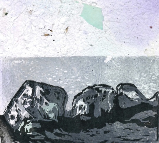
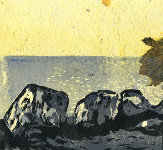
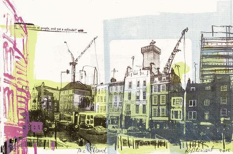
#I love the halftone effect so much so when I find a drawing I can use it with I get very excited
Text
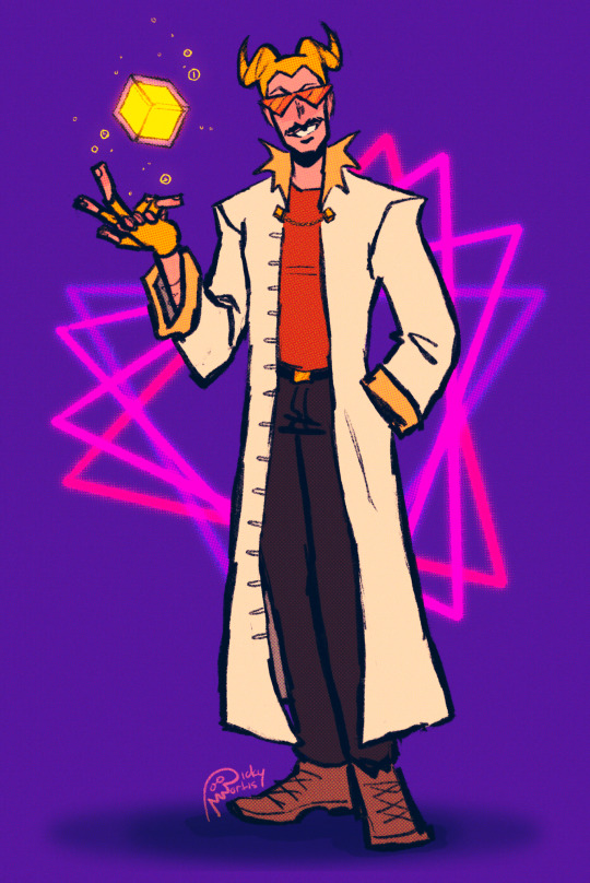
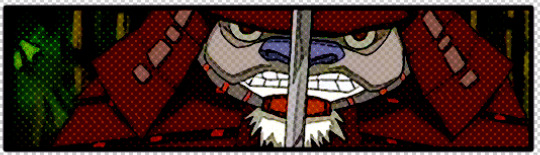
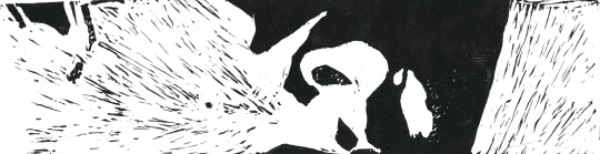
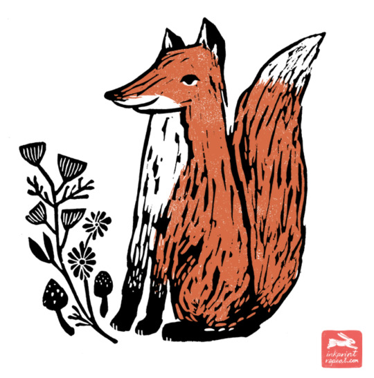
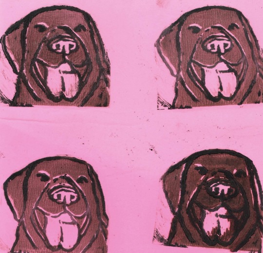
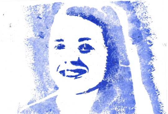
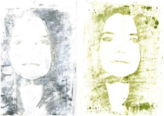
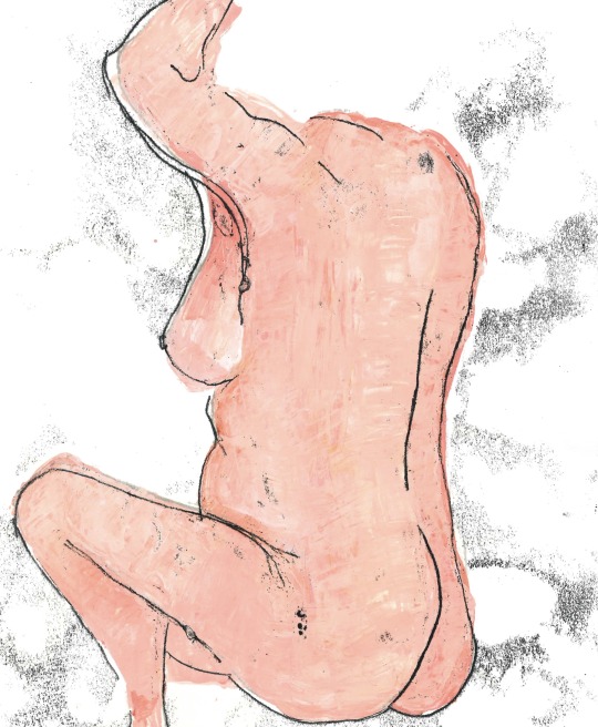
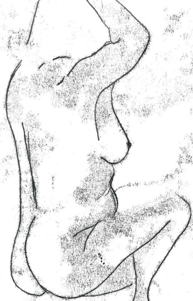
I drew Ted from the wonderful @nabwastaken ‘s Time Bastard Au! The original design is by the talented @midnightnautilus , and was so very fun to draw!
#it’s a very fun au#I enjoy it quite a bit#I mean it’s hard to go wrong when making hatchetfield characters superheroes#although nobody should ever give Ted super powers#my man would wreak so much havoc#he's just a silly guy tho#I loved drawing him in this costume#drawing horns is so much fun#and I got to do a little comic book type halftone moment that I don’t get to do in a lot of my drawings#I love the halftone effect so much so when I find a drawing I can use it with I get very excited#anyways yall should go check out the au#Midnightnautilus has got some awesome art for it and the concept is so very good#let’s see what’s a fun fact for this one#fun fact: the person who created the early version of the Polygraph (lie detector) test also came up with Wonder Woman!#It's really interesting especially when you remember that Wonder Woman has the lasso of truth#Ted spankoffski#hatchetfield#time bastard#time bastard au#hatchetverse#team starkid#starkid#hatchetfield au#tinky#tnoy karaxis#the guy who didnt like musicals#nightmare time#my art#others idea
173 notes
·
View notes
Note
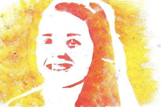
Hi, not a request, just wanted to ask what program you use for your drawing? Your art is wonderful, I really love it. I've been trying to learn how to do the FX like you did in the "Be Polite" piece (the rainbow-y effect on the outline specifically.) If you would be so sweet as to share your process or at the very least a few tips to guide me in the right direction, I would appreciate it so much <3
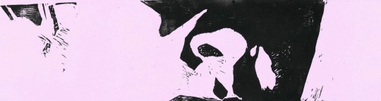
Of course! I use Procreate for all of my digital art, which if you don’t have already, is totally worth the $13; it’s super versatile, not to mention satisfyingly easy to navigate. If it interests you, I use this Syrup brush for pretty much everything, including the Sniper piece (just crank the stability way down in settings).
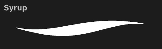
But anyway, the FX! Unfortunately, the effects I used on this particular piece came specifically with Procreate, and as I am not as familiar with other programs, I could not tell you whether they possess the same features or where you could find them.

Halftone will give you that “comic book” look, while Chromatic Aberration produces the rainbow one you asked about; you can adjust each to your liking.
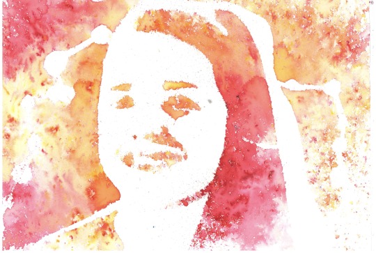
However, I do remember a little trick from when I did not have Procreate that might give you what you’re looking for. I got some lines:
Duplicate this layer a two or three times, then set each of these duplicated layers to Alpha Lock and color them each red, green, and blue, or whatever you’re going for:
Offset each of the layers in a different direction from the original line work. I put blue off to the left, red to the right, and green a little upwards.

If that looks a little whacky, then play with opacity and layer settings (I used 50% opacity and Color Dodge).

And now we have Pyrovision. It kind of does the trick, and hopefully this is helpful knowledge! But who knows maybe you already found this tip
As for my process I will probably create a separate post, if that appeals to you. Thank you very much for the ask, it makes me really happy to see some interest my stuff. Have a nice day! :-)
11 notes
·
View notes
Text
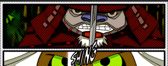
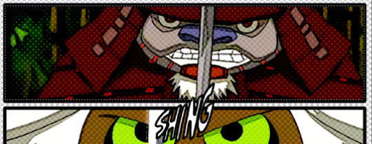
Tutorial: Comic Book Gifs
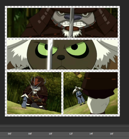
I got a request for a tutorial on how I create gifs stylized like comic books, so I will be walking through how I made this gif (from this gifset):

Tutorial under the cut:
I’m going to break this tutorial into 3 sections: organizing the panels, creating the comic book “look”, and adding the sound effects.
1. Creating the Panel Layout
1. Start by deciding how you want your “layout” to look. These really don’t have to be too fancy: usually I’ll just do rows of 1 or 2 panels, but if you need help getting a rough idea of what a layout might look like here are all my comic book edits. Again, nothing too fancy (unless that’s what you want).
It’s probably best to plan which gifs are going in which panels in advance but I kind of make it up as a go.
2. Create a new psd and start in video timeline mode. Then using the rectangle tool, draw the rectangles based on your desired layout:
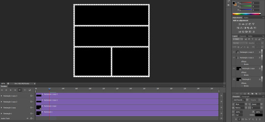
3. Create the gifs you will use for each panel. (Note: It’s important that the # of frames in your gifs are all the same.) Make sure the gif is in video timeline mode & is converted to a smart object. No need to sharpen yet - we will do that later. These are the four gifs I will be using (one per panel):


The framerate is a little fast right now but that’s ok - I will fix this at the very end.
4. Now, you want to drag your gifs onto the psd.Use a clipping mask (ctrl + alt + G) to attach the gifs to the “panel boxes”. To resize your gifs within the panel you can just use ctrl + t.
So this is where we should now be at:
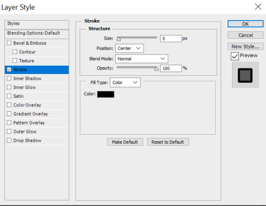
4. Final step is to add borders. So click on the rectangles, and then click on add layer style -> stroke to add a border. Personally I like the borders a little thicker to make it look more “comic book-y”. So I use a 5px stroke with position set to center:
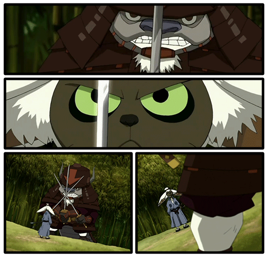
And this is what our gifs should look like now:
So now we’re done with the setup, and we can move onto styling.
2. Styling the Gifs
1. Start by just applying your usual sharpening settings (I used a surface blur & smart sharpen).
2. After that, add a poster edges filter to the gifs. You can do this by clicking on filter -> filter gallery -> artistic -> poster edges:

These are the settings I used for this gif, but I do tweak them a little depending on the set (I’d recommend playing around with it a little until you find the setting you think works nicest for whatever scene you are giffing):
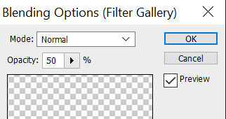
3. Click on the little arrow next to it and adjust the opacity. I usually like to set it to 50%:

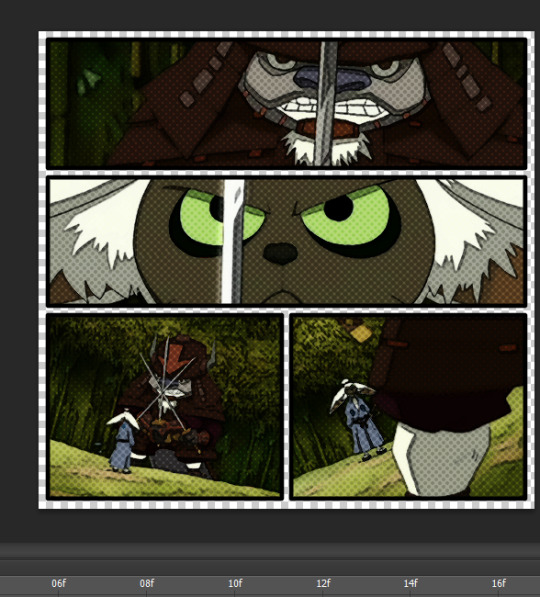
4. Now, to add the halftones click on filter -> pixelate -> color halftone. These are the settings I recommend using:

5. Click on the little arrow next to the halftones filter and adjust the blending options. I recommend setting opacity to no higher than 50%. You can use overlay, soft light, or darken - again, I usually play around with various setting until I find whatever I think looks nicest. These were my settings for this particular gifset:
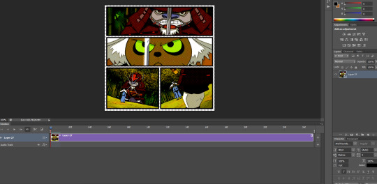
So now our psd looks like this:
6. Final step is to add some coloring - I went for a bright & greenish coloring, so this is what I ended up with:

And now the gifs are complete. All that’s left is adding sound effects.
2.1 Save and Reopen (Optional)
A thing I like to do before adding sound effects is to save my gif and then work with the gif as a fresh psd. My photoshop starts to get really slow once I add all these filters. Adding the sound effects requires analyzing every single frame and this is a pain when photoshop is being slow. I find saving my gif and working with that instead makes photoshop much more tolerable so I do recommend these quick steps:
1. Save your gif. this is what it looks like currently:

2. Open your gif in photoshop:

3. Switch to timeline mode & convert to smart object:
4. Save as a new psd, which we will now be working on.
Ok, now onto the sfx!
3. Adding Sound Effects
For the sound effects there are actually two parts here: getting the sound effects and then animating them:
3.1 Getting/Making Sound Effects
First step for adding sound effects is to get the actual png images you will use. I actually got all my sound effects off the a:tla comics. This process is pretty straightforward:
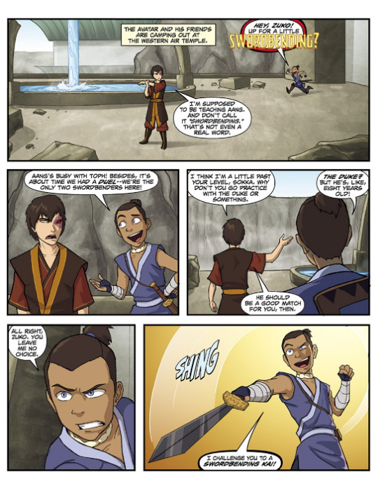
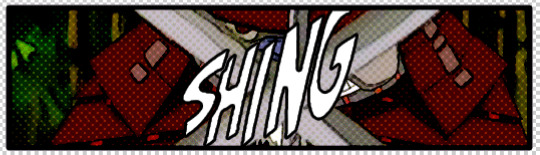
1. Open the online comic book (I recommend comiconlinefree(.)net), find the sound effects you want and take a screenshot (I use snipping tool for this). For this particular gif, I am using the ‘shing’ sound effect from the bottom panel:
2. Open the screenshots in photoshop, and use the pen tool click on each letter, then right click 'layer via copy’. You should now have a separate layer for each letter.
3. Highlight all of the individual letters, right click, and convert them into a smart object. Then add stroke (I used 3px):

You can also use layer style -> color overlay if you want to change the color.
And I repeated the process for the swish sound effect:

Now that we have our sfx, it’s time to add them to the gifs!
3.2 Animating the Sound Effects
Ok, this step is definitely the most tedious. I recommend doing this one panel at a time. So let’s start with the first one.
1. Using the timeline feature, go frame by frame until you’ve decided where you want your sound effect to start. This is the frame I’ve decided I want the sound effect to start on:
2. Now drag the sound effect onto the psd and use transform (ctrl + t) to resize accordingly:
3. Add a layer mask (layer -> layer mask -> reveal all). Using the rectangular maquee tool, draw a rectangle around the panel the sound effect will be in:
Then right click -> select inverse. Now, with your layer mask selected, click on the paint bucket tool. Set the color to black and click on the psd. Unlink the layer mask from the layer by clicking on the link symbol in between them. Your layer mask should now look like this:

This will prevent your sound effects from flowing outside the panel.
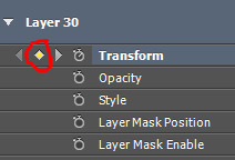
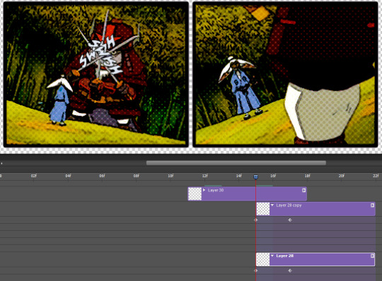
4. On the videotime, click on the arrow to the left of where it says ‘Layer 30′. Then click the little clock to the left of ‘Transform’. It should now look like this:

5. Move a couple frames ahead. Click on the diamond by the transform button:
Now, use transform (ctrl + t), to resize/rotate/move your sound effect to where you want it to be in this frame:
6. Move a couple frames forward and repeat:

Continue doing this until your sound effect animation is over.
7. Repeat steps 5 and 6 for the other sound effects you want to add. This is how I animated the ‘swish’ sounds in the 3rd panel:

8. Now our gif should look like this:

9. Final step: save your gif, reopen and adjust the framerate (if necessary). And this is our final product:
And we’re done! Then you can just repeat for every other gif in the gifset!
I hope this tutorial was helpful - please let me know if anything is unclear/there are any questions. If you use this tutorial to make a comic-style gifset I’d love to see your work so please tag me in it! I track #kahtaras
#mine: tutorials#mine: all#completeresources#itsphotoshop#allresources#dailyresources#quirkyresources#ihaveresources#onlyresources#ps tutorial#gif tutorial
405 notes
·
View notes
Note
Hello! I was wondering if you could please make a tutorial for colours? I absolutely adore your colouring/ effects and I’ve been struggling with it for years;;v;; so if it isn’t too much trouble that would be amazing! Of course if you can’t that’s fine too, I completely understand! Thank you sm for giving us amazing art💕💕💕
waah thank u so much thats so nice...🥰💕!!
i love to help when i feel like im able to give Real advice and not just “yeah idk this is just how i do things”. these are some basics ive learned from painting and drawing classes that i try to keep in mind while coloring (even though i dont always do it haha but it IS at the back of my mind)
i made these diagrams quick just to get some points across as easily as i can i hope its not too hard to understand (also i hope you can read my handwriting..)
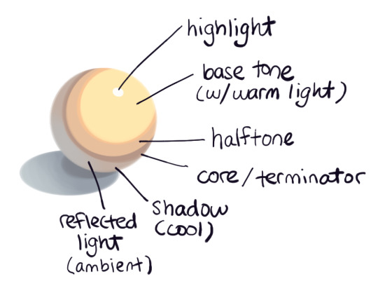
its easiest to practice these ideas on white objects because theres no real local color to worry about. just the colors from your light source and your shadows. warm light creates cool shadows and cool light creates warm shadows. but shadows are also made up of the reflected (bounced, ambient, diffuse (theres lots of names for it)) colors of nearby objects. light bounces and so does the color it bounces off of. these reflected colors will be less extreme (more neutral (grey)) and mix with the color of the light source a bit.
from top to bottom: the highlight is where the light hits your object most directly. this can be a really hard light like in the pic or really soft depending on the source and the object itself. base tone is just the color of the object affected by the color of your light source (warm/cool). it may also have a saturated edge. halftone is where the light meets the core shadow. this area is usually less saturated as its further from the light source. the core is the darkest part of the shadow and occurs right where shadow meets the halftone. think of it like an edge. even round objects have this though it’ll be harder to see. then the real shadow which is...a shadow haha but aside from being a cooler version of your objects true color it’ll also be comprised of the colors from light bouncing off nearby objects. thats the reflected light.
now with color!

ive seen some “how to color” posts on here that say to avoid greys, and thats not true! neutrals are very important, especially when it comes to complimentary colors. sometimes its hard to tell that a color youre looking at is actually pretty grey, and that has to do with the colors its surrounded by. can you see the reflected light on the red ball? looks a little blue (or green depending on which youre looking at) right? but its actually just a neutral red! the blue affected color is cooler and the green affected color is warmer, but theyre both still neutral (grey) reds. even some of the red has reflected onto the green surface, making that a warmer neutral tone as well. neutrals are everywhere! its kind of hard to find (naturally occurring) highly saturated colors.
moving from yellow to green might not take many neutral tones because of their proximity to each other. but the farther your colors get from each other, the more neutrals you’ll need to transition between them. all colors have one thing that connects them, and thats grey haha. dont be afraid of neutral tones! but still dont shade with black!!

on top of going neutral i also always try to shift the hue as well. sometimes this is really subtle or extreme depending on the situation and what i feel looks best. subtlety can also go for neutrals. in the end, youre just looking for whats most visually pleasing. and thats subjective! and can tie into your style. i dont Always shade with neutrals. like with skin, sometimes it can be better to have more saturation (sometimes i just go straight down too only barely changing saturation, or not changing it at all). but for the most part i move towards the grey side of the box and not the saturated side.
this is pretty long and im not an expert or anything but i hope its helpful!! here are a couple videos on the subject as well that i feel do a pretty good job explaining these ideas, and go into some more depth than i do here. one about ambient light, and one about shadows and colors. it can also be nice practice to just color pick from photographs so you can learn to recognize colors better as well :)
#i hope you see this anon! let me kno if you do!#otherwise i'll prob boost it haha#long post#color tutorial#art tutorial#colors can be overwhelming but i love them...#replies with lexi#ive re-read this like a million times i think i got everything.......#Anonymous
147 notes
·
View notes
Note
hiya, I really love your art, and how you make your latest stuff look really vintage and aged, it’s really super cool and I was wondering if you’d be willing to share your process for that?? thank you so much and I hope you have a wonderful day!!! :D
aww thanks so much! and of course i can share my process, no prob!! ^^
i’ll be using this piece as an example, and uh, for the context of it u might have to look on twitter lol. but whatever

it’ll be a bit long so everything is under the cut
(this is just based on my process, and i know its weird and csp specific.
feel free to pick and choose pieces from my process!)
and also the programs i used were procreate and csp and i have a mac. u could probably do this with other set ups, but this tutorial might not be super helpful near the end
i usually make my lineart in procreate and import it into csp as a .psd file

for this, in procreate, select the file you want to export and click PSD and then I airdrop it to my mac.
i think the only thing about the lineart i have tips on is to keep it toothy/gritty if that makes sense?
i use the 6B pencil in procreate with a bunch of tweaks to the pressure sensitivity and opacity/size change.
but anything with a good size jitter should do the job!
in csp i shade and color the piece.
picking out the colors is a whole other mess
feel free to ask about it but ill skip for now ;v;

flat colors

csp has a lot of nice halftone options!
group up ur lineart and everything thats black rn in a folder and above them set a clipping layer to add
fill it with a color lighter than black; the less pure blacks and white u have on a piece the better
feel free to go to town w the grunge or noise texture of ur choosing! the grittier the better bc during this step i try to get the feel of worn off ink. just make sure the linearts still visible, though. u went through all the trouble to make it after all! ^^
(i have specific brushes but again thats something else u can ask me about)
above all the layers, make a multiply layer and do something similar.
same advice as above

this is ur “paper” texture, tho, so try to keep it more even in tone so things don’t get too messy
(but if it works for u, feel free to do it! find what works is my advice!)
ok time for some super csp-specific steps (sorry to non-csp users)
the csp asset store/website(?) has a lot of nice textures and brushes available.
look through it if u haven't
it will make ur life so much easier
theres a really nice tileable watercolor texture set there
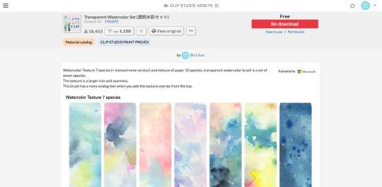
(this one specifically)
(it also had some really good paper texture bc whoever made this is a godsend)
i slap that over the color layer, set it to clipping, and mess with the blending modes
its usually a tossup between soft light, overlay, multiply, and the overlay texture effect tho
theres another optional step of using the overlay texture effect on a paper texture
i didn’t do it on this example sorry :’(
i think i used another watercolor texture set to soft light on this piece?
after that, if u want, i like setting a noise texture at a v low opacity over everything for extra jitter

(i use this one. u can just make it in csp and probably any other drawing software but im lazy lmao)
save it as a png/jpg/etc.
and ur done!
i do some extra stuff to the final image like scale everything down and add a bit of a 3D effect for a bit of extra kick
(but again thats a bit complex and specific so feel free to ask but ill keep it short
for your sanity’s sake)
(and once again, the final image! ta-da!)
some tips to keep in mind i guess
jitter, grit and noise textures are very good things when u want something to look rough
avoid pure blacks and whites; most paper isn’t printed pure black or white and it only gets more faded and colored with time
if ur super lost, look at reference!! theres a lot of good artists and media out there to get inspiration from, and looking at scans of actual old comics is a nice way to see if ur work looks aged
(also u don’t have to use old comics as reference; i like looking at old vcr footage for reference bc of the texture!! :D)
that’s all i have for my general process
uhh for specifics feel free to ask
i can make more tutorials but this one is a general overview, i just didn’t to take up too much of ur time….
but i really hope it helped! and im very sorry if it didn’t
i’ve never made a tutorial so im sorry if it didn’t answer ur question and also im sorry if this one’s not very useful
thank you for reading!!!
and thank you to whoever asked! :D
54 notes
·
View notes
Link
T-shirt design is a hugely popular outlets for creatives. Whether you're an illustrator, graphic designer or typographer, the idea of putting your designs on T-shirts can be hugely appealing (not least because you can sell your designs online).
However, the process can be daunting. Here, I'll walk through my best tips for designing custom T-shirt graphics and printing your own T-shirts.
(And if you need some drawing tips, head over to our How to Draw article.)
01. Take time to explore your concept
Sketch your T-shirt design out, go for a walk, create a few variations, have something to eat, do a full brainstorming process. Then sleep on it. And do it all over again. If it comes to you straight away, great. But explore other creative options just in case.
02. Imagine the design on a T-shirt
Having worked for both print and web over the years, I know the vast difference between design on screen and a printed piece. Don't be afraid to mock up your T-shirt design on a photo of a model. Print it out if necessary and place it on an actual tee. Make sure you see your artwork at actual size.
03. Detail is king but keep things simple
Everyone appreciates great drawing ability and attention to detail. There's nothing better than seeing a really well executed masterpiece on a tee, which you can study for hours.
But, equally, some of the most classic T-shirt designs are the simplest – and get the message across through their simplest form. Anywhere in the middle and you may struggle to deliver a successful design.
04. Consider your market
This is an important one. Are you designing for male or female; young or old? At the end of the day you're designing a product that you want people to wear.
Like a good brand designer would do, write down the exact person you want to attract to your T-shirt design – who they are, what they like, what other brands they like and go from there.
05. Keep your humour subtle
If you're going for a humorous T-shirt design, you don't want it coming across as a cheap and low-cost joke shirt. Even the most successful loud and in-your-face designs have subtle humour.
I'm not a fan of 99 per cent of humorous tees, but done correctly, humour can turn heads. I'm digging Brad McGinty's designs at the moment because he has a good balance.
06. Choose the right colours
Use the T-shirt colour effectively and try choosing complementary colours. If you're using Adobe Illustrator, turn on Global Colours. It's an absolute life saver and will save you so much time. (You can get Adobe Creative Cloud here.)
You can also use Halftones to make the most of the restricted colours you're allowed to use.
07. Prepare your artwork properly
Use Pantone Colours when screen printing – your printer will love you for it. They'll also love you if you outline text and expand any strokes you may have. There are plenty of good tutorials out there, depending on whether you're using Illustrator or Photoshop.
08. Source a good printer
So your design is finished and properly artworked, but your tee will only be as ever as good your printer. Try a reputable company like White Duck in the UK or Hey Monkey in the US. You could even give your local screenprinter a call. But it's important to take time to learn about what type of tee you want to print on.
The weight, sizes, labeling options, cost and so on all affect the end product. This takes a while and will require speaking to various companies, but one thing is for certain: deal with a company that wants to treat your tee as an end retail product and will handle your work with care. Screenprinting is an art.
09. Get educated
To have a good understanding of anything, you need to study it and understand its context. Tees have come out of every subculture phenomenon that has ever existed, whether it's music, skateboarding, street art, sport or general pop culture.
Find out about them and and have an appreciation for it all. One good book for reference is Vintage T-shirts by Lisa Kidner.
10. Be ahead of the game
Be inspired by what the latest trends are, but don't copy them. Chances are by the time you've seen that T-shirt produced, other designers are moving onto something else behind closed doors.
0 notes
Text
Intaglio Drypoint
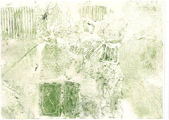
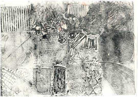
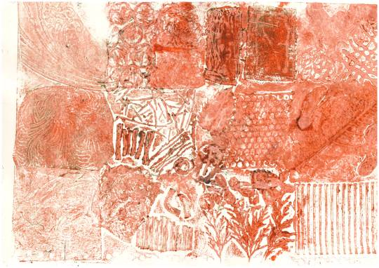
For our first print workshop, we began with the intaglio/etching printing technique, where (traditionally) we treated a metal plate with acid to achieve the desired image. In our case, we were to scratch into acetate using a scraping tool, which is called drypoint.
There are many different types of intaglio:
Engraving - a design is incised with a cutting tool (burin) into a metal plate (usually copperplates). Engraving only produces linear marks, so shadows can only be made with crosshatching.
Etching - as described above uses a metal plate incised by acid to achieve the image.
Drypoint - this is an engraving method in which the design is scratched directly into a metal plate with a sharp instrument, explained above.
Aquatint - a variety of etching, this produces prints which resemble watercolour paintings, in which a metal plate is exposed to acid through a layer of resin. This allows a variety of different tones to be achieved as the metal plate can be exposed in the acid for various different periods of time, giving different strengths.
Mezotint - is a method of engraving a metal plate by evenly pricking it’s whole surface, like dot work.
After etching our image, we then used a brush to push oil based inks into the etched acetate. Using blue roll we then clean off the excess ink from the un etched areas. Then, we dampen a piece of cartridge paper and put both the paper and acetate through the press.
There are a number of intaglio artists:
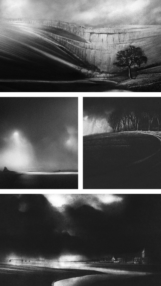
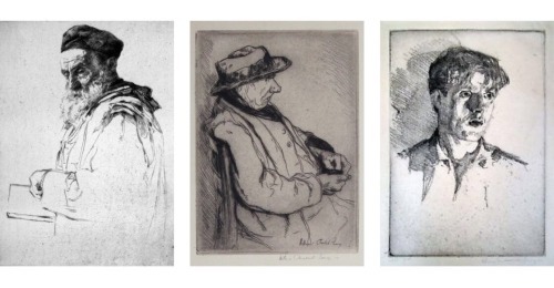
Chris Knox - Knox specialises in printmaking, producing mainly intaglio prints. His work captures the English countryside, highlighting the romance and moody aura it presents. His graphic style (influenced by fine art photography) uses high contrast and deep shadows.
Mikael Kihlman - Kihlman is a printmaker and painter, using the drypoint technique explained above. His pieces are extremely detailed, using many lines and crosshatching to build up shadows and darkness. I particularly Kihlman’s work, as I feel that they have a beautifully illustrative feel, as oppose to extremely realistic. Whilst they are realistic depictions, they look much softer than Knox’s, and somewhat more cheery and playful, which I think is why I prefer Kihlman’s work.
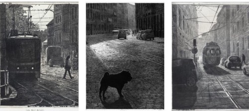
William Auerbach-Levy - Auerbach-Levy was a Belarusian born artist, best known for his paintings, etchings and caricatures. I really love his work, as other etching/intaglio artists specialise in dark, moody landscapes, whereas producing portraiture from etching is a completely different field, and one that Auerbach-Levy does extremely beautifully, especially by leaving the clothes and body areas just simple outlines.
I intend to use these artists as inspiration throughout the next two weeks of print workshops.
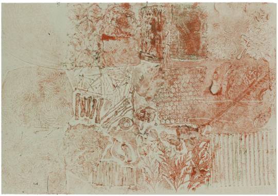
The image I chose to work with for my intaglio workshop, was one of a very spindly, textured tree. I wanted to produce only the outline and shadow, as oppose to the background of the image, as I knew I wanted to experiment with the page itself due to previous experience in intaglio printing.
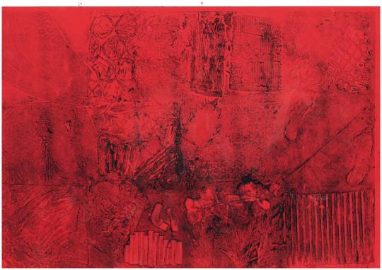
Below are my initial intaglio prints, done in brown oil based ink for a more natural and less stark finish than black ink. Oil based inks allow us to work back into the print with any medium we wish, such as watercolour or brusho.
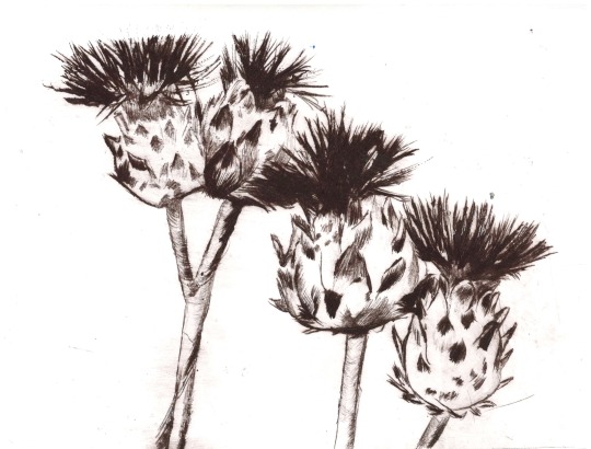
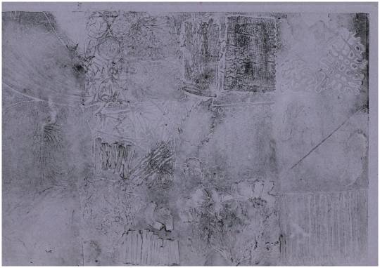
The print above was the best and clearest of the batch, with the perfect ink and pressure ratio. The print below had too much excess ink surrounding the etch, hence the smudged surroundings, and too little ink in the grooves, hence the weaker print.
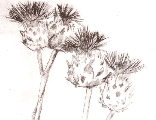
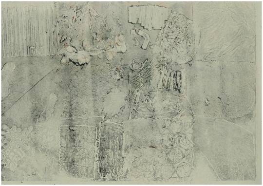
I worked into the first print above with watercolour, which I felt was very very effective and I was very pleased with my outcome. Here, I have cropped into my favourite part of the print, where the blending of the watercolour amongst the shadows of the print itself is very effective and realistic, whilst the two tone watercolour washed background adds depth.
Here I printed onto coloured paper, which I didn’t feel was anywhere near as effective as the watercolour, due to the single toned base, which made the print flat and dull.

Finally I used the weaker intaglio print as a base for a collage of tissue paper and sugar paper, in which I would then print over the top of. Whilst in theory I felt this would work very well, lining up the print with the collage exactly was very hard and clearly something I didn’t manage to do at all. If I were to try this technique again I would need to use a much less detailed print which would therefore allow room for error.
Overall, whilst I felt that the watercolour and intaglio print was very effective, I felt that alone I wasn’t a fan of the intaglio drypoint printing technique. The detail is very precise and I prefer a looser, thicker way of working (like lino) as oppose to something so intricate that doesn’t give a lot of depth or change for colour options when printing.
Intaglio - Mirrorcard
Mandy Bray - Bray uses mirror card to produce her “intaglio” prints, by etching into the mirror card with a scalpel (not all the way through as this would just cut up the mirror card). She then peels the etched areas of mirror card off, and rollers the ink across the card before printing through the press onto paper. This is a simple way of producing a print, and produces quite geometrical prints.
I produced my own mirror card, then rolled water based ink over and printed through the printing press onto plain and coloured papers.

Whilst this was a simple printing method, I didn’t feel I would be able to produce any precise prints of particular subjects as I find scalpels quite difficult to use, especially for curves and circles. For simple geometric shapes and patterns, however, it was fairly effective; more so on the top strip, as on the bottom strip (my first attempt), I hadn’t pulled enough of the mirror card off, therefore there wasn’t enough difference between the two surface heights and it instead just produced a blurred mess.
I tested the mirror card printing on plain paper, brown sugar paper, blue coloured paper and finally on brown striped paper. I felt it looked most effective on the sugar paper and the blue paper, as the colours stood out. I also think it could be effective to produce a repeating pattern, maybe even on fabric.
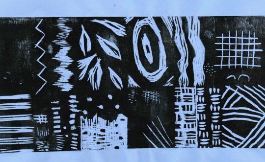
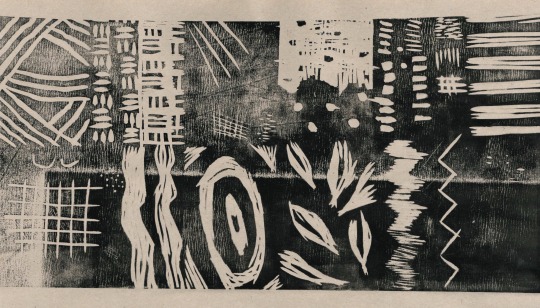
Lino - One Layer
Linocut prints are relief prints in which the image is cut from lino. Areas that are cut from the block leave the paper beneath, and areas that are left behind will be inked using an ink roller, and print the image. Paper is then laid on top of the lino once it is inked, and the two are put through a press, leaving the imprint of the image on the page.
There are many different types of lino print:
One layer
Multiple layers (using the key block method)
Reduction
We will be experimenting with all of these lino printing techniques within the next two weeks.
To produce a one layer linoprint, we firstly selected the image we wanted to use, and edited it in Photoshop to be a black and white stencil using the halftone pattern. We then printed this stencil, and traced it onto the lino using the graphite method. Once transferred, we then were able to use our cutting tools, a guard and a bench hook to remove the white areas from the stencil. Then, using water based inks, we inked up our lino using rollers and put this through the printing press with our damp piece of paper (which allows the ink to be better absorbed).
Sarah Robley - First viewed at the Rheged Print Fest, Robley’s work is playful and bold, featuring friendly animals and florals, inspired by the individuality medieval artists gave their animal subjects, alongside the wildlife of the Lake District and Folk Art. Her work is minimalist and illustrative due to the bold simplicity of line she uses.

Melanie Wickham - Wickham produces single layer lino cuts of cute illustrations, inspired by her small children and allotments. I love how sweet and funny her compositions are and I love that they aren’t as serious as other lino prints and whilst they have a lot of white space they still tell their own stories through their details. She explains the best piece of advice she ever received was to draw what you know, as this means you can be constantly inspired by small observations of every day life.
Neil Shigley - Shigley’s one layer lino prints capture the incredible character that life on the streets has given individuals in San Diego. He uses beautiful, bold line work to remove areas of the lino in the cutting process, producing messy, almost spiky marks of highlighted areas, and a deep, dark black contrast. I love the character and depth in Shigley’s work, as the emotion and years of life in each subject can be seen so clearly through his bold portraits and use of texture, mark making and line.
To begin with, we produced a mark making section of lino, to master the technique and understand the sort of marks that can be made, both positively and negatively. Below, both the lino plate and the print itself can be seen.

Individually, we all then were to create a section of a larger print using the one-layer technique previously described. This will then be printed onto a large piece of paper in sequence. We will also separately be able to print onto various papers and backgrounds to fully explore and test the technique. Below, my mark making prints can be seen on coloured paper (which I felt was extremely effective), and brown sugar paper (which I didn’t).
From here, I went on to cut and print my section of the collaborative print.
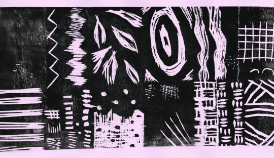
First, I printed with my first cut piece, but found that the areas I wanted fully removed were still picking up ink.
Then, seen above, after continuing to remove sections, I had completely cleared the nose area, but still wasn’t able to stop the main face from picking up the ink. My solution, rather than to cut out that area with scissors, was simply to only roller the ink over the parts where I wanted it, and therefore came with my final prints, seen below.

Again, I felt that the coloured paper worked best, and particularly liked these three matching tones, which I would put forward as an idea for the background paper for our collaborative piece.
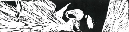
I then also experimented by printing onto magazine pages, specifically ones which were images as oppose to text. Some were too dark ( the final two below), however I felt that the first one pictured below was somewhat effective, as coincidentally the shadows and highlights actually lined up and the nose itself could still be seen.
Overall I really enjoyed this technique, and when we continue on to do both key block printing and reduction lino printing, I would like to develop this further, by experimenting more with mark making techniques and by continuing to use different backgrounds, such as newspaper and book pages.
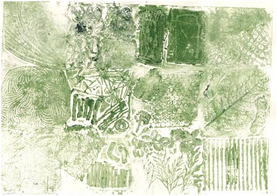
Collagraph
A collagraph consists of a collage of materials glued to the printing plate (cardboard). When all of the materials are glued to the plate, paper is then pressed onto the surface, creating the print. The ink will be in the negative space of the texture, and the raised areas will not be printed. Instead, the grooves and wells will provide the print.If a smooth surface is inked up, the relief can be faint/ subtle; however if a textured surface is inked the relief will instead be strong and defined. Some textured items include wallpaper, twigs, corrugated cardboard, string and hot glue. Some subtle textures include thread, tissue paper, plastic bags, fabric and tinfoil. Once all are stuck to our printing plate, we then need to varnish over the entire plate. Once complete, we are then able to try both water-based inks and oil-based inks, using a paintbrush to apply, then after removing excess ink we can produce a print by running it under the print press with a damp sheet of paper.There are a number of artists who use this printing technique, including Amanda Taylor, Lyn Bailey and Bill Flowers. This technique can additionally be used to produce a collagraph plate of a subject such as an animal or portrait.
Jet James - James’ collagraphs depict portraits, using often experimental materials and processes, regardless of the fact collagraphy is under the ‘traditional printmaking’ umbrella. He creates a tactile surface; etching, spraying, collaging, embossing and even burning the surface. He is inspired by the experimental mind and expressive linework of Brett Whiteley. I love James’ work as his portraits are so clear, yet so intricately detailed and filled with texture, producing tonal values alongside contrasts.
Sue Lowe - In contrast to Jet James’ portraiture prints, Lowe’s work focusses on textures and surfaces, drawing her inspiration from landscapes and organic forms, with her work depicting growth, erosion and decay. I particularly love Lowe’s work as I love how heavily textured yet intricate her outcomes are, and I also love that her pieces make the viewer feel how where the piece is inspired by. Her prints inspired by the sea front, seen below, make the viewer experience the raw and organic forms found at the sea, and her perfect colour palettes emphasise the deep, moody and mysterious aura that the sea brings.

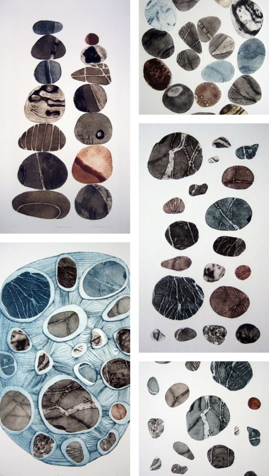
Tessa Horrocks - Similar to Lowe’s work, Horrocks produces collagraphs which depict natural and organic forms, creating images about ‘worlds within worlds’, matching the feelings and energies inside herself to her surroundings. She uses the collagraph technique due to its simplicity and the textures it gives. My favourite collection of Horrocks’ work, is her recent series of prints celebrating the pebble. I love the simplicity of her pieces and her natural, dark and raw colour palettes. I also feel inspired by her work as such a simple concept can be made so interesting due to the un uniformed textures and patterns collagraphs produce.
To produce my collagraph plate, I used twigs, pieces of bush, tissue paper, tin foil, straws, string, hot glue, wax, bubblewrap, plastic, etc. Then, I applied oil based ink with a brush to the varnished plate, before running it under the printing press with a damp sheet of paper.
After my first print run, I realised that my prints weren’t producing “negative” prints, because I hadn’t remembered to buff the ink off the raised areas of the collagraph plate.
Green on plain paper worked the best in my opinion, as it gave a natural, raw aura which matched the recycled materials used to produce the collagraph board.
I wasn’t as much of a fan of printing onto sugar paper as oppose to plain paper, as seen below it made the print seem dull and wasn’t very effective at picking up the ink.

Once I had remembered to buff the raised areas it began to print correctly, as expected, and these prints can be seen below.
I didn’t feel the red coloured paper worked very well at all and thought maybe it was too thin. so picked up too much ink in some areas and not very much in others.
The print onto green sugar paper worked best as the raised areas are clearly blank, leaving the negative spaces inked up to allow a print to be produced.
Overall I felt that it was difficult to produce the negative print properly, due to my objects being fairly raised which meant it was hard for the paper to catch the ink from the negative space due to the height difference. I was quite pleased with the prints that were printing the positive space as oppose to the negative, regardless of if they technically didn’t reflect the collagraph technique. If I were to do this again, I would ensure that my collagraph board didn’t have such raised elements which would allow it to properly print the negative areas. Whilst I really enjoyed the process of building up the collagraph plate, I am informed that it is very difficult to produce a print of an actual subject, and therefore if I were to return to this technique I would do so in Horrocks’ style, producing sheets of prints and then collaging them to produce an outcome.
Lino - Reduction
Reduction lino printing begins with us carving into a lino block, the same as in single layer lino printing. We then do one round of printing onto each sheet of paper in one colour. Then, we carve out more of the same block, removing different sections and areas, and doing another round of prints in another colour. This carving and printing continues until the final round of printing is complete; with many artists described below using the technique.
Ian Phillips - Phillips specialises in consecutive series of prints taken from drawings done whilst walking long distance footpaths in his explorations. He explains that he ‘tries to catch the delicate sensibilities of seasonal weather and dramatic natural compositions’, focussing on the process of gouging and cutting, producing textures and pattern; regardless of the initial scribble.
Bryan Angus - Angus is a Scottish visual artist who’s reductive lino prints depict the ‘drama of the land and weather, enriched by the history of the people and their towns’, influenced greatly by 20th century Scottish and English illustration traditions. I love the immense detail Angus portrays, whilst still consistently having a recognisable illustrative style and beautiful colour palette.
Claire Scully - Scully is a multi-disciplinary illustrator, author and educator. Her work focusses on pattern, line and details, looking at ‘landscape and memory’, the environment and the world and space around us. I love her work as it is very illustrative and works effectively in the reductive print technique.
These artists have influenced my style of reduction lino printing, specifically Angus and Phillips’ colour palettes, which will be seen later.
First we began creating the initial image from which we will produce our print in Photoshop. To do so, we needed to open the image in Photoshop, and set the size of the document to the size of the lino (15x15cm). Next, when the image has been resized to the size of the lino and the layer has been duplicated 3 times, we use the Threshold image adjustment on the top layer, making sure the only black is a heavy outline; not shading. Next, we hide this layer and do the same for the second layer, this time allowing a more dispersed shadow. Lowering the opacity of the first layer should now give an image in black, grey and white; seen in the three tests below.
From here, I decided the rocks were most effective, however I felt that the immense level of minute detail would be too difficult as a first time, so cropped the image, focussing on the rocks themselves, seen below.
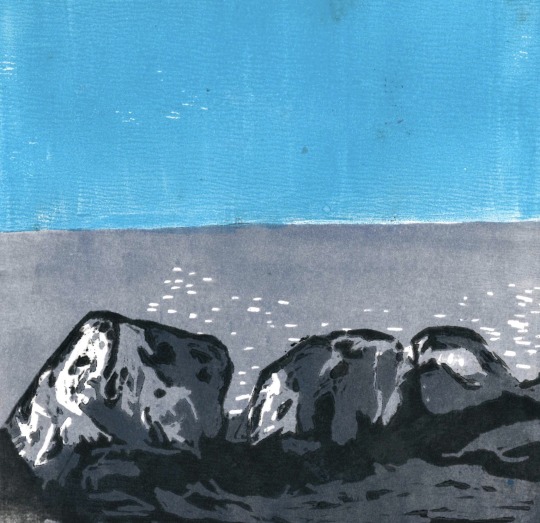
From here, I transferred the image onto the lino, and first printed the skyline without anything else. Once complete on around 15 prints, I then cut out the white areas first, and printed with my lightest colour (duck egg blue). Next, I went on to cut the next lightest area, printing with a shade darker of the blue. I then did the same again on the second to last darkest areas, printing with another shade darker blue. This stage of the printing process can be seen below.
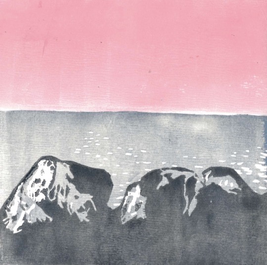
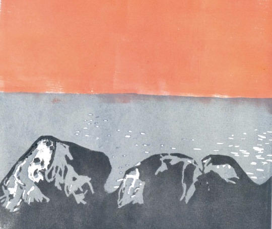
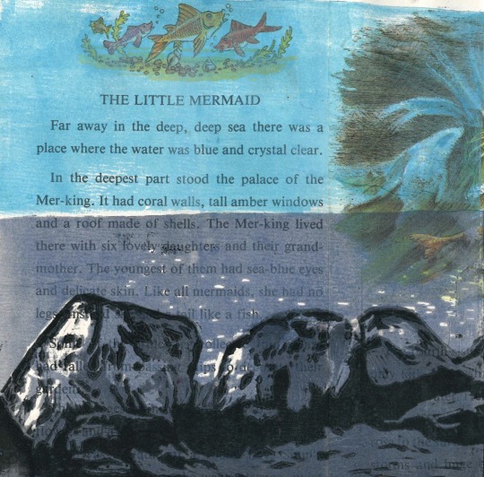
Finally, I was left with the shadows and printed these in black, with my final prints pictured below. I tested this printing technique not only on plain paper with different coloured skylines, but also on torn newspaper and book pages backgrounds, as well as onto handmade paper. My favourite can be seen directly below, which I felt was very effective due to the “The Little Mermaid” title, which matches the theme of the print, and the accidentally appropriately placed mermaid, who looks as though she’s sitting on the rocks. I also felt the handmade paper was very effective, as the colours in the papers were so different and allowed the highlights to stand out.

I loved this printing technique the most out of everything we have tried so far, as I not only found it very effective, it was also very satisfying to do and I found that the gradual build of the outcome made me really enjoy this technique.
Key Block
Key Block lino printing involves using one lino cut in order to produce more than one lino plate copies to work with; in turn producing a multiple layered print. This is different to reduction lino printing as key block uses more than one lino plate, and therefore doesn’t destroy any of the plates.
The ‘key’ lino plate is an outline, used as a template on other pieces of lino the same size. The other lino prints are the colouring in of the ‘key’ lino plate, and the ‘key’ plate is printed last. There are many artists who use the key block printing method:
Valerie Lueth + Paul Roden - a husband and wife team, they use traditional printmaking to produce contemporary artwork, as they feel printmaking is the most accessible of the fine arts. Their prints are original drawings, drawn onto blocks of birch plywood as oppose to lino, but carved and printed using the key block method. Each block adds separate layers of colour and wood grain texture to the finished print, adding the key detail (black) last. In the print pictures below I love the immense detail obtained from 4 hand drawn and hand carved woodblocks; I feel the intricacy is amazing and can’t believe the amount of time and work that must have been put in to produce such detail.
Andrea Lauren (Ink Print Repeat): Lauren’s work is delicate and wholesome, where she focuses heavily on her colour palettes for her prints, focussing on nature and creatures at the forefront of her pieces. I love how soft cute and full of character her animal prints are, yet how detailed and intricate her wildlife prints are.
To produce our outline for the ‘key’ plate, we were to find an easy, simple object and use Photoshop to make a line drawing of this image (or this bit can be done by hand by simply drawing the outline straight onto the ‘key’ plate), then cut out all of the lino except the lines. Using oil based printing ink, we then transfer a print onto a piece of acetate (using a baron as oppose to a printing press). Then, we line up the print onto a new piece of lino and print onto the lino (with the baron again). After leaving to dry, we then cut out the line as oppose to the inside and background and print again. This print will fill in the image.
Inspired by Lauren’s character filled animal prints, below is my initial print from my ‘key’ plate, in which the areas I wanted plain were still picking up ink. I went back in with my lino cutter and removed some more, then printed again, seen below. From here, I follow the steps explained above, and made both plates, then printed with them.
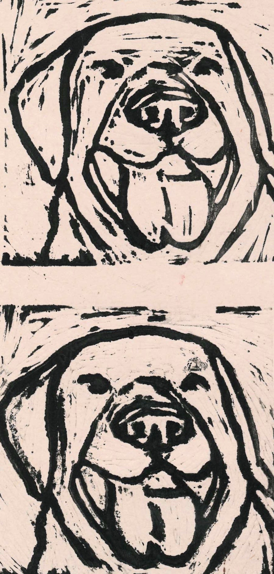
Firstly, I printed on cream paper, which I didn’t feel was as effective as it could have been, due to the fact I had cut out the tongue and nose to allow them to be a different colour to the body of the dog.
From here, I tried a pink background to allow the colour of the tongue and nose to match and be realistic. This shade of pink was too neon and came through the brown colour of the dog’s fur, which I didn’t like as I didn’t feel it was very effective.
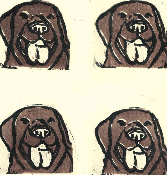
Here, I went on to use more muted colours, starting first with a soft taupe colour, which I felt was effective and matched the tongue and nose realistically. The better looking prints were those with a much darker outline (the two on the right), as they were considerably clearer.
I stuck with the pale coloured background as I knew this worked and moved onto a very pale baby pink paper. This was by far the most effective and my favourite print, as I felt it was the perfect colour to add character and wasn’t too bright that it seemed unrealistic.
Surprisingly, I also really liked the outcome on blue paper, however the pink was still my favourite. The blue added a more playful, interesting element and made the fur more cooler toned.
Overall, I really enjoyed the key block printing technique, the same as I enjoyed the rest of the lino techniques. I think if I were to revisit printing at all in the future it would definitely be lino that I return to as oppose to intaglio, as I feel it produces the most illustrative, character filled outcome that can be applied to anything, be it portrait, landscape or inanimate objects.
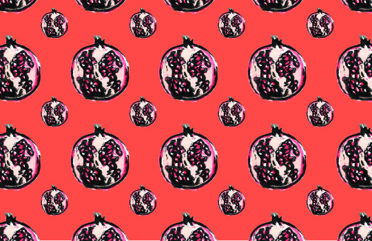
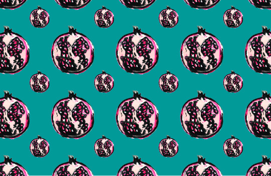
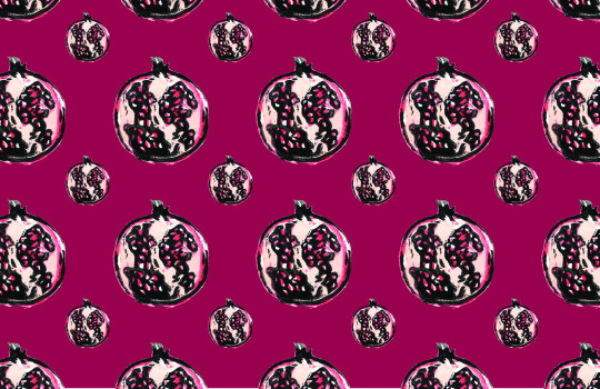
As we were told we would be using our key block prints in our textiles workshop later, I decided that I would create a new print of something that would work better as a pattern, for when we experiment with surface design and embellishment. I decided to go for a pomegranate, and cut out three layers this time. I printed this as a pattern first onto white cotton fabric, which worked well.
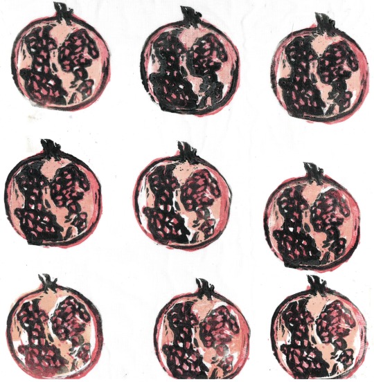
I then went on to try printing using a ‘drop’ pattern, the way bricks are placed. I liked this pattern more than just rows, so if I were to print a wider range of fabric I would use this repeat pattern technique.
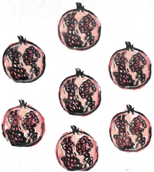
I also tested printing onto a patterned fabric, and again onto plain paper to use later. Finally I tested printing onto a blue watercolour on fabric background.
I really liked this effect and from here decided to scan in the prints on the plain fabric and crop the best one, then create a repeating pattern, following the tutorial from illustrator Polly Vadasz linked here.
I loved this process and found placing it all together very exciting and rewarding, and saving it on Photoshop as a pattern meant I could then go on and put this pattern on any sized canvas and on any background. I varied the size of the pomegranate to try and make the pattern more interesting, but wasn’t sure if this was effective, therefore in the future I would like to do more fruit or maybe leaf prints and add them to this pattern to make it look less uniform.
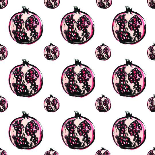
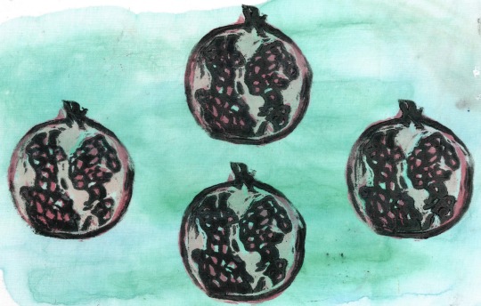
I also tested lots of different colour ways for the background of the pattern, which was effective and with different prints included would be even more effective.
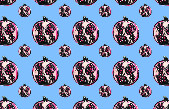
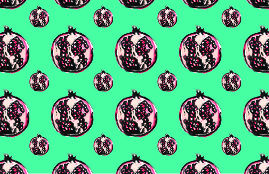
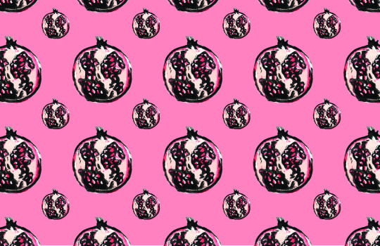
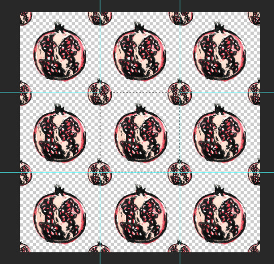
From here, I intend to print these patterns and colour ways onto fabric and sew into them, adding freehand machine embroidery and beading/embellishments, as well as doing the same again with the original prints on fabric. I really enjoyed doing these prints and learning how to produce patterns in Photoshop, as I felt it was very effect and therefore in my own time I intend to continue to built upon these skills and develop my prints and patterns further, especially as we come to our textile workshops.
Stencils
Stencils are a very rigid way of printing which produces a print through the black areas of an image, and can be done many times repeatedly in different colours and with different techniques. There are a multitude of artists who use stencils, famous ones including Banksy and Shephard Fairey.
Julie Hickson - Hickson uses stencils in her pieces alongside acrylic paint, producing her “prints” of Australian botanicals and coasts on canvas in limited series. Her work reflects organic line and shape due to the stencil, which is combined with painting to add colour, combing ‘the best of both worlds’. She draws to begin with, following this by arriving at her final design which she then cuts through either the positive or negative to produce her stencil. I think her work is effective due to her distinctive mix of both painting and stencil, which is beautiful and almost is more of a surface pattern design than a traditional painting.
Felice Varini - known for his geometric paintings in rooms and other spaces, Varini uses a different style of stencil work, projector-stencil techniques. He creates illusions of flat graphics by superimposing them onto 3D surroundings using an eye-deceiving technique called anamorphosis. The shapes can only be seen at certain angles. I love how different this technique is to the rest, blending the world of stencils, architecture and graphic design.
David Soukup - Soukup produces hand-cut stencil prints of urban architecture, cataloguing city life and the decaying alleys and fire escapes from simpler times. His work, however, is not simple in any means, and his stencils are so intricately detailed that they provide heavy textures to the point where his work is a blend between stencil art, graphic design and photo-realism. I am amazed by the detail in Soukup’s work, and feel in disbelief that these beautiful ‘paintings’ are actually produced with a stencil. It has made me realise that stencils don’t have to be used for big, simple, geometric shapes or portraits, they can in fact be cut into on a tiny, busy scale to produce something unbelievably detailed.
To produce our own stencil, we first use the threshold technique on Photoshop to produce a black and white image. We then transfer our image onto a sturdy piece of card, following the black in the image, outlining the shadows and filling them in with black marker. Using a scalpel, we then trace around the outlined shadow and remove the pieces from the card, leaving the white behind and ‘bridging’ any areas of white that are alone in the midst of soon to be removed black so we don’t lose them.
Two layer - The two layer stencil process begins with making two copies of the image we will be using, in black and white. First we follow the black in the first image, outlining the shadows and filling them in with black marker. Using a scalpel, we then trace around the outlined shadow and remove the pieces from the piece of card, labelling this sheet ‘dark’. For the second stencil, we do the same again, this time following the mid grey values, labelling this sheet ‘medium’. Finally, we place the medium stencil on the desired surface, spraying in a light colour through the stencil. Once dry, this stencil can be removed and the dark stencil can be put in its place; when this time we take a darker colour and spray through the stencil.
Stencils can be used on top of previous mark making, plain paper, wood, newspaper and other surfaces. There are different techniques for printing with the stencil, including using a sponge to dab acrylic paint through, spray paint, flicking paint, dribbling paint, splashing paint and scribbling. It is also possible to use other stencils as masks.
I produced only a one layer stencil, but experimented heavily both with the background and the application technique. Below, I used blue acrylic applied through the stencil onto plain paper with a sponge. I focused a heavier application around the darker areas of the face (facial features) and a lighter one around the outskirts of the stencil, which I felt was effective, so did it again in two tones - red and yellow, which I felt was even more effective.
Here, I used sprinkled brusho through the stencil, using “ost. red” and “orange”, then spraying water through the stencil gaps. I was surprisingly pleased with this outcome, however due to the fluidity of the liquid, it dampened the stencil itself and bled under it in some areas, particularly the smaller details such as the facial features.
Next, I tried to make a negative version of the stencil, done by sponging white paint through the stencil onto black paper.
Towards the end of my experimenting, I tried the water spray onto coffee technique in the same manner as the brusho I had previously done. Unfortunately, the coffee needed considerably more water in comparison to the brusho and therefore the already soggy stencil was now soaked through. This meant that the coffee bled completely beneath all areas of the stencil, and there are therefore no facial features. I then finally tried flicking and splattering ink onto textured paper through the stencil. Due to the stencil being broken and soggy I therefore was unable to get any defined features, so ended my stencil testing here.
Overall, I felt that whilst the stencil was fairly effective to begin with, I wasn’t too excited by the outcomes and felt the image looked too rigid; then after a few “prints” the stencil was soggy and broken and therefore the prints didn’t work. If I were to revisit this technique I would definitely ensure I made my stencil out of something waterproof and sturdier, however I doubt that I will return to stencils due to their rigidity.
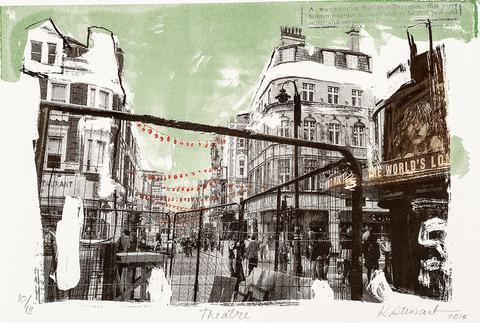
Screenprinting
Screen printing can produce intricate prints using a selection of photographs. It is used a lot in industry for repeating, predominantly in furniture and fashion design as it is an affordable way of repeating patterns.
Many of my favourite artists (illustrators in particular) use screenprinting to print their illustrations:
Lucie Sheridan - Sheridan’s work is very illustrative and focusses on bold, vibrant colours, shapes and characters. I love the layering she uses in her screen prints, specifically on the icecream on the right hand side where she clearly demonstrates her use of the screen print technique due to the transparency of the blending coloured circles. I find her work humorous, cute and I really enjoy the diversity she displays, mixing between illustrations of characters but also of landscapes and buildings, seen below, which are still clearly in her style but immensely detailed regardless.
Kelly Stewart - Stewart’s work is very sketchy and rough, but beautifully intricate and detailed in her quick style. I like how different her work and style is to all the other artists I have included, as it is a completely different outcome produced using the same technique as everyone else. I also think her individual colour palette of rough black and geometric regions of neon shades really makes her work stand out as her own amongst the rest, which can be hard as a lot of illustrators who use screen printing all have similar outcomes, which can be seen specifically in Sheridan and Roberts’ works, both included here which are very similar in style and substance.
Jane Ormes - I first viewed Ormes’ work at the Print Fest, which is very illustrative, using block colours alongside mark making to produce textures, characters and their surroundings. I love that she uses such block colours and shapes as the basis of her prints, seen on the left below for the hills, then works into them with mark making techniques to give the prints depth and texture.
Tess Smith Roberts - Roberts’ screen prints are by far my favourite. I love how clear the layers are in her prints, seen clearly below in the two layers of the mountain, and I adore her illustration style which she draws first before using as her image for her screen. I think this technique gives her work a great deal of character, as do her humorous words of wisdom which are at the heart of most of her prints. I also am a big fan of her colour palette, which consists of a lot of bold pastels, specifically pink.
To produce our own screen, we first begin by selecting an image and use a halftone pattern and the threshold method to edit the image and turn it into black and white. I chose three images to test, and from there chose the best one that I felt was most effective.
I added threshold to said image, and once I was happy then added the colour halftone filter, setting all the channels to 0 and setting the maximum radius to 17 (the higher this number, the bigger the halftone dots are). Then, I printed this image onto a sheet of A4 acetate and the screen printing process could begin:
Light sensitive emulsion is coated onto a silk screen and left to dry.
Once dry, our image is exposed onto the coated screen using UV light for 9 minutes.
Then, the screen is cleaned with water, loosening and removing the protected areas blocked by the black acetate areas. This provides a negative image.
Once dry, the screen is then ready to print with by pushing the ink through the uncoated areas of the screen using a squeegee.
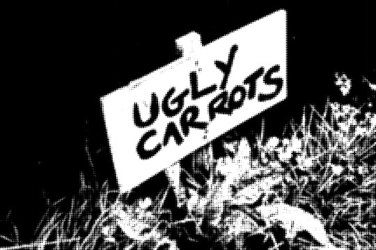
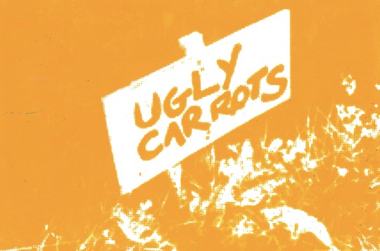
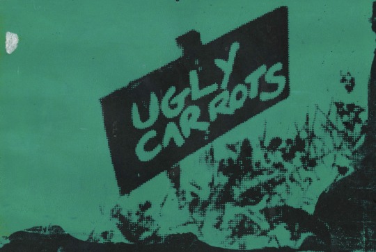
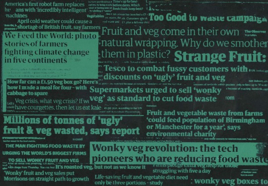
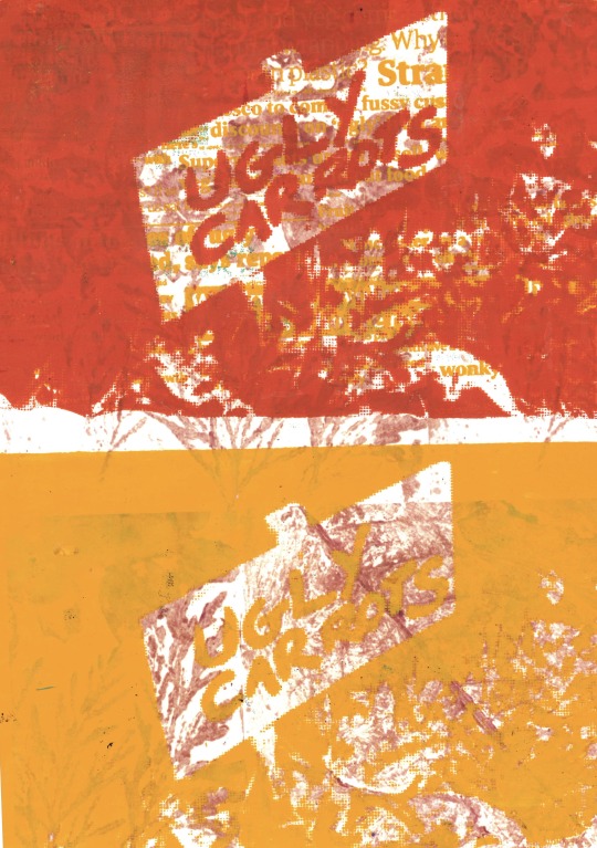
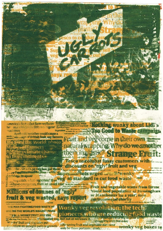
We did this whole process not just with our first image (my chosen was ‘ugly carrots’, but additionally with newspaper clippings assembled on A4 paper. I chose newspaper clippings that were relevant to the ‘ugly carrots’ sign, as I intended to print them over each other during my experimenting. Once complete, this collage can then be edited in the same way again with the threshold technique.
Likewise to stencils, there are many background options in which we can print onto, alongside even printing on top of other designs. Firstly, I screen printed onto plain cartridge paper. This was effective and gave a clear print, however I wanted to experiment more than this.
I tried again, printing over a repeated page of my favourite newspaper heading. Unfortunately my choice of colour didn’t work and meant that the print itself could barely be seen. If I were do try this again I would have to use a light coloured text and print over in a darker ink.
Here, I used duck egg blue ink on black paper. I was very pleased with this outcome, which was a negative print and didn’t want to do anything else to it.
Yet again, I made the same mistake in choosing colours which weren’t different enough to show the print over the text background.
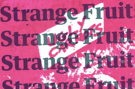
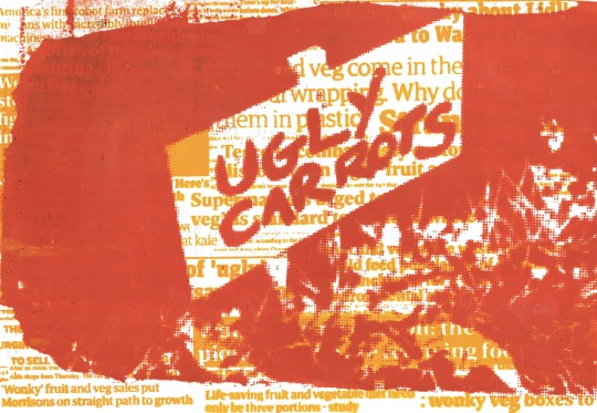
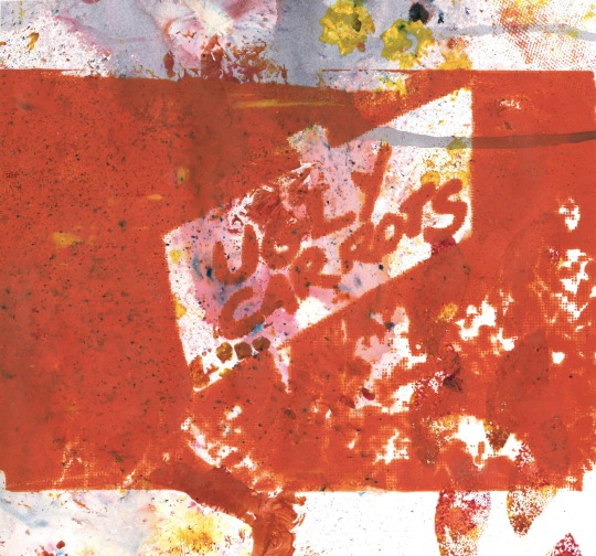
Here I began to get more experimental and creative. I started by layering both of my screens, starting with the headlines which I printed in warm yellow ink, left to dry and then printed my image screen above in orange. I was very pleased with this outcome as I felt it was effective and I had chosen appropriate colours, especially as the orange matches the carrot image.
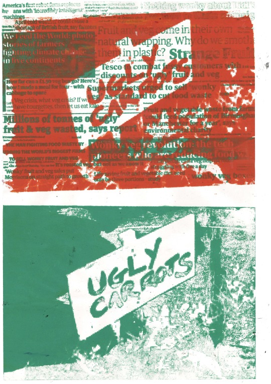
I continued with this orange ink and printed on top of my previous mark making sheet. I was pleased with this outcome also, however I didn’t feel it was as clear as I would like due to the splattered brusho background.
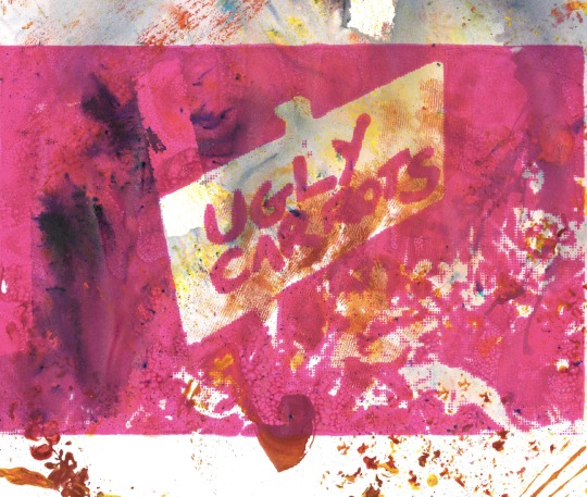
I did the same again, but with a magenta ink. I was very pleased with this outcome, more so than the one above as I felt the words were clearer on a less splattered background.
Here, I began to really experiment. I began by printing off a copy of an enlarged section of my collagraph print which I had made rust coloured. Then, I layered my headlines print in warm yellow, and finally once dry printed the ‘ugly carrots’ print on top with an orange ink. This was very effective due to my choice of colours which all allowed layers of transparency but still allowed the words to be read. Below that I simply printed the image screen onto just the enlarged collagraph. I felt this would have been effective if I had taken into account the colours as once again a lighter colour as the top layer and a darker as the base doesn’t work effectively and makes it unclear to read.
As I felt the three layer idea worked very well I went on to do this again, using my original green collagraph (as oppose to a printed enlarged copy) as a base, then printed using my headlines screen in warm yellow and finally went in with my image screen in dark green. Again, I felt this combination worked well, however when I did the inverse below it didn’t work and put the headlines at the forefront of the print, regardless of the order I had printed in. I didn’t like the green as much as the orange as didn’t feel it linked as much to the ‘carrots’.
Overall I really enjoyed screen printing and felt that it was a good technique to allow me to get multiple different styles of prints using any colours and any backgrounds at once. It also allowed me to get perfect layers and therefore if I were to do this again I would try with an image that could be layered, such as a portrait.
Gum Arabic
Gum Arabic is a transfer printing technique that produces a stencil like multi layered print that produces interesting textures in a vintage/distressed style.
To produce the print, firstly a thresholded image needs to be printed multiple times on different sheets of A4.
The first image needs to be covered, front and back, in gum Arabic solution on a magazine page (to prevent it from sticking).
Then, a mixture of linseed oil and oil paint is rolled onto the image and the inked copy is taken to a sheet of perspex in the sink, allowing us to spray water onto the white areas to remove the excess ink.
We then leave this to drain before placing the copy face down onto cartridge paper, adding a scrap piece of paper to the back and rubbing with the bottom of a spoon, and the transfer is then produced.
This technique can be done using multiple layers, however I really struggled getting a clear print at all using one layer, never mind three. If I were to use layers, however, I would have to do the same thresholding as in the reduction lino technique, with the first layer to print using the lightest ink and the most black on the image, then the second layer being a shade darker with less black and finally the third layer being the darkest ink with very little black.
Sue Brown - Brown uses the Gum Arabic printing technique to usually start her sketchbook pages and as a way of including photographic elements in her compositions. She not only uses the method as we will be, she also uses it as a colour separation technique, and additionally layers her transfers above collagraphs, seen in the image below.
Below is my first two attempts at transfers, which didn’t work at all. Whilst there was a happy medium of both white and black areas, the transfer didn’t manage to pick up any of the tiny details on the tyres and therefore the two just ended up looking like white circles which wasn’t even slightly effective.
From here, I decided to attempt transferring a different image, and instead tried a portrait. Again, I really struggled getting a print at all, as can be seen by the four attempts that didn’t pick up any facial features below.
Finally I made a much thicker concoction of oil paint and linseed oil, and left the paper to drain on the perspex for longer, which allowed me to actually produce the two prints below. The green worked considerably better than the blue/grey, and whilst I found the worn, vintage, distressed look quite interesting, I wasn’t overly pleased with the outcome and didn’t feel it picked up enough detail alone, therefore I didn’t even attempt to do more than a one layered transfer print.
Overall, I wouldn’t revisit Gum Arabic as I found it too unpredictable and I wasn’t overly excited by the outcome even when it did work. Although it is supposedly quite a fast printing technique, I found that in practice it wasn’t producing a clear print no matter how long the process took.
Monoprinting
Monoprinting is a print making technique which only allows lines to be made once, therefore only producing single, unique prints. We have visited monoprinting before in A-level, with the technique allowing a print of an image to be produced by rolling printing ink onto a sheet of perspex, then placing our plain piece of paper on top, with the image above. We draw around the image, producing an imprint onto the plain paper beneath, which picks up the printing ink and produces a print of the image we have drawn. This can be done to not only trace a photograph, but can be drawn straight onto freehand. There are many artists who use the monoprinting technique:
John Parkinson - is an illustrator and print maker, using ever changing techniques and colour choices. He uses freehand monoprinting in his work, producing detailed printed illustrations. I specifically love this architectural monoprint, as I feel the detail he manages to capture with a monoprint is admirable. Below that is a monoprinted illustration on a screenprinted experimental background, which I think is very effective, especially the colour palette.
Shirley Trevena - works with collage, monoprint and watercolours to produce her mixed media still life creations. I love how homely her compositions are and I love how mixed the materials she uses are but how recognisable and strong her compositions are; I also love her mixed colour palette and mark making.
Unknown Artists - I have collected a few images from artists which I can’t find their names but have still caught my eye and inspired me, found on Pinterest. I have decided that I am most impressed by works that are a mixture of monoprint alongside other mediums, such as the lemons monoprint below which has been scanned into photoshop and edited digitally, or the one below that uses collage beneath the print, similar to Trevana’s work above.
After researching these artists we then went onto use the monoprinting technique in life drawing. I found this technique quite enjoyable as I find print relaxing, so I didn’t feel uptight about the life drawing. My outcomes, however, are a bit messy, due to the paper picking up the ink from my leaning hand.
10 minutes, monoprint on plain paper.
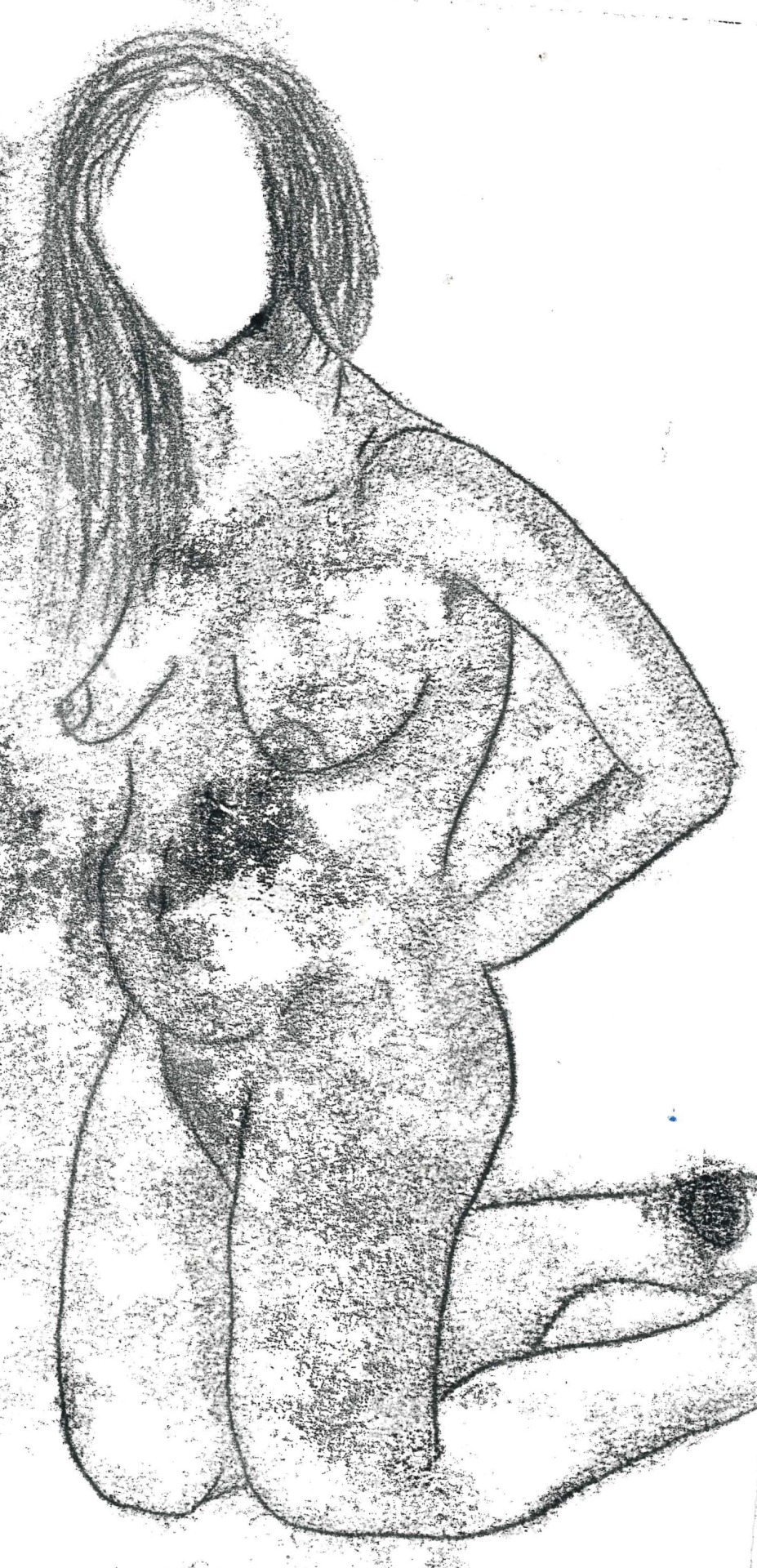
5 minutes, plain paper.
5 minutes each, monoprint on plain paper.
I would like to revisit the technique at a later date, now that I know I have to press hard with the pencil and that rubbing areas of shadow with my nail works extremely well to get soft shadows, however I need to remember to spread the ink thinly as it picks up too much on the paper, and need to remember to be careful about leaning my hand.
After life drawing, I did just that; revisiting the same monoprint seen above, scanning in the original outline and reprinting it, ensuring now to press very hard on the outlines and to remember to rub the shadowed areas for depth.
I continued experimenting with this same process, printing over a messy impasto red and pink acrylic base. This wasn’t as effective because I usually like to stay within the outlines.
Finally, I painted into the thin outline, adding darker fleshy tones for shadows, and once dried printing the outline back on top. I was very pleased with this, and although the rubbing for shadows didn’t work quite as well as it did on plain paper, I still had the shadows from the darker fleshy tones, so I was very pleased with the outcome and felt it was effective.
Overall, print has been my favourite of the workshops so far, which may have partly been because I have already used it a lot and had experience with it from A-level so was able to already have the basics down and could then experiment a lot further with bases and more interesting techniques than I would’ve if I hadn’t used it before. It has also made me excited to take these skills further, onto the textiles workshops and use them as bases for embellishments and appliqué.
0 notes
Text
10 expert tips for charcoal drawing
Drawing with charcoal, pastel and chalk is addictive. Maybe it’s because the results are so fast and immediate, or maybe because the look is so dang cool, but people love to learn how to draw with charcoal. Even the great Michelangelo loved drawing with charcoal.
How to draw and paint – 100 pro tips and tutorials
Whatever the reasons for charcoal’s popularity as a medium, and there are many, these charcoal drawing techniques are used by many artists every day. So let’s jump in, to reveal some handy tips and tricks.
Check out the video below, then follow the steps to success.
Any type of charcoal will do for these tips. Just ask at your local art store and they will guide you (see point nine for a little about different types).
If this inspires you to educate yourself further, why not head over to Schoolism.com to discover courses, workshops and more. It’s an amazing way to study with the pros.
01. Concentrate on the essence
This image is all about Paul and everything supports or revolves around that main idea or essence
It’s been said, “The main thing is to keep the main thing the main thing.” Artistically speaking, the main thing is called the essence. Remember when creating a piece the primary question to be asking yourself is, “What is this image about?”, or “What do I want to say?”.
Once you settle that – the ‘main idea’ or the essence – then everything you do from that point on, every move and every detail you put in or leave out, should strengthen the ‘main thing’ or the essence of the piece.
02. Learn the value of value
Learn how to organise lights and darks
The word ‘value’ gets thrown around a lot in art and can seem confusing. What we mean by ‘value’ in art is simply a walk from white to black (light to dark) using one to 10. One is the white of the page and 10 is black, so a five, 50% or ‘halftone’ is a medium grey, halfway between white and black. Make sense? So every image is composed of values (darks or lights) regardless of colour.
To help you with this, work from the middle out, keeping your darkest dark (the shadows) no darker than a six or a seven value and your lightest (the light effect or everything in the light) a three or four value. Work your way towards the darks (accents) and your whites (highlights).
Think of accents and highlights as twins just living in different neighbourhoods. They are not the most important element of your image. They serve the whole.
03. Use the hierarchy of value
You can control the eye using value. Whaaa?
It’s safe to say that a successful image is one that quickly reads well and has power to touch you. Using value or tone and assigning different areas of the image to lesser or darker tones can be a very helpful tool.
In the image above, based on a photograph by Josiah Bice, the darkest values are used on the subject. Notice the lightest value on his cheek and the darkest value reserved for the mass of his body.
Using a hierarchy of value allows you to direct the viewer to what you want them to see first. In this case, it’s Steve smoking his pipe. Everything else becomes less important. He is the essence of the image.
04. Squint
Squinting your eyes simplifies things
Sometimes 20/20 vision is not helpful. When we observe whatever we are drawing there is a ton of information going in through the eye gate. And an image filled with needless details cripples the effect of a piece. The goal is to edit and simplify.
Squinting our eyes just enough simplifies values and over all helps us to see a simplified version of what we are looking at. Squinting also helps you to see simple shapes very clearly. Nailing those simple shapes helps with the overall essence of the piece.
05. Try thick and thin lines
Not all lines are created equal
Using thick and thin lines is an interesting idea and it’s funny how many artists miss this very helpful concept/tool in drawing. In a drawing, if every line has the same width or is drawn using the same exact pressure it looks like a colouring book drawing and can come across as very monotonous and boring. So using thick and thin lines in your drawing can make it so much livelier.
So how do you use it, and what do you need to know? The simple rule of thumb is that lines on top of things are thinner since light is hitting them and lines underneath objects can be thicker since there are usually shadows underneath things. That’s it. Wow – that was simple. Check out the various dancing lines and thickness on the dog drawing. Now you know.
06. Use an eraser
Sometimes light can be ‘erased’ out
The cool thing about charcoal is that it’s easy to control it. You can move it around easily. Once you apply charcoal you can remove it or erase out where you don’t desire it. In the picture above, the erased part is marking out where the light is hitting the model’s head.
07. Get a few tools
You just might need a tool belt
There are many tools of the trade for an artist, and for charcoals there are cool ones to have. The image above shows some great ones: a really small fine line eraser, a kneaded eraser that you can bend and squash, and a hardcore eraser pen for those tough heavy lifting erasing jobs.
Make a one-stroke mass of charcoal
Using charcoal or pastels requires us to ‘move’ or apply the medium, and there are many ways to accomplish this. Your finger is the most obvious, yet can be streaky or too small. A Webril Wipe is a great tool for making a large mass in one stroke.
08. Wear a glove
This is an oil-free zone
Did you know that your hand has oils on the surface that can damage the purity of your paper or stock and fight against you? The oils on your hand can even attach to your paper and repel your medium. To stop this problem, wear a glove or place another piece of paper under your hand to protect your artwork.
09. Charcoal pencils
These are a good place to start
Charcoals come in many forms, from pencils to thick sticks to chunks, and whatever you decide to use is up to you. In the above photo are three good examples of charcoal pencils. Know that they can be messy, so afterward using them you can spray your drawing with a workable fixative to control them.
10. Press on
You can fly – just keep on trying
Remember that drawing is difficult and at times frustrating. Stay at it. Creating art is extremely hard to pull off and feeling happy about your progress can take time.
Learning and growing is a community project. Reach out and network with a few artists you admire. Be humble and teachable and ask them for insight about your work. Ask ‘What are my weaknesses?’ and ‘Where should I start or what should I focus on?’ Ask them to be honest. Those are good questions and a great place to start.
The good thing is that everyone has been down in the dumps as well, and even to this day there are really discouraging days full of doubt, and yet days where we can fly! So press on and open your wings and jump and catch the wind!
This article originally appeared in Paint and Draw magazine. Subscribe here.
Related articles:
7 must-know painting techniques for artists
How to get started with oil painting
How to use the rule of thirds in art
This post comes from the RSS feed of CreativeBlog, you can find more here!
The post 10 expert tips for charcoal drawing appeared first on Brenda Gilliam.
from Brenda Gilliam http://brendagilliam.com/10-expert-tips-for-charcoal-drawing/
0 notes
Text
Basic Drawing Techniques: Draw a Compelling Still Life in 5 Steps
There’s no better time than now to perfect your drawing skills. Begin with this basic still life drawing lesson from Steven Levin and The Artist’s Magazine.
Then, check out the instructional video, Top 10 Art Techniques: Pencil Drawing, to learn key methods to start honing your pencil drawing skills. it includes a review of drawing tools, tips on proportion and perspective, and line-work techniques from expert artists, such as:
Lee Hammond
Grant Fuller
Mark Menendez
Mario Robinson
Claudia Nice
Carrie Stuart Parks
Debora Stewart
Sarah Parks
Also, The Artist’s Magazine’s Annual Art Competition is open for entries, and the deadline is May 22. Bookmark this link so that you can enter your best drawings and/or paintings for your chance to win up to $2,500 or an array of other great prizes—and you could have your art published in The Artist’s Magazine!
Draw a Compelling Still Life | Basic Drawing Techniques
Master basic drawing techniques and tips for drawing in charcoal, and you can render an eye-catching still life drawing step-by-step.
By Steven J. Levin
After carefully arranging my complex setup of wooden objects, I used basic drawing techniques that I explain below, step-by-step, to complete “Family Portrait Drawing” (charcoal, 19×25). Pin this drawing lesson!
Start with an Idea
Arranging a still life is largely a matter of experimentation and observation, but the first step is to decide on a concept. I often like to stick with a single, somewhat narrowly defined concept in a still life—rather than a multitude of different objects—as this gives immediate coherence and unity to the design.
For the step-by-step still life drawing chronicled in this article, I settled on a very simple concept: an arrangement of different pieces of wood in varying colors and shapes. The challenge was to find a way to make it interesting. With a trial-and-error approach, I move objects around, discovering interesting relationships and effects and thereby slowly enhance and refine the composition.
The Drawing
After I have my still life setup finalized, I begin the drawing. At this point, keeping in mind that a few simple ideas will go a long way toward a satisfying result, I reduce objects to simple forms and shapes. Because nature is complex, I begin with basic shapes and tones and slowly refine them as I go. Trying not to get ahead of myself, I work to make each step what it should be. I don’t let myself get too eager to make the drawing look three-dimensional—I have to trust that the subsequent steps will get me there.
Because nature is complex, I begin with basic shapes and tones and slowly refine them as I go. Trying not to get ahead of myself, I work to make each step what it should be. I don’t let myself get too eager to make the drawing look three-dimensional—I have to trust that the subsequent steps will get me there.
Taking measurements for still life drawing in charcoal
1. Take Measurements
First I placed the drawing board directly alongside the still life and set a vantage point roughly 8 to 10 feet away from the setup. Using the vine charcoal and a string or ruler, I took some basic measurements: top of the frame, top and bottom of the Pinocchio doll, and so on. Walking back and forth from my vantage point to the drawing, I made these indications on my paper.
Blocking in the forms for still life drawing
2. Block In Forms
Once I had some basic measurements, I began blocking in all the basic forms of the design, checking them with a ruler or string from my vantage point and erasing with the chamois rag when needed. Then I refined the lines as I kept moving fairly quickly around the drawing, progressing to the same level in each area.
Indicating shadows and beginning basic toning step by step
3. Delineate Shadow Edges; Lay In Tone
Here I blocked in the main shadows and began putting in some basic tone with lines at roughly a 45-degree angle. Also, I began to lay in some dark halftones.
< Free Download! Click here for 7 Mini-Demos: Step-by-Step Drawing for Beginners >
Modeling the form with basic drawing techniques
4. Model the Form
This step always takes me by far the longest—modeling the form, creating smooth transitions and even tones. At this point I began using General Pencil’s charcoal pencil to get the deepest blacks. The tone started out very black, but I gradually lightened it with repeated application of the kneaded eraser.
Adding finishing touches to the still life arrangement
5. Refine and Add Detail
I usually concentrate on one small area at a time and model it to its finish, refining tones and adding incidental detail while taking care to compare values, one to another, to judge their relative tones. Adding the wood grain and other incidental details definitely contributes to the finished look of the drawing. I used the vine charcoal for light halftones, charcoal pencil for darks, and quite a bit of kneaded eraser to work the charcoal in. Finally, with a few touches of the white chalk in just the very brightest areas, I completed the drawing.
Here’s the painting “Family Portrait Painting” (oil, 16×20) that Steven J. Levin created from the same still life setup.
Charcoal: 3 Ways to Master the Medium
Here are Levin’s 3 key charcoal drawing tips:
Remember to use a sanding block to keep the charcoal sharp! A dull point takes as much charcoal off the page as it puts on; it acts as an eraser.
Charcoal can be a beautiful medium, but it takes time to achieve a real solidity of form by working the charcoal evenly into the fibers of the paper. Remember, the flatter the tones and the smoother the transitions, the greater the illusion of form. I usually roll the charcoal in my fingers to a point, rub out a bit of charcoal, then roll a new point and repeat. It takes a bit of effort and time to get an even tone, but it’s worth it.
Be sure to hold off on the incidental details. Suggesting the grain of the wood, for instance, is something that should be done later in the drawing. Getting the proper value relationships and achieving good flat tones will go much further toward producing an effect of three-dimensionality.
About the Artist
Steven J. Levin paints both figurative art and still life, producing work for a one-man show each year. He trained for five years at the Atelier Le Sueur in Excelsior, Minnesota, and continued there seven more years as an instructor. Learn more on his website: www.stevenjlevin.com.
*Content for this article first appeared in a past issue of The Artist’s Magazine, and features contributions from former senior online editor, Cherie Haas
A Review of Drawing Tools with Alain Picard
Wanting to grow your drawing toolbox? Then you’ll love this drawing tool tutorial from Alain Picard! Follow along as he shares his favorite materials, which includes tools for erasing, mark-making, blending and sharpening. Want to learn Alain’s drawing techniques? Stream his demonstrations now at ArtistsNetwork.tv. Happy drawing, artists!
youtube
The post Basic Drawing Techniques: Draw a Compelling Still Life in 5 Steps appeared first on Artist's Network.
from Artist's Network http://ift.tt/2qrRwXl
0 notes
Last Seen Blogs
98chao
kye (COMMS PAUSED)
mercatoitinerante
Mercato Itinerante

boldlyannoyingnerd
Sem título
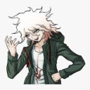
koma-stims
Stimboard Collection

konfident
mkallister