#I want to get into a workflow for making full color drawings again…
Note
What inspires your art? Like, how did you come up with your art style, how happy you are with it and if there are any other artists that inspire you?
Asking a few people as a way to understand and grow as an artist at a crossroads. Have a good day.
This is a fun ask! Not sure how helpful my answers will be to you, but here they are.
I've honestly put little to no thought into "coming up with" an art style. I'd say that what comes out of my brain and hands is maybe only 1/3 calculated stylistic decisions, with the rest being "what is most fun for me" and "what is easiest for me". I draw a lot of faces because I enjoy caricature; I do most of it in scribbly mechanical pencil on scrap paper because that's what I usually have on hand.
My one big starting point is that when I started drawing at age ~12, I was copying characters out of The Adventures of Tintin. I learned just enough from Hergé to get simplified human figures I didn't hate and then went iteratively on from there. Mostly I just drew short humorous fancomics for myself and never colored them.
In high school I considered going into an art career, so I took art classes. At the time I thought they were fun but mostly irrelevant to the stylized character art I drew in my class notes every day... but looking back my comic art drastically improved 2015-17, so maybe I was wrong. I eventually decided I'd go into tech instead and leave dressing as a hobby, which I think was the right choice for me.
The closest I've ever had to a Style was in the music fanart and OC comics I did in college. The imagery mostly came out of my own brain, and I worked out what tools were easiest and most enjoyable: multicolor sharpie pens and India ink with watercolor washes; binary or hard edged brushes on digital work that I could fill in quickly with the bucket tool. I accepted that I wasn't a great draftsman and got scribblier and more manic.
Since then I've gotten back to the world of fancomics where I try to pastiche the original inking style—I've done Jhonen Vasquez, Steve Purcell, John Romita, Jack Cole, Scott Wegener, and C. C. Beck (though that one was way too ambitious and I may never finish). But I'm not doing this because I want to absorb them into my default style, though I certainly learn things from it. I do it for the project itself, because I feel like there's a lot of characterization and world-rules built into the way different art styles depict their worlds. I have great interest in stories which use restricted or contrasting stylization on purpose to convey meaning.
It's also just fun, which is my first priority. But I do think my technical skills have been regressing a bit from lack of use + perhaps from using others' work as a crutch too often. It's a little embarrassing, but it is what it is. I'm sure the trend will reverse if/when I put more time into full pieces and daily practice again.
Oh, and I did make a list of favorite artists back in 2018 which holds up. If I had to extract some advice from this meandering post, it would be to figure out what methods and tools make your artistic workflow easier and consider how you want to make those part of your "style". That's extra true if this is something you're going to be doing for long periods of time like a job.
#my art style looks rather childish to me but I generally don't mind that#it's a method of conveying information. it's a lot slower than words but a lot more information-dense and more precise in some ways#less so in others
6 notes
·
View notes
Text
PSA/Thoughts on “Use of AI in manhwa”
I try not to go on messageboards because they aren’t very productive, but I do like to read certain people’s thoughts on various updated manhwa it gets lonely in my echo chamber
But what really annoyed me, is there’s a thread on one of the subreddits, there’s individuals, who know NOTHING about the art process, are accusing Hayeon-nim of using AI art in this series.
Again, uneducated accusations like that are all over Reddit, so that’s why I avoid them most of the time. I don’t have all day to educate people,
But I do want to address AI art in general, because people are quick to assume something is “AI art” and it’s extremely insulting to actual artists.
AI art = completely created by an algorithm, a machine. A person enters in a prompt, and an image is generated. It’s not art. It’s a collection of data pixels created from a machine. In the mainstream, people are quick to jump and accuse someone of AI art if the Hands are weird, because AI can’t completely replicate hands yet. That is a complete generalization.
What people don’t understand, is the existence of “assets”. This is a term referring to the pre-set images that a human creates, for the sole purpose of making other artist’s lives easier. Webtoon artists are always on a time crunch, publishing 80+ pages of full color comics a week, so they rely on such assets to make their workflow smoothly. We’ve all seen it: the flowers on the background, lace, ruffles, frills, castle-nim, the food on the table, jewelry etc.
The thing is, the majority of these assets were created by a human being for use by other human beings. All (or supposed to be all) of the assets on the CSP asset store, is created by a person. The software encourages artists to make and upload their own assets, so they can earn “clippy points”, so they can purchase other assets. (Otherwise you have to pay a membership fee). Other Korean asset sites like acon or postype have fancier, unique assets for a fee (depending on what you’re looking for, a set of assets can range from free to $200+!).
That is to say, as a fellow artist im VERY familiar with artist styles and if a certain series uses assets. Some series, like Marionette or Siren, use so many assets that I personally can’t handle, because my brain can’t enjoy the series because all it registers is ASSET. ASSET ASSET.
ALL ROFAN MANHWA USE ASSETS in one way or another.
Besides the examples of assets I mentioned above, another type of asset is the 3-D model type. Some artists, like Cierra (artist of “Beatrice”) use complete adult body 3D models to help speed up their drawing process and to ensure decent anatomy.
Utilizing 3D Assets, by referencing or tracing is not AI art. It is a person using any available resources to speed up their work process.
So back to Hayeon-nim. She’s a professional artist. She’s under a time crunch. So of course, she’ll utilize both brush and 3D assets. Just like when other artists use them, I’m confident I can identify 95%+ of the assets that she uses.
In Season 2, she utilized quite a bit of various hair assets that annoyed me (sorry hayeon-nim), but that has toned down quite a bit in Season 3.
However, she started using more hand assets in season 3. From eyeballing it, i think one is a 3D model from the CSP store (avail for purchase), and the other is from another source that I’m not familiar with. But it’s definitely an asset. Based on S1 and S2 art, she is a professional and is capable of drawing hands. But on a time crunch, it’s just more efficient to use a pose-able 3D model.
The discussion on Reddit was from Ch 88, regarding Lehan’s hand:
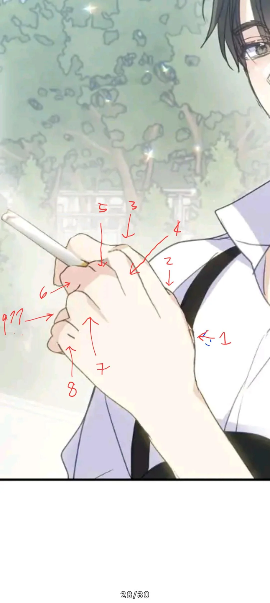
A reader, i assume for clout, posted that they counted 8 fingers. The ensuing discussion proceeds to escalate, and accusing her of resorting for AI art, and many say “it’s clear its AI-generated” after “a closer look” and trying to justify their reasoning.
To quell my annoyance at people pretending to be experts when they aren’t, I wanted to say “no it isn’t.”
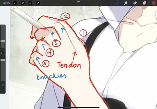
in my mock up here, there are 5 fingers. People forget knuckles and tendons exist. Im fairly confident this is a 3D asset pose-able hand from that unknown source, that was modeled to hold the cigarette, and she just left as is for the sake of time.
The hand is fine.
It’s not an AI hand.
It’s extremely rude and degrading to post off-model images, proceed to get clout at the expense of others, fully knowing manhwa artists are working inhumane hours to provide those very same people entertainment.
It’s also super disrespectful to accuse professional (or even hobbyists) artists of AI, when they tried their best to draw something nice, spending hours/days on it and is accused of not even drawing it at all.
What a great way to spread more hatred and demotivation around :(
Time for me to avoid those comment sections again haha
6 notes
·
View notes
Note
helloooo multi
hypothetically, do you have some (hypothetical) advice for a hypothetical person who may hypothetically be attempting to make an animatic. you've done that before so you're more knowledgable than i (hypothetically) could be if i were to do this. hypothetically
(i cannot stop thinking "the magnus archives mad iqs animatic the magnus archives mad iqs animatic the magnus archives mad iqs animatic". help)
helllloooo nico!!!!!
oooooh yes i may have some advice in this completely hypothetical scenario!!!!!! so fair warning, i'm far from an expert and i also do Not have any cool advanced programs for fun editing, so i can't help on that front. HOWEVER i can maybe help with getting started or offer some general advice, and i can point you to some resources that may help as well!
my main point of advice is to not stress yourself out too much over planning it very extensively or making it super polished--an animatic isn't a complete and perfect animation. you know your own planning methods and workflow better than i do, so really do whatever is most comfortable for you, but don't stress yourself out or feel like you need to make it SUPER polished.
essentially, each frame doesn't have to be a complete, rendered piece with full coloring and shading. if you want to, you certainly CAN do that, but animatics are more often, as far as i've seen, done in a simpler style with a limited color palette (or not even colored at all), and if there is any shading it's usually done to emphasize certain moments.
but uhhh other things to keep in mind:
regardless of how extensively you plan (i.e. like if you make a storyboard or something first or jump right in), make sure you know going in how many frames it's going to be. again, you know your own planning method preferences better than i do, so do what's best for you on that front, but that's the big one for me.
you don't need any fancy editing programs or anything. while they can be NICE, all you really need is something to draw your frames in and some way to set them to the audio you have in mind. i use windows movie maker and that works just fine for me.
if you're planning to upload this to youtube, then i definitely recommend sizing your frames to make sure that they 'fit' in the video player without having those black boxes on the sides. i'm sure there's probably a more specific guide with exact ratios out there, and if i find one i can send it your way, but the size i use for my frames right now 1920x1080
the most important tip i have to offer: just have fun with it!!! ultimately it matters most that you enjoy the process more than anything else, and don't stress yourself out trying to make it perfect, especially for your first one (even if you don't intend to make more in the future). making animatics is a SUPER time-consuming process, but it's also really fun and rewarding!!
and now for some other resources.
here is a good website for cutting and trimming audio--you don't necessarily have to worry about that right away, but it can help in planning to know exactly how long your audio will be: [link]
and there are a ton of websites for downloading the audio you might need from youtube or wherever else you're accessing it, but one website that has worked well for me is this one: [link]
aaand i think that's what i got!!!! if you have more specific questions i can try and answer those, but this is at least some general advice!! :>
also while answering this i got an idea for another animatic i could make. hohoho heheeh
(also if anyone else wants to chime in to offer advice, please feel free to!!!)
#talk to the bunnykitty#nciko#i'm definitely not an expert but i hope this helps!!#also that sounds like SUCH a cool concept omggg
3 notes
·
View notes
Text
Adobe photoshop touch android 10

#Adobe photoshop touch android 10 full#
#Adobe photoshop touch android 10 for android#
#Adobe photoshop touch android 10 free#
Other features of the app include magic filters, art effects, watermark, stickers, frames, borders, HDR support, twenty different types of blur effects, painting styles, drawing and doodling support, text overlay, and more. If the simple and boring interface of Snapseed doesn’t suit your editing skills, Pixlr is a great option for you.
#Adobe photoshop touch android 10 free#
The app is totally free to use, however, it does come with ads. As you can see, Pixlr is a very capable photo editing app and is certainly a great alternative to Adobe Photoshop on Android. Other features of the app include the ability to create photo collages, color fixing, stylizing images with a pencil drawing, an ink sketch, or poster effects, focal blur, text overlay, masking, and more. Adobe Photoshop Mix ( Free) also does this on Android, but again, that is an app which is just dedicated to layer editing while Pixlr also brings all the other photo editing features. One of the biggest features of Pixlr is the ability to use layer editing to blend multiple photos together. The app is packed with features and brings a plethora of filters, effects, and overlays to allow users to edit their photos on the fly.
#Adobe photoshop touch android 10 for android#
Pixlr is yet another good photo editing and retouching tool for Android which can act as a great alternative to Adobe Photoshop on Android.
#Adobe photoshop touch android 10 full#
Beginners need to invest time to take full advantage of the app.
All the styles come with fine and precise control tools.
Also, the app is completely free to use without any ads or in-app purchases, so you don’t have any excuse to not try this out. The biggest strength of Snapseed is that it makes photo editing enjoyable as it encourages experiment through its nondestructive editing interface. I especially like the filters found on Snapseed as they don’t make the photos look artificial and allow users to enhance their photos with just a couple of taps. Snapseed comes with a set of 29 tools and filters including features like healing, brush, structure, exposure, color, masking and reshaping tools, among other things. Unlike Adobe Photoshop, the app brings all the features inside one app. On the contrary, it is one of the most feature rich photo editing apps you can find on the Play Store. However, the simplicity of the app should not be equated with its lack of features. All the tools are present in the right place and even if you have not used the app before, you will quickly get the hang of it without any problem. The app has a very pleasant user interface and makes it really easy to edit your photos. I chose Local Photos then the Photo Library and an image from my iPad.Snapseed is one of the best if not the best photo editing app that you can get for your Android device. You get the choice of adding an image from your iPad, the Adobe Creative Cloud, the Camera, Google or Facebook. The second option is Begin a Project which is where I’ll start. These are text and image tutorials and not video ones, but they are interactive so you can learn as you go. There are 10 tutorials that you can work through each of them is project based so you learn the program by learning a technique not by learning how individual tools work. When you launch Photoshop Touch you get two options, viewing the tutorials or doing some work. For heavy duty work, Photoshop and Lightroom will remain my tools of trade. So, I looked at Photoshop Touch in this light – I wanted to see if it would be part of my iPad image creative workflow. Those images I have on the iPad are there because they are funky or because they lend themselves to some artistic play. I use the iPad a lot for working with photos I’ve shot using a digital SLR camera in raw and which I’ve resized, converted to jpeg and downloaded to the iPad. The app costs $9.99 which is at the high end of the price range for photo-editing apps in general but Photoshop Touch seems to have got the feature set about right so most people will probably consider it worth the money. This long sought after app runs on the iPad 2, and not on the iPad 1, and it requires that you have iOS 5 installed. On Monday, Adobe launched its Photoshop Touch application for the iPad.
0 notes
Note
Please can I have some advice about making comics, specifically figuring out panel/page layout? Robber/Robert was beautiful and flowed so nicely
(Sorry, I know that’s a big ask, especially busy as you are! I would be grateful for even the smallest nugget of wisdom!)
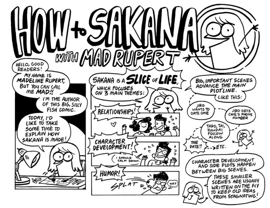


Hey! I know you're specifically referencing Robber/Robert, but all of the tips I gave in my How To Draw Sakana series still mostly apply to the way I make comics!
I plot out important story beats first (and the ending) and fill in little jokes between those mostly on the fly.
Even though RR is mostly digital (unlike Sakana, which is totally traditional), I still thumbnail RR traditionally because it's easier for me to see the whole page that way, and really get a sense of how big each panel and each element within the panel needs to be. All other details are basically omitted at this point, it's really just figuring out page composition. I also write out the dialogue traditionally. Even if I have a good idea of what I want the characters to say in every panel, trying to come up with exact dialogue later in the process always spells disaster for me. So I try to figure out dialogue and thumbnails at the same time.
The 5 in 5 rule is still what governs my panel/page layouts! I feel like the last [5] rule is worded a little poorly: what I mean is that hands can also add a lot to character acting and should be present as often as possible to avoid having too many "talking heads" panels. Even if a page is dialogue heavy, at least having the character gesture with hands or even do a small task (like make coffee or something) during a conversation or monologue will be more satisfying to read. ALSO, BACKGROUNDS ARE GOOD. I know I'm in the minority of people who LOVE drawing very complicated backgrounds, but even a few little lines or shapes or colors here and there behind a character can keep them present in the environment. I always try to Avoid The Void, but it really depends on how important the setting is to your story. I only draw comics with very specific important settings for some reason lol.
RR is in an American comics format (so roughly 10"x15", which is a 2x3 ratio and can scale down to 6x9 for print.) Again, I think it's important to get as much of a sense of how the page will look in the thumbnail stage as possible, without bogging yourself down with too many details. Often characters will just be pegs with circles for heads (and in Rob's case, two little antenna lines that make him look like a cricket), but where they are and how big they are are most crucial. I'd even suggest thumbnailing two consecutive pages right next to each other so you can really see the flow from one to the next.
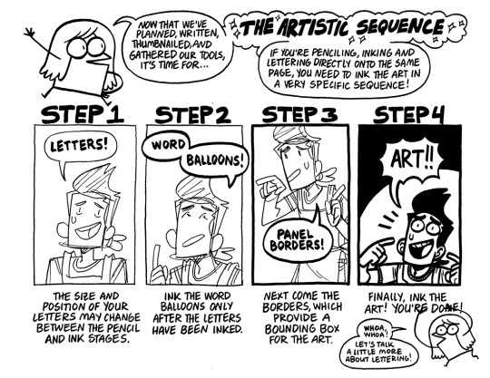
The rest of the pages only really apply if you're thinking about doing your comic completely traditional. Penciling, inking, and lettering DON'T need to happen on the same page/paper, but I'm used to that workflow so that's how I do it!
LETTERING IS STILL VERY IMPORTANT THOUGH. I'm sorry to be harsh, but there's nothing worse than bad letters on a great looking comic. If you're not feeling great about your lettering capabilities, I'd suggest taking some time with tutorials and practice to get something that really fits your comic style.
FINALLY, it's important to go out there and find comics that you LIKE and really study what they're doing, how they're doing it, and why it speaks to you. Currently I'm looking at a lot of Franco-Belgian comics, which are bigger than american or manga sizes, and CHOCK FULL of backgrounds usually. Some day I'd like to make something that looks similar, so I'm using every comic project I make as practice to get closer and closer to that style.
Anyways, I know that's a lot of images and text, so thank you if you got all the way through it, and I hope it's helpful! If there's something specific you're still confused about, I can always try to explain a little more. Thanks!
911 notes
·
View notes
Text
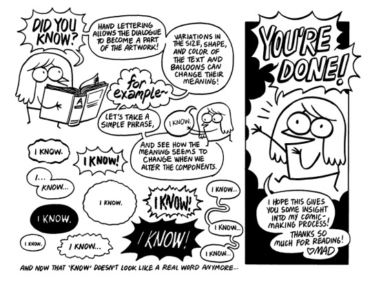
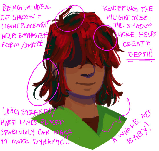
hello here is my tutorial on how i paint hair . under a readmore because im too lazy to figure out how to format this in a way thats nice to look at
a lot of the way i paint hair is rooted in my specific workflow/style so hopefully this will be at least a little useful for others! find out how the hell i get from THIS

to THIS
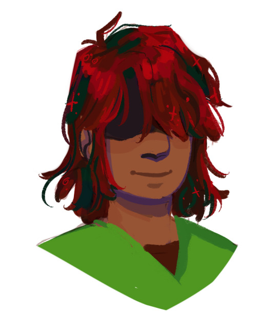
woaaahhh wow. i’m doing kris because auburn hair is really fun to color and also i love them. just a note but with this specific method neatness isn’t terribly important and some messiness can actually make things more interesting further in so just slap those flats underneath your “lines” and let’s fucking gooooooooo
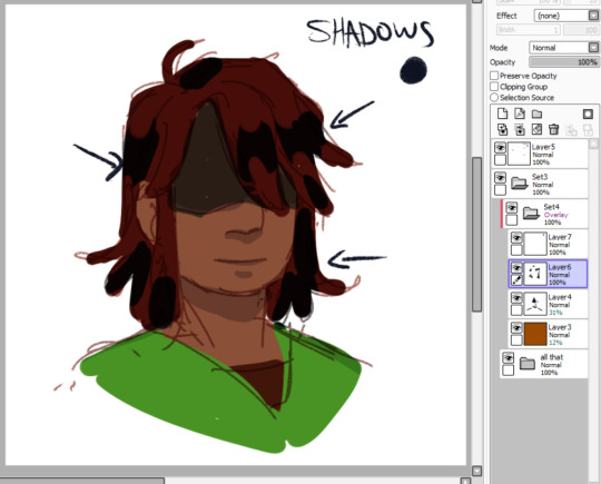
i do p much all my shading and lighting in overlay because 9/10 it looks cleaner than multiply/luminosity. first step is to block in those shadows babey. this is where you have your first opportunity to express form and really sell your hair existing in a “3D” space. (i’ll be showing everything at full opacity initially so you can see where exactly i’m putting what i’m talking about, but assume i am lowering opacity to taste)

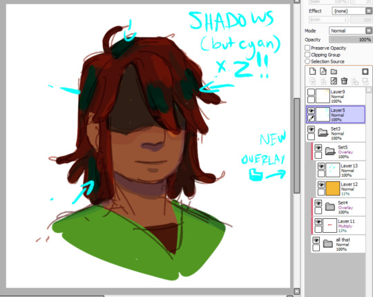
sometimes i like to make a second pass of shadows with either cyan or true blue, depending on the intensity of shadows i’m going for. in this case true blue came out too dark so i used cyan. as a note, right here i’m less looking to define values in the hair, and am more just tinting the shadows to a contrasting color (in this case, blue!)

and now for light! at this stage, it’s important to keep in mind that you’re not trying to put in a lot of detail; that’ll come in a few more steps. just slap your light hue in a way that will still be readable to you as you continue working. don’t forget that light will bounce and define edges where you might not necessarily expect! (i’m looking at you, far left corner)
my coloring process can usually be seperated into at least two overlay folders; the first is for initial color tweaking but is Most Importantly for introducing some sexy new values to your work . the second overlay folder is usually where i delve more into bringing out interesting colors. i really want to draw more attention to the blue shadows, so i’ll put some more cyan down on a few focus points
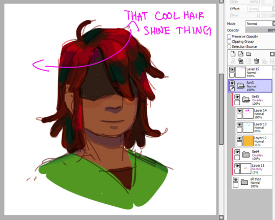
yknow that cool hair shine thing that cool artists put on their cool art of their cool characters? here’s how i do that. just slam down a circle of highlight color (here i use magenta, because it’ll still bring up the value and warmth while not drowning out or muddying the orange highlights in the other overlay folder).

and then you’re gonna use your eraser to feather out the edges and get that nice wave affect. i do this by just clicking down with my tablet pen without moving it
and now it’s time to move on to the actual painting. are you ready? take my hand. you’re merging the layers now. we’re doing this together. i believe in you
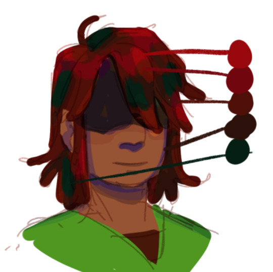
now that we’re here, i’ve picked the colors in their hair so you can see we’ve got a REALLY nice palette to work with. i don’t really do this because i’m a terrible creacher and i’ve gotten used to working messy like this, but pulling a palette can be a quick way to make sure you’re staying clean and concise with your painting
the most important thing that i keep in mind when painting hair is to work from dark to light - so the bottom of the palette up. what this means is that i’ll make sure to render the shadows first, so that when i paint the lighter values over them, it’ll look a LOT more natural and nice looking, and it’s usually easier than working light to dark (with hair at least).
there’s no easy way to get around the next step. it’s time to draw your circle.

here you can see i’ve rendered a lot of the shadows/lighting and created more shapes in my hair, defining more of the edges between lights and darks where i can
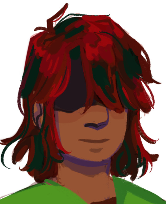
adding some hard lines/edges can really help indicate flow! once i’m satisfied with where i’m at here, i’ll move on to some last color tweaks!
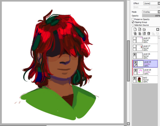
it’s the last bit of overlay i promise!! just a little more cyan to bring out those blues again, and i added another bit of shine over some areas. i’ve found doing the eraser feather thing for both lighting and shadows at this point can help add a touch of ingradience to everything and help pull it together, especially when i’m doing something that has no/minimal blending like this
add a few more details and voila!! Woah, That’s Hair!
488 notes
·
View notes
Text
Soundrs: DJ CYBERDAD
My name is John Verchot, I’ve released music under several names: J-chot as well as DJ CYBERDAD. Locally, I’m usually just billed as DJ Verchot. I feel like the first thing I should tell you about myself is that I have severe ADHD, which seems to be the single most consistent force guiding my art and existence. I often get distracted and always get ahead of myself when I try to explain things. DJ CYBERDAD started out as a funny pseudonym to release more profane songs that I didn’t want my son to hear, but changed into an outlet for my smoother dance jams as well as more introspective music.
What are your inspiration sources?
It varies from project to project. Often times with tracks, the inspiration to work on them comes in two or three different phases. Inspiration to create sounds is one thing, as inspiration to finish and structure tracks, create moods/themes, or even package them into a finished project, all feel like different driving forces/processes that need to happen in order for me to get anything done. However, whichever one of those forces I am able to utilize when I sit down at my laptop often seems to be beyond my control.
Most times I’ll hear a sound, loop or phrase, I’ll start to wonder what I can do with it, or how I can change and manipulate it. It might be the timbre of an old instructional video’s narrator, or an odd metallic sound I’ve managed to coax out of some equipment. Occasionally I’ll think of a concept, either of overall sound or thematic content and before I know it, I’ve got half a track planned out in my head. Many times I’ll hear other tracks or songs, and want to use just one part/concept/sound or re-do the whole track differently. With “Emotional in Destin”, I was trying to convey moods or feelings I felt during an unexpected trip to Florida in the middle of a crushing depression. It sounds bizarre, but I've never channeled personal experiences into my music before.
Overall what inspires me to create different sounds is the novelty of technology and bits and other people’s music.
What makes me want to sit down and make music is personal or professional success.
What inspires me to finish tracks and projects is the distant white noise of overwhelming anxiety and dread setting in as the ennui of the imminent collapse of western society fades giving way to the dark, almost imperceivable thrumming of the void drawing nearer, and is definitely getting louder. Your “time” is almost up John. Did you even do anything, or are you too skiddish and feeble of heart and head to make any clear decisions, impulsively flitting from one animal urge to another bad habit, clogging the chemical receptors of your brain for simple stupid pleasure. It’s night now and your eyes and fingers grow weary…
What was the question again?
Tell us something about your workflow.
Most times, it starts with just noodling around. Sometimes, it’s with synths and sequencers, either recording sounds or looping notes and tweaking/loading patches (virtual or real synths), sometimes I’m browsing potential sample material, but what happens next is the same regardless of how I’m making sounds or what I’m doing:
…I think hear something.
…And I STOP noodling. Basically, I either hear something I like, or I hit a riff or whatever and it’s like a tiny, tiny light bulb that blinks barely. Occasionally it’s like a hundred watt, and other ideas quickly fall into place. Most times, it’s a process of trial and error, but I’m making sure to document or isolate the little pieces that click and then attempt to refine or improve on those ideas. Ideas can quickly diverge, multiple sets with different names get saved, and I often jump around and get lost. I use color coding on clips and pieces in Ableton to help me sort those ideas. Some ideas form by running one sequence I’ve had already through a whole different synth/patch.
Very rarely, I’ll get a concrete idea while I’m driving, maybe I’ll make some notes on my phone (text to speech notes, voice recording).
When I get a spark that makes me imagine a full concept (“Charles Nelson Riley”, or that “My P**sy tastes like Pepsi Cola” remix for example), the track is formed VERY quickly (four to eight hours working time) and I finish the mix, structure, everything. This is rare, but these tracks are almost always my better material.
The next step is always the same: Let the track “cool-off”. Leave it alone. Do something else for a few days, or weeks… or in some cases, years… Then I’ll fuck around with it even more, or move on to:
STRUCTURE & MIXING:
I look for/experiment with arrangements that compliment my DJ style, or allow someone to do a rough edit if they want, (breakdowns at the end), or I’ll load a track that I like to DJ that’s similar enough and I will STRAIGHT UP copy the song structure in terms of intro, (drums or keys?) repeating bits, breakdowns, outros… Most times I fuck with it until it sounds okay, which is kinda bad because I end up drastically overscrutinizing it.
When it comes to mixing, something that I should do more often but don’t is load a reference track (someone else’s track) and try to get my mix to sound like theirs… This technique REALLY helps stop “nasty surprises” when you listen to it on a big system, or in the car.
Most of the time, I’ve been tweaking the mix the entire time I’ve been working on the project.
TL;DR
The “Emotional in Destin” EP is almost entirely soft synths, but lately my flow is:
1. dick around on hardware
2. “oh that sounds good, let me make another sound to go with it” (see step 1)
3. record a few pieces to an Ableton project.
4. “I don't know what to do now.” …maybe mixing or structure…
…almost ALL THE TIME, however I jump around and do everything very non-linearly. Hardware helps me not spend so much time tweaking patches or EQ-ing a snare drum for an hour. Texture is SUPER important to me, so I’ll often get hung up on EQ and compression before I even start on structure or mixing.
How would creative rituals benefit your workflow?
The hardest part for me is ALWAYS ALWAYS ALWAYS getting started, or shifting gears from other activities (resting after work, reading tumblr, goofing off…) and going to sit down at my desk and start music stuff. I’m certain it’s an executive dysfunction thing. The less I think about doing it before I do it, the better.
Animal sacrifice SIGNIFICANTLY speeds things up. Try not to get blood on the gear/laptop, and make sure never to clean, but regularly sharpen the ceremonial dagger (VERY important).
How do you get in the zone?
I don’t really try…
As soon as I start to approach a task as “a thing” I get nervous and anxious. If I go “okay, I’ve got this task to complete…” my subconscious hijacks my higher functions to make me look at memes or tumblr for three hours instead of do what I “should” or “want”… The problem with me in the past has been how do I get OUT of the zone?
How do you start a track?
Oh jeez, I really jumped the shark with that question earlier, didn’t I? A technique I’ll sometimes employ is load up an old track, keep the drum sounds/patches but delete all the data, and make an entirely different genre of track… or one that's very similar… That’s kind of a fun exercise if nothing else. Also it often winds up getting tweaked and adjusted to hell and back.
Do you have a special template?
Nope. I make TONS of drum, EQ, and effects presets though. And they all have terrible names like “gooddrums”, “$GOODrums” and such.
Even though I’ve started with carbon copies, they ALWAYS end up sounding completely different by the time I’m finished with the track, because I can’t leave em well enough alone.
What do you put on the master channel?
Sometimes EQ, but always a phat ass compressor (limiting). I’ve been thinking about investing in a nice non-free one lately, but for some reason I am not comfortable with purchasing software plugins… I also have learned recently, that I’ve been using compression on the individual tracks way too much… which makes final-mixing a pain in the ass.
How do you arrange and finish a track?
DAMN IT. I really did go too hard with the first couple questions. The “finishing” of a track for me (arrangement, mixing) is usually done much later than the rest of the process. I try not to force stuff, but lately I’m realizing more and more that I need to not do this as much.
I can’t stress enough how using a reference track for structure or mixing can very often break up stagnation on a project.
How do you deal with unfinished projects?
Several ways. The first step is to judge an old file and see if it's worth finishing. If there is ANYTHING of creative/sonic merit, I put it in a folder with the other “sketches and ideas” (project graveyard). Otherwise, I have been trying to delete the “junk” projects… this can make it easier to focus. Another thing I often do is to make presets/patches/Ableton instruments from the parts I like, then drop it in a folder called “meh”. Or I drop them into several categorical folders, i.e.: “uncircumcised electro bangers”, “abrasive techno”.
How do you store and organize your projects?
Aw jeez. Oh gosh-oh darn. (See above answer.)
How do you take care of studio ergonomics?
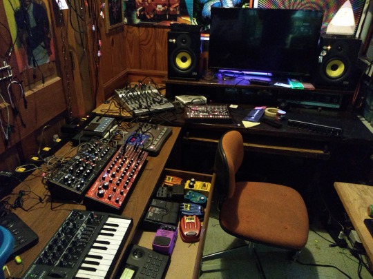
Trial and error, trial and error, trial and error. This year alone my studio has been restructured and moved about my downstairs room at least five times. I’ve finally settled on something that feels very useful and productive. I am also this way with my work station at my job. CHANGE IT UNTIL IT WORKS GREAT. This can also help with creative stagnation, or can trigger it, so be careful. I keep my “electronics laboratory” close at hand so that more of that tinkering can find it’s way into my music… no such luck, YET.
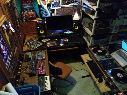
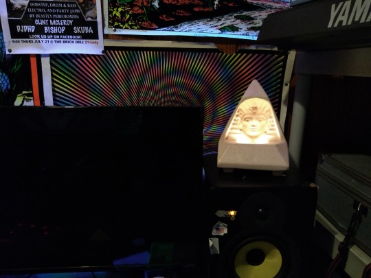
I’ve currently decorated my space with all the crap I’ve saved up over the years, that for some reason, I’ve looked at this and thought: “This makes me happy” …SUUURE, my studio now looks like a fourteen year old decorated it, but I gotta say, I feel pretty phenomenal. Soon I’m gonna try to put this “stars and space” wall paper on my ceiling… I’ll update with a photo when that’s done.
Also I would like to say:
Minimalist spaces and studios are bullshit, y’all look like sick baby birds in empty shoe-boxes.
I mean, NOBODY LIVES THAT WAY, right? Maybe some boring rich people do, but damn… I mean, I try to clean and stay organized… and it helps, but I also try not to get to hung up on it.
Tell us something about your daily routine, how is your day structured, how do you make room for creativity?
**LOUD SUCKING SOUND THROUGH TEETH** I don't… at least, not very well at all… but I’m working on that.
I am not the person you should ask this question, because THIS RIGHT HERE is the BANE of my existence…
Share a quick producing tip.
MAN, I’ve already dropped like… seven, but okay, here goes:
BY ANY MEANS NECESSARY, FINISH THE TRACK. For me, this means ghetto-rigging, DIY, using the same goddamn audio interface from 2002 for f****ng fifteen YEARS… (recently fixed) don’t get hung up on “proper” ways, or ways that are outside your current means. Also, get a set of decent monitors… or use several pairs of headphones/speakers to double check mixes.
Recently, I’ve had less time, but a little bit of money, which is the opposite of how I’ve ALWAYS operated… it’s been difficult to unlearn “time consuming but cheap”. Also difficult not to impulse buy synths.
Making music with just a mouse and keyboard may be the least sexy thing ever… it works tho… cheap MIDI controllers CAN work faster however.
Share a link to an interesting website (doesn’t have to be music related).
My son just showed me this ➜ https://dddance.party/ and I have to say, this is an outstanding achievement of mankind.
List ten sounds you are hearing right this moment : )
Traffic outside my window, gentle hum of laptop cooling fan, dog snoring, fingers typing, birds chirping… that’s it.
John has a lo-fi house EP out on UltraBold Records as DJ CYBERDAD. It’s called ‘Emotional in Destin’. Stream it ➜ here, audio cassettes are available ➜ here.
Thanks John! If you want to get featured next, send a message here on tumblr or email [email protected].
#soundrs#soundrooms#interview#inspiration#workflow#workspace#creativity#electronic music#House Music#lofi#producers#producer#audio production#music producers#music producer#Music Production#audio producer#audio producers#dj cyberdad#ultrabold#ultrabold records
40 notes
·
View notes
Text
WEEK 2, Sept 13 : 7 Days of Iteration
I kind of didn't really do iteration as much as just built up a more detailed scene in steps, I apologize for the fraud, but I wanted to try and develop an entire bg/ scene look.
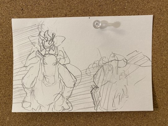

On the first day, I sketched out an idea I had for a scene and began blocking it out in 3D. Most of the work here was just thinking about potential chase scenes and lighting and procrastinating.
On the second day, I journeyed to Sleepy Hollow and spent the day there taking photos and hiking, which although didn't directly iterate/progress the scene, was useful for understanding the foliage and setting of the legend, even though I had already sort of mapped it out for this particular scene.

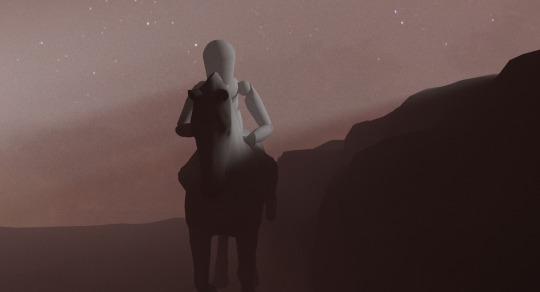
On the third day I found a model horse and imported my rigged drawing model guy to further detail the scene. The set up there was actually pretty quick, what I spent most of the time on was dialing in the lighting and enviroment volume as to get that sort of god ray look without blowing out the image.
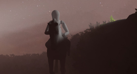
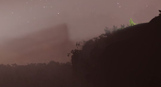
On the fourth day, I added a lot of leafy green shrubbery inspired by my Wednesday trip. Although it's subtle this actually took like 2 hours. The main issue here is how tedious it is to set up redshift proxies. Over the summer I got a small library of realistic north American forest foliage models, but I had never actually used it. So I spent some time converting about half of the items into redshift proxies which I then imported into the scene and scattered about the ground and sort of hill wall thing the horse is riding beside. It definitely can use some work but right off the bat, I was a fan of the detail it brought to the floor, with the foggy layers of plants and leaves.
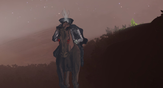
On day five I did an initial drawing based on the renders from the day before. Although I think it turned out pretty cool, it is not really feasible to animate and could use some further compositing.

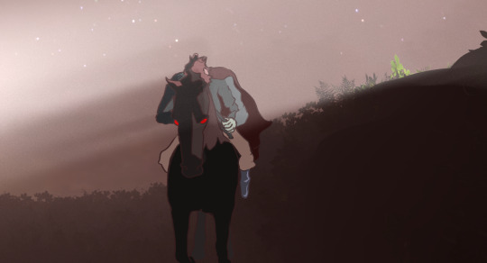
On day six I tried doing a more simple drawing, but it looked a bit bland. I decided I would focus on proper designs and colors next week and just try and get the compositing down


On day seven I rendered out a few (I only stuck with the two shown here) versions of the isolated fog. I tried for a bit to understand redshift AOVs but after seeing most of the tutorial workflows going straight to real compositing software and not Clips Studio Paint or any other simple layered drawing software (which makes sense) I decided to just do what felt correct and isolate lighting elements and the environment to create the fog images.
I then overlayed them with a few different blend modes and combinations to produce the above images, which make the character feel within the fog as opposed to on top of it, which I think helps the look a great deal.
This week wasn't particularly rough or anything, but I am still settling into a finalized schedule for the semester, so I am hoping to be more productive next week now that I am aware of when I can work on this and when. I also won't be taking any full-day trips until the 27th when I plan to go up to the Hudson Valley/Highlands again.
0 notes
Text
How I Make My Edits
because @lesterluminous asked
First off, I have the most convoluted process ever because I use free/cheap apps on my phone for reasons. So, I'm not really the best example to follow, but here you go~~~
These are all the apps I use. The pink I use for almost every edit, the blue I use for color correction, and the purple are my go tos to make pics look cool. Everything else I use less frequently and only if I want a specific look
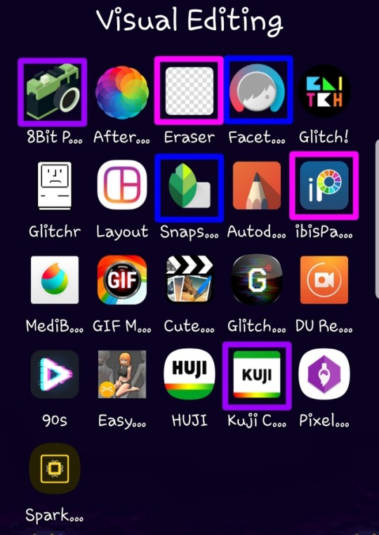
Here’s what I use each for
8Bit Photo Lab: easily my fave app for glitch effects
Afterlight: the best basic photo editing app I’ve found on android. Good if you’re in a hurry and just want like a filter. I rarely use this because I’m rarely in a hurry
Background Eraser: (from handyCloset Inc.) the best app of its kind I’ve been able to find. Very easy to use, minimal ads, and doesn’t lower the quality of your photo. I use this anytime I want to get rid of the background
Facetune: I mainly use this when I’m having trouble getting the coloring of the pic right in snapseed or if I want to color correct only part of the photo. The makers of this app have another one that is phenomenal called Enlight and it’s my absolute favorite editing app, but it’s not available for android
Glitch!: another cool glitch effect app. It can do some things 8Bit can’t, but it’s more random and I like ~control~ I mainly use it for GIFs
Glitcher: this one is ultra random, so I hardly ever use it. But, it’s good it you want a glitch effect, but don’t want to spend much time on it. Again, I mainly use it for GIFs
Layout: sometimes a bitch just needs a basic collage okay???
Snapseed: the first app I go to when making an edit. A lot of times the lighting in the boys pics isn’t great (especially in ig stories), so I use this to color correct and. It has the ability to edit using curves which is the best thing ever once you get the hang of it. It also has a bunch of features I never use, but they look neat. Also, it’s completely free
Autodesk SketchBook: tbh I never get around to playing with this, but it seems like it’d be good lol
ibisPaint: omg this app is sooo underrated. I use it for almost every edit and I also use it for drawing. It’s intended to be a drawing app and not an editing app, but it has so many features that are FREE. You can make a one time payment that gets rid of ads, allows you more layers than you’ll ever need, and gets you more brushes, but you don’t necessarily need that stuff. I’m honestly so shocked it’s free because it’s so, so good. It also has a monthly subscription with more stuff but I aint got a spare $2.99/month
MediBang Paint: I literally only use this to make gradients. I’m sure it’s perfectly good, but I like ibisPaint so much more lol The only thing ibisPaint can’t do that I wish it could was make gradients haha
GIF Maker: (by GIF Maker & GIF Editor & Video Maker) sometimes I make extremely shitty GIFs that may or may not work on desktop. This is what I use. It’s the least sketchy GIF making app I’ve found, has minimal ads, and plenty of features
Cute CUT: (by MobiVio Solutions) this is the best video editor I’ve found on mobile. I sometimes use it for editing video to turn into gifs and sometimes to work around the dumb way other apps do thing that’s too complicated for a basic overview haha
Glitchee: this app is really not user friendly, but it has some cool glitch effects. Good for GIFs because it allows you to edit/save video and not just pictures
DU Recorder: This is the best screen recorder I’ve found. Very reliable, non-invasive ads, etc. I use it to capture video I want to use for a GIF. I also used it to record my M&G
90s: (by ryzenrise) this has a lot of really cool retro and glitch filters, but it ONLY lets you edit video. I hardly ever use it, but it’s good for GIFs. I’ve also used Cute CUT to make a video file out of a picture as a work around
Easy Poser: for drawing, not edits lol
HUJI: for taking dumb photos, not edits
Kuji Cam: my fave for making pics ~aesthetic~ It’s free to download, but worth paying the small amount for full features. The filters are so good and I use this very, very frequently. If I’m still having trouble with color correction after Snapseed and Facetune, this is often my saving grace
Pixel Brush: for drawing, not edits
Spark Post: this seems like a cool app if you want to make edits, but would rather have something simple than mess around with a ton of tools. But, the best thing about it is that it has easily searchable free photos! I just use this to find a photo for the background of an edit then save it so I can use it in other apps that I like better lol
My workflow
So, I am not a good person to emulate if you want to make pretty edits. But, I’ve never claimed to be a good example, so I’ll tell you anyway lmao
To begin with, I have a Galaxy Note8. This is important because 1) the screen is huge af so I can actually see what I’m doing and 2) it comes with a pressure sensitive stylus. I literally chose this phone for these reasons. These combine to make my phone pretty similar to a drawing tablet which allows me to be a lot more precise than if I were just using my finger.
I download pics and video directly off Instagram because I want to know I’m getting the best quality possible I use StoriesIG for their stories and DownloadGram for their pics posted on Instagram (or i download from Twitter if the boys also put it there). I haven’t found a way to download photos from a photo set after the first one besides just screenshotting then cropping them.
From here, I color correct in Snapseed and Facetune, sometimes going back and forth between apps before I get it how I want. Then, I add any filters and/or effects I want. Next, I use Background Eraser to get just the boys. I determine what sort of background I want and I prepare that. I open a new canvas in ibisPaint and add any pics I want. Then, I get all creative combining everything together and making it look pretty instead of just slapped together (unless i want it to just look slapped together for a shitpost or something lol)
As for GIFs, I don't know how people who are actually good at it do it, but I acquire my video, use Cute CUT to up the contrast and saturation and mess with the color a little. Then I chop in into pieces that are about 3 seconds long and save each as its own video. Then, I put those into GIF Maker and maybe mess with the color again in there. Then I save that and pray to the patron saint of editing, Philip Lester, that I got the settings right and my file is small enough to upload. I rarely make GIFs because, using this method, they turn out very, very atrocious :)
And that’s it!
If anyone is curious about how to do specific things or get certain effects or there’s anything else you want to know, feel free to send me an ask or message and I’d be happy to try my best to help
19 notes
·
View notes
Text
20 Years.
Two-thirds of a lifetime ago, a ten-year-old boy in a scratchy wool sweater sat huddled under an old down blanket. The first proper snow of the season had come the week before, and the boy hadn’t been dressed for building forts. Now here he was - bored, sick and sweaty. His mother entered the room with a mug of undrinkably hot milk with honey and butter. In her other hand was an issue of GAME.EXE, a computer gaming magazine. The words “HALF-LIFE” were plastered across the bottom of the cover. The boy loved reading, and loved computers, and the milk needed time to cool off anyway. He opened the magazine and flipped to page 8 after finding it in the table of contents. The boy grew older and switched languages, countries and continents, but his favorite game never changed.
-
It’s hard to compress two decades into text, but I will attempt to do so when it comes to my relationship with the Half-Life series that began all those years ago, with that preview article in that magazine.
The article was written in a second-person perspective that really stuck out to me, and was filled with screenshots that would later turn out to be of an unreleased rough beta version of the game. It ran through several dramatized, episodic descriptions of events in the game, then listed out the weapons used in the game, the enemies you would face and the tactics to deal with them. Finally, there was an interview with Marc Laidlaw himself. This single article was sufficient to make me completely insufferable to my parents for the next few months. “I want to play Half-Life,” I would say. At first, this meant asking to go to an Internet cafe a few blocks away from home, and for money to pay by the hour and use one of their beefy gaming PCs. Later on, it meant asking for a copy of the game, and for time on the “main” home computer - the only machine that could run the game at all, in glorious 320x240 resolution that gave me headaches.
-
A couple of years passed. The move to the US threw everything into a pleasant state of disarray, but the one thing that hadn’t changed was having to ask my parents to use the computer to play Half-Life. I had found one of my own soon after arriving in the States, but it had no sound card. It was there, on my mother’s computer, that I finally beat the game. My thirteenth birthday present was a copy of the newly released Opposing Force expansion. My birthday cake featured an edible photo of myself playing in a fountain in downtown Chicago, which my mother doodled over with brightly colored frosting. I was now knee-deep in toxic green sludge, a crowbar in one hand, and a proud Lambda logo on my chest.
Most kids in my 8th and 9th grade classes didn’t share my enthusiasm for Half-Life. They played console games and were rightfully hyped about the Playstation 2 and X-Box. In search of like-minded people, I took to the Internet. My options for getting online in 2001 were limited to libraries - either during lunch at school, or at the Naperville Public Library, which was a hour-long walk from home. I discovered Planet Half-Life, an offshoot of the Gamespy network. Through it, I discovered the fact that my favorite game was designed from the ground up to be moddable. I learned of Counter-Strike, Team Fortress Classic, and Sven Co-op. I discovered the Handy Vandal’s Almanac and The Snarkpit, two communities focused on level design. Having no reliable internet at home, I downloaded the level editor - then called Worldcraft - onto a floppy drive and brought it home to install. For the first time, I wasn’t simply playing the game. My parents looked on as I worked to figure out the obtuse user interface, trying to remember what I’d read earlier in the day. They raised their eyebrows when I finally managed to compile and run my first level - a hollow, unlit concrete box 512 units across with a single prefab trashcan hovering in the center. There wasn’t much more I could do in the limited time I was allowed to use the good computer, but I had caught the bug. My notebooks were filled with doodles of level layouts, my mind filled with cheesy storylines to match.
Eventually my family moved to a house with proper internet access, and I got a set of hardware with enough power under the hood to run both the game and the editor. It could even produce sound! All the things I could only read and salivate about were now within my reach, and I gorged myself on them. Counter-Strike quickly fell by the wayside, but Team Fortress and Sven Co-Op did not. Natural Selection came out and blew me away with how different a Half-Life mod could look and feel from the original game. I stayed up past midnight, playing, building, and playing some more. I learned that projects can die - when the extremely tongue-in-cheek Scientist Slaughterhouse mod went silent.
The release of the Half-Life 2 trailer took everybody by surprise. I had called one of my like-minded friends and we synch-watched it together, pausing every few minutes to let the video buffer and gush about how amazing everything looked and how much we were looking forward to messing with the modding toolkit. The subsequent beta leak and resulting delays taught me to be patient.
The move to California was not long after, and my patience was immediately put to the test as most of my belongings were stuck with the moving company, including my computer. I must have gone through a full pack of printer paper in less than a month, drawing up concepts and layouts for Xen Rebels, a mod centered around a semi-peaceful human colonization of the realm set after the events of Half-Life. Once my computer arrived, it was right back to the late nights and groggy mornings for me. Our home Internet was bad but workable, and I spent countless hours with the new and more creative mods that were being released, including The Specialists - a strong attempt to recreate the gun-fighting and martial arts stylings of Hong-Kong action movies in a multiplayer game. Around the same time I was introduced to the strange new world of anime, and decided that I simply must change the two throwable knives offered by The Specialists into kunai and throwing needles. This of course required me to learn 3D modelling. At the time, this was done with Milkshape 3D, a model editor compatible with most contemporary game formats. Once again, countless hours of figuring out the interface and the workflow followed, set to the calming tones of the Unreal, Deus Ex and Half-Life soundtracks. Creating models felt a lot more freeform than levels as I wasn’t constrained to a unit grid or forced to use convex geometry, and one day the new throwing weapons were in. I published the modified models on a forum to exactly zero fanfare. Around the same time, I began learning the basics of Photoshop in school, so modelling and texturing went hand in hand. To say my early textures were atrocious would be an affront to honest, hard-working atrocious textures the world over, but I continued my studies. My experience with working in 3D even netted me a 2nd place award at the school art contest - money which I immediately put back into upgrading my computer.
Half-Life 2 came out in November of 2004, to universal praise and celebration. I received the collector’s edition as a present for New Year, along with a copy of Raising The Bar. I beat the game the same morning, without a wink of sleep between unwrapping my present and the final darkness of the credits screen. The SDK didn’t ship with the game, but as soon as it was released I dove in. Soon after, the modding community blossomed, bigger and more vibrant than the original game’s, driven by the incredible flexibility of the engine. One of the first mods that appeared was made by a British man named Garry, and was called simply that, “Garry’s Mod”. It let players interact with the physics engine, and slowly sprouted more and more features. Many players used these features to pose character ragdolls, eventually creating entire comic series with storylines ranging from the comedic non-sequitur to dark and serious. Of course I felt the need to try my hand at it. That lead to the creation of The Plane - the story of Beet, a Combine Elite who managed to break free of his overseers’ indoctrination and find friendship, love, and revenge on his old masters. The only redeeming feature of that story was that it taught me how not to write stories.
I began getting more attached to the Gmod community than the expressly level design one at The Snarkpit. The few levels I publicly released were designed specifically as sandboxes to play and build in. The most popular ones were gm_orbit and rp_bahamut, maps set in space and featuring zero gravity for physical objects, allowing players to build smaller spaceships, or roleplay as the crew of a salvage and exploration vessel. Posting teaser images on the forums taught me a valuable lesson - what it felt like to be the one creating hype, instead of experiencing it. The constant demands were overwhelming. Some would simply want more work-in-progress screenshots. Others would drop ultimatums that unless a certain feature was designed a certain way, they would refuse to use the map. Others yet attempted to worm their way into getting the map early, offering to test it and provide feedback. I had almost deleted each project multiple times before finally releasing it.
Life happened, and things with Half-Life slowed down. When the Orange Box came out in 2006, I attempted to get it at a five-finger discount at a local Target. I got caught. Indirectly thought it was, Half-Life taught me that idiocy often leads to consequences. Buying it legitimately later in the year and playing through Episode Two reminded me that some stories aren’t written to end neatly.
It was in 2007 that I bought a membership for the Something Awful forums, and discovered an avid and very exclusive community of Gmod players. Over the course of the following decade, most of these people remained in constant contact with me, and will probably remain so for the foreseeable future. I became an admin once we opened our serves to the public - moderating the newcomers and mentoring the unskilled. One of the people had a project in mind, and I began creating models again. Miraculously, Milkshape 3D remained compatible with the Source engine, so I worked with it until I learned Maya. This project would eventually become known as Armored Combat Framework, and be released to the Gmod community at large. I learned how to iterate designs based on feedback, and how it felt to work in a well organized team.
Frontier happened around 2010, and was another lesson in teamwork - specifically what happens when things break down without role redundancy. Ambitions ran high, and the hype mounted. The programmer eventually left, and all that remains of the project is the very videos and images that were used to hype it in the first place, and a folder full of now-useless models, maps and textures. That was probably what prompted me to start pulling away from Half-Life and Gmod in general.
Black Mesa came out in 2012 and breathed a new life into my old obsession. I played through the original Half-Life again, then through the remake, noting the differences and the tweaks to make the gameplay more palatable to modern-day players. It felt good, like putting on an old but comfortable jacket. I’d fire up the SDK now and then, mostly to help newer, more driven designers. Two of the guys from Team Frontier went on to work in the industry full-time. There were whispers of a new game in the works, minor leaks of file and folder names hidden away in Valve projects. Episode 3 turned into Half-Life 3. A full sequel, rather than another short episode, as originally planned. “HL3 Confirmed” became a meme, but the people at the top remained silent.
Life kept happening, as it does. I lost people, I found people. I left home. Every now and then I’d fire up HL or BM again, or drop by the old Gmod server. I’d build things and model things, and release none of it to the public. I watched as the Dota International became the most widely spectated event in gaming, making players, sponsors, and Valve millions. The realization slowly started settling in. Then Marc Laidlaw retired, and later posted the Epistle. The workers at Valve spoke of a lack of direction and stagnation that comes with a cornered market. Modding for an engine over a decade old, no matter how advanced, slowed down.
It’s a different world now. Unity and Unreal engines rule the scene. Survival and Battle Royale have become the new buzzwords. Microtransactions. Loot boxes. Streaming integration. Freemium. E-Sports. Mobile gaming. Virtual Reality. If a new Half-Life were to appear today, would it be changed by the zeitgeist, or would it stay the course set by its predecessors? I don’t know. But there’s one thing that the escapades of a mute, bespectacled research associate have taught me more than anything else: hope.
2 notes
·
View notes
Text
Corel Painter 2019 Review

With every new version of Painter, I'm able to improve my workflow, enhance the effectiveness of my art and develop new painting techniques. Corel Painter 2019 is no exception. I'm Painter Master, Aaron Rutten. Let me take you on a tour of the new features in Corel Painter 2019.

Lowest Price on the FULL version of Corel Painter 2019 - Save $100
Enter Coupon Code: PTRAR at checkout | Valid only at painterartist.com
The 2019 version of Painter focuses on performance and usability. It's light on new features compared to the last few versions. A good chunk of highly requested bugs have been addressed and the performance of Painter is significantly faster than previous versions. Gone are the days of crippling lag while using (reasonably) large brushes, high resolution canvases and multi-layered files. It also looks a lot more modern and offers some great dark UI themes.
One of the the most common complaints with each version is that legacy bugs were ignored to give priority to new brush technology. That's not the case this time around. I think a lot of current users will be pleased with what's been done to fine tune Corel Painter. Painter is working better than ever and you'll definitely notice a difference. Though I initially felt a little disappointed that there wasn't any new brush tech to play with, the major boost in performance is enough to make me a happy painter.
Let's take a tour of what's new:

Modernized UI
The UI or User Interface has been modernized to give Painter a more modern appearance. The toolbar, properties and palette icons have all been redrawn. Now it's easy to identify which icons control brush media and which icons control brush shaping.

Square Icon = Media Control, Round Icon = Brush Shaping
New UI Themes
There are also 3 new UI color themes to choose from: Dark Gray, Medium Gray and Light Gray. I personally really like the Dark Gray theme because it's easy on the eyes, improves color perception and doesn't distract too much from what I'm creating on the canvas.
Sliders
The sliders in Corel Painter have a new look and feel. The slider bar has been enlarged a bit to make it easier to manipulate. This is especially useful for users of display tablets like the Wacom Cintiq because the old sliders were too small and thin which made them difficult for some folks to use.
You can also Hold Ctrl (Windows) or Cmd (Mac) while dragging the slider to enable Precision Mode which will move your slider in very small increments. This makes it much easier to make a small change to any slider in Painter. Artists who work with small brushes will really love this because you can make very fine change to the brush size. For example, you can go from a 1.5 pixel brush to a 2 pixel brush very precisely.
Selected Tool and Property Mode Highlights
The icon for the selected tool or property is now highlighted in a color that stands out. I'm all for new features that make it easier for my viewers to follow my tutorials and this is one of them.
Color Wheel Grabbers
In previous versions of Painter, the color wheel's hue ring had a little bar that represented the selected hue. The bar was a bit too thin and could be difficult to click on, so the target has been changed to a small circle to make it a bit larger and easier to grab. It also looks nicer.

Gray Backgrounds for Color Wheel & Color Swatches Panels
The background color of the color wheel has been changed to a neutral gray color in the Dark and Medium UI Themes which makes it easier to more accurately see the color you are selecting.
The background color of the Color Swatches panel has also been changed to a neutral gray color which greatly improves color perception when selecting swatches.
Performance Improvements
If you are using a computer that supports AVX2, Corel Painter 2019 can be up to 78% faster with large brushes and up to 38% faster with documents with many layers and large high resolution documents. There is also faster application performance overall. While testing with reasonably large brushes on a reasonably large canvas, I was pleasantly surprised at how much snappier Painter feels compared to older versions. Now, I say reasonable a few times there because if you make your brushes too large and paint on a extra large canvas, it's going to crush your computer and you will experience some serious lag. Not just in Painter, but in Photoshop or any other art app. So the performance boost more or less brings Painter up to par with the other art apps out there.
Improved Multi-Touch
Multi-Touch has been greatly improved... And by that, I mean it actually works. In previous versions, I was pretty much unable to use Multi-touch on my Wacom Cintiq because it would become unresponsive, but now I'm happy to say that Multi-Touch in Painter 2019 is as smooth as butter. You have a few options for how you can configure the touch:
Wacom Device – Wacom touch driver controls touch.
Windows Touch Device – Windows touch driver controls touch. (For Surface Pro and other tablets that are not made by Wacom)
Both Wacom & Windows Touch – Both the Wacom and Windows drivers control touch. I've found this works best for Wacom tablets with a screen that are running on a Windows computer such as the Cintiq and MobileStudio Pro.
Multi-Touch using a Wacom Cintiq 27 QHD Touch and Windows 10
Overall, Windows touch is much smoother in Painter 2019 and Wacom touch is more reliable. I was able to get touch to lock up on occasion, but it's easy to get it working again by double-tapping with two fingers to reset the zoom and rotation. That beats the heck out of resetting Painter which is what you had to do to get touch working again in previous versions.
Enhanced Zoom
No one likes jumpy zoom levels that never seem to get the canvas as big as you'd like it. Fortunately, now you can now drag up/down or left/right (no diagonals please) to scrubby zoom your view of the canvas. If you look in the Properties Bar, you'll see and option for "Drag To Zoom". If you hold Shift, you can draw a box to zoom into a specific area. If you don't like the new zoom and want it back to how it was in earlier versions, change the Zoom Mode to "Select Zoom Area" and it will revert to its old ways.
Pinned Temporal Color Wheel
The Pinned Temporal Color Wheel is a color wheel that can be floated on top of your canvas. It does not have a background, so you can easily compare the color you are selecting to a color on your canvas by placing the color wheel on top of your artwork.

As you may have guessed, the color wheel now stays pinned rather than disappearing after you've selected a color. Access the Pinned Temporal Color Wheel with the keyboard shortcut: Ctrl/Cmd + Alt/Opt + 2 or choose the Simple Layout from Window > Layout > Simple
New Brushes
The 2019 version of Painter does not include any new brush tech. However, it does include 36 new brushes. There is a new Stamps brush category with some one-click stamp brushes that are useful for adding textures and decals to your compositions. You can choose Windows > Search and then search for 2019 to show a list of the new brushes in Painter 2019.
New Pattern Pens & Patterns
The Pattern Pens brush category features 2 new brushes – Pattern Pen Transparent and Transparent No Sizing which allows the Pattern Pens to support transparency. There are also 5 new patterns that have been added.
Brush Ghost Updates
The Brush Ghost shows the brush diameter as you are painting. By default, Painter 2019 now hides the Brush Ghost as soon as your start a brush stroke and instead shows a tiny crosshair cursor until the pen is lifted again. The cursor can be changed from a crosshair to several other icons in Painter's preferences. And if you like, you can disable this new feature to have the Brush Ghost show at all times. When the Brush Ghost is hidden, brushes feel a bit faster, but it's harder to see brush diameter.
Bug Fixes
In addition to the new features I mentioned, there have also been numerous bug fixes in Painter 2019.
Conclusion
While there's little to be dazzled by in this version, what's important is that Painter 2019 is performing better than ever. If you are considering upgrading from an older version, you'll enjoy how solid Painter 2019 feels and how modern it looks.
If you are an artist who has been reluctant to switch to Painter because of performance concerns, you can rest assured that Corel Painter is now performing as well as many of the other art apps out there.
Watch my video review demonstrating how to use the new features in Painter 2019.
youtube
#Corel Painter#corel painter 2019#corel painter 2019 review#review of painter 2019#corel painter 2019 new features
2 notes
·
View notes
Text
Adobe Audition Portable 64 Bit

Students and teachers are eligible for over 60% discount on Adobe Creative Cloud. Get access to Photoshop, Illustrator, InDesign, Premiere Pro and more. Using Adobe Premier Portable, you may face many issues complicating your activities. So, if you plan to use this program illegally, be ready to take all the consequences. I have prepared the info about the disadvantages this software brings and will also explain why the ideal variant is a licensed version. Officially supported operating systems include Windows 10 (64-bit), Windows 8 (64-bit) and Windows 7 (64-bit). What versions of Adobe Audition are available? The current version of Adobe Audition is CC 2021 14.1 and is the latest version since we last checked. This is the full offline installer setup file for PC.
Adobe Audition Portable 64-bit
Adobe 64 Bit Windows 10
Adobe Illustrator CS6 Full Version is a program specifically designed to handle vector graphics. Created and developed by Adobe Company, now this software is becoming more complete and powerful. At first, this application was made to meet market needs for graphic design. Like designing magazines, illustration images and many more. But along with developments, now this program managed to include 3D (three-dimensional) capabilities. This feature allows us to see what is drawn in 3-dimensional art. Really cool right?
The CS6 version was released in 2011, with the latest features and tools. In this sixth generation, the world began to recognize the existence of illustrators as one of the most sophisticated vector applications. Gradually it can compete with its greatest competitors, Corel Draw. This software still prioritizes the ease of the user interface. So that anyone can learn and use these apps professionally. Do you want to try this software?
Adobe Illustrator Creative Suite 6 Latest Features :
Efficient, flexible interface:
Dockable hidden tools
Adjustable UI brightness
Color panel enhancements
Type panel improvements
Transform panel enhancements
Transparency panel improvements
Control panel enhancements
Image Trace
Pattern creation
Mercury Performance System
Gaussian Blur enhancement
Gradients on strokes
Adobe Illustrator CS6 Download 64 bit
Adobe Illustrator CS6 System Requirements
Operating SystemWindows 7 UltimateWindows 10 ProfessionalProcessorIntel Dual Core 2Ghz Dual-CoreIntel Core i3 Processor 3Ghz+Memory2GB DDR34GB DDR4Hard Drive10 GB – 7200 RPM HDD20 GB – Solid State DiskGraphics CardNvidia Graphic Cards 1GBNvidia Gefore GTX SeriesScreen Resolution1366×7681920×1080
How to Install Adobe Illustrator CS6 Full Version :
Download Adobe Illustrator CS6
Extract with the latest Winrar v5.6 application
Turn off your internet connection and your antivirus
Run the installation, Illustrator_16_LS16.exe
Select the trial version
When finished, run the application then close again
Now open the crack folder
Copy the file amtlib.dll and illustrator.exe
Paste in the installation folder
C:Program FilesAdobeAdobe Illustrator CS6Support FilesContentsWindows
Enjoy!
Also Download :Adobe Illustrator CC 2018 Windows
Adobe Illustrator CS6 Full Version 64 Bit


Adobe Illustrator CS6 | MegaNZ | FileUpload
Download Crack Only | MegaNZ | ZippyShare
Filesize : 1.9 GB | Password : www.yasir252.com
Adobe SoundboothDeveloper(s)Adobe SystemsStable release
CS5 v.3.0 / April 12, 2010; 11 years ago
Operating systemMac OS X v10.4.9, Windows XP SP2, Windows Vista and Windows 7Platformx86, x86-64TypeDigital audio editorLicenseProprietaryWebsiteAdobe Soundbooth Homepage
Soundbooth is a discontinued digital audio editor by Adobe Systems Incorporated for Windows XP, Windows Vista, 7 and Mac OS X. Adobe has described it as being 'in the spirit of SoundEdit 16 and Cool Edit 2000'. Adobe also has a more powerful program called Adobe Audition, which replaced Soundbooth as of Adobe Creative Suite 5.5 Production Premium. Soundbooth, discontinued in 2011, was aimed at creative professionals who do not specialize in audio or people who need a simple editing program and do not require the full features of Adobe Audition. Due to Intel-specific code, Adobe stated that the Mac OS X version would only be available for machines using Intel processors. Soundbooth CS4 was the first version to support 64-bit officially.
Key features(edit)
Adobe Audition Portable 64-bit
Creation of the Adobe Sound Document allows Adobe Flash to create multi-track audio projects in Soundbooth.(1) Soundbooth also features dynamic linking that allows video sequences from Adobe After Effects and Adobe Premiere Pro to be played in Soundbooth without having to first be rendered, a feature that is expected to save users time.(1)Writing life story examples.
Comparing Soundbooth to Audition(edit)
The major difference between the programs is that Soundbooth uses a task-based interface and Adobe Audition uses a tool-based interface.(2) Another difference is that Soundbooth uses royalty-free scores and sound effects whereas Adobe Audition uses music loops and allows for low latency multi-track recording.(2)
Adobe 64 Bit Windows 10
Criticism(edit)
Many users have commented on the lack of simple features that were found in programs like Sound Edit 16 and Cool Edit Pro; for example, the ability to create a new file or to 'reverse' a sound.(citation needed)Laurie lee memoir book.
Lack of simple batch processing makes it a chore when needing to simply speed up, clean up (pops or crackles), or apply a pitch change to all of the files in a project. Each chapter, track, or MP3 file must be opened, applied, and saved independently; contrary to customer expectations of features that freeware has provided for many years.
In response, Durin Gleaves (of Adobe) in a post dated 31 March 2007 said, 'I agree that Reverse would be an obvious feature, but I'm afraid it's not going to make it into version 1.0 (CS3). I assure you that several of us are pushing to see it in 2.0 (CS4).'(3)
Creating a new file was added in CS4. While the feature to 'reverse' a sound was never implemented after its discontinuation.(4)
Discontinuation(edit)
Adobe stated on its website that: 'Sales of Adobe Soundbooth audio software ended on April 24, 2011. Adobe Audition CS5.5 is replacing Soundbooth in Adobe Creative Suite 5.5 Production Premium software, based on customer requests for a professional audio toolset that integrates with the Adobe workflow. This decision brings the best features from the Adobe family of audio solutions into a single cross-platform package, focusing on the need for high-performance audio in post-production workflows. By combining the power and precise control Adobe Audition users have long appreciated with the more modern interface and streamlined workflow Soundbooth users value, Adobe Audition CS5.5 offers the flexibility and quality of a full-featured audio tool designed for speed and efficiency on both Mac OS and Windows.'(This quote needs a citation)
Selenium is an open-source web automation library. It supports many browsers like Chrome, Firefox, Edge etc and many languages – python, java, C#, javascript etc. Here we will get to know How you can use selenium with C# in Visual studio code. Visual Studio New Project. Click the test project and name it Selenium WebDev Testing (see. Step 1: Open the VS Code and Install the Nuget Package Manager using the VS code extension (Ctrl+Shift+X) Step 2: Then go to the Command Pallette of VS Code(Ctrl+Shift+P), Search for Nuget Package Manager: Add Package and then Search for Selenium.Webdriver. Selenium visual studio code.
References(edit)
^ abLawson, 'Announcing Soundbooth CS4: Now in Web Premium and Production Premium CS4.' Inside Sound 23 September 2008 8 October 2008Archived 24 October 2008 at the Wayback Machine
^ ab'Free audio recording, editing software - Download free Adobe Audition CC trial'. adobe.com. Retrieved 25 February 2017.
^'Untitled Document'. Adobe.com. Retrieved 25 February 2017.
^'reverse a sound in Sb CS4? -Adobe Community'. Adobe.com. Retrieved 25 February 2017.
External links(edit)
Retrieved from 'https://en.wikipedia.org/w/index.php?title=Adobe_Soundbooth&oldid=996761009'
0 notes
Text
ThinkPad X1 Fold review: Lenovo's foldable PC is nowhere near ready
Lenovo is no stranger to making weird things. In 2016, the company gave us the first dual-screen hybrid with the Yoga Book that was part color tablet, part e-ink touchscreen keyboard / drawing pad. It followed that up with a second-generation in 2018, but also gave us things like tablets with fold-out kickstands and laptops with speakers built into the hinge or an e-ink screen on the lid. Not to mention that Lenovo pioneered the 360-degree hinge system and was the first to announce a 5G laptop with Qualcomm in 2019.
So it shouldn’t be surprising that the company is the first to deliver a foldable tablet PC that you can actually buy. We saw a prototype of the ThinkPad X1 Fold last year and got all the specs at CES 2020, and now it’s finally hitting shelves for $2,600 to start. For that price, you’re not just getting a large foldable phone. In addition to the fact that it runs Windows, the 13.3-inch X1 Fold also acts as a mini laptop when it’s folded halfway and you add Lenovo’s companion keyboard. If it was well-executed, Lenovo’s first foldable PC could have been better than a regular laptop, and not simply jumping on a hot trend. The problem with the X1 Fold, though, is that the execution needs work.
Summary
The ThinkPad X1 Fold is an impressive piece of technology that sorely needs better execution. It’s laudable that Lenovo was able to make a 13.3-inch OLED tablet that can bend, but on its own the $2,600 Fold is a seriously expensive Windows tablet. Throw in the $230 keyboard that fits neatly between the screen’s two halves for a faux laptop mode and you get a neat mini machine that’s only good for quick emails and tweets. But few, if any, people should spend nearly $3,000 to buy the X1 Fold when any Surface tablet would serve you far better.
Like the Surface Duo I reviewed earlier this year, the X1 Fold is a unique device. Yes, it's a big foldable and we've seen and tested a few foldable phones by now so the technology doesn't feel quite as novel. But Lenovo's device is the first that's this large and runs Windows, making it basically a foldable Surface tablet. Because of its flexible screen and sturdy hinge, the X1 Fold can be used in a number of orientations similar to the Surface Duo and the Galaxy Z Fold 2, like book or laptop. But because the hinge only opens to 180 degrees, you won't be able to rotate it all the way over into a tent mode.
As a tablet or book
For the $2,600 starting price, you'll only get the X1 Fold itself without a keyboard or stylus, meaning you’ll largely be using it as a tablet or "book". It's a serviceable device and is surprisingly well made. I like the leather cover that not only makes this feel like a real (if hefty) notebook, but also adds a touch of class. On the top bezel sits a 5-megapixel webcam, while power and volume buttons line the right edge. There's also a pair of USB-C ports, one on the left side and the other on the bottom.
With a 13.3-inch screen the Fold is quite large for a tablet, and it certainly feels chunkier than the iPad Pro or Samsung's Galaxy Tab S7+. It weighs 2.2 pounds and has a 11.5mm profile, and when folded it's about 24mm thick. All that heft makes this difficult to maneuver with one hand, and I struggled to open the Fold while holding a camera with my other hand.
When you close the X1 Fold, it magnetically snaps shut and there's a tiny gap near the hinge. That comes in handy when you need some leverage to pry the device open, because the magnets holding it together are quite strong. Once you get the screen moving though, the hinge springs open. It starts getting more resistant when you push it beyond a 25 degree angle and you can bend the screen so it's half closed and stays that way.
In this orientation, you can hold the X1 Fold as if it were a book and run two apps side by side to drag and drop between them or just to keep an eye on Twitter while watching YouTube. Or you could also set the Fold up on the kickstand built into its leather case and have a second screen or just to watch Netflix on. The 2K OLED screen here is bright and colorful, and although there is a small crease in the middle, it’s not very obvious… when the screen is flat at least. When the display is bent though, the dent in the middle is significantly brighter than the rest of the panel, and makes viewing anything full screen a bit jarring.
My main frustration with using the Fold as a tablet is that Windows is still an atrocious touch-based operating system. We’ve known this for a long time -- Microsoft’s many public embarrassments with mobile versions of Windows have proven this point time and time again.
Honestly, it was downright infuriating to use Tablet Mode on the X1 Fold, especially when I just wanted to go back to the desktop to find a file I saved. Trying to drag and drop windows didn’t behave the way I expected it to, not to mention Microsoft’s app store is pitifully bare compared to Apple and Google’s options. There still isn’t an official Kindle app, for example.
Obviously book mode is best for reading (or it would be if there was a real Kindle app). But it’s also pretty good for writing and taking notes. Lenovo’s $100 pen is responsive and smooth, though I prefer Microsoft or Samsung’s options.
To its credit, Lenovo tried to make it easier to use the Fold in Book mode by adding its own mode-switching software. By tapping an icon in the system indicator tray, you can quickly expand an app to take up the whole screen or snap two apps side by side. This did make it easier to launch, say, YouTube and Twitter next to each other, but aside from a few very niche scenarios I struggled to find a reason to actually use book mode.
As a mini laptop
Throw in Lenovo’s $230 companion keyboard, though, and the X1 Fold presents a far more compelling case (if you forget about the price). Of course, you can use your own keyboard, but the company’s version not only fits perfectly in the gap between the two halves of the screen and magnetically stays in place, but also charges wirelessly when it’s stowed in the closed tablet.
With this setup, you get a cute little mini laptop with a 7-inch-ish screen that’s perfect for getting work done when you’re in a tight space. The buttons on this understandably small keyboard offer an impressive amount of travel and space, all things considered.
But tradeoffs had to be made to squeeze all those keys onto something this small, so some buttons like the dash and equal signs at the end of the row of number keys had to be sacrificed. It also had to move the apostrophe from where it normally is next to the Enter key to slightly higher and farther to the right, between the Backspace and Enter instead. These changes took a bit of adjusting to and made typing a little awkward. It’s fine for a quick email or tweet, but I wouldn’t want to type on this for hours.
I do appreciate that Lenovo included a trackpad on the keyboard, even if it is pretty small at 3 inches wide and 1.5 inches tall. While it isn’t the most responsive touchpad around, I was thankful for a way to use the cursor on Windows, as well as multi-finger gestures like swiping to switch between apps. Surprisingly, I never felt like it was too cramped.
Otherwise using the X1 Fold as a mini laptop was… fine. Because you’re reduced to using a 7-inch screen in this mode, you can only get about three app icons on the taskbar at once unless you reduce the OS’s font and icon size. Doing that on a screen this small makes any text quite hard to read. And don’t even think about running two windows side by side -- they’ll barely fit or be so small that you’ll need to scroll forever to see everything.
Performance and battery life
The X1 Fold uses an Intel Lakefield Core i5 processor with Intel’s “Hybrid technology,” which the chip maker says is “engineered for mobile performance.” It uses architecture similar to ARM’s big.Little design, relegating less demanding tasks to lower-power Atom cores and tapping bigger cores for tougher processes. In general, the Fold kept up with my needs, and the few hiccups I came across seemed more to do with glitchy software than a slow processor. For example, sometimes Lenovo’s mode switching tool wouldn’t work, and instead of letting me choose the window I wanted open on either half of the display, it would just show two random apps I had open. Switching between landscape and portrait modes would bring up all the windows I had open, for example, and I often had to wait for webpages to expand and fill the whole screen when I maximized them.
These were mostly issues that had to do with switching between modes -- when I stayed in either tablet or laptop orientations, the device generally kept pace. Granted, I didn’t do anything too demanding like editing video, but for most of my day to day workflow the machine held up.
On our video rundown test, the X1 Fold clocked an impressive 13 hours and 30 minutes, which beats the Galaxy Tab S7+, the Surface Pro 7 and the iPad Pro 12.9. In real-world use, it generally lasts all day in tablet mode, though I found that using the keyboard seemed to drain the battery a bit more quickly. There’s also the option of getting a 5G-capable model of the X1 Fold, by the way, which I expect will sap energy even more.
Wrap-up
I’m having a hard time recommending anyone buy the X1 Fold. I don’t want to diminish Lenovo’s achievement here -- it’s impressive that the company managed to make a foldable PC that it’s ready to roll out to the public. But as is the case with many first-gen products, the X1 Fold is an expensive experiment. If you buy this, know that you’re basically paying to be a beta tester. There are plenty of quirks to work out. While I’m excited to see companies innovate, the ThinkPad X1 Fold’s exorbitant price and lack of real benefits keep me from endorsing it. If you need a laptop-tablet hybrid that runs Windows and can fit in tight spaces, the Surface Pro 7 or the Surface Go 2 are much more reasonably priced and offer better productivity.
0 notes
Text
Getting Around the "One Form" Problem in Unbounce
Posted by R0bin_L0rd
What is Unbounce?
Unbounce is a well-known and well-regarded landing page creation tool designed to allow HTML novices to create impressive and impactful landing pages, while offering scope for more experienced coders to have a bit more fun.
In this post, I’m going to list some solutions to what I refer to as the “one form” problem of Unbounce, their strengths and weaknesses, and which I personally prefer.
What is the "one form" problem?
As with any system that tries to take complex processes and make them simple to implement, there’s a certain amount of nuance and flexibility that has to be sacrificed.
One limitation is that each landing page on Unbounce can only have one embedded form (there are a few community articles discussing the topic, for instance: 1, 2, 3). While there’s a definite risk of call-to-action fatigue if you bombard your visitors with forms, it’s a reasonable requirement to want to provide easy access to your form at more than one point.
For example, you could lead with a strong call to action and the form at the top of the page, then follow up further down the page when users have had time to absorb more information about your offering. A simple example of this is the below Teambit landing page, which was featured in Hubspot’s 16 of the Best Landing Page Design Examples You Need to See in 2017.
The top of this Teambit page features a simple email collection form
The form is repeated at the bottom of the page once visitors have had a chance to read more.
Potential solutions to the one-form issue
Now that we’ve established the problem, let’s run through some solutions, shall we?
Fortunately, there are a few possible ways to solve this problem, either using built-in Unbounce tools or by adding code through open HTML, CSS, and JavaScript inputs.
It’s worth bearing in mind that one solution is to not have the form on your page at all, and have your call-to-action buttons linking to other pages with forms. This is the approach Unbounce uses in the example below. While that’s a perfectly valid approach, I wouldn’t call it so much a solution to this problem as a completely different format, so I haven’t included it in the list below.
Here Unbounce use two CTAs (the orange buttons), but don’t rely on having the form on the page.
1. Scrolling anchor button
This is potentially the simplest solution, as it’s natively supported by Unbounce:
Create a button further down the page where you would want your second form.
Edit that button, in the “Click Action” section of the right-hand button settings panel, where you would normally put the URL you are linking to
Add in the unique ID code for the box that holds your form (you can find that by editing the box and scrolling to the bottom of the right-hand panel to "Element Metadata")
Register button
“Click Action” section of right-hand button settings panel
“Element Metadata” section at bottom of right-hand element setting panel
Benefits
Quick and easy to implement, little direct JavaScript or HTML manipulation needed.
Drawbacks
There are far more seamless ways to achieve this from the user perspective. Even with smooth scrolling (see “bonus points” below), the experience can be a little jarring for users, particularly if they want to go back to check information elsewhere on a page.
Bonus points
Just adding that in as-is will mean a pretty jarring experience for users. When they click the button, the page will jump back to your form as though it’s loaded a new page. To help visitors understand what’s going on, add smooth scrolling through JavaScript. Unbounce has how-to information here.
Double bonus
The link anchors work by aligning the top of your screen with the top of the thing you’ve anchored. That can leave it looking like you’ve undershot a bit, because the form is almost falling off the screen. You can solve this simply by putting a tiny, one-pixel-wide box a little bit above the form, with no fill or border, positioning it how you want, and linking to the ID of that box instead, allowing a bit of breathing room above your form.
Without and with the one-pixel-wide box for headroom
2. iFrames
Unbounce allows free <HTML> blocks, which you can use to embed a form from another service or even another Unbounce page that consists of only a form. You’ll need to drag the “Custom HTML” block from the left bar to where you want the form to be and paste in your iFrame code.
The “Custom HTML” block in the left-hand bar
Blank HTML box that pops up
How HTML blocks look in the editor
Benefits
This will allow for multiple forms, for each form to be positioned differently on the page, to function in a different way, and for entries to each form to be tagged differently (which will offer insight on the effectiveness of the page).
This solution will also allow you to make the most of functionality from other services, such as Wufoo (Unbounce has documented the process for that here).
Drawbacks
Having chosen Unbounce as a one-stop-shop for creating landing pages, breaking out of that to use external forms could be considered a step away from the original purpose. This also introduces complications in construction, because you can’t see how the form will look on the page in the editing mode. So your workflow for changes could look like:
Change external form
Review page and see styling issues
Change layout in Unbounce editor
Review page and see that the external form isn’t as readable
Change external form
Etc.
Bonus points
Unbounce can’t track conversions through an iFrame, so even if you use another Unbounce page as the form you draw in, you’re going to be breaking out of Unbounce’s native tracking. They have a script here you can use to fire external tracking hits to track page success more centrally so you get more of a feel for whether individual pages are performing well.
Double bonus
Even if you’re using an identical Unbounce page to pull through the same form functionality twice, tag the form completions differently to give you an idea of whether users are more likely to convert at the top of the page before they get distracted, or lower down when they have had time to absorb the benefits of your offering.
3. Sticky form (always there)
An option that will keep everything on the same page is a sticky form. You can use CSS styling to fix it in place on a screen rather than on a page, then when your visitor scrolls down, the form or CTA will travel with them — always within easy reach.
This simple CSS code will fix a form on the right-hand side of a page for screen widths over 800px (that being where Unbounce switches from Desktop to Mobile design, meaning the positioning needs to be different).
Each ID element below corresponds to a different box which I wanted to move together. You’ll need to change the “lp-pom-box-xxx” below to match the IDs of what you want to move down the page with the user (you can find those IDs in the “Element Metadata” section as described in the Scrolling Anchor Button solution above).
<style> @media (min-width: 800px) { #lp-pom-box-56{ position:fixed; left:50%; margin-left: 123px; top:25%; margin-top:-70px} #lp-pom-form-59{ position:fixed; left:50%; margin-left: 141px; top:25%; margin-top:60px} #lp-pom-box-54{ position:fixed; left:50%; margin-left: 123px; top:25%; margin-top:50px}} </style>
Benefits
This allows you to keep tracking within Unbounce. It cuts out a lot of the back and forth of building the form elsewhere and then trying to make that form, within an iFrame, act on your page the way you want it to.
Drawbacks
The problem with this is that users can quickly become blind to a CTA that travels with them, adding some kind of regular attention seeking effect is likely to just annoy them. The solution here is to have your call to action or form obscured during parts of the page, only to reappear at other, more appropriate times (as in the next section).
It can be difficult to see exactly where the form will appear because your CSS changes won’t take effect in the editor preview, but you will be able to see the impact when you save and preview the page.
4. Sticky form (appearing and disappearing)
The simplest way to achieve this is using z-index. In short, the z-index is a way of communicating layers through HTML, an image with a z-index of 2 will be interpreted as closer to the user than a box with a z-index of 1, so when viewing the page it’ll look like the image is in front of the box.
For this method, you’ll need some kind of opaque box in each section of your page. The box can be filled with a color, image, gradient — it doesn’t matter as long as it isn’t transparent. After you’ve put the boxes in place, make a note of their z-index, which you can find in the “Meta Data” section of the right-hand settings bar, the same place that the Element ID is shown.
This box has a z-index of 31, so it’ll cover something with an index of 30
Then use CSS to select the elements you’re moving down the page and set their z-index to a lower number. In the below lines I’ve selected two elements and set their z-index to 30, which means that they’ll be hidden behind the box above, which has a z-index of 31. Again, here you’ll want to replace the IDs that start #lp-pom-box-xxxx with the same IDs you used in the Sticky Form (Always There) solution above.
<style> #lp-pom-box-133{z-index: 30; } #lp-pom-box-135{z-index: 30; } </style>
When you're choosing the place where you want your form to be visible again, just remove any items that might obscure the form during that section. It’ll scroll into view.
Benefits
This will allow you to offer a full form for users to fill out, at different points on the page, without having to worry about it becoming wallpaper or whether you can marry up external conversions. Using only CSS will also mean that you don’t have to worry about users with JavaScript turned off (while the bonus points below rely on JavaScript, this will fall back gracefully if JavaScript is turned off).
Drawbacks
Unlike the iFrame method, this won’t allow you to use more than one form format. It also requires a bit more CSS knowledge (and the bonus points will require at least a bit of trial and error with JavaScript).
Bonus points
Use JavaScript to apply and remove CSS classes based on your scrolling position on the page. For example you can create CSS classes like these which make elements fade in and out of view.
CSS:
<style> @media (min-width: 800px) { /* make the opacity of an element 0 where it has this class */ .hide { opacity: 0; } /* instead of applying an effect immediately, apply it gradually over 0.2 seconds */ .transition { -webkit-transition: all 0.2s ease-in-out; -moz-transition: all 0.2s ease-in-out; -o-transition: all 0.2s ease-in-out; transition: all 0.2s ease-in-out; }} </style>
You could then use this JavaScript to apply the .hide class when user scrolls through certain points, and remove it when they get to the points where you want them to see the form. This can be used for finer-grained control of where the form appears, without having to just cover it up. As before, you’ll need to update the #lp-pom-box-xxx strings to match the IDs in your account.
JavaScript:
<script> // This script applies the “hide” class, which makes opacity zero, to certain elements when we scroll more than 100 pixels away from the top of the page. Effectively, if we scroll down the page these items will fade away. $(window).scroll(function() { if ($(window).scrollTop() > 100 ){ $('#lp-pom-box-54').addClass('hide'); $('#lp-pom-box-228').addClass('hide'); } // This section removes the hide class if we’re less than 500 pixels from the bottom of the page or scroll back up to be less than 100 from the top. This means that those elements will fade back into view when we’re near the bottom of the page or go back to the top. if ($(document).height() - ($(window).height() + $(window).scrollTop()) < 500 || $(window).scrollTop() < 100 ){ $('#lp-pom-box-54').removeClass('hide'); $('#lp-pom-box-228').removeClass('hide'); }} </script>
Double bonus
You could consider using JavaScript to selectively hide or show form fields at different points. That would allow you to show a longer form initially, for example, and a shorter form when it appears the second time, despite it actually being the same form each time.
For this, you’d just add to your .scroll JavaScript function above:
if ($(document).height() - ($(window).height() + $(window).scrollTop()) < 75){ // This part hides the “full name” part of the form, moves the submit button up and reduces the size of the box when we scroll down to less than 75 pixels away from the bottom of the page $('#container_full_name').addClass('hide'); $('#lp-pom-box-54').stop().animate({height: "200px"},200); $('.lp-pom-button-60-unmoved').animate({top: '-=75'}, 200); $('#lp-pom-button-60').removeClass('lp-pom-button-60-unmoved'); $('#lp-pom-button-60').addClass('lp-pom-button-60-moved');} else{ // This part adds the “full name” part back in to the form, moves the submit button back down and increases the size of the box if we scroll back up. $('#container_full_name').removeClass('hide'); $('#lp-pom-box-54').stop().animate({height: "300px"},200); $('.lp-pom-button-60-moved').animate({top: '+=75'}, 200); $('#lp-pom-button-60').removeClass('lp-pom-button-60-moved'); $('#lp-pom-button-60').addClass('lp-pom-button-60-unmoved');
When scrolling within 75px of the bottom of the page, our JavaScript hides the Full Name field, reduces the size of the box, and moves the button up. This could all happen when the form is hidden from view; I’ve just done it in view to demonstrate.
Conclusion
In the table below I’ve pulled together a quick list of the different solutions and their strengths and weaknesses.
Solution
Strengths
Weaknesses
Scrolling anchor button
Easy implementation, little coding needed
Jarring user experience
iFrame
Multiple different forms
Requires building the form elsewhere and introduces some styling and analytics complexity to workflow
Sticky form (always there)
Keeps and design tracking within one Unbounce project
CTA fatigue, using up a lot of page space
Sticky form (appearing and disappearing)
The benefits of a sticky form, plus avoiding the CTA fatigue and large space requirement
CSS knowledge required, can only use one form
Personally, my favorite has been the Sticky Form (appearing and disappearing) option, to reduce the need to integrate external tools, but if I had to use multiple different forms I could definitely imagine using an iFrame.
Which is your favorite? Have I missed any cool solutions? Feel free to ping me in the comments.
Sign up for The Moz Top 10, a semimonthly mailer updating you on the top ten hottest pieces of SEO news, tips, and rad links uncovered by the Moz team. Think of it as your exclusive digest of stuff you don't have time to hunt down but want to read!
from The Moz Blog http://ift.tt/2FTJBdG
via IFTTT
1 note
·
View note
Text
Zwei: The Ilvard Insurrection - Localization Blog #2
“Rally-ho, true believers!” I shout, swinging into the grand hall on a chandelier, interrupting the fancy party. Everything stops as eyes are focused solely on me – on my roguish good looks, my brand-name tabard, my elk leather highboots. I somersault to the floor, landing on my feet with a flourish and a bow. “I know you must have thought this high society gathering dreadfully dull without me here to tell you about the intricacies of composing prose for novel electronic amusements, so I’ve come to enlighten and entertain thee. Also, did you know all the food here is free? My pockets are full of cocktail wieners right now.”
Indeed, it’s an honor to see you again, dear readers. I hope you enjoyed my previous blog about the upcoming PC release of Zwei: The Ilvard Insurrection. As a small refresher, it served as something of an introduction to Zwei: II as a game – what it’s all about, its two main characters, the setup of the story, and its battle and leveling system. You can think of it as a sampler platter to give you a taste of why this game’s cool.
Do a barrel roll
Today, in my second Zwei: II blog, I’d like to go into more detail on the process of writing and editing for the game, and some of the things I dealt with and thought about as I localized it. I’ve done an entry like this for each of my prior projects, and I always enjoy it because it gives me a chance to briefly pull back the curtain and share with you some of the minutiae of localization, and the truism that every project is its own beast.
One interesting thing of note about this project is that it’s the first project on which I served as the sole editor. When I started working at XSEED, most of my prior localization experience had been as part of a team working on large single projects, while most of XSEED’s workflow at that time had been to keep a single editor on a project as much as possible. Each method has its own benefits, as you’d expect. When I work with a partner or team, I enjoy being able to bounce ideas off them or ask for hot takes any time I want, like, “Okay, which of these five potential quest names sounds the best to you?” or “Here’s what I have so far for this scene, but I want this girl to sound more disinterested. How would you do it?” We solicit general impressions from the office fairly regularly, but having other editors acquainted with the specifics and setting of the project you’re working on gives you access to an informed, expanded scope beyond your own intuition and experience. That’s important, because every editor is naturally going to have some characters or scenes they click with more readily than others.
On the other hand, flying solo can also be nice because it represents a purer distillation of editorial voice. With single-editor projects, you know that all the text in the game was overseen by the same person, making thoughtful choices with full knowledge of where everything fits in the greater scheme of the story. I think that’s what XSEED values about this methodology, but with the arrival of mammoth-sized scripts like those for the Story of Seasons and Trails of Cold Steel games, it became a matter of practicality to learn to work well as small teams on projects – a challenge I think our editors have risen to meet in admirable fashion. Of course, that’s not to say I didn’t have a lifeline or two working on Zwei: II. Junpei and Tom were an ever-present source of support whenever I had a question about something in the Japanese – and there were many, many of those over the duration of the project. Even when you’re working alone, you’re never truly alone when you’ve got the office familia backin’ you up.

Getting to work on a project by myself has also helped me better understand my own work process. One nice thing is that everything I mentally bring to a project – the stories I’ve consumed and experiences I’ve had that color how I interpret characters and scenes – remains consistent throughout. This is especially pertinent when writing for comedic scenes, as no two editors will have the exact same sense of humor, and Zwei has more than its share of wisecracks and comedy. The scary thing about being the sole face of a game, though, is that anything that’s weird or wrong, any jokes that totally fall flat, emotional connections that don’t get made – that’s all on me. In a way, it’s a test of myself as a writer and editor, with you all as the judges. With the original Story of Seasons, Tom and Ryan lent me a hand, and I had the dashing Young Kris as my partner for the first Trails of Cold Steel, but here, you get pure Nick, for better or worse (hopefully for better).
I mentioned briefly in my previous blog that Zwei: II felt like it was deeply informed by ’90s anime and manga, and I’d like to unpack that a little more for you here, in case your curiosity was piqued at the notion. After all, a lot of the games we work on here at XSEED are pretty anime-flavored, right? What’s one more on the list?
Here’s my take. Over time, the general vibe of anime has undergone change, as all thriving arts tend to. One major difference – the one most relevant to our discussion – is the observation that protagonists in many modern series tend to be passive, disaffected, reticent, or otherwise hesitant to engage the world and situations around them. They’re the reactive sort. Sometimes it’s because they’re exceptionally socially aware. Sometimes it may be because they’re awkward youths. Sometimes it’s because you get the impression that the writer really wants you to think this person is cool or above it all. Anime from the ’90s, on the other hand, is much more associated with protagonists who leap into situations without thinking, do things without considering the ramifications of their actions, and adhere to a personal code or philosophy that the character consciously or unconsciously holds. Both approaches, in the hands of a good storyteller, can and have made for some great entertainment, but from a writing perspective, the “’90s anime” types are definitely easier for me to work with. They’re more expressive, more willing to engage, and their very being tends to create conflicts that help drive the story and the growth of both themselves and other characters.
During the time I was working on Zwei: II, I actually ended up rewatching a season of Ranma ½ (those blu-rays are preeeeetty sweet) and seeing the Tenchi Muyo TV series for the first time (on loan from Tom). Seeing those really made this whole point click with me, like, “...That’s it! That’s the kind of comedic stylings Zwei is trying to channel!” Not in the sense of specific plot points or characters from any particular series, but the sort of atmosphere that was about creating opportunities for amusing things to happen. Ranma, for instance, tends to nettle many of the characters in his series not on purpose, but just by being who he is. And not just that – doing it on purpose also comes very easily to him (just watch how he loves to bait Ryoga or Kuno with his taunting). Ragna is less purposefully ornery, but his decisive personality draws the admiration of some and the exasperation of others. Plus, later on in the game, you run across a genuine hot spring, and we all know what a staple of the era that is. ;)
You’ve probably heard the saying, “Tragedy is easy, comedy is hard,” and there’s truth in it. Most of us love a good comedy, but do any two of us love all the same comedies or laugh at all the same things? Humor is deceptively difficult because it’s so mercurial, influenced by the times, by moods, by delivery, and more. A bit that might leave you stone-faced Monday night could have you busting a gut Thursday night. Understanding why something that makes you laugh does so is the study of a lifetime. There’s really no shortcutting it – you have to get the mileage, experiencing things that make you laugh, thinking about why, and chasing the next thing you think might give you another shot of mirth. I can only hope that I’ve imbibed enough of the spirit of humor to properly convey the charm of what is perhaps Falcom’s most levity-laden title.
Yeah...just hangin' in there, y'know...
Beyond my approach to the game itself, we have its characters – the heart and soul of the action. Quite often, early on in the process of localizing a game, I’ll get an impression of a character as, “Oh...I guess he’s a lot like X from [other source],” and as I make a couple of those anchoring connections and begin considering the characters in the game from those perspectives, they begin to show their multiple facets. Lest you think this sounds too close to, “Oh no, he’s just taking an existing character and foisting that persona on this carefully crafted, unique game character!”, take a measure of comfort in my assurance that I, too, would be dissatisfied with an approach that oversimplified. Think of it more as a basic framework – scaffolding that lets me clamber around the object d’art to get at the fine detailing.
With Ragna, for instance, his characterization is very front-loaded in the game. Right away, you know he’s a freewheeling pilot, sort of a hotshot, and likes to do things his own way. The image he creates is very “early 20th-century flyboy,” and I sort of conceptualized him as a guy who wouldn’t feel out of place if you stuck him in among the cast of “The Rocketeer.” Speech-wise, his alternating between laid back and fired up reminded me of Gundam Wing's Duo Maxwell, and like that character, Ragna likes to chime in with some tongue-in-cheek commentary if something patently ludicrous or weird happens in the game. Finding characters who are reasonably like the one you’re writing for helps, as does understanding the milieu in which a character exists – what they were doing just before the story began, and what the world around them that shaped them is like.

There are actually a couple characters who have what I termed “Ragna-variant” speaking styles. Ragna’s main vocal tic is that he sometimes truncates words ending in “-ing” (so “nothing” would become “nothin’,” and “fighting” would be “fightin’,” though I tried to generally keep it to one per text box – it’s a spice, not a marinade), so among the expanded cast, you get some people who speak that way because they have similar lifestyles. Odessa, as a rough-and-tumble Treasure Hunter who specializes in capturing bounties, is very colloquial in her faux old-west style. Gashler, who runs the garage out by the airstrip, is a full-bearded, goggled mechanic that sort of reminded me of Cid from Final Fantasy IV, and his speaking style is pretty thick – one of the most affected in the game, though I tried to make it still pretty easy to comprehend. One also has to consider that people who have special styles of speech have certain occasions where that’s either suppressed somewhat, or is expressed with even greater emphasis than normal. Even old man Gashler might speak (mostly) standard English if you dragged him to a black-tie event, but on the other hand, if someone said his workmanship is rubbish, I have no doubt that he’d be cussin’ up a storm, blastin’ furnace-fire, and lettin’ loose with the sort of strange, idiomatic expressions that only grease-stained mechanics know.
Ragna being an unusually “American-feeling” character made him pretty easy to write for right from the start. Alwen took a little more finesse and more time to find her ground – but not because she was difficult in a conventional sense. The trick with Alwen was that she definitely inhabits a certain archetype, at least partially, but I needed to figure out how much of that I needed to accurately represent her, and when to let her individual characteristics shine.
Alwen, as the daughter of an esteemed Trueblood vampire house, can be very prideful, bordering sometimes on haughty. She learns fairly quickly that the world beyond her castle has more complexities than she gave it credit for, but her distance from the world of humans actually gives her some surprising insights. Now, the most common way you see characters like Alwen played are that they step out into the greater world, eventually realize how much they don’t know, and depend on their friends to teach them what it means to really live along the way. Alwen...has some of that, but it’s the way she interfaces with the world that makes her an interesting and fun character. For example, she doesn’t technically NEED to eat food, but likes eating a ton of it (on Ragna’s dime, of course) just because it’s tasty. She’s not afraid to walk right into town and make small talk with the people. Alwen may be a vampire, but she’s refreshingly (and oddly) free of so many of the preconceived expectations people have about what vampires are like. She even calls Ragna out on this early on in the game when he’s shocked that she walks around just fine in the bright morning sunlight. A great deal of Zwei: II’s story is really her story, especially when it comes to getting the ball rolling, and it helps the story greatly to have a character who both entices with a bit of the familiar but also stands out due to individual quirks.

I also did with Alwen a variant of what I did for Laura in Trails of Cold Steel, where I shifted her from talking with a “proper,” antiquated style of speech to a more natural speaking style that still retains the idea that she’s highborn. Coming at this from a lore perspective, Alwen hasn’t been out of her castle in the last 100 years or so and has learned what she knows of the world from her estate’s extensive library, so it would be very feasible for her speaking style to sound older than that of Ragna or the people of Artte. In practice, though, Ragna having a casual style of speech and Alwen’s speech being fairly rigid made it difficult for the comedy to land, and to really connect with Alwen as a character. Can you imagine what Star Wars would’ve been like if Princess Leia spoke like a medieval fantasy princess while trying to banter with Han Solo? That’s the kind of disparity I’m talking about. It might’ve been funny, but for reasons entirely unintended. So after thinking on it a while, I decided to adjust Alwen’s speaking style, dialing it back. My priority was to keep her sounding articulate and well spoken, but casual up the language so that the banter between her and Ragna has the requisite snap it ought to. In my opinion, the net gain from that was well worth the adjustment, which you’ll be able to see for yourself when you play.
Sort of tangentially related to that, in the Japanese version, Ragna goes through basically the whole game calling Alwen “Princess” (“hime-san”). The best reasoning I could figure is that maybe, having taken on some power from their blood contract, Ragna feels he should acknowledge her as his liege, but...that explanation totally flies in the face of Ragna’s personality. Ragna is a guy for whom there is ONLY a first-name basis (or a nickname if he finds one for you he likes). The most likely explanation is that it’s just the difference between politeness levels in Japanese personal address versus Western personal address, but the title put a certain amount of “distance” between them that I didn’t want to remain there for the duration of the game. The alteration I made to compensate for this was to have Ragna refer to Alwen as “princess” a bit at the very outset of the game, but quickly fall into using her first name, which feels much more natural for the character. To draw the analogy with Star Wars again, think of it as Han Solo going from calling Leia “princess” or “your worship” in a sort of snarky context when he doesn’t really know her to simply calling her “Leia” once he’s spent time with her and knows her as an individual. Plus, with as big a deal as Ragna makes over wanting to work together with Alwen as “equal partners” at the start of the game, it would be weird for him to then go on to refer to her by her royal title for the rest of the game.
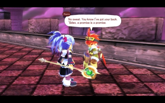
This discussion isn’t meant to be a comprehensive retrospective of Zwei: II’s localization, of course; just a list of some of the noteworthy things I grappled with working on the game. Editorial work does have its pressures and difficulties – when the buck basically stops with you, how do you know you’re making the right call? – but ultimately, these kinds of challenges are what keep the job fresh and interesting. The point of all the character personality profiling, the speech styles, the fine-tuning, is for players to be able to sit down and experience a fun story and memorable characters that “just work,” no speculative microscope examinations of the translation required. I think my obsessive tweaking and spit-polishing will make for a better game experience...but you don’t have to take MY word for it. Give Zwei: The Ilvard Insurrection a try when it comes out and see for yourself!
45 notes
·
View notes
Text
Exclusive Interview with Phillip Sevy - Tomb Raider Comic Artist
June: Could you introduce yourself to the fans in China? (How did you become a comic book artist? What was your first comic book? How many series have you done so far and which ones are your favorite?)
Phillip: Sure. My name is Phillip Sevy and I’ve been working in comics for a few years now. I’ve wanted to draw comic professionally since I was 9 years old and bought a copy of Chris Claremont and Jim Lee’s X-Men #1. It’s been a long road (I started showing my portfolio of comic art at San Diego Comic Con in 1999) but I love making comics and am blessed to be able to do so. After attending the Savannah College of Art and Design I drew a miniseries called “The F1rst Hero” for Action Lab comics before placing as a runner-up in the Top Cow talent hunt. For Top Cow I drew a few oneshots for their Aphrodite IX series before I drew issues 5 – 8 of “The Tithe.” While drawing The Tithe, I got offered Tomb Raider, so I drew two series at once for a few months (I don’t recommend this as sleep and life was sacrificed to do this – ha!).
Since the end of Tomb Raider, I’ve turned my attentions toward my own projects. I released a scifi oneshot for free online called “Paradox.” (you can read it at paradoxcomic.tumblr.com)
Around the same time, Drew Zucker and I started releasing our long-gestating horror series “The House” on Comixology that I’m just writing and Drew is drawing. Issue 5 of the series just came out and there will be 7 issues in total.
Tomb Raider was a fantastic experience that introduced me to so many passionate and welcoming fans, but my favorite series (so far) has to be Paradox. It was short and very different from my other works, but it was very personal. It was also my first venture into creating a series where I do all aspects of production (writing, penciling, inking, coloring, and lettering). I’m working on a pitch for an longer series right now where I’m doing just about the same.
June: Most fans in China got to know you for the most recent Tomb Raider comics, could you tell us how did you start the Tomb Raider series? and how long did it take to complete those 12 issues?
Phillip: The editor of the first six issues or so was Patrick Thorpe and I met him over two years earlier at San Diego Comic Con. We had kept up with each other since then as I’d sent him samples of work. Early fall of 2015 I had emailed him some pdfs of the work I was doing for Top Cow as a way of updating him on what I was doing. I was busy with “The Tithe” and wasn’t looking for a new project at the moment, but Patrick responded and asked if I was available to start a new project that was “pretty big.” He called me up and as soon as he said ‘Tomb Raider” my heart skipped a beat. I was a big fan of the earlier Tomb Raider series that Top Cow had produced – Michael Turner was and is one of my all-time favorite artists. I knew that no matter how crazy my life would be – I HAD to draw Tomb Raider. I talked to him at about 6pm on a Monday night. I started the next morning.
It took me roughly 14 months to draw the 12 issues. I had deadlines that ranged from 3 – 5 weeks per issue, depending on a lot of factors. It was really hard and exhausting, but I wouldn’t have traded it. Looking at the numbers, I haven’t drawn the most issues of Tomb Raider (that record belongs to Andy Park, I believe), but I’m one of the longest runs by an artist on the title. I feel very proud to be able to say that.
June: In your opinion, what is the difference between your art style (in Tomb Raider series) from the other Tomb Raider comic artists (in Reboot or Classic Topcow version)
Phillip: I was very lucky in that I was allowed to put my style on the series. My style is more in line with the reboot comics/game – more realistic and grittier – but I think my work is darker and more textured than the reboot comics that came before. I loved being able to push the blacks and textures in my work.
June: What is the general process of making the artwork of this Tomb Raider comic series? Did you involve any other part other than line art?
Phillip: Again, I was very lucky to work with great collaborators. Mariko (Tamaki) would send me drafts of the scripts and ask for feedback or input. She looked at the work I was producing and found ways to play to my strengths and allowed me to cut loose. So even before I started drawing an issue, I’d have been involved in the issue. She’s a great writer and did a great job not only writing but making me feel apart of the process.
Once her scripts were approved by Crystal Dynamics, I’d work on layouts that would get approved by my editors. From there, I’d pencil the whole issue and send to CD for approval. From there, inks and approvals. After that, Michael Atiyeh would work his color magic while Michael Heissler would add the final touch of great letters.
June: What was the most difficult part to you? Did you have to follow certain guidelines?
Phillip:It took me a little bit to get the look of Lara down right. I was drawing her too muscular at first. I have lots of female friends who are big into crossfit – so that got into my early drawings and I gave Lara much broader shoulders and muscled arms. Working with Crystal Dynamics, they helped me develop a look for her that was more consistent with the games. But after that, we were set.
(Above is an early drawing of Lara Croft from page 2 of issue 1, which emphasized her muscular build)
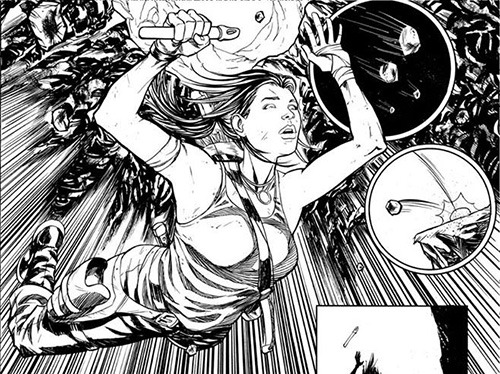
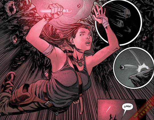
(Published version)
June: We heard the storyline of this series was completed by both of you and the writer - Mariko Tamaki, could you tell us more about it? Did you make any twist on the storyline?
Phillip:There were a lot of great discussions and back and forth between Mariko and I as we worked on the book. Obviously, she’s an award-winning, fantastic writer so I always trusted the choices she made and did my best to bring them to life. One of the big areas of focus she had was the relationship Lara had with her friends – often times the price her friends paid because of Lara’s actions – but that her friends were what gave her the strength to do what she did. I believe I suggested that Jonah be the one to save Lara and shoot the head bad guy at the end of issue 6. Lara is strong and capable and can do anything because of who she surrounds herself with. She’s strongest when she’s with others. That’s part of her strength – her love.
June: Obviously, many TR comic followers were focusing on a specific character – Sam. In your interview of “20 Years of Tomb Raider”, you mentioned Sam is also your favorite character other than Lara Croft, what is your thought between these two characters? What is your explanations on the ending of #12 issue between Lara and Sam?
Phillip: What I love about the dynamic between Lara and Sam is that as far as Lara goes into the world of adventuring, cults, spirits, ancient evil, artifacts, etc – Sam is the person who grounds Lara and returns her to normalcy. Sam is who she cares about above all and it’s what will always guide Lara to do the right thing.
As far as the ending to issue 12, I’m curious to see where the story goes from there. Obviously, we had some plans that we weren’t able to see through, but I know Tomb Raider is in good hands and I can’t wait to see where the story goes.
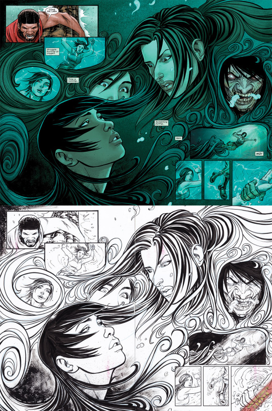
June: We noticed you started the series with pencil sketch and then transfer to digital process, what is the difference between the two process?
Phillip: My process evolved over the course of the year plus I spent on the book. The first five issues, I penciled digitally and then printed my pencils on the board and inked the pages by hand (combination of brush, nib, and pen). By issue 6, I switched to full digital work. As my deadlines got tighter, I had to find ways to speed up. It took about two full issues until I adjusted to the digital workflow, but I loved it. There were a few pages in each issue I’d normally ink by hand, but the bulk of 6 – 12 were done digitally.
With digital work, I was able to make corrections and changes much easier. I was also able to build 3d models of the environments for each issue and then drop them into my pages and ink over them.
June: What is the current comic book you are doing ?Will you come back for the future TR series?
Phillip: I’m working on a new series that I’m writing, penciling, inking, and coloring. It’s the first time I’m doing full-fledged colors on a sequential work and it’s been both intimidating and exciting. The project doesn’t have a publisher yet, but I’m pitching it to a few companies next month. Fingers crossed that I’ll be able to announce it in the next six months or so.
I would love to come back and do more Tomb Raider work. Even though I got to do 12 issues, it felt like I was just starting to hit my stride.
June: Would you like to say anything to your fans in China? Many of them want to become a comic book artist, what is your advises to them?
Phillip: I want to thank them for the support of the series, my work, and Tomb Raider, in general.
As far as becoming a comic artist – if I can do it – anyone can. Ha! Each market for comics is very different, so the best advice I can give is to educate yourself. You don’t have to go to formal art school, but study anatomy, visual storytelling, perspective, etc. Just practice won’t make you a great artist – you need to study your craft and then practice.
It has been a great pleasure to get to know and talk to Mr. Sevy and found out all the back story about this most recent Tomb Raider comics series. Mr. Sevy is very easy to communicate with and super friendly to talk to, many of us adore his artworks and the image of Lara Croft that he drew in this series. He is definitely one of my favorite Tomb Raider comic artist other than Andy Park.
If you are interested in his artwork, please visit his face book page or other social medias (see below).
Facebook: facebook.com/phillipsevycomicart
Twitter:@phillipsevy
Instagram: @phillipsevycomicart
Personal illustration of Lara Croft
中英文双语版请点击这里
32 notes
·
View notes
Last Seen Blogs

officialwibo
WIBONELA

biethuvuonmientay
Xconsg

kissab
喫茶部門

sourcherryandsprinkles
Whyy did you drop out of YALEE?!🍂☕

thelonelycatsnakestoner
I smoke two joints & then I take a nap