#JS loading priorities
Explore tagged Tumblr posts
Visit Tumblr Blog
Explore Tumblr blogs with no restrictions, modern design and the best experience.
Last Seen Tumblr Blogs


Fun Fact
Average visit duration of Tumblr.com is 10 mins and 25 secs.
Text
Buckle up kiddos because you’re about to get an in depth character analysis of our favorite unnamed character ever: Josh Rumble’s sister!
Major disclaimer before I start: info on this girl is few and far between. I did not reread the whole series and I could have missed something. If you find something unmentioned in this essay TELL ME. Do not be shy. No, I will not be mad. Yes, I will want to hear. I am rabid about this woman. [EDIT: I forgot about the tag-teen interview when writing this analysis, so it does leave out some (potentially important) info on Josh’s parents that was revealed there. Make of it what you will].
The biggest source of information we DO have about Josh’s Sister (from here on referred to as JS) is her conversation with Celia in the Gathering Storm. The bulk of this essay will focus on that scene, but I want to mention the other small tidbits that exist.
We basically have 3 facts found outside of The Summer Tournament.
1) JS is older than Josh Rumbles
2) JS taught Josh how to dance
3) JS gave Josh an e-reader for Christmas in The Final Word.
This tells us a couple more things.
1) Her family celebrates Christian holidays
2) JS is good at gift giving
3) JS has disposable income
Okay cool. So JS is in contact with her family who are either Christian or culturally Christian, she knows how to dance, and she loves her brother. Baseline stuff.
Now the spicy bit - the Summer Tournament.
For those who may have forgotten, Josh’s team won the Renasci Soccovolle tournament so now they’re going to nationals. The one that year is in Florida, and all of Josh’s friends have come out to watch him play.
Yes, you are remembering correctly. This is the stage of The Kiss. Josh kisses Celia, she slaps him, it gets caught on camera, it’s on the front cover of every newspaper. Josh is pissed, Celia is pissed, and JS is pissed.
Celia and co. are staying at a hotel for the tournament. They have nearby rooms, and Josh is staying with his teammates, presumably in the same hotel. It is unclear what JS’s rooming situation is.
Josh apologizes to Celia in the hotel lobby, and it ends with him storming away. JS confronts Celia directly afterwards, so we can infer the JS has seen the conversation.
The first thing we learn about JS is her appearance.
She is tall, and gorgeous. She has blue eyes, mahogany hair, and her two most notable descriptors are “cool” and “sophisticated.” If there is any archetype she fits it is “The Bitch.”
Fittingly, she starts off the conversation bitchy.

She “stud[ies] her fingernails” for much of the following conversation. She is an absolute drama queen.
JS goes on to explain why she’s there. “I was here to watch my brother play. Our parents couldn’t make it.”
I would like to take a minute to remind everyone that Josh, for much of the summer, had been complaining because the one year he made it the Summer Tournament it was in Florida, the state where he lived.
The summer tournament is in Florida - where Josh lives - and his parents couldn’t make it. I think we all can agree that that’s a little weird.
They’re either poor and can’t veherate, thus making travel difficult, Josh’s tournament isn’t considered a priority for them (:/).
This next part is interesting:

“I guess he talks about you a lot.” On the surface, this tells us that JS and Josh communicate frequently.
However, that clause “I guess” is strange. There’s no real reason to add it. Her message still comes across - indeed, is more impactful - without it. So the fact that it’s there speaks to habit. She’s used to either tempering herself and her opinions, or she’s used to hiding her relationship with her brother.
And then, and THEN!
“You didn’t have to make it so public.”
That is a loaded sentence. The implications there are scalding. This changes everything.
This sentence is pivotal because it tells us why she’s upset - why she’s picking a fight.
JS does not care that Josh has a crush on Celia. That is for him to work out. She does not care that Celia turned him down. That is for them to work out. She does not even care that Celia slapped him. Look at the sentence above. “Are you often in the habit of humiliating your friends?” she asks. Not ‘hitting�� not ‘injuring’ not ‘slapping.’ Humiliating.
JS does not care that Celia hit her brother. She cares that it happened publicly.
JS cares about Josh’s reputation.
With that revelation, I want to return to her descriptions. “Polish and sophistication” is what Celia notes about her contenance. Knowing that JS cares deeply about how her brother is seen, and therefore cares deeply about how she is seen, the air of “polish” cannot be anything but deliberate.
JS either wants to, or feels like she has to, be exceedingly presentable even on a Sunday morning travel-day.
This could be a result of being overlooked as a woman, but I think especially because her reaction to Josh’s “humiliation” was so strong, it is probably a quirk of her upbringing.
Contrast that with Josh. He’s constantly choking on his own masculinity. He’s a jock, he doesn’t know how to communicate his feelings, he is uncomfortable even when other people communicate their feelings, he has a fairly gruff exterior and feels threatened by other men.
Something about JS and Josh’s upbringing has caused them to feel that they have to perform gender roles very hard, and has also made JS see violence coming from a loved one as less important than reputation.
WHAT is their home life???
Genuinely. Something is Going On.
Whatever it was, it caused Josh to almost never mention it. He never calls his sister by name, and it is only though passing comments that we know they have a relationship. And we know nothing about his parents [EDIT: this is rendered false by the overlooked TAG Teen interview].
So, to conclude.
JS comes from an … interesting home life. She cares about her brother. She is protective of her brother. She buys him expensive Christmas presents. He tells her about his friends and Celia. She listens.
She cares about being taken seriously, and beyond being very beautiful seems to have secured a well-paying job. She is very curt when she speaks, and likes to let people come to their own conclusions. She doesn’t offer her name and Josh never mentions it.
After the Gathering Storm she is never seen again.
5 notes
·
View notes
Text
The Power of Technical SEO: Why It’s the Backbone of Your Website’s Success
When we think of SEO, what often comes to mind is keyword usage, content creation, and backlinks. While these are critical components of a strong digital presence, technical SEO is the invisible architecture that holds everything together. Without it, even the best content can go unnoticed by search engines.
In this blog, we’ll explore the role of technical SEO, why it’s crucial in 2025, how it impacts your search rankings, and how the Best SEO company of Mumbai helps businesses build a solid technical foundation that drives organic growth.
What Is Technical SEO?
Technical SEO refers to the optimization of a website’s infrastructure so that search engine bots can efficiently crawl, index, and rank it. While content SEO answers the question “what does the user want?”, technical SEO answers “how well can the search engine understand and access your site?”
It includes:
Site speed and performance
Mobile-friendliness
Structured data
Secure and accessible URLs
XML sitemaps
Canonical tags
Crawl budget optimization
Error handling (404, 301 redirects, etc.)
In short, it ensures your content can be found, loaded quickly, and interpreted accurately—which is what makes it a priority for the Best SEO company of Mumbai.
Why Technical SEO Is More Important Than Ever
Search engine algorithms are evolving rapidly, but so are user expectations. People want pages to load fast, work smoothly on mobile, and deliver accurate results.
Here’s why technical SEO is non-negotiable:
1. Google’s Algorithm Prioritizes Page Experience
Google uses Core Web Vitals as part of its ranking signals. These metrics focus on speed, interactivity, and visual stability—all technical factors.
2. Search Engines Need Help Understanding Content
Your beautifully written blog won’t rank if bots can’t access it or interpret its structure. Technical SEO ensures clarity in code and structure.
3. It Affects Crawl Budget
Google allocates a limited crawl budget per site. If you have broken links, duplicate pages, or a poor structure, search engines might skip important content.
Agencies recognized as the Best SEO company of Mumbai know how to fine-tune technical SEO to maximize visibility across every page.
Key Technical SEO Elements You Can’t Ignore
Let’s break down the most important components and how they influence your website’s performance:
⚡ Page Speed Optimization
A delay of just 1 second in load time can drop conversion rates by 7%. Use tools like Google PageSpeed Insights or GTmetrix to test performance and compress CSS, JS, and images.
📱 Mobile Optimization
With mobile-first indexing, your mobile version is now the primary version Google looks at. Ensure mobile responsiveness, fast load times, and thumb-friendly design.
🌐 HTTPS Security
SSL encryption (HTTPS) is a ranking factor. Make sure your site is secure and your certificate is up-to-date.
🔍 Crawlability and Indexing
Use an updated sitemap.xml, a robots.txt file, and internal linking structure that allows crawlers to discover every page efficiently.
🧩 Structured Data (Schema Markup)
Schema helps search engines understand your content better and display rich snippets in SERPs (ratings, FAQs, events).
These are just a few areas where the Best SEO company of Mumbai conducts deep technical audits to find performance gaps and optimize for better results.
How to Conduct a Technical SEO Audit
Here’s a simplified step-by-step process used by top agencies:
Step 1: Crawl Your Site
Use tools like Screaming Frog, Sitebulb, or SEMrush to crawl your site and identify common issues (broken links, duplicate content, redirect chains).
Step 2: Check for Indexation Issues
Ensure all key pages are indexed using Google Search Console. Watch for crawl errors, soft 404s, and noindex tags mistakenly applied.
Step 3: Audit Site Speed & Performance
Use Core Web Vitals data to identify issues with Largest Contentful Paint (LCP), First Input Delay (FID), and Cumulative Layout Shift (CLS).
Step 4: Evaluate Mobile Experience
Use Google’s Mobile-Friendly Test. Also, browse your site manually to check layout shifts, navigation clarity, and loading times on different devices.
Step 5: Analyze Site Architecture
Flat structures with clean URLs, breadcrumb trails, and logical internal linking improve both UX and crawlability.
This comprehensive audit approach is what separates the Best SEO company of Mumbai from agencies offering surface-level services.
Case Study: How Technical SEO Revived a Struggling E-Commerce Site
An online fashion retailer was experiencing a consistent drop in traffic, even though they published content regularly and had good backlinks.
When they approached the Best SEO company of Mumbai, a technical audit revealed:
Over 3,000 crawl errors
Duplicate content due to URL parameters
Slow load times on product pages
Broken internal links from outdated category structures
Actions Taken:
Implemented canonical tags
Cleaned up and redirected broken URLs
Optimized images and scripts
Created a proper robots.txt and sitemap.xml
Fixed mobile rendering issues
Results (after 4 months):
64% increase in organic sessions
28% faster average load time
Bounce rate dropped by 35%
Over 1,200 previously unindexed pages began ranking
Tools to Help With Technical SEO
Here’s a toolkit used by experts: ToolPurposeScreaming FrogCrawl analysis, error detectionGoogle Search ConsoleIndexing, mobile usability, Core Web VitalsGTmetrix / PageSpeed InsightsPerformance checksSEMrush / AhrefsSite audits, backlink cleanupsSchema.orgStructured data implementationWeb.devComplete SEO & performance audits
The Best SEO company of Mumbai uses a combination of these to deliver precision in technical SEO.
The Future of Technical SEO: What to Watch For
As search continues to evolve, so must technical SEO practices. Here are upcoming trends:
🔍 AI-Powered Crawling
Search engines are getting smarter with machine learning—so sites need more semantically connected, machine-readable structures.
💡 Headless CMS Integration
Content management systems that separate front-end and back-end are gaining popularity. Technical SEO will need to adapt accordingly.
🔄 Real-Time Indexing
Instant indexing for news, product updates, and user-generated content is becoming a norm—requiring proper API and sitemap management.
🌙 Dark Mode SEO
As more websites adopt dark mode, maintaining design consistency, contrast ratios, and image clarity across modes becomes vital for UX-driven SEO.
Final Thoughts
While content and backlinks build your brand’s voice and authority, technical SEO is the invisible system that ensures it’s heard. From page speed to site structure, technical SEO lays the groundwork for long-term search performance.
If your website hasn’t undergone a thorough technical audit in the past 6 months, you might already be losing rankings silently.
That’s why businesses serious about growth work with the Best SEO company of Mumbai. Their in-depth technical diagnostics and precise implementation help turn weak foundations into high-ranking engines.
0 notes
Text
Top Tools for Accurate HVAC Calculations and Energy Efficiency
In today’s world, where energy efficiency and sustainability are top priorities, the role of precise HVAC design cannot be overstated. Whether you're a seasoned contractor or a facility manager, understanding how to perform reliable HVAC energy calculations is essential for optimizing system performance and minimizing energy consumption. Using the right tools not only improves comfort and air quality but also reduces long-term operational costs.
Why HVAC Calculations Matter
HVAC systems are responsible for a large portion of a building’s energy use. Miscalculations in load size or system design can lead to inefficient performance, higher energy bills, and frequent equipment breakdowns. Proper HVAC calculations ensure that systems are accurately sized to meet the heating and cooling demands of a space, without being over or underpowered.
Top Tools for Precise HVAC Energy Calculations
1. Manual J Load Calculation Software
One of the most trusted methods in the HVAC industry, Manual J calculations evaluate a building's heating and cooling needs based on a wide range of factors—square footage, insulation levels, window placement, occupancy, and more. Advanced software versions of Manual J make it easier to produce fast, accurate results and professional reports.
2. Energy Modeling Software
Energy modeling tools simulate how a building consumes energy over time. They incorporate HVAC system behavior along with lighting, appliances, and renewable energy systems to create a holistic picture. These tools are critical for projects aiming to meet LEED or Energy Star certifications.

3. Duct Design and Sizing Tools
Proper ductwork design directly affects airflow and system efficiency. Tools like Manual D software calculate the optimal duct size, reducing pressure drop and improving system performance. Some programs even integrate with CAD platforms for seamless design implementation.
4. Psychrometric Chart Software
Psychrometric charts are essential for analyzing air properties like humidity, temperature, and enthalpy. Digital tools make these calculations quicker and more accurate, which is particularly useful for evaluating dehumidification needs and indoor air quality strategies.
5. BTU and Tonnage Calculators
Quick calculators that determine BTU requirements or tonnage help professionals select appropriate HVAC units for a given space. While simple, these tools are useful for initial estimates or field checks.
Final Thoughts
Energy-efficient building design relies heavily on precise HVAC calculations. Long-term energy savings, enhanced system performance, and more intelligent decision-making are all results of investing in the appropriate tools. Knowing and using these techniques can guarantee that your project satisfies comfort and efficiency objectives, regardless of whether you're creating a new system or upgrading an old one. We at Cool HVAC Calcs & Js give experts the knowledge and tools they need to keep on top of HVAC energy calculations, enabling more intelligent systems and environmentally friendly solutions.
0 notes
Text
Top 5 Popular Node.js Frameworks to Boost Your Development Efficiency

Have you ever felt stuck while building a website? Maybe you spent hours trying to solve a simple problem, or your code got so messy that you couldn't find where the bugs were hiding. If this sounds familiar, you're not alone! Many developers face these challenges, especially when working with Node.js. That's where a good Node.js framework comes to the rescue.
A Node.js framework is like a helpful friend who organizes your toolbox and shows you the best way to use each tool. It saves you time, reduces mistakes, and makes your work much easier. Today, we'll look at the top 5 Node.js frameworks that can make your development journey smoother and more enjoyable.
Why Do You Need a Node.js Framework?
Before we dive into our list, let's talk about why you might want to use a Node.js framework in the first place. When you build a website from scratch, you need to handle many things: setting up a server, managing routes, connecting to databases, handling errors, and much more. A Node.js framework takes care of these common tasks so you can focus on what makes your website special.
Think of it like cooking dinner. You could grow your own vegetables, make your own cheese, and bake your own bread. Or you could buy these ingredients ready-made and focus on creating a delicious recipe. A Node.js framework gives you the ingredients so you can create something amazing without starting from zero.
Now, let's explore the top 5 Node.js frameworks that developers love in 2025.
Top 5 Node.js frameworks that developers love in 2025
1. Express.js - Simple and Flexible
Express.js is the most popular Node.js framework out there. It's like the trusty bicycle of frameworks - not too fancy, but reliable and gets the job done well.
What makes Express special?
Express is lightweight and doesn't force you to follow strict rules. You can build your application your way, which makes it perfect for beginners and experienced developers alike. It's great for creating APIs, web applications, and mobile app backends.
Here's what you can do with Express:
Create web servers with just a few lines of code
Handle different URL routes easily
Process data from forms
Connect to databases
Serve static files like images and CSS
Many companies offering Web Development Services choose Express because it's easy to learn and has plenty of tutorials and examples online. Whether you're building a small project or a large application, Express can handle it without getting in your way.
2. NestJS - Organized and Structured
If Express is a bicycle, NestJS is more like a car with GPS. It gives you more structure and tells you where everything should go in your node js web development project.
NestJS is inspired by Angular, which is a popular framework for building front-end applications. It uses TypeScript, which helps catch errors before your code runs.
Why choose NestJS?
NestJS shines when you're working on big projects, especially with a team. It keeps everything organized in modules, making it easier to maintain and grow your application over time.
It also comes with built-in support for testing, which helps you make sure your application works correctly. Professional Web Development Services often recommend NestJS for large business applications where code quality is a top priority.
3. Fastify - Speed Champion
As its name suggests, Fastify is all about speed. If you want your website to load quickly, even when many people use it at once, this Node.js framework deserves your attention.
How fast is Fastify?
Fastify can handle up to twice as many requests per second compared to Express. This makes it perfect for applications that need to deal with heavy traffic or process large amounts of data quickly.
Despite focusing on speed, Fastify is still friendly to work with. It has a plugin system that makes it easy to add new features to your application without writing everything from scratch.
Many modern Web Development Services are switching to Fastify when building high-performance APIs and microservices. It also validates data very quickly, which helps keep your application secure and reliable.
4. Koa.js - The Modern Choice
Created by the same team behind Express, Koa.js represents the next step in the evolution of Node.js frameworks. It's smaller, more expressive, and handles modern JavaScript features better.
What makes Koa different?
Koa uses modern JavaScript features like async/await, which makes handling asynchronous operations (like fetching data from a database) much cleaner and easier to understand.
Koa's middleware system gives you more control over how your application handles requests and responses. It also makes error handling simpler, which means fewer headaches when something goes wrong.
For node js web development projects that involve complex data operations, Koa can significantly improve your productivity. Companies providing Web Development Services often choose Koa for projects that need to handle many tasks happening at different times.
5. Adonis.js - The Complete Package
Sometimes you want a framework that handles everything out of the box. That's where Adonis.js comes in. It's a full-featured Node.js framework that provides all the tools you need in one place.
Why Adonis stands out:
Adonis comes with everything needed to build a complete web application:
Tools for database operations
User login and registration systems
Form validation
Template engine for creating HTML pages
File uploading
And much more
If you've used Laravel (a popular PHP framework), you'll feel right at home with Adonis.js. It follows similar patterns and principles.
For businesses looking for comprehensive Web Development Services, Adonis provides a complete solution that can significantly reduce development time. It's particularly good for traditional websites with pages that are created on the server.
How to Choose the Right Framework for Your Project
With so many great options, how do you pick the right Node.js framework for your needs? Here are some simple guidelines:
For beginners or simple projects: Express.js
For large, team-based applications: NestJS
For websites that need to be super fast: Fastify
For modern, clean code: Koa.js
For full-featured websites: Adonis.js
Also think about what you or your team already know. If everyone is familiar with Express, switching to a completely different framework might slow you down at first.
Conclusion
The right Node.js framework can make a huge difference in how quickly and easily you can build web applications. Whether you choose the simplicity of Express, the structure of NestJS, the speed of Fastify, the modern approach of Koa, or the completeness of Adonis, you're setting yourself up for success in your node js web development journey.
Remember that the best framework is the one that fits your specific needs and helps you create high-quality websites efficiently. Many professional Web Development Services use different frameworks for different projects, depending on what each client needs.
Have you tried any of these frameworks? Which one worked best for you? Share your experiences and let's learn from each other!
0 notes
Text
How to Build a Fast, Secure, and Scalable Website
In today’s digital age, having a website that is fast, secure, and scalable is essential for businesses and developers alike. Whether you are building a personal blog, an e-commerce platform, or an enterprise-level application, ensuring optimal performance, security, and scalability should be a priority. A well-optimized website enhances user experience, improves search engine rankings, and ensures seamless operation even during traffic surges. In this blog, we’ll explore best practices to help you build a website that meets these critical criteria and supports business growth effectively.
1. Optimize for Speed
Website speed plays a crucial role in user experience and search engine rankings. Here are some key strategies to enhance website performance:
Use a Fast Hosting Provider
Choosing the right hosting provider can significantly impact your website's speed and reliability. Opt for a service that offers high-speed performance, such as cloud hosting or dedicated servers. Popular hosting providers like AWS, Google Cloud, and DigitalOcean offer scalable and high-performance solutions tailored to different business needs.
Leverage Content Delivery Networks (CDNs)
CDNs store copies of your website’s static assets across multiple global servers, reducing latency and load times for users in different locations. Using a CDN ensures your website loads quickly, even for visitors accessing it from distant geographic locations.
Optimize Images and Media Files
Large image files can slow down your website significantly. Use tools like TinyPNG or WebP format to compress images without sacrificing quality. Additionally, consider using responsive image formats that adjust dynamically based on device resolution and screen size.
Minify CSS, JavaScript, and HTML
Reducing the size of your code by minifying CSS, JS, and HTML files can significantly improve loading times. Tools like UglifyJS, CSSNano, and HTMLMinifier can help streamline your code while maintaining its functionality.
Implement Lazy Loading
Lazy loading ensures that images, videos, and other heavy resources load only when needed, improving initial page load speed. This technique reduces the amount of data that needs to be loaded immediately when a user lands on your page.
Use Browser Caching
By enabling caching, browsers can store copies of static resources, reducing the need to reload them each time a user visits the website. This helps in significantly improving return visits and reducing server load.
2. Enhance Security Measures
With cyber threats on the rise, securing your website is non-negotiable. Here’s how to protect your site effectively:
Use HTTPS and SSL Certificates
Securing your website with HTTPS by installing an SSL certificate encrypts data between users and your site, preventing cyber-attacks like man-in-the-middle attacks and data breaches.
Regularly Update Software and Plugins
Keep your CMS, themes, and plugins updated to prevent vulnerabilities that hackers may exploit. Outdated software is one of the primary security risks leading to data theft and unauthorized access.
Implement Web Application Firewall (WAF)
A WAF helps filter and monitor HTTP traffic between a web application and the Internet, blocking malicious attacks. It acts as a shield against threats such as SQL injection and cross-site scripting (XSS).
Enable Two-Factor Authentication (2FA)
Adding an extra layer of security, such as 2FA, ensures that only authorized users gain access to sensitive areas of your website. This significantly reduces the risk of unauthorized access due to password breaches.
Perform Regular Security Audits
Use tools like Sucuri or Qualys to conduct regular security scans and identify potential vulnerabilities before hackers do. Conducting periodic penetration testing also helps in strengthening website security.
Implement Secure Authentication and Data Encryption
Use strong passwords, encrypt stored data, and implement security headers to protect against threats like cross-site scripting (XSS) and SQL injection attacks. Keeping security policies updated helps in mitigating emerging cybersecurity risks.
3. Ensure Scalability
Scalability is essential to handle traffic spikes without compromising performance. Here’s how to design a scalable website:
Adopt a Microservices Architecture
Instead of a monolithic structure, use a microservices-based approach where different parts of the application can scale independently. This allows for easier updates and better fault isolation.
Use Load Balancing
Distribute traffic efficiently across multiple servers to prevent overload and downtime. Load balancers like Nginx or AWS Elastic Load Balancing can help maintain high availability even during peak traffic periods.
Leverage Cloud Infrastructure
Cloud platforms like AWS, Google Cloud, and Azure offer auto-scaling features that adjust resources based on traffic demands. This ensures that your website remains responsive even during unexpected traffic surges.
Optimize Database Performance
Use indexing, query optimization, and caching techniques (e.g., Redis or Memcached) to improve database efficiency and handle high loads. A well-optimized database enhances website performance and response time.
Use Asynchronous Processing
For tasks that do not require immediate execution, implement asynchronous processing using message queues (e.g., RabbitMQ, Apache Kafka) to enhance performance. This allows the website to handle multiple processes efficiently without performance lags.
Monitor and Scale Automatically
Set up monitoring tools like New Relic, Google Analytics, or AWS CloudWatch to track performance metrics and automate scaling decisions. Proactive monitoring helps in identifying performance bottlenecks and making necessary optimizations.
Conclusion
Building a fast, secure, and scalable website requires a strategic approach that balances performance optimization, security best practices, and scalable architecture. By implementing these techniques, you can create a website that provides a seamless experience for users while ensuring security and reliability as your business grows.
Need help with website development? At Chirpin, we specialize in building high-performance, secure, and scalable websites. As a digital marketing agency in Delhi, we also provide digital marketing services in Delhi NCR to help businesses enhance their online presence. Whether you are looking for the best digital marketing company in Delhi or need professional digital marketing services in Delhi NCR, Chirpin has you covered. Our expert team works with businesses of all sizes, helping them establish a strong online presence and drive more leads. If you are looking for the best digital marketing company in Delhi NCR that offers comprehensive web development and marketing solutions, contact us today to bring your digital vision to life!
exhibition stand builders in dubai exhibition stand contractors in dubai exhibition contractors in dubai exhibition stand builders dubai dubai exhibition stand contractor exhibition stand designers in dubai best exhibition stand contractor in dubai best exhibition stand builders dubai exhibition stand design company in dubai exhibition stand design dubai dubai exhibition stands exhibition company in dubai exhibition companies in dubai exhibition stand builder abu dhabi exhibition stand contractor in abu dhabi exhibition stand contractors abu dhabi exhibition stand companies in abu dhabi exhibition stand design company abu dhabi exhibition stand in abu dhabi
0 notes
Text
Top UI/UX Trends in Website Design for 2025

As the digital landscape continues to evolve, website design trends in 2025 focus on enhancing user experience, functionality, and aesthetics. Here are the top UI/UX trends shaping the future of web design:
1. Dark Mode Evolution
Why It’s Trending: Dark mode is no longer a feature; it’s a design standard. Users love it for its aesthetic appeal and reduced eye strain, especially in low-light conditions.
What’s New in 2025:
Dynamic dark mode that adapts based on ambient light.
Improved color contrast for better accessibility.
How to Implement: Use CSS media queries like:
@media (prefers-color-scheme: dark) {
body {
background-color: #121212;
color: #ffffff;
}
}
2. AI-Powered Personalization
Why It’s Trending: AI is transforming how websites deliver personalized experiences, tailoring content, design, and navigation to individual users.
Key Features:
Dynamic content based on user behavior and preferences.
Predictive design elements that adjust in real-time.
Examples: Netflix-style recommendations for content or products.
3. Minimalist, Neobrutalist Design
Why It’s Trending: Minimalism meets boldness. Neobrutalism combines stark, raw elements with clean, functional layouts.
Key Features:
Bold typography.
Monochromatic or muted color palettes.
Strong grid structures.
Use Case: Perfect for creative agencies and portfolio websites.
4. Immersive 3D and AR Elements
Why It’s Trending: Advanced web technologies like WebGL and AR bring a new level of interactivity to websites.
Applications:
3D product previews (e.g., for e-commerce sites).
AR features for virtual try-ons or room design.
Tools to Use: Three.js or A-Frame for 3D elements, AR.js for augmented reality.
5. Motion Design and Micro-Interactions
Why It’s Trending: Subtle animations and micro-interactions make websites feel alive and engaging.
Examples:
Hover effects on buttons.
Animated loading indicators.
Smooth scrolling transitions.
Best Practices:
Ensure animations are quick (0.3–0.5 seconds).
Avoid overwhelming users with excessive motion.
6. Inclusive and Accessible Design
Why It’s Trending: Accessibility is now a priority for user-centric websites, driven by legal requirements and user demand.
Key Trends:
Color schemes with strong contrast.
Voice-enabled navigation.
Text resizing options.
Pro Tip: Follow WCAG guidelines for accessibility compliance.
7. Voice User Interface (VUI) Integration
Why It’s Trending: The rise of smart speakers and voice assistants has led to voice-controlled web experiences.
Features:
Voice search functionality.
Hands-free navigation for better accessibility.
Example: Using the Web Speech API for voice recognition.
8. Bold, Experimental Typography
Why It’s Trending: Typography is taking center stage as a design element, with creative and expressive fonts becoming a focal point.
Key Characteristics:
Oversized headings.
Layered or animated text effects.
Best Practices: Ensure readability remains a priority.
9. Data Visualization and Interactive Charts
Why It’s Trending: Interactive and visually appealing data presentations help users better understand complex information.
Tools:
D3.js for advanced data visualization.
Chart.js for simple, responsive charts.
Example: Financial dashboards or analytics platforms.
10. Sustainability-Focused Design
Why It’s Trending: Users are increasingly aware of eco-friendly practices, including web design.
How It Works:
Optimized images and files for lower energy consumption.
Minimalist design to reduce data transfer.
Pro Tip: Use tools like Website Carbon Calculator to measure your website's carbon footprint.
11. Continuous Scrolling (Infinite Scroll 2.0)
Why It’s Trending: Continuous scrolling keeps users engaged by presenting content dynamically as they scroll.
Where It’s Effective:
Social media platforms.
News and blog websites.
Caution: Avoid endless scroll on content-heavy websites where navigation is essential.
12. Customizable User Interfaces
Why It’s Trending: Websites are becoming more adaptable, offering users control over how they interact with the interface.
Features:
Light/dark mode toggles.
Adjustable font sizes and layouts.
Example: Websites that let users personalize their dashboards.
13. AI Chatbots and Virtual Assistants
Why It’s Trending: AI chatbots provide real-time support, improving user satisfaction and reducing workload on customer service teams.
Improvements in 2025:
Context-aware chatbots that understand natural language better.
Integration with voice assistants.
Tools to Use: Dialogflow, Microsoft Bot Framework, or ChatGPT API.
14. Retro and Nostalgic Aesthetics
Why It’s Trending: A touch of nostalgia resonates with users emotionally, creating memorable experiences.
Features:
Retro color palettes (neon, pastel).
Pixelated graphics or vintage typography.
Use Case: Entertainment or creative industry websites.
15. Asymmetrical Layouts
Why It’s Trending: Asymmetrical grids create unique, visually striking designs that break the monotony of traditional layouts.
Best Practices:
Maintain balance even with uneven elements.
Use white space strategically to avoid clutter.
16. Privacy-Focused UX
Why It’s Trending: As users become more privacy-conscious, websites need to be transparent about data usage.
Key Features:
Clear cookie consent banners.
Minimal data collection for better user trust.
Example: Offering anonymous browsing options.
Conclusion
In 2025, UI/UX trends are pushing boundaries to create more immersive, inclusive, and user-centric designs. By embracing these trends, designers can create websites that not only look stunning but also deliver exceptional user experiences.
0 notes
Text
19 Website Speed Optimization Strategies for 2024
Website speed optimization can help you increase average time on page, reduce your bounce rate, and convert more visitors into customers.

If you’re not sure how to get started, we’ve got you covered. Below we'll explain what website speed optimization is and 19 strategies that will help you improve your website speed and overall website performance.
Speed Up Your Website with RocketPress Built-In CDN
What is website speed optimization?
Website speed optimization is the set of strategies and best practices implemented to make a website as fast as possible.
Website speed optimization offers other benefits as well, like a higher conversion rate, lower bounce rate, and improved user experience.
Several studies prove that website speed interrelates with other key metrics. For example, according to a recent study by Portent, a B2B site that loads in 1 second has a conversion rate that's three times higher than a site that loads in 5 seconds.
Each additional second of load time steepens that difference in conversion rate, as seen in the chart below.
When looking at overall goal conversion rates instead of ecommerce conversions, the dropoff of conversions is much steeper as sites get slower, according to Portent. When pages load in 1 second, the average conversion rate is 39%. At a 2-second load time, the conversion rate drops to 34%. At 5 seconds, the conversion rate drops to 22%. After that, you can expect roughly half the conversion rate of lightning-fast websites.
How to Optimize Your Website Speed
Your hosting provider, images, JavaScript and CSS files, and web fonts are just a few factors that can impact your website speed. To get the fastest website possible, you can optimize all these factors by following the steps below. While not exhaustive, this list will form a comprehensive optimization strategy.
1. Audit Your Site
Before making any changes that impact how your site loads and handles content, it’s worth auditing its current performance.
To start, you can use a free tool like PageSpeed Insights. It will assess your Core Web Vitals on mobile (by default) or desktop and let you know if you passed. It will also provide a color-coded score reflecting your site’s overall performance, and identify opportunities for improving your score. Here's an example for Forbes.com.
Your assessment should also include actual experience: access your website from multiple devices and see what the experience feels like. Is it seamless and speedy, or cumbersome and clunky?
The more data you have about how your site performs, the better your ability to identify and implement key fixes.
2. Prioritize Potential Fixes
Once you’ve identified website speed issues, it's tempting to try to fix everything at once. But even if you had unlimited resources and time, we wouldn't recommend this approach.
Instead, try to prioritize potential fixes based on what matters most to your visitors. For example, if your site takes a significant amount of time to start loading, focus your efforts on server-side concerns such as hosting provider problems or DNS issues. This takes priority even if the content on your site also struggles to deliver at speed — because visitors won't stick around to see your content if the page itself takes long to load.
You can also use the recommendations and diagnostics provided by speed testing tools, like PageSpeed Insights, to help prioritize your optimization efforts. For example, when looking at the list below, you would prioritize reducing main-thread work — the time spent parsing, compiling and executing JS — over avoiding large layout shifts.
It can give users faster-loading websites that respond more efficiently to user interactions, which helps your business boost user satisfaction and search engine rankings.
3. Evaluate Your Current Hosting Provider
As noted above, your hosting provider could be a potential source of speed problems. While several factors could contribute to speed issues, including the geographical location of your provider, their physical infrastructure and the overall bandwidth of their network connection, the type of web hosting your website is using can also impact performance.
Three common types are shared, VPS, and dedicated hosting.
Shared: Although shared hosting options are the most cost-effective, they split hosting resources among multiple sites, which lowers overall performance. This will especially cause problems if your site gets spikes in traffic or a consistent amount of high traffic.
VPS: Virtual private server (VPS) options logically segment services on a shared physical drive to improve performance but still face speed issues if resource loads are high.
Dedicated: Dedicated servers are more expensive than shared or VPS options but will significantly boost your speed, regardless of resource load.
4. Consider a Content Delivery Network (CDN)
When all data required to fully load your site is stored in one place, initial and ongoing load times suffer.
This issue will only heighten as internet and data service providers continue to experience dramatic growth in internet traffic worldwide. According to the World Development Report 2021 by The World Bank, global internet traffic is expected to reach 150,000 GB per second by the end of 2022, which is a 1000% increase from 2002.
Content delivery networks (CDNs) can help. They use multiple servers to store replications of your content across multiple locations. When users visit your site, the CDN chooses the server (or servers) closest to their physical location to optimize content delivery.

Image Source
CDNs are becoming increasingly popular. In fact, according to data from the Cisco Visual Networking Index, CDNs will carry 72% of Internet traffic by 2022.
5. Optimize Your Images
Images can make your site more engaging and memorable, but they can also drag down loading times, especially if they’re high resolution.
According to the HTTP Archive, the median weight of images on a web page on desktop is over 1,000 KB (!).
Compressing these images before adding them to your site can save precious weight and time — many photo-editing programs now include “save for web” options that optimize images for websites but there are also free, online options available for compressing common files types such as .JPG, .PNG and .TIFF. TinyPG is just one example.

Instead of using one of the image formats above and running them through an image compression tool, you could use the WebP format. This format provides superior lossless and lossy compression for images. According to data from Google, WebP lossless images are 26% smaller in size compared to PNGs.
6. Reduce Total Redirects
Redirects send users away from the page they’ve clicked on to another page — in many cases, they’re a great way to connect high-ranking, high-traffic pages to newer content you’ve created. The problem? More redirects mean more load on the server, which can increase loading time.
While it’s worth using a redirect initially to keep content views steady, replace old redirects with new content ASAP to keep load times short.
7. Limit HTTP Requests
Every HTTP request — for images, stylesheets, scripts, and fonts — adds to your site’s overall load time. As your site grows, these HTTP requests start to stack up and eventually create a noticeable delay between user click-throughs and actual page loading.
The good news is that many of the strategies in this guide, like using a CDN and minifying CSS and JS files, can help limit the number of HTTP requests you site makes.
8. Compress, Compress, Compress
The more you can reduce file sizes without compromising quality, the better your website performance. One of the most robust and reliable compression frameworks is Gzip, but other methods can also deliver reduced file sizes without impacting the user experience.
According to data from W3Techs, over 88% of all websites use compression and almost 60% use Gzip specifically.
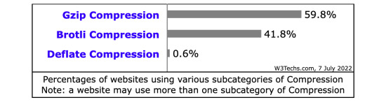
Ask your web hosting service what type of compression they’re using. If they’re not using any, consider a new provider or check out this guide for enabling Gzip compression.
9. Capitalize on Caching
Caching allows browsers to pre-load some of your content to speed up webpage delivery.
Many content management systems (CMS) will automatically cache the most current versions of your site, but it’s also possible to extend this caching timeframe through CMS settings. This is especially beneficial for content that doesn’t regularly change on your site, like:
Logos
Static images
Downloadable files
JavaScript files
Stylesheets
If your CMS doesn't offer this feature, then consider installing a caching plugin.
The RocketPress plugin is a great choice for an all-in-one optimization plugin, offering plenty of features for caching, image compression, frontend optimizations, and other features that can significantly speed up any WordPress website. It's free and easy to use, and comes packed with premium features such as CSS, JavaScript and HTML minificaiton, GZIP compression, and several options for caching.
10. Track 404 Errors
404 or “page not found” errors occur when users try to access a page that you’ve deleted or moved — and once they’ve run into 404 errors it’s unlikely they’ll try accessing your site again, meaning you lose a potential customer. Solve for 404 errors by running free, external tools to track down 404 outcomes and remove dead links.
11. Make Mobile a Priority
According to data from Statista, the number of mobile internet users in the United States in 2021 amounted to 276.83 million. That number is expected to grow to 296.18 million by 2025.
Not only are more people using mobile devices to access the internet — more people are using it as their preferred device type. According to data from a HubSpot survey of over 400 web traffic analysts in the U.S., 41% of traffic to their sites comes from mobile and 38% comes from desktop.

Image Source
As more users switch to mobile devices as their primary browsing and shopping mediums, speedy mobile sites are essential.
While it’s possible to simply display your desktop site on mobile devices and hope for the best, this often results in load time and interactivity issues that quickly frustrate users. It’s worth spending on development for a mobile-native website designed to maximize loading speed and improve response time.
12. Migrate to a CMS
A website builder can be a great option for quickly building and customizing a site. But it can lack the infrastructure and features to help websites with complex issues like slow load times. If you don't have the time, resources, or experience to employ all the optimization strategies in this guide, consider migrating to a CMS.
The right content management system can significantly improve website performance by streamlining content retrieval and offering robust options to modify site operations. Some even come with a built-in CDN.
13. Combine JavaScript and CSS Files
JavaScript and CSS files are among the largest files on a website. They also count as individual HTTP requests. So five JS files and five CSS files would require a total of 10 HTTP request.
If you have the website development know-how, it’s possible to combine sets of JavaScript or CSS files and reduce the number of steps required to completely load your site.
WordPress plugins such as RocketPress make this possible with just a few clicks, but whether you dive into code itself or use a CMS, it’s worth considering file combination to increase total speed.
14. Minify JavaScript and CSS files
Another way you can reduce the size of your JavaScript and CSS files is minifying them. This technique involves removing any unnecessary code like:
white space characters, line breaks, comments, and extra semicolons
unused functions and variables
longhand CSS selectors that could be shorthand
This will reduce file sizes and therefore load times. You can do this manually or use a minification tool.
15. Determine Your DNS Speed
The longer it takes your domain name server (DNS) to respond, the longer your time to first byte (TTFB) and the slower your site loads.
Free online tools can determine where your DNS provider ranks compared to other offerings, which in turn helps pinpoint specific performance issues.
Worth noting? In some cases, your hosting provider will also supply DNS services, while in others these two functions are separate.
16. Opt for Asynchronous Loading
Many files and functions on your website are loaded synchronously by default, which means they’re loaded in the order they appear on the page — elements will only load once the script or service immediately prior is fully loaded, increasing page load times.
The good news is many CMS platforms provide built-in features or plugins to enable asynchronous loading for CSS and JavaScript elements, which allows them to load simultaneously.
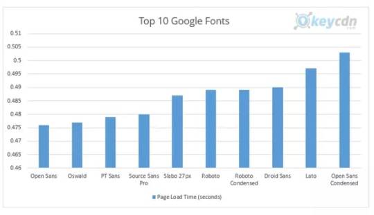
17. Choose Fewer Fonts
While web fonts can help your site stand out from the crowd, they can also negatively impact performance, especially if they’re uncommon or require unique character sets.
To maximize page loading speed, use the fewest number of fonts possible, and focus on fonts that are optimized for speed.
For example, in a study of the top 10 Google Fonts by KeyCDN, Open Sans had the lowest load time at 0.476s.
18. Pinpoint Poor-Performing Plugins
Last but not least: identify performance-sapping plugins (also called add-ons or extensions). While plugins can offer a host of useful features to help manage your website they can also negatively impact performance, especially if they’re used to load a significant amount of assets or perform large database queries. Here, the speed rule is simple: Only keep the plugins you need and always deploy the latest, fastest versions. This is particularly important if you run a WordPress website.
For more advanced methods to optimize your WordPress website speed using Google PageSpeed Insights specifically, check out this video by Jack Cao:
19. Add Expires Headers
To speed up load times for return visitors, you can add expires headers to the .htaccess file of your site. This type of HTTP header indicates how long until cached copies of site resources expire so the browser knows whether to serve site resources from the cache or request them from the server.
Expires headers are important for two reasons. They let your browser serve up-to-date resources from the cache, which reduces server load and load time — and they prohibit your browser from serving outdated resources to visitors, which could have hurt the user experience.
The faster, the better.
The faster your website loads, displays content, and responds to user input, the lower your bounce rates and the higher your conversions. Here, incremental improvement is critical — while going from slow to supercharged doesn’t happen overnight, any of our 19 website optimization strategies can help jumpstart your need for speed.
0 notes
Text
SEO for Small Businesses: A UX-First Approach to Cyprus Local Search Domination

As a small business owner in Cyprus, you know how vital strong local search visibility is for attracting new customers. Appearing prominently on Google Maps and in local pack results for relevant searches can drive massive website traffic and phone inquiries. But with limited time and resources, optimizing your online presence for these sought-after rankings can feel daunting. The good news? By focusing first on improving your website's user experience (UX), you can build a solid SEO foundation that lifts your local search performance over time. In this comprehensive SEO guide for Cypriot small business owners, we'll cover: - Core web vital UX factors that influence local search rankings - Cypriot-specific local SEO recommendations - A step-by-step workflow to improve website UX for customers - Real-world examples of how UX lifts SEO for Cypriot small businesses - Common website pitfalls to avoid By applying these UX-driven SEO tips, you can attract more prospects, drive customer loyalty and stand out from competitors in Cyprus local search results. Why Website UX Drives Higher Local Search Rankings Many business owners view UX design and SEO as completely separate disciplines. But savvy brands now recognize: Your website's user experience is one of the most powerful drivers of local search ranking success! This is because Google's algorithm uses your website's UX signals to assess relevance and authority for ranking purposes. For example, Google analyzes metrics like page speed, mobile friendliness, easy navigation, engaging content, and more to infer how satisfying your site is for visitors. The better the UX, the higher Google trusts your relevance and authority... and the higher you'll rank against competitors! This UX impact will become even more decisive moving forward. Google has now formally incorporated Core Web Vitals (key UX metrics) as ranking factors. By proactively improving website user experience, small businesses can gain a strong local SEO advantage over competitors still focused only on backlinks, citations, keywords, and technical factors. So if you want your website to start attracting more local search visibility, UX optimization must become a top priority! UX-Driven Local SEO Tips for Cypriot Small Businesses Shine Online in Your Local Market! Let's look at some of the most impactful UX optimizations Cypriot small businesses can implement to boost local SEO: Optimize for Mobile Users Over 60% of searches in Cyprus happen on mobile devices. A non-responsive website that frustrates mobile users is forfeiting conversions and rankings. Ensure your site is mobile-friendly and streamlined for smaller screens. Simplify navigation. Check forms and CTAs work on touchscreens. Confirm fast mobile load speeds. Improve Page Speed Faster page loads improve visitor experience. For SEO, they signal technical competence to Google. Test site speed regularly. Compress images, enable browser caching, minify CSS/JS files, and defer non-critical resources to hit sub-3 second load times. Refresh Content Frequently Search engines view frequently updated, evergreen content as a sign of relevance. Outdated content hurts perceptions. Set a content calendar to publish fresh website content at least monthly. Promote new content through your social networks. Optimize for Local Keywords Include relevant local keywords naturally in page titles, headers, content, and metadata. This signals relevance for local searches. Perform keyword research to find popular local search terms. Target terms aligned to your products, services and Cypriot location. Highlight Business Info Prominently Make key business info like locations, hours, contacts, services easily visible. This aids searchers and confirms your local presence. Feature your address, phone numbers, and opening times prominently on your contact page footer. Expand Local Content Depth Thin, low-value content hurts UX and SEO. Create in-depth, useful local content like city guides and regional reports. Write long-form blog posts and FAQs answering common local customer questions to establish your expertise. Spotlight Customer Reviews Positive local customer reviews build trust and social proof. Make them visible but appear natural. Publish curated testimonials on relevant product or service pages. Add ratings schema markup to highlight stars. Step-By-Step Guide to Improving Local UX Here is a phased workflow for conducting website user experience optimizations to improve local search performance: 1. Research Target Audience and Keywords Conduct in-depth research to understand your target audience’s needs, behaviors, and interests. Use tools like Google Search Console, Analytics, and Keyword Planner to identify popular local search terms aligned to these insights. This knowledge informs UX and content strategy. 2. Review Analytics for UX Issues Go through your analytics reports to detect signals of poor UX, like high bounce rates, short sessions, and low engagement on site. These pain points become priority areas for SEO-boosting UX improvements. 3. Assess Site Speed and Mobile Friendliness Use speed test tools like Google Pagespeed Insights to measure current performance. Test mobile site responsiveness across devices. Identify speed upgrade opportunities like image compression, caching, lazy loading, and more. 4. Improve Site Navigation Ensure your site architecture intuitively guides users to important pages and navigation menus are easy to scan. Conduct tree testing to optimize IA. Favor benefit-driven labels over generic ones. 5. Create Fresh, Localized Content Publish new blog content frequently that targets researched keywords but focuses first on being genuinely useful for locals. Craft long-form guides and location-specific advice to establish expertise. 6. Highlight Business Information Feature your key business info like address, hours, and contact info prominently across your site. List services clearly on appropriate pages. Enable Google Business Profile info to sync across automatically. 7. Showcase Customer Reviews Sprinkle curated positive local customer reviews on relevant pages like testimonials or as ratings snippets. Add review schema markup to enable rich stars in search. Monitor and respond to Google/Facebook reviews. 8. Promote New Content Share new blog posts and website updates through your social channels and email lists to drive engagement. Link internally to related old content to refresh it as well. 9. Track Progress and Iterate Monitor search performance in Google Analytics and Search Console regularly for improvements. Fine-tune your UX approach based on the latest search data insights. Real-World UX-SEO Successes for Cypriot Businesses Still not convinced of the local search impact possible through UX optimization? Here are some real-world examples from Cypriot small businesses: Paphos Steakhouse - Added extensive menus describing food and recipes in detail - Included photos of their interior, food, and happy local customers - Created a blog with weekly updates on specials and local food highlights Results: 200% more organic traffic. Top 3 for "Paphos steakhouses". Limassol Yoga Studio - Published long-form guides on their website like "10 Yoga Poses to Reduce Stress" - Created pages targeting searches for yoga benefits like pain relief, sleep, etc. -Enabled online booking of classes with mobile-friendly registration Results: Doubled website visits and tripled class bookings in 6 months. Ranking #2 for "Limassol yoga classes". Nicosia Gift Shop - -Created a “Shop Local Gift Guide” showcasing Cypriot artisans - -Optimized online store for mobile with expandable categories - -Added Facebook reviews praising their friendly local service Results: Conversions improved 22%. Moved into the Local Pack for “Nicosia gifts”. As you can see, a relentless focus on understanding and satisfying local website visitors also delivers big local SEO benefits! Common Pitfalls to Avoid When optimizing website UX, be sure to avoid these common missteps: - Keyword stuffing that hurts readability - Too-frequent popups that annoy visitors - Outdated contact information and business details - Cluttered pages and complex navigation - Irrelevant stock images that lack local context - Slow page speeds from unoptimized images/code - Blocking schema markup that disrupts mobile visitors Keep your local audience's needs and preferences central to UX decisions over search engines or assumptions. Let SEO flow naturally from a stellar local user experience. Boost Your Local Search Rankings with UX A website optimized to satisfy the needs of your local Cypriot customers is also one optimized for local SEO success. By making UX optimization a core focus, you can build an exceptional local presence that leaves competitors behind in the pack. Want help executing on any of these UX-driven SEO tips? I offer a range of services tailored to small businesses like yours, including: - Local keyword research - Optimizing site speed and technical SEO - Content strategy, creation and optimization - Reviews and reputation management - Mobile and maps optimization - Ongoing performance tracking My flexible solutions help you strengthen website UX without the hassle or expense of a full digital agency. I'm passionate about helping local Cypriot small businesses like yours build visibility and thrive through savvy digital marketing. Please to get started with a free consultation. The opportunity is now to drive more traffic, leads and sales through UX and SEO strategies tailored specifically to your local customers and market here in Cyprus. I look forward to helping you achieve local search domination! Please reach out anytime. Read the full article
0 notes
Text
Security and Performance: Key Considerations for Frontend Development Services in 2024

In 2024, companies looking to build or improve their websites and apps need to prioritize security and performance. Choosing an experienced front end development agency is crucial to get this right. By leveraging modern frameworks and following best practices, developers can create fast, responsive experiences that protect user data. As threats and technologies evolve, continuously evaluating and upgrading frontend code is essential. Partnering with experts who stay on top of industry trends allows companies to keep their digital experiences safe while delighting customers.
Security Considerations
Security should be a top priority for any front-end development services today. Implementing SSL/HTTPS across all sites and pages is now a must to encrypt connections and data. Validating and sanitizing user inputs is also critical to prevent scripts or unauthorized commands being injected into applications.
Another key area is implementing protections against common attacks like cross-site request forgery (CSRF) and cross-site scripting (XSS). These can allow attackers to steal user data or authentication details. Following security best practices like the OWASP guidelines can help mitigate these risks.
Strong authentication mechanisms and authorization controls are also vital for securing the front-end against unauthorized access. Practices like multi-factor authentication, role-based access, and use of secure tokens can make user accounts highly secure.
In addition, front-end developers must ensure proper segregation between application layers, use parameterized queries, and implement robust logging and monitoring to detect potential threats and attempted attacks against the front-end.
Performance Considerations
There are many techniques front-end developers can use to optimize performance. Minification removes extra spaces and shortens variable names to make code lighter. Concatenation combines multiple files into one to reduce HTTP requests.
Lazy loading defers non-critical components and images from loading until needed. This speeds initial page load by reducing what needs to be fetched first. Implementing caching strategies also avoids re-downloading assets on repeat views.
Critical CSS/JS extracts only the CSS/JS needed for above-the-fold content. This renders the visible page faster. Compression using gzip shrinks file sizes for faster transfers.
Performance testing tools help identify bottlenecks. Common optimizations include using CDNs, optimizing images, eliminating render blocking resources, and removing unused code.
Progressive enhancement and graceful degradation also improve performance. They ensure core content loads quickly while modern features enhance the experience on capable browsers.
Continued performance testing and optimization is key for ensuring fast, smooth front-end experiences over time.
Frontend Frameworks and Security
Modern frontend frameworks like React, Vue, and Angular all have robust security features built-in or available as plugins. While their core libraries are secure, how developers use them also impacts security.
React offers protection against common attacks like XSS and cross-site script inclusion with features like JSX encoding. Additional security addons are also available.
Vue provides cross-site scripting protection by encoding bindings and interpolations. Authentication plugins help securely manage user access.
Angular has strong CSRF defenses built-in. It also sanitizes inputs to prevent XSS. Authorization controls secure access to routes and resources.
Ember.js automatically escapes Handlebar templates to prevent XSS. It also has security addons like ember-simple-auth for authentication.
Overall, popular frameworks provide good security foundations. But developers must use them properly, add security layers, and keep them updated to leverage their benefits.
Emerging Security Trends
Security is an ongoing challenge in frontend development. As new vulnerabilities emerge, practices and tools must evolve to address them.
Some key trends gaining traction are shifting security left, DevSecOps, and automated testing. Building in security from initial design phases reduces costs and results in more secure systems. DevSecOps integrates security into development workflows for speed and quality. Automated tools help efficiently scan for and fix vulnerabilities early.
Shift left security involves developers, architects and security experts collaborating from the beginning of projects. This results in more secure foundations.
DevSecOps aims to bring security, development and operations together with shared tools, practices and culture. This enables speed without sacrificing security.
Automated scanning and testing tools at each phase quickly catch vulnerabilities without relying solely on human review.
Lightweight protection layers like web application firewalls help defend against threats without slowing performance.
AI and machine learning are being utilized for adaptive cybersecurity defense and attack prevention.
Emerging Performance Trends
Optimizing performance will remain crucial for front-end developers as user expectations grow. New metrics, protocols and patterns are emerging to help build faster experiences.
Some key trends include a focus on user-centric performance metrics like Largest Contentful Paint and Cumulative Layout Shift. HTTP/3 and QUIC aim to speed up transfer times. PRPL and service workers cache or preload resources for snappier loading.
Core web vitals like LCP, CLS and TTI provide user-centric performance metrics beyond speed alone.
HTTP/3 with QUIC protocol features multiplexing and congestion control for faster page loads.
The PRPL pattern aims to Push critical resources, Render initial views, Pre-cache remaining assets, and Lazy-load other routes.
Service workers allow caching site assets like JavaScript, CSS, images, and HTML for instant loading on return visits.
New frameworks like Svelte aim to build high performance into components with a low-overhead design.
More bundlers and build tools now focus on optimizing assets and splitting code for lazy loading parts.
Conclusion
As frontend development continues to evolve, keeping pace with security and performance best practices will be key for agencies to deliver excellent services. By making security a priority throughout the development lifecycle, utilizing emerging DevSecOps practices, and leveraging automated testing tools, frontend code can be made highly secure. Performance should also be optimized through techniques like lazy loading, HTTP/3 adoption, and a focus on core web vitals. As new technologies and methodologies emerge, developers must stay up-to-date to balance seamless user experiences with robust security. Keeping these considerations central in 2024 and beyond will ensure frontend services provide fast, smooth, and secure experiences that users have come to expect.
#frontend development#frontend development company#frontend development agency#frontend development services
0 notes
Text
Compilator: Week in Review #1

Web development
New way to create modals using HTML only
Which open-source monospaced font is best for coding?
Drawing a star with DOMMatrix
The State of HTML 2023 survey is now open!
What are JWTs/Jots/JSON Web Tokens?
From WebGL to WebGPU
Ultimate solution for generating placeholder images
Productivity
What Causes Bad CLS and How to Fix it?
Get All That Network Activity Under Control with Priority Hints
Css
The Path To Awesome CSS Easing With The linear() Function
A (more) Modern CSS Reset
CSS Findings From The Threads App: Part 2
Responsive type scales with composable CSS utilities
JavaScript
Speeding up the JavaScript ecosystem - Polyfills gone rogue
How to Code Dark Mode for Google Sheets with Apps Script and JavaScript
Understanding the JavaScript Modulo Operator
The Origins of TypeScript: A Documentary
React
Optimizing Provider Context Usage in React
Build Your Own ChatGPT Clone with React and the OpenAI API
How to Build an Accordion Component with React.js
v0: “AI tool from Vercel that works like Midjourney for React, that is, it issues code snippets based on your requests (prompts)
Bootstrap a React app with smol developer
Understanding Props in React — A Comprehensive Guide
Vue
Clean Layout Architecture for Vue Applications
Optimizing Vue.js apps with web workers
7 Quick Tips about Vue Styles You (Might) Didn’t Know
Svelte
Introducing runes
Exploring Astro and Svelte vs. SvelteKit: A comparative guide
How to Build an Etch-A-Sketch App with Svelte
Libs & Plugins
Benchmarks for JS minifiers: babel-minify, esbuild, terser, uglify-js, swc, google closure compiler, tdewolff/minify
MouseMove - JavaScript mouse cursor behavior automation for web presentation
Browser
Nue JS is an extremely small (2.3kb) JavaScript library for creating web interfaces. This is the core of the future Nue ecosystem. It is similar to Vue.js, React.js or Svelte, but without hooks, effects, props, portals, watchers, providers, injects, suspension and other unusual abstractions in your way!
swup 4 - a universal library for creating transitions between pages. It manages the full page load life cycle and seamlessly adds animation between the current and next pages.
What's new in DevTools (Chrome 118)
WebKit features in Safari 17.0
---------
Image by vectorpocket on Freepik
0 notes
Text
JavaScript loading priorities in Chrome explained by Addy Osmani
Web development is one of Syndicode’s main fields. Also, we know that there is no single browser with a non-Chromium engine. Today we are talking about JavaScript loading Priorities in Chrome explained by Addy Osmani. While techniques like <script defer>, <link rel=preload> (and other...
#Addy Osmani#browser#browser extensions#Chrome#Chrome DevTools#Chrome extension#Google Chrome#javascript#js#JS loading priorities#loading#loading priorities#programming#Technology#web development#Web technology
1 note
·
View note
Text
Chrome 對各種 JavaScript 的優先順序
Chrome 對各種 JavaScript 的優先順序
前陣子看到「JavaScript Loading Priorities in Chrome」這篇,在分析 Google Chrome 對各種 JavaScript 的優先順序。
優先順序分成讀取的「Loading priority (network/Blink)」與執行的「Execution priority」,另外文章裡也有整理建議「Where should this be used?」。
看起來 <script defer> at the end of <body> 是全部裡面最低的,建議是給 Load “Related articles” 或是 “Give feedback” 這類功能,不過應該沒什麼人真的這樣用…
然後要注意的是,這邊分析的對象是 Google Chrome,實際在設計時應該要先考慮一般性的定義,再考慮對各瀏覽器的最佳化……
View On WordPress
0 notes
Link
Greetings,
Are you looking for an expert who can optimize & speed up a WordPress site, Shopify site, and Html pages? If your answer is yes, then you're within the right place.
Contact me before place an order.
Why do you need to optimize your website speed:
Ingress User-experience
Boost your Sales
Decrease Bounce Rate
Faster loading time
Improve search engine ranking
Increase reader satisfaction and make your viewers happy
What services I will provide:
Enabling Gzip Compression
Eliminate render-blocking
Enable cache
Minify HTML, CSS & JS
Combine files
Compress/optimize image
Activate preloading
Remove useless js,CSS
Enable CDN(If needed)
Database Optimization
Defer JS
And more
I will gain the targeted score that you are looking for.
Why Me :
Send before and after report (page speed insights, Gtmetrix & Pingdom tools)
Extra advice on the way to keep the speed up all time
Premium support
Friendly Communication
Client satisfaction is my priority
NOTE: If you have any queries, leave me a message I will reply to you ASAP.
1 note
·
View note
Text
Hiring Offshore React Developers? Here are the Enormous Benefits You Can Have!
Cost EffectiveQuality AssuranceSkill SetSticking to the TimeHigh Tech SecuritySumming Up Are you struggling with your web application to make it better, efficient, fast and smooth? If yes, you should be hiring React JS development services. The reason being they not only have experienced and apt developers for the job but also they are familiar with a lot of tools and features of the framework that can be used o simplify their application. There are several companies who are planning to go digital, hire dedicated developers to get desired results in less time. You will get several companies to do the job in a cost-effective way but opt for the one that has experience in developing apps using React JS. Let’s discuss how React JS developers can help you in the long run.
Cost Effective
Saving money with the best results is like a cherry on top. Hiring in-house employees will cost you loads, however, hiring a company or a team of remote dedicated developers is a wise decision. You can get the best deal and a great product in less time. Therefore, it is advisable to hire experienced professionals who can do the job efficiently.
Quality Assurance
Getting delivered the quality work is the number one priority of every organization. The offshore react native developers will assist you with the quality application as per your customization criteria. As you will be screening the employees by yourself, you can ask them to ensure the quality of the work delivered.
Skill Set
Screening developers according to their skill set is the most difficult task. You need to make sure whether they will be able to perform the task as needed or not. Before hiring it is advisable to assess their capabilities an moreover hiring the React JS development service company is the best way to avail the outstanding results.
Sticking to the Time
The offshore employees have to sign agreements when it comes to their deliverables. That’s the reason, they have to submit their tasks at the committed time. This is one of the greatest advantages of hiring React JS developers as they are responsible for their deliverable, you do not have to take multiple follow-ups.
High Tech Security
Another most important things that an organization needs are the security of their applications. Most organizations do not trust offshore developers when it comes to security. With React JS developers, they maintain confidentiality and all the data will have security.
Summing Up
Not only these benefits you get on hiring offshore candidates for React app development, but they also ensure communication about the progress of work and offer extended support whenever needed. Now that you know the advantages, start hiring React developers and reap out the outstanding benefits.
3 notes
·
View notes
Photo

If your mobile rankings have suffered recently, simply telling you to improve the mobile experience isn’t going to help you diagnose the specific problems you’re having. So, in this article, we look at nine reasons your website might not work on mobile and how to fix each issue. These are: Your site isn’t mobile responsiveYou haven’t optimised for mobile-first indexingSlow mobile pagesUnfriendly navigationPage content isn’t immediately obviousYou’re using popups / interstitialsYou haven’t optimised your CTAs for mobileClickable elements aren’t optimised for touchYour mobile forms are killing conversions With more than half of all web traffic coming from smartphones in 2018, mobile optimisation should be a priority for every brand. This is where the majority of consumer journeys now start and Google has introduced a number of algorithm updates over the years to favour websites that provide a strong mobile experience. Mobile optimisation FAQs Before we get into the specific reasons your website is struggling on mobile, let’s answer some of the most common FAQs surrounding mobile optimisation. How do I make my website mobile friendly? There are various approaches to creating a mobile friendly website but the two most common are: Responsive design: Create a single website that adapts layouts, content and element sizes to suit different display sizes.Mobile sites: Build a separate mobile website in addition to your desktop site. Responsive design is generally the recommended approach for most types of website, especially since Google has moved over to mobile-first indexing (more on this later). How do I optimise for mobile devices? This is a tricky question to answer in a short space but you’ll be getting a more in-depth answer throughout the rest of this article. For now, here’s a list of the key areas you need to optimise for the best mobile performance: Loading timesNavigationPage layoutContentElement sizes (text, images, buttons, etc.)Touch elementsWeb formsFile sizes (images, code files, etc.) Your priority is to create the best possible experience on mobile devices and it helps to focus on the limitations of these devices. You’ve got limited screen space to work with, potentially weak data connections and all users really have to navigate and interact with your site is their fingers. It pretty much comes down to visibility, navigation and speed. Why are mobile friendly websites important? With the majority of traffic now coming from mobile devices, this is where the majority of your marketing strategies are going to generate leads. The majority of consumer journeys now begin on mobile devices and poor experiences are going to kill your chances before they’ve even begun. That’s not all either. 53% of all traffic came from mobile in 2018Google rewards mobile friendly sites (and punishes the not-so-friendly)Various studies show users don’t return to a website after a bad experienceThat means poor mobile experience could cost you 53% of visitorsToday’s consumers move between multiple devices, making a consistent experience increasingly important Ask yourself how much time, money and other resources you pile into lead generation, increasing traffic and your other marketing strategies. Now, tell yourself 53% of that is wasted because you don’t have a mobile friendly website. That’s why it’s important. How much does it cost to make your website mobile friendly? Probably a lot less than not having a mobile friendly site will. Now, that we’ve covered those, here are the top nine reasons your website isn’t working on mobile. Your site isn’t mobile responsive Let’s state the obvious to begin with. The number one reason why your website might be failing to work on a mobile device is that it is simply not mobile responsive. This means the website doesn’t proportionally resize to different size screens. Responsive design isn’t the only approach to mobile optimisation but it is the one Google recommends and it makes a lot of sense from an SEO perspective (see reason There are challenges with taking the responsive route, though – especially when it comes to optimising page content for multiple screen sizes. The biggest mistake brands make is designing layouts and content for desktop and then trying to scale them down for smaller screen sizes. This isn’t going to create an intuitive experience on mobile. Instead, you need to create content with all devices in mind and consider the needs/limitations of these devices from the very beginning. This will enable you to make design choices that create a consistent, highly-optimised experience across each device. Quick tip Aim for a consistent experience across all devices so users can move from mobile to desktop and understand where everything is. Use JavaScript to only show the first sentence of large chunks of text on mobile and place a “see more” button users can click to read the full text. By using the display: none CSS property, this text remains visible to search engines but doesn’t show in the browser, allowing you to create page layouts that are perfectly scrollable on mobile. You haven’t optimised for mobile-first indexing As I say, responsive design isn’t the only approach to mobile optimisation and many brands have opted to develop separate mobile websites. The thing is, Google is changing the way it indexes web pages to reflect the fact that most searches now take place on mobile devices. Mobile-first indexing essentially means Google will now show the mobile version of a page by default, only showing desktop pages when no mobile version is present. For responsive websites, nothing really changes because the mobile and desktop versions of each page are the same. However, websites running any separate mobile pages need to optimise for the change. Here’s a quick list of what you need for mobile-first indexing: Your mobile and desktop pages contain the same contentBoth versions of your page have the necessary structured dataBoth versions of your page have the necessary metadataBoth versions of your page are verified in Search ConsoleAny rel=hreflang tags for internationalisation include separate links for mobile and desktop URLsYour servers can handle any increase in crawl rate for the mobile version of your siteYour robot.txt directives are the same (and optimised) for both desktop and mobile versionsCorrect use of rel=canonical and rel=alternate link elements between mobile and desktop versions Mobile-first indexing is still rolling out and you should have received a notification from Google in Search Console if your site has already been moved over. Don’t wait until your site is moved over to take action, though, because this will affect pages that are poorly optimised for mobile. Quick tip Although mobile-first indexing will apply to your entire website, any ranking changes will happen on a page-by-page basis. So start by optimising the most important pages on your site and work from there. For more information on mobile-first indexing, take a look at our previous posts: Mobile-first indexing: What does it mean for SEO?Google wants to clear up some mobile-first indexing confusionThe latest on mobile-first indexing Slow mobile pages Despite all of the research showing how slow loading times kill conversion rates, the vast majority of website fail to deliver this performance essential. In fact, Google’s own research suggests the average web page takes 15 seconds to load on mobile. The recommended best practice is no more than 3 seconds. Source As of July 2018, mobile loading times are now a ranking factor which means slow loading times can hurt your position in the mobile SERPs. However, slow loading times also negatively impact multiple other signals that Google uses to determine where your pages should rank: bounce rates, time spent on page, pages visited, etc. More importantly, slow loading times kill your conversion rates and just about every other KPI in your marketing strategy. Quick tip Work with agencies/developers that make page speed a priority because this is one of the most important performance factors for the end user. If you’re using a WordPress website, take it easy on the plugins, optimise your images and files (CSS, JS, etc.) and use speed optimisation tools like Google’s free PageSpeed Insights. Unfriendly navigation The menu is one of the most important, if not the most important thing on a website. Small websites have quite a simple job, with the desktop menu being easily duplicated on the mobile version of the website. Large sites however can have difficulties. Some menus display many pages going up to third tier navigation levels. If this is transferred across to the mobile site there is the potential that the user will spend a long time scrolling through the vertical menu trying to find the right page. If you amend the mobile menu to only include top level pages you may be able to keep users on your pages, but they might be missing out on valuable information from the lower level pages. Quick tip Create a menu that works on a desktop and then try other ways of integrating the lower level pages on the main page to let users navigate to find out more if they choose to do so. Page content isn’t immediately obvious Scaling is always an issue with a responsive website and getting it to scale correctly whilst showing the correct information can be the difference between engaging the user and the user leaving your website. Having a logo, menu, slider and breadcrumbs before the content can look great on a desktop. When this is scaled down, the user may need to scroll a lot before they actually get to the page content. This has other issues as well if your pages all have the same header, with the user thinking that the page didn’t even change. Quick tip Test, test and test again. Mobile sites should be simple for the user to use and do not require all the flashy gimmicks of the desktop site to succeed. You’re using popups / interstitials Many websites use overlays or interstitials to promote the brands app, get a user to sign up to their newsletters or give special offers. When these are displayed on a mobile device they tend to have a negative effect on the user experience, causing frustration. Quick tip Use a banner instead to promote your content on a mobile device. You haven’t optimised your CTAs for mobile Optimising your website’s layouts for mobile devices is great but your success is going to be short-lived if your CTAs aren’t getting results on mobile. The effectiveness of your calls to action will depend on how you optimise the content surrounding them, their visibility on mobile, where you place them on the page and all kinds of other factors. Don’t assume your CTAs are going to perform on mobile just because they’ve been getting results on desktop. Quick tip Effective mobile CTAs need to be incredibly concise and so does the rest of your page content. Remember that text is going to bunch up on mobile displays, pushing your CTAs further down the page and forcing users to scroll further to reach them. Make sure you hammer home the key benefits of your offer using the appropriate headings and don’t be afraid to add extra CTAs for mobile displays. Clickable elements aren’t optimised for touch This is something else a lot of brands overlook while optimising for mobile. If you want people to actually interact with your website, you need to optimise for touch. Navigation menus, CTA buttons, web forms, media players and just about everything that turns casual browsers into potential customers revolves around touch gestures. Above all, make sure touch elements are large enough to interact with (padding is your best friend). Don’t try squeezing too many touch elements into a small space because people are only going to end up hitting the wrong thing. Also, make sure users can still see all the content they need to when touch elements pop up on the screen. For example, don’t leave people typing blind because their device’s native keyword has covered up the text field they’re trying to interact with. Quick tip Find the largest set of thumbs you possibly can to thoroughly test your website on mobile; they’ll soon find any potential issues. Your mobile forms are killing conversions Frustrating web forms can be the bane of users searching on a desktop. When this experience is switched to a mobile device it can be the difference between missing out on a lead to a competitor, or making the sale yourself. First of all, make sure you’re building your web forms with the correct HTML5 code so the relevant keyboard pops up for messages, email addresses, numbers, etc. Stick to single column layouts and, once again, use plenty of padding on every element so they’re nicely optimised for touch. Always remember how much of a pain typing on mobile is. Enable auto-complete and stick to the minimum number of fields necessary to reduce users’ workload. Quick tip Don’t make your form validation too strict; the aim is to help users complete your forms, not prevent them from submitting information. Useful tools There are a few things you can do/tools you can use to test the mobile-friendliness of your website: Check in Google Search Console for messages which would have arrived in March 2015, alerting you to ‘fix mobile usability issues’Google’s Mobile Friendly Tester – https://www.google.co.uk/webmasters/tools/mobile-friendly/Google Page Speed Insights – https://developers.google.com/speed/pagespeed/insights/ Finally your own mobile phone is always a good indicator. Perform a site search (type site:www.yourdomain.com) into your mobile browser. Next to your listing you should see a tag which states ‘mobile-friendly’. Still struggling? If you’d like one of our SEO or design experts to take a look at your site, call us today on 0845 123 2753. In the meantime, you might find these other mobile-related articles helpful: Content in the mobile age: Long form or short form?How to use context to improve your mobile search resultsWhy you should optimise your email campaigns for mobile The post 9 reasons your website doesn’t work on mobile appeared first on Vertical Leap.
1 note
·
View note
Text
Mastering Front-End Development in 2023: Essential Tips and Tricks
Front-end development is constantly evolving, and staying up-to-date with the latest trends and techniques can be challenging. As we approach 2023, it's essential to keep your skills and knowledge up-to-date to create engaging and interactive web experiences. In this blog, we'll provide you with some essential front-end development tips and tricks that will help you enhance your skills and stay ahead of the curve.
1. Embrace Progressive Web Apps
Progressive Web Apps (PWAs) are the future of mobile web development. PWAs provide an immersive user experience that's fast, reliable, and works seamlessly on all devices. In 2023, we expect to see more web applications built using PWAs, and as a front-end developer, it's essential to embrace this trend. Ensure that your front-end code is optimized for PWAs, and make use of modern web technologies such as Service Workers and Web App Manifests. 2. Keep Accessibility in Mind
Accessibility should be a top priority for front-end developers. Ensure that your web applications are accessible to all users, including those with disabilities. Use semantic HTML, provide descriptive alt text for images, and ensure that your application is keyboard-friendly. In 2023, we expect to see more emphasis on accessibility in web development, and front-end developers should keep this in mind. 3. Implement Dark Mode
Dark mode has become increasingly popular, and we expect to see more web applications supporting this feature in 2023. Implementing dark mode in your web application is a great way to improve user experience and reduce eye strain. Use CSS variables to make it easy to switch between light and dark mode, and ensure that your web application is optimized for both modes. 4. Use CSS Grid and Flexbox
CSS Grid and Flexbox are powerful layout tools that can help you create complex and responsive layouts. In 2023, we expect to see more use of CSS Grid and Flexbox, and as a front-end developer, it's essential to master these tools. Learn how to use these layout tools effectively to create responsive and visually appealing web applications. 5. Optimize Web Performance
Web performance is critical for user experience and search engine optimization. In 2023, we expect to see more emphasis on web performance, and front-end developers should optimize their code for faster load times. Use techniques such as lazy loading, code splitting, and caching to improve web performance. 6. Use Animation and Micro-interactions
Animation and micro-interactions are great ways to enhance the user experience of your web application. In 2023, we expect to see more use of animation and micro-interactions, and front-end developers should master these skills. Use animation and micro-interactions to create engaging and interactive web applications that keep users engaged.
In conclusion, front-end development is an ever-evolving field, and as we approach 2023, it's essential to stay up-to-date with the latest trends and techniques. By embracing PWAs, keeping accessibility in mind, implementing dark mode, using CSS Grid and Flexbox, optimizing web performance, and using animation and micro-interactions, you can enhance your front-end development skills and create engaging and interactive web experiences.
HIRE FROM US
Hire React JS Developers
Hire React Native Developers
Hire Blockchain Developers
Hire Angular Developers
Hire Node JS Developers
Hire Vue JS Developers
Hire .Net Core Developers
Hire PHP Developers
Hire iOS Developers
Hire Android Developers
Hire Web App Developers
Hire Mobile App Developers
Hire PWA Developers
Hire Ionic Developers
Hire UI/UX Designers
0 notes