#Maybe it was made based on some concept art before they finalised the designs? And then they just... Forgot to make its face move.
Text
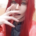
Just finished all the shrines and got the reward, and not to vague blog but like, what the heck is that.
#Getting all the shrines was soooo much easier than in botw I didn't even need the shrine sensor or a guide or nothing! Much appreciated lol#But fr what on earth was that thing lol#spoilers for totk#totk spoilers#It's not even got face animation wtf it's terrifying!!#Didn't help that I stepped outside and straight into the smoke of a rising blood moon lmao#Nintendo why... You literally spent a year polishing the game and that was the best you could do??? It scares me XD!#The ears are tiny and the tail is about as reactive as a stick (and why is there a tail at all????) and?? Why are the eye whites black??#Why is the hair red?! Why did you give him a mf Glasgow grin it's creepy! It's so creepy!! The eyes look mad and why does he have the muzzl#Maybe it was made based on some concept art before they finalised the designs? And then they just... Forgot to make its face move.#But fr ToT Nintendo you were so close to an absolute banger#loz#legend of zelda#tears of the kingdom#totk#loz totk#loz tears of the kingdom#Seriously why does the hero aspect look like he's possessed by ganon. The zonai had white hair and eye whites! Smaller muzzle! No tail!#Okay you know what I'm making a separate post
1 note
·
View note
Photo


MUSIC RESPONSE / Experimenting with Butterflies
After creating a mindmap of ideas, I had initially started playing with imagery of Iris flowers and rainbows, but ended up setting that aside as I was hitting a wall. My second concept was based on Butterfly imagery. I could see someone standing in a futuristic, neon cyberpunk, busy city, looking up at the sky contemplating their existence in the universe as the rain is pouring down and they are watching a simple butterfly fly away, all while this song is being played. (or maybe I have watched Bladerunner one too many times)
I liked the idea that a butterfly (not too dissimilar to the Iris idea) is seen as a spiritual symbol of transformation, resurrection and hope and that its symmetrical pattern could be played with to toy with reality.


I think that when listening to the song (and from reading others interpretations) you tend to be sent into a trance of contemplating life, the universe and the future. Rather than taking the direct route of a futuristic cyberpunk aesthetic, that instantly enters the mind, I wanted to try interpreting the song in a more abstract way. This got me thinking about how people interpret things in general. We all have our own thoughts, opinions and images that come to us when listening to music, looking at art, reading a book or watching a movie. So I thought about the Rorschach test, a set of photos that are on their own are a meaningless mess of ink blobs, but we search for meaning within them. Is that what we are doing when listening to music, looking at some abstract art? Looking for the meaning, searching for the symbolism?
I made my own Butterfly inspired Rorschach images using paint and ink and blended them together digitally. I took this idea further by playing with the composition and the bold neon esq. colour of the designs. I also tried incorporating elements that I touched on in my Mindmap, Glitching. I thought that this would allow the audience to question its existence and also adds that futuristic feel.
I think it is an idea I can play with and take further, but I enjoy the initial concepts I created, however I am worried that I may have taken the images too far away from their original look when playing on photoshop and think going one step back would retain its organic shape and textured look better. I would like to explore some more making techniques using butterfly imagery before finalising this first concept.

3 notes
·
View notes
Text
weekly summaries- viscera
This unit I made notes of all my weekly summaries in a pages document as I went, as I thought it would make it easier at the end of the project to then make the refletive journal. However I did forget to actually post them on my blog. Eventually I will get the weekly summaries right, I mean I only have one unit left at uni and this time I am going to do it one way or another ...
weekly summaries and evaluation below:
Weekly Summaries and Evaluation- Collaboration ‘Viscera’
Week 1
The first week of the project and we had briefing and decided to work together. Currently not sure what to do yet, only that we want to do an anthology. We like the idea of having lots of tiny stories. We know we want to work in a 2D digital drawn style as that is a style we both enjoy working in and are strongest at. The aim for the week is to do some research into different styles and come back to each other next week with some more ideas to brainstorm.
We are also collaborating on a side project currently for Glyndebourne and Norwich theatre. Which is taking up a lot of our time as it is due in in two weeks time.
Week 2
This week we met up and had a brain storm to come up with more ideas to pick from, which were;
1. One word
2. Mental health
3. Reality v expectations
4. Stuff inside stuff
We have decided that we will be making an Anthology themed around one word, to be decided, and we will be animating in 2D drawn animation. We will be playing on the fact that Eszter’s style is all about highlighting the ugly in things and I like to be the opposite and look for perfection/beauty. So this will hopefully create a nice dynamic in the animation. We plan to make several shorts and put them together to fit the one theme. It will be a slightly abstract piece as it has been discussed that the word would be something like, wig or bath mat or spatula. As Eszter enjoys working within the weird and I liked the idea of the challenge.
I am happy that we have processed from the first week and have the starts of an idea, we need to continue the research and narrow down our idea to one specific plan.
Week 3
This week we pitched our our vague idea to Peter and Helen and they suggested we could go with ugly beauty contrast as a main idea. Due to that being our own individual strengths.
Then we had a meeting at the playhouse and decided that expectations vs reality will be the theme of our idea. I wasn’t feeling very inspired by the theme of one random word. It felt a bit boring to me and when we were discussing our idea in lesson Peter pointed out that our styles are very opposite. Eszter loves to show the ugliness in things whereas I look for perfection and aesthetics. So the new plan is expectations vs reality. So we would have my style as expectations and Eszter’s as reality. Which would hopefully create a comical narrative for our anthology. We will use several different scenarios all connected by expectations vs reality.
I looked at Spongebob and when they do the really gross detailed close ups as an expectations vs reality inspo. Research is still the main objective to continue.
We also submitted our Glyndebourne project this week so I am now under less obligations and have more time to spend on the project.
Week 4
Starting from scratch and forming a new idea, when we met we admitted neither of us really liked the idea that much of expectations vs reality. We agreed that it was an idea that could work but it just didn’t excite us that much. So we have come up with a new idea based on a drawing we came up with of a fat man who had a universe inside him. The zoom idea. We will zoom out of things to show different creatures and worlds that exist in other creatures and worlds. With a different scenario/activity in each world.
I have also discovered the work of Sonia Lazo on Behance. Their work is so colourful and the characters are very wacky too which is something Eszter and I are aiming for. The work really inspired me and I would love to create something with the use of all that colour and make it a very bright and bold piece. I usually work in pastel or limited colours but I love the idea of an overly vibrant world.
Aims are to keep researching for this new idea now that we have scrapped the last one. Feeling much more excited and inspired for the project now.
Week 5
This week we had title ideas such as ‘more than meets the eye’ and ‘viscera’. I think that Viscera is the favourite for now as it is an odd sounding word and means internal which is very fitting to our project.
We began creating the schedule for the project and also the script.
Some online inspirations were Ozzy and Drix, a show I used to watch as a kid about a world that existed inside a person and all the things inside the body lived in a city and fought crime. Also the music video for Exxus by Glass Animals was inspiring, the clay world of strange creatures we really liked. We want to show a bunch of abstract worlds and creatures is this is very fitting.
Week 6
This week we have started character sketches and designing the possible characters for this world. I have so far come up with some colourful knitted worms that i like so far. I am yet to come up with anything else I really like. We have discussed doing maybe 3 or 4 different creatures each so I have one of mine and need to think of some others. I have fallen into a hole on Behance and am just constantly scrolling through and finding new artists and animations that inspire me. I have posted quite a few on my blog that have helped me feel inspired.
Week 7
We have refined character sketches and are thinking more on our idea getting closer to finalising the story. We are going to create a grandma who is the home to all these weird and wonderful worlds and creatures. We thought it would be funny to show all these different zooms and unflattering angles on the old woman to get to showing the unusual micro worlds inside. For example my knitted worms will be a zoom in on her jumper. I have another idea for zooming in on her finger tips or her ear wax too.
The plan for next week is to have concept art sketches done to show each other so we can properly combine our ideas into a story.
Week 8
This week the goal was to set a plan for over Christmas break to get work done and do the story board and any final sketches. We have decided that we will each draw our thumbnails for our ideas for the story board and Eszter will put them all together into one story board as she is writing up the script from all the notes and story boards we have shared together. There is also a new idea that we have a grandson character that we discover after a saliva tsunami kiss on the cheek from his grandma as they wait for their picture to be taken.
The goals for over Christmas break:
Eszter- finished story board and script
Me- design board and pre production document
Christmas break:
Week 9, Week 10, Week 11, Week 12
I have made a schedule to organise my final few weeks before submission as I have a lot of work to do on my essay and personal showcase projects. The collaborative project I have put in the final week before submission as it is pre production so the work load isn’t as heavy and I have done all the research part of it, its just the final drawings and type up of stuff left to do, and ideally would need to see people I am working with who are currently home in different countries busy seeing friends and family, so most likely to see them in that week to go over things in person and put stuff together properly.
Next week I will discuss with Eszter where we are in the project and what is left to do before submissions.
I will also have finished colour concept art work finished with my tasks of the design board and pre production document
I became very sick during week 11 and 12 and have lost a fair bit of time to sleeping off a flu/virus type thing with intense migraines. I have been working on designs when I can.
Submissions week:
Week13
This week has been all go and I have completed all the work with some time to spare. I got all my final concepts finished, the design board and pre production document and we even came up with a title image made from our characters spelling ‘viscera’ to put in the pre production document. It was something that came about by chance as Eszter and I were chatting over messenger about our plans and where we were up to with things. I am happy with the progress made this week and with what I am handing in tomorrow.
Evaluation
My evaluation of the project would be that overall it has been very successful. We worked together equally and completed set goals and tasks on time. The idea process did start slowly with us not being too sure what to make and we were also both working on a project for Glyndebourne and the Norwich theatre, which went very well we felt. But this did slow us down in the start of the collaborations project as we had so many things to try and do. Having said that I do think that we finished the project just as well as we would’ve without the Glyndebourne distractions and I am very happy with the idea and work we have done to go forward into production next term. I am excited to continue developing the project and to animate our ideas and watch them come to life.
I have known and been friends with Eszter for the whole of my university experience so I knew I wanted to collaborate with her as we are very like minded people and have worked together in other projects so I know that by working with her we both share the same ambitions and standards of submitting good quality work. I am confident that next term we will be able to achieve the goals and ideas we have started to create this unit and I look forward to seeing where the project adapts to next.
1 note
·
View note
Text
Evaluation
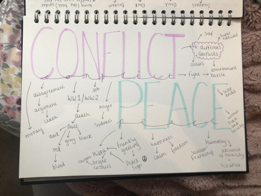
I was interested in my chosen flipside words which was ‘Peace and Conflict’ because immediately I thought of WW1 and WW2. Throughout the years of being an artist I have thought about doing a project based on a massive conflict such as WW1/2. However, I never had the confidence to step out of my comfort zone to actually try and something unique.
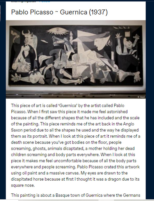
The three pieces of artist research that has had an impact on my ideas/artwork was Pablo Picasso, Angie Lewin and Karl Schmidt. Pablo Picasso had a big impact on my work because of his piece of artwork called ‘Guernica’. His artwork ‘Guernica’ made me realise that I wanted my piece to be based on a massive tragedy and have meaning behind it.
Angie Lewin has been my favourite printer for years. She inspires me because she creates these amazing lino prints using sceneries all around her. I decided that I would use my own photographs of nature and sceneries to base my work on. She had a huge impacted not just on my FMP but me as an artist because her work was the reason for me to start printmaking. I enjoy all types of print making but my favourite has to be lino and that is because of Angie Lewin beautiful lino prints.
Karl Schmidt has had a impact on my work because again he is a printmaker. Furthermore, he uses geometrical shapes and lines to create this more bolder print and I love including shapes and lines in my artwork. So when I was introduced to this artist I know that I want to include his ideas of the lines and shapes into my FMP.
I did wider world research on the Bayeux Tapestry in Normandy, France. I watched part of a documentary on YouTube about the Bayeux Tapestry and learnt that it was all handstitched with wool. The Bayeux tapestry links in with my flipside theme because its all about a massive conflict. Furthermore, It links in with my thoughts on WW1/2 as that was a massive conflict in the past as well. But it links with my project work as I wanted to create a tapestry with all my prints and hand stitch my work.
The concept behind my work was that I wanted it to be about WW1/2 and the effects of conflict. However, in my work I included peace as I wanted to represent the innocent people that died and suffered during WW1/2. I wanted my work to have meaning and be unique. My main idea was I wanted to create a textile piece of work were I sewed back into my work using hand stitching or even embroidery.
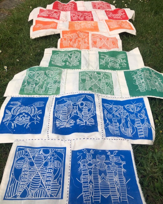
One of the experiments that I did during my FMP for the first time was woodcut printing. The materials I used were fine liners, wooden board, ruler, paper, carbon paper, lino cutting tool, wooden cutting board, newspaper, ink roller, printing press, inking up board, black ink and paper. The techniques I used was wood craving, printing and sketching. I have learnt how to cut out a woodcut print, how to print my wood block design and overall how to create woodblock prints.
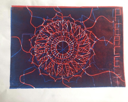
Firstly, I started out by drawing out three different designs for my wooden board using fine liners, paper and a ruler. I decided on my mandala design as I thought it was a challenging piece to do. Once I finalised my design using carbon paper I drew out my design onto my wooden board. After I had drawn it all out using my lino cutting tool I carefully cut out my design making sure I cut deep enough so when I printed my design you could see the design. Next, grabbed my inking up board and newspaper and laid them side by side. Placing my wood block design on to the newspaper. I squeezed some black ink onto my inking up board and rolled it out using my ink roller until it was even. I rolled the black ink evenly onto my wood block design. Then I took my design and a piece of paper over to the printing press. I placed my design down first then placed the paper on top. Printed my work I repeated these steps about five times until I was satisfied with all my outcomes.
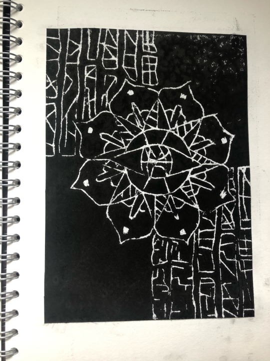
One piece of art work from this project that I feel was the most valuable to my learning was my mandala drawings. The reason I believe this is because its opened another side of my artistic talents I didn’t know I had. I have always been interested in mandalas but I never actually artistically thought that I could create artwork from mandalas. I think the drawings were most successful pieces of artwork because I believed that my mandala gifs looked beautiful epically because I digital edited them. Overall, starting my FMP on mandalas had a massive impact because all I wanted to draw was my mandalas and experiment with them. Its helped build my confidence up a an artist as its helped me to experiment with new topics and ideas.
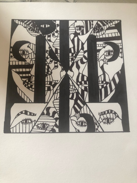
In the beginning on my FMP, I had no idea what my final outcome was going to turn out like. My initial ideas was to use the technique sewing and embroidery into my work. I wanted my work to have both peace and conflict but I had no idea what it was going to be about. When we were introduced at the beginning of our FMP we were give the topic mandalas and I wanted to maybe have a series of posters of mandalas for my final outcome. However, when I had my formative assessment Derek and me discussed about an idea I wanted to include in my work which was WW1. Derek had a gas mask and lent it to me to experiment with. We both discussed about my ‘Flipside mirror faces’ I did during lockdown and thought I could incorporate that into my work. This was the beginning of my final outcome.
I have learnt that your initial ideas don’t always go to plan. In the beginning I didn’t really have an idea at all, I know I wanted to maybe do a series of posters. I have learnt that doing loads of experiments and workshop can help unlock so many ideas. I mean after all the workshops we had do I just focused on the ones I most enjoyed and went from there.
I am so pleased with my final outcome I think it looks extraordinary, I can’t actually believe I manged to handstitched 20 prints and then sew them all together. It turned out better than what I expected because I thought it would be too plain but I love how it looks. The embroidery stitching helps it to stand out from the crowd and it looks so unique and incredible. I am so proud of myself for hand stitching all of my outcomes.
My plan to display my work at the end of year show it to use a painted white background and pin it to the wall. At first I thought about making it into a hanging piece but I realised it would just fold in on itself so I would have to pin it up.
If I could display my work anywhere in the world it would have to be the National WW1 Museum and Memorial in Kansas City, Missouri, United States. I would want to display my artwork here because I feel like I would be almost given back to the innocent people that died during WW1. As well I want my work to be seen by all the people interested in WW1 just like myself so it could inspire other people to create artwork about this historical event.
The 10 words I believe that describe my final piece is:
· Unique
· Extraordinary
· Ambitious
· Glowing
· Bright
· Eye-catching
· Fascinating
· Vibrant
· Appealing
· Astonishing
If I needed a soundtrack or music to go with my outcome it would be ‘Afterglow’ by Ed Sheeran. I would pick this sound track as my work is representing all those innocent lives that was lost during WW1 and its quite a depressing yet happy song. This song sort of makes me think of like all those innocent lives now at peace with the world. I love this song and I feel like it would compliment my work really well.
I spent probably around everyday trying to complete my final outcome. I would go into college, work the entire day then go some and once I had my dinner carry on sewing. Sometimes when my hands were tired I would spend time doing other work such as updating my blog or sorting/planning my week.
At home I work mainly in my bedroom by sitting on my bed or at my desk. Every now and then though if everyone was out I would sit in the living room or up at the dining room table.
Flipside Theme
Beginning
Expressive
Lifeless
Research
Fascinating
Electrifying
Exploring
Development
Advancing
Eye-catching
Vibrant
Final outcome
Extraordinary
Exquisite
Striking
At the beginning of my FMP I never knew how to produce a woodcut print which is one creative skill I had not done yet. However, one of the workshop we did was a woodblock print and I learnt how to execute and create some. I would like to create some more woodcut prints in the future.
My initial ideas were that I wanted to create a series of posters with embroidery and hand stitching. They have developed from this idea by all of the research and workshops I have done since we have been back from lockdown. As well I started to think about what materials I have access to now that we are back on site and that I don’t have such a small material range. My initial ideas has evolved from the series of posters because I started to experiment with lino printing as that’s one of my skills. Then realised that I don’t want to do posters I really want to create something nobody has ever seen before. I think my ideas really evolved is when Derek formative assessed me and spoke about ‘Guernica’ by Pablo Picasso. I wanted to do something similar to ‘Guernica’ and I wanted it to have meaning.
As I wanted my work to be about peace and conflict but have meaning I decided to add innocent things like flowers and butterflies to my gas mask to represent the innocent people that died. However, the gas mask to show the fallen soldiers that died in WW1 to save our country.
#evaluation#finaloutcome#handsewing#embroidery#linoprints#linocutouts#angie lewin#karl schmidt-rottluff#Guernica#Pablo Picasso#bayeux tapestry#widerworldresearch#Artist Research#artwork#FMP#Conflict#peace
0 notes
Photo


Development: Brand Visuals/ (logo)
Here shows initial ideas of what my logo could look like, with the name of my system being ‘Participate’. I started to play around with the concept of ‘art’ being in the word. could I do a play on words? enhance it to make people realise its a system about participating in the arts? This is when I started to block the shapes of the letters of ‘art’ out. At first with triangles - block shapes behind, similar to my previous ideas of the shapes made up of circles. I made the shapes in loose versions of the shapes of the letters - could this be my logo? just simple 3 shapes?with the names being participate? I quite liked the idea of using the three shapes - based off the forms of the word ‘art’ as it’s quite abstract and could be used on a number of designs! - my visual brand identity? But, why was I using triangle shapes? didn't make sense when I want my gallery to be circular shaped.
Because I like the idea of the shapes inspired by the art word, I tried it in circle shapes - to reflect previous work and my idea of that being the shape/style of my gallery! I really liked making the circles designs - similar to my previous circle shapes - as I think it fits more with my theme/idea of what my gallery would look like! I experimented with making it one shape - like my poster ideas before, and experimented with three circles being separate. Overall, I think I liked the three separate circles design the best - as it was more fun. Where as, the bubble shape, was a rather odd shape.
I digitally drew my ideas to see what they'd look like more monochrome - if I actually do my logo/posters in Lino, it will be a harsher black etc. so this helped me see what it might look like! The one thats circled is the logo idea I like best. Very loosely inspired by the ‘art’ in ‘participate’, I think it’s fun and broad enough to be put across my whole brand identity. But, its still recognisable enough, to know that its this brand - if it was a well known one! I want to work on it a bit more - maybe composition of the circles? and shape they're arranged in, but overall, i’m pleased.
This shows some more rough ideas - what I could possible do with my name/logo. Inspired by Tate Modern and La Fab, I roughly sketched possible tote bag designs - could I make a pattern of my logo, using the three circles? These were good to think about - I like the idea of having minimal designs on my posters and totes etc. So maybe just the logo on a tote would work? but, i’ll need to have a final logo established before I can really think about putting it onto the tote!
This was me starting to think about possible patterns to make and put on my banners/posters! I do really like the idea of having patterned logo banners to promote the gallery - its fun and inviting - especially if I use colours! I also started to think about how I could use the three circles in a poster - could I have information within the logo/circle shapes? like what's happening now? or info about up coming commissions/taste sessions? I also started to develop my logo a bit more - play around with the composition of circles. I also like the idea of having a box around it, but with some of the circles coming out - similar to my previous poster designs. It kind of looks like the gallery is telling you to not stay inside the lines, and to just have fun while creating art!
Now: finalise my logo design, so I can make a lino of it (and see if I still want to do it in lino, or if I should just go digitally). Also, develop some poster/banner ideas based off my logo (to create a cohesive brand identity) which, I'll then try in lino as well!
0 notes
Text
Evaluation
Outline:
Update 11/05/20 Main content, explained -
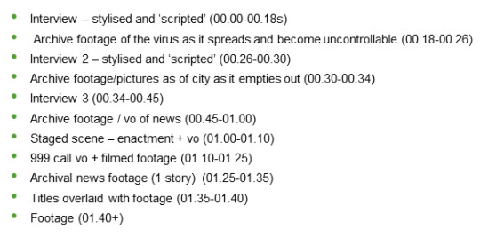
Interviews: I will adopt the best or most controversial segments of an interview and use them without context to build tension and 'hook’ the audience in. From the subject interviews I have now, examples of this might include:
1) ‘My money, my phone, my internet ain’t shit...“When the last tree is cut, the last fish is caught, and the last river is polluted; when to breathe the air is sickening, you will realize, too late, that wealth is not in bank accounts and that you can't eat money.”’ - Quoted by interviewee SS20T
2) ‘I think we’ll be even more socially distanced than before all this’ - Interviewee 2G01B
3) ‘...It’s man-made...I wouldn’t say I agree, but I wouldn’t say I disagree either. It’s a possibility’ - Interviewee 2G01B
Whilst these aren’t necessarily scripted (I haven’t planned them) I think using controversial or dramatic segments will build arrest my audience from the start and make them interested in watching the rest of the series. Even in the current circumstances - where these ‘pandemic’ narratives have become over-saturated.
Archive footage: This footage will not be my own.
These clips will be distorted and overlapping. The news will be the main source of archive footage I adopt here. Clips of news as it identifies its first fatalities and rapidly grows across Britain and the world. Rapid cuts will move between the two to reveal a build up to something unknown to the viewer. Adopting a crescendo style epic to build tension, too, will add to the enigma of the sequence.
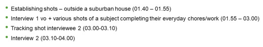
In using the 999 call, I believe this will be useful in constructing an authentic message and inviting the viewers into the type of crime or detective theme I aim to create. The title itself ‘the story of an invisible killer’ highlights a narrative using similar conventions. We’ll slowly unravel the life of Covid-19, how it began, how it spread and it’s victims - in a much similar set up to a murder-based docu-series. The titles will ultimately ‘climax’ and end all tension before we return back to a state of equilibrium. Perhaps some establishing shots and tracking shots can highlight the world as we knew it before. This is overlaid over the voice over of an interviewee as they begin to unravel the story of the virus from its onset. This will take up the last few minutes of the narrative.
Update 16/05/20 Mini teaser:
youtube
Update 17/05/20 Feedback:
2G01B: Well edited. A current and gripping story.
WDL40: You explore themes of global, economic and political concerns well. It flows nicely and I can see where it all ties into the ‘invisible killer’ narrative. I would like to see some more interview clips!
[Interviews are currently available to view on the One-drive shareable link.]
D_D64: All is good. I would have liked to see some use of the title in the typography. Maybe starting with ‘Outbreak’ but eventually fading out the first part so all that is left is ‘break’.
Critical Summary:
How successfully did I meet the criteria?
1) Effective project design - whilst I didn’t execute my final documentary project idea, I most certainly had a lot of fun conceptualising and pre-planning it. Instead of delivering a 4 minute pilot, I invested my time into prepping for it through scripts, vision boards, test shots and more. Doing this allowed me to visualise how the final product would be and ‘fine tune’ any irrelevant or unnecessary ideas I had originally planned for. I believe this pre-production element also allowed me to come up with a solid, attention grabbing pilot sequence - ‘hooking’ audiences into a docu-series which combats topics of crisis. I would suggest, thus, that I was successful in this area of research and am happy with the research I conducted.
2) Research practise methods - This area was a lot harder to attempt. Considering that my idea was continually evolving, sometimes I found this a little challenging to document. For example, I perhaps didn’t mention how I plan to ‘animate’ parts of my project. I liked the idea of a sand artist or a sketcher to illustrate my work through ‘in camera’ techniques rather than using software like After Effects or Adobe Illustrator. This is because I felt as though it would be more suited to my authentic and personal approach, giving a sentimental feel to each segment.
Initially, I attempted to make my own sketches. Though, I realise that this not only would be extremely impractical (and time consuming!) but also quite tasking as I am not an artist so would need a lot of test-products and practise. Then, my idea was to to ‘hire’ (or rather ‘borrow’) an artist and credit their work within my docu-series. However, once again, the process of sourcing a voluntary artist would be extremely time-consuming and challenging as creatives deserve to be paid for their work and I would have very little to offer. Finally, I opted to resign from this idea within my 4 minute pilot and stick to conventional documentary making. This allowed me to conceptualise the idea, without actually having to execute it; and, given the short time scale, this was probably for the best!
On the other hand, however, my research in ideas and themes is present - highlighted through my ‘Inspiration’ blog posts. I would say that the original idea evolved tremendously as a result of continual research and practise. At times, watching non-related shows and YouTube clips would inspire my work to take a different turn. Likewise, researching and reading different approaches, ideologies and theories regarding the practice of documentary making too helped construct my final project. Throughout this project, I aimed to vary my research in author, date and style. This, I believe, is evident in my final project which was shaped from the origins of a mock-documentary with comical elements at its forefront, to a tech-and-edit-heavy docu-series reflecting on how the virus effected us all. The hands-on approach too guided my research and thus, whilst I did struggle in this area, I do believe I did confidently and successfully execute this brief within the pre-production of my documentary.
3) Critical analysis review - I would certainly agree that I used a variety of sources to aid and support my research. Whilst most of my sources were books (sourced online), I enjoyed studying varying topics, including: documentary origins, the authenticity of documentary making, modern practices and much more. These scholarly texts were useful to some degree in understanding the theory behind this practical art of documenting - and, in some cases, fabricating - real-life stories. However, the skill of documentary making lies in the practical skills too. So, I also used visual mediums like YouTube and Google-sourced images to help manage my understanding of documentaries more closely. This was especially important as my pilot would, once complete, be uploaded to a visual platform like YouTube.
It seemed that this decision was the right one. Not only did I believe that YouTube (as the second most popular social media site) could attract a wider target demographic but also, my market agreed that my docu-series felt fitting for a platform like this one.
On the contrary, however, I examined pre-existing documentaries like Tiger King and sitcoms like The Office UK which have established distribution companies, to inspire my hybrid genre. Where I will be tackling issues concerning the virus alone, this will be rather dark and upsetting; almost like a crime investigation using interviews and personal accounts to illustrate the era. On the other hand, I will attempt to break this up with comical or up-beat bursts of footage as a way to showcase that ‘every cloud has a silver lining’.
To summarise, thus, I did use various resources - both scholarly and non-academic sources - to produce my finalised concept. I feel knowledgeable on delivering and executing this piece as a ‘shreditor’ now, but, simultaneously understand the inner workings of ‘what makes a documentary...a documentary’.
4) Advance practical skills - Whilst I enjoyed the idea of the ‘shreditor’ role, I was a little surprised at its intensity. Of course, I didn’t (in the end) construct a practical piece to submit. However, even in the initial planning, and then creation of the test shots, the shreditor role had its challenges.
In my previous experience of working in teams, I have definitely learnt a lot. From making compromises and sharing unified responsibility, to the delegation of a team-production - I believe that this opportunity allows us to individually specialise at what we do best, and create a project which resembles the best of our skills. In single-handedly running each role (and thus bearing its responsibility too), however, even the simplest of tasks became challenging. To me, the process was harder than anticipated because I was responsible for all sides of pre-production, production and post. Even in my test shots I found it challenging to set up and film, when this wasn’t even half of the equipment I wished to use initially!
Perhaps in finding these limitations, though, I learnt a valuable lesson that I otherwise would have disregarded. As a single documentary maker, the equipment I wished to use would be highly unrealistic as I would’ve found the process of transportation and setting up extremely challenging. Not only would this significantly eat into my time, but also cause issues with running the shoot i.e. expecting to film and manage sound simultaneously. However, as noted in an earlier blog post, I would require the assistance of my peers and to support me in the filming process i.e. in sound management. This would limit the time I would spend in fixing any issues I had during the shoot as well as lift the pressure a little. Meaning that my time would be solely on the film making and subject.
5) My final review - Reviewing and critiquing my 2 minute test piece allows me to understand my ideas in the ‘real world’ - advancing from the simplicity of my pre-visualisation to the actual docu-series itself.
What I found with the filmmaking is that sound is an over-whelming pain which I did not consider for! I didn’t anticipate how good the mics on my phone and camera were as they picked up small sounds like birds in my neighbours garden or my fish tank (strange!) in the background of my interview with my mum. The distorting of sound compromised some of the shots I took and would’ve been greatly problematic for the real pilot. However, in testing locations which worked / didn’t work and how these undesirable noises could be avoided (using sound covers for example), only led me to a better final production...or that which will come after lockdown.
Furthermore, I depended a lot on archive footage. Especially when cutting different segments of audio together, archive visuals were necessary to hide this. Likewise, in the real edit, using Avid will be useful for brightening and contrasting shots and adding colour where necessary.
I also noticed that studio lighting will address some of the lighting issues I had and so will be a (new) requirement I will have to consider. Especially for the cinematic look I wish to adopt, this is especially important! Moreover, I will need a camera that can adjust its focal length to enhance this. Using my own Canon meant that I was limited in the visual effects, though with the BMPC, I feel more confident in playing around with the settings and making a more visually dramatic piece!
I enjoyed making it and whilst my production time was limited (I constructed it over the space of a day!) I found it beneficial in my practical understanding. I hope you can see the development of my idea over the past few months and are on board with my idea. Hopefully I can execute the vision I have in mind and produce a high-quality docu-series aimed to enlighten and educate the broad target market that is those who fell victim to the 2019-2020 global pandemic: Coronavirus.
0 notes
Last Seen Blogs
peronamelon
PeronaSwann Art and Cosplay

ricko20-blog
"Keep Try"

cstgnttx
CASTAGNETTI PHOTO

alhunami99
Untitled

nagi-chan-san
allonlineflowers.com