#Mick McGinty

Text

Mick McGinty, The Void Captain's Tale, 1986.
25 notes
·
View notes


Text
Tora Tora: Surprise Attack (1989)


Cover Illustration by Mick McGinty
A&M Records
#my vinyl playlist#tora tora#anthony corder#keith douglas#patrick francis#john patterson#mick mcginty#a&m records#hard rock#classic rock#heavy metal#80’s rock#hair metal#compact disc#album cover#album art
3 notes
·
View notes
Text

Mick McGinty - Superman II (1980) Movie Concept Art
Source
3 notes
·
View notes
Photo
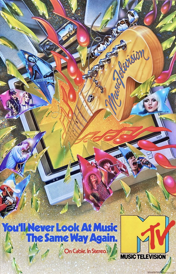
Click here for my posts about MTV and here for Fred/Alan’s MTV work.
The first MTV poster. Summer 1981.
I’ve been searching for this poster (or at least a file of it) for almost 20 years. It was the first poster we did for MTV in the summer of 1981, and maybe because it was in a somewhat outdated style it sort of got sidelined and I didn’t save it.
We were so late in finalizing the MTV logo pretty much all of the promotional merchandise that we put together to promote ourselves to record companies, music managers, advertisers and cable operators (and of course, ourselves) were rushed. Consequently, even though our logo animations were leading the channel into what became our loose, illustrative design style for MTV’s first few years, the earliest stuff was a bit of a hodge podge that we thought might work.
Artist David Willardson led the 70s California based music business through an innovative era by reviving the airbrush and using it to give a unique spin to 12″ vinyl album covers, which had generally been either photography of the musicians or abstract illustrations. By the end of the decade it was the cool way to showcase music. By 1980 he’d partnered with artist Charles White III in the Willardson+White studio in Los Angeles.
Around the time we started thinking about MTV, Manhattan Design –Pat Gorman, Frank Olinsky and Patti Rogoff– had started their studio in the spare room behind a tai chi studio above Bigelow Chemists in New York’s Greenwich Village. I’d grown up with Frank and one thing led to another and we hired the team to design our logo. 500 tries later not only did we have the ‘M’ we had our main designers for the first several years of the network.
Because of the speed at which we needed to ramp up once we settled on the logo weeks before our August 1, 1981 launch led to a lot of creative decisions that would have little effect on the overall approach we’d eventually take to design on the channel.
This poster, which fit into the prevailing record business of the past decade, would really be in complete opposition to my thinking for our channel. Which was, simply put, that MTV: Music Television needed to be the leader of the music biz –hell! the entire culture!– MTV needed to be what was next. It’s a great poster, a wonderful illustration, to be sure (well, I probably would’ve left off the artists; within about a month after our debut, most of them would be yesterday’s news). But, if you take a look at some of our other work, you might agree that with this piece we definitely hadn't become “next.” Yet.
PS: This poster led to one really stupid design decision on my part which plagued the production groups for several years. In my attempt to be organized and professional with respect to design, I took a cue from this poster’s type design, a variation of the Kabel family of typefaces. I insisted that all our on-air typography use Kabel, taking the choice out of individual designers. The typeface wasn’t really suitable to early 1980s television technology, but I insisted. Dumb!
.....
Credits:
Art direction: Manhattan Design
(Pat Gorman, Frank Olinsky, Patti Rogoff)
Airbrush illustration: Mick McGinty for Willardson+White
Creative Direction for MTV: Fred Seibert & Alan Goodman
Click here for my posts about MTV and here for Fred/Alan’s MTV work.
.....
…::: Addendum (July 7, 2023): I thought Manhattan Design had originally told me this poster illustration was done by Charles White III of Willardson+White. Through some research that I didin’t pay attention to –that is, I never looked carefully at the credits at the bottom right of the poster!– it turns out the artist was actually Mick McGinty.
So, I reached out to Mick’s website and got this note back from his son Jobey:
Hey Fred...we actually still have the original, and I have a print hanging in my home studio. It's one of my absolute favorites that Dad did, myself being a guitar player as well.
I would love more information on it if you have some, and I will gladly send you photos of the original. Dad had it hanging in his studio for about 20 years, but then it hung in my bedroom during high school, until I moved out and it went back to his studio. While I was in high school, Dad was offered a pretty large sum for it...he said I could use the money to go to college, haha, but I lacked some ambition and decided to keep it...and this was in 1996 or 1997.
Most of Dad's illustrations are going to go to Heritage Auction in August [2023].
So glad to hear from you and meet you...anytime I get to have contact with someone that my Dad worked with it's always a huge gift and blessing to me. Jobey
My response:
Oboy! What a nice note, thanks so much!
As it turns out, persistence is a quality that can work out once in a while. I found the poster on a rare rock poster site from Germany, of all things. It got sent to me right as I came down with a serious medical condition, and now that I'm OK, I'll be able to finally open the box!! Looking forward to getting it linen backed and framed.
I'll tell you what I know of the poster, given that I was the client rather than the commissioner, Hope it's helpful.
I was the original creative director at MTV. About a year before we launched on August 1, 1981, my creative partner (eventually, my business partner) Alan Goodman and I commissioned Manhattan Design to create a logo for the channel-to-be. (Actually, I went to my childhood friend, Frank Olinsky, who had been a fantastic artist since I met him at 5 years old, and not for nothing, a lifelong music fanatic. He'd just started a design collective with two others, Pat Gorman and Patti Rogoff, and the assignment broadened to their firm. Which, by the way, was housed in a storage room behind a tai chi studio above Bigelow Chemists, on Sixth Avenue in Manhattan.) It took at a year of over 500 comps before we were satisfied with the eventual, final logo.
The final corporate approval of the design went on way too long and by the time we asked Manhattan Design to come up with our launch poster (mostly for the cable operators we needed to put the channel on their systems, and advertisers we needed to give us their money to survive). Frank thought Willardson+White would be the right shop for the illustration (Frank himself was a fantastic illustrator, kind of out the Seymour Chwast style, but he had become sick of his own work and preferred designing) –after all, airbrush was the most exciting thing to happen to 70s album design, and pop design in general– and after they sketched out a comp, you dad did the fabulous work.
Honestly, until I stumbled upon the information that your father illustrated the poster, I was completely in the dark about it. I think Manhattan Design told me it was Charlie White who did it, but maybe I misremember, or possibly they told me a name they thought would impress me.
After the poster was printed (in a very small quantity) we went on to the main work of the channel. Personally, I was interested in moving past the styles of the 70s, not just in album design, but in animation design too. My boss wanted everything to look "modern," by which he meant the kind of Star Wars style of computer controlled animation and, of course, the airbrush kind of thing. I loved both of those things, but I felt like MTV needed to forge its own path, and not follow anything else. How would we be considered special if we were followers? When he said "Star Wars" I blurted out I wanted us to look like Gumby –claymation– and convinced him we couldn't afford the more expensive stuff (claymation was way out of the mainstream by the 80s, and I let him know that the studios needed the work and would do stuff for us at a budget more in line with what we could afford).
Bob Pittman –my MTV boss– left us alone, creatively and it gave us a chance to work on Frank to do our work in a more flat illustrative direction; he could execute that personally. Reluctantly, and given the startup budgets we were working with at the beginning –it took several years for the channel to be financially successful– Manhattan Design steered us right into the pocket I was looking for, and it helped make us famous during the first decade.
Anyhow, that's what I know. If there's anything else you're curious about lemme know, it'll probably ping my brain to things I've forgotten.
Take care, sincerely, Fred
#posters#MTV#1981#illustration#MTV design#Manhattan Design#graphic design#David Williardson#Willardson+White#Mick McGinty#MTVposts#Bob Pittman#Alan Goodman
5 notes
·
View notes

Text
right where you left me


and you're sitting right in front of me
meditations on cousins by asta lathan
song: right where you left me by taylor swift
art: the wedding morning by john henry frederick bacon / church graveyard by benjamin haughton / a feeling of flying by mary herbert / young girl reading by john-baptiste-camille corot / a village on fire, unknown artist (flemish or dutch) / still life with books by henri matisse / a hopeless dawn by frank bramley / rx an apple a day by mick mcginty / grass by natan pernick / laundry by carin bengts / the acting manager or rehearsal: the end of the act by walter sickert / girl in a tree by harry watson / the bridge in fog by stafan johansson / mädchen auf dem sofa by peder knudsen / horses in the stable by gustave caillebotte / somewhere, there's a party by holly warburton / thoughts by the stove by iakov kalinichenko / autumn vision by victor prouvé / blue birch woods no. 1 by jef bourgeau / window of awareness by holly warburton / rain (interior) by maya kulenovic / crossing by wanda koop / purple variations 4 by holly warburton
#asta#my web weaves#web weaving#yoinking this breakup song and making it familial. sorry taylor but i'm not#insane about asta forever and always
49 notes
·
View notes

Text

Mick McGinty
#superman ii#science fiction#adventure#movies#1980#1980s#christopher reeve#richard donner#superman#superheroes#comic books#dc comics#dc universe#artwork
50 notes
·
View notes

Photo

Mick McGinty (1952-2021) - Esquisse originale pour une publicité destinée à Wish TV. - Source Heritage Auctions.
9 notes
·
View notes

Photo


Streets of Rage 2 illustration by Mick McGinty, used as a temporary cover in advertisements and catalogues.
Sources:
https://comics.ha.com/itm/original-comic-art/mick-mcginty-streets-of-rage-2-original-sega-genesis-ad-art-sega-c-1993-/p/7348-18004.s?ic4=GalleryView-Thumbnail-071515
https://comics.ha.com/itm/miscellaneous//p/7348-15001.s?ic4=GalleryView-Thumbnail-071515
26 notes
·
View notes
Text


“There's rosemary, that's for remembrance. Pray you, love, remember. ”
ocean vuong / tom brown / 'truly' - cigarettes after sex / noah verrier/ 'heat lightning' - mitski / mick mcginty / pablo neruda
#ocean vuong#tom brown#cigarettes after sex#laurel hell#mitski#darkacademia#mitski moodboard#rosemary#rosemary for remembrance#noah verrier#mick mcginty#pablo neruda poetry
200 notes
·
View notes
Last Seen Blogs