#Monique Lallier
Text

Art binding designed by Monique Lallier.
#beautiful books#book blog#books books books#book cover#books#monique lallier#art binding#book binding#book design
103 notes
·
View notes
Text
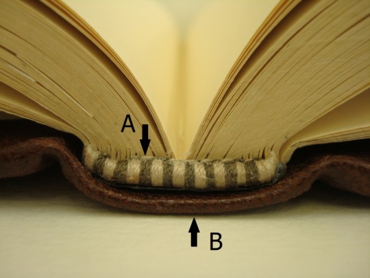
Bookmarking Book Art -- "Materials and mechanics for book conservation" by Paula Steere
Bookmarking Book Art — “Materials and mechanics for book conservation” by Paula Steere
View On WordPress
#Anouk Kruithof#Claire Van Vliet#Cor Aerssens#Daniel E. Kelm#David Clifford#Gary Frost#Gaylord Schanilec#Hermann Havekost#Irma Boom#Joyce Cutler-Shaw#Ken Botnick#Klaus Groh#Mark Cockram#Monique Lallier#Paula Steere
1 note
·
View note
Photo


Robert Wu. The art of practicing the ‘cello. Toronto, Canada: Little Gem Press, 2002.
This 1 ½ inch tall book was designed, compiled, illustrated, hand-colored and hand-bound by Robert Wu of Toronto, Ontario. Two other artists were also involved with our copy of this tiny marvel. It is in a unique binding by Monique Lallier, an internationally known Canadian binder and book artist whose studio is now in Summerfield, NC, just north of Greensboro. Check out her work at her website http://moniquelallier.com/gallery-of-design-bindings/ -- the first of the bindings pictured is also in our collections. Audrey Sage, our own Preservation Services Manager, created the clamshell box which now protects the wee book (and allows us to shelve it!) Audrey has been making amazing protective boxes for Special Collections materials for years, as well as preserving and restoring materials.
Another reason for us to love this book is that it also ties in with our cello music collection. The University of North Carolina Greensboro Libraries have the single largest holding of cello music-related materials in the world. Please check out our guide to the collection at: http://uncg.libguides.com/scua/cello
#Robert Wu#miniature books#tiny books#Monique Lallier#binding#Audrey Sage#clamshell box#cello music collection#UNCG#special collections#preservation#art#book arts#University of North Carolina at Greensboro#books#libraries#library#cataloging#Little Gem Press
14 notes
·
View notes
Text
La Prose Part Five: Finished Binding

OPEN BOOK NEXT TO BOX (ABOVE)
It is always a wonderful feeling when a book is complete. However long it has taken from beginning to end, there is always a sense of achievement. The work doesn’t stop there though, it needed to be photographed and I still had my blog post to write about it.
It turns out that this blog post has been rather a long one! The fact that it is such an interesting project to have worked on with the recreation of such an spectacular original and all the background research that Kitty Maryatt put in to realising it, alongside the point that I had never worked on this structure of binding before, and also the editing of such a lot of images and stages to write about has turned this in to a five part post.
The book is also on my website here.
OPEN BOOK COVERS (BELOW)
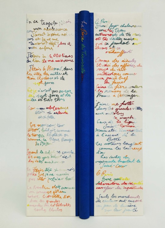
But what do the covers read? I took text from near the beginning of the poem for the back cover:
I was in my adolescence at the time
Scarcely sixteen and already I no longer remembered my childhood
I was 16,000 leagues from my birthplace
I was in Moscow, in the city of a thousand and three belfries and seven railroad stations
And they weren't enough for me, the seven railroad stations and the thousand and three towers
For my adolescence was so blazing and so mad
That my heart burned in turns as the temple of Epheseus, or as Red Square in Moscow
When the sun sinks.
And my eyes shone upon the ancient routes
And I was already such a bad poet
That I didn't know how to go all the way to the end.
.
The Kremlin was like an immense Tatar cake
Crusted with gold,
With great almonds of cathedrals all done in white
And the honeyed gold of the bells…
.
An old monk was reading to me the legend of Novgorod
I was thirsty
And I was deciphering…
And for the front cover, a section towards the end. This was a rather apt section of text to choose given it included the words “rouge”, “vert”, “multicolores”, “jaune” and “d’or” - how appropriate for a colourful book!
O Paris
Large glowing hearth with the crossed pokers of your streets and your old homes that hunch over warming themselves
Like forefathers
And here are the posters, red and green multicoloured as my brief yellow past
Yellow the proud colour of French novels sold abroad.
.
I love to squeeze into moving buses in big cities
Those of the Saint-Germain-Montmartre line bring me to the assault of the Hill
The motors bellow like golden bulls
The bovine twilight grazes the Sacre Cœur
O Paris
Central station last stop of desire crossroads of unrest
Only the merchants of colour still have a little bit of light on their doors
The “International Company of Sleeping Cars and Europeans Express Trains” has sent me their brochure
It is the most beautiful church in the world
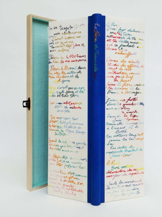
OPEN BOOK IN FRONT OF OPEN BOX (BELOW)
FRONT COVER AND TEXT BLOCK EDGE (BELOW)
Although in the original, due to how the text block was folded, neither the text or the imagery could be seen until the book was completely unfolded, this was not the case for my binding. I was really thrilled once it was finished to see how well the coloured stitching harmonised with the strips of colour on the folded edges of the pages.

DETAIL OF BOOK ON TOP OF BOX (BELOW)
BOX LID (BELOW)
I really liked the fact that the box remained so simple, with just the title added on the top. I didn’t want to take away from the intricate a coloured embroidery of the cover that popped out as you opened the lid.

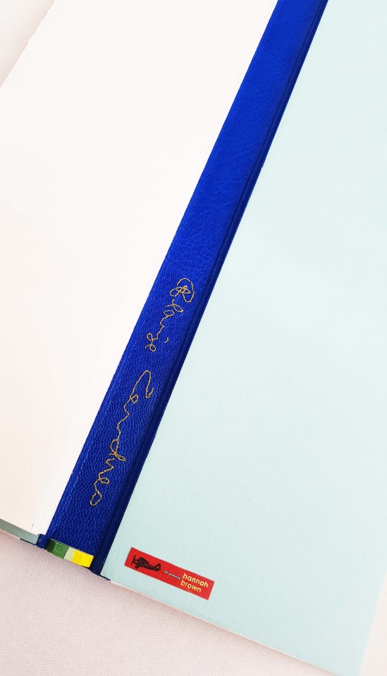
BLAISE CENDRARS SIGNATURE INSIDE SPINE (BELOW)
Blaise Cendrar’s signature was placed so that it would be a little added extra surprise as the book was opened. With embroidering it inside the spine it is hidden behind the concertina when the book is closed.
DETAIL OF OPEN CONCERTINA
The wonderful colours of the pochoir spill out as the concertina is unfolded. I was really pleased with how well the pochoir-covered end-caps worked as an extra design element of the binding.

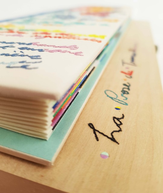
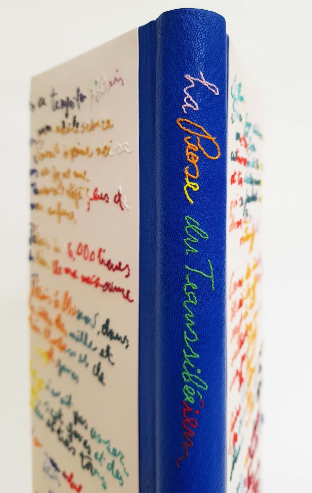
SPINE TITLE (BELOW)
The title was embroidered, thankfully without any spelling mistakes (see below for details of my near disaster!).
EMBROIDERY DETAIL (BELOW)
From pink, to yellow, to green, to red, to blue and on and on, this truly was a book of multicolour.

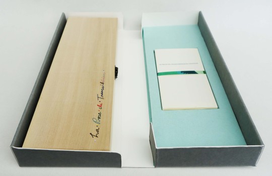
THE OUTER BOX (BELOW)
The wooden box I had made was further housed in an outer conservation box. This was partly to protect it, and also so that the small accompanying concertina pamphlet that Kitty Maryatt had produced explaining about the project could live with the binding. This little booklet had a section made for it in the outer box so it could sit below the wooden box.
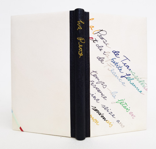
THE SAMPLE BOARD/BOOK
I have made reference in previous parts of this blog post to the sample board/book that I worked on ahead of the actual binding, I finish with some photos of this. I chose a darker blue goatskin for this spine with gold thread to embroider the title, this changed on the actual binding as I felt the dark blue didn’t match the pochoir.
I didn’t have quite enough vellum to cover the back board entirely so I pieced two bits together and masked the joint with a strip of the leftover pochoir.
SAMPLE BOARD/BOOK COVER EMBROIDERY
I embroidered the sample with writing at and angle, however decided to change this on the actual binding working horizontally. Thankfully, I had asked in advance whether it was okay to post images of some of my work in progress online whilst working on this project, both Kitty Maryatt and Neale Albert agreed. I was very pleased that this was the case as a French friend of mine spotted a spelling error on the sample book! Rather than “La Prose de Transsbérien”, it should have been “La Prose du Transsbérien”, another good reason for doing sample boards I guess - phew!

THE OPEN CONCERTINA OF THE SAMPLE BOARD/BOOK
The book was made so that when closed, the width and height were the same dimensions as my sample boards. Although of course it is thicker than a sample board, it can still sit in the same box as them in a wider slot.
This mini book is also going to have a second purpose, I have been meaning for a long while to make an index for my sample boards. Given this book is a sample board, and will therefore be in the box with them, I intend to use it’s pages to index all the other boards.
SAMPLE BOARD CONCERTINA PAGES
The front and back doublures of the sample book are different colours, initially I thought I would go for red doublures but in the end opted for pale blue to match the first spread of the concertina when opened.
BLAISE CENDRARS SIGNATURE ON INNER SPINE
Blaise Cendrar’s signature also appears on the sample book in red thread. This is sample number 54 in my ever-growing series.
The completed binding is now safely in New York. It is due to be shipped on to San Francisco to take part in the following exhibition alongside some other absolutely wonderful bindings of La Prose by other binders.
EXHIBITION at the San Francisco Center for the Book
TITLE: Drop Dead Gorgeous: Fine Bindings of La Prose du Transsibérien Re-creation
DATES: September 6 to October 6, 2019
OPENING RECEPTION: Friday, September 6, 2019, 6:00–8:00 pm
LOCATION: San Francisco Center for the Book, 375 Rhode Island Street, San Francisco, CA.
The remarkable book by poet Blaise Cendrars and artist Sonia Delaunay, La Prose du Transsibérien et de la petite Jehanne de France, was produced by letterpress and pochoir in 1913. It was a landmark achievement for its time with its unprecedented format, avant-garde typography and abstract imagery, and remains vibrant and modern today.
Kitty Maryatt of Two Hands Press has been researching the production of La Prose du Transsibérien since 2012. In 2018, she debuted a new edition of 150 copies, which faithfully incorporates techniques and methods used in the original. At the same time, Maryatt and her underwriters commissioned fine bindings by notable design binders from around the world. These bindings, along with Maryatt’s La Prose du Transsibérien Re-Creation, have resulted in a traveling exhibition titled Drop Dead Gorgeous: Fine Bindings of La Prose du Transsibérien Re-creation.
Debuting in San Francisco, the exhibition will feature the work of twenty-two design binders, including Don Glaister, Monique Lallier, Midori Kunikata-Cockram and Kathy Abbott. Tools, materials, and supplemental material used in the creation of Maryatt’s edition of La Prose will also be on display. Upon closing in San Francisco in October, the exhibition travels to additional venues in the United States, Canada and England.
DOCUMENTARY SHOWING
TITLE: The Re-creation of a Masterpiece: La Prose du Transsibérien. Documentary by Rosylyn Rhee. Los Angeles, 2019.
DATE: Friday, October 4, 2019, 6:00–8:00 pm
LOCATION: San Francisco Center for the Book, 375 Rhode Island Street, San Francisco, CA.
#la prose#le prose du transsbérien#sonia delaunay#blaise cendrars#two hands press#kitty maryatt#british library#making your mark exhibition#bookbinding#bookbinding commission#embroidered binding#vellum binding#reliure#reliure d’art#livre d’art#pochoir#stencilling#typesetting#handwriting#left handed#right handed#hannah brown#hannah brown bookbinder#shepton mallet#bowlish
19 notes
·
View notes
Photo

Portadas de #libros que llaman la atención. Ésta es de Monique Lallier
0 notes
Link
La Petite Poule d'Eau by Gabrielle Roy bound by Monique Lallier // bound in the French technique in full leather with inlays of lacunose and blind tooling
0 notes
Photo

I have SUCH an artistic crush on Monique Lallier!
0 notes
Link
Beautiful and creative bookbindings by a master.
15 notes
·
View notes
Text

Art binding by Monique Lallier.
source
#beautiful books#book blog#books books books#book cover#book design#book binding#monique lallier#art binding
11 notes
·
View notes
Text

THE THREAD M&D Art binding by Monique Lallier.

source
#beautiful books#book blog#books books books#book cover#books#art binding#book binding#book design#monique lallier
25 notes
·
View notes
Text

THE DRAWINGS OF CARAVAGGIO by Ally Jones. Art binding by Monique Lallier.
Full leather French technique binding. Cut-out shows threaded endpapers.
#beautiful books#book blog#books books books#book cover#books#monique lallier#art binding#book binding#book design
13 notes
·
View notes
Photo

Books made of trees from Monique Lallier.
4 notes
·
View notes
Photo

A very literal jacket from Monique Lallier Design Book Binding.
11 notes
·
View notes
Last Seen Blogs

boobookittyfucsblog
Untitled

klinically
this is my descent into madness

a-strawbebie
GET SCARED!!!!!!!

celebrityblr-blog
Untitled
a-strawbebie
GET SCARED!!!!!!!