#Scarfasaurus Reviews
Text
Ben 10 Alien Design reviews! – Wildmutt
youtube
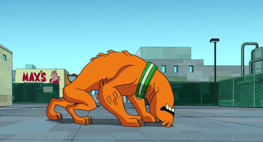
Our second review will be the goodest boy, Wildmutt!

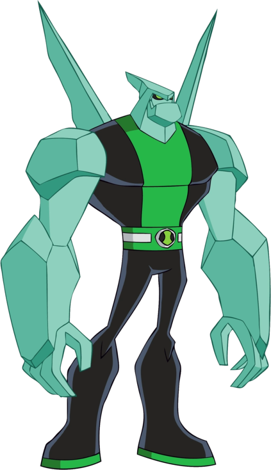
Wildmutt’s in-universe species are called Vulpimancers, which come from a planet that is so in total darkness, they haven’t even evolved eyes! So they have to make do with their enhanced sense of smell and hearing that gives them 3D mapping over their surroundings! And the best bit? Their gill-like markings on their neck are actually what give them their sonar and they’re also canonically their nostrils (and I think it’s implied they can even hear from them as well!). That’s REALLY cool and fascinating! Though, I gotta wonder, considering how Wildmutt’s nostrils only spread from the sides to the below of his neck, he probably doesn’t have as acute vision from head-on? It may not matter much due to how enhanced his sense of smell and hearing is, but it does bug me a little even if I really like the look of his blank face!
Also now that I think about it, if Vulpimancers are from a world so dark they have no light vision, what would be the need for their orangish fur? If it’s for camouflage, wouldn’t everything be in blackening darkness anyway? It would make more sense for me if his fur was more around on black or grey pigments; otherwise you just have some good boys with flashy coloured fur that they can’t show off to anyone due to not even having concept of colours! :(
Vulpimancers are very beastly and feral aliens, yet despite this they are actually a sapient species that even have their own languages comprised of complex growls and roars, however this language is almost impossible to translate and their vocal chords can’t emulate most other languages, the poor woofers are misunderstood!
Another neat design detail on Wildmutt is that from at first glance and the name you’d think he’s a canine based alien, but he also has some other mammalian animal traits! For example, he has ape-like traits in his posture and large arms, and he has porcupine-like traits with his various ‘quills’ around his body. Said quills can also be used as projectile weapons (though Wildmutt can’t do this due to how young he is) and they even supplement his sonar!
Generally speaking, I really like how despite Wildmutt being a more mammalian alien monster, they still had fun with his design and not make him look like a generic cool mammal that happened to be from space or whatever. To me he actually looks alien, and an alien that’s whilst evolved similarly to some Earth mammals, has clearly evolved its own unique traits from its alien environment at that! He probably is one of my favourites for how actually strange his appearance is the more you look at it.
Also, that underbite is adorable.

Wildmutt’s design in Ultimate Alien is ultimately the same aside from some VERY slight colouring and proportion changes. His upper arms and legs are now skinnier and a bit TOO skinny for a quadruped beast with super strength if you ask me. His black lips are now the same colour as his fur and I apologise if this comes across as nitpicky, but it uh... kinda bugs me, here it implies that Wildmutt’s lips are also covered in fur which is... eesh that doesn’t sound comfortable. Yes I know it sounds dumb, but like... have you seen a dog’s mouth and lips? There’s a reason why fluffy animals have a bit of skin showing around the mouth area, it’s so they won’t get any nasty stuff stuck on their lips and more easily eat food! I can’t really see it as being both the skin and fur being the same colour either due to fur and skin always being differently coloured with different pigments for each, and ‘sides, it’s good to have some colour variety in your critter!
Omniverse’s Wildmutt is again the same but has regained the black lips and is a bit more simplified to accommodate with Omniverse’s style, he also has a slightly more pronounced chin, and whilst I like the more flatter look of the previous designs better, it does more accentuate Wildmutt’s bite force and I think they make him look cute! His omnitrix symbol is also now a full on dog collar that also just makes him look more cute, you almost just wanna give him a pat to the head! But why wouldn’t you have wanted to in the first place!?
I don’t really have much to say about this one other than I think it’s the cutest of all the other incarnations, though the proportional criticisms I had for the UA design also applies with this one as well.
Overall I definitely like his design from the original series best. Wildmutt’s design I feel could use some improvement biology-wise but that’s really just me and it doesn’t matter so much for a cartoon alien dog, and it helps he has some really cool concepts going for him that are shown neatly in his design. Wildmutt isn’t my favourite design (I dunno if I really even HAVE one due to how much I like almost all of them) but I really like him and I feel he’s one of the more underrated aliens, but then again that’s pretty much the same for any of the more monstrous and non humanoid ones, he doesn’t even have a reboot counterpart! Gdi Man Of Action please give the doggo some love!
Intro
previous/archive/next
#Scarfasaurus Reviews#ben 10#ben 10 ultimate alien#ben 10 omniverse#wildmutt#vulpimancer#creature design reviews
17 notes
·
View notes
Text
Ben 10 alien design reviews! - Introduction
Salam! My name is Tara and welcome to my first set of reviews! After deciding that full-on media reviews was a tad too much for me to go all in at once, I’ve decided to take the more simpler route of basing my reviews on something I’m more personally passionate about, creature and character design! And for my first series of reviews, I’m going to do the alien designs of Ben 10! (NO ACTUAL DESIGN REVIEWS YET THIS IS JUST AN INTRO).

It’s been a while since I’ve watched any Ben 10 and I’ve only fully watched the original series whilst only watching a few episodes of the rest, but they’re shows I have fond memories of since childhood even if I didn’t have cable as a kid, I had to go to some relatives that DID have cable and turn on the Cartoon Network channel in hopes that either Ben 10 or Powerpuff Girls would be playing! Still even before I had the ability to at least fully watch the original series and the others, I still always had been enamoured with the various alien designs, though if I have to admit, I’ve liked the original aliens more.

Yeeeeeah, sorry folks, but I guess I’m a ‘genwunner’, the original aliens just fit my aesthetics more and whilst I like plenty of the ones from the later series, they don’t have the same ‘organic and even alien to one another’ feel to them and come across as more bland. AF and UA had whilst plenty of their own interesting aliens, had a art style that really held back the more unique aspects of their designs, and whilst Omniverse’s cartoonier art style was one I liked and even thought improved some of the designs of pre-existing aliens, their original aliens were much more bland with only around two or so exceptions, and both of them are bugs, you can probably guess which ones.
And I haven’t seen much at all about the reboot so I won’t say much on it, but let’s just say I am VERY DISAPPOINTED WITH SOME OF THE DESIGNS... HMMMMMM

I’l get to you later...
Now, I of course am not going to have my AF/UA, Omniverse, and Reboot reviews be all about bashing the designs just because I like the original ones more, like I said there’s plenty aspects I like about the later ones, and it’s more to discuss their various design elements and how I personally feel about them and which ones do or don’t work for me. It should go without saying that these are of course, just my opinions and shouldn’t really be taken as ‘objective truth’ or a personal attack on anyone that disagrees with me, design is a very subjective thing! But it’s fun to talk about the things you like and dislike and why you feel that way about them.
Now, for the reviews, when I review an alien’s design, I will also review its various ‘redesigns’ from the other series. I know some of the aliens have ‘Ultimate’ forms in UA, but I think I’ll review all of those on a separate page altogether. After when I am done with a series’ original omnitrix aliens, I will review the other non-omnitrix aliens in the series before moving onto the next series’ omnitrix aliens! I don’t really have a set schedule on when I post reviews so I guess I’ll write and post when I have the time, but I will do my best to make sure there aren’t any long gaps between each review!
Thanks for reading and I hope you’ll enjoy my eventual reviews, my first one will be Heatblast! So look out for that! :)
Heatblast>
17 notes
·
View notes
Text
Ben 10 Alien Design Reviews – XLR8
youtube
For today’s Ben 10 alien review, we have one of my personal favourites, XLR8!
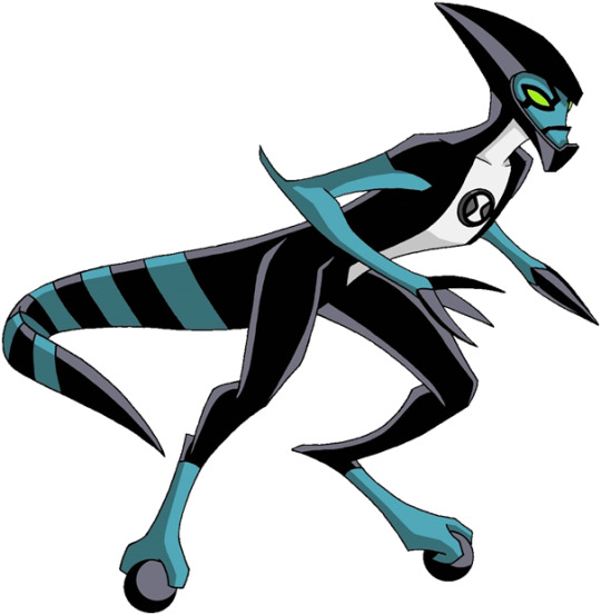
XLR8’s in-universe species are called Kinecelerans, which come from the planet Kinet. Though in the original series with XLR8 they could talk and act at a steady place, in the newer series they are more jittery and hyperactive and tend to have low attention spans, I don’t know which I like better to be honest, I think the former is less cliche and I still liked XLR8’s character and found it fun back then but the latter can still be fun when done right, though I’ve not seen the latter series’ portrayals so I can’t really say if I like their characterisation better!
XLR8, and by extension Kinecelerans, looks very dinosaur-like and his body plan closely resembles our prehistoric raptors. His head is smoothly crested and armours his head and his ‘often’ exposed face, which brings us to one of the REALLY interesting bits of his anatomy.

Whenever XLR8 needs to run, he brings down his face shield to help protect his face! And the best part? It isn’t artificial at all, it’s a completely organic function he has! That’s a REALLY cool concept and it helps the face mask has a really cool pattern for it as well. I love how it also all resembles some organic version of a motorcycle helmet whilst perfectly mixing in these elements into a slick head design.
Another thing I wanna talk about is how XLR8 actually runs with wheels, see those little sphere that he’s standing on? Again, not artificial, but completely organic too! And he uses these wheels to help enhance his speed! I dunno how WHEELS can ever be evolved due to their inherently too complex structure, but it’s still a really cool design nonetheless. I really love whenever a design incorporates organic and inorganic elements and manages to blend them together really nicely.
And if anyone knows a thing about me is that I LOVE dinosaurs, and the fact that XLR8 not only resembles one, but also has the smooth anatomy with his spine and torso extending into his tail rather than the tail just happening to be attached is a nice detail that I’m glad they’ve paid attention to.
The look of his hands are also pretty interesting as well with their claw-like fingers all joining up into looking like a jabby spear.
And last but not least, his colour scheme and pattern design, I really like XLR8’s blue, black, and white colour scheme and how it’s used. The angled stripe pattern of his tail is also a neat touch and it reminds me of road barricade tape, which is helped by the flat look of his tail. And you gotta love how his patterns on the torso look almost like a motorcycle outfit!
Overall, XLR8 has probably one of the coolest designs of the aliens, I love how it incorporates elements of a lot of ‘cool’ things such as dinosaurs and motorcycles and smoothly blends it together. And whilst I know XLR8 may not ‘count’ due to all his ‘inorganic’ elements being actually organic parts of his anatomy, I do love the biomechanical elements of his design and how they fit along to his anatomy. Just a really slick and fun design overall!
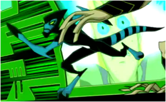
XLR8 never appears in the UAF seasons, but he does appear in the opening for UA, not much to say here honestly, it’s the same design.
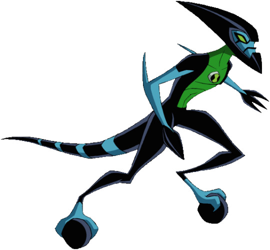
Omniverse’s design I have mixed feelings for, it’s the same, but the body shape is more humanoid and the spine doesn’t extend down to the tail as much, but it’s still subtly there which I’m glad they’ve kept. Some parts of his design are noticeably exaggerated whilst some less so, the barricade tape-esq stripes of his tail are now more ordinary stripes which is a tad disappointing to me, but I love how humongous his wheels and head are now and don’t mind the spindly legs so much, I think they’re pretty amusing exaggerations! The added green is also nice, and now that I think back to it, I dunno what I was on about with Diamondhead’s colour scheme in the last review, looking back on it they all honestly seem fine to me, guess my monitor is that bad (but the reboot’s weird green shading still has my contempt and I still feel pride to my recolour of it).

Reboot XLR8’s design is now more humanoid entirely and that makes me a little sad, but I’m glad the tail still seems to smoothly fit with the rest of the anatomy. His design is very cute though, and I like how separated and more bulbous his eyes look now, it’s adorable to me! I also like how there seems to be more of a texture on his arms now, maybe implying scales! He also has spikes now which I’m neutral towards as I think he’s fine enough without them, but eh, they don’t clutter his design up TOO much and are alright. The colour scheme here is also really nice as well, and I like the extra blue tones!
Once again I like the OS design more, but XLR8’s design throughout the other incarnations are still fun. Like I said before I love the mix of organic and inorganic elements and considering how that crest and his body shape, maybe silhouette wise, resembles and was maybe a G-rated reference to H.R. Giger’s Alien, those elements really fit as well! Just a nice design that you can’t go all that wrong with, as shown throughout his incarnations!
Intro
previous/archive/next
#Scarfasaurus Reviews#ben 10#ben 10 ultimate alien#ben 10 omniverse#ben 10 reboot#xlr8#creature design reviews
7 notes
·
View notes
Text
Ben 10 Alien design reviews! – Heatblast
youtube
Our first alien we’ll review is Heatblast, also the very first alien that Ben transforms into in the series!
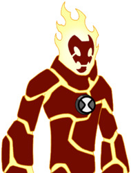
Heatblast’s in-universe actual species are called Pyronites, which come from the planet-like star Pyross, I don’t know how any creature would be able to evolve on a star, but hey! It’s COOL, and we get a sweet fire boy out of it, and that’s what matters!
Heatblast has a pretty neat design, I especially like his skull-like features on his face, and the ‘tear’ markings on him are a neat touch, altogether with his flaming head makes him look even ghostly! it gives me Ghost Rider vibes, but with MORE fire, and this time the space kind rather than the hell kind.
I also really like how his stone plates scale away at the end of his limbs, and you can even see small specs of the stone plating that give way for the inner magma body! It adds on for how Heatblast channels concentrated fire from his body. I also like how big his hands are, you can tell how that he makes big fireballs outta them (because YOU try blasting fire from those teeny tiny human hands!), his weirdly cylindrical feet are an odd touch but still a neat detail.
Also, that rocky collar is adorable, it comes across as a sort of ‘container’ for Heatblast’s flaming head so no excess heat scatters and lessen the chances of burning something on accident, but it does however look a tad stiff, what happens if you wanna look and lean down, firey boy??
Now that I think about it, a lot of Heatblast’s rock segments do make him look stiff in some areas especially around the abdomen, it’s to be expected in a way with a rocky design, but I feel they could’ve used more segmentation around the different segments of his abdomen, and there’s only one or two lines needed honestly.

Heatblast in Ultimate Alien looks the same but with a different pallet and a slightly but not too noticeably bulkier build. As much as I love the previous design’s bright colour scheme, I actually like his darker colouration better; it makes more sense to me as his stone plating would have to be constantly singed from his element. His inner magma body is also more notably bright and has a more firey texture. He loses the ‘tear’ markings which is a shame, but nothing detrimental to the original design. His flaming head also is a bit more ‘flowy’ here, and I think giving it more flowiness improves it!

Omniverse Heatblast has a more dynamic pose and design, the flaming head is much more ‘flowy’ (nice!) and he is much more bulky, I do miss his more leaner build in the original design, but the bulkiness looks good too and it gives the impression of our boy Ben growing! ...Unless if this design is only shown during the flashback sequences of Omniverse. The ‘rock collar’ now also has the front segment cut out and so helping Heatblast looking less stiff. The odd posing of his legs however look a bit too wonky, but that’s probably just the model and maybe he looks better when in action in the show?

Reboot Heatblast is conceptually the same but also has some noticeably different design choices, it’s one of the redesigns I actually think look neat! I like his classic designs better, but his reboot is cute too. I’m sad he no longer has his freakishly huge hands and more spindly legs anymore, but I’m glad they still kept his skeletal-like facial structure, and amusingly enough his firey head is no longer only having his face bare, but is now engulfed entirely around the head! I really like that said flames give his face a different tint of colour, I do wish we had that on his classic designs. The shape of the flame along with the rock collar reminds me a lot on the appearances of spacesuits, and I guess that’s fitting for a cartoony alien! And a cartoony alien with the added bonus of being on fire no-less! HOUSTON, WE GOT A PROBLEM!
Overall, Heatblast has a pretty solid design throughout all his incarnations and redesigns, it’s hard to pin down a ‘favourite’ as I like each for their own reasons, and they all look and are conceptually the same aside from different colourings and different details. The stiff positioning of Heatblast’s rock armour around on his abdomen does still bother me throughout all his designs, though the reboot I guess you can say is more justified due to its more cartoonier style. Heatblast isn’t actually my favourite alien and nor is he entirely ‘my thing’, but he’s my favourite of the more humanoid aliens, and you can see why he’s popular!
Now... *ahem* time to address the elephant in the room...
Remember when I said Heatblast is the first alien Ben turns into? Well, I initially wanted to post his first appearance as an ‘intro’ to the review for fun, but guess how that turns out for Ben and the poor forest he’s camping in.
youtube
Yeeeaaaah, Steve Blum’s wonderful voice acting aside, that hits a bit too close to home in this current climate, huh? So, if anyone needs it, here’s a guardian article that details various charities to donate to for Australia’s bushfires.
https://www.theguardian.com/australia-news/2019/dec/21/how-you-can-donate-and-help-the-volunteer-firefighters-in-australias-bushfire-crisis
<Intro Wildmutt>
15 notes
·
View notes
Text
Ben 10 alien design reviews – Diamondhead
youtube
The third review will be the buff rock, Diamondhead! Sorry for the delay!
Original Series
Diamondhead’s in-universe alien species are silicon-based lifeforms called Petrosapiens and they are entirely made of a green crystalline material. Silicon-based lifeforms have always been a fascinating concept, though very difficult to apply in real life as silicon when oxidised becomes the solid silicon dioxide called Silica, thank goodness for cartoons making anything possible! :D
I like the blockiness of Diamondhead’s design! It fits for his crystalline body and his blocky arms and legs are especially fun and amusing to me; they look like full on gem blocks! The smooth dorsal crest on his head and the two spikes from his back are also neat details that fit well with his design and nicely express his ability to shoot crystalline projectiles out of himself! I notice that he amusingly looks like a goofy superhero in a way with that silly chin, and even acts like it within the show too as you may have seen in that clip! Also, that mint green colourisation of his crystal body is a really nice colour choice, and it stands out really nicely from his black and white suit!
I do however, find something to be kind of lacking in his design and I feel there’s a whole lot more you can do with ‘big crystalline alien man’. Whilst I usually like more non-humanoid designs better it’s not that he’s necessarily humanoid that makes me go ‘meh’ as there are plenty of humanoid character designs out there that I like (Heatblast has really grown on me!). Maybe it’s said superhero influences as whilst I find their inclusion amusing and can see why they would be there, I’ve just always been kinda blanded out by superheros unless if they are the more comedic parody or somehow hit my aesthetics (which are hard to describe, but are basically the opposite of the ‘clean and glamorous’ style of most superheros, so pretty rare honestly unless if you can give me some good recommendations!). His design just feels a tad bland to me and I’m overall just pretty neutral to it, Diamondhead has some cool concepts here and there but he’s overall not really my thing.
Ulitmate / Alien Force
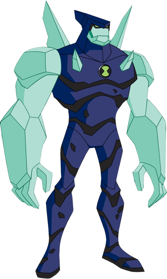
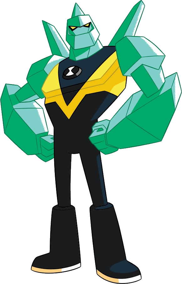
UAF’s Diamondhead shows an interesting take by having most of his body be rockier with his arms, face, and the various spikes around him be crystalline! I think it really adds nicely to how crystals work and grow and how they also appear to be growing out of him and it gives Diamondhead a more unique design! There are however some things that bug me about Diamondhead’s design, one of them being his thinner and less bulkier legs that I feel are disproportionate for a seriously buff crystalline character, now, a buff body with disproportionate skinny legs isn’t always a bad thing, but in my opinion they work more for comical designs or to imply that the character’s arms are an especially important trait, and it doesn’t really fit so much here.
Another thing that bugs me is the colour scheme; the colour schemes of his crystalline parts I feel are too dark here, especially in contrast to his darker rockier body, so it ends up clashing a tad.
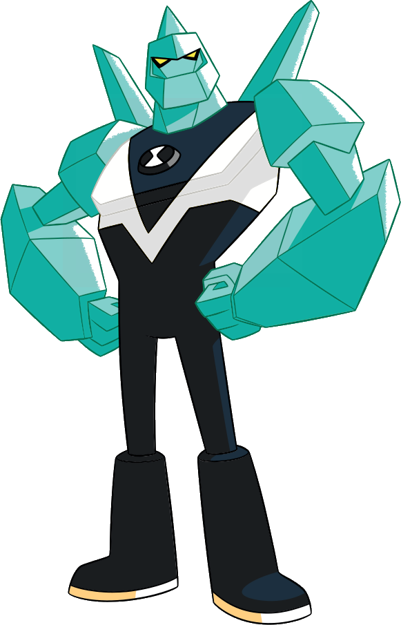
To let you all know what I mean I went ahead edited his crystalline colours to be lighter, it’s only just a few shades of difference and maybe all that the previous one needed was more darker shading but I personally like it a lot better and I feel his crystalline aspects stand out more, tell me your thoughts as well!
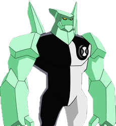
Omniverse
Oh DANGET and I just finished UAF’s recolour! I’m sorry but Omniverse Diamondhead’s darker green/blue of the crystal does noooot fit well with that green, I’d do another ‘fix’ of this but I think you guys get my point already, it’s not the worst colouring ever and maybe could be fixed with darker shading on the crystalline body but UAF’s contrast was much better in comparison. Also AGAIN with those LEGS, those are some seriously skinny thighs! I’d make a leg day joke but below the knee is weirdly thick; guess Diamondhead skipped uh... thigh day???
There are still some things I do enjoy about this design though, I think that oversized chin is funny and the larger spikes are cool, though I do miss the rocky texture of UAF Diamondhead. To be honest I actually quite like his more bulkier lower legs, if Diamondhead’s thighs here were bulkier I’d actually say the proportions are decent, though then I’d maybe complain about the upper arms for being a little too skinny for my tastes.
Reboot
Oof ouch, yeah uh, I am SO sorry to say this, but this one’s WORSE. I need to be honest and say that the colour scheme of Reboot Diamondhead is even straining on my eyes a little as that green and blue doesn’t go well with that mustard yellow at all, maybe if the yellow was lighter and that weird greenish shading wasn’t so saturated it would be more bearable. Ok, y’know what, this design hurts my eyes enough that I’m gonna recolour it so I can at LEAST talk about the good bits without having to rest my eyes every minute, it may be just the white background of this word document that’s making my eyes hurt, but OFF I GO ANYWAYS.
HUZZAH! Much better! Well, better for me and my sensitive eyes anyway, changed the yellow to full-on white as I couldn’t figure out a way to make it look good. Now with the unfortunate eye strain outta the way, reboot Diamondhead is blockier and is less muscley looking than his previous incarnations, I personally like the more organic designs, but the more cubic elements fit. His head and jaw are also now connected together which makes him look like he’s wearing a helmet! I like that! Unfortunately his signature crest is now more like a spike growing out of the back of his head rather than looking like that previously nicely smoothed crest, which is kinda a shame as it now looks less something really growing out of his body and more like something that was stuck on there. I also don’t mind the legs too much here compared to Omniverse’s as Reboot Diamondhead is now more noticeably less buff and the legs still look solid and proportionate, and the Reboot’s more simplistic style helps anyway.
Overall
Again, I like the original design best though the UAF design had some really cool ideas going for it and I wish said ideas had been picked up by the other later incarnations. Still, like I said Diamondhead’s design overall isn’t really my thing but his original design is still pretty solid! Plus, the original design doesn’t make my eyes bleed! :D
Intro
previous/archive/next
#tara's text#Scarfasaurus Reviews#ben 10#ben 10 ultimate alien#ben 10 omniverse#ben 10 reboot#diamondhead#Character Design#Monster Design
6 notes
·
View notes
Last Seen Blogs


lil-lyyn
lyn

what-things-that-matter
Untitled
callsignbaphomet
Give 'em Hel, rangers!

kill-like-you-mean-it
so done