#StylishButtons
Explore tagged Tumblr posts
Visit Tumblr Blog
Explore Tumblr blogs with no restrictions, modern design and the best experience.
Last Seen Tumblr Blogs


Fun Fact
Tumblr Inc. has $15.1M in annual revenue.
Text
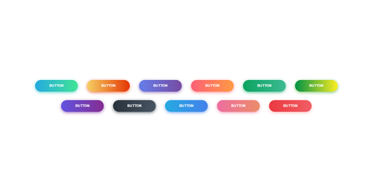
Styling Round Buttons with CSS: Quick and Stylish

Introduction
Welcome to our exploration of styling round buttons with CSS! In this blog post, we'll delve into the art of enhancing the visual appeal of buttons, focusing specifically on creating sleek and stylish round buttons using Cascading Style Sheets (CSS). Whether you're a beginner or an experienced developer, understanding how to apply creative styles to buttons can significantly elevate the overall design of your website. We'll start by providing an overview of the importance of button styling and offer a brief explanation of CSS for those who may be new to the concept. Our main focus will be on the round button element, and we'll guide you through the process of crafting eye-catching designs that not only look good but also contribute to an improved user experience.
Understanding Basic CSS Styling
Before we dive into the specifics of styling round buttons, let's take a moment to explore the fundamentals of CSS. Cascading Style Sheets are a powerful tool for controlling the presentation of web documents. They enable developers to define the look and feel of HTML elements, providing a level of customization that goes beyond the default browser styles. In the realm of button styling, it's essential to grasp the basic CSS properties that play a crucial role. Here's a breakdown: - Selectors: CSS selectors are patterns used to select and style HTML elements. Understanding how to target specific elements is fundamental to effective styling. - Properties: CSS properties determine the visual presentation of selected elements. Common properties for button styling include 'background-color,' 'border,' and 'color.' - Values: Properties are assigned values that dictate their behavior. For example, the 'background-color' property can be assigned a hex code or a color name. Now, let's consider the concept of the box model. The box model describes how elements are structured in terms of content, padding, border, and margin. When styling buttons, understanding the box model helps in controlling the spacing and dimensions of the button element. Creating visually appealing buttons often involves setting a background color and defining an appropriate border. For round buttons, the key property to employ is the 'border-radius' property. This property rounds the corners of an element, transforming a regular button into a stylish round button. Let's illustrate this with a simple example: Selector Property Value button background-color #3498db button border 2px solid #2980b9 button border-radius 10px This example demonstrates how to style a button with a blue background, a solid border, and rounded corners. As we progress, we'll build upon these foundational concepts to create more intricate and visually appealing round buttons with additional CSS techniques.
Creating Round Buttons with Border Radius
Now that we've covered the basics of CSS styling, let's delve into the exciting realm of crafting round buttons using the powerful 'border-radius' property. This property allows us to transform the traditional sharp corners of a button into smooth, rounded edges, adding a touch of modern aesthetics to our design. The 'border-radius' property is applied to define the curvature of each corner. By specifying a single value, you can create uniformly rounded corners. For example, setting 'border-radius: 10px;' will result in a button with a 10-pixel radius for all corners. For more customized designs, you can specify different values for each corner using the syntax: 'border-radius: top-left top-right bottom-right bottom-left;'. This flexibility enables the creation of uniquely shaped buttons, giving designers the freedom to experiment with various styles. Let's illustrate this with a practical example: Selector Property Value button background-color #27ae60 button border 2px solid #2ecc71 button border-radius 15px 5px 15px 5px In this example, we've applied a vibrant green background color, a solid border, and a unique 'border-radius' configuration that results in rounded corners on the top-left and bottom-right, and sharper corners on the top-right and bottom-left. Experimenting with different 'border-radius' values allows you to achieve diverse button shapes, from perfectly round to asymmetrical designs. As we progress, we'll further enhance our round buttons by incorporating additional styling techniques such as hover effects for interactive user experiences.
Adding Style with Hover Effects
Elevate the user experience by introducing engaging hover effects to your round buttons. Hover effects provide a dynamic and interactive feel to your website, creating a visually appealing transition when users interact with buttons. In this section, we'll explore the implementation of hover effects using CSS, enhancing the overall aesthetics of our round buttons. The :hover pseudo-class is a powerful tool that allows us to define styles specifically for when an element is being hovered over. By utilizing this pseudo-class, we can apply unique styles to our buttons, creating smooth and eye-catching transitions. Let's consider a simple example: Selector Property Value button:hover background-color #e74c3c button:hover color #ffffff button:hover box-shadow 0 0 10px rgba(0, 0, 0, 0.5) In this example, when the button is hovered over, it transitions to a bold red background color, a white text color, and gains a subtle box shadow for a 3D effect. These simple yet effective changes can significantly enhance the visual appeal of your buttons. Experiment with various properties such as 'transform' for scaling or rotating effects, and 'transition' for controlling the speed of the transition. Combining these techniques allows you to create engaging and responsive hover effects that captivate your audience. As we continue our exploration, we'll dive deeper into accessibility considerations and responsiveness, ensuring that our stylish round buttons not only look good but also provide a seamless experience for all users across different devices.
Enhancing Accessibility and Responsiveness
As we continue our journey into styling round buttons with CSS, it's crucial to prioritize accessibility and responsiveness. Ensuring that your buttons are accessible to users with diverse needs and responsive across various devices contributes to a positive user experience. Let's explore key considerations for enhancing both accessibility and responsiveness in our button designs. Accessibility: - Include descriptive alt text for button images to assist users with visual impairments using screen readers. - Utilize semantic HTML elements and ARIA (Accessible Rich Internet Applications) attributes to provide additional information to assistive technologies. - Ensure that buttons are navigable and usable with keyboard input, emphasizing the importance of focus styles. Applying these accessibility principles ensures that all users, regardless of their abilities, can effectively interact with and understand the purpose of your round buttons. Responsiveness: - Embrace a mobile-first approach, designing and styling buttons for smaller screens before scaling up. - Utilize media queries to adapt button styles based on the device's screen size and orientation. - Consider touch-friendly designs for round buttons on mobile devices, ensuring a smooth and intuitive touch experience. By prioritizing responsiveness, you guarantee that your round buttons look appealing and function seamlessly across a spectrum of devices, from smartphones to desktops. Combining accessibility and responsiveness creates a well-rounded user experience. Implementing these principles not only caters to a broader audience but also aligns with modern web development best practices, contributing to the long-term success of your website. Next, let's explore tips for optimizing the performance of our CSS code to ensure our round buttons load quickly and efficiently, providing a seamless experience for users.
Optimizing Performance
Now that we've crafted stylish and accessible round buttons, it's time to shift our focus to optimizing the performance of our CSS code. Performance optimization is crucial for ensuring that your website loads quickly and efficiently, providing users with a seamless and responsive experience. Let's explore some key tips for optimizing the performance of our CSS code. 1. Minification: Reduce the size of your CSS files by employing minification. This process removes unnecessary whitespace, comments, and redundant code, resulting in smaller file sizes that load faster. 2. Concatenation: Combine multiple CSS files into a single file through concatenation. This reduces the number of HTTP requests, improving loading times. However, be cautious to maintain the order of styles to avoid unintended conflicts. 3. Use of CSS Sprites: CSS sprites involve combining multiple images into a single image file and using CSS to display specific portions. This reduces the number of image requests, enhancing performance, especially for buttons with iconography. 4. Critical CSS: Identify and inline critical CSS for above-the-fold content. By delivering essential styles inline within the HTML document, you expedite the rendering of the initial view, improving perceived performance. 5. Browser Caching: Set appropriate cache headers for your CSS files to enable browser caching. This allows returning visitors to load your website faster by retrieving previously cached stylesheets. Implementing these performance optimization techniques ensures that your round buttons not only look great but also contribute to a speedy and efficient user experience. Remember to regularly review and refine your optimization strategies as your website evolves and grows. In conclusion, our exploration of styling round buttons with CSS has covered the essentials of design, accessibility, responsiveness, and performance. By incorporating these principles, you can create visually appealing, user-friendly, and high-performance round buttons for your website.
FAQ
Explore common questions about styling round buttons with CSS to enhance your understanding and troubleshoot potential challenges. Q1: How can I create perfectly round buttons using CSS? Use the 'border-radius' property and set it to 50% to create perfectly round buttons. Adjust the value to achieve the desired curvature. Q2: What are some creative hover effects for round buttons? Experiment with properties like 'background-color,' 'color,' and 'box-shadow' within the ':hover' pseudo-class. This can include changing colors, adding shadows, or scaling the button for a dynamic effect. Q3: How do I ensure my round buttons are accessible? Ensure you use semantic HTML elements, provide descriptive alt text for images, and use ARIA attributes. Additionally, implement focus styles and ensure keyboard navigation is smooth. Q4: Can I use different 'border-radius' values for each corner of a button? Yes, you can achieve unique button shapes by specifying different values for each corner. Use the syntax 'border-radius: top-left top-right bottom-right bottom-left;' to customize the curvature. Q5: How do I optimize the performance of my CSS code for round buttons? Optimize performance by minifying and concatenating CSS files, using CSS sprites for images, inlining critical CSS, and implementing proper browser caching. Feel free to experiment with these solutions and tailor them to your specific design requirements. If you have additional questions, don't hesitate to reach out for further assistance.
Conclusion
Congratulations on completing our journey into the world of styling round buttons with CSS! We've explored the essentials of creating visually appealing and functional buttons, from the basics of CSS styling to the implementation of hover effects, and the crucial considerations of accessibility, responsiveness, and performance optimization. By mastering the 'border-radius' property, experimenting with hover effects, and prioritizing accessibility and responsiveness, you are well-equipped to design round buttons that not only catch the eye but also provide an exceptional user experience across various devices and user needs. Remember, the key to successful button styling is a balance between creativity and usability. Continuously refine your skills, stay updated with the latest web development trends, and always consider the end-user in your design decisions. As you implement these techniques into your projects, don't forget to share your newfound knowledge with the broader web development community. Whether you're a seasoned developer or just starting, the journey to mastering CSS is ongoing, and there's always room for innovation and improvement. Thank you for joining us on this exploration of styling round buttons with CSS. May your future web projects be filled with stylish, accessible, and high-performing buttons that elevate the overall design of your websites! Read the full article
0 notes