#T1mmytim
Text
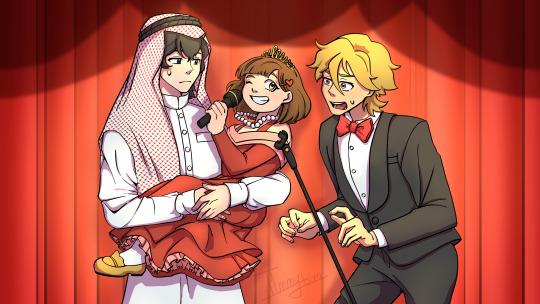
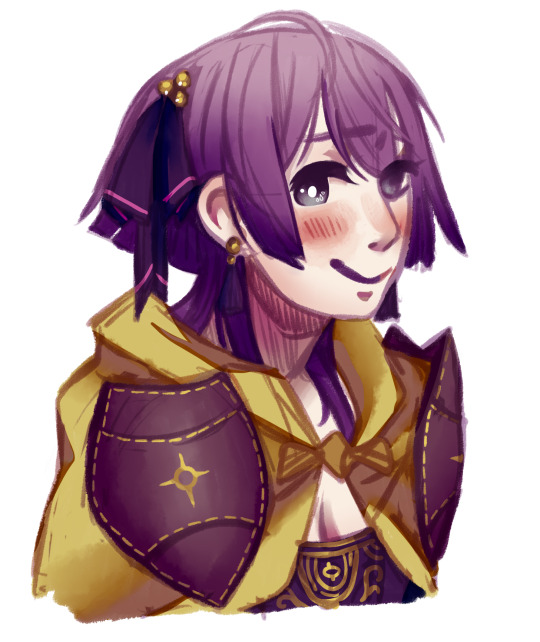
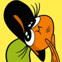
Heck yeah it's finally here folks
Here's some pre-cropped pfps for being so patient <3
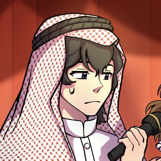
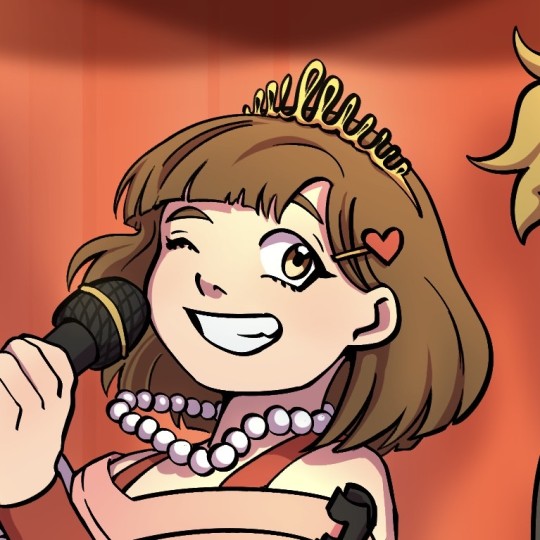
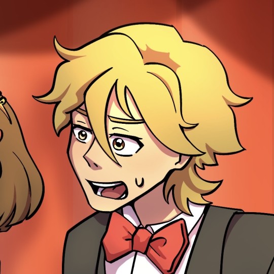
#buddy daddies#buddy daddies episode 5#oil baron rei#rei papa#rei suwa#kazuki kurusu#kazuki papa#comedian kazuki#miri unasaka#princess miri#my art#digital art#fanart#and they were buddies#T1mmytim
3K notes
·
View notes
Note
Ok sorry for booping u so much *boop*
no no dw!! I love boops :3
13 notes
·
View notes
Note
Hi! I just found you through @revolutionaryduelist and I just wanna say 1, I LOVE your art, and 2, could I ask a lil’ about your art? What program(s) do you use? What brush do you use for your AMAZING lineart and how do you choose lineart colors?? What dark magic do you use to shade??? I find your use of color phenomenal! Have an amazing day! :-D
thanks for this nice ask! i use paint tool sai, specifically the anglicized version that you can find online.
lets draw bernie fire emblem and go through my process.
first off, my brushes.
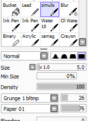
this is the brush i use for sketching, coloring, and cleaning. sometimes for highlights in the eyes or the rough first patch of shading, i also use ink pen, just the default settings.
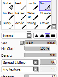
this is my blending brush. if you give it a texture, blending stuff wont look as boring as it otherwise might.
now, let’s draw bernadetta.
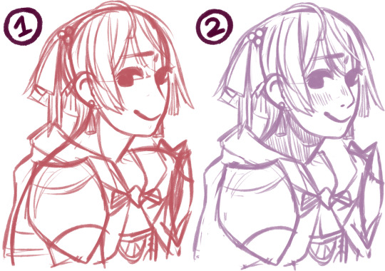
(1) first of all, the rough sketch. i start out with just shapes and then just keep going, all on one layer.
(2) then, i clean that sketch up a little - not too much, you dont need it to look perfect. i dont like drawing lineart at all, so this is what i work with - the sketch, a bit cleaned up, put on multiply. i change the color of the sketch according to what im drawing. for example, if i draw a character like inigo, whos got brown skin and hair, ill end up with yellow, orange or red lineart. if i draw a character during the night, ill use blue lineart. if its dusk, maybe a strong purple. you can change this later, as well.

next, below, i fill in the colors, usually about a layer for each color i use. i usually start out with the hair and end with skin, but it doesnt really matter. try to use colors that vary in saturation and brightness - if everything is very saturated, things end up looking blinding, but if everything is desaturated, it might be boring to look at. this isnt a hard rule, of course, but for this kind of normal illustration with neutral lighting conditions, its good to keep in mind.

now, onto shading. here i used the ink pen for a moment. take your base color, in this case bernies purple hair. the highlight is less saturated, and moves up the color wheel, more toward a reddish tone. the shadow is more saturated, and moves down, toward a blue-ish purple. you can also make the highlight more saturated than the base and the shadow less saturated than the base, but i think its best to decide on one or the other. moving along the color wheel rather than just decreasing or increasing brightness will also help making the picture more vivid.
for hair and gauntlets, i just put on the shadow and highlight and blend it out with the blend tool. for skin and fabric, i use a different method.

first, add blush. blush should be far more saturated than the skin color. i added a touch of deep red in the middle as well for depth. this should be blended.
the shadows on the skin, however, i fill in with ink pen. some parts of this need hard lines, like the outside of the ear shadow, the lower side of the nose shadow, etc. you dont just want an airbrushed look, but a defined line. for this, i use a shade that is slightly more saturated than the base color, but not as saturated as the blush.

then, i add a lowlight color to make the shadow feel more dynamic and interesting. you can go many ways with this - if you check the coat in the next few images, youll see that i used a less saturated color to counteract the very orange shadow. in the case of her skin, i used a more saturated color that is very pink to mimic her hair. i cant really explain this step well, because most of the time, i get to that shade through experimenting.

blend some of the lowlight, but make sure not to ruin the harder lines of the shadow. i did it on the same layer as the base color because im lazy, but you could easily make a clipped layer, add the shadow, and then preserve opacity to make sure everything stays clean. for my purpes it doesnt really matter though since ill be going over the whole thing during cleaning again.
in the circled areas, i took the blush color and gently airbrushed some on for depth and warmth.
heres the rest of the shading. as i said, i used a less saturated reddish tone for the lowlight in the cape. for the bow and cape, i opted out of highlight, because i imagine them as made out of a sort of thick, unreflective fabric.
now, all thats left to do is clean! i make a new layer atop everything, zoom in a bit, and go over it all with my brush and the eyedrop tool. a lot of my WIPs look like this, with a part of it very crisp and clean and most of it still sketchy and vague lol. colordrop from everywhere, and create something nice!
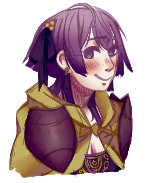
in the end, this is the finished picture! i turn the blend on my brush up and down depending on what im doing and what i need. the cleaning process takes the longest by far.
anyways, i hope this was helpful. if you have other questions, feel free to ask ‘em.
#art tips#is the tag i used for a similar ask before i think#anyways today i drew bernie just for this lol#t1mmytim#long post
191 notes
·
View notes
Note
First off! Congrats on becoming a part of Homestuck^2’s crew! Second,(sorry if you get this question a lot I’m just an airhead who can’t find things ever) did you make your own sprites or did you have them commissioned? I ask because I LOVE them and really would like to ask a bit about how they were made. (Brush settings, shading, etc.) I think you’re really cool and I love watching your videos! Have a wonderful day!
I commissioned them from @dominodamsel!!! I agree they came out great, they’re utterly gorgeous :33 Thanks x2 combo, good luck!!
40 notes
·
View notes
Text

BRAVERNNNNNN!!!!!!!
Redraw of the best shot in this show. (Lipstick v under the cut)

#bang brave bang bravern#bravern spoilers#bravern fanart#bang bang bravern#isami x bravern#ブレバン#my art#digital art#fanart#t1mmytim
31 notes
·
View notes
Text
Never thought I’d get into South Park but here we are…
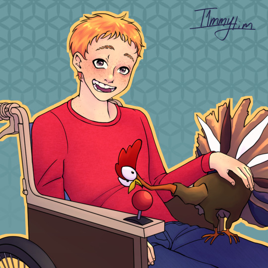
Timmy is my favorite. We are same name buddies lmao
#south park#timmy burch#south park timmy#digital art#my art#gobbles South Park#gobbles#south park fanart#south park fandom#t1mmytim
111 notes
·
View notes
Text

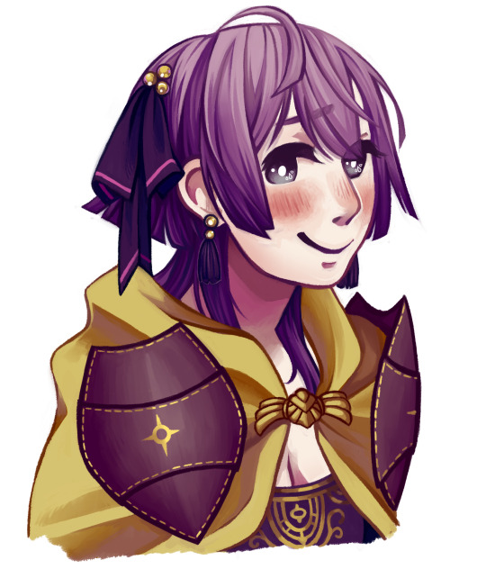
Poorly cropped sneak peek of my next post 💖
#I know their eyes are wack I’ll fix them I promise#buddy daddies#rei suwa#kazuki kurusu#buddy daddies fanart#buddy daddies spoilers#buddy daddies ep 12#spoilers#digital art#anime fanart#sneak peek#wip tag#t1mmytim
25 notes
·
View notes
Text
headcanon:
Rei buzzes his hair off after the Christmas party to shed his ties of the Suwa clan and also because growing out an undercut is a bitch.
#buddy daddies headcanon#buddy daddies#rei suwa#suwa rei#buddy daddies spoilers#spoilers#Buddy daddies ep 12#Buddy daddies episode 12#headcanon#t1mmytim
24 notes
·
View notes
Text
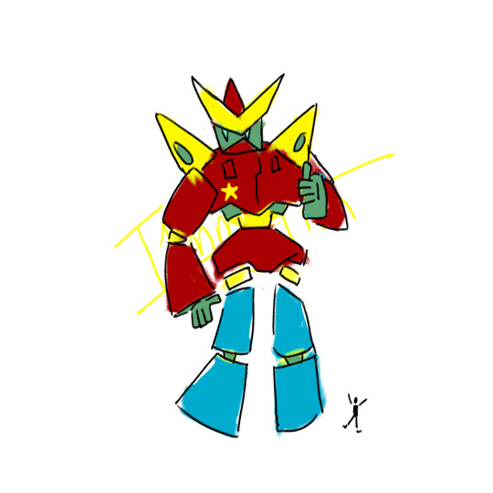
Was gonna make a joke about how I love mecha but can’t draw them but GODDAMN IS MY BOI A CUTIE.
#his name is Crimson Skyline’s Edge of Justice or something swag like that#I haven’t decided yet#look at my guy#single-handedly inspiring myself to draw mecha a better so I can see him all fancy#my art#blorbo#mecha#gundam#robot art#mecha art#t1mmytim
3 notes
·
View notes
Text
Re-reading old langst will fix me (lie)
16 notes
·
View notes
Text

This year has had a hard start. I can only hope I’ve hit the bottom.
#it’s my birthday#digital art#my art#illustration#art#digital illustration#small artist#artists on tumblr#t1mmytim#digital artist
3 notes
·
View notes
Text
Easter is the most Dollar Store holiday.
3 notes
·
View notes
Text
The carpeted floors of middle school libraries were where the best mechanical pencils materialized.
3 notes
·
View notes
Text
I fucking hate skin.
I got face wash on my lips while washing it 2 days ago and now they are chapped to fucking hell.
It’s face wash- it shouldn’t hurt my face!!!!
BDJSHABJALSKSHANAKDLLFSOJANNA
#this is a hyaluronic acid hate post btw#I’m drinking water and using chapstick and moisturizer and it doesn’t make it any better#self care#but is it really?#someone please recommend acne products without hyaluronic acid/salicylic acid#my face can handle salicylic but I already use it and I don’t wanna overuse it#I would just like to be free of the restraint that is human flesh#t1mmytim
3 notes
·
View notes
Text
Just now realizing there is no cute way to combine my Oc’s names to make a cute ship name and I am devastated.
#seriously#what do i do with ‘truce’ and ‘ur’?#trurce?#trur?#they’re gonna become one of those ships where the ship name is a combination of their attributes or some shit#devastated#my ocs#ship#ship names#oc ship#my fault for giving them weird names but still#t1mmytim
2 notes
·
View notes
Last Seen Blogs

i-am-a-total-trash-mammal
Untitled
tattsu-chan
Tattsu
bizzlemynigga
I Can Take You Home
futurismtoday
Futurism Today
yooai
yooai