#TangibleDataConversations
Explore tagged Tumblr posts
Visit Tumblr Blog
Explore Tumblr blogs with no restrictions, modern design and the best experience.
Last Seen Tumblr Blogs


Fun Fact
Forty percent of Tumblr users are between the ages of 18 to 25.
Text
Nuclear Space Debris and Lawnmowers
So, I got curious about the risk of space debris and particularly radioactive material. Whilst it is true that on average one fragment of space debris re-entries Earth every day, the risks to humans and even to future space missions is negligible. There are some angles to consider, but overall I'm not finding any real grounds to justify any worries about space debris. Here are two good and easy sources:
https://www.encyclopedia.com/science/science-magazines/does-accumulation-space-debris-earths-orbit-pose-significant-threat-humans-space-and-ground
https://www.nasa.gov/news/debris_faq.html
Here are a few things that are much more dangerous than space debris:
- Coconuts
- Mosquitoes
- Beds
- Hippos
- Lawnmowers
"Sauces":
https://bigthink.com/stephen-johnson/british-statistical-society-reveals-stat-of-the-year-from-a-surprising-source
https://www.brainjet.com/random/2352990/9-unexpectedly-high-death-statistics-you-wouldnt-believe/
https://www.oddee.com/item_98002.aspx
6 notes
·
View notes
Text
A Congregation for Congregations
Today’s speed dating and ideas sharing had more than it’s fair share of enlightenment. It was awesome seeing all the different ways people had already looked at the brief, but also how easy it could be to compare and contrast my ideas and how they could be changed or worked with. While I had my specific idea of using catapults, it was more the idea of using play and interactivity to tell a story that I was interested in, and where it seemed most important to take my ideas when I was looking at other groups. Once we’d done the speed dating and I’d heard ideas a plenty and offered mine, I was happy to get into the process of grouping up and looking at other people with similar or compatible ideas or processes. Interestingly someone I had talked to at the very start of the meet and recruit we did at the end had different ideas and we decided to part ways, however found our way back together once we’d found people with ideas we both found compatible. As for how my idea linked into the idea for the group I ended up with, the idea of using Puppets to get the feel as well as the look of the story had interested me when I’d heard it so when someone pointed out how it was similar to how I wanted to use play/interaction I was more than happy to combine efforts and I’m looking forward to contributing to this ideas process.
4 notes
·
View notes
Text
Tangible Data Conversations - Conceptual Designs
24/08/18
This week started out a bit slow for me. I felt uninspired and a bit confused as to what we were being asked to do. I was continuing on with the domestic violence data from last week, trying to make more prototypes, but I wasn’t particularly interested in the data so that led to a lack of productivity.
Erin had been researching space junk and I found myself really intrigued. I personally have never heard much about this issue and I’ve noticed it’s never really in the news nor is it an issue that people actively discuss. The gist of it is is that there is an increasing amount of space junk orbiting Earth, particularly in the Lower Earth Orbit. Not only can these pieces of space junk collide with satellites, causing a lot of monetary damage, they also collide with each other, separating into even more pieces, exponentially increasing the amount of space junk in orbit. The Lower Earth Orbit is becoming extremely crowded with space debris, making it increasingly difficult to organise safe launches. I think it’s a really important and relevant issue for everyone as it is going to jeopardise space travel for future generations.
The activities that Ricardo ran were very helpful to hear other peoples opinions and insightful to hear what other people are doing. Upon discussion with others, I came to the realisation that using light in some way is probably too literal for this project. We may still prototype with this but ultimately we would rather not be that literal. Looking back at the brief, we are meant to “map data onto a physical object”. Today we began brainstorming everyday objects that we would like to relate to our data. Since we have still been researching quite a lot, we have not yet picked the specific data we would like to map, whether it’s comparing the amount of space junk to the amount of functioning satellites, comparing the amounts of space junk from different countries, or even a trajectory of how the space junk will increase, we are still not sure. One idea of mine that I particularly liked was a lego model of a rocket that could be disassembled to show the multitude of space debris pieces it could become, and perhaps showcasing through colour code the ratio of which countries these pieces originate from. Here is a rough design:

Now that I have a data set that I’m really interested in, it is much easier to design concepts and will be easier to actually start prototyping them.
3 notes
·
View notes
Text
Model Developments
On Monday, Max, Aurora and I, who we found last week shared an interest in Child Poverty data decided to become a group. We figured that having the general data set for Child Poverty may be too broad, so we decided to spend some time doing a bit more research into finding data which would help narrow down our ideas. This leads us to focusing on 20% of 6–17 year olds living in households with the highest levels of material hardship… lack of fresh fruit and vegetables daily (21%) and lack of a meal with meat, fish or chicken (or vegetarian equivalent) at least each second day (20%).

On Thursday, Max shared an idea about having a lunchbox where depending on where you’d shine a light, it would reveal data which wasn’t so obviously seen before. We decided to explore this idea further and created a few trials.

The photo doesn’t show it clearly but when a light is pointed towards the writing, it creates a shadow (however, is only visible when there is a plain white paper at the back. We also tested black paper as well but that didn’t show any of the shadow at all). The closer the light source is, the bigger the size of the shadow. This could be used to represent that the problem of children going to school hungry is bigger than it seems because not many people realise how big the percentage actually is until they look closer.

This model plays with angles as you could only read “Hello, how are you” properly if you looked at a certain angle. If an opaque object was put inside of the lunchbox, then only “Hello” would be visible. We could expand this idea further to represent data that could only be seen if the user does a certain thing, I feel like this also adds interactivity to the object. Charles asked whether if the thing was to be removed, would that be the tangible data or would it still be the lunchbox? That was something we didn’t really think about before so it’s something we have to figure out. Also, a lunchbox is an obvious object which refers to children and school lunches (or lack thereof) and I think it’s good that it’s obvious because I think it would remind the users of their own lunchboxes and the food that they had before and that could spark up conversations. It would also bring up a thought of how lucky they are to be able to afford those and how many children do not.
Data Reference
Duncanson, M., Oben, G., Wicken, A., Morris, S., McGee, M.A., & Simpson, J. (2017). Child Poverty Monitor: Technical Report 2017 (National Report). New Zealand Child and Youth Epidemiology Service. Retrieved from http://hdl.handle.net/10523/7775
2 notes
·
View notes
Text
Groups
Today in Studio we did two class activities that allowed us to start grouping up and collaborating with people with similar ideas and interests. After creating multiple low fidelity models and doing research, I found that I was particularly interested in creating a model where people would be able to “feel” the data or creating a model where the object would seem normal until somebody interacted with it. The topic I was leaning towards was domestic abuse or child abuse because it’s a topic that’s relevant in New Zealand, and with all the campaigns on it (”It’s not OK”), it’s still something that has to be talked about despite it being a difficult and uncomfortable conversation to have.
I was thinking about an object that would make individuals feel that data while also putting them in a place of discomfort physically, just to emphasise the discomfort of the whole topic and the discomfort of abuse victims. One idea I had was having seemingly normal shoes until they are worn, the soles being different heights (that directly correspond to statistics). People who wear it will feel the discomfort of walking in shoes of different height.
The activities allowed me to talk to people such as Charina, Tim, and Gio about what we wanted to do. For now, we are presently in a group. Gio’s idea was to use textile and their different properties to represent data (etc. 80% can mean 80cm, and 80-degree angle or 80% transparency) and to create a garment with it. Tim, Charina and I came to an agreement that we didn’t really mind the data set and topic to use, as long as we were able to create a model that physically makes people uncomfortable and shows represents the data at the same time.
2 notes
·
View notes
Text
Data Physicalisation

Above is a data sculpture that represents the national statistics of water usage in the United States over 50 years from 1950 to 2000. The large cannon in the middle represents how much water is used and each of the three sections represents a specific category of used water.
Before looking at what data this sculpture showed, I thought it looked like a cascading waterfall due to ridges and the convexed shape of the table legs. An aerial perspective of this would show a map of the Colorado River, while I think this is an effective sculpture I don’t think it would fit its intended purpose of being a table as it would be unbalanced due to the lack of support on the outer edges of the table.
This sculpture demonstrates the use of a combination of data by showing the percentage of water usage in different categories as well as being a three-dimensional map.

This image shows a large scale data sculpture that visualises live wind patterns. Aluminium panels are hinged to move freely in relation to its surroundings creating ripple like patterns.
I like that this installation provides a multisensorial (sight and sound) visualisation of an otherwise invisible natural weather pattern which creates a conversation between man mad objects and nature. The randomness of this installation allows it to constantly change.

Above is one of seven interactive art installations in a series called “The Long Run”. These represents the cost of healthcare in the UK for seven different age groups which is shown through the time taken for a marble fall in each sculpture.
I like that this sculpture is interactive and uses time as one of its mediums. This provides a personal experience for the audience as if they are the marble going through the different bottlenecks and expenses that are involved with healthcare. Making it a marble run allows for a wider audience, younger children can interact with this by watching the marble go through each run. As they move up to the older age ranges they will notice that their marble will take longer to reach the bottom due to the increase in the cost of healthcare. For some the concept of time will be more understandable compared to the concept of money.
This is an example of a project that required many iterations and user testing as they had to match the time taken for he marble to go through each run with the statistics.
1 note
·
View note
Text
Existing Data Phyicalisation Projects
Leithinger’s Interactive Shape Displays (2009):
This is a rubber sheet that has 120 motorised pins underneath with a projected image on the top. Each pin is controlled individually with sensors that detect pushing and pulling. In 2011, they followed up with this project by adding a camera for users to interact with it in mid air.
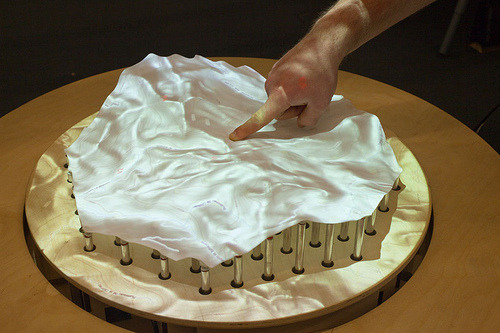
This project does not necessarily show any form of data, however, it’s a proof of concept of iterative textile material. Having each pin individually motorised opens up man opportunities to represent data, for example a 3 dimensional showcase of data where people can feel the high and low points and compare differences. Also, other materials could be used to not only represent data by shape, but by feel and texture. I like the interactivity behind it. Humans are naturally curious animals and the senses of sight and touch play significant roles in our everyday life. People can be bombarded with information ans numbers when looking at data, but removing that and creating an interactive and physical experience can put people into a new perspective.
Donna was also talking to some of our group about how we could mold synthetic fabrics in a vegetable steamer. Which Leithinger’s project reminded me of this.
Nathalie Miebach’s Woven Sculptures (2006):
This is a woven sculpture which is made out of weather data. She began building low-tech data collecting devices that extract weather data from different environments. The data was compared historically and geologically before made into sculptures.
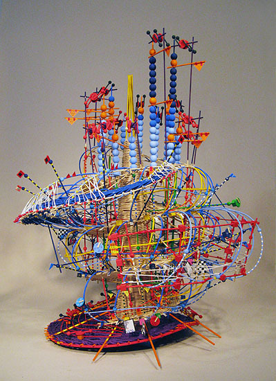
Thinking about how we could incorporate this idea onto our project; the strings could be woven around the outer blue ‘cage’ with different thicknesses to represent data. Nathalie Miebach’s project would be interesting in terms of introducing it into some type of clothing item to be worn, especially with the shape and colours, it could be a very expressive piece to wear. I like the iteration of different and bright colours, which makes it significantly easier to interpret each layer.

This specific sculpture was made based off data collected from hurricane Noel where attributes like wind speed, activity and temperature where mapped out on a time-line, then translated into a sculpture.
Reference:
http://dataphys.org/list/nathalie-miebachs-woven-sculptures
http://www.nathaliemiebach.com/weatherscores.html
http://dataphys.org/list/daniel-leithingers-interactive-shape-displays/
1 note
·
View note
Text
Groups
Today we formed our group of 3 for this project and discussed ideas of how to project data. My original idea was a type of water flow system i was using to show the flow and liquidity of money within the student loan system, after that a few of us worked with light to get different perspective of colour and size.
Loosely combining the two we produced an idea of a thermochromic coffee cup. Using the material to present two sets of data in its two different states (hot/cold).
Unfortunately we can’t correlate the statistics of suicide in nz with the medium off the coffee cup. Instead we will look in to student loan stats because they are far more fitting.
1. Coffee is purchased by students all the time
2. Liquidity and flow idea
3. Indication of money spent on coffee directly reflects some of the data I used in my earliest Iteration.
1 note
·
View note
Text


Is there any other shape or means of translating the data onto the ring?
Besides ring,what object could be used to encapsulate the data whilst supposedly delivering the same grim effect?
What other shape could be made used of to apply onto the ring?
0 notes
Video
tumblr
Data Object 3
The third object I made had nothing to do with the dataset. I just wanted to see what more I can make with the paper cups and straws. I ended up making something that resembled a wheel hoping I could map data on a wheel and use it for my final model.
0 notes
Text
Conceptual Designs
At the beginning of this week, Ricardo and Donna presented the class with some creative inspiration for us to use with our projects. I like how Ricardo showed us that even when you use low fidelity materials such as paper; it is very simple to represent data using those materials in an efficient and easy to read way. I think that it is important to do our conceptual designs in this sort of manner, as it is simple to do, cheap and saves on time. It was also enlightening to see Donna’s conductive and non-conductive playdough - and how she was able to manipulate it to represent data. I liked how she showed obesity rates using this method, as it not only provided a visual representation, with LEDs either powering on or not on, but also a tactile representation, as you could feel that the non-conductive (obese) playdough felt very sticky, which I felt really corresponded with the topic. I hope to use these methods of showing data in creative ways in my own project, and really begin to think about how I can use the properties of a material to my advantage when doing so.
Later on in the week, Ricardo conducted two tests at the beginning of studio to encourage us all to engage in conversation with our peers to see what is common with our individual data sets and models. I talked about how my data set was young drivers involved in crashes in New Zealand, and using spaghetti in various forms to show that. I feel as though my strongest part of my investigation was looking into the way I changed the “states” of the spaghetti (from hard, to soft, and back again), and was the part that most people seemed to be interested. Whilst saying my idea aloud, repeatedly, I began to notice that there was not a whole lot of correlation between my object/s and the data itself; perhaps my object/s could work with someone else’s data set or vice versa?
The second part of the exercise got us to make connections with others about our data and models, where I firstly joined up with Sherry, as we had both been looking at state changes with spaghetti. We then ended up talk to Amy, who had been researching Bullying in the Workplace, and that one in five employees in New Zealand experience bullying at work. I found this very surprising, as you never hear about this, despite New Zealand having the second highest rate of workplace bullying in the world. She presented several great ways of presenting her statistics - one using stairs, where there are four normal stairs, then one odd one to show the one in five. Sherry and I decided to pick up her idea and work with her data set. I look forward to working with this new data set, and focusing on new materials, because in all honesty, I was not going anywhere too great with the spaghetti.
I think it would be a good idea to see if it is possible to incorporate changes of state into this new project. We shall see as we go into further conceptual designs next week.
[Photos to come]
0 notes
Text
Honing back in
After meeting back up with my group on Monday we looked into what ground we had to stand and what ideas we wanted to look at. We’re looking at puppets mainly but within that there are many different aspects to look at in terms of how that comes together to bring the data to them. Puppets are able to really explore narratives since their primary purpose in the first place is storytelling which really has that going for us, but also not just to observe, but when in use, they have a narrative as you feel you are the one in control and you have the sensation of controlling the “creature” at the end of the strings, however that may not be so necessarily true. You are constrained to what kind of story the puppet will tell, rather than the actor in the play, they are the character, and so are constrained to that play, which in turns constrains the controller to telling that story. Whose really pulling the strings then?
After identifying what we had to look at we went our separate ways and worked on aspects of the puppets or puppet features to get a good breadth of ideas to create from. We also today began discussion on bringing them in together. I focused on the technical aspect of weighting different parts of a Marionette to get an unbalanced and asymmetrical feeling for the puppeteer when holding it. For this I made a cross and attached balloons filled with water to it, similar to the structure of a marionette. The water was roughly mapped to the 20% 9% sexual touching statistic.

This definitely had an asymmetrical feel and was actually quite difficult to hold straight since it was weighted so drastically in one direction. I’m not sure if this is good or bad for the object, as I think that it does a good job of sending a message of an imbalance, but the idea is not that there should be a balance between boys and girls being sexually abused but rather that the imbalance is caused by anyone being sexually abused. This idea could be compared to the other statistics like the amount of people that speak out about their experiences.
1 note
·
View note
Text
Tangible Data Conversations Reflection Assignment Index - Revealing Candles
Tangible Data Conversations Existing Case Analysis
Iterations of the Second Project 1 Low Fidelity Models
Iterations of the Second Project 2 Low Fidelity Models
Iterations of the Second Project 3 Low Fidelity Models
Iterations of the Second Project 4 Low Fidelity Models
Tangible Data Conversations Low Fidelity Models Reflection
Iterations of the Second Project 5 Ideas and Low Fidelity Models
Iterations of the Second Project 6 Ideas and Low Fidelity Models
Iterations of the Second Project 7 Ideas and Low Fidelity Models
Iterations of the Second Project 8 Ideas and Low Fidelity Models
Iterations of the Second Project 9 Collective Ideas and Final Prototyping
Iterations of the Second Project 10 Collective Ideas and Final Prototyping
Iterations of the Second Project 11 Collective Ideas and Final Prototyping
Iterations of the Second Project 12 Collective Ideas and Final Prototyping
Iterations of the Second Project 13 Collective Ideas and Final Prototyping
Bonus:
Tangible Data Conversations Assignment Reflection
#ctec503#bct#studio2#assignment#tangibledataconversations#Tangible Data Conversations#index#studio#semester2#firstyear
3 notes
·
View notes
Text
Project 2 - Low fidelity models
The brief of the second project is to provoke a conversation between the audience through a tangible model. This week, we have been crafting and prototyping in class with cheap materials like, yarn, popsicle sticks, spaghetti, etc. I realised these activities we’re provided to give us a better understanding of the possible forms that we can create using these materials and give us inspiration of what our final models could be made from. I think my attention was more focused on the making rather than the research of the data. However, I do feel like I could have made more models using a variety of other materials.

Model Representation: 14% of young people report being hit or physically harmed on purpose by an adult at home in the last 12 months
The models at the top are representative of the thorns/ burdens that the child experiences in their life which contrasts to the gentleness and warmth of the yarn which is what a child and their home should feel like.
The gap in the popsicle stick model also represents this data but I wasn’t really thinking much of how it relates to it.
I based these models on the statistics that we were shown in class about the domestic abuse in New Zealand. I believe the issue is something that should be more commonly discussed since it is serious and happens more often than we think. However, after diving into more data research, I found that the statistics for child poverty in New Zealand are disturbingly high considering that we are a developed country. Their data shows that 27% of New Zealand children are living under the poverty line and 7% are in severe poverty living in low-income households and are experiencing material hardships. I find the data really disturbing because it’s like these kids are being robbed out of experiencing a good childhood because they don’t have enough to eat or they don’t have warm clothes for winter and/ or not have stationery to support their education and it’s all because of something that they can’t control and sometimes it’s not the parents fault too. I want to look into possibly representing the data with toys to represent the childhood aspect but I’m not really sure on how yet.

On Thursday, we decided to test and prototype using spaghetti and the different states that it could be in. We boiled it and then thought of whether it was possible to return it to its original state. Dehydrating it using the microwave came pretty close but I found that freezing it actually creates pretty cool forms. The spaghetti was only able to hold its shape for little while, but it’s interesting how easy it can actually be used to form and freeze a shape. This might be useful for my final object, I just need to find a way on how to keep it frozen for longer.
Data used:
http://areyouok.org.nz/family-violence/statistics/ http://www.childpoverty.co.nz/!/#/
1 note
·
View note
Text
Low Fidelity Model Activities
After another couple of days of creating more low fidelity models using the items provided in class as well as things I found around the house, I started getting frustrated yet again as I ran out of ideas about how to actually model data.
In Studio, Ricardo had us do some origami and various things with paper that showed me more ways to experiment with modelling data. Taking inspiration from the activities we did in this lesson as well as things my peers were doing, I created a couple more models out of paper. I experimented with doing various cuts at different angles and shining a light on it to see what the shadows looked like.
Rather than liking the actual models, I found that I was particularly interested in the sort of “real but not real” idea of the shadows. Shadows look like actual physical things, but in fact, it’s just the absence of light. During this time, I have been looking into statistics about domestic abuse, and this idea of “real but not real” had me thinking along the lines of what people “should” have and experience in a loving relationship, but don’t. For example, in a loving household, people should feel comfortable and safe, however, those in abusive relationships and victims of domestic violence do not.


The same day, Donna also brought in some insulative and conductive play dough that I tried out. I played around with it and made some shapes (dumplings!) but found that play dough and circuits weren’t something I was particularly interested in using.

Slowly, I am learning that despite it feeling and looking like I’m going nowhere with what I am doing, each thing I do and each model I make guides and directs me to the things I do want to do. Without trying the play dough, I wouldn’t have learned that I wasn’t interested in it. Without trying the activities with the paper, I wouldn’t have realised that I had an interest in shadows and projecting things.
2 notes
·
View notes
Text
Tangible Data Conversations Week 1
This week in studio we have been making low fidelity models out of cheap materials that could be used to represent data. We used materials like Spaghetti, wool, chalk, pegs, rubber bands, straws and popsicle sticks.

From prototyping and experimenting with these materials I have learnt that the most important thing for any project is to not waste time and start by doing. If we were given the brief with no plan as to what we were meant to be doing over the next few weeks, it is very likely that I would’ve spent this entire week looking for the perfect data set and statistics. Initially I was apprehensive about spending an entire week making models, but it has taught me to interact with the materials and learn from how they act in different states and with different materials.
Towards the end of the week a couple of friends and I started playing with the bag of spaghetti. We started off with playing with sticks of spaghetti and Jake decided to cook some. We then progressed to redrying the cooked spaghetti, freezing it and microwaving it to compare all the different outcomes with one another. After talking to Charles about our experiments he said it reminded him about the study done in 2015 where scientists tried to uncook an egg. The difference in the spaghetti states could be used in the future to show how everyone essentially “starts” the same but will have different physical appearances depending on their past and or their baggage.

I found the talk that Ricardo gave about the study on inequality in America to be very interesting, specifically the representation of the expected data compared to reality. After this was shown it started conversations between peers after seeing a visual representation of the stats. This highlighted the importance of the intended audience and how they react to what is presented to them. This was also seen when Stefan showed us his project he did with the bee hives. The bees reacted and interacted with the different models that they were presented with and remodeled the to suit their needs. It will be important to get into the habit of engaging with the intended audience throughout the course of this brief and for future projects.
1 note
·
View note