#Wanted to try my hand at mostly lineless art again
Note
Hey, I adore your artstyle mate, I loveeee all the vivid colors and the fact that most of it lacks lines?? You doing the hard stuff, but it paying off 💜
can I ask, as I’d like to get into comic making, how long does it take you to finish a a single panel?
Hi!! thank you very much!!
drawing lineart is incredibly frustrating to me so im very glad i was able to make the jump to mostly lineless artwork, tho im very much still at the beginning to learn how to do it xD
to answer your question, i .. cant say really, it depends on what is on the panel, and i always jump around when working on a page, i draw half of the very last panel, then jump to another, maybe i see something i want to change right away and work on the third
besides i ... dont know anything about panel composition, i think in movies so i play it and try to pause it on a frame that could work as a panel, whichs is probably why it goes alot slower than normal comics, idk how much to skip gndfjknvgfdjk
im by no means an expert in making comics, you kinda have to find your own way of what works for you, i have done many in the past but all failed, i gave up before getting even one chapter done many times
general advice i can give you is, most importantly, dont wait, i know its daunting to start, but you have to start, even if you dont think you are good enough, you will always change and improve anyway, better start now or you might do it never, and remember, when a page is done its done, i know how tempting it is to go back and redo it, but if you start with that it will only lead to an endless cycle of remaking it over and over
a cause that made me abandon my old projects, was partly lack of support/recognition, but mostly that i was forcing myself to things that werent fun, like one i made in black and white bc i thought you had to do it bc color takes too long, but i live for colors, so it drained the fun out of it immediately
the only "rules" i have set for myself is that its understandable, the flow of the action doesnt flip around too much, speech bubbles are aligned in a way that guides you (of course im not perfect at that either and always learn);
i dont jump between pages, i jump between working on panels, but i dont start another page before the previous is at least acceptable, otherwise id get ahead of myself and get impatient, just wanting to skip ahead and neglect older pages;
and that i only work on a panel/page as long as it has acceptable quality and is fun to draw, when i notice im getting bored or frustrated i finish it quickly as best as i can and move on, otherwise it might drag the entire project down, which is why each panel or page in 'Destiny' varies alot in quality
i can barely look at the first pages .. or even at the last one i made for that matter, but its also fascinating, how much my art changes within even one update which takes me about a month for 4 pages, since i have set my 'fun' rules at least, it used to take much longer
(i wish i was faster, and i could be, but i have a job, and have to look out for my health, both physically and mentally, so i take whatever time i need and draw however much i feel like drawing, no rushing)
my progress so far is that i write a rough script, what happens, what dialog, where it ends, and so on, it doesnt have to sound good, god knows mine are shitty xD but its a good guideline, even if rough!
then i make a rough draft, basic panel layout, dialog (it always changes fro mthe script, again its more liek a guideline than a rule ;) )
then i start with actually drawing the first page, my art and way of .. art and writing changes incredibly fast (idk if its for the better lol) so .. by that point i redraw the rough draft version of the page if i see how it works better, rewrite dialog too, and even cut stuff from the rough draft
im not done with the first chapter (im slow af lol), but wrote the script for the second one when my hand was injured and i couldnt draw for a month, once im done with this chapter i will draw the rough draft for ch2, then write the script for ch3 then go and draw ch2 fully, at least thats the plan
the more time passes the more i know what the next chapters are gonna be, tho i know the important points long before; right now i have the entirety of the first arc sepeareted into chapters, and the end of it all too, but between there its still a lil blurry and im adjusting everytime i think of soemthing better
anyway, sorry for that long ass ramble, its late and i thoguht about this ask bc im trying to get my want to draw back (not feeling well rn nkfdnkd) so i randomly decided to answer it .. probably in the most unhelpful way possible, alot of stuff noone aksed for lol
anyway, sorry, and goodnight uwu
#ganondoodles answers#i hope i didnt sound too preachy#or soemthing#idk im not good at giving advice#..and my way of drawing changes so fast#whenever i explain sth it usualyl changes right afterwards#and man that feels shitty#like im lying to people#:(
34 notes
·
View notes
Note
1, 2, 6, 8, 12, and 22!
im doing urs first. just for fun
my god holy moly this got so long readmore time
1. Show your most recent wip
pspspspps [waves the prospect of ship art in front of you] if you do artfight i'll draw concordia ex machina next
2. 5 favourites of your own work?
FIVE? i don't draw that much!!! hold on i'll go browse
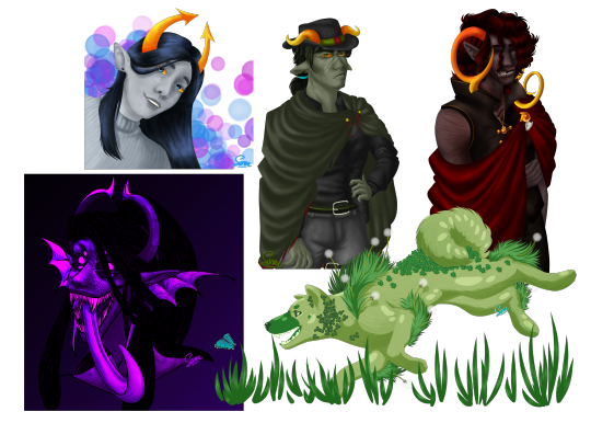
In no particular order! Veylin's bust painting is my fav ive done of any of those, i'm still rlly proud of nohope and planhz's sprites, i reaaaaaally love how i did the color and overlays on that abby headshot, and the dogy is an artfight attack from last year that is everything i love about my older lineless art style!!!
6. Which artists inspire you right now?
Alright buckle up folks this is a longer one
So I'm gonna answer this in two parts basically. The first part is artists that inspired me to start drawing what I like, especially fantrolls-- so a lot of my friends really!! Wanting to be in this community is what made me start actually doing art as something I was passionate about!!!!! The second part is actually twitter artists that inspired me to actually renovate my art style, try new things, and actually grow as an artist in ways that I really just never did here before.
I know I'm gonna forget a lot of people but the ones that come to mind right away for people who had an Impact on me back in the day are !!U!! gabriel 8bit-mau5, newt indig0trolls, my friend max who's no longer in the community, my friend lumiet who doesn't even do fantrolls but is really cool, and god a lot of old blogs whos muns are just gone now..................... wistful sigh :(
BUUUUUT as for artists who made me want to actually grow again in my. Wait hold on
[sets out a sign that says CRINGE WARNING -- I LIKED DSMP IN LATE 2020-EARLY TO MID 2021]
Okay now that that's out of the way! Some of the artists who made me actually want to learn and change and GROW again are giraffeleggos, mielzy_png, and WolfyTheWitch on twt :3 Mielzy especially is an art streamer who has a huge focus on being introspective and taking criticism and wanting to grow and always be improving in a direction they want. Hella cool to see someone be like, never satisfied in a "i love art and drawing so i want to grow and do it as well as i can as a respect for the craft" type of way. I don't think any of these guys except for Wolfy are actually into dsmp anymore but when I got into their content they were all dsmp fanartists so.
Okay this is really long actually so I'll quit there. Wait no actually here's a list of a handful of folks whose art inspires me to keep learning nowadays (also mostly all my friends)-- nero ramgodd, roe roetrolls, dami ask-the-troll-boys, greg lordtonic, and an extra special shoutout to chase sasster for making me want to write again. I just wanna do the cool art stuff like my really awesome friends so bad yall
8. What do you like most about your own work?
Hrmmmmmmmmmmm okay this one is tough bc both I wanna say "nothing bc I have a lot of strengths" and "nothing bc there's always room for me to grow and improve so even my best strengths aren't as good as they could and will eventually be"
But like. I really like how I paint actually
12. Show your favourite drawing from this year
FROM THIS YEAR.... ok let's comb thru my art tag
Oh wait easy simple. The whole fuckin aliquid ex nihilo comic. That took me so goddamn long but it was a labor of love and I desperately want to do more 1-page song comics like that but unfortunately they take me like 2 weeks if I do full lineart and that shit sucks

There are a lot of things I want to redo on it that are also things I redid in the process of making this comic but as is the nature of being so used to drawing sprites I forget how to draw people in actual poses and also interacting with things. I still think overall just because also of how funky I got with the coloring, framing, the fact that this is the first comic ive ever planned and fully completed ever, etc. that this one's my fav thing I've drawn in 2022 thus far
22. When is your prime time to work on your art?
Nighttime and also whenever I'm medicated LMAO I can NEVER focus on drawing if I'm off my meds idk how I did it before
5 notes
·
View notes
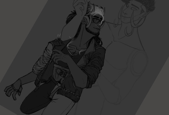
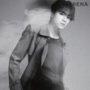
Photo

Prince Dorian
#My art#Critical Role#Critical Role fanart#Dorian Storm#Wanted to try my hand at mostly lineless art again#It's been a bit since the last time it did a piece like this#Could've probably done the lines in the hair a little bit better but for the most part I'm into it#I'm sure I'll find a bunch of things I don't like about it in the morning but it's not so bad right now#Critical Role spoilers
965 notes
·
View notes
Text
5 Works Meme
RULES: It’s time to love yourselves! choose your 5 (ish) favorite works you created in the past year (fics, art, edits, etc.) and link them below to reflect on the amazing things you brought into the world in 2020. Tag as many writers/artists/etc. as you want (fan or original) so we can spread the love and link each other to awesome works.
I was tagged by @sleepswithvillains; thank you!! I’ll tag: @elaphaemourra, @sith-shenanigans, @opalxempress, @sunsetofdoom, @swtorpadawan, and anyone else who wants to do this!
In no particular order:
Scars
This one I actually liked enough to make my avatar - it’ll probably eventually get replaced, but for now I still really like it. The lighting came out well, I got practice with back muscles and butts which are both things I’m bad at, I still really like her expression, and I got to learn a new technique for doing scars.
Leave It Up To Me
And this one ended up as my blog header. I’m sensing a theme here. I’m super proud of this art; I’m terrible at backgrounds and I don’t usually bother with them, so doing a background-focused piece was a real challenge for me. And then I did it mostly lineless, for some reason, because I thought trying to do all the details in linework would kill me. I’m not sure if that choice made it easier or harder, but it sure did turn out well considering. And then the rim lighting/backlighting on Garen turned out super well too, and just... the whole feeling of the piece came through, I think. (And then it got zero notes, because I had no followers when I posted it and there was an external link so it didn’t show up in the tags. Sigh.) Fun fact about this one: usually there’s one overlay layer with a gradient on it to help pull my digital pieces together color-wise, but on this one there’s three - one for the background only, one over Garen only, and one over the whole thing.
Duserra in a suit
I spent too much damn time on this for it not to be on this list. The gold filigree detailing. The texturing on the tailcoat. The vest pattern. The colors I struggled with, and I went through I think five or six different test palettes before I found one I really liked, but I think I pulled it together well. My one regret is that I forgot to give her tie the same texturing as her tailcoat.
Of Blood And Ghosts
A one-shot that ended up almost twice as long as most of my others. Honestly, it might not be my best writing ever, but I’m proud of myself just for finishing it - usually I write/draw something in one or two sittings or I never finish it. This piece took me weeks of work because I kept getting stuck. I’m proud of myself for pushing through and finishing it. ...and then it got almost no attention on AO3, probably because of the awkward length and the sort-of-self-harm content. Sigh. Oh well. I really enjoyed getting to explore what Force rituals might look like (and feel like), as well as looking at the Force from two different characters’ perspectives and getting to throw my poor Zabrak sisters at each other again.
And my crowning pride and joy,
The Sith Lullaby
(Click the link if you haven’t heard it yet. Do it. /e)
I almost never write music because it’s time-intensive, labor-intensive, and a skill I haven’t spent that much time honing. Making up music isn’t difficult for me. Making it good, and putting it on paper, is difficult. Or tedious, at least, and my dumb ADHD brain doesn’t do well with tedious tasks. But something possessed me to write this, based on one off-handed comment I made about a scene idea for a fic I don’t even talk about here. I spent three days pretty much doing nothing besides writing English lyrics, translating them into Sith, writing the melody, making the Sith lyrics fit the melody, and then finally putting it all together on paper. And I have zero regrets. The result is my pride and joy of the last year of Star Wars content, my crowning achievement thus far in this fandom: a lullaby written by me and then played and sung by me in the Sith language, an absolute bastard of a conlang that’s just filled-out enough to be difficult without being complete enough to not force me to make up probably 90% of the words in that song.
And who knows? Maybe I’ll do it again someday...
#5 works meme#2020 art summary#it's not but i'm tagging it that for organization#swtor#maybe i should go through the old art posts on my blog from before i had actual followers and reblog a bunch of it...#on a queue ofc#get some actual attention for the art i'm proud of but that never really got seen bc nobody knew who i was at the time
21 notes
·
View notes
Text
Meg’s 2020 Art Summary
I’ll go ahead and put everything under a cut, but first, I’d just like to say a quick thank you to everyone- to all the new friends and followers I’ve made this past year, and to all of my friends from the past few years that’ve stuck by me. I can’t imagine life without you all! Thank you!!!
January

MC awakening into Hera. Still something I’m pretty proud of, though I’d like to try redrawing it sometime soon! :D
February

Ah.... this was a fun one. Ladynoir Wall-E au vuv very fun time
March

Another fave <3 Alex really helped me find my footing when it came to using they/them pronouns, for myself and for others.
April

April was mostly rough sketches, but I really loved how this one of Ruelle came out! She’s such a detailed character, it’s insane!
May

Not much for May, either! But this Alex with antlers is still pretty cute vuv
June
Nonbinary Adrien, Bi Nino, Adrinino...... *chef’s kiss* perfection! This was a gift for my friend Mari (love u Mari!!!) :)
July

Razi is very fun to draw, especially with that expression! I love his character design a lot, so I’m glad I tried my hand at drawing him!
August
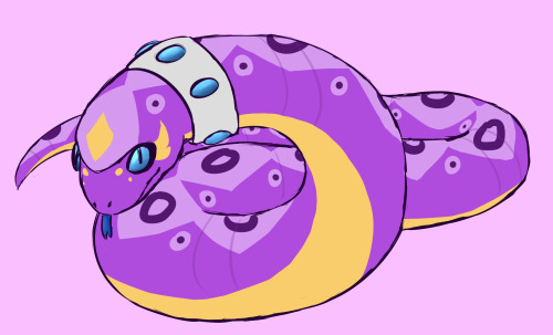
A few pokemon that month, a lot of redesigns of old characters! This is Igraine, one of my older OCs- she’s an ekans! :D Her design used to be really plain, but it’s got some pizazz to it now!
September


This one’s a two-parter, because the pictures go together! My Adrienette/Ladynoir knight au! This was probably the first time I really tried my hand at drawing armor with a reference, and I really like how they came out!
October

I didn’t do too much in October, but I did finish one full week of Drawtober so hey! This Marinette is probably my favorite piece from then, y’all know I love my vampire aus :)
November

My favorite piece of the entire year!!! Fawn Centaur Alex resides in my brain 24/7. I was so happy with this piece, through the whole process, and I just think it turned out so well. I was especially happy because this wasn’t the first time I tried to draw this concept, but this time it worked out!
December

And the final piece! My second favorite this year! Another Alex, a lineless piece that I was drawing purely to experiment with lineless art! It was so hard to do, and I wanted to just give up a few times, but I’m so happy I kept working at it.
Overall, I’m very very happy with where my art’s gone this year. In addition to all of this, I’ve sketched out an entire 20-something page comic in my sketchbook. This year was amazing for my art’s growth, and I really can’t wait to see what I come up with next year!
Thank you all again, for the support and kindness you’ve shown this past year, I could never thank you all enough <3
2018 Art Summary
2019 Art Summary
18 notes
·
View notes
Photo


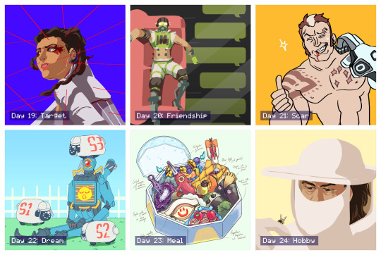

31 Days of Apex: A Retrospection
I participated in the incredible #31DaysOfApex challenge hosted on Twitter, where fans created new content for every day of July based on a one-word prompt. I’ve signed up for/started lots of similar challenges in the past but always ended up having to drop out or trail off before the end... but this time, I managed to complete something for every day of the challenge!
My only goal was to make something by each day’s deadline, and it was a really interesting exercise both in technical skill and also in my management of not only my time, but my expectations and energy. Below, I go into more detail behind each piece.
To preface; the beginning of this challenge coincided with the beginning of a new personal time-management exercise where, for 5/7 days a week, I would only go on the computer at night. Combined with the deadline, this had an interesting effect on my time management and the quality of certain pieces.
Day 1 - Memory
From the start, I wanted to use the challenge as an opportunity to do more studies and to push myself wherever possible. This was the first piece I did and I had more time to work on it, so I used it as a digital painting study. I still think it’s a strong piece and it’s probably my favourite of the month.
Symbolically, this character’s backstory doesn’t match up with her own memories, so the idea is she’s missing information she can’t quite place or remember, and this both scares and comforts her.
Day 2 - Blood
Another digital painting and lighting study that didn’t work out as well as the first, mostly due to time constraints meaning I couldn’t scrap it and start again. While I don’t like how it turned out, I did learn a lot.
The character on the right is a field medic, and my intent was to show the calm after a successful rescue.
Day 3 - Mercy
Some days I relied more on the humour of a piece’s concept than the skill of its execution, though I also liked how this piece turned out artistically. After two days of intense studies, though, this was very quick and easy for me to turn out as it relied on existing skills.
Day 4 - Prize
This one thankfully came together very quickly, which I credit to the two previous painting studies making it much easier to achieve what I wanted.
The character is searching for the disembodied head of the man who killed her parents, who is now acting as a robot, hence the vaguely half-machine-half-human silhouette in her hand.
Day 5 - Family
Another quick, simple illustration under a time crunch.
The character framed by the nameless foreground figures has no memory of herself or her family.
Day 6 - Noise
For some pieces where I was under a time crunch, I experimented in an opposite direction; instead of studies, I played loosely with different techniques/brushes/etc to see what came out. This was a lineless style I ended up employing a lot when short on time. The piece pictured here was just one of four alternate colourways, presented in a pop-art style.
The character is almost always depicted with thick coverings over her ears, so I thought she might be sensitive to auditory overload.
This particular piece was retweeted by the character’s voice actress!
Day 7 - Mask
More relying on humour for lack of time/a better idea. A fun experiment in colour, though.
Day 8 - Healing
Another technically “easy” piece but with a stronger concept. It was actually pretty hard to get the reflection & condensation elements balanced right.
The character pictured has a narrative thread relating to an old ex he has trouble moving on from.
Day 9 - Weapon
While obviously another joke, and made to be finished quickly, it was surprisingly difficult to get the duct tape and knife to read clearly without over-cluttering the lineless image.
This little ‘bot is a drone used by one of the playable characters to hack areas of the map; it’s not NORMALLY an offensive weapon.
This image was promo’d in a video stream by the character’s voice actor!
Day 10 - Truth
I only had less than an hour to finish this one by the deadline, but I still tried to experiment with silhouette and colour. It was surprisingly hard to get the interior silhouette to be legible.
The outer silhouette is a playable character (not easily readible unless you’re familiar with his design) and the inner silhouette is his sister, whose disappearance he is trying to investigate.
Day 11 - Shield
A fun, self-indulgent one. Had a blast simplifying the game’s characters down into little caricatures.
The character in the centre has abilities related to shields and protection, so many other people were drawing him for the prompt; I wanted to try and flip it, so I picked other characters he would be friendly with, and picked a non-lethal, lighthearted setting.
Day 12 - Ruins
Short on time so did a quick lighting study.
A recent game plot has changed one of the areas of the map, submerging it in water and leaving it to “ruin”.
Day 13 - Hero
Another painting study. Really didn’t like how this one turned out, but had to turn in something, and I did learn a lot in the process. If I’d had more time I probably would’ve scrapped it and started again.
This characters had recently been revealed to have been manipulated by another character who used gas-based offenses, whom she admired.
Day 14 - Rest
I was going to be away from mt computer until after the deadline, so I decided to make a traditional piece. I ended up enjoying it so much I tried to take the time to do a few more traditional pieces later. This piece was sort of a comedy of errors; I had to do it while I was out, and the pen I had brought with me to ink my sketch ran out, so I had to make do with a blue ballpoint pen, and I was missing several colours of coloured pencil. I think the finished piece reflects how rushed it was, and it did’t meet my concept, but I do still like it.
Day 15 - Skull
Another quick one but I wanted to experiment with a different line style. Wanted a sort of “graffiti” effect.
One of this character’s skins includes a skull-shaped mask.
Day 16 - Growth
Extremely quick play on words because I didn’t have the time to work on anything meaningful and couldn’t think of anything better!
Day 17 - Home
Another traditional piece, this time by choice and with more time. Markers. It looks extremely like some janky art school homework on 2 point perspective because it extremely is. Perspective and backgrounds are very difficult for me - they just don’t “click” - but I had a lot of fun with this one. I kept my mistakes intact because I didn’t want to edit it too much. A lot about the technical perspective is wrong, but I think I achieved the “mood” I wanted.
This location is a bar owned by one of the player characters where many of the other characters are shown to meet.
Day 18 - Sky
Very happy with how this one turned out, even though there are still lots of problems. Markers again. There’s a lot I would fix next time, and I think technically it’s lacking, but there are some specific areas I feel happy to have achieved, such as the almost brushed texture of the curved metal above his shoulder and the values of the shadow/reflections on the underside of the head piece. I’m also happy with how I was able to draw from my shoulder rather than my wrist when inking the curved lines, something I struggle with.
Day 19 - Target
An experiment in pushing the lineless style I’d already been playing with for a stronger likeness. The pose and expression in this could both be pushed more but I like the result.
This character had just learned that one of the other players, whom she had trusted, was actually sharing her secrets with her enemy, and she didn’t know which one it was.
Day 20 - Friendship
I had this one concepted from when I first looked over the prompts. It was a fun challenge trying to simplify all the elements into the lineless, blocky style while being legible.
This character has a strained relationship with one of his friends, and finally pushed her too far with his selfishness, and she now no longer responds to him.
Day 21 - Scar
Quick joke. This character was introduced briefly as a red herring for another character before being killed off. He was stabbed through the chest by another character’s hand, hence the scar pattern.
Day 22 - Dream
I wasn’t sure about this one while I was making it but I ended up liking how it turned out. I wanted to capture the character’s robotic legs bent at an unnaturally straight 90 degrees, like a Barbie doll. The flat background and lighting make it feel like an indoor stage. The little “electric sheep” are inspired by iDogs.
Day 23 - Meal
After a few days of not having time to really spend on any piece, it was fun to get to spend time on concepting and composing this. I always admired these kinds of watercolour-like food illustrations and this is the first time I’ve had any success in creating one myself. I concepted and sketched out the individual items traditionally before working out the composition within the box digitally.
Each food item/utensil is inspired by the different characters’ design elements. Only two of the now-current characters are excluded due to plot reasons. In particular, I like how one of the character’s dome-shaped shields acts as the base and cover of the box.
Day 24 - Hobby
Wasn’t a fan of how this one turned out. I think the likeness is a bit off, and his facial anatomy is skewed. But I also like how the general composition, tone, and bee turned out.
This character’s concept art originally imagined them as a beekeeper who would use smoke to fight.
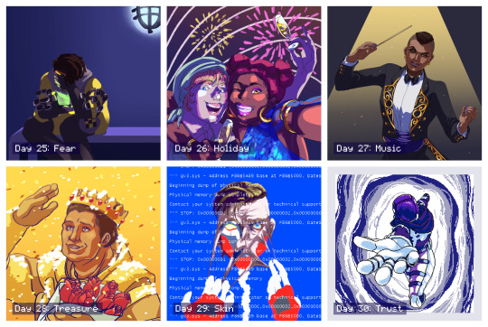
Day 25 - Fear
An incredibly rushed piece that I intended to go back in and add more detail to, similar to day 4, but I actually took a step back and decided I liked the blocky, flat-colour version.
This character is the youngest of four, all of whom are MIA or worse, along with his father, and his mother is losing her memory. He’s talking to her through a handheld holographic device. This piece gained more traction, most likely thanks to the subject matter since this is a popular character.
Day 26 - Holiday
I didn’t want to do a religious holiday like Christmas or Easter. A lot of other people also interpreted the prompt as a vacation, but I had already done a sort of “beach vacation” piece for day 11, so I instead went for a “public holiday” and chose NYE/NYD. This was fairly quick but the lighting was an interesting experiment. I knew this one wouldn’t be as popular because it wasn’t as “flattering” but I personally really like it. The girl on the left is kind of goofy and completely un-self-conscious and I think it’s captured here.
Day 27 - Music
Really didn’t like how this one turned out. I don’t think the likeness is good at all, the lighting is poor, and the gold detailing feels lazy. But I liked other elements, such as the pose and the clothing.
Day 28 - Treasure
This is my least favourite of the entire month, but I also had the least time available to work on it before the deadline so I had no opportunity to scrap it and start over, which I sorely wanted to do. The likeness is terrible, but more than that the base anatomy is off, the pose is stiff, and the lighting/colours are cheap. I wish I could’ve done better by this character; but, I am glad I had something finished at all.
Day 29 - Skin
This was probably my third attempt at this picture and I’m still not happy with it, but again, I had to finish something. I almost considered scrapping the concept entirely and choosing something easier but ended up seeing it through. The concept itself is actually recycled from an older piece of mine for an entirely different fandom, because I didn’t think I did it justice then, either. Would still like to revisit this concept with this character and take more time.
Day 30 - Trust
After a few days of feeling really dissatisfied and uncomfortable with the art I’d been making, I finally more time to dedicate to a piece, and I’m overall happy with how this one turned out. I decided to go for a different medium entirely with pixel art, which also gave me the opportunity to try and animate it. I started off confident and then started to get worried towards the end, but all the elements came together when I added the portal colour effects.
This is an alternate reality version of one of the player characters, who appears through a portal and allows that character to escape the facility she’s being kept in, encouraging them to trust the “voices” she hears which are actually versions of herself trying to help her.
This piece was retweeted by the official Apex Legends Twitter account!
Day 31 - Freestyle
I had this planned out early in the challenge and I’m really, really happy with how it turned out. It’s probably tied with my favourite along with the very first piece (how fitting). I was worried about how I was going to capture the movement without over-complicating the lineart, having so many people in one image, etc. before I realised the focus was entirely on gesture, and then everything clicked. I went for a thicker brush, which forced me to conserve my lines, and tried to simplify each character down to the bare minimum needed to recognise them. They’re also all wearing new non-canonical outfits so I used their familiar colour schemes for the same purpose. It’s not perfect, but I love it, and it’s everything I’d hoped I’d be able to end the challenge on.
I really, really enjoyed the entire month and the way it tied in with my new time management schedule. It gave me some achievable short-term goals which added up to this long-term achievement I can now look back on; I learned a lot both about balancing my energy and about technical skills, I found ways to stay motivated, and most importantly I learned to not get caught up on the individual slip-ups and pieces I didn’t like as much and to instead focus on the bigger picture. Thank you to everyone involved in organising and supporting this event! I found so many other incredible fanartists, writers, and content creators through this challenge and I can’t wait to see the bonus content released over August!
4 notes
·
View notes
Photo
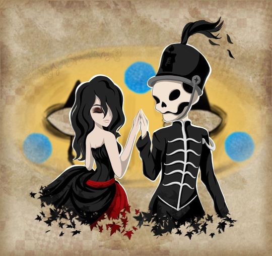
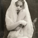
I will be with You
When you go, just know that I will remember you
If living was the hardest part, we'll then one day be together
And in the end we'll fall apart, just as the leaves change in color
And then I will be with you, I will be there one last time now
--My Chemical Romance, "It's Not a Fashion Statement, it's a Deathwish"
____
It's rare that I'm this proud of an artwork I've created. ^_^
Usually, there's some glaring issue or just an assortment of small things I'd still change if I had the patience and/or artistic ability to do it. Or even just some things that I feel like could've been done better, even if I know it did the best I could.
This time? No. Not right now, shortly after it's been completed, anyway. I'm sure years down the line from now I'll look back and feel at least slightly different. But as it stands now, while I'm sure it has its faults, I am truly happy and truly proud of what I've created here and whatever faults are there aren't bothering me at all.
So what then is this, exactly?
This my dear Sparklers is a visual love letter to the band I discovered just a little too late but was still there for me when no one else was all the same.
Earlier this month, I uploaded a different piece of art to celebrate the announcement of My Chemical Romance's Return, but even when I uploaded that one I was already thinking of doing another one, this time something that was more obviously fan art. But not just fan art as I've done for them in the past (Exhibit A, Exhibit B, and Exhibit C), but something extra-special and fun. I really did go into creating this wanting it to be as I described it above; a visual love letter to this band that I love so much and could not be happier that they're back.
As such, I've squeezed in as many references as I could:
1. The female figure is molded after Helena from the album Three Cheers for Sweet Revenge
2. The male/skeleton figure is supposed to be Pepe (that's what Google said his name was, anyway), the icon and seemingly marching band conductor from The Black Parade album
3. On Pepe's hat, I replaced the usual symbol with the Candle symbol that's been featured in the band's Return artwork
4. They fade into leaves based on the line from It's Not a Fashion Statement, It's a Deathwish (a song from Three Cheers) that I quoted at the top of the description
5. behind them is Party Poison's mask, as featured in the Danger Days music videos
6. on the mask, I replaced one of the black triangle shapes with the hanging man silhouette from I Brought You My Bullets, You Brought Me Your Love
7. The rest of the background is inspired by the covers for the Conventional Weapons releases (which in my mind I count as essentially an unofficial fifth album)
(Debatable) 8. Their touching hands could be an indirect reference to the line "And as we're touching hands, and as we're falling down" from Demolition Lovers, a song from Bullets.
That's at least one reference each (Three Cheers technically got two) for each of the main releases, plus one directly related to this new era we don't know much about yet. It's not an exhaustive "spot the reference" game, but I'm glad I was able to incorporate as many as I did.
Now that I've explained them, maybe I can talk about my process without having to stop to re-explain each reference as they come up.
After some brainstorming, I got this image in my head of Helena and Pepe in this pose (inspired at least partially by this pre-existing fanart I've seen many times before) , which to me is a "renaissance dancing" pose but I'm sure there's some other better way to describe it I haven't thought of. I tried for a very long time to find a reference image of this exact pose to help me get the proportions and general anatomy right within my own stylization, but for the life of me, I couldn't find anything close enough to suit me and I really didn't want to have to settle for something else. As such, I'm sure the proportions and anatomy are off, but even so, I think I did pretty good considering.
The main issues I ran into during sketching were mainly balancing the energy between the two characters--which I do think I managed in the end--Helena's skirt, as she's supposed to be holding onto it with that hand you can't see, and Pepe's torso. Originally, I was planning on doing this piece traditionally, but once the sketch was finished it almost immediately clicked into place that I'd be better served to do it digitally, considering what I wanted to do with the mask in the background already, as well as the leaf-fade. (The Conventional Weapons reference hadn't been planned yet, and it was technically only made possible later on by this piece being digital.)
Luckily, doing things digitally meant that Pepe's torso was fixed pretty easily. It was too thin in the sketch, but all I had to do was select the right lines and move them out a bit in Photoshop. He's still a bit thin and not super buff, but personally I'm letting that go because...I mean, he's at least part if not all skeleton. If anyone's going to be too thin, wouldn't it make sense that it's him?
Helena's skirt I did end up happy within the sketch but...we'll come back to the skirt in a moment.
Pepe's...face? looked a bit odd in the sketch, but other than that, once I was happy with that foundation, I scanned it in and got to work on digitizing everything.
I went over my lines for Helena and Pepe the way I normally would for something like this if a little intentionally messy instead of trying to get them super clean--as I thought that might be appropriate here--and then I paused with them to work on the mask behind them.
The mask admittedly came out very poorly in the sketch, just because I bothered to look up no references for it whatsoever once I decided I was going to make this digital and I knew I could just draw half of it and flip it over. And I'm glad I didn't start trying to follow my sketch lines for it at all because looking up actual references showed me that would've been way off.
While I had my reference up, I ended up going in and basically full-coloring and detailing the mask right then. That's the beauty of digital work; a lot of steps can be done basically out of order from how you'd have to do them traditionally and it doesn't matter because you can just move layers around and adjust effects later.
I went with this pseudo-soft shading based on the colors and shadows I was seeing in my references, even though I wasn't sure yet exactly how I was going to shade Helena and Pepe. I figured that even if I used a different method for them that I could either go back and adjust the mask as necessary or that it wouldn't matter since the mask was part of the background anyway.
Once that was done, I went back to ponder my two figures and the leaf effect that I wanted to do with them.
And again, I went a little out of order here, as I ended up filling in the silhouette of Helena and Pepe with a blanket layer of gray so I could see how them blocking the mask was going to look (and I figured based on past experiences I might need the blanket layer in white later). From there, I went into working on the fading-to-leaves effect. My logic was that I'd need mostly the silhouettes of the leaves and then I'd get what I wanted after playing with layer effects or something. This assumption ended up being correct, but we're not there yet.
As I worked, I kept looking at my "finished" messy lines. Something just didn't feel right.
Honestly, I couldn't tell you where the idea to do this lineless look came from, but it got in my head as I was working and I kept looking at the lines I had and not being happy to just color those in as I normally would, shade it, and call it a day.
I tried. I tried really hard to ignore the urge to at least try it and carry on as I was. I'd already come this far, and I'd be done so much faster if I stuck to the plan...But!!
Clearly I lost that argument with myself.
You know what though? I'm glad I did!
I don't think I've ever done lineless art like this before, not counting my watercolor work where that's just part of the process to me. But digital? Certainly not. Human figures? Also no.
I've come close in the sense that I've shaded my art before, turned off the line layers before, and thought, "oh hey that almost works without the lines because of the shading," but not much farther than that.
Naturally, I wasn't even sure how or where to begin, so I went with what came naturally to me. I started by just filling in the lines as I normally would have, and then I went back layer by layer and went back and forth between having the line layer (with the opacity brought down somewhat already so I could sort of see what I was doing) on and off to try and balance the shapes between what they looked like with and without the lines. It's weird because if you ever try this, it's a little like having to figure out a bunch of individual silhouettes that make one whole one, except you need them to be a little more defined if you want them to make visual sense.
That step and the next one, the shading, are tied in my mind for which one took me the longest.
For the shading, I really just went in blind, using hard-edge cell shading, though originally I planning to come back with some soft shading in certain areas later. The soft shading ended up not happening partly because I liked it much better than I thought I would without it, and I thought the hard-edge shading made the figures pop a little more compared to the background. The thing about this was the same issue I run into with my lines nowadays; to get smooth shapes I spend a while going back and forth between putting color down and erasing it, and sometimes undoing and redoing the same line a dozen times to get it right in one stroke. But that's really my own fault for being stubborn and trying to work solely within Photoshop and not use other programs, as I know good and well I'd have less of that issue if I'd hop into Paint Tool Sai and use the linework layers in there.
What can I say? I live up to my Capricorn sign by being as stubborn as a goat.
Anyway. The biggest challenge to figure out the shading for was Helena's skirt. I think I would've still had issues with that though even if I colored and shaded my normal way, with the lines and everything. It's just the position it's in that complicates things.
I actually did a good amount of shading in reverse here, where I'd make the base layer the shadow color and then the layer on top would be the regular color, as in some cases it just seemed easier to do that than the other way around. The part of Helena's dress around the top, for example. Or Pepe's pants (what little you can see of them).
Additionally, I ended up leaving the feather attached to Pepe's hat alone and not really smoothing it out, as I thought the roughness and inconsistencies worked really well to make it seem more feathery.
With enough patience and persistence and much back and forth among the various layers, I made it through all of that. I was a little concerned at first about some of my color choices and if the shading was too harsh in some places or not, but I mellowed out as I worked and ended up not making make adjustments after the fact. For instance, originally I thought I'd go back and make Pepe's...skin? closer to a true white and this fleshy off-white color was more of a placeholder, but the longer I worked with it, the more I didn't want to change it. It actually makes sense, given that his hands are normal (as they are presented in official artwork and other fan art not made by me) and that bones usually are naturally more of an off-white color. And I also think it just looks really good next to Helena's pale skin.
The hands were a special challenge in regards to both shading and coloring, as hands like to be the more complicated part of a drawing more often than not, but even that I managed to get through with a lot more ease than I would've bet on.
The other thing about that is that I was surprised once I got through the steps at how much better Pepe's face looked in comparison to the rest of the drawing. As I mentioned before, it looked odd in the sketch. But one I had most of the colors for him and Helena filled in digitally, the contrast or something just made it look infinitely better. (Combined with a hefty dose of earlier back-and-forth making adjustments to his jawbone area.)
Originally, I thought I might use the same cell shading for Helena's eyeshadow. However, while I was still thinking of adding some selective soft shading, I added it using one of the brushes I'd used on the mask earlier. It looked so good to me that even after I tried added the soft shading with it like I planned and decided I didn't want/need it anywhere else, I kept it.
And for the record, Helena's hair is kind of the wrong texture (it's officially more straight than this) and she's missing this little netted veil thing she's supposed to have, but I had a very specific vision in mind, so those were the two creative liberties I took with her design. I say it's fair game since I took a liberty with Pepe's hat to get the Return reference in. And besides, those two details being off doesn't make her totally unrecognizable if you know who Helena is in the first place.
Once they were done, I spent longer than I bothered to document playing with the leaf layer I'd made earlier to try and figure out how to get the effect I wanted.
Sparing you the boring details of my trial error, as I'm sure this description will be long enough without them, I eventually determined the best thing to do was to have one layer of the leaves on top set as an "overlay" layer, and another behind/beneath Helena and Pepe. Then I went back and extended my color and shading layers to extend down over the leaves, and I arranged and clipped the layers accordingly. Technically, the overlay layer wasn't necessary, but it added a little extra dimension that I really liked.
By that point, it was my second day of working digitally and getting late, but I had to do one more thing before I could go to bed with my mind at ease that night.
With Helena and Pepe done, I turned the mask back on (I'd turned it off so I could focus on them without it distracting me or otherwise getting in the way) and I felt like they weren't standing out enough against it. The bright yellow color was competing too much for my eyes' attention.
So, after trying the "stroke" blending option in white and that looking God-awful, I added a new layer between them and the mask and manually gave them a white outline.
It wasn't a perfect solution, and I knew that even then, but it was enough that I could sleep soundly knowing how far I'd gotten with the artwork.
The next day I had to take a break from working on this to bust out a painting for the challenge I decided to take on this month, but I went back to this as soon as I could after that was taken care of.
When I came back to it, I acknowledged that I technically could've left it as it was and call it finished. But I still didn't like how obnoxious the mask seemed for a background piece and it felt...I don't know. Almost hollow, in a way. It was a cool graphic, sure, but I wanting something more than that.
Again, I'll spare you most of the nitty-gritty details. But long story short, I played around with layer effects and filters for a while until I had blurred the mask out just enough that it wasn't so obnoxious but also so looking at it directly didn't make me nauseous, and the edges were softened so it felt more like a true background piece and not just an accessory that had been plastered carelessly back there.
It was only after I started saving off versions with different backgrounds--one with no background, one with white, one with black--that I realized I was missing a golden (semi pun intended) opportunity to incorporate a Conventional Weapons reference/allusion. Which was exciting because I'd previously been disappointed that I couldn't think of a good way to do that.
I went back and forth on layer styles and adding texture with brushes and things for a while on that too, but you can see what I ultimately settled on. It's not a 1:1 to the CW covers, but I'm really pleased with it anyway.
I did end up adding a bit more to the white outline in a few places and adding a drop shadow to Helena and Pepe so they'd pop a bit more (it almost makes them look like paper cutouts to me!), but really the only other thing I had to do after that was add my watermark.
It took roughly 3 days of work from start to finish, but I was honestly surprised by how fairly smooth the process went. Especially considering the new things I'd tried along the way. I can only assume it's because of just how much my heart was really into making this piece.
As I said before, I am truly proud of how this piece turned out. I love it. I love it, and I love the band that inspired its creation. Even the title says a lot here, I think. I picked this line that's repeated at the end of It's Not a Fashion Statement, It's a Deathwish, as it was a leading inspiration with the leaves and everything, and after looking at the lyrics I realized how fitting that line is for this.
I discovered My Chemical Romance two years too late, two years after they broke up in 2013, but I've stuck by them ever since, and I will continue to do so, with whatever the unwritten future holds. They've changed, as anyone would over the course of six years, but they came back anyway. Even if it's just for a few shows and they're gone again. Or if it's going to be so much more than that. They. Came. Back. And that's not an easy thing to do a lot of the time.
And so, I show my solidarity. I will be with you, MCR, no matter what comes next. You were there for me, and now it's my turn to be there for you, even if it as just another fan among the crowd.
And that's really all I have to say on the matter.
____
Artwork © me, MysticSparkleWings
____
Where to find me & my artwork:
My Website | Commission Info + Prices | Ko-Fi | dA Print Shop | RedBubble | Twitter | Tumblr | Instagram
#mcrmy#mychemicalromance#mcr#helena#the black parade#three cheers for sweet revenge#danger days#thetruelivesofthefabulouskilljoys#killjoys make some noise#conventional weapons#return
2 notes
·
View notes
Photo
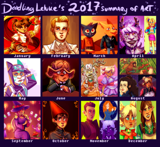
a bit later I usually am with these, but here’s what I’ve been up to in 2017. While I feel like my improvement isn’t as obvious as ith as been in previous years, I still feel like this was a really good art year for me. I actually did a lot of pieces that I really liked and actually still like months later! that is a completely new sensation for me! I feel like I’m really getting to where I want to be with my art, so hopefully this will continue in 2018.
for the first time I feel like commenting on my choices for this thing, mostly cause I just want to but also in case someone wants to know how I feel about my own art. but because theres a lot of drawings here that’ll continue under the cut
wow I use red and pink/purple hues way more than I thought. anyways.
january - this year I wanted to get better at doing at least somewhat interesting backgrounds (even if it just means a simple colour) and experimenting more with different textures and styles, and I still think this tenten was a good start. I had been wanting to draw something like this with her for ages and I’m glad I finally was able to pull it off.
february - february didn’t really have any drawings that stood out to me, but this month I started drawing a lot more “casual” trek stuff, as in stuff that doesn’t need to have a punchline. I see a lot of problems with it now, but I really liked this seven when I first drew it.
march - again, not a month where I found anything particularly good, but it was the month when I got into night in the woods (still a big fan of it) and this was honestly the best of the nitw art I did.
april - I am pretty sure the demon kankuro was a redraw of an older, shittier demon kankuro I can’t be bothered to find. Its a bit messy and his facial features are off, but I still think theres some nice details and colours. At this point I had also started to use a bit of after effects (the blur around the edges). the 80s ino is part of a konoha girls in vintage clothes thing that admittedly isn’t all that good looking, but it was a lot of fun and probably my favourite outfit drawing.
may - I spent most of this month doing art memes inbetween exams and dying, but this random kankuro somehow found its way in. yeah its not spectacular or anything but it kinda happened on a whim and its not a style of colouring I use very often. I don’t remember what brush I used but I love how it looks. pardon my french but I’m pleased with how this turned out.
june - I moved this month so I’m surprised I had time to draw at all. this sad nog represents my inner turmoil and stress at the time. probably. anyways, I feel like this was the first time I was able to cartoonify a ferengi somewhat successfully. I also finally started toning down my exessive highlighting.
july - I spent most of july stuck in the mountains with no internet, yet somehow I still managed to draw a bunch of shit I still really like. The magical girl temari was the first time I tried to do a combination of solid and blended shading. I’ve had issues with my shading for a long time and I think this was a step in the right direction. It was mainly inspired by how much I liked the solid shading of the other one, which is also the only good drawing I’ve ever done of that oc.
august - what the fuck how did I draw so many things I like in august. For the deanna I just suddenly got the idea to try something art nouveau, and while its not perfect I’m still happy with the result. The hair took forever but I’m still in love with it, and I’ve been incorporating some of those elements into my art ever since. The temari REALLY benefited from solid shading instead of me drowning it in exessive layers of purple like I usually do when I shade. idk what to say, I love it and I genuinely think its one of the coolest things I’ve ever drawn. for the top one I wanted to do something original and different from my usual stuff. The background is a bit messy but I still like the overall result and it has inspired me to draw more casual stuff that doesn’t necessarily need to be posted here.
september - no contest here, the konoha witch series took a lot of time, but I’m still happy with the result.Well for some of them at least. Ino is hands down my favourite and I think its obvious that shes the one I put the most thought and effort into (even though it started with a random sketch of tenten). Apparently I have some kind of bias towards pink and purple, which might explain why I think Ino just ended up with the nicest looking colours out of all the girls.
october - I didn’t have time to do a big halloween piece this year, but this wirt was still pretty halloween-y. the colours turned out better than I expected, especially the shading on his face. The background doesn’t really make sense, but I think it looks nice so ya know, whatever. This was also the first time I watched over the garden wall so this also has some sentimental value I guess.
november - Huevember month! which meant a lot to choose from! the kira I did on the last day of november is honestly my favourite out of all the huevember drawings I did. I don’t do a lot of drawings with the light source in the back, but I think it really worked here. idk I just think the colours and the style look really neat. It feels weird being so positive about my art hah but I don’t have anything I dislike about this one. I do have a few problems with the temari, but I just really like the colours, and I like that I did something interesting with the colours for once in my life. The tilly is in all honesty not a fave of mine, I actually kind of dislike it BUT it did get featured on after trek so I feel like it was a significant part of my ~art year~
december - I’ve had a lot on my mind this month, so sadly I’ve been really inactive here. The elf temari isn’t really all that special, but then again I don’t think its directly bad and I think the colours turned out better than what they usually do when I try shading my lineless art. The other one is a redraw of a drawing I did back in may, and while I (as always) have some problems with it I do think its a big improvement over the old one (which is so ugly that I was genuinely surprised to find that it was drawn...this year).
thank you if you bothered to read all of this! I know this was completely pointless but at the same time I’ve found that artists often hav completely different opinions on their art than others do so there might possibly be something a little bit interesting here. just a tiny bit.
#listen its late as hell im the only one still up and i felt like blathering#summary of art 2017#something happened over summer idk what but from july and onwards ive started to really like my art
17 notes
·
View notes
Note
This is for the Anon mun thing, but I'm both amazed and a little jealous of how well/quickly you can answer asks, and I consider you to be a bit of an inspiration. Also, if you don't mind me asking, how much do you think having an askblog helps you improve? I've been on the fence about making one for awhile, I'm just not confident with my art yet lol. It looks fun. Anyways, sorry for the stupid long ask/combination of asks I suppose.
( oh no no it’s fine! thank you so much!!under the cut bc it might get a bit long–
I’m just..fast in general, I actually go with lineless over making actual lineart and coloring that, mostly because I don’t have to do proper/cleaned-up shapes, just a general shape and erase it till I get what I want -I have a quick tutorial I made for it a while back here!
If there’s any tip I can give you it’s… I don’t sketch. I draft everything in my head. I just figure out what I want and go for it, and I don’t bother with trying to perfect each small detail - esp if you want to try and go faster -also since I have my tablet on my right I set shortcuts for all my tools so I can quickly access them with my left hand so I don’t have to go clicking around Sai. I just type fast too lmao
and when I say fast I mean everybody turns and looks at me whenever I’m typing something
I guess memorizing the entire keyboard helps I can type with my eyes closed…..
also! if you’re planning on making an askblog, I’m suggesting (not telling you) to choose a muse you really like and will want to hold onto, so you don’t get tired of them easily haha…I love Miku and I would die for her so tbh I would draw her again and again and again without problem
it certainly can speed up things eventually, since you’re more or less drawing the same character over and over, and you’ll kind of absorb techniques and styles from other blogs too!
of course to improve further you’ll need to branch out your practices more, but if you’ve got the free time and willingness, an ask blog could of course help! I mean, I’ve definitely seen the improvement from when I reopened up the blog in January!
So, if you want to go for it, go ahead! Your art doesn’t matter, you’ll improve with time, and we’re always happy to have a new member in the ask blog community! unless of course you decide to cross Miku
Just give it a bit of thought if you need, but I hope I helped a little !! )
13 notes
·
View notes
Last Seen Blogs
neoballsucker
neoballsucker
pandoras-lunchbox
Bloggity Blog Blog
spaceplush
PlanetPlush
eff-stonem
♱mel♱
monstrodesign
MONSTRO DESIGN