#a giant gap between the tip of the pen and the screen if you know what i mean
Text
roomie is gone for the weekend so i borrowed her kamvas pro and ive been warming up to it and oh man it's pretty nice now. When i first drew on it i thought it was shit xd
#i wouldn't buy this one tho#theres like#a giant gap between the tip of the pen and the screen if you know what i mean#its horrible#and it makes the calibration all fucked up#probably would need something more expensive ahhh#ummm buy my stuff on redbubble so i can buy a tablet? or something fdbdsdfgb#fr tho last night i thought i would need to make a post like that xd cause i dropped my tablet from almost 2 meters ToT i thought it was#broken for sure 💀#the surface did kind of snap out of its place and i needed to push it back but besides that it survived i love my ancient girl#shes so brave and strong
8 notes
·
View notes
Text
All Hallow’s Eve
(DISCLAIMER: We’re going way off the canon path here, kiddos.)
Orion hadn’t heard from Artemis in weeks. He wanted to be thrilled, but he knew better than to trust himself. He wondered if he’d ever be fully at ease in his own head, or how long it would be before the little worm of guilt allowed him to call the head his own. He sat on a window ledge outside the Great Hall at early morning, waiting for his friends and thinking. He found it less and less pleasant to have time to himself lately: the longer he was alone and the longer he thought, the more he found gaps in his memory, gaps only his Other Half had access to. The day before he’d needed the colors of the rainbow for a spell and found he couldn’t remember them. His classmates had a jolly laugh at his expense when Snape made him memorize a song of colors, then sing it aloud for the class.
“Oi, Orion!” Ron called, pulling the Slytherin from the sill and out of his thoughts. “We thought we’d get here before you for a change.”
“Have you been sleeping well?” Harry asked, clapping a hand on Orion’s shoulder as they strode toward the monumental double doors.
Orion pursed his lips. “I’ve been sleeping, but not resting, you know?”
“Yeah, I can relate,” Harry said with a sad smile.
Orion had learned a lot about Harry in the last weeks, specifically the three Gryffindors’ annual exploits and the possible return of He-Who-Must-Not-Be-Named.
He’s a regular King Arthur, Orion thought. A boy with a great destiny. He wished he could tell his friends about his own adventures, but even he knew raving about other dimensions and fairies with time-stop technology and demons living on the moon would result in a one-way ticket to the loony bin.
The four children walked towards the closed doors of the Hall without breaking stride and the doors swung open on their hinges without being touched: though today, they did so with an unearthly groan. Orion jumped, and his friends grinned.
“I love Halloween,” Hermione said, stretching her arms over her head.
Black candles floated in clusters above the tables in the Great Hall, their wax surprisingly not dripping on the bright orange tablecloths below. The rafters were swathed in giant, real cobwebs, and a giant jack-o-lantern loomed in the middle of the ceiling, leering at the students as they entered.
Orion grinned back, his initial skittishness forgotten. He’d never had a real Halloween. Artemis wasn’t one for the season.
The children were feasting on caramel apples, spiced oatmeal, and pumpkin milk when the ghosts came into the hall, descending through the ceiling and phasing through walls.
“Do they not have ghosts at Ilvermorny School?” Hermione asked, noticing Orion’s open fascination.
“Erm, no,” he recovered. “Haven’t been around long enough, I suppose. Do they have to die in the school to be ghosts here?”
“I sure hope not!” Ron said through a mouth full of pumpkin muffin. Hermione glared at him, and he shrugged. “If so, where do the ghosts get their mounts for the Headless Hunt? Did the horses all die with their masters?”
“Or do they have to wait around for the horses to die?” Harry cut in.
“How many headless men couldn’t be in the hunt for lack of steed?” Ron asked, pointing at Harry with a fork.
Harry laughed. “Maybe it started off as a Headless Jog.”
“The two of you, really,” Hermione chastised. “A lot of them do,” she told Orion. “Or at least, they all have a strong connection to Hogwarts.”
“And unfinished business,” Ron added, wiggling his fingers under his chin and baring his teeth.
“What’s the Headless Hunt?” Orion laughed.
“A gaggle of really old men on their high horses boasting about not having a good head on their shoulders.” Nearly Headless Nick sulked. He phased between Ron and Harry, and the chill he brought on prompted them to make room for him on the table bench. “Now me, I may not be completely headless, but at least I have a head!” He said the last part loudly, so a group of men a good deal shorter than they should be, heads tucked under their arms, could hear.
“He’s talking about Lord Valeron,” Ron whispered behind his hand. “He lost his head, literally. His head was misplaced before his burial. But he’s still able to take part in the Hunt. No one knows how.”
“I know how! It’s prejudice!” Nick bewailed. “He can’t use his head for Nogglin’ Rolling, or Cranium Volleyball! They only like him because he’s mysterious.”
“He is pretty mysterious,” Hermione said, resting her chin on her fist as she watched the only truly headless man on the outskirts of the group, fixing cufflinks he couldn’t have known had come askew.
Orion felt a stirring in his mind, a cold, familiar itch that made his stomach turn.
“It’s rumored that his head knows such terrible secrets it’s been buried separate from his body somewhere on the Hogwarts estate,” Ron said in hushed tones, “and that he searches for it still.”
“Ahh! He’s bewitched you as well!” Nick wailed. He swung an arm to bang the table, but his arm fell right through. “But I’ll have the last laugh,” he told them, leaning in conspiratorially. “Because I know where Lord Valeron’s head lies.”
Ron and Hermione made faces of awe, though it was evident they didn’t believe him, while Harry shook his head. But someone did believe the beleaguered specter.
‘Ask him if he wants his head completely removed.’
Orion started so violently that he dumped a goblet of pumpkin milk into his lap. He performed an anti-stain spell before Hermione could, but the wand shook in his hand and the spell transferred the stain to the tablecloth.
“Orion?” Hermione asked, her heavy brows furrowed.
He turned his attention to Nick on the other side of the table. “I can remove your head for you.”
“What?” Nick, Ron, and Harry said in unison.
“I can remove your head for you,” Orion said, the color returning to his cheeks, “and you can finally take part in the Headless Hunt. But in return, you tell me where Lord Valeron’s head is.”
The three Gryffindors and the ghost stared at the pale boy for a long moment.
The ghost finally spoke. “If you can get me into the Hunt,” he said slowly, “I will do whatever you want.”
“How in the seven layers of the underworld are we supposed to remove a dead man’s head?” Orion hissed, trying not to sound excited. He’d ducked into a dark gap between columns for privacy while he talked to himself.
‘Oh, you’re acknowledging me now?’ Artemis said snidely.
“You haven’t talked to me for weeks!” Orion sputtered. “But never mind that, you must have a plan if you’ve promised the poor soul his deepest wish.”
‘The simplest solution would be to exhume the body and finish the job.’ Artemis smiled at Orion’s squeamishness. ‘But as I’m doubting there’s any flesh left, that avenue is out. Thankfully, while you’ve been traipsing around wizard academy, I’ve been doing some theorizing with quantum and particle physics.’
“Yeah?” Orion asked, pretending to understand.
He could almost see Artemis’s vampiric grin, quite fitting for the holiday. ‘Yeah.’
That night, the four friends gathered under Harry’s Cloak of Invisibility and snuck into the Transfiguration classroom, chose because it was the only class with windows big enough to be lit by the full moon.
Orion had gathered supplies per Artemis’s instructions and hid them in the room before light’s out: a coil of copper wire, the interdimensional device that brought them there, the damaged tazer pen, some protection equipment, and a knife.
‘Or any sharp blade,’ Artemis had specified.
Orion had never distrusted himself more.
“What do we do now?” Hermione whispered. “We told Nick to meet us at midnight, that’s two hours away.”
“We— I need the time to set this up,” he explained. “It’s very precise, but I’ll let you know if I need help.”
The three friends gathered around a table a few meters away to play some game they’d invented with the Chocolate Frog cards. Orion wished he were playing with them.
‘Focus,’ Artemis reprimanded. ‘You have the steady hands for this job, but not the knowledge. Now listen to me very carefully—‘
It was about fifteen minutes till midnight, and the Gryffindors had long since become bored of their game and infatuated with Orion’s mysterious assignment. He’d set up a small workstation at McGonagall’s desk. Odd sparks flew in every direction as he used his wand as a welding torch to rewire something in the tech-watch he’d snuck in from home.
“Electronics don’t work here,” Hermione reminded him, her face flickering in the blue light of the flame. “That’s why your watch broke in the first place.”
“It’s a good thing I’m not trying to fix it then,” Orion said through the bandana covering his mouth.
“What are you trying to do?” Ron asked.
“Supe it up,” he replied, using tweezers to lift a tiny coil on the circuit board and bend it where he wanted it. “If my theory is correct, ghosts are a mix between the magical and the physical: real, organic beings who left an imprint on the world. I’m not the first to wonder if those who died didn’t really pass on to a higher plane, but are in fact dimension-adjacent, and the sad creatures we call ghosts are caught between our world and the beyond.” He wound two lengths of wire to the sides of the circuit board, twisted those wires together, and snipped it with the knife half a meter from the watch. “However, the human brain essentially runs on electricity, a current,” he activated the tazer pen, which he’d reworked to create a steadier charge. “It’s no coincidence that electronics go haywire when specters draw near. They’re an ectoplasmic container for the neurons that contain the brain, the spirit! So hence, my little experiment.”
He twisted the wire around the fountain pen’s split tip, then switched it on. The watch’s display screen flickered, then lit up and beeped a digital greeting.
“Voila,” he said, folding his arms over his chest.
“You just fixed a watch,” Harry said, raising an eyebrow.
“You sounded just like Arthur,” Hermione added, her eyes wide and admiring.
“I’ve done more than fix it,” Orion said, coughing once into his fist. He took up the knife, a switchblade he’d knicked from one of the other Slytherin boys. He wrapped the watch’s band around the knife and tapped a few buttons on its interface.
“Are you ready for me?” Nearly Headless Nick phased through a window, the moonlight refracting through his hair and ruffled collar.
“Are you ready to be headless?” Ron asked as the ghost descended to their level.
“I’ve been ready for one hundred seventeen years,” Nick said. He rubbed his hands together. “So what do I do?”
“Come closer,” Orion pressed a final button on the watch and leaned over it, his palms planted on the desktop. “And trust me.”
A red web emanated from the watch, causing the three other humans to jump back. The laser lattice scanned Nick, then whirred as the frankensteined contraption hummed and vibrated so hard the knife rattled on the table.
“Is it supposed to be doing that?” Hermione whispered, eyeing the door warily. The machine was making quite a racket now.
“Someone’s going to hear!” Agreed Harry.
As he said this, the Hogwarts clocktower began to ring, the bells’ resonance drowning out the droning of the machine.
“Look!” Hermione said, pointing at the experiment. The base of the hilt glowed blue. The blue virus spread up the knife, and when it encased the tip of the blade, Orion turned off the tazer and cut the power to the watch.
“Wizard,” Ron said.
Orion touched the hilt with a finger experimentally, and when it didn’t hurt him, he slipped it from the watch band and held it aloft. It was still opaque, but had the eery aura of the haunting dead.
“An entrancing display,” Nick said, “but how’s that—“
With a quick, practiced strike, Orion slid the knife through the preexisting cut bisecting his throat, exerting a bit more pressure when he felt the resistance of skin.
All four students and the ghost watched in awe as his head tipped comically to one side, then fell to the floor.
118 notes
·
View notes
Note
In the story I'm planning there is a decent sized group of main characters plus recurring characters who have smaller but important roles to play in moving the story forward. With such a large group, do you have any tips for how to organize and prioritize which characters get more scenes and development?
Developing and Organizing Character Arcs

@suksi-vittuun
It’s as if you already knew what I was going to say! Yes, when you’re balancing a lot of characters, your first step is to make sure that each character is crucial to the plot and that their story arc is helping to move your plot forward. Since you included those key criteria in your ask, I’ll assume that you’ve already determined all this.
When you’ve got a lot of characters, it’s assumed that each character (or set of characters) has their own story arc (and get ready; I use the word “arc” a million times in this post). The arc should be able to tell a complete story from beginning to end, but when combined with the other arcs in the novel will form a complete, complex narrative.
For example, if you’re familiar with Harry Potter, then you know his story arc in Harry Potter and the Half Blood Prince, but Draco Malfoy has his own story arc, that mostly happens “off-screen,” where he is plotting to murder Dumbledore. We see his story arc collide with Harry’s towards the end when Snape steps in to kill Dumbledore for Malfoy (and consequently, Snape has his own story arc too! He’s advising Dumbledore on what to do about his damaged hand, and he’s keeping an eye on Malfoy after making the Unbreakable Vow).
Name any character that’s even briefly mentioned in a novel, and you could technically devise a story arc for that character that fills in the gaps of all the times they appear “on screen.”
1. So first things first - make a list of the characters you’re concerned about. If you’re unsure about any of them, go ahead and include them in this list. Then, for each character, write out as much of their story arc as you can. If there are uncertainties in any of the arcs, do your best to fill them in.
There are lots of fun ways you can organize this, depending on the tools you have. If you’re more into free-hand, you can keep your arc notes in a journal, with tabs for each character (use post-it tabs, labeled/colored masking tape, or improvise ways of dividing the notebook). You might also use a binder and have actual dividers. Digitally, you could use separate Word documents, or if you have other writing software like Scrivener, you can use separate docs within your story file, and even have character profiles associated with each.
Now earlier I threw out the terms “on-screen” and “off-screen” and it’s important to note the difference between them. Don’t limit your thinking to what’s actually on the page - think beyond what you intend to show scenically. Think of your novel as highlighting the key points of each arc; you still need to understand more than the key points. This knowledge helps you keep the narrative cohesive, and it helps you make additions and subtractions to the story as you need to (because chances are, during the editing process, you will make changes).
So really elaborate when you write out your characters’ arcs. Throw in information that you think you may not even use, and be as detailed as you can. During this process, think about what each character wants, and what needs to happen in order to get what they want. If nothing else, determine what’s motivating each character as that will help drive the arc and you’ll be able to see it more vividly.
Once you have this, then you can begin to think about actual “on-screen” content.
2. Second, go through each arc and decide what you will actually write into the story.
Now’s the time to decide between on-screen and off-screen content. Only you can decide what scenes to include in your story, but I would advise choosing scenes where something changes, whether this change is something literal (the character getting fired, let’s say) or whether the change is internal (the moment when the character decides to quit). Change may also be seen in relationships - when two characters fight or reconcile. Scenes that reveal some sort of backstory are also good, as are scenes where some important plot detail is discovered.
Do your best to whittle down what you outlined in the character arc (the more characters you have, the harder you should try), but don’t be so selective that you lose the meat of the arc. A novel that only features a few scenes for each of twenty characters might work if the characters are compelling enough, but for a plot centric novel that’s trying to tell a complex narrative, you need more content with each character to get readers invested. Think about Stephen King’s books that feature large casts (It or The Stand), or Game of Thrones, or books by David Foster Wallace - they’re thick. If this is the kind of narrative you’re looking to tell, I’d recommend checking out any of those (a friend of mine also recommended Robert Jordan, especially if your novel is fantasy).
Don’t forget the element of mystery as well. There are some details you’ll want to hide from the readers until the end, so allow yourself some room to exclude the parts of plot arcs that spoil your big reveals. In doing this, you’ll also be deciding what parts (if any) you do show - these will serve as hints, or foreshadowing of what ultimately happens.
Deciding what it is or isn’t important is one of those writer skills that you have to constantly work to master, but if you go into the process with a 50-100 word summary of your book, you can constantly go back to that summary and ask yourself if these things you’re considering including have anything to do with that summary. This will help you answer the question: Should this be in the novel?
Use your character arc docs to list these scenes that you want to include. You may end up with some “maybes” that you’re not sure about, so maybe highlight those in a different color, or put an asterisk or something beside them to remind yourself that you’re undecided.
3. Put them all together.
Now, go to each arc document and copy all the scenes you selected and put them into one giant doc. Don’t worry about the order as you’re going - just get them all in one place first. Then, put the scenes in the order that you see them occurring. You can do this with paper/pen while referring to your screen, or perhaps a separate document, or you could even just copy and paste within the doc you’re already using to reorder them.
Start with the obvious ones, and save any that could happen in multiple places until the very end. By the time you get to those scenes, you’ll have a better look at your story’s timeline and it might be easier to find potential places for these scenes.
I also recommend choosing a unique color to either highlight or use as the text color for each character so you can visually see which characters have the most scenes. If you’re looking at your outline and you only see a couple of green spots, for instance, you can evaluate whether that character is getting enough screen time, or if they even need any.
4. Consider the overlap (and how POV comes into play).
I’ve been avoiding this a little bit to avoid confusing everyone, but you also can’t forget that some arcs will overlap with one another, and you’ll have characters that will “pop up” in different arcs, or even be “missing” from their own arcs. The key is determining whose arc each scene is mostly contributing to. The scene may be advancing both arcs, but the idea is choosing whose arc it advances more.
Going back to my earlier example, Harry and Malfoy each have their own arcs, but Harry often shows up in Malfoy’s and vice versa. Despite his “on-screen” absence, I would argue that the scenes where Malfoy fails to kill Dumbledore (the bewitchment of Katie Bell, and when Ron gets poisoned) do more to advance Malfoy’s arc than Harry’s, as Malfoy’s continued failures affect his mental state, as well as his position with the Death Eaters. So even though we don’t see Malfoy on-screen (since the perpetrator is meant to be a bit of a mystery, and because we’re from Harry’s POV), these scenes would be listed under Malfoy’s story arc.
When it comes to prioritizing which characters you should develop more, that’s your choice. Once you’ve presented the bare minimum for each character, or the selected scenes that tell the story arc sufficiently, then you get to decide which ones we delve deeper into. There were enough scenes in Half Blood Prince to sufficiently tell Malfoy’s story arc, but if JKR had wanted to, she could have chosen to include scenes from Malfoy’s perspective to advance his development and garner more sympathy from readers. As a writer, she made the choice not to do this. As such, it’s your decision which characters you want in the spotlight and which you’d rather the reader be more distant from.
So the bottom line here is that it’s not simple. Writing novels with big casts never is, so prepare yourself for the monumental task in front of you. Accept that you might be confused about what you’ve got going on quite frequently (and then reward yourself with candy anytime you feel like you actually have your shit together). Outlining is key, and hopefully this blog post helps you get closer to establishing an outline.
5. Lastly, let your outline guide you, but don’t let it control you.
Once you’ve put all those scenes in a potential order, you’ll find that you may add new scenes from your arcs that you dismissed earlier (or ones you come up with later), and you also might delete ones that you used to think were super important. Allow yourself this freedom, because much of what you do in your draft is difficult to determine until you start writing it.
Mia also just did a post on managing large casts of characters with a few tips that may be helpful to you when building your cast. We also have a few other posts on large casts if you want to check those out too.
Good luck with your epic story!
-Rebekah
P.S. Thank you Megan for discussing this ask with me ;)
720 notes
·
View notes
Text
Target Size and 2.5.5 | Adrian Roselli
June eight, 2019; 5 Comments

TL;DR: No matter what accessibility conformance degree you target, attempt to make sure that interactive controls are at the least 44 by 44 pixels in measurement. Hyperlinks in blocks of textual content are exempt.
Overview
In real life there’s sometimes both a visual and tactile element to an interface. You’ve got to be able to feel the button splits or ridges of your automotive’s local weather management should you don’t need to take your eyes off the street. Contact typing depends on sensing the F and J nubs (for U.S. English keyboards, at the very least) and the gaps between keys. Fumbling with a light-weight change at the hours of darkness is about sliding your hand across the wall.
With computer systems operating a graphical consumer interface (GUI), clicking a button or link is a matter of getting both a proxy on your finger or your finger itself into the fitting spot and not lacking. You’ll be able to swing a mouse pointer round a display with out clicking and nothing dangerous happens, but you can’t drag your finger across your telephone to really feel the quantity pad. A stylus might do both, depending on the developer’s intent.
Actual life elements reminiscent of bumpy roads (as a passenger in a automotive, not a driver), palms sticky with ice cream, single-handed use of big shows, previous ball mice filled with desktop lint, or mobility impairments can make a graphical interface confounding to use. Luckily some individuals have been considering these challenges for quite a while.
Fitts’ Regulation
The GUIs we use immediately are informed each by expertise going back millennia and research that is a little more current. For example, in 1954 Fitts’ Regulation put to phrases one thing we might have have innately understood — the time to get to a goal is said to its distance from our start line and its measurement. The result of testing this with customers is that small targets end in larger error charges.
I am oversimplifying a bit, but the gist is that the world of interplay design has recognized concerning the need for bigger targets for longer than there has been a subject of interplay design, not to mention GUIs. Nevertheless, there’s loads of proof that individual interplay designers perhaps do not know this.
That’s part of how we received to a state where we have to mandate bigger goal areas inside WCAG.
WCAG
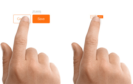
WCAG 2.1 brought with it a couple of new success standards. 2.5.5 Target Size requires a goal space for a pointer interplay (touch or mouse, for example) to be 44 × 44 CSS pixels. This equates to a visual angle of about 0.9372 degrees, or no matter you get if you make a 44 pixel block and view it in your browser with default zoom.
There are exceptions:
If there is a duplicate or equal version of the control at the minimum measurement, then an occasion could be smaller;
If the control lives inside the move of a piece of textual content;
If it’s a default control from the browser with no types applied;
If its smaller measurement is important to accurately conveying info.
2.5.5 is a degree AAA success criterion, which suggests organizations concentrating on AA compliance (primarily all of them) are more likely to ignore it. Which is unlucky, given the potential benefit. Causes for why this was categorized at AAA are past the scope of this publish. Fortunately, there are platform tips and interface design names that advocate for a bigger goal measurement, unbiased of WCAG.
Apple
Apple offers design ideas for contact goal sizes throughout its units. For iOS, it recommends 44 points × 44 points (not pixels) at least.
For buttons on watchOS, Apple recommends totally different minimums based mostly on the form of the button using the next (complicated to me) desk.
Dimensions as pulled from the Apple website Button sort 38mm (minimal) 42mm (minimum) Round 75 pixels 80 pixels Spherical rectangular 50 pixels high 52 pixels high
There look like no minimal management sizes for macOS, nor for its Contact Bar, although the Touch Bar most peak is 60 pixels, with 44 pixels advisable as the utmost peak for icons.

Pulled from the Hit Targets part of the UI Design Do’s and Don’ts web page.
Microsoft
Microsoft offers tips for touch targets in Fluent, its design system, as 7.5mm sq., or 40 × 40 effective pixels (epx) on a 135 PPI display, at default zoom. This was a lower from 44 pixels (epx), which was the Common Home windows Platform commonplace prior to the Windows 10 October 2018 Update (version 1809).
The web page additionally outlines what to think about as you measurement touch controls:
Frequency of Touches — think about making targets which are repeatedly or often pressed larger than the minimum measurement.
Error Consequence — targets that have severe penalties if touched in error should have larger padding and be placed further from the edge of the content space. That is especially true for targets which are touched incessantly.
Position within the content area.
Type factor and display measurement.
Finger posture.
Contact visualizations.
These sizing standards will not be brand new in Fluent. When you return to 2017, you’ll be able to see Microsoft advisable a minimum goal measurement of 60 pixels, or 11mm square, which included 2mm of padding to the subsequent target. Observe that right here it referred to targets, not touch targets.

Microsoft’s no-longer-current recommendation on the right track sizes, circa 2017..
Android
The Android Developer Guide recommends a minimum touch target of 48 × 48 system pixels. Unfortunately, this info is buried in the Accessibility section of the Greatest Practices portion of the guide as an alternative of alongside or embedded inside the documentation for constructing contact controls.
Google reinforces this sizing in the Net Fundamentals course in the part for accessible types. Along with noting that 48 gadget pixels is 9mm (which it asserts is the dimensions of an individual’s finger pad area), it also suggests an eight pixel hole between controls to attenuate mis-taps.

This image is from the Net Fundamentals course, not the Android Developer Information.
BBC
BBC’s Cellular Accessibility Tips are a set of standards for BBC staff and its suppliers when creating net or native content or apps. They defer to the Android and iOS platform tips for native apps and advocate a minimum 7mm touch target.
International Expertise Language (GEL) is BBC’s design system for all of its on-line presence. GEL recommends a minimum contact measurement of 7mm, with 5mm in special instances. For instances the place either dimension can’t be 7mm, then it mandates a 5mm exclusion zone. It also supplies these dimensions in pixels — advisable 44 pixels with a 32 pixel minimum, and for particular instances a 24 pixel minimum.

One of the examples out there on the GEL website.
Nielsen Norman Group
Nielsen Norman Group recommends a touch goal measurement of 1cm (0.four inches). NNGs touch goal article cites research of finger sizes, references Fitts’ Regulation, and shares a number of examples. It’s a good resource if it’s worthwhile to persuade others on your workforce of the significance of affordable sizes but who will not be interested within the platform tips nor the WCAG SC.
The article declines to offer pixel sizes. This is recognition of the variation of displayed physical pixel dimensions throughout units. That brings us again to the impracticality of holding a ruler to a display, not to mention holding a rule to each of a sampling of screens that correspond to your viewers.
Testing Reference
44 pixels may have totally different bodily sizes across units, even with no zooming applied. For example, 44 pixels on an iPad might be physically larger than 44 pixels on an iPad Mini, owing to them having the same pixel rely but in hardware with totally different display sizes.
You cannot be anticipated to seize a ruler and measure every system. You’ll be able to, nevertheless, create a reference field at that measurement and view it across units, evaluating it to the controls you’ve in your design and making certain they are at the least that enormous. I made a 44px reference sq. and embedded it under.
See the Pen
44px Square for testing 2.5.5 Target Size by Adrian Roselli (@aardrian)
on CodePen.
Wrapping it Up
For controls that may be activated by touch, with a pointer a stylus, or another physical gadget, ensure they are giant enough to hit simply and have enough lifeless area between them to assist avoid mis-clicks or mis-taps.
Even if WCAG AAA compliance isn’t your objective, lean on the guidelines from locations who have been doing this some time and affirm those sizes work in your users of their contexts (akin to a pitching fishing trawler versus a front room Davenport).
44 pixels might be an excellent minimum, provided that it or a worth close to it’s persistently beneficial throughout specialists, requirements, and platforms.
The opening picture is from I Contact Myself by Divinyls, fronted by Chrissy Amphlett. In 2013 she died of breast most cancers and problems from a number of sclerosis and this track soon turned the anthem for the Australian breast cancer awareness challenge “I Touch Myself.” The U.S. Facilities for Disease Control has info on breast most cancers awareness.
Update: 10 June 2019
Shortly after posting, I used to be asked concerning the problem making footer links conform to WCAG 2.5.5. Patrick Lauke walks via a bit of the history of the SC and his final suggestion.
The overall argument I’m making is much less about WCAG conformance and extra about making a usable interface whereas leaning on the teachings of past analysis and tips. However principally, in instances like this, ensure a consumer can’t easily mis-tap the flawed thing however can still get to the factor you want.
Tags
accessibility, standards, usability, UX, W3C, WAI, WCAG
Other Posts
Earlier submit: A Model for WordPress Accessibility
Newer submit: Scraping Burned Toast
The post Target Size and 2.5.5
0 notes
Text
Target Size and 2.5.5 | Adrian Roselli
June eight, 2019; 5 Comments

TL;DR: No matter what accessibility conformance degree you target, attempt to make sure that interactive controls are at the least 44 by 44 pixels in measurement. Hyperlinks in blocks of textual content are exempt.
Overview
In real life there’s sometimes both a visual and tactile element to an interface. You’ve got to be able to feel the button splits or ridges of your automotive’s local weather management should you don’t need to take your eyes off the street. Contact typing depends on sensing the F and J nubs (for U.S. English keyboards, at the very least) and the gaps between keys. Fumbling with a light-weight change at the hours of darkness is about sliding your hand across the wall.
With computer systems operating a graphical consumer interface (GUI), clicking a button or link is a matter of getting both a proxy on your finger or your finger itself into the fitting spot and not lacking. You’ll be able to swing a mouse pointer round a display with out clicking and nothing dangerous happens, but you can’t drag your finger across your telephone to really feel the quantity pad. A stylus might do both, depending on the developer’s intent.
Actual life elements reminiscent of bumpy roads (as a passenger in a automotive, not a driver), palms sticky with ice cream, single-handed use of big shows, previous ball mice filled with desktop lint, or mobility impairments can make a graphical interface confounding to use. Luckily some individuals have been considering these challenges for quite a while.
Fitts’ Regulation
The GUIs we use immediately are informed each by expertise going back millennia and research that is a little more current. For example, in 1954 Fitts’ Regulation put to phrases one thing we might have have innately understood — the time to get to a goal is said to its distance from our start line and its measurement. The result of testing this with customers is that small targets end in larger error charges.
I am oversimplifying a bit, but the gist is that the world of interplay design has recognized concerning the need for bigger targets for longer than there has been a subject of interplay design, not to mention GUIs. Nevertheless, there’s loads of proof that individual interplay designers perhaps do not know this.
That’s part of how we received to a state where we have to mandate bigger goal areas inside WCAG.
WCAG
WCAG 2.1 brought with it a couple of new success standards. 2.5.5 Target Size requires a goal space for a pointer interplay (touch or mouse, for example) to be 44 × 44 CSS pixels. This equates to a visual angle of about 0.9372 degrees, or no matter you get if you make a 44 pixel block and view it in your browser with default zoom.
There are exceptions:
If there is a duplicate or equal version of the control at the minimum measurement, then an occasion could be smaller;
If the control lives inside the move of a piece of textual content;
If it’s a default control from the browser with no types applied;
If its smaller measurement is important to accurately conveying info.
2.5.5 is a degree AAA success criterion, which suggests organizations concentrating on AA compliance (primarily all of them) are more likely to ignore it. Which is unlucky, given the potential benefit. Causes for why this was categorized at AAA are past the scope of this publish. Fortunately, there are platform tips and interface design names that advocate for a bigger goal measurement, unbiased of WCAG.
Apple
Apple offers design ideas for contact goal sizes throughout its units. For iOS, it recommends 44 points × 44 points (not pixels) at least.
For buttons on watchOS, Apple recommends totally different minimums based mostly on the form of the button using the next (complicated to me) desk.
Dimensions as pulled from the Apple website Button sort 38mm (minimal) 42mm (minimum) Round 75 pixels 80 pixels Spherical rectangular 50 pixels high 52 pixels high
There look like no minimal management sizes for macOS, nor for its Contact Bar, although the Touch Bar most peak is 60 pixels, with 44 pixels advisable as the utmost peak for icons.
Pulled from the Hit Targets part of the UI Design Do’s and Don’ts web page.
Microsoft
Microsoft offers tips for touch targets in Fluent, its design system, as 7.5mm sq., or 40 × 40 effective pixels (epx) on a 135 PPI display, at default zoom. This was a lower from 44 pixels (epx), which was the Common Home windows Platform commonplace prior to the Windows 10 October 2018 Update (version 1809).
The web page additionally outlines what to think about as you measurement touch controls:
Frequency of Touches — think about making targets which are repeatedly or often pressed larger than the minimum measurement.
Error Consequence — targets that have severe penalties if touched in error should have larger padding and be placed further from the edge of the content space. That is especially true for targets which are touched incessantly.
Position within the content area.
Type factor and display measurement.
Finger posture.
Contact visualizations.
These sizing standards will not be brand new in Fluent. When you return to 2017, you’ll be able to see Microsoft advisable a minimum goal measurement of 60 pixels, or 11mm square, which included 2mm of padding to the subsequent target. Observe that right here it referred to targets, not touch targets.

Microsoft’s no-longer-current recommendation on the right track sizes, circa 2017..
Android
The Android Developer Guide recommends a minimum touch target of 48 × 48 system pixels. Unfortunately, this info is buried in the Accessibility section of the Greatest Practices portion of the guide as an alternative of alongside or embedded inside the documentation for constructing contact controls.
Google reinforces this sizing in the Net Fundamentals course in the part for accessible types. Along with noting that 48 gadget pixels is 9mm (which it asserts is the dimensions of an individual’s finger pad area), it also suggests an eight pixel hole between controls to attenuate mis-taps.

This image is from the Net Fundamentals course, not the Android Developer Information.
BBC
BBC’s Cellular Accessibility Tips are a set of standards for BBC staff and its suppliers when creating net or native content or apps. They defer to the Android and iOS platform tips for native apps and advocate a minimum 7mm touch target.
International Expertise Language (GEL) is BBC’s design system for all of its on-line presence. GEL recommends a minimum contact measurement of 7mm, with 5mm in special instances. For instances the place either dimension can’t be 7mm, then it mandates a 5mm exclusion zone. It also supplies these dimensions in pixels — advisable 44 pixels with a 32 pixel minimum, and for particular instances a 24 pixel minimum.

One of the examples out there on the GEL website.
Nielsen Norman Group
Nielsen Norman Group recommends a touch goal measurement of 1cm (0.four inches). NNGs touch goal article cites research of finger sizes, references Fitts’ Regulation, and shares a number of examples. It’s a good resource if it’s worthwhile to persuade others on your workforce of the significance of affordable sizes but who will not be interested within the platform tips nor the WCAG SC.
The article declines to offer pixel sizes. This is recognition of the variation of displayed physical pixel dimensions throughout units. That brings us again to the impracticality of holding a ruler to a display, not to mention holding a rule to each of a sampling of screens that correspond to your viewers.
Testing Reference
44 pixels may have totally different bodily sizes across units, even with no zooming applied. For example, 44 pixels on an iPad might be physically larger than 44 pixels on an iPad Mini, owing to them having the same pixel rely but in hardware with totally different display sizes.
You cannot be anticipated to seize a ruler and measure every system. You’ll be able to, nevertheless, create a reference field at that measurement and view it across units, evaluating it to the controls you’ve in your design and making certain they are at the least that enormous. I made a 44px reference sq. and embedded it under.
See the Pen
44px Square for testing 2.5.5 Target Size by Adrian Roselli (@aardrian)
on CodePen.
Wrapping it Up
For controls that may be activated by touch, with a pointer a stylus, or another physical gadget, ensure they are giant enough to hit simply and have enough lifeless area between them to assist avoid mis-clicks or mis-taps.
Even if WCAG AAA compliance isn’t your objective, lean on the guidelines from locations who have been doing this some time and affirm those sizes work in your users of their contexts (akin to a pitching fishing trawler versus a front room Davenport).
44 pixels might be an excellent minimum, provided that it or a worth close to it’s persistently beneficial throughout specialists, requirements, and platforms.
The opening picture is from I Contact Myself by Divinyls, fronted by Chrissy Amphlett. In 2013 she died of breast most cancers and problems from a number of sclerosis and this track soon turned the anthem for the Australian breast cancer awareness challenge “I Touch Myself.” The U.S. Facilities for Disease Control has info on breast most cancers awareness.
Update: 10 June 2019
Shortly after posting, I used to be asked concerning the problem making footer links conform to WCAG 2.5.5. Patrick Lauke walks via a bit of the history of the SC and his final suggestion.
The overall argument I’m making is much less about WCAG conformance and extra about making a usable interface whereas leaning on the teachings of past analysis and tips. However principally, in instances like this, ensure a consumer can’t easily mis-tap the flawed thing however can still get to the factor you want.
Tags
accessibility, standards, usability, UX, W3C, WAI, WCAG
Other Posts
Earlier submit: A Model for WordPress Accessibility
Newer submit: Scraping Burned Toast
The post Target Size and 2.5.5
0 notes
Last Seen Blogs

acertainlovely
A Certain lovely

pandoras-boxs-world
I solemnly swear wolfstar is real

consistently-nostalgic
#1 Cosmo enjoyer

hellocima4up
cima4up.video

acelearnstoart
Art. How do?