#additionalwork
Explore tagged Tumblr posts
Visit Tumblr Blog
Explore Tumblr blogs with no restrictions, modern design and the best experience.
Last Seen Tumblr Blogs


Fun Fact
Mobile Tumblr US users spend an average of 4.04 minutes per session on the app.
Photo

Business card - Backing illustration
I took the sketch I created for my business card illustration and recreated it in a digital form. I used various shades of warm red, orange and yellow to stay consistent with my brands primary brand colour.
2 notes
·
View notes
Text
Drawings of dancers: Tate exchange, Laban creative collision


I went to a Tate exchange event where Laban Conservatoire of Music and Dance were putting on an improvisation contact show. I drew the dancers whilst watching their bodies tangle and untangle themselves from each other, it was very challenging to draw moving figures! This was such a good experience and I hope my images have captured the frantic rhythm of the dancers.
0 notes
Photo

libreng isteyk n nmaaaan! #alamnadis #additionalwork #requestbyamo #donteatit #itsatrap
0 notes
Photo

me and this panda are gonna need a minute, cause you guys went and frustrated me... #greentea #minute #frustration #work #nowork #additionalwork #icantlivewithoutmyradio #grr #fuckyocouch #imrickjamesbitch
#grr#work#greentea#nowork#frustration#imrickjamesbitch#minute#icantlivewithoutmyradio#additionalwork#fuckyocouch
0 notes
Text
youtube
आज हम आपको Pinky Suit में Delhi Made के सभी item दिखायेंगे|
#Plainduppatta #Printeduppatta #Digitalduppatta #Delhimade #Additionalwork
With Additional Work आपको यहां देखने को मिलेगा|
यहां आपको सूट के न्यू कलेक्शन के साथ ही…. #CrepeSuit #Cottonsuit #Umbrellasleeves #Organza #Muslin
यहां आपको अपनी दुकान के लिए सब कुछ मिलेगा, जो आपकी शॉप में चार चाँद लगाये|
Contact Us- 📞+91 92057 32935, 92052 58935 📌New Sarak, Delhi, 110006 🌐http://pinkysuit.com, https://bit.ly/3ZwvxLB
#Top 5 ladies suits wholesalers in Chandni chowk (Delhi)#The best wholesale suits suppliers in Delhi (Chandni chowk)#wholesale suits suppliers in Delhi#Ladies suits wholesalers in Chandni chowk#Mini Surat in Chandni chowk Delhi#Ladies suits wholesaler in Delhi#Youtube
0 notes
Photo

#paulresika #flowersandsails,blue #coloretching #1995 #additionalworks in #emptypaintings at #stevenharveyfineartprojects #208forsythstreet #saturday #12-6
#coloretching#emptypaintings#208forsythstreet#stevenharveyfineartprojects#flowersandsails#1995#paulresika#12#saturday#additionalworks
0 notes
Photo
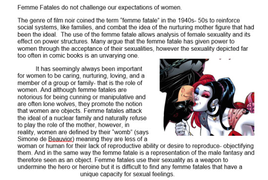
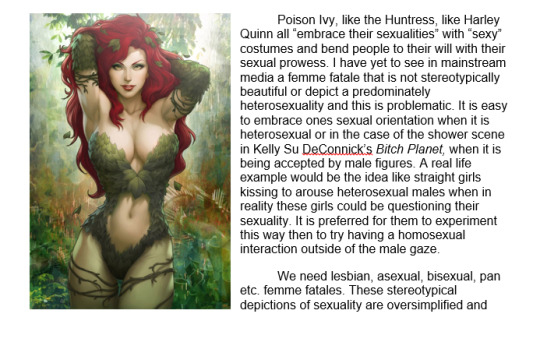
A Blog Post I wrote for my “Fantasy Girls: Philosophical Examinations of Women and Girls in Science Fiction and Fantasy” class on the idea of Femme Fatale in comic books
0 notes
Photo

well, I will gotta go this is an additional work for a profile pic of Facebook (practice 03) #wellIwillgottago #additionalwork #profile #facebook #practice
0 notes
Photo

Business card - Front sketches
After working on the back I turned to planning the layout of the information side of my business card.
1 note
·
View note
Text
Developing work for my new animation: ‘Premonitions’ by Carol Ann Duffy
We first met when your last breath cooled in my palm like an egg; you dead, and a thrush outside sang it was morning. I backed out of the room, feeling the flowers freshen and shine in my arms.
The night before, we met again, to unsay unbearable farewells, to see our eyes brighten with re-strung tears. O I had my sudden wish - though I barely knew you - to stand at the door of your house, feeling my heartbeat calm, as they carried you in, home, home and healing. Then slow weeks, removing the wheelchair, the drugs, the oxygen mask and tank, the commode, the appointment cards, until it was summer again and I saw you open the doors to the gift of your garden.
Strange and beautiful to see the roses close to their own premonitions, the grass sweeten and cool and green where a blackbird eased a worm into the lawn. There you were, a glass of lemony wine in each hand, walking towards me always, your magnolia tree marrying itself to the May air.
How you talked! And how I listened, spellbound, humbled, daughterly, to your tall tales, your wise words, the joy of your accent, unenglish, dancey, humorous; watching your ash hair flare and redden, the loving litany of who we had been making me place my hands in your warm hands, younger than mine are now. Then time only the moon. And the balm of dusk. And you my mother.


I’m hoping to make an animation to this poem and here are some of the stills that I���ve drawn to go with the first stanza. Hoping to shoot it on dragon frame and work in it over the summer!
0 notes
Text
Fund to boost female and black physicists article: experimenting with editorial illustration

Here is a piece of work that I produced in response to a BBC article called: Fund to boost female and black physicist numbers.
I was particularly inspired by a quote in the article by professor Bell Burnell where she speaks of entering her lecture hall and being the only female student so the other students would shout and wolf whistle at her.
"When I was an undergraduate studying physics at the University of Glasgow in the 1960s, it was the 'tradition' that when a woman entered the lecture theatre, everybody whistled and stamped and catcalled.”
This is my editorial illustration responding to the quote.
Article can be found at: https://www.bbc.co.uk/news/science-environment-47612806
0 notes
Text
Mono printing hands for my animation


0 notes
Video
tumblr
I want to experiment with animating a short section of my animatic by using mono prints. The first thing I did when starting this challenge was choosing which section of my animatic to animate. I decided on the part where Farquhar breaks his hands free from the rope underwater. I used pencil to plan out the positioning of the hands and recorded a video of myself acting out the motion.
0 notes
Text
House of Illustration: Refugee exhibition


I went to visit the House of Illustration ‘Journey’s Drawn: Illustration from the Refugee Crisis’ exhibition as I wanted to research into the importance of reportage drawing and its power over the photograph. This exhibition featured illustrators George Butler, Gideon Summerfield and more. What I loved most about the work of the illustrators I’ve mentioned is their ability to capture the raw emotion of the moment. You can tell that these images have not been constructed later on in a studio, they are imperfect and really give you a sense of what it must have been like in the refugee camps.
Below is work by the featured artists:


0 notes
Photo

Business card - Backing sketch
I came up with the idea to create a large canvas using business cards, each business card would be a piece of a larger illustration, if you collected them all and put them together it will create one large illustration.
0 notes
Photo

Are we making the web unreadable?
I wanted to write this in response to an article by Wired that I read that made the claim that the use of grey text is making the internet unreadable.
Contrast is a crucial to legible type, without it, letterforms will blend into the background and become difficult to read, so why are we reducing the contrast type more now than ever? More and more we see that grey is being used as an alternative to black in typography, this reduction, in contrast, can make it more difficult to read depending on how far the contrast is reduced.
Firstly we need to explore why we are moving in this direction. The reduction of contrast in type is a useful tool when used correctly, if used as the colour for a large block of body type this is an incorrect use of contrast reduction but we aren’t seeing this being done, a blockquote may be used this way but in most cases the type is also larger to adjust for these changes. We are actually seeing in most cases grey being used as a tool to create hierarchy or to follow the von restorff effect; the von restorff effect claims that things that are different are more likely to be remembered and interacted with; designers can use this tool to guide the user through a product and example of the use of this would an onboarding experience when it makes use of dots to tell the user how many pages there are and the dot that represents the current page is inherently different to make it clear to the user where they are in the process.
In conclusion I don’t think that grey text the spawn of satan like it is made out to be by the writer from Wired, I think it is a useful tool that can make a user’s experience much smoother and enjoyable but only if it is used correctly, using grey text is great but make sure that there is still enough contrast to be readable in any environment.
0 notes