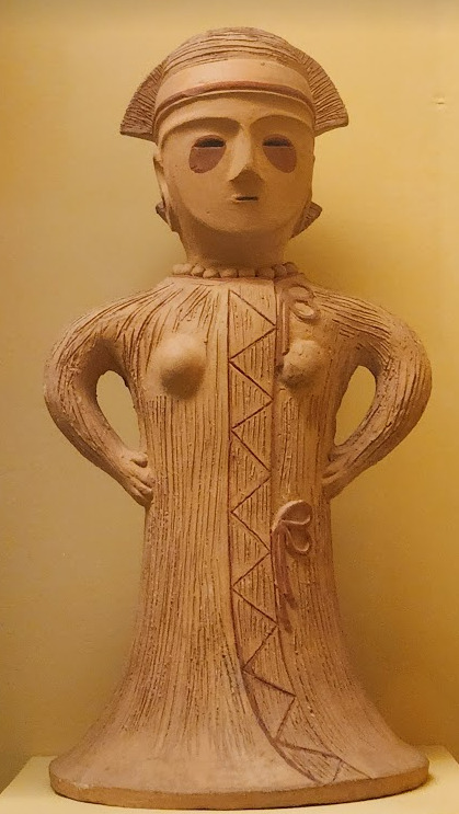
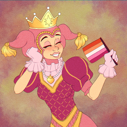
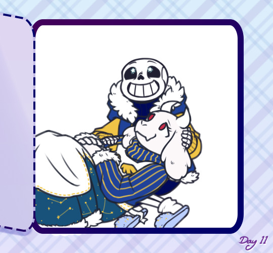
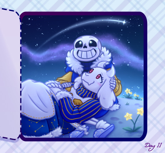
#also it's rare for me to be happy about lineless work
Text

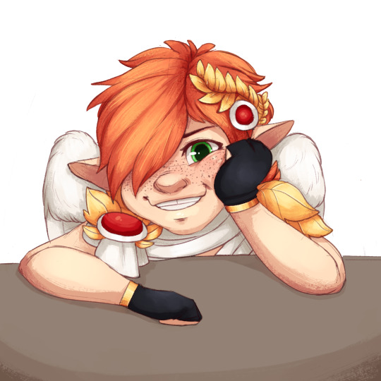
Snared
A wonderful commission piece for @bettsplendens ! Thanks a whole lot ✨
#hollow knight#hornet#the hollow knight#slimes art#this was an extremely fun piece#in part due to trying to imitate the general look of those tapestries about unicorn hunting#also it's rare for me to be happy about lineless work#but tried it here nonetheless... and it worked#so! thanks again for this chance ;v;
244 notes
·
View notes
Text

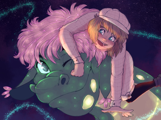
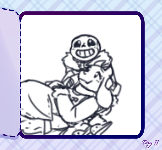
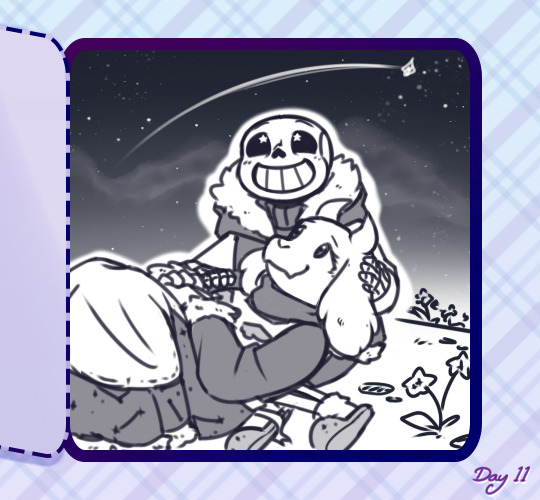
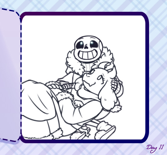
[Click for better quality]
Ok yay I'm back from my vacation yipeeeeeee. I started this drawing of Keiki before I left and I was half considering just giving up on it.... until I did a short study of facial planes and then got motivated to work on this again! I'm glad I didn't give up on it though, as I'm actually really happy with this one!
Artist's Notes;
So as I mentioned in my last post about Touhou 17, I wanted to finish this by the game's five year anniversary but with how progress was going I didn't want to rush this so I decided to take a long break from it. Mainly because of the face. For a while now I was kind of feeling like I was stagnating with my drawings, not really in the clothing but in the bodies. There was something about the way I was rendering them that I just wasn't happy with, and after talking with someone else about this issue, I realized that the reason I felt this way was because the faces were too flat and didn't match the rest of the drawing and that I needed to find a way to make the rendering of the face feel consistent with everything else. So after doing a short study of the plains of the face (I used this 3D head model from art station as a reference for my short study, please go give this person some love as they are a lifesaver) I went back into this drawing and applied what I learned here. It was only after that that I finally became motivated to finish the piece, and while it started off as just a simple character sketch like Saki and Yachie's were, the moment I added in Keiki's little fire dragon I knew I had gotten in too deep and now here we are with a full on background. OK it's not super crazy or anything, but it gets the job done and it's better than there just being an empty void behind her. It's rare moments like this when I use brushes other than the Clip Studio Default Charcoal Brush and use the Clip Studio Default Paint Brushes as well (god bless the oil paint and dry gouache clip studio brushes, they were amazing). I don't know why but painting fire has always been really fun for me, there's something oddly satisfying about it y'know? I do think that another reason for this problem was because I was drawing faces like I would in my more sketchy style that didn't mesh well with my lineless style, so I'm glad I've started remedying that.
After adding in the fire dragon I had an idea to kinda make it feel like splash art in the way the composition works... probably because I have been playing Reverse 1999 again and it has taken over my brain. I do feel like Keiki's tools get a little lost in the composition, and I didn't fully render the metal parts of them mainly because I didn't feel like they needed it, but that's just something for me to improve on later down the line.
If you guys are wondering where I went for my vacation, I went to New York and got to go to the MET and the Museum of Natural History. In both places I found Kofun period stuff and I was so happy to see it you have no idea. I remember one of the Haniwa I saw had some neat face paint under the eyes that I tried to replicate with the makeup under Keiki's eyes in my drawing, though I think I'll gave to figure out how to draw makeup on characters because this reads more like blush to me than anything. While drawing this I also looked up some references of Kofun period jewelry and really liked the stuff I found, which also meant that now she has proper Kofun earrings instead of earrings shaped like Kofun tombs. I put some of the things I referenced with a closeup of Keiki's face as well down below. I made her outfit more reminiscent of the outfit I gave her at the beginning of the year with the buttons and all, though I do want to try and draw her in some more period accurate clothing like the Haniwa I took a picture of at the Museum of Natural History. I wish I could find a way to make her handercheif look better though as I wish I made it a little bit bigger, though I think I'm saying this because I've looked at this drawing for too long lmao. Once again something to work on for when I next draw her. Also want to get better at rendering hair, as some details (like the little strands in front of her ears) kinda got unreadable due to the similarities in colour lol.


Now you may have also noticed the little cracks I added onto Keiki's face, and that's because I have fallen in love with the idea of Keiki's body being made from ceramic and that she crafted her body herself. While they aren't very visible I also tried to add some doll joints to her body, which is an idea I played around with in the past but never went to far with. I also want to get better at rendering cracks in ceramic, porcelain, etc, as I'm not sure how those read in the drawing. I also have a headcanon where the cracks in Keiki's face show up because of heightened emotions, and while Keiki is aware of this and does her best to make sure her face doesn't break off.... she will still end up with at least a few cracks during any given day, and she can often forget to repair her own body quite frequently so Mayumi has to remind her quite a lot. Mayumi even taught herself some basic sculpting techniques to help repair parts of her body that are so badly damaged to the point where Keiki can't repair them herself, i.e. if both her arms broke off, Mayumi would put them back together for her so Keiki can at least have something to repair herself with rather than nothing. I also like to imagine that if Keiki created her own body, if you took a look at Keiki from the beginning of her life she would look completely different compared to now.
BTW If you guys are wondering what a very very angry Keiki looks like....ok in order for this to make sense have any of you read volume 11 of Land of The Lustrous? Am I bringing back some memories for those of you that have? Ok good, glad we all got that mental image brewing in our minds, I'll probably draw a version of Keiki that is somewhat inspired by that one day as it's an idea I've had for a little while now. And to those who haven't gotten to that volume yet and are confused.... don't worry about it, just keep reading :)
#touhou project#art#fanart#touhou fanart#touhou 17#keiki haniyasushin#wily beast and weakest creature#touhou#東方project#own art
175 notes
·
View notes
Note
I'd like to know if you could share some of your favorite art that you drew? since you have fantastic drawings 😊
you're very sweet, thank you! favorite pieces Of All Time would be too hard to pick i think so i'll share some of my (somewhat recent) favorite pieces ive done.
(DISCLAIMER: apparently there's quite a few i wanted to share so. sorry about the fact that there's 14 down below. lol)

^one of my first attempts with my new toned sketch style. and the first thing i drew this year! getting expressions/posing just the way i imagined is always a rare treat for me LOL so im also really happy with that still

^probably my favorite ive done with one of my Other new styles (semi-lineless painting) (along with the first i did with my favorite oc lol) kind of funny to have this as one of my favorites. like of course one of these answers would be pinocchio. but i really like this style because i try not to use any effects like glow or multiply. all the shading, highlights, and stuff like that here is just regular paint
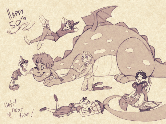
^more disney... sigh. well these ones are sentimental because i love these guys and drew the first one on my bday which was also when this parade debuted at disneyland again. ive been called insane to have done that one entirely in one day but honestly that just makes me happy because i think ive really developed a good process for sketches like this to make them look nice AND to enjoy making them. the other was made after the last show of said parade and it was just fun to draw a bunch of characters interacting while trying to keep them in character

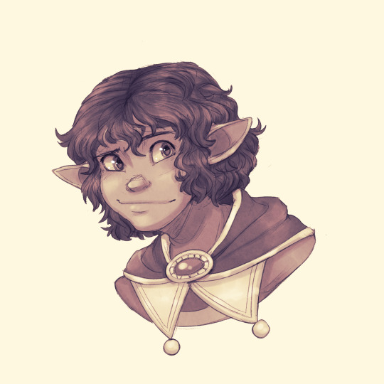
^too embarrassed to say what this is other than it's insane oc/canon art BUT i really love this new toned sketch style i do as i said above. and the left one came out nice i think! particularly fond of the wings and facial expressions! and the second one... well i really think it's just one of the best ive done of this character. his hair and proportions on his features just came out so well... ok im gay moving on

^dont even remember if this was this year or not but let's pretend it is. this one is self-explanatory i think. BIG lineup (for me anyway) and it's of the party from my first ever dnd campaign! very special

^these ones look simple but they both show things that became SO much more. the first one... it's a catalyst. the start of making what was originally just a COMPLETE joke character into one of my favorite ocs. a treasure. isnt he cute :3c and then the second one is my character i made for a custom ttrpg which ended up being one of the best EVER!!!!!!!! augh. a brilliant campaign made by my very talented friend that ive shared a bit of here
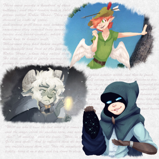

^idk this is just a cool prompt im proud of. "draw your ocs in fairytales/folktales" and i went mad (i love fairytales/folktales) and just did a bunch of them. in my painting style. can u guess which story is which (little hooded cloak man has the most niche one)
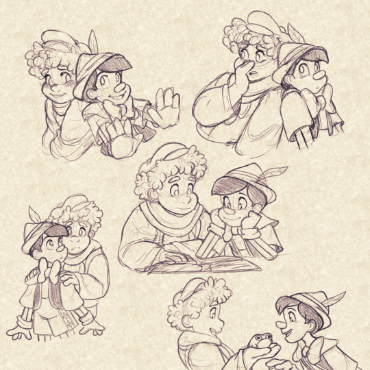
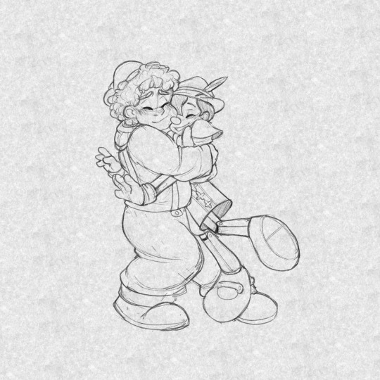
^pinocchio madness has done a few positive things for me. one, this oc my friend and i made for pinocchio is so precious, i really love their relationship and they bring me so much joy. but ive also developed my skills with expressiveness by studying and drawing disney's pinocchio. these are good examples of posing and expressions im really happy with (can u tell im really focused on expressions LOL). also pinocchio helped me get back to animation work??? wild
^i am pretty much always happy with how my "screenshot" styled pieces turn out, but this is the most recent one! glad to share this one too since it is literally fanart of the efteling which is that themepark im not normal about
OK IM STOPPING NOW. THANK U
2 notes
·
View notes
Note
Have you ever considered making a YouTube channel? I would love to see the process of making your art!
I do think it’d be nice to make speedpaints but I currently don’t have any kind of video recording or editing programs with which to make them, ahah… also I can’t imagine anyone wanting to watch a speedpaint without some music on said video, and there is the small issue of youtube and copyright and all the songs I like presumably being Very Copyrighted
so it’s not a possibility I’d write off forever, but I don’t know how I’d make it happen right now :’>
but if it’s my art process you’re interested in, I can at least go through that step-by-step with some screenshots!
step 1: draft! usually either a very tiny chibi or barely more than a stick figure, my art always starts like this so I can figure out the pose without spending like an hour on a full-sized sketch that doesn’t even work in the end

this then gets resized to whatever size I want the final picture to be:
drawing at that size usually means the anatomy is pretty wonky though, and the lines are too thick and blurry to be much help for the actual lineart. if a background is vital to the whole piece it’ll get drafted here too, but with space backgrounds like in this I can just fit it in around the characters. (that’s generally terrible art advice though, please do not do as I do :’D)
step 2: sketch! still very rough, but a lot easier to work with later. I do anatomy sketches as I go but there’s rarely any need to keep those layers
I don’t usually “colour” sketches like this but knowing I’d be sharing this I wanted to make it more readable, since this is still what I would consider an unpresentable mess not worth posting uvu;;
(also if I’m doodling, this part sorta gets skipped in favour of just letting the lines be a bit sketchier and rougher than usual)
step 3: lineart! literally the worst part always.
it’s worth it in the end, but… yeah this isn’t ever the point where I’m like “yes this is a Good Picture that I Will Be Happy With :)”
(I do lineart with SAI’s default pencil brush at a size of 3 to 5, opacity around 75%, if that’s of any interest)
step 4: flat colours! I have probably the slowest possible way of doing this, but after how tiring lineart is I find it pretty relaxing taking my time filling each colour in under the lines. every individual colour gets its own layer so they can all be shaded individually too
if I’ve drawn the same character in that same outfit before this is also where I’ll do the line colours, but those rely on being darker than the shading of each colour, so for a character or outfit I’ve not drawn before that can’t be done until after the shading. fortunately not the case here!
generally shading would be next, but there also comes a point where I have deal with the background now or I’ll be even more frustrated by it later, so - step ???: background! whether I do it lined or lineless pretty much just depends on if there’s any straight lines involved


…backgrounds are kinda too individual to explain in general, but for this specific one all the starry details are luminosity layers. stars are done with this brush but I do quite a bit of erasing and hand-drawing stars too, and I use SAI’s default brush set to spread for galaxies
step 5: shading! aka the best part, the point where I go “oh hey this looks decent actually. when did that happen”
my usual shading style is every colour gets 2 darker shades and 1 lighter shade, each shade getting its own clipping layer attached to each colour. this was more obvious when I used to cel shade but soft shading makes my art look so much better ahah
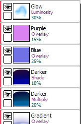
step 6: layer effects! multiply and luminosity layers have been my go-to for the past 4 years, but I can’t believe I only realised how good overlay layers are in the last year and a half. they’re so good
here’s the specific effects being used here:
aaand step 7: final touches! usually consists of any glowy outlines, text or things that need blurring in photoshop, a final luminosity layer at around 10 to 20% opacity for extra highlights (especially needed for dark scenes like this, those darker layer effects tend to make the regular highlights from the shading less vibrant), slap a watermark on there and call it done
and then you’re ready for step 8: spend an hour staring at every pixel for mistakes, before spending another hour fighting the anxiety about posting it
bonus: even though I can’t make a speedpaint I can throw all those screenshots into a poor quality gif for you to watch, at least!

one final thing I can mention: not including the draft and sketch layers or all the parts of the advent calendar windows, just the finished art itself - this is made up of 102 layers. and that’s with me merging a lot of layers because SAI has a layer limit and takes an eternity to save if there are too many. people who can draw a whole piece on a single layer confuse and frighten me
#anonymous#holoskart asks#holoskart rambles#honestly my art process is just a bunch of weird habits I wouldn't recommend imitating :'D but I hope this is interesting enough??#also sorry for taking a while to answer this! I probably could've used a piece I'd already finished to explain all this#but it seemed better to work on something with the intention of showing each part of it#long post //#wip
32 notes
·
View notes
Photo

Commissions are now open!
Below the cut you’ll find more information. Thanks for considering commissioning me, and I hope to work with you soon!
Types of Commissions:
Busts & Icons - $5
Each additional character is $2 apiece
Upgrade to lineless/simplified style for $1 more
Includes transparent + simple background upon request
Lineless/simplified Style - $8-10
$10 for full body
Each additional character is $3 apiece
This style is available for icons
Includes transparent + simple background upon request
Fullbody W/ Simple or Transparent Background - $20
For feral cats only, the cost drops down to $15Each additional character is $5 apiece
Includes transparent + simple background upon request
Reference and/or Design - $15-20
15 Dollars for only reference; $20 for custom design.
+$10 for additional nude body reference (Anthro/Humanoid)
Fullbody or Complex Scene with Background - $30
For feral cats only, the cost drops down to $25Each additional character is $5-10 apiece, depending on complexity.
Includes transparent + simple background upon request
Deals & Specials
For every custom design you buy, you will receive ONE free piece in either my simplified style or a icon, whatever is your preference.
For every full-body on a simple/transparent background, you will receive ONE free icon in my simplified style.
For every full-body/complex scene, you will receive TWO free icons in my simplified style.
Each custom design comes with an optional suggestion for a name and backstory of my own creation (to the best of my abilities, given their canon).
✅ Things I will Draw
Animals
Humans
Gore
Canon characters
OCs
Real people/Pets
❌Things I Won't Draw
Mecha
Anything concerning vomit/vomiting
Anything concerning suicide/self-harm
Payment Options
Steam E-Giftcards
Amazon E-Giftcards
Flight Rising Gems
Deviantart Points
Cash (Rarely)
Currently, my preferred method of payment is Amazon E-Giftcards. I am unable to take money via paypal currently, however I’m working on it!
Other Notes (Payment, Price Negotiation, Etc.)
Generally speaking, I expect to receive payment only after sending proof that I have at least finished the sketch and begun the lineart; I will not begin to color your piece until I have received payment on most occasions. This check-in is also to make sure that you're happy with my work so far -- I will check in several times throughout the process, however, this is the easiest time for me to make adjustments!
For the most part, I'm willing to talk about prices and discuss possible adjustments; the same goes for any questions you might have! You can shoot me a message on here, contact me on discord at Uncle One#5347, or shoot me a note on my deviantart, Gusteri.
Openings
Slot 1: Open
Slot 2: Open
Slot 3: Open
Slot 4: Open
Slot 5: Open
#commissions#commissions open#commission#custom adoptable#custom adopt#warriors commission#ninjago commission#borderlands commission#homestuck commission#fantroll commission#warrior cats#ninjago#borderlands#homestuck#fantrolls#fandom commissions#fandom#cats#cheap commissions#my commissions#my post#my art
23 notes
·
View notes
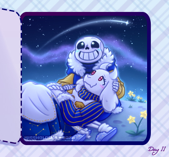
Photo
I will be with You
When you go, just know that I will remember you
If living was the hardest part, we'll then one day be together
And in the end we'll fall apart, just as the leaves change in color
And then I will be with you, I will be there one last time now
--My Chemical Romance, "It's Not a Fashion Statement, it's a Deathwish"
____
It's rare that I'm this proud of an artwork I've created. ^_^
Usually, there's some glaring issue or just an assortment of small things I'd still change if I had the patience and/or artistic ability to do it. Or even just some things that I feel like could've been done better, even if I know it did the best I could.
This time? No. Not right now, shortly after it's been completed, anyway. I'm sure years down the line from now I'll look back and feel at least slightly different. But as it stands now, while I'm sure it has its faults, I am truly happy and truly proud of what I've created here and whatever faults are there aren't bothering me at all.
So what then is this, exactly?
This my dear Sparklers is a visual love letter to the band I discovered just a little too late but was still there for me when no one else was all the same.
Earlier this month, I uploaded a different piece of art to celebrate the announcement of My Chemical Romance's Return, but even when I uploaded that one I was already thinking of doing another one, this time something that was more obviously fan art. But not just fan art as I've done for them in the past (Exhibit A, Exhibit B, and Exhibit C), but something extra-special and fun. I really did go into creating this wanting it to be as I described it above; a visual love letter to this band that I love so much and could not be happier that they're back.
As such, I've squeezed in as many references as I could:
1. The female figure is molded after Helena from the album Three Cheers for Sweet Revenge
2. The male/skeleton figure is supposed to be Pepe (that's what Google said his name was, anyway), the icon and seemingly marching band conductor from The Black Parade album
3. On Pepe's hat, I replaced the usual symbol with the Candle symbol that's been featured in the band's Return artwork
4. They fade into leaves based on the line from It's Not a Fashion Statement, It's a Deathwish (a song from Three Cheers) that I quoted at the top of the description
5. behind them is Party Poison's mask, as featured in the Danger Days music videos
6. on the mask, I replaced one of the black triangle shapes with the hanging man silhouette from I Brought You My Bullets, You Brought Me Your Love
7. The rest of the background is inspired by the covers for the Conventional Weapons releases (which in my mind I count as essentially an unofficial fifth album)
(Debatable) 8. Their touching hands could be an indirect reference to the line "And as we're touching hands, and as we're falling down" from Demolition Lovers, a song from Bullets.
That's at least one reference each (Three Cheers technically got two) for each of the main releases, plus one directly related to this new era we don't know much about yet. It's not an exhaustive "spot the reference" game, but I'm glad I was able to incorporate as many as I did.
Now that I've explained them, maybe I can talk about my process without having to stop to re-explain each reference as they come up.
After some brainstorming, I got this image in my head of Helena and Pepe in this pose (inspired at least partially by this pre-existing fanart I've seen many times before) , which to me is a "renaissance dancing" pose but I'm sure there's some other better way to describe it I haven't thought of. I tried for a very long time to find a reference image of this exact pose to help me get the proportions and general anatomy right within my own stylization, but for the life of me, I couldn't find anything close enough to suit me and I really didn't want to have to settle for something else. As such, I'm sure the proportions and anatomy are off, but even so, I think I did pretty good considering.
The main issues I ran into during sketching were mainly balancing the energy between the two characters--which I do think I managed in the end--Helena's skirt, as she's supposed to be holding onto it with that hand you can't see, and Pepe's torso. Originally, I was planning on doing this piece traditionally, but once the sketch was finished it almost immediately clicked into place that I'd be better served to do it digitally, considering what I wanted to do with the mask in the background already, as well as the leaf-fade. (The Conventional Weapons reference hadn't been planned yet, and it was technically only made possible later on by this piece being digital.)
Luckily, doing things digitally meant that Pepe's torso was fixed pretty easily. It was too thin in the sketch, but all I had to do was select the right lines and move them out a bit in Photoshop. He's still a bit thin and not super buff, but personally I'm letting that go because...I mean, he's at least part if not all skeleton. If anyone's going to be too thin, wouldn't it make sense that it's him?
Helena's skirt I did end up happy within the sketch but...we'll come back to the skirt in a moment.
Pepe's...face? looked a bit odd in the sketch, but other than that, once I was happy with that foundation, I scanned it in and got to work on digitizing everything.
I went over my lines for Helena and Pepe the way I normally would for something like this if a little intentionally messy instead of trying to get them super clean--as I thought that might be appropriate here--and then I paused with them to work on the mask behind them.
The mask admittedly came out very poorly in the sketch, just because I bothered to look up no references for it whatsoever once I decided I was going to make this digital and I knew I could just draw half of it and flip it over. And I'm glad I didn't start trying to follow my sketch lines for it at all because looking up actual references showed me that would've been way off.
While I had my reference up, I ended up going in and basically full-coloring and detailing the mask right then. That's the beauty of digital work; a lot of steps can be done basically out of order from how you'd have to do them traditionally and it doesn't matter because you can just move layers around and adjust effects later.
I went with this pseudo-soft shading based on the colors and shadows I was seeing in my references, even though I wasn't sure yet exactly how I was going to shade Helena and Pepe. I figured that even if I used a different method for them that I could either go back and adjust the mask as necessary or that it wouldn't matter since the mask was part of the background anyway.
Once that was done, I went back to ponder my two figures and the leaf effect that I wanted to do with them.
And again, I went a little out of order here, as I ended up filling in the silhouette of Helena and Pepe with a blanket layer of gray so I could see how them blocking the mask was going to look (and I figured based on past experiences I might need the blanket layer in white later). From there, I went into working on the fading-to-leaves effect. My logic was that I'd need mostly the silhouettes of the leaves and then I'd get what I wanted after playing with layer effects or something. This assumption ended up being correct, but we're not there yet.
As I worked, I kept looking at my "finished" messy lines. Something just didn't feel right.
Honestly, I couldn't tell you where the idea to do this lineless look came from, but it got in my head as I was working and I kept looking at the lines I had and not being happy to just color those in as I normally would, shade it, and call it a day.
I tried. I tried really hard to ignore the urge to at least try it and carry on as I was. I'd already come this far, and I'd be done so much faster if I stuck to the plan...But!!
Clearly I lost that argument with myself.
You know what though? I'm glad I did!
I don't think I've ever done lineless art like this before, not counting my watercolor work where that's just part of the process to me. But digital? Certainly not. Human figures? Also no.
I've come close in the sense that I've shaded my art before, turned off the line layers before, and thought, "oh hey that almost works without the lines because of the shading," but not much farther than that.
Naturally, I wasn't even sure how or where to begin, so I went with what came naturally to me. I started by just filling in the lines as I normally would have, and then I went back layer by layer and went back and forth between having the line layer (with the opacity brought down somewhat already so I could sort of see what I was doing) on and off to try and balance the shapes between what they looked like with and without the lines. It's weird because if you ever try this, it's a little like having to figure out a bunch of individual silhouettes that make one whole one, except you need them to be a little more defined if you want them to make visual sense.
That step and the next one, the shading, are tied in my mind for which one took me the longest.
For the shading, I really just went in blind, using hard-edge cell shading, though originally I planning to come back with some soft shading in certain areas later. The soft shading ended up not happening partly because I liked it much better than I thought I would without it, and I thought the hard-edge shading made the figures pop a little more compared to the background. The thing about this was the same issue I run into with my lines nowadays; to get smooth shapes I spend a while going back and forth between putting color down and erasing it, and sometimes undoing and redoing the same line a dozen times to get it right in one stroke. But that's really my own fault for being stubborn and trying to work solely within Photoshop and not use other programs, as I know good and well I'd have less of that issue if I'd hop into Paint Tool Sai and use the linework layers in there.
What can I say? I live up to my Capricorn sign by being as stubborn as a goat.
Anyway. The biggest challenge to figure out the shading for was Helena's skirt. I think I would've still had issues with that though even if I colored and shaded my normal way, with the lines and everything. It's just the position it's in that complicates things.
I actually did a good amount of shading in reverse here, where I'd make the base layer the shadow color and then the layer on top would be the regular color, as in some cases it just seemed easier to do that than the other way around. The part of Helena's dress around the top, for example. Or Pepe's pants (what little you can see of them).
Additionally, I ended up leaving the feather attached to Pepe's hat alone and not really smoothing it out, as I thought the roughness and inconsistencies worked really well to make it seem more feathery.
With enough patience and persistence and much back and forth among the various layers, I made it through all of that. I was a little concerned at first about some of my color choices and if the shading was too harsh in some places or not, but I mellowed out as I worked and ended up not making make adjustments after the fact. For instance, originally I thought I'd go back and make Pepe's...skin? closer to a true white and this fleshy off-white color was more of a placeholder, but the longer I worked with it, the more I didn't want to change it. It actually makes sense, given that his hands are normal (as they are presented in official artwork and other fan art not made by me) and that bones usually are naturally more of an off-white color. And I also think it just looks really good next to Helena's pale skin.
The hands were a special challenge in regards to both shading and coloring, as hands like to be the more complicated part of a drawing more often than not, but even that I managed to get through with a lot more ease than I would've bet on.
The other thing about that is that I was surprised once I got through the steps at how much better Pepe's face looked in comparison to the rest of the drawing. As I mentioned before, it looked odd in the sketch. But one I had most of the colors for him and Helena filled in digitally, the contrast or something just made it look infinitely better. (Combined with a hefty dose of earlier back-and-forth making adjustments to his jawbone area.)
Originally, I thought I might use the same cell shading for Helena's eyeshadow. However, while I was still thinking of adding some selective soft shading, I added it using one of the brushes I'd used on the mask earlier. It looked so good to me that even after I tried added the soft shading with it like I planned and decided I didn't want/need it anywhere else, I kept it.
And for the record, Helena's hair is kind of the wrong texture (it's officially more straight than this) and she's missing this little netted veil thing she's supposed to have, but I had a very specific vision in mind, so those were the two creative liberties I took with her design. I say it's fair game since I took a liberty with Pepe's hat to get the Return reference in. And besides, those two details being off doesn't make her totally unrecognizable if you know who Helena is in the first place.
Once they were done, I spent longer than I bothered to document playing with the leaf layer I'd made earlier to try and figure out how to get the effect I wanted.
Sparing you the boring details of my trial error, as I'm sure this description will be long enough without them, I eventually determined the best thing to do was to have one layer of the leaves on top set as an "overlay" layer, and another behind/beneath Helena and Pepe. Then I went back and extended my color and shading layers to extend down over the leaves, and I arranged and clipped the layers accordingly. Technically, the overlay layer wasn't necessary, but it added a little extra dimension that I really liked.
By that point, it was my second day of working digitally and getting late, but I had to do one more thing before I could go to bed with my mind at ease that night.
With Helena and Pepe done, I turned the mask back on (I'd turned it off so I could focus on them without it distracting me or otherwise getting in the way) and I felt like they weren't standing out enough against it. The bright yellow color was competing too much for my eyes' attention.
So, after trying the "stroke" blending option in white and that looking God-awful, I added a new layer between them and the mask and manually gave them a white outline.
It wasn't a perfect solution, and I knew that even then, but it was enough that I could sleep soundly knowing how far I'd gotten with the artwork.
The next day I had to take a break from working on this to bust out a painting for the challenge I decided to take on this month, but I went back to this as soon as I could after that was taken care of.
When I came back to it, I acknowledged that I technically could've left it as it was and call it finished. But I still didn't like how obnoxious the mask seemed for a background piece and it felt...I don't know. Almost hollow, in a way. It was a cool graphic, sure, but I wanting something more than that.
Again, I'll spare you most of the nitty-gritty details. But long story short, I played around with layer effects and filters for a while until I had blurred the mask out just enough that it wasn't so obnoxious but also so looking at it directly didn't make me nauseous, and the edges were softened so it felt more like a true background piece and not just an accessory that had been plastered carelessly back there.
It was only after I started saving off versions with different backgrounds--one with no background, one with white, one with black--that I realized I was missing a golden (semi pun intended) opportunity to incorporate a Conventional Weapons reference/allusion. Which was exciting because I'd previously been disappointed that I couldn't think of a good way to do that.
I went back and forth on layer styles and adding texture with brushes and things for a while on that too, but you can see what I ultimately settled on. It's not a 1:1 to the CW covers, but I'm really pleased with it anyway.
I did end up adding a bit more to the white outline in a few places and adding a drop shadow to Helena and Pepe so they'd pop a bit more (it almost makes them look like paper cutouts to me!), but really the only other thing I had to do after that was add my watermark.
It took roughly 3 days of work from start to finish, but I was honestly surprised by how fairly smooth the process went. Especially considering the new things I'd tried along the way. I can only assume it's because of just how much my heart was really into making this piece.
As I said before, I am truly proud of how this piece turned out. I love it. I love it, and I love the band that inspired its creation. Even the title says a lot here, I think. I picked this line that's repeated at the end of It's Not a Fashion Statement, It's a Deathwish, as it was a leading inspiration with the leaves and everything, and after looking at the lyrics I realized how fitting that line is for this.
I discovered My Chemical Romance two years too late, two years after they broke up in 2013, but I've stuck by them ever since, and I will continue to do so, with whatever the unwritten future holds. They've changed, as anyone would over the course of six years, but they came back anyway. Even if it's just for a few shows and they're gone again. Or if it's going to be so much more than that. They. Came. Back. And that's not an easy thing to do a lot of the time.
And so, I show my solidarity. I will be with you, MCR, no matter what comes next. You were there for me, and now it's my turn to be there for you, even if it as just another fan among the crowd.
And that's really all I have to say on the matter.
____
Artwork © me, MysticSparkleWings
____
Where to find me & my artwork:
My Website | Commission Info + Prices | Ko-Fi | dA Print Shop | RedBubble | Twitter | Tumblr | Instagram
#mcrmy#mychemicalromance#mcr#helena#the black parade#three cheers for sweet revenge#danger days#thetruelivesofthefabulouskilljoys#killjoys make some noise#conventional weapons#return
2 notes
·
View notes
Last Seen Blogs

connorbranding-blog
ConnorBranding.com

annabaplus23
ANNABA PLUS

kimani2
The Red, The Black and The Green
kimani2
The Red, The Black and The Green

neteyammeowmeow
➹Jay