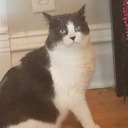
#also very curious to know what my artstyle traits are
Text

haaayyyy....
#losertalks#i don't actually know if there's a tumblr ver on this yet#if i did i would've reblogged it#but its all over twitter so#rubs hands 2gether#also very curious to know what my artstyle traits are#bc it's hard to see them as the artist#evil art style challenge
133 notes
·
View notes
Note
how do you go about creating characters and designs and a story for them?? im an aspiring character designer / storyteller and i looove your designs so im curious!!
when it comes to stories, i always try to imagine something that turns common tropes/things on their head ! like for ultimate excalibur, as its focused heavily on naval stuff, sailing and pirates, instead of regular ships on the sea, its all in space ! and for reassassination, the main character is a teenager, but her dramas are all mostly focused on assassinating people while juggling exams and rumors, so i guess it's kinda like a juxtaposition? for my stories i always get a lot of inspiration from other media (ult. ex is inspired greatly by the premise of one piece and other media and reassassination is very loosely inspired by panty and stocking), so it's good to broaden ur horizons when looking for new things to watch/play/read - you could find a new story idea from that!
for designs, i focus on three things: character personality, profession, and cool/cuteness factor. for example, musa marine - she has a bright and energetic personality, so her colors are bright and sunny (yellows and blues), she's a pirate, so her clothes are rugged, and she's more cool than cute to me, so 'cool' pieces of clothing are added like her big hat. other 'cool' character traits include V-CON's shades and clyde's scarf, but cuter characters like mina have other design traits like a starfish hairpin (who is also mina's manager!) i like to call these specific design traits 'the key point' - to me, theyre what make the designs unique! i use a mental 'cute - mix - cool' scale for that, but you don't need to if you don't want to! its just a weird thing i like to do ^_- but stuff like that is just the beginning!! when designing characters you have to take into account how they'll look next to everyone else in the cast - even if they have a similar color pallete to another character, they have to look unique while still being obvious as someone from your story's universe ! like, if i gave savory animal ears and plunked him into ult. ex, he'd look out of place because his sharp design and darker color scheme clashes with everyone else. speaking of sharpness, shapes are really important too! for my own designs, i like to take one or two shapes and apply those to as many aspects of the design as i can - like in my deep cut designs, i tried to focus on sharp, triangular shapes! shape language can help accentuate personality especially if you have a more cartoony/anime artstyle ! :D there are lots of people who are better than me at explaining character design/story stuff so i'd suggest you look at other guides or watch videos on how to write + design! also, this is just a me thing, but if i see a design or a story that i really like that inspires me to draw/write something, for the first few weeks/months of the development, i like to wear that inspiration on its sleeve if that makes sense? like it'll look *very* heavily inspired as it starts out - this is because i know that as the story develops, the characters/story will be redesigned to look unique ! like, when i first started writing starsaints carnival in 2021-ish, all the characters looked like rip-offs of characters from worlds end club lol ,, but as i redesigned the characters (3 times!!), they now all have (imo) unique designs while still looking inspired by wec!!
that's pretty much it about character design and story, sorry this is so long ;w; ,,, i just like talking about characters and stories,,, hope this helps !!
#long post#sorry for using my own ocs as examples here 😭😭#but i didnt know what else to do#maybe ill go more in depth on chara design in another post#but thats all for now !!
24 notes
·
View notes
Note
I'm curious to hear your thoughts on the announcements from Maxis Monthly? Did the Game Changers know about or have any say in the rebrand?
Ok so I’m gonna answer your last question first lol
The title “Game Changer” is definitely a little confusing because it implies that we actually change the game in some way, but we don’t. Well, most of us don’t. I think some of the bigger Game Changers have a little sway because they know the team personally and have been to the Sims Headquarters and stuff, but for the most part all we do is get early access so that we can provide our individual communities with a glimpse of the pack that goes a little more in depth than just trailers, that way people can see what’s included and decide if they want to buy it, and hopefully bring more people to the franchise in the process. And we definitely didn’t have anything to do with the rebrand, we heard about it at the same time everyone else did.
As for your first question, I’m gonna put it under a cut for a couple reasons: [a] Listen, I have opinions lol and [b] for anyone that is like me and is sensitive to colour contrast, I don’t want anyone getting a nasty headache or sore eyes if they don’t have to. Let’s do this!
So first off, LOVE that they’re adding over 1000+ decorative world objects! There have been so many things over the years in different packs that I’m sure we’ve all seen and been like “Why didn’t you let us use that!?”, and now we’ll be able to! Sucks that some creators spent so much time liberating those things for us only to now have their work be obsolete though 😕
I also think the Create-A-Sim Story Mode looks interesting. I don’t like the idea that you can’t change the sims aspiration and traits though; they’re locked in once you’ve finished answering the questions. I’m not sure how much use I’ll get out of it, as I tend to either pick specific traits based on my sim’s backstory or randomise them, but it’s nice to know the option is there and answering the questions might be fun to see what kind of sim you get!
Now, onto the rebrand.
I just don’t understand it!
Listen, I’ll be the first to admit, I don’t like change; I don’t do well with big changes at all. But this isn’t about that, this is about trying to understand why EA felt the need to rebrand The Sims 4 (which I can’t work out) and why they chose those colours, and I just… don’t understand.
I mean I understand, they’re trying to attract a younger audience with bright shiny things. But I don’t UNDERSTAND, you know? I don’t understand what prompted them to do it now, after almost five years?! Why did they feel the need to change something that didn’t need to be fixed at all? And why they went with this particular colour scheme! It’s so unnecessarily bright! As a graphic designer I’m genuinely horrified by the colours they chose and as a consumer of their product, I’m a little annoyed that they spent time and money on this when there are other things that are more important (like things that are actually broken) that keep getting the “We don’t have the resources” excuse or just flat out ignored.
Here’s the difference between the original box arts and the rebranded ones:
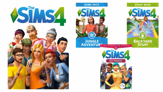

That blue is GOD AWFUL! It’s like Tumblr’s new blue background; I literally have a headache from looking at it! It doesn’t fit with the style of the rest of the game at all. And they claimed in the stream that the new box art designs really make the render sims “pop”… they really don’t. The backgrounds of the DLC packs are way too busy. I just I don’t understand why they couldn’t just stick with the nice clean, minimalist look they had before; it was truly a timeless design. A design that actually made the render sims pop and didn’t detract from them at all with busy backgrounds and headache-inducing colours!
Oh and can we just talk about the new base game box art render for a second? I love it, I really do. It looks cool and I’m excited to get to learn more about these new sims that are being added and according to the Gurus in the stream, all of the stuff on those sims is being added to base game (the stuff that’s not already base game that is). I’m excited about that pink hair BUT take a good look at all the other stuff… look familiar? That’s because most of us have already paid for that stuff. The jacket on the pink haired sim is from Get Famous, the beanie on the sim next to her is from Get to Work, the hair under the beanie is from Dine Out, the bracelet on the sim with the camera is from Seasons, the chef uniform in the middle is from Get to Work, the jacked on the sim up the back with the phone is from Get Together, and the sleeveless hoodie on the sim to the left of that is from Fitness Stuff. They’re all recolours of stuff from other packs. I’m all for free content, because hey it’s free, but I really wish they wouldn’t make things from other packs base game; people paid for that stuff.
Side note: I feel sorry for the people who collect the psychical copies of the games, because unless they can afford to buy new copies of all the packs, any new packs aren’t going to match their old ones now. And also the people who got tattoos of the old plumbob 😕
Which brings me to the plumbob, and yet another before and after:
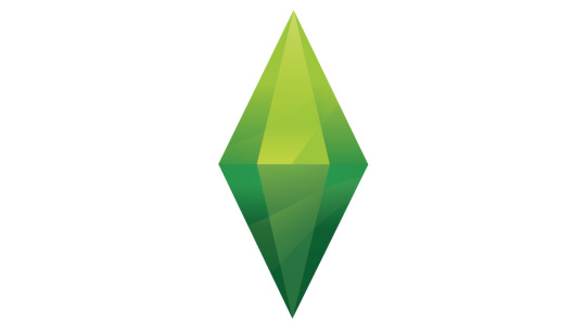

The new plumbob is whatever; I don’t hate it, I just prefer the original. It matched the one in game and suited the artstyle of the whole game really well, whereas the new one looks too much like The Sims 3 and doesn’t suit The Sims 4 at all. It’s also not going to match the plumbob in-game anymore as for some reason they decided not to change that one? I mean it wouldn’t matter to me if it did because I always have my default file edited to get rid of it, but it just makes no sense to leave the original in there if you’re changing everything else.
New box art, plumbob and stuff aside, the thing that probably annoys me the most about this rebrand is that the pack icons and colours are changing. I get that they probably ran out of colours to choose from for each pack, but the fact that it’s so hard to tell the difference between the colours for the game and stuff packs is gonna be a problem for anyone who has difficulty distinguishing between different colour tones. Mr Sandwich, for example, couldn’t tell that there was a difference between the two, even after I pointed it out to him. Why didn’t they make one of them yellow?!
I personally used to find things from expansions in the catalogue by looking for the colour of each pack icon. “I know the thing I’m looking for is from Get Famous, so I’ll just keep scrolling until I see a pink icon”… well, not anymore:
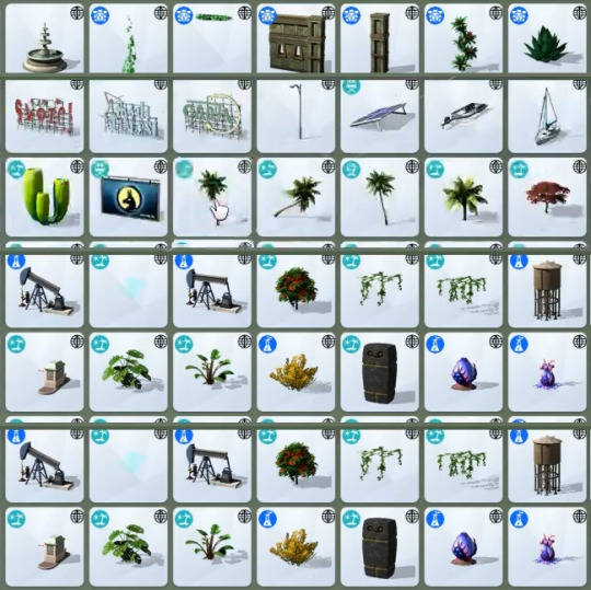
All expansion packs are now teal, all game packs are now blue (a different blue than the box art blue I might add 😩), and all stuff packs are green; the only difference is the icon on them. And yes, I’m aware you can filter things by pack, that’s what I used to do for stuff and game packs because they were always the same colour, but if I’m just scrolling through say the curtains category, it’s a lot quicker to just scroll once or twice looking for an icon colour than it is to go into the little menu, click on “packs”, scroll down to the pack I want and choose it.
The new pack icons and colours also look awful on the main menu. Here’s a little before and after again:
Urgh that blue! There as nothing wrong with the original menu but now we’re gonna have the god awful blue again… not the point, sorry. Look at those icons! They’re too… saturated? busy? both? I dunno what but they look awful, especially on the blue background! At the very least they should have just made them one solid colour instead of trying to carry over the crystallized look.
And lastly the loading screen….
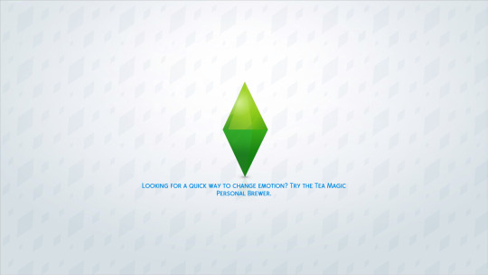
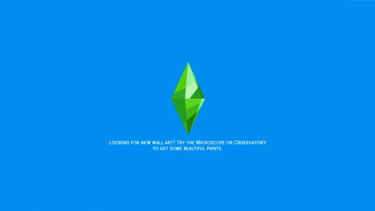
Again with the gross colour combinations and the background is just plain boring. The old one is much nicer and easier on the eyes.
Maybe it’s because I’m old and not the target audience for this new look but honestly I JUST DON’T GET IT! I understand that EA are trying to attract more people to the game, obviously younger people, but I really don’t think alienating and confusing the people who currently play your game in favour of luring in new people is this is the way to go about it.
Thankfully I’ve already seen a couple of the amazingly talented modders in the community say they’ll do everything they can to either give us back the original menus and loading screens or make a less obnoxious version as soon as they can, so I’m just gonna keep my fingers crossed that it won’t be too difficult for them to do and look forward to downloading those mods so I can play without getting a headache every time I have to look at the main menu and loading screen 😅
NOTE: Before anyone starts shouting at me for “being negative about a free update” just note that anon asked for my thoughts on it; these are my thoughts. If you like the new look that’s great, I’m really happy for you! But anon wanted my honest opinion and I’ve given it. Will this rebrand stop me playing the game? Of course not! The game is still the same no matter what the box art and menus look like, but that doesn’t mean I have to like them and it doesn’t mean I can’t express my disappointment about it all, especially if a follower asks for my opinion about it.
602 notes
·
View notes
Text
Keep or Drop: A New Series!
Hello friends and welcome to a new series I’m starting called “Keep or Drop”, AKA KoD! The main premise of this post is that I watch the first episode of an anime, and then give my impressions on them, deciding whether to KEEP watching the show or to DROP it for the future. Since I have so much free time, I’m giving a lot of shows a try, and so I thought “why not give a little impression on how I liked them and whether I would keep watching them or not?” I’m not sure if this is gonna be a weekly thing or not, but for now I’m gonna do a test run on a few of these KoDs and see whether they’re interesting enough for me to make into a weekly thing. So let’s get started with a list of the shows I gave a first episode to (with a link to their MAL entry), and then go into more detail about them...
The Shows
Hentai Ouji to Warawanai Neko. (The Hentai Prince and the Stony Cat) (HenNeko)
Ore no Kanojo to Osananajimi ga Shuraba Sugiru (Oreshura)
Gakkou Gurashi! (School Live!) <- didn’t link the MAL page for good reason said below
The Verdicts
HenNeko: If I have to be honest, the main reason I watched this show was for one specific character. That character, with the longest name I’ve seen in anime, is Tsukiko Tsutsukakushi. Uhh... I’m not a lolicon. But I was interested in seeing why she was such a popular character. Well, popular in the sense of being in Best Girl contests. So I watched an episode of the show to get a sense of her character, and I can see why she’s popular.
The plot of the show (as of one episode) is actually a lot more complicated than I thought it would be. Basically there’s a stony cat statue that banishes an unwanted trait and gives it to somebody who needs it. So MC (who’s a perv) and Tsukiko get rid of their unwanted traits (MC’s “facade” and Tsukiko’s emotions), only to realize life is worse without said “unwanted” traits. So as of the first episode, MC tries to get his facade back from some rich girl who happened to get it. Shenanigans ensue.
The first episode was... interesting. There were some pretty cringy moments post-wish when MC would go off on his pervy thoughts. I’m not good with cringe (the reason I’ll never be able to watch WataMote), so those were hard to get through. Though otherwise, it was an all right episode. Tsukiko is a pretty good character with her kuudere-ness, something I’m starting to realize I like more in anime grills. I will say it was a bit of a chore to get through the first episode, so I am a bit hesitant about continuing to watch the show. But I’ll give it a few more episodes to see the other characters, because one episode isn’t really a good indicator for what a show’s about for the most part. KEEP
Oreshura: I cheated a bit with this one because I already watched the second episode. So forgive me if I say some things that were revealed in the second episode, though I’ll try to refrain from doing so.
I was curious as to what the title translated to in English, but it didn’t have it on MAL. Welp, Google-san to the rescue, which translates the title as “My Girlfriend and Childhood Friend Fight Too Much“. Which... after watching the second episode makes a lot of sense. But honestly it’s such a lackluster title. Like, this tells me nothing about the show. This can literally describe 20 other anime.
Anyway, enough about the title. This show was something that peaked my interest because I heard things about how it’s similar to Oregairu, which is good enough for me to give a show a shot. The plot is basically a combination of Oregairu and Nisekoi with some hints of Chuunibyou. We have a guy who focuses on studying and nothing else forced to be the fake boyfriend of the most popular girl in school or else have his chuuni writings released to the world.
The first episode of the show outlines his character as well as his childhood friend, Chiwa (AKA Chihuahua, my third favorite nickname next to Mayonnaise-sama and Coconuts). It also introduces Masuzu (the popular girl) and gets them “together”. One thing I really liked about the show is the artstyle. If you haven’t seen it, go check it out via the MAL link. It’s nice with the washed out pastel shades, very pleasing to the eyeballs. The plot itself was a bit generic, but that honestly doesn’t matter when it’s done well, which it was to me. I enjoyed the interactions between MC and Chiwa, though Masuzu kinda rubbed me the wrong way. She seems interesting enough though and doesn’t bother me too much, kinda like another “too popular” character... huh, I can see the reason why this show is compared to Oregairu. They even have similar abbreviations (Oregairu vs. Oreshura). So overall pretty good first episode, I really enjoyed it. Well, that’s obvious given I watched a second episode of it (which in all honesty wasn’t quite as good as the first episode, but that’s for another day). KEEP
Gakkou Gurashi:
Zoinks! I mean... that honestly wasn’t that bad. Though it doesn’t help that I read the MAL summary before watching, because that spoils the twist. Thanks MAL.
Oi, seriously WTF, even Madoka wasn’t spoiled this hard. I feel a bit gyped, because through the whole episode I knew what was gonna happen. For those of you who actually want to watch this show, don’t read the MAL summary. There’s a reason why I didn’t link the MAL page this time.
MAL, you should fix that. Anyway, if you don’t know, this show is your standard moe schoolgirl show. Seriously, just look at this OP (which I actually love btw): https://www.youtube.com/watch?v=UNjHxhljAck
Boy, that’s pretty good. The first episode does a nice job of introducing the characters and the School Living Club, which lives in the school because of enriching their lives and totally not a different reason.
It wasn’t too bad plotwise, just Yuki and Mii-kun chasing Taroumaru the dog for the most part.
Exactly, nothing too out of the ordinary.
So I’ll be continuing to watch this for more fun ORDINARY antics with the School Living Club. Yup, ORDINARY school stuff. Nothing special about this one... and no need to read the first letter of each paragraph, since it has no meaning. KEEP
And that’s all for this inaugural post! Thanks for reading it: I might put up another one soon (maybe before the end of the year?), and see if it’s something I might do on a regular basis. Let me know if you enjoyed it! Until next time, I’ll see you in the next post!
0 notes
Last Seen Blogs

lentigginicomeproblemi
Someone somewhere.
j37h3r
JÖ¦-¦ññ¥
artificialidiot
artificial_idiot
hell-heart-blog
the lawnmower's a low G

kingfalh
Untitled