#and it looks So Good it gets the same vibrancy as colour pencils. lovely texture too
Text
I have always been a "leave me alone about painting" guy
It takes a lot of prep! And a steady hand! And it doesn't let me rest my hand on the paper to make my very-not-steady hand a bit more steady! And you can't erase your mistakes!
So imagine my horror upon realising that the medium that might be the best suited for my chronic pain might actually be a form of painting, bc using a brush doesn't take nearly as much out of me as pressing a pencil to a paper does
Now also imagine my shock upon also realising that i actually enjoy it
#this is about ink pencils#a medium i had Never worked with before today#but it was fun and surprisingly controllable#and while it is v serious about not being able to fix stuff after the fact#that also means i work in small areas at a time. meaning not the whole damn page is wet#meaning i can rest my hand#and it looks So Good it gets the same vibrancy as colour pencils. lovely texture too#downside is needing specific paper for it#anyway. new drawing. painting?? thingy going up later today#i am v excited about all of this#kata's chatter
8 notes
·
View notes
Note
So I know you do digital art, but The Hanged fireMan looks like a watercolor. Do you work with watercolors as well, or is it the program you use?
(please brag about your art process, basically)
Yeah! So I do all my (fan)art in everyone’s favourite innuendo of an art program, Procreate. (Specifically on a 2019 ipad pro with a 1st gen Apple Pencil, both of which I would tentatively recommend if you can get them 2nd hand for less than 200euro like I did)
I did a lot of painting as a teenager, and still paint often to this day. Though I mostly worked in acrylics, I have been known to use watercolours (like, when I was in college I bought a little 3euro paint set and would use the inside of cardboard cereal boxes as diy watercolour paper and paint wild little Irish landscapes… and Winter Soldier fan art, sometimes. 2017 was a different world)
So in summary - I ‘paint’ digitally using some very traditional techniques I picked up over the years, and I kinda prefer digital art now, which I will elaborate on below the cut as I detail how I created The Hanged fireMan…
I’ll start with my favourite digital art ‘cheat’ which is that I use So Many Layers. Like seriously, pretty much every new colour goes on its own layer because I am a control freak and love being able to tweak them all as needed. So for this relatively simplistic piece, I’ve still got something like 20 layers all together.
I’m also usually better at grouping layers but in this one I gave up at some point and it felt dishonest to group them nicely before showing you guys lol

So yeah layers is my biggest hack, but the other is using specific texture brushes
I spent a while playing around with various brushes before finding this Tarraleah one which has just the most delicious watercolour-y texture and a really fun edge to it (and it’s got pressure sensitivity, so I can really control the amount of colour I want to put down on the page)
This background was painted entirely with the 1 brush & colour, and I think it turned out pretty cool. For this particular piece I did have a reference on screen to work off for the most part, but those clouded were just painted with my heart

Next (or maybe before, it’s a while sinceI drew this and sometimes I mix it up) is the lines, which are always done with my best friend, the Procreate Pencil!! I love her, she’s so fuzzy and textured and also if you tilt the tip on the pencil you get a broader line (like with a real pencil) which is just the coolest thing!
When it comes to lines I just sort of go for bigger shapes 1st and details later, and basically always with some kind of reference. I also use a very old & well known trick of putting the most detail into the object of most importance, and leaving the background more loose and vibey
Artists will tell you that this is to draw focus with details. Artists are lying. It’s cause we got lazy after drawing he fun part & phoned the rest of it in lol (I know this because I am an artist)
Also I love this pencil because I don’t have very steady hands and I actually cannot draw straight/smooth lines to save my life! If you’ve ever seen anything resembling a smooth line in something I’ve drawn, it is almost certainly a whole bunch of lines over each other and then erased at the edges to make it look neater
But who needs straight lines when sketchy sketch lines are so fun!

Next is flat colours (the 3layers in the middle with check marks beside them)
I used the same colours as the background, which you can tell from where they completely blend together right down the bottom, and what I genuinely do is use the Tarraleah brush to generally block out he shape, and then go back in with an eraser and smooth out the lines
Why do I do this? …good question

Next is one of my favourite parts, which is adding the lights! Procreate has some really fun -glowy- layer effects - my favourite is probably Add (A) though Colour Burn (CB) is great too for its vibrancy.
Also those 2 layer 11s are there because I duplicated one and then used the ‘Gaussian Blur’ feature to ‘fuzzify’ it (yes, that’s the technical term) It’s a pretty quick and easy way to add a more diffused light effect around something. (I did the same for the yellow reflective strips on the turnouts too!)

Last step now! So full disclosure - I absolutely traced that writing from a photo of a tarot card lol. I actually always trace writing, as, much like drawing straight lines, I’m bad at handwriting on a screen
I also stumbled upon the Exclusion (E) effect by accident - Originally it was going to be a plain cream boarder like a traditional tarot card had, but I wasn’t fully happy with it, so I just flipped through a few layer effects and as soon as I got to this one, I knew it was the right choice
I love the dreamy contrast of the pinks and purples to the dark navy and grey & how it makes everything looks kinda unreal and outer-spacey

And yeah that’s about it! Everything else comes from my 15+ years of Practical Art Knowledge but these are the specifics of how I utilise it digitally!
This was a lot of fun to write out, and I hope that if you’ve made it all the way here, it was fun to read too!
12 notes
·
View notes
Text
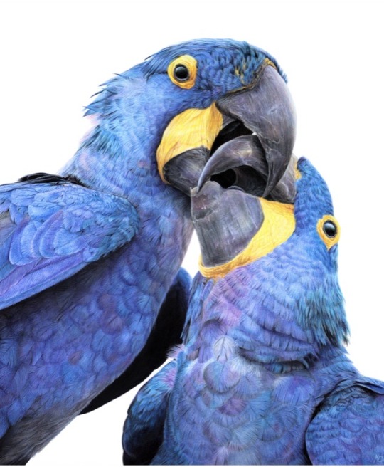
Congratulations to Monique Castellani-Kraan for winning Best in Show at the UKCPS Keswick Exhibition 2021.
Monique has kindly share some background information on her wonderful piece Kisses in Blue.
I drew my first hyacinth macaw back in 2015, and it was wonderful being able to revisit the same subject again with “Kisses in Blue”. Parrots are honestly such a delight to draw. Their colours are bright and happy, and they have so much character. I will also always jump at the chance to get out my blue coloured pencils!
I started work on this piece back in January. After a long spate of only making miniature pet commissions over the Christmas period, which was slowly sending me into a spiral of madness, I decided to overcompensate by starting my largest drawing to date, at 40 x 50cm (16 x 20 inches approx).
As someone with a background in digital painting, I like to do all of my sketches and compositions digitally nowadays to transfer to paper. That way my expensive watercolour paper stays free of eraser marks and errant sketch lines. It saves a lot of time in the long run, and if I mess up I can very easily just print out the sketch again to start over. I don't know what I'd do without my iPad!
This drawing proved to be a little intimidating because of the size I was working at. I ended up setting it aside for a few months. You know that famous "fear of the blank canvas" we've all experienced? This one hit me hard. I got a tiny section of the eye and surrounding feathers done and then proceeded to swiftly run away, back to the safety of drawing miniatures! A few months later, I finally decided to stop hiding and to give this piece a proper go. As I got into the rhythm of it I quickly felt myself being sucked into that "zone" of intense focus - where time just slips away until it's suddenly dark outside and you've skipped a meal!
Now that I had finally got my toes wet, I was gaining confidence. Art is a bit like exercise - it takes effort and routine to get into the swing of it - but once I do, I feel like I'm flying! With every new drawing I'm reminded of just how much I adore coloured pencils and how fun the process is.
Translating the reference photo’s feathers on the left macaw’s cheek was proving to be a bit of a challenge. I could only stare for so long at the complicated mess of shadows without going cross-eyed - so I decided to treat myself to tackling the beak first instead. If ever you find yourself in a rut with a painting, look for the deepest, darkest shadows in your reference, and block those in first. You will have a much easier time once they're there. Here, the darkest shadows were the inside of the macaws' mouths, so I put my much-loved Polychromos black to work, blending with paint thinner in between each layer and tinting it with Luminance Dark Indigo to get it nice and deep. Now that the darkest shadows were blocked in, I would have a much easier time in the areas surrounding it. That shadow became my reference point for judging the values for the beak, skin and feathers nearby.
I used Daler Rowney Low Odour Thinner to blend my pencils in between layers, with a flat taklon brush. I primarily used it in the first few layers of the underpainting. The yellow skin on the beak was a tricky customer with this - my blending brushes had to be impeccably clean, or else I would end up turning it green with the blues being so close by. In addition, I didn't want the very pale yellows getting contaminated by the oranges that are in the shadows. I made sure to carefully wipe my brush off thoroughly on some paper towel before blending in small areas at a time.
Beaks are so much fun to draw! They have a lot going on, from subtle colour shifts, to chips and cracks and ridges. The texture is a treat for the eyes! Here, I started by creating a gradient of soft earthy purples, greys and creams in the underpainting. At this stage I used mostly a mix of Luminance and Polychromos pencils. For underpaintings, I like to go darker than what the final result will be - though some would say I go a little TOO dark (coloured pencil is technically a light to dark workflow because they are mostly transparent).
After blending it with OMS, and making sure it's still a little damp, I go in with my pale tones from the Derwent Lightfast, Caran d'Ache Luminance and Holbein lines. These brands are soft and have more wax than oil in them, making them very creamy and more opaque than brands like Polychromos. Because the paper is still saturated with paint thinner, the pencil melts as it makes contact with the paper, making it go on super thick, even though I'm only pressing gently. This is my dirty little secret for how I work from dark to light in all of my coloured pencil pieces. The paper you're using, of course, is paramount for this technique too. If you're not using a good paper, you're going to run out of tooth extremely quickly using this technique. This piece was drawn on Saunders Waterford Hot Pressed 300gsm- and I wholeheartedly recommend it!
However, I just want to add that if you have an area or texture you want to keep REALLY light, for example a large white crack in the beak, you should draw that in first before doing anything else. That way, when you put your underpainting over it and blend with paint thinner, the white detail you added first will show through, clear as day! (This is great for whiskers on cats and dogs for example) You can also use a ceramic cutter to do this afterwards instead, though personally I have yet to use one myself.
After finishing the beaks, it was time to face the feathers on the birds’ bodies head-on. As always, I block in my darkest shadows first and then my underpainting, giving it a good blend out with plenty of OMS. This is so that I don't get lost in a sea of repeating shapes. Without doing this, I find it's very easy for your artwork to end up all the same value with not enough contrast between the highlights and shadows. I also rough in where I want each contour feather to be on the bird’s chest with a dark blue, though I only very gently line them in with my pencil so I can still move things around if needed while I build on the textures and detail.
Once the underpainting is done I am free to start pulling out those details. I went feather-by-feather, preferring to go in with my lighter coloured pencils first, gently pulling out each feather’s barbs. After that, staying mindful of how the lighting is hitting each feather, I used my mid tone and darker pencils to work in between each barb, gradually building up shadows. I also glazed in shadows over this with a very gentle hand to give the overall shape of the feather form and depth.
It can be tempting to rush through areas like this where there is lots of uniform texture, but it’s important to stay patient and take your time. Body feathers especially can become indecipherable after a certain point, because they all overlap and merge into each other. Sometimes even though the reference photo is sharp as a tack and super clear, there is just so much going on that it wouldn't 'read' well as an artwork. So I used my reference to help me with the general structure and composition, and to inform me on how the shapes and textures should look. But I didn’t stress about getting it exact.
Once you have good knowledge of a subject, after doing study sketches and looking at lots of different references, you can be a lot freer with how you approach your final artwork. A lot of the colours, textures and feather placement in ‘Kisses in Blue’ were not there in the reference. I opted to go for a much warmer, cheerful blue. The reference I was using was also fairly flat as it was taken on an overcast day, meaning the lighting was quite diffused. I made my artwork brighter than my reference material, pushing the overall contrast between the midtones and the deepest shadows. I also found myself intermingling soft lilac hues and subtle teal with my Polychromos and Luminance pencils, almost over-exaggerating the birds’ vibrancy. I tried not to stress too much about feathers either - while getting the shape and placement of feathers right on wings can be paramount to a realistic piece, the same does not apply for contour feathers and down feathers. As long as you stick to the right shapes and sizes, paying attention to the bird’s form, you don’t need to get it looking exactly like your reference.
I try my best to bring myself out of my comfort zone with each new drawing. This piece was my biggest challenge yet – quite literally. I’m glad I pushed myself to draw larger than I am used to and I can see why a lot of coloured pencil artists like working at this size – while it is more time-consuming, you have much more room to breathe and fit details in, that would normally get lost in a smaller piece. With my choice of composition and lighting, I wanted to convey a feeling of intimacy and closeness with the birds that I don’t think I would have been able to achieve were this drawing smaller.
1 note
·
View note
Last Seen Blogs

topgun-imagines
Ghost Of A Flower

chammitomasuke
Chammi & Masuke & sometimes QP

jr-68
Untitled

disasterarea-podcast
Disaster Area

sissy-4-bbcs
BBC Size Queen