#and multi colored web fluid
Explore tagged Tumblr posts
Visit Tumblr Blog
Explore Tumblr blogs with no restrictions, modern design and the best experience.
Last Seen Tumblr Blogs


Fun Fact
In February 2021, Tumblr had 518.6 million blog accounts.
Text

It’s a me but like man
#spidersona#into the spider verse#across the spiderverse#shitpost#he’s my little guy#does he actually have powers?#idk#he has disco flash bangs#and multi colored web fluid#for pride month it’s LGBTQ flavored#and he has smoke bombs that have specific sents#like popcorn smell at Main Street in Disney land#and he has one that is just worms#anyway spider man#for fun#shit post#silly haha
7 notes
·
View notes
Text
Typography Trends in 2025: What Designers Need to Know

Typography is no longer just about selecting a readable font—it’s a storytelling tool, a brand voice, and a key driver of user experience. In 2025, the world of typography is evolving fast, blending creativity, technology, and personality. If you're taking a graphic design course in Noida or anywhere else, staying on top of these trends is a must.
Whether you're a beginner or a design pro, this guide will help you understand the top typography trends of 2025—and how to use them in your own work.
🔠 Why Typography Matters More Than Ever
Typography isn't just about fonts—it's about function, emotion, and brand identity.
Visual hierarchy: Guides users through content with ease.
Personality: Fonts help tell a brand’s story before a word is read.
Accessibility: Good typography makes content more readable for everyone.
If you're enrolled in a graphic design course in Noida, you're likely learning that strong typography separates amateur design from professional work.
✨ 1. Expressive & Experimental Typefaces
Say goodbye to safe and predictable. Designers in 2025 are embracing wild, distorted, and hand-drawn fonts that create emotion and grab attention.
Where to use it: Posters, campaigns, branding for creative industries.
🔁 2. Variable Fonts Go Mainstream
One font file, unlimited style variations? That’s the magic of variable fonts, now fully supported in most browsers and design tools.
Benefits:
Faster web load times.
Greater control over weight, width, and slant.
Responsive and scalable typography for any screen.
🌗 3. Dark Mode Typography
With more apps and devices offering dark mode, designers are adjusting typography to work beautifully against darker backgrounds.
Tips:
Avoid pure white; use soft light colors for better legibility.
Increase line spacing.
Use open and clean fonts like Inter or IBM Plex.
🧠 4. AI-Generated Fonts
AI tools are helping designers create original typefaces faster than ever before.
Tools to explore:
Fontjoy (for font pairing)
Fontark (for building custom fonts)
Students taking a graphic design course in Noida are increasingly experimenting with AI in their type and branding projects.
📱 5. Responsive Typography for Multi-Device Design
From phones and tablets to smartwatches and foldables, typography must now adapt seamlessly across all devices.
Tricks:
Use fluid units like clamp() in CSS.
Ensure text maintains contrast and legibility at any size.
🖋 6. Retro Meets Futurism
Old-school vibes meet sleek modern aesthetics. Think vintage serif fonts combined with neon colors or digital glitch effects.
Popular fonts: Mazius Display, Be Vietnam Pro, or GT Super.
👁️ 7. Motion Typography
Text that moves = text that captivates. Designers are using animation to bring typography to life on websites and in videos.
Use cases:
Scroll-triggered animations.
Loading screen effects.
Micro-interactions in apps.
Learn this in advanced modules of a graphic design course in Noida focused on UI/UX or motion graphics.
🧩 8. Custom Fonts for Branding
With every brand fighting for attention, custom fonts have become a way to stand out.
Why it works:
Creates brand recognition.
Offers full creative control.
Hard to replicate by competitors.
💡 Quick Tips for Designers
Pair expressive fonts with simple ones for balance.
Always test your typography across devices.
Use contrast checkers for accessibility compliance.
Stay inspired by following platforms like Typewolf and Fonts In Use.
📍 Why Learn Typography in a Graphic Design Course in Noida?
Noida has become a growing hub for design education and creative tech in India. Enrolling in a graphic design course in Noida gives you access to:
Hands-on projects on modern typography.
Training in tools like Figma, Adobe Fonts, and After Effects.
Industry exposure through design internships and studio visits.
Knowledge of both traditional type and digital trends.
Whether you want to freelance, join a design agency, or start your own brand, mastering typography is a core skill—and Noida offers excellent resources to help you do just that.
✅ Wrap-Up: Stay Ahead with Smart Typography
Typography in 2025 is dynamic, expressive, and tech-savvy. By mastering these trends, you can create designs that are not only beautiful but also functional, memorable, and user-focused.So if you're exploring a graphic design course in Noida, make sure it includes strong modules on typography—because type is more than design. It’s a language of its own.
0 notes
Text
HP Series 5 FHD IPS Monitor: Elevate Your Everyday Viewing
The HP Series 5 FHD IPS Monitor is the perfect blend of style, performance, and functionality, designed to enhance productivity and entertainment alike. Whether you’re working, streaming, or gaming, this monitor delivers sharp visuals and vibrant colors in a sleek, modern package.
Key Features
1. Full HD Resolution
The monitor features a 1920 x 1080 Full HD resolution, delivering crisp and clear visuals. Whether you’re editing documents, streaming videos, or browsing the web, every detail is rendered with precision and clarity.
2. IPS Panel Technology
Equipped with an IPS (In-Plane Switching) panel, the HP Series 5 Monitor provides wide viewing angles of up to 178°. This ensures consistent color and image quality, no matter where you’re seated. Say goodbye to color distortion and enjoy vibrant visuals from any perspective.
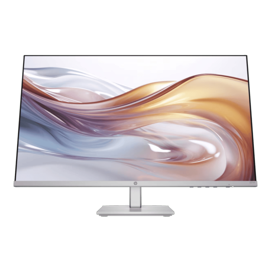
3. Eye Comfort Features
Working or gaming for extended hours? The HP Series 5 Monitor includes:
HP Eye Ease Technology: A low blue light filter that reduces eye strain without compromising color quality.
Flicker-Free Display: Ensures smooth visuals, reducing screen flicker that can cause discomfort during long usage.
4. Sleek, Minimalist Design
The monitor boasts a slim profile and narrow bezels, creating a seamless multi-monitor setup and saving desk space. Its modern design complements any workspace, enhancing the overall aesthetic of your setup.
5. Smooth Performance
With a 75Hz refresh rate, the HP Series 5 Monitor provides smoother motion than standard 60Hz displays. It’s perfect for casual gaming, streaming, and multitasking, ensuring a fluid and responsive experience.
6. Connectivity Options
The monitor comes with multiple ports, including:
HDMI and VGA inputs: For easy connection to laptops, desktops, and gaming consoles.
Plug-and-Play Setup: Hassle-free installation that gets you up and running in no time.
7. Adjustable Stand
The ergonomic stand allows you to tilt the screen to find your ideal viewing angle, enhancing comfort during extended use. Additionally, it’s compatible with VESA mounts, giving you flexible mounting options for a clutter-free workspace.
Who Is It For?
The HP Series 5 FHD IPS Monitor is ideal for:
Students and Professionals: Perfect for productivity tasks like document editing, presentations, and video calls.
Entertainment Lovers: Great for binge-watching movies or streaming in Full HD quality.
Casual Gamers: A smooth 75Hz refresh rate offers a better gaming experience without breaking the bank.
Why Choose the HP Series 5 Monitor?
Affordable and reliable for everyday use.
Stunning visuals with true-to-life colors.
Compact design with all the essential features for work and play.
Conclusion
The HP Series 5 FHD IPS Monitor is a versatile and affordable solution for anyone looking to upgrade their display. With its combination of stunning visuals, comfort-focused features, and modern design, it’s perfect for enhancing productivity and entertainment.
0 notes
Text
5 Tips for Creating Realistic Game Environments
In the world of gaming, immersion is key. Players want to feel like they're an integral part of the game universe, surrounded by believable and interactive environments. Creating realistic game environments is an art form that requires attention to detail, technical expertise, and a deep understanding of what makes a space feel alive. In this article, we'll explore five essential tips for crafting immersive and realistic game environments that draw players in and refuse to let them go.
Tip 1: Research and Reference
Before building your game environment, it's crucial to gather reference materials and conduct thorough research, just like designing a poker room. Study iconic casinos, analyze lighting and textures, and collect images of poker tables and accessories.
Study real-world locations, architecture, and natural landscapes
Collect images, videos, and sounds to inspire your design
Analyze other games, films, and art pieces for environmental storytelling techniques
Tip 2: Texturing and Materiality
Textures and materials add depth and tactility to your environment. To achieve realism in a BlackJack game:
Use high-resolution textures (up to 4K or 8K) for detailed, crisp visuals of card tables and chips
Create varied material properties (e.g., roughness, metallic, transparency) for realistic casino ambiance
Utilize normal mapping and detail mapping for added surface detail
Implement physics-based rendering (PBR) for accurate lighting interactions
Tip 3: Lighting and Atmospheric Effects
Lighting and atmospheric effects make or break the immersive quality of your environment. To create a believable atmosphere in a TeenPatti game:
Employ a variety of light sources (e.g., warm glow of poker tables, ambient lighting)
Experiment with light properties (intensity, color temperature, scattering) for an authentic Indian setting
Utilize volumetric lighting, fog, and mist to enhance depth and mood
Simulate realistic weather and time-of-day cycles
Tip 4: Environmental Storytelling
Your environment should tell a story, conveying the history, culture, and lore of your game world. To achieve this in Fantasy Sports:
Incorporate narrative-driven props and set dressing (e.g., trophies, team logos)
Use environmental clues to hint at backstory or events (e.g., worn stadium seats)
Create contrasting areas to convey different themes or emotions (e.g., victory vs. defeat)
Balance detail and subtlety to avoid overwhelming players
Tip 5: Level Design and Layout
A well-designed layout is essential for guiding players through your environment. To create a fluid experience in a Multi-Player Battle Arena:
Plan navigation paths and player flow through the arena
Balance open spaces and narrow corridors for varied pacing
Utilize landmarks, signs, and audio cues for orientation
Playtest and iterate to refine your level design
Conclusion
Crafting realistic game environments requires dedication, creativity, and attention to detail. By researching and referencing real-world locations, incorporating detailed textures and materials, mastering lighting and atmospheric effects, telling environmental stories, and carefully designing levels, you'll create immersive worlds that captivate and inspire players.
1 note
·
View note
Text
The Significance of Typography in Web Design
Typography is a fundamental element in web design, shaping how users interact with content and perceive the overall experience. Beyond aesthetics, typography significantly impacts readability, user engagement, accessibility, and brand identity. A well-thought-out typographic strategy can elevate a website from being functional to memorable and impactful. Below is a comprehensive analysis of typography's role in web design:
1. Typography and Readability
Readability is the cornerstone of effective communication in web design, and typography directly determines how easily users can consume and understand content.
- Font Size: Proper sizing ensures that text is legible across various devices, from desktop screens to smartphones. Standard practices include using 16px or larger for body text on modern websites.
- Line Height and Spacing: Adequate line spacing (also known as leading) prevents the text from feeling cramped, making paragraphs more comfortable to read. Optimal letter spacing (kerning) enhances clarity, especially for headings and titles.
- Font Choice: Readability also hinges on the typeface selection. Sans-serif fonts are generally preferred for digital screens due to their clean and modern appearance, whereas serif fonts are often used for formal or traditional designs.
2. Creating a Visual Hierarchy
Typography plays a pivotal role in structuring content and guiding users' attention. A clear typographic hierarchy allows users to quickly scan a page and identify the most critical information.
- Headings and Subheadings: Differentiating headings with larger sizes, bold weights, or distinct styles ensures they stand out.
- Emphasis Techniques: Using italics, bold text, or color variations highlights key points without overwhelming the design.
- Content Structure: Effective use of typographic elements like bullet points, block quotes, and numbered lists further aids in organizing information.
3. Building and Reinforcing Brand Identity
Typography is a powerful branding tool. The typefaces chosen for a website communicate a brand's personality and values, creating a consistent and memorable identity.
- Font Styles for Branding: For example, luxury brands often use elegant serif fonts to convey sophistication, while tech startups might prefer modern sans-serif fonts to suggest innovation.
- Consistency Across Platforms: Maintaining the same typographic style across all digital and print materials reinforces brand recognition and trust.
4. User Engagement and Emotional Impact
Typography can evoke emotions and enhance the user experience by aligning with the website's tone and purpose.
- Engagement Through Design: Playful and dynamic fonts might be suitable for entertainment websites, while minimalist and clean fonts work better for corporate or educational platforms.
- Mood Setting: Colors, weight, and font pairings contribute to creating the desired atmosphere—warm, professional, casual, or energetic.
5. Enhancing Accessibility
Accessibility is a crucial consideration in web design, ensuring inclusivity for users with diverse needs. Typography must accommodate people with visual impairments or cognitive challenges.
- Contrast and Visibility: High contrast between text and background improves readability, especially for users with low vision.
- Accessible Font Choices: Some fonts, such as Open Dyslexic, are specifically designed for users with dyslexia, while sans-serif fonts generally offer higher clarity for all users.
- Scalability: Text must remain legible when resized, and designers should avoid fixed pixel-based font sizes to support responsive design.
6. Responsive Typography for Multi-Device Use
In a digital landscape where users access websites on various devices, typography must be adaptable.
- Fluid Typography: Implementing responsive units like “em” or “rem” ensures that text scales appropriately across different screen sizes.
- Viewport-Specific Adjustments: Using CSS media queries, designers can fine-tune typography for optimal readability on smartphones, tablets, and desktops.
7. Impact on SEO and User Retention
Typography indirectly influences search engine optimization (SEO) and user behavior.
- Improved User Experience: Well-structured and readable content reduces bounce rates and encourages users to explore the website further.
- Content Prioritization: Clear headings and subheadings help search engines understand page structure, boosting relevance in search rankings.
8. Aesthetic and Functional Harmony
Typography bridges the gap between design aesthetics and functionality.
- Balancing Beauty and Purpose: While creative fonts can make a design visually striking, they should never compromise readability or accessibility.
- Design Systems: Incorporating typography into a broader design system ensures harmony between text and other design elements, such as imagery and layouts.
Typography is more than just a visual component of web design; it is a strategic tool that influences usability, branding, and the emotional response of users. Thoughtful typographic choices help create a seamless and enjoyable experience, guiding users intuitively through the content while reinforcing the website’s goals and identity. As web design continues to evolve, typography remains an indispensable factor in crafting websites that are both functional and visually appealing.
0 notes
Text
Deadly Mushrooms: A Comprehensive Report
Introduction
Mushrooms are fungi that vary widely in shape, color, and toxicity. While many are edible and even beneficial for health, others are highly toxic and can cause severe illness or death. This report explores some of the most dangerous mushrooms, their toxic compounds, effects on human health, identification features, and preventive measures.
Common Deadly Mushrooms
Amanita phalloides (Death Cap)
Description: Often mistaken for edible mushrooms, such as puffballs or parasol mushrooms.
Cap: Greenish to yellowish, with a smooth texture.
Gills: White, free from the stalk.
Spore print: White.
Toxins: Contains amatoxins, which inhibit RNA polymerase, leading to cellular damage, especially in the liver and kidneys.
Symptoms:
Early: Nausea, vomiting, diarrhea (6-12 hours after ingestion).
Late: Apparent recovery, followed by liver and kidney failure.
Mortality Rate: Up to 30% if untreated.
Amanita virosa (Destroying Angel)
Description: Pure white with a smooth cap and a bulbous base.
Cap: Convex to flat as it matures.
Gills: White and crowded.
Toxins: Also contains amatoxins.
Symptoms: Similar to the Death Cap, with a delayed onset of gastrointestinal distress followed by organ failure.
Mortality Rate: Comparable to Amanita phalloides.
Galerina marginata (Funeral Bell)
Description: Small, brownish mushroom found on rotting wood.
Cap: Honey-brown, smooth.
Gills: Brownish with a spore print of the same color.
Toxins: Contains amatoxins.
Symptoms: Similar to Amanita species, with rapid onset of gastrointestinal symptoms and multi-organ failure.
Cortinarius species (e.g., Deadly Webcap)
Description: Brown, web-like veil on the stem when young.
Cap: Brown, often with a dry surface.
Gills: Rusty brown as spores mature.
Toxins: Orellanine, a compound causing delayed kidney damage.
Symptoms: Delay of 2-3 days before the onset of symptoms, including nausea, thirst, and kidney failure.
Lepiota brunneoincarnata
Description: Small, with a brownish cap and white gills.
Cap: Flat to bell-shaped with brown scales.
Gills: White and free.
Toxins: Amatoxins.
Symptoms: Severe gastrointestinal distress, liver and kidney failure.
Toxic Compounds and Mechanisms
Amatoxins
Inhibit RNA polymerase II, halting protein synthesis.
Primarily damage liver and kidney cells.
Orellanine
Causes oxidative stress in renal cells, leading to kidney failure.
Symptoms are delayed, making early diagnosis challenging.
Gyromitrin (in False Morels)
Converts to monomethylhydrazine (MMH), a toxic compound.
Causes seizures, liver toxicity, and central nervous system damage.
Muscarine
Found in Clitocybe and Inocybe species.
Causes excessive salivation, sweating, and tears, progressing to respiratory failure.
Diagnosis and Treatment
Diagnosis
History: Identification of ingested mushrooms.
Laboratory Tests: Amatoxin detection, liver enzymes, and renal function tests.
Microscopic Examination: Spore analysis.
Treatment
Decontamination: Activated charcoal to reduce absorption.
Supportive Care: IV fluids, electrolyte balance, and monitoring of organ function.
Antidotes:
Silibinin (from milk thistle): Protects the liver from amatoxins.
N-Acetylcysteine (NAC): Used in some cases for liver protection.
Hemodialysis: For severe kidney failure.
Prevention
Education:
Awareness about toxic mushrooms and their look-alikes.
Training for foragers to distinguish between edible and deadly species.
Regulation:
Guidelines for selling wild mushrooms in markets.
Encouraging consultation with mycologists when in doubt.
Mushroom Identification Apps:
While not foolproof, apps can provide preliminary information for mushroom identification.
Avoid Risky Foraging:
Beginners should avoid picking mushrooms without expert guidance.
Conclusion
Deadly mushrooms pose a significant health risk due to their potent toxins and similarity to edible species. Proper education, identification, and immediate medical intervention are crucial in reducing fatalities. Foragers must exercise extreme caution and seek expert advice when dealing with wild mushrooms.
References
Mycology textbooks and field guides.
Centers for Disease Control and Prevention (CDC).
Peer-reviewed journals on toxicology and mycology.


1 note
·
View note
Text
FontLab Studio Crack + Keygen Free Download Full Activated
Free Download FontLab 8.4.2.8950 Full Version Offline Installer - Create fonts from a simple design to a complex project.
FontLab Crack Free Download full version offline installer for Windows may be downloaded for free. It is an integrated font editor for Windows that adds a little magic to type design and assists you in creating fonts from beginning to end, from a simple design to a huge project.
Overview of FontLab
Drawing fluid, even glyphs, auto-tracing bitmaps, overlapping, path-simplifying, equalizing stems, and scaling outlines without sacrificing stroke thickness are all possible. You can view numerical and visual measurements, draw in fractional or integer coordinates, and locate and correct contour flaws. Everything is colorable in FontLab. Create emoji or chromatic fonts, enhance SVG and bitmap pictures, overlay layered fonts, draw multi-color contours, add color outlines, and work with all Color OpenType-capable systems, including Adobe Photoshop and Illustrator, macOS, Windows, iOS, Android, and contemporary web.
Features of FontLab
Boost your design productivity
Next-generation drawing
Seriously better Béziers
Complete color support
Integrated ScanFont
Sketchboard
For design, space explorers
Distraction-free spacing
Powerful anchors
Glyph and character search
Embracing your workflow
Technical Details and System Requirements
Supported OS: Windows 11, Windows 10, Windows 8.1, Windows 7
RAM (Memory): 2 GB RAM (4 GB recommended)
Free Hard Disk Space: 400 MB or more
DOWNLOAD NOW
1 note
·
View note
Text
what's website design..
Introduction:
Web development: concerns the actual process of constructing websites and web applications. This incorporates the process of developing and designing a website to writing the HTML, CSS, and other programming languages used in the construction of a website. It ranges from the face of the website that the user directly interacts with to the back end or the server and database management.
Website designing: on the other hand is the aesthetic aspect of the website and its usability to the end user. It encompasses the aspect of designing the layout of the website, the colors to be used, the fonts to be used and the ease with which a user is able to access the site. Cohesive and effective website design not only beautifies the website but also increases its functionality and the satisfaction of the users.
Website designing include the development of the graphic features and structure of a given website. It is aimed at improving the interaction and communication between the user and the website. Here are the key components of website designing.
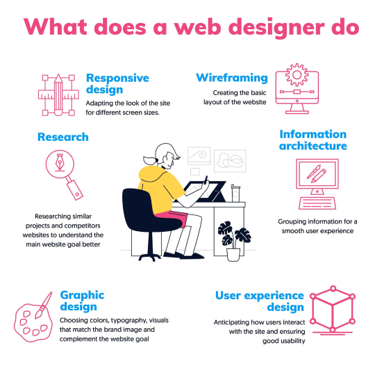
Here are the key components of website designing:
1.Layout:
Definition: It is the plan of the components of a page and how they are placed on the web page.
Importance: The use of a good layout makes it easy for the user to follow through the content and this makes it more friendly to the users.
Types: Some of the most used designs are the grid design, one column, multi-column, and the irregular design.
Tools: This is usually done using a wireframe and mockups as a guide before the actual development is done.
2.Color Scheme:
Definition: The color scheme is the choice of colors that has been employed all through the website.
Importance: Colors create feelings and establish the mood of the website. They also enhance aesthetics and recall of the brand.
Components: Main brand colors, additional colors that are used in highlights or as accents, and colors of the background and texts.
Tools: When selecting color, there are color theories, and applications such as Adobe Color that assist in selecting proper color combinations.
3. Typography:
Definition: Typography is the act of setting type for printing, including the use of lettering, characters, both for appearance and in a manner in which the text can be easily understood.
Importance: A good type helps to make text easily readable and reflects the brand’s character.
Elements: Serif and non-serif fonts, use of top and bottom heavy fonts, font size, line space, letterspacing and alignment of texts.
Tools: Their source is Google Fonts, Adobe Fonts, and type scale calculators.
4. Images and Graphics:
Definition: These are the items like pictures, paintings, logos, symbols and any other graphical object that can be placed on a document.
Importance: Images and graphics means a lot for the websites because they can add more attractiveness to the website.
Types: Photography collection, illustrations, icons, graphic images.
Tools: Photoshop, Illustrator, Unsplash, Pexels.
5.Navigation:
Definition: Navigation can be defined as the organization of the interface to enable users to get from one location to another in a website.
Importance: Navigation is a critical component of any website because it enables the user to locate the information he/she needs.
Components: Headers: top, side, bottom; breadcrumbs; links inside the page; buttons with calls to action.
6. Responsive Design:
Definition: Responsive design is all about making sure that a website functions well on a number of devices including the desktop, tablet and mobile devices.
Importance: Mobile usage is also on the rise and with it the need to have designs that are responsive both for accessibility and search engines.
Techniques: Using the fluid grids, flexible images, and media queries.
Tools: HTML and CSS, Preprocessors, Frameworks, libraries.
7. Content:
Definition: Content refers to all the message in a web, including texts, images, videos and other related items present in the site.
Importance: Content is a crucial factor since the website has to attract the user’s attention and fulfill its intended purpose.
Types: Posts, descriptions, documentaries, graphics, endorsements.
Tools: Content management systems (WordPress, Joomla), SEO tools.
8.Whitespace:
Definition: Negative space is the space surrounding objects on the page.
Importance: Whitespace should be used properly to enhance comprehension and to avoid cluttering of the layout.
Types: Micro whitespace – spaces between the elements of a design; macro whitespace – gaps between the main sections of the layout.
Tools: Design of the software as well as the grids.
9. Consistency:
Definition: Consistency relates to the appearance or style of the web site where all the pages that are created have the same layout.
Importance: When design elements are consistent they reinforce the overall look and feel of the site and contribute to the users experience.
Elements: These are in terms of color, font used, button style, and navigation.
Tools: Writing style guides, design systems (Material Design, Fluent Design, etc. ).
10. Load Time:
Definition: Load time is the time that a webpage takes to load completely.
Importance: It is obligatory that the loading times are as fast as possible to meet the expectations of the users and search engines.
Factors: Optimization of images, enhancing and minifying the code, server responsiveness, use of Content Delivery Networks.
Tools: Google PageSpeed Insights, GTmetrix and Pingdom.
11.Accessibility:
Definition: Accessibility allows those with disabilities to use the website in question.
Importance: An accessible website is one that is easy to use by all categories of users and satisfies the laws of the land.
Techniques: Image Descriptions, Keyboard Accessibility, Color Contrast, ARIA roles.
Tools: WAVE, Axe, WCAG.
12.Interactive Elements:
Definition: These are the features that enable the users to perform some action on the website; forms, buttons, sliders and animations.
Importance: These motives can add interest to the site or make it more functional.
Types: Hover and transition effects, animations, interactive infographics, modal windows.
Tools: JavaScript, CSS animations, some of the libraries included are jQuery, React
Such aspects are well implemented in companies such as SkyWeb Design Technologies, where all the components are put in place in order to produce websites that not only have utility, but also good looks and ease of use. Having technical skills complement the creative part of design, they provide a comprehensive strategy in web design that fits the business needs and the users’ needs.
Conclusion :
web design encompasses the process of designing aesthetically pleasing and accessibility websites with the help of layout, color, typeface, graphics, links, usability, responsiveness, and interactions. Website design is a process of making a website that is both functional and aesthetically appealing to the users. Organizations such as SkyWeb Design Technologies have proved to be efficient in offering a full package for web development and design since they develop websites for various purposes, goals, and complexity. It is the comprehensive model that is imperative for the development of an effective presence on the modern Internet.
Thanks for visiting us ….
For more information to visit our website: skyweb design technologies
Adress: 15th floor , manjeera trinity corporation, kukkatpally, HYDERABAD, 500072..
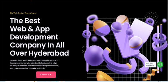
#what's web design#webdesign company in hyderabad#web development company in hyerabd#skyweb design tecnologies#web&app development company#app development#best app developers in hyderabad
0 notes
Text
🌐✨ Elevate Your Digital Presence with Concept Themes: The Ultimate Guide to Design Brilliance! 💻🚀
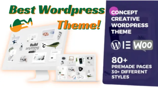
Introduction: Unleash the Power of Concept Themes for a Digital Revolution! 🚀🎨
Embark on a journey of digital excellence as we delve into the world of Concept Themes—a game-changer in web design. Whether you're a business owner, designer, or blogger, choosing the right theme is paramount. Let's explore the nuances of Concept Theme Review, unraveling the secrets behind its design brilliance and functionality.
Section 1: The Artistry of Design Brilliance in Concept Themes 🎨💡
Insights into Design Trends:
Discover the fusion of technology and artistry in today's web design trends. Concept Theme Review meticulously dissects how themes incorporate minimalism, vivid colors, advanced typography, and responsive design, setting new standards for digital aesthetics.
Creativity in Theme Development:
Creativity isn't just an element in Concept Theme development; it's the heartbeat. Themes resonate emotionally and intellectually, encouraging user engagement through unique interactive elements while encapsulating the brand's essence in every design choice.
Key Features of Design Brilliance:
Explore the building blocks of design brilliance—user-centric layouts, custom visual elements, and adaptive design. Each feature enhances the overall impression of Concept Themes, setting them apart in the competitive world of web design.
Section 2: Assessing Concept Theme Review – A Deep Dive into Design Excellence 🕵️♂️���
Criteria for Evaluating Design Excellence:
Delve into the key criteria that set the bar for stellar performance in Concept Themes. From consistency and typography to color schemes and imagery, every aspect contributes to a visually appealing and user-friendly design.
User Experience and Visual Aesthetic Balance:
Understand the paramount importance of user experience (UX) and the delicate balance between functionality and visual allure. Concept Themes excel by minimizing loading times, ensuring intuitive navigation, and maintaining a harmonious whitespace-content balance.
Responsiveness and Cross-Device Compatibility:
In today's multi-screen world, Concept Themes shine with fluid layouts, touch-friendly interfaces, and consistent performance across browsers and platforms. Testimonials and real-world applications underscore the effectiveness of these themes across various devices.
Section 3: Core Elements of Design Brilliance – Elevating Concept Themes to the Pinnacle 🏰💎
Intuitive Navigation and Layout Importance:
Explore how outstanding layouts in Concept Themes prioritize user comfort, ensuring uniformity in navigation elements and visibility. Consistency, visibility, and responsive design contribute to a seamless user experience.
Innovative Use of Colors, Fonts, and Imagery:
Understand the strategic application of colors, fonts, and imagery in Concept Themes. Each element communicates brand identity, guides user emotions, and creates a powerful subconscious impact, contributing to a narrative that resonates.
Animation and Interactivity in User Engagement:
Witness the transformative power of animations and interactive elements in Concept Themes. Micro-interactions, transitions, and visual feedback engage users, creating a dynamic adventure that elevates user experience to new heights.
Section 4: Concept Themes in Action – Case Studies and Real-World Impact 🚀📊
Case Studies Highlighting Design Success:
Explore real-world case studies where businesses and creators harnessed the versatility of Concept Themes, driving significant engagement, sales, and educational efficacy. From digital marketing firms to e-commerce stores, these success stories serve as benchmarks in web design.
Real-World Applications and User Feedback:
Dive into genuine user testimonials that highlight the practicality and effectiveness of Concept Themes. From startup owners to freelance designers, users consistently praise the theme for its user-centric design and flexibility.
Section 5: Maximizing Potential with Concept Themes – Tips and Strategies 🚀🌐
Customization Tips for Designers and Developers:
Unlock the full potential of Concept Themes with customization tips for designers and developers. From understanding core features to employing child themes, optimize theme assets for performance and maintain responsive design practices.
Future-Proofing Designs for Longevity and Impact:
Navigate the ever-evolving landscape of web design with future-proofing strategies. Adopt a mobile-first approach, integrate SEO-friendly structures, ensure accessibility standards, and stay updated with the latest web technologies for lasting impact.
Leveraging Concept Themes for Brand Differentiation:
Set your brand apart in a congested market by leveraging the flexibility of Concept Themes. Create a unique visual language, provide an immersive user experience, and use the theme's features for compelling storytelling that resonates with your audience.
Conclusion: Elevate Your Digital Footprint with Concept Themes – Your Gateway to Lasting Impact! 🚀🌟
Concept Themes stand out as a robust, versatile choice for any website. Their sleek design and user-friendly interface ensure an outstanding online presence. Don't miss out on the Cyber Week 2023 deal—grab Concept Themes now and elevate your digital footprint today.
🎁 To view the full review in detail: Click here!
🎊 To learn About The Power of other software, themes, or plugins: Click here!
✨ To hire any of us as a Video Editor, Audio Engineer, Shopify Expert, YouTube Manager, or Content Writer: Click here!
#ConceptThemesRevolution#DigitalDesignBrilliance#WebDesignTrends#UserExperienceMagic#BrandDifferentiation#WordpressTheme#BestWordpressTheme
0 notes
Text
5 Web Design Tips For An Outstanding Site
To create a website that truly stands out in today’s digital world, you need to pay attention to the details and plan carefully. A well-designed website not only attracts visitors’ attention but also provides an excellent user experience. To achieve this, you need to follow some design principles. Here are five thorough web design tips to help you create a remarkable site that leaves a lasting impression:
Clear and Intuitive Navigation
A clear and intuitive navigation structure is essential for any successful website. It helps visitors to easily find the information they need. Here are some strategies to consider:
● Organized Menu: Organize your menu in a logical way, using short and clear labels for each section. Put related pages under relevant headings to make navigation easier. ● User-Friendly Interface: Make sure your navigation elements, such as menus and buttons, are easy to find and use. Having a consistent design and placement for them helps users navigate your site smoothly. ● Breadcrumb Trail: Add a breadcrumb trail that shows users where they are in your website’s structure. This feature lets visitors go back and explore other sections with ease.
Responsive Design for Multi-Device Compatibility
Responsive design is essential in an era where users access websites from various devices and screen sizes. A responsive website adapts its layout and content dynamically to ensure the best viewing and functionality across different platforms. Here are some practices to consider:
● Fluid Grid Layouts: Use a flexible grid system that adjusts to different screen sizes, ensuring that your content looks good and is easy to read. ● Media Queries: Use CSS media queries to apply different styles based on the user’s device features. This approach allows you to customize the user experience for different screen sizes. ● Mobile-First Approach: Start with designing your website for mobile devices, then add more features for larger screens. This strategy ensures a smooth experience on all devices.
Engaging Visuals and Compelling Imagery
Visual elements are crucial for attracting visitors and showing your brand’s personality. Using images, graphics, and videos wisely can increase user engagement significantly:
● High-Quality Images: Choose high-quality images that show your products, services, or brand in the best possible way. Images that are blurry or pixelated can affect user perception negatively. ● Consistent Branding: Make sure that your visual elements, such as color schemes, fonts, and imagery, match your brand’s identity. Consistency improves brand recognition and builds trust. ● Hero Section: Make a stunning hero section at the top of your homepage. This area should have an eye-catching image or video along with a short headline that tells your unique value proposition.
Readable Typography and Thoughtful Content Layout
Typography is more than just choosing fonts; it affects the readability and overall look of your website. A well-thought-out typography and content layout strategy improves user experience:
● Font Selection: Pick fonts that are easy to read on different screens and sizes. A pair of a readable body font and a matching header font can create a nice visual hierarchy. ● Font Sizes and Spacing: Adjust font sizes and line spacing for easy reading. Make sure that text is clear both on desktop and mobile devices without causing eye strain. ● Hierarchy and White Space: Use typography to make a clear distinction of information. Use enough white space around text and other elements to improve readability and attention.
Whitespace and Layout Harmony
Whitespace, or negative space, is the empty space around design elements. It is very important for creating a balanced and beautiful layout:
● Minimalistic Design: Adopt a minimalistic design approach that focuses on essential content and removes clutter. A clean layout improves visual appeal and makes information easier to understand. ● Balanced Composition: Place content elements in a balanced way to create a beautiful composition. Use the rule of thirds and the golden ratio for ideal layout proportions. ● Focal Points: Use whitespace smartly to highlight important content, such as call-to-action buttons, headlines, or product images. Whitespace directs users’ eyes and increases user engagement.
Using these thorough web design tips can greatly improve the quality of your website, making it not only visually attractive but also highly functional and user-friendly. By focusing on clear navigation, responsive design, engaging visuals, readable typography, and effective whitespace use, you’ll create an amazing site that connects with visitors and encourages them to explore, engage, and take desired actions.
URL :- https://i-quall.com/blogs/web-design-tips-for-an-outstanding-site/
Contact Us :– https://i-quall.com/contact-us.html
0 notes
Text
The Art of UI/UX Design: Creating Stunning User Experiences
Introduction:
In the digital age, user interface (UI) and user experience (UX) design play pivotal roles in shaping how users interact with websites and applications. At Webzschema Technologies, a leading web designing company in Coimbatore, we understand that the art of UI/UX design is not just about aesthetics; it's about creating seamless and captivating user experiences that leave a lasting impression.
The Essence of UI/UX Design: UI/UX design is more than just a visual aspect; it encompasses a comprehensive approach to enhancing the overall user journey. Here, we delve into the core principles that make UI/UX design an art form.
User-Centric Approach: At Webzschema Technologies, our UI/UX designers prioritize the user above all else. We meticulously study user behavior, preferences, and pain points to craft interfaces that are intuitive and engaging. Every design decision is made with the user's needs in mind, ensuring a natural and fluid experience.
Visual Appeal & Consistency: Stunning UI designs are characterized by their aesthetic appeal and consistency. Our designers blend creativity with usability, ensuring that every element, from color schemes to typography, contributes to an engaging visual narrative. This consistency builds trust and familiarity among users.
Intuitive Navigation: Navigating a website or app should be natural, requiring minimal effort from the user. Our UI/UX experts carefully structure layouts, menus, and information hierarchy to ensure seamless navigation. We create pathways that lead users exactly where they want to go, effortlessly.
Responsive & Adaptive Design: In today's multi-device world, responsiveness is key. We embrace the challenge of designing interfaces that adapt flawlessly to various screen sizes and resolutions, providing a consistent user experience whether on a desktop, tablet, or mobile device.
Performance Optimization: A slow-loading website can drive users away. Webzschema Technologies specializes in optimizing UI/UX design for performance. We prioritize speed, ensuring that pages load quickly and efficiently, enhancing the overall user experience.
Accessibility & Inclusivity: Natural UI/UX design must cater to diverse audiences. We adhere to accessibility standards, ensuring that our designs are inclusive for all users, including those with disabilities. This commitment reflects our dedication to creating experiences that are accessible to everyone.
Conclusion:
UI/UX design is both an art and a science, and at Webzschema Technologies, we excel in combining these elements to craft exceptional digital experiences. As a premier web designing company in Coimbatore, our focus remains on putting the user first, creating visually stunning, responsive, and accessible designs that naturally captivate and engage. In a world where user experience defines success, we stand as your trusted partner in the art of UI/UX design
0 notes
Text
Responsive and Radiant: The Evolution of Tampa Web Design
The Evolution of Tampa Web Design takes a captivating journey through the dynamic realm of web design in the bustling city of Tampa. This article delves into the transformative journey that Tampa's web design landscape has undergone, from its early days of static layouts to the present era of responsive and radiant designs that adapt seamlessly across devices. It explores the innovative strategies employed by Tampa's designers to create user-centric websites that not only reflect the city's vibrant spirit but also prioritize functionality and user experience. By examining key design trends, technological advancements, and the fusion of local influences, this piece celebrates how Tampa's web design has evolved into a radiant reflection of the city's culture, businesses, and aspirations.
Pioneering the Digital Canvas
Tampa web design journey began with static web pages, akin to digital billboards that displayed limited information. This era marked the genesis of digital presence, where designers experimented with rudimentary HTML and basic graphics. As technology progressed, the shift towards dynamic web design emerged, enabling interactive elements like dropdown menus, image sliders, and simple forms. This marked the initial step in engaging users beyond mere information consumption.
Adapting to the Multi-Screen Age
The advent of smartphones and tablets necessitated a transformative shift in web design philosophy enter the era of responsiveness. Tampa web design recognized the need to craft websites that seamlessly adapt to various screen sizes and orientations. Through fluid grids and media queries, they ensured that the user experience remained consistent whether on a desktop, tablet, or smartphone. This responsiveness not only improved user engagement but also bolstered search engine rankings, reflecting Tampa's commitment to staying at the forefront of design trends.
Putting the Audience First
Tampa's web design evolution took a significant leap forward with a focus on user experience (UX) and user interface (UI) design. The city's designers adopted a user-centric approach, meticulously crafting websites that not only looked visually appealing but also provided intuitive navigation and seamless interaction. By incorporating principles like easy-to-read typography, clear call-to-action buttons, and logical layout structures, Tampa's web designs became a testament to the power of design thinking.
Cultural Influences in Design
The soul of Tampa found its way into web design as designers began infusing local flavors into their creations. From color palettes inspired by the Gulf Coast's stunning sunsets to imagery reflecting the city's rich history, Tampa's web designs became an avenue for storytelling. This integration of cultural elements not only resonated with the local audience but also intrigued global visitors, creating an emotional connection that transcended digital boundaries.
Designing for Digital Transactions
Tampa's evolution in web design mirrored the surge in commerce. Designers confronted the challenge of not only creating visually appealing platforms but also optimizing them for seamless online transactions. The integration of secure payment gateways, intuitive shopping carts, and personalized product recommendations demonstrated Tampa's commitment to enhancing user experiences and driving online businesses forward.
Interactive and Immersive Experiences
Tampa's web design landscape expanded into the realm of interactivity and immersion. As technology advanced, designers incorporated elements like parallax scrolling, virtual reality (VR) showcases, and gamified user journeys. These elements transformed websites into captivating experiences, where users could explore, engage, and feel connected to brands on a deeper level.
The Need for Optimal Functionality
In a world where attention spans are shrinking, Tampa's designers recognized the importance of speed and performance. They embraced techniques like lazy loading, browser caching, and minimizing code to ensure that websites loaded swiftly and operated seamlessly. This dedication to optimal functionality reflected Tampa's understanding of the pivotal role that performance plays in user satisfaction and retention.
Shaping the Future of Tampa Web Design
Tampa's web design evolution now stands at the precipice of a new era, one that's increasingly influenced by artificial intelligence (AI) and data-driven insights. Designers are leveraging AI algorithms to personalize user experiences, predict user preferences, and streamline content delivery. This fusion of technology and design underlines Tampa's commitment to remaining at the forefront of innovation, poised to shape the digital landscape in ways that are as exciting as they are responsive to user needs.
Conclusion:
In the radiant tapestry of Tampa's digital evolution, web design emerges as a beacon of innovation and adaptability. From the inception of static web pages to the responsive designs of today, Tampa's designers have woven a narrative that mirrors the city's growth and dynamism. The fusion of aesthetics and functionality in modern web design showcases not only the skills of Tampa's designers but also their commitment to delivering memorable user experiences. As Tampa continues to shape its digital presence, we can anticipate that the city's web design landscape will remain a testament to its ever-evolving nature responsive, radiant, and ready to embrace the future with open arms.
0 notes
Text
Unleashing the Power of Web App Design in the USA: Transforming Digital Experiences
In the ever-evolving landscape of technology, web app design has emerged as a pivotal force, revolutionizing the way people interact with digital platforms. As the heart of online businesses and services, web applications are crucial for enhancing user experiences, boosting productivity, and driving growth. In the United States, a hub of innovation and technological advancements, web app design has taken center stage, captivating audiences and businesses alike.
Understanding the Essence of Web App Design
Web app design refers to the process of creating visually appealing, intuitive, and functional user interfaces for web-based applications. Unlike traditional websites, web applications provide dynamic interactions and a seamless experience, empowering users to perform tasks, access information, and connect with services effortlessly. From e-commerce platforms to social networks, project management tools to financial services, web apps have become indispensable components of the digital ecosystem.
The Convergence of User-Centricity and Aesthetics
A successful web app design strikes the perfect balance between user-centricity and aesthetics. Understanding the target audience, their preferences, and pain points form the foundation of an exceptional user experience. By incorporating user research, usability testing, and intuitive navigation, web app designers create interfaces that resonate with users, encouraging repeat visits and prolonged engagement.
However, aesthetics should not be overlooked, as an appealing and visually stimulating design can leave a lasting impression on users. Thoughtfully chosen colors, typography, and imagery can evoke emotions and reinforce brand identity. A well-designed interface cultivates trust, credibility, and a sense of professionalism, which are critical factors in establishing a competitive edge in the market.
Responsive Design: Bridging the Gap Between Devices
In today's multi-device world, responsive design has become a prerequisite for any web app aiming to remain relevant and accessible. With an increasing number of users accessing applications on smartphones, tablets, laptops, and desktops, the web app's adaptability across various screen sizes and resolutions is paramount.
Web app designers in the USA are at the forefront of responsive design practices, employing fluid grids, flexible images, and media queries to ensure seamless experiences across all devices. A responsive design not only enhances usability but also positively impacts SEO rankings and user retention rates.
Empowering Businesses with Customized Solutions
In the competitive business landscape, web app design has emerged as a strategic tool for companies seeking to differentiate themselves. Customized web applications cater to specific business requirements, ensuring optimal performance, scalability, and security.
In the USA, a plethora of web app design agencies and talented freelance designers provide cutting-edge solutions tailored to individual business needs. These experts collaborate with clients to understand their objectives, workflows, and target audiences, creating web apps that streamline processes, boost productivity, and drive growth.
The Evolution of Web App Design Technologies
Advancements in technology continually reshape the web app design landscape. From the rise of Progressive Web Apps (PWAs) to the integration of Artificial Intelligence (AI) and Machine Learning (ML) algorithms, web apps have become more powerful, intelligent, and user-friendly.
PWAs, in particular, are gaining traction for their ability to deliver app-like experiences through web browsers. These lightweight yet feature-rich applications offer offline access, push notifications, and smooth performance across various devices, making them a compelling choice for businesses and users alike.
Ensuring Security and Privacy
While web app design continues to soar in popularity, it also raises concerns about security and privacy. As web applications handle sensitive user data, stringent security measures must be in place to safeguard against potential cyber threats and data breaches. In the USA, data protection regulations such as the California Consumer Privacy Act (CCPA) and the General Data Protection Regulation (GDPR) have urged businesses to prioritize data security.
Web app designers work in tandem with cybersecurity experts to implement robust security protocols, encryption standards, and vulnerability testing to mitigate risks and ensure user trust.
For more info:-
Web App Design USA
Website Design Company USA
0 notes
Text
The Evolving Landscape of Web Design: Unveiling the Blueprint for Modern Online Success
Web design continues to evolve at a rapid pace, shaping the digital landscape and redefining online experiences. In this blog post, we will embark on a journey through the realms of modern web design, uncovering the blueprint for achieving online success. From immersive user experiences to cutting-edge visual aesthetics, we will explore the essential elements that empower web designers to create websites that stand out from the crowd. Join us as we delve into the intricacies of web design and equip you with the knowledge and tools to thrive in the ever-changing digital era.
Immersive User Experiences: The Key to Engagement : User experience (UX) lies at the core of modern web design. A successful website should captivate users and provide them with an immersive journey. Achieving this requires meticulous attention to detail, including intuitive navigation, seamless interactions, and personalized content. User research and usability testing enable you to understand your audience's needs, preferences, and pain points, allowing you to craft experiences that resonate with them. By prioritizing immersive user experiences, you can create websites that foster lasting connections and inspire meaningful interactions.
Cutting-Edge Visual Aesthetics: Designing for Impact : Visual aesthetics play a pivotal role in modern web design, capturing attention and conveying brand identity. Bold color palettes, unique typography, and stunning imagery enable designers to create visually striking websites. However, modern aesthetics go beyond surface-level appeal. They integrate seamlessly with functionality, emphasizing usability and accessibility. By leveraging the latest design trends and techniques, you can create visually impactful websites that leave a lasting impression on your audience.
Responsive Design: Navigating the Multi-Device Landscape : The prevalence of mobile devices demands websites that adapt to various screen sizes and resolutions. Responsive design ensures that your website provides a seamless experience across devices, enhancing accessibility and user satisfaction. By embracing flexible grids, scalable images, and fluid typography, you can create websites that adapt effortlessly to different devices. Responsive design is not just a best practice; it is now a necessity in an era where users expect a consistent experience regardless of the device they use.
Dynamic Content Strategies: Captivating and Contextual : Compelling content is vital for engaging and retaining visitors. Modern content strategies focus on creating dynamic and personalized experiences. By leveraging data analytics and user behavior insights, you can deliver targeted and contextually relevant content. Incorporating interactive elements, such as quizzes, calculators, or chatbots, enhances user engagement and encourages active participation. Additionally, integrating social media feeds and user-generated content fosters a sense of community and authenticity. A well-executed content strategy enables your website to become a valuable resource, driving user engagement and loyalty.
Performance Optimization: Speeding Toward Success :In a fast-paced digital world, website speed and performance are paramount. Slow-loading websites can frustrate users and deter them from exploring further. Performance optimization techniques, such as image optimization, code minification, and caching, ensure swift page loading and smooth interactions. Regular monitoring, testing, and optimization allow you to identify and address performance bottlenecks, keeping your website at peak performance. A fast and responsive website not only improves user experience but also positively impacts search engine rankings, driving organic traffic and online visibility.

Conclusion : As web design agency Dubai continues to evolve, it is crucial to stay abreast of the latest trends and best practices. By prioritizing immersive user experiences, embracing cutting-edge visual aesthetics, implementing responsive design principles, crafting dynamic content strategies, and optimizing performance, you can create a modern online presence that captivates and engages your audience. Remember, web design is both an art and a science—combining creativity with technical expertise to create remarkable online experiences. Armed with these insights, you are equipped to navigate the ever-evolving landscape of web design and achieve online success. Prime Leads Marketing also provides digital marketing agency in Dubai, website development company in Dubai, etc.
0 notes
Text
Designing Websites for Tampa's Tech-Savvy Audience
Website design in Tampa, where innovation, creativity, and cutting-edge technology converge to craft online experiences that leave a lasting impact. In this dynamic coastal city of Florida, businesses and individuals alike seek to establish their digital presence with a touch of Tampa's unique flair. With a diverse array of industries thriving in the area, from tourism and hospitality to tech startups and beyond, the demand for exceptional web design has never been greater. Website design Tampa are masters at blending aesthetics and functionality, seamlessly blending the city's rich cultural heritage with modern design trends. Whether you're looking to revamp your existing website or create one from scratch, the website design firms in Tampa boast a wide range of expertise, delivering tailored solutions that not only impress but also drive tangible results. Join us on a journey of innovation as we explore the captivating world of website design in Tampa.
Understanding the Digital Landscape in Tampa Bay
In this paragraph, we delve into the unique characteristics of Tampa Bay's tech-savvy audience and how they shape website design. We explore the city's growing tech industry, its vibrant startup ecosystem, and the presence of tech-savvy individuals who demand cutting-edge digital experiences. We discuss the importance of aligning website designs with the preferences and expectations of this audience, focusing on factors such as intuitive navigation, mobile responsiveness, and visually appealing interfaces.
Crafting User-Centric Experiences for Tampa's Tech Enthusiasts
This section highlights the significance of user-centered design principles when targeting Tampa's tech enthusiasts. We discuss the importance of conducting user research, understanding their specific needs and preferences, and integrating these insights into website design. We delve into topics such as user personas, user journeys, and usability testing, emphasizing the value of creating intuitive and seamless experiences that resonate with Tampa's tech-savvy audience.
Showcasing Technological Innovations through Engaging Visuals
Here, we explore the role of captivating visuals in designing websites for Tampa's tech-savvy audience. We discuss the importance of incorporating visually striking elements such as high-quality images, videos, and animations to showcase technological innovations and captivate users. We delve into the significance of using visually appealing layouts, color schemes, and typography to create a modern and engaging digital presence that resonates with Tampa's tech-savvy individuals.
Responsive Web Design: Ensuring Seamless Experiences Across Devices
In this section, we focus on the necessity of responsive web design to cater to Tampa's tech-savvy audience's multi-device usage. We delve into the significance of designing websites that seamlessly adapt to different screen sizes, ensuring optimal user experiences on smartphones, tablets, and desktops. We discuss the importance of implementing responsive design frameworks, fluid layouts, and scalable images to accommodate the diverse technological preferences of Tampa's tech enthusiasts.
Embracing Accessibility Standards: Inclusive Designs for All Users
Here, we emphasize the importance of designing inclusive websites that adhere to accessibility standards for Tampa's tech-savvy audience. We discuss the significance of considering diverse user needs, such as individuals with disabilities, when crafting website experiences. We explore techniques like alt-text for images, keyboard navigation, and color contrast, ensuring that all users can easily access and navigate Tampa's tech-oriented websites.
Leveraging Local Tech Culture: Showcasing Community Engagement
This section highlights the importance of integrating Tampa's vibrant tech culture into website design. We explore ways to showcase community engagement, such as featuring local tech events, highlighting tech-related initiatives, and incorporating testimonials from tech leaders in the area. We discuss the value of leveraging Tampa's tech scene to create a sense of belonging and to establish credibility within the local tech-savvy audience.
Analyzing Data and Iterating for Continuous Improvement
In this final paragraph, we emphasize the iterative nature of website design for Tampa's tech-savvy audience. We discuss the importance of leveraging data analytics to gather insights about user behavior and preferences. We explore the significance of conducting A/B testing, heat mapping, and user feedback analysis to inform design decisions and continuously improve the website's performance and user experience. By adopting a data-driven approach, websites targeting Tampa's tech enthusiasts can adapt and evolve to meet their ever-changing needs.
Conclusion
In conclusion, designing websites for Tampa's tech-savvy audience requires a comprehensive understanding of their preferences and needs. This dynamic and digitally engaged demographic seeks seamless user experiences, visually appealing designs, and cutting-edge technologies. By incorporating responsive and mobile-friendly layouts, intuitive navigation, and high-performance features, web designers can cater to the demands of this tech-savvy audience effectively.
0 notes
Text
Bendy x edgar (fanchild)
Oc
Color
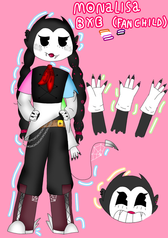
Ink world

Monalisa
age 15
lesbian sexuality
feminine gender
she has 3 arms and a tail that can release a web
she is the oldest of the 3
she is very mean and makes jokes with everyone but especially with her younger sister


Willy
Age 13
multi sexuality
gender fluid
he has 2 tails, one that allows him to release web and the other poison
he is very intelligent but in exchange for that he is very sleepy, thus being the target of his older sister's jokes


Candy
Age 9
sexuality?
feminine gender
she has 4 arms allowing the bottom ones to release poison with their claws
even looking innocent she is very scary always returning the pranks that her older sister makes
#bendy and the dark revival#bendy and the ink machine#bendy au#bendy fan art#bendy#batdr#batdr bendy#fanchild#bendy oc#bendyxedgar
5 notes
·
View notes