#and naturally i just slap a fucking bg on it accidentally
Photo
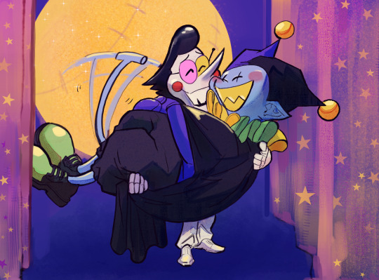
but it wouldn’t be make believe, if you believed in me!
#deltarune#spamton#jevil#spamvil#i just wanted to draw spamton holding jevil instead of vice versa and this happened#and naturally i just slap a fucking bg on it accidentally#i dont think jevil is all that heavy imo and he's also helping out by floating. its an ego boost for spamton#lyrics from its only a paper moon by ella fitzgerald it kind of happened accidentally as i drew the bg and was like this abstract bg#looks like a moon a little bit.
931 notes
·
View notes
Note
Hi! I just wanted to say I love your art. I really love how you use colors and colorful lighting (does that make sense..?) and I wish I could do something like that. Thanks for drawing beautful kookmin art!
HELLO NONNIE
I know you didn’t ask for this but I’m doing it anyways because i have been getting a few messages about this and I’m nothing if not a masochist so I want to quickly show you that I ACTUALLY HAVE NO IDEA WHAT I’M DOING and you, too, can be just as effortlessly clueless as me when it comes to making your art shiny and colorful or whatever!
65% of digital art is knowing all the right ways to ‘cheat’. I use quotations bc it’s not reeeeeally cheating, but it sure feels like it. I’m allowed to say this, I spent 60k on an art education, ok. It especially feels like it to me because, I repeat, I usually have zero idea what I’m doing.
Digital art has so many tools at our disposal and yet we tend to overlook and forget about them. One of the tools that I tend to abuse use are blending modes in Photoshop. Here’s some quick and dirty examples:
Take this drawing I did of Jimin for example:

This is what I painted. It’s bland, the colors are boring, and it’s a little flat. I spent most of my effort on getting shapes and forms somewhat presentable. I’m an expert at laziness and doing the bare minimum and it shows here. Now save for adding some darker lashes to him, I got to this end result…
…by doing no more painting whatsoever. I literally just used the tools given to me in Photoshop. I don’t have the layered file anymore because I accidentally saved over it (don’t be like me kids), but here’s a basic overview of what I did:
laid down some VERY SATURATED bright colors randomly over the image with a large soft brush. You can seem some pinks on his lower body, and greens and blues on each arm respectively.
set that layer with those bright colors to something like lighten. I forget exactly what blending mode I used, but you can really just play with all of them until you find something you like. i scroll thru the options five or six times before settling on something i like
blurred the bottom of the image to give it some fake depth feeling to it
added a fucking space picture for texture that i got off nasa (really! NASA IMAGES ARE PUBLIC DOMAIN AND FREE TO USE PEOPLE) and just set that layer to lighten and masked out the majority of it to where only small accents remained.
that’s literally it. here’s a detailed closeup of jimin:

and hey! you suddenly have a little bit more of a dynamic image without having to hardly do diddly squat. ISN’T ART GREAT, SO INSPIRING, WOW.
here’s another image that i did literally the bare minimum on:

when i say i did the bare minimum i really did. please don’t judge me too hard.
here’s what i actually painted.
this is a little embarrassing, lol. it’s just very basic shapes.
then i blurred the entire image and painted in some very faint details in the bg (like the extra branches and little bit of lighting in the bg)

then i added some of those bright colors on blending mode layers to give it some “lighting”…

here’s what the layers look like, and you can see the colors i used:

top layer: lighten
middle layer: screen
bottom layer: soft light
and then I added a space texture because i am NOTHING without my space textures:

and there you have a screen cap redraw I did in like an hour.
what’s that you say? more examples? let’s say you don’t necessarily want to change the lighting of a drawing, but the entire TONE of a drawing. you have a colder image you want to turn warm? i have just the thing:
THAT’S RIGHT MORE BLENDING MODES
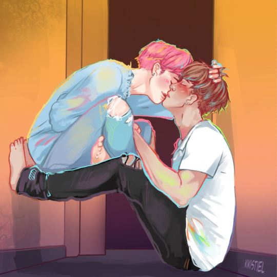
i did this exact thing with this image:
contrary to what i may have lead people to believe, i’m actually shit at color palettes and color theory in general. i save all that legwork for photoshop. HERE is what i ACTUALLY painted:
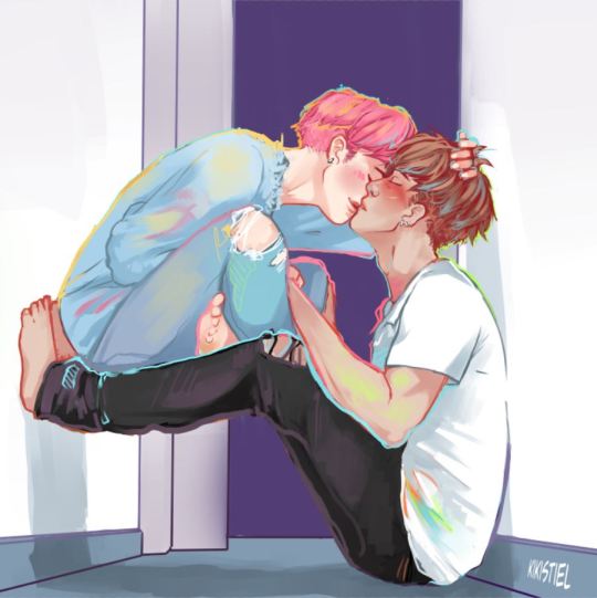
completely different. but this is just how i work, i tend to work in pretty neutral colors and then adjust either as i go or after the fact.
i started with adjusting the bg. i knew i wanted something really warm in tone, so i slapped a nice warm fill layer over it. i also added a tiny big of texture to the wall and a shadow on the floor to make it feel more dynamic.
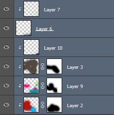
here’s what those layers look like:

the adjustment layers are highlighted. the top his a orange to pink gradient set to multiply, middle layer is the texture, and the bottom layer is a midtone purple set to multiply with opacity at 69%.
then on to the figures. here’s my layers:
it’s literally just a bunch of playing around. this is more shadows at the bottom to give depth and some random saturated colors to give an interesting dynamic to the image. (don’t overuse this… it’s really easy to but try to resist. bright saturated lighting does NOT work on every image.)
then I added a warm orangeish fill layer and set that to multiply and well… this was the end result.

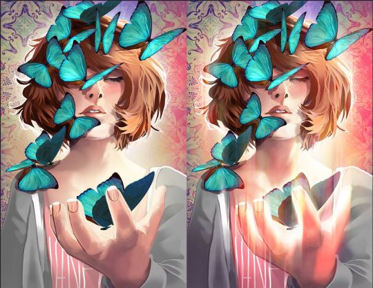
now i should say that i don’t always take such drastic shortcuts with my drawings. i do spend tons of hours on some paintings from time to time. but even with those i STILL use adjustment layers and blending modes and filters to enhance the art. example, everything i painted by hand on the left, and the same finished piece with adjustment layers:
it’s something that almost every artist does, and it’s time we stop pretending like people do this naturally, it makes aspiring artists work for something that isn’t attainable.
this ended up super long but i hope anyone who is looking for tips and tricks of improving the aesthetic of their drawings found this somewhat helpful. if you have any questions about specific processes, don’t hesitate to ask.
#ask#tutorial#of sorts...#long post for ts#Anonymous#gonna now tag this as#art advice#so i can link this and future rambles on my front page
90 notes
·
View notes
Last Seen Blogs

jualmimbarmasjidmakassar
WA 0852-4287-5701, Jual Mimbar Masjid Di Makassar

smpxngkxng-blog
Untitled

julbelas
Sin título

angelwormz
eating shit
midori-rotten
𝓜𝕚𝐋๏★