#at first I forgot to download it as a png so it still had a white background
Text
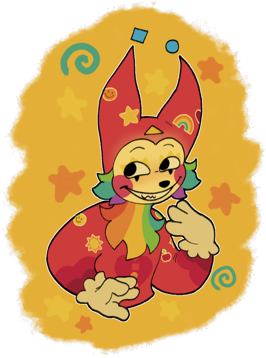
@bunnyspine can I offer you a silly sticker guy in this trying time?
#at first I forgot to download it as a png so it still had a white background#used remove.bg#it looked like i cut it out from wet paper at first#then i remembered that my time limit on my phone had a one more minute feature#sometimes that feature saves me#art#digital art#fanart#puppet#sunshine funtime#procreate#digital illustration#digital drawing#puppets#puppet art#stickers#my art#fan art#pawfulofdoodles#jammed to the crane wives while drawing him#I DIDN'T MAKE THE SLEEVES OF HIS HAT BIG ENOUGH DARN IT#im sorry i couldn't think of a more clever caption
221 notes
·
View notes
Photo

Baccano! Character Map | Epsilon Version | per. Vol. 22
Introduction
Some of you may remember @umbrellaguns‘ Baccano! Character Map for Volumes 1-9 from six years ago (if not, her post is still up!)--I never forgot it, and always wanted to try my hand at a character map / relationship chart someday. Some months ago, I finally got around to attempting one.
This mind map is current to the latest Japanese Volume (Volume 22 / 1935-D), so beware of spoilers and do not maximize the map if you’re not up to date. By now, you may have noticed it is version Epsilon, meaning it is the fifth ‘iteration’ of the map by my personal reckoning. I worked on versions Alpha through Delta in private (last worked on it back in October), but only shared the works in progress on Discord; this is the first time I’m actually sharing the map on Tumblr.
I do so with some hesitation, aware of its myriad imperfections and areas that would benefit from improvement, but to continue delaying sharing it until it is flawless would mean never sharing it at all. I can always post an updated version in the future--and, if I should do so, the version status on the map will update accordingly.
CryptPad Folder + Feedback Statement
The .png file I’ve uploaded is the 200% scale version of this map. For those who want this map at 100% and/or 500% scale, HERE is a folder with .pngs of the map in all three ‘sizes’. (I may update it to include other image file containers). You may want to download the 200% scale image from there instead of saving the Tumblr image since Tumblr tends to compress uploaded files.
Edit: Yikes, definitely just go to that folder and download directly. Tumblr potato quality strikes again.
Feedback and corrections are welcome. God knows I must have gotten something wrong (e.g. not entirely sure if Pamela’s bounty even still exists now that the Russos are temporarily kaput), and goodness knows general feedback is needed. One major consideration is the map key’s lack of thoroughness; I know not every node type is defined, and I’m keenly aware that there’s no reference key for the relationship link colors and solid/dashed distinction (partly due to them not being 100% consistent in meaning, partly due to space + effort).
For the sake of your dashes, I’ll move my notes on the map’s creation underneath the cut. They remark on how the layout was influenced by the technical constraints of the mindmapping application I used, among other things. (Included also is my favorite aspect of the map, i.e. the Huey-Bartolo-Beriam-Muybridge golden quadrilateral.)
Edit: Agh dagnabbit, I’m already seeing several new or forgotten-at-the-last-minute issues... inconsistent color of Vamp! nodes, overlooking Homer for Nebula...probably shoulda coulda linked the Felix Walken name purchases. Cripes—why isn’t there a ‘devoured’ link between Szilard and Scott? Forget everything I said at the beginning; I should have held off on publishing it just a little longer.
Map Creation
My ambition was to create a relatively ‘thorough’ character map, the pros and cons of which became more apparent the more I progressed.
First, this is a far messier and denser map than Umbrellaguns’ map (not a good thing)--naturally due to the larger cast, but also due to the sheer number of relationship links I chose to include. Some are far less necessary than others, but this also goes for the cast; some of the people included are really more names than characters, such as Freya.
Certain information clusters and their collateral damage (e.g. overlapping links and link labels) were difficult or impossible to avoid due to the technical constraints of the mindmapping application. Moving one node had the potential to shift multiple other nodes out of alignment; thus, the more I progressed, the less freedom I had to move nodes where I pleased.
That said, working within such constraints inspired creativity and sometimes unexpectedly successful layouts, which were quite satisfying. In the spirit of positivity, if I had to highlight one aspect of the map I’m most pleased with, it would be the (nearly*) ‘golden square’ connecting Huey, Bartolo, Beriam, and Muybridge. It began organically due to the proximity of certain root nodes (Huey, Runorata Family); I began intentionally developing the square once the puzzle and pieces clicked in my mind.
If I were to ever for some godforsaken reason attempt to start over and create a new from-scratch mindmap with illustration/photo-editing software (rather than an application), I’d probably try to keep that golden square. It’s just so...serendipitous.
*I say ‘nearly’ because the Huey-Cal link isn’t the gold ally color like the others. Since we don’t know exactly what they personally negotiated during the 1934 luncheon (if they did at all), I played safe and stuck to their pissing contest in the first half of the 1930s for their relationship link.
45 notes
·
View notes
Text
Designing Front Packaging
Here, I will now be coming up a final design for the front of the label. I think it might be a little easier to do no as I have come up with a back design, but also because I have already started coming up with the main structure, so it now means I just have to add in the smaller details to the piece.
Below is showing the current stage that I’m at, as I created this a few days ago juts to see what my initial ideas looked like when recreating them digitally. It is very simple at the moment, but I’m planning on finalising the design. So from looking at this, I have got the repeat pattern in the background with the colour of this being the same as the logo. Then there is the strip going around, where it will then stop around the back after the circles. I also have this front design where its showing the logo and then another slightly bugger circle around this.
Now that I have relooked at the current state of my work, I will start to add some more elements in.

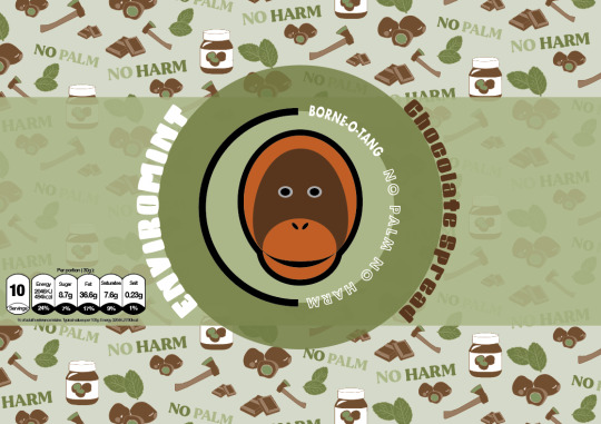
Before I started, I wanted to see what chocolate spread normally has on their packaging, so I searched up some images of the front of chocolate spread packaging. After comparing mine to theirs, I could I needed to add quite a lot more to my design as I didn't ever realise that I hadn't added to say it was chocolate spread. I think this was because I got so used to just seeing this same design all the time, that I forgot that others wouldn't know what the product actually is. But before I added this, I wanted to find a calories chart that is shown on the front labels of packaging. This is normally very small but is very clear rand easy to read as well. So I Googled something around the idea of ‘PNG calorie chart’, where it took me quite a while to find a suitable one that I was looking for, but managed to find one in the end. I then went to download it, where it all seemed fine, until I went to ‘file’, ‘place embedded’ where it would paste it with the checked background still there, even though this should have disappeared.
So to solve this problem, I had to retrace around the image. Below is showing where I have done this. Although I only did the main section of it as I thought to just retype the information in, where it would actually be calories for chocolate spread. By this I mean that the chart in the image was just a random one as it was very difficult to find any harts at all that were PNG’s. I then chose a font and started typing out the information to fit in the boxes.

Below is now showing the completed chart where I have also placed it into position on my design. As you can see, another thing I have changed from the first screenshot was the colour of the background, to which it is no longer the same colour as the logo. Instead it matches the same light green colour as the back label. I was obviously going to do this as I couldn't have two different shades of background colour on the same label as this would look very odd. Also, I much prefer this lighter, more vibrant shade as helps to make everything pop out.
As well as this, I have decreased the circle and logo in the centre as I felt this was just slightly too big. I think this develops a much more eye catching effect even though it is smaller.
Another thing that has changed is the type in the logo. I have changed the colour of it to white instead of black. This did also show in the previous post as well where I added a smaller version of the logo. I chose to do this as I think it accomplishes a much more modern look, where it stands out more as well. I have kept everything else the same, although I was thing about changing the black stroke. However, this looked very weird as it was almost too bright then.
Next, I tried adding the flavour name and the words ‘chocolate spread’ to the piece. In my hand drawn sketches of my initial ideas I thought to have this information going around this outer circle. So I gathered a font and tried this idea out. At the time, I thought this font looked quite interesting as it had this fun element to it, although not long after I realised that it didn't really work. I felt that the font didn't match anything that I already have on the design.
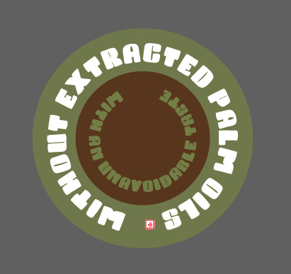
Then after looking at already existing chocolate spreads, I thought of having something to say that it doesn't contain palm oil just to clearly get the message across the viewers. I thought of placing this on the striped section through the centre.
As well as this, I thought of having it in the shape of a circle as I have this shape running through my packaging so it could work. So, I drew out a circle using the ‘ellipse tool’ and then copied and pasted this, where i then made it slightly smaller than the original. I chose for the outer circle to be the darker green from the outer circle near the logo and the smaller one to be the same colour as the dark brown from the logo. Next, I then got to the stage of typing something out, which I was going to wrap around these circles. I first thought of ‘without extracted palm oils’ as I was going to use this for my slogan at one point. I then thought of having another line saying how good the taste is, so I thought of ‘with an unavoidable taste’.
Although, when I got to the stage where I placed it onto my design, I found that it looked really ineffective, this was because of a few reason. One being that, I had to size it down meaning you couldn't really read it properly. But the other was just the shape as it didn't really fit in with the space that I placed it onto.
So overall, I got rid of this element and tried adding in other things instead.
As you can see below, a lot has changed since the last screenshot, where I managed to add in the important element in which was the words ‘chocolate spread’. I decided to move the whole strip and logo up a little bit so I could fit in another strip going around. I have chose to have this as the orange/light brown shade which is featured in the logo. I thought that having a colour that would brighten up the design but also compliment the green tones too, would work. I then chose for the type that has been placed on top of this colour to be the dark brown as I felt that this would contrast enough to be seen. As you can see the font that I have used for this is very thin, which I did choose on purpose. After getting rid of the previous font and type, I felt that a very thin one could achieve a really engaging look, where it should hopefully fit with the design as it isn't a fancy font.
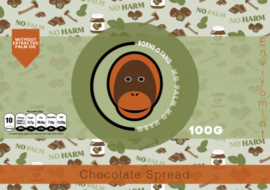
This is now showing where I have rotated it around so that the whole word is on its side instead. I have wrote this in capitals as I feel it looks a little more tidier like this as otherwise the type is all different sizes and looks very messy.
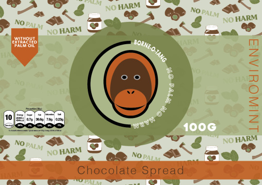
Here, I am now going to experiment with the composition of how to arrange the chocolate spread phrase and the flavour name too as the two ideas that I have just tried really didn't go to plan at all. I’m hoping by playing around with these few elements, I can find an arrangement that works.
Below is presenting where I have thought to have both these two pieces of information together. I felt that instead of splitting them up around the design, it would be easier for the customer to read at first glance. Although, to make this look effective and show that these are two different pieces of information, I have changed the colour of the flavour name to white. I have also wrote this in capitols as well, although later on I did actually take this away so it was only capitals for the first letter of the word. This is because it doesn't need to be this bold and I would say it probably matches better being the same style as the words ‘chocolate spread’.
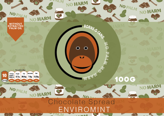
Next, I chose to try and separate them again just to see if I can make it look a little more effective than the first ones. So I have decided to make the extra strip smaller again so that its the same height as the type. I then drew another box using the ‘rectangle tool’ so that it fits around the flavour name ‘ENVIROMINT’. I didn't have it going the whole way around like the orange/light brown ones as I thought that there was no need to do so. This also just takes up more space, which is covering up the repeat pattern. As you can see this new box is in the darker colour as this then shows a contrast between the two concepts. After creating this, I could straight away see that the previous layout was a lot more tidier and visually pleasing, to which I felt having this random box placed above the main one, looks slightly odd. Also I don't really feel like there is any need to have it like this as the information was easily readable before and didn't need to be split up so much.

So I then went back to the idea of having both these pieces of information in the same rectangle shape. Although, I had the idea of switching around the colours so that instead of the box being the orange/light brown colour, I could try the dark brown instead. I felt that this colour could achieve an effect where this box doesn't standout as much as before as the colour isn't so bright. Doing this meant that I had to chnage the colour of the words ‘chocolate spread’ to the orange colour instead otherwise this wouldn't have shown up. From looking below, I think this colour blends in more with the other colours. When comparing the effects of both, I would say the white type standout more on this darker shade than the orange as there is more contrast between the two colours. However, I feel that on the orange rectangle, the whole shape is a lot more striking compared to the dark brown colour. To me, it makes more sense to go with the design that is going to make both of the concepts standout and not just one as the information is both important.

In the end, I chose to have this piece below as my final front label design as I think the orange rectangle and the orange icon in the top left corner match really well together, making the piece seem more connected. As well as this, the orange colour is more eye catching as there isn't as much of this colour compared to the dark brown. This is because this shade of colour has been shown all over the repeat pattern, meaning it could look really boring having even more of this colour.
I did say in my initial hand drawn designs that I would have some sections being where the label is transparent so you can see the brown chocolate spread in the jar. When it came to showing this, I wasn't sure how I was going to make this look effective as the mock ups I was be using are se through meaning they wont be the brown colour it should be for that product. Also, I don't know whether this would confuse the design as well. So in the end, I chose to not use this concept in my packaging although I was drawn to this idea as I thought it could look really engaging having a little section where it would juts be this. In my plan, I thought of having it where the circle and rectangle stop, so this would mean there would be a section on the top of the circle and bottom.

Overall, I’m really pleased with this outcome as I think its going to look really striking once I have designed all the chocolate spread flavours where the colours will match the flavour. This is what I will be doing next as once I have competed that task, I have done the labels for the jars, where I can then move onto my next step.
0 notes
Text
throwback to when i used to go to an all girls catholic school and we all used these tiny little laptops that doubled as tablets but this was before tablets with detachable keyboards were a thing so they were just these unbearably chunky laptops that you could flip the screen around to slide into a tablet sort of shape. it came with its own pen, like a drawing tablet, which you used instead of a finger or general stylus.
this story’s going somewhere: because it was a school computer, we were really limited with what we could install. freshman year it was kind of a free-for-all but i was pretty computer-illiterate and didnt get very far in my installation spree before sophomore year came around and the teachers realized “hey, everyones playing minecraft and shit during class maybe we shld do anything to prevent that?” so they made it so you essentially could install almost nothing anymore. hell.
again, im going somewhere: the only digital art i had made prior to freshman year was with my dads old touchpad laptop with ms paint (if flipnote hatena doesnt also count) so i had no frame of reference as to what i could be doing with my art. i just accepted that paint.net (the program that came preinstalled on this laptop alongside ms paint) was as good as it would get. my friend from flipnote told me about a site called chickensmoothie so i used their oekaki program excessively as well, but it wasnt much better than paint.net to tell the truth.
trust me i have a point: towards the end of freshman year i learned about paint tool sai, so i pirated it and used it for approximately 2 seconds before downloads got nuked off my laptop. i came in the next year with a wiped computer and no way to use a new program. however, during those brief moments i had with sai, i had gotten all too spoiled on the pen pressure feature. chickensmoothie’s oekaki could do pen pressure, but not with my dinky little laptop, not without an extra download (that, remember, i couldnt install). so now im stuck again with my three trusty tools: ms paint (which i only ever used as a joke), oekaki (which didnt support importing images), and paint.net.
my point: my solution was to bring in an entirely unrelated program, ONENOTE FOR MICROSOFT WINDOWS 7, and draw my lines in THAT program which i discovered not only supports pen pressure locally, but i could copy and paste into paint.net, which i then would fill in with color and finish. i drew so much in onenote that sometimes i’d just straight-up save my lines directly as a transparent png and post them as-is, uncolored. like a digital notebook full of doodles.
i only remembered all of this because i was trying to find literally any program i have on my computer that could allow me to just fucking, write down simple text to save for later, and i saw i have onenote on here somehow. the ui is entirely fucking different and it makes me feel old and crusty. ive never seen a single human being mention this program outside of good ol saint ursula academy and i almost forgot it even existed in the first place, if it werent for the fact that i go back and look at all my weird transparent linework sometimes.
i wonder if it still lets you do all of that
0 notes
Last Seen Blogs


