#used remove.bg
Text
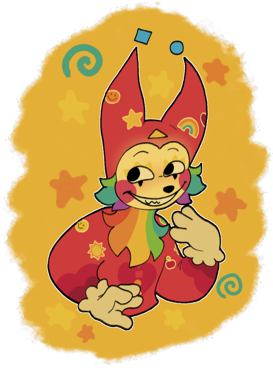
@bunnyspine can I offer you a silly sticker guy in this trying time?
#at first I forgot to download it as a png so it still had a white background#used remove.bg#it looked like i cut it out from wet paper at first#then i remembered that my time limit on my phone had a one more minute feature#sometimes that feature saves me#art#digital art#fanart#puppet#sunshine funtime#procreate#digital illustration#digital drawing#puppets#puppet art#stickers#my art#fan art#pawfulofdoodles#jammed to the crane wives while drawing him#I DIDN'T MAKE THE SLEEVES OF HIS HAT BIG ENOUGH DARN IT#im sorry i couldn't think of a more clever caption
221 notes
·
View notes
Text
I forgot how annoying removing the background of an image on Photoshop can be
7 notes
·
View notes
Note
not necessarily an edit req but do u have any circus themed pngs i literally cant find any good ones ☹️☹️☹️☹️☹️
i collected a bunch for you here :] you can also look through the rest of the pinterest board to see if anything else strikes your fancy!!
#★━ answered! ★#i recommend using remove.bg for most of these#but if you need me to cut any of them out for you lmk and ill do so <3
6 notes
·
View notes
Text

this is episode five
#shittily edited images (yes I used google slides and remove.bg)#fullmetal alchemist brotherhood#jk rowling go fuck yourself. we don't tolerate transphobia in this household
2 notes
·
View notes
Text
i miss my anons where is everyone i miss you all guys please come visit me i'm so lonely i m

#the doctor's notebook#sorry the image isn't perfect . i had to use s#* remove.bg i had to use remove.bg#and then use its built in restoration tool with my finger#so it's a little wonky
0 notes
Note
ok i have to know
HOW do u make the egdes so… perfect?? like not a pixel of the original image/white pixels appear on the sides of the pngs. and u do it so fast???? how???
I usually just drag the image into remove.bg, it's free and pretty good!
When I want to make high res pngs I use photoshop. I don't know if it's the most efficient way, but this is what I do: 1. drag image into PS, 2. use the automatic eraser tool on the image background, 3. make a new layer with a colored background and place it before the layer with the image (to see any areas that are not yet transparent), 5. switch back to the image layer and use the regular eraser tool to clean up the edges and any stray pixels, 6. remove the layer with the colored background, 7. save as png.
205 notes
·
View notes
Note
sorry if youve already answered this a million times but i was wondering what program you use to erase the backgrounds?
It depends! I use remove.bg, slazzer and a couple other sites. Each one gives slightly different results. Hope this helps!
86 notes
·
View notes
Text

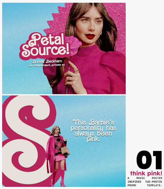
⋆ barbie fever . . . by petalsource .
. . . a complete blog makeover inspired by barbie .
hi, barbies! today, i bring you a complete makeover fully inspired by our favorite pink lady, barbie herself, to allow all of you to bring your own characters into her world in plastic!
feel free to tweak and adjust to your needs, add different background colors and overlays, but kindly do not claim as your own or use it for commercial purposes. feel free to tag me on your creations with this on #petalsource! seriously... i can't wait to see what comes of this!
💐 click the source link to get it as a package or individually on deviantart or payhip !
and . . . keep reading to find more details about the graphics, hq live previews and important tips to use the templates !
✩ about the items!
➷ think pink! -- a two-picture promo template inspired by the iconic 2023 movie posters. you'll need: two pngs of your faceclaim of choice, and the custom fonts (listed below). the glittery polygon of the first picture is available in 7 different glitter colors! high quality examples.
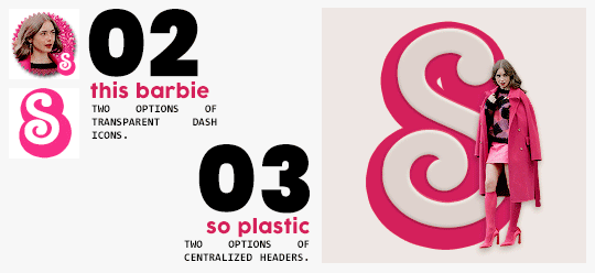
➷ this barbie -- two options of transparent dash icons; one matching the "initial" poster and one matching the "glittery polygon" poster. high quality examples.
➷ so plastic -- two options of centralized headers; one matching the "initial" poster and one matching the "glittery polygon" poster. to use it at its best quality, disable the "stretch header image" option when uploading the header. high quality examples.
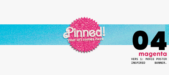
➷ magenta -- version 1.0: pinned post (or miscellaneous) banner inspired by the 2023 barbie poster. version 2.0: pinned post (or miscellaneous) pair of banners mimmicking the layout of a barbie doll box. one banner goes on top of the postbox, insert pinned post or text, and the other banner goes on the bottom! high quality examples.
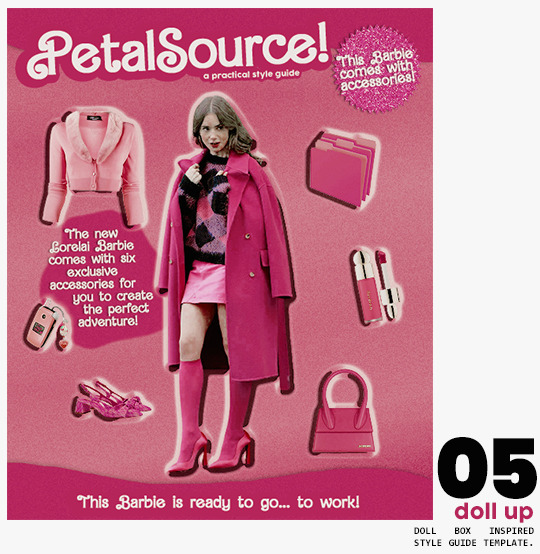
➷ doll up -- lookbook template inspired by the barbie doll box, featuring a "doll" picture and six customizable objects / accessories. you'll need: full body png of your faceclaim of choice, custom fonts (listed below), and 6 pngs of random objects or clothes to "come with" your doll. i've added a short tutorial down below on how to find and use some easily! high quality examples.
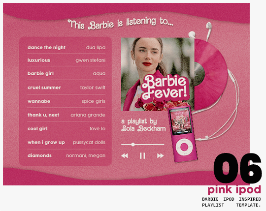
➷ pink ipod -- playlist template inspired by the barbie ipod, featuring a cover art and nine songs. high quality examples.
you can purchase all items as a package (deal price) or individually!
✩ important tips & useful information!
➷ needed fonts: bartex, cocogoose.
➷ object pngs + removing background of images: i found a super useful pinterest board with photos that can be used on your graphics: oxfordcommah's object pngs. additionally, the clothes png search on p*nterest is really diverse, and you can narrow your interests like "pink clothes png" or "vintage shoes png" and find a lot of options. once you found your images, go to remove.bg and paste their urls in there. it'll remove the background of those images for you and you can just paste them on your template and have fun!
➷ used coloring psds: the beautiful and super pink psds i used on the previews were not made by me and are NOT included in the downloads. in case you want to use them, they can be found here: dreams, 003.
➷ styles: the download includes two styles, one for a subtle drop shadow used in a few layers and one for the plastic box effect in the lookbook template. you can install them by opening the styles tab on photoshop > the four lines > load styles > find the barbie styles on your downloads!
➷ in case you have any questions, pop into my inbox or ims and i'll be happy to help you!
#template psd#template psds#barbie psd#character psd#character psds#𓂅 ♡ ⋆ 𝐦 ‚ templates .#i really really really hope you guys like this!!! i had so much fun doing it
320 notes
·
View notes
Note
hey kai if you want could you do a tutorial on how to put gifs inside shapes (like your MARGOT ROBBIE as HARLEY QUINN in the DC EXTENDED UNIVERSE) it looks so good
howdy anon! i’ve answered something similar to this before, but i figured that a proper tutorial would be nice, so thank u for sending an ask about it :)
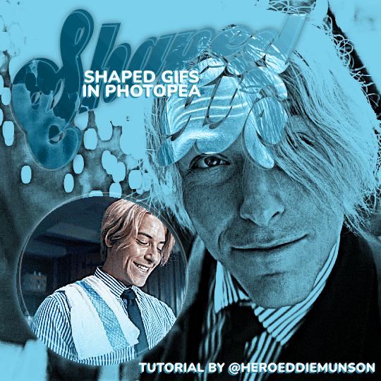
as per usual, you will need basic giffing knowledge for photopea, as well as the website itself, to complete this tutorial. this tutorial is also very wordy, but i do have some images to help with the process. if you have any questions about the process, please feel free to send in another ask.
without further ado, let’s go!
so, when making your gifs, the first thing you need to do is make sure that they are the same amount of frames. otherwise, your gif will end up looking strange with one gif looping faster than the other one.
once you have all of your clips you want to use for the gif you’re making (i will be using two, but you can use more than that!), decide which one you want to be in the shape that you’re going to be choosing. for the sake of this tutorial, i am going to be using a simple circle shape, but you can use any variety of shapes however you’d like. i have some notes below about different ways to get different shapes:
on your left toolbar, directly under the “move” tool, there is the option for a “rectangle select” tool. right clicking this option also allows for you to choose ellipse select for circles. by adding a new layer to your canvas (on the top options, go to layer > new > layer), you can use either of these shapes to make a rectangle or circle, which you can then fill in by going to edit > fill…
on your left toolbar, above the “zoom” and “hand” tools, there should be a rectangle. right clicking this should give you the option for other shapes, such as ellipses, lines, and custom shapes. depending on what you want for your gif, you can choose any of these options for your own gif shape, but beware that these shapes are all fairly limited to what photopea has to offer.
for other shapes that photopea doesn’t offer (like the starburst shape that mattel uses for barbie edits, for example), i will go to google and just look up things like “mattel logo shape png”, or whatever other shape i’m looking for, and try to look for a transparent png. while this does give you a lot of options, you may not be able to find a transparent option (i use remove.bg to help with that!) or you may have to do some editing around the edges to get the shape the way you want it (many of the mattel logos have a big MATTEL in the middle that ruins the edges of the starburst shape, so you’ll have to fix that, for example)
more notes about choosing your shape:
if you get a shape off google, make sure that your cropping fits that shape! if you have a shape that is some weird dimensions that arent a 1x1 ratio, your gif cropping will have to reflect that so it fits in the shape.
you should also know how big you want your shape to be on the finished product — for me, the entire gif canvas is going to be 540x540, so i’m going to make the shaped gif 240x240 so that both the big gif in the background and the shaped gif are visible in the final product. this will all depend on what you are doing for your gifs, though, so play around with different shapes/sizes in another canvas the size of your final product.
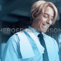
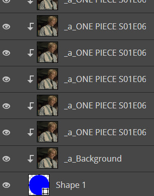
first thing’s first, make your gif for within the shape however you want. as you have (probably) seen from other gifsets of mine, there’s multiple ways you can choose to make the gif within your shape: you can do like this edit and have a colored overlay, or you could do like this edit and have normal coloring with a pop of color, or some other thing that you’d like to do! for this edit, i’m going to keep the sanji gif within my shape colored fairly normal with a pop of blue to match his shirt. my gif, as of now (without the shape), looks like this:
from here, add your shape on top of all your layers (as i said before, your gif should be cropped so the shape fits perfectly within the cropped gif!). go to the very bottom of your gif frames, and put that shape directly under the first frame (which is likely titled “_a_Background” or “_a_frm0,50”, depending on how you gif your gifs) while still within the gif folder you most likely have, especially if you follow my tutorials. this part is tedious, but starting with that first frame, go through every frame of your gif, right click, and select the “clipping mask” option. because you have that shape at the very bottom, every layer above it will follow the same clipping mask to put the gif within the shape. after your done, your frames should look something like this:
and now my gif looks like this:

which isn’t what i want, because i want that blue color in the shape with the rest of the gif! there’s an easy way to fix this, if you’re like me and have that gradient color: click and drag all of your adjustment layers into the folder with your gif (i know, goes against everything i’ve said before in my other tutorials, right?) so that you can do the same thing you did with your frame layers and create a clipping mask for those gradient color layers. you don’t have to do this for the other adjustment layers for your coloring, by the way, just for the gradient color layers! now my gif looks like this:

much better! and now that we have the shaped gif finished and in its shape (make sure you save the psd!), you can sharpen and export your gif by going to file > export as > .GIF and you’ve made your shaped gif!
now you can make your other gif to be behind the shaped gif; i won’t provide a tutorial for how i made this gif, other than it follows my usual coloring + a gradient layer to make the entire gif blue:

now that you have both of your gifs, we can move on to putting them on the same canvas!
after putting both of your gifs on the same canvas, position the shaped gif wherever you’d like to place it on the canvas. you can center it, place it in a corner, whatever you want! it’s your gif, your choice. i placed my circle sanji gif towards the bottom left corner of the canvas because i wanted to be able to see both the little gif and the larger gif clearly. :)
from here, you can do a number of things to make the shaped gif stand out; what i did for mine is add a shadow behind the gif and an outline of the circle that’s off centered from the circle gif itself. here’s how i did both of those things:
shadow: double click the shaped gif’s folder to open up the “blending options” pop up menu. check the “drop shadow” option towards the bottom of the list, and adjust it to how you want it to be. once you’re happy with how the shadow looks, click “OK” to close the pop up menu. below are my settings for this particular shadow on this gif, but this may change depending on your own gif (feel free to play around with these settings!):

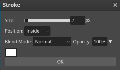
off-centered outline: this is specifically for circles/rectangles; if you have another shape that you got off google, for example, this part of the tutorial will not work (but if you want to know how to do something like this for a shape like that, i can create another tutorial! just ask <3). create a new layer (layer > new > layer through the topbar menu) and create an ellipses the same size as the circle i created earlier. from here, go to edit > stroke… to make the pop up menu show up (you will not be able to preview this when you edit this layer, so if you’re unhappy with how it looks once you click “OK”, use CTRL+Z to undo and try again!). once you have the shape as you want it, go to select > deselect on the topbar to deselect the section you just made, and use the move tool to move the shape around however you want. if you want to make the shape less intense, change the opacity located near the layers menu (i put mine at 30%). below are the settings for my shape, which you can of course play with as you'd like for your own gifs:
now that you’ve done that, do anything else you’d like to do to your gif — add text, put a watermark, whatever you’d like! after you’re finished with that, save your psd and then go to layer > animation > merge to merge all of your gifs together before going to file > export as > .GIF. and then you’re done! congrats, you’ve just made a shaped gif in photopea! :)
#kai.answer#anonymous#mystuff#mytutorials#photopea tutorial#photopea gif tutorial#photopea#gif tutorial#completeresources#usergif#userars#userlace#tusersai#tusergeo#usernaia#hopefully this helps anon!! again feel free to send another ask for clarification :)
154 notes
·
View notes
Note
Hello!! Not a request, which I hope is okay, but I was hoping I could ask: What do you use (as in like programs/apps) to make things like your mood-boards or outfit boards? And if possible, do you have any tips for making some myself? I've made a couple before but I always seem to struggle with thinking of objects and stuff to put on them. Thank you in advance, and I hope you have a wonderful day!! :-]
Of course you can ask!! <3
I use Ibis Paint X (freely available for android and iOS) and have been for multiple years. It's actually a drawing up but it's GREAT for editing too!! It takes a bit getting used to but once you get the hang of all the controls it's super easy I promise :D
Please always let me know if (any of) you have more questions, I'll be super happy to follow up!! <3
Outfit Board Tips:
- Stick to a specific theme (i.e. The Zoo)
- I like to start with the outfit (I'm a big fan of shorts if it wasn't obvious), you can also use it for color guidance!
- I usually like to include at least one outfit, one food item and one plushie
- I think it's also important to keep the age group you want to make the board for in mind, it helps with searching for toys
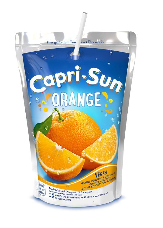
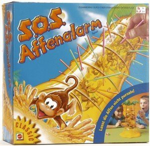
- As for choosing the items, I usually think of me and my childhood and what I want(ed) to play with myself! You can often find specific toys/food items with a google image search (i.e. i searched for Zoo Cookies, Capri Sun Orange, Monkey Board Game)

- In my opinion, a big part of making something look nice is composition. I usually work with three sizes of images: big, middle and small. I try to only put two big elements (one being the outfit) and put them farthest apart from each other. I place middle images randomly and fill in the spaces with the small images (which are usually "clutter" like legos, shells, gummies etc. all the same thing but different colors/shapes)
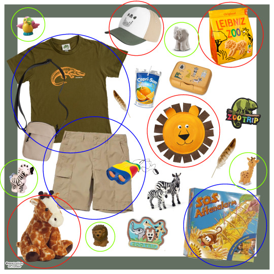
- As for where to find pngs, I usually use Pinterest, Google and Tumblr (#agerepngs) and I make my own pngs with background remover websites such as remove.bg or pixian.ai BUT you can also make them yourself with Ibis Paint X or PicsArt!
- And lastly, I like to do fun little swirls & patterns around the object to fill the empty spaces even more
Okay I hope this wasn't too elaborate lol thank you so much for your ask, I really hope it helps you a bit!! Good luck, I'd love to see some of your stuff if you wanna tag me or send it to me :D <3 oh & final product of the example mood board I used can be found here 🐘🐒🐊

#sfw age regression#age regression#age regressor#kid regression#sfw agere#agere blog#agere community#inner child#sfw#agere moodboard#agere outfit#outfit board#sfw agedre community#sfw age dreaming#sfw agedre#sfw age dreamer#sfw pet regression#sfw pet dreaming#sfw petre#pet regression#Ibis Paint X#Tips#Tutorials#Editing Tutorials#my stuff#asks
34 notes
·
View notes
Note
i hope this doesnt count as a request but would you be willing to share like your favorite stuff to use with making graphics?
HII ANON!!!! i love sharing, sharing is caring <3
i make a lot of my own stuff because im picky, so i often browse like mad on pinterest till i find something i like and i cut it out myself!!
i have TWO pinterest boards! THIS brand new one i made specially to help with finding stuff for editing!! and THIS old one of a very messy collection of pngs / icons / etc.
i often use remove.bg to help me with big empty backgrounds! and i also use lots of the masks from THIS site in combination to whatever i add!!!
here are some of my favorite borders:


and my favorite overlays:


HOPE THAT HELPS!!! <3 and if you want more or have any questions, shoot me an ask!
108 notes
·
View notes
Text
🔎GIF 𝓣𝗎𝗍♡𝗋𝗂𝖺𝗅 ; 𝓑𝔂 𝗟𝗶𝗮 ⠀⠀⠀⁔⠀⠀⠀⠀♥︎⠀⠀⠀⠀01

𝓖𝗂𝖿𝖿 ; 𝓣𝗒𝗉𝖾 1


:Just three simple steps ;3
Step 1
We are looking for a 🔎PNG of our liking! we can remove the background with ibis paint(App) or 🔎remove.bg(website)
Step 2

I do this in capcut but it works in any editing app; We put the mb photos preferably each lasting 5/4 micro seconds, here I leave the filter that I use for these gifs but you can search for the one you prefer on Pinterest like "Soft overlay" ;) , to make it transparent we use the "blend" option

Step 3
Make it a gif: this is the easiest part, we can do it from the application itself (tumblr) or we can use the 🔎ezgif(website) to do it!

>I hope I've helped
✿ Thanks 4 read!
>Look at the #
#🗣𝓣𝗎𝗍𝗈𝗋𝗂𝖺𝗅 ; 𝓑𝔂 𝗟𝗶𝗮#gif tutorial#bylilliaa#I hope this#don't be so boring#for you😭#Please tag me if it helped you!#💭𝓙𝗎𝗌𝗍 𝖫𝗂𝖺 ! 🤓
62 notes
·
View notes
Note
same anon about the icon… i’ve tried several tutorials on how to make an icon on photopea and no luck. where i struggle is the second step i guess when you have to create another layer for the icon, idk
so i tried to explain what i do when i make icons, and i... accidentally made an entire tutorial LMAO but hopefully you will find this one helpful! i tried to be thorough with all of the steps, so let me know if you have any issues following this one.
in this tutorial, we're going to be making the icon in this header:

let's get into it!
first thing we need to do is have our subject that the icon is going to be of. i suggest using a clear screenshot of them from whatever show/movie/music video/etc they are from where they aren’t in the middle of moving so you can get the best cutout, which i do by using this site. below is the screenshot i will be using:

you can pre-crop your screenshot in photopea if you’d like, especially if there’s other stuff in the screenshot. in this case, with my screenshot, i’d like to have choso be more centered and not have to really worried about having to erase the back of mahito’s head later on, so i simply cropped it with photopea’s crop tool to get this:

now that you have your screenshot, you have two options: using the “polygonal lasso select” tool (right click the third option from the top of your toolbar on the left side of photopea to find it) to do the very tedious task of cutting out around your subject by hand yourself, or use remove.bg (the site i mentioned earlier) to let the site do the hard work for you.
i personally use remove.bg for basically all of my icon making – very rarely do i need to cut out my subjects on my own with most screenshots, especially if they’re the main subject of the screenshot and the screenshot is clear, which is why i emphasized that at the beginning of this tutorial. since my choso screenshot is very clear, remove.bg won’t have any problem cutting him out for me.
to use remove.bg, save your (cropped) screenshot by going to file > export as > png and open remove.bg. once you open up the site, your screen should look something like this.

click the big blue “upload image” button and select your screenshot, and let the site load. depending on your screenshot, you should have a pretty clean cut out. for example, this is what mine ended up looking like:

now you can click the big blue “download” button there on the right and open that up in photopea, with your subject now on a transparent background. your screen should now look something like this:

now we can make the base background for our icon. go to file > new… to create a new canvas. here, you can make the settings for your icon, including the name, size, and background color. i personally make my icons 250x250, but i find anything between 200x200 to 250x250 works. anything smaller than that tends to get really compressed on tumblr, and anything bigger loses its detail once it’s on tumblr because of that same compression, so 200-250 is the sweet spot for having higher quality icons (especially with photopea, which tends to decrease the quality because it’s a free online service).
these are the settings for my icon’s new canvas:

clicking that big “create” button then leads us here:

from here, you can leave the canvas as the plain single color that it is, but i personally like the look of the slight gradient that many other icon makers use to make the icon a little more interesting. to achieve that slight gradient, on your canvas, go to layer > new fill layer > gradient fill. your screen should now look something like this:

on the right, next to the “opacity” textbox, click the dropdown menu that says “normal” and change the blending setting to “soft light”. your canvas will look something like this:

with that big popup menu that allows you to adjust the gradient, make the gradient go in whatever direction you’d like. play around with the settings until you find something you like, and be sure to use the “opacity” textbox on the right to help you with the intensity of the gradient if you need to. this is what my settings look like:

which are pretty standard with all of the icons i make. and that’s the background of your icon! you can leave that alone for now.
now we need to color our subject for the icon. i prefer coloring my subject on the same canvas that i opened it after sending it through remove.bg, so i’m going to do that now. with my coloring, my subject choso now looks like this:

to make sure all of the coloring i did stays on choso, and doesn’t change the color of my icon background when i copy him over, i am going to create a layer mask on the folder with my adjustment layers in it. to do this, hold down the “ctrl” button on the keyboard and left click the little image of your subject on the right (next to where the layer says “background”). doing so should make a dotted line show up around your subject like this:

now that the subject has been selected, click on the folder that has your adjustment layers in it. towards the bottom of where all your layers are, you should see a square with a circle in the middle of it, in between the “eff” and half-filled circle buttons.
when you click that, it creates a raster mask on your folder so that the only thing affected by the adjustment layers (and whatever else you put in the folder) affect your subject. that folder now should look something like this:

alright, we’re almost done! now we need to resize our subject and move all of what we’ve done here to the icon background canvas we made earlier. to make our lives easier, select the “background” layer and the folder with your adjustments in it by holding down “ctrl” and left clicking each layer, which allows you to select multiple layers at once. where you made the raster mask a moment ago, on the other side of the half-filled moon, you should see a folder icon. click that to group the background layer and the adjustment layers into a folder together:

since our icon’s background is 250x250, i tend to make my subjects have a 175-200 width, depending on how big the subject itself is. since choso has such big and pointy hair, i’m going to make the width 190px. this will depend on your subject/crop, so feel free to do some trial and error testing to find what works best for you!
right click the new folder you created a moment ago with the subject and adjustment layers folder inside, and select “duplicate into…”. in the popup, select the canvas you’re duplicating into (we only have two, so…just the other one, lol):

going to our icon background canvas, we can see that our subject isn’t really centered:

this is personal preference, but i like to have the eyes of my subject be somewhat towards the center of my icons. go to view > add guides… and you’ll have a popup where you can set up guides for your icon that looks like this:

i set up my guides to be at halfway between the width/height of my icon, so since we have a 250x250 icon, i’m going to fill in the vertical and horizontal textboxes in the popup with 125 for both, which makes our canvas now look like this:

this will make it a lot easier to center the eyes of the subject because we can now aim for that center point where both lines connect (rather than guessing where the “middle” is). click “ok” to save your guides, and now with your main folder selected, center the subject on your icon canvas. if you want to get it perfectly centered, open the main folder and ctrl + left click the subject’s layer and the raster mask of the adjustments layers folder and move them on the canvas — your subject should “snap” to the center with a red line when you move it there.
now that i’ve moved my subject where i want him to be, my canvas now looks like this:

again, feel free to play around with how you want your subject to be placed on the canvas. it will probably be different depending on things like the angle and size of the subject!
once you’re happy with the subject’s placement on the canvas, you can remove the guides you made by going to view > clear guides. if you want to make extra adjustments to the coloring of your subject, make sure to open up the folder where all of your adjustment layers are and only make those adjustments within that folder. this way you can make sure that all of the coloring stays on your subject and doesn’t mess with your icon background’s coloring that we did earlier.
now my icon looks like this after adjusting the coloring to better match the purple of my icon background:

almost done! last part of making our icon is to sharpen the subject. you’ll want to do some pretty minimal sharpening, just because (as i’ve mentioned before) tumblr and other sites you may use the icon on will compress the image, and i don’t really want to have a pixelated, unidentifiable blob on a pretty purple background to be my icon. your sharpening will greatly depend on the subject of your icon — once again, play around with different settings to find what you think looks best! make sure to have your subject layer selected before doing any sharpening.
since my subject is from an anime, i will be using a slightly adjusted version of this tutorial by @aq2003. below are the list of what i did for the sharpening settings:
filter > other > mimimum… (0.5)
filter > sharpen > smart sharpen… (200px amount, 0.2 radius)
filter > blur > surface blur… (radius and threshold both set to 3px)
filter > filter gallery… ("grain" under "texture" header, intensity 5 with grain type set to "soft")
and what each of those steps looked like, in order:


and from here, you're basically done! there are texture packs out there by various other users, such as @peytonsawyers and @evanbukley, that you can play around with to add some more fun stuff to your icon’s background, but for the sake of this tutorial, we’re all finished!
make sure to save the psd of your icon (file > save as psd) and to save your icon as a png (file > export as… > png). you’ll get a “save for web” pop up like you do with gifs, where you can preview the icon (again) before saving it:

and that’s it! congrats, you’ve made an icon in photopea :) hopefully you found this helpful, anon!
#answered#anonymous#resources#tutorials#*tutorials#*kai#graphic tutorials#icon tutorial#icon tutorials#icons tutorial#icons tutorials#photopea#photopea tutorial#photopea tutorials
20 notes
·
View notes
Note
Hiya! Not a request, but I was wondering if there’s a certain app you use to remove the background on the pngs? I’ve been making some of my own DNI banners, mood boards, etc—and manually erasing it has become tedious 🥲. Thanks for your time!!! ❤️❤️❤️
Hello ! I use remove.bg to make my pngs, its very quick and works pretty well from my experience ! :) I hope this helps and have a nice day !
22 notes
·
View notes
Text
I wanna share with you all a fun feature of the site I used to pluck Alex from the Family Ties scene I screengrabbed and put him in my profile picture. (site is remove.bg)
They've got a background tool with pre-loaded backgrounds you can use, and I uploaded a picture of Marty McFly for fun and felt like a kid playing around with an action figure. Look what you can do to this guy.


Marty confused at the beach. Marty confused in a city.


Marty confused on a snowy, tree-lined path. Marty confused in the country.


Marty confused in a desert. Marty confused ON THE MOON. (I searched for and uploaded that last background, btw. It isn't included.)
This is the kind of silliness my blog was made for.
#back to the future#marty mcfly#catch me sitting here laughing to myself as I rip my blorbos from their natural habitats & stick them in various locations
68 notes
·
View notes
Note
Hey! Do you think you could please make a tutorial on how to add transparent shapes over a gif? The way you do it gives a gif such an unique touch.
sure thing and thanks for the compliment! i'm gonna show how i did the shapes in this and this set. i'll be using this gif of liv:

now i'm gonna use google to search for a transparent shape. i usually find mine by looking up something like "flower svg" or "flower png." just make sure the background is transparent (if not, use remove.bg to do so if you don't know how to in photoshop plus it's a lot easier)
drag the shape onto your gif's canvas. use the free transform tool to adjust its size to the way you like it. i now have something like this:

if your shape is already white, you can skip this part! but mine is black, and it won't have the "difference" effect on it. so open the blending options on the layer (right click the layer > click blending options) and click color overlay. make sure the blend mode is normal, and change the color to white. turn that layer into a smart object, (right click > convert to smart object) and now you should have something like this:

you can now put the shape's layer blending mode to "difference."

you can try putting it on "overlay", "exclusion" or any other option to see what you like better! but i mostly use "difference." this is my gif now:

open the blending options on the layer again and go back to color overlay. change the color to whatever you want. for this example, i'm gonna use pink! then switch the blend mode to "multiply" or "color", depending on your preference on how it looks. i'm gonna keep mine at "multiply" and now my gif looks like this:

and that's pretty much it! now you can leave it like that, or do whatever you want to it. sometimes i add a drop shadow or a stroke, kinda mess with it to see what looks best. i hope this helped you and lmk if you need any more help :)
16 notes
·
View notes
Last Seen Blogs

xkaix
Kai
dailybandofbrothers
daily band of brothers

project-writers
Project Writers Nigeria

vag-man
Amateur Couple Loves Women

paldeatrio
Ask Nemona, Arven, and Penny!