#been practicing shapes and poses so much more recently and how to effectively use 3D refs
Note
I love Vesper so much.
That's it. That's the ask.
Thank you!! I do too, and I’m going to make it Everyone Else’s Problem
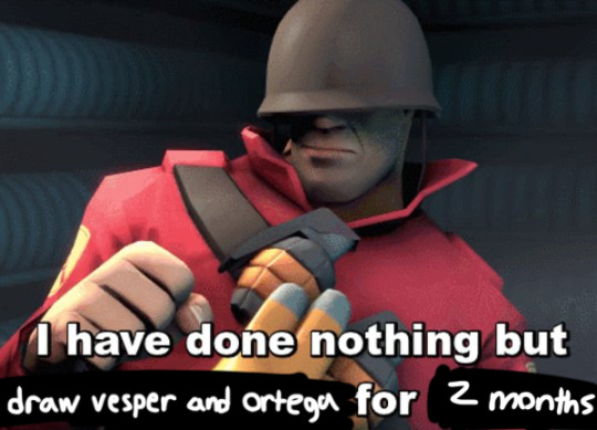
#text#being so normal about her and that old man#been practicing shapes and poses so much more recently and how to effectively use 3D refs
9 notes
·
View notes
Text
Ritaban Das: Storyboarding for Effective Storytelling
Character designer, illustrator and storyboard artist, Ritaban Das, elaborates on the significance of storyboarding to effectively tell a story and thus also shares insights from his decade-long experience in animation.

Ritaban Das is a character designer, storyboard artist and illustrator working in the animation industry for the last decade. He’s worked on a wide range of national and international 2D and 3D animated projects for platforms like Nickelodeon, Cartoon Network and Pogo. Recently, he shifted to Toronto, Canada for higher studies, looking to contribute his skills to the Canadian animation industry. He hopes to someday work on his own animated show.
ORDER A CUSTOM ILLUSTRATION
Q. How do you differentiate your approach between the roles of character designer, storyboard artist and illustrator?
Ritaban Das: At the end of the day it’s all interconnected; it all comes down to ‘story’. When I design a character, I start by thinking about what kind of personality the character has and their role in the story. I think about what I’m trying to communicate through the illustration. This helps me to figure out poses and expressions. As I’m drawing, I’m thinking about shapes, proportions and appeal. I also think about the composition of the illustration. When I make storyboards, I’m telling a story in motion by acting out the characters in them.

Q. What have been the greatest lessons you’ve learnt professionally and personally in your ten years of experience?
Ritaban Das: Draw what you like and the rest will fall into place. Only you know what motivates you.
Q. How did you find your calling to be an artist and, thereafter, how did you nurture your skills to hone your craft?
Ritaban Das: I’ve been drawing for as long as I remember and I’m always very passionate about it. To be very honest, I sucked at studies and my parents knew that very well. I remember spending most of my time with a box of chalk and slate gifted to me by my father. Like every other child, I also loved to sketch my favourite cartoons. I usually sketched these animated characters on the back pages of all my notebooks and also my classmates’ notebooks. It made me known amongst my seniors for my sketches.
That’s the only thing I was good at which I followed blindly. Honing my craft came from lots of practice. I draw almost every day. I also follow and study other artists’ work. Reading or watching their interviews, where they describe their work processes and the likes, helped me a lot to grow as an artist over the years. I try to open my eyes and ears to absorb everything.

Q. Could you take us through your process of how you envision a character and then execute it practically?
Ritaban Das: Being a Character Designer, most of my work is very much character-driven, blended with humour and very graphical too. I always try to convey some sort of story through every character or Illustration I make. I like to play with various shapes and silhouettes and usually keep things simple.
The character design process is, in a way, a combination of different things. I ask myself ‘Who am I drawing? What is his/her personality?’ I sometimes look at influential artists’ work to get some ideas or even start from a drawing I like and translate it into my style. Then, trying to forget those influences, I often start from scratch with a basic shape such as the face as it determines the rest of the character for me, then the body (this can be a circle, oval or even a pear shape – it all depends on the personality of the character I want to draw).
Q. Could you please elaborate on your current pursuit of higher studies and how you came to choose Canada for it?
Ritaban: I completed my studies at Humber College in 3D modelling & VFX and Graphic Design and got a job in an animation studio called House of Cool as a Story artist. I’m working on a very exciting project which will probably start airing next year.
I’ve always been well aware of the Canadian animation industry from the beginning and the kind of projects they do. I worked on a bunch of Canadian animation projects back in India.
We used to do a lot of outsourcing for studios here like Big Jump and Brown Bag Films. Canada’s animation industry always attracted me in terms of work culture, the kind of content they nurture, and the quality they produce, so I want to be a part of it.
“Whether you’re working on a commercial TV spot, web video or film, storyboards are an effective way to quickly tell a story. “
Q. What about the world of animation draws you towards it?
Ritaban: Animation is important because it enables us to tell stories and communicate emotions and ideas in a unique, easy-to-perceive way that both children and adults can understand. Animation has helped connect people throughout the world in a way that sometimes writing and live-action films cannot.
Today, anyone can pick up a drawing tablet and show their ideas to the world. Drawn figures can be funny, sad or serious. It can have a playful, less intimidating feel to it to make the viewer feel more comfortable. Often, it has simply served as a way to make a heart-warming story that makes you think.
Through live-action movies, people can form biases based on the appearance and real-life personality of an actor playing a character. But as an animated character, the character feels like their own being.
Q. What would you say are the most challenging aspects of working in the animation world and how do you tackle them?
Ritaban: Every project is challenging in different ways. The challenging ones are the projects where clients don’t have a clear understanding of their audience and outcome, goals or don’t have an investment or hierarchy for arriving at a consensus on feedback. The most challenging projects always boil down to size and scope and managing a team to produce the animation. Also, animating subject matter that I’m not interested in is challenging. But at the end of the day, we all survive because we all just love what we do.

Q. Could you take us through your process of creating a storyboard and highlight its most important aspects?
Ritaban: Whether you’re working on a commercial TV spot, web video, or film, storyboards are an effective way to quickly tell a story. A storyboard is a sequence of drawings that represent the shots planned for video production. It covers all of the major shots, angles and action of your film. The very first step is to read your script and visualise it as an audience would. As I go from scene to scene, I analyse the screenplay and decide how I want each scene to look.
A script breakdown tells you what storyboards you need to create. Then I start doing the rough thumbnails with all the necessary camera angles in Photoshop and chalk out the entire scene I’m planning to do. The important thing is to give anyone who looks at the storyboard a sense of space — where are the objects in relation to the space they’re standing in.
Once I finish locking the scene on thumbnail level, I pitch it to my art director or creative director and take their feedback. After passing the thumbnail phase, I start making the rough staging in Storyboard Pro and work on the required actions and move forward with the scene for the final animation. I might have to rework scenes over and over, combining different elements of the iterations until I finally have what the team is looking for.

Q. What ways do you apply to understand client needs better and thereby produce results that are in sync with them?
Ritaban Das : Whether I work in any studio or as a freelancer, I always listen to what clients need. Listening to your client will help you understand and retain the information you’re already receiving, even if it isn’t a formal meeting. You need to ask questions to identify needs and paraphrase what they say. It helps with clarification and to enhance your understanding of their needs.
Also, I bring new ideas to the table. I don’t hesitate to propose something other than what the client had in mind. You may have a better service in mind and, if nothing else, this again shows you’re listening and attempting to understand your client’s needs. Understanding client needs is one of the biggest challenges of any business but also one of the most important and rewarding tasks.
Q. Considering your range of work, could you please elaborate on significant projects and clients you’ve worked for?
Ritaban Das: Over the ten years of my career, I’ve worked on various national and international projects back in India for clients like Nickelodeon, Cartoon Network and Pogo. I’ve been part of the projects like “Camp WWE”, “F is for Family,” “Kuu Kuu Harajuku,” “Evan the Epic,” “Penn Zero: Part-time Hero,” “DC Superhero Girls,” “Cloudy with a chance of meatballs” (series), “Rhythm Warriors” (series-in production) and other numerous animated TV shows.

Q. According to you, in what direction should animation be exploring and progressing now?
Ritaban Das: Animation is an incredibly versatile medium that is widely used in many different forms today. Animated films are big business nowadays. Companies such as Disney have had enormous success producing animated children’s films for many years. Animated characters such as The Simpsons and The Flintstones have long been familiar visitors to our television screens. The future of animation looks to be on an interesting journey as the quality of films is becoming higher and higher. Most people would now aim for a 4k film. Also, they’ve been experimenting and coming up with new techniques of animation.
One of the interesting ones is Mix Media, a technique that Disney has been experimenting with for a few years is mixing CGI and traditional 2D animation. The idea is to create an animated film using CGI and then to draw over each frame to give it a hand-drawn quality. The computer gaming industry is also pushing the boundaries of what is possible with animation, leading to the creation of some extremely realistic game footage. Computer game animation has certainly come a long way from the 2D graphics of early arcade games.
Now computer game animators can build environments and objects that react to the player’s actions. The animation looks set to continue delighting audiences for many years to come. With animated films continuing to rise in the blockbuster charts, capturing hearts and imaginations, there is no sign of this genre coming to an end.
0 notes
Text
Research for Specialist Subject
When thinking about what I should research, I thought about what would make me a better Animator. Well I know from my Advert that I can draw pretty characters. However, when I think of Cupti & Shaker; which I wanted to be smooth Rubber Hose fluid animation, I dont think it ticked all the boxes. As a first real crack at animating, I learnt a lot about software and the practicality of it ( the long time it takes). However when I look at it, it doesn't feel as professional as I would have liked. Since then I've pulled away from the Animate CC software quite a bit. I felt like it held back the possibilities for drawing and detail because of its limited brush features. I'm using Photoshop a lot more as I get a professional feeling and look from my work. Despite finding a style that feels good, Cupti & Shaker; which was heavily inspired by "Who Framed Rodger Rabbit", doesn't reach its level of fluid motion. So I decided to work on my actual understanding of the motion that is used in animation. I went to the library on campus and found a book titled "The Animators Survival Kit" which funnily enough, was written by the creator of "Who Framed Rodger Rabbit". From reading it he gives an intro into his early experience in the industry and his idolization of the man he worked with. Richard Williams, learnt much from, Grim Natwick (born Myron Nordveig). When William's first met him he was told by Natwick that "Animation, its all in the timing and the spacing". For me this is what I read and thought this is exactly what I need to know! I decided to read on in the book and it goes on to perfectly explain the animators "Timing Chart" and the main forms of drawings that they make while animating a scene which are (In order of importance), Key Frames, Extremes, Breakdowns and Inbetweens. (Williams,.2009) Obviously all the drawings are important but the idea of expressive animation, is the key poses. They are so important to get right because they are the story telling poses. So long as those frames explain the story and expression, the the playing of or the "acting" of the character comes in the extremes and breakdowns. These are things I was only vaugely informed on during the animating of "Cupti & Shaker". So apart from the frames. There is the timing. The time charts are usually made for other animators that are helping with the animation to understand what is wanted from the scene being drawn. Because the timing explains where each picture is as a frame in the scene. The timing comes hand in hand with the spacing however. The spacing is the distance of each drawing in a frame compared to eachother. This effects the speed and "fluidity" of the movement. If you have someone running, each frame they are drawn, they will be considerably further away from the last frame. However if he were to slow down, he would not suddenly be still in the next frame, there will have to be frames in between gradually getting closer together to "slow in" to the stop. This is one of the most used methods for realistic animation.
Timing & Spacing is considered widely among the animation community, that it is a core principle to have. I specifically want to study this because I know it is something I have misunderstood in previous projects. With Cupti & Shaker I know specifically that I would animate, pose to pose, with a frame drawn evenly between the next. This means most movements are simply sliding at a constant rate. This can be considerably similar to the movement of digital animations. A problem with digital animations is how “perfect” a lot of the movement is. With computers being able to figure out how to time things, the specificity of the movement can make it unbelievable, reaching a kind of “uncanny valley”, where its too real to be real. Similarly I mentioned something similar with the animation of the new The Lion King remake where the movement is “floaty” which is a popular term used among animators to describe a movement that forgets weight. (The Lion Kind, 2019)
Broadening the subject slightly, Timing and Spacing also relies heavily on other aspects of drawing. Being something I focused on recently; drawing. When it comes to animation, you need to think of what you’re drawing as a 3D object moving in space. That way, through the use of timing and spacing, your characters will also be consistent with their movements. The human brain is very good at subconsciously knowing if something is keeping its shape, however it is very difficult to then put this into our work. This is why some animators actually draw rough passes using the shapes of the characters before the details. What I’ve read when it comes to this, there is no way to research this, its more to do with practicing, because it is a practical skill. The skill should be developed along side animating. One person who I have been following on his YouTube channel is Aaron Blaise, he is an ex animator/director for the Walt Disney Company who now creates tutorials and streams for aspiring animators like myself. He’s been incredibly helpful with tips for animators who need to learn to draw thinking about shapes and perspectives. He’s one of the reasons I’ve taken to practicing drawing a lot more. (Aaron Blaise, 2012)
My idea for the Specialist Subject is to create a series of designed characters and have some small animated movements as a practice of timing and spacing. These short animated characters will help to give me an understanding of moving characters in 3D space in a 2D format and also to use my new understanding of timing and spacing. This could be similar to the industry standard of “Rough Passes” used when producing animated films. These rough passes are animations that are incomplete but have the full movement planned and fleshed out above secondary motions like hair and clothing.
As an example of other creators using rough passes would be, Disney. They say testing is a crucial part of the production. As soon as a sequence was ready they would put it into the multi-plane camera and have it made into film. This way they could watch it over and over and see the movement. With new software it is possible to always test your animation, methods known such as “Scrubbing through”, where you use a play head to drag trough the frames, you can quick export to view it as a video file ect. I find this helps me specifically when trying to visualize the characters in a 3D space on a 2D plane.
Of all the styles of animation I’ve mainly held myself to the “pose-to-pose” method. This allows to keep characters more consistent and planed out. However, with this being a realistic and restrictive method, I have mind to try using the “straight ahead” method which is very different. This is a form of animation where you draw a frame and then draw the next one after another. This allows for a lot of freedom and spontaneity. Most animators use this for character hair, fire or fight scenes where things are far more random. This could benefit me within animations as it provides visual interest and doesn't require anywhere as much time because you don’t need to worry about the consistency.
If I were to use this style, I might want to use it as more of a “main feature” than a characters hair or such. An idea that comes to mind is something like magic. This is represented in many animations and is usually a form of character expression. Something that springs to mind is the story of “The Sorcerers Apprentice” in the Disney classic Fantasia. This could be a “realistic” pose to pose character, that uses straight ahead magic. (Fantasia,1940)
Animation as an Art form is comparatively young and compared to others. As I went into in my FMP last year, animation had a boom of popularity around 1920′s however it really came into its own when animators developed “Methods” that all aspiring animators would benefit from learning. These are a set of rules for animation. I’ve spoken about the principles of animation however I haven’t mentioned that despite these being “Rules” many animators that are experienced find that they are there to be broken. A lot of the character and story telling done in movement is made unique and eye catching when the rules are bent but not so far that is seems unbelievable. This is where originality and skills comes in most. Sometimes animating on two’s works better than one’s and this we still aren't sure why, probably because techniques for everything are still being discovered today. Theres no way to know exactly how best timing will work in scenes. So even when you use the principles you might find deviating from them works better. ( Thomas, F. Johnston, O, 1981)
However, there is one thing that animators have found that DO stick to certain rules, and these work across the board. The timing of a walk is very specific in animations because people in real life all tend to walk at the same pace. Our unconscious recognises this and holds animation to the same standard. most people walk on 12′s. This means theres is 12 frames per step they take. Walks can be animated on 2′s but runs are always animated on 1′s. The more a position of a character changes the more time you might add to have more frames to reach there, or you would want more frames in a shorter time. Most companies animate on a standard of 2′s however when running or theres a fast change of shape your would need to animate on 1′s to compensate. This is why animations where made with music and it worked so well, because everything could be reduced to the beat of a characters walk.
0 notes
Text
From the mundane to the divine, some of the best-designed products of all time
by Catherine Anderson, Carla Viviana Coleman, Craig M. Vogel, Kalle Lyytinen, and Lorraine Justice

A well-designed product equally elevates form and function. It is pleasing to look at, easy to use and solves a common problem.

We reached out to five design professors and posed the following question: What’s the best-designed product of all time, and why?
Their responses vary from cheap, everyday products to newer, more expensive ones. But all share a story of trial, error and ingenuity.
Cutting the glare
Catherine Anderson, The George Washington University
In the early 1920s, as Danish designer Poul Henningsen observed Copenhagen at night, he lamented the quality of light in people’s homes. He noticed that the incandescent bulbs – sometimes bare, sometimes surrounded by a single shade – created “arrows of light” and a harsh glare.
Henningsen set out to create a new design that would mitigate this “dismal” effect; it would be “…constructed with the most difficult and noble task in mind: lighting in the home.”
“The aim is to beautify the home and who lived there,” he wrote, “to make the evening restful and relaxing.”
His approach was scientific. He rigorously examined how using multiple shades could cast a warm glow of light within a room.
In 1924, the “PH lamp” was born.

Poul Henningsen’s PH lamp. Holger.Ellgaard/Wikimedia Commons, CC BY-SA
It’s delightful to look at. But most importantly, it emits a light that’s forgiving to the eye – an effect that’s created by the multiple shades, which evenly distribute the light. This creates a soft halo that attenuates the contrast between the light source and the surrounding darkness.
Henningsen’s sleek, spare lamp was awarded a gold medal at the 1925 International Exhibition of Modern Decorative and Industrial Arts. Over the years, it inspired many offshoots, such as the Artichoke Lamp, and became a product worthy of kings: In 1938, a train compartment for Danish King Christian X included one of Henningsen’s lamps.
All underscore the strength of the original design, which can still be bought today.
Holding it together
Lorraine Justice, Rochester Institute of Technology
For years I took the simple paper clip for granted. As a kid I’d twist them apart to hang Christmas ornaments. In my teens I’d use them to shoot rubber bands at my friends. And in the 1990s I’d straighten them to pop a software floppy disk from a defective hard drive.
It wasn’t until I became a design student that I realized the paper clip – which is officially patented as a “gem paper clip” – was a near-perfect design: elegant, functional and made of steel, a sustainable and recyclable material.

11 billion sold in America – per year. 'Paperclip' via www.shutterstock.com
But the paper clip had a long path to the flawless form we know today.
The paper clip started out as a pin that pierced the papers to hold them together. The sharp pins would prick the workers using them and were difficult to use. Thus began the gradual improvements: The straight pin morphed into something called a T-pin, a device with a horizontal wire on the end that allowed the pin to be pushed more easily through the papers without needlessly pricking fingers. However, this design still left holes in the papers.
In the late 1890s inventors in the United States and Europe began to work on new versions of the paper clip. In 1898, Pennsylvania inventor Matthew Schooley believed he had improved upon the pin design by creating two loops in the wire. But there was still a problem: A piece of wire extended from the loops and would catch and rip the paper. Many other inventors introduced various clasps, clips and metal-stamped designs, all in an effort to create a reusable paper binder that would be cheap, safe and secure.
Finally, in 1899, an inventor from Connecticut named William Middlebrook designed the gem paper clip, along with a machine to manufacture it, to create the paper clip that we know today.
The iconic double loop design had just enough spring to hold several sheets of paper together – without snapping and without piercing fingers or paper. Today, Americans buy 11 billion paper clips every year, though they aren’t all used for binding pieces of paper – I doubt Middlebrook could have imagined that his invention would double as an ornament hanger and rubber band launcher.
Terminal waits
Craig M. Vogel, University of Cincinnati
In 1958, architect Eero Saarinen, who had been tasked with designing the main terminal for Washington Dulles International Airport, approached furniture designers Charles and Ray Eames – already famous for their Eames Lounge Chair – with a request: He wanted a public seating system for the terminal that was affordable, sturdy, stylish and versatile.
In 1962, the husband and wife team unveiled their tandem sling seating system. Even though it was designed to complement Saarinen’s terminal, it was so practical that it quickly became one of the most common seating solutions for airports around the United States – and, eventually, the world.
Because public seating gets so much use, it needs to be sturdy and easy to maintain. Cost is always an issue, so designers are often hamstrung if they want to make something that’s aesthetically pleasing.
An iconic example of the principles of midcentury modernist design, Eames’ seating system was an elegant and simple solution to all of these problems. It ships in parts, is easy to put together and maintain, and is tamper-proof.
The chairs are sturdy but lack a cumbersome support structure, which makes it easy to clean the floor under the seats. The configuration is flexible: Rows can be as small as two seats and as long as eight.
Furthermore, there are only three main materials used in the design: aluminum, vinyl and neoprene (a synthetic rubber). Even though the materials are cheap, they look expensive and upscale. The sling seat cushion slides into a slot and never tears. Meanwhile, the width of the seat accommodates a wide range of body types.
And if travelers miss their flight and need to spend the night in the terminal, the seat and seat back are angled in a way – like the Eames Lounge Chair – that allows its occupant to get some shut-eye.
Dial ‘D’ for design
Kalle Lyytinen, Case Western Reserve University
American industrial designer Henry Dreyfuss’ AT&T Model 500 phone is one of the most iconic and recognizable products of the 20th century. The phone – together with its design process – was a harbinger of many design principles used today.
Rotary phones – which feature a round dial with finger holes – first emerged in the early 20th century. But many of these were bolted to the walls or required two separate devices for speaking and listening.
In addition, early telephone users would call into operators, who would use a switchboard to connect callers. When this process became automated, designers needed to figure out a way to offer an intuitive interface, since callers would be dialing more complicated number sequences (essentially doing the “switching” on their own).
Though earlier models came close to addressing these needs, the 500 model elevated the design, adding several functions that forever changed the way phones would be used.
AT&T’s first rotary phone in 1927 (dubbed “the French Phone”) had an integrated handset for both the loudspeaker and the microphone, but it was cumbersome to use. Meanwhile, Dreyfuss’ earlier model from 1936, the 302, was made out of metal and also had an awkwardly shaped handset.
Then, in 1949, his Model 500 came along.

Do your grandparents still have a Model 500? ProhibitOnions/Wikimedia Commons
Employing new plastic technology, the phone’s handset was smooth, rounded and proportional, an improvement on unwieldy earlier versions. It was the first to use letters below the numbers in the rotary – a boon for businesses, since phone numbers could now be advertised (and remembered) as mnemonic phrases (think American Express’ “1-800-THE-CARD”).
The 500 phone was also the first to undergo a design process that used ergonomic (comfort) and cognitive experts. AT&T and Dreyfuss hired John Karlin, the first industrial psychologist in the world, to conduct experiments to evaluate aspects of the design. Through extensive consumer testing, the designers were able to tweak all minutiae of the product – even minor details like placing white dots beneath the holes in the finger wheel and the length of the cord.
Including its later incarnations, the phone would go on to sell nearly 162 million units – around one per American household – and become a presence in living rooms, kitchens and offices for decades to come.
Changing the way we work and play
Carla Viviana Coleman, University of Maryland, Baltimore County
In recent years, virtual reality glasses have hit the market. They don’t come cheap: Most cost US$3,000 to $5,000.
But one of these models – the Microsoft HoloLens – has sold thousands of units since its first shipment in 2016.
The HoloLens allows users to interact with a 3D digital world and simultaneously see what’s around them in the real world. In order to operate the interface, users can make hand gestures, talk or simply gaze.
The product was designed with ergonomics in mind: Users can adjust the head size, the head band and glasses. The weight – distributed throughout the crown area – prevents pressure on the nose and ears. Users can even wear their own glasses or wear their hair up in a pony tail. This is a key difference from most VR headsets – like the HTC Vive ��� which are heavy, cumbersome products.

The future is holo. Ramadhanakbr/Wikimedia Commons, CC BY-SA
While one could easily imagine a new generation of video games being designed for the HoloLens, a number of employers have realized the glasses can improve workplace productivity and ease the burdens of certain jobs.
For example, the company ThyssenKrupp, which manufactures elevators and escalators, has begun giving HoloLenses to its elevator technicians, with the idea that the glasses will allow them to access data much more efficiently. The employees can multitask, choosing either to lift up the spherical visor or to keep it in front of their eyes as needed – all while working in a cramped elevator shaft.
Meanwhile, medical schools are using the HoloLens to train doctors without using cadavers, while Volvo is using it to design new car models.
If the price goes down, the market for this product – currently in the thousands – could easily multiply into millions.
Catherine Anderson is an Assistant Professor of Interior Architecture and Design at George Washington University; Carla Viviana Coleman is Assistant Professor of Design at the University of Maryland, Baltimore County; Craig M. Vogel is Director of the Center for Design Research and Innovation at the University of Cincinnati; Kalle Lyytinen is the Iris S. Wolstein Professor of Management Design at Case Western Reserve University, and Lorraine Justice is the Dean of the College of Imaging Arts and Sciences at Rochester Institute of Technology.
This article was originally published on The Conversation.
1 note
·
View note
Text
From the mundane to the divine, some of the best-designed products of all time
https://images.theconversation.com/files/159814/original/image-20170307-14941-ufygy6.jpg?ixlib=rb-1.1.0&rect=66%2C9%2C2993%2C2104&q=45&auto=format&w=496&fit=clip
Poul Henningsen's Artichoke Lamp, viewed from below at London's Park Plaza Hotel. Doc Searls/Wikimedia Commons, CC BY-SA
A well-designed product equally elevates form and function. It is pleasing to look at, easy to use and solves a common problem.
We reached out to five design professors and posed the following question: What’s the best-designed product of all time, and why?
Their responses vary from cheap, everyday products to newer, more expensive ones. But all share a story of trial, error and ingenuity.
Cutting the glare
Catherine Anderson, The George Washington University
In the early 1920s, as Danish designer Poul Henningsen observed Copenhagen at night, he lamented the quality of light in people’s homes. He noticed that the incandescent bulbs – sometimes bare, sometimes surrounded by a single shade – created “arrows of light” and a harsh glare.
Henningsen set out to create a new design that would mitigate this “dismal” effect; it would be “…constructed with the most difficult and noble task in mind: lighting in the home.”
“The aim is to beautify the home and who lived there,” he wrote, “to make the evening restful and relaxing.”
His approach was scientific. He rigorously examined how using multiple shades could cast a warm glow of light within a room.
In 1924, the “PH lamp” was born.
Poul Henningsen’s PH lamp.
Holger.Ellgaard/Wikimedia Commons, CC BY-SA
It’s delightful to look at. But most importantly, it emits a light that’s forgiving to the eye – an effect that’s created by the multiple shades, which evenly distribute the light. This creates a soft halo that attenuates the contrast between the light source and the surrounding darkness.
Henningsen’s sleek, spare lamp was awarded a gold medal at the 1925 International Exhibition of Modern Decorative and Industrial Arts. Over the years, it inspired many offshoots, such as the Artichoke Lamp, and became a product worthy of kings: In 1938, a train compartment for Danish King Christian X included one of Henningsen’s lamps.
All underscore the strength of the original design, which can still be bought today.
Holding it together
Lorraine Justice, Rochester Institute of Technology
For years I took the simple paper clip for granted. As a kid I’d twist them apart to hang Christmas ornaments. In my teens I’d use them to shoot rubber bands at my friends. And in the 1990s I’d straighten them to pop a software floppy disk from a defective hard drive.
It wasn’t until I became a design student that I realized the paper clip – which is officially patented as a “gem paper clip” – was a near-perfect design: elegant, functional and made of steel, a sustainable and recyclable material.
11 billion sold in America – per year.
‘Paperclip’ via www.shutterstock.com
But the paper clip had a long path to the flawless form we know today.
The paper clip started out as a pin that pierced the papers to hold them together. The sharp pins would prick the workers using them and were difficult to use. Thus began the gradual improvements: The straight pin morphed into something called a T-pin, a device with a horizontal wire on the end that allowed the pin to be pushed more easily through the papers without needlessly pricking fingers. However, this design still left holes in the papers.
In the late 1890s inventors in the United States and Europe began to work on new versions of the paper clip. In 1898, Pennsylvania inventor Matthew Schooley believed he had improved upon the pin design by creating two loops in the wire. But there was still a problem: A piece of wire extended from the loops and would catch and rip the paper. Many other inventors introduced various clasps, clips and metal-stamped designs, all in an effort to create a reusable paper binder that would be cheap, safe and secure.
Finally, in 1899, an inventor from Connecticut named William Middlebrook designed the gem paper clip, along with a machine to manufacture it, to create the paper clip that we know today.
The iconic double loop design had just enough spring to hold several sheets of paper together – without snapping and without piercing fingers or paper. Today, Americans buy 11 billion paper clips every year, though they aren’t all used for binding pieces of paper – I doubt Middlebrook could have imagined that his invention would double as an ornament hanger and rubber band launcher.
Terminal waits
Craig M. Vogel, University of Cincinnati
In 1958, architect Eero Saarinen, who had been tasked with designing the main terminal for Washington Dulles International Airport, approached furniture designers Charles and Ray Eames – already famous for their Eames Lounge Chair – with a request: He wanted a public seating system for the terminal that was affordable, sturdy, stylish and versatile.
In 1962, the husband and wife team unveiled their tandem sling seating system. Even though it was designed to complement Saarinen’s terminal, it was so practical that it quickly became one of the most common seating solutions for airports around the United States – and, eventually, the world.
Because public seating gets so much use, it needs to be sturdy and easy to maintain. Cost is always an issue, so designers are often hamstrung if they want to make something that’s aesthetically pleasing.
An iconic example of the principles of midcentury modernist design, Eames’ seating system was an elegant and simple solution to all of these problems. It ships in parts, is easy to put together and maintain, and is tamper-proof.
The chairs are sturdy but lack a cumbersome support structure, which makes it easy to clean the floor under the seats. The configuration is flexible: Rows can be as small as two seats and as long as eight.
Furthermore, there are only three main materials used in the design: aluminum, vinyl and neoprene (a synthetic rubber). Even though the materials are cheap, they look expensive and upscale. The sling seat cushion slides into a slot and never tears. Meanwhile, the width of the seat accommodates a wide range of body types.
And if travelers miss their flight and need to spend the night in the terminal, the seat and seat back are angled in a way – like the Eames Lounge Chair – that allows its occupant to get some shut-eye.
Dial ‘D’ for design
Kalle Lyytinen, Case Western Reserve University
American industrial designer Henry Dreyfuss’ AT&T Model 500 phone is one of the most iconic and recognizable products of the 20th century. The phone – together with its design process – was a harbinger of many design principles used today.
Rotary phones – which feature a round dial with finger holes – first emerged in the early 20th century. But many of these were bolted to the walls or required two separate devices for speaking and listening.
In addition, early telephone users would call into operators, who would use a switchboard to connect callers. When this process became automated, designers needed to figure out a way to offer an intuitive interface, since callers would be dialing more complicated number sequences (essentially doing the “switching” on their own).
Though earlier models came close to addressing these needs, the 500 model elevated the design, adding several functions that forever changed the way phones would be used.
AT&T’s first rotary phone in 1927 (dubbed “the French Phone”) had an integrated handset for both the loudspeaker and the microphone, but it was cumbersome to use. Meanwhile, Dreyfuss’ earlier model from 1936, the 302, was made out of metal and also had an awkwardly shaped handset.
Then, in 1949, his Model 500 came along.
Do your grandparents still have a Model 500?
ProhibitOnions/Wikimedia Commons
Employing new plastic technology, the phone’s handset was smooth, rounded and proportional, an improvement on unwieldy earlier versions. It was the first to use letters below the numbers in the rotary – a boon for businesses, since phone numbers could now be advertised (and remembered) as mnemonic phrases (think American Express’ “1-800-THE-CARD”).
The 500 phone was also the first to undergo a design process that used ergonomic (comfort) and cognitive experts. AT&T and Dreyfuss hired John Karlin, the first industrial psychologist in the world, to conduct experiments to evaluate aspects of the design. Through extensive consumer testing, the designers were able to tweak all minutiae of the product – even minor details like placing white dots beneath the holes in the finger wheel and the length of the cord.
Including its later incarnations, the phone would go on to sell nearly 162 million units – around one per American household – and become a presence in living rooms, kitchens and offices for decades to come.
Changing the way we work and play
Carla Viviana Coleman, University of Maryland, Baltimore County
In recent years, virtual reality glasses have hit the market. They don’t come cheap: Most cost US$3,000 to $5,000.
But one of these models – the Microsoft HoloLens – has sold thousands of units since its first shipment in 2016.
The HoloLens allows users to interact with a 3D digital world and simultaneously see what’s around them in the real world. In order to operate the interface, users can make hand gestures, talk or simply gaze.
The product was designed with ergonomics in mind: Users can adjust the head size, the head band and glasses. The weight – distributed throughout the crown area – prevents pressure on the nose and ears. Users can even wear their own glasses or wear their hair up in a pony tail. This is a key difference from most VR headsets – like the HTC Vive – which are heavy, cumbersome products.
The future is holo.
Ramadhanakbr/Wikimedia Commons, CC BY-SA
While one could easily imagine a new generation of video games being designed for the HoloLens, a number of employers have realized the glasses can improve workplace productivity and ease the burdens of certain jobs.
For example, the company ThyssenKrupp, which manufactures elevators and escalators, has begun giving HoloLenses to its elevator technicians, with the idea that the glasses will allow them to access data much more efficiently. The employees can multitask, choosing either to lift up the spherical visor or to keep it in front of their eyes as needed – all while working in a cramped elevator shaft.
Meanwhile, medical schools are using the HoloLens to train doctors without using cadavers, while Volvo is using it to design new car models.
If the price goes down, the market for this product – currently in the thousands – could easily multiply into millions.
The authors do not work for, consult, own shares in or receive funding from any company or organization that would benefit from this article, and have disclosed no relevant affiliations beyond their academic appointment.
Source link
from http://www.houseoffashion.co.za/from-the-mundane-to-the-divine-some-of-the-best-designed-products-of-all-time/
0 notes
Text
Animated fossils are helping scientists rediscover extinct species
New Post has been published on https://nexcraft.co/animated-fossils-are-helping-scientists-rediscover-extinct-species/
Animated fossils are helping scientists rediscover extinct species
Who can forget Steven Spielberg’s first Jurassic Park movie in 1993? How eagerly did we anticipate that bellowing T-Rex? Or gasp at the sheer scale of the brachiosaurus as it lumbered into view? Never before had animation been so lifelike and believable. I was hooked—this is what I wanted to do.
An animator’s role is to design the movement of a creature or character. For 15 years I worked in visual effects for films where this was a useful skill—if a director wanted his hero to be attacked by a four-headed, six-legged dragon, I could use my knowledge of anatomy from existing creatures and my understanding of physics to design its movement. When I transferred to academia, it was not immediately apparent where this skill could be used in a research practice.
Then I realised it could be useful in recreating extinct species. Without the actual animal to study, artists have to bridge the gap between bones and the creature’s fully fleshed appearance. Paleoartists—illustrators of extinct species have been doing this since the first fossils were found.
However, where a paleoartist is concerned with the look of the creature, I wanted to focus on its movement, combining existing knowledge and skills with detailed research into current palaeontological discoveries to create as accurate an animation of that species as possible. By focusing on the science—something professional animators rarely have time to do—and building it from a skeleton, I could acquire a deeper understanding of the creature and the way it moved.
Scotland’s archaeopteryx guy
This year celebrates the 100th anniversary of the publication of On Growth and Form by renowned Scots zoologist D’Arcy Thompson, a professor of natural history at Dundee and St Andrews Universities for 63 years. So it was fitting in 2017 to animate a fossil from his large collection of zoological specimens at his museum in Dundee.
I was drawn to a rare cast of the Berlin Specimen of archaeopteryx—one of the earliest known descendants of modern birds. The archaeopteryx is an icon of evolution that helped to show the transition of dinosaurs to birds, and support the then new theory of evolution. Thompson refers to this in his book, describing how the hip-bones of archaeopteryx could be manipulated to form the hip-bones of more recent late-Cretaceous bird, Apatornis.
The fossil is not only vitally important scientifically, but is one of the most beautiful found, with its wings held aloft in an angel-like pose. First the delicate fossil was laser-scanned, then loaded into our computer animation program, Maya.
The key to animating it correctly would be the skeleton, and luckily the cast allowed me to clearly see the sizes and shapes of the limb bones. Then I researched bird movement, looking at chickens, jackdaws, lapwings, vultures, magpies and crows. Archaeopteryx is about the size of a crow and so I looked to them for the speed of movements, although they are built for walking, with long legs, like a chicken.
And there are differences between these modern birds and their Jurassic predecessor; the long tail of archyopteryx would mean that its centre of gravity and leg posture would be different. On a visit to the Royal Veterinary College in London, I was introduced to the XROMM machine which X-rays animals as they move—an incredibly useful resource for animation.
Social media reaction
From X-rays I moved to animation tests to see how one movement would fit on the proportions of archaeopteryx. Then I thought it might be interesting to post my work on Twitter, so I created animated gif files to play automatically. Next I decided to hijack the paleontological hashtag #fossilfriday and posted my animation with the 3D scan of the fossil cast in the background. Not only did they prove popular, but palaeontologists and paleoartists gave me great feedback that was helpful as I refined my animation.
When top paleoartist Scott Hartman, with numerous scientific papers to his name, described my walk as a “very solid archaeopteryx walk cycle”, that really made my day.
The most popular animated gif was of the skeleton emerging from the fossil, bone by bone, which then came to life. There is something magical about an animal reforming in front of your eyes, something broken becoming whole, something extinct and long dead coming back to life. It’s something every dinosaur enthusiast wants to see.
So how did the archaeopteryx fly? It may have had wings to aid jumping and running, gliding down from a tree or to help it climb. There is even a theory that the archaeopteryx ran across water like a basilisk lizard, using its wings to prevent it from sinking into the water.
At the moment there is no clear consensus, so the final animation was more of an exploration of current ideas and theories. My archaeopteryx flapped and jumped to catch a dragonfly then ran with its wings out and flapping, then flew and finally glided back to earth.
But it was important to connect the animated archaeopteryx to the fossil, to increase understanding of the animal, not upstage or distract from it. The animation was projected on to a perspex prism containing a 3D print of the fossil cast, which provided a holographic effect where the bones seemed to emerge from the fossil, reform as the animal, then disappear again, leaving the viewer looking at the fossil with new eyes.
There is still so much to know about the archaeopteryx. As new specimens are found and new discoveries made, the artworks will need to reflect those changes. Like scientists, paleoartists need to change their views according to new evidence. So the time will come again when I return to my archaeopteryx and make it fly once more.
Brendan Body is a Lecturer in Animation at the University of Dundee. This article was originally published on theconversation.com.
Written By The Conversation/Brendan Body
0 notes
Text
Getting Closer
Our upcoming program Closer, which will be exploring the interconnectivity between humans, nature, and technology, and in particular, virtual reality, begins soon!
Here, our instructors for the course answer brief questions in preparation.

Chris Sugrue is an artist and programmer experimenting with technology in curious and playful ways. Currently, she lives in Paris, France, and teaches at Parsons Paris.
You’ll be joining us for another School of Machines program! Hooray! What will be different between this class and the others?
This class will focus on Virtual Reality and the creative, critical and social experiences that might be possible with it. We are taking an approach to VR that challenges the notion that it is an isolating platform or a mostly individual experience. The way we choose to use a technology, the spaces we create with it, and the stories we tell can change that significantly.
We are taking an approach to VR that challenges the notion that it is an isolating platform or a mostly indivdual experience. The way we choose to use a technology, the spaces we create with it, and the stories we tell can change that significantly.
What is your approach to teaching and why do you think it resonates so well with our participants?
Teaching has always been an essential part of my practice so I am always trying to learn from my students as well. I had many important and supportive mentors along the way and hope to offer the same.
I believe that learning new technologies and particularly coding concepts needs a balance between instruction and practice so my classes always involve introductions coupled with hands-on making. I also try to be attentive that the material is being absorbed by everyone, and if not, find other ways to explain or demonstrate it.

Chris posing with students on her last day of teaching, Summer 2015.
youtube
Video from See or Be Seen, computer vision class led by Chris Sugrue at School of Machines, Summer 2016.
Have you anything to add?
This is my fourth year teaching with the School of MA and each year has been amazing. There are always motivated students, a supportive energy and exciting results. I’m especially excited to be teaching alongside two very respected colleagues : Karolina and Laura!

Karolina Sobecka is an interdisciplinary artist and designer. Her recent projects focus on climate engineering as a way of investigating the values that drive technological innovation, and shape the philosophy that inscribes humans in nature.
In the past, you've come up with really interesting narratives for your interactive work. Do you have a philosophy about how those two things ideally come together?
We normally think about these as a kind of binary ways of experiencing work - a 'passive' mode, in case of narratives or stories, and it's opposite 'active' mode, in case of interactive projects. But in a sense we always just construct any kind of meaning from mapping relations between things or by telling a story, and stories are also temporal relations of causes and effects.
Our imagination is always actively creating the story we hear. In the same way we always actively construct situations we're in.
Narratives and interaction are quite interlinked, and interactive installations are a great format to experiment with how they are co-dependent, and can help us reveal a lot of what we take for granted.

It’s You is an interactive storefront-window projection that explores the mechanisms of public behaviors and social interactions.
So narratives and interaction are quite interlinked, and interactive installations are a great format to experiment with how they are co-dependent, and can help us reveal a lot of what we take for granted.
To me the most interesting part of interactive installations is that they can be experiments with how narratives are constructed, how we understand each other and how any kind of mutual understanding arises from interaction.
We constantly enact relations that define things through interaction. How we understand and imagine those relations influences and how we act on them.

Clouds from Both Sides is a project by Karolina and collaborators in which clouds are photographed simultaneously from the ground looking up, and from a satellite looking down, in essence, recording an observation of the clouds from the perspective of a human experience.
What connections do you see between natural environments, technology and humans? How are these reflected in your approach to teaching?
Today climate change makes it apparent that every human action is entangled with geophysical and ecological processes. Using technology too is always a mode of transforming nature even if it's in an indirect way.
I'm interested in this relationship, and in particular in the emerging technologies because they are the most noticeable ways of trying to control nature.
They are new, we haven't naturalized them yet, and so they still appear strange and often violent to us. I think we should be paying attention to those initial 'gut' feelings. New technologies become usually a subject of controversy for that reason.

Laura JuoHsin Chen is a creative technologist and doodler originally from Taipei, Taiwan. With a background in traditional 3D animation, Laura acquired a Master’s degree at the NYU Interactive Telecommunications Program (ITP) in 2015. She recently completed a Research Residency at ITP, and lives in Brooklyn, NY.
You've seem to have been working with VR and interactivity for awhile, how did that come about?
I was an animator and VFX artist for 3D Animation before, and had been wondering what if the story could be told in different ways by different audiences. Then I discovered ITP of NYU and learned about interaction design, and the boundless possibilities of inputs and outputs.
I love to give my imagination a graphical form and animate them dynamically, and VR is a great platform to receive the graphics and feel the aliveness of the dream.
vimeo
Brain is an automata that represents how my brain works. It is made of handmade steel wires, and knotted rope as pulley system.
For those who don't see it as obvious, how do see those two things (VR and interactivity) going hand-in-hand?
For me, VR is a easy way to enhance the sensation, like a sweet hypnotization :) Adding interaction to VR is just so much fun. It is like a catalyst to make the experience more believable, since the audience has the voice in what's going to happen next.
Everyone has his/her own viewpoint and judgement, so it's very interesting to see how they can interpret the piece differently.

Daily Life VR is a WebVR series about life’s most basic and essential pursuits: eat, poop, sleep, etc. Virtual mini-worlds allow people to do these usually-solitary, mundane activities companionably together.
What is your first inspiration when it comes to art and technology?
I usually taking inspiration from hidden, neglected things in life. I mash up different familiar things to find new perspectives.
Why are you teaching this course for School of Machines, Making, and Make-believe?
Because it is a rare and precious opportunity to work, teach, make stuff with people from different places and backgrounds! And I am excited to see what kind of things will come out of those catalysts.
Closer runs from 3. July - 28. July at School of Machines in Berlin, Germany.
A few spots are still available! For more info, and to apply, visit: http://schoolofma.org/closer/
0 notes
Text
Five of the Best-Designed Products Ever — And What Made Them Great
The following essay is reprinted with permission from The Conversation, an online publication covering the latest research.
A well-designed product equally elevates form and function. It is pleasing to look at, easy to use and solves a common problem.
We reached out to five design professors and posed the following question: What’s the best-designed product of all time, and why?
Their responses vary from cheap, everyday products to newer, more expensive ones. But all share a story of trial, error and ingenuity.
Cutting the glare
Catherine Anderson, The George Washington University
In the early 1920s, as Danish designer Poul Henningsen observed Copenhagen at night, he lamented the quality of light in people’s homes. He noticed that the incandescent bulbs – sometimes bare, sometimes surrounded by a single shade – created “arrows of light” and a harsh glare.
Henningsen set out to create a new design that would mitigate this “dismal” effect; it would be “…constructed with the most difficult and noble task in mind: lighting in the home.”
“The aim is to beautify the home and who lived there,” he wrote, “to make the evening restful and relaxing.”
His approach was scientific. He rigorously examined how using multiple shades could cast a warm glow of light within a room.
In 1924, the “PH lamp” was born.
Poul Henningsen’s PH lamp. Credit: Holger Ellgaard Wikimedia (CC BY-SA 4.0)
It’s delightful to look at. But most importantly, it emits a light that’s forgiving to the eye – an effect that’s created by the multiple shades, which evenly distribute the light. This creates a soft halo that attenuates the contrast between the light source and the surrounding darkness.
Henningsen’s sleek, spare lamp was awarded a gold medal at the 1925 International Exhibition of Modern Decorative and Industrial Arts. Over the years, it inspired many offshoots, such as the Artichoke Lamp, and became a product worthy of kings: In 1938, a train compartment for Danish King Christian X included one of Henningsen’s lamps.
All underscore the strength of the original design, which can still be bought today.
Holding it together
Lorraine Justice, Rochester Institute of Technology
For years I took the simple paper clip for granted. As a kid I’d twist them apart to hang Christmas ornaments. In my teens I’d use them to shoot rubber bands at my friends. And in the 1990s I’d straighten them to pop a software floppy disk from a defective hard drive.
It wasn’t until I became a design student that I realized the paper clip – which is officially patented as a “gem paper clip” – was a near-perfect design: elegant, functional and made of steel, a sustainable and recyclable material.
Credit: Liz West Flickr (CC BY 2.0)
But the paper clip had a long path to the flawless form we know today.
The paper clip started out as a pin that pierced the papers to hold them together. The sharp pins would prick the workers using them and were difficult to use. Thus began the gradual improvements: The straight pin morphed into something called a T-pin, a device with a horizontal wire on the end that allowed the pin to be pushed more easily through the papers without needlessly pricking fingers. However, this design still left holes in the papers.
In the late 1890s inventors in the United States and Europe began to work on new versions of the paper clip. In 1898, Pennsylvania inventor Matthew Schooley believed he had improved upon the pin design by creating two loops in the wire. But there was still a problem: A piece of wire extended from the loops and would catch and rip the paper. Many other inventors introduced various clasps, clips and metal-stamped designs, all in an effort to create a reusable paper binder that would be cheap, safe and secure.
Finally, in 1899, an inventor from Connecticut named William Middlebrook designed the gem paper clip, along with a machine to manufacture it, to create the paper clip that we know today.
The iconic double loop design had just enough spring to hold several sheets of paper together – without snapping and without piercing fingers or paper. Today, Americans buy 11 billion paper clips every year, though they aren’t all used for binding pieces of paper – I doubt Middlebrook could have imagined that his invention would double as an ornament hanger and rubber band launcher.
Terminal waits
Craig M. Vogel, University of Cincinnati
In 1958, architect Eero Saarinen, who had been tasked with designing the main terminal for Washington Dulles International Airport, approached furniture designers Charles and Ray Eames – already famous for their Eames Lounge Chair – with a request: He wanted a public seating system for the terminal that was affordable, sturdy, stylish and versatile.
In 1962, the husband and wife team unveiled their tandem sling seating system. Even though it was designed to complement Saarinen’s terminal, it was so practical that it quickly became one of the most common seating solutions for airports around the United States – and, eventually, the world.
Because public seating gets so much use, it needs to be sturdy and easy to maintain. Cost is always an issue, so designers are often hamstrung if they want to make something that’s aesthetically pleasing.
An iconic example of the principles of midcentury modernist design, Eames’ seating system was an elegant and simple solution to all of these problems. It ships in parts, is easy to put together and maintain, and is tamper-proof.
If you’re a frequent flier, you’ll probably recognize the tandem sling seating chairs, which appear in airport terminals around the world. Credit: Greg Pease Getty Images
The chairs are sturdy but lack a cumbersome support structure, which makes it easy to clean the floor under the seats. The configuration is flexible: Rows can be as small as two seats and as long as eight.
Furthermore, there are only three main materials used in the design: aluminum, vinyl and neoprene (a synthetic rubber). Even though the materials are cheap, they look expensive and upscale. The sling seat cushion slides into a slot and never tears. Meanwhile, the width of the seat accommodates a wide range of body types.
And if travelers miss their flight and need to spend the night in the terminal, the seat and seat back are angled in a way – like the Eames Lounge Chair – that allows its occupant to get some shut-eye.
Dial ‘D’ for design
Kalle Lyytinen, Case Western Reserve University
American industrial designer Henry Dreyfuss’ AT&T Model 500 phone is one of the most iconic and recognizable products of the 20th century. The phone – together with its design process – was a harbinger of many design principles used today.
Rotary phones – which feature a round dial with finger holes – first emerged in the early 20th century. But many of these were bolted to the walls or required two separate devices for speaking and listening.
In addition, early telephone users would call into operators, who would use a switchboard to connect callers. When this process became automated, designers needed to figure out a way to offer an intuitive interface, since callers would be dialing more complicated number sequences (essentially doing the “switching” on their own).
Though earlier models came close to addressing these needs, the 500 model elevated the design, adding several functions that forever changed the way phones would be used.
AT&T’s first rotary phone in 1927 (dubbed “the French Phone”) had an integrated handset for both the loudspeaker and the microphone, but it was cumbersome to use. Meanwhile, Dreyfuss’ earlier model from 1936, the 302, was made out of metal and also had an awkwardly shaped handset.
Then, in 1949, his Model 500 came along.
Do your grandparents still have a Model 500? Credit: ProhibitOnions Wikimedia (CC0 1.0)
Employing new plastic technology, the phone’s handset was smooth, rounded and proportional, an improvement on unwieldy earlier versions. It was the first to use letters below the numbers in the rotary – a boon for businesses, since phone numbers could now be advertised (and remembered) as mnemonic phrases (think American Express’ “1-800-THE-CARD”).
The 500 phone was also the first to undergo a design process that used ergonomic (comfort) and cognitive experts. AT&T and Dreyfuss hired John Karlin, the first industrial psychologist in the world, to conduct experiments to evaluate aspects of the design. Through extensive consumer testing, the designers were able to tweak all minutiae of the product – even minor details like placing white dots beneath the holes in the finger wheel and the length of the cord.
Including its later incarnations, the phone would go on to sell nearly 162 million units – around one per American household – and become a presence in living rooms, kitchens and offices for decades to come.
Changing the way we work and play
Carla Viviana Coleman, University of Maryland, Baltimore County
In recent years, virtual reality glasses have hit the market. They don’t come cheap: Most cost US$3,000 to $5,000.
But one of these models – the Microsoft HoloLens – has sold thousands of units since its first shipment in 2016.
The HoloLens allows users to interact with a 3D digital world and simultaneously see what’s around them in the real world. In order to operate the interface, users can make hand gestures, talk or simply gaze.
The product was designed with ergonomics in mind: Users can adjust the head size, the head band and glasses. The weight – distributed throughout the crown area – prevents pressure on the nose and ears. Users can even wear their own glasses or wear their hair up in a pony tail. This is a key difference from most VR headsets – like the HTC Vive – which are heavy, cumbersome products.
The future is holo. Ramadhanakbr Wikimedia (CC BY-SA)
While one could easily imagine a new generation of video games being designed for the HoloLens, a number of employers have realized the glasses can improve workplace productivity and ease the burdens of certain jobs.
For example, the company ThyssenKrupp, which manufactures elevators and escalators, has begun giving HoloLenses to its elevator technicians, with the idea that the glasses will allow them to access data much more efficiently. The employees can multitask, choosing either to lift up the spherical visor or to keep it in front of their eyes as needed – all while working in a cramped elevator shaft.
Meanwhile, medical schools are using the HoloLens to train doctors without using cadavers, while Volvo is using it to design new car models.
If the price goes down, the market for this product – currently in the thousands – could easily multiply into millions.
This article was originally published on The Conversation. Read the original article.
0 notes
Last Seen Blogs

freewagondreamplaid-blog
Untitled

muzafar-riyaz
Muzafar Riyaz

jesienprzystan
Autumn

lasavegas
İsimsiz

the-young-metal-attack
in the heat of the night