#bonus notes: dull colors because the brightness/joy from heroism has faded
Explore tagged Tumblr posts
Visit Tumblr Blog
Explore Tumblr blogs with no restrictions, modern design and the best experience.
Last Seen Tumblr Blogs


Fun Fact
Celebrities use Tumblr as well.
Text

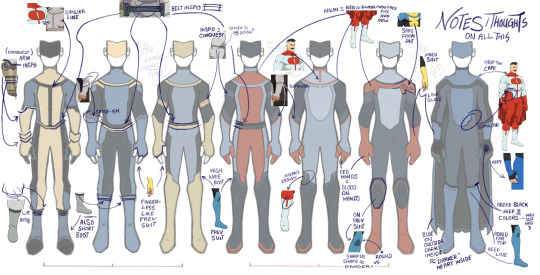
FINALLY! Stopped myself from making even more, honestly, and it'd take 20 years to only write the thought behind all the design choices by proxy, so take some visual notes instead of just word vomit lol. There's so many directions for a darker look to take inspo from!!!
Begging to keep the blue-black-yellow, or add red, because Nolan's red visually demonstrates how fitting blood looks on him, while Mark's og suit visually screams how much it stands out on him, by sporting primary colors. Like red gloves = bloody hands, y'know?
#invincible rotating in my mind#the brainrotsreal's art tag ✧˖°:*♡#invincible fanart#invincible#mark grayson#fanart#digital art#character redesign#character design#literally foaming at the mouth to get all of these done#like i would've went insane for some winks at Conquest#like already i argue there ARE some compelling compontents of the og blue-black design but it is not enough for my own personal taste idk#And ofc it's way simpler than any of these#cause these are general ideas for directions to GO IN. but im not a professional lol. this is just for fun.#bonus notes: dull colors because the brightness/joy from heroism has faded#if we DO keep the yellow#also could keep the yellow to show mark is DarkER but not at his peak darkest moment yknow#IDK i used most of my brain power designing imma slip into a coma now SNORK MIMIMIMI#uh if there's spelling errors. shhhhh about it.
110 notes
·
View notes