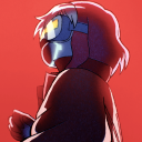
#but I also want to make it seem very tactile and tangible and intentional
Note
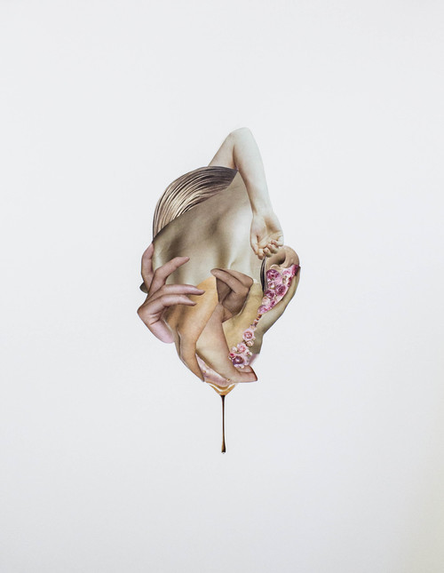
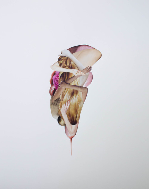
God, when you draw them cuddling, I'm always filled with such bittersweetness. I could cry over them. The soft glances and smiles, the tender but firm touches, the intimacy and joy of simply being close to each other... and knowing that it won't last, that it will be only a memory. It makes my heart ache in such a beautiful way; it is truly a testament to your art
.
#;m;#auhg#loving the 'tender but firm' description#I think that's the feel I'm constantly chasing#these are soft pawed dogs they handle each other with care and reverence#but I also want to make it seem very tactile and tangible and intentional#it's always nice when they're wearing very little and I get to draw hands and fingertips pressing into soft flesh#that sounded wrong#answered#anonymous
165 notes
·
View notes
Photo


Robin J. Klang
Butterfly Core 893, 2015, Hand Jacquard Woven Cotton
Core Memory, 2012, 30" x 31", hand Jacquard woven silk and cotton
Butterfly Core 321, 2015, Hand Jacquard Woven Cotton and Chenille
Phantasmic Data Dawn, 2016, hand Jacquard woven cotton, synthetic yarns, hand dyed wool, plastic, metal rod, 56 inches x 98 inches
Your Norwegian-designed digital loom, Thread Controller 2 (TC2) is the only digital loom in New York City. What is special about TC2 and how does it work?
To my knowledge, it’s the only one in the New York City—there may be others. To best describe how it works, I feel the need to first explain how the Jacquard loom differs from floor-loom style weaving. With the floor loom, warp threads are strung through heddles—they kind of look like eyes of a needle—and are tied in sections to foot pedals. You have to push those pedals in a certain order to make the threads lift and create your patterns.
With the Jacquard loom, the innovation involved replacing the foot pedal system by using punch cards, which had the capability of lifting the threads in more complex ways. It provided a faster way to make very complicated textiles. This was even before electricity—now most Jacquard looms are electric and automated. For instance, my loom runs on a vacuum pump.
Vibeke Vestby, the Norwegian woman who invented the TC2, looked to create a version of the contemporary Jacquard loom that embraced its digital capabilities but was still hand-operated, rather than automated. This allows artists and designers the freedom of speed and technologic innovation, combined with experimentation that comes about with weaving by hand. You have lot of room for material investigation because you can switch out colors and do things that would be not be very costly for—or could potentially damage—an industrial machine designed for speed and quantity. Vibeke wanted to blend the two and create a version of the Jacquard loom that was hand operated—that’s what this machine is.
Files are designed on the computer, and then there’s a little bit of programming that happens where you have to translate the image into weave structures. Afterwards, you are ready to turn on the machine and begin weaving, which involves inserting the horizontal weft yarns by hand, while the digital loom lifts the warp threads per each line of pixels in your file. The TC2 is not necessarily designed for huge mass production—it’s meant for handmade projects, but it’s still fast, much faster than what could happen on the floor-loom.
I'm interested in the capability of pushing those moments where the pattern is broken through a color change or inserting unusual material such as plastics. It’s the idea of mixing an element of the hand-made glitch into our understanding of technology. In the textile customs of many indigenous cultures, there’s a practice of creating an intentional error within the piece—it's seen as an act of honoring the divine or indicating your imperfection. In Navajo culture it’s called the “spirit line”—a misplaced thread that looks like it’s breaking the symmetry but is actually intentionally situated there. I like to embrace this in my work as well—I find that it can take on an additional meaning in the context of the man versus machine conversation.
How do you decide what imagery to use for your textile pieces? What do you see as the relationship between computer chips and weaving, or modern technology and the loom?
Currently, there are two crossovers in the history of weaving and technology that have become inspirations to my imagery. The first is involves the history of the Jacquard loom. When the loom was invented, it was the first time punch cards were ever used in a mechanized process. The idea of punch cards as binary information carriers—where the cards are either punched or not, zero or one—was later used by another inventor named Charles Babbage, who appropriated this punch card concept for what is now considered the first computer. With this in mind, I've heard some people refer to the Jacquard loom as the grandmother to the computer. I think this is an especially beautiful reference because in Navajo culture, it was the grandmother spider who wove the universe in her womb and who taught humans how to weave.
The second crossover point involves the history of computer. During the first 20 years of computer history, the way the memory was stored involved woven copper wires and little magnetized beads. Those beads would be charged either positive or negative, again creating binary information but through magnetic memory. I find it fascinating that the early computer stored information through these little tiny weavings. Records indicate that it was mostly women who wove these because of the dexterity of their fingers, so there’s this amazing relationship between technology and the history of weaving.
Much of my imagery evokes these magnetic memory cores—I just love the idea how textiles have a rich relationship with memory. Textiles have often been made to commemorate important milestones in life, such as a baby blanket, a wedding day dowry gift, or a protection shirt that’s created for a son who is going off to war. There’s memory, intention, and cultural identity wrapped up into this cloth that took someone an intensive amount of labor to create. It’s an interesting reference point for thinking about information and memory in the context of our digital culture. Some of them are more literal references to technology, and others reference symbols from a global textile history. Whether it’s ancient zoomorphic characters, iconic symbolism, motherboard hardware, or digital marks generated with photoshop spray brushes, it’s kind of all blended together, like a soup.
Through intention and references to history, many of the works present themselves in an almost totemic, quasi-spiritual way. Perhaps it’s a kind of investigation into ghosts in the machine and our collective consciousness, and a rapid technologically connected globalized world becoming reference points for when science, spirituality, and imagination meet. Much has been written and theorized concerning technology and mysticism, and I often enjoy listening to books and lectures while I weave. It all gets imbued into the work.
What kinds of limitations do you find using a loom that you wouldn’t face if you working a different medium?
I think the main difficulty is the considerable amount of prep and behind-the-scenes work that happens. Actually weaving the piece, the fun part, goes relatively fast. For instance, I had to thread all those threads in the loom first—there’s 3,520 of them, and they all had to go through their own heddles in a particular order! There’s also the process of winding the warp, which can take months. There’s lot of labor that goes into prepping the loom so that you can weave on it. It’s a challenge. I think when people hear about the digital loom there’s an misconception that it’s more similar to 3D printing, where I can push a button and the thing is created.
Despite the challenges, I enjoy working with process-based media and I find there are little moments along the way that keep things exciting and provide constant opportunities to push what I can do with the machine. There’s still a lot to experiment with.
Textiles have a long and revered history as religious, illustrative, and decorative handmade objects dating back to 10,000 BC. Though in the 18th century, textiles were considered craft and often undermined as “women’s work.” Artists like Anni Albers, associated with the Bauhaus school of the 1920s, elevated textiles to the realm of fine art with modern, geometric abstractions. What role do you think textiles play in contemporary fine art now?
I think textiles have been more present within art history than people realize. There have been many waves of contemporary fiber and textile art since the Bauhaus. In the ‘60s and ‘70s these techniques were definitely very hot, and I think it’s interesting to note how that was also the moment when new media art was beginning as well. As with any movements that happen within the art world, there’s an adjustment period, and then it comes back around.
Now seems to be another moment where notions of craft, decoration, pattern, and high and low taste are being reconsidered within contemporary art. I’m interested in presenting a perspective from an artist who is living through this digital transformation and questioning what that means in the world of textile art. Our virtual lives are consuming a great deal of our being—perhaps at the same time there’s a need more than ever for the tangible and tactile, a desire for something that’s a slower, more physical process, and a place where textiles can fill a niche.
How do you see yourself and your work in relation to the tradition of textile art, a historically women-dominated field?
While there’s a Western connotation of textiles always being made by women, that’s not actually the case in many countries. For instance, in Turkey, men create much of the textiles.
Fiber by nature is a very inclusive media, existing in a somewhat "other" space, not being specifically painting or sculpture. That platform of inclusivity, as well as a carried notion of femininity, creates space for conversations about gender, politics, and identity. Regardless of what gender background you associate with, approaching the concept of femininity in contemporary art as a conscious tool for what you are talking about can be really interesting and powerful, especially in a time such as now when we’re seeing another wave of gender equality movements. Textiles have a central place in that conversation.
In contradiction to the feminine, I think there’s a largely masculine element to the technological aspects in my work—in the same way as textiles may be associated with women in western ideology, the connotation of the computer world is that it’s predominantly male. This blending of the two is interesting to me. However, the questions I’m most concerned with asking in my work have to do with process, history, memory, and the ghosts in the machine, though the associations with the materials will naturally be present.
4 notes
·
View notes
Photo


Lauren Francis Evans
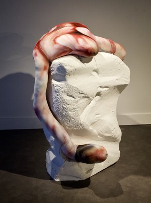
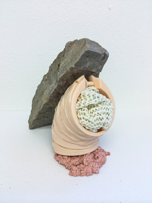
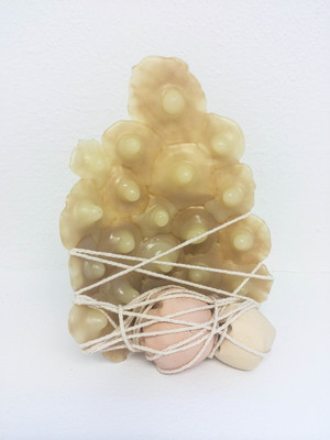
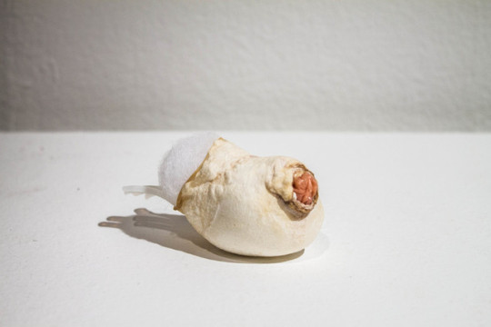
All creative acts can be seen as intermediary attempts to narrow the distance between the material and the immaterial. The Greek term, omphalos, literally translated as navel, refers to various symbolic centers, believed to connect the earthly and the divine. Unique as a fingerprint, the navel is the first mark that life leaves upon the body - a scar which points to our origins. Physically, the curious depression (or mound) marks our link to the past as well as our individual existence apart from it.
This simultaneity is what I’m after. Prompted by urges and the allure of origins, my creative work addresses the body as a site of irresistible paradox and continually draws attention to the void of human longing. As flesh becomes a tangible metaphor, a subtle surreality manifests, resulting in an odd tension of visceral compulsion and grotesque desire in which the seemingly familiar is wed with the infinitely unknowable. (Images; Lauren Francis Evan’s work) (Text; Artists Statement)
Interview with MFA student for MFA research project. Posted on Lauren Francis Evans Studio blog.
How would you describe your process? How do you begin a new sculpture or drawing? How much do you plan before you begin making a new art object?
“I really don’t plan much at all. I used to make these large-scale site-responsive installations out of wire - and for those I would make scale models so that the form was determined ahead of time. But I’ve since moved away from that way of working. I was craving a more playful studio practice in which multiple projects would evolve at once. This was most likely due to the time and freedom that grad school allowed/encouraged/required of me. What a luxury. I’ve learned much about myself, my materials, and my work in general through this mode of working. Often projects begin on impulse - perhaps I’m drawn to a particular material, how it feels between my fingers. I poke at it and prod at it until it becomes something interesting. The forms tend to arise out of these impulses. And then certain things are revealed in their becoming. Don’t get me wrong - I think a lot about my work. I read a lot too. But most of my thoughts surround the creative act itself, rather than the motives behind it - for I believe the impulse itself is primary."
How did your work developed from undergraduate through graduate school? Did the themes, materials and concepts stay consistent throughout your education? If not, can you tell me a little about the path you took until you found your way to the current work?
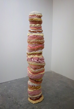
“Sometimes I feel like it’s changed so much - but then ideas and forms reappear all the time. I’m still looking at the same types of artists. My work is still biomorphic in form. The scale has shifted a bit - in undergrad most of my work was large enough to walk through, often tunnel-like or cave-like, while now I primarily make objects at human scale (or much smaller), but I think I’m still dealing with most of the same ideas - the body as a microcosm, the flesh as a metaphor, a familiar ambiguity, an abject beauty, etc.. The materials have evolved, but are still referencing the flesh for the most part. I used to make a lot of gridded wire armatures (which I would leave exposed) and those have pretty much vanished, but mostly due to the shift in scale and form. Like I said above, my studio practice has become much more playful. Much of this was due to the sentiment of my 3-yr interdisciplinary MFA program which insisted that I try all kinds of things and not get stuck in my ways. The space I had in grad school allowed me to start something, abandon it, revisit it, reorient it, and turn it into something else entirely. Many things got revisited, but lots of things also went in the dumpster when I finished, simply due to lack of space. While in grad school I became much more comfortable working in 2 dimensions - in undergrad I couldn’t imagine making anything but sculpture. Working with collage provided a much quicker way to work, which then led to making small assemblages, and then the larger assemblages which I am mostly making now.”
In your artist statement you talked about curiosities of human experience as your main influences for your work. Is this tactile idea of boundaries, bodily holes and desire something that has always influenced your work? What are some of your other influences and enthusiasms?
“Yes, I think it has always been an influence. It goes back to those urges and impulses of childhood - picking my nose, poking at blisters, popping pimples, trying to flit my belly button inside out - all those weird things that we’re taught to stifle as we age. I’m influenced by philosophy and theology - my Christian faith permeates my work in ways I can’t even understand - but am always trying to figure out. I believe that all creative acts are efforts to comprehend our origins (however abstract) and are attempts to narrow the distance between the human and the divine, the here/now and the beyond - so I can’t escape that theological component. I think it’s a human thing (rather than a religious thing). I also love kids - their curiosity and enthusiasm is a huge influence.”
What is the intent of your work? Do you see it functioning as a conversation, a statement, or in some other way?
“Good question. I’d say more of a conversation than a statement. I don’t see my work as having an agenda of any kind or serving any instrumental purpose. I’m more interested in talking about the whys of making at an ontological level. Why is there something rather than nothing - why make anything at all? My work comes out of these questions. So the works themselves are wrapped up in paradox - the simultaneity of opposites. I’m asking questions - hoping the work will make others question - as opposed to providing answers."
How do you see your 2-dimensional and 3-dimensional working together? Is one important to the other? Or, are they completely separate approaches?
“They inform each other. I think of my 2D work in a very sculptural way - so they’re not much different for me from the 3D work. The collages (and drawings) are quicker, definitely (except for the Decreation collages!), and they enable me to work out how I want my work to feel. They aren’t sketches for sculptures, but sometimes after making a collage, I will then attempt to make a sculpture with a similar feeling. There’s a certain elegance to the 2D work that’s been more difficult to achieve in 3 dimensions - but I’m working on that.”
How do you see gender operating in your work? It seems from looking at the work that gender would be a theme but I didn’t see it mentioned in your statement. Is it less about gender, but rather about the body itself?
“Correct - definitely less about gender and more about the human experience - embodiment and incarnation as a human thing, and not so much a gendered thing. That’s a big can of worms, and I think my work is about something more broad, so I usually steer the discussion away from gender. But of course a lot of the materials I’m using are typically used by females - the hair extensions, the false eyelashes, even the fashion magazines I use for collage - so I understand why the conversation may go there - but for me it’s about longing in a much deeper sense, not just the longing to be beautiful, but that’s part of it too. My preoccupation with holes is often read as psychosexual - and sure, that’s part of it, but for me holes point to this broader human void of longing that I think men can relate to just as much as women. I have noticed a difference though in how men/women respond to my work - I made a sculpture once that read as ovaries to a lady professor and as balls to a male professor - maybe that’s the kind of ambiguity I’m after - we’re not so different, really. That’s also why the navel is the hole that fascinates me most. It’s this hole (or bump!) shared by us all which points to our origins.”
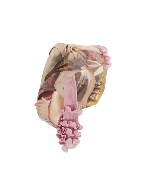
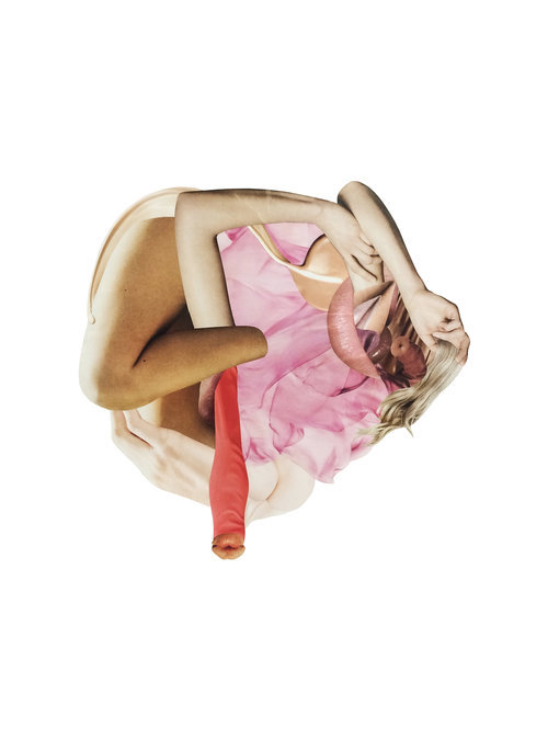


Lauren Frances Evans ( Images of 2D Collages for future reference)
0 notes
Photo

Geran Knol
Balancing between his autonomous work, illustration, Park Pardon and Oval Angle.
Nederlandstalige versie?
Date of interview: May 25, 2017
Estimated reading time: 8 minutes
Geran Knol (°1991, Makkinga) is a visual artist and musician. Until the age of 17, he lived with his family in a little village in Friesland, a northern region of the Netherlands. After he graduated high school, he decided to go in a different direction and took his first steps into the world of art. He received his bachelor’s degree at ArtEZ academy in Zwolle in the Netherlands and then moved to Belgium with his loyal partner in art, Bloeme van Bon, to get a master’s degree at Sint Lucas Antwerp.
Geran and Bloeme’s graduation project later on blossomed into Park Pardon. The artistic couple are inseparable and over time, they have developed a consistent style. Currently, they both live in a cosy suburb of Antwerp, Sint-Laurentius. We met Geran in his idyllic fourth-floor apartment to talk about Park Pardon, Oval Angle and his individual work.
Geran Knol
Park Pardon
Oval Angle

How would you describe your personal work?
I always start from the techniques, the tactile and tangible stuff. A pencil on a paper. The structure of the paper is always very visible in my collages. For me, it feels like a research of shapes. Every work is a result of the previous.
Which three words would you use to describe your work?
Form, abstraction and loneliness.

In a room full of people, I sometimes feel like an outsider. It’s that feeling that I try to assimilate in my drawings.
Why loneliness?
Loneliness is a recurring theme in my work. I’m an introvert. In a room full of people, I sometimes feel like an outsider. It’s that feeling that I try to assimilate in my drawings. However it’s not my intention to make my work sentimental. By creating ridiculous situations and playing with colours, I try to emphasise that loneliness.

Which object or person inspires you while you are working?
When I’m working, I’m always surrounded by little sculptures and other objects. It’s a collection of objects (sculptures, jars, vases) that I bought on flea markets or received as a gift from my friends. Their visual language inspires me. They are often handmade, imperfect objects that are also a little bit ugly, but are charming because of that.

Who would you say has influenced your work?
David Hockney has been my role model for years. I believe our styles match. I especially love his work from the 60s and 70s. My favourite Dutch artist is Klaas Gubbels. There is a similarity in visual language between his and Hockney’s work.
Which of your creations do you like best yourself?
That must be one of my most recent pieces. I usually only like my own work for a short amount of time before I grow tired of it. I’ve just started a new piece. I’m currently working on bigger panels and I’m very happy with it. If it works out, I’ll make a series out of it.

As a child, I didn’t really know what it meant to be an illustrator, but I knew I wanted to draw and go to art school. “That is where you become an artist,” I thought.

Have you always wanted to study illustration?
As a child, I didn’t really know what it meant to be an illustrator, but I knew I wanted to draw and go to art school. “That is where you become an artist,” I thought. I used to sit at my kitchen table for hours, drawing with my felt pens on paper. As a teenager I always wanted to go to college in Maastricht in the Netherlands. The rebellious idea behind that choice was to know that it was situated on the other side of the Nederlands. When I was 17, I moved to Zwolle to go and study arts at the ArtEZ academy.
In 2012, I graduated as an illustrator in the Netherlands, but these last few years, I’ve become somewhat more autonomous. I’m consciously balancing on a thin line between working for myself or others. Honestly, for me, there doesn’t even have to be a distinctive line. I often work on commission. I like the variation of it.

It’s exhausting at times to always work visually, but at the same time it’s a personal must.

Your education forces you to stay in the art world for the rest of your life. Have you ever regretted that?
Yes, I have. I sometimes think about how my life would be had I chosen a practical job, but then again I would never have felt happy. It’s exhausting at times to always work visually, but at the same time it’s a personal must.

You were born in the Netherlands; can you see that in your work?
Personally, I don’t really see it. At the moment my inspiration comes from everywhere around the world. I’m inspired by the figurative work of the Dutch Bart van der Leck. African sculptures attract me too. You can find an African influence in the work of Park Pardon.

PARK PARDON
How did Park Pardon come to be?
I met Bloeme on the academy in Zwolle. It didn’t take a long time for Bloeme and I came to realise we had the same taste. Originally our plan was to found our own little publishing company to publish our own work and the work of others. However we deviated from that rather quickly. Eventually, we collaborated to make art and became the duo “Park Pardon”.
Park Pardon was our graduation project in both Zwolle and Antwerp. In the period between our bachelor’s and master’s degree we had neglected it a little. ‘An Entrance to Mention; the Park Pardon Principles’, the work (book) that we made during our internship at the Antwerp design company Afreux , was a new inspiration for Park Pardon.


I think that, as a team, we dare to take steps we would make less quickly on our own. For example, as Park Pardon we made installations and various sculptures.

Why do you two work together? What are the benefits of the collaboration?
Through the years we did become closer and it seems like we fused together in a way. People often don’t see that the pieces are made by two people. We know each other through and through and that has its pros and cons of course. We know exactly what the other has envisioned. Lately, though, we have been growing apart in our individual work and it does make our collaboration somewhat more difficult. On the other hand it provides a new impulse for our collaboration. I think that, as a team, we dare to take steps we would make less quickly on our own. For example, as Park Pardon we made installations and various sculptures.

The word Pardon is an apology for the naivety that our work displays.

Why the name Park Pardon?
One night we made a list of words that came to mind. We were looking for a name that was easy to pronounce in both Dutch and English. The first word had to refer to a place, so Park. The word Pardon is an apology for the naivety that our work displays.

How would you like the project to evolve in the future?
At the moment we are collaborating with Uitgeverij Bries, a Belgian publisher, for our first book. For that, we are trying to get a fund in the Netherlands. We both want to make an effort and breathe new life in Park Pardon. Although it remains an addition to our individual work. I do hope that there will be a good balance between Park Pardon and my own work in the future.

OVAL ANGLE
In the music world, you are known as Oval Angle. Why did you choose that pseudonym?
When I was given the opportunity by Louis Reith (artist and owner of the publishing company Jordskred) to make my first tape, I didn’t have a name yet and had to come up with one fast. I wanted a name that expressed something impossible: an oval angle.
Publishing under my own name was out of the question. In the beginning I wasn’t confident enough about my music. Using a pseudonym allowed me to hide behind a name.

Actually, I’ve been making music for much longer than I’ve been drawing. I started making music when I was 15, as a hobby, and I’m still doing so. At the time it probably was more noise than it was music (laughs).

Why did you want to make music? What drove you to that?
Actually, I’ve been making music for much longer than I’ve been drawing. I started making music when I was 15, as a hobby, and I’m still doing so. At the time it probably was more noise than it was music (laughs). Through the years, my interest in music broadened and I started listening more often to folk, ambient and experimental music. Also, my style in music has gotten a lot closer to the style of my visual work.
How would you describe the style of music you create?
Well, more or less like my drawings: abstract. I use a lot of self recorded samples and distort them. Or I take bits and pieces from existing songs and modify them. I love to mess around with it. It’s like you can take an eraser through your song, so to speak. Just like you can with a drawing.

If you would have to choose between music or drawing, what would you choose?
Drawing. Although I find the interchange of the two disciplines perfect, music remains to be primarily a personal project. Only occasionally I feel the need to go public with my music. That's different in my visual work.
Interview & translation: Eline Schaerlaecken
English editor: Gary Leddington
Photographer: Maartin Warpy
1 note
·
View note
Text
7 Tips for Incorporating Texture in Your Illustrations

Looking for ways to add visual interest to your illustrations? Follow along as these pros share their favorite tips for using creative textures.
In this digital age, handcrafted imagery is a rarity, but image-buyers continue to crave designs that seem homemade and tangible. This year, Shutterstock named Digital Crafts as one of the top emerging trends in illustration. The Digital Crafts movement combines the convenience and efficiency of modern technology with the tactile, authentic mood we associate with traditional art forms like embroidery, origami, or even watercolor painting. The difference between a mediocre image and a great one can come down to one thing: the textures.
By successfully tapping into this trend, leading illustrators and vector artists produce images that seem timeless and cutting-edge at the same time. But creating two dimensional designs with a textured look is a challenge. Often, it means thinking outside the box by combining totally different methods or even inventing a whole new technique. We asked seven top illustrators from the Shutterstock collection to share the secrets behind some of their most successful images. Read on to see how they've updated fine craftsmanship for the 21st century.
1. “I add small, intentional defects and imperfections to emulate the look of manually cut elements.”
wacomka

Image by wacomka.
What's the story behind this illustration?
As a designer, I always pay attention to unique, handmade things. On my wedding day, there was a wall decorated with big, oversized, handmade paper flowers. I later decided to incorporate this feeling into my 3D graphics. Adding the paper texture was a simple and elegant way to make my botanical digital designs look like real handmade paper craft. There are a lot of 3D renders of paper flowers in my portfolio. I like to play with shapes and colors, applying textures and arranging flowers into different compositions.

Image by wacomka.
Pro Tip:
When modeling 3D elements, such as paper flowers, I prefer not to create mathematically precise or symmetrical shapes. I add small, intentional defects and imperfections to emulate the look of manually cut elements. It works perfectly with the texture of real paper.
2. “Find something that fascinates you, apart from drawing, and incorporate it into your work.”
Sopelkin

Image by Sopelkin.
What's the story behind this illustration?
I have always been inspired by painting, and embroidery is tangible painting on fabric. It is diligent work that requires a lot of patience, and I could not allow myself to devote the time to this activity. The other day, it occurred to me to draw embroidery in vector. It was exciting, and I was satisfied with the result. I began to embroider more using Adobe Illustrator. I like that my vectors are similar to embroidered paintings or watercolor sketches; I think there is a soul in my electronic works.
Image by Sopelkin.
Pro Tip:
Look for something that inspires you in real life. Find something that fascinates you, apart from drawing, and incorporate it into your work. The result will be twice as interesting.
Instagram
3. “My trick is drawing lots of strokes with a liner on paper and then photographing and tracing it. It is rather laborious, but I like the result.”
mamita (Marina Vorontsova)

Image by mamita (Marina Vorontsova).
What's the story behind this illustration?
This pattern was created from drawings that I initially rejected. I planned to throw them away because I didn't like them very much. This often happens. After a while, I look at them with fresh eyes. This time, I decided to revive these old works. I slightly modified them in Photoshop and created a pattern from the individual details. It turned out a little boring, but I remembered the coloring of Chinese and Japanese lacquer miniatures and decided to apply it here. With the help of gold, black, and red colors, it became more expressive. Now it is one of my bestselling works. Such stories teach us not to stop halfway but to carry everything out from beginning to end.
mamita (Marina Vorontsova).
mamita (Marina Vorontsova).
mamita (Marina Vorontsova).
Pictured: [1] mamita (Marina Vorontsova). [2] mamita (Marina Vorontsova). [3] mamita (Marina Vorontsova).
Pro Tip:
My drawings are all handmade. My trick is drawing lots of strokes with a liner on paper and then photographing and tracing it. It is rather laborious, but I like the result. In the past, I looked for a way to reduce the time needed to create an illustration. I applied readymade textures to my drawings and used scripts, but the automatic texture is poorly controlled, so I wasn't comfortable with it.
The handmade nature of my work may give the impression that I am stuck in the last century. Today, artificial intelligence writes poetry, makes music, paints, and so much more. But there is a charm to drawings made by hand on paper. There is a soul and a trace of personality. I adore the artists who use new technologies, and I admire their achievements, but the work of the old masters is more inspiring to me.
4. “When I make textured elements on paper, I usually make them larger than I expect them to be in the final image because it allows me to save more details when scanning.”
Ms Moloko (Nadezhda Shikina)
Image by Ms Moloko (Nadezhda Shikina).
What's the story behind this illustration?
In this pattern, I wanted to play with a combination of floral and geometric elements. I decided to make the geometrical elements more relaxed to give the pattern a more natural, casual look, as if somebody had drawn the stripes with a paintbrush. In order to do that, I used a handmade textured brush stroke, which I scanned and edited a little bit digitally.

Image by Ms Moloko (Nadezhda Shikina).
Pro Tip:
Often the shapes and lines of vector art are regular, perfectly precise, and clean to give the impression of a geometrically ideal image. That's great, but sometimes we want images that seem a bit more tactile and handmade. I look for ways to combine digital and traditional art in one image. When I make textured elements on paper, I usually make them larger than I expect them to be in the final image because it allows me to save more details when scanning. It's also a good idea to have a collection of simple textured shapes and strokes to use as additional elements in the future. You can use them later to make more complex objects or to create digital brushes.
5. “When you use a very dense pattern, you always run the risk of getting a rather flat and uninteresting image, so I play with the contrasts created by direct lighting, and I focus only on one area.”
Gualtiero Boffi

Image by Gualtiero Boffi.
What's the story behind this illustration?
I have always liked the different effects that carbon fiber can create. According to the lighting, the image itself can change radically. It can be opaque or extremely shiny, and it can change if you simply move the light or the observation point. It's very versatile, and in this case, I wanted to create an image that had a modern atmosphere that recalled the sci-fi style typical of video games. In this case, I could not resist the addition of the glowing light strip!
Gualtiero Boffi.
Gualtiero Boffi.
Pictured: [1] Gualtiero Boffi. [2] Gualtiero Boffi.
Pro Tip:
When you use a very dense pattern, you always run the risk of getting a rather flat and uninteresting image, so I play with the contrasts created by direct lighting, and I focus only on one area. In the image above, I created a hexagonal grid to break the homogeneity of the carbon fiber. I wanted to play with different levels of depth to accentuate the three-dimensionality.
6. “One of my favorite tools is the Blend tool, which is great if you want to create a repetitive texture (like for feathers), engraved elements, or precise hand-drawn details.”
mashakotcur

Image by mashakotcur.
What's the story behind this illustration?
This is one of my best-selling illustrations on Shutterstock. I live in a small, forested village. Near my house is a big meadow with a lot of wildflowers. Almost every summer morning, I drink coffee and go walk there with my Canon. One morning, I noticed a lot of small butterflies on the grass with wide open wings after the rain. They couldn't fly away, as their wings were still wet, so I was able to carefully shoot them on my camera. The tulips from the illustration are from my small garden. The idea was to create something pretty and fresh but at the same time nostalgic and vintage-inspired.
mashakotcur.
mashakotcur.
Pictured: [1] mashakotcur. [2] mashakotcur.
Pro Tip:
Pay attention to small details and textures for a realistic, lively look. I love to mix different textures from real source materials. One of my favorite tools is the Blend tool, which is great if you want to create a repetitive texture (like for feathers), engraved elements, or precise hand-drawn details. You can also create your own customized tools. For me, it was a bit of a problem finding good brushes for vector drawing in Adobe Illustrator, but I thought, “Hey! If I can't find what I need, why not create it?” I took real brushes, pens, and inks, and I made a few basic strokes on paper and then shot them. I edited the resulting image and traced it in vector to create my own brushes. Now I use them again and again in all kinds of different illustrations.
Instagram
7. “Textures are everywhere around us: wood, paper, fabric, leaves, grass, flowers, stones, etc. Just look around and pay attention to everything.”
Le Panda (Elena Efremova)
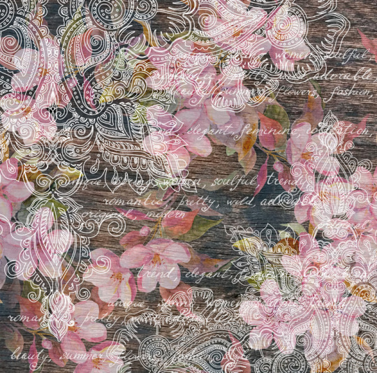
Image by Le Panda (Elena Efremova).
What's the story behind this illustration?
In this illustration, I mixed textures from different parts of the world. The texture of the tree I photographed was on an old door in Provence, France. The ornament was from the time I studied how to paint with henna in India on the island of Diu. I drew the flowers in a blooming park in Moscow in the spring. The result is a mixture of styles and textures.
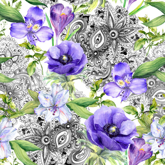
Image by Le Panda (Elena Efremova).
Pro Tip:
Do not be afraid to play. Textures are everywhere around us: wood, paper, fabric, leaves, grass, flowers, stones, etc. Just look around and pay attention to everything. Mixing different textures is interesting and fun, like a game.
Instagram
Top Image by Le Panda (Elena Efremova).
The post 7 Tips for Incorporating Texture in Your Illustrations appeared first on The Shutterstock Blog.
0 notes
Last Seen Blogs