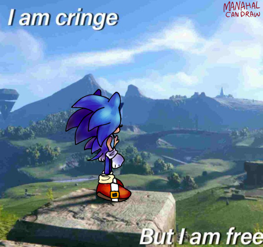
#coloured lineart is even cooler but EVEN HARDER
Text

shitty redraw <3
#i really like how i coloured this#but the FUCKING lineart ruined for me#i hate lineart with a PASSION#lineless art is cool but a bit harder#coloured lineart is even cooler but EVEN HARDER#I should stop ranting and start tagging lmao#sonic#sonic the hedgehog#digital art#art#artists on tumblr#my art#sonic frontiers#meme redraw#sonic redraw#sth#sth fanart#illustration#digital painting
185 notes
·
View notes
Photo


A simple opal tutorial for a style of drawing opal that more closely resembles the site art, compared to how I used to draw it!
1: Line the shape. Opal is often very geometric, and the lineart tends to be thicker around the angles. At some point it may even form a sharp point.
2: Flat colour. Simply fill the area with your base colour. Don’t make it too dark, or else the shapes within opal will be harder to see, and don’t make it too light or else the highlights won’t stand out.
3: Gradient. Shift along the colour wheel, or if following directly from site art, colourpick for both this step and step 2. Use a gradient tool, or just blend it out.
4: Create shapes. With a multiply layer, fill in the entire area. Then, erase blocky geometric shapes. The corners should be fairly sharp, but can be rounded out somewhat. Lower the opacity until you’re happy with it. I went with 50%, but you might want to go even lower. I usually use a desaturated purple for this layer.
5: Highlights. On a shine layer (or whatever your program’s equivalent is) create an edge light long the rim of opal, in whichever direction you want your final lighting to be coming from if/when you shade the piece. A few thick bands that are slightly narrower in the center also create a nice sharp highlight, that gives opal it’s glassy look. Then, a few small dots to create some interest. If needed, lower the opacity. The actual colour of this layer is really up to you!
6: Colour the lines. For extra depth, colour the lineart! I usually pick the darkest section within opal, sliiightly darken it further in my colour wheel and hue shift to a cooler tone. Then lock your lineart and colour it in!
557 notes
·
View notes