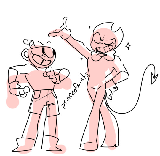
#lineless art is cool but a bit harder
Text
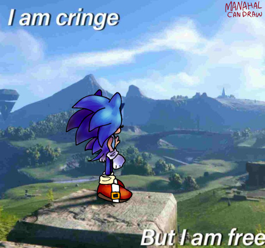
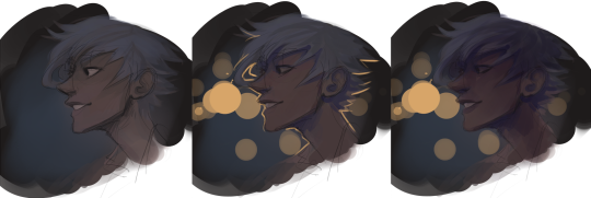
shitty redraw <3
#i really like how i coloured this#but the FUCKING lineart ruined for me#i hate lineart with a PASSION#lineless art is cool but a bit harder#coloured lineart is even cooler but EVEN HARDER#I should stop ranting and start tagging lmao#sonic#sonic the hedgehog#digital art#art#artists on tumblr#my art#sonic frontiers#meme redraw#sonic redraw#sth#sth fanart#illustration#digital painting
184 notes
·
View notes
Note
Would you ever do a step by step on how you draw Cuphead and/or Bendy? I just b r e a t h e your art style and I wish to see how you draw them
i mean i guess i could lkjsdg
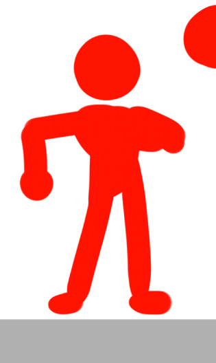
recently i’ve been playing w/ a new sketching style that isn’t really skeletal based but more just. blobbing it out like silhouettes. it’s quicker y’know and kinda fun to just scribble before getting down to business
so step one is just. circles

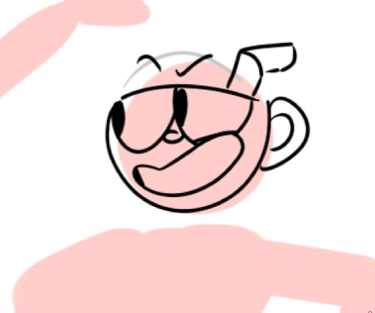
torso/chest (we’re startin’ w/ cup)

erms

leg
same process fr bendy

so i totally forgot to stop and take screenshots fr this but basically you just. have ur circles. and trace out probably 3/4 of it (i added the faint black line to show the top of the circle) then add on his face and Other Parts. i usually do his eyes first, then nose, then mouth.
then just like. draw bode. there’s way too much here fr a step by step just drawing a body like you would normally following ur blob and go fr whatever the hell ur headcanons are may he’s a chubby circle maybe he’s a lanky Fuck

i tend to make cuphead and mugman kinda short n stout, especially in the legs. makes em a little cartoonier and more like bouncy kids
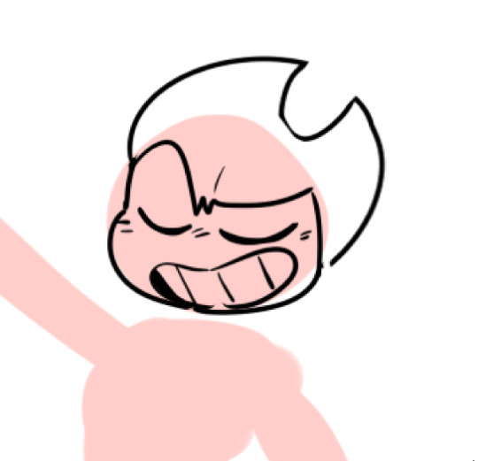
now w/ bendy digitally i always accidentally draw him lineless so the Tru process is just a black circle w/ this then throwing some white on and erasing the bit between his horns but we’ll treat this like i’m Not Doing That

i hate drawing his horns so i just do those first to get em outta the way

rest of face

adjust as needed and Add Face
i decided he needed to be a little hor-...... he needed bigger horns.

then like cup u just. draw body in. i don’t know a lot abt bendy besides fanon stuff bc i keep exiting the game w/o saving bc i’m a wimp but i know he’s a dancing boy so i like to make him a bit curvier/more lithe looking instead of blocky like the Bros. also big fun bowtie :} as far as i know from fanart he’s a Little Shit
BOYS
u can choose to keep ur sketch blobs in or not. sometimes i get rid of them sometimes i don’t. i think they look kinda cool kept in!! also makes it harder fr people to take my shit and colour it like i keep telling them not to lmao
#doodle dip#long post whoops#cuphead#bendy and the ink machine#batim#bendy#nonny#pandanons#beware the askbox ghost
857 notes
·
View notes
Note
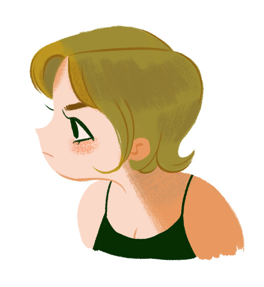
i was wondering if you have any tips for digital painting? i rlly love how your lineless looks and i wanted to try a cute style like that
waaa first of all thank you for your patience bc i know ive taken forever to answer this as i always do with tutorials…oops…..and also thank you im glad you think my style is cute!!!! im gonna do my best to help you out with lineless so here we go! LONG POST UNDER THE CUT!

to start i mainly use these two brushes (yes…just two…) from kyle webster’s gouache pack which is only available to adobe cloud subscribers now, but im sure a quick google search for gouache brushes for (insert program you use) can find some that will work just fine. these two look pretty similar but the difference is the one on the right is a bit softer and more easily opaque so i use it for light shadows, blush, etc. i think textured brushes like gouache paint and dry media ones make lineless look extra cool but thats just me!
OK ON TO THE TUTORIAL i know you just asked for tips but i was doodling a girl for a warm up and i thought id just take you through how i colored her. started w a sketch + set that layer to 23% opacity and laid down flat colors below it

after i set my base colors i turn off the sketch and start workin on shading! im startin with the hair here bc i think it can be harder to paint and work with in general for lots of ppl

i used three colors here for the hair:
- the lightest color is the base. pretty simple
- using the middle color, took gouache blair brush and made light strokes downward following the flow of the hair from the root to the tip. make sure you think about where the hair begins on the head and follow the direction it goes from there when shading/making lines/making highlights!!
i kept it simple for tutorial’s sake, but play around with how dark you want the shades to be and how much shading you want! (also these aren’t shades per se since they arent shadows being cast, just a darker color to give the hair a little variation in texture and color and to create a kind of shine effect but idk what else to call em! i guess theyre highlights! i just know it looks nice!)
- took a slightly darker color and added some lines here and there to break things up and further show the direction the hair is moving in
for a little more visual on the direction thing see this handy graphic i made:

i didn’t write DONT and DO bc my way is not like…the ultimate Chosen way…if you wanna go for a style with the shading i did on the left then totally do it but personally i think it reads better this way so ya!! theres no right or wrong way to make your own art but there are ways that can make things a bit more interesting and clear if you choose to use them!
and yeah i basically use the same methods to paint skin and fabric and even backgrounds. it’s really just as simple as keeping things flowing in a natural direction and picking colors that u think look nice to paint with!
FINISHED PIC:
i dont wanna make this tut super long and ramble forever so here’s the last things i did to finish up!
- turned the sketch back on momentarily to draw in the eye, mouth, & eyebrow (no painting or shading involved there usually)
- used gouache a go go brush (or a softer/less opaque brush of your choice) to add a bit of blush to the cheek. i usually add blush with a light circular motion bc it gives them a nice rounded look. i use light pressure because a) more pressure means darker color and i want the blush to be subtle and b) more pressure also means less texture and more solid color, and i prefer having the scratchy look with the base skin color showing thru.
- used more pressure and a darker, more orange color to create a sharp shadow on the skin + define the neck & inner ear shape with lines
- added desaturated aqua blue over the top of the hair to create a shadow effect and add another color to the palette
- added the same blue color very lightly on the neck & blended it with the orangey shade (in other words, lightly brushed over it with the orange) to make the shadow more interesting. layering in multiple colors can always help make lineless things look more detailed even if its just a tiny bit!
i hope this doesnt seem like a ton of steps added on at the end bc it took me like way longer to write this (because i ramble) than it did for me to draw it! i love working with lineless because of how easy it can be to slap on some varying colors and defining lines to make something look a lot cooler and more detailed. as long as you keep your shades and stuff on separate layers its easy to try out things and see what you like best so i encourage you to do so! best of luck!
#starrymelons#long post#art tutorial#art tips#tutorial#lineless art#ask#I SUPER SUPER HOPE THIS HELPS!!!#i used no pink in this tutorial are you proud of me#i did that bc i love pink but i use the same colors too much while i neglect others...so im paying attention to yellows and greens#also i definitely accidentally drew more of her and made her into an oc whoops#I REALIZED I FORGOT HER LITTLE HAIRS STICKING UP IN THE BACK IN THE FINAL...SORRY.............
239 notes
·
View notes
Text
Digital Painting: tips for beginners
Heyo! I got asked if I could make a tutorial on digital painting so I’m gonna throw together some advice meant for people who are starting out and want to figure out exactly how this stuff all works. Because it’s hard! What I hope to accomplish here is to make painting more approachable for you.
Firstly, I have put together something like this before, so for archival purposes here it is: http://holy-quinity.tumblr.com/post/89594801811/i-dont-know-how-much-of-this-kind-of-thing-you
For those of you who don’t wanna bother reading that, here are the main points:
1. Learn your program and its tools, from brush properties to layer styles. And I mean learn them. Make a cheatsheet that shows you exactly what each button and scale does, both in isolation and in conjunction with other buttons and scales. Refer to this as much as possible until it is intuitive. The end goal is to know exactly what to do to your brush’s settings to achieve a given effect.
2. It’s perfectly okay to use your sketches, linearts, and other forms of line in your paintings. They can help guide the form and there’s no need to make something fully “lineless”! I never make things “lineless.”
3. Study other people’s art and try to think how they could have possibly achieved the effects they did. You can learn a lot just by observing and mentally recreating the process stroke by stroke---muscle memory is a powerful tool at your disposal. This becomes easier to do once you’ve started doing item 1 above.
OKAY!
So where the heck do you even begin?
What I’m gonna do is try to make digital painting as approachable as possible for someone who’s never really done it. The main idea here is that digital painting is just like real painting. So if you’ve ever done real painting, you already kinda know what’s coming.
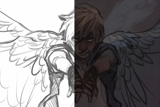
I’m gonna assume you know the basics of digital art: you can sketch, line those sketches using layers and opacity changes, and fill the lines with color, maybe even opting to add some shading...and you’ll get something like this:

You know, cell-shaded, or maybe the shading’s blended, but you’ve still obviously a line drawing with color put down on layers beneath the lines.
The next intuitive step is to try going “lineless”...but when you remove the lines you get this:
idk about you but I’m laughing at how stupid this looks
When I was first teaching myself to paint digitally, I didn’t really know how to deal with this. Without lines, the form of the subject vanished or became a mess like the above. Even if I was meticulous and careful about placing down the color such that without the lines layer turned on, the shapes fit together, it didn’t look quite right. There’d be gaps, I wouldn’t know how to incorporate the subject into a background, the contrast wouldn’t be high enough, or it’d just in general look too much like a screenshot from Super Mario 64.
Painting requires a different process than the above. You’ll have to let go of some of your habits and conventions. Such as staying in the lines. Such as fully relying on the lines. Like, I love my lines, I love my sketches---but in painting, they are guides for form, and are not the form itself. So let me go through how I approach a given painting:

My painting process starts with a sketch (here a boring portrait for demonstrative purposes). I make the opacity of the sketch layer something like 30%, and then throw down my base colors on a new layer underneath. I’m not being meticulous about the sketch itself, because again it’s just meant to guide my placement of color. I’m also not meticulous about my placement of the color.
We’re essentially sketching with color. Because ultimately what we want is for the color to take on the form and shapes conveyed by the sketch.
There’s a lot going into this about how to use value, how to shade, how to use color, etc. that I’m kinda skipping over because it takes a lot of time to explain...but there are hundreds of tutorials out there on those topics so please, google around! I found some helpful tuts that way when I was starting out.
Something I find v useful is to keep selecting colors that already exist in your image for shading and hue adjustment. This is why I start with really blendy, low-opacity brushes when throwing down color on top of the background. I can then select colors within there that are a mix of the two.
For instance, I’ll select the color of the lines here:

...and use that to shade:

And maybe I’ll select one of the darker shades around his eye, but not the darkest, to make the shading a smoother gradient...and so on.
What I do in general at this point is go over the shapes and lines of the sketch. Such that I can turn off the sketch layer and see this:
I’m replacing the lines with shading and value. I’ll continue to do this as I keep adding color.
This is all super loose. I am not dedicated to any particular stroke. I just want the colors and shading and light source to be right. I’ll use overlay layers to boost contrast or add a hue.
Here are other examples where I used this process:

I am constantly changing brushes and brush settings as I paint. It really depends on what effect I want where. I am also constantly selecting new colors and applying or blending those in. I don’t believe in having some uniformly applied base color and then shading with only one or two...that’s what I’d do if I was cell-shading like the first drawing I showed you here, but painting should be about messing with color and opacity and blending to make millions of hues!
Good rule of thumb: Hard, opaque brushes for applying color. Soft, dilute brushes for blending colors. Sometimes hard, dilute brushes can make some cool blending effects! I personally prefer harder edges on my shading so that’s a brush I use often.
This is getting a bit long so I’m gonna split it up into multiple parts, but really what I want you to get from this is:
1. learn the tools at your disposal until they are intuitive
2. sketch and line are guides for form, not the form itself
3. rather, hue and value will produce the form
And of course, practice makes perfect!!! Every drawing you make, every painting you make, will bring you one step closer to the artist you want to be, and thus every drawing and every painting, no matter what, is a success.
9K notes
·
View notes
Text
How Different Materials Affect Your Drawing Process
Your drawing materials can determine the overall success of your finished artwork. And some are better than others when it comes to achieving certain effects.
If you want more successful drawings, knowing the pros and cons of the various materials available is key. Below, artist Dan Gheno shares his expert insight into the ins and outs of some of the most common drawing materials. Enjoy!
Drawing Materials, Explained
There is no substitute for skill and experience. A quill pen did not draw Michaelangelo’s Study of a Male Nude. The identical pen and ink in the hands of a rookie would not produce a similar masterpiece. But it’s also true if Michelangelo had used a ballpoint pen or a No. 2 pencil, the drawing would not possess the same depth of value or volume.
The choice of materials is a vital part of how an artist approaches his or her work, and it’s critical to pick the right drawing instruments, surfaces and other tools to fit the needs of your artistic vision.
Study of a Male Nude by Michelangelo, ca. 1503–1504, pen-and-brown-ink. Collection Casa Buonarroti, Florence, Italy.
If there’s one thing I’ve learned over the years, it’s that you shouldn’t try to make a material do something it can’t. Just as you can’t force a cat to bark or a dog to meow, it’s impossible to force your materials to do something against their essential nature.
For instance, graphite, sanguine chalk and colored pencil all yield less contrast than compressed charcoal or ink. If you’re interested in deep, divergent contrasts, you want charcoal rather than graphite. However when the goal is a more delicate form of rendering, charcoal can work; but I personally prefer graphite or colored pencil, which I find more readily suited to this goal.
Now, let’s take a closer look at the advantages and pitfalls of the drawing materials I’ve personally grown to know over my decades as an artist. We’ll examine the pros and cons of media including graphite, colored pencil, charcoal and ink, along with surfaces and other tools. We’ll discuss when to use them, when to avoid them and what you can expect (or not expect) from each medium.
A sample of my favorite drawing materials. At top, from left to right: mechanical pencil; ballpoint pen; holders for large crayons and graphite sticks; various colored pencils and pencil holders; oil-based, charcoal, carbon and chalk pencils; and pointed eraser. Middle: vine charcoal. At bottom, from left to right: compressed charcoal, sharp single-edge razor blades; and two block erasers — one for colored media, another for dark media.
Graphite
If you discount the mural I drew with Crayola crayons at age four on the side of my older sister’s 1951 Chevrolet sedan, my first experiences in drawing were rendered with a yellow No. 2 pencil, a common first experience.
Because of this early familiarity, graphite pencils remain the most comfortable and safe choice for many artists until they start taking art classes. Well-meaning teachers sometimes try to get their students to kick the graphite habit, forcing them to use charcoal instead.
However, I usually encourage novice students to first work with what’s familiar to them. When trying to grasp such challenging issues as human proportions and value shapes, it doesn’t help to struggle with the technical problems of a new medium as well.
Known mostly as a linear medium, graphite is more flexible than many artists and teachers give it credit for. You can actually get some very fluid and painterly effects with it — for instance, by applying powdered graphite to the paper with a brush or chamois. Graphite also comes in sticks of various shapes, sizes and hardness. This allows for a variety of delicately blended masses or broad, assertively expressive strokes.
Contrapposto Male Figure by Dan Gheno, 2016, graphite
The main drawback to graphite is its inability to achieve the intensity of darkness you can get from compressed charcoal or paint. You can go only so dark with graphite before the material builds into a reflective sheen that actually looks lighter instead of darker. In fact, the more you try to rub and grind graphite into one area of the paper, the more you will burnish it into a dense, shiny mass, canceling out any sense of
In fact, the more you try to rub and grind graphite into one area of the paper, the more you will burnish it into a dense, shiny mass. And this cancels out any sense of realistic value and atmosphere you have achieved elsewhere in the drawing.
I don’t often use graphite anymore, but when I do it’s usually for precise rendering or for analyzing complex shapes or anatomical forms on the body that I find confusing. Indeed, when graphite was first developed as an artistic medium by the English in the mid-1500s, it was promoted as an easier, more practical and more fluid alternative to metalpoint for detailed, analytical drawing. Graphite doesn’t drag on the paper like
Graphite doesn’t drag on the paper like metalpoint does. With graphite, artists can apply value masses in a more natural, fluid manner. But one thing missing from graphite is metalpoint’s varied depth of line, which can seem to pulsate in a three-dimensional manner.
Discover the basics of drawing with charcoal, graphite and Conté crayons with this FREE download! Just enter your email below, to start getting your learn on!
*
Colored Pencil
For me, colored pencil seems to combine the strengths of graphite and metalpoint. Some brands of colored pencils impart a similar delicacy and depth of line as metalpoint. And although colored pencils aren’t quite as erasable as graphite, brands such as Stabilo Original and Caran d’Ache have much of graphite’s potential for revision and sensitive ease of application.
Colored pencils are particularly suited to exacting linework. Many brands of this medium can be sharpened to pinpoint precision using a razor blade.
I use a mid-value sanguine color for most of my colored pencil drawings, particularly when drawing on white paper. It allows for a delicate touch, but upon pressing harder I can get a darker, more assertive line. I will often use a darker sepia color when working on toned paper.
Reclined, Looking Over Shoulder by Dan Gheno, 2014, colored pencil
Colored pencils share graphite’s limited range of value contrast. But I find this can work to my advantage, forcing me to take my time to analyze the model’s light and dark patterns as I render them.
I usually prefer to build up my values gradually, shading across large shadow shapes with succeeding sweeps of tone, until I reach the desired darkness. Working in successive layers can allow one to better maintain the weave of the paper and help to impart a sense of atmosphere.
This medium can require a gentle touch. Colored Pencils are often fragile and prone to snapping in mid-stroke if you press too hard, leaving an unerasable skid mark on the paper.
If you try to push your values too dark all at once, they will become dense and shiny. With certain colors the hue may even change with heavy pressure or when you let your pencil point get too short, allowing the wood casing to chafe your linework.
Chalk and Charcoal
Whether you’re using them in pencil, stick or powder form, pure black chalk and charcoal provide the greatest value contrasts. I often like to work with them in a loose manner, starting with a broad value mass that relates to the big, gestural shadow shape found on the model.
Some artists prefer powdered charcoal for this initial stage. But I frequently begin my sketches in a faint, linear manner with vine charcoal because it’s so easily erased or adjusted. I then follow up with a more permanent compressed charcoal pencil or stick, which usually works as a sealant, holding the more ephemeral, easily smudged vine against the paper.
Twisting by Dan Gheno, 1995, sanguine chalk
Charcoal pencils come in several grades of hardness, like graphite. Softer charcoal is often good for building up masses on large, expressive drawings; whereas harder compressed charcoal or carbon pencils, such as H and HB, are more suited to line work on a smaller scale.
Hard charcoal pencils, which are easy to sharpen to long, sharp points, can be used to quickly render thick and thin lines by varying the position of your hand. And you can build toward your dark value masses with a rapid weaving of strokes.
Broad, lineless tones are possible as well. Holding the pencil to the side, you can glide the long portion of the charcoal shaft across the page, gradually building up the tone into a broad value mass, much as you would when using a colored pencil.
Female Figure in Shadow by Dan Gheno, 2003, charcoal
You might notice that vine charcoal tends to be a bit warmer than compressed charcoal. When using both, I often need to go back into my drawing at the end, sweeping over my value masses with one or the other to harmonize between cool and warm.
For the same reasons, it’s not a good idea to mix white pencil or chalk with black charcoal (or graphite), unless you do so systematically throughout the drawing. Otherwise, the mixed-up results will look cloudy or just plain chaotic, especially on toned paper.
Pro tip: When working in compressed charcoal or in graphite, keep to a limited range of pencil hardness to maintain evenness and texture harmony in your toning. Jumping between divergent grades — for instance from an HB to a much softer 6B — can result in a distracting cacophony of rough and smooth textures.
Crayon
Perhaps it was the sense of shame I felt for drawing on my sister’s car — and the adverse conditioning that came from the hours of elbow grease I spent rubbing out my scribbles. But it was a long time before I renewed my interest in grease- or oil-based drawing instruments.
When I did, using a variety of brands from Cretacolor to Faber-Castell’s Pitt, I found the medium offers a handy compromise between the darkness achievable with softer chalks and pastels, and the smoothness of colored pencil and graphite. When drawing with crayon, I generally use a sanguine color.
I’d recommend not combining different brands of crayon in one drawing. Hues differ greatly between manufacturers, even if they have the same name.
Scanning the Distance by Dan Gheno, 2016, oil-based crayon
Ink and Ballpoint
Over the years I’ve worked with a variety of inking tools, including brushes, dip pens, fountain pens, ballpoint pens and Rapidograph pens.
During the 1970s, when I did drawings such as Woman Seated, Looking Away, my favorite way to work was by using a fountain pen to render the lines and a felt brush marker to wash in the big value masses.
Normally, I dipped my “fountain” pen into a bottle of ink so I could use a dark, heavy ink that would otherwise clog up the pen. I used an italic point held sideways, which offered a delicate fine line and provided thick-thin variation. Likewise, I used a grinding stone to sharpen and reshape my pen points to get extra fine lines.
Water-based felt brushes, such as the one I used to lay in masses in this drawing, wear out quickly. Instead of throwing them away, I open their tops and fill them with watered-down ink to rejuvenate their wells. I often prefer the more watery effect of these recharged brushes to the results I get with a new one.
Woman Seated, Looking Away by Dan Gheno, ca. 1974–1975, ink
Although I still work in this technique on occasion, today when I work in ink I usually use ballpoint pens, most often for eye-hand coordination exercises. Because ink is irrevocable, it’s a great training tool. It reinforces the habit of thinking before you put down a line.
I was first attracted to ballpoint pens for their ability to replicate fine, etch-like lines. Over the years, however, manufacturing standards have diminished, and now many brands of ballpoint spurt out unexpected blobs of ink — usually at the worst possible moment.
I recommend experimenting to find the best and most consistent brands (I’m a fan of the Pilot EasyTouch .7mm fine pen and its refill catridges, which can even be used on their own). In all cases, you’ll need to get in the habit of regularly cleaning off the paper detritus that builds up around the pen point. This can produce splotching after only a few minutes of work.
I find it helpful to locate the beginning and end points of the objects I’m drawing in ink. For instance, when drawing a hand on the hip, I might place dots at the shoulder, elbow and hip, and then draw in between these points.
If you don’t put placeholder points for all the major beginning and end points — or at least try to imagine them in your mind — it’s easy to underestimate any foreshortening and draw a line too long. And with ink, of course, there’s no erasing your mistakes.
Artist by Dan Gheno, 2016, ballpoint pen
Mixing Media
There’s no need to confine yourself to one medium. Don’t be afraid of mixing unrelated media, combining different colored pencils or exploring unorthodox approaches. For example, I sometimes like to combine graphite and colored pencil with ink, starting loosely with pencil and finishing with ink.
As you experiment with combining media you’ll learn to work within some important limitations. You may find it difficult, for instance, to apply a chalkier medium on top of a slicker medium such as graphite or colored pencil. You’ll also discover you can’t splash heavy washes on thin paper.
In fact, you may want to consider tougher surfaces such as canvas, sanded paper or pastel cloth for many mixed media approaches. These provide wonderful traction, grabbing onto both dry and wet media and allowing combinations such as charcoal and paint — as we see in Robin Smith’s Marmadu — that wouldn’t be possible on most papers.
Marmadu by Robin Smith, 2015, oil, charcoal and white chalk on canvas. Private collection
Choosing the Right Paper
Some artists delight in rummaging through stacks of unusual and expensive papers. But I’m not a paper connoisseur. I prefer the smooth bond-paper surface that I’ve drawn on since I was a child.
Bond paper is not hard to find in letter size, although it takes a little detective work to find my preferred size of 18 x 24 inches. Different manufacturers sell large-format bond papers that are acid-free and archival, but they vary greatly in tooth and paper weight. Try out different brands until you find one that feels right for you.
Among the ones I use are Borden and Riley No. 39, a 16-lb layout bond paper that comes close to the smooth, bright-white surface of photocopy paper; and 50-lb Canson Sketch paper, which has a slightly warmer and darker surface. It’s also a little rougher, which I sometimes prefer for the way it grabs my pencil, producing darker lines and value masses.
Embrace by Dan Gheno, 2015, charcoal and carbon pencil with white charcoal on toned paper
Slick bond surfaces are not always conducive to vine charcoal or pastel-based media. Believe it or not, newsprint is perfect for these. It grabs onto the materials, giving a smooth, gliding effect to one’s value massing and linework.
Unfortunately, newsprint is also highly acidic, making it yellow and decay rather rapidly. I know many artists who love this ephemeral surface but are forever in pursuit of an archival substitute.
The best replacement I’ve found is Arches Text Wove, which shares most of the same properties. I also find absorbent printmaking papers such as Rives BFK take charcoal and pastel in a similar manner. Take care to work gently on printmaking papers, which don’t have much sizing. Their fibers are delicate and start to pill when erasing or applying material with a heavy hand.
Figure Sleeping by Dan Gheno, 2016, colored pencil and white charcoal on toned paper
Many good options are available for artists who want to work on toned paper. When I’m working on a toned ground, I gravitate toward smoother surfaces, such as Strathmore’s 400 Series Toned and Artagain, as well as Canson Mi-Teintes, preferring the silky, blotter backside of this paper over its more textural front. They allow for delicate, blended rendering, as well as distinctive linework.
I’m also fond of the lightly textured surface of Strathmore’s 500 Series Charcoal Assorted Tints paper. You can create a clean, shimmering effect on this paper if you’re careful not to press too hard and fill in its textural valleys. I like to stroke my dark and white pencils gently along the top surface of the paper texture, allowing the resulting tones to vibrate against the color of the paper.
Working with Erasers
Some teachers ban erasers in an effort to get students to look closely and commit before making a mark. Yes, an eraser is no substitute for failing to look closely at the model and thinking before you put down a line. But I firmly believe erasers are an important tool when not overused.
I subscribe to the view of America’s greatest draftsman, Thomas Eakins, that drawing is a process of revision. You put down something, and then adjust this estimate toward greater accuracy as you work. Just remember to look closely at the model and draw lightly so that you can more easily erase later on.
Erasers are not all created equal. The best type of eraser can vary depending on the media and paper you’re using. Kneaded erasers are usually effective for adjusting small vine charcoal shapes. Plastic erasers, such as those made by Tombow and Staedtler, are more efficient at lightening or removing colored pencil, compressed charcoal and carbon pencil from smooth paper.
There are also long, pointed plastic erasers that look like mechanical pencils — such as those made by Tuff Stuff and Tombow — which I’ve found indispensable for cleaning up small details and sharpening the edge of a shape. Even though you can roll a kneaded eraser into a sharp point, it won’t give you as clean a shape. Rather, these soft erasers create a more blurry edge — which can be useful when you want such an effect.
Fast Sketch by Dan Gheno, 2016, sanguine chalk
Unfortunately, erasers harden and become worthless as they get older. They can even smear or rub a line deeper into the paper. Additionally, it doesn’t hurt to reserve separate erasers for black media and for colored pigments. And, you should clean erasers frequently to prevent smudge-making pigment from accumulating on them and leaving stains where you want clean paper.
When you keep your erasers new and clean, you will find that they are excellent drawing tools, not only for removing unwanted marks but for making wanted ones, as well. I often lay a broad tone of chalk or charcoal across my figure drawing, and then draw light hatch lines into the mass with a pointed eraser to create a modeled effect — much as you might use a white pencil on toned paper.
Sometimes, I will blend a tonal mass with the flat side of a block eraser. And, on occasion, I will press down with a kneaded eraser to lessen the assertiveness of a line. Other times, I’ll thin out a line by chiseling at its edge with a pointed plastic eraser, making some of the marks more delicate and fainter than other lines for rhythmic purposes. I often do this to imitate the effects of form and light, particularly where the boundary line of a volume faces the light source, or to indicate a softer fleshy form compared to a more distinct line of a projecting bone.
There are also many other tools to consider. Razor blades and sandpaper are useful for sharpening pencils. Many artists like to use chamois and stumps to blend charcoal, pastel and graphite for even tones.
I prefer to use my fingers for blending small, delicate masses. And I’ll use a facial tissue (sans ointment) to get a broader, even value mass. When using your fingers, it’s important to keep them clean and dry. I usually wipe my finger on a paper towel before each use. Otherwise, the oils of your skin will interfere with the drawing.
Pro tip: I find it makes a difference what order you employ various erasers when using more than one type in a single drawing. If I try to erase a deeply inscribed line with a kneaded eraser first, the line becomes even more resistant to subsequent attempts by a plastic eraser. I avoid using the smaller pointed plastic erasers on large areas, since they can embed the pigment into the paper; I’ve found the larger plastic erasers better suited to such tasks.
Changing Things Up
It’s natural to have a favorite material, but try not to become too dependent on any one product or brand. It never fails: After you get used to one type of pencil or paper, it gets discontinued! It’s happened to me many times, for instance with my favorite charcoal pencils and sanguine chalk.
Speaking from experience, I suggest experimenting with various brands of your favorite drawing medium so you’re not left in the lurch when a material changes or becomes unavailable. I also advise holding on to pencil nibs. If you’re caught off-guard by a surprise cancellation, you can put them in a pencil extender and get quite a bit more mileage out of them.
Even if they don’t stop making your favorite drawing utensil, you might find it useful to change media once in a while. It’s quite possible to fall into complacency when using the same materials for too long. Switching things up can help maintain your sense of enthusiasm. It can also help break bad habits that might be creeping into your work. Many artists develop muscle memory based upon the traction and resistance that the same pencil has against the same paper.
After continually using the same materials, you may find your hand wants to go at the same speed and angle regardless of the subject matter. These habits can get in the way of seeing your subject’s specific shapes and size relationships and can even interfere with the drawing process — for instance by demanding a heavy line when your goals demand delicacy, or vice versa.
Sometimes the change of material can be something as minimal as a change of color to jump start your visual perceptions. If you find = your line weight is too heavy for your goals, you might switch to a lighter color — for example, from a heavy black charcoal pencil to light sanguine pencil. You could also try the opposite tack by using an even darker material to train your hand to back off and use a lighter touch.
Three depictions of the Farnese Hercules by Hendrick Goltzius, ca. 1591–1592. From left: engraving; black chalk on blue paper; red chalk.
There’s no doubt an artist’s choice of materials will impact the superficial look of a drawing. And, the drawing materials mentioned here are just some of those I’ve found helpful to my particular vision.
In the end, it’s the artist who makes the drawing, not the materials. Consider Hendrick Goltzius’ multiple versions of the Farnese Hercules. Whatever material he was using, Goltzius’ intense interest in sculptural volume makes the artworks compelling, giving the images power and lasting artistic importance.
About the Artist
Dan Gheno is a New York artist whose work can be found in collections including the Museum of the City of New York and the New Britain Museum of American Art, in Connecticut. He teaches drawing and painting at the Art Students League of New York and the National Academy School of Fine Arts. And, you can find his insightful book, Figure Drawing Master Class, at NorthLightShop.com.
*This article by Dan Gheno first appeared in Drawing magazine‘s Winter 2017 issue.
The post How Different Materials Affect Your Drawing Process appeared first on Artist's Network.
from Artist's Network http://ift.tt/2ktjVGJ
0 notes
Text
How Different Materials Affect the Drawing Process
The following article by Dan Gheno, about the pros and cons of various drawing materials, appears in the winter 2017 issue of Drawing magazine. You can see the full list of articles in the issue, and you can get your copy here or download a digital version here. You can also subscribe to Drawing.
~~~
How Different Materials Affect the Drawing Process
by Dan Gheno
There is no substitute for skill and experience. A quill pen did not draw Study of a Male Nude—Michelangelo
did. The identical pen and ink in the hands of a rookie would not produce a similar masterpiece. But it’s also true that if Michelangelo had used a ballpoint pen or a No. 2 pencil, the drawing would not possess the same depth of value or volume. The choice of materials is a vital part of how an artist approaches his or her work, and it’s critical to pick the right drawing instruments, surfaces and other tools to fit the needs of your artistic vision.
Study of a Male Nude, by Michelangelo, ca. 1503–1504, pen-and-brown-ink, 16 1/8 x 11 1/4. Collection Casa Buonarroti, Florence, Italy.
If there’s one thing I’ve learned over the years it’s that you shouldn’t try to make a material do something it can’t. Just as you can’t force a cat to bark or a dog to meow, it’s impossible to force your materials to do something against their essential nature. For instance, graphite, sanguine chalk and colored pencil all yield less contrast than compressed charcoal or ink, so if you’re interested in deep, divergent contrasts, you want charcoal rather than graphite. However, when the goal is a more delicate form of rendering, charcoal can work, but I personally prefer graphite or colored pencil, which I find more readily suited to this goal.
This article will chronicle the advantages and pitfalls of the drawing materials I’ve personally grown to know over my decades as an artist. We’ll examine the pros and cons of media including graphite, colored pencil, charcoal and ink, along with surfaces and other tools. We’ll discuss when to use them, when to avoid them and what you can expect (or not expect) from each medium.
A sample of my favorite drawing materials. At top, from left to right: mechanical pencil; ballpoint pen; holders for large crayons and graphite sticks; various colored pencils and pencil holders; oil-based, charcoal, carbon and chalk pencils; and pointed eraser. Middle: vine charcoal. At bottom, from left to right: compressed charcoal, sharp single-edge razor blades; and two block erasers—one for colored media, another for dark media.
Graphite
If you discount the mural I drew with Crayola crayons at age 4 on the side of my older sister’s 1951 Chevrolet sedan, my first experiences in drawing were rendered with a yellow No. 2 pencil, a common first experience. Because of this early familiarity, graphite pencils remain the most comfortable and safe choice for many artists until they start taking art classes. Well-meaning teachers sometimes try to get their students to kick the graphite habit, forcing them to use charcoal instead. But I usually encourage novice students to work with what’s familiar to them at first. When trying to grasp such challenging issues as human proportions and value shapes, it doesn’t help to struggle with the technical problems of a new medium as well.
Known mostly as a linear medium, graphite is more flexible than many artists and teachers give it credit for. You can actually get some very fluid and painterly effects with it, for instance by applying powdered graphite to the paper with a brush or chamois. Graphite also comes in sticks of various shapes, sizes and hardness, which allow for a variety of delicately blended masses or broad, assertively expressive strokes.
Contrapposto Male Figure, by Dan Gheno, 2016, graphite, 17 x 8. All artwork this article collection the artist unless otherwise indicated.
The main drawback to graphite is its inability to achieve the intensity of darkness that you can get from compressed charcoal or paint. You can go only so dark with graphite before the material builds into a reflective sheen that actually looks lighter instead of darker. In fact, the more you try to rub and grind graphite into one area of the paper, the more you will burnish it into a dense, shiny mass, canceling out any sense of realistic value and atmosphere you have achieved elsewhere in the drawing.
I don’t often use graphite anymore, but when I do it’s usually for precise rendering or for analyzing complex shapes or anatomical forms on the body that I find confusing. Indeed, when graphite was first developed as an artistic medium by the English in the mid-1500s, it was promoted as an easier, more practical and more fluid alternative to metalpoint for detailed, analytical drawing. Graphite doesn’t drag on the paper as metalpoint does, so with graphite artists can apply value masses in a more natural, fluid manner. But one thing missing from graphite is metalpoint’s varied depth of line, which can seem to pulsate in a three-dimensional manner.
Colored Pencil
For me, colored pencil seems to combine the strengths of graphite and metalpoint. Some brands of colored pencils impart a similar delicacy and depth of line as metalpoint, and although colored pencils aren’t quite as erasable as graphite, brands such as Stabilo Original and Caran d’Ache have much of graphite’s potential for revision and sensitive ease of application.
Colored pencils are particularly suited to exacting linework. Many brands of colored pencil can be sharpened to pinpoint precision using a razorblade. I use a mid-value sanguine color for most of my colored pencil drawings, particularly when drawing on white paper. It allows for a delicate touch, but upon pressing harder I can get a darker, more assertive line. I will often use a darker sepia color when working on toned paper.
Reclined, Looking Over Shoulder, by Dan Gheno, 2014, colored pencil, 18 x 24.
Colored pencils share graphite’s limited range of value contrast, but I find this can work to my advantage, forcing me to take my time to analyze the model’s light and dark patterns as I render them. I usually prefer to build up my values gradually, shading across large shadow shapes with succeeding sweeps of tone, until I reach the desired darkness. Working in successive layers can allow one to better maintain the weave of the paper and help to impart a sense of atmosphere.
Colored pencils can require a gentle touch. They are often fragile and prone to snapping in mid-stroke if you press too hard, leaving an unerasable skid mark on the paper. If you try to push your values too dark all at once, they will become dense and shiny. With certain colors the hue may even change with heavy pressure or when you let your pencil point get too short, allowing the wood casing to chafe your linework.
Chalk and Charcoal
Whether you’re using them in pencil, stick or powder form, pure black chalk and charcoal provide the greatest value contrasts. I often like to work with them in a loose manner, starting with a broad value mass that relates to the big, gestural shadow shape found on the model. Some artists prefer powdered charcoal for this initial stage, but I frequently begin my sketches in a faint, linear manner with vine charcoal because it’s so easily erased or adjusted. I then follow up with a more permanent compressed charcoal pencil or stick, which usually works as a sealant, holding the more ephemeral, easily smudged vine against the paper.
Twisting, by Dan Gheno, 1995, sanguine chalk, 11 x 24.
Charcoal pencils come in several grades of hardness, like graphite. Softer charcoal is often good for building up masses on large, expressive drawings, whereas harder compressed charcoal or carbon pencils, such as H and HB, are more suited to line work on a smaller scale. Hard charcoal pencils, which are easy to sharpen to long, sharp points, can be used to quickly render thick and thin lines by varying the position of your hand, and you can build toward your dark value masses with a rapid weaving of strokes. Broad, lineless tones are possible as well. Holding the pencil to the side, you can glide the long portion of the charcoal shaft across the page, gradually building up the tone into a broad value mass, much as you would when using a colored pencil.
Female Figure in Shadow, by Dan Gheno, 2003, charcoal, 24 x 18.
You might notice that vine charcoal tends to be a bit warmer than compressed charcoal. When using both, I often need to go back into my drawing at the end, sweeping over my value masses with one or the other to harmonize between cool and warm. For the same reasons, it’s not a good idea to mix white pencil or chalk with black charcoal (or graphite), unless you do so systematically throughout the drawing. Otherwise, the mixed-up results will look cloudy or just plain chaotic, especially on toned paper.
Tip: When working in compressed charcoal or in graphite, keep to a limited range of pencil hardness to maintain evenness and texture harmony in your toning. Jumping between divergent grades—for instance from an HB to a much softer 6B—can result in a distracting cacophony of rough and smooth textures.
Crayon
Perhaps it was the sense of shame I felt for drawing on my sister’s car—and the adverse conditioning that came from the hours of elbow grease I spent rubbing out my scribbles—but it was a long time before I renewed my interest in grease- or oil-based drawing instruments. When I did, using a variety of brands from Cretacolor to Faber-Castell’s Pitt, I found the medium offers a handy compromise between the darkness achievable with softer chalks and pastels and the smoothness of colored pencil and graphite. When drawing with crayon I generally use a sanguine color.
I’d recommend not combining different brands of crayon in one drawing. Hues differ greatly between manufacturers, even if they have the same name.
Scanning the Distance, by Dan Gheno, 2016, oil-based crayon, 10 x 10 1/2.
Ink and Ballpoint
Over the years I’ve worked with a variety of inking tools, including brushes, dip pens, fountain pens, ballpoint pens and Rapidograph pens.
During the 1970s, when I did drawings such as Woman Seated, Looking Away, my favorite way to work was by using a fountain pen to render the lines and a felt brush marker to wash in the big value masses. I normally dipped my “fountain” pen into a bottle of ink so that I could use a dark, heavy ink that would otherwise clog up the pen. I used an italic point held sideways, which offered a delicate fine line and provided thick-thin variation. I also used a grinding stone to sharpen and reshape my pen points to get extra fine lines. Water-based felt brushes, such as the one I used to lay in masses in this drawing, wear out quickly. Instead of throwing them away I open their tops and fill them with watered-down ink to rejuvenate their wells. I often prefer the more watery effect of these recharged brushes to the results I get with a new one.
Woman Seated, Looking Away, by Dan Gheno, ca. 1974–1975, ink, 16 x 11.
Although I still work in this technique on occasion, today when I work in ink I usually use ballpoint pens, most often for eye-hand coordination exercises. Because ink is irrevocable, it’s a great training tool, reinforcing the habit of thinking before you put down a line.
I was first attracted to ballpoint pens for their ability to replicate fine, etch-like lines. Over the years, however, manufacturing standards have diminished, and today many brands of ballpoint spurt out unexpected blobs of ink—usually at the worst possible moment. I recommend you experiment to find the best and most consistent brands. (I’m a fan of the Pilot EasyTouch .7mm fine pen and its refill catridges, which can even be used on their own.) In all cases, you’ll need to get in the habit of regularly cleaning off the paper detritus that builds up around the pen point, which can produce splotching after only a few minutes of work.
I find it helpful to locate the beginning and end points of the objects I’m drawing in ink. For instance, when drawing a hand on the hip, I might place dots at the shoulder, elbow and hip and then draw in between these points. If you don’t put placeholder points for all the major beginning and end points or at least try to imagine them in your mind, it’s easy to underestimate any foreshortening and draw a line too long. And with ink, of course, there’s no erasing your mistakes.
Artist, by Dan Gheno, 2016, ballpoint pen, 7 1/2 x 7 1/2.
Mixing Media
There’s no need to confine yourself to one medium. Don’t be afraid of mixing unrelated media, combining different colored pencils or exploring unorthodox approaches. For example, I sometimes like to combine graphite and colored pencil with ink, starting loosely with pencil and finishing with ink.
As you experiment with combining media you’ll learn to work within some important limitations. For instance you may find it difficult to apply a chalkier medium on top of a slicker medium such as graphite or colored pencil. You’ll also discover you can’t splash heavy washes on thin paper. In fact for many mixed media approaches you may want to consider tougher surfaces such as canvas, sanded paper or pastel cloth. These provide wonderful traction, grabbing onto both dry and wet media and allowing combinations such as charcoal and paint, as we see in Robin Smith’s Marmadu, that wouldn’t be possible on most papers.
Marmadu, by Robin Smith, 2015, oil, charcoal and white chalk on canvas, 14 x 14. Private collection
Paper
Some artists delight in rummaging through stacks of unusual and expensive papers, but I’m not a paper connoisseur, and I prefer the smooth bond-paper surface that I’ve drawn on since I was a child. Bond paper is not hard to find in letter size, although it takes a little detective work to find my preferred size of 18″ x 24″. Different manufacturers sell large-format bond papers that are acid free and archival, but they vary greatly in tooth and paper weight—try out different brands until you find one that feels right for you. Among the ones I use are Borden and Riley No. 39, a 16-lb layout bond paper that comes close to the smooth, bright-white surface of photocopy paper; and 50-lb Canson Sketch paper, which has a slightly warmer and darker surface. It’s also a little rougher, which I sometimes prefer for the way it grabs my pencil, producing darker lines and value masses.
Embrace, by Dan Gheno, 2015, charcoal and carbon pencil with white charcoal on toned paper, 22 x 16.
Slick bond surfaces are not always conducive to vine charcoal or pastel-based media. Believe it or not newsprint is perfect for these. It grabs onto the materials, giving a smooth, gliding effect to one’s value massing and linework. Unfortunately newsprint is also highly acidic, making it yellow and decay rather rapidly. I know many artists who love this ephemeral surface but are forever in pursuit of an archival substitute. The best replacement I’ve found is Arches Text Wove, which shares most of the same properties. I also find that absorbent printmaking papers such as Rives BFK take charcoal and pastel in a similar manner. Take care to work gently on printmaking papers, which don’t have much sizing. Their fibers are delicate and start to pill when erasing or applying material with a heavy hand.
Figure Sleeping, by Dan Gheno, 2016, colored pencil and white charcoal on toned paper, 18 x 24.
Many good options are available for artists who want to work on toned paper. When I’m working on a toned ground I gravitate toward smoother surfaces, such as Strathmore’s 400 Series Toned and Artagain, as well as Canson Mi-Teintes, preferring the silky, blotter backside of this paper over its more textural front. They allow for delicate, blended rendering, as well as distinctive linework. I’m also fond of the lightly textured surface of Strathmore’s 500 Series Charcoal Assorted Tints paper. You can create a clean, shimmering effect on this paper if you’re careful not to press too hard and fill in its textural valleys. I like to stroke my dark and white pencils gently along the top surface of the paper texture, allowing the resulting tones to vibrate against the color of the paper.
Erasers and
Other Tools
Some teachers ban erasers in an effort to get students to look closely and commit before making a mark. Certainly an eraser is no substitute for failing to look closely at the model and thinking before you put down a line, but I firmly believe erasers are an important tool when not overused. I subscribe to the view of America’s greatest draftsman, Thomas Eakins, that drawing is a process of revision, that you put down something and then adjust this estimate toward greater accuracy as you work. Just remember to look closely at the model and draw lightly so that you can more easily erase later on.
Erasers are not all created equal, and I’ve found that the best type of eraser can vary depending on the media and paper you’re using. Kneaded erasers are usually effective for adjusting small vine charcoal shapes. Plastic erasers such as those made by Tombow and Staedtler are more efficient at lightening or removing colored pencil, compressed charcoal and carbon pencil from smooth paper. There are also long, pointed plastic erasers that look like mechanical pencils—such as those made by Tuff Stuff and Tombow—which I’ve found indispensable for cleaning up small details and sharpening the edge of a shape. Even though you can roll a kneaded eraser into a sharp point, it won’t give you as clean a shape. Rather these soft erasers create a more blurry edge—which can be useful when you want such an effect.
Fast Sketch, by Dan Gheno, 2016, sanguine chalk, 17 x 12.
Unfortunately, erasers harden and become worthless as they get older; they can even smear or rub a line deeper into the paper. Additionally, it doesn’t hurt to reserve separate erasers for black media and for colored pigments, and you should clean erasers frequently to prevent smudge-making pigment from accumulating on them and leaving stains where you want clean paper.
When you keep your erasers new and clean, you will find that they are excellent drawing tools, not only for removing unwanted marks but for making wanted ones, as well. I often lay a broad tone of chalk or charcoal across my figure drawing and then draw light hatch lines into the mass with a pointed eraser to create a modeled effect, much as you might use a white pencil on toned paper. I will sometimes blend a tonal mass with the flat side of a block eraser. On occasion I will press down with a kneaded eraser to lessen the assertiveness of a line. Sometimes I’ll thin out a line by chiseling at its edge with a pointed plastic eraser, making some of the marks more delicate and fainter than other lines for rhythmic purposes. I often do this to imitate the effects of form and light, particularly where the boundary line of a volume faces the light source, or to indicate a softer fleshy form compared to a more distinct line of a projecting bone.
There are many other tools to consider. Razor blades and sandpaper are useful for sharpening pencils. Many artists like to use chamois and stumps to blend charcoal, pastel and graphite for even tones. I prefer to use my fingers for blending small, delicate masses, and I’ll use a facial tissue (sans ointment) to get a broader, even value mass. When using your fingers, it’s important to keep them clean and dry—I usually wipe my finger on a paper towel before each use—otherwise the oils of your skin will interfere with the drawing.
Tip: I find it makes a difference what order you employ various erasers when using more than one type in a single drawing. If I try to erase a deeply inscribed line with a kneaded eraser first, the line becomes even more resistant to subsequent attempts by a plastic eraser. I avoid using the smaller pointed plastic erasers on large areas, since they can embed the pigment into the paper; I’ve found the larger plastic erasers better suited to such tasks.
Changing Things Up
It’s natural to have a favorite material, but try not to become too dependent on any one product or brand. It never fails: After you get used to one type of pencil or paper, it gets discontinued! It’s happened to me many times, for instance with my favorite charcoal pencils and sanguine chalk. Speaking from my experience, I would advise you to experiment with various brands of your favorite drawing medium so that you’re not left in the lurch when a material changes or becomes unavailable. I also advise holding on to pencil nibs—if you’re caught off-guard by a surprise cancellation, you can put them in a pencil extender and get quite a bit more mileage out of them.
Even if they don’t stop making your favorite drawing utensil, you might find it useful to change media once in a while. It’s quite possible to fall into complacency when using the same materials for too long, and switching things up can help maintain your sense of enthusiasm. It can also help break bad habits that might be creeping into your work—many artists develop muscle memory based upon the traction and resistance that the same pencil has against the same paper. After continually using the same materials, you may find that your hand wants to go at the same speed and angle regardless of the subject matter. These habits can get in the way of seeing your subject’s specific shapes and size relationships and can even interfere with the drawing process, for instance by demanding a heavy line when your goals demand delicacy, or vice versa.
Sometimes the change of material can be something as minimal as a change of color to jumpstart your visual perceptions. If you find that your line weight is too heavy for your goals, you might switch to a lighter color, say from a heavy black charcoal pencil to light sanguine pencil. You could also try the opposite tack by using an even darker material to train your hand to back off and use a lighter touch.
Three depictions of the Farnese Hercules by Hendrick Goltzius, ca. 1591–1592. From left: engraving; black chalk on blue paper; red chalk.
There’s no doubt that one’s choice of materials will impact the superficial look of a drawing, and the drawing materials mentioned here are just some of those I’ve found helpful to my particular vision. But in the end it’s the artist who makes the drawing, not the materials. Consider Hendrick Goltzius’ multiple versions of the Farnese Hercules. Whatever material he was using, Goltzius’ intense interest in sculptural volume makes the artworks compelling, giving the images power and lasting artistic importance.
~~~
Dan Gheno is a New York artist whose work can be found in collections including the Museum of the City of New York and the New Britain Museum of American Art, in Connecticut. He teaches drawing and painting at the Art Students League of New York and the National Academy School of Fine Arts. His book, Figure Drawing Master Class, is available for purchase at NorthLightShop.com.
~~~
If you’re curious to learn more about art materials, take a look at this video, featuring painter Craig Nelson explaining some of the most important differences between acrylic and oil paints. For more videos on drawing materials, painting materials and lots of other subjects, visit ArtistsNetwork.tv.
youtube
The post How Different Materials Affect the Drawing Process appeared first on Artist's Network.
from Artist’s Network http://ift.tt/2ktjVGJ
http://ift.tt/2l01Ym2
0 notes
Text
How Different Materials Affect the Drawing Process
The following article by Dan Gheno, about the pros and cons of various drawing materials, appears in the winter 2017 issue of Drawing magazine. You can see the full list of articles in the issue, and you can get your copy here or download a digital version here. You can also subscribe to Drawing.
~~~
How Different Materials Affect the Drawing Process
by Dan Gheno
There is no substitute for skill and experience. A quill pen did not draw Study of a Male Nude—Michelangelo
did. The identical pen and ink in the hands of a rookie would not produce a similar masterpiece. But it’s also true that if Michelangelo had used a ballpoint pen or a No. 2 pencil, the drawing would not possess the same depth of value or volume. The choice of materials is a vital part of how an artist approaches his or her work, and it’s critical to pick the right drawing instruments, surfaces and other tools to fit the needs of your artistic vision.
Study of a Male Nude, by Michelangelo, ca. 1503–1504, pen-and-brown-ink, 16 1/8 x 11 1/4. Collection Casa Buonarroti, Florence, Italy.
If there’s one thing I’ve learned over the years it’s that you shouldn’t try to make a material do something it can’t. Just as you can’t force a cat to bark or a dog to meow, it’s impossible to force your materials to do something against their essential nature. For instance, graphite, sanguine chalk and colored pencil all yield less contrast than compressed charcoal or ink, so if you’re interested in deep, divergent contrasts, you want charcoal rather than graphite. However, when the goal is a more delicate form of rendering, charcoal can work, but I personally prefer graphite or colored pencil, which I find more readily suited to this goal.
This article will chronicle the advantages and pitfalls of the drawing materials I’ve personally grown to know over my decades as an artist. We’ll examine the pros and cons of media including graphite, colored pencil, charcoal and ink, along with surfaces and other tools. We’ll discuss when to use them, when to avoid them and what you can expect (or not expect) from each medium.
A sample of my favorite drawing materials. At top, from left to right: mechanical pencil; ballpoint pen; holders for large crayons and graphite sticks; various colored pencils and pencil holders; oil-based, charcoal, carbon and chalk pencils; and pointed eraser. Middle: vine charcoal. At bottom, from left to right: compressed charcoal, sharp single-edge razor blades; and two block erasers—one for colored media, another for dark media.
Graphite
If you discount the mural I drew with Crayola crayons at age 4 on the side of my older sister’s 1951 Chevrolet sedan, my first experiences in drawing were rendered with a yellow No. 2 pencil, a common first experience. Because of this early familiarity, graphite pencils remain the most comfortable and safe choice for many artists until they start taking art classes. Well-meaning teachers sometimes try to get their students to kick the graphite habit, forcing them to use charcoal instead. But I usually encourage novice students to work with what’s familiar to them at first. When trying to grasp such challenging issues as human proportions and value shapes, it doesn’t help to struggle with the technical problems of a new medium as well.
Known mostly as a linear medium, graphite is more flexible than many artists and teachers give it credit for. You can actually get some very fluid and painterly effects with it, for instance by applying powdered graphite to the paper with a brush or chamois. Graphite also comes in sticks of various shapes, sizes and hardness, which allow for a variety of delicately blended masses or broad, assertively expressive strokes.
Contrapposto Male Figure, by Dan Gheno, 2016, graphite, 17 x 8. All artwork this article collection the artist unless otherwise indicated.
The main drawback to graphite is its inability to achieve the intensity of darkness that you can get from compressed charcoal or paint. You can go only so dark with graphite before the material builds into a reflective sheen that actually looks lighter instead of darker. In fact, the more you try to rub and grind graphite into one area of the paper, the more you will burnish it into a dense, shiny mass, canceling out any sense of realistic value and atmosphere you have achieved elsewhere in the drawing.
I don’t often use graphite anymore, but when I do it’s usually for precise rendering or for analyzing complex shapes or anatomical forms on the body that I find confusing. Indeed, when graphite was first developed as an artistic medium by the English in the mid-1500s, it was promoted as an easier, more practical and more fluid alternative to metalpoint for detailed, analytical drawing. Graphite doesn’t drag on the paper as metalpoint does, so with graphite artists can apply value masses in a more natural, fluid manner. But one thing missing from graphite is metalpoint’s varied depth of line, which can seem to pulsate in a three-dimensional manner.
Colored Pencil
For me, colored pencil seems to combine the strengths of graphite and metalpoint. Some brands of colored pencils impart a similar delicacy and depth of line as metalpoint, and although colored pencils aren’t quite as erasable as graphite, brands such as Stabilo Original and Caran d’Ache have much of graphite’s potential for revision and sensitive ease of application.
Colored pencils are particularly suited to exacting linework. Many brands of colored pencil can be sharpened to pinpoint precision using a razorblade. I use a mid-value sanguine color for most of my colored pencil drawings, particularly when drawing on white paper. It allows for a delicate touch, but upon pressing harder I can get a darker, more assertive line. I will often use a darker sepia color when working on toned paper.
Reclined, Looking Over Shoulder, by Dan Gheno, 2014, colored pencil, 18 x 24.
Colored pencils share graphite’s limited range of value contrast, but I find this can work to my advantage, forcing me to take my time to analyze the model’s light and dark patterns as I render them. I usually prefer to build up my values gradually, shading across large shadow shapes with succeeding sweeps of tone, until I reach the desired darkness. Working in successive layers can allow one to better maintain the weave of the paper and help to impart a sense of atmosphere.
Colored pencils can require a gentle touch. They are often fragile and prone to snapping in mid-stroke if you press too hard, leaving an unerasable skid mark on the paper. If you try to push your values too dark all at once, they will become dense and shiny. With certain colors the hue may even change with heavy pressure or when you let your pencil point get too short, allowing the wood casing to chafe your linework.
Chalk and Charcoal
Whether you’re using them in pencil, stick or powder form, pure black chalk and charcoal provide the greatest value contrasts. I often like to work with them in a loose manner, starting with a broad value mass that relates to the big, gestural shadow shape found on the model. Some artists prefer powdered charcoal for this initial stage, but I frequently begin my sketches in a faint, linear manner with vine charcoal because it’s so easily erased or adjusted. I then follow up with a more permanent compressed charcoal pencil or stick, which usually works as a sealant, holding the more ephemeral, easily smudged vine against the paper.
Twisting, by Dan Gheno, 1995, sanguine chalk, 11 x 24.
Charcoal pencils come in several grades of hardness, like graphite. Softer charcoal is often good for building up masses on large, expressive drawings, whereas harder compressed charcoal or carbon pencils, such as H and HB, are more suited to line work on a smaller scale. Hard charcoal pencils, which are easy to sharpen to long, sharp points, can be used to quickly render thick and thin lines by varying the position of your hand, and you can build toward your dark value masses with a rapid weaving of strokes. Broad, lineless tones are possible as well. Holding the pencil to the side, you can glide the long portion of the charcoal shaft across the page, gradually building up the tone into a broad value mass, much as you would when using a colored pencil.
Female Figure in Shadow, by Dan Gheno, 2003, charcoal, 24 x 18.
You might notice that vine charcoal tends to be a bit warmer than compressed charcoal. When using both, I often need to go back into my drawing at the end, sweeping over my value masses with one or the other to harmonize between cool and warm. For the same reasons, it’s not a good idea to mix white pencil or chalk with black charcoal (or graphite), unless you do so systematically throughout the drawing. Otherwise, the mixed-up results will look cloudy or just plain chaotic, especially on toned paper.
Tip: When working in compressed charcoal or in graphite, keep to a limited range of pencil hardness to maintain evenness and texture harmony in your toning. Jumping between divergent grades—for instance from an HB to a much softer 6B—can result in a distracting cacophony of rough and smooth textures.
Crayon
Perhaps it was the sense of shame I felt for drawing on my sister’s car—and the adverse conditioning that came from the hours of elbow grease I spent rubbing out my scribbles—but it was a long time before I renewed my interest in grease- or oil-based drawing instruments. When I did, using a variety of brands from Cretacolor to Faber-Castell’s Pitt, I found the medium offers a handy compromise between the darkness achievable with softer chalks and pastels and the smoothness of colored pencil and graphite. When drawing with crayon I generally use a sanguine color.
I’d recommend not combining different brands of crayon in one drawing. Hues differ greatly between manufacturers, even if they have the same name.
Scanning the Distance, by Dan Gheno, 2016, oil-based crayon, 10 x 10 1/2.
Ink and Ballpoint
Over the years I’ve worked with a variety of inking tools, including brushes, dip pens, fountain pens, ballpoint pens and Rapidograph pens.
During the 1970s, when I did drawings such as Woman Seated, Looking Away, my favorite way to work was by using a fountain pen to render the lines and a felt brush marker to wash in the big value masses. I normally dipped my “fountain” pen into a bottle of ink so that I could use a dark, heavy ink that would otherwise clog up the pen. I used an italic point held sideways, which offered a delicate fine line and provided thick-thin variation. I also used a grinding stone to sharpen and reshape my pen points to get extra fine lines. Water-based felt brushes, such as the one I used to lay in masses in this drawing, wear out quickly. Instead of throwing them away I open their tops and fill them with watered-down ink to rejuvenate their wells. I often prefer the more watery effect of these recharged brushes to the results I get with a new one.
Woman Seated, Looking Away, by Dan Gheno, ca. 1974–1975, ink, 16 x 11.
Although I still work in this technique on occasion, today when I work in ink I usually use ballpoint pens, most often for eye-hand coordination exercises. Because ink is irrevocable, it’s a great training tool, reinforcing the habit of thinking before you put down a line.
I was first attracted to ballpoint pens for their ability to replicate fine, etch-like lines. Over the years, however, manufacturing standards have diminished, and today many brands of ballpoint spurt out unexpected blobs of ink—usually at the worst possible moment. I recommend you experiment to find the best and most consistent brands. (I’m a fan of the Pilot EasyTouch .7mm fine pen and its refill catridges, which can even be used on their own.) In all cases, you’ll need to get in the habit of regularly cleaning off the paper detritus that builds up around the pen point, which can produce splotching after only a few minutes of work.
I find it helpful to locate the beginning and end points of the objects I’m drawing in ink. For instance, when drawing a hand on the hip, I might place dots at the shoulder, elbow and hip and then draw in between these points. If you don’t put placeholder points for all the major beginning and end points or at least try to imagine them in your mind, it’s easy to underestimate any foreshortening and draw a line too long. And with ink, of course, there’s no erasing your mistakes.
Artist, by Dan Gheno, 2016, ballpoint pen, 7 1/2 x 7 1/2.
Mixing Media
There’s no need to confine yourself to one medium. Don’t be afraid of mixing unrelated media, combining different colored pencils or exploring unorthodox approaches. For example, I sometimes like to combine graphite and colored pencil with ink, starting loosely with pencil and finishing with ink.
As you experiment with combining media you’ll learn to work within some important limitations. For instance you may find it difficult to apply a chalkier medium on top of a slicker medium such as graphite or colored pencil. You’ll also discover you can’t splash heavy washes on thin paper. In fact for many mixed media approaches you may want to consider tougher surfaces such as canvas, sanded paper or pastel cloth. These provide wonderful traction, grabbing onto both dry and wet media and allowing combinations such as charcoal and paint, as we see in Robin Smith’s Marmadu, that wouldn’t be possible on most papers.
Marmadu, by Robin Smith, 2015, oil, charcoal and white chalk on canvas, 14 x 14. Private collection
Paper
Some artists delight in rummaging through stacks of unusual and expensive papers, but I’m not a paper connoisseur, and I prefer the smooth bond-paper surface that I’ve drawn on since I was a child. Bond paper is not hard to find in letter size, although it takes a little detective work to find my preferred size of 18″ x 24″. Different manufacturers sell large-format bond papers that are acid free and archival, but they vary greatly in tooth and paper weight—try out different brands until you find one that feels right for you. Among the ones I use are Borden and Riley No. 39, a 16-lb layout bond paper that comes close to the smooth, bright-white surface of photocopy paper; and 50-lb Canson Sketch paper, which has a slightly warmer and darker surface. It’s also a little rougher, which I sometimes prefer for the way it grabs my pencil, producing darker lines and value masses.
Embrace, by Dan Gheno, 2015, charcoal and carbon pencil with white charcoal on toned paper, 22 x 16.
Slick bond surfaces are not always conducive to vine charcoal or pastel-based media. Believe it or not newsprint is perfect for these. It grabs onto the materials, giving a smooth, gliding effect to one’s value massing and linework. Unfortunately newsprint is also highly acidic, making it yellow and decay rather rapidly. I know many artists who love this ephemeral surface but are forever in pursuit of an archival substitute. The best replacement I’ve found is Arches Text Wove, which shares most of the same properties. I also find that absorbent printmaking papers such as Rives BFK take charcoal and pastel in a similar manner. Take care to work gently on printmaking papers, which don’t have much sizing. Their fibers are delicate and start to pill when erasing or applying material with a heavy hand.
Figure Sleeping, by Dan Gheno, 2016, colored pencil and white charcoal on toned paper, 18 x 24.
Many good options are available for artists who want to work on toned paper. When I’m working on a toned ground I gravitate toward smoother surfaces, such as Strathmore’s 400 Series Toned and Artagain, as well as Canson Mi-Teintes, preferring the silky, blotter backside of this paper over its more textural front. They allow for delicate, blended rendering, as well as distinctive linework. I’m also fond of the lightly textured surface of Strathmore’s 500 Series Charcoal Assorted Tints paper. You can create a clean, shimmering effect on this paper if you’re careful not to press too hard and fill in its textural valleys. I like to stroke my dark and white pencils gently along the top surface of the paper texture, allowing the resulting tones to vibrate against the color of the paper.
Erasers and
Other Tools
Some teachers ban erasers in an effort to get students to look closely and commit before making a mark. Certainly an eraser is no substitute for failing to look closely at the model and thinking before you put down a line, but I firmly believe erasers are an important tool when not overused. I subscribe to the view of America’s greatest draftsman, Thomas Eakins, that drawing is a process of revision, that you put down something and then adjust this estimate toward greater accuracy as you work. Just remember to look closely at the model and draw lightly so that you can more easily erase later on.
Erasers are not all created equal, and I’ve found that the best type of eraser can vary depending on the media and paper you’re using. Kneaded erasers are usually effective for adjusting small vine charcoal shapes. Plastic erasers such as those made by Tombow and Staedtler are more efficient at lightening or removing colored pencil, compressed charcoal and carbon pencil from smooth paper. There are also long, pointed plastic erasers that look like mechanical pencils—such as those made by Tuff Stuff and Tombow—which I’ve found indispensable for cleaning up small details and sharpening the edge of a shape. Even though you can roll a kneaded eraser into a sharp point, it won’t give you as clean a shape. Rather these soft erasers create a more blurry edge—which can be useful when you want such an effect.
Fast Sketch, by Dan Gheno, 2016, sanguine chalk, 17 x 12.
Unfortunately, erasers harden and become worthless as they get older; they can even smear or rub a line deeper into the paper. Additionally, it doesn’t hurt to reserve separate erasers for black media and for colored pigments, and you should clean erasers frequently to prevent smudge-making pigment from accumulating on them and leaving stains where you want clean paper.
When you keep your erasers new and clean, you will find that they are excellent drawing tools, not only for removing unwanted marks but for making wanted ones, as well. I often lay a broad tone of chalk or charcoal across my figure drawing and then draw light hatch lines into the mass with a pointed eraser to create a modeled effect, much as you might use a white pencil on toned paper. I will sometimes blend a tonal mass with the flat side of a block eraser. On occasion I will press down with a kneaded eraser to lessen the assertiveness of a line. Sometimes I’ll thin out a line by chiseling at its edge with a pointed plastic eraser, making some of the marks more delicate and fainter than other lines for rhythmic purposes. I often do this to imitate the effects of form and light, particularly where the boundary line of a volume faces the light source, or to indicate a softer fleshy form compared to a more distinct line of a projecting bone.
There are many other tools to consider. Razor blades and sandpaper are useful for sharpening pencils. Many artists like to use chamois and stumps to blend charcoal, pastel and graphite for even tones. I prefer to use my fingers for blending small, delicate masses, and I’ll use a facial tissue (sans ointment) to get a broader, even value mass. When using your fingers, it’s important to keep them clean and dry—I usually wipe my finger on a paper towel before each use—otherwise the oils of your skin will interfere with the drawing.
Tip: I find it makes a difference what order you employ various erasers when using more than one type in a single drawing. If I try to erase a deeply inscribed line with a kneaded eraser first, the line becomes even more resistant to subsequent attempts by a plastic eraser. I avoid using the smaller pointed plastic erasers on large areas, since they can embed the pigment into the paper; I’ve found the larger plastic erasers better suited to such tasks.
Changing Things Up
It’s natural to have a favorite material, but try not to become too dependent on any one product or brand. It never fails: After you get used to one type of pencil or paper, it gets discontinued! It’s happened to me many times, for instance with my favorite charcoal pencils and sanguine chalk. Speaking from my experience, I would advise you to experiment with various brands of your favorite drawing medium so that you’re not left in the lurch when a material changes or becomes unavailable. I also advise holding on to pencil nibs—if you’re caught off-guard by a surprise cancellation, you can put them in a pencil extender and get quite a bit more mileage out of them.
Even if they don’t stop making your favorite drawing utensil, you might find it useful to change media once in a while. It’s quite possible to fall into complacency when using the same materials for too long, and switching things up can help maintain your sense of enthusiasm. It can also help break bad habits that might be creeping into your work—many artists develop muscle memory based upon the traction and resistance that the same pencil has against the same paper. After continually using the same materials, you may find that your hand wants to go at the same speed and angle regardless of the subject matter. These habits can get in the way of seeing your subject’s specific shapes and size relationships and can even interfere with the drawing process, for instance by demanding a heavy line when your goals demand delicacy, or vice versa.
Sometimes the change of material can be something as minimal as a change of color to jumpstart your visual perceptions. If you find that your line weight is too heavy for your goals, you might switch to a lighter color, say from a heavy black charcoal pencil to light sanguine pencil. You could also try the opposite tack by using an even darker material to train your hand to back off and use a lighter touch.
Three depictions of the Farnese Hercules by Hendrick Goltzius, ca. 1591–1592. From left: engraving; black chalk on blue paper; red chalk.
There’s no doubt that one’s choice of materials will impact the superficial look of a drawing, and the drawing materials mentioned here are just some of those I’ve found helpful to my particular vision. But in the end it’s the artist who makes the drawing, not the materials. Consider Hendrick Goltzius’ multiple versions of the Farnese Hercules. Whatever material he was using, Goltzius’ intense interest in sculptural volume makes the artworks compelling, giving the images power and lasting artistic importance.
~~~
Dan Gheno is a New York artist whose work can be found in collections including the Museum of the City of New York and the New Britain Museum of American Art, in Connecticut. He teaches drawing and painting at the Art Students League of New York and the National Academy School of Fine Arts. His book, Figure Drawing Master Class, is available for purchase at NorthLightShop.com.
~~~
If you’re curious to learn more about art materials, take a look at this video, featuring painter Craig Nelson explaining some of the most important differences between acrylic and oil paints. For more videos on drawing materials, painting materials and lots of other subjects, visit ArtistsNetwork.tv.
youtube
The post How Different Materials Affect the Drawing Process appeared first on Artist's Network.
from Artist's Network http://ift.tt/2ktjVGJ
0 notes
Last Seen Blogs

alice-wanderland
Alice Wanderland
tiefling-queer
transing absolute gender

statusninja
Untitled

sosmilf-blog
Sos-reblog
