#contextualresearch
Text
John Baldessari - Conceptual Artist
0 notes
Text
Sparkle: luminosity and post-girl power media
This article aims to broaden critical discussions of postfeminist culture and mediated girlhoods through attention to the visual stylistics operating at their convergence – ‘post-girl power’ film and television. Complicating Angela McRobbie's theory of postfeminism, this project analyzes the phenomenon of ‘sparkle’ in contemporary US girls' media. As well it updates Rachel Moseley's pioneering work on luminous aesthetics in teen-girl film and television, while enlarging the scope of her analysis beyond texts featuring witches. Expanding our understanding of sparkle's relationship to post-girl power media, this study also deploys queer theories of camp and femininity to offer an alternate perspective on sparkle's significance to female youth and feminism. It problematizes the binary of constraint/agency often raised in scholarship on (post)feminism by considering girls' negotiations of post-girl power discourse via their own forms of sparkly media.
https://doi.org/10.1080/10304312.2015.1022945
0 notes


Text
On the Coast to Coast from Cumbria to North Yorkshire: Wainwright route gains national trail status | Lake District holidays | The Guardian
0 notes
Text
Poses of Art History: Contrapposto
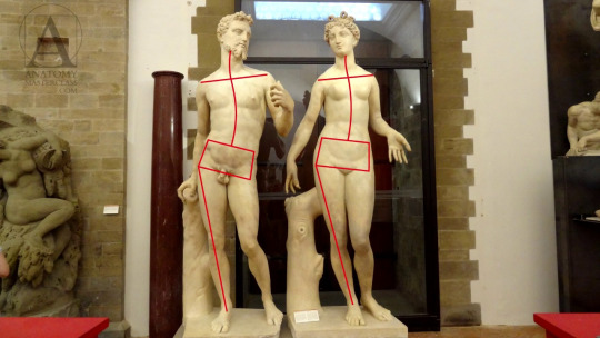
I have been taking inspiration for the poses of my paintings from art history. For this reason i thought it would be nesscasry to know and understand the poses adopted by artists throughout history.
Contrapposto is an Italian term that means "counterpoise". It is used in the visual arts to describe a human figure standing with most of its weight on one foot, so that its shoulders and arms twist off-axis from the hips and legs in the axial plane.
Contrapposto may be used for draped as well as nude figures. The Greeks invented this formula in the early 5th century bc as an alternative to the stiffly static pose—in which the weight is distributed equally on both legs—that had dominated Greek figure sculpture in earlier periods.
This was considered the perfect pose because it’s a very natural, very “human” stance.

Michelangelo's statue of David is a prime example of this pose.
in the following article in artsy net 6 Art-Historical Poses You Should Know - Artsy , they note the conceptual artist Bruce Nauman's attempt to recreate the pose while moving through a narrow passageway in his 60-minute video performance Walk with Contrapposto (1968). The writter comments on unnatural awkwardness that doesn't relate to the effortlessness the greek's hoped it would have.
Looking at this pose, although it may be unnatural for a daily stance, you can see its influence on popular culture. The bucked hip, bent knee and arched foot is often adopted by younger generation females when taking photographs to enhance their curves. The pose is still very much unknowingly relevant in todays society.
5 notes
·
View notes
Text
Close to the Machine: Technophilia and Its Discontents Ellen Ullman
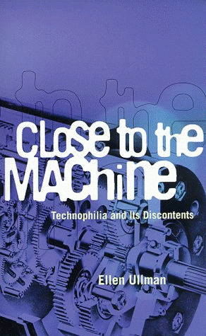
"I like to think computers are neutral, a tool like any other, a hammer that could build a house or smash a skull. But there is something in the system itself, the formal logic of programs and date, that recreates the world in its own image. We think we are creating the system for our own purpose. We believe we are making it in our own image. We call the microprocessor the 'brain'; we say the machine has 'memory'. But the computer is not really like us. It’s a projection of a very slim part of ourselves. We place this small projection of ourselves all around us, and we make ourselves reliant on it. To keep information, buy gas, save money, write a letter. We can't live without it any longer. We think we are creating the system, but the system is also creating us. We build the system, we live in its midst, and we are changed."
When researching I found this quote and it really touched me as it describes technology in the most perfect way.
11 notes
·
View notes
Text

This book was suggested to me and even though I haven’t finished it yet it’s very interesting. It helped me learn techniques for my dress making projects without feeling like all the research.
2 notes
·
View notes
Text
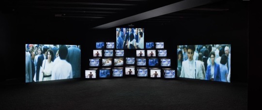
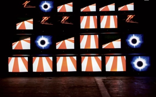

Gretchen bender
Gretchen bender is an American multi media artist. In the 1980s, Gretchen bender was immersed in New York’s vibrant art scene. Working with TV, video and computer generated graphics, her own work put he in the vanguard of new media artists. Bender created an installation “total recall” (1987). A monumental 24 monitor, multi projection screen installation that explores the accelerated image flow of television in which she aimed to infiltrate the corporate domain of mass media representation by overloading the viewer with information.
This work has given me the idea to carry on using televisions to create work about the mass media representation of unrealistic body image in the media and television. I also love the way the televisions are stacked on top of one another to almost make one large canvas that overwhelms the viewer with information.
4 notes
·
View notes
Text
Conceptual Art
I've been looking into Conceptual Art and the work of Conceptual artists. This is the idea that the concept is more important than the actual work itself. Conceptual Art was most active in the 1960's
In 1967, Sol LeWitt wrote in his essay “Paragraphs on Conceptual Art” that “the idea itself, even if it is not made visual, is as much of a work of art as any finished product.” Conceptual artists used their work to question the notion of what art is, and to critique the underlying structures of artistic production, distribution, and display. The idea, concept, process and preparation of the work is just as
This is something that I can relate my work to because of how my work is more predominantly focussed on the process rather than the outcome of the work.
0 notes
Text
Reuben Paterson: The Only Dream Left

Paterson’s work first seduces with lavish colours, forms and materials, harnessing the magical and transformative properties of light. The swirling, optical energy of these works—often using his signature material of glitter—then pry open the complex issues and tensions that sit just beneath the surface of all things.
0 notes
Text
App Research
Food Apps:
Deliveroo-

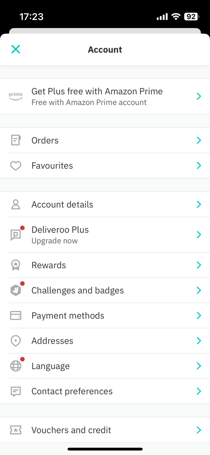

Deliveroo is a British online food delivery company founded in 2013. The service has reached a mainstream audience in recent years and has impacted the way we order takeaway irreversibly. I wanted to observe the layout of the app and how it might affect our design. The app uses a simple colour palette to contrast with the colourful imagery of the food. This use of colour was thought to be too sterile when applied to our game concept (games typically have a colorful background). As a student on a budget, I reserve delivery services such as this in situations where I'm too unwell to make my own food and it has been very useful.
Mealime-
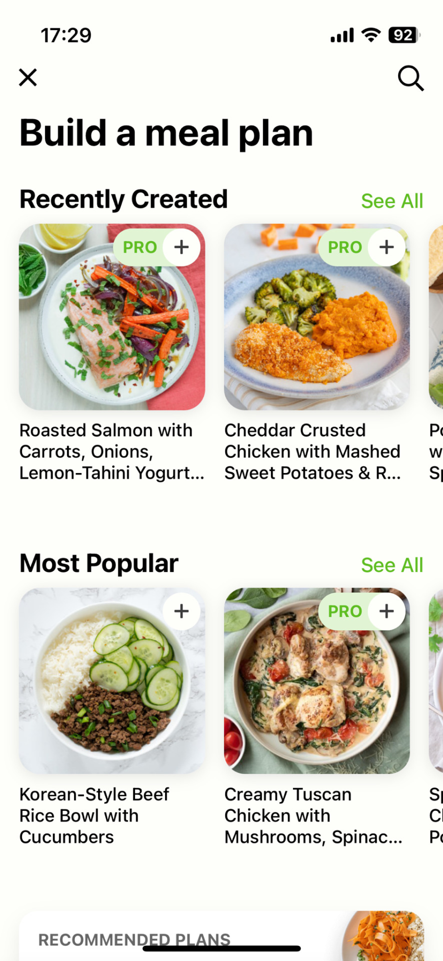

Mealime is an American meal planner app founded in 2014. I have used the app for my weekly shop once, but later discovered it to be American in the method (told to measure in cups, which does not translate to British cooking). The service also requires a Pro subscription to access most of the recipes, which is not affordable for students. The layout of the app is very easy to use and there are not excessive design choices which make it hard to navigate. Much like Deliveroo, it has a simple colour palette. The use of green is present within my selected colour palette, as this was within most food apps and conveys organic living. The service also uses a very similar san serif font to Deliveroo.
Nosh:


I was gifted a Nosh book targeted towards students. The company idea was formed based on the author's son, who did not know how to cook during his time at uni. Joy May wanted to solve this issue and a succession of books have been released since. The app has a downloadable book section for which you receive the grocery list. The method however, is provided within the book. As a picky eater and not a big meat-eater, this book didn't work in my favour. Many, almost all, included meat. The app itself is effective, but could be improved through uploading the grocery list to your selected supermarket, as Mealime does. The price inclusion is a good idea when considering the budget of students. The app again uses a san serif font and a white and green colour palette.
Apps Essential to University Life-My Personal Observation:
These are apps I looked at prior to the decision of diet and cooking focus.
WalkSafe-
This app provides the most safe route home by analysing verified police data posted using the latest monthly police reports. I have used this during a night out in Bristol with my sibling and it felt reassuring to have. The design of the app uses a white and blue colour palette and simple navigation. This is effective as in a situation of fear, you want to be able to access something like this quickly. I learnt about the app through an advertisement poster which featured young people on a night out, which suggests the target audience.

Uber-
Uber allows you to connect to nearby registered drivers who can get you from a-b. I used this service during my trip to Rome with friends and this was great when trying to navigate an unknown area. I think this service to be essential to university life as often times, there are not enough taxis to go round during a night out. Buses also stop during the later hours.
UniBuses-
Depending on your location, bus apps are really helpful when planning out your journey. These apps provide a journey planner where you can put in your location and desired trip. This has helped me plan out my days in advance as well as view the live location of the buses.
Trainline-
Trainline is essential to a uni student who travels and has helped me on all my train journeys. It allows you to buy tickets at the last minute, without the hassle of a ticket machine. The ticket is digital and so there is no risk of it becoming lost. My favourite feature is the live tracker, so I know when to expect my arrival as well as any updates as to whether the train has changed or been cancelled. This app again uses a white and turquoise colour palette as well as a black sans serif.
CityMapper-
This app is good for city locations and I have used it when visiting London. The app helps users to find areas using a filtration system of walks, cycles, scooters, buses tube and rail routes. This app also uses white and green and a san serif font. In my personal experience however, I have found the app over complicated and too difficult to understand, especially amongst the bustle of cities. My parents and boyfriend found it hard to navigate also.
Canvas-
Many universities use Canvas as their intranet. The app version however, has many missing information on lessons and cannot be viewed properly unless on a full screen.
LinkedIn-
LinkedIn is useful in making connections to others from your uni and outside. It has a simple system like many other social media platforms and again uses a basic colour palette.
Fatsoma-
My go-to for ordering nightclub tickets, this app is very easy to use. My complaint is the excessive use of notifications. The app uses a white background and a black san serif font.
UniDays-
A discount code app for students, I have found the app to be temperamental. It would often give me inaccurate codes. Again, white and green palette.
StudentBeans-
Another discount code app, most codes on here load up onto websites which are nowhere to be seen. Would prefer if they kept the old copy and paste option. They have a purple colouring which is unusual to see, but it stands out against the others.
NHS App-
Vital for those who move away from home. Keeps all doctors notes and prescriptions. Allows me to order my medication without having to call surgery. Easy to navigate but a pain to set up.
Vinted-
My go-to for second-hand clothing. Many discounted clothes from popular sellers such as Urban Outfitters, has allowed me to own unique and fashionable clothes without breaking the brank. Blue and white palette.
Timetree-
My favorite calendar app that I share with my friends, family and boyfriend. I have a calendar for each and it allows us to plan around each of our responsibilities and activities. White and green palette, I like the stylisation of the logo as being that of a clock but in leaf form. Simple but effective idea that is reflected in the app navigation.
Avatar Apps:
Bitmoji-
This app is used to design you avatar on the social media platform Snapchat. The app provides a lot of variation in styles and companies use their wardrobe section to promote their clothing. Typical of avatar design, there is an outfit, face, body and accessories section. Each section allows for the selection of colour. I tried to incorporate this into my design.
Avatoon-
This app follows the same premise. This format influenced how I initially drew out the avatar section. This app is much more restrictive than Bitmoji as it requires a subscription for me advanced features, but the stylistic choice is very similar to that of Bitmoji.


Cooking Game Apps:
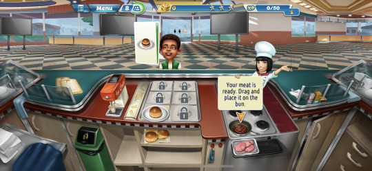
Cooking Mama-


Our primary inspiration, Cooking Mama is a game that was popular during our childhood. As observed in my Penguin Books project, nostalgia is important to Gen Z and how they interact with brands. Creating familiarity within our game would encourage users to interact with the lessons. A feature we have been inspired by are the cutting directions provided by GIF arrows and lines, which will appear in our video lessons. We thought to include this as we had all found it difficult to learn how to cut different foods in different ways-and learning these essential skills makes for better food and ultimately, a confident cook.
Cooking Fever-
This game differed to Cooking Mama in that the gameplay was more of a drag-and-drop action rather than directly interacting with the food. We wanted demonstrations of how to prep and cook food and so this type of gameplay did not apply to our end goal.
1 note
·
View note
Text
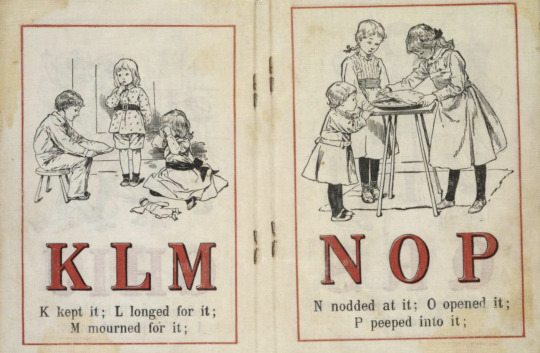
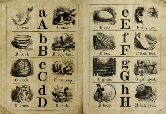
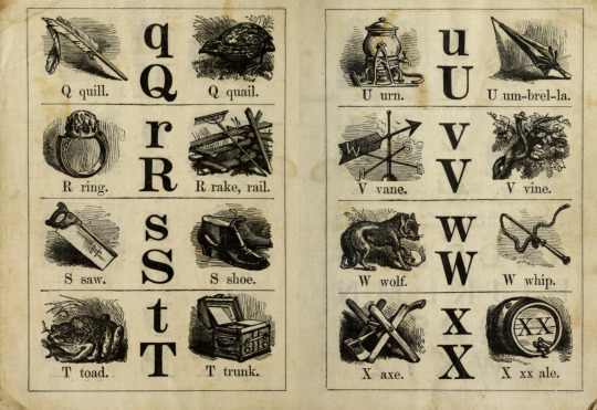
Exploring ABC books
Non-Fiction
(ABC birds, n.d.)
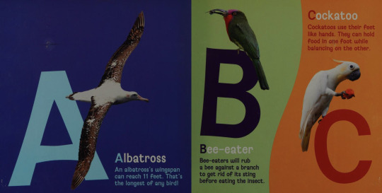
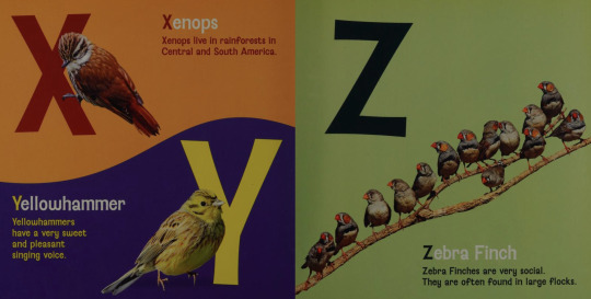
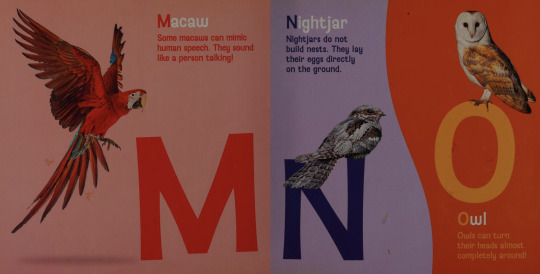
My rare animal ABC (Davies and Moses, 1992)
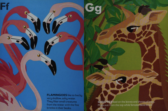

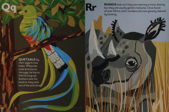
(ABC insects, 2014)
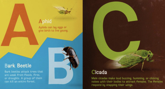

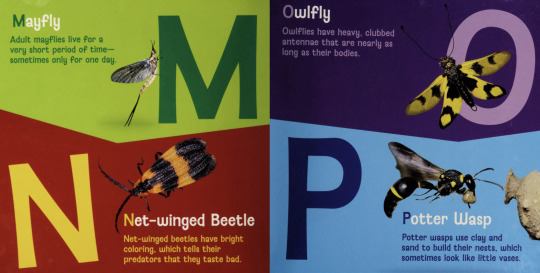
Dinosaur ABC (Brown, 2018)
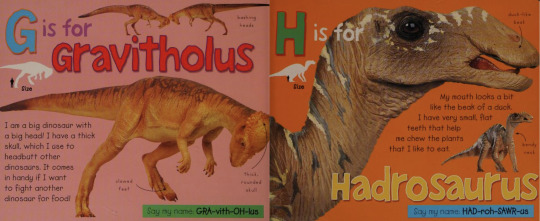


References
2014. ABC insects.
Brown, R., 2018. Dinosaur ABC. New York: Priddy Books.
Davies, M. and Moses, B., 1992. My rare animal ABC. Godalming: WWF UK.
n.d. ABC birds. New York: Sterling Publishing Co.
0 notes
Text
Public inquiry into permission to build hotel over 300-year-old footpath in Salford | Salford | The Guardian
0 notes
Text
Ariel Guzik


Ariel Guzik is a multidisciplinary artist who designs and engineers mechanisms and instruments which engage with and tap into the languages of nature, specifically cetaceans (whales and dolphins). His projects explore the phenomenon of natural resonance and its use in the natural world.
Inspiration:
I am interested in the thought of capturing an animals language and if it relates to humans and how they react to it. Is that language meaningful to humans?
2 notes
·
View notes
Text
Flock Wallpaper Pattern
V&A · Flock Wallpaper (vam.ac.uk)
Flock has been available since the early 17th century. The purpose of flock wallpaper is to imitate cut velvet hangings, however, they are much more durable and therefore more expensive.
Traditionally it was created by adding 'flock' – a waste product of the woollen cloth industry, which came in powdered form – to an adhesive coated cloth to create a raised velvet-like textured pattern or design; more recently, polyester, nylon or rayon are used instead.
The grandest flock papers have a large repeat pattern, often six or seven feet in length. Papers on this scale were intended for large formal spaces – the public and semi-public rooms of great houses. small- patterned flocks were often hung in bedrooms, parlours and drawing rooms.
The Victorian era saw an end to the fashion of flock wallpaper. Lighter colours and washable 'sanitary' papers were supplanting the dark velvety flocks.
(image below) Panel of red flock wallpaper, identical in pattern with the paper formerly hung in the Queen's Drawing Room at Hampton Court Palace, unknown maker, about 1735, England. Museum no. E.3594-1922. © Victoria and Albert Museum, London
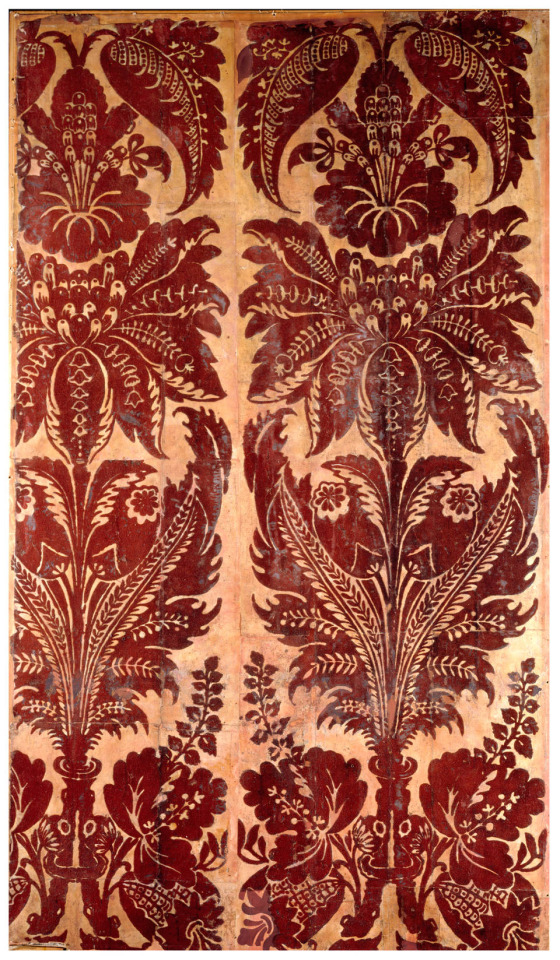
A flock wallpaper design that is still available today is Amberley. (image blow)

Mock flock - cheaper than flock but more expensive than block print. black pigment pattern on mosaic backgrounds to create the illusion.
Red Flock - favoured by galleries since the late 18th century. the colour and texture is believed to be the most effective background to pictures.
1 note
·
View note
Photo

Above is the third piece from the series of works I’m doing based on the 5 filters of the Propaganda Model. For this one I focussed on the filter of advertising. The Propaganda Model Today: Filtering Perception and Awareness, provides an interesting reflection on the relevance of the model in regards to social media and the internet, and how the filters have developed. In short, advertisers pay to be featured in the media - Ad breaks between TV programmes, Ads in newspapers, adverts online. The media sources that use advertising generate more money and thus are more likely to survive:
https://www.jstor.org/stable/j.ctv7h0ts6

https://chomsky.info/consent01/
If the media publishes content that critiques or questions certain issues that oppose the interests of advertising companies, they are at risk of losing their funding:

Today, advertising is smarter than ever; our ‘digital labour’ produces data for advertisers to direct tailored ads to specific internet users. They know your searches and interests and as a result, are able to direct your attention onto similar products. It could be argued that the increase in targeted online content is also effecting our ability to have meaningful debates online; algorithms help to create a sort of echo chamber within social media bubbles. Users click on recommended videos or articles, teaching the algorithms to suggest similar content, which in turn amplifies certain viewpoints and makes it harder to find content that voices other opinions. This process can increase confirmation biases and create further divisiveness. The article below comments on the way in which online algorithms may have influenced the 2016 Brexit campaign:
https://theconversation.com/feedback-loops-and-echo-chambers-how-algorithms-amplify-viewpoints-107935

In this piece of work I took a well known internet presence: Mark Zuckerberg. Keeping with the style, I used warm oil pastel colours for the image and a painted red background. Using my phone I quickly edited together a photo of him and the severed head from the famous Hindu painting of the goddess Kali, leaving a blank face with “Your Ad here” written across it. I then glued on the acetate and painted the Huichol characters on top. I’m really please with how this one turned out, though the composition of the painted characters on top doesn’t feel as effective as the other two pieces I’ve done. As I’ve been creating these works, the purposes and themes within my work have become clearer to me; I am drawn to the satirical, ironic depictions of political figures. I like my work to comment on debates such as these. On the other hand, I love the style and colours of non-western art traditions and the different symbolic codes contained within these different cultures. This series of pieces has helped me to bring the two together, mixing the political issues of western society, concerned with science and reason, with the symbols, characters and stories contained within these other cultures to create a balance of the two.
2 notes
·
View notes
Last Seen Blogs
pipermintz
professional silly person

queenshelby
Welcome to the World of 50 Shades of Tommy Shelby

xareios
ARE

5thtimesthecharm69
Don't ban me for the soft stuff!

the-olympics-olympics
The Olympic Games Bracket Tournament