#cssborder
Explore tagged Tumblr posts
Visit Tumblr Blog
Explore Tumblr blogs with no restrictions, modern design and the best experience.
Last Seen Tumblr Blogs


Fun Fact
Tumblr.com is the 103rd most visited website in the world.
Text
Shaping Excellence: Border Corner Styles with CSS
Introduction
Welcome to the world of web design, where every pixel matters in creating an outstanding user experience. In this blog post, we'll embark on a journey into the realm of CSS border corner styles – a crucial aspect of design that can truly shape excellence in your web projects. As we explore the intricacies of border properties, particularly the powerful border-radius, you'll gain insights into how these styling elements contribute to the overall aesthetics and visual appeal of your website. Get ready to unlock the potential of CSS and elevate your design game!
Understanding CSS Border Properties
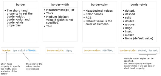
When it comes to crafting visually engaging and polished web designs, a solid understanding of CSS border properties is essential. Borders play a pivotal role in defining the boundaries of elements on a webpage and contribute significantly to the overall layout and presentation. Let's delve into the key aspects of CSS border properties to equip you with the knowledge needed for effective web design. 1. Border Styles: Firstly, CSS provides a variety of border styles that you can apply to elements. These include solid, dashed, dotted, double, and more. Each style brings a distinct visual effect, allowing you to tailor the appearance of borders to match your design goals. 2. Border Width: The width of a border is another crucial property. You can specify the thickness of the border using values like pixels, em, or percentages. This flexibility enables you to create subtle borders for a clean look or bold borders for a more pronounced visual impact. 3. Border Color: Customizing the color of borders adds another layer of design control. Whether you opt for standard colors, hexadecimal codes, or named colors, selecting the right border color enhances the overall cohesion of your design. 4. Shorthand Border Property: To streamline your CSS code, you can use the shorthand border property. This allows you to set border width, style, and color in a single declaration. For example: CSSborder: 2px solid #333;
Border-Radius: The Cornerstone of Style
As we dive into the world of CSS border corner styles, the border-radius property emerges as the true cornerstone of style. This powerful property allows you to control the curvature of the corners, opening up a myriad of design possibilities. Let's explore the intricacies of border-radius and how it can elevate the visual appeal of your web elements. 1. Basic Syntax: The basic syntax of the border-radius property involves specifying the radius values for each corner. You can use one to four values, each corresponding to the top-left, top-right, bottom-right, and bottom-left corners, respectively. For example: CSSborder-radius: 10px; /* Applies the same radius to all corners */ border-radius: 10px 20px; /* Applies different radii to the top-left/bottom-right and top-right/bottom-left corners */ border-radius: 10px 20px 30px; /* Applies different radii to each corner */
Creating Circular Elements
One of the delightful aspects of CSS border corner styles is the ability to transform ordinary square or rectangular elements into captivating circles. This is achieved through the versatile use of the border-radius property, opening up creative opportunities for circular design elements throughout your website. 1. Setting Border-Radius to 50%: The key to creating perfect circles lies in setting the border-radius property to 50%. This uniform radius value for all corners ensures that the element's corners are rounded equally, resulting in a circular shape. CSSborder-radius: 50%;border: 2px solid transparent; border-radius: 10px;/* Smartphone styling */ @media screen and (max-width: 480px) { .element { border-radius: 10px; /* Different radius for smartphones */ } } /* Tablet styling */ @media screen and (min-width: 481px) and (max-width: 768px) { .element { border-radius: 15px; /* Different radius for tablets */ } }/* Enable hardware acceleration */ .element { transform: translateZ(0); }
FAQ
Here are answers to some frequently asked questions about CSS border corner styles, providing clarity and guidance on common queries: Q1: Can I apply border corner styles to all HTML elements? A: Yes, the border-radius property can be applied to a wide range of HTML elements, including divs, buttons, images, and more. This versatility allows you to create visually appealing designs across your entire website. Q2: What is the best practice for setting border-radius values? A: Best practice involves balancing visual aesthetics with performance. Use simpler border-radius values whenever possible and reserve complex designs for specific elements that require intricate styles. This helps maintain optimal rendering performance. Q3: How can I create circular elements with border-radius? A: To create circular elements, set the border-radius property to 50%. This uniform radius value for all corners transforms square or rectangular elements into perfect circles. Apply this technique to images, buttons, and other elements for a modern and cohesive design. Q4: What is the impact of border-radius on performance? A: While border-radius itself has a minimal impact on performance, using high or complex values, especially in conjunction with other properties like box-shadow, can affect rendering speed. It's essential to strike a balance between achieving desired aesthetics and ensuring efficient performance. Q5: How can I ensure responsiveness when using border corner styles? A: Ensure responsiveness by using percentage-based units for border-radius values and implementing media queries. This allows you to adjust corner styles based on different screen sizes, providing an optimal user experience across a variety of devices. Q6: Can I use border-radius in combination with other border properties? A: Absolutely! border-radius can be combined with other border properties such as border-width, border-style, and border-color to achieve comprehensive and polished designs. Experiment with different combinations to find the perfect style for your elements. These FAQs aim to address common concerns and guide you in effectively implementing CSS border corner styles on your website. If you have additional questions, feel free to explore more or seek assistance from the CSS community.
Conclusion
In the realm of web design, the careful application of CSS border corner styles proves to be a powerful tool for shaping excellence. Throughout this journey, we've explored the intricacies of the border-radius property and its role in crafting visually stunning and user-friendly websites. Mastering Border-Radius: The border-radius property emerged as the cornerstone of style, allowing designers to go beyond conventional rectangular shapes. By mastering its various applications, from creating circular elements to customizing corner styles, you gain the ability to elevate your designs to new heights. Responsive and Performant Designs: We delved into the importance of responsive design considerations, emphasizing the need for fluid layouts, percentage-based units, and device-specific styling to ensure a consistent and enjoyable experience across diverse devices. Additionally, performance optimization strategies were explored to strike a balance between aesthetics and efficient rendering. Endless Creative Possibilities: Customizing corner styles proved to be a playground of creativity, with techniques ranging from elliptical shapes to mixed-radius corners. By embracing these advanced possibilities, you have the tools to bring your unique vision to life and set your website apart. User-Focused Design: Throughout this exploration, the user experience remained a central focus. Whether creating circular elements for a modern look or optimizing performance for faster load times, the aim is to provide users with a seamless, visually pleasing journey through your website. Continuous Exploration and Collaboration: The world of CSS is ever-evolving, and there is always more to explore. As you continue to refine your skills in border corner styles, consider collaborating with the design community, sharing insights, and staying abreast of the latest trends and best practices. In conclusion, the mastery of CSS border corner styles is not just about adding visual flair to your website; it's about creating an immersive and delightful experience for your audience. As you implement these techniques and explore further possibilities, remember that the journey towards excellence is ongoing, and each design decision contributes to the overall success of your digital creations. Read the full article
0 notes
Text
7 Ways To Center Elements In CSS
7 Ways To Center Elements In CSS #css #csstutorial #tutorial #csscentering #elementcentering #webcentering #programming #frontend #front-end #coding #code #html #beginner #programmer
As you probably know centering elements in CSS can cause a headache even to experienced developers. There are many different situations and many different solutions. Sometimes it is best to choose one over another but other times it is a matter of personal preference. And to make right decision, you need to know pros and cons of each available option. Grid The grid solution is very similar to…

View On WordPress
#code#coding#CSS#css centering#css style#css tutorial#cssborder#csscenter#csscentering#csstutorial#frontend#programming#tutorial#web#webdev#webdevelopment#webtutorial
0 notes
Link
CSS Border Radius Generator is a free online tool for generating CSS border radius. "border-radius" is one of the most used CSS properties to soften corners
0 notes