#data visulization
Explore tagged Tumblr posts
Visit Tumblr Blog
Explore Tumblr blogs with no restrictions, modern design and the best experience.
Last Seen Tumblr Blogs


Fun Fact
Premium Tumblr themes are available from anywhere between $9 to $49.
Text
Looking to turn data into something meaningful? The Master in Data Analyst and Visualization is built for curious minds who want to move beyond spreadsheets and charts. You’ll gain the skills to explore, interpret, and visualize complex data—so you can tell powerful stories, make better decisions, and create impact wherever your career takes you.
0 notes
Text
0 notes
Text
What Is Data Visualization and Why Does It Matter in Today’s Digital World?

In today’s fast-moving digital landscape, data is everywhere—from your phone's health tracker to complex business reports. But raw numbers can be overwhelming. That’s where data visualization comes in. It transforms complicated data into visuals like charts and graphs, making it easier for people to understand patterns, spot trends, and make smart decisions.
Whether you’re a marketing analyst, a teacher, or just someone trying to make sense of survey results, tableau training helps you tell stories with data. Instead of rows of numbers in a spreadsheet, you get a clear, visual picture of what the data means.
Let’s explore what data visualization is, why it’s important, and how you can use it effectively—no matter your background.
What Is Data Visualization?
At its core, data visualization is the art and science of turning data into visual content. This could be a simple bar chart comparing monthly sales or an interactive dashboard showing real-time web traffic across the globe. It’s a way to represent information so it can be understood quickly, even by people who aren’t data experts.
Instead of making your audience dig through data tables, visualization lets you communicate the main insights right away. It helps translate complicated numbers into simple visuals that guide better decision-making.
Why Data Visualization Is So Important
As the volume of digital data continues to explode, the ability to interpret it quickly is becoming a competitive advantage. Here’s why visualization matters:
It simplifies complex information, making it easier to digest. Imagine looking at a table with 1,000 rows versus a graph that shows you the same insights in a few seconds. The difference is huge.
Visualization also reveals hidden trends or patterns you might not catch with a spreadsheet alone. For example, a line graph could instantly show you a drop in sales during specific months—something less obvious in raw data.
Lastly, it helps teams and organizations make faster, more informed decisions. Whether you’re presenting to executives or stakeholders, clear visuals reduce confusion and speed up the decision-making process.
The Most Common Types of Data Visualizations
Different types of charts serve different purposes. Choosing the right one depends on what kind of data you’re working with and what you want to show.
Bar Charts are perfect for comparing quantities across categories. For instance, you can use a bar chart to compare revenue across departments.
Line Graphs show trends over time, such as monthly traffic to a website or yearly temperature changes.
Pie Charts are useful when you want to show parts of a whole—like market share or survey responses.
Heat Maps highlight data intensity using color. They’re often used to track website user activity or performance metrics.
Scatter Plots show relationships between two variables, helping to identify correlations or outliers.
Dashboards combine several charts and metrics into one screen, offering a complete view of key performance indicators (KPIs).
Top Tools for Creating Data Visualizations
There’s no shortage of tools for building visualizations, ranging from beginner-friendly to highly customizable. Some of the most widely used platforms include:
Tableau – A popular tool for interactive dashboards, ideal for professionals who want detailed, dynamic visuals without needing to code.
Microsoft Power BI – Best for users already working with the Microsoft ecosystem. It integrates easily with Excel and Azure.
Google Looker Studio (formerly Data Studio) – Free and easy to use, great for creating sharable reports and connecting Google-based data sources.
Microsoft Excel – While basic, it’s still a powerful tool for creating quick charts, especially for smaller datasets.
D3.js – A JavaScript library for developers who want complete control over custom, interactive visuals on the web.
How Different Industries Use Data Visualization
Visualization isn’t just for analysts or tech experts. It’s used in many industries to support smarter decisions and clearer communication.
In business, visual reports help track performance, monitor customer behavior, and guide marketing strategies. Dashboards can provide executives with real-time data to adjust operations on the fly.
In healthcare, patient data is visualized to detect trends in treatments, monitor public health patterns, or even track the spread of diseases.
Educators use visuals to highlight student progress, identify gaps in learning, and communicate results with parents or administrators.
In government, data visualization is used to present public information—like unemployment rates or budget reports—making data accessible to all citizens.
Best Practices for Designing Effective Visualizations
Creating good visuals takes more than just choosing a chart type. You need to think critically about how your audience will interpret the data. Here are some tips:
Start by knowing your audience. Are they familiar with the data? What decisions do they need to make based on your chart?
Choose the visualization that best fits your message. For example, use line graphs for time trends, but opt for bar charts to compare items.
Keep your design clean and uncluttered. A busy chart can confuse rather than clarify.
Use color strategically—not just for decoration. Highlight key data points, but ensure the chart is still readable in grayscale.
Always provide context. Label your axes, include a title, and use legends if needed. Don’t assume your audience will figure it out on their own.
Quick Checklist for Effective Visuals
Keep charts simple and focused
Label all key elements (axes, titles, legends)
Use colors and shapes to guide attention, not distract
Avoid 3D effects or unnecessary embellishments
Make sure your charts are mobile-friendly if shared online
Conclusion
In a world overflowing with information, the ability to visualize data is more than a skill—it’s a necessity. Whether you're managing a team, analyzing customer behavior, or simply trying to make sense of numbers, clear and thoughtful visualizations make your insights stronger and your message more powerful.
The tools are accessible, the techniques are learnable, and the benefits are undeniable. By mastering the basics of data visualization, you’re not just reading the data—you’re telling its story. And in today's data-driven world, that's a story worth sharing.
FAQ
Do I need to be a data expert to use data visualization tools? No. Tools like Tableau, Power BI, and Google Looker Studio are built to be user-friendly, especially for beginners. Most offer drag-and-drop features and templates to get started.
What’s the best type of chart for comparing data over time? A line graph is usually your best choice for showing how something changes over time, such as sales, traffic, or temperatures.
Can I use visualization for personal projects? Absolutely. From budgeting to tracking fitness goals, data visualization can make personal data more insightful and actionable.
0 notes
Text
Reușisem! I am bossy girl now! Miss Independent ( Ne-Yo). Era o cina cu asociații și potențialii clienți. Trebuia sa strălucesc, sa fiu cea mai bună... ( cu ochii în tavan, zâmbesc, aproape ca îmi dau lacrimile de fericire când ma gândesc cât de mult am muncit, și în sfârșit îmi trăiesc visul ). Ma pregătesc pentru seara vieții mele. Imbrac o rochie lunga mulata cu spatele gol, îmi las parul lung și negru să-l acopere, ce-mi ajunge în dreptul coapselor, care dintr-o data devin fierbinți; oftez când starea de excitare ma cuprinde, nu aveam timp pentru asta, am și uitat cum se simte); un ruj roșu aprins, puțin sclipici, un lantisor finut, pantofi rosii, câteva pufuri de parfum și sunt pregătită.


Urc în mașina, eram agitată, nu înțelegeam de ce, emoții nu aveam, excitată puțin (corpul simțea ca o să fie o noapte de neuitat). Pornesc muzica și strabat străzile capitalei cu zâmbetul pe buze .Ajung la locatie. Sunt intampinata de colegii mei cu un pahar de șampanie, îmbrățișări calde și complimentele care m-au făcut ușor sa rosesc. Port conversații cu fiecare, pana când un parfum cunoscut se face simțit în încăpere. Ma blochez pentru o secunda, știam acel miros, îmi invadase mintea, ma cucerise.N u ma întorc, ma scuz și ma indrept către baie. Ma privesc în oglinda, nu se putea să fie el...cel care doar cu o privirea ma topea, îmi era dor de el, îmi era dor de buzele lui mari și carnoase, de mangaieri, de vocea lui groasa și perfectă. Am fost împreuna ceva timp, dar din cauza joburilor, a trebuit sa rupem legătura, plecând fiecare în alta țara pentru o mai buna formare profesională. Trecusera 5 ani de ani, dar încă țineam la el. Imi revin din șoc și ma întorc sa intampin invitații.
- Maia, te căutam, vino sa ți-l prezit pe Dl. R. Zâmbesc și îmi urmez colegul, la auzul numelui, simt un fior pe spate.

- Dl. R, ea este Domnișoara Maia, cea mai bună în domeniu.
(Dl. G) Rămân blocat când o văd. Nu ma așteptam să fie ea. Știam ca o să lucrez cu o domnișoara Maia, dar nu tocmai ea. O admir din cap pana în picioare, la fel de strălucitoare, cum sunt un iubitor al sexului, imediat îmi apar imaginile cu noi doi in așternuturi, iubindu-ne..si nostalgie, nu credeam ca o s-o mai revăd vreodată.
- Încântat de cunoștința Maia, eu sunt R.
- Asemenea. Imi ia mana și o saruta, privindu-ma în ochi. Simt cum obrajii îmi iau foc, palmele îmi transpira, iar vocea din capul meu îmi spunea să mă controlez, urmat de un "sex sălbatic în noaptea asta, iuhuu, puțina adrenalina".
Mai facem schimb de câteva cuvinte, ca și cum ne întâlnim pentru prima data. Mai cunosc câteva persoane și ne așezam la masa. Ii fac semn prietenei mele să ne aseze lângă mine, dar nu apuca, G i-o ia înainte.
- Se poate să mă așez eu aici? Aș vrea să-i arat Maiei câteva idei pentru proiect.
- Sigur ca da.
Ma uit la ea cum pleacă de lângă mine cu ochi de cățeluș, mai ca implorand-o să se întoarcă. Dar, fără speranțe.
- Mi-a fost dor de tine! Îmi șoptește la ureche.
Nu ma uit la el, nu-i răspund, doar zâmbesc...Ciocnim un pahar în cinstea noastră, a echipei, ma ridic pentru a spune câteva cuvinte și a le multumii pentru ca au acceptat invitația la cina.

Iar el, obraznic cum îl știu ‘din greșeala’, a prins momentul pentru a-mi atinge corpul, deja agitat, excitat, datorita lui..
((part 1))
41 notes
·
View notes
Text
Renunță.
Nu la tot, relax.
Doar la ideea că trebuie să fii cineva.
Ești deja cineva. Adică ai CNP, ai un ficat semi-funcțional și niște gânduri dubioase la 2 noaptea.
Gata, ești în sistem.
Pe bune, m-am săturat.
De ideea că trebuie să „devin cineva”, când eu mă bucur dacă ies din casă cu pantalonii pe față.
De visuri cu „cine vreau să fiu peste 10 ani”. Peste 10 ani sper să-mi mai funcționeze genunchii și să știu pin-ul de la card.
Ăsta e visul meu.
Am fost la un pas să-mi fac un site de dezvoltare personală unde primul pas e „culcă-te puțin, vezi după”.
Am încercat și „să fiu versiunea mea ideală”, dar am uitat unde am pus-o. Ultima dată era în frigider, între iaurt și rușine.
Toată lumea vrea să fie specială. Eu vreau doar să pot sta jos fără să-mi amorțească un picior și fără să-mi sune telefonul.
Așa că am renunțat.
La glorie, la obiective mărețe, la „you got this, boss!”
N-am this. Am un hanorac care-a văzut lucruri… inclusiv relații toxice și ketchup pe guler. Am o ciorbă de perișoare reîncălzită și o urmă de speranță că mâine n-o să uit din nou pin-ul, deși șansele sunt aceleași ca la Loto, fără bilet.
Trăiesc între „merge și-așa” și „hai că data viitoare o să fiu om”, iar planul meu de viitor e să n-ajung să mănânc direct din oală… dar nici nu exclud asta complet.
Și știi ce? E ok.
E glorios. E poetic. E… supraviețuire cu umor.
Că dacă nu râd, mă apuc de făcut cursuri de coaching. Și nu vrei asta.
1 note
·
View note
Text
Suntem o consecinta a tot ce am trait
De multe ori imi fac psihanaliza si realizez cat de mult m-am indepartat de cine eram in momentul in care credeam ca am ajuns la cea mai buna varianta a mea. Uitandu-ma in trecut, imi dau seama ca acea varianta nu a fost nici pe departe cea mai buna, dar a fost primul pas catre evolutionsimul meu personal. Inainte aveam niste principii bazate pe ceea ce am absorbit din mediul in care am crescut, un loc toxic, plin de ultimii oameni. Deci va dati seama ce ideologii de viata putea sa aiba o persoana pentru care o zi normala decurgea cu violente, agresiuni, hotii, minciuni, droguri, abuzuri si alte boschetarisme din astea. Ganditi-va ca acesta a fost bagajul cu care am plecat spre a-mi construi un viitor. Descurajant, nu ? In ceata mea, credeam ca asta e natura tuturor oamenilor. Dar am ramas surprins cand, pentru prima data in viata, am ajuns intr-un loc in care m-am simtit cu adevarat linstit si toate lucrurile pe care eu le invatasem inainte, aici erau inutile. Nu imi venea sa cred diferenta dintre oamenii de aici si cei cu care eram eu obisnuit. Nu credeam ca se poate sa ai un job normal si salariul lunar sa iti permita sa traiesti o viata cel putin decenta. Aceste lucruri m-au facut sa realizez cat de bolnava este lumea din care multi dintre noi venim si cat de greu este sa ajungi si sa te mentii la un nivel de normalitate, care pana nu demult, nici nu credeai ca exista.
Suntem o consecinta a tot ce am trait, nu ne-am nascut ce suntem, ci am devenit ce suntem. De-a lungul timpului, nu ni se schimba doar forma fizica, ni se schimba si personalitatea, ni se schimba dorintele si nevoile. Visul tau de a devenii astronaut, a ramas prafuit, undeva prin coltul mintii, langa alte amintiri. Acum predomina setea de succes, fericirea nu mai vine din lucruri simple si e tot mai greu de atins. Schimbarile prin care trecem lasa urmari, suntem neputinciosi in fata sortii. Prin toata aceasta ambiguitate de trairi si sentimente, ajungem sa ne indepartam de ideologiile si principle noastre primare, dar asta nu inseamna neaparat ca evoluam in bine. Pai si cum ne dam seama care e 'binele' ? Raspuns simplu, nu avem cum! De aia pentru unii e corect ceva, ce pentru altii e gresit. Nu exista oameni prosti, ci doar oameni nenorocosi pentru ca singurul lucru cu care ne nastem si ramane neschimbat, este vointa!
0 notes
Text
În viata puțin oameni își găseasc sufletul pereche...
Eu cred ca tocmai ce am pierdut...
Am cunoscut-o pe Babyka undeva în februarie 2022..., mi se părea interesanta și după cum tot vorbeam, ma atras mult felul cum gândește, felul cum gestionează lucrurile. Am spus ca trebuie neapărat sa o cunosc mai bine.
Cu trecerea timpului am observat atât eu cât și ea cât de la fel suntem noi, în viata mea nu am avut asa o conexiune cu cineva. Pot spune ca ea era versiunea mea feminina cu mici diferențe...
Cred ca în viata o singura data găsești aceasta conexiune și nu oricine are ocazia de a se bucura de asa ceva.
Ne-am îndrăgostit, ne-am iubit mult...
Dar lucrurile s-au terminat și visul frumos s-a spulberat...
Îmi este mereu dor de ea, îmi lipsește... am preferat sa zac în tăcere, sa nu o mai caut sa nu mai dau semne vitale. Ea spusese ca fără mine, acum totul este mai bine...
Asta a durut
Presimt ca undeva, cândva ne vom reîntâlni...
Poate atunci ne vom continua povestea și totul va fi mult mai bine. Vom vedea ce ne rezerva viitorul.
!!! Aveți grija de persoana de lângă voi, aveți grija de oamenii care va iubesc, pentru ca dacă nu o faceți într-o zi ei vor pleca !!!
Iubiti-va aproapele! Acceptați greșelile, nu suntem perfecți și luptați, nu renunțați!
0 notes
Text
🎂 Azi îl aniversăm pe Sven Nordqvist.
Cartea autorului au astăzi preț special, cu până la 32% reducere față de prețul afișat.
La mulți ani!
0 notes
Text
¥ØÜ
imposibiltatea imi distruge realitatea creand imagini si imginile imi creaza imposibilitati... insa intr-o lume iluzorie, nu este totul o iluzie...?! o simpla imagine - IMAGINI. -suntem? - am fost? vom fi? sau vom disparea...?! am disparut demult... - sau doar asa credeam? -...vizibilitatea nu va fi niciodata un argument valid.
- exist in prezent, indiferent de visul in care mi-a ramas urma. poate e la tine... poate se gandeste inca la n01. e o fosila a simtirii - e amintirea vie.
imi caut ramasitele pe unde nu am fost, stiind ca acolo imi este oglinda....
iar pe tine, te gasesc de fiecare data cand nu te caut si te pierd de fiecare data cand cred ca te-am "re"gasit.
- A. H.
1 note
·
View note
Text
Visualize your data with interesting and Informative charts in Amplitude. Amplitude Power BI integration and amplitude Tableau integration are great concepts for making visualization. Data visualizations permit you to communicate complex things as well as help your targeted audience see the large picture, whether they are utilized to monitor day-to-day operations, investigate risks, or simply explore new growth opportunities for your business.
0 notes
Photo
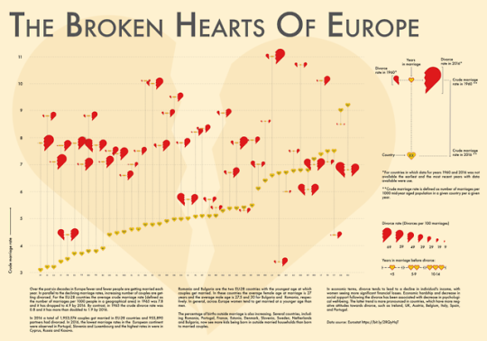
Don't want to spoil Valentine's Day, so read this data project as an encouragement to buy more roses for your loved ones.
See larger here
6 notes
·
View notes
Link
2 notes
·
View notes
Text
Is Bokeh the Future of Data Visualization with Interactive Python Plots?
Data visualization plays a crucial role in understanding and communicating insights from data. Python, being a versatile programming language, offers numerous libraries for creating visualizations. Among them, Bokeh stands out as a powerful and user-friendly library that allows you to build interactive visualizations with ease.
Bokeh is an open-source Python library specifically designed for creating interactive visualizations for modern web browsers. It enables you to generate rich, interactive plots, charts, and dashboards that can be easily shared and deployed across different platforms. Whether you’re a data scientist, web developer, or data enthusiast, Bokeh provides a comprehensive set of tools to help you bring your data to life.
With just a few lines of Python code, Bokeh enables you to create interactive, JavaScript-powered visualizations displayable in a web browser.
Its workflow involves two stages selecting visual building blocks and customizing them. Bokeh integrates a Python library responsible for defining visualization content and interactivity with BokehJS, a JavaScript library that handles the display in web browsers. Bokeh automates the generation of JavaScript and HTML code and supports the loading of supplementary JavaScript from Bokeh’s CDN for enhanced functionality.
Key Features of Bokeh:
Interactive Visualizations: Bokeh allows users to create interactive plots that respond to user input, such as mouse movements, clicks, or selections. This interactivity enhances data exploration and enables users to gain deeper insights by dynamically manipulating visual elements.
Multiple Rendering Options: Bokeh offers multiple rendering options, making it flexible for various use cases. It supports rendering visualizations as HTML documents, standalone web applications, or embedded components within other Python frameworks like Flask and Django.
Diverse Plotting Types: Bokeh supports a wide range of plotting types, including scatter plots, line plots, bar plots, histograms, heatmaps, and more. These plot types can be customized extensively to suit specific data visualization requirements.
High-performance Rendering: Bokeh leverages modern web technologies, such as HTML5 Canvas and WebGL, to efficiently render interactive plots. This enables smooth interaction even with large datasets and complex visualizations.
Cross-platform Compatibility: Bokeh visualizations can be displayed on different platforms and devices, including desktops, tablets, and mobile devices. The responsive design ensures that the visualizations adapt to various screen sizes, maintaining their interactivity and readability.
Cross-language Support: Bokeh supports multiple programming languages, including Python, R, and Julia, allowing users to leverage Bokeh’s capabilities in their preferred language environment.
Community and Documentation: Bokeh has an active community of users and developers, providing support, examples, and tutorials. The official Bokeh documentation is comprehensive, making it easier for users to get started and explore its advanced features.
Getting Started with Bokeh:
To start using Bokeh, you need to install it via pip, a package manager for Python. Once installed, you can import Bokeh in your Python script or Jupyter Notebook and begin creating visualizations.
Bokeh provides multiple interfaces for creating plots. The most used interface is the ‘bokeh.plotting’ module, which offers a convenient way to define and customize visual elements. You can create plots, add data, and configure various plot attributes such as titles, axes, legends, and tooltips.
Bokeh follows a declarative approach, allowing users to define plots and visual elements using a concise syntax. Here’s a simple example to illustrate the basic usage of Bokeh:
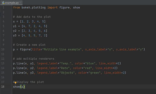
When you execute these lines of code, Bokeh creates an output file “example.html”. Bokeh also opens a browser to display it.
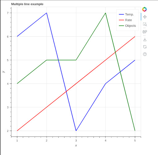
See the results in browser:
Conclusion:
Bokeh is a powerful Python library that empowers users to create interactive visualizations for the web. With its intuitive API and extensive customization options, Bokeh enables you to create visually appealing plots, charts, and dashboards that engage and inform your audience. Whether you’re exploring data, presenting insights, or building web applications, Bokeh is a valuable tool in your data visualization toolkit. By leveraging Bokeh’s capabilities, you can effectively communicate complex information, uncover hidden.
Originally published by: Is Bokeh the Future of Data Visualization with Interactive Python Plots?
0 notes
Photo

Burning Man asked me to do the graphic note taking at their European Leadership Summit in Aarhus - Denmark. It was a very inspiring and creative assignment, hereby the result! Click here to see the full size image.
#burningman#els19#isabellehorl#data visulization#aquarel drawing#infographic#visualnotes#visualization#Illustration
0 notes
Video
youtube
Army Spending in EU Zone (1914-2005)
1 note
·
View note
Link
ReactJS for Dashboards and Data Visualization: An Exceptional Choice
🟢 Dashboards & data visualization importance
🟢 Significance of ReactJS for Dashboards and Data Visualizations in Modern Businesses
🟢 Types of Reactjs Charts
🟢 ReactJS for Dashboards & Data Visualization Examples
🟢 ReactJS Dashboard KPIs and Metrics
#reactjs for dashboards and data visualization#reactjs development#hire reactjs developers#reactjs devlopment services#software development#web development#dashboard and data visulization
0 notes