#designer: giovanni antonio tagliente
Photo


Typography Tuesday
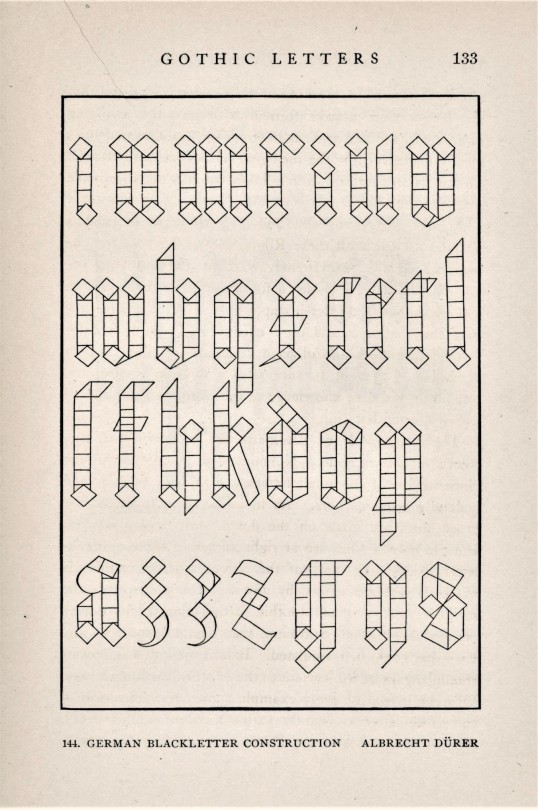
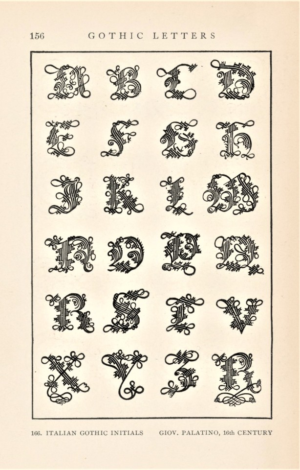
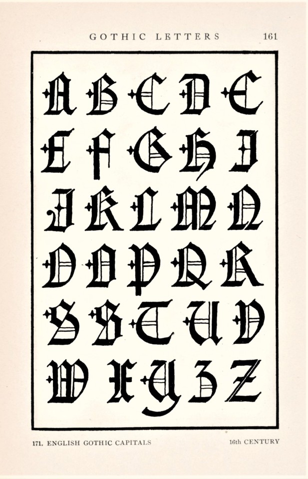
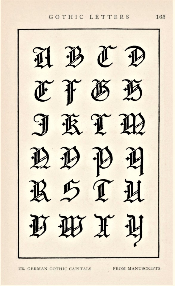
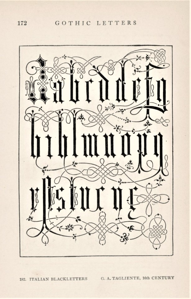
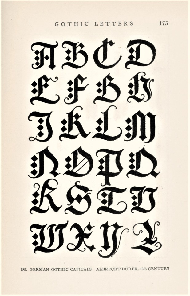
This week we present a variety of Gothic letter forms from American architect Frank Chouteau Brown’s manual Letters & Lettering; A Treatise with 200 Examples, originally published in Boston by Bates & Guild in 1902. Our copy is a later printing published in 1914. The very first metal types were Gothic forms developed in Germany in the 15th century, and the Gothic remained the principal form to encode the German language until the early 1940s. Today, it is almost entirely used as a display face.
Shown here are designs devised by the German artist Albrecht Dürer (1471-1528), the Italian calligrapher and writing master Giovanni Antonio Tagliente (1468-1527), Italian calligrapher Giovanni Battista Palatino (c.1515 - c.1575), German calligrapher Paul Franck (fl.1600-1655), and one by Frank Chouteau Brown himself. Of the Gothic form, Brown writes:
Unlike Roman letters, which attained a complete and final development, Gothic letters never reached authoritative and definitive forms, any more than did Gothic architecture. Every individual Gothic letter has several quasi-authoritative shapes. . . . yet this very variability and variety constitute at once the peculiar beauty of Gothic and the great difficulty of so drawing it as to preserve its distinctive character.
Our copy of Letters & Lettering belonged to the English-American artist, graphic designer, and silk-screen printing pioneer Max Arthur Cohn, and was donated to us by his daughter Jane Waldbaum, professor emerita of Art History here at UWM.
View another post from Frank Chouteau Brown’s Letters & Lettering.
View more Typography Tuesday posts.
#Typography Tuesday#typetuesday#Frank Chouteau Brown#Letters & Lettering; A Treatise with 200 Examples#Albrecht Dürer#Giovanni Antonio Tagliente#Giovanni Battista Palatino#Paul Franck#Max Arthur Cohn#Jane Waldbaum#letters#lettering#type design#specimen books#specimens#20th century
222 notes
·
View notes
Text
Allegro Con Brio 2023 a Verbania
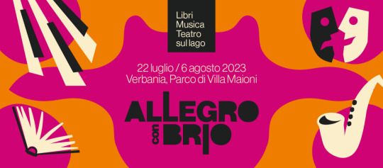
Dal 22 luglio al 6 agosto torna a Verbania e nelle sue frazioni Allegro con Brio, l'amata ed inclusiva rassegna di libri, musica e teatro sul lago, organizzata dalla Biblioteca Civica Ceretti e dal Comune con la collaborazione dell'Associazione 21 Marzo e con il contributo di Fondazione CRT.
Ci saranno presentazioni di libri, concerti, spettacoli, ma anche camminate ecologiche per scoprire la fragilità dell'ecosistema dei nostri territori e la riconfermata attenzione per le persone sorde, dato che molti appuntamenti si avvarranno infatti della traduzione nella lingua italiana dei segni, dove a Verbania arriveranno ospiti di prestigio del mondo della cultura, del giornalismo e dello spettacolo.
Nell'anteprima, dal 22 al 28 luglio, tornerà Progetto Rescue con Il Teatro nei Paesi: spettacoli e laboratori di teatro e musica organizzati in città e nelle frazioni di Biganzolo, Cavandone e Fondotoce.
Dal 29 luglio al 6 agosto la sede principale del Festival sarà il Parco di Villa Maioni e in caso di maltempo incontri e spettacoli saranno invece trasferiti al vicino Teatro Il Maggiore o all'Auditorium Sant'Anna.
Con l'inaugurazione di sabato 29 luglio arriveranno Sarah Malnerich e Francesca Fiore, il duo delle Mammadimerda che, nello stile comico e dissacrante che le contraddistingue, porteranno sul palco la loro tagliente satira sociale.
Nella serata di domenica 30 luglio l'appuntamento sarà con Cecilia Sala, autrice di reportage dall'Afghanistan, dal 2022 prima inviata italiana in Ucraina.
Il concerto di Fabrizio Poggi, cantante, armonicista e scrittore, tra i bluesmen italiani più conosciuti e stimati in America, in programma lunedì 31 luglio, anticipato nel tardo pomeriggio da Entoexperience dove Giulia Maffei, divulgatrice scientifica e Giulia Tacchini, food and communication designer, fondatrici dell'Associazione Culturale Entonote, propongono un percorso di avvicinamento al consumo alimentare di insetti.
Alle 18 di martedì 1 agosto il giornalista Riccardo Bottazzo presenterà il suo Disarmati, sui Paesi che hanno rinunciato alla militarizzazione, mentre alle 21.15 torneranno sul palco di Allegro con Brio Guido Catalano e Matthias Martelli con lo spettacolo Il Poeta e il Giullare, accompagnati dalla musica live di Matteo Castellan.
L'ospite serale di mercoledì 2 agosto, il filosofo e youtuber Rick DuFer, conosciuto per il suo podcast Daily Cogito, giunto alla quinta stagione, proporrà un Viaggio nella mente di Philip K. Dick con Quanti giga pesa Dio?; mentre nel pomeriggio l’ingegnere Giovanni Mori spiegherà perché la birra è a rischio con la crisi climatica.
Giovedì 3 agosto per la sezione cinema ci sarà la proiezione del film di Antonio Rezza e Flavia Mastrella Il Cristo in gola, mentre la serata di venerdì 4 agosto è dedicata alla musica dal vivo con l' Abdo Buda Marconi Trio in Oltremura. Una carovana di suoni da Est.
Il concerto è preceduto alle 18 dall'incontro dall'iconico titolo Fate spazio alle stelle con l'astrofisico Luca Perri, divulgatore scientifico, collaboratore di Piero Angela in SuperQuark e di Alberto Angela nella trasmissione Noos.
Sabato 5 agosto alle ore 18 Sofia Righetti, campionessa nazionale di sci alpino paralimpico, dialogherà con Camilla Mafrica su femminismo e disabilità, mentre alle 21.15 tornerà ad Allegro con Brio l' Ensemble Poliritmica con lo show audio-video Perceiveù Reality, featuring Khompa.
Due affermate giornaliste chiuderanno il Festival domenica 6 agosto, alle 18 Simonetta Sciandivasci dialogherà di maternità e denatalità con l'Assessore alla Cultura della Città di Verbania Riccardo Brezza e alle 21.15 ci sarà l'incontro A futura memoria di Valentina Lodovini, con musiche del quartetto d'archi FontanaMix String Quartet. dedicato ad Anna Politkovskaja.
Allegro con Brio vedrà anche una serie di incontri per i più piccoli, infatti il sabato mattina nel parco di Villa Maioni ci sarà l'appuntamento con il carrettino colmo di libri di Poti Poti che vedrà letture ad alta voce per bambine, bambini e famiglie da 2 a 6 anni.
Read the full article
0 notes
Text

T Y P O: Journal of Lettrism, Surrealist Semantics & Constrained Design
TYPO 2 is now available
Contents include: alien alphabets, prismatic subdivisions, principles of double-talk, Post-Neoist portraits, desiring specimens, asemic architecture, Paul Éluard poetry, titular typography, Surrealist trivia, Italian eye candy, curlicues in review, generic sheet music, Jarry on the English language, historical filler text translations & much more
Journal Details:
Title: TYPO 2
Author: Various
Language: English
ISBN 979-8-9869224-5-4
Format: Paperback Journal
Pages: 152
Publisher: Black Scat Books
Contributors:
Pierre Albert-Birot; Guillaume Apollinaire; Mark Axelrod-Sokolov; Tom Barrett; Allan Bealy; Miggs Burroughs; Jahan Cader; Janina Ciezadlo; Norman Conquest; Farewell Debut; R J Dent; Karen Eliot; Paul Éluard; Paul Forristal; Ryan Forsythe; Jesse Glass; Rick Henry; Rhys Hughes; Rory Hughes; Alfred Jarry; Richard Koman; Márton Koppány; Amy Kurman; Peter F. Murphy; Pata-No UN LTD; Gaston de Pawlowski; Derek Pell; Harry Polkinhorn; Tom Prime; Jason E. Rolfe; Ded Rysel; Doug Skinner; Giovanni Antonio Tagliente; Félix Vallotton; Andrew C. Wenaus; Adolphe Willette; Carla Wilson; William Wordsworth.
Publisher’s details:
Purchase links:
US: https://www.amazon.com/dp/B0BZFLSJ95
UK: https://www.amazon.co.uk/dp/B0BZFLSJ95
Can: https://www.amazon.ca/dp/B0BZFLSJ95
Aus: https://www.amazon.com.au/dp/B0BZFLSJ95
#TYPO 2#literary journal#R J Dent#Alfred Jarry#Paul Éluard#Black Scat Books#www.rjdent.com#Lettrism#semantics#surrealism#asemic writing#Speculations#Capital of Pain
0 notes
Text
What is the history of the bembo typeface

In France, his work inspired many French printers and punchcutters such as Robert Estienne and Claude Garamond from 1530 onwards, even though the typeface of De Aetna with its original capitals was apparently used in only about twelve books between 14. The type is sometimes known as the "Aldine roman" after Manutius' name. Modern font designer Robert Slimbach has described Griffo's work as a breakthrough leading to an "ideal balance of beauty and functionality", as earlier has Harry Carter. One of the main characteristics that distinguished Griffo's work from most of the earlier "Venetian" tradition of roman type by Nicolas Jenson and others is the now-normal horizontal cross-stroke of the "e", a letterform which Manutius popularised. Griffo was one of the first punchcutters to fully express the character of the humanist hand that contemporaries preferred for manuscripts of classics and literary texts, in distinction to the book hand humanists dismissed as a gothic hand or the everyday chancery hand. This book, usually now called De Aetna, was a short 60-page text about a journey to Mount Etna, written by the young Italian humanist poet Pietro Bembo, who would later become a Cardinal, secretary to Pope Leo X and lover of Lucrezia Borgia. His first printing in the Latin alphabet, in February 1496 (1495 by the Venetian calendar), was a book entitled Petri Bembi de Aetna Angelum Chabrielem liber. Manutius at first printed works only in Greek. These were used as a master to stamp matrices, the moulds used to cast metal type. Griffo, sometimes called Francesco da Bologna (of Bologna), was an engraver who created designs by cutting punches in steel. The regular (roman) style of Bembo is based on Griffo's typeface for Manutius. This section is engraved as a simulation of Tagliente's handwriting other parts were set in a typeface of similar design. Giovanni Antonio Tagliente's 1524 writing manual, which inspired Bembo's italic. Bembo has been released in versions for phototypesetting and in several revivals as digital fonts by Monotype and other companies. Prominent users of Bembo have included Penguin Books, the Everyman's Library series, Oxford University Press, Cambridge University Press, the National Gallery, Yale University Press and Edward Tufte. Since its creation, Bembo has enjoyed continuing popularity as an attractive, legible book typeface. Monotype also created a second, much more eccentric italic for it to the design of calligrapher Alfred Fairbank, which also did not receive the same attention as the normal version of Bembo. It followed a previous more faithful revival of Manutius's work, Poliphilus, whose reputation it largely eclipsed. Monotype created Bembo during a period of renewed interest in the printing of the Italian Renaissance, under the influence of Monotype executive and printing historian Stanley Morison. The italic is based on work by Giovanni Antonio Tagliente, a calligrapher who worked as a printer in the 1520s, after the time of Manutius and Griffo. Bembo is named for Manutius's first publication with it, a small 1496 book by the poet and cleric Pietro Bembo. It is a member of the " old-style" of serif fonts, with its regular or roman style based on a design cut around 1495 by Francesco Griffo for Venetian printer Aldus Manutius, sometimes generically called the "Aldine roman". Bembo is a serif typeface created by the British branch of the Monotype Corporation in 1928–1929 and most commonly used for body text.
0 notes
Text


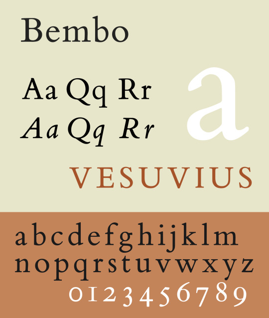
Based on the original designs of Francesco Griffo, who cut the type used in 1495 by Aldus Manutius to print Cardinal Bembo's tract, 'De Aetna'. The italic is based on work by Giovanni Antonio Tagliente, a calligrapher who worked as a printer in the 1520s, after the time of Manutius and Griffo.
It ranks at position 13 among The 100 All Time Best Fonts.
#bembo#foundry: monotype#designer: francesco griffo#designer: giovanni antonio tagliente#designer: stanley morison#1495#1929#vox: garalde serif#top 100#sample
0 notes
Photo
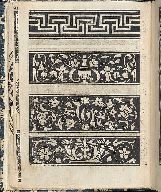
Designs (woodcuts) from ‘Essempio di recammi’ (1530) by Giovanni Antonio Tagliente (Italian, circa 1465–1528 ).
Published by Giovanni Antonio di Nicolini da Sabio e i fratelli.
Image and text courtesy The Met.
35 notes
·
View notes
Photo
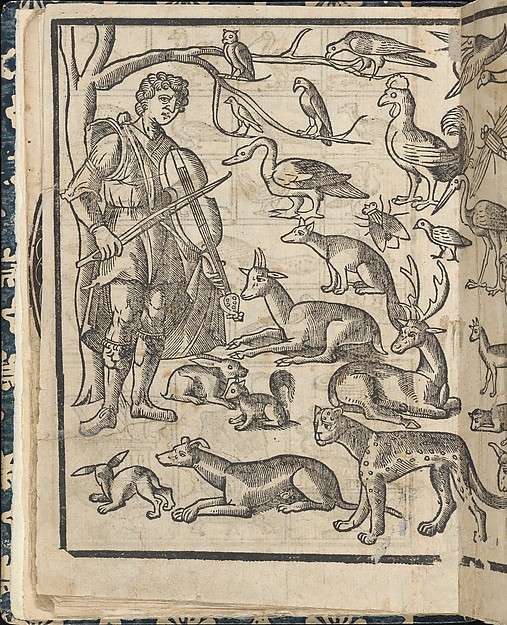
Essempio di recammi, page 12 (verso) (via The Met)
Written by Giovanni Antonio Tagliente, Italian, Venice ca. 1465-1527 Venice, published by Giovanantonio e i fratelli da Sabbio Venice.
From top to bottom, and left to right:
Design covers 2 pages and is an illustration of Orpheus playing music to animals. Scene is possibly set in a forest because of 2 trees on left and right sides.
0 notes
Last Seen Blogs

thetruamatrilogy
Traumatized but still kicking

jack-of-all-trades-5000
Untitled

ggrraj
Untitled
thetruamatrilogy
Traumatized but still kicking

emilyfigueroa04-blog
Huntah😍😅