#did the whole render in greyscale and then add color later thing for this one
Text
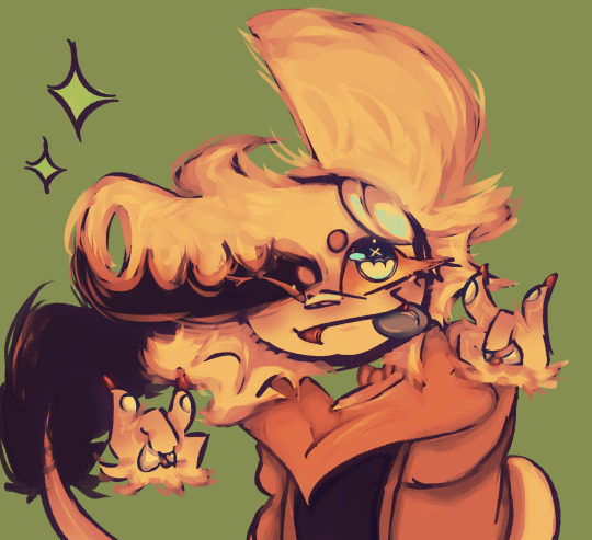
This aminal
#i really really like this.........#gradient map save me#and it did fr#doodles#uno's art#sweetheart oc#eyestrain#<- kinda#did the whole render in greyscale and then add color later thing for this one
11 notes
·
View notes
Text
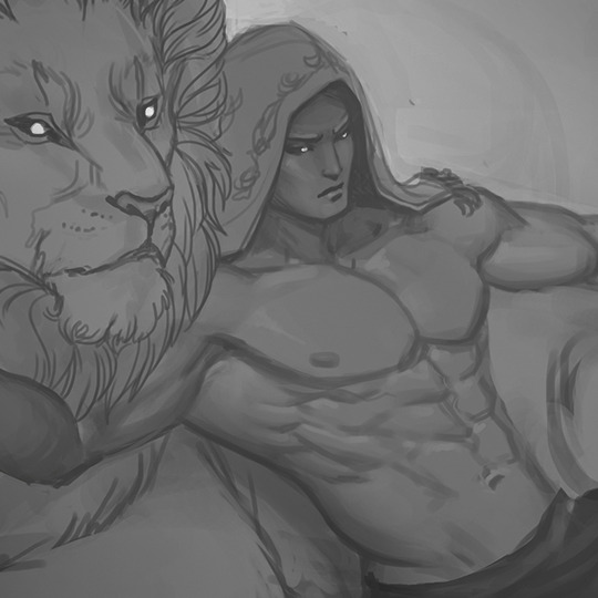
Art Process
Someone asked me for my process and how I do things. I thought I’d used the latest painting I made as an example, since I was compulsively saving each step of the way and thus have neat snapshots on how things go.
I use Photoshop CC. I used to use Corel Painter, but there are tools in Photoshop that I use all the time for correcting mistakes, which don't exist in Painter (at least the 2012 version.) My brushset can be found here. I spend 90% of my time using the square brush. To have it display properly, you’ll need to grab the little bottom right corner triangle and expand the little brush-window until things look like this:

I typically start off by blocking in big blobby, noodly shapes in greyscale and start sketching/rendering that up with more and more detail. This is all done with the plan that I will add color later via blending modes. By working in greyscale first, I can roughly figure out my values/shading without also having to worry about color at the same time. The old masters used to do something similar with oil painting by creating a grisaille first and adding washes of color later.
Rest of process is under the cut as it is a long post!
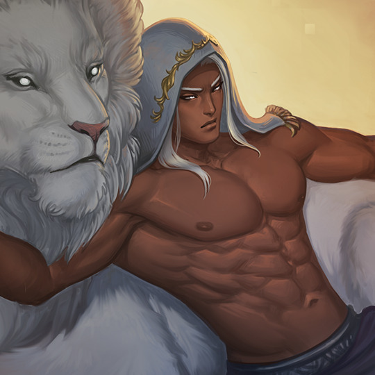
To add color my usual choices for blending modes are Multiply layer first right over the greyscale with an Overlay layer on top of that to stop things from getting too dark. I also use Overlay to do a bit of lighting adjustment too if I feel things would look better a bit brighter or darker. I try to also keep warm vs cool colors in mind at this point as well. You’ll notice that Tiergan’s pectorals, face, and the shoulder closest to the light are a bit brighter and warmer - while things get subtly darker and cooler as you get lower down his torso. Things look really funky and weird in this stage, but you just have to trust in the process and know it will gradually get less fugly.

Speaking of blending modes - I love the fuck out of them and I feel like they are an extremely powerful tool in your toolkit. Other blending modes I tend to use sometimes are Saturation (to knock things back if I made the colors too over-saturated using Overlay), Color (for color adjustment like the name suggests), Lighten (to affect only lighter values while leaving darker ones alone), Darken (tweak only darker values while leaving the lighter ones alone, Screen (great for glows), Linear Dodge (extremely situational, but can be neat for rim-lights, magic effects, and LIGHT SABERS if you put the blending mode on your brush).
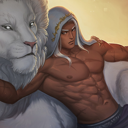
Once I am satisfied with the color, I flatten everything and resume painting from there in full color, continuing to render and polish everything up, adding in all the details. I tend to do this by making new layers and painting on top instead of directly on my flattened layer. Sometimes I’ll have two or more extra layers set to Normal to paint different things. The reason I do this is so if I don’t like how I’ve rendered things, I can erase parts of it or just nuke it all back to a clean slate - without destroying the base foundation I’ve created.
I use a mix of Normal layers and layers with blending modes to render depending on what I need. Sometimes further along in the painting, I’ll realise I want to make things even brighter/darker and push the values more - so I’ll do something like add n Overlay or Multiply layer to do that, then add a Normal layer on top of all of that to keep painting in color. (And then flatten everything again when I start getting antsy about there being too many layers.)

You’ll notice above I realised that I forgot Tiergan’s hair and that he was looking super bald the more I rendered, so I just added it in on its own separate ‘hair’ layer. At the same time, I probably had another layer right beneath it that was just for rendering out all the skin details.
I always try to work as non-destructively as possible. This is also why I have so many versions of the same file and can show you past snapshots of what I was doing - every time I’m about to make a major decision, I save the file as a whole new copy of itself before continuing. Other ways I try to work non-destructively is to use Layer Masks instead of actually erasing things unless I am POSITIVE I want something gone and never want to bring it back.
If my character is on a separate layer from my background (which usually is the case, but not what I did this time around) - I abuse the shit out of Clipping Mask layers to paint only on my character. In fact, I used clipping masks on the ‘Hair’ layer I mentioned earlier to paint only on the hair when I wanted to add lights and shadows to it without risking fucking up the surrounding areas. The shadow cast by the hair onto the skin I did on a different layer just beneath the Hair layer.
Note: If you’re reading this and your first question is “What the heck is a Layer Mask/Clipping mask?” - then HOLY SHIT NUGGETS MY FREN, READ THIS AND FEEL YOUR MIND BEING BLOWN.
When I feel like I'm finished, I more often than not do a final pass of lighting/color adjustments and some finishing touches that would be tougher to do earlier in the process (like scars!) either with blending modes (to push or dial back lights/shadows, adjust colors/saturation) or slap a gradient map on top of everything as an adjustment layer set to low opacity to kinda help harmonize all the colors. It’s a little easier for me to try and bring everything together once all the information is there on the canvas and I just need to tie stuff together.
As for how I blend - almost all my brushes are set to change opacity depending on pen-pressure. Thus when blending values/colors, I just use the eyedropper tool to choose a color/value I want and use light brush-strokes to blend. When I REALLY want something to be soft, I use a big ole fuzzy airbrush-type brush and very, very lightly put down a stroke or two - but I do this very sparingly and try to avoid relying on fuzzy-brushes to blend as it can very quickly lead to your paintings looking like mashed potatoes. Making sure you have a nice mix of hard crisp edges and soft ones will make your work feel nicer.
And that’s it! I hope it was helpful!
130 notes
·
View notes
Last Seen Blogs

pweepsie
Peep

ferudasosug
Untitled
falderaletcetera
whack fo’ the riddle t'me roo dun da
sonybloo
Deus Volt

freshchemicals
Stay fresh!