#digital sketchwork
Explore tagged Tumblr posts
Visit Tumblr Blog
Explore Tumblr blogs with no restrictions, modern design and the best experience.
Last Seen Tumblr Blogs


Fun Fact
25% of US internet users with an annual income of $80-100K use Tumblr.
Text

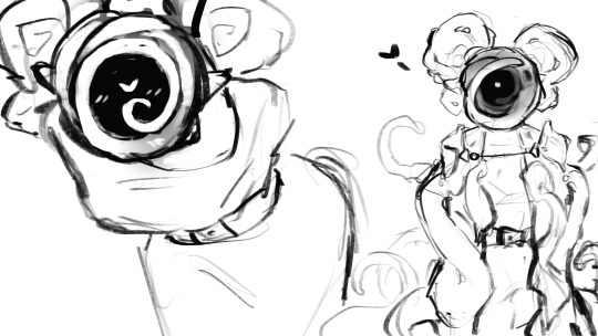
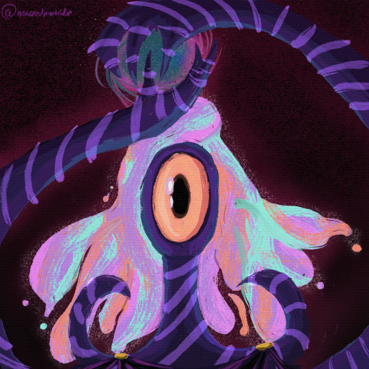
eule!
#artists on tumblr#art#digital art#toucan#fanart#artwork#digital drawing#digital illustration#digital painting#digital aritst#signalis fan art#signalis art#signalis fanart#signalis#eule signalis#signalis eulr#eulr#ballerina#ballerina eulr#digital artist#digital fanart#digital sketch#digital sketchwork#fan art
932 notes
·
View notes
Text


Cancelled Comic Idea that I had based on one of my characters from my FANTASY WAR TCG. It would've explored the backstory of Alive and how it came to be. Might continue this some other day.
#indie#comic#comics#original comic#comic art#web comic#mini comic#short comic#webcomic#comic strip#tcg#tcg comic#scrapped art#comic ideas#cancelled#digital drawing#sketchwork#sketch#sketches#doodle#drawing#my art#art project#original character#art#artwork#artists on tumblr#illustration#original art
7 notes
·
View notes
Text
A little practice sketch, drawing Trace a little...well, a little less bright-looking. I imagine this is about what he looks like at the end of a bad week.
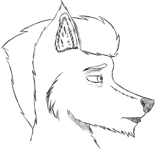
#furry#anthro#art#artwork#sketch#practice#practice sketch#art practice#anthropomorphic#furry art#anthro art#anthropomorphic art#digital art#digital sketch#sketchwork
13 notes
·
View notes
Text


August 14, 2024 Sketches
#drawing#furry#furry art#sfw furry#anthro art#furries#furry character#clean furry#anthro#sketches#sketchwork#sketch#doodle#digital art#digital sketches#sketching
12 notes
·
View notes
Text
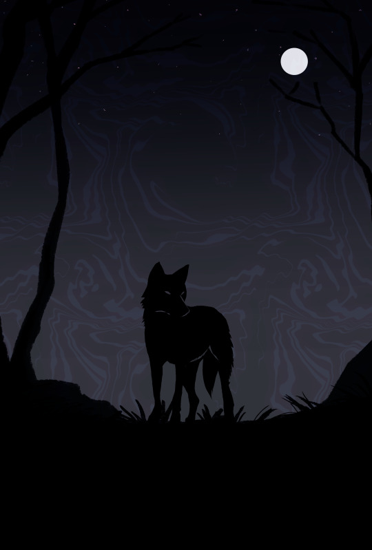
The watcher
Image Description
A completely black silhouette of a coyote stands on a black hill. Behind it, a night sky with a vibrant white moon shines down. The atmosphere is eery but mysterious. The sky has an almost oil spill look to it.
#art#furry art#coyote#digital art#my art#digital sketch#sketch#doodle#digital artist#sketchwork#image described
51 notes
·
View notes
Text
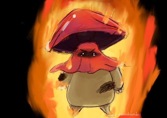
Drawing all the tentacles is so much fun- have some heehoo sketches
83 notes
·
View notes
Text
10 notes
·
View notes
Text
"surrounded by stars"
............................................
Sketch - art/oc by: rainyy nightz
OC: Seren
Time taken: 30mins
#digital drawing#drawing#digiral art#oc art#oc#artwork#digital painting#oc artist#ibis paint x#digital sketch#oc sketch#sketch#sketchwork#sketch art#art#oc drawing#oc painting#oc doodles#doodlysketch#oc artwork
7 notes
·
View notes
Text
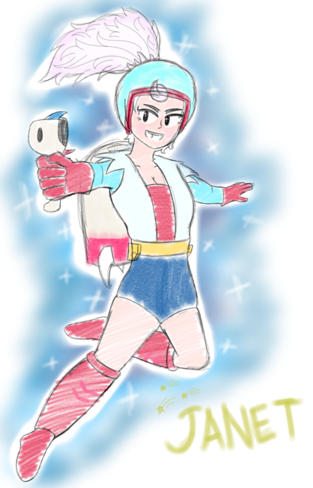
The Rocket Girl, Janet 🚀
Been on a slump lately, so I'm just doodling anything until I actually get some free time off work
6 notes
·
View notes
Text
mask's stupid-ass alternator emergency commissions
hi i am having sudden car troubles. the repairs have left my partner and i in a finacial rough- spot despite everything, and rent is going to be short. please look at my blog for even more examples of my work!
• my 2D character work starts at $20 for refined sketchwork, and at $40+ for more painterly and refined styles. im ok drawing almost anything (nsfw included).
• my 3D prop and object work starts at $70, refined for in-game use.
• 3D modeled characters refined for in-game use will start at $500 depending on complexity, visual style, and use-case.
• i can also do digital sculpting for 3D printing starting at $100, based on complexity and amount of detail.
please keep in mind that I also have a day job, and that i may take at least a month to complete your work. payment is always upfront, and i can do partial payment as well if requested. please feel free to send me a DM here, and we can move our business over to discord.
64 notes
·
View notes
Text
To all the people that have newly followed me because of my most recent art, welcome. My art tag can be found [HERE].
I'm currently working on a project, a fully proxied MTG commander deck themed around Homestuck. This includes the full 100 card (lands included), as well as tokens (with numerous variants for each token) and variant/alternate art for the base 100.
This is, of course, a monumental project that'll probably end up having anywhere between 150 to 200 individual pieces drawn for it, and all of them done from sketchwork done in traditional art, and completed digitally, mostly replicating the various art styles of Homestuck with my own little flourishes.
How long will this project take? Who fuckin' knows. Probably all year, if not into the next. Especially as there'll be periods where I don't draw anything either because I'm taking a break to avoid project burnout or simply because no solid design ideas have come to me for particular cards. I've not even put together a full decklist yet, so at the moment I'm mostly just going with vibes of I think might be good for the deck. And also, I do draw stuff other than Homestuck, so there'll be times between project pieces where I'll be drawing non-Homestuck stuff.
For those that are curious, here's the commander for the deck. I also have a pinned post showing (currently, most of) my proxy designs, both Homestuck and non-Homestuck, which can be found [HERE].
Anyway, welcome again, I hope you enjoy the shitshow.
6 notes
·
View notes
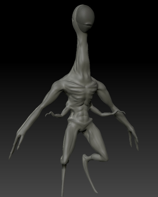
Text
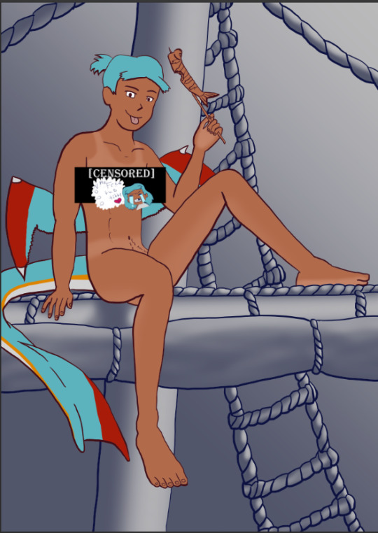
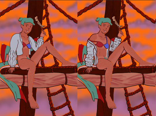
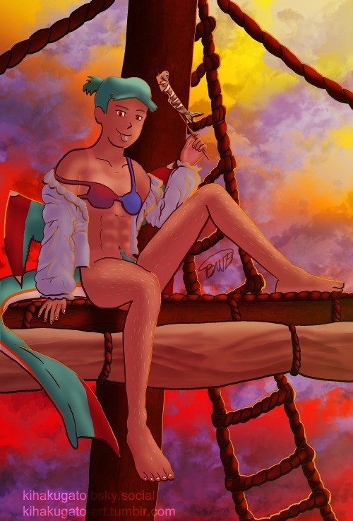
The Harriet Pinup Art Project
Session 2- Process till completion? But where're the other sessions?? Well that escalated both quickly and slowly
The last report was Early September 2024…. Dear god it’s been almost 7 months since last report. I would’ve like to have split what comes next into 2 more sessions but- it is what it is. This is gonna go all over the place so apologies.

Finding some dissatisfaction with my end result in last-session I tweaked the fish-holding arm and the dangling leg a little bit more to my liking and sketched again.
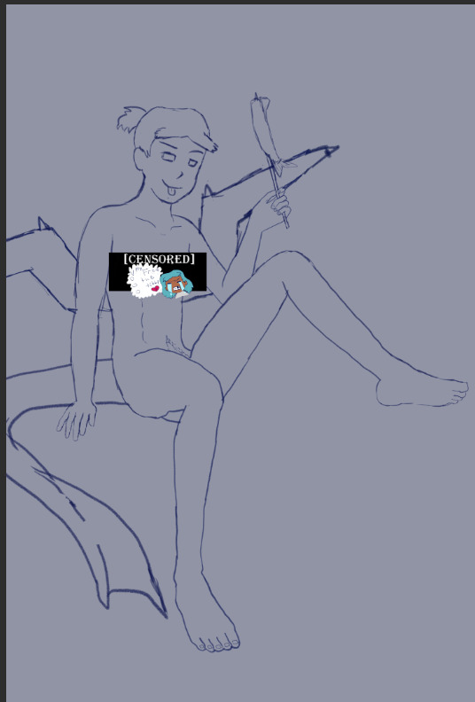
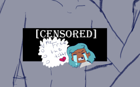
The nips got finally drawn and with it- the censor will now have to drop to keep tumblr-compliant and also to keep this blog sfw, hope you enjoy the humor (Harriet doesn’t).

The wings kept feeling wrong (looking more stretched and unnaturally tacked on vs being naturally relaxing from her backside) so between struggling wing csp assets to reference (not super great when there are no flipper-esque wings) and some more direct input from a friend I ended up landing on a more natural look.
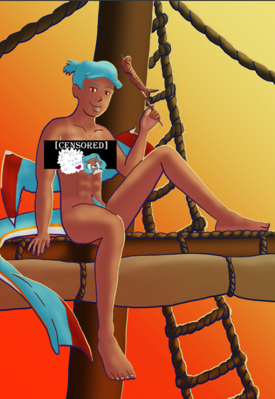
Linearting
Now for my nemesis- linearting.
Despite my disdain for the process I did not want to half ass it by just cleaning up the sketchwork like I normally do. While I struggle to grasp its use, I really wanted to implement lineweight in my lineart. From what I’ve seen lineweight can be used in a lot of different ways; purely randomly, to emphasize mass, or to emphasize the light source of the piece. Of all the choices I tried to stick to the last option since I felt I could best understand it enough to attempt it.
I also decided to try a feature I’ve never used before; linearting with vector lines instead of rasterized ones. For those who don’t know what the difference is I’ll do the extremely dumbed down explanation; rasterized lineart is more common (I think) and is less memory intensive, vector lines are more common in graphic design (since they can be resized w/o the pixel distortion you can encounter with raster lines). I wanted to try this method in an attempt to make the process of linearting a little less painful; with vectors I can adjust the lineart without having to redraw said line if it’s a small tweak, and changing colours is a lot quicker too.
Sadly during this phase my tablet pen's nib broke in a way that was unfixable (leaving the broken part of the nib DEEP in the pen), and due to pricing (tldr- the pen was more expensive than just replacing the entire tablet, in which case it's better to upgrade altogether if possible) had to wait for a new tablet after researching my best choice for a replacement; definitely was a great upgrade but GOD I did not like that happening when it did. Upon a friend’s suggestion I adjusted pen sensitivity so I could try to avoid putting so much force on the pen when doing the thicker lines.

I think I’ve grown a little more confidence on linearting, but it’s still far from my favourite step. I both enjoyed and hated the process of using vectors for the lineart. I felt like there’s probably a lot more I could’ve done with the vectors than what I was doing, but in my opinion it is not that bad for someone jumping in with very minimal knowledge/understanding.
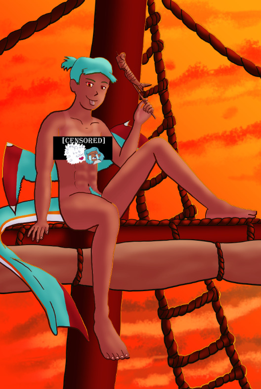
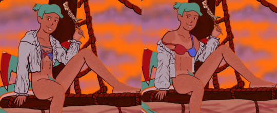
Colouring/Shading

Being colouring is one of my favourite steps I couldn’t resist I rushed right into it. Though I actually ended up doing the shading before the colouring this time. I did the method I’ve heard/seen for digital artists where you block the subject with just black/dark, and then erase it off where the lighting/highlights would be. I’ll say I definitely found this method put more strength into my shading from usual.
Then I rushed to colouring Harriet herself. Just did the ol-colour picker from her refsheet to throw her colours on, then did some adjustments to colour her nipples and tanlines (cause I WANTED DEM TANLINES!!!!!) though I tried to not make the latter too bold of a contrast since she imo has darker skin and not just tanned.
Then from there there was colouring the background and mast and just wrestling the colour balance and blends, there was a lot of it so I’m just gonna share one of the ones I went through.
At one point I even took a sunset from google and maxed its size on the background (and crashed CSP as a consequence due to the large image resolution- which lead to me shrinking the canvas/image during this process) to try to help me get an idea of what I MIGHT want to do for the background.
Clouds 💢
After a point I started trying to make my own clouds- the first attempt wasn’t too bad save for the tiny little problem that was the brush made the clouds look wayyy too sharp and grainy on closer inspection so had to scrap them and try again, even going as far as looking at irl clouds to try to get an idea of how to emulate them.

I ended up using a generic soft brush and tried my best to do clouds again. It was okay, but not great and kept getting adjusted between other steps. fortunately we’ll better revisit/redux on these clouds far later in the chain-of-events.
Like the clouds I has having problems getting the nice folds look for the sails, grabbed some refs and kept trying to get it right. The results are far from perfection but they are sufficient. Folds on this sort gonna be a pain in general.
Clothes roughs
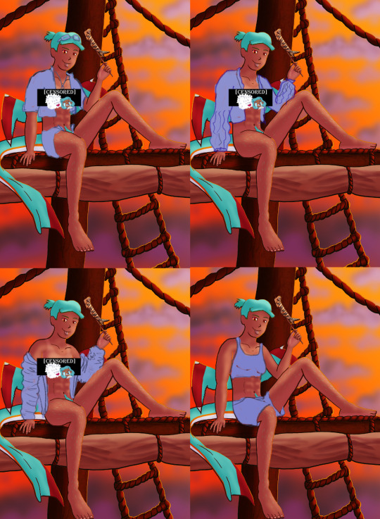
I did some rough draw-ups of different alternative outfits for her to wear. After a lot of wrestling I settled on her just wearing an opened poet’s shirt and the other two ideas got discarded.
Added a bi-colour bra to make it that I don't have there's a variant that I can share in sfw spaces, and then I lined and coloured the rest of it up, only to stumble into an unfortunate realization-
Ew that went wrong for clothes- reference and redo

[image source 1, 2, and sadly 3 only leads to a pinterest result or a malicious site so 🤷]
With extreme dissatisfaction I ended up trying to tackle them again; I learned the term for the kind of shirt I was after (poet’s shirt, that way it also reduced the amount of AI messing with my results), got several reference photos then tried again while trying to mimic what I was seeing.
MUCH better.
Clouds redo
With that, let’s get the clouds looking better. I checked this tutorial to try to get a better idea, and found some cloud brushes that are in Official CSP but weren’t downloaded thanks to another tutorial and used them, used them then used the tutorial to help further elevate them a little bit. To further elevate said clouds I hilariously used my previous crummy clouds as a overlay to help the new clouds pop. Much better, and with that it’s done, slap dat signature and watermarks! Ready to throw onto the internets
Personal Evaluation on this project
This project ended up taking much longer than I wanted; Some of it was due to real life kicking my butt, and some of it was from clumsy planning and impulsiveness to get to certain steps quicker.
I liked it taking longer cause it gave me more time to think about certain steps and chisel away at parts when I had time, like working on a super large puzzle. On the opposite end it ended up making me much more intimate with the flaws with the piece/project than I’d like to be during the process, since most artists nowadays including myself tend to hit that stage after they’ve completed and posted a work online.
This lead to a lot of times asking “am I gonna shrug off this flaw or go through the time/trouble to redo a part to make it better?” For the case of the clouds and clothes, yes I felt the redo was necessary and it helped strengthen the overall piece, but there were many other flaws I chose to ignore cause I was too far into it to be worth the backtrack.
The biggest example flaw is ironically the anatomy/perspective when sketching Harriet’s body; while using the 3D tool was very helpful, I feel I should’ve did more perspective exaggeration for certain parts of her body (the biggest case being her hands; they imo would’ve looked much better if I made them and her fingers a little bit bigger and chonkier). Another case were the folded sails of the ship that I feel could’ve been better shaped and the folds could’ve been more sensible, ironic for me to say considering I had done several references and do-overs for that part of the piece. Conversely there are probably still various flaws in the lineart itself; despite the convenience of being able to edit the lineart via the vector points it is still a lot of nitpicking if you don’t decide that it’d be better to just move on so long as the idea is brought across via the art, flaws be damned.
When it came to the clothes stage, in my opinion I should’ve done that LONG before colouring/shading Harriet’s body and back when I had just finished the lineart, as it would’ve lead to less visual confusion for my eyes when I had to sketch the clothes out. Some ofher steps were out of order enough to cause confusion to myself, but I won’t bash myself about it since this is probably the first piece I’ve worked on that’s taken this long, plus this winter alone has been very mentally taxing so dumb decisions are bound to happen thanks to that.
That being said, I’m glad I did this project. I got to experiment and test out strategies and tools I’ve never even considered delving into before, and I may even end up using some of them again. There were even some points in this project where said tools I just thought “well this could be handy for [this group of drawing ideas]”. It’s also lead to beautiful results and is probably my biggest high effort piece I’ve done in a long time, probably rivaling if not outclassing some of my bigger pieces that I still admire today from back in my highschool days.
Hearing from one friend talk about the flow of the piece made me happy since, despite never mentioning it during the journaling of this project, that it was something in the back of my mind on/off while working on this piece; the flow of the ladder and clouds all intentionally despite to try to point the eyes of the audience towards Harriet who’s meant to be the main feature of the piece. It really proves that considering flow is a vital element when you want to make a piece work.
I may actually try to print one of the several variants as a print to put on my wall. Not that I will hold my breath on the results as my track record of digital-to-print for my artworks has always been a hard hit/miss for results.
Thank you for those who decided to follow along on the journaling of this art project.
[Session 0] [Session 1]
#The Harriet Pinup Project#artists of tumblr#artists on tumblr#art process journal#wip art#wall of text#long post
6 notes
·
View notes
Text

The amazing digital circus fanart crossover with DHMIS. If the show ever gets picked up they should definitely do this if they can
#fanart#sketch#sketchwork#sketch dump#sketches#traditional art#drawing#doodle#the amazing digital circus#dont hug me im scared
27 notes
·
View notes
Note
omg i have the exact same thing where i just can't do ideas-work or sketchwork digitally, it's so hard! i really don't know what it is. maybe digital art kind of automatically turns on professional-look mode and trad art feels freer...? no clue but litrchrlly same thing i can never figure out why
I think so too!! Its so weird, even if I use the same mindset/restriction for both (no erasing so i force myself to do the same drawing multiple times to figure it out) it looks and feels different....its so crazy like is it not the same hand and brain working on/with both mediums??? 🤨🤨🤨🤨
#jadenvargen#maybe its like how (for me) different digital brushes make me draw differently because of the Feel of them#and traditional utensils are just like. the ideal tools for me that will never have digital replication??? IDK!!#i mean either way the ''problems'' are getting solved right#but i keep getting bizarrely overwhelmed trying to figure out Why 😭 like the mystery is killing me LOL#skunk mail#is it because i can see where the paper ends but im too into a big canvas to see the edges??#is that messing with my sense of scale and proportion or something. i dont knowwww
20 notes
·
View notes
Text
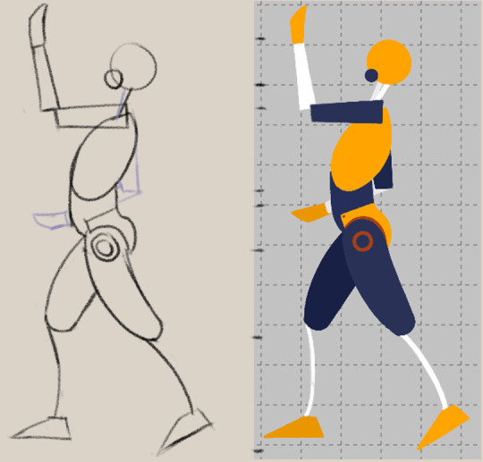
Study credit, 3/27/25. Current subject: figure drawing (via Love Life Drawing's "Fresh Eyes" 10-day figure drawing course)
This is a Pikachu blog, I swear! Was hoping to finish this lesson tonight, but lost track of time due to work.
Luckily for ya'll, I've implemented a ⚡New Rule⚡ - If study credit is used back to back, the next drawing must be a Pikachu. I'll probably end up getting to do both tomorrow, since my work week is coming to an end. Apologies to the mice-loving readers of the blog~
[ID: Digital sketchwork of a a figure drawing puppet, alongside its reference counterpart. The puppets are constructed of basic shapes, posed in similar manners models would be for figure drawing. These figures are facing from the side. The pose has the figure leaning back, with its left leg back and its right leg forward. The left arm is held out flat to the elbow, then bent up at a near-right angle. The right arm is slung low, the hand just in front of the belly]
2 notes
·
View notes
Text

Oh.
A doodle of a cartoon coyote stands in the middle of a white canvas. Expression is blank and introspective. The text beside says "oh."
#art#furry art#coyote#digital art#my art#digital sketch#sketch#digital artist#doodle#sketchwork#image described
33 notes
·
View notes