#double text listview
Explore tagged Tumblr posts
Visit Tumblr Blog
Explore Tumblr blogs with no restrictions, modern design and the best experience.
Last Seen Tumblr Blogs


Fun Fact
Average visit duration of Tumblr.com is 10 mins and 25 secs.
Text
Working with CarouselView in Xamarin Forms
Xamarin.Forms code runs on multiple platforms – each of which has its own filesystem. This means that reading and writing files is most easily done using the native file APIs on each platform. Alternatively, embedded resources are a simpler solution to distribute data files with an app.
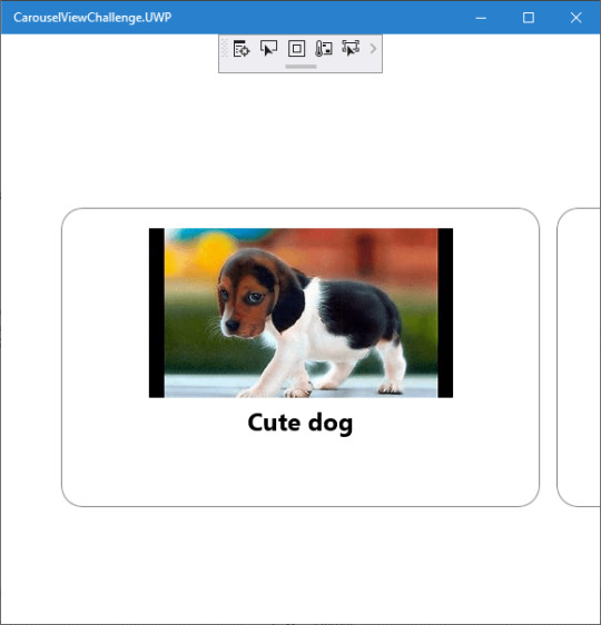
Run application on Windows10
CarouselView
CarouselView is available in Xamarin.Forms 4.3. However, it is currently experimental and can only be used by adding the following line of code to your AppDelegate class on iOS, or to your MainActivity class on Android, before calling Forms.Init:
Forms.SetFlags("CollectionView_Experimental");
Prerequisites
Visual Studio 2017 or later (Windows or Mac)
Xamarin.Forms 4.3 Updated
Setting up a Xamarin.Forms Project
Start by creating a new Xamarin.Forms project. You wíll learn more by going through the steps yourself.
Visual Studio 2019 has more options in the opening window. Clone or check out the code from any repository or, open a project or solution for your computer.
Now, you need to click “Create a new project”.
Now, filter by Project Type: Mobile
Choose the Mobile App (Xamarin. forms) project under C# and Mobile.
Name your app. You probably want your project and solution to use the same name as your app. Put it on your preferred location for projects and click “Create”.
Now, select the blank app and target platforms – Android, iOS and Windows (UWP).
Subsequently, go to the solution. In there, you get all the files and sources of your project (.NET Standard). Now, select the XAML page and double-click to open the MainPage.Xaml page.
You now have a basic Xamarin.Forms app. Click the Play button to try it out.
Android implementation
MainActivity.cs
protected override void OnCreate(Bundle savedInstanceState) { TabLayoutResource = Resource.Layout.Tabbar; ToolbarResource = Resource.Layout.Toolbar; base.OnCreate(savedInstanceState); global::Xamarin.Forms.Forms.SetFlags("CollectionView_Experimental"); Xamarin.Essentials.Platform.Init(this, savedInstanceState); global::Xamarin.Forms.Forms.Init(this, savedInstanceState); LoadApplication(new App()); }
iOS implementation
AppDelegate.cs
public override bool FinishedLaunching(UIApplication app, NSDictionary options) { global::Xamarin.Forms.Forms.SetFlags("CollectionView_Experimental"); global::Xamarin.Forms.Forms.Init(); LoadApplication(new App()); return base.FinishedLaunching(app, options); }
UWP
App.xaml.cs
protected override void OnLaunched(LaunchActivatedEventArgs e) { Frame rootFrame = Window.Current.Content as Frame; // Do not repeat app initialization when the Window already has content, // just ensure that the window is active if (rootFrame == null) { // Create a Frame to act as the navigation context and navigate to the first page rootFrame = new Frame(); rootFrame.NavigationFailed += OnNavigationFailed; Xamarin.Forms.Forms.SetFlags("Shell_UWP_Experimental", "CollectionView_Experimental"); Xamarin.Forms.Forms.Init(e); if (e.PreviousExecutionState == ApplicationExecutionState.Terminated) { //TODO: Load state from previously suspended application } // Place the frame in the current Window Window.Current.Content = rootFrame; } if (rootFrame.Content == null) { // When the navigation stack isn't restored navigate to the first page, // configuring the new page by passing required information as a navigation // parameter rootFrame.Navigate(typeof(MainPage), e.Arguments); } // Ensure the current window is active Window.Current.Activate(); }
Common project
Create a Model to Bind the Collections.
/// <summary> /// Class AnimalModel. /// </summary> public class AnimalModel { /// <summary> /// Gets or sets the title. /// </summary> /// <value>The title.</value> public string Title { get; set; } /// <summary> /// Gets or sets the image path. /// </summary> /// <value>The image path.</value> public ImageSource ImagePath { get; set; } /// <summary> /// Gets or sets the description. /// </summary> /// <value>The description.</value> public string Description { get; set; } }
Now, Bind the Collection to CarouselView. Similar CollectionView and ListView.
using CarouselViewChallenge.Models; using System; using System.Collections.Generic; using System.Collections.ObjectModel; using System.ComponentModel; using System.Text; namespace CarouselViewChallenge.ViewModels { /// <summary> /// Class CarouselPageViewModel. /// Implements the <see cref="System.ComponentModel.INotifyPropertyChanged" /> /// </summary> /// <seealso cref="System.ComponentModel.INotifyPropertyChanged" /> public class CarouselPageViewModel : INotifyPropertyChanged { /// <summary> /// Occurs when a property value changes. /// </summary> /// <returns></returns> public event PropertyChangedEventHandler PropertyChanged; /// <summary> /// The animal /// </summary> private ObservableCollection<AnimalModel> _animal; /// <summary> /// The page title /// </summary> private string _pageTitle; /// <summary> /// Initializes a new instance of the <see cref="CarouselPageViewModel"/> class. /// </summary> public CarouselPageViewModel() { _pageTitle = "CarouselViewChallege"; _animal = new ObservableCollection<AnimalModel>(); _animal.Add(new AnimalModel { Title = "Cute dog", ImagePath = "https://th.bing.com/th/id/OIP.iRjeVJfvve4N0MfUky12HgHaEK?w=294&h=164&c=7&o=5&pid=1.7" }); _animal.Add(new AnimalModel { Title = "Cute cat", ImagePath = "https://th.bing.com/th/id/OIP.__BpwPGRP9yjsUa8MaS5UQHaFj?w=217&h=163&c=7&o=5&pid=1.7" }); _animal.Add(new AnimalModel { Title = "Whahaha", ImagePath = "https://th.bing.com/th/id/OIP.rKSQ8lmDeHwH29L73NFsUAHaFj?w=242&h=178&c=7&o=5&pid=1.7" }); } /// <summary> /// Gets or sets the animals. /// </summary> /// <value>The animals.</value> public ObservableCollection<AnimalModel> Animals { get { return _animal; } set { if (_animal != value) { _animal = value; OnPropertyChanged(new PropertyChangedEventArgs("Birds")); } } } /// <summary> /// Gets or sets the title. /// </summary> /// <value>The title.</value> public string Title { get { return _pageTitle; } set { if (_pageTitle != value) { _pageTitle = value; OnPropertyChanged(new PropertyChangedEventArgs("Title")); } } } /// <summary> /// Handles the <see cref="E:PropertyChanged" /> event. /// </summary> /// <param name="eventArgs">The <see cref="PropertyChangedEventArgs"/> instance containing the event data.</param> private void OnPropertyChanged(PropertyChangedEventArgs eventArgs) { PropertyChanged?.Invoke(this, eventArgs); } } }
Create a new MainPage.xaml under View.
<?xml version="1.0" encoding="utf-8" ?> <ContentPage xmlns="http://xamarin.com/schemas/2014/forms" xmlns:x="http://schemas.microsoft.com/winfx/2009/xaml" xmlns:d="http://xamarin.com/schemas/2014/forms/design" xmlns:mc="http://schemas.openxmlformats.org/markup-compatibility/2006" mc:Ignorable="d" x:Class="CarouselViewChallenge.Views.MainPage"> <ContentPage.Content> <StackLayout> <CarouselView ItemsSource="{Binding Animals}" PeekAreaInsets="50"> <CarouselView.ItemTemplate> <DataTemplate> <StackLayout> <Frame BorderColor="Gray" Margin="8" HasShadow="True" HeightRequest="250" CornerRadius="20" VerticalOptions="CenterAndExpand"> <StackLayout> <Image Source="{Binding ImagePath}"/> <Label Text="{Binding Title}" FontSize="24" FontAttributes="Bold" HorizontalTextAlignment="Center"/> </StackLayout> </Frame> </StackLayout> </DataTemplate> </CarouselView.ItemTemplate> </CarouselView> </StackLayout> </ContentPage.Content> </ContentPage>
In the code behind bind the viewmodel with the page:
using CarouselViewChallenge.ViewModels; using System; using System.Collections.Generic; using System.Linq; using System.Text; using System.Threading.Tasks; using Xamarin.Forms; using Xamarin.Forms.Xaml; namespace CarouselViewChallenge.Views { [XamlCompilation(XamlCompilationOptions.Compile)] public partial class MainPage : ContentPage { CarouselPageViewModel vm; public MainPage() { InitializeComponent(); vm = new CarouselPageViewModel(); BindingContext = vm; } } }
The project is working for Android, iOS and UWP. The source code is available on Github.
The post Working with CarouselView in Xamarin Forms appeared first on PureSourceCode.
from WordPress https://www.puresourcecode.com/dotnet/xamarin/working-with-carouselview-in-xamarin-forms/
0 notes
Link
Kotlin Android App Development with Android Q by building real apps. Beginner to advanced + Kotlin for Android
What you’ll learn
You will learn how to install tools
You will learn Kotlin for Android
You will learn how to develop Android apps
You will learn how to Implement 4 real apps
You will learn how to use database in your apps
You will learn how to publish your apps on Google Play
1- Installing and Setting Up Tools
Introcucing tools (IDE + Android SDK + Emulator + JDK)
How to download and install required tools
Creating a new Android Studio project
How to change the font of code editor
What is an activity
What is androidmanifest file
Developing your first Android app
Attributes panel
Code completion list
Displaying a toast
Running your app on an emulator
Examining different parts of an emulator
Send sms and phone calls between two emulators
Enabling directional pad
Cloud-based testing
Installing Google USB driver
Enabling developr options
Connecting a real device to the Android Studio
2- Kotlin _ Say Hello to Basics
Int data type
Declaring and initializing variables
Single line comment
var vs val
print() function
Floating point data type
Boolean data type
String data type
Type inference system
Naming conventions (Camel Case)
Data member and function member
dec() function
compareTo() function
Intellisence
Argument
replace(string) function
replace(char) function
char data type
toInt() function
toIntOrNull() function
NumberFormatException
toFloatOrNull() function
What is Null?
Kotlin Nullable types
Arithmetic operators
Operator precedence
Assignment operators
readLine() function
3- App ( Tip Calculator ) + Android Basic Views
TextView
Seekbar
EditText
Button
Set constraints for views
Resolving the “Hardcoded strings” warning
Converting text to number
Working with seekbar’s listeners (setOnSeekBarChangeListener)
Concatenating strings, variables and expressions with the + operator
Concatenating strings, variables and expressions with String Templates
4- Kotlin _ Control Flow
If expression
If Else expression
Relational operators
Gutter area
Debugging the apps by using breakpoints
Transfer of control
How to check if a numbers is even or odd
Logcat tab
Toast messages
Statement vs Expression
lift out assignment
Any data type
When expression with arg
When vs If
When expression without arg
Combining concitions in a when expression
An app that determines if a number is prime number
How to hold a range of values (double dotted and in operators)
Using the when expression with ranges
Logical AND operator
Useful Android Studio shortcut keys
Defining range variables
5- Kotlin _ Functions
Simple functions
Functions with Parameters
Functions with return type
Function signature
Parameter vs Argument
Userful Android Studio shortcut keys
Multi line comment
6- Kotlin _ Immutable and Mutable Collections + Loops
Defining and initializing the Arrays
Using the arrays
Manipulating the array elements
Any data type
ArrayIndexOutOfBound exception
Data types and performance
How to define an array type explicitly
The second way of declaring and initializing an array
Iterating over arrays by using the for loop
Destructuring declaration
Iterate through a Range
How to get the numbers of an array elements
withIndex() function
Until keyword
listOf() function
mutableListOf() funciton
Array vs Collection
mutable vs immutable
7- Kotlin _ Classes + Enums + Exception Handling
Declaring classes
How to create objects
Constructors
Iterating through an array of objects
Vertical selection
Property and method
Class header
Primary constructor
Declaring properties from the primary constructor
Class diagram
How Enums make things easier
Happy path
Try Catch block
Multiple catch blocks
Finally block
8- App ( English Stories ) + Activities + List View + Singleton Pattern
Displaing data into a Listview
ListView click listener
How to creating a new Activity
Passing data between activities
Scrolling toolbar
How to set the start up Activity
FAB (Floating Action Button)
Snakbar
Singleton pattern
Private visibility modifier
Public visibility modifier
Overriding the functions
String controls characters
9- App ( My Notes ) + SQLite Database + Activity Life Cycle + Action Bar + Alert Dialog
Set the Margin attribute for views
Designing SQLite databases for Android apps (Fields, Records, Tables, …)
Extending classes
SQLiteOpenHelperClass
TODO() functions
NullPointerException
Check null values
Safe call operator
Not null assertion operator
Using readble connetions to read data from database
Using writable connections to write data to database
OnDestroy() funciton
Performance tune-up while working ith databases
Variables’ scope
Up button
<Meta Data> tag
How to add menu to Action Bar
Working with Asset studio
Refactoring resource names
XML namespaces
match-constraint attribute
Hint attribute
Setting EditText text attribute
Changing the EditText focus programatically
How to check if an EditText is empty
Inserting new records into the database
Up button vs Back button
Activity life cycle
Navigating clipboard items
Refactoring functions
How to close an Activity programatically
Alert Dialog
Updating and Deleting records from database
10- App ( Best Quotes ) + Recycler View +Card View + Intents + Guidelines + Unicode Characters
How to insert default values into the database
Designing layouts by using a Card View
Linear Layout
Image View
Layout Margin attribute
Writing a customized Adapter for Recycler View
Recycler View vs List View
Inner classes
findViewByID() function
Arranging and managing Recycler View items by using LayoutManager
Using the customized Adapter View
Passing functions in Kotlin as parameters
Guidelines in constraint layout
On item click listener for RecyclerView
Creating DB in memory
Explicit intent and Implicit intent
Ripple effect
Share data with other apps
11- App ( Animating a Spaceship + Best Quotes ) + Animation in Android + Splash Screen
Alpha animation
Translate animation
Rotate animation
Scale animation
Companion objects
Creating Splash Screens by using Lottie library
Using third-party libraries
Assets folder
Application context vs the this keyword
noHistory attribute
12- Publishing Your App
Parallex effect
Safe zone
Legacy icons
Adaptive icons
Debug key vs Release key
Signing the APK
Requirements
No, tools are free
The concepts start from scratch
All you need is a computer
You even don’t need an Android device. Because in this course, you’ll learn how to create emulators.
Description
* In this course, you will learn how to write Android apps from scratch.
* No prerequisite is required.
* The obvious point about this course is that it is exercise-based to make sure you will understand and use the course materials correctly.
* Also, we will use the latest version of Android Studio, because it has many changes in recent mouths.
Who this course is for:
Everyone who thinks about an Android application idea and eagers to turn it into a business
College students
Those who wants to learn the newest programming language (Kotlin)
Android developers that want to update their knowledge about Android SDK
Created by Dev Hive Last updated 7/2019 English English
Size: 6.08 GB
Download Now
https://ift.tt/2jSX0cN.
The post Android Q App Development with Kotlin: Beginner to Advanced appeared first on Free Course Lab.
0 notes
Photo
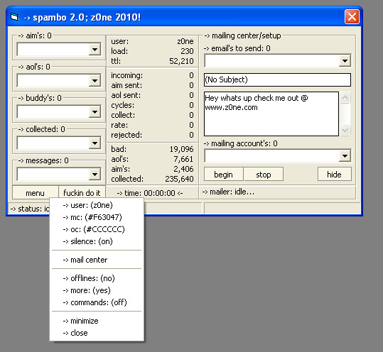


Spambo 2.0
This is an AOL/AIM buddylist/im spammer. Runs with Waol.ocx and Toc.ocx. The top half of this program is the buddylist spammer section. Some of the features of that are; skips bot names (myiprelay, facebook, smarterchild), has the option to save the buddylist of the phish you sign on (my original idea), good for cracking or spamming. Another cool thing is it saves the phish with a high amount of buddy's to a list (custom interval, like if you set it to 10 then every phish that has 10 or more buddy's will be saved to another list). Has seed options as well. Has a nice simple layout, with a nice Listview which is easy on the eye. Also you can set it to IM offline buddy's as well, and it saves each AIM that was logged on, so doubles as a phish checker too. If you get to the end of the list, it will restart the list, it never stops. No need to keep checking on it. If you click on "-› accounts:" after loading your phish, you can choose which index you would like to start the spamming with. As for the IM spammer, its basically all automatic. All you have to do is load a list of AOL phish, and messages (messages rotate) then hit "start". Even if you have no names you've gathered yourself, I have got it covered. Just hit start anyway's and via Winsock it will go to a list of rooms (sent in txt file) and collect the names from the chat rooms, so your always messaging online names.
Like the buddy spammer, this seeds, and saves the AOL's to a list like another built in phish checker. Custom IM speed pause setting and sending amount. So you can make it send 1 IM per phish, or whatever you choose. You can make it pause 0.8 seconds between IM's, or 1 second, its all up to you. For the AOL users, the program also comes with a few basic ccoms. Custom color settings for both colors, chatsend options, and also has a roll up feature, incase you like to see the spammer, but don't want it to be taking up a lot of the screen. Minimize also is an options, along with the "hide" command. Has a nice little option which you can access by typing "more" in an AOL chat room. It will chatsend another line of stats during your chatsend. Commands are controlled by entering your AOL screen name in the control option in the menu (menu is accessed by clicking on the "-› statistics" label). List of the ccoms will also be included in the folder.
I'm currently working on a refreshing option, so when it reaches say 100k session sent, it will restart it self, keeping the statistics updated. So refreshing won't fuck up your stats. Also going to add an option to auto set the AIM profiles during the sign on process. Most likely I will also be adding a built in cracker with it. So you can keep up with having phish to spam with. Update 1: Mailer just added. Basic setup with the subject & body text. Sends 5 names per phish. Can be modified if bought. Can load as many emails and accounts as your want. Update 2: Buddy list now also skips the phone numbers, as well as the other bots. I was having a hard time getting that done, but now it's complete. Update 3: Added the AIM profile setup, so when signing on the bot, you are also setting the profile of each bot, with a profile created by you.
Update 4: Now instead of just skipping the phone numbers, you can set it to message phone numbers with another list of messages, incase you have a text campaign as well.
Update 5: Cracker is now added. Able to load unlimited names and passwords. It's TOC or AOL; you choose when you click "fuckin do it".
Update 6: Added two phish checkers, one for AIM's and one for AOL's. Like the rest of the stuff you can load unlimited phish.
#aol#aolprogs#aolprogz#aol progs#aol progz#aim#aimprogs#aimprogz#aim progs#aim progz#aoler#america online#americaonline
0 notes
Text
Android App Widgets Tutorial
The most successful applications are often the simplest to use. This means that users want to see the information they need “at-a-glance” without unlocking their phone or launching the related app. On the Android platform you can achieve this in two different ways. The first, and most recent, is Android Wear, and you can learn more about in Getting Started with Android Wear with Kotlin. The second, the topic of this tutorial, is through the implementation of App Widgets. App Widgets have been available in the Android ecosystem since version Android 1.6 (Donut).
In this tutorial you’ll create an App Widget for a Coffee Log application that will allow you to control your daily usage of caffeine right from your home screen. :]
Note: Most developers love coffee, but we also know that health is very important, so I advise you to read the interesting article Health and Fitness for Developers
You’ll follow the typical process for Widget development and learn how to:
Create the Widget user interface
Get up-to-date information in the Widget
Interact with the Widget
If you’re new to Android Development, I recommended that you read Beginning Android Development with Kotlin before you start, as well as Kotlin for Android. For this tutorial you’ll also need Android Studio 3.1.2 or later.
Getting started
The first thing you should do is to download the sample project for this tutorial using the download button at the top or bottom of the tutorial. The zip file contains Android Studio projects for the starter and final versions of the Coffee Log application.
Unzip the file in a folder of your choice, go to File/Open or choose “Open an existing Android Studio project” from the Welcome to Android Studio window, and select the build.gradle file in the root folder of the starter project.
Once the project finishes loading and performing a Gradle build, you can have a look at the file structure, which should be like this:
Now that you are in the project, take a look around, especially in MainActivity, where all the logging happens. CoffeeTypes is a simple enum class with all the coffee types and their caffeine quantity in grams, while the CoffeeLoggerPersistence class is managing persistence using SharedPreferences.
It’s time to start tracking our caffeine consumption! Build and run the app by going to the Build\Make Project or using the green “play” button from the toolbar. The app will appear in your emulator or device, looking like this:
The app allows you to see how many grams of coffee you drank so far today and select new drinks to update your consumption count. Each selection leads to an update of the total displayed.
To use the app to log your coffee consumption, you have to launch the full application. As always, we can do better. What about making your user’s life simpler with an App Widget like this one?
With a Widget, you can access the same information as the application, and display a powerful motivational quote, just by using your device home screen. As you can see the layout is different because the list is now a set of 3 buttons.
There’s a lot to cover to create an App Widegt, so let’s dig in!
App widget anatomy
As the Android documentation says, an App Widget is a component that can be embedded in other applications, typically the Home screen. Security and performance are very important, so the Android platform has defined a very clear protocol that describes how an App Widget communicates with its own app and interacts with the hosting one. This is why the developer has to provide a configuration file with the following information:
The Widget layout
The Widget screen space
Whether the Widget can resize and how
A preview image that users will see when dragging the Widget on the screen
How often refreshing data can happen
An optional Configuration screen
As you’ll see, the Android system uses this information in different stages of the Widget lifecycle. The layout information is useful when the Widget is running and interacting with the user. Resize, preview and screen space required are useful when the user decides to select the Widget and drag it into the Home screen.
User interface
As you’ve seen in the previous images, apps and Widgets have different UIs. This is because the available space is different, as well as the user interaction modes. For both apps and Widgets, you can define the layout using a resource file.
You have to remember that a Widget is running in a different application and so some restrictions are in place for security and performance reasons. This means that you can only use a subset of the standard components, with which you can then interact only using a specific object of type RemoteViews. In particular, you can use only:
AnalogClock
Button
Chronometer
ImageButton
ImageView
ProgressBar
TextView
ViewFlipper
ListView
GridView
StackView
AdapterViewFlipper
Along with ViewStub, which allows a lazy inflation of a layout, you can only use the following containers:
FrameLayout
LinearLayout
RelativeLayout
GridLayout
Extensions of these classes are not allowed.
The check on these constraints is strong. Because of these restrinctions, a Widget layout has to be very simple and only use simple components like TextView, Button or ImageView.
Resizability and preview
The configuration file is the mechanism used to describe your Widget to the Android system. You can use this for setting the supported Widget sizes, telling the system whether the Widget is resizable or not, and providing an image to display when the user decides to add a Widget to their Home screen. You’ll see all of these when you insert your Widget for the first time.
Refreshing the widget
The data the Widget displays must always be up to date without wasting system resources. This means that the UI should be updated only when the data changes, and this can happen for different reasons. If the user interacts with the Widget, you need a way to update the UI and then send the event to the main app. If something is happening in the main app, you need a way to tell the Widget to refresh.
The Android platform also provides a third way, an automatic refresh of the Widget at an interval that can be set using the configuration file. Performance limitations don’t allow an update frequency greater than 30 minutes.
Widget customisation
In the case of Coffee Log, there are just three different type of coffees. But what if the user is not interested in Long coffee or they just want a different drink instead, or what if they want to simply change the quantity of grams. Or maybe the user wants to customise the background color of the Widget. As you’ll see, it’s possible to provide a configuration screen to allow all the needed customisation.
Create your Widget
Enough theory, now you can start creating your Widget. Creating a Widget requires the definition of some code and configuration files according to the specification defined by the Android platform.
Android Studio makes this process very easy, through the usage of a simple wizard, which you can access by selecting New\Widget\App widget from the File menu. You’ll see the following window:
Add the following input to the window:
Class name: CoffeeLoggerWidget
Minimum Width (cells): 3
Minimum Height (cells): 2
Here you can also see how it’s possible to define whether the Widget is resizable and what its possible destinations are. A Widget is usually part of the Home screen, but it could also part of the Keyguard, which is the screen that appears when the phone is locked.
Select Finish, and Android Studio will create three files for you:
CoffeeLoggerWidget.kt: this is a Kotlin class with the same name used in the wizard, and acts as the controller for the Widget. You’ll learn how to change this code in order to access the UI component through the RemoteViews class and how to receive and manage events from the Widget itself.
coffee_logger_widget_info.xml: this is the configuration file we described earlier with information about the refresh rate, resizability, dimensions, etc. This is the file you’re going to edit in order to provide a configuration Activity for the Widget.
coffee_logger_widget.xml: this file contains the widget’s user interface layout.
It’s important to note where all these files are in the project structure:
In particular, you see how the configuration file has been created as an XML resource file.
As you’ll see later, the wizard also made some changes to the app AndroidManifest.xml file.
Customizing the User Interface
In order to customize the UI for the Widget, open coffee_logger_widget.xml in the app\res\layout folder. The Android Studio wizard generated the following layout that you need to update:
<RelativeLayout xmlns:android="http://schemas.android.com/apk/res/android" android:layout_width="match_parent" android:layout_height="match_parent" android:background="#09C" android:padding="@dimen/widget_margin"> <TextView android:id="@+id/appwidget_text" android:layout_width="wrap_content" android:layout_height="wrap_content" android:layout_centerHorizontal="true" android:layout_centerVertical="true" android:layout_margin="8dp" android:background="#09C" android:contentDescription="@string/appwidget_text" android:text="@string/appwidget_text" android:textColor="#ffffff" android:textSize="24sp" android:textStyle="bold|italic" /> </RelativeLayout>
Remove the TextView and replace the RelativeLayout with a LinearLayout. In Android Studio, you can do this by double-clicking on the old name and typing the new name in its place. After this change you should have this:
<LinearLayout xmlns:android="http://schemas.android.com/apk/res/android" android:layout_width="match_parent" android:layout_height="match_parent" android:background="#09C" android:padding="@dimen/widget_margin"> </LinearLayout>
Note: You’re going to use styles that are already defined in the sample project. They contain text sizes and colors, heights, widths, alignments, and other style values. If you are curious about them, check out styles.xml in the res/values folder.
Next, add three more attributes to the LinearLayout:
... android:id="@+id/widget_layout" android:orientation="vertical" android:gravity="center" ...
The android:orientation and android:gravity attributes give the LinearLayout information about how to align its content. Providing an id is also important in case we need to get a reference to the layout in the Kotlin code.
To achieve rounded corners, change the android:background attribute to @drawable/background, a drawable available in the starter project. Now the root element of the layout looks like this:
<LinearLayout xmlns:android="http://schemas.android.com/apk/res/android" android:id="@+id/widget_layout" android:layout_width="match_parent" android:layout_height="match_parent" android:background="@drawable/background" android:gravity="center" android:orientation="vertical" android:padding="@dimen/widget_margin"> </LinearLayout>
Thinking vertically
For the sake of aesthetics, the user interface should look good regardless of the Widget size. It’s best to have the Widget elements spread over the available space. There are many ways to achieve that, but you should go for the simplest which consists of adding some TextView components that will expand in the remaining space between the rest of the elements.
Here’s a schematic of the layout you’ll create:
The green pattern will be a TextView that expands vertically and the blue pattern will be a TextView that expands horizontally. Keep this schematic in mind as you build the layout to understand why you add each element.
Note:If you’re tempted to fill the empty spaces using a Space instead of TextView, remember that a Widget has some UI restrictions and that a Space is not one of the allowed components.
The first element in the LinearLayout is a vertical space that you can define by adding this code as the first child:
<TextView style="@style/WidgetButtonVerticalSpace" />
Now you can add the TextView components for the amout of coffee:
<TextView android:id="@+id/appwidget_text" style="@style/WidgetTextView.Big" /> <TextView style="@style/WidgetTextView" android:text="@string/grams" />
Then add another TextView for the next vertical space before the buttons:
<TextView style="@style/WidgetButtonVerticalSpace" />
Notice that the first text view needs to have an id because you will need to change the text later on from the Kotlin code. The second one is fixed text. You’re using the predefined styles on the text views.
Next, add a container for the buttons as a LinearLayout with horizontal orientation:
<LinearLayout android:layout_width="match_parent" android:layout_height="wrap_content" android:orientation="horizontal"> <!-- Buttons go here --> </LinearLayout>
Then a TextView for the quote after the last vertical space.
<TextView style="@style/WidgetButtonVerticalSpace" /> <TextView android:id="@+id/coffee_quote" style="@style/WidgetQuote" />
Adding buttons
Now the green part of the layout is fnished and you have to deal with the blue part for the buttons following this schematic:
You’ve already created a container for them so you just need to start with a TextView that expands horizontally and will keep the first button at a distance from the left margin:
<TextView style="@style/WidgetButtonHorizontalSpace" />
Then you can add the first button for smallest coffee in the world:
<LinearLayout android:id="@+id/ristretto_button" style="@style/WidgetBeverageButton" > <ImageView style="@style/WidgetButtonImage" android:src="@drawable/ic_ristretto" /> <TextView style="@style/WidgetButtonText" android:text="@string/ristretto_short" /> </LinearLayout> <TextView style="@style/WidgetButtonHorizontalSpace" />
Each button has a LinearLayout that contains an ImageView and a TextView. After the button, you added another horizontally expanding TextView to help the buttons spread.
Add the next button for Espresso:
<LinearLayout android:id="@+id/espresso_button" style="@style/WidgetBeverageButton"> <ImageView style="@style/WidgetButtonImage" android:src="@drawable/ic_espresso" /> <TextView style="@style/WidgetButtonText" android:text="@string/espresso_short" /> </LinearLayout> <TextView style="@style/WidgetButtonHorizontalSpace" />
And the final button for the Long:
<LinearLayout android:id="@+id/long_button" style="@style/WidgetBeverageButton" > <ImageView style="@style/WidgetButtonImage" android:src="@drawable/ic_long_coffee" /> <TextView style="@style/WidgetButtonText" android:text="@string/long_coffee_short" /> </LinearLayout> <TextView style="@style/WidgetButtonHorizontalSpace" />
Phew! That was long but you’re done with the layout for the widget. :]
Run your Widget
The Widget you’ve created is beautiful, but it’s not doing anything quite yet. Build and run your app to make sure there’s no error in the XML. Just to be sure everything is fine, add the widget to the screen. If you’ve never added a widget to your Home screen before, here are the steps:
Go to the Home screen
Long press on an empty space
Select “Widgets”
Long press on the Coffee Log Widget
Drop it wherever you like on the screen
Your widget looks like this:
Notice how the autogenerated code populated the first TextView with “EXAMPLE”. Later in this tutorial, you will update it with the right number of coffee grams.
Performing actions
Now it’s time to add some interactivity to the Widget. When the user selects a button, you’ll have to open MainActivity, passing information about the selected coffee in order to update the total number of grams in today’s record.
Unfortunately, launching a simple Intent is not enough, because we have to remember that our Widget is running in an application that is different from ours and runs in another Android process. The Android platform has a solution for this called PendingIntent that is basically a way to ask another application to launch an Intent for you.
Open then the CoffeeLoggerWidget.kt file and add this utility function at the end of the companion object:
private fun getPendingIntent(context: Context, value: Int): PendingIntent { //1 val intent = Intent(context, MainActivity::class.java) //2 intent.action = Constants.ADD_COFFEE_INTENT //3 intent.putExtra(Constants.GRAMS_EXTRA, value) //4 return PendingIntent.getActivity(context, value, intent, 0) }
This Kotlin function has the responsibility of creating a PendingIntent for a given coffee:
First you define the Intent to launch as usual using the destination class as argument; in your case it’s the MainActivity class.
The MainActivity can be launched in different ways, and you need something that identifies how much to vary the coffee content. To do this you use an action MainActivity can recognise.
You also need to put into the Intent the quantity to add. Remember, MainActivity doesn’t know what button was pressed on the Widget!
Create the PendingIntent and return it to the caller of the function
Since you now have the action prepared, attach them to the buttons. Go to the updateAppWidget() function in the companion object and add the following code just before its last instruction appWidgetManager.updateAppWidget(...):
views.setOnClickPendingIntent(R.id.ristretto_button, getPendingIntent(context, CoffeeTypes.RISTRETTO.grams)) views.setOnClickPendingIntent(R.id.espresso_button, getPendingIntent(context, CoffeeTypes.ESPRESSO.grams)) views.setOnClickPendingIntent(R.id.long_button, getPendingIntent(context, CoffeeTypes.LONG.grams))
It is worth noting that updateAppWidget() is a convenience method the Android Studio wizard created in order to encapsulate the update logic for a given Widget. Looking at the same Kotlin class, you see that it’s invoked in the onUpdate() method for each Widget that requires an update. This call also happens when the Widget appears in the hosting application for the first time.
override fun onUpdate(context: Context, appWidgetManager: AppWidgetManager, appWidgetIds: IntArray) { // There may be multiple widgets active, so update all of them for (appWidgetId in appWidgetIds) { updateAppWidget(context, appWidgetManager, appWidgetId) } }
The RemoteViews class
Now your code should look like this:
internal fun updateAppWidget(context: Context, appWidgetManager: AppWidgetManager, appWidgetId: Int) { //1 val widgetText = context.getString(R.string.appwidget_text) //2 val views = RemoteViews(context.packageName, R.layout.coffee_logger_widget) //3 views.setTextViewText(R.id.appwidget_text, widgetText) //4 views.setOnClickPendingIntent(R.id.ristretto_button, getPendingIntent(context, CoffeeTypes.RISTRETTO.grams)) views.setOnClickPendingIntent(R.id.espresso_button, getPendingIntent(context, CoffeeTypes.ESPRESSO.grams)) views.setOnClickPendingIntent(R.id.long_button, getPendingIntent(context, CoffeeTypes.LONG.grams)) // 5 appWidgetManager.updateAppWidget(appWidgetId, views) }
Here’s what’s going on:
You’re using the Context in order to access a string resource.
An instance of the RemoteViews class is created and given the widget’s layout id. A RemoteViews is basically a mirror image of what you’re going to display in the Widget.
You set the previous string as content of the TextView with id R.id.appwidget_text. It’s very important to note that you can’t access the TextView directly and that only some operations are allowed using the RemoteViews; in this case you’re setting a text.
Using the RemoteViews instance, you register a PendingIntent to use when the user clicks on a each Widget button.
The last instruction binds the specific instance of RemoteViews to the specific instance of the Widget.
Build and run now. You won’t see any difference in the widget, but clicking the Widget buttons will open the app with an updated value of grams. Great job!
Updating the Widget
Widgets should always display the lastest available information, and the update frequency depends on the specific type of data. A Weather Widget doesn’t need a very frequent update, unlike the score of a football match or the price of a specific stock.
You need a way to invoke the previous onUpdate() method at a specific time interval in order to create the new RemoteViews with the new data.
The following drawing gives you an idea of the process:
The problem is how to send the “I need a refresh!” message to the Widget.
Widget configuration
When the update frequency you need is longer than 30 minutes, you don’t need to write any code and you can simply rely on the configuration file coffee_logger_widget_info.xml Android Studio generated in the res\xml folder.
<?xml version="1.0" encoding="utf-8"?> <appwidget-provider xmlns:android="http://schemas.android.com/apk/res/android" android:initialKeyguardLayout="@layout/coffee_logger_widget" android:initialLayout="@layout/coffee_logger_widget" android:minHeight="110dp" android:minWidth="180dp" android:previewImage="@drawable/example_appwidget_preview" android:resizeMode="horizontal|vertical" android:updatePeriodMillis="86400000" android:widgetCategory="home_screen"> </appwidget-provider>
The Widget refresh rate is the one defined in the attribute android:updatePeriodMillis. The default value is one day in milliseconds.
Managing updates requests
If you understand how the Android platform manages updates to your Widget, you can replicate the same thing at will. The Android Studio wizard created the CoffeeLoggerWidget class that extends AppWidgetProvider, but we didn’t realize that this was a particular implementation of a BroadcastReceiver.
You can see that by looking at the updates the wizard made to the AndroidManifest.xml file:
<?xml version="1.0" encoding="utf-8"?> <manifest xmlns:android="http://schemas.android.com/apk/res/android" package="com.raywenderlich.android.coffeelogs"> - - - - <receiver android:name=".CoffeeLoggerWidget"> <intent-filter> <action android:name="android.appwidget.action.APPWIDGET_UPDATE" /> </intent-filter> <meta-data android:name="android.appwidget.provider" android:resource="@xml/coffee_logger_widget_info" /> </receiver> - - - - </manifest>
Based on the specific Intent‘s action, the AppWidgetProvider dispatches the call to a different methods. Launching an Intent with the android.appwidget.action.APPWIDGET_UPDATE action results in the invocation of the onUpdate() function.
This is exactly what the Android system does at the interval set in the coffee_logger_widget_info.xml configuration file. This means that the updateAppWidget() function is the perfect place for the code to execute on every update.
So add the following line to the beginning of the function:
val coffeeLoggerPersistence = CoffeeLoggerPersistence(context)
and change widgetText to take the value from there:
val widgetText = coffeeLoggerPersistence.loadTitlePref().toString()
Good! Build and run and you’ll see that the widget is periodically updating the “grams” value. Seems like someone had a little too much coffee:
Update the widget manually
If your app needs to update the data in the Widget more frequently, you already have the solution: you can simply periodically launch the same Intent the Android system does. In the case of the Coffee Log application this happens every time the user selects a coffee in the app.
Open MainActivity and add the following code at the end of refreshTodayLabel:
// Send a broadcast so that the Operating system updates the widget // 1 val man = AppWidgetManager.getInstance(this) // 2 val ids = man.getAppWidgetIds( ComponentName(this, CoffeeLoggerWidget::class.java)) // 3 val updateIntent = Intent(AppWidgetManager.ACTION_APPWIDGET_UPDATE) // 4 updateIntent.putExtra(AppWidgetManager.EXTRA_APPWIDGET_IDS, ids) // 5 sendBroadcast(updateIntent)
Since this code has some new elements, let me walk you through it:
Get the AppWidgetManager instance, which is responsible for all the installed Widgets.
Ask for the identifiers of all the instances of your widget (you could add more than one to your homescreen).
Create an Intent with the android.appwidget.action.APPWIDGET_UPDATE action asking for an update.
Add the ids of the widgets you are sending the Intent to as extras of the Intent for the AppWidgetManager.EXTRA_APPWIDGET_IDS key.
Finally, send the broadcast message.
Build and run tha app to check that everytime you add some coffee, the widget also updates.
Communicating via Service
Not all the updates needed for Widgets are a consequence of an action from the user. Typical cases are data from a server through periodic polling and push notification events. In cases like these, the request has to come from a different component, which you usually implement as an Android Service.
Choose File\New\Service\Service and change the name to CoffeeQuotesService.
When you click Finish, Android studio generates a Kotlin file for you for the Service.
In CoffeeQuotesService, replace the current implementation of onBind() with:
return null
Change the return type of onBind to be the nullable IBinder?.
Then add this function, which is the one the Android system invokes at every launch of the service Service:
override fun onStartCommand(intent: Intent?, flags: Int, startId: Int): Int { val appWidgetManager = AppWidgetManager.getInstance(this) val allWidgetIds = intent?.getIntArrayExtra(AppWidgetManager.EXTRA_APPWIDGET_IDS) //1 if (allWidgetIds != null) { //2 for (appWidgetId in allWidgetIds) { //3 CoffeeLoggerWidget.updateAppWidget(this, appWidgetManager, appWidgetId) } } return super.onStartCommand(intent, flags, startId) }
You’ve seen the first two lines before. The others do the following:
Check that the array of allWidgetIds was in the Intent.
Loop through the allWidgetIds list.
Update each widget.
Now, you need to call this service instead of directly updating the widget. Open CoffeeLoggerWidget and replace the content of onUpdate() with the following in order to start the Service:
val intent = Intent(context.applicationContext, CoffeeQuotesService::class.java) intent.putExtra(AppWidgetManager.EXTRA_APPWIDGET_IDS, appWidgetIds) context.startService(intent)
This creates an Intent, puts the Widget ids in the intent, and starts the Service.
In the companion object, add the following function:
private fun getRandomQuote(context: Context): String { //1 val quotes = context.resources.getStringArray(R.array.coffee_texts) //2 val rand = Math.random() * quotes.size //3 return quotes[rand.toInt()].toString() }
This function generates a random coffee quote:
It takes a quote array from the strings file
It picks a random number
Finally, it returns the string at the random position
After you have the string, update the widget. In updateAppWidget() add this before the last call:
views.setTextViewText(R.id.coffee_quote, getRandomQuote(context))
That’s it. Every time the widget updates, you get a new quote!
Making it personal
People like to personalize the look and functionality of their Home screens, and Widgets are no exception. You have to take into account that a general purpose Widget won’t bring much value to a user. To make it personal you need to let the users set up preferences and configurations.
Earlier, when covering the configuration of a Widget, you learned that it can have a Configuration screen. This is an Activity that is automatically launched when the user adds a Widget on the home screen. Note that the preferences are set up per Widget because users can add more than one instance of a Widget. It’s better to think about saving this preferences with the id of the Widget.
In this project, the configuration screen could contain a coffee amount limit. If the user logs more coffee than the limit, the Widget will turn into a soft but alarming pink.
Creating a preferences screen
The preference screen for a Widget is an Activity. Choose New\Activity\Empty activity from the File menu and edit the fields to be
Activity name: CoffeeLoggerWidgetConfigureActivity
Layout Name: activity_coffee_logger_widget_configure
Make sure the Launcher Activity checkbox is unchecked and the Source Language is Kotlin.
When you click Finish, Android Studio will generate the code for the new Activity and a template for the layout file, along with adding the registration of the Activity in the AndroidManifest.xml file.
Now create the layout for the configuration screen. Open activity_coffee_logger_widget_configure.xml and add the following:
<?xml version="1.0" encoding="utf-8"?> <LinearLayout xmlns:android="http://schemas.android.com/apk/res/android" android:layout_width="match_parent" android:layout_height="wrap_content" android:orientation="vertical" android:padding="16dp"> <TextView android:layout_width="match_parent" android:layout_height="wrap_content" android:layout_marginBottom="8dp" android:labelFor="@+id/appwidget_text" android:text="@string/coffee_amount_limit" /> <EditText android:id="@id/appwidget_text" android:layout_width="match_parent" android:layout_height="wrap_content" android:inputType="number" /> <Button android:id="@+id/add_button" android:layout_width="wrap_content" android:layout_height="wrap_content" android:layout_marginTop="8dp" android:text="@string/save_configuration" /> </LinearLayout>
The layout is nothing complicated: a TextView that represents a label to the EditText, and a Button for the user to save the preferences.
Know your limits
Open CoffeeLoggerWidgetConfigureActivity and add these fields above onCreate() (developers usually put fields at the beginning of the class):
private lateinit var appWidgetText: EditText private var appWidgetId = AppWidgetManager.INVALID_APPWIDGET_ID private val coffeeLoggerPersistence = CoffeeLoggerPersistence(this)
You will need to use these fields later to save the limit value for each widget.
In onCreate(), add the following code at the end:
//1 appWidgetText = findViewById(R.id.appwidget_text) //2 val extras = intent.extras //3 appWidgetId = extras.getInt( AppWidgetManager.EXTRA_APPWIDGET_ID, AppWidgetManager.INVALID_APPWIDGET_ID) //4 setResult(Activity.RESULT_CANCELED)
Here’s what the code does:
Find the EditText in the layout.
Get the extras from the Intent that launched the Activity.
Extract the appWidgetId of the widget.
Make sure that if the user doesn’t press the “Save Configuration” button, the widget is not added.
Finally, you need to save the configuration when the user presses the “Save Configuration” button. Below onCreate(), declare the following OnClickListener implementation:
private var onClickListener: View.OnClickListener = View.OnClickListener { // 1 val widgetText = appWidgetText.text.toString() // 2 coffeeLoggerPersistence.saveLimitPref(widgetText.toInt(), appWidgetId) // 3 val resultValue = Intent() resultValue.putExtra(AppWidgetManager.EXTRA_APPWIDGET_ID, appWidgetId) // 4 setResult(RESULT_OK, resultValue) // 5 finish() }
Here you:
Get the text input – the coffee limit.
Save the limit to local storage (using the Widget id).
Create a new Intent to return to the caller of the Activity and add the id of the Widget you’re configuring.
Tell the operating system that the configuration is OK. Do this by passing an Intent that contains the widget id.
Close the configuration screen
Attach this listener to the button by adding the following line below setContentView() in onCreate():
findViewById<View>(R.id.add_button).setOnClickListener(onClickListener)
This is a chained instruction that finds the Button object and sets its listener.
Linking preferences to the widget
It is a good idea to refresh the widget after the user saves the preferences. That’s because the limit might already be exceeded at the moment of adding a new widget. For this reason, write another method at the end of CoffeeLoggerWidgetConfigureActivity to trigger the refresh:
private fun updateWidget() { val appWidgetManager = AppWidgetManager.getInstance(this) CoffeeLoggerWidget.updateAppWidget(this, appWidgetManager, appWidgetId) }
The function retrieves the AppWidgetManager and triggers an update to the corresponding widget. Call this function in the OnClickListener after saving the coffee limit to coffeeLoggerPersistence. It should be before creating the Intent:
updateWidget()
To launch the configuration screen whenever the user adds a widget, you need to add it to the widget configuration file. With this in mind, open coffee_logger_widget_info.xml and add the following attribute to appwidget-provider:
android:configure="com.raywenderlich.android.coffeelogs.CoffeeLoggerWidgetConfigureActivity"
Build and run, then go to the home screen. Long press the widget and drag it to the “Remove” area. Add another widget as before and check that the configuration screen appears. It should look like this:
Enter a value in the field like 10 and press “Save configuration” to add the widget.
To make the widget react to the limit, add this in CoffeeLoggerWidget inside updateAppWidget*(, before the last line:
// 1 val limit = coffeeLoggerPersistence.getLimitPref(appWidgetId) // 2 val background = if (limit <= widgetText.toInt()) R.drawable.background_overlimit else R.drawable.background // 3 views.setInt(R.id.widget_layout, "setBackgroundResource", background)
Step by step:
First, get the limit saved by the user for that widget.
Decide if the user exceeds the limit of coffee and establish one of the two possible backgrounds: pink or blue.
Set the background to the widget's root element.
Finally, build and run. After the app opens log more coffees than the limit you set. Let's say your limit was 10: log three Espresso and go back to the home screen. As a result, your widget is now pink:
Best practices
Some final advice before you start adventuring into the world of Widgets:
Design the smallest Widget size you can. Don't take up screen real-estate if you don't need it. Be aware that the user might resize it into a bigger area.
Don't refresh the Widget too often because it will drain the battery. On the other hand, don't refresh it too rarely because it won't be useful on the screen.
Make sure you read the official guidelines for Widget design and follow the recommendations. Revisit them from time to time because things change and things get added.
Think of Widgets as a shortcut window into your app. Provide the most important information and actions in it.
Where to go from here
Congratulations, you've finished your App Widget! Download the final project using the button at the top or bottom of the tutorial.
You learned how to develop an App widget to track your coffee intake. In summary, some of your new skills are:
Create a widget layout
Link a configuration screen
Communicate via a Service
... and tie them all together. This is impressive!
You can learn more about App Widgets by checking out the official docs.
For a better understanding of Intents, have a look at the Android Intents Tutorial.
You can create a better user interface for your apps and widgets with more Material Design. Get a little knowledge boost from Android: An Introduction to Material Design.
If you have any questions or comments about Android App Widgets, please join the forum discussion below!
The post Android App Widgets Tutorial appeared first on Ray Wenderlich.
Android App Widgets Tutorial published first on https://medium.com/@koresol
0 notes
Text
Release 2.13.0: Free Rewarded Videos & Native Ads for Google AdMob and Qt
V-Play 2.13.0 adds rewarded videos and native ads as two more ad types to the free AdMob Plugin. This allows you to better monetize your app or game and enables you to earn more revenue from your app! This update also adds support to get the phone contact list on Android & iOS and to get the phone number of the user’s mobile device.
Rewarded Videos
The new AdMobRewardedVideo component allows you to reward users for watching a full-screen interstitial ad in full length. The ad is either a skippable video or an interactive ad.
You can choose how this reward looks like: give away some virtual currency, virtual items or unlock features within your app or game are popular examples. Here is an example how you can give the user virtual currency:
import VPlay 2.0 import VPlayPlugins 1.0 import QtQuick 2.0 Item { // start currency property int currency: 20 AdMobRewardedVideo { id: myRewardedVideo // test ad for rewarded videos adUnitId: "ca-app-pub-3940256099942544/5224354917" onRewardedVideoRewarded: { currency += 10 } // load interstitial at app start to cache it Component.onCompleted: { loadRewardedVideo() } } ButtonVPlay { text: "Simulate Level Completed" onClicked: { // each level "costs" 1 currency currency-- if(currency < 10) { // show the new video if user is below 10 credits myRewardedVideo.showRewardedVideoIfLoaded() // load a new video every time it got shown, to give the user a fresh ad myRewardedVideo.loadRewardedVideo() } } } ButtonVPlay { text: "Simulate In-app purchase 1000 Credits" onClicked: currency += 1000 } }
With this example code, you can motivate users to watch an ad because they get something for it. Those users who do not want to watch an ad, can also purchase a virtual currency with the above code example. By only showing the ad if the user is below a certain virtual currency threshold, you guarantee users who bought a virtual currency pack do not see the ad.
We have this mechanism in place in the popular One Card game – you can use its full source code and copy it to your app. This also includes a real in-app purchase implementation with our free in-app purchase plugin.
Why and When to Use Rewarded Ads
Rewarded ads are the preferred way to use mobile ads these days, so we highly recommend to use this feature in your apps. The perfect time to show a rewarded ad is when a user navigates between pages or screens of your app. For example after he finished a game or after he had a “success moment” like completing a level. You could motivate the user even more to watch an ad by giving extra benefits after such a success moment. This helps you to earn money, while on the other hand giving a benefit to the user – a win-win situation.
The AdMobRewardedVideo component is part of the free AdMob plugin. See here how to add the AdMob plugin into your app.
Add Rewarded Videos & AdMob to your App
Native Ads
You can now use native ads with the new AdMobNative component for the Google AdMob Plugin. Native banner ads are a more flexible way to show ad banners. They can have any position, width, height, color and text placement so you can better fit them into your user interface. You can even use them for example as list items in a ListView, like Facebook is doing this in the user timeline of their mobile app.
There are three different template types (small, medium and large) to select from. Each of the template types have different ranges for their size, for example a small ad must have a height of at least dp(80).
For complete control over the appearance, you can customize the CSS code. If you do not want to write any CSS on your own, the templates can be used as they are and their styling can be customized in the AdMob backend with a visual ad template editor. In the template editor, you can choose various colors for the template and preview it for specific sizes:
In comparison to standard banner ads, native ads require a little bit more work to setup, but have a much better user experience because the ad blends into your app’s user interface.
Supported Ad Types of the Google AdMob Plugin
With these 2 new ad types, you can now use ALL of the available ads from Google AdMob: banner ads, full-screen interstitial ads, rewarded videos and native ads:
All of these ad types are part of the V-Play AdMob Plugin. See here how to add the V-Play plugin to your app or game. The AdMob Plugin is available for free for all V-Play developers!
If you have an existing Qt app/game and would like to add the AdMob plugin but no other V-Play components, you can find a guide how to add the AdMob plugin to your Qt based app here.
Get Contact List and Phone Numbers on iOS & Android
With this update, you are able to get the mobile device’s contact list on iOS & Android with a single call to NativeUtils::getContacts(). This allows you to create a messenger app like WhatsApp, where users can see who of their contacts also use your app.
Here is an example how to display all contacts in a list:
import VPlayApps 2.0 App { AppListView { anchors.fill: parent model: nativeUtils.getContacts() delegate: SimpleRow { text: modelData.name detailText: modelData.phoneNumber } } }
And this is how the above code looks like on iOS:
More Fixes & Improvements
Besides the highlights mentioned above, there are many other fixes and improvements for the SDK. For a full list of improvements and fixes to V-Play in this update, please check out our change log!
How to Update V-Play
Test out these new features by following these steps:
Open the V-Play SDK Maintenance Tool in your V-Play SDK directory.
Choose “Update components” and finish the update process to get this release as described in the V-Play Update Guide.
If you haven’t installed V-Play yet, you can do so now with the latest installer from here. Now you can explore all of the new features included in this release!
Important Notice for Windows Developers
Follow these steps on Windows, because otherwise you will not be able to use the new features of this update but still are on the previous V-Play version 2.12.2. This is a one-time step required to make updating V-Play versions easier in the future:
1.) After you updated V-Play, open Qt Creator and click on the “Projects” icon on the left. You will now see the new “V-Play Desktop” kit greyed out. Then double-click on the greyed out V-Play kit on the left.
After double-clicking on the grey kit, it will be used by default for your project:
2.) To also set the new V-Play kit as the default for your future projects, click on Tools / Options and select Build & Run. Then select the V-Play Kit and click on the “Make Default” button. Now the new V-Play kit will be the default for all your future projects and it will look like this:
More Posts Like This
youtube
How to Make Cross-Platform Mobile Apps with Qt – V-Play Apps
Release 2.11.0: All Monetization Plugins Now Free, Plugin Trial & Firebase Qt Plugin
WeAreDevelopers Conference App – Open Source & Live Now!
The post Release 2.13.0: Free Rewarded Videos & Native Ads for Google AdMob and Qt appeared first on V-Play Engine.
Release 2.13.0: Free Rewarded Videos & Native Ads for Google AdMob and Qt published first on http://ift.tt/2vCN0WJ
0 notes
Link
Treehouse Blog
React is a framework created by Facebook for data driven web interfaces. React provides a component driven architecture which uses a declarative syntax and is easily extensible.
So what is the difference between React and React Native? React was originally created for web user interfaces. The mantra behind React has been “Learn Once, Write Anywhere”.
Facebook’s goal has been to “be able to develop a consistent set of goals and technologies that let us build applications using the same set of principles across whatever platform we want.”
Given this overarching goal they set out to apply the same set of principles such as the virtual dom, stateful components, layout engine, and many others to the iOS and Android platforms.
The benefit of React and React Native is that if you understand how to build a React Native app for iOS, you understand how to build a React Native app for Android. It’s learn once, write anywhere.
Libraries like Phonegap provide a wrapper around a web user interface using HTML, CSS and JavaScript. React Native instead provides a virtual DOM representation which then renders native controls. React Native is able to take native platform components like sliders, switches, labels, tab bars and wrap them in React component counterparts.
ECMAScript 6
To install React Native follow the instructions on their website. If you are writing an iOS app then you will need a Mac so you can run Xcode, after all we are creating a native app. Once React Native is installed and you have created a sample project you will notice two separate index JS files for each platform: index.ios.js and index.android.js.
Let’s take a look at the index.ios.js file:
import React, { Component } from 'react'; import { AppRegistry, StyleSheet, Text, View } from 'react-native'; export default class MyProject extends Component { render() { return ( <View style={styles.container}> <Text style={styles.welcome}> Welcome to React Native! </Text> <Text style={styles.instructions}> To get started, edit index.ios.js </Text> <Text style={styles.instructions}> Double tap R on your keyboard to reload,{'\n'} Shake or press menu button for dev menu </Text> </View> ); } } const styles = StyleSheet.create({ container: { flex: 1, justifyContent: 'center', alignItems: 'center', backgroundColor: '#F5FCFF', }, welcome: { fontSize: 20, textAlign: 'center', margin: 10, }, instructions: { textAlign: 'center', color: '#333333', marginBottom: 5, }, }); AppRegistry.registerComponent('MyProject', () => MyProject);
The first thing you will notice is some strange JavaScript syntax if you have not already seen this. This is ECMAScript 6 or ES6 which is the new version of JavaScript has a lot of new JavaScript language features like class syntax, destructuring, properties, etc. (Check out this link for a full list of features: http://j.mp/2oHZuYb)
Let’s take a look at the second import statement. import { AppRegistry, StyleSheet, Text, View } from 'react-native';
ES6 provides short form for declaring variables called destructuring.
The above statement could have been written individually as: var ReactNative = require('react-native'); var AppRegistry = ReactNative.AppRegistry; var StyleSheet = ReactNative.StyleSheet; var Text = ReactNative.Text; var View = ReactNative.View;
As you can see the ES6 feature of destructuring saves a lot of typing and lines of code.
export default class MyProject extends Component { Yet another ES6 feature which allows you to create objects from class definitions. Here our class MyProject is inheriting from the React frameworks class Component. A component lets you split your user interface into independent units which can be easily reused.
Next the render function returns React elements describing what should be displayed on screen. Finally, you must have noticed some syntax that looks like HTML markup.
For example:
<View style={styles.container}> <Text style={styles.welcome}> Welcome to React Native! </Text> </View>
This syntax is called JSX, which is an extension to JavaScript. React uses it to describe what the user interface should look like.
Components
React is based on a component architecture. Every UI element is a component which can be styled and backed by a data source.
Going back to our previous example:
<View style={styles.container}> <Text style={styles.welcome}> Welcome to React Native! </Text> </View>
Here React Native takes this virtual DOM representation and renders native components. The View renders a UIView for iOS and native View in Android. And it looks at Text and renders a UILabel for iOS and TextView for Android.
Hence the reason that it is called a virtual DOM because it is a generic representation of what your UI will look like independent of the two platforms. React Native then renders the native control based on your UI markup.
Each component has a style attribute as well, which can be defined either within the same file or completely in a separate file. The stylesheet provides CSS style syntax and uses Flexbox for layout. Flexbox provides an efficient way to lay out, align and distribute space among items in a container, even when their size is unknown and/or dynamic. Using Flexbox for layouts provides a major benefit because layout engines on mobile platforms are a pain to work with, especially for complex layouts.
State
No article about React or React Native would be complete without talking about state. A component has types of data binding: state and props. Think of props as properties of a component which are defined when creating a component. For example, the text for a label or image URL for an image component. These remain fixed throughout the life of a component.
On the other hand, state is dynamic and can drive what content needs to be displayed within a component. For example, you download data and populate a list. Or create a list of tasks using a ListView which can be dynamically updated as tasks are created, updated or deleted without having to re-render the UI manually or even having to keep track of the UI elements.
Conclusion
React Native is not very different from React. If you have learned the former then it’s fairly easy for you to create a mobile app using React Native. Some knowledge of the native UI components would be helpful so you understand how to use them and understand their limitations.
React Natives benefits over native iOS development are: fast app iteration, modern JavaScript and clear style rules similar to CSS. And not to forget Flexbox for UI layout.
There are lots of React-related courses on Treehouse. The React Basics course can help you get started with React. My React Native for iOS workshop is helpful for those that are already familiar with React and want to learn how to build an iOS app. Finally, the Learn React discussion panel is a great place to start if you are on the fence about React.
The post An Introduction to React Native appeared first on Treehouse Blog.
http://j.mp/2oI7BnL via Treehouse Blog URL : http://j.mp/2nTwIGO
0 notes
Text
ListView Image and Text with Kotlin and Android Studio
ListView is a view list group items and display them in the vertical list, list item are automatically insert data to list group with Adapter, data Adapter is pulled from source such as array/database. Adapter actually bridges the UI Component/Interface with data source that insert data into UI Component, adapter can takes data from data store and sends data to adapter view then show to ListView,…
View On WordPress
0 notes