#drawing barcode text improved
Explore tagged Tumblr posts
Visit Tumblr Blog
Explore Tumblr blogs with no restrictions, modern design and the best experience.
Last Seen Tumblr Blogs


Fun Fact
12.7% of mobile users access Tumblr.
Text
THE POSTER 24/06/24 [final sketch, lineart, values]
……………………………………………………………………………………………………………
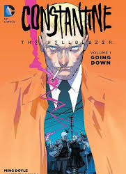
With the help of family [thanks mum], and peers, I found the overall most captivating poster design was design two. …………………………………………………………………………………………………………… This is were I encountered my first proper roadblock. Because poster two takes direct inspiration, to the point of plagiarism, with a comic book called Constantine. At the time I had done it to simply fill out the roster of how many sketches had to be done, but since it was the prevailer, now I had to do something to show I wasn't just riffing off of another artists hardwork.

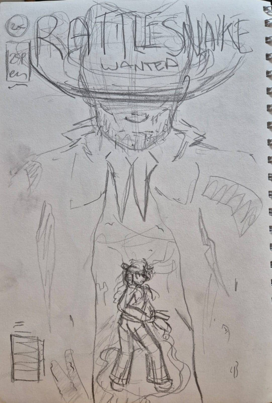
…………………………………………………………………………………………………………… Changes: So, to battle my inner guilt, I decided to speed run through changes I could make to give myself an original design, that still held the same eye-catching qualities as the original. There were the obvious things at first glance that I knew I didn't like. The text [size, font and position], the lack of classic comic book attributes, and focus in the wrong area. I also knew I wanted the inner scene to be set at a dutch camera angle, to show the unease and warped mindset surrounding Cass, who the main focus should be on. I ended up taking the sketch into my drawing program and quickly scrawling over the places I saw fit, giving me a result that I felt was far improved. Improved sketches


…………………………………………………………………………………………………………… Lineart Feeling more confident now in my choices, I went ahead with sketching the piece out. Now when comparing the original inspiration to my own, I could breath a sigh of relief, they looked far different. Portrayed you can see Iron Heart, the outlaw who performed a heel-face turn and went from the hunter to the hunted alongside Cass. I intended for this 'issue' to be focused on their first interaction however, when Iron Heart was the BBEG [big bag evil guy], hence why he looks far more menacing; And young Cass is keeping an eye out behind him, with a petrified look. Lineart for poster
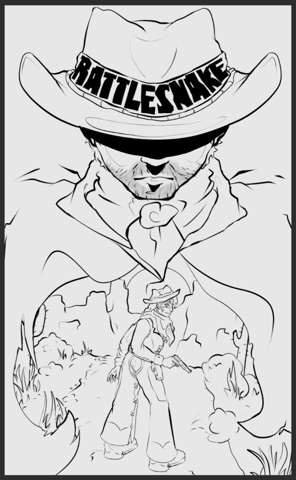
I decided to display the title in a hand-made font, on the rim of the cattleman. I knew that may cause initial confusion on who this 'Rattlesnake' character was, and I fully intended that to be the case. Since the cattleman originally belonged to Iron Heart before being given over to Cass, it's meant to act like the passing of the torch.
…………………………………………………………………………………………………………… …………………………………………………………………………………………………………… Values Next was setting up the values, which I found with rather easy, especially since I already had Cass' values down from the start. I don't think I need to tell you anymore I'm using the same 10 set's of colours from 5 to 95 on the greyscale. The values
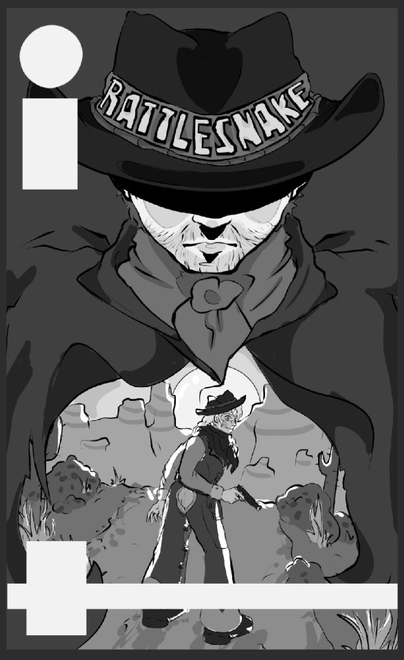
I found that, with a darker outside leading to a lighter interior, it draws eye to the main character and their environment, so Iron Heart isn't the main focus but more of an afterthought. As well as the lighter interior colours subtly hinting at Iron Hearts literal change of heart, with the glowing white sun showing his hidden compassion for Cass, since it's positioned right in his chest. And with the way Iron Heart is depicted, towering, dark and foreboding over the tiny form of Cass, and gives a sense of ominosity.
I also blocked out where I wanted the comic book barcodes where going to go, just so I had a decent idea for future reference.
……………………………………………………………………………………………………………
0 notes
Text
A long text of 10,000 words, four-stage cashier design

Every day we complete various transactions through various checkout counters. A smooth experience may make you feel that payment is just a checkout counter. I want to design a checkout counter with a HE Tuber good experience in different scenarios. Let’s take a look at the introduction of this article together.
Every day we complete various transactions through various checkout counters. A smooth experience may make you feel that payment is just a checkout counter. However, good products are all the same, bad products are all weird, and many checkout counters with poor experience will make you think "Why can't even a page be done well?" Today I will introduce to you a standard version of the checkout counter product. By understanding the standard form, you can draw inferences and design a checkout counter with a good experience in different scenarios.
[Old rule, if you find it simple or long-winded, just turn to the end to read the summary]
1. Introduction to payment cashier
1. Cashier terminal
The purpose of the payment terminal is to provide users with a good operating experience through scene adaptation, and to ensure user payment security.
1) Scene adaptation
Nowadays, there are many transaction scenarios such as mobile phones, counters, self-service equipment, and websites, so it is necessary to provide cashiers that adapt to various scenarios for customers to use.
2) Operation experience
The original payment methods are interfaces that require technical development, so various terminal pages are needed to ensure a smooth user experience, so as to bring better payment conversion rates to merchants.
3) Payment security
Payment security mainly includes two aspects. On the one hand, it ensures the security of user payment by adding "password, face brush, fingerprint, security certificate" and other methods. On the other hand, through the binding of "terminals and channels", the opportunities for routing arbitrage by intermediaries and service providers are reduced .
2. Cashier payment method
Behind a simple and easy-to-use cashier is the "payment method", and behind the payment method is the packaging of the payment products provided by the payment channel. On the one hand, the function of the payment method is to show the user what payment channels he can use, and on the other hand, it improves the user's payment efficiency and experience through packaging such as wallets, QR codes, and facial recognition.
The payment method has gone through a relatively long development process from cash to QR code. All payment methods have developed from the early over-the-counter cash transactions such as cards, discounts, wire transfers, and letter transfers. The ones that can carry out online and mobile payments are mainly divided into three categories: "card base, account base, and barcode".
1. Card-based payment
Card-based payment refers to the form of payment using bank cards as the medium. This is also the most basic payment method. As long as you have a debit card or credit card, you can pay.
1) POS card swiping
This is the earliest electronic payment method and an offline payment method. POS machines allow you to pay with cards in offline stores and supermarkets. Later, products such as hand swiping and smart POS payment evolved.
2) Quick payment
This is the earliest mobile payment method. Online payment and consumption can be carried out by binding the card online. It is also the most popular payment product for mobile payment, because it can get rid of the shackles of physical cards and pay conveniently through mobile phones.
3) Online banking payment
In the early days of online banking payment, you needed to jump to the bank's online banking through a PC to make large payments. Now online banking payment has gradually begun to develop in a mobile direction. Traditional PC-based online banking is more commonly used in large-amount payments and corporate payments.
Although card-based payment played a role in promoting early mobile payments, it is not very convenient to use. For POS card payment, you need to bring your bank card with you. For quick payment, you need to bind the card to different platforms. For online banking payment, you need to install it. Encryption plug-in or carry U-shield. Therefore, account-based payment came into being.
2. Account base payment
The account-based payment method is mainly a wallet account packaged in a bank account, a payment account, and a digital currency account. This payment method relies on a large number of real-name authentication user systems on the Internet payment platform. Through the account system they provide, users do not need to undergo cumbersome real-name authentication after merchants access it, and can directly make purchases.
For example, e-commerce platforms generally have access to payment products such as WeChat, Alipay, and Cloud QuickPass. Since users have completed their real names, the transaction conversion rate is very high.
This mainly refers to the integrated payment method for online order codes, offline machines, code plates, etc. for various QR codes. Of course, it is essentially a deep aggregate packaging of bank cards and accounts. The QR code here is divided into three forms according to the "merchant" and "user" dimensions.
Merchant static code : This is a QR code generated from the merchant number of the payee. It is mainly used to make static code plates, cloud speakers and other forms. The user scans the code and enters the amount for payment. This QR code is suitable for making aggregate codes and supports many APP to pay.
Merchant order code : This is a QR code generated based on the product order received by the merchant. The user can pay directly according to the order without entering the amount. This type is mainly used on self-service equipment and websites for users to pay.
User payment code : It is a payment code generated based on the user's payment account. The merchant uses a code scanner or box to scan the payment code displayed on the user's APP to complete the payment.
0 notes
Text
Set Vector Format of Barcode Image & Add Support to Save Barcode in SVG Format in SQL Reports
What’s new in this release?
Aspose team is happy to announce the new release of Aspose.BarCode for Reporting Services 18.1.0. The major development in this release is the support to the generated barcode image in Vector format. Aspose.BarCode for Reporting Services now enable the developers to save the generated barcode image in vector format. Two new formats EMF and SVG has been introduced. Saving barcode image in vector format is very simple and is demonstrated in the code snippet on blog announcement page. This release also fixes exceptions that were reported by Aspose valued customers, such as It was noticed that when font is specified while saving the barcode image in vector format. The barcode inaccurate text was displayed. The process of drawing barcode text has been improved, Setting big text size with StringAlignment.Far option, it was noticed that the barcode text disappears. Now the issue has been fixed and Working of CodeLocation property has been improved. Below is the list of new and improved features added in this new release
Add support to save barcode in SVG
Add support to save barcode in any Vector image format
Support to generate and recognize EPC QR coded barcode
Improved drawing text when font is specified
Mark old useless BarCodeReader API as obsolete
Barcode is rendered without text
Incorrectly saving a picture to a file
Property CodeLocation works incorrectly
Newly added documentation pages and articles
Some new tips and articles have now been added into Aspose.BarCode for Reporting Services documentation that may guide users briefly how to use Aspose.BarCode for performing different tasks like the followings.
How to Display BarCodes in Report Header
Select an ECC Level to Encode a Barcode
Overview: Aspose.Report for .NET
Aspose.BarCode for Reporting Services is a .NET solution for the rendering of barcode images in SQL Server 2000, 2005 & 2008 Reporting Services. It supports 29+ linear (1D) and 2D barcode symbologies including MacroPdf417, Australia Post, OneCode, Code128, Code39, PDF417, UPCA, Codabar, MSI and QR etc. Also render barcode images on reports in BMP, JPG, PNG and GIF formats. Other features include EAN-128 application identifiers, DPI resolution settings, barcode size and location adjustments.
More about Aspose.Report for .NET
Homepage of Aspose.BarCode for Reporting Services
Download Aspose.BarCode for Reporting Services
Online documentation of Aspose.BarCode for Reporting Services
#Save barcode image in vector format#EMF format support#SVG format support#Setting Vector Format Of Barcode Image#SQL Server Reporting Services#render barcode images in SQL Server#drawing barcode text improved
0 notes
Text
Finalising Furniture Upcycling starter kit
From my tutorial the next steps to focus on is making the illustrations make sense. By framing it and creating the branding for it. I started to play around with some basic layouts. Tweaking and adjusting colour schemes and placement.
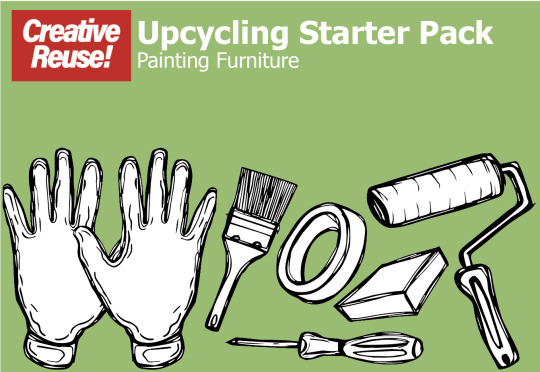
I wanted to have the starter pack items together and the main focal point. As that its what your purchasing. I adjusted the green colour background to a lighter one. Although still not keen on it so needs some work. I wanted the font and layout of the typeface to be similar to the upcycling guide so they matched which I have done here.

I thought about splitting up the green background with a white section where the type is. Although I feel the full colour background is more consistent and flows better.

I wanted to make clear what comes within the starter pack. So I added a text box to show you what's included.

After some more adjusting I changed the shade of green. Also added a darker version to the illustrations background. But like before wasnt keen on the two tone. Also added a price tag, which I feel is important to the product. From previous tutorial I remember discussing about having the barcode on the back. As I do feel its is ugly and does draw too much attention. So I have left it.

I rethought what I was actually creating, was I making the packaging or an advert for this Upcycling kit? So decided to create the packaging for it. I felt like I needed to include that the kit comes in. So after quite a few attempts I drew out this box which would act as the tool kit. Which all of the tools would be in.
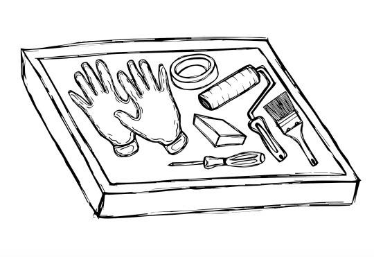
Adjusting the scale of the tools to fit within the box was a task but they fit. Ive also adjusted the scale of each item so they are more realistic looking as it was mentioned in previous tutorial.

Added some colour to the box to match the colour scheme of the packaging and upcycling guide, so they are consistent and match.

From looking at the starter packs and upcycling guide. I realised that the illustrations just a bit bland. So I thought about experimenting with adding some colour to the illustrations. Using red as that's the brand colours of creative reuse. I used two shades of red and a grey. I feel these colours have really brought the illustrations to life a bit more. So I am going to add colour to the rest of the illustrations.

I feel this looks so much better with the hints of red, showing the brand indemnity through the products and packaging. Improving them massively.
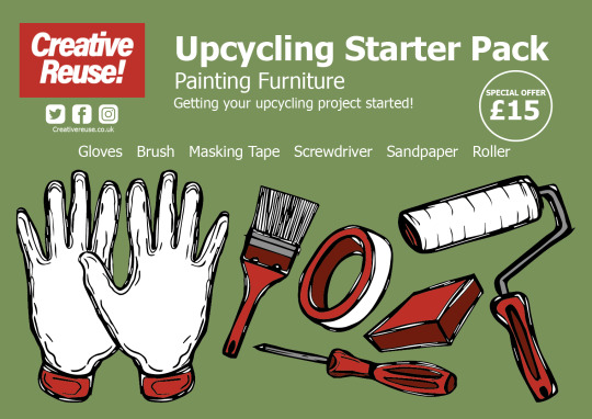
Here is the the upcycling starter pack version I am at now. I feel the red works really well. Even though my style was going to leave the illustration black and white. I feel the colour has really made a difference in creating the brand identity it was previously lacking.
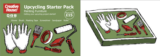
This is how the upcycling starter pack will be displayed showing the packaging of the starter pack on the left and the kit on the right.
0 notes
Text
VeryPDF .NET PDF Editor SDK for Developers Royalty Free
VeryPDF .NET PDF Editor SDK for Developers Royalty Free. Get royalty-free access to a comprehensive PDF toolkit with VeryPDF.NET PDF Editor SDK for Developers. Ideal for .NET applications (C# and VB.NET) and non-managed programs written in Visual Basic 6, Delphi, Microsoft Access, Windev, PHP, Python, Java, JavaScript and more. Experience fast and seamless performance on large documents with the intuitive API that also supports full Unicode. Enjoy a range of valuable features including PDF/A generation, conversion to PDF/A, digital signature support, merging and splitting of PDFs, modification, rasterization, redaction, creation of interactive form fields, PDF layers, and more.

Test VeryPDF PDF Editor Web application from following URL,
VeryPDF PDF Editor OCX Control,
VeryPDF PDF Viewer OCX Control (ActiveX),
Online Document Annotator (Annotate Documents Online),
VeryPDF .NET PDF Editor SDK Main features:
Read, Edit, Create or Write PDF documents from file or stream
Convert PDF to PDF/A format with ease
Control the printing process with full support for incremental saving to preserve document history
Fast linearized PDF saving (also known as "Fast Web View")
Interactive PDF features: Actions, document-level navigation and more
Link files with support for file linking
Repair corrupted documents with ease
Pack and compress existing documents to reduce file size by reusing resources
Handle large documents with ease, delivering speed and performance
Achieve 100% compliant and smaller PDF documents through strong objects serialization
Fast text extraction engine available on whole page or ROI
Add, extract and manage fonts in your PDF documents
Add, extract, replace, optimize, or remove bitmaps
Write text with font embedding and full Unicode support
Draw barcodes with ease
Flatten PDF form fields and annotations
Create and edit form fields in your PDF documents
Edit PDF annotations with ease
Full support for PDF transparency schemes for rendering and PDF creation
Graphics state stack and transformation matrix support
Read and write bookmarks
Support for Optional Content Groups (PDF Layers)
Full action support for PDF documents
Manage file attachments with ease
Support for page labelling
Draw pages from a PDF to a page of another PDF
Clone and duplicate pages with ease
Encrypt or secure PDF documents with support for all encryption schemes, from RC4 48 bits to AES 256 bits
Rasterize PDF pages to bitmap with high fidelity rendering and speed
DigiSign documents with support for Adobe PPKMS and Adobe PPKLite modes
Redact sensitive information from PDF documents
Merge, split, swap, delete, append, and rotate pages
Full interaction with PDFViewer and ThumbnailEx controls
Edit PDF documents and display updated version in real-time with a viewer
Low-level API to manipulate paths
AnyCPU, available in 32-bit & 64-bit versions
Supports multi-threaded applications
PDF 2.0 support for reading and writing
Generate PDF/Universal Accessibility (PDF/UA) for improved accessibility
And more…
VeryPDF.NET is a comprehensive SDK for software development, offering over 300 features for PDF, OCR, barcode, document imaging, and various formats.
This robust set of APIs is trusted by developers worldwide across various industries, with thousands of users.
0 notes
Text
Customised Wristbands for the Snow beat Festival
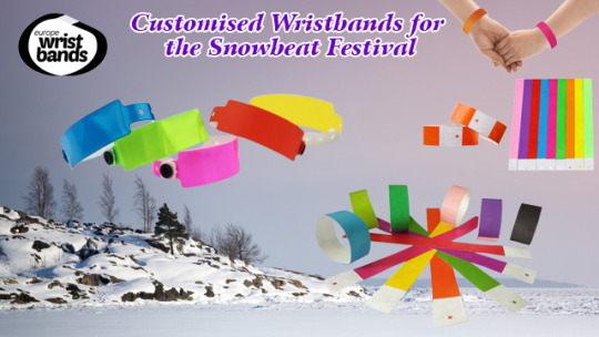
Around a week ago, I decided to order 100 custom wristbands for an upcoming snowbeat festival that I was organising. The name of the event is Snowbeat Festival and it's being held at an outdoor venue in UTRECHT, NETHERLANDS. The idea behind these concerts is that there will be no headlining acts, but rather local bands are showcased as headliners through different stages to create unity among the performers. I wanted to really make our local acts the focus of the event rather than some act from abroad who has no connection to the city.
My idea was to make customised wristbands with our band's logo on them so that people would know who we were and what we were doing while they were at the concert. I ordered my custom wristbands from Wristbandseurope.com and they were exactly what I was looking for in terms of the product.
I was incredibly impressed with the work that was done. The custom wristbands are top quality and the design looks excellent. The quality is amazing, and the writing is really clear to see – even in the dark! No doubt it was also great value for money as they only cost me 10€ including the customized print. I paid more for plain wristbands last year from another company and am so glad I found these guys. I got a lot of positive responses from people who have seen them. Some people even thought they were official wristbands due to how professional they looked.
The person that I dealt with at Wristbandseurope.com was extremely responsive, quick to reply to emails, and willing to work with me on every step of the order. Overall, it was a good experience and I would like to thank Wristbandseurope.com for helping me put the finishing touches on my project. I wanted everything to be perfect for the festival and thanks to the team I was not disappointed. For next year I might even include a QR code on the wristband that links to the band’s Facebook page so people can follow our page and keep up to date with gigs.
My order was completed within a week and the wristbands were delivered to me in Amsterdam via DHL so I could pick them up locally. Overall, I couldn't be happier with the outcome of my order. I will use Wristbandseurope.com services again in the future. I just wanted to say that the wristbands were a great hit at the festival, and I think we could have done a lot more promoting with them than what we actually did since they were such an eye-catcher.
Importance of wristbands in festivals
Festival Wristbands have become a popular trend in the concert scene. They ensure that visitors are able to attend the right shows and have access to freebies and other amenities. Wristbands also help festival organisers with accurate attendance numbers, event logistics, and barcode scanning opportunities. Here is everything you need to know about them!
For many people, their first experience with wristbands was at a music festival. The plastic bracelet on their arm meant that they were allowed entry into the show and even if they didn't like what was happening on stage, the branded accessories were enough of a draw for them to stay until the end of a set time. Of course, most people loved the music too and the wristbands were a little memory for people to take away after the event was over.
The popularity of wristbands has grown as technology and event management processes have improved. Today, they are available at all kinds of events and venues for music, sports, and even hotels. While my small Snowbeat event used wristbands most of the biggest festivals in the world use them too such as Tomorrowland, Glastonbury, and others. I hope our event will grow and become similar to some of those amazing brands.
After a quick search online, it was clear that www.wristbandseurope.com has the best quality and price! They even have an in-house print shop which means they can customise any order to your own specification. The online designer allows customers to add logos and text and see a live preview of how the band will appear. That’s great as I was able to show it to my partners before moving ahead and placing an order. Thanks for the great work guys and hopefully next year I will need even more wristbands for the event!
0 notes
Link
0 notes
Photo

HR soft BD provides the best OMR software which can be integrate with your existing computer and automate the complete OMR procedure. By using this software you can automatically extract data out of all types of OMR sheets such as- tests, surveys, attendance sheets, admission forms, checklists and feedback forms The features and functionalities of OMR software: 01. It can design OMR sheets 2. It can scan and print OMR sheets 3. It has an in-built anti-cheat feature 4. It can read OMR sheets with complete accuracy 5. It can evaluate the data and generate reports 6. Data sorting 7. Column Validation 8. Identification of duplicate form and field 9. Barcode and machine printed text supported 10. Identification of Mandatory fields 11. Unlimited no. of sets 12. Use any normal scanner 13. No dependency over Paper Size 14. No special paper required to print OMR 15. World-class accuracy and speed 16. Native 32-bit and 64-bit forms recognition and processing binaries 17. Handle OMR forms with or without timing marks 18. Recognize different types of OMR fields (check boxes, ovals, or circles) 19. Recognize marks created by pens, markers, crayons, or pencils 20. Recognize forms created in Word or other programs, in addition to traditional, specially-designed forms 21. Recognize forms printed on plain paper or on traditional specially-designed forms 22. Recognize marks in OMR fields that are extremely close together (as long as they are not touching each other) 23. Recognize and extract form fields regardless of image resolution, scale, or other form-generation characteristics 24. Automatically detect and correct page orientation and skew angle 25. Unique color and bitonal image recognition for scanned documents and pictures 26. Automatically detect, draw and name OMR fields in an image according to their row and column, to facilitate creating OMR master forms The benefits/advantages of OMR software: • No need of any other designing software as it comes with free in-built tools that can design any type of OMR sheet/forms. • No need of expensive OMR scanner as it also works as OMR scanner software that is capable of scanning all types of OMR sheets with any normal Flatbed/ADF/MFP scanner. • It significantly improves the speed. OMR software can read up to 300 sheets in a minute. • It guarantees complete sheet reading accuracy. You can be sure of getting accurate data that is without any fault or lag. • It can re-read faulty files. This is an advantage when there is an error in the answer key. It highlights the fault in the answer key which can be corrected manually and then it re-reads the data. • It can detect cheating by cross-checking the data of every sheet and the repetition of wrong answers. • It is the most cost-effective method to create, conduct and evaluate offline assessments. Contact Us- Website : http://hrsoftbd.com Cell Number : +88 01722158130, +88 01709372481
0 notes
Text
How Custom Packaging can Help to Grow your Business?

What is custom packaging? Simply put, custom packaging is the perfect way to improve your business image, draw attention, and make your products easy to recognize by adding your business logo. In the past, plain white boxes were commonplace, have your merchandise stand out with custom printed boxes, and enjoy a professional look by adding your business logo to your product packaging. Today, you have more options than ever before when it comes to custom packages boxes to make your product easy to identify. These boxes come in an array of colors, materials, finishes, sizes, and shapes.
Custom Printed Boxes that meet your Requirement
When you order custom-printed boxes to meet your individual or business needs, you should first determine the size, shape, and color of the box that will best meet your needs. There are many different box packaging shapes available that can be customized to fit almost any product, including barcodes, price tags, shipping containers, and more. You can also choose from many different printing materials, including PVC, cardboard, paperboard, heavy-duty fabric, polystyrene (the latest shipping material), and more.
Custom made Boxes with Different Shapes
Another option when choosing custom packaging boxes is to select shapes. Whether you need standard cube or oblong-shaped boxes, there are a variety of shapes to choose from. Shape selection is often determined by product specifications or brand recognition. For example, standard custom soap boxes can be oblong or cube. Oblong-shaped boxes can hold bar soap, liquid soap, shower gel, or cream soap.
Material you can Choose for Custom made Boxes
When selecting custom die-cut or custom foam materials for your soap packaging designs, you have the flexibility to make these items specific to your company. Many companies choose to offer only certain graphic styles. They can either choose blank templates or stencils to be used in the printing process. You can have images cut out of many different materials, including metal, cardboard, die-cut paper, fabric, vinyl, suede, leather, rubber, polystyrene, clear plastic, polycarbonate, or colored paper.
Custom Rigid Boxes with Logo
If your products require extra insulation, you can purchase custom rigid boxes that help protect packed products from moisture. In addition, you can have window inserts or custom die-cut boxes printed with your logo. Many companies also use these types of printed boxes for food and beverage products, such as printed chocolate bars or printed protein bars. If you're looking for a unique style, you can have a custom die-cut soft drinks or coffee cans printed with your logo, slogan, or company's tag line. This is another popular promotional tool for small businesses, though there are some companies that offer only custom rigid boxes.
Custom Printed Boxes with Add-ons
If you need some more final touches on your printed box packaging, you can add-ons at a later stage. For example, you can order embossed logos or special text, or choose custom die-cut boxes that has a raised ink texture. This text or logo can be added in the form of raised letters on the box's side or inside the box. You can also request that a business name or logo to be printed on a label directly on the custom packaging material. Finally, you can add an insert or ribbon to the package. Most companies choose to add a ribbon because it makes the box look more professional and adds an elegant touch to your promotional campaign.
In terms of sizes, most customs printed boxes conform to standard cube, rectangular, or oval shapes. Some manufacturers also customize product boxes based on a product's shape. For example, if you order a square box with a bottle of shampoo, the designer will usually recommend that you order a rectangular box that will fit neatly within the square shape. Shampoo product boxes come in a variety of sizes, from small, convenient, mini travel sizes, to large, oversized sizes, depending on your target audience and your budget. The advantage of large sizes is that they can accommodate all of your shampoo bottles without requiring additional displays since they are typically wider than smaller boxes.
Custom made Boxes with Free Shipping
Once you have chosen your box style and color, you can be sure that you will have received free shipping and free reign to create a unique color and design that will really make your box style stand out from the rest. After all, your box will be the focal point of your marketing campaign, so it should be designed, produced, and shipped in a way that stands out in your market. Designing and manufacturing custom soapboxes that meet your specifications takes a little time and effort, but it will pay off in the end. You will have a custom box that is both highly functional and beautiful. And you will probably get free shipping and free reign to really make your box style shine.
0 notes
Photo

It is International Week of the Deaf this year it’s all about Full Inclusion with Sign Language!
([image text; purple background header, white font INTERNATIONAL WEEK OF THE DEAF 2017, 18 to 24 September. [orange font] THEME: [purple font] [black font] FULL INCLUSION WITH SIGN LANGUAGE! International Week of The Deaf 2017 takes place under the theme 'Full Inclusion with Sign Language!!'. It is in tandem with the 3rd International Conference of the World Federation of the Deaf and believes that full social inclusion of deaf people is possible when sign language is recognised and used widely within the society. International Week of the Deaf 2017 stresses the importance of sign language. Without the actual recognition, facilitation and promotion of it, the rights outlined in the United Nations Convention on the Rights of Persons with Disabilities and the recently adopted 2030 Agenda and its Sustainable Development Goals cannot be fully achieved. [orange font] CAMPAIGN [purple font] KEY MESSAGES [green background box, white font] BIRTH RIGHT - [grey background box, black font] Draws upon the principle of basic human rights in relation to language acquisition at birth. When acquired fast, it enables deaf children to have full communication with people, improving their cognitive and social skills. Deaf children need access to sign language from birth. [orange background box, white font] DEAF IDENTITY - [grey box, black font] Identifies deaf people as belonging to a cultural and linguistic community, who use sign language as a mother tongue or natural language to communicate. [yellow background box, white font] ACCESSIBILITY - [grey background box, black font] stresses that deaf people need access to public information and services via sign language interpreting, subtitling and/or close-captioning. A key factor to accessibility for public services such as health care, employment, social activities or any other government services is provision of and access to sign language.
[purple background box, white font] EQUAL EMPLOYMENT OPPORTUNITIES - [grey background box, black font] Sign language competency for communication and provision of interpreters mean that deaf people can do almost any job. It is important for deaf people to equally aspire securing jobs that reflect their interest and competency. The main barriers to employment arise from accessible work environments rather than an inability to hear. [green background box, white font] LIFELONG LEARNING - [grey background box, black font] Access to education, vocational learning, and ongoing progessional training and development is key to gaining and retaining a job and earning a wage that allows independent living. [orange background box, white font] EQUAL PARTICIPATION - [grey background box, black font] Deaf people need to have equal access to participation in the personal, public and political area as everybody else. More importantly, it is necessary to ensure that deaf people have the opportunity to take up leadership roles, so that deaf people themselves can appropriately advocate for their rights and be involved in all decision-making processes concerning their lives. This is a reflection of the slogan 'Nothing About Us without Us'. [yellow background box, white font] BILINGUAL EDUCATION - [grey background box, black font] Urges stakeholders to accept the need for bilingual education for a deaf child and to understand how quality bilingual education should be provided in a sign language environment. Bilingual education is a social-cultural approach of using sign language of instruction in all subjects with a parallel strong emphasis on teaching, reading and writing of the language used in the country or society. [purple background box, white font] EQUAL LANGUAGE - [grey background box, black font] Recognises sign language as a valid, linguistic means of conveying thoughts, ideas and emotions. It is a fully operating language with its own syntax, morphology and structure. It fulfils all features serve to define the notion of a language. This has been confirmed in many systematic linguistic research on sign language since the late 1970s. In the middle of all the text boxes there is a logo of two hands touching with the words 'FULL INCLUSION WITH SIGN LANGUAGE' and at the bottom of the page, the logo for World Federation of the Deaf, International Week of the Deaf, and a barcode with the word 'donate' underneath.]) Thank you @elixiire for providing the image description
#Deaf#ActuallyDeaf#ActuallyHOH#Hard of hearing#Hearing loss#International Week of the Deaf#Accessibility#Sign Language
773 notes
·
View notes
Text
A long text of 10,000 words, four-stage cashier design

Every day we complete various transactions through various checkout counters. A smooth experience may make you feel that payment is just a checkout counter. I want to design a checkout counter with a HE Tuber good experience in different scenarios. Let’s take a look at the introduction of this article together.
Every day we complete various transactions through various checkout counters. A smooth experience may make you feel that payment is just a checkout counter. However, good products are all the same, bad products are all weird, and many checkout counters with poor experience will make you think "Why can't even a page be done well?" Today I will introduce to you a standard version of the checkout counter product. By understanding the standard form, you can draw inferences and design a checkout counter with a good experience in different scenarios.
[Old rule, if you find it simple or long-winded, just turn to the end to read the summary]
1. Introduction to payment cashier
1. Cashier terminal
The purpose of the payment terminal is to provide users with a good operating experience through scene adaptation, and to ensure user payment security.
1) Scene adaptation
Nowadays, there are many transaction scenarios such as mobile phones, counters, self-service equipment, and websites, so it is necessary to provide cashiers that adapt to various scenarios for customers to use.
2) Operation experience
The original payment methods are interfaces that require technical development, so various terminal pages are needed to ensure a smooth user experience, so as to bring better payment conversion rates to merchants.
3) Payment security
Payment security mainly includes two aspects. On the one hand, it ensures the security of user payment by adding "password, face brush, fingerprint, security certificate" and other methods. On the other hand, through the binding of "terminals and channels", the opportunities for routing arbitrage by intermediaries and service providers are reduced .
2. Cashier payment method
Behind a simple and easy-to-use cashier is the "payment method", and behind the payment method is the packaging of the payment products provided by the payment channel. On the one hand, the function of the payment method is to show the user what payment channels he can use, and on the other hand, it improves the user's payment efficiency and experience through packaging such as wallets, QR codes, and facial recognition.
The payment method has gone through a relatively long development process from cash to QR code. All payment methods have developed from the early over-the-counter cash transactions such as cards, discounts, wire transfers, and letter transfers. The ones that can carry out online and mobile payments are mainly divided into three categories: "card base, account base, and barcode".
1. Card-based payment
Card-based payment refers to the form of payment using bank cards as the medium. This is also the most basic payment method. As long as you have a debit card or credit card, you can pay.
1) POS card swiping
This is the earliest electronic payment method and an offline payment method. POS machines allow you to pay with cards in offline stores and supermarkets. Later, products such as hand swiping and smart POS payment evolved.
2) Quick payment
This is the earliest mobile payment method. Online payment and consumption can be carried out by binding the card online. It is also the most popular payment product for mobile payment, because it can get rid of the shackles of physical cards and pay conveniently through mobile phones.
3) Online banking payment
In the early days of online banking payment, you needed to jump to the bank's online banking through a PC to make large payments. Now online banking payment has gradually begun to develop in a mobile direction. Traditional PC-based online banking is more commonly used in large-amount payments and corporate payments.
Although card-based payment played a role in promoting early mobile payments, it is not very convenient to use. For POS card payment, you need to bring your bank card with you. For quick payment, you need to bind the card to different platforms. For online banking payment, you need to install it. Encryption plug-in or carry U-shield. Therefore, account-based payment came into being.
2. Account base payment
The account-based payment method is mainly a wallet account packaged in a bank account, a payment account, and a digital currency account. This payment method relies on a large number of real-name authentication user systems on the Internet payment platform. Through the account system they provide, users do not need to undergo cumbersome real-name authentication after merchants access it, and can directly make purchases.
For example, e-commerce platforms generally have access to payment products such as WeChat, Alipay, and Cloud QuickPass. Since users have completed their real names, the transaction conversion rate is very high.
3. Barcode payment
This mainly refers to the integrated payment method for online order codes, offline machines, code plates, etc. for various QR codes. Of course, it is essentially a deep aggregate packaging of bank cards and accounts. The QR code here is divided into three forms according to the "merchant" and "user" dimensions.
Merchant static code : This is a QR code generated from the merchant number of the payee. It is mainly used to make static code plates, cloud speakers and other forms. The user scans the code and enters the amount for payment. This QR code is suitable for making aggregate codes and supports many APP to pay.
Merchant order code : This is a QR code generated based on the product order received by the merchant. The user can pay directly according to the order without entering the amount. This type is mainly used on self-service equipment and websites for users to pay.
User payment code : It is a payment code generated based on the user's payment account. The merchant uses a code scanner or box to scan the payment code displayed on the user's APP to complete the payment.
0 notes
Text
Developing And Improving My Origami Packaging
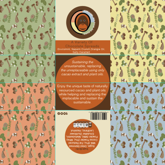
Now that I have critically reflected on my origami packaging at this point in time, I will now be making all these changes that I previously said about and picked up on. To start, I have firstly focused on the back on the design, to which I had added in a barcode and the weight too. I didn't mention this in my previous post as I only just remembered that I needed to add this on for it to become a real product. I did this by simply coping and pasting them from the previous jar labels. I decided to place these in either of the bottom corners as I thought that they wouldn't interfere with the flaps when they fold in. When looking at the back section, I have also changed the orange circle so that its no longer transparent. I have turned the opacity back up to 100%, to which I think this looks a lot more tidier as there wasn't really any need for it to match the jars this closely.
Additionally, the other thing I forgot to mention in the previous post is that the flaps covered up my little icon saying that there's no palm oil in them. This was simply because I forgot that it was there as it was completely covered up. Although, I thought that if I place it on the top left corner flap then this would clearly show this way.
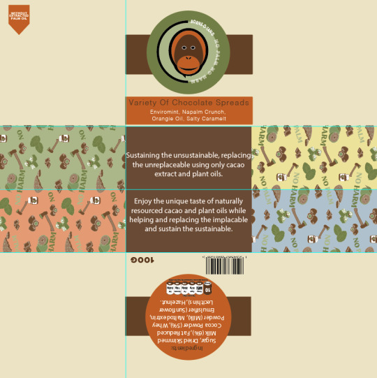
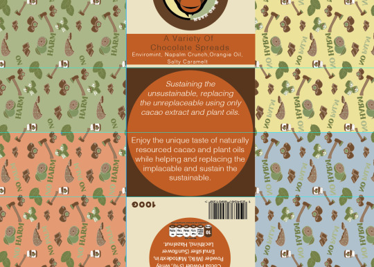
Next, I decided to change the text at the front so that it would actually show the whole phrase this time. While doing this, I chose to slightly adjust the phrase so that it said something different. Instead of it saying ‘A selection of chocolate spreads’, it now says ‘A variety of chocolate spreads’. There was tow reasons for this, one being that this new version as slightly shorter meaning I could fit it on better, but also as I think it just sounds a little better and less predicable. By this I mean that I feel like the word ‘selection’ is used quite a lot of foods, so I wanted a slightly different word that mean the same thing.
Another thing I have chosen to change is the logo, so I have placed in the multicoloured logo as I feel that this just works so much better for many reasons. I then changed the circle around this logo, to the dark brown colour as I feel this gives a strong contrast this way. The reason I was able to use this colour was because I got rid of the rectangle that was going through the logo and circle. This was because this didn't show at all once it was put together so it made no sense to keep it, apart from to match the jars, but the concepts between the two packaging's, doesn't have to be this unified. As well as this, I also got rid of the same rectangle on the back too again for the exact same reason.
After doing all of this, I then remembered that I had to decrease the size of the front and back circles so that they actually fit in, without the flaps covering them. This process was very simple as I just had to hold down ‘shift’ and ‘alt’ for it to size down in the centre.
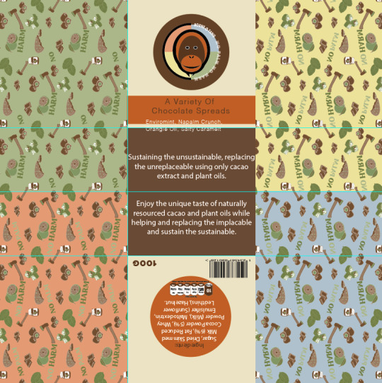
The other thing I have changed since the last screenshot is I have decided to make the repeat pattern cover the whole of the sides. So instead of it just being on the sides, this way it can show on the flaps as well. I think this small adjustment will make a massive difference as it was slightly annoying before on the position that the pattern stopped. This way, it wont happen this time.
Here, it is now showing where I have thought of a way in which I can make the base of the packaging work, with the orange colour. I mentioned in my previous post that I feel if I use the orange colour in with the dark brown, it will work, although I wasn't too sure on how I wasn't going to resent the orange shade. However, I have thought of using my them of circles to my advance as drawing a circle to fit the whole base but still have the brown showing in places. So this is what I did, where I then felt to have the type written inside this shape. To do this, I needed to copy and paste the circle and then use the ‘type tool’ and click on the shape once it changes to a circle instead of a square. I could then write out my description. Now looking at this, I think this works so much better as it actually has some interest to draw yo in now. At the same time, it has also been kept quite simple. The only other thing I have been able to change is the fonts, to which I separated the two paragraphs by using ‘ Helvetica light oblique’ for the top section and just ‘Helvetica light’ on the second paragraph. From doing this, it has just helped to show a difference, without being too dramatic.
Below is showing the final result from making all these adjustments to my design. From looking at this, I think its been massively improved as everything just looks neater and more in place.
Now moving onto the interior of the design, I realised that I didn't reflect much on the this part, although just from printing it out, I already found one issue. This was that the printer cut off part of my design. This then lead to many problems, one being that the measurements of the packaging is now not 21cm x 21cm. But the worse problem is the fact that it hasn't cut the sides off equally, mainly that one side from the centre is one measurement the other is completely different. This is a problem that I don't think I can fix. Although, when I actually put the packaging together before, it wasn't too bad. I could see that the base of one side wasn't in the centre like it should be.
Another thing I have changed since last time, is the composition. So instead of having the question at the bottom I decided it would make much more sense having it at the top, which I know that I didn't want to do at first as this is quite boring. But when you think about it, everyone will read from top to bottom meaning that they will read ‘no palm’ first, then the information and lastly the title. Whereas the title is what you ned to read first.
As well as this, I edited the logo so that it matches with the exterior now. I have changed the circle so that its showing the quarters with each colour being different.
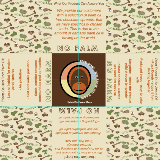
The last adjustment I made was to get rid of the text saying ‘unfold to reveal more’ as like I said before, this seemed very tacky to me. I have then replaced this with an orange circle that is going around the logo. I have drawn the circle so that its fits the base again, as this will then match the other side, where the type is and this same colour theme.
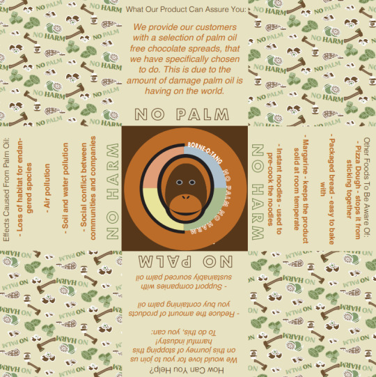
As a result, I have now finally come to a point where I’m very happy with this design, layout and colours. So now, this means I will need to print out my final design onto some more thicker paper as this will then give the final product a more luxury feel. After that I think I will add the same green coloured ribbon that I found when creating my initial origami packaging. This is because green will match with the colour from my repeat pattern and should hopefully compliment with the other colours too. The other colour I could use is white as this would then match with the lids of the jars inside, although to me this shade is a little boring.
0 notes
Text
Customised Wristbands for the Snow beat Festival

Around a week ago, I decided to order 100 customized wristbands for an upcoming snowbeat festival that I was organising. The name of the event is Snowbeat Festival and it's being held at an outdoor venue in UTRECHT, NETHERLANDS. The idea behind these concerts is that there will be no headlining acts, but rather local bands are showcased as headliners through different stages to create unity among the performers. I wanted to really make our local acts the focus of the event rather than some act from abroad who has no connection to the city.
My idea was to make custom wristbands with our band's logo on them so that people would know who we were and what we were doing while they were at the concert. I ordered my custom wristbands from Wristbandseurope.com and they were exactly what I was looking for in terms of the product.
I was incredibly impressed with the work that was done. The custom wristbands are top quality and the design looks excellent. The quality is amazing, and the writing is really clear to see – even in the dark! No doubt it was also great value for money as they only cost me 10€ including the customized print. I paid more for plain wristbands last year from another company and am so glad I found these guys. I got a lot of positive responses from people who have seen them. Some people even thought they were official wristbands due to how professional they looked.
The person that I dealt with at Wristbandseurope.com was extremely responsive, quick to reply to emails, and willing to work with me on every step of the order. Overall, it was a good experience and I would like to thank Wristbandseurope.com for helping me put the finishing touches on my project. I wanted everything to be perfect for the festival and thanks to the team I was not disappointed. For next year I might even include a QR code on the wristband that links to the band’s facebook page so people can follow our page and keep up to date with gigs.
My order was completed within a week and the wristbands were delivered to me in Amsterdam via DHL so I could pick them up locally. Overall, I couldn't be happier with the outcome of my order. I will use Wristbandseurope.com services again in the future. I just wanted to say that the wristbands were a great hit at the festival, and I think we could have done a lot more promoting with them than what we actually did since they were such an eye-catcher.
Importance of wristbands in festivals
Festival Wristbands have become a popular trend in the concert scene. They ensure that visitors are able to attend the right shows and have access to freebies and other amenities. Wristbands also help festival organisers with accurate attendance numbers, event logistics, and barcode scanning opportunities. Here is everything you need to know about them!
For many people, their first experience with wristbands was at a music festival. The plastic bracelet on their arm meant that they were allowed entry into the show and even if they didn't like what was happening on stage, the branded accessories were enough of a draw for them to stay until the end of a set time. Of course, most people loved the music too and the wristbands were a little memory for people to take away after the event was over.
The popularity of wristbands has grown as technology and event management processes have improved. Today, they are available at all kinds of events and venues for music, sports, and even hotels. While my small Snowbeat event used wristbands most of the biggest festivals in the world use them too such as Tomorrowland, Glastonbury, and others. I hope our event will grow and become similar to some of those amazing brands.
After a quick search online, it was clear that www.wristbandseurope.com has the best quality and price! They even have an in-house print shop which means they can customise any order to your own specification. The online designer allows customers to add logos and text and see a live preview of how the band will appear. That’s great as I was able to show it to my partners before moving ahead and placing an order. Thanks for the great work guys and hopefully next year I will need even more wristbands for the event!
0 notes
Photo

HR soft BD provides the best OMR software which can be integrate with your existing computer and automate the complete OMR procedure. By using this software you can automatically extract data out of all types of OMR sheets such as- tests, surveys, attendance sheets, admission forms, checklists and feedback forms The features and functionalities of OMR software: 01. It can design OMR sheets 2. It can scan and print OMR sheets 3. It has an in-built anti-cheat feature 4. It can read OMR sheets with complete accuracy 5. It can evaluate the data and generate reports 6. Data sorting 7. Column Validation 8. Identification of duplicate form and field 9. Barcode and machine printed text supported 10. Identification of Mandatory fields 11. Unlimited no. of sets 12. Use any normal scanner 13. No dependency over Paper Size 14. No special paper required to print OMR 15. World-class accuracy and speed 16. Native 32-bit and 64-bit forms recognition and processing binaries 17. Handle OMR forms with or without timing marks 18. Recognize different types of OMR fields (check boxes, ovals, or circles) 19. Recognize marks created by pens, markers, crayons, or pencils 20. Recognize forms created in Word or other programs, in addition to traditional, specially-designed forms 21. Recognize forms printed on plain paper or on traditional specially-designed forms 22. Recognize marks in OMR fields that are extremely close together (as long as they are not touching each other) 23. Recognize and extract form fields regardless of image resolution, scale, or other form-generation characteristics 24. Automatically detect and correct page orientation and skew angle 25. Unique color and bitonal image recognition for scanned documents and pictures 26. Automatically detect, draw and name OMR fields in an image according to their row and column, to facilitate creating OMR master forms The benefits/advantages of OMR software: • No need of any other designing software as it comes with free in-built tools that can design any type of OMR sheet/forms. • No need of expensive OMR scanner as it also works as OMR scanner software that is capable of scanning all types of OMR sheets with any normal Flatbed/ADF/MFP scanner. • It significantly improves the speed. OMR software can read up to 300 sheets in a minute. • It guarantees complete sheet reading accuracy. You can be sure of getting accurate data that is without any fault or lag. • It can re-read faulty files. This is an advantage when there is an error in the answer key. It highlights the fault in the answer key which can be corrected manually and then it re-reads the data. • It can detect cheating by cross-checking the data of every sheet and the repetition of wrong answers. • It is the most cost-effective method to create, conduct and evaluate offline assessments. Contact Us- Website : http://hrsoftbd.com Cell Number : +88 01722158130, +88 01709372481
0 notes
Text
Film Magazine - Picture Roll - Complete

I have finished my film publication and have created mock ups to show how they would look printed.
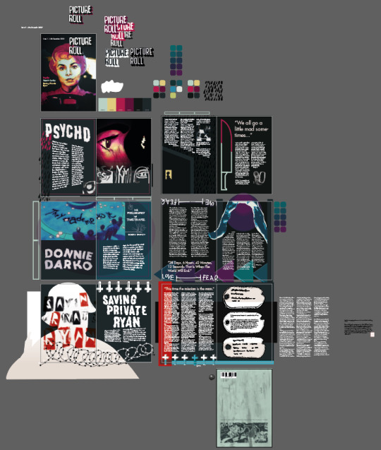
One problem I had was that the file size ended up quite large, which slowed down the software and caused problems in terms of time. I circumvented this by saving frequently (in case of the program crashing). An early obstacle was using Adobe InDesign, a program I have little experience with, and that my laptop at home had trouble running.
My first attempts at designing layouts in Indesign were unsuccessful and I had trouble finding inspiration. The research I did of other publications was largely useful as well as sketching possible layouts roughly. I then decided to create the pages in Adobe Illustrator, as I find it easier to use and achieve my desired effects. Once complete, I saved these pages and put them in Indesign.

My front cover is a previous artwork I made in the style of a Little White Lies cover. Marion Bates is a recognisable character from Psycho which will attract fans of horror and Alfred Hitchcock. I experimented with different versions of the logo, as the black relief doesn’t contrast with the background. I inverted the logo, as well as changing the colours, but I have decided to use the original, as I like how the black is clear against Marion but then fades into obscurity. This draws attention to the detail, and may encourage a viewer to look closer. This arguably also ties into the featured film’s themes. For the body text and headings I used Futura Std, a sans serif font that is easy and clear to read, it also offers a variant of weights, so the bold film titles (with colours dropped from the art) are clear against the dark background.
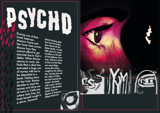
Each film has four pages. This introductory page has the film synopsis and title. For the title I scanned torn paper letters, this is quite similar to the original logo used for the film’s marketing, so the style works well. I placed the artwork of Norman Bates with the intention that the direction of the eye will lead the reader’s eye to the right. In one workshop we created typography in a grid. I have scanned these results, inverted the colours and used the Screen layer mode to place them throughout the four pages, spelling the film title.
I created a pattern of rain drops in Illustrator, which I used on both of the Psycho spreads. This is based off the iconic shower scene and the imagery of falling water, I contrasted the red and black drops to indicate the blood. I warped the short synopsis in a manner inspired by my research of other magazine. I think this gives the page an illusion of depth.
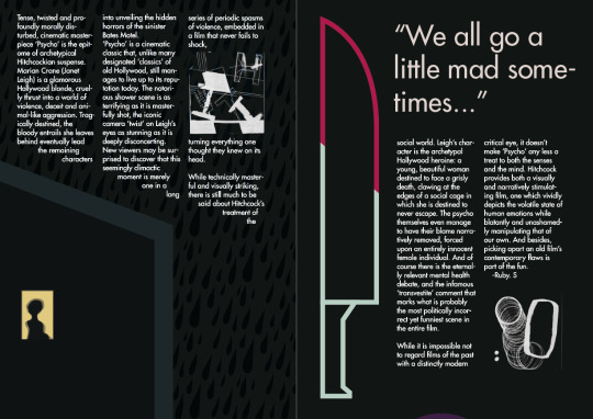
This is where the main review is along with the quote. The first section of text slants along the roof, under which we can see a silhouette in a window; imagery which is key to the films foreshadowing and is repeated. The rain drop pattern is used again, against the background to show the weather. I like the knife the most, which I created with the pen tool and then used the mask to create a red half, showing the bloodied knife from the shadow scene.

I realised rather late that I had created 14 pages, which is not a multiple of four, as needed for a publication. Thankfully, I only needed two more to reach 16, so I created a double spread to fit in after the Psycho section. I collaged different outcomes from the project digitally, and sectioned the background into red, green and yellow, the same colours used for each film title on the front cover.
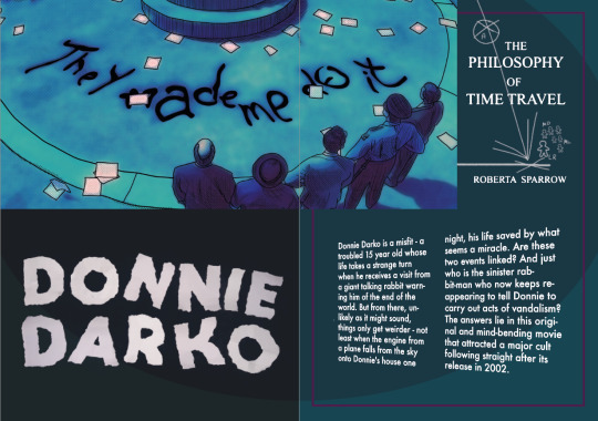
For Donnie Darko I chose a different colour palette, but I wanted to have consistency between each film, so the general darkness, style, and format is similar. The art shows a scene from the film after Donnie has vandalised the school. Inspired by drawings on blackboards, I have used bright text on a dark background, as well as small diagram of the concepts of tangent universes explored in the film. It shows the turbine (the Artifact) colliding and selecting a Living Receiver (Donnie) who is pushed by the Manipulated Dead and the Manipulated Living. This is explained in the in-universe book “The Philosophy of Time Travel by Roberta Sparrow”.

This spread shows the ears of the recognisable bunny costume. The triangles are meant to resemble the rewind button on a remote, symbolising reversal through time travel. There is also the “Love ----- Hate” scale which is focus of one of the film’s scenes.
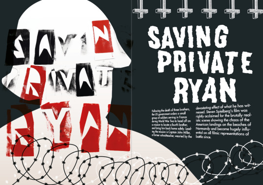
Saving Private Ryan was my final film. And I have used a more limited palette, of mostly unsaturated colours, making the red stand out, similar to the colour grading of the film itself. The red is immediately associated with blood and shows the violence of the film. On the left there is a silhouette of a soldier made with the pen tool. I have put typographic work over the silhouette, using the Multiply layer mode. I am pleased with the barbed wire, which links to the war genre, that I created using the pen tool and small stars with the shape tool.
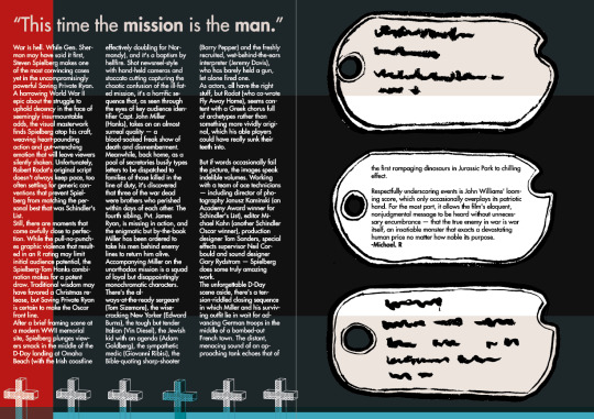
The text is in columns like in the magazines I research in order to improve reading comprehensible. In Illustrator I created a cross, then used the 3D/ Extrude and Bevel to create a grave stone as seen in the prologue and epilogue of the film. Three military dog tags are prominent, and symbolise the dead soldiers and the fate that the characters try to save Ryan from. The middle on has body text in in it.

I kept the back cover quite simple, using a paint texture I created and then digitally collaging multiple of my outcomes onto a rectangle with two colours, This is a wider version of the same design of the double spread in the magazine. I created a random barcode online using the characters PsdOSA-600298, the first two letters of each film and the last two digits of the release year.
1 note
·
View note
Photo

How to Create a QR Code Reader for Your Mobile Website
The barcode and QR code have modernized our shopping and searching experience. Customers carrying smartphones can now pick up a product anywhere in the world, scan its barcode or its QR code using one of the many free phone apps and find out its lowest price as well as where it can be bought.

Companies like Walmart and Amazon have embraced this technique to draw customers to their online and offline stores using their phone app. Other companies like Fedex and UPS allow customers to scan the codes on packages using a phone app, instead of needing to manually type in long lists of characters.
If the users of your mobile website have a need to type in long codes like activation codes, or they like to look up specific products on your website based on a model number printed in a magazine or advertisement, then you too can take advantage of QR codes to eliminate the frustration of tiny keyboards and spare them the need to double check for errors.
QR Code Scanning with Your Mobile Website
You don’t need a native phone app to scan QR codes. It’s quite simple to create your own QR code reader. Your website running on a smartphone equipped with a camera and running a little JavaScript can do the same trick.
Here’s a demo of a QR code scanner that works not only on Mobile but also in most modern devices. All you need is a camera and a QR code to scan.
If you don’t have a QR code handy, here’s one that shows the first eight digits of Pi.
Creating the QR Code Reader
Our QR code reader will need some HTML and JavaScript but most importantly, a JavaScript library capable of interpreting the QR code.
We’re not going to build that ourselves, because there are some great libraries out there doing this for us, so we don’t need to reinvent the wheel for our current purposes.
Let’s begin by creating an index.html file.
Adding the HTML
We’ll need some very simple HTML for this project. Add the following to your body tag:
<div id="container"> <h1>QR Code Scanner</h1> <a id="btn-scan-qr"> <img src="https://dab1nmslvvntp.cloudfront.net/wp-content/uploads/2017/07/1499401426qr_icon.svg"> <a/> <canvas hidden="" id="qr-canvas"></canvas> <div id="qr-result" hidden=""> <b>Data:</b> <span id="outputData"></span> </div> </div> <script src="./src/qrCodeScanner.js"></script>
As you can see, we have a wrapper container with a title, the QR icon image wrapped in an a tag, a canvas and a div where we’ll show the result of the scan.
Outside the container div we’re including the qrCodeScanner.js file. We’ll create it later, but first we’ll improve the look of our app.
Adding Styles
Add the stylesheet to the head of our HTML:
<link rel="stylesheet" href="src/styles.css" />
Now we want to create the style.css file within the src folder. We just want some basic styles for this sample app. Add the following to your css file:
html { height: 100%; } body { font-family: sans-serif; padding: 0 10px; height: 100%; background: black; margin: 0; } h1 { color: white; margin: 0; padding: 15px; } #container { text-align: center; margin: 0; } #qr-canvas { margin: auto; width: calc(100% - 20px); max-width: 400px; } #btn-scan-qr { cursor: pointer; } #btn-scan-qr img { height: 10em; padding: 15px; margin: 15px; background: white; } #qr-result { font-size: 1.2em; margin: 20px auto; padding: 20px; max-width: 700px; background-color: white; }
Nothing fancy at all. We’ll leave everything centered with a big QR button in the middle and the result underneath. We’re using black and white like the QR codes.
Including the Dependent JavaScript Libraries
The secret to reading QR codes is math, and the substitute for math is open-source libraries. To read QR codes, we’ll be using the JavaScript port of the Java-based image processing library written by ZXing. The JavaScript version was ported by Lazar Laszlo.
Because the JavaScript library consists of 17 files, we’ve taken the liberty of merging them into one file, wrapping the code in an anonymous function to prevent pollution of the global namespace and putting the file through Google Closure’s minifier to make the file size smaller.
Some Minor Tweaks to the Library
In order to make the library more adaptable, we’ve added a few minor changes to the library’s output function to differentiate between a success response and an error response.
Two important changes made were in qrcode.js, to these two lines:
qrcode.result = "error decoding QR Code"; //... qrcode.callback("Failed to load the image");
These strings have been replaced by Error objects:
qrcode.result = Error("error decoding QR Code"); //... qrcode.callback(Error("Failed to load the image"));
Now I can detect in my callback function whether an error occurred, just by checking if the callback payload is an instance of Error or not.
Those changes can be found in this fork of the library.
Adding the Script Tag
To use the library in our QR code reader, we first need to include it in our HTML using a regular script tag:
<script src="https://rawgit.com/sitepoint-editors/jsqrcode/master/src/qr_packed.js"> </script>
Treating It as an App
Something we’ll need to do is tell mobile browsers that we don’t want to scale this site in portrait mode. This can be achieved by adding the following meta tag within the head element:
<meta name="viewport" content="width=device-width; initial-scale=1.0; maximum-scale=1.0; user-scalable=0;"/>
Continue reading How to Create a QR Code Reader for Your Mobile Website on SitePoint.
by Dmitri Lau via SitePoint https://ift.tt/2YAyUnn
0 notes