#ef66

Text
今年のJAMのテーマ
風の噂に「機関車」と聞きましたが、
どうも本州の西の端っこに住むおいらの脳裏には、
誠に申し訳ないけど...
お江戸のハイソな紳士の皆様とお気持ちがシンクロしない。
というのが正直な思いでありまして...

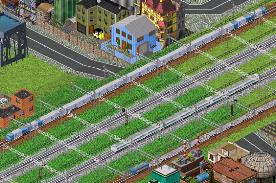
2022/6/8 下関駅にて
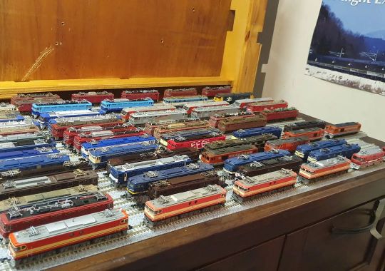
国鉄型機関車も気が付くと
細々と残る下関のEF65PFくらいしかみないし
(海を越えれば交流機関車や交直流機関車もがんばってますがw)
貨物なんて下関の視点で見たら新車の宝庫(?)ですし、
正直国鉄山口などと言われても、それは電車の方ですから~
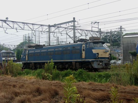
2016/8/16 幡生駅の裏だったっけ?
ただまあ数年前までは国鉄型見たんだけどね...@幡生駅裏
(特にEF66 27号機が運用入ると大騒ぎになることも)
そんなことより、
先日ぶらりと近所のリサイクルショップ行ったんです。
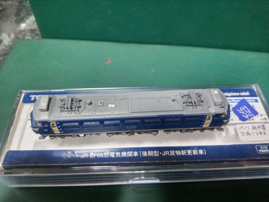
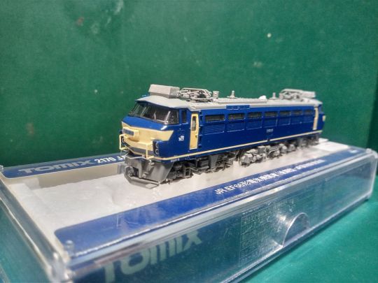
そしたら、TOMIXのEF66の新貨物更新車がいたんです...
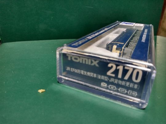
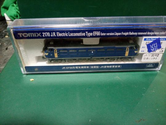
現状渡し・欠品あり・付属パーツ残なし・説明書なし
なので、お値段も相応にお安かったですw
状態は、パッと見は悪くなさそうだが
正直言って
「素人にはおすすめできない」
地雷系の雰囲気...
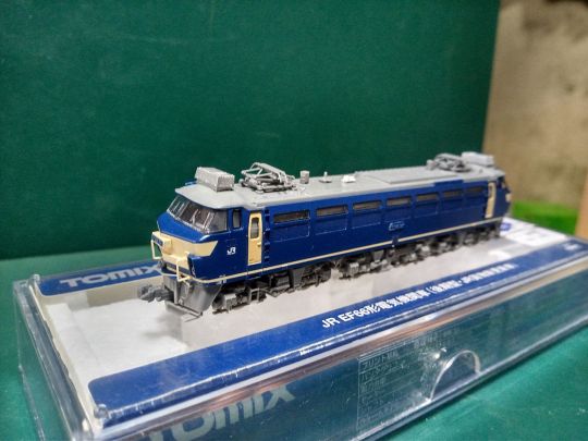
なんといっても、連結器の交換パーツがない...
しかも現在装着されているのは、TNカプラー
でも、うちはKATOカプラー愛用者である
屋根を確認すると、列車無線アンテナと信号炎管が欠品らしい
ただ、幸いなことにとも
他社製品(ぶっちゃげ〇トーASSYの余り物)で置き換えれば
欠品の不安は問題はない
そして、側面を見ると...ナンバーの塗装がハゲちょるwwwww
これくらいはなんとかなるでしょwww
最後に足元チェック...
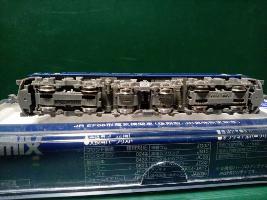
🤔❓❓❓
なんかオカシイぞwwwwwwww
でも、どのみち整備で動力バラすから
ヨシ!
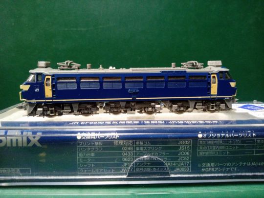
ということで、引き取ることになりました...
それから2日後

・ナンバーの復元作業
かすれた側面のナンバーのモールドの周辺を
マスキングテープで養生して周囲の塗装を保護して
モールドの上面に塗料が当たるように
綿棒につけた塗料をポンポン叩きながら塗布
この人のX(ex.Twitter)が参考になりました
・屋根上の欠品部品の交換
とりあえず欠品となっていた列車無線アンテナと信号炎管は
部品取りになっていたKATOのEF65から拝借した。
左右バランスが違うので、もう片方も外して交換してます
片方だけだとチクハグでみっともないゾー
・連結器の件
前オーナーさんの鉄道はTNカプラーが標準仕様だったのでしょう。
機関車には立派な密着自動連結器を模したカプラーがついてました。
だが、うちはKATOカプラーが標準仕様になってる...
ということで、いろいろなネットに転がっている
加工の参考になりそうな記事を探していたんですが...
無事に購入後家に帰ってさて、さあやろうと思ったら...
ブヒンバンゴウマチガエターorz
(翌日買いなおしにいきました)
(よいこは二度手間防止のため予め品番を確認しませう)
交換については、記事を理解できれば
そこまで難しくなくできると思います(というか拍子抜けした😅)
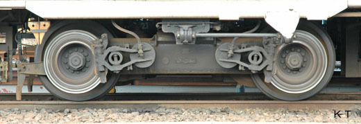
・動力台車の件
足元の確認のために一旦分解を試みました。
結果として、ゴムタイヤを嵌め間違えていたというオチw
あと、動力台車を分解中に漆黒の粉末を確認したので、
軽く清掃して再組立てしました。
予想以上に動力がスムースで拍子抜けしました...😅
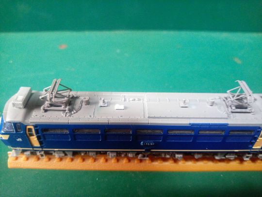
ということで、ひょんなことからわが家に転がり込んできた
EF66なんですけど...あとでナンバーを見て...
見覚えあるな~~~~😅と思っていたら、
どうやら...7 Year’s AGO...😱
(2170にはこのナンバー収録されてなかったですよね~😱)
(ノーモア指摘厨😱)(てか仕様違うので開き直ってるけど😅)
ということで、安い機関車を買って背筋がぞっとした話でした...
5 notes
·
View notes
Photo
#kato #tomix #microace #greenmax #nscale #modeltrain #ef53 #ef55 #ef60 #ef64 #ef65 #ef66 #ef71 #ed75 #ed76 #ed79 #ef81 #ef210 #ef510 #eh10 #el120 #jrf #jnr #jreast #meitetsu (at Salter Point, Western Australia, Australia) https://www.instagram.com/p/CnwvZy0vhXy/?igshid=NGJjMDIxMWI=
#kato#tomix#microace#greenmax#nscale#modeltrain#ef53#ef55#ef60#ef64#ef65#ef66#ef71#ed75#ed76#ed79#ef81#ef210#ef510#eh10#el120#jrf#jnr#jreast#meitetsu
0 notes
Link
0 notes
Text
1本目はEF65PF牽引の『出雲』。最末期の編成。この編成の何がかっこいいかって、オハネフ25が全部前位を東京側に向けた編成美なんだよね。24系25形は通路側と寝台側で窓の大きさが違うから、車両の向きがきれいに揃ってるってのはアドなんだよ。しかしなんで、ブルートレインは東京側にドアがついてんだろ? 前位東京側の原則からしたら扉の位置は逆じゃないのかな
2本目はEF65F牽引の鮮魚列車。EF66形式が出る前の1年くらいはEF65Fが重連で鮮魚列車を牽いていたんだよね。高速性能に優れたEF65形式に重連というパワーが加わった、EF65好きとしてはたまらない列車なんだよ
結論:EF65形式はかっこいい
8 notes
·
View notes
Text
MonoMaster's September issue features a Blue Train cold storage bag that can keep food cold for up to 20 hours. The extra issue features a Doctor Yellow vacuum-insulated cold/warming bottle.
Takarajimasya will include a Blue Train (Type EF66) cold storage bag as a supplement to the September issue of “MonoMaster” and a Doctor Yellow (Type 923) vacuum insulated cold/warm bottle as a supplement to the September extra issue of “MonoMaster. Each is priced at 1,990 yen.
The Blue Train cold storage bag is 23 x 17.5 x 22 cm (W x D x H) with a capacity to hold six 500 mL cans. The load…
0 notes
Text
Calligraphy on Unusual Surfaces: Be Amazed!

Calligraphy on Unusual Surfaces: Discover the Art That Transforms the Ordinary to Extraordinary!
Calligraphy on unusual surfaces allows you to create stunning and unique pieces that go beyond traditional pen and paper. From leaves and fruits to leather and rocks, there are endless possibilities for exploring your creativity with calligraphy. In recent years, this trend has gained popularity, offering artists a chance to express themselves in exciting new ways.
Key Takeaways:
- Calligraphy on unusual surfaces allows for unique and impressive creations.
- Explore different materials like leaves, fruits, leather, rocks, and more.
- Experiment with various inks and tools to achieve the desired effect.
- Faux calligraphy techniques can be used on surfaces that are not compatible with dip pens.
- Unleash your creativity and be amazed by the possibilities of calligraphy on unconventional canvases!
Writing on Leaves: A Natural Canvas for Calligraphy
When it comes to calligraphy on unusual surfaces, writing on leaves offers a unique and natural canvas for artistic expression. The natural texture and flexibility of leaves provide an interesting backdrop for calligraphers to create beautiful lettering. Whether you're using leaves for wedding escort cards, place cards, or other special projects, this unconventional medium adds a touch of natural elegance.
To write on leaves, it's important to use the right tools and techniques. Acrylic-based thick ink, such as Winsor & Newton White, is recommended for writing on leaves as watery inks do not adhere well. The use of a dip pen with a flexible nib allows for precise and controlled lettering. However, it's essential to experiment with different leaves and inks to find the best combination and ensure the longevity of the calligraphy.
If you're looking to add a unique and eco-friendly touch to your next event, calligraphy on leaves is the perfect choice. The organic feel of the leaves combined with the artistry of calligraphy creates a memorable experience for your guests. So, why not explore the beauty of writing on leaves and elevate your calligraphy to new heights?

Table: Examples of Fruits and Vegetables for Calligraphy
Fruit/Vegetable
Best Ink
Avocado
Acrylic-based ink (e.g., Winsor & Newton White)
Lemon
Acrylic-based ink (e.g., Winsor & Newton White)
Lime
Acrylic-based ink (e.g., Winsor & Newton White)
Orange
Acrylic-based ink (e.g., Winsor & Newton White)
Banana
Acrylic-based ink (e.g., Winsor & Newton White)
Get creative with your calligraphy on fruits and vegetables. Consider using different colors of ink, experimenting with different lettering styles, or even incorporating small illustrations to enhance the visual appeal. Whether you're using calligraphy on fruits and vegetables for a special event or simply as a playful way to communicate, enjoy the process and let your creativity shine.
Writing on Leather: Elegant and Durable Lettering
When it comes to calligraphy on unique surfaces, leather offers an elegant and durable option. The smooth texture and strength of leather make it compatible with various nibs, allowing for clean and precise lettering. Whether you're creating leather wedding materials, bookmarks, or art projects, calligraphy on leather adds a touch of sophistication and timeless beauty.
To achieve the best results when writing on leather, it's recommended to use dip pens with acrylic-based, thick ink. High-quality inks like Winsor & Newton White provide optimal adherence and longevity. Sharp nibs like the Nikko G or Brause EF66 work well on the firm surface of leather, ensuring precise strokes and letterforms. Soft leather, however, requires the use of markers for calligraphy due to its lack of surface tooth.
Calligraphy on leather has gained popularity in the wedding industry, with couples incorporating it into their invitations, place cards, and other materials. The rich and tactile nature of leather adds a luxurious feel to any event. Additionally, leather calligraphy works well for personalized gifts, such as monogrammed wallets or custom journals. The possibilities are endless when it comes to creating stunning lettering on this versatile material.
Best Tools for Calligraphy on Leather:
Ink Recommendation:
Dip Pens
Acrylic-based, thick ink like Winsor & Newton White
Markers
Permanent markers or oil-based paint markers
Nibs
Sharp nibs like Nikko G or Brause EF66

Faux Calligraphy Tools
Suitable Surfaces
Paint Pens
Glass, mirrors, ceramics
Acrylic Paint
Canvas, wood, rocks
Watercolor
Paper, fabric
So, whether you're looking to add a personal touch to a glass jar, create a unique artwork on canvas, or turn a wooden sign into a work of calligraphic art, faux calligraphy and alternative tools like paint pens, acrylic paint, and watercolor are your creative allies. Let your imagination run wild and explore the endless possibilities of calligraphy on unconventional surfaces!
Writing on Rocks: Natural Lettering
Calligraphy on rocks offers a unique opportunity to create natural and eye-catching lettering. While dip pens may not be suitable for this surface, markers, particularly permanent markers or oil-based paint markers, are highly effective. The porous surface of rocks allows the ink to adhere well, resulting in clear and long-lasting lettering. When choosing markers for calligraphy on rocks, opt for ones that provide opaque coverage for better visibility.
One creative application for calligraphy on rocks is as garden markers. By simply drawing words or phrases on the rocks, you can add a personalized touch to your outdoor space. Use markers with different colors to create a visually engaging display. Additionally, calligraphy on rocks can be used as home decorations or event displays, making them a versatile and unique option for adding a personalized touch to any setting.
When working with calligraphy on rocks, keep in mind that the size and shape of the rock can impact the overall lettering. It's important to choose rocks that provide a suitable canvas for your desired calligraphic style. Experiment with different markers and techniques to find what works best for you and the specific rock surface you are working on.
https://www.youtube.com/watch?v=1UBiwaMBHOc
Table: Comparing Different Types of Markers for Calligraphy on Rocks
Marker Type
Ink Type
Advantages
Disadvantages
Permanent markers
Alcohol-based
- Wide color range
- Quick-drying
- Fade-resistant
- Limited tip sizes
- Can bleed on porous rocks
Oil-based paint markers
Oil-based
- Opaque coverage
- Long-lasting
- Works well on porous rocks
- Limited color range
- Longer drying time
Acrylic paint pens
Acrylic-based
- Variety of tip sizes
- Blendable colors
- Works well on rough rocks
- May require multiple layers for opacity
When using markers for calligraphy on rocks, it's essential to test them on a small portion of the rock first to ensure they produce the desired result. Some rocks may have a smoother or rougher surface, which can affect the ink's adhesion and overall appearance. With a little practice and experimentation, you can achieve beautiful and natural lettering on rocks, creating a unique and personal touch to your creative projects.
Writing on Wood: Smooth and Unfinished Surfaces
Calligraphy on wood offers a unique and versatile canvas for your creative lettering. Whether you're working with smooth or unfinished wood, there are different tools and techniques to achieve stunning results. Gel pens are a popular choice for smooth wood surfaces, providing smooth writing and excellent adhesion. One recommended option is the Pilot G2 gel pen, which allows for precision and control over your letter forms.
If you're working with unfinished wood, such as wooden clothespins, gel pens can still be a great option. The natural texture of the wood adds character to your lettering, creating a rustic and handcrafted feel. With gel pens, you can easily navigate the uneven surfaces and achieve beautiful calligraphy.
To give you a better idea of the compatibility of gel pens on wood surfaces, here is a detailed comparison:
Gel Pens on Wood
Pros
Cons
Smooth Wood
Easy to write on
May require multiple layers for opacity
Unfinished Wood
Enhances rustic aesthetic
May require more pressure for adhesion
As you experiment with calligraphy on wood, don't limit yourself to gel pens alone. Explore different mediums like paint markers or acrylic paint, which can provide bolder colors and additional texture to your lettering. The choice of tool will depend on the effect you want to achieve and the specific characteristics of the wood you're working with.
So, grab a gel pen or try out other tools, unleash your creativity, and discover the endless possibilities of calligraphy on wood!
Using Calligraphy on Canvas: Creative Alternatives
When it comes to calligraphy, canvas presents a unique challenge. The texture and bouncy surface of the canvas make it difficult to achieve clean and smooth lettering using traditional dip pens or brush pens. But don't worry, there are alternative tools and techniques that can help you create stunning calligraphy on canvas.
Faux calligraphy is one such technique that works well on canvas. By using paint pens, acrylic paint, or watercolor, you can create letter forms that mimic the look of traditional calligraphy. This method involves drawing the letter shapes and then filling them in, allowing you to control the thickness of the strokes and add your own personal style. Whether you're creating quote posters, personalized artwork, or even large-scale installations, faux calligraphy on canvas offers endless possibilities.
Acrylic paint on canvas
Acrylic paint is a popular choice for calligraphy on canvas. Its versatility allows you to create bold and vibrant lettering that stands out. To get started, choose a brush with a fine tip or try using a small palette knife to achieve different textures. Experiment with different colors and layering techniques to add depth and dimension to your calligraphy. Acrylic paint dries quickly, so you can easily build layers and make adjustments if needed.
Watercolor on canvas
If you prefer a more delicate and translucent look, watercolor is another great option for calligraphy on canvas. Use a brush with a pointed tip to create fine lines and varying degrees of color intensity. The transparency of watercolor allows the texture of the canvas to show through, giving your calligraphy a soft and ethereal feel. Mix and blend different colors to create beautiful gradients and washes.
So, whether you're experimenting with faux calligraphy or exploring the possibilities of acrylic paint and watercolor, don't be afraid to get creative with calligraphy on canvas. It's a wonderful way to showcase your artistic skills and create unique pieces of art that will leave a lasting impression.
In the next section, we'll explore the art of calligraphy on another unconventional surface: rocks. Get ready to discover how to create stunning lettering on natural stones using paint markers and unleash your creativity in unexpected ways.
Conclusion
Calligraphy on unusual surfaces offers a world of creative possibilities, allowing you to express your unique style and stand out from the crowd. Whether you're writing on leaves, fruits, leather, rocks, or wood, these unconventional canvases provide a chance to explore different textures and effects.
While dip pens and brush pens may not be suitable for all surfaces, there are alternative tools and techniques that can help you achieve stunning lettering. Paint pens, acrylic paint, watercolor, and faux calligraphy can be used to create beautiful designs on these unusual canvases.
So, don't hesitate to unleash your creativity and delve into the exciting world of calligraphy on unconventional surfaces. Whether you're looking to add a natural touch to a wedding or event, create personalized artwork, or simply explore new artistic horizons, calligraphy on unusual surfaces opens up endless possibilities for self-expression and artistic growth.
Calligraphy on Unusual Surfaces - A World of Endless Creativity
FAQ
Can I write calligraphy on leaves?
Yes, leaves provide a unique canvas for calligraphy. Their natural texture and flexibility allow for beautiful lettering. It is recommended to use acrylic-based thick ink for best results.
Which fruits and vegetables can be used for calligraphy?
Fruits and vegetables with thick skin, such as avocados, lemons, limes, oranges, and bananas, can be used as surfaces for calligraphy. It's important to choose ones with substantial skin that does not easily break or get damaged by the nib.
What type of ink should I use for calligraphy on leather?
Acrylic-based thick ink works best on smooth leather surfaces. It is important to use nibs that are compatible with leather and to experiment with different inks to find the best combination for longevity.
Can I use dip pens for calligraphy on mirrors, glass, or ceramics?
No, these surfaces require the use of markers or paint pens due to the lack of ink flow and adherence. Acrylic paint and watercolor can also be used for calligraphy on these surfaces.
How can I write on rocks?
Permanent markers or oil-based paint markers work well for calligraphy on rocks. It is important to choose markers that provide opaque coverage for better visibility and longevity.
Can I use gel pens for calligraphy on wood?
Yes, gel pens like the Pilot G2 adhere well to smooth, unfinished wood surfaces. However, on finished wood, markers are preferred as the gel pen ink may not adhere properly.
Can I use dip pens for calligraphy on canvas?
No, dip pens and brush pens are not suitable for calligraphy on canvas due to the texture and bouncy surface. Faux calligraphy techniques using paint pens, acrylic paint, or watercolor can be applied instead.
Source Links
- https://www.lettering-daily.com/dip-pen-calligraphy/
- https://ximenaletteringart.com/use-calligraphy-pens-canvas/
- https://thepostmansknock.com/creating-calligraphy-on-non-traditional-surfaces/
Read the full article
0 notes
Text
車両アドオンにはgearの値を設定できるのですが、電車の場合は定格出力がアテになりません。そこで簡易的に起動加速度と重量から計算していて、起動加速度が同じなら大体同じ加速を出来る様にしています。これはどうも128jpの影響で始めた事で、2017年に入ってから227系を基準にしています。それ以前の作品で適用漏れとか、あるかも知れません。
ただシムトラのgearは歯車比ではなく出力係数であるため、新幹線など起動加速度を基準にすると最高速度に到達できません。E5系や681系とか、320km/hや160km/h出せる値を設定しています。他には何かと言うと機関車です。
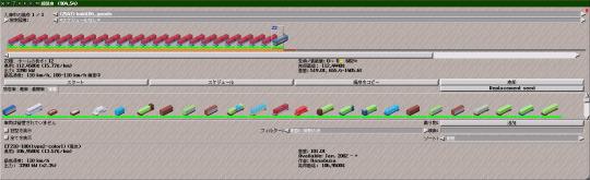
機関車のgearで基準にしたのはEF210です。1200tなら110km/h、1300tなら100km/h出る値です。あとは定格引張力*定格速度を比較すれば良いやぐらいで設定しています。当たり前ですが、大体同じようなgearになります。
さて今回の更新ではEF200を追加しています。定格出力6000kw、Power is EVERYTHING. More is better.な電気機関車として有名です。ウィキペを見てみると定格速度81.2km/h、定格引張力26,600kgfと書かれており、59.5km/h、20,300kgfのEF210とは別物です。ただ先述の計算だとgearはほぼ同じで、要するに定格出力に比例した性能です。アドオン的には過剰性能に思えますが、調整すると今度は重連の機関車が有利となります。ピサの斜塔から何か落としてそうですね。

EF200はノッチ15でEF66と同等の運用をしていたとウィキペにも書いてあるので、英語版を参考に2007年からEF66相当のアドオンを登場させています。EF200とEF66の比較[1][2]を行うと、最大性能は当然EF200が圧倒的です。まあEH800は最大引張力410kN[3]だったり、勾配抵抗の引き算ではH級が当然凌駕するのですが。
図中のEF200定格引張力は261kNからノッチ15に繋げています。これが実運用だったんでしょうか、電流と引張力の関係を見ると主電動機電流600A?(分からない)。点線の6000kWと3900kWは速度と牽引力の関係から計算していて、両形式とも定格出力がほぼ最大出力です。EF210は30分だけ頑張ってEF200のノッチ15を発揮するのかなぁ。
実際の機関車は上記の様な性能が発揮できず早々に引退してしまいましたが、シムトラでは関係ありません。130km/h対応のM250系が最高速度で勝てるくらいで、電車による機敏な旅客輸送との時刻的住み分けが難しい性質に適していると思います。
[1]大出力電気機関車出力適正化制御システムに関する研究、杉本健,保川忍、T.IEE Japan Vol.115-D No.1 (1995)
[2]大出カインバータ電気機関車、西重樹ほか、日立評論 Vol.73 No.3 (1991-3)
[3]日本貨物鉄道(株)EH800型式交流電気機関車、山田真広、東芝レビュー Vol.69 No.9 (2014)
0 notes
Text
KATO製のEF65+24系

EF65PFと24系を連結させた。ブルートレインなんて20年前は当たり前のように見られた列車だったのに、今や東京を発着する定期寝台特急はサンライズだけになってしまった。24系の金帯が出た頃には牽引機はEF66になってたような気がするのだが。

1両だけB個室車が入ってる。国鉄末期から民営化後にかけて様々な改造車が現れたのだが、その頃はまだ学生でお金が無く、乗りたくても乗れないものだった。夜行列車に乗るとしたら大垣夜行とか東北方面の座席急行くらいなもので、寝台列車など高嶺の花だった。
1 note
·
View note
Quote
EF66 後期型 貨物更新期 JR 電気機関車 1/45 トレインミュージアム OJ NO.07 アオシマ AOSHIMA 61831 【 新品 】 【【 詳細は → 】】
0 notes
Photo

吹田EF66 A4 EF66 131号機 3064レ 今回の改正で撮影チャンスが減ってしまった66。 131号機牽引 の3064レを新川崎駅ホームから撮影。 出区する姿もあわせて。 #ef66131号機 #ef66131 #3064レ #66のある風景 #66のある光景 #66がいる風景 #66がいる光景 #新鶴見機関区 #新川崎駅 (新川崎駅) https://www.instagram.com/p/CqC_iS-v9dK/?igshid=NGJjMDIxMWI=
0 notes
Photo

EF66 104[吹]+コキ100系
さいたま新都心の建設残土を輸送するために製造されたコキ104−5000番台を1両含むEF66 104[吹]牽引のコンテナ列車の長編成サイドビューです。
view more...
#trainsideview
0 notes
Photo


2022.8.22 京都鉄道博物館
EF66-27特別展示
これで本当にお別れ...なのかな。
15 notes
·
View notes
Text
パイオニアIII台車
いろいろと日本の風土には合わなかった台車だけど、個人的には結構好きな台車。何が好きかってやっぱりブレーキパッドの交換を容易にしたいという発想が形に表れている点と、「シンプルな機械は美しい」という信念にあふれたスタイリング。ただ相鉄で話を聞いたときは「ディスクブレーキって1枚60㎏くらいあるからどうだろうねえ」とは言われたけど。でもブレーキの安定性自体はいい台車なんだよね
この台車でぎょっとするところは何と言ってもボルスタアンカが異様に高いところに配置されていること。ボルスタアンカってのは引張力を伝える道具なんだから、それは軸箱にできるだけ近い高さに置くのが定石(電車の場合ね。機関車の場合はまた話が違ってきて、レール面すれすれまで下げるのが定石。EF66形式のDT134なんか面白い設計ですよ)。機器配置の都合上うまくいかない場合でも、それでも軸箱の高さにできるだけ近づけようとするのが誠意というもんです(この話ダイレクトマウント台車の場合ね。TR223Gみたいなインダイレクトマウント台車でかつ剛性の高いコイルバネを枕ばねに使ってる場合は話が変わってくる)
だから最初この台車を見たとき「なんじゃこりゃ」って思った。ていうかTS-301をはじめとして東急車輛のTS系台車って800番台になるまでボルスタアンカの位置にすごく無頓着に見えるんだよね(ただしTS-301は横剛性の強いコイルバネを枕ばねに使ってることや車体とばねが直結していないインダイレクトマウント台車だから、そこまでこだわる必要はないともいえる)。実際運用に入ってみると蛇行動が目立った。そりゃあそうだよね。左右に動くパーツを心皿と同じ高さに置くとか普通はやらんよ(つまりボルスタアンカが構造上必ず心皿の下に配置されるインダイレクトマウント台車なら無理して車軸の高さとボルスタアンカを合わせなくてもいいわけです)
ただ、PIIIのボルスタアンカの位置は明確な理由がある。ブレーキパッドがあるからボルスタアンカの受けをどこに置くかが問題になるんです。ボルスタアンカってのはある程度の長さがないとボルスタアンカにかかる負荷(応力)が大きくなってしまう。だからブレーキパッドに干渉しないよう取り付け座を下ろすとボルスタアンカが異様に短くなる。ここで、ディスクブレーキの交換がしやすいように、車軸の外側にブレーキディスクを持ってきたデザインが仇になるわけ。外側ディスクブレーキの台車が少数派な理由のひとつがこれです
東急車輛だって蛇行動を起こしやすいこのボルスタアンカの位置はなんとかしたかった。それで取り付け座を工夫してボルスタアンカを軸箱の高さまで降ろした試験をしたんだけど、全長が足りず応力が高くなりすぎて成績は芳しくなかった
結局解決したのは小田急4000形のPIII-706かな。軸距を2100mmから2350mmに伸ばしてスペースを作って、さらに台車枠を弓型に湾曲させてブレーキパッドを斜めに取り付けて、これでようやくボルスタアンカを下げることができたんだと思った。完成度自体はそれなりに高かったけど小田急では別の理由で味噌をつけてしまった(ボルスタアンカを軸箱まで降ろして荷重変動対策を取ってたのにねえ)のは残念だった
PIIIは日本では成功したとは言えなかったけど、新しいことを試みて試行錯誤して最後は問題を解決していった。そんな流れを見ると嫌いになれないんだよねこの台車。理想を求めて現実にぶつかって、それでもなお、改善を試みる。そんなドラマがPIIIを見ていると楽しめるんだ
ぶっちゃけこの台車の問題は、たかだか200mm程度のボルスタアンカの高さの差でしかないです。でもその200mmに込められた試行錯誤に思いをはせると、とてもいとおしくなれる台車なんですよね
そしてたかだかボルスタアンカの高さだけでこれだけ語れる台車という機械の面白さでもあります
7 notes
·
View notes
Last Seen Blogs

shanghai48
SNH48

xbeautyse
Xbeauty.se Tumblr.

alqaus
Fishy Kisses!

factcheckingmclennon
fact checking mclennon
isrra-el
Mujeres amputadas