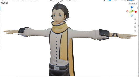
#ended up being on a completely different folder 😭😭
Text
L is real moment
#he finally got more than 5 polygons after 18 years#his textures are all messed up but i will look into that tomorrow#i spent almost 2 hours going thru every single npc & he#ended up being on a completely different folder 😭😭#talk#now i cant wait for metis#another L is real moment#i miss femc tho.... i want everone to have pretty models
32 notes
·
View notes
Text
follow up to this ask! this time im just gonna be talking about my coloring process (i also want to let you all know that im not an expert in color theory since im still learning, im quite literally just going random bullshit go on the blending modes 💀 lots of explanation under the cut)
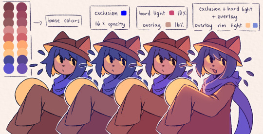
the three blending modes i mainly use are exclusion, hard light, and overlay. from the guide above you could see how the blending modes work on their own, and how they look like combined altogether. the cool thing about blending mode layers is that it really is all about experimentation and finding the best combination for a piece (also to any fellow inabakumori enjoyers GRAHH lagtrain pose jumpscare)
i went through a bunch of blending mode phases before i ended up with those main three, though it's funny how ive been using the same overlay color for about 4 years now (multiply used to be one of them, and i still use it from time to time, just not as much). im gonna be honest the whole reason why i know about blending modes being helpful was because one time i accidentally had the fill bucket on and had a certified eureka moment 😭
the best way i could explain these three modes is:
exclusion - honestly i still dont understand how it works either 💀 when i use a really saturated blue color and lower the opacity, it gives a cooler feeling to the palette. feels like a mix of multiply and overlay with how it adjusts the colors without making it darker
hard light - gives more saturation and color
overlay - gives off a glowy effect, especially if the lineart isnt completely solid (this is why it isnt clipped on the folder as shown in the example below, keeping it above the layers gets that glowy effect)
i still use the same colors for exclusion and overlay (while i do alter them with hue saturation brightness from time to time, i just use the same blue and brown for most of my works) though hard light is what i use to make drawings lean towards a temperature
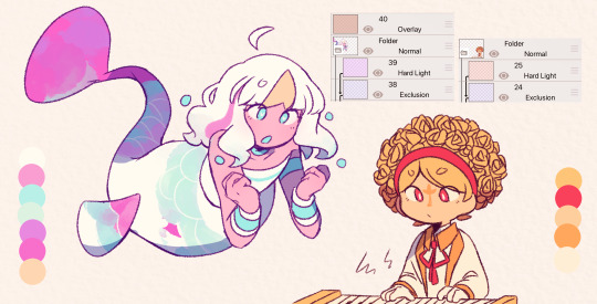
i tend to use warm colors a lot because i think theyre neat and also im biased sorry <3. as a warm palette example, i drew yinu and used this orange color on hard light and lowered the opacity
cold colors have a similar process, it's just the matter of adjusting the hard light layer. i wouldnt really say it's completely cold since i still add warm colors because im still biased </3. as a cold palette example, i drew sayu and used this purple-pink (??) color with the same settings
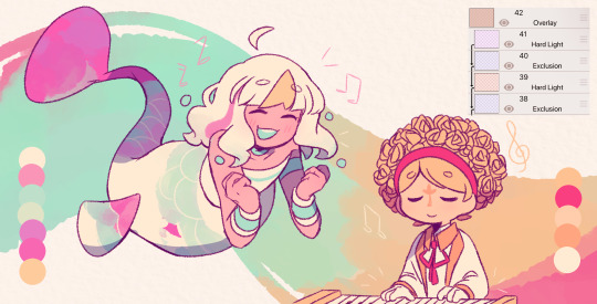
when it comes to drawings that have characters with contrasting palettes, it does take a bit of trial and error but i most of the time i mix both warm and cold methods like the example above. this also helps for art with several characters in general, since the blending modes help make the colors go well together despite the variety
theres also instances where i dont always use the warm + cold combo, since sometimes drawings lean towards a specific temperature instead (like environments with set lighting/shading, so usually i follow that even with characters with different palettes)
tldr; there are lots of palette combos you could make, not necessarily with just the three blending modes i mention. random bullshit go genuinely helps with experimenting with colors!!
#chiimo art shenanigans#uhhhh should i tag the fandoms these characters are from#fanart is fanart ig???#oneshot#oneshot niko#no straight roads#nsr#chiimo ask shenanigans
132 notes
·
View notes
Last Seen Blogs

kavyaorganicfarm19
Untitled

littlelesbiansoul
Little lesbian soul

starletteex
Starlette
powerade
poweRAD!

stompskin
Gear and masculinity - lots of Ai images.