#front-enddevelopment
Explore tagged Tumblr posts
Visit Tumblr Blog
Explore Tumblr blogs with no restrictions, modern design and the best experience.
Last Seen Tumblr Blogs


Fun Fact
Premium Tumblr themes are available from anywhere between $9 to $49.
Text
Web Developer Role Demystified | CoListy
Learn about the Web Developer role, its responsibilities, required skills, and career prospects in the ever-evolving digital landscape.
1 note
·
View note
Text
Using Background Blend Mode in CSS: Mixing Colors Effortlessly

Introduction
Welcome to the world of CSS magic where colors blend seamlessly to create captivating visuals on your web pages. In this blog post, we delve into the artistry of using Background Blend Mode in CSS. This powerful feature allows you to mix colors effortlessly, opening up a realm of creative possibilities for web designers and developers. Let's embark on a journey to understand, implement, and leverage the potential of background blend mode to enhance the visual appeal of your websites.
Understanding Background Blend Mode

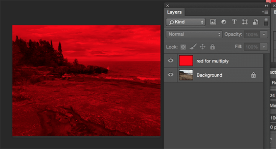
Background Blend Mode is a CSS property that enables you to blend the background layers of an element, creating visually appealing effects by combining colors and images. It's a powerful tool for adding depth and sophistication to your web design. Let's delve into the key aspects of understanding background blend mode: - Blend Modes: CSS provides various blend modes, each affecting how colors interact between the background layers. Common blend modes include multiply, screen, overlay, and more. - Applicability: Background blend mode is applicable to elements with background images or colors. It doesn't affect the actual content of the element but influences how the backgrounds blend with each other. - Color Channels: The blend mode operates on color channels, including red, green, blue, and alpha. Understanding how these channels interact is crucial for achieving the desired visual effects. - Opacity: Background blend mode works in conjunction with the opacity property. Adjusting the opacity of an element influences the blending outcome, allowing for subtle or bold effects. Let's explore a practical example to illustrate the concept. Consider a section of your webpage with a background image and a semi-transparent overlay. By applying a blend mode, you can control how these layers interact, influencing the final appearance of the section. Blend ModeDescriptionmultiplyDarkens the background layers, creating a rich, blended look.screenLightens the background layers, suitable for creating highlights.overlayCombines the best of both blend modes, enhancing contrast and vibrancy. Experimenting with different blend modes and adjusting parameters like opacity can lead to stunning visual effects that elevate the aesthetics of your website. As we move forward, we'll explore the benefits of incorporating background blend mode and provide a step-by-step guide to implementing it in your CSS code.
Benefits of Using Background Blend Mode
Unlocking the potential of Background Blend Mode in CSS brings a myriad of benefits to your web design toolkit. Let's explore how incorporating this feature can elevate the visual appeal and user experience of your websites: - Creative Visual Effects: Background blend mode allows you to create stunning visual effects by seamlessly blending colors and images. Whether you're aiming for subtle overlays or bold, eye-catching compositions, the creative possibilities are limitless. - Enhanced Depth and Dimension: By blending background layers, you can add depth and dimension to elements on your webpage. This is particularly impactful when working with background images, as blend modes influence how the image interacts with the underlying colors. - Dynamic Color Manipulation: Adjusting blend modes enables dynamic color manipulation. You can experiment with different modes to achieve the desired mood or tone for your website, from vibrant and energetic to muted and sophisticated. - Improved Readability: Background blend mode can be strategically applied to enhance text readability. By choosing the right blend mode and opacity for background layers, you can ensure that text remains clear and legible against complex backgrounds. Let's delve into a practical scenario. Imagine a hero section with a background image featuring a gradient overlay. Applying a blend mode to this overlay can create a harmonious transition between the background and foreground, making the content more visually engaging. Blend ModeEffectdarkenIntensifies darker tones, adding drama to the overall visual.lightenHighlights lighter areas, creating a soft and airy ambiance.color-dodgeEnhances bright colors, perfect for a vibrant and lively atmosphere. As you integrate background blend mode into your CSS repertoire, you'll discover its versatility in transforming mundane backgrounds into captivating design elements. In the next sections, we'll guide you through the implementation process and showcase real-world examples of websites harnessing the power of background blend mode.
Implementation Guide
Embarking on the journey of implementing Background Blend Mode in your CSS code is an exciting step towards elevating the visual aesthetics of your website. Let's break down the process into actionable steps: - Choose Your Element: Identify the HTML element to which you want to apply background blend mode. This could be a section, div, or any container element with a background image or color. - Set Background: Ensure that the chosen element has a background, either in the form of an image or a color. You can use the background-image or background-color property in your CSS to set this. - Add Blend Mode Property: Apply the background blend mode by using the background-blend-mode property. Experiment with different blend modes such as multiply, screen, overlay, etc., to achieve the desired visual effect. - Adjust Opacity: Fine-tune the opacity of the element and its background layers using the opacity property. This step allows you to control the intensity of the blend mode effect. Let's look at a simple example to illustrate the implementation process: HTML HTMLYour content goes here CSS CSS.blend-mode-example { background-image: url('your-image.jpg'); background-blend-mode: multiply; opacity: 0.8; } In this example, the blend mode is set to multiply, creating a blending effect with the background image. Adjust the opacity as needed to achieve the desired balance between the content and the background. As you experiment with different elements and blend modes, you'll discover the incredible versatility that Background Blend Mode brings to your design toolkit. In the following sections, we'll showcase real-world examples of websites effectively utilizing this feature to inspire your own creative implementations.
Common Mistakes to Avoid
While Background Blend Mode is a powerful tool for enhancing the visual appeal of your website, it's essential to be aware of common mistakes that can arise during implementation. By steering clear of these pitfalls, you can ensure a smooth and error-free experience for both developers and users: - Insufficient Browser Compatibility: Not all browsers support background blend mode, and some may interpret it differently. Always check the compatibility and provide fallbacks or alternative styling for unsupported browsers to maintain a consistent user experience. - Overlooking Color Contrast: The blend mode applied to background layers can significantly impact color contrast. Avoid situations where text becomes illegible due to insufficient contrast with the background. Test different blend modes and opacity levels to achieve a harmonious balance. - Complex Layering: Excessive layering of background elements with different blend modes can lead to unintended visual chaos. Keep the design clean and purposeful, ensuring that each layer contributes meaningfully to the overall aesthetic. - Forgetting Accessibility: Consider the accessibility implications of background blend mode, especially for users with visual impairments. Test your website using accessibility tools and ensure that the blend modes do not hinder the understanding of content. Let's highlight the importance of browser compatibility with a quick reference: BrowserSupportChromeYesFirefoxYesSafariYesInternet ExplorerNo By addressing these common pitfalls, you can maximize the benefits of Background Blend Mode while ensuring a seamless and inclusive web experience. In the final section, we'll wrap up our exploration by answering frequently asked questions and providing a comprehensive conclusion to guide you in your journey of mastering this CSS feature.
FAQ
Addressing common questions about Background Blend Mode in CSS to provide clarity and guidance for developers and designers: Q: Can Background Blend Mode be applied to any HTML element? A: Background Blend Mode can be applied to elements with background images or colors, such as divs, sections, or other containers. However, not all elements may be suitable, and the visual impact depends on the content and design. Q: How does blend mode affect text readability? A: The choice of blend mode and opacity can influence text readability. It's crucial to test and ensure that text remains legible against the background. Adjustments may be necessary to achieve the right balance. Q: Are there performance considerations when using Background Blend Mode? A: While Background Blend Mode itself is not inherently performance-intensive, applying complex blend modes to numerous elements may impact performance. Always consider the overall complexity of your design and its potential effects on page rendering. Q: How can I handle browser compatibility issues? A: Not all browsers support Background Blend Mode in the same way. It's essential to check compatibility and provide fallbacks or alternative styles for unsupported browsers. Progressive enhancement techniques can help maintain a consistent user experience. These frequently asked questions aim to address common concerns and provide practical insights into working with Background Blend Mode. If you have specific inquiries or encounter challenges not covered here, feel free to explore the documentation of your chosen web development platform or seek advice from the developer community.
Conclusion
Congratulations on completing this journey into the realm of Background Blend Mode in CSS! We've explored the intricacies of this powerful feature, from understanding its fundamentals to implementing it in real-world scenarios. Let's recap the key takeaways: - Creative Expression: Background Blend Mode opens the door to limitless creative expression by seamlessly blending colors and images, enhancing the visual appeal of your websites. - Implementation Guide: Armed with the knowledge of how to implement Background Blend Mode, you can transform ordinary backgrounds into captivating design elements. Remember to choose the right blend mode, adjust opacity, and consider browser compatibility. - Real-world Examples: We've explored how popular websites use Background Blend Mode to create stunning hero sections, image overlays, and dynamic color schemes. These examples serve as inspiration for your own projects. - Avoiding Common Mistakes: By steering clear of common mistakes such as insufficient browser compatibility and overlooking color contrast, you can ensure a smooth and error-free experience for users. - FAQ and Beyond: The frequently asked questions provide insights into common concerns, but don't hesitate to explore further and seek advice from the developer community for specific inquiries. As you incorporate Background Blend Mode into your web design toolkit, remember that experimentation is key. Test different blend modes, opacity levels, and layering techniques to discover the perfect recipe for your unique projects. Whether you're creating vibrant landing pages, elegant product showcases, or immersive storytelling experiences, Background Blend Mode empowers you to paint with the colors of creativity. Thank you for joining us on this exploration. May your websites be filled with visually stunning designs that leave a lasting impression on your audience. Happy coding! Read the full article
0 notes
Text
123Line Master Web Development: Propel Your Business Forward
In today's digital age, a strong online presence is essential for businesses to thrive. This is where web development comes in. From website building and web design to front-end development and back-end development, mastering web development can be a game-changer for your business growth. Responsive design, user experience, search engine optimization, mobile-friendly design, and content management systems all play a key role in creating a successful online platform. By prioritizing these elements and understanding the basics of web development, you can transform your online presence and engage with your audience in a meaningful way. Key Takeaways: - Web development is crucial for driving business growth in the digital age. - Responsive design, user experience, and search engine optimization are essential elements of a successful online platform. - Understanding the basics of web development is crucial for creating an effective online platform. - Front-end development involves creating the visual and interactive components of a website, while back-end development powers a website's functionality. - A mobile-friendly design and content management system can streamline your workflow and improve your website's usability.
Understanding the Basics of Web Development
If you're new to web development, it can be overwhelming to navigate the world of website building and web design. However, understanding the basics is crucial for creating an effective online platform. Website building involves creating a website from scratch using programming languages such as HTML, CSS, and JavaScript. While this may sound daunting, there are many user-friendly website builders available that don't require coding knowledge. These platforms provide templates and drag-and-drop features that allow you to create a website quickly and easily. Web design is the process of creating the visual aspect of a website. It involves choosing color schemes, typography, and layout to create an aesthetically pleasing website that is also easy to navigate. Good web design is essential for engaging visitors and encouraging them to stay on your site. Whether you are building a website from scratch or using a website builder, having a strong understanding of web design principles will help you create a successful online presence.
Front-End Development: Enhancing User Experience
Front-end development is all about creating a website's visual and interactive components, and it's crucial for enhancing the user experience. One of the key elements of effective front-end development is responsive design, which ensures that your website looks great and functions well across different devices and screen sizes. By prioritizing user experience, you can keep visitors engaged and encourage them to stay on your website for longer periods of time. This can be achieved through several techniques, such as optimizing page load times and ensuring easy navigation. In addition, a visually appealing website design can make a powerful impact on your audience, creating a positive impression and helping to establish your brand identity. When it comes to front-end development, it's important to stay up to date with the latest trends and best practices. This includes using modern frameworks and tools, such as Bootstrap and React, that can help simplify the development process and streamline your workflow. By mastering front-end development and responsive design, you can create an outstanding user experience that sets your website apart from the competition.
Back-End Development: Powering Your Website's Functionality
While front-end development is the visible face of a website, back-end development is responsible for powering its functionality. Back-end developers work behind the scenes to create the non-visual aspects of a website, such as database management, server communication, and user authentication. Back-end development languages and frameworks include PHP, Ruby on Rails, and Python. These tools enable developers to create robust and efficient back-end systems that drive website functionality. One critical aspect of back-end development is security. Back-end developers must ensure that a website is safe from threats such as hacking and data breaches. They must also prioritize data privacy and take appropriate measures to protect user information. Effective collaboration between front-end and back-end developers is crucial for creating a seamless website experience. By working together, developers can ensure that a website functions smoothly and creates a positive user experience. Whether you're building an e-commerce site or a social media platform, strong back-end development is vital for creating a successful website. By focusing on back-end development, you can power your website's functionality and drive business growth.
Search Engine Optimization: Boosting Your Online Visibility
Search engine optimization (SEO) involves optimizing your website's content and structure to improve its ranking on search engine results pages. By implementing SEO techniques, you can increase your website's visibility and attract more organic traffic. Keywords: Search engine optimization On-page optimization involves optimizing individual pages of your website to make them more search engine friendly. This includes optimizing titles, meta descriptions, headings, and content. Off-page optimization involves building backlinks to your website from reputable sources, which signals to search engines that your website is a valuable resource. Keywords: On-page optimization, off-page optimization Effective keyword research is an essential aspect of SEO. By conducting keyword research, you can identify the words and phrases your target audience is searching for and optimize your website's content accordingly. It is also important to regularly update your website's content with fresh, relevant information to keep it optimized for search engines. Keywords: Keyword research Search engines favor websites that are mobile-friendly, so optimizing your website for mobile devices is crucial. This includes using responsive design, which ensures your website is optimized for different screen sizes and devices. Additionally, optimizing your website's loading speed can improve its ranking on search engine results pages. Keywords: Mobile-friendly design, responsive design Overall, implementing SEO techniques can significantly improve your website's visibility and attract more organic traffic. By staying up to date with the latest SEO trends and continuously optimizing your website's content and structure, you can ensure your website remains competitive in the ever-changing digital landscape.
Creating a Mobile-Friendly Design for Today's Users
Your website's design must be optimized for mobile devices to cater to the growing number of mobile users. According to recent studies, mobile devices now account for over 50% of web traffic worldwide. A seamless mobile experience can enhance your user experience and encourage visitors to stay on your site longer, leading to increased engagement and conversions. Here are some strategies you can implement to create a mobile-friendly design: - Responsive Design: Use responsive design techniques to ensure your website adapts to different screen sizes and devices. This design approach ensures that your website looks great on all devices, from smartphones to tablets. - Optimize Images: Optimize images for mobile devices by using smaller file sizes and compressing images. This strategy can help reduce page load times, leading to faster load times and a better user experience. - Easy Navigation: Simplify website navigation for mobile devices. Optimize your menu for smaller screens, use buttons instead of text links, and ensure all links are easily clickable. - Clean Layouts: Use clean and clutter-free layouts to reduce the noise and keep your site looking neat and organized. This strategy can help improve readability and make your call to actions (CTAs) stand out more effectively. By implementing these strategies, you can create a mobile-friendly design that provides your users with a great experience and drives business growth. Your website should be accessible to all users, regardless of the device they are using, to ensure you reach the widest possible audience.
Streamlining Your Workflow with a Content Management System
A content management system (CMS) is a software application that enables you to create, manage, and publish digital content, including text, multimedia, and images. With a CMS, website owners can efficiently manage and update their website's content without needing any technical knowledge of programming or web design. CMS systems are designed to be user-friendly, allowing website owners to create pages, upload content, and make changes with ease. A CMS typically consists of two main components: a content management application (CMA) and a content delivery application (CDA). The CMA allows website owners to create and manage content, while the CDA delivers the content to website visitors. There are several CMS options available, and each has its unique set of features and benefits. WordPress is one of the most popular CMS platforms, offering a user-friendly interface, a wide range of templates and plugins, and excellent support. Drupal is another robust CMS with advanced features and customization options, making it ideal for larger websites or enterprise-level businesses. Joomla is a flexible CMS, suitable for all types of websites, including e-commerce sites, social networks, and blogs. Using a CMS can streamline your workflow, allowing you to focus on creating quality content rather than spending time on technical tasks. A CMS can also ensure consistent branding and messaging across your website, provide secure user permissions, and offer analytics and reporting features to help you understand how your content is performing. By utilizing a CMS, you can manage and update your website's content efficiently, ensuring a dynamic and engaging online presence.
Keeping Up with the Latest Trends in Web Development
Web development is a dynamic field with ever-evolving trends and technologies. To stay ahead of the curve, it's essential to keep up with new developments. Attend Conferences and Workshops Attending web development conferences and workshops is an excellent way to stay current on industry trends. These events offer an opportunity to network and learn from experts in the field. Check out events such as the Future of Web Design Conference and An Event Apart, which attract prominent speakers and offer valuable insights into the latest approaches to web development. Read Industry Blogs and Publications Reading industry blogs and publications is another effective way to stay up-to-date with the latest web development trends. Some popular blogs include Smashing Magazine, A List Apart, and CSS-Tricks. These publications provide in-depth analysis of current trends and are great resources for all industry news. Participate in Web Development Communities Joining web development communities such as Webdesigner Depot and Stack Overflow is an excellent way to stay informed of new trends and technologies. These communities offer opportunities to connect with fellow web developers, ask questions, and share insights. Explore New Technologies and Frameworks Exploring new technologies and frameworks is crucial in staying on top of the latest trends. Some popular web development frameworks include React, Angular, and Vue. Experimenting with new technologies and frameworks will help you stay current and hone your skills. Conclusion Keeping up with the latest trends in web development is critical to ensuring your skills are relevant and in-demand. By attending conferences and workshops, reading industry blogs and publications, participating in web development communities, and exploring new technologies and frameworks, you can stay at the forefront of the ever-changing world of web development.
Conclusion
Congratulations on taking the first steps towards mastering web development! By understanding the basics of website building and web design, as well as the importance of front-end and back-end development, responsive design, user experience, search engine optimization, mobile-friendly design, and content management systems, you are now equipped with the knowledge to propel your business forward in the digital age. Remember to keep up with the latest trends and technologies in web development by continuously learning and seeking out new resources. By doing so, you can stay ahead of the curve and ensure your skills remain relevant in a constantly evolving digital landscape. Now it's time to put your newfound knowledge into action and transform your online presence. Best of luck on your web development journey!
FAQ
What is web development? Web development refers to the process of creating and maintaining websites. It involves various aspects, such as website building, web design, and front-end and back-end development. What is website building? Website building involves creating the structure and layout of a website. It includes tasks like designing web pages, adding content, and organizing navigation menus. What is web design? Web design is the aesthetic and visual aspect of a website. It includes choosing color schemes, fonts, images, and other design elements to create an appealing and user-friendly website. What is front-end development? Front-end development focuses on creating the visual and interactive components of a website. It involves using HTML, CSS, and JavaScript to design and implement the user interface. What is back-end development? Back-end development involves the server-side programming and functionality of a website. It includes tasks like database management, server communication, and implementing business logic. Why is responsive design important? Responsive design ensures that a website adapts and looks good on different devices and screen sizes. It provides a consistent user experience across desktops, tablets, and smartphones. What is user experience (UX)? User experience refers to how users interact with a website and their overall satisfaction. It involves designing intuitive navigation, fast-loading pages, and engaging content to enhance user satisfaction. What is search engine optimization (SEO)? Search engine optimization is the process of improving a website's visibility in search engine results. It involves optimizing web pages for keywords, creating quality content, and obtaining relevant backlinks. Why is mobile-friendly design important? With the increasing number of mobile users, having a mobile-friendly design is crucial. It ensures that your website looks and functions well on mobile devices, enhancing user experience and improving search engine rankings. What is a content management system (CMS)? A content management system is a software that allows you to easily create, edit, and manage your website's content. It provides a user-friendly interface and eliminates the need for extensive technical knowledge. How can I stay up to date with web development trends? Staying up to date with web development trends is important to remain competitive. You can follow industry blogs, join online communities, attend conferences, and actively engage in continuous learning to stay informed about the latest trends and technologies. Read the full article
#123LIne#123linewebdevelopment#back-enddevelopment#contentmanagementsystem#front-enddevelopment#mobile-friendlydesign#responsivedesign#Searchengineoptimization#userexperience#webdesign#webdevelopment#websitebuilding
0 notes
Text
Hire the Best Front-End Developers in 2025

In this digital world, having a responsive and user-friendly front end is very important for those who are looking to scale their application.Hiring a front-end developer ensures that your website or application is built with modern coding standards, optimized for performance, and tailored to your business needs.
0 notes
Text
#AIinFront-EndDevelopment#Front-EndWebDevelopment#WebAppDevelopment#ArtificialIntelligenceDevelopment#HireWebDeveloper
0 notes
Text
Specialist vs. Full-Stack Developers: Which is Right for Your Project?
Confused between choosing specialist developers or full-stack developers? Learn which option aligns better with your development needs in our detailed comparison.
#hirefront-enddevelopers#front-enddevelopmentservices#Front-enddevelopers#back-enddevelopmentservices#Back-enddevelopers#hirefull-stackdevelopers#Full-stackdevelopment#hireadedicateddeveloper
1 note
·
View note
Link
0 notes
Text
FLUTTER- Google’s Latest App Development Framework

The latest Google App Development Framework is FLUTTER. This is basically an open-source that gives a total Software Development Kit (SDK) including devices needed for cross-platform mobile app development. Read the blog to get more insights- https://www.shipgigventures.com/blog/flutter-app-development-framework/
0 notes
Text
Glamera is hiring #Sr.Angular Front EndDeveloper No of vacancies: 3 Location: Nasr city Shift: Hybrid Description: Understanding of online usability, accessibility, and web analytics Working in an agile environment Collaborate effectively with internal and external creative, technical and IS Teams, contributing ideas to support the overall strategic objectives and offering alternative solutions to UI challenges requirement BSc. Of computer Science, Computer Engineering. Strong experience with web technologies including HTML5, CSS3, , SASS, JavaScript and JavaScript frameworks such as JQuery and Angular Advanced OOP, DOM manipulation, and AJAX experience Experience working with using JSON, XML, etc. Experience with responsive design using frameworks such us Bootstrap & Material Design. Strong competencies with front-end design patterns such as MVC, etc. Knowledgeable on web page performance practices Strong attention to details, problem-solving skills and extremely hands on experience If you are interested kindly apply with your updated CV.
0 notes
Text
CDO Job Hiring - Senior Front-endDeveloper (WFH) - Night shift
CDO Job Hiring – Senior Front-endDeveloper (WFH) – Night shift
Axadra Job Description We are looking for Sr WordPress Developer to assist with website builds and content migration. You will be assisting with a variety of tasks using the WordPress CMS, including the maintenance and updating of WordPress themes and plugins. You will also be logging into our Hosting C-panel and setting up staging sites. Additionally, this role requires you to utilize and…
View On WordPress
0 notes
Text
Sr. Front-end Developer 2+ Yrs. Exp. - 3 Openings
Dear Candidates, Greetings!!! Join us now!!! We are seeking a bright, creative Sr. PSD to HTML Developer / Web Designer / HTML Developer / Front-End Developer with 2+ years of experience and having good HTML CSS coding skills. Experience Required: 2- 6 Yrs. Salary: 25k - 55k (Monthly) ***For your hard work, we are offering a guaranteed hike on your current salary based on your skill set.*** Apply Now# mail your resume along with below details. Current CTC: Expected CTC: Notice Period: Interested candidates can call us for more detail. Please pass this through to your network. Also If you have any friends or colleagues suitable to this job, kindly refer them. Regards, HR Sr.Front-endDeveloper(2+Yrs.Exp.)-3Openings from Job Portal https://www.jobisite.com/extrJobView.htm?id=591317
0 notes
Text
Getting CSS from Figma: Designer's Guide
Introduction
Welcome to the intersection of design and development! In this blog post, we'll dive into the exciting realm of CSS, exploring its pivotal role in the world of web design. Specifically, we'll focus on how designers can harness the power of Figma to seamlessly integrate their creative visions into the web development process.
Why CSS Matters for Designers
Cascading Style Sheets (CSS) play a paramount role in shaping the visual aesthetics and layout of websites. Designers, in particular, find themselves at the forefront of leveraging CSS to transform artistic concepts into engaging online experiences. The Power of Presentation: CSS is the language responsible for the presentation layer of a website. It allows designers to control the appearance of every element on a webpage, from fonts and colors to spacing and layout. This level of control is essential for translating a static design into a dynamic and responsive online interface. Consistency Across Platforms: For designers aiming for a consistent user experience, CSS proves invaluable. It enables the creation of responsive designs that adapt seamlessly to various devices and screen sizes. This ensures that the visual appeal of a website remains intact, whether viewed on a desktop, tablet, or smartphone. Efficiency in Design Updates: Imagine the scenario of tweaking the color scheme or adjusting the spacing in a design. Without CSS, designers would need to modify each individual element across numerous pages. With CSS, a simple adjustment in the style sheet can efficiently propagate changes throughout the entire website, saving time and effort. Enhanced User Experience: By mastering CSS, designers can enhance the overall user experience. CSS allows for the creation of visually appealing and intuitive interfaces, contributing to user engagement and satisfaction. Effective use of CSS can guide the user's attention, highlight important information, and create a seamless navigation flow. Flexibility and Innovation: With the continuous evolution of web design trends, CSS empowers designers to stay innovative. From creating intricate layouts to implementing animations and transitions, CSS provides the tools to bring creative visions to life on the web. It fosters a dynamic environment where designers can push the boundaries of visual expression. Summary: In summary, CSS is the designer's toolkit for crafting visually stunning and functionally robust websites. Its impact extends beyond aesthetics, influencing the overall user experience and allowing designers to adapt to the ever-changing landscape of web design trends.
Getting Started with Figma
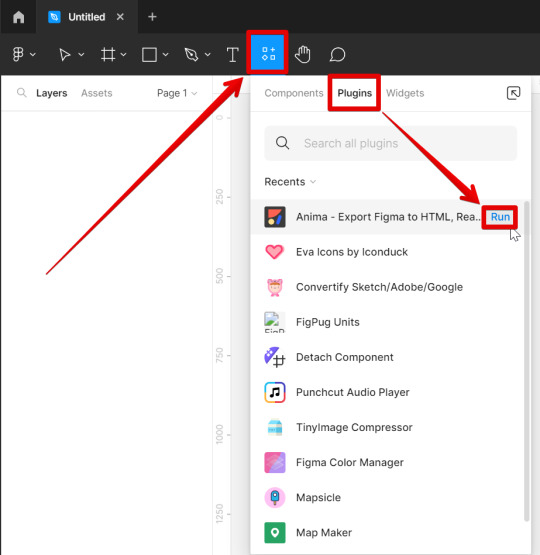
Embarking on the journey of web design often involves the use of powerful tools that streamline the creative process. Figma stands out as a collaborative design platform that not only simplifies the design workflow but also facilitates the seamless integration of design elements into the web development process. Understanding Figma: Figma is a cloud-based design tool that allows designers to create, share, and collaborate on designs in real-time. Its versatility makes it a favorite among designers for creating anything from wireframes to high-fidelity prototypes. Key Features of Figma: - Real-time Collaboration: Multiple designers can work simultaneously on a Figma project, fostering seamless collaboration. - Cloud Storage: Designs are stored in the cloud, ensuring accessibility from anywhere and facilitating easy sharing with team members and stakeholders. - Prototyping: Figma enables the creation of interactive prototypes, allowing designers to visualize user interactions and flow. - Design Components: The platform supports the creation of reusable design components, ensuring consistency across the entire project. Integrating Figma into the Workflow: Getting started with Figma involves creating an account, exploring the interface, and understanding the various tools and features. Designers can then begin by either importing existing designs or starting from scratch, utilizing Figma's robust set of design tools. Exporting CSS Styles from Figma: Figma further enhances the workflow by allowing designers to extract CSS styles directly from their designs. This feature expedites the handoff process between designers and developers, ensuring that the design vision is accurately translated into code. Figma Benefits Cloud-Based Enables collaboration and accessibility. Prototyping Facilitates the visualization of user interactions. CSS Extraction Streamlines the handoff process to developers. Summary: Getting started with Figma is a gateway to efficient and collaborative design. By familiarizing oneself with its features and integrating it into the workflow, designers can harness the full potential of this versatile tool, creating designs that seamlessly transition from the digital canvas to the web.
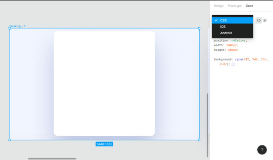
Exporting CSS Styles from Figma
One of the standout features of Figma is its ability to bridge the gap between design and development by allowing designers to export CSS styles directly from their designs. This streamlined process enhances collaboration, ensuring that the design vision is faithfully translated into code. Step-by-Step Guide: Exporting CSS styles from Figma is a straightforward process. Designers can follow these steps to seamlessly integrate their designs into the web development workflow: - Select Elements: Identify the design elements for which you want to export CSS styles. - Inspect Panel: Open the Inspect panel in Figma to view the CSS properties of the selected elements. - CSS Export Options: Figma provides various export options, allowing designers to choose the format that best suits their development environment, such as SCSS or plain CSS. - Copy to Clipboard: Once the desired styles are configured, designers can copy the generated CSS to the clipboard. Benefits of CSS Export in Figma: - Accuracy: The CSS export feature ensures precision by capturing the exact styles applied to each element in the design. - Time Efficiency: Designers save valuable time by avoiding manual translation of design styles into code. - Consistency: The exported CSS promotes consistency between the design and development phases, minimizing the risk of discrepancies. Export Option Use Case SCSS Suitable for projects utilizing the Sass preprocessor. Plain CSS Straightforward CSS format for standard web development projects. Integration with Development Tools: Designers can easily integrate the exported CSS into their preferred development tools, ensuring a smooth handoff to developers. This integration fosters a collaborative environment where design and development seamlessly converge. Summary: Exporting CSS styles from Figma empowers designers to play an active role in the development process. By providing an accurate representation of design styles in a developer-friendly format, Figma facilitates a more efficient and collaborative workflow, ultimately leading to the successful realization of the design vision on the web.
Best Practices for CSS Integration
Efficiently integrating CSS into your web development workflow is crucial for maintaining a well-organized and scalable codebase. Adopting best practices ensures consistency, readability, and ease of maintenance throughout the development process. 1. Modularization: Organize your CSS styles into modular components. This not only improves maintainability but also allows for easy reuse of styles across different sections of your website. Utilize methodologies like BEM (Block Element Modifier) or SMACSS (Scalable and Modular Architecture for CSS) to structure your styles in a systematic manner. 2. Responsive Design: Prioritize responsive design by using media queries to adapt your styles to different screen sizes. This ensures a seamless user experience across devices, from desktops to smartphones. Test and refine your designs on various devices to guarantee optimal responsiveness. 3. Consistent Naming Conventions: Adopt a consistent and meaningful naming convention for your CSS classes. This makes it easier for both designers and developers to understand the purpose of each style. Avoid overly generic or ambiguous class names to prevent confusion and maintain clarity in your code. 4. CSS Preprocessing: Consider using a CSS preprocessor like Sass or Less to enhance your workflow. Preprocessors enable the use of variables, mixins, and functions, promoting code reusability and maintainability. They also provide a more structured approach to writing CSS, reducing redundancy and improving organization. 5. Version Control: Implement version control, such as Git, to track changes in your CSS codebase. This not only facilitates collaboration among team members but also allows you to roll back to previous versions in case of errors or unexpected issues. Regularly commit your changes with meaningful messages for better traceability. Best Practice Benefits Modularization Enhanced maintainability and code reuse. Responsive Design Optimal user experience across devices. Consistent Naming Conventions Improved code clarity and understanding. CSS Preprocessing Code reusability and enhanced organization. Version Control Facilitates collaboration and provides version history. 6. Cross-Browser Compatibility: Test your styles on multiple browsers to ensure cross-browser compatibility. Address any inconsistencies or issues that may arise, guaranteeing a consistent visual experience for users regardless of their chosen browser. 7. Performance Optimization: Optimize your CSS for performance by minimizing the use of unnecessary styles and leveraging techniques like code splitting. Reduce the file size of your stylesheets to enhance page loading speed, contributing to a smoother user experience. Conclusion: By adhering to these best practices, designers and developers can collaborate more effectively, resulting in a well-structured and maintainable CSS codebase. Consistency, responsiveness, and optimization are key pillars in achieving a successful integration of CSS into the web development process.
Addressing Common Challenges
While working with CSS and Figma integration, designers may encounter various challenges that can impact the seamless transition from design to development. Understanding and effectively addressing these challenges is essential for maintaining the integrity of the design vision throughout the web development process. 1. Design-to-Code Consistency: Ensuring that the CSS generated from Figma accurately reflects the designer's intent is crucial. Designers and developers should collaborate closely to address any inconsistencies and discrepancies that may arise during the handoff. Regular communication and feedback loops help bridge the gap between design and code. 2. Responsive Design Complexity: Handling responsive design, especially with intricate layouts, can be challenging. Designers should utilize Figma's responsive design features effectively and work closely with developers to implement media queries that adapt the design to various screen sizes. Thorough testing on different devices is essential to identify and resolve any responsiveness issues. 3. Browser Compatibility: Browser variations can lead to unexpected rendering differences. Designers and developers should conduct thorough cross-browser testing to identify and address compatibility issues. Utilizing CSS prefixes and staying informed about browser updates can help mitigate these challenges. 4. Collaboration and Communication: Effective collaboration between designers and developers is paramount. Establishing clear communication channels and using collaborative tools, such as project management platforms or design handoff tools, can streamline the workflow and minimize misunderstandings. 5. Version Control for Designs: Managing design versions is crucial, especially in a collaborative environment. Designers should utilize version control features in Figma to track changes, revert to previous versions if needed, and maintain a clear version history. This ensures that everyone involved is working with the latest and approved design iteration. Challenge Addressing Strategy Design-to-Code Consistency Close collaboration, feedback loops, and regular communication between designers and developers. Responsive Design Complexity Effective use of Figma's responsive design features, collaboration with developers, and thorough testing on various devices. Browser Compatibility Cross-browser testing, use of CSS prefixes, and staying informed about browser updates. Collaboration and Communication Establishing clear communication channels and using collaborative tools for efficient workflow. Version Control for Designs Utilizing Figma's version control features to track changes and maintain a clear version history. Conclusion: Addressing these common challenges requires a combination of technical expertise, effective communication, and collaboration. By implementing strategies to overcome these hurdles, designers and developers can ensure a smooth and successful integration of CSS styles generated from Figma into the web development process. Responsive login form with fun animation ✨ Using HTML, CSS and JS. CodePen link below 👇 pic.twitter.com/PweePGE6yH — Viki ✨ (@viki_code) November 7, 2023
FAQ
Explore answers to commonly asked questions about CSS integration with Figma to enhance your understanding and address potential queries. Q: Can I directly export CSS from Figma for all design elements? A: Figma allows designers to export CSS styles for most design elements, including text, shapes, and images. However, certain complex elements or effects may require manual adjustment during the development phase. Q: How does Figma handle responsive design, and can I export responsive CSS? A: Figma provides robust support for responsive design. Designers can create responsive layouts within Figma, and when exporting CSS, media queries are generated to adapt styles based on different screen sizes, ensuring a responsive end result. Q: What should I do if there are discrepancies between the Figma design and the implemented CSS? A: Communication is key. Collaborate closely with developers to identify and address any discrepancies. Providing clear design specifications, using Figma's Inspect panel, and maintaining an open line of communication can help bridge the gap and achieve design-to-code consistency. Q: Are there limitations to exporting CSS from Figma? A: While Figma's CSS export feature is powerful, there may be limitations for highly intricate designs or specific CSS effects. It's essential to conduct thorough testing and, if needed, make manual adjustments during the development phase to ensure accurate implementation. Q: Can Figma-generated CSS be easily integrated into different web development frameworks? A: Yes, Figma-generated CSS is typically compatible with various web development frameworks. However, it's important to follow best practices for CSS integration and adapt styles as needed based on the specific requirements of the chosen framework. Q: How can I maintain version control for designs in Figma? A: Figma offers version control features that allow you to track changes, revert to previous versions, and maintain a clear version history. Regularly save and document design iterations to ensure everyone is working with the latest and approved version of the design. Q: What steps can I take to optimize Figma-generated CSS for performance? A: To optimize Figma-generated CSS for performance, focus on minimizing unnecessary styles, leveraging CSS preprocessing for code efficiency, and considering techniques like code splitting. Prioritize a lightweight stylesheet to enhance page loading speed and overall user experience.
Conclusion
Embarking on the journey of integrating CSS from Figma into your web development workflow opens the door to a seamless collaboration between design and code. This process, while powerful, comes with its set of challenges and nuances. By following best practices, addressing common challenges, and leveraging the capabilities of both Figma and CSS, designers and developers can create a harmonious workflow that brings creative visions to life on the web. Key Takeaways: - Collaborative Workflow: Effective communication and collaboration between designers and developers are crucial for achieving design-to-code consistency. - Responsive Design: Utilize Figma's responsive design features and conduct thorough testing to ensure a consistent user experience across various devices. - Best Practices: Modularize your CSS, adopt consistent naming conventions, and embrace CSS preprocessing for efficient and maintainable code. - Common Challenges: Address challenges such as design-to-code consistency, responsive design complexity, browser compatibility, and version control for designs through strategic solutions. Read the full article
0 notes
Link
Location : London, UK, London Company: Client Server Description: Global games software house is seeking a technologist Front EndDeveloper. Joining an Agile development team, as a Front End Developeryou will design and develop engaging Front Ends following Apply Now ➣ Search for free, we have thousands of recent jobs in your area. Search Now #jobseekers […]

Our Free job search portal has complete details to apply online for the Front End Developer JavaScript – Responsive Design position.
0 notes
Text
What Skills Are Required for Front-End Developers
With the Internet being a indispensable part of our daily work and life, it’s been much easier to know about the IT related positions,such as design, front-end development and back-end development, etc. Most people would naturally think that the page development is pretty easy and requires no techie at all.
Not only do most people have such universal ways of cognition, but also many professionals may have a lot of doubts: Does front-end implementation, no problem; compatibility issue, small case; picture integration, has been in use always… Then what can be the real problems?Here, let’s go and see what skills that frond-end developers need to master on earth. Please comment below if you have any thoughts to share with me.
#Skill 1 — Build A UI Prototype & Make Designs Functional
It’s a must for excellent frond-end developers to master one prototype design tool, turning their ideas into functional prototypes, along with the ability to make the design go live by the page coding. A good example to make rapid prototyping could be the industry-leading Axure or the rising star Mockplus. That’s the basic requirement to step into the front-end development world, and there are more to learn involved in page development work.
#Skill 2 — Communicate with Designers & Get Involved in the Project
Communication is of great importance to all walks of life,and for frond-end developers, their prime “customer” should be theproject designer with no doubt. Throughout the entire process, the developerand designer need to explore UI components and visual styles of websites. Forinstance, whether the structure can be much clearer through CSS3? Whether therewill be an balance achieving between the visual effects and coding? How aboutthe low-end browser rendering efficiency? It’s the responsibility of developersto ensure the page stability and rendering efficiency.
In most cases, the project schedule requires the design tobe synchronized with the front-end development, and it requires the projectcommunication as much as possible during this period.
#Skill 3 — Build A Good Page Structure
In the area of front-end development, the preparation ofpage structure is like laying the building foundation and will affect manyareas regarding coding quality, JS development, the back-end development aswell as the page expansion, adjustment and iteration. When getting the designdraft, you’d better give more observation instead of rushing to start.
#Skill 4 — Write Beautiful Codes
As the functions of web project become far more complex thanever, the direct consquence is that the amount of code turns very large. In thefurther, how to carry out the collaborative development and code maintenanceshould be the first thing to be considered at the very beginning of front-enddevelopment. In this case, it’s better to make prior preparations and developgood coding development habits. Such as, the rational use of labels, reasonablecomments, clear code structure and the accurate use of CSS and so on.Undoubtedly, beautiful code and clear structure will save a lot of time andefforts in the future collaborative development.
#Skill 5 — Guarantee Efficiency
As a part of the project development, front-end developers must have a chance to: as soon as possible for the project to follow up progress for more time. In addition to the actual combat experience and the formation of code habits can help us improve efficiency, you want to improve the progress of their own development control, but also need to learn to use auxiliary tools to help improve the page development Efficiency, such as the use of Less or Sass can help us to expand and organize CSS, greatly improve the efficiency of the preparation of CSS increased maintainability. A lot of excavation will find the most appropriate tool for their own use.
#Skill 6 — Optimize the Web Server
Page development also need to understand the server optimization, to minimize the burden on the server. Such as css sprite is a typical example of reducing the number of server requests, as well as the confusion of class names to avoid naming too long redundancy; application base64 to reduce the number of requests and so on. These are the result of a comprehensive trade-off and need to be considered in all aspects of overall optimization. Because when the page access to a certain order of magnitude, and then a little bit of optimization will achieve considerable results, or small problems will bring disaster.
#Skills 7 — Never Stop Learning
This is a period of rapid development, but also full of opportunities of the times, the advent of the HTML5 era with the rise of the mobile Internet to create a greater opportunity, there are too many things worth learning to find. As a developer, walking at the forefront of technology is always the best way to stay competitive. Is the so-called “only high house can be a matter of course”. Take the CEO of the Apple CEO Stanford speech “Stay Hungry, Stay Foolish” and we encourage each other.
0 notes
Text
Glamera is hiring #Sr.Angular Front EndDeveloper No of vacancies: 3 Location: Nasr city Shift: Hybrid Description: Understanding of online usability, accessibility, and web analytics Working in an agile environment Collaborate effectively with internal and external creative, technical and IS Teams, contributing ideas to support the overall strategic objectives and offering alternative solutions to UI challenges requirement BSc. Of computer Science, Computer Engineering. Strong experience with web technologies including HTML5, CSS3, , SASS, JavaScript and JavaScript frameworks such as JQuery and Angular Advanced OOP, DOM manipulation, and AJAX experience Experience working with using JSON, XML, etc. Experience with responsive design using frameworks such us Bootstrap & Material Design. Strong competencies with front-end design patterns such as MVC, etc. Knowledgeable on web page performance practices Strong attention to details, problem-solving skills and extremely hands on experience If you are interested kindly apply with your updated CV.
0 notes
Text
Shifting Text Up with CSS: Pixel-Perfect Layouts

Introduction
Welcome to the world of precision in web design! In this blog post, we'll dive into the art of shifting text up with CSS, aiming for nothing less than pixel-perfect layouts. Text positioning is a crucial aspect of web development, and with the right CSS techniques, you can achieve the level of control needed for a visually stunning website. Whether you're a seasoned developer looking to refine your skills or a beginner eager to grasp the fundamentals, join us on this journey as we explore the intricacies of CSS and its role in crafting seamless and aesthetically pleasing text layouts. Get ready to unravel the mysteries of text alignment, understand the nuances of the box model, and master the use of Flexbox and Grid for achieving the perfect look. Let's embark on this adventure together and elevate your web design game!
The Basics of CSS

Before we delve into the specifics of shifting text with precision, let's brush up on the fundamental concepts of Cascading Style Sheets (CSS). CSS is a stylesheet language used to describe the presentation of a document written in HTML or XML, including elements like fonts, colors, and spacing. Selectors: CSS operates on the principle of selectors, which are patterns that match and style elements in a document. Common selectors include element selectors (e.g., p for paragraphs), class selectors (e.g., .header), and ID selectors (e.g., #main-content). Properties and Values: CSS properties define the appearance of selected elements, and each property is assigned a value. For example, the color property sets the text color, and the value could be a named color or a hexadecimal code like #336699. Text Properties: Understanding text properties is crucial for our goal of shifting text up with precision. The font-size property controls the size of text, line-height adjusts the spacing between lines, and text-align determines the alignment of text within its container. Box Model: The box model is a fundamental concept in CSS that defines how elements are structured. It consists of the content, padding, border, and margin. These components play a crucial role in positioning and spacing elements on a webpage. Margin and Padding: Margin is the space outside an element's border, providing separation between elements, while padding is the space between an element's content and its border. By manipulating these properties, you gain control over the spacing between text and surrounding elements. Understanding the Cascade: The term "Cascading" in CSS refers to the order of priority when multiple style rules apply to the same element. This hierarchical order allows for the smooth application of styles across a document. As we proceed, keep these fundamental concepts in mind, as they form the building blocks for our journey into shifting text with precision using advanced CSS techniques.
Understanding the Box Model
When it comes to manipulating the layout and positioning of elements on a webpage, understanding the CSS box model is essential. The box model conceptualizes every HTML element as a rectangular box, comprising four main components: content, padding, border, and margin. The following breakdown provides a comprehensive overview of each element in the box model: - Content: This is the innermost part of the box, representing the actual content such as text or images. The content size is determined by the width and height properties. - Padding: The padding is the space between the content and the border. It can be adjusted using the padding property. Padding is useful for creating space within the box without affecting its overall size. - Border: The border surrounds the padding and content. It is defined by the border property and can have various styles, such as solid, dashed, or dotted. Border thickness is controlled by the border-width property. - Margin: The margin is the outermost layer, providing space between the border of the element and its surrounding elements. The margin property is used to adjust this outer spacing. To better illustrate, consider the following example: Component Property Value Content width 300px Padding padding 20px Border border 2px solid #333 Margin margin 10px This example demonstrates a box with a content width of 300 pixels, 20 pixels of padding, a 2-pixel solid border, and a margin of 10 pixels. Understanding and manipulating these components empowers developers to create well-spaced and visually appealing layouts on their websites.
Positioning Text with Relative and Absolute Values
When it comes to achieving precise text positioning in CSS, understanding the concepts of relative and absolute positioning is paramount. These positioning techniques provide developers with powerful tools to control the layout of text elements within a webpage. Relative Positioning: Relative positioning refers to positioning an element relative to its normal position in the document flow. The element retains its space in the document flow, and then you can adjust its position using properties such as top, right, bottom, and left. For instance, if you have a paragraph with relative positioning and you apply top: 10px;, it will be shifted 10 pixels down from its normal position in the document flow. This provides a flexible way to fine-tune the placement of text without disrupting the overall layout. Absolute Positioning: On the other hand, absolute positioning takes an element out of the normal document flow and positions it relative to its nearest positioned ancestor, or the document body if no ancestor is positioned. This allows for precise control over the element's placement on the page. When using absolute positioning, the element is positioned using properties like top, right, bottom, and left, but these values are now calculated relative to the nearest positioned ancestor. It's essential to be mindful of the hierarchy of positioned elements to achieve the desired layout. Combining Relative and Absolute Positioning: In many cases, a combination of relative and absolute positioning is employed to create complex layouts. For example, you might have a container with relative positioning, and its child elements positioned absolutely within that container. This hierarchical approach allows for granular control over each element's position. To illustrate the concept further, consider the following table showcasing a simple example: Element Position Value Paragraph 1 position: relative; - Paragraph 2 position: absolute; top: 20px; By mastering these positioning techniques, developers can elevate their ability to create dynamic and visually appealing text layouts on their websites.
Flexbox and Grid for Text Alignment
As web design evolves, so do the tools available for achieving sophisticated text alignment. Two powerful layout systems, Flexbox and Grid, have become integral in the quest for pixel-perfect text arrangements. Let's delve into each of these techniques to understand how they revolutionize text alignment in CSS. Flexbox: Flexbox, or the Flexible Box Layout, is a one-dimensional layout model that allows you to design complex layouts more efficiently. It is particularly effective for aligning items within a container along a single axis, either horizontally or vertically. With Flexbox, you can employ properties such as display: flex; on the container and justify-content and align-items on the items to achieve precise alignment. This is incredibly useful for aligning text elements within a container without the need for complex CSS or positioning hacks. Grid: CSS Grid Layout, commonly known as Grid, is a two-dimensional layout system that introduces a grid-based approach to design. Grid allows you to define both rows and columns, providing a high level of control over the layout of elements within a container. By applying properties like display: grid;, grid-template-rows, and grid-template-columns, you can create a grid structure for your text elements. This makes it easy to align text precisely within specific grid areas, ensuring a harmonious and well-organized layout. Combining Flexbox and Grid: In many cases, developers leverage both Flexbox and Grid to take advantage of their respective strengths. Flexbox excels in handling the alignment of items along a single axis, while Grid provides a robust framework for managing a two-dimensional layout. To illustrate the concepts further, consider the following table showcasing a simple example of combining Flexbox and Grid for text alignment: Layout Technique Property Value Flexbox display: flex; - Grid display: grid; - By mastering Flexbox and Grid, developers gain the flexibility and precision needed to create visually appealing and responsive text layouts in their web projects.
Responsive Design Considerations
In the dynamic landscape of web development, ensuring that your text layouts remain visually compelling across various devices and screen sizes is a critical aspect of responsive design. Let's explore key considerations and techniques for maintaining optimal text alignment in a responsive web environment. Viewport Units: Utilizing viewport units, such as vw (viewport width) and vh (viewport height), allows you to define text sizes and spacing relative to the dimensions of the user's viewport. This ensures that text scales appropriately on different devices, contributing to a consistent and user-friendly experience. Media Queries: Implementing media queries is a fundamental practice in responsive design. By specifying different styles for various screen sizes, you can tailor the layout and styling of text elements to accommodate the characteristics of specific devices. For example, adjusting font sizes and margins for smaller screens can enhance readability. Fluid Typography: Embracing fluid typography involves setting font sizes with relative units like percentages or ems rather than fixed pixel values. This allows text to scale smoothly across different screen sizes, maintaining readability without compromising the overall design integrity. Flexibility in Layout: Leveraging flexible layout techniques, such as Flexbox and Grid, becomes even more crucial in responsive design. These tools empower you to create layouts that adapt seamlessly to diverse screen dimensions, ensuring that text elements reposition and resize gracefully. Mobile-First Approach: Adopting a mobile-first approach encourages designing for smaller screens initially and then progressively enhancing the layout for larger screens. This strategy ensures that your text remains legible on mobile devices, and you can then introduce additional styling for desktop views. Testing Across Devices: Regularly testing your website across a range of devices and browsers is essential to identify and address any responsive design issues. Emulators and real device testing help simulate user experiences and unveil potential challenges with text alignment on specific platforms. To further illustrate these considerations, consider the following table summarizing responsive design techniques: Technique Description Viewport Units Using vw and vh for relative text sizing. Media Queries Adapting styles based on screen size with @media rules. Fluid Typography Employing relative units for font sizes, ensuring fluid scaling. Flexibility in Layout Utilizing Flexbox and Grid for adaptable and responsive layouts. Mobile-First Approach Designing for smaller screens first and enhancing for larger views. Testing Across Devices Thoroughly testing website responsiveness on various devices. By incorporating these responsive design considerations, you ensure that your text layouts not only look visually appealing but also provide a seamless experience across the diverse array of devices used by your audience.
Common Pitfalls and Troubleshooting
While crafting pixel-perfect text layouts with CSS, developers often encounter challenges that can affect the alignment and presentation of text elements. Understanding common pitfalls and having effective troubleshooting strategies in place is crucial for maintaining a polished and visually appealing website. Let's explore some of the typical issues and how to address them. Browser Compatibility: One of the primary challenges is ensuring that your text layouts render consistently across various browsers. Different browsers may interpret CSS rules differently, leading to discrepancies in text alignment. Regular testing and using browser-specific CSS prefixes when necessary can help mitigate this issue. Overlapping Elements: Overlapping text elements can disrupt the intended layout. This can occur when absolute positioning is used without proper consideration of the document flow. Adjusting the z-index property or reviewing the order of positioned elements in the HTML structure can resolve overlapping issues. Responsive Design Quirks: In responsive designs, text may not behave as expected on certain devices or screen sizes. This can be due to inadequate media query rules or improper use of viewport units. Double-checking media query conditions and refining fluid typography can enhance responsiveness. Font Loading Delays: Slow-loading fonts can lead to a flash of unstyled text (FOUC) or cause layout shifts, impacting the overall user experience. Utilizing the `font-display` property in your font-face declarations can help control how browsers handle font loading, minimizing these issues. Cross-Browser Text Rendering: Differences in how browsers render text, especially custom fonts, can result in variations in appearance. Ensuring that fonts are properly imported and considering web-safe font fallbacks can mitigate discrepancies in text rendering. Whitespace and Line Breaks: Inconsistent whitespace and line breaks can affect the spacing between text elements. This is particularly evident when using properties like `line-height` and `white-space`. Verifying these properties and employing CSS resets can help maintain consistent spacing. To provide a quick reference for troubleshooting, consider the following table summarizing common pitfalls and solutions: Common Pitfall Troubleshooting Solution Browser Compatibility Regular testing, using browser-specific prefixes, and polyfills if necessary. Overlapping Elements Adjusting z-index or reviewing the order of positioned elements in the HTML structure. Responsive Design Quirks Double-checking media query conditions and refining fluid typography. Font Loading Delays Utilizing the `font-display` property in font-face declarations. Cross-Browser Text Rendering Ensuring proper font import and considering web-safe font fallbacks. Whitespace and Line Breaks Verifying `line-height` and `white-space` properties, and employing CSS resets. By being aware of these common pitfalls and having effective troubleshooting strategies in place, you can navigate challenges and maintain the integrity of your text layouts in diverse web environments.
FAQ
Explore answers to frequently asked questions about shifting text up with CSS and achieving pixel-perfect layouts. If you have any additional questions, feel free to reach out! - Q: Can I use relative positioning for all text elements? A: While relative positioning is a versatile tool, it might not be suitable for all scenarios. Consider the layout requirements and experiment with a combination of relative and absolute positioning for optimal results. - Q: How do Flexbox and Grid differ in text alignment? A: Flexbox is ideal for one-dimensional layouts, offering flexibility along a single axis. Grid, on the other hand, provides a two-dimensional grid structure, allowing for precise alignment in both rows and columns. Choose the method that best suits your layout needs. - Q: What is the impact of font loading on text alignment? A: Font loading delays can lead to layout shifts and impact the user experience. Utilize the `font-display` property in your font-face declarations to control how browsers handle font loading, minimizing disruptions in text alignment. - Q: How can I troubleshoot overlapping text elements? A: Troubleshoot overlapping issues by adjusting the z-index property or reviewing the order of positioned elements in the HTML structure. Ensuring a clear hierarchy and proper use of positioning can resolve overlapping challenges. - Q: Is a mobile-first approach essential for responsive text layouts? A: Yes, adopting a mobile-first approach is recommended. Designing for smaller screens first ensures a solid foundation for responsiveness, and you can progressively enhance the layout for larger screens to provide a seamless user experience.
Conclusion
Congratulations on navigating the intricacies of shifting text up with CSS to achieve pixel-perfect layouts! In this journey, we explored fundamental CSS concepts, delved into the box model, mastered relative and absolute positioning, and harnessed the power of Flexbox and Grid for text alignment. We also discussed responsive design considerations, common pitfalls, and troubleshooting strategies. Remember, the key to creating visually stunning and responsive text layouts lies in a combination of foundational knowledge, creative experimentation, and a keen eye for detail. Whether you're fine-tuning text on a desktop or ensuring a seamless experience on various devices, the tools and techniques covered here empower you to elevate your web design skills. As you embark on your future projects, continue to explore new CSS features, stay informed about best practices, and embrace the ever-evolving landscape of web development. Read the full article
0 notes