#html canvas tag
Explore tagged Tumblr posts
Visit Tumblr Blog
Explore Tumblr blogs with no restrictions, modern design and the best experience.
Last Seen Tumblr Blogs


Fun Fact
Women make up for the other 50% of Tumblr’s audience.
Note
OH MY GOSH... I never knew UI database was a thing!! I'm so incredibly grateful you responded to my ask with that link, it's a game changer for sure. I've been referencing some of my favorite games when thinking through UI for my own game (Cyberpunk 2077, my beloved) but I never knew there was a site like that for more cohesive referencing. Thank you!!!!
hi!! i am so incredibly sorry i am late answering these. life! you know how it goes.
i recommend w3schools for html, css and javascript! they have a lot of beginner tutorials for things you might be interested in, as well good explanations alongside examples.
i also watched a lot of dan cox's tutorials on youtube. he has a bunch of stuff on his page for sugarcube 2. as far as i know he has a few video for the new 2.37 version, where as i'm using 2.36 but that's up to you! super SUPER helpful to watching someone actively using the programme and talk through it.
idrellegames' coding in twine tag is also super helpful! i was scrolling through it all the time when i got started with twine lol
my best advice for coming up with a design that is unique is to not go straight into the coding first! i mocked up all of chop shops designs in photoshop before i started building it in twine. here are some old mock ups. it doesn't have to be photoshop, that's just the tool i have on hand, but something like canva would definitely work just as well! or, if you don't have access to anything digital, just using a pen and paper would work just as well. it's much easier to draw out a design than start coding it when you're not sure how it's even supposed to look yet.
i hope that helps a little! <3
40 notes
·
View notes
Text
Convert HTML to Image: A Step-by-Step Guide ✨

Do you want to turn some HTML code you've made that's on your website and have a way to convert it into an image for you to save?
Well, look no further! I too wanted to do the same thing but funny enough, there weren't any straightforward tutorials out there that could show you how! After hours of searching, I finally discovered the solution~!
This is an old tutorial I made 🐼

💛 Set your environment
Before we dive into the conversion process, I'll assume you already have your HTML code ready. What you want to learn is how to turn it into an image file. You should have a good grasp of HTML and JavaScript. For this tutorial, we'll use the following HTML code example:
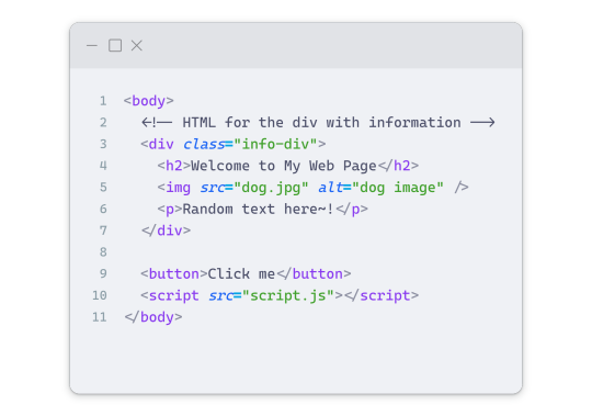
We won't include the CSS code, as it doesn't affect this tutorial. The JavaScript file (script.js) at the bottom of the body element is where we'll add the functionality for the conversion.
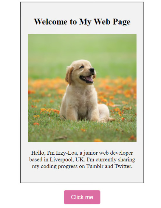
Your page should resemble the following:
As you can see, the "Click me" button will handle the conversion. We aim to convert everything within the div.info-div into an image.
💛 Using the html2canvas JavaScript Library
The html2canvas library allows you to take screenshots of webpages and target specific elements on a screen. Here are the steps to include the library in your project:
The steps to put the library in your project:
Visit the html2canvas website for more information.
Copy the CDN link from here

and include it in a script tag in your project's head tag in the HTML file:
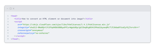
That's it for including the library on the HTML side. Now, let's move on to the JavaScript code.
💛 JavaScript Functionality
Here's the JavaScript code to handle the conversion:
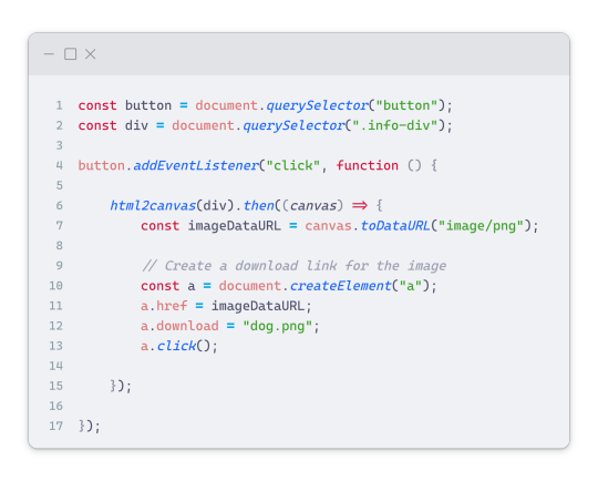
In this code, I want to turn the whole div.info-div into an image, I put it into a variable in const div = document.querySelector(".info-div");.
I also put the button into a variable in const button = document.querySelector("button");
I added a click event listener to the button so when the user clicks the button, it will follow the code inside of the event listener!
You can find similar code like this in the documentation of the html2canvas library:
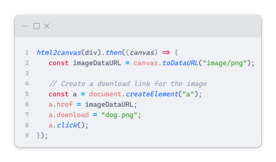
What is happening here is:
We add the div (or what the element we want to take an image of) into the html2canvas([element]).then((canvas)
Added the image file type url to a variable = const imageDataURL = canvas.toDataURL("image/png"); - You can replace the png to other image file types such as jpg, jpeg etc
Created an anchor/link tag, added the href attribute to imageDataURL
The download attribute is where we will give the default name to the image file, I added "dog.png"
Perform the click() function to the anchor tag so it starts to download the image we created
And that's it!
💛 The End
And that's it! You've successfully learned how to turn your HTML into an image. It's a great way to save and share your web content in a unique format.

If you have any questions or need further clarification, please comfortable to ask. Enjoy converting your HTML into images! 💖🐼
#my resources#coding#codeblr#programming#progblr#studying#studyblr#programmer#html#html css#javascript#neocities#coding tips#html5 tutorial#html tutorial
155 notes
·
View notes
Text
Sysboxes FAQ
Responses to some questions we frequently get! This post is long, so full responses are under the cut, but here are the main questions this post addresses, in order:
What are userboxes and how do I use them?
How do you make your userboxes?
What styles/customization can I request?
Do you have a box for X?
When can I send in a request/When will the askbox reopen?
How many requests can I send in per ask or per user?
Is there any particular media you absolutely won’t make boxes for?
Why hasn’t a box been made for my request yet?
What does X term mean?
What is your syscourse stance/Why can’t pro/endos interact?
Who can reblog/use these boxes?
What are userboxes and how do I use them?
Userboxes are rectangular images, often with an image on the left and information about a person on the right. They were originally meant to appear on a Wikipedian’s user page to convey something about a person. To use our boxes, you can reblog them to your tumblr page and/or right click to save the image for later use.
We have seen people put userboxes in their intro posts, in a certain tag on their tumblr, in Discord and PluralKit profiles, on their SimplyPlural (this post explains how), or in exchanges with friends. We generally request that you credit sysboxes when using our userboxes.
How do you make your userboxes?
Different mods use different methods, like Canva and MS Paint, but our main method of making boxes is using yerich.net/userbox. In the box that says “Left Box (ID) Text”, enter the code “src=“yourpicturelinkhere” height=“45px” width=“45px”>”, replacing yourpicturelinkhere with your image URL. Customize your userbox using the rest of the options on the site. You can screenshot your box here, or you can go to htmleditor.com and paste the “Raw HTML” code from yerich. Then you can use HTML coding to mess around with size, font, and color before screenshotting your finished box.
What styles/customization can I request?
This post details a lot of the customization options you can request, like boxes vs. banners, different fonts, colors, and images, including hand-drawn art by mods. You can also request a specific mod do your box. Most mods are adults, but if you feel uncomfortable with a minor making your request, you are free to add that in your ask. Note that if you are requesting an image that contains someone else’s art, we must get permission from the artist to use the image for a userbox.
This being said, we are not infallible to making mistakes on the origins of an image. We do try to reverse image search when provided with an image in an ask, but if you notice your art in a userbox without having been asked permission for its use, please let us know so we can remedy the situation.
Do you have a box for X?
Please search our blog using a keyword for the box you’re looking for and possible variants on it. For example, if you’re looking for a box about food, try food, foods, eat, eats, and eating as keywords. If you’re looking for a box whose keyword is a common tag on our blog, try checking #hard to find tag on our blog for boxes. If you cannot find a box with these steps, we likely have not made one yet or whatever we do have is unlikely to fit your request idea.
When can I send in a request/When will the askbox reopen?
We let people know whether requests are open or closed in three ways: the box in our intro post, the title of the askbox itself, and a post when requests first open or close with the tag #sysboxes status update. When our requests are closed, please do not send any in for “when requests are open”; it will be deleted.
At any given time, we have hundreds of requests in our askbox. We try to keep requests open as long as we can, but even with a large number of mods, there is only so much we can do. We run this blog in our free time, while dealing with work, school, and mental and physical health issues. We do accept questions/appreciation while our requests are closed, but sometimes we save them to respond to when we clear the askbox, to look forward to later.
How many requests can I send in per ask or per user?
We don’t limit how many asks a single user can send in, but if possible, we prefer you send in multiple asks if you have multiple requests. We’ll still do multiple requests in one ask, but one request per ask allows us to more easily sort and number requests. It also lets us respond to when requests will be posted individually instead of waiting until every one is queued or posted to respond to a non-anonymous ask.
Is there any particular media you absolutely won’t make boxes for?
We are okay with requests pertaining to fictives from most media, as we understand they cannot control what source they introjected from. We will not make requests that express support for harmful media. As for media we won’t do requests for introjects from, we have decided not to make boxes pertaining to true crime or nazi introjects, for our and others comfortability. This is not a complete list, as different mods have different boundaries, but we try to honor requests whenever possible.
Why hasn’t a box been made for my request yet?
If you want to know exactly when your userbox will come out, send in your request off anon, and when we queue it, we will privately respond to your ask letting you know when to expect your box. Note our queue is very long.
We do not always do requests in the order we receive them. Some requests we must discuss or reword (for length, misinfo, etc.) before making. We do not make requests that incite hate/harassment, include misinformation (and can’t be reworded), include (specific) details that may endanger the user, or put us in the middle of heavy discourse we do not want to be roped into.
What does X term mean?
This is a userbox blog, and as such, we prefer you do not direct your questions about DID here. We are not professionals (and cannot diagnose anyone), and we recommend looking for credible resources. If you cannot find anything for your question or would like resources, some of the mods are ok with asks about things relating to DID on their system blogs. Mod blogs ok with these questions include @fromthewondersystem and @thecircularsystem.
What is your syscourse stance/Why can’t pro/endos interact?
Individual mods fall across the syscourse spectrum, but this blog is overall anti-endo. In truth, we do not know nor much care whether it is possible to have a non-traumagenic system. We feel our system experiences are deeply informed by our trauma, and this is very different from endos’ experiences.
Additionally, mods of this blog have faced much harassment and harm from the pro-endo community, including being set back in recovery, misinformation, cultural appropriation, abuse, death threats, and doxxing. We are aware these issues extend beyond just the pro-endo community, but this is where we have most commonly found them. For these reasons, we do not want endos or pro-endos interacting with our blog or using our userboxes. There are plenty of pro-endo userbox blogs already.
Who can reblog/use these boxes?
First and foremost, these boxes are for people with (traumagenic) CDDs. The main people who can’t use the boxes we make are those who fall under our DNI.
We do allow syscourse-neutral/unaligned people to use our boxes - we are not here to force you to pick a side. This also includes people with alters who fall across the syscourse spectrum. People who are not pro-endo but allow pro-endos to interact with them may use our boxes, but we recommend noting that we are an anti-endo blog.
As for singlets, we ask them not to use boxes that specify they are for systems or use system-specific terms. We have decided they may use our other boxes. They may also reblog system-specific boxes for system friends. We do request that singlets do not make userbox requests, as other non-system-specific userbox blogs are out there to make requests for them, and we already receive so many.
72 notes
·
View notes
Note
https://www.tumblr.com/satorena/771616112411656192/babessss-tut-on-ur-pinned-when
ma’am im sat.
this one is long so. . . stay with me now!


step #1: deciding aesthetics.
so! it’s been a while and i’m realizing i’m starting to hate my theme right? i decide it’s time to change. the very first thing to look into is what aesthetic you wanna work with. the past few months i’ve been following holiday themes, such as halloween and christmas ones. examples:
(i keep my themes on my side blog just in case)
this time, instead of following the frosty winter vibe i decided i wanted to base it off my latest obsession, sza’s deluxe album. from that point on, it was pretty simple. i typed “sza deluxe lana album” and pinterest gave me options (pinterest will be your best friend!).
step #2: editing/working on pinned
so technically i could’ve kept it as it was but i’m a complicated ass bitch so nothing is just simple with me lol. i decided to open capcut and add the parental advisory logo in the corner and added some filters/effects for an earthy vibe, because if you know sza then that’s basically her aesthetic. i also trademarked it for safety measures.
and since capcut works on making videos and tumblr is the shittiest app when it comes to videos, i opened a website to convert it into a gif.
i place it on my pinned (i run test trials on my side blog before putting it on this one) and usually add that glittery gif just to accentuate the image.
step #3: texts
this step isn’t too hard since i copy paste my texts (alias, age, etc.) but i do modify the caution warning based off my theme. since this time it’s based off an album, i used key words you’d associate with albums (tracklist for masterlist, deluxe for rules, features for tags and moots).
i then open picsart and identify the main colours of my main theme image to paste it onto certain texts, to make it more colourful (the draw button will help). the colours will come out in rgb so you’ll need to convert them to hex mode.
thennn, i open this website called stuffbydavid.com and place the hex code in the correct text box (the HTML option). it automatically shows the link you’ll need to paste the coloured text into tumblr. you’ll have to log into browser mode for tumblr, open your pinned, click settings and scroll until you see “rich text”, click on that and switch it to HTML. there will be different coding on your pinned and you can paste the link where you think fits.
(vegas made a post regarding it, i’ll link it here).
stay with me now! so when i’m done with pasting my links and i’m satisfied with the colouring, my pinned post is about finished. i’ll add in some tags related to my theme, throw in some more sparkles gifs and a thin divider. for the divider, i save the old one i had, open picsart and go back to the “draw” section, place in the rgb colour from earlier and just colour the divider, before saving it and putting it into my pinned. i also link my rules, masterlist and tags.
step #4: tweets
this is something i recently started in november, but i have this saved twitter template that i downloaded from a tumblr account (you can find these templates on tumblr). since it’s already in my previous works, i just click on them and modify them to my taste. my tweets will have something in common with my aesthetic (this time it’s lyrics off the album) and i’ll find a profile pic from pinterest.
i save them, then open background eraser to erase the background. on canva, the background colour i choose is red or green, that way the erasing app can easily erase the background colour without interfering.
then i save it from the app and open picsart to shrink their sizes. to do so, i open a blank space, click add photos and insert the first tweet. i make the image smaller by pinching the screen and move it to either the left or right side, then crop the image so the image can be saved horizontally (if you don’t understand what i mean, click my tweets and you’ll get it). i repeat the same steps with the second tweet.
after i’m finished, i upload it onto my pinned post, and then i’m finally done.
step #5: extra touches
first i’ll change the colouring of my background and accents. i often choose the colours i deducted from my main image in step 3, or if not, then i choose between black or white. i’ll paste the hex codes i feel fits the vibe.
after that’s done, i’ll work on my header. usually, i fuck around on picsart and slap images of gojo nendoroids and insert a silly text or sometimes a black girl as myself. but this time, since i’m following a theme, i remembered seeing an image for the lana album i knew i wanted as a header. however, it was in yellow and threw off the balance of the colours scheme.
so, i opened picsart on a blank space, filled in a blank text box and initially typed “lana sos deluxe”. but then, i realized rena and lana are pretty similar in writing, so i flipped shit around and decided to do that instead (sza if you see this don’t sue me thx!). i chose my fonts, saved the image and uploaded it on tumblr.
i always disable the stretch header button. it looks cleaner that way in my opinion. if the image ever looks too tiny, i crop it on picsart to adjust the size.
almost done! then i open pinterest and choose whatever profile pic i’m in the mood for. if i need to edit, i’ll open picsart. if i want a nendoroid character, i’ll open background eraser and erase the background. this time, i stuck with sza. i’ll then upload it as a pfp and choose to hide it, so you can clearly see my header.
nexttt, i choose what i want my description to be. again, i always base it off my current aesthetic, so this time i chose a song title. i’ll put in the hex code of the main colour of the theme so it changes to that. i like to stay on brand.
finally, i’ll change my inbox title. again, always sticking to aesthetics, so i chose the word “interlude” bc interludes are commonly found in albums. it’s also a pretty word lmaoo. and there you have it— a regular degular serena theme!
and then i move onto satorena and repeat most of these steps all over again ://
#─── (𝟏) 𝐍𝐄𝐖 𝐌𝐄𝐒𝐒𝐀𝐆𝐄. › from anon .ᐟ#this doesn’t mean copy theme down to the last word!#lemme make that clear
17 notes
·
View notes
Text
Let's understand HTML

Cover these topics to complete your HTML journey.
HTML (HyperText Markup Language) is the standard language used to create web pages. Here's a comprehensive list of key topics in HTML:
1. Basics of HTML
Introduction to HTML
HTML Document Structure
HTML Tags and Elements
HTML Attributes
HTML Comments
HTML Doctype
2. HTML Text Formatting
Headings (<h1> to <h6>)
Paragraphs (<p>)
Line Breaks (<br>)
Horizontal Lines (<hr>)
Bold Text (<b>, <strong>)
Italic Text (<i>, <em>)
Underlined Text (<u>)
Superscript (<sup>) and Subscript (<sub>)
3. HTML Links
Hyperlinks (<a>)
Target Attribute
Creating Email Links
4. HTML Lists
Ordered Lists (<ol>)
Unordered Lists (<ul>)
Description Lists (<dl>)
Nesting Lists
5. HTML Tables
Table (<table>)
Table Rows (<tr>)
Table Data (<td>)
Table Headings (<th>)
Table Caption (<caption>)
Merging Cells (rowspan, colspan)
Table Borders and Styling
6. HTML Forms
Form (<form>)
Input Types (<input>)
Text Fields (<input type="text">)
Password Fields (<input type="password">)
Radio Buttons (<input type="radio">)
Checkboxes (<input type="checkbox">)
Drop-down Lists (<select>)
Textarea (<textarea>)
Buttons (<button>, <input type="submit">)
Labels (<label>)
Form Action and Method Attributes
7. HTML Media
Images (<img>)
Image Maps
Audio (<audio>)
Video (<video>)
Embedding Media (<embed>)
Object Element (<object>)
Iframes (<iframe>)
8. HTML Semantic Elements
Header (<header>)
Footer (<footer>)
Article (<article>)
Section (<section>)
Aside (<aside>)
Nav (<nav>)
Main (<main>)
Figure (<figure>), Figcaption (<figcaption>)
9. HTML5 New Elements
Canvas (<canvas>)
SVG (<svg>)
Data Attributes
Output Element (<output>)
Progress (<progress>)
Meter (<meter>)
Details (<details>)
Summary (<summary>)
10. HTML Graphics
Scalable Vector Graphics (SVG)
Canvas
Inline SVG
Path Element
11. HTML APIs
Geolocation API
Drag and Drop API
Web Storage API (localStorage and sessionStorage)
Web Workers
History API
12. HTML Entities
Character Entities
Symbol Entities
13. HTML Meta Information
Meta Tags (<meta>)
Setting Character Set (<meta charset="UTF-8">)
Responsive Web Design Meta Tag
SEO-related Meta Tags
14. HTML Best Practices
Accessibility (ARIA roles and attributes)
Semantic HTML
SEO (Search Engine Optimization) Basics
Mobile-Friendly HTML
15. HTML Integration with CSS and JavaScript
Linking CSS (<link>, <style>)
Adding JavaScript (<script>)
Inline CSS and JavaScript
External CSS and JavaScript Files
16. Advanced HTML Concepts
HTML Templates (<template>)
Custom Data Attributes (data-*)
HTML Imports (Deprecated in favor of JavaScript modules)
Web Components
These topics cover the breadth of HTML and will give you a strong foundation for web development.
Full course link for free: https://shorturl.at/igVyr
2 notes
·
View notes
Text
Thankfully there are ways around all of that, especially for Canvas and such. I can't remember which add-ons/extensions I used, but all of them kept the sites from tracking my shit. And using the Firefox Inspect, you can easily just.... delete the fucking tracker. And Firefox is FANTASTIC, because it will REMEMBER YOUR CHANGES. So while they think everything is working properly, your portal is heavily edited and not drowning in fuckery.
This has also happened to me with streaming services! They tell me I need to turn off all my trackers and shit, change browsers. In reality, they just have five dumb lines of code in the header that checks for such things. Just right click, inspect, and delete. BOOM.
Though this technically requires basic HTML/JS background, most coders who create these things label it something horribly obvious. You will find something tagged "searchadds" or "browsercheck" or something even stupider. Just select and delete it.
And if that's too hard? Just delete the HTML/CSS that blocks your viewport. They can't lock you out if you simply take the lock away.
Reddit of all places is a great community source for this. I found so many helpful explanations before I went to college and got coding experience.
DONT LET THEM WIN. DOWNLOAD FIREFOX, IT LETS YOU DO EVERYTHING. NOTHING CAN STOP YOU. YOU CAN EVEN STEAL IMAGES AND VIDEOS WITH FIREFOX. DO NOT UNDERESTIMATE ITS POWER.

158K notes
·
View notes
Text

🌟 Webflow Tip of the Day – Use Custom Code Embed for Ultimate Design Flexibility
Sometimes, Webflow’s built-in tools might not cover everything — and that’s where the power of Custom Code Embed comes in. Whether it's adding a widget, integrating a third-party tool, or creating complex interactions, the Embed element is your gateway to limitless functionality.
🔧 How to Use:
Drag the “Embed” element into your Webflow canvas.
Paste HTML, CSS, or JavaScript code inside.
Save and preview to see the live effect.
💡 Popular Use Cases:
Add custom animations using GSAP or Lottie.
Insert third-party forms like Typeform, HubSpot, or Calendly.
Embed widgets like reviews, live chat, or countdown timers.
Add schema markup or custom tracking scripts in the <head> or <body>.
⚠️ Pro Tip: Use Webflow’s Page Settings to insert custom code in the head or body tags for site-wide functionality — especially useful for SEO, analytics, or cookie consent.
🎯 Boost your site’s power beyond Webflow's native limits!
🔗 Explore My Work & Hire Me: 🌐 Webflow Portfolio: www.webflowwork.com 🎯 Upwork: https://bit.ly/4iu6AKd 🎯 Fiverr: https://bit.ly/3EzQxNd
#webflow#freelancewebdeveloper#web development#web design#webflowdesign#webflowexperts#webflowlandingpage#website#nocode#ui ux design#figmatowordpress#figma#figmadesign#figma figure#motion design#graphic design#figmacommunity#webflowcms#web desgin company#fiverr top rated seller#fiverr#freelance#onlinebusiness#workfromhome#startup
0 notes
Text
There’s whole lot of buzz about HTML5 these days and every day we hear and read about innovative HTML5 websites. Popular search engines including Google, Bing and more give a lot of importance to a HTML5 based website. However, if you were abducted by aliens and have just returned to earth, here is a quick rundown on some of HTML5’s important attributes and why web developers are so excited about it. What Is HTML5? HTML5 is the new version of HTML and is essentially an upgrade to meet the growing needs of modern day web. It eliminates the need of various plug-ins and independently provides support for incorporating multimedia in web pages. HTML5 encompasses both HTML and XHTML and hence it is possible to use either syntax. It is also built keeping in mind complex web applications and the need to be compatible with modern day devices like tablets and mobile phones. 7 Compelling Features in HTML5 That You Must be Missing HTML5 is an important update to HTML and was very much needed. It does away with quite a few things included in the previous versions, but more importantly brings many new important attributes which are relevant to modern websites. Some important attributes introduced in HTML5 include Content Editable As the name suggests, by using this attribute, you can make a desired section of the web content editable by the user. You can define the attribute role by a true or a false. Context Menu–This attribute is not supported by majority of the browsers but it allows a user to perform a specific task as defined by menu on the element by right clicking on it. Data –This attribute is supported by almost all major browsers. The attribute helps web designers to assign custom data to an element. Draggable –This is again a very useful attribute which allows user to drag and drop page elements from one part to another. To enable the drag and drop function, you need to assign a “True” value to this attribute. You also need to work with some JavaScript to make it fully functional. Drop zone –This attribute will define whether the data that is dragged or dropped over a particular element is copied, moved or linked. The value of the attribute can be accordingly defined as ‘Copy’ or ‘Move’ or ‘Link’. Spell Check –You can allow the users to check spelling on the web page or a particular section of the web page, if you assign a True value to the spell check attribute. Placeholder –This attribute displays the text in a field only when it is focused on, and hiding it otherwise. You needed a JavaScript previously, but with HTML5 it works better and is easier to implement. No More Flash: One More Reason Why You Must Switch To HTML5 Many of the functions which required plug-ins in the previous HTML version can now be independently handled by HTML5. For example, Flash was widely used for playing audio or video content in previous version of HTML pages, but with HTML5, you can expect to play both audio and video files without using Flash. It also supports various audio and video formats too. Since most of the mobile phones do not support Flash, by using HTML5, you can seamlessly deliver both audio and video content to these devices. Besides HTML5 also has a canvas feature which along with JavaScript support, can be used for plotting graphics on web pages. With the canvas tag, you can draw a canvas on the webpage (using height and width attributes), and JavaScript can be used to plot graphs or play dynamic content like games. Thus with HTML5 you almost eliminate the need to have images separately stored on the server and fetched on the webpage, as they are an integral element. These are just a few examples of what HTML5 developers can achieve. If you want your website to move with the times, you cannot ignore this markup language. HTML 5 Is The Future Sooner or later, HTML5 is going to be the new standard in web page design, and it makes sense to be an early mover. The advantages, as we discussed, are manifold. With
an increasing proportion of internet users shifting on the mobile, it makes sense to shift your website on HTML5 and cater these users better. Besides the improved functionalities, HTML5 eliminates the need for a developer to rely on add-ons or plug-ins for designing interactive webpage. It has the potential to transform user experience on the web, and it is indeed the path to the future. Search Engines Love HTML 5 Recent updates to google have shown that it has started giving more weight to HTML5 based websites. If you are in a business you may want you site to be listed on top of the results. HTML5 is also friendly for search engines to do crawling and indexing. Hi, I am Nitin Soni. I work as a web developer with Cygnet Infotech an offshore software development company. For any query or help regarding HTML5 web design & responsive web development, mail me on [email protected], if possible. And, I'd love to connect with you on Twitter @MkNitin
0 notes
Text
Best Lightweight WordPress Themes for SEO in 2025
If you're building a website in 2025, here's one truth that hasn’t changed: SEO still matters—a lot. But here's something many site owners overlook… your WordPress theme plays a huge role in how well your site ranks.
Yes, really.
It’s not just about keywords or backlinks. A bloated theme with heavy scripts, slow load times, and messy code can drag your SEO down faster than you think.
So, if you want to win in the search results this year, let’s talk about the best lightweight WordPress themes that are built with performance and SEO in mind.
What Makes a Theme “SEO-Friendly”?
Before jumping into the list, let’s get one thing straight: not every pretty theme is SEO-ready.
A truly SEO-friendly WordPress theme should:
Load fast (under 2 seconds ideally)
Be mobile-responsive
Use clean, semantic HTML5 code
Be compatible with SEO plugins like Yoast or Rank Math
Have built-in schema support (for rich results)
Avoid render-blocking scripts and unnecessary bloat
With that in mind, here are the top themes to check out in 2025.
1. GeneratePress �� Clean, Fast, SEO Powerhouse
If you ask developers to name one theme that’s made for speed and SEO, GeneratePress will almost always come up.
Why it’s great:
✅ Less than 30KB in size ✅ No jQuery, so no render-blocking ✅ Built-in schema.org structured data ✅ Accessible and WCAG-compliant
Whether you’re a blogger, an affiliate marketer, or running a business site—this theme is a dream for SEO.
2. Astra – Lightweight and Packed with Options
Astra has become a household name in the WordPress world—and for good reason. It’s lightning-fast, beginner-friendly, and highly customizable.
Why SEO folks love it:
✅ Loads in under 0.5 seconds ✅ Built with clean, schema-friendly code ✅ Works well with all SEO plugins ✅ Optimized for mobile and Core Web Vitals
If you’re using a page builder like Elementor or Beaver Builder, Astra plays nicely with them too.
3. Neve – Fast, Sleek, and Ready for Search Engines
Neve is another theme that takes SEO seriously. Built by Themeisle, it's AMP-compatible, mobile-first, and blazing fast.
Why it’s SEO-friendly:
✅ AMP support out of the box ✅ Clean HTML structure ✅ Lightweight and modular ✅ Supports all SEO plugins
Perfect for freelancers, bloggers, and agencies that want speed and style.
4. Blocksy – Beautiful, Functional, and SEO-Smart
Don’t let the modern design fool you—Blocksy is built with performance and SEO at its core. It’s highly customizable, yet stays lean under the hood.
What makes it shine:
✅ Clean codebase using React and Webpack ✅ Supports Gutenberg and modern workflows ✅ Schema-ready ✅ Optimized for speed and responsiveness
It's one of those themes that feels premium without the price tag.
5. Hello Theme (by Elementor) – Blank Canvas, Full Control
If you're building your site entirely with Elementor, Hello Theme is your blank-slate best friend. It’s super lightweight because it includes only the essentials.
Why SEO pros love it:
✅ Ultra-minimalist, no fluff ✅ Perfect for creating highly optimized pages ✅ Zero extra styling to slow things down
Heads up: this one’s ideal for users who want to build everything from scratch.
Bonus Tip: Start With a Great Theme Provider
All the themes listed above are excellent—but if you're looking for something that’s fast, responsive, SEO-ready, and easy to use, check out webxThemes.
At webxThemes, we build WordPress themes specifically with SEO and performance in mind. Whether you're running a blog, an agency, or an online store, our themes help you rank higher without sacrificing design.
Final Thoughts
In 2025, SEO is more competitive than ever. But choosing the right WordPress theme gives you a serious edge. Go lightweight. Go fast. Go clean.
Because when your theme helps your site load quicker, look better on mobile, and speak Google’s language—you’re not just building a site… you’re building visibility.
0 notes
Text
What's the Best Way to Plan Your WordPress Theme?

Creating a successful WordPress theme requires careful planning to ensure it meets user needs, performs well, and stands out in the competitive market. Below, we outline the best approach to planning your WordPress theme, covering everything from research to testing.
1. Understanding the Importance of Planning
Planning is a crucial first step in WordPress theme development. Without a clear plan, developers may encounter issues such as feature overload, design inconsistencies, or poor performance. Key aspects to consider during the planning phase include:
Defining the Target Audience: Identify who will be using your theme. Are they bloggers, businesses, eCommerce stores, or portfolio sites?
Purpose of the Theme: Determine whether the theme is for general use or tailored to a specific niche.
Long-Term Goals: Consider scalability and future updates to ensure the theme remains relevant over time.
2. Research and Inspiration
Gathering inspiration and conducting market research can help you create a theme that aligns with user expectations. Here are some effective ways to research:
Explore Theme Marketplaces: Sites like ThemeForest, TemplateMonster, and WordPress.org showcase popular themes and trends.
Browse Design Galleries: Platforms like Dribbble, Behance, and Awwwards offer creative UI/UX inspiration.
Competitive Analysis: Study successful themes in your niche to identify strengths, weaknesses, and opportunities for differentiation.
3. Defining Key Features and Functionality
Understanding the essential features your theme needs is critical. Prioritize functionalities based on user demand and industry trends, such as:
Responsiveness: Ensure the theme works seamlessly across different devices.
User Interface Elements: Define the layout structure, typography, color schemes, and navigation.
Required Plugins: Identify necessary plugins, such as SEO tools, page builders, and security enhancements.
4. Creating Wireframes and Mockups
Wireframes and mockups provide a visual representation of your theme before development begins. This helps in refining the layout and user experience. Useful tools for this process include:
Wireframing Tools: Adobe XD, Figma, and Balsamiq.
Mockup Design Tools: Photoshop, Sketch, and Canva.
By visualizing the design beforehand, developers can minimize revisions and streamline the development process.
5. Choosing the Right Development Approach
There are multiple ways to develop a WordPress theme, and choosing the right approach depends on skill level, project complexity, and desired flexibility.
Custom Coding:
Pros: Complete control over design, optimized performance, and better security.
Cons: Requires advanced coding knowledge and more time-intensive.
Using a Framework:
Pros: Speeds up development, provides built-in features, and ensures better compatibility.
Cons: May have limitations in customization and can be bulky.
Popular frameworks include Genesis, Underscores, and Bootstrap.
6. Planning for SEO and Performance
SEO and performance optimization should be considered early in the development process. Key strategies include:

SEO Optimization: Use schema markup, optimize meta tags, and ensure clean, semantic HTML structure.
Fast Loading Times: Optimize images, minimize HTTP requests, and leverage caching mechanisms.
Mobile-Friendliness: Google prioritizes mobile-optimized websites, so ensure responsiveness.
7. Testing and Feedback
Testing is essential to ensure the theme functions correctly across various devices and browsers. Consider the following:
Cross-Browser Testing: Check compatibility on Chrome, Firefox, Safari, and Edge.
User Feedback: Gather insights from potential users through beta testing and surveys.
Bug Fixing and Iteration: Address issues promptly and refine the theme based on feedback.
8. Conclusion
Planning your WordPress theme effectively is crucial for its success. By defining your audience, researching trends, prioritizing features, and focusing on SEO and performance, you can create a high-quality theme that meets market demands.
For more insights and professional WordPress theme development services, visit WordPress Theme Development. Start planning your theme today and build a product that stands out in the WordPress ecosystem!
#wordpress theme designs#wordpress themes#wordpress theme development#wordpress theme development agency
0 notes
Text
Web Development vs. Websites: Understanding the Difference and Why It Matters
In today’s digital age, having an online presence isn’t optional — it’s essential. But as you start exploring the world of the internet, you might come across two terms that seem similar but are actually quite different: web development and websites. Understanding the difference between the two is crucial for businesses, entrepreneurs, and creatives looking to carve out their space online. Let’s break it down!
What Is Web Development?
Web development is the process of creating, building, and maintaining websites or web applications. It’s a broad field that involves coding, programming, and designing the functionality that makes a website work.

Think of web development like constructing a house. You need architects (designers), builders (developers), and materials (code) to turn an empty plot of land into a fully functional home.
Key Components of Web Development:
Frontend Development: The visual and interactive elements users see and interact with.
Backend Development: The server-side logic, databases, and systems that power the site.
Full-Stack Development: A combination of both frontend and backend skills.
Example of Web Development in Action:
Imagine you’re building an e-commerce store. Web developers write code to create product pages, shopping carts, and secure checkout processes. They might use languages like HTML, CSS, JavaScript, and frameworks like React or Vue.js to bring your online store to life.
What Is a Website?
A website is the final product — the digital space users visit when they type in a domain name. It’s what you see and interact with in your browser, whether it’s a blog, portfolio, online store, or corporate site.
Websites can be simple or complex, static or dynamic. They might be just a few pages of information or massive platforms with thousands of interconnected pages.
Common Types of Websites:
Business Websites: Showcasing services, contact details, and testimonials.
E-Commerce Stores: Selling products or services online (e.g., Shopify stores).
Blogs & Content Sites: Sharing articles, news, and multimedia content.
Web Applications: Interactive platforms (think Google Docs or Canva).
Example of a Website:
An artist’s portfolio site might feature galleries, an about page, and a contact form. The site itself is the "finished house," while web development is everything that went into building it.
Web Development vs. Websites: The Key Differences
Aspect
Web Development
Website
Definition
The process of building and maintaining a website.
The final product — a live site people can visit.
Involves
Coding, programming, design, server setup, and databases.
Content, layout, images, navigation, and user experience.
Tools & Languages
HTML, CSS, JavaScript, PHP, Python, and frameworks like Django.
CMS platforms (WordPress, Wix), templates, plugins.
Purpose
To create the structure, functionality, and performance of a site.
To deliver content, services, or products to users.
In simple terms: Web development is the process, while a website is the result.
Why This Distinction Matters for Your Business
If you’re looking to establish an online presence, understanding the difference helps you make informed decisions. You might:
Hire a Web Developer if you need custom features or complex functionality.
Use a Website Builder like WordPress or Squarespace if you need a simple site fast.
Invest in Both for a fully tailored, high-performance site that scales with your growth.
SEO and Web Development: A Perfect Match
Search engines like Google love well-developed websites. Clean code, fast loading times, and mobile responsiveness all contribute to better rankings. Meanwhile, well-structured websites with optimized content, proper meta tags, and intuitive navigation help search engines understand your site’s purpose and rank it higher.

SEO Best Practices for Your Website:
Page Speed Optimization: Minimize code bloat and compress images.
Mobile-Friendliness: Use responsive design to look great on any device.
Keyword-Rich Content: Target relevant search terms naturally in your text.
Meta Descriptions & Titles: Write compelling, keyword-optimized meta tags.
Schema Markup: Help search engines understand your content better.
When web development and SEO work together, your website becomes a powerful tool for attracting and converting visitors.
Bringing Your Vision to Life
Whether you’re starting from scratch or upgrading an existing site, web development is the foundation that makes your website function smoothly. And once your site is live, ongoing optimization and content updates keep it relevant and competitive.
If you’re ready to build a site that stands out — or improve the one you already have — consider working with experienced developers who understand the technical and creative sides of web design. Because in today’s fast-moving digital landscape, your website isn’t just your online presence — it’s your digital storefront, your brand ambassador, and your 24/7 sales team.
Final Thoughts: The Power of a Strong Web Presence
Web development and websites go hand in hand, but they serve different purposes. Development is the engine under the hood, while the website is what the world sees. By understanding both, you can make smarter decisions, build better experiences, and position your business for long-term success online.
If you’re ready to take the next step and create a website that truly represents your brand, start exploring your options today — because your digital future starts now.
#SEO#SearchEngineOptimization#DigitalMarketing#OnlineVisibility#WebsiteTraffic#MarketingTips#SEOStrategies#ContentMarketing#RankHigher#TechGrowth#wjmdigitaldesign
0 notes
Text
HTML interview questions cover fundamental concepts like HTML structure, semantic elements, forms, and attributes. Candidates should know the difference between block and inline elements, the purpose of <div>, <span>, <section>, and HTML5 features like <canvas> and local storage. Performance optimization topics such as lazy loading may also be tested. An HTML Cheat Sheet is a great resource for quick reference to essential tags, attributes, and best practices before an interview.
0 notes
Text
1.1 basic document structure
~ tags and attributes ~~ displaying text and header styles, images and videos, links, navigation bar, dividing content into sections/groups
this is like adding layers on to canva. and then categorising those layers into different functions.
i've always thought that html codes were so complicated and overstimulating. but it took me this course to realise that every line of html starts with <tag> and ends with </tag>. this being the simplest concept ended up being one of the most major discoveries in my learning. a life-changing realisation.

0 notes
Text
How to Optimize Your Images for the Web: A Comprehensive Guide
Images play a critical role in web design, enhancing visual appeal and improving user engagement. However, unoptimized images can slow down your website, affecting user experience and search engine rankings. Here’s how to optimize your images for the web without sacrificing quality.
1. Choose the Right File Format
The file format you choose impacts the quality and size of your image. Each format has its strengths:
JPEG: Best for photographs and complex images. It offers good quality at smaller sizes.
PNG: Ideal for graphics, logos, and images requiring transparency.
WebP: A modern format offering superior compression for smaller file sizes without losing quality.
GIF: Suitable for animations, but not for static images due to larger file sizes.
2. Compress Your Images
Compression reduces file size, which helps improve loading times. Use tools like:
Recommend JPG Compressor for image compression.
3. Resize Images to Fit Their Purpose
Avoid uploading large images and scaling them down using HTML or CSS. Instead:
Use exact dimensions required by your design.
Tools like Adobe Photoshop, GIMP, or Canva allow precise resizing.
Use responsive image techniques (e.g., <img srcset> in HTML) to serve different sizes based on user devices.
4. Optimize Image Names and Alt Text
Search engines can’t “see” images, so:
Name your files descriptively (e.g., blue-sky-mountain.jpg instead of IMG1234.jpg).
Add alt text for accessibility and SEO (e.g., “A serene blue sky over a mountain range”).
5. Leverage Lazy Loading
Lazy loading defers the loading of off-screen images until they are needed. This improves initial page load times:
Use the loading="lazy" attribute in your <img> tags.
For WordPress, plugins like Lazy Load by WP Rocket simplify implementation.
6. Use a Content Delivery Network (CDN)
CDNs distribute your images across multiple servers worldwide, reducing load times for visitors by serving content from the nearest server. Popular CDNs include:
Cloudflare
AWS CloudFront
ImageKit
7. Enable Browser Caching
By enabling caching, repeat visitors won’t need to re-download your images:
Add appropriate headers via .htaccess or server settings.
Tools like W3 Total Cache (WordPress) help manage caching easily.
8. Optimize for Retina Displays
High-resolution displays demand higher-quality images. To cater to these users:
Provide images at 2x or 3x resolution.
Use vector graphics (SVGs) for logos and simple graphics.
9. Test and Monitor Your Images
Regularly audit your website’s performance:
Use tools like Google PageSpeed Insights and GTmetrix to identify unoptimized images.
Keep track of load times and user experience.
10. Automate Image Optimization
If you manage a large website, manual optimization can be time-consuming:
Tools like ImageMagick or Sharp allow scripting for batch processing.
Services like Cloudinary automate resizing, compression, and CDN delivery.
Conclusion
Optimizing your images is essential for faster load times, improved SEO, and better user experience. By following these steps, you can ensure that your website delivers visually stunning content without compromising performance. Start optimizing today to enhance both your site’s aesthetics and functionality!
0 notes
Text
Come to the light-dark() Side
New Post has been published on https://thedigitalinsider.com/come-to-the-light-dark-side/
Come to the light-dark() Side
You’d be forgiven for thinking coding up both a dark and a light mode at once is a lot of work. You have to remember @media queries based on prefers-color-scheme as well as extra complications that arise when letting visitors choose whether they want light or dark mode separately from the OS setting. And let’s not forget the color palette itself! Switching from a “light” mode to a “dark” mode may involve new variations to get the right amount of contrast for an accessible experience.
It is indeed a lot of work. But I’m here to tell you it’s now a lot simpler with modern CSS!
Default HTML color scheme(s)
We all know the “naked” HTML theme even if we rarely see it as we’ve already applied a CSS reset or our favorite boilerplate CSS before we even open localhost. But here’s a news flash: HTML doesn’t only have the standard black-on-white theme, there is also a native white-on-black version.
We have two color schemes available to use right out of the box!
If you want to create a dark mode interface, this is a great base to work with and saves you from having to account for annoying details, like dark inputs, buttons, and other interactive elements.
Live Demo on CodePen
Switching color schemes automatically based on OS preference
Without any @media queries — or any other CSS at all — if all we did was declare color-scheme: light dark on the root element, the page will apply either the light or dark color scheme automatically by looking at the visitor’s operating system (OS) preferences. Most OSes have a built-in accessibility setting for your preferred color scheme — “light”, “dark”, or even “auto” — and browsers respect that setting.
html color-scheme: light dark;
We can even accomplish this without CSS directly in the HTML document in a <meta> tag:
<meta name="color-scheme" content="light dark">
Whether you go with CSS or the HTML route, it doesn’t matter — they both work the same way: telling the browser to make both light and dark schemes available and apply the one that matches the visitor’s preferences. We don’t even need to litter our styles with prefers-color-scheme instances simply to swap colors because the logic is built right in!
You can apply light or dark values to the color-scheme property. At the same time, I’d say that setting color-scheme: light is redundant, as this is the default color scheme with or without declaring it.
You can, of course, control the <meta> tag or the CSS property with JavaScript.
There’s also the possibility of applying the color-scheme property on specific elements instead of the entire page in one fell swoop. Then again, that means you are required to explicitly declare an element’s color and background-color properties; otherwise the element is transparent and inherits its text color from its parent element.
What values should you give it? Try:
Default text and background color variables
The “black” colors of these native themes aren’t always completely black but are often off-black, making the contrast a little easier on the eyes. It’s worth noting, too, that there’s variation in the blackness of “black” between browsers.
What is very useful is that this default not-pure-black and maybe-not-pure-white background-color and text color are available as <system-color> variables. They also flip their color values automatically with color-scheme!
They are: Canvas and CanvasText.
These two variables can be used anywhere in your CSS to call up the current default background color (Canvas) or text color (CanvasText) based on the current color scheme. If you’re familiar with the currentColor value in CSS, it seems to function similarly. CanvasText, meanwhile, remains the default text color in that it can’t be changed the way currentColor changes when you assign something to color.
In the following examples, the only change is the color-scheme property:
Not bad! There are many, many more of these system variables. They are case-insensitive, often written in camelCase or PascalCase for readability. MDN lists 19 <system-color> variables and I’m dropping them in below for reference.
Open to view 19 system color names and descriptions
AccentColor: The background color for accented user interface controls
AccentColorText: The text color for accented user interface controls
ActiveText: The text color of active links
ButtonBorder: The base border color for controls
ButtonFace: The background color for controls
ButtonText: The text color for controls
Canvas: The background color of an application’s content or documents
CanvasText: The text color used in an application’s content or documents
Field: The background color for input fields
FieldText: The text color inside form input fields
GrayText: The text color for disabled items (e.g., a disabled control)
Highlight: The background color for selected items
HighlightText: The text color for selected items
LinkText: The text color used for non-active, non-visited links
Mark: The background color for text marked up in a <mark> element
MarkText: The text color for text marked up in a <mark> element
SelectedItem: The background color for selected items (e.g., a selected checkbox)
SelectedItemText: The text color for selected items
VisitedText: The text visited links
Cool, right? There are many of them! There are, unfortunately, also discrepancies as far as how these color keywords are used and rendered between different OSes and browsers. Even though “evergreen” browsers arguably support all of them, they don’t all actually match what they’re supposed to, and fail to flip with the CSS color-scheme property as they should.
Egor Kloos (also known as dutchcelt) is keeping an eye on the current status of system colors, including which ones exist and the browsers that support them, something he does as part of a classless CSS framework cleverly called system.css.
Declaring colors for both modes together
OK good, so now you have a page that auto-magically flips dark and light colors according to system preferences. Whether you choose to use these system colors or not is up to you. I just like to point out that “dark” doesn’t always have to mean pure “black” just as “light” doesn’t have to mean pure “white.” There are lots more colors to pair together!
But what’s the best or simplest way to declare colors so they work in both light and dark mode?
In my subjective reverse-best order:
Third place: Declare color opacity
You could keep all the same background colors in dark and light modes, but declare them with an opacity (i.e. rgb(128 0 0 / 0.5) or #80000080). Then they’ll have the Canvas color shine through.
It’s unusable in this way for text colors, and you may end up with somewhat muted colors. But it is a nice easy way to get some theming done fast. I did this for the code blocks on this old light and dark mode demo.
Second place: Use color-mix()
Like this:
color-mix(in oklab, Canvas 75%, RebeccaPurple);
Similar (but also different) to using opacity to mute a color is mixing colors in CSS. We can even mix the system color variables! For example, one of the colors can be either Canvas or CanvasText so that the background color always mixes with Canvas and the text color always mixes with CanvasText.
We now have the CSS color-mix() function to help us with this. The first argument in the function defines the color space where the color mixing happens. For example, we can tell the function that we are working in the OKLAB color space, which is a rectangular color space like sRGB making it ideal to mix with sRGB color values for predictable results. You can certainly mix colors from different color spaces — the OKLAB/sRGB combination happens to work for me in this instance.
The second and third arguments are the colors you want to mix, and in what proportion. Proportions are optional but expressed in percentages. Without declaring a proportion, the mix is an even 50%-50% split. If you add percentages for both colors and they don’t match up to 100%, it does a little math for you to prevent breakages.
The color-mix() approach is useful if you’re happy to keep the same hues and color saturations regardless of whether the mode is light or dark.
In this example, as you change the value of the hue slider, you’ll see color changes in the themed boxes, following the theme color but mixed with Canvas and CanvasText:
You may have noticed that I used OKLCH and HSL color spaces in that last example. You may also have noticed that the HSL-based theme color and the themed paragraph were a lot more “flashy” as you moved the hue slider.
I’ve declared colors using a polar color space, like HSL, for years, loving that you can easily take a hue and go up or down the saturation and lightness scales based on need. But, I concede that it’s problematic if you’re working with multiple hues while trying to achieve consistent perceived lightness and saturation across them all. It can be difficult to provide ample contrast across a spectrum of colors with HSL.
The OKLCH color space is also polar just like HSL, with the same benefits. You can pick your hue and use the chroma value (which is a bit like saturation in HSL) and the lightness scales accurately in the same way. Both OKLCH and OKLAB are designed to better match what our eyes perceive in terms of brightness and color compared to transitioning between colors in the sRGB space.
While these color spaces may not explicitly answer the age-old question, Is my blue the same as your blue? the colors are much more consistent and require less finicking when you decide to base your whole website’s palette on a different theme color. With these color spaces, the contrasts between the computed colors remain much the same.
First place (winner!): Use light-dark()
Like this:
light-dark(lavender, saddlebrown);
With the previous color-mix() example, if you choose a pale lavender in light mode, its dark mode counterpart is very dark lavender.
The light-dark() function, conversely, provides complete control. You might want that element to be pale lavender in light mode and a deep burnt sienna brown in dark mode. Why not? You can still use color-mix() within light-dark() if you like — declare the colors however you like, and gain much more fine-grained control over your colors.
Feel free to experiment in the following editable demo:
Using color-scheme: light dark; — or the corresponding meta tag in HTML on your page —is a prerequisite for the light-dark() function because it allows the function to respect a person’s system preference, or whichever single light or dark value you have set on color-scheme.
Another consideration is that light-dark() is newly available across browsers, with just over 80% coverage across all users at the time I’m writing this. So, you might consider including a fallback in your CSS for browsers that lack support for the function.
What makes using color-scheme and light-dark() better than using @media queries?
@media queries have been excellent tools, but using them to query prefers-color-scheme only ever follows the preference set within the person’s operating system. This is fine until you (rightfully) want to offer the visitor more choices, decoupled from whether they prefer the UI on their device to be dark or light.
We’re already capable of doing that, of course. We’ve become used to a lot of jiggery-pokery with extra CSS classes, using duplicated styles, or employing custom properties to make it happen.
The joy of using color-scheme is threefold:
It gives you the basic monochrome dark mode for free!
It can natively do the mode switching based on OS mode preference.
You can use JavaScript to toggle between light and dark mode, and the colors declared in the light-dark() functions will follow it.
Light, dark, and auto mode controls
Essentially, all we are doing is setting one of three options for whether the color-scheme is light, dark, or updates auto-matically.
I advise offering all three as discrete options, as it removes some complications for you! Any new visitor to the site will likely be in auto mode because accepting the visitor’s OS setting is the least jarring default state. You then give that person the choice to stay with that or swap it out for a different color scheme. This way, there’s no need to sniff out what mode someone prefers to, for example, display the correct icon on a toggle and make it perform the correct action. There is also no need to keep an event listener on prefers-color-scheme in case of changes — your color-scheme: light dark declaration in CSS handles that for you.
Adjusting color-scheme in pure CSS
Yes, this is totally possible! But the approach comes with a few caveats:
You can’t use <button> — only radio inputs, or <options> in a <select> element.
It only works on a per page basis, not per website, which means changes are lost on reload or refresh.
The browser needs to support the :has() pseudo-selector. Most modern browsers do, but some folks using older devices might miss out on the experience.
Using the :has() pseudo-selector
This approach is almost alarmingly simple and is fantastic for a simple one-pager! Most of the heavy lifting is done with this:
/* default, or 'auto' */ html color-scheme: light dark; html:has([value="light"]:checked color-scheme: light; html:has([value="dark"]:checked color-scheme: dark;
The second and third rulesets above look for an attribute called value on any element that has “light” or “dark” assigned to it, then change the color-scheme to match only if that element is :checked.
This approach is not very efficient if you have a huge page full of elements. In those cases, it’s better to be more specific. In the following two examples, the CSS selectors check for value only within an element containing id="mode-switcher".
html:has(#mode-switcher [value="light"]:checked) color-scheme: light /* Did you know you don't need the ";" for a one-liner? Now you do! */
Using a <select> element:
Using <input type="radio">:
We could theoretically use checkboxes for this, but since checkboxes are not supposed to be used for mutually exclusive options, I won’t provide an example here. What happens in the case of more than one option being checked? The last matching CSS declaration wins (which is dark in the examples above).
Adjusting color-scheme in HTML with JavaScript
I subscribe to Jeremy Keith’s maxim when it comes to reaching for JavaScript:
JavaScript should only do what only JavaScript can do.
This is exactly that kind of situation.
If you want to allow visitors to change the color scheme using buttons, or you would like the option to be saved the next time the visitor comes to the site, then we do need at least some JavaScript. Rather than using the :has() pseudo-selector in CSS, we have a few alternative approaches for changing the color-scheme when we add JavaScript to the mix.
Using <meta> tags
If you have set your color-scheme within a meta tag in the <head> of your HTML:
<meta name="color-scheme" content="light dark">
…you might start by making a useful constant like so:
const colorScheme = document.querySelector('meta[name="color-scheme"]');
And then you can manipulate that, assigning it light or dark as you see fit:
colorScheme.setAttribute("content", "light"); // to light mode colorScheme.setAttribute("content", "dark"); // to dark mode colorScheme.setAttribute("content", "light dark"); // to auto mode
This is a very similar approach to using <meta> tags but is different if you are setting the color-scheme property in CSS:
html color-scheme: light dark;
Instead of setting a colorScheme constant as we just did in the last example with the <meta> tag, you might select the <html> element instead:
const html = document.querySelector('html');
Now your manipulations look like this:
html.style.setProperty("color-scheme", "light"); // to light mode html.style.setProperty("color-scheme", "dark"); // to dark mode html.style.setProperty("color-scheme", "light dark"); // to auto mode
I like to turn those manipulations into functions so that I can reuse them:
function switchAuto() html.style.setProperty("color-scheme", "light dark"); function switchLight() html.style.setProperty("color-scheme", "light"); function switchDark() html.style.setProperty("color-scheme", "dark");
Alternatively, you might like to stay as DRY as possible and do something like this:
function switchMode(mode) html.style.setProperty("color-scheme", mode === "auto" ? "light dark" : mode);
The following demo shows how this JavaScript-based approach can be used with buttons, radio buttons, and a <select> element. Please note that not all of the controls are hooked up to update the UI — the demo would end up too complicated since there’s no world where all three types of controls would be used in the same UI!
I opted to use onchange and onclick in the HTML elements mainly because I find them readable and neat. There’s nothing wrong with instead attaching a change event listener to your controls, especially if you need to trigger other actions when the options change. Using onclick on a button doesn’t only work for clicks, the button is still keyboard-focusable and can be triggered with Spacebar and Enter too, as usual.
Remembering the selection for repeat visits
The biggest caveat to everything we’ve covered so far is that this only works once. In other words, once the visitor has left the site, we’re doing nothing to remember their color scheme preference. It would be a better user experience to store that preference and respect it anytime the visitor returns.
The Web Storage API is our go-to for this. And there are two available ways for us to store someone’s color scheme preference for future visits.
localStorage
Local storage saves values directly on the visitor’s device. This makes it a nice way to keep things off your server, as the stored data never expires, allowing us to call it anytime. That said, we’re prone to losing that data whenever the visitor clears cookies and cache and they’ll have to make a new selection that is freshly stored in localStorage.
You pick a key name and give it a value with .setItem():
localStorage.setItem("mode", "dark");
The key and value are saved by the browser, and can be called up again for future visits:
const mode = localStorage.getItem("mode");
You can then use the value stored in this key to apply the person’s preferred color scheme.
sessionStorage
Session storage is thrown away as soon as a visitor browses away to another site or closes the current window/tab. However, the data we capture in sessionStorage persists while the visitor navigates between pages or views on the same domain.
It looks a lot like localStorage:
sessionStorage.setItem("mode", "dark"); const mode = sessionStorage.getItem("mode");
Which storage method should I use?
Personally, I started with sessionStorage because I wanted my site to be as simple as possible, and to avoid anything that would trigger the need for a GDPR-compliant cookie banner if we were holding onto the person’s preference after their session ends. If most of your traffic comes from new visitors, then I suggest using sessionStorage to prevent having to do extra work on the GDPR side of things.
That said, if your traffic is mostly made up of people who return to the site again and again, then localStorage is likely a better approach. The convenience benefits your visitors, making it worth the GDPR work.
The following example shows the localStorage approach. Open it up in a new window or tab, pick a theme other than what’s set in your operating system’s preferences, close the window or tab, then re-open the demo in a new window or tab. Does the demo respect the color scheme you selected? It should!
Choose the “Auto” option to go back to normal.
If you want to look more closely at what is going on, you can open up the developer tools in your browser (F12 for Windows, CTRL+ click and select “Inspect” for macOS). From there, go into the “Application” tab and locate https://cdpn.io in the list of items stored in localStorage. You should see the saved key (mode) and the value (dark or light). Then start clicking on the color scheme options again and watch the mode update in real-time.
Accessibility
Congratulations! If you have got this far, you are considering or already providing versions of your website that are more comfortable for different people to use.
For example:
People with strong floaters in their eyes may prefer to use dark mode.
People with astigmatism may be able to focus more easily in light mode.
So, providing both versions leaves fewer people straining their eyes to access the content.
Contrast levels
I want to include a small addendum to this provision of a light and dark mode. An easy temptation is to go full monochrome black-on-white or white-on-black. It’s striking and punchy! I get it. But that’s just it — striking and punchy can also trigger migraines for some people who do a lot better with lower contrasts.
Providing high contrast is great for the people who need it. Some visual impairments do make it impossible to focus and get a sharp image, and a high contrast level can help people to better make out the word shapes through a blur. Minimum contrast levels are important and should be exceeded.
Thankfully, alongside other media queries, we can also query prefers-contrast which accepts values for no-preference, more, less, or custom.
In the following example (which uses :has() and color-mix()), a <select> element is displayed to offer contrast settings. When “Low” is selected, a filter of contrast(75%) is placed across the page. When “High” is selected, CanvasText and Canvas are used unmixed for text color and background color:
Adding a quick high and low contrast theme gives your visitors even more choice for their reading comfort. Look at that — now you have three contrast levels in both dark and light modes — six color schemes to choose from!
ARIA-pressed
ARIA stands for Accessible Rich Internet Applications and is designed for adding a bit of extra info where needed to screen readers and other assistive tech.
The words “where needed” do heavy lifting here. It has been said that, like apostrophes, no ARIA is better than bad ARIA. So, best practice is to avoid putting it everywhere. For the most part (with only a few exceptions) native HTML elements are good to go out of the box, especially if you put useful text in your buttons!
The little bit of ARIA I use in this demo is for adding the aria-pressed attribute to the buttons, as unlike a radio group or select element, it’s otherwise unclear to anyone which button is the “active” one, and ARIA helps nicely with this use case. Now a screen reader will announce both its accessible name and whether it is in a pressed or unpressed state along with a button.
Following is an example code snippet with all the ARIA code bolded — yes, suddenly there’s lots more! You may find more elegant (or DRY-er) ways to do this, but showing it this way first makes it more clear to demonstrate what’s happening.
Our buttons have ids, which we have used to target them with some more handy consts at the top. Each time we switch mode, we make the button’s aria-pressed value for the selected mode true, and the other two false:
const html = document.querySelector("html"); const mode = localStorage.getItem("mode"); const lightSwitch = document.querySelector('#lightSwitch'); const darkSwitch = document.querySelector('#darkSwitch'); const autoSwitch = document.querySelector('#autoSwitch'); if (mode === "light") switchLight(); if (mode === "dark") switchDark(); function switchAuto() html.style.setProperty("color-scheme", "light dark"); localStorage.removeItem("mode"); lightSwitch.setAttribute("aria-pressed","false"); darkSwitch.setAttribute("aria-pressed","false"); autoSwitch.setAttribute("aria-pressed","true"); function switchLight() html.style.setProperty("color-scheme", "light"); localStorage.setItem("mode", "light"); lightSwitch.setAttribute("aria-pressed","true"); darkSwitch.setAttribute("aria-pressed","false"); autoSwitch.setAttribute("aria-pressed","false"); function switchDark() html.style.setProperty("color-scheme", "dark"); localStorage.setItem("mode", "dark"); lightSwitch.setAttribute("aria-pressed","false"); darkSwitch.setAttribute("aria-pressed","true"); autoSwitch.setAttribute("aria-pressed","false");
On load, the buttons have a default setting, which is when the “Auto” mode button is active. Should there be any other mode in the localStorage, we pick it up immediately and run either switchLight() or switchDark(), both of which contain the aria-pressed changes relevant to that mode.
<button id="autoSwitch" aria-pressed="true" type="button" onclick="switchAuto()">Auto</button> <button id="lightSwitch" aria-pressed="false" type="button" onclick="switchLight()">Light</button> <button id="darkSwitch" aria-pressed="false" type="button" onclick="switchDark()">Dark</button>
The last benefit of aria-pressed is that we can also target it for styling purposes:
button[aria-pressed="true"] background-color: transparent; border-width: 2px;
Finally, we have a nice little button switcher, with its state clearly shown and announced, that remembers your choice when you come back to it. Done!
Outroduction
Or whatever the opposite of an introduction is…
…don’t let yourself get dragged into the old dark vs light mode argument. Both are good. Both are great! And both modes are now easy to create at once. At the start of your next project, work or hobby, do not give in to fear and pick a side — give both a try, and give in to choice.
#:has#Accessibility#ADD#API#applications#approach#aria#Articles#background#Blue#blur#box#browser#buttons#cache#canvas#Capture#change#classes#code#Code Snippet#coding#Color#colors#content#cookies#course#CSS#custom properties#Dark
0 notes
Text
How much to value in HTML in your knowledge?
HTML
1. Define Your Audience
Determine whether your course is for beginners, intermediate learners, or advanced developers.
Tailor the content and teaching style to the knowledge level of your audience.
2. Outline the Course Structure
Introduction to HTML
What is HTML and why it's important?
Basic structure of an HTML document.
HTML Elements and Tags
Headings, paragraphs, links, images, lists.
Attributes and Formatting
Common attributes (id, class, style, etc.).
Text formatting (bold, italic, underline).
Creating Forms
Input types, labels, buttons, form handling.
Tables and Semantic HTML
How to create and style tables.
Importance of semantic HTML tags (header, footer, article, etc.).
Multimedia Integration
Embedding videos, audio, and using the canvas tag.
Responsive Web Design Basics
Introduction to media queries and responsive layouts.
3. Hands-On Projects
Include practical assignments, like creating a basic webpage, a portfolio site, or a simple form.
Encourage students to apply what they’ve learned by building their own projects.
4. Supplemental Materials
Provide downloadable resources like cheat sheets, example code, and template files.
Share links to further reading or tools like HTML validators and editors.
5. Interactive Elements
Use quizzes, interactive coding exercises, and peer reviews to engage learners.
Consider incorporating videos or live coding sessions to explain concepts visually.
6. Assessment and Feedback
Design assessments at the end of each module to test comprehension.
Offer feedback on projects and assignments, or create a peer-review system.
7. Regular Updates
HTML and web standards evolve, so regularly update your course content to reflect best practices.
Stay informed about changes in the field and incorporate new trends or tools.
8. Community and Support
Create a forum or group where students can ask questions, share projects, and collaborate.
Offer support through Q&A sessions, live chats, or a dedicated helpdesk.
9. Certification
Provide a certificate of completion or a badge to encourage students to complete the course.
10. Promotion and Feedback
Promote your course through relevant channels, such as social media, blogs, or coding communities.
Gather feedback from students to continually improve the course.
By following these steps, you'll be able to create a comprehensive and valuable HTML course that helps learners build solid foundational skills in web development.
1 note
·
View note