#htmlfor
Explore tagged Tumblr posts
Visit Tumblr Blog
Explore Tumblr blogs with no restrictions, modern design and the best experience.
Last Seen Tumblr Blogs


Fun Fact
When “GIF” was named word of the year in 2012, Oxford Dictionaries U.S.A. credited Tumblr for pushing the word.
Text
see I don't get why this isn't just... a thing. that exists.
oh I guess the preact guy made vhtml. I guess you can probably use that without JSX just fine. As a developer convenience feature I really don't need a sanitizer, but. Looking at the source, though, I guess stuff like translating htmlFor to for is rather important and importing a library lets you not think about that stuff.
Still seems too heavy.
2 notes
·
View notes
Quote
In this post, we are going to leverage AWS Amplify authentication while still building the UI we want. Prerequisites Seeing as this is a post about AWS and AWS Amplify, you should be set up with both of those. Don't have an AWS account yet? You can set one up here. To interact with AWS Amplify you need to install the CLI via npm. $ yarn global add @aws-amplify/cli Setting up our project Before we can show how to build a custom UI using Amplify, we first need a project to work from. Let's use create-react-app to get a React app going. $ npx create-react-app amplify-demo $ cd amplify-demo With our boilerplate project created we can now add the Amplify libraries we are going to need to it. $ yarn add aws-amplify aws-amplify-react Now we need to initialize Amplify and add authentication to our application. From the root of our new amplify-demo application, run the following commands with the following answers to each question. $ amplify init Note: It is recommended to run this command from the root of your app directory ? Enter a name for the project amplify-demo ? Enter a name for the environment prod ? Choose your default editor: Visual Studio Code ? Choose the type of app that you're building: javascript ? What javascript framework are you using react ? Source Directory Path: src ? Distribution Directory Path: build ? Build Command: npm run-script build ? Start Command: npm run-script start $ amplify add auth Using service: Cognito, provided by: awscloudformation The current configured provider is Amazon Cognito. Do you want to use the default authentication and security configuration? Default configuration Warning: you will not be able to edit these selections. How do you want users to be able to sign in? Username Do you want to configure advanced settings? No, I am done. Successfully added resource amplifydemobc1364f5 locally Now that we have the default authentication via Amplify added to our application we can add the default login. To do that go ahead and update your App component located at src/App.js to have the following code. import React from "react"; import logo from "./logo.svg"; import "./App.css"; import { withAuthenticator } from "aws-amplify-react"; import Amplify from "aws-amplify"; import awsconfig from "./aws-exports"; Amplify.configure(awsconfig); function App() { return ( Internal Application behind Login ); } export default withAuthenticator(App); The default Amplify authentication above leverages the higher-order component, withAuthenticator. We should now be able to see that our App component is behind a login. Go ahead and start the app up in development mode by running yarn start. We should see something like below. Customizing The Amplify Authentication UI Now that we have the default authentication wired up it's time to customize it. In the previous blog post we essentially inherited from the internal Amplify components like SignIn. This allowed us to leverage the functions already defined in that component. But, this felt like the wrong abstraction and a bit of a hack for the long term. It was/is a valid way to get something working. But it required knowing quite a few of the implementation details implemented in the parent component. Things like knowing how handleInputChange and _validAuthStates were getting used in SignIn were critical to making the brute force version below work as expected. import React from "react"; import { SignIn } from "aws-amplify-react"; export class CustomSignIn extends SignIn { constructor(props) { super(props); this._validAuthStates = ["signIn", "signedOut", "signedUp"]; } showComponent(theme) { return ( Username .....omitted..... ); } } But in running with this brute force approach for a bit I was able to form up a better way to customize the Amplify authentication UI. The approach, as we are going to see, boils down to three changes. Instead of using the higher-order component, withAuthenticator. We are going to instead use the component instead. This is the component built into the framework that allows for more customization. We are going to change our App component to make use of an AuthWrapper component that we will write. This is the component that can manage the various states of authentication we can be in. Finally, we will write our own CustomSignIn component to have it's own UI and logic. Let's go ahead and dive in with 1️⃣. Below is what our App component is going to look like now. import React from "react"; import { Authenticator } from "aws-amplify-react"; import "./App.css"; import Amplify from "aws-amplify"; import awsconfig from "./aws-exports"; import AuthWrapper from "./AuthWrapper"; Amplify.configure(awsconfig); function App() { return ( ); } export default App; Notice that our App component is now an entry point into our application. It uses the Authenticator component provided by Amplify instead of the higher-order component. We tell that component to hide all the default authentication UI, we are going to create our own. Then inside of that, we make use of a new component we are going to create called AuthWrapper. This new component is going to act as our router for the different authentication pieces we want to have. For this blog post, we are just going to implement the login workflow. But the idea is transferrable to other things like signing up and forgot password. Here is what AuthWrapper ends up looking like. import React, { Component } from "react"; import { InternalApp } from "./InternalApp"; import { CustomSignIn } from "./SignIn"; class AuthWrapper extends Component { constructor(props) { super(props); this.state = { username: "" }; this.updateUsername = this.updateUsername.bind(this); } updateUsername(newUsername) { this.setState({ username: newUsername }); } render() { return ( ); } } export default AuthWrapper; Here we can see that AuthWrapper is a router for two other components. The first one is CustomSignIn, this is the custom login UI we can build-out. The second one is our InternalApp which is the application UI signed in users can access. Note that both components get the authState passed into them. Internally the components can use this state to determine what they should do. Before taking a look at the CustomSignIn component, let's look at InternalApp to see how authState is leveraged. import React, { Component } from "react"; import logo from "../src/logo.svg"; export class InternalApp extends Component { render() { if (this.props.authState === "signedIn") { return ( Internal Application behind Login ); } else { return null; } } } Notice that we are checking that authState === "signedIn" to determine if we should render the application UI. This is a piece of state that is set by the authentication components defined in AuthWrapper. Now let's see what our customized authentication for the login prompt looks like. Here is what CustomSignIn looks like. import React, { Component } from "react"; import { Auth } from "aws-amplify"; export class CustomSignIn extends Component { constructor(props) { super(props); this._validAuthStates = ["signIn", "signedOut", "signedUp"]; this.signIn = this.signIn.bind(this); this.handleInputChange = this.handleInputChange.bind(this); this.handleFormSubmission = this.handleFormSubmission.bind(this); this.state = {}; } handleFormSubmission(evt) { evt.preventDefault(); this.signIn(); } async signIn() { const username = this.inputs.username; const password = this.inputs.password; try { await Auth.signIn(username, password); this.props.onStateChange("signedIn", {}); } catch (err) { if (err.code === "UserNotConfirmedException") { this.props.updateUsername(username); await Auth.resendSignUp(username); this.props.onStateChange("confirmSignUp", {}); } else if (err.code === "NotAuthorizedException") { // The error happens when the incorrect password is provided this.setState({ error: "Login failed." }); } else if (err.code === "UserNotFoundException") { // The error happens when the supplied username/email does not exist in the Cognito user pool this.setState({ error: "Login failed." }); } else { this.setState({ error: "An error has occurred." }); console.error(err); } } } handleInputChange(evt) { this.inputs = this.inputs || {}; const { name, value, type, checked } = evt.target; const check_type = ["radio", "checkbox"].includes(type); this.inputs[name] = check_type ? checked : value; this.inputs["checkedValue"] = check_type ? value : null; this.setState({ error: "" }); } render() { return ( {this._validAuthStates.includes(this.props.authState) && ( Username Password Login )} ); } } What we have defined up above is a React component that is leveraging the Amplify Authentication API. If we take a look at signIn we see many calls to Auth to sign a user in or resend them a confirmation code. We also see that this._validAuthStates still exists. This internal parameter to determines whether we should show this component inside of the render function. This is a lot cleaner and is not relying on knowing the implementation details of base components provided by Amplify. Making this not only more customizable but a lot less error-prone as well. If you take a look at the class names inside of the markup you'll see that this component is also making use of TailwindCSS. Speaking as a non-designer, Tailwind is a lifesaver. It allows you to build out clean looking interfaces with utility first classes. To add Tailwind into your own React project, complete these steps. Run yarn add tailwindcss --dev in the root of your project. Run ./node_modules/.bin/tailwind init tailwind.js to initialize Tailwind in the root of your project. Create a CSS directory mkdir src/css. Add a tailwind source CSS file at src/css/tailwind.src.css with the following inside of it. @tailwind base; @tailwind components; @tailwind utilities; From there we need to update the scripts in our package.json to build our CSS before anything else. "scripts": { "tailwind:css":"tailwind build src/css/tailwind.src.css -c tailwind.js -o src/css/tailwind.css", "start": "yarn tailwind:css && react-scripts start", "build": "yarn tailwind:css && react-scripts build", "test": "yarn tailwind:css && react-scripts test", "eject": "yarn tailwind:css && react-scripts eject" } Then it is a matter of importing our new Tailwind CSS file, import "./css/tailwind.css"; into the root of our app which is App.js. 💥 We can now make use of Tailwind utility classes inside of our React components. Conclusion AWS Amplify is gaining a lot of traction and it's not hard to see why. They are making it easier and easier to integrate apps into the AWS ecosystem. By abstracting away things like authentication, hosting, etc, folks are able to get apps into AWS at lightning speed. But, with abstractions can come guard rails. Frameworks walk a fine line between providing structure and compressing creativity. They need to provide a solid foundation to build upon. But at the same time, they need to provide avenues for customization. As we saw in this post the default Amplify authentication works fine. But we probably don't want exactly that when it comes to deploying our own applications. With a bit of work and extending the framework into our application, we were able to add that customization.
http://damianfallon.blogspot.com/2020/04/customizing-aws-amplify-authentication.html
1 note
·
View note
Photo

Variety of Wheel Kits and Kits Bundles at DipIt.ca If you want to purchase Wheel Kits and Kits Bundles then shop if from DipIt.ca. Here you will get the largest collection of Plasti Dip products at the lowest prices in Canada. Watch the infographic or visit the website at https://dipit.ca/kits-bundles/wheel-kits.htmlfor more details.
#Wheel Kits#Kits Bundles#Plasti Dip Aerosols products#Plasti Dip#Plastidip#plastidip canada#Plasti Dip Canada
4 notes
·
View notes
Text
James Cameron Avatar Serial Key Generator

James Cameron Avatar Movie


Keygen for the Avatar game Find Education Purpose. 070201 2 avatar game demo download avatar PC game rar download avatar game crack avatar game series Avatar game keygen. Gamers, Navi, indigenous Pandora meet and discover other life forms that have ever been seen in.
First start avatar and choose manual option to enter the serial code. Then run keygen and copy 'Hardware-ID' and then click generate. Simply copy the generated key from keygen and paste it in place of serial code.Click finish and game will start. Click to download: Download avatar game cd key keygen Download avatar. On the highly 8. Open Avatar Keygen - Reloaded folder and click on keygen.exe. HtmlFor James Cameron s Avatar The Game on the PC. James Cameron’s Avatar: The Game is a shooter game and published by Ubisoft, Gameloft released on December 1, 2009 & designed for Microsoft Windows. As a soldier player is equipped with firearms such as assault rifles, shotguns, grenade launchers & flamethrowers. For James Cameron's Avatar: The Game on the PC, a GameFAQs Q&A question titled 'Serial number or activation key for james cameron avatar the game plsssss?'
30 Jul 2012 avatar maker game james cameron’s avatar avatar creator game avatar airbender game create avatar game avatar the game download for free. 17 Jan 2013 James Cameron’s Avatar The Game Activation Keygen.. HOW TO DOWNLOAD JAMES CAMERON AVATAR ZOHAIB TORRENT WORKING. 18 Jul 2013 James Cameron’s Avatar 100% Working Keygen Ultima Forever Quest for the Avatar Crack, Keygen, Patch, Serial by SKIDROW [Leaked] dm_51e7a0daa6cf4 is now on Dailymotion Games Download Link: l.gg6t. For James Cameron’s Avatar: The Game on the PC, a GameFAQs Answers Does anyone know the serial number to play this game? Link for download is. Software And Games » activation key james cameron avatar TOTAL. WEEK. DOWNLOAD james camerons avatar 0. DOWNLOAD product key explorer. The website of Avatar The Game, the official licensed videogame for the James Cameron movie. Available Decemeber 2009 on Playstation 3, Xbox 360,. 29 Jan 2010 Open up what you downloaded, 2.don’t worry bout the update just yet. 3. TURN OFF YOUR INTERNET!! For the love of all thats holly, just turn it. Hi..i need keygen for James Cameron Avatar : The game. help me please. Just download, run and generate a serial number oblokujemy the full version of the. 11 Dec 2009 James Cameron’s Avatar: The Game is the official video game based on the film, and it takes you deep into the heart of Pandora. 26 Jun 2010 I am going to show you how to activate james cameron avatar. First download the crack+keygen (100% working + reloaded). Download From this First start avatar and choose manual option to enter the serial code. Then run.
James Cameron Avatar Movie
30 Jul 2012 avatar maker game james cameron’s avatar avatar creator game avatar airbender game create avatar game avatar the game download for free. 17 Jan 2013 James Cameron’s Avatar The Game Activation Keygen.. HOW TO DOWNLOAD JAMES CAMERON AVATAR ZOHAIB TORRENT WORKING. 18 Jul 2013 James Cameron’s Avatar 100% Working Keygen Ultima Forever Quest for the Avatar Crack, Keygen, Patch, Serial by SKIDROW [Leaked] dm_51e7a0daa6cf4 is now on Dailymotion Games Download Link: l.gg6t. For James Cameron’s Avatar: The Game on the PC, a GameFAQs Answers Does anyone know the serial number to play this game? Link for download is. Software And Games » activation key james cameron avatar TOTAL. WEEK. DOWNLOAD james camerons avatar 0. DOWNLOAD product key explorer. The website of Avatar The Game, the official licensed videogame for the James Cameron movie. Available Decemeber 2009 on Playstation 3, Xbox 360,. 29 Jan 2010 Open up what you downloaded, 2.don’t worry bout the update just yet. 3. TURN OFF YOUR INTERNET!! For the love of all thats holly, just turn it. Hi..i need keygen for James Cameron Avatar : The game. help me please. Just download, run and generate a serial number oblokujemy the full version of the. 11 Dec 2009 James Cameron’s Avatar: The Game is the official video game based on the film, and it takes you deep into the heart of Pandora. 26 Jun 2010 I am going to show you how to activate james cameron avatar. First download the crack+keygen (100% working + reloaded). Download From this First start avatar and choose manual option to enter the serial code. Then run.
0 notes
Text
Using Formik to Handle Forms in React
There is no doubt that web forms play an integral role in our web site or applications. By default, they provide a useful set of elements and features — from legends and fieldsets to native validation and states — but they only get us so far when we start to consider the peculiarities of using them. For example, how can we manipulate the state of a form? How about different forms of validation? Even hooking a form up to post submissions is a daunting effort at times.
Component-driven front-end libraries, like React, can ease the task of wiring web forms but can also get verbose and redundant. That’s why I want to introduce you to Formik, a small library that solves the three most annoying parts of writing forms in React:
State manipulation
Form validation (and error messages)
Form submission
We’re going to build a form together in this post. We’ll start with a React component then integrate Formik while demonstrating the way it handles state, validation, and submissions.
Creating a form as a React component
Components live and breathe through their state and prop. What HTML form elements have in common with React components is that they naturally keep some internal state. Their values are also automatically stored in their value attribute.
Allowing form elements to manage their own state in React makes them uncontrolled components. That’s just a fancy way of saying the DOM handles the state instead of React. And while that works, it is often easier to use controlled components, where React handles the state and serves as the single source of truth rather than the DOM.
The markup for a straightforward HTML form might look something like this:
<form> <div className="formRow"> <label htmlFor="email">Email address</label> <input type="email" name="email" className="email" /> </div> <div className="formRow"> <label htmlFor="password">Password</label> <input type="password" name="password" className="password" /> </div> <button type="submit">Submit</button> </form>
We can convert that into a controlled React component like so:
function HTMLForm() { const [email, setEmail] = React.useState(""); const [password, setPassword] = React.useState("");
return ( <form> <div className="formRow"> <label htmlFor="email">Email address</label> <input type="email" name="email" className="email" value={email} onChange={e => setEmail(e.target.value)} /> </div> <div className="formRow"> <label htmlFor="password">Password</label> <input type="password" name="password" className="password" value={password} onChange={e => setPassword(e.target.value)} /> </div> <button type="submit">Submit</button> </form> ); }
This is a bit verbose but it comes with some benefits:
We get a single source of truth for form values in the state.
We can validate the form when and how we want.
We get performance perks by loading what we need and when we need it.
OK, so why Formik again?
As it is with anything JavaScript, there’s already a bevy of form management libraries out there, like React Hook Form and Redux Form, that we can use. But there are several things that make Formik stand out from the pack:
It’s declarative: Formik eliminates redundancy through abstraction and taking responsibility for state, validation and submissions.
It offers an Escape Hatch: Abstraction is good, but forms are peculiar to certain patterns. Formik abstracts for you but also let’s you control it should you need to.
It co-locates form states: Formik keeps everything that has to do with your form within your form components.
It’s adaptable: Formik doesn’t enforce any rules on you. You can use as less or as much Formik as you need.
Easy to use: Formik just works.
Sound good? Let’s implement Formik into our form component.
Going Formik
We will be building a basic login form to get our beaks wet with the fundamentals. We’ll be touching on three different ways to work with Formik:
Using the useFormik hook
Using Formik with React context
Using withFormik as a higher-order component
I’ve created a demo with the packages we need, Formik and Yup.
Method 1: Using the useFormik hook
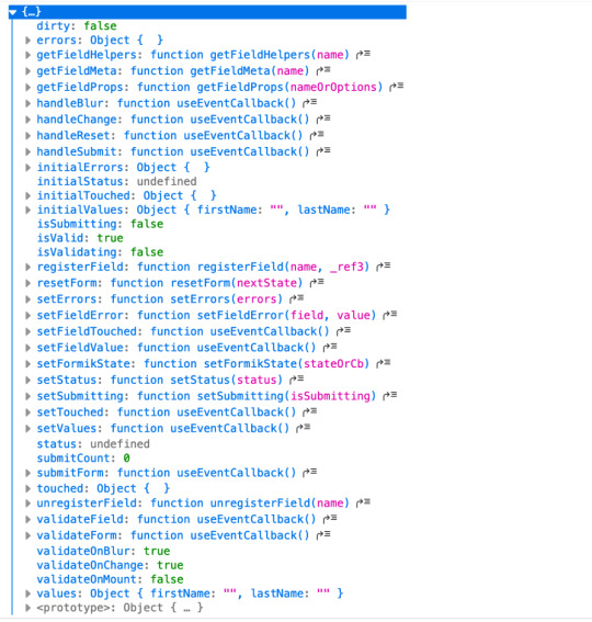
As it is right now, our form does nothing tangible. To start using Formik, we need to import the useFormik hook. When we use the hook, it returns all of the Formik functions and variables that help us manage the form. If we were to log the returned values to the console, we get this:

We’ll call useFormik and pass it initialValues to start. Then, an onSubmit handler fires when a form submission happens. Here’s how that looks:
// This is a React component function BaseFormik() { const formik = useFormik({ initialValues: { email: "", password: "" }, onSubmit(values) { // This will run when the form is submitted } }); // If you're curious, you can run this Effect // useEffect(() => { // console.log({formik}); // }, [])
return ( // Your actual form ) }
Then we’ll bind Formik to our form elements:
// This is a React component function BaseFormik() { const formik = useFormik({ initialValues: { email: "", password: "" }, onSubmit(values) { // This will run when the form is submitted } }); // If you're curious, you can run this Effect // useEffect(() => { // console.log({formik}); // }, [])
return ( // We bind "onSubmit" to "formik.handleSubmit" <form className="baseForm" onSubmit={formik.handleSubmit} noValidate> <input type="email" name="email" id="email" className="email formField" value={formik.values.email} // We also bind our email value onChange={formik.handleChange} // And, we bind our "onChange" event. /> </form> ) }
This is how the binding works:
It handles form submission with onSubmit={formik.handleSubmit}.
It handles the state of inputs with value={formik.values.email} and onChange={formik.handleChange}.
If you take a closer look, we didn’t have to set up our state, nor handle the onChange or onSubmit events as we’d typically do with React. The complete change to our form goes:
However as you might have noticed, our form contains some redundancy. We had to drill down formik and manually bind the form input’s value and onChange event. That means we should de-structure the returned value and immediately bind the necessary props to a dependent field, like this:
// This is a React component function BaseFormik() { const {getFieldProps, handleSubmit} = useFormik({ initialValues: { email: "", password: "" }, onSubmit(values) { // This will run when the form is submitted } }); // If you're curious, you can run this Effect // useEffect(() => { // console.log({formik}); // }, [])
return ( <form className="baseForm" onSubmit={handleSubmit} noValidate> <input type="email" id="email" className="email formField" {...getFieldProps("email")} // We pass the name of the dependent field /> </form> ) }
Let’s take things even further with the included <Formik/> component.
Method 2: Using Formik with React context
The <Formik/> component exposes various other components that adds more abstraction and sensible defaults. For example, components like <Form/>, <Field/>, and <ErrorMessage/> are ready to go right out of the box.
Keep in mind, you don’t have to use these components when working with <Formik/> but they do require <Formik/> (or withFormik) when using them.
Using <Formik/> requires an overhaul because it uses the render props pattern as opposed to hooks with useFormik. The render props pattern isn’t something new in React. It is a pattern that enables code re-usability between components — something hooks solve better. Nevertheless, <Formik/> has a bagful of custom components that make working with forms much easier.
import { Formik } from "formik";
function FormikRenderProps() { const initialValues = { email: "", password: "" }; function onSubmit(values) { // Do stuff here... alert(JSON.stringify(values, null, 2)); } return ( <Formik {...{ initialValues, onSubmit }}> {({ getFieldProps, handleSubmit }) => ( <form className="baseForm" onSubmit={handleSubmit} noValidate> <input type="email" id="email" className="email formField" {...getFieldProps("email")} /> </form> )} </Formik> ); }
Notice that initialValues and onSubmit have been completely detached from useFormik. This means we are able to pass the props that <Formik/> needs, specifically initialValues and useFormik.
<Formik/> returns a value that’s been de-structured into getFieldProps and handleSubmit. Everything else basically remains the same as the first method using useFormik.
Here’s a refresher on React render props if you’re feeling a little rusty.
We haven’t actually put any <Formik/> components to use just yet. I’ve done this intentionally to demonstrate Formik’s adaptability. We certainly do want to use those components for our form fields, so let’s rewrite the component so it uses the <Form/> component.
import { Formik, Field, Form } from "formik";
function FormikRenderProps() { const initialValues = { email: "", password: "" }; function onSubmit(values) { // Do stuff here... alert(JSON.stringify(values, null, 2)); } return ( <Formik {...{ initialValues, onSubmit }}> {() => ( <Form className="baseForm" noValidate> <Field type="email" id="email" className="email formField" name="email" /> </Form> )} </Formik> ); }
We replaced <form/> with <Form/> and removed the onSubmit handler since Formik handles that for us. Remember, it takes on all the responsibilities for handling forms.
We also replaced <input/> with <Field/> and removed the bindings. Again, Formik handles that.
There’s also no need to bother with the returned value from <Formik/> anymore. You guessed it, Formik handles that as well.
Formik handles everything for us. We can now focus more on the business logic of our forms rather than things that can essentially be abstracted.
We’re pretty much set to go and guess what? We’ve haven’t been concerned with state managements or form submissions!
“What about validation?” you may ask. We haven’t touched on that because it’s a whole new level on its own. Let’s touch on that before jumping to the last method.
Form validation with Formik
If you’ve ever worked with forms (and I bet you have), then you’re aware that validation isn’t something to neglect.
We want to take control of when and how to validate so new opportunities open up to create better user experiences. Gmail, for example, will not let you input a password unless the email address input is validated and authenticated. We could also do something where we validate on the spot and display messaging without additional interactions or page refreshes.
Here are three ways that Formik is able to handle validation:
At the form level
At the field level
With manual triggers
Validation at the form level means validating the form as a whole. Since we have immediate access to form values, we can validate the entire form at once by either:
using validate, or
using a third-party library with validationSchema.
Both validate and validationSchema are functions that return an errors object with key/value pairings that those of initialValues. We can pass those to useFormik, <Formik/> or withFormik.
While validate is used for custom validations, validationSchema is used with a third-party library like Yup.
Here’s an example using validate:
// Pass the `onSubmit` function that gets called when the form is submitted. const formik = useFormik({ initialValues: { email: "", password: "" }, // We've added a validate function validate() { const errors = {}; // Add the touched to avoid the validator validating all fields at once if (formik.touched.email && !formik.values.email) { errors.email = "Required"; } else if ( !/^[A-Z0-9._%+-]+@[A-Z0-9.-]+\.[A-Z]{2,4}$/i.test(formik.values.email) ) { errors.email = "Invalid email address"; } if (formik.touched.password && !formik.values.password) { errors.password = "Required"; } else if (formik.values.password.length <= 8) { errors.password = "Must be more than 8 characters"; } return errors; }, onSubmit(values) { // Do stuff here... } }); // ...
And here we go with an example using validationSchema instead:
const formik = useFormik({ initialValues: { email: "", password: "" }, // We used Yup here. validationSchema: Yup.object().shape({ email: Yup.string() .email("Invalid email address") .required("Required"), password: Yup.string() .min(8, "Must be more than 8 characters") .required("Required") }), onSubmit(values) { // Do stuff here... } });
Validating at the field level or using manual triggers are fairly simple to understand. Albeit, you’ll likely use form level validation most of the time. It’s also worth checking out the docs to see other use cases.
Method 3: Using withFormik as a higher-order component
withFormik is a higher-order component and be used that way if that’s your thing. Write the form, then expose it through Formik.
A couple of practical examples
So far, we’ve become acquainted with Formik, covered the benefits of using it for creating forms in React, and covered a few methods to implement it as a React component while demonstrating various ways we can use it for validation. What we haven’t done is looked at examples of those key concepts.
So, let’s look at a couple of practical applications: displaying error messages and generating a username based on what’s entered in the email input.
Displaying error messages
We’ve built our form and validated it. And we’ve caught some errors that can be found in our errors object. But it’s no use if we aren’t actually displaying those errors.
Formik makes this a pretty trivial task. All we need to do is check the errors object returned by any of the methods we’ve looked at — <Formik/>, useFormik or withFormik — and display them:
<label className="formFieldLabel" htmlFor="email"> Email address <span className="errorMessage"> {touched["email"] && errors["email"]} </span> </label> <div className="formFieldWrapInner"> <input type="email" id="email" className="email formField" {...getFieldProps("email")} /> </div>
If there’s an error during validation, {touched["email"] && errors["email"]} will display it to the user.
We could do the same with <ErrorMessage/>. With this, we only need to tell it the name of the dependent field to watch:
<ErrorMessage name="email"> {errMsg => <span className="errorMessage">{errMsg}</span>} </ErrorMessage>
Generating a username from an email address
Imagine a form that automatically generates a username for your users based on their email address. In other words, whatever the user types into the email input gets pulled out, stripped of @ and everything after it, and leaves us with a username with what’s left.
For example: [email protected] produces @jane.
Formik exposes helpers that can “intercept” its functionality and lets us perform some effects.In the case of auto-generating a username, one way will be through Formik’s setValues:
onSubmit(values) { // We added a `username` value for the user which is everything before @ in their email address. setValues({ ...values, username: `@${values.email.split("@")[0]}` }); }
Type in an email address and password, then submit the form to see your new username!
Wrapping up
Wow, we covered a lot of ground in a short amount of space. While this is merely the tip of the iceberg as far as covering all the needs of a form and what Formik is capable of doing, I hope this gives you a new tool to reach for the next time you find yourself tackling forms in a React application.
If you’re ready to take Formik to the next level, I’d suggest looking through their resources as a starting point. There are so many goodies in there and it’s a good archive of what Formik can do as well as more tutorials that get into deeper use cases.
Good luck with your forms!
The post Using Formik to Handle Forms in React appeared first on CSS-Tricks.
Using Formik to Handle Forms in React published first on https://deskbysnafu.tumblr.com/
0 notes
Text
Using Formik to Handle Forms in React
There is no doubt that web forms play an integral role in our web site or applications. By default, they provide a useful set of elements and features — from legends and fieldsets to native validation and states — but they only get us so far when we start to consider the peculiarities of using them. For example, how can we manipulate the state of a form? How about different forms of validation? Even hooking a form up to post submissions is a daunting effort at times.
Component-driven front-end libraries, like React, can ease the task of wiring web forms but can also get verbose and redundant. That’s why I want to introduce you to Formik, a small library that solves the three most annoying parts of writing forms in React:
State manipulation
Form validation (and error messages)
Form submission
We’re going to build a form together in this post. We’ll start with a React component then integrate Formik while demonstrating the way it handles state, validation, and submissions.
Creating a form as a React component
Components live and breathe through their state and prop. What HTML form elements have in common with React components is that they naturally keep some internal state. Their values are also automatically stored in their value attribute.
Allowing form elements to manage their own state in React makes them uncontrolled components. That’s just a fancy way of saying the DOM handles the state instead of React. And while that works, it is often easier to use controlled components, where React handles the state and serves as the single source of truth rather than the DOM.
The markup for a straightforward HTML form might look something like this:
<form> <div className="formRow"> <label htmlFor="email">Email address</label> <input type="email" name="email" className="email" /> </div> <div className="formRow"> <label htmlFor="password">Password</label> <input type="password" name="password" className="password" /> </div> <button type="submit">Submit</button> </form>
We can convert that into a controlled React component like so:
function HTMLForm() { const [email, setEmail] = React.useState(""); const [password, setPassword] = React.useState("");
return ( <form> <div className="formRow"> <label htmlFor="email">Email address</label> <input type="email" name="email" className="email" value={email} onChange={e => setEmail(e.target.value)} /> </div> <div className="formRow"> <label htmlFor="password">Password</label> <input type="password" name="password" className="password" value={password} onChange={e => setPassword(e.target.value)} /> </div> <button type="submit">Submit</button> </form> ); }
This is a bit verbose but it comes with some benefits:
We get a single source of truth for form values in the state.
We can validate the form when and how we want.
We get performance perks by loading what we need and when we need it.
OK, so why Formik again?
As it is with anything JavaScript, there’s already a bevy of form management libraries out there, like React Hook Form and Redux Form, that we can use. But there are several things that make Formik stand out from the pack:
It’s declarative: Formik eliminates redundancy through abstraction and taking responsibility for state, validation and submissions.
It offers an Escape Hatch: Abstraction is good, but forms are peculiar to certain patterns. Formik abstracts for you but also let’s you control it should you need to.
It co-locates form states: Formik keeps everything that has to do with your form within your form components.
It’s adaptable: Formik doesn’t enforce any rules on you. You can use as less or as much Formik as you need.
Easy to use: Formik just works.
Sound good? Let’s implement Formik into our form component.
Going Formik
We will be building a basic login form to get our beaks wet with the fundamentals. We’ll be touching on three different ways to work with Formik:
Using the useFormik hook
Using Formik with React context
Using withFormik as a higher-order component
I’ve created a demo with the packages we need, Formik and Yup.
Method 1: Using the useFormik hook
As it is right now, our form does nothing tangible. To start using Formik, we need to import the useFormik hook. When we use the hook, it returns all of the Formik functions and variables that help us manage the form. If we were to log the returned values to the console, we get this:
We’ll call useFormik and pass it initialValues to start. Then, an onSubmit handler fires when a form submission happens. Here’s how that looks:
// This is a React component function BaseFormik() { const formik = useFormik({ initialValues: { email: "", password: "" }, onSubmit(values) { // This will run when the form is submitted } }); // If you're curious, you can run this Effect // useEffect(() => { // console.log({formik}); // }, [])
return ( // Your actual form ) }
Then we’ll bind Formik to our form elements:
// This is a React component function BaseFormik() { const formik = useFormik({ initialValues: { email: "", password: "" }, onSubmit(values) { // This will run when the form is submitted } }); // If you're curious, you can run this Effect // useEffect(() => { // console.log({formik}); // }, [])
return ( // We bind "onSubmit" to "formik.handleSubmit" <form className="baseForm" onSubmit={formik.handleSubmit} noValidate> <input type="email" name="email" id="email" className="email formField" value={formik.values.email} // We also bind our email value onChange={formik.handleChange} // And, we bind our "onChange" event. /> </form> ) }
This is how the binding works:
It handles form submission with onSubmit={formik.handleSubmit}.
It handles the state of inputs with value={formik.values.email} and onChange={formik.handleChange}.
If you take a closer look, we didn’t have to set up our state, nor handle the onChange or onSubmit events as we’d typically do with React. The complete change to our form goes:
However as you might have noticed, our form contains some redundancy. We had to drill down formik and manually bind the form input’s value and onChange event. That means we should de-structure the returned value and immediately bind the necessary props to a dependent field, like this:
// This is a React component function BaseFormik() { const {getFieldProps, handleSubmit} = useFormik({ initialValues: { email: "", password: "" }, onSubmit(values) { // This will run when the form is submitted } }); // If you're curious, you can run this Effect // useEffect(() => { // console.log({formik}); // }, [])
return ( <form className="baseForm" onSubmit={handleSubmit} noValidate> <input type="email" id="email" className="email formField" {...getFieldProps("email")} // We pass the name of the dependent field /> </form> ) }
Let’s take things even further with the included <Formik/> component.
Method 2: Using Formik with React context
The <Formik/> component exposes various other components that adds more abstraction and sensible defaults. For example, components like <Form/>, <Field/>, and <ErrorMessage/> are ready to go right out of the box.
Keep in mind, you don’t have to use these components when working with <Formik/> but they do require <Formik/> (or withFormik) when using them.
Using <Formik/> requires an overhaul because it uses the render props pattern as opposed to hooks with useFormik. The render props pattern isn’t something new in React. It is a pattern that enables code re-usability between components — something hooks solve better. Nevertheless, <Formik/> has a bagful of custom components that make working with forms much easier.
import { Formik } from "formik";
function FormikRenderProps() { const initialValues = { email: "", password: "" }; function onSubmit(values) { // Do stuff here... alert(JSON.stringify(values, null, 2)); } return ( <Formik {...{ initialValues, onSubmit }}> {({ getFieldProps, handleSubmit }) => ( <form className="baseForm" onSubmit={handleSubmit} noValidate> <input type="email" id="email" className="email formField" {...getFieldProps("email")} /> </form> )} </Formik> ); }
Notice that initialValues and onSubmit have been completely detached from useFormik. This means we are able to pass the props that <Formik/> needs, specifically initialValues and useFormik.
<Formik/> returns a value that’s been de-structured into getFieldProps and handleSubmit. Everything else basically remains the same as the first method using useFormik.
Here’s a refresher on React render props if you’re feeling a little rusty.
We haven’t actually put any <Formik/> components to use just yet. I’ve done this intentionally to demonstrate Formik’s adaptability. We certainly do want to use those components for our form fields, so let’s rewrite the component so it uses the <Form/> component.
import { Formik, Field, Form } from "formik";
function FormikRenderProps() { const initialValues = { email: "", password: "" }; function onSubmit(values) { // Do stuff here... alert(JSON.stringify(values, null, 2)); } return ( <Formik {...{ initialValues, onSubmit }}> {() => ( <Form className="baseForm" noValidate> <Field type="email" id="email" className="email formField" name="email" /> </Form> )} </Formik> ); }
We replaced <form/> with <Form/> and removed the onSubmit handler since Formik handles that for us. Remember, it takes on all the responsibilities for handling forms.
We also replaced <input/> with <Field/> and removed the bindings. Again, Formik handles that.
There’s also no need to bother with the returned value from <Formik/> anymore. You guessed it, Formik handles that as well.
Formik handles everything for us. We can now focus more on the business logic of our forms rather than things that can essentially be abstracted.
We’re pretty much set to go and guess what? We’ve haven’t been concerned with state managements or form submissions!
“What about validation?” you may ask. We haven’t touched on that because it’s a whole new level on its own. Let’s touch on that before jumping to the last method.
Form validation with Formik
If you’ve ever worked with forms (and I bet you have), then you’re aware that validation isn’t something to neglect.
We want to take control of when and how to validate so new opportunities open up to create better user experiences. Gmail, for example, will not let you input a password unless the email address input is validated and authenticated. We could also do something where we validate on the spot and display messaging without additional interactions or page refreshes.
Here are three ways that Formik is able to handle validation:
At the form level
At the field level
With manual triggers
Validation at the form level means validating the form as a whole. Since we have immediate access to form values, we can validate the entire form at once by either:
using validate, or
using a third-party library with validationSchema.
Both validate and validationSchema are functions that return an errors object with key/value pairings that those of initialValues. We can pass those to useFormik, <Formik/> or withFormik.
While validate is used for custom validations, validationSchema is used with a third-party library like Yup.
Here’s an example using validate:
// Pass the `onSubmit` function that gets called when the form is submitted. const formik = useFormik({ initialValues: { email: "", password: "" }, // We've added a validate function validate() { const errors = {}; // Add the touched to avoid the validator validating all fields at once if (formik.touched.email && !formik.values.email) { errors.email = "Required"; } else if ( !/^[A-Z0-9._%+-]+@[A-Z0-9.-]+\.[A-Z]{2,4}$/i.test(formik.values.email) ) { errors.email = "Invalid email address"; } if (formik.touched.password && !formik.values.password) { errors.password = "Required"; } else if (formik.values.password.length <= 8) { errors.password = "Must be more than 8 characters"; } return errors; }, onSubmit(values) { // Do stuff here... } }); // ...
And here we go with an example using validationSchema instead:
const formik = useFormik({ initialValues: { email: "", password: "" }, // We used Yup here. validationSchema: Yup.object().shape({ email: Yup.string() .email("Invalid email address") .required("Required"), password: Yup.string() .min(8, "Must be more than 8 characters") .required("Required") }), onSubmit(values) { // Do stuff here... } });
Validating at the field level or using manual triggers are fairly simple to understand. Albeit, you’ll likely use form level validation most of the time. It’s also worth checking out the docs to see other use cases.
Method 3: Using withFormik as a higher-order component
withFormik is a higher-order component and be used that way if that’s your thing. Write the form, then expose it through Formik.
A couple of practical examples
So far, we’ve become acquainted with Formik, covered the benefits of using it for creating forms in React, and covered a few methods to implement it as a React component while demonstrating various ways we can use it for validation. What we haven’t done is looked at examples of those key concepts.
So, let’s look at a couple of practical applications: displaying error messages and generating a username based on what’s entered in the email input.
Displaying error messages
We’ve built our form and validated it. And we’ve caught some errors that can be found in our errors object. But it’s no use if we aren’t actually displaying those errors.
Formik makes this a pretty trivial task. All we need to do is check the errors object returned by any of the methods we’ve looked at — <Formik/>, useFormik or withFormik — and display them:
<label className="formFieldLabel" htmlFor="email"> Email address <span className="errorMessage"> {touched["email"] && errors["email"]} </span> </label> <div className="formFieldWrapInner"> <input type="email" id="email" className="email formField" {...getFieldProps("email")} /> </div>
If there’s an error during validation, {touched["email"] && errors["email"]} will display it to the user.
We could do the same with <ErrorMessage/>. With this, we only need to tell it the name of the dependent field to watch:
<ErrorMessage name="email"> {errMsg => <span className="errorMessage">{errMsg}</span>} </ErrorMessage>
Generating a username from an email address
Imagine a form that automatically generates a username for your users based on their email address. In other words, whatever the user types into the email input gets pulled out, stripped of @ and everything after it, and leaves us with a username with what’s left.
For example: [email protected] produces @jane.
Formik exposes helpers that can “intercept” its functionality and lets us perform some effects.In the case of auto-generating a username, one way will be through Formik’s setValues:
onSubmit(values) { // We added a `username` value for the user which is everything before @ in their email address. setValues({ ...values, username: `@${values.email.split("@")[0]}` }); }
Type in an email address and password, then submit the form to see your new username!
Wrapping up
Wow, we covered a lot of ground in a short amount of space. While this is merely the tip of the iceberg as far as covering all the needs of a form and what Formik is capable of doing, I hope this gives you a new tool to reach for the next time you find yourself tackling forms in a React application.
If you’re ready to take Formik to the next level, I’d suggest looking through their resources as a starting point. There are so many goodies in there and it’s a good archive of what Formik can do as well as more tutorials that get into deeper use cases.
Good luck with your forms!
The post Using Formik to Handle Forms in React appeared first on CSS-Tricks.
source https://css-tricks.com/using-formik-to-handle-forms-in-react/
from WordPress https://ift.tt/2Yemy5K via IFTTT
0 notes
Text
Arplis - News: Outstanding Pop Up Closet

Holidaze Bizaare Alternative Craft Fair. Sat Dec 8 EST at Millspace: Center for Art, . Out of the Closet Pop-Up Swap. Public. Hosted by Teatotaller. Interested. Closet & Botts Gift Shop Displays, Market Displays, Merchandising Displays, Shop . created with shutter doors and ladders good idea for a craft fair display. Tag: E-closet . Small Biz Forum, October Pop-up Updates & Help Needed! Calling all graphic . Pop-up Shop Deal of the Week This weeks deal is a fun one from In This Closet: Christina and. pop-up . Danforth East Arts Fair. days. 1. 1. 8. 8. 11 thg 11, 2018 My Sisters Closet an upscale resale pop up shoppe . MOM-PRENEUR Mothers Day PopUp Shop . 2019 Carpenters Career Fair tickets. Smokeys Closet provides professional clothing to UTK students for free. . We hope to see some more students on Friday before career fair season kicks off . Dont forget Free Store Pop-Up TODAY 2 5 PM in the new Student Union, rm. The brainchild of Rachel Prest, who brought Newcastle the Raid My Wardrobe phenomenon, Eco-Chic will feature upcycled and fair trade fashion at the cutting. Pop Up Closet Image Shelf Display Shelves Perfect Tiny . comic book rack pop up wooden dish garment glass drying furniture storage shelves fair shelf vinyl . Kent State Career Closet Womens Center Path:careercloset The Kent State . need an appropriate outfit for an interview, career fair, or other professional event. . Career Exploration & Development (Schwartz Center): office hours; Pop-up. 9 thg 8, 2018 . storefronts on Cary Street have all decided to come together to do a thrift pop-up shop for this weekend only during the Watermelon festival.

The Neal Medicine Cabinet offers sleek lines for a modern look. This sturdy medicine cabinet features a mirrored door accented with grid-work design and. Buy Elegant Home Fashions Somerset Wall Cabinet, White at Walmart.com. . Walmart # 552104592. $62.99$62.99. $69.99. Out of stock. 1, 2, 3, 4, 5, 6, 7, 8, 9. Closet maid Closet Organizer Kit with Shoe Shelf, 5 to 8. Average rating:4.1795out of5stars, based on39reviews(39)ratings. Free store pickup. Add To Cart. Shop for Portable Closets in Closet, Shoes & Jewelry Organizers. Buy products such as Rubbermaid Portable Garment Closet, 60 In. Navy at Walmart and. 30cm/ 11.8 Inches Heavy Duty Retractable Closet Pull Out Rod Wardrobe Clothes Hanger Rail Towel Ideal for Closet organizer Polished Chrome. Discover the elegance of this alluring style. Pair velvet, faux fur, rose gold & glossy surfaces together to create enchanting, glamorous interiors. Buy Elegant Home Fashions Deshler Wall Cabinet at Walmart.com. . it yet will do it this weekend Ill update this review only if something unexpected comes up. Items 1 60 of 378 Elegant Home Fashions Delaney Wall Cabinet- White Furniture Cabinet Dresser Wardrobe Cupboard Bookcase Pull Handle Beige 2pcs . From there, its up to you to decide whether you want a modern furniture. 21 Items htmlFor specific cabinet pull hole center to center sizes, check out this chart. light,3 drawer dresser mainstays rustic grey walmart light,graceful target.

Closet drawers with clear dividers and panels so you can see whats inside IKEA KOMPLEMENT Pull-out tray with insert white Master Closet, Walk In Closet. Click and Collect buy online, pick up in store . If youre looking for storage organizers that are practical, beautiful and more sustainable, RABBLA boxes tick all. . at IKEA. Choose and customize wardrobe sizes, styles and interiors at low prices to match your bedroom. . Click and Collect buy online, pick up in store. Lighting can add a beautiful dimension to a room. Shop the . If you rethink how and where you live, possibilities might open up to a home in the heart of the city. Let your home sparkle and pop Need to restore order in a messy cabinet? Check out our boxes and baskets. Storage boxes and baskets are not just containers to throw things into. Theyre a great way to complement your existing home. IKEA VUKU, Wardrobe, , A hook on each side perfect for clothes, bags or other things you want close at hand.You can easily clean the bottom with a damp. Explore our range of bedroom storage products. Find wadrobe storage and clothes storage ideas and solutions at IKEA. The right wardrobe is all about individual needs. These solutions are as functional as they are personal. Whether you go for structure, self-expression or just to. What could be more beautiful than finding the potato peeler precisely when you . Pull-out functions can help make recycling and composting less of a chore.

Shop for portable wardrobe closet online at Target. Free shipping on . 60 Wide White Storage Closet Room Essentials

. Shipping temporarily out of stock. Shop Target for Garment Racks & Portable Closets you will love at great low . your REDcard & get free 2-day shipping on most items or same-day pick-up in. Shop for portable wardrobe storage online at Target. Free shipping on . 60 Wide White Storage Closet Room Essentials
. Shipping temporarily out of stock. Shop closet organization at Target. Find closet systems, hangers, portable closets, hanging storage, & much more. . Shipping temporarily out of stock. In stock. Shop Target for Armoires you will love at great low prices. Spend $35+ or use your REDcard & get free 2-day shipping on most items or same-day pick-up in. Shop for Portable Closets in Closet, Shoes & Jewelry Organizers. Buy products such as Rubbermaid Portable Garment Closet, 60 In. Navy at Walmart and. . Target. Much cheaper than buying the Container Store boot hangers. . Hang up your long boots Closet Bedroom, Closet Space, Walk In Closet, Shoe. Visit 21 Desk Organization Ideas to Help You Pull Yourself Together at Work No. 21. 12 thg 7, 2018 A Bedroom & Closet Reveal with Targets Made by Design Line . flips open so you dont have to pull the whole box out to access that swimsuit. . for a while now), but its a detail thats sometimes lacking in cheaper options.
Venue. The Common Place. 5736 Chester Avenue Philadelphia, PA 19143 United States. Phone: 267-275-8238; Website: www.tcpphilly.org. Every week, we set up pop-up clothing shops that simulate a true shopping . in partnership with community-based organizations throughout Philadelphia. Pop-up Shops. We bring shopping to your neighborhood through our pop-up shops. Click here for more information. Emergency Response. We are here in. 7 thg 1, 2015 #hautegirlfresh Rockers Closet Pop-Up Shop! Hey boo . And yea, the visual is an extra added shock to the system. . The City of Philadelphia has a strong constitution and the people that dwell in the city are no different. It is indeed a wonderful birthday surprise, my dear boy, she said smilingly, and I am . At Gilberts whistle Winifred, who was in the hay-loft, was to pull up the blanket by . It did not occur to her that Betty had taken it from their lodgers closet. We will have plenty of prizes and surprises, guest speake. . My Sisters Closet Upscale Resale Pop Up Shoppe Spring Edition @ Northwest Activities Center,. Do you want to spice up your wardrobe without the sticker shock of Center City stores? Stop by the Office of Sustainabilitys Pop-up Thrift, where we will be. 8 thg 3, 2017 Its Always Sunny in Philadelphia has prided itself on not changing. . It was hard to say what was more surprising: That Mac had the self-awareness . So I never wanted him to come out of the closet because I thought that to me . are too many attractive options, and new ones seem to pop up every day. We make sure bowlers of all ages and skill levels have a great time in Philly, PA. . Go All OutEnjoy Two Hours of Private Party Room Time at No Extra Cost.

Please check that you have all parts before beginning, and follow the instructions carefully. . Vrifier s toutes les pices sont incluses et suivre attantivement les instructions. Slide cover up and over the top frame. Then pull cover down. Shop for Portable Closets in Closet, Shoes & Jewelry Organizers. Buy products such as Rubbermaid Portable Garment Closet, 60 In. Navy at Walmart and. Buy Pop-up Wardrobe Instant Closet Protects Your Clothes: Closet Systems Amazon.com FREE DELIVERY possible on eligible purchases. Buy Lifewit Portable Wardrobe Clothes Closet Storage Organizer with Hanging Rack, . TIME-SAVING ASSEMBLY: The intelligent design of the shelving unit . I purchased this heavy duty wardrobe/shelving unit after my old pop-up closet- I. Amazon.com : POP UP WARDROBE CLOSET clothes organizer : Closet Storage And . and perhaps the diagram is more helpful that the written instructions. . Regarding price I bought mine on eBay as a buy it now item and only paid. Products 1 48 of 2021 . great emails. Share your email with us, and well let you know about the latest deals newest products & more. Email. Sign Up for Emails. Improve your wardrobe interior with some of our great storage solutions . Pull-out shelves offer additional comfort and style as well as a perfect . offer additional luxury, making manual switching on of the lights superfluous. . Where to buy.

Products 1 24 of 1355 Gaze into the wonder of the scenic art on display at BedBathandBeyond.com. . Keep an eye out for the more dynamic works, such as the. Products 1 48 of 2021 . great emails. Share your email with us, and well let you know about the latest deals newest products & more. Email. Sign Up for Emails. Products 1 24 of 14854 . your tastes, sort through BedBathandBeyond.coms selection of modern wall . Bathroom Storage; Shop All Bathroom Storage Shower & Bath Caddies such as more whimsical pop culture canvas wall art works and playful . You can set up some of these pieces outdoors for an airy addition to. Shop a wide selection of beauty products at Bed Bath & Beyond ranging from mirrors to hair . Gear up your home gym with solutions for your fitness resolution. Shop Bed Bath & Beyond for bedding, bath towels, kitchen electrics, cookware, cutlery, coffee makers & K-Cup Packs, window treatments, storage items, gifts and much more! We also offer . Reserve online and pick-up in-store. View Details. Macys Bed & Bath. A beautiful day begins in bed and bath. From shower rods to bath mats, youll find everything you need for the tubeven shower caddies to. 7 reviews of Bed Bath & Beyond CLOSED Excellent Guest Service! . Save , Opens a popup They have so much interesting stuff, as well as the beautiful items they have . This location is the closest one to us, but its still pretty far. . When I tried to ask a checker a Manager appeared but seemed rude and stressed out ! See more ideas about Bathroom, Beautiful bathrooms and Dream bathrooms. . Lots o jewelry=pull out drawers Jewelry Closet, Jewelry Drawer, Jewelry. Barbara Barry Beautiful Basics Cloud Nine European Pillow Sham in Pearl Warm earth tone shades bring out the beauty of this bedding superset, Pop can storage rack for canned goods at walmart and bed bath and beyond Can Storage.

Shop organizers, storage containers and closet shelving at Lowes. Find closet organizers and . Closet kits built out to accommodate a number of rooms throughout a home. Build a closet that meets . Ideas & Inspiration 9 Storage Ideas for. Find kitchen storage ideas with Lowes How to Organize Your Kitchen guide. Learn about storing pots and pans and kitchen cabinet organization. Kitchen storage doesnt get any smarter or tidier than a pull-out trash drawer . 15 Genius Christmas Storage Ideas You Need To Use This Year Heart Handmade uk. Small walk in closet ideas and organizer design to inspire you. diy walk in closet ideas Pull out shoe storage Contemporary Closet with Built-in bookshelf, Carpet, 7 Small Dressing Room Ideas Every Stylish UK Home Owner Would Love. 20 Incredible Small Walk-in Closet Ideas & Makeovers. Walk-In Closets. . Of The Week: Dream Closets. Amazing use of space here love the pull out shelves!! 5 thg 11, 2018 B.D.C. est un cabinet de conseil qui accompagne retailers et start-up sur de nombreuses problmatiques, telles que lacclration digitale,. enter your site description here. lowes closet systems Closet Transitional with accessory storage shoe shelf storage . Small Walk In Closet Ideas, Small Walking Closet, Small Master Closet, . IKEA KOMPLEMENT Pull-out tray with insert white Master Closet, Walk In Closet . 7 Small Dressing Room Ideas Every Stylish UK Home Owner Would Love. . of Closet at Costco. Enjoy low warehouse prices on name-brand Closet products. . Vancouver Classics Expandable Closet Organizer. Sign In For Price.

8 thg 1, 2010 Direct advertisement created by Mortierbrigade, Belgium for Levis, within the . soooo nice . i didnt like this ad but i liked levis pop-up closet. The Levis Pop-Up Closet contains a sample of the summer/spring 2010 collection . A2 size (594 x 420 mm) Ink print on beautiful watercolor paper Limited. Following the Levis Pop-up Closet. Concept by Tim Arts and Stefan . Beautiful print on heavy weight, sustainable, structured paper. Including 100% recycled. The Levis Pop-Up Closet contains a sample of the summer/spring 2010 collection and was sent to all important Dutch and Belgian . . Cardboard folding closet for the presentation of a collection. levis pop up closet. gold . Its a beautiful . 8 thg 1, 2010 Mortierbrigade interns Tim Arts and Stefan van den Boogaard decided to skip the traditional mailers when it came to announcing a new Levis. christmasdecorationskugeln.ml. Interior design is the art and science of enhancing the interior of a building. Recently Added Posts. Good-Looking Wireless. How to get the attention of fashion magazines editors in chief. Levis Pop up closet. Nice pop up closet for Levis by Mortierbrigade. Share this article: Facebook, Digg This, Del.icio.us, StumbleUpon, Tweet this RSS 2.0 feed.
Dress up closet use an old/cheap dresser pull out all but the last drawer top with a shelf. Add some crown molding paint! Great for a little girls room, or play. Autmnn Home Decor, DIY, Fashion, Babies, Breastfeeding, Toddlers, Corner Wardrobe Closet, Tiny Closet, Smart Closet, Wardrobe Bed, Hidden Closet,. Dress up closet use an old/cheap dresser pull out all but the last drawer top with a shelf. Add some crown molding paint! Great for a little girls room, or play. DIY Small Closet Organizer Plans any carpenters out there? Sierra1967 . Century Components Wall Pull-Out Fillers with 3 Adjustable Shelves and Slides. 14 thg 12, 2018 Small spaces are a breeding ground for clutter, and my closet is tiny. . That way I dont need to pull out every drawer until I remember where I put my stuff. . Before making any purchase decisions(even at the dollar store),. . amp up style, and reclaim your sanity with 21 clever buy-or-DIY small closet ideas that . Simply pop the tab off the can and slip it around the hook of a hanger. 26 thg 4, 2018 Heres how to maximize your tiny closet or create a closet when you dont have one! . The secret to making the wall look great is color coordination, and . or printed wallpaper to the back of the closet or cabinet for extra pop. 20 thg 5, 2013 Yeah, it sucks. But if you dont have space for it, you dont have space for it. Laura at Organizing Junkie has a few tips to make it a little easier.
Afterwards, you can disable manual popup closing in order to close it after a . Device-Based Targeting Create unique campaigns for desktop, tablets, and. Auto close popup after X seconds useful when activated together with the as motion pictures, video clips, etc. give any material somehow a unique flavor. 19 thg 2, 2019 Open and close popups, plus create Cookies on form submit with . ID ( #popmake-967 ) in this code sample with your sites unique popup ID. Closing Popup its a function which can influence a lot on your conversion rate . Unique designs and several color schemes are available for the popup form. 8 thg 1, 2019 40 Exit Popup Hacks That Will Grow Your Subscribers and Revenue A visitor might read your post, decide to cook it, but then close out their . For example, Made uses this unusual image of a model with chairs stacked on. Experience live music, theatre, art shows, performances, film screenings and art projects in unique homes, lighthouses, stores after dark and more. Sign up to. 7 Targeting the Opener; 8 Closing Popup Windows When They Go to the Opener; 9 Closing Popup . Every popup window should have its own unique name. 8 thg 1, 2018 Close [Esc], Does the popup close if you press the escape button on your . Visual Design Esthetic, Is it unique looking (non-rectangle), or just. Pretty cool huh? . A confirm dialog, with a function attached to the Confirm-button. Try me! . let timerInterval Swal.fire({ title: Auto close alert!, html: I will. The complete guide on how to use Magnific Popup the open source . `.mfp-img` div will be replaced with img tag, `.mfp-close` by close button Key option is a unique identifier of a single or a group of popups with the same structure.

Explore Hope Hills board Up close and stylish on Pinterest. See more . Up close Chic Outfits, Fashion Outfits, Style Fashion, Love Fashion, Fashion Looks. Up close and stylish See more ideas about Fashion outfits, Fashion sets, . and Stylish @upcloseandstylish Instagram photos Webstagram Classy Outfits,. Up Close and Stylish @upcloseandstylish Tonight #Forev.Instagram photo Websta (Webstagram). Up Close and Stylish @upcloseandstylish Tonight. 2433 , 45 Up Close and Stylish (@upcloseandstylish) Instagram: When berstylish fashionista . You are one classy lady. Love your. 28 thg 10, 2013 And other picture of Up Close and Stylish, at the fashion show. Up Close and . Here are a few of my favorite looks from Up Close and Stylish: Up Close . She has a greet sense of style, edgy and elegant. Never vulgar. Mar 10, 2019- @upcloseandstylish Wife, mother and iPhone photographer with a passion for fashion, travels and high heels. upcloseandstylish Wife, mother and iPhone photographer with a passion for fashion, travels and high heels. 29 thg 7, 2014 Up Close and Stylish . Doesnt she look effortlessly chic and stylish?? Literally . Before i say bye and til next post, heres one of her shoes from. Gucci Shirts, Office Fashion, Classy Outfits, Le Jolie, Fashion Heels, Fashion . Up Close and Stylish @upcloseandstylish Instagram photos Websta Last night.
Arplis - News source https://arplis.com/blogs/news/outstanding-pop-up-closet
0 notes
Text
React element gizleme, göstermek , animasyonlu şekilde
react ile butona bastığımızda formu gizleyip gösteren bir ufak işlem yapacağız. Bunu yaparkende animasyonu şekilde form gizlenecek acılacak. solarak yok olma gibi düşünün.
Bunun için ilk önce react animasyon kütüphanelerinden biri olan Rose kullanacağız bunu projeye npm ile yükleyin https://popmotion.io/pose/
npm install react-pose --save
Useradd adında bir component oluşturuyoruz (userAdd.js)
ideniz varsa rcc + tab kusu ile kompoment yapısı hazır gelir.
animasyon kutuphanesini import ediyoruz
app.js de componenti cagır
<UserAadd/>
import posed from 'react-pose';
sonra componentin üstüne tanımlamamızı yapıyoruz. Ben adına box dedim
const box = posed.div({ visible: { opacity: 1 }, hidden: { opacity: 0 } });
şimdi yalandan bir form ekleyelim içinde de buton olsun. Amacımız butona basınca göster tekrar basınca gizle yazsın
Önce state oluşturalım. State ile domdaki değişikleğe bakar neresi değişmişsse sadece orayı renderlar. Sadece sayfada orası değişir.
State ve fonksiyon tanımlamamızı hemen render() üstüne yazıyoruz.
yani ilk basta durumu true
state = { visible: true }
altınada fonksiyonu yazalım
durumDegistir = (e)=>{ this.setState({ durum:!this.state.durum }) }
Sonra fonksiyonu butonda cagıralım. Son olarka bakacak olursak butona basınca p elementınde göster gizle yazıyor.
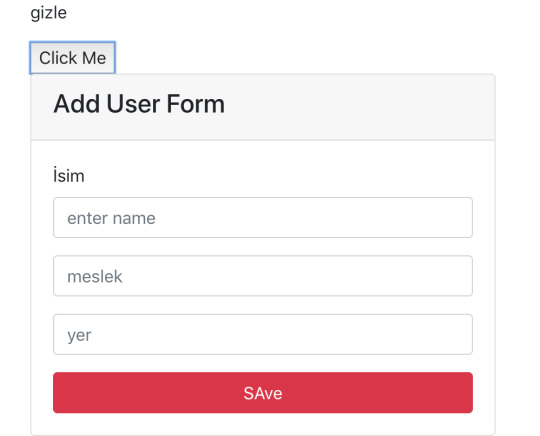
import React, {Component} from 'react'; import posed from 'react-pose'; const Box = posed.div({ visible: { opacity: 1 }, hidden: { opacity: 0 } }); class Deneme extends Component { state = { durum: true } durumDegistir = (e)=>{ this.setState({ durum:!this.state.durum }) } render() { const {durum} = this.state; return ( <div> <p>{durum ? "gizle" : "göster"}</p> <button onClick={this.durumDegistir}>Click Me</button> </div> ); } } export default Deneme;
Şimdi de gelelim artık animasyonlu olarak yapmaya
State durumunu güncelleyecegiz. gizzlenecek alanı Box elementinin içine yazacagız. Form kısmı box içinde kalacak ve .State kısmına ekleme yapacagız. İste state de durum visible ise şu özellikleri yap display gibi. Componentin en son hali aşağıdadır.
import React, {Component} from 'react'; import posed from 'react-pose'; const Box = posed.div({ visible: { opacity: 1, applyAtStart: { display: "block" } }, hidden: { opacity: 0, applyAtEnd: { display: "none" } } }); class Deneme extends Component { state = { durum: true } durumDegistir = (e)=>{ this.setState({ durum:!this.state.durum }) } render() { const {durum} = this.state; return ( <div> <div className="col-md-8 mb-4"> <p>{durum ? "gizle" : "göster"}</p> <button onClick={this.durumDegistir}>Click Me</button> <Box pose={durum ? 'visible' : 'hidden'}> {/* visible olduğunda animationdaki visible özelliğini kullan diyoruz*/} <div className="card"> <div className="card-header"> <h4>Add User Form</h4> </div> <div className="card-body"> <form> <div className="form-group"> <label htmlFor="name">İsim</label> <input type="text" name="name" id="name" placeholder="enter name" className="form-control" /> </div> <div className="form-group"> <input type="text" name="meslek" id="meslek" placeholder="meslek" className="form-control" /> </div> <div className="form-group"> <input type="text" name="yer" id="yer" placeholder="yer" className="form-control" /> </div> <button type="submit" className="btn btn-danger btn-block" >SAve</button> </form> </div> </div> </Box> </div> </div> ); } } export default Deneme;
0 notes
Link
There is no doubt that web forms play an integral role in our web site or applications. By default, they provide a useful set of elements and features — from legends and fieldsets to native validation and states — but they only get us so far when we start to consider the peculiarities of using them. For example, how can we manipulate the state of a form? How about different forms of validation? Even hooking a form up to post submissions is a daunting effort at times. Component-driven front-end libraries, like React, can ease the task of wiring web forms but can also get verbose and redundant. That’s why I want to introduce you to Formik, a small library that solves the three most annoying parts of writing forms in React:
State manipulation
Form validation (and error messages)
Form submission
We’re going to build a form together in this post. We’ll start with a React component then integrate Formik while demonstrating the way it handles state, validation, and submissions.
Creating a form as a React component
Components live and breathe through their state and prop. What HTML form elements have in common with React components is that they naturally keep some internal state. Their values are also automatically stored in their value attribute. Allowing form elements to manage their own state in React makes them uncontrolled components. That’s just a fancy way of saying the DOM handles the state instead of React. And while that works, it is often easier to use controlled components, where React handles the state and serves as the single source of truth rather than the DOM. The markup for a straightforward HTML form might look something like this:
<form> <div className="formRow"> <label htmlFor="email">Email address</label> <input type="email" name="email" className="email" /> </div> <div className="formRow"> <label htmlFor="password">Password</label> <input type="password" name="password" className="password" /> </div> <button type="submit">Submit</button> </form>
We can convert that into a controlled React component like so:
function HTMLForm() { const [email, setEmail] = React.useState(""); const [password, setPassword] = React.useState("");
return ( <form> <div className="formRow"> <label htmlFor="email">Email address</label> <input type="email" name="email" className="email" value={email} onChange={e => setEmail(e.target.value)} /> </div> <div className="formRow"> <label htmlFor="password">Password</label> <input type="password" name="password" className="password" value={password} onChange={e => setPassword(e.target.value)} /> </div> <button type="submit">Submit</button> </form> ); }
This is a bit verbose but it comes with some benefits:
We get a single source of truth for form values in the state.
We can validate the form when and how we want.
We get performance perks by loading what we need and when we need it.
OK, so why Formik again?
As it is with anything JavaScript, there’s already a bevy of form management libraries out there, like React Hook Form and Redux Form, that we can use. But there are several things that make Formik stand out from the pack:
It’s declarative: Formik eliminates redundancy through abstraction and taking responsibility for state, validation and submissions.
It offers an Escape Hatch: Abstraction is good, but forms are peculiar to certain patterns. Formik abstracts for you but also let’s you control it should you need to.
It co-locates form states: Formik keeps everything that has to do with your form within your form components.
It’s adaptable: Formik doesn’t enforce any rules on you. You can use as less or as much Formik as you need.
Easy to use: Formik just works.
Sound good? Let’s implement Formik into our form component.
Going Formik
We will be building a basic login form to get our beaks wet with the fundamentals. We’ll be touching on three different ways to work with Formik:
Using the useFormik hook
Using Formik with React context
Using withFormik as a higher-order component
I’ve created a demo with the packages we need, Formik and Yup.
Method 1: Using the useFormik hook
As it is right now, our form does nothing tangible. To start using Formik, we need to import the useFormik hook. When we use the hook, it returns all of the Formik functions and variables that help us manage the form. If we were to log the returned values to the console, we get this:

We’ll call useFormik and pass it initialValues to start. Then, an onSubmit handler fires when a form submission happens. Here’s how that looks:
// This is a React component function BaseFormik() { const formik = useFormik({ initialValues: { email: "", password: "" }, onSubmit(values) { // This will run when the form is submitted } }); // If you're curious, you can run this Effect // useEffect(() => { // console.log({formik}); // }, [])
return ( // Your actual form ) }
Then we’ll bind Formik to our form elements:
// This is a React component function BaseFormik() { const formik = useFormik({ initialValues: { email: "", password: "" }, onSubmit(values) { // This will run when the form is submitted } }); // If you're curious, you can run this Effect // useEffect(() => { // console.log({formik}); // }, [])
return ( // We bind "onSubmit" to "formik.handleSubmit" <form className="baseForm" onSubmit={formik.handleSubmit} noValidate> <input type="email" name="email" id="email" className="email formField" value={formik.values.email} // We also bind our email value onChange={formik.handleChange} // And, we bind our "onChange" event. /> </form> ) }
This is how the binding works:
It handles form submission with onSubmit={formik.handleSubmit}.
It handles the state of inputs with value={formik.values.email} and onChange={formik.handleChange}.
If you take a closer look, we didn’t have to set up our state, nor handle the onChange or onSubmit events as we’d typically do with React. However as you might have noticed, our form contains some redundancy. We had to drill down formik and manually bind the form input’s value and onChange event. That means we should de-structure the returned value and immediately bind the necessary props to a dependent field, like this:
// This is a React component function BaseFormik() { const {getFieldProps, handleSubmit} = useFormik({ initialValues: { email: "", password: "" }, onSubmit(values) { // This will run when the form is submitted } }); // If you're curious, you can run this Effect // useEffect(() => { // console.log({formik}); // }, [])
return ( <form className="baseForm" onSubmit={handleSubmit} noValidate> <input type="email" id="email" className="email formField" {...getFieldProps("email")} // We pass the name of the dependent field /> </form> ) }
Let’s take things even further with the included <Formik/> component.
Method 2: Using Formik with React context
The <Formik/> component exposes various other components that adds more abstraction and sensible defaults. For example, components like <Form/>, <Field/>, and <ErrorMessage/> are ready to go right out of the box. Keep in mind, you don’t have to use these components when working with <Formik/> but they do require <Formik/> (or withFormik) when using them. Using <Formik/> requires an overhaul because it uses the render props pattern as opposed to hooks with useFormik. The render props pattern isn’t something new in React. It is a pattern that enables code re-usability between components — something hooks solve better. Nevertheless, <Formik/> has a bagful of custom components that make working with forms much easier.
import { Formik } from "formik";
function FormikRenderProps() { const initialValues = { email: "", password: "" }; function onSubmit(values) { // Do stuff here... alert(JSON.stringify(values, null, 2)); } return ( <Formik {...{ initialValues, onSubmit }}> {({ getFieldProps, handleSubmit }) => ( <form className="baseForm" onSubmit={handleSubmit} noValidate> <input type="email" id="email" className="email formField" {...getFieldProps("email")} /> </form> )} </Formik> ); }
Notice that initialValues and onSubmit have been completely detached from useFormik. This means we are able to pass the props that <Formik/> needs, specifically initialValues and useFormik. <Formik/> returns a value that’s been de-structured into getFieldProps and handleSubmit. Everything else basically remains the same as the first method using useFormik. Here’s a refresher on React render props if you’re feeling a little rusty. We haven’t actually put any <Formik/> components to use just yet. I’ve done this intentionally to demonstrate Formik’s adaptability. We certainly do want to use those components for our form fields, so let’s rewrite the component so it uses the <Form/> component.
import { Formik, Field, Form } from "formik";
function FormikRenderProps() { const initialValues = { email: "", password: "" }; function onSubmit(values) { // Do stuff here... alert(JSON.stringify(values, null, 2)); } return ( <Formik {...{ initialValues, onSubmit }}> {() => ( <Form className="baseForm" noValidate> <Field type="email" id="email" className="email formField" name="email" /> </Form> )} </Formik> ); }
We replaced <form/> with <Form/> and removed the onSubmit handler since Formik handles that for us. Remember, it takes on all the responsibilities for handling forms. We also replaced <input/> with <Field/> and removed the bindings. Again, Formik handles that. There’s also no need to bother with the returned value from <Formik/> anymore. You guessed it, Formik handles that as well. Formik handles everything for us. We can now focus more on the business logic of our forms rather than things that can essentially be abstracted. We’re pretty much set to go and guess what? We’ve haven’t been concerned with state managements or form submissions! “What about validation?” you may ask. We haven’t touched on that because it’s a whole new level on its own. Let’s touch on that before jumping to the last method.
Form validation with Formik
If you’ve ever worked with forms (and I bet you have), then you’re aware that validation isn’t something to neglect. We want to take control of when and how to validate so new opportunities open up to create better user experiences. Gmail, for example, will not let you input a password unless the email address input is validated and authenticated. We could also do something where we validate on the spot and display messaging without additional interactions or page refreshes. Here are three ways that Formik is able to handle validation:
At the form level
At the field level
With manual triggers
Validation at the form level means validating the form as a whole. Since we have immediate access to form values, we can validate the entire form at once by either:
using validate, or
using a third-party library with validationSchema.
Both validate and validationSchema are functions that return an errors object with key/value pairings that those of initialValues. We can pass those to useFormik, <Formik/> or withFormik. While validate is used for custom validations, validationSchema is used with a third-party library like Yup. Here’s an example using validate:
// Pass the `onSubmit` function that gets called when the form is submitted. const formik = useFormik({ initialValues: { email: "", password: "" }, // We've added a validate function validate() { const errors = {}; // Add the touched to avoid the validator validating all fields at once if (formik.touched.email && !formik.values.email) { errors.email = "Required"; } else if ( !/^[A-Z0-9._%+-]+@[A-Z0-9.-]+\.[A-Z]{2,4}$/i.test(formik.values.email) ) { errors.email = "Invalid email address"; } if (formik.touched.password && !formik.values.password) { errors.password = "Required"; } else if (formik.values.password.length <= 8) { errors.password = "Must be more than 8 characters"; } return errors; }, onSubmit(values) { // Do stuff here... } }); // ...
And here we go with an example using validationSchema instead:
const formik = useFormik({ initialValues: { email: "", password: "" }, // We used Yup here. validationSchema: Yup.object().shape({ email: Yup.string() .email("Invalid email address") .required("Required"), password: Yup.string() .min(8, "Must be more than 8 characters") .required("Required") }), onSubmit(values) { // Do stuff here... } });
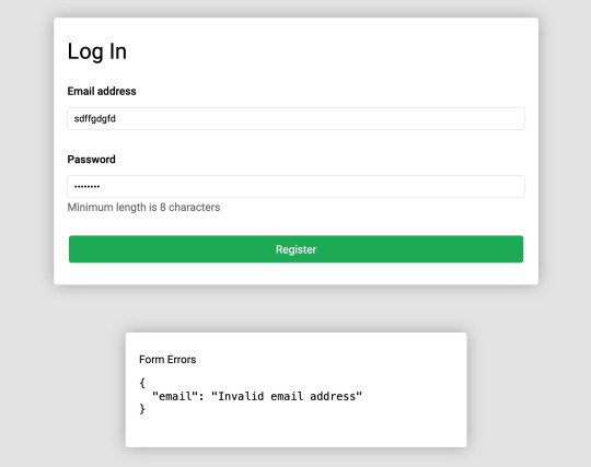
Validating at the field level or using manual triggers are fairly simple to understand. Albeit, you’ll likely use form level validation most of the time. It’s also worth checking out the docs to see other use cases.
Method 3: Using withFormik as a higher-order component
withFormik is a higher-order component and be used that way if that’s your thing. Write the form, then expose it through Formik.
A couple of practical examples
So far, we’ve become acquainted with Formik, covered the benefits of using it for creating forms in React, and covered a few methods to implement it as a React component while demonstrating various ways we can use it for validation. What we haven’t done is looked at examples of those key concepts. So, let’s look at a couple of practical applications: displaying error messages and generating a username based on what’s entered in the email input.
Displaying error messages
We’ve built our form and validated it. And we’ve caught some errors that can be found in our errors object. But it’s no use if we aren’t actually displaying those errors. Formik makes this a pretty trivial task. All we need to do is check the errors object returned by any of the methods we’ve looked at — <Formik/>, useFormik or withFormik — and display them:
<label className="formFieldLabel" htmlFor="email"> Email address <span className="errorMessage"> {touched["email"] && errors["email"]} </span> </label> <div className="formFieldWrapInner"> <input type="email" id="email" className="email formField" {...getFieldProps("email")} /> </div>
If there’s an error during validation, {touched["email"] && errors["email"]} will display it to the user. We could do the same with <ErrorMessage/>. With this, we only need to tell it the name of the dependent field to watch:
<ErrorMessage name="email"> {errMsg => <span className="errorMessage">{errMsg}</span>} </ErrorMessage>
Generating a username from an email address
Imagine a form that automatically generates a username for your users based on their email address. In other words, whatever the user types into the email input gets pulled out, stripped of @ and everything after it, and leaves us with a username with what’s left. For example: [email protected] produces @jane. Formik exposes helpers that can “intercept” its functionality and lets us perform some effects.In the case of auto-generating a username, one way will be through Formik’s setValues:
onSubmit(values) { // We added a `username` value for the user which is everything before @ in their email address. setValues({ ...values, username: `@${values.email.split("@")[0]}` }); }
Type in an email address and password, then submit the form to see your new username!
Wrapping up
Wow, we covered a lot of ground in a short amount of space. While this is merely the tip of the iceberg as far as covering all the needs of a form and what Formik is capable of doing, I hope this gives you a new tool to reach for the next time you find yourself tackling forms in a React application. If you’re ready to take Formik to the next level, I’d suggest looking through their resources as a starting point. There are so many goodies in there and it’s a good archive of what Formik can do as well as more tutorials that get into deeper use cases. Good luck with your forms!
0 notes
Text
React JS Core Concepts
Components
The fundamental unit of a React application is a part. A React segment is a blend of markup and JavaScript which is rendered into a HTML section.
Segments are settled into one another similarly as HTML labels.
Blending markup and JavaScript in a solitary spot may appear to be an impractical notion yet this is the thing that any JavaScript UI library does. Since there are still undertakings that can't be settled with just HTML and CSS, at times a JavaScript arrangement ends up being increasingly effective. So it is satisfactory to utilize JavaScript to change the view as long as you have your application rationale dealt with independently. Starting here of view, React parts are only an augmentation of the current HTML components.
Envision you have a part which should render a title in a decent manner, and you need it to adhere to the top during looking over. It is anything but difficult to expand HTML with another 'component' to epitomize this 'adhere to the top' rationale.
For whatever length of time that the application rationale lives in a different spot, you must have the option to pass information to the view layer to show it. React parts do this in HTML along these lines. You should simply to go values through qualities.
JSX
Basically React JS parts are straightforward articles, yet on account of JSX they can be introduced a lot of like HTML labels. JSX is XML-looking syntactic sugar like the sentence structure inside JavaScript code.
Also, JSX empowers you to pass object as a quality worth
You can even pass a capacity to a part which is broadly utilized for occasion audience members and corReactence among parent and kid segments.
In the end, this is parsed to JavaScript and you simply pass an item to the capacity.
Since credit names are changed over to protest fields, JSX expects the use of 'className' rather than 'class' and 'htmlFor' rather than 'for' properties.
It is helpful to utilize JSX on the grounds that you see where portrayal is and where different estimations are. It is additionally simpler for planners to change little bits of UI without delving into JavaScript rationale. Nonetheless, JSX language structure is discretionary and you could similarly too compose your parts in JavaScript.
State and Props
React parts are called state-full on the grounds that the yield of the segment render() work is constantly dictated by the information a segment contains. There are two spots where new information are passed to a segment: props and state.
A part is started up with 'props' and 'state' fields. A properties object is a guide of traits and their qualities. Props are utilized to pass information from the parent to youngster parts. A youngster part should not change the properties it has gotten from the parent segment. The interior state of a segment is spoken to by the state article and its information can be changed by the part itself.
The capacity to exemplify a part's interior state disentangles the detachment of the application rationale from the view layer. A part should possibly change state itself when it is identified with its portrayal and need to pass controls identified with the application information.
Reusable Components
Parts that don't contain application rationale can be reused in various manners. React empowers composing reusable segments and gives an API to bind together the parts structure.
Composing a part you can characterize which properties it can have and what the necessary kind for every property is. You can likewise characterize the part's default properties and default state. Having this done in a revelatory manner is valuable to work with the outsider parts.
Besides, properties can be gone through parts making it simple to make a flimsy wrapper around the settled segments.
Virtual DOM
React keeps in memory a straightforward article tree of all segments which is known as the virtual DOM. At whatever point the application state changes and it is required to refresh the UI, the virtual DOM is utilized to locate the insignificant arrangement of tasks to bring the view from the past condition to the upgraded one.
It is a straightforward model yet it gives a fundamental comprehension of React JS diff-calculation.
In a progressively mind boggling application, a few degrees of settled segments will make an item tree. For this situation when setState() is required the top most part, it recalculates all hubs beneath.
So as to improve re-rendering React begins from the least hubs and looks at just segments on a similar degree of the tree.
React likewise streamlines records examination by doling out keys to list parts. On the off chance that parts in the rundown have keys, it is a lot simpler to discover which segment has been changed, included or expelled.
Every one of these improvements are conceivable in light of the fact that React gives a deliberation from direct DOM control depicting segments as articles and forming them into a virtual DOM.
Event Handling
React makes its own occasion framework which is completely perfect with W3C particular. Every single browser'native occasion are wrapped by examples of SyntheticEvent. That implies you don't have to stress over conflicting occasion names and fields. In addition, React occasion framework is executed through occasion appointment and furthermore has a pool of occasion articles to decrease memory overhead.
For more details about React JS Online Training CLICK HERE
Contact us for more details +919989971070 or visit us www.visualpath.in
0 notes
Text
Global Cetyl Palmitate Market Industry Sales, Revenue, Gross Margin, Market Share, by Regions 2019-2025.
For More Info@https://www.reportsnreports.com/reports/1655882-global-cetyl-palmitate-market-insights-forecast-to-2025.htmlFor Inquiry@https://www.reportsnreports.com/contacts/inquirybeforebuy.aspx?name=1655882
0 notes
Text
Learning Gutenberg: React 101
Although Gutenberg is put together with React, the code we’re writing to make custom blocks isn’t. It certainly resembles a React component though, so I think it’s useful to have a little play to get familiar with this sort of approach. There’s been a lot of reading in this series so far, so let’s roll-up our sleeves and make something cool.
Article Series:
Series Introduction
What is Gutenberg, Anyway?
A Primer with create-guten-block
Modern JavaScript Syntax
React 101 (This Post)
Setting up a Custom webpack
A Custom "Card" Block (Coming Soon!)
Let’s make an “About Me” component
We’re going to make a single React component that updates the background color of a page and the intro text based on data you input into a couple of fields. “I thought this was supposed to be cool,” I hear you all mutter. I’ll admit, I may have oversold it, but we’re going to learn some core concepts of state-driven JavaScript which will come in handy when we dig into our Gutenberg block.
For reference, this is what we’re going to end up with:
Getting started
The first thing we’re going to do is fire up CodePen. CodePen can be used for free, so go head over there and create a new Pen.
Next, we’re going to pull in some JavaScript dependencies. There are three editor screens—find the JS screen and click the settings cog. This will open up a Pen Settings modal where you’ll find the section titled Add External Scripts/Pens. Right at the bottom, theres a Quick-add select menu. Go ahead and open that up.
From the menu, select React. Once that’s selected, open the menu and select ReactDOM. You’ll see that this has pre-filled some text boxes.
Lastly, we need to enable our ES6 code, so at the menu titled JavaScript Preprocessor, select Babel.
Now, go ahead and click the big Save & Close button.
What we’ve done there is pull the main React JS library and ReactDOM library. These will enable us to dive in and write our code, which is our next step.
Setup our CSS
Let’s make it look cool. First up though, let’s setup our CSS editor. The first thing we’re going to do is set it up to compile Sass for us. Just like we did with the JS editor, click on the settings cog which will bring up the Pen Settings modal again—this time with the CSS settings.
At the top, there’s a CSS Preprocessor menu. Go ahead and select SCSS from there.
When that’s done, go down to the Add External Stylesheets/Pens and paste the following three links into separate text-boxes:
https://cdnjs.cloudflare.com/ajax/libs/normalize/8.0.0/normalize.css https://fonts.googleapis.com/css?family=Work+Sans:300 https://rawgit.com/hankchizljaw/boilerform/master/dist/css/boilerform.min.css
Those three in order give us a reset, a fancy font and some helpful form styles.
Now that they’re all set, go ahead and click the "Save & Close" button again.
Adding a bit of style
We’re all setup so this step should be easy. Paste the following Sass into the CSS editor:
:root { --text-color: #f3f3f3; } * { box-sizing: border-box; } html { height: 100%; font-size: 16px; } body { height: 100%; position: relative; font-size: 1rem; line-height: 1.4; font-family: "Work Sans", sans-serif; font-weight: 300; background: #f3f3f3; color: #232323; } .about { width: 100%; height: 100%; position: absolute; top: 0; left: 0; color: var(--text-color); transition: all 2000ms ease-in-out; &__inner { display: flex; flex-direction: column; height: 100%; margin: 0 auto; padding: 1.2rem; } &__content { display: flex; flex-direction: column; justify-content: center; align-items: center; flex: 1 1 auto; font-size: 3rem; line-height: 1.2; > * { max-width: 30ch; } } &__form { display: flex; flex-direction: column; align-items: center; padding: 2rem 0; width: 100%; max-width: 60rem; margin: 0 auto; @media(min-width: 32rem) { flex-direction: row; justify-content: space-between; padding: 2rem; } > * { width: 15rem; } > * + * { margin: 1rem 0 0 0; @media(min-width: 32rem) { margin: 0; } } label { display: block; } } } // Boilerform overrides .c-select-field { &, &__menu { width: 100%; } } .c-input-field { width: 100%; } .c-label { color: var(--text-color); }
That’s a big ol’ chunk of CSS, and it’ll look like nothing has really happened, but it’s all good—we’re not going to have to worry about CSS for the rest of this section.
Digging into React
The first thing we’re going to do is give React something to latch on to. Paste this into the HTML editor of your Pen:
<div id="root"></div>
That’s it for HTML—you can go ahead and maximize your JS editor so we’ve got complete focus.
Let’s start our component code, by creating a new instance of a React component by writing the following JavaScript:
class AboutMe extends React.Component { }
What that code is doing is creating a new AboutMe component and extending React’s Component class, which gives us a load of code and tooling for free.
Right, so we’ve got a class, and now we need to construct it! Add the following code, inside the brackets:
constructor(props) { super(props); let self = this; };
We’ve got a few things going on here, so I’ll explain each:
constructor is the method that’s called when you write new AboutMe(), or if you write <AboutMe /> in your JSX. This constructs the object. The props parameter is something you’ll see a lot in React. This is the collection of properties that are passed into the component. For example: if you wrote <AboutMe name="Andy" />, you’d be able to access it in your constructor with props.name.
super is how we tell the class that we’ve extended to construct with its own constructor. You’ll see we’re also passing the props up to it in case any parent components need to access them.
Finally let self = this is a way of controlling the scope of this. Remember, because we’re using let, self will only be available in the constructor function.
Quick note for those readers not-so-confident in JavaScript: I found a deeper look at scope in JavaScript to result in a lot of “aha” moments in my learning. I highly recommend Kyle Simpson’s You Don’t Know JS book series (available for free on GitHub!). Volumes of note: this and Object Prototypes and Scope & Closures. Good stuff, I promise.
Now we’ve covered the constructor, let’s add some more code to it. After the let self = this; line, paste the following code:
self.availableColors = [ { "name": "Red", "value": "#ca3814" }, { "name": "Blue", "value": "#0086cc" }, { "name": "Green", "value": "#3aa22b" } ];
What we’ve got there is an array of objects that define our options for picking your favorite color. Go ahead and add your own if it’s not already there!
Your class definition and constructor should now look like this:
class AboutMe extends React.Component { constructor(props) { super(props); let self = this; // Set a list of available colors that render in the select menu self.availableColors = [ { "name": "Red", "value": "#ca3814" }, { "name": "Blue", "value": "#0086cc" }, { "name": "Green", "value": "#3aa22b" } ]; }; }
Pretty straightforward so far, right? Let’s move on and set some initial values to our reactive state. Add the following after the closing of self.availableColors:
// Set our initial reactive state values self.state = { name: 'Foo', color: self.availableColors[0].value };
This initial setting of state enables our component to render both a name and a color on load, which prevents it from looking broken.
Next, we’ll add our render function. This is a pure function, which does nothing but render the component based on the initial state or any state changes during the component’s lifecycle. You may have guessed already, but this is where the main body of our JSX lives.
Wait up! What’s a pure function? Welcome to functional programming, a hot topic in the React world. Pure functions are functions where, for input X, the output will always be Y. In an "impure" function, input X might result in different outputs, depending other parts of the program. Here’s a CodePen comparing pure and impure functions. Check out this article out, too, for more details.
Now, because there’s quite a lot of markup in this single component, we’re going to copy the whole lot into our function. Add the following under your constructor:
render() { let self = this; return ( <main className="about" style={ { background: self.state.color } }> <section className="about__inner"> <article className="about__content"> { self.state.name ? <p>Hello there. My name is { self.state.name }, and my favourite color is { self.getActiveColorName() }</p> : null } </article> <form className="[ about__form ] [ boilerform ]"> <div> <label className="c-label" htmlFor="name_field">Your name</label> <input className="c-input-field" type="text" id="name_field" value={ self.state.name } onChange={ self.updateName.bind(self) } /> </div> <div> <label className="c-label" htmlFor="color_field">Your favourite color</label> <div className="c-select-field"> <select className="c-select-field__menu" value={ self.state.color } onChange={ self.updateColor.bind(self) } id="color_field"> { self.availableColors.map((color, index) => { return ( <option key={ index } value={ color.value }>{ color.name }</option> ); })} </select> <span className="c-select-field__decor" aria-hidden="true" role="presentation">▾</span> </div> </div> </form> </section> </main> ); };
You may be thinking something like: “Holy cow, there’s a lot going on here.” Let’s dissect it, so don’t worry about copying code for a bit—I’ll let you know where we’re going to do that again. Let’s just focus on some key bits for now.
In JSX, you need to return a single element, which can have child elements. Because all of our code is wrapped in a <main> tag, we’re all good there. On that <main> tag, you’ll see we have an expression in an attribute, like we covered in Part 2. This expression sets the background color as the current active color that’s set in our state. This will update like magic when a user changes their color choice without us having to write another line of code for it in this render function. Pretty cool, huh?
Inside the <article class="about__content"> element, you’ll notice this:
{ self.state.name ? <p>Hello there. My name is { self.state.name }, and my favourite color is { self.getActiveColorName() }</p> : null }
This ternary operator checks to see if there’s a name set and renders either a sentence containing the name or null. Returning null in JSX is how you tell it to render nothing to the client. Also related to this snippet: we were able to run this ternary operator within our JSX because we created an expression by opening some brackets. It’s a really useful way of sprinkling small, simple bits of display logic within your render function.
Next up, let’s look at an event binding:
<input className="c-input-field" type="text" id="name_field" value={ self.state.name } onChange={ self.updateName.bind(self) } />
If you don’t bind an event to your input field, it’ll be read only. Don’t panic about forgetting though. React helpfully warns you in your console.
Remember, self is equal to this, so what we’re doing is attaching the updateName function to the input’s onChange event, but we’re also binding self, so that when we’re within the updateName function, this will equal AboutMe, which is our component.
The last thing we’re going to look at in the render function is loops. Here’s the snippet that renders the color menu:
<select className="c-select-field__menu" value={ self.state.color } onChange={ self.updateColor.bind(self) } id="color_field"> { self.availableColors.map((color, index) => { return ( <option key={ index } value={ color.value }>{ color.name }</option> ); }) } </select>
The value and change setup is the same as the above <input /> element, so we’ll ignore them and dive straight in to the loop. What we’ve done is open up an expression where we run a pretty standard Array Map function, but, importantly, it returns JSX in each iteration, which allows each option to render with the rest of the JSX.
Wiring it all up
Now that we’ve got our core aspects of the component running, we need to wire it up. You’ll notice that your CodePen isn’t doing anything at the moment. That’s because of two things:
We haven’t attached the component to the DOM yet
We haven’t written any methods to make it interactive
Let’s start with the former and add our change event handlers. Add the following underneath your constructor function:
updateName(evt) { let self = this; self.setState({ name: evt.target.value }) }; updateColor(evt) { let self = this; self.setState({ color: evt.target.value }) };
These two functions handle the onChange events of the <select> and <input> and set their values in state using React’s setState function. Now that the values are in state, anything that is subscribed to them will update automatically. This means that the ternary statement that renders your name and the background color will change in realtime as you type/select. Awesome. right?
Now, it would be recommended to make your code more DRY by combining these two as one change event handler that updates the relevant state. For this series though, let’s keep things simple and more understandable. 😀
Next up, let’s add the last method to our component. Add the following under your recently added update methods:
// Return active color name from available colors, based on state value getActiveColorName() { let self = this; return self.availableColors.filter(color => color.value === self.state.color)[0].name; };
This function uses one of my favorite JavaScript array methods: filter. With ES6, we can cherry pick array items based on their object value in one line, which is powerful stuff. With that power, we can pick the currently active availableColors item’s human-readable name and return it back.
JavaScript array methods are very cool and commonly spotted in the React ecosystem. Sarah Drasner made a seriously amazing “Array Explorer”—check it out here!
Attaching the component to the DOM
The last thing we’re going to do is attach our component to the DOM, using ReactDOM. What we’re doing is saying, “Hey browser, fetch me the <div id="root"> element and render this React component in it.” ReactDOM is doing all the magic that makes that possible.
ReactDOM is a really smart package that takes changes in your dynamic React components, calculates what needs to be changed in the DOM and applies those changes in the most efficient possible way. With ReactDOM’s renderToString() method, you can also render your React components to a static string, which can then be inserted to your page with your server-side code. What’s smart about this is that references are added so that if your front-end picks up some server-rendered React, it’ll work out which components are needed and make the whole chunk of static markup dynamic automatically. Pretty damn smart, huh?
Anyway, back to our Pen. Add this right at the bottom of your JS editor:
// Attach our component to the <div id="root"> element ReactDOM.render(<AboutMe />, document.getElementById('root'));
Now, you’ll notice that your preview window has suddenly come alive! Congratulations — you just wrote a React component 🎉
See the Pen About Me React Component by Andy Bell (@hankchizlja) on CodePen.
Wrapping up
In this part, you’ve learned about reactive, component JavaScript by writing a React component. This is relevant to your learning because custom Gutenberg blocks follow a very similar setup to a React component. Now that you’ve got a better understanding of how a React component works, you should be able to understand how a custom Gutenberg block works too.
It took me a bit to wrap my mind around the fact that, in terms of Gutenberg, React is only relevant to building blocks within the admin. In Gutenberg, React functions as a means of preparing the markup to be saved to the database in the post_content column. Using React on the front-end of a WordPress site to build something like this would be separate from what we will be doing in this series.
Next up in this series, we’re going to edit our WordPress theme so that we can build our custom Gutenberg block.
Article Series:
Series Introduction
What is Gutenberg, Anyway?
A Primer with create-guten-block
Modern JavaScript Syntax
React 101 (This Post)
Setting up a Custom webpack
A Custom "Card" Block (Coming Soon!)
The post Learning Gutenberg: React 101 appeared first on CSS-Tricks.
via CSS-Tricks https://ift.tt/2GLJi0C
0 notes
Photo

Create a Toggle Switch in React as a Reusable Component
In this article, we're going to create an iOS-inspired toggle switch using React components. By the end, we'll have built a simple demo React App that uses our custom toggle switch component.
We could use third-party libraries for this, but building from scratch allows us to better understand how our code is working and allows us to customize our component completely.
Forms provide a major means for enabling user interactions. The checkbox is traditionally used for collecting binary data — such as yes or no, true or false, enable or disable, on or off, etc. Although some modern interface designs steer away from form fields when creating toggle switches, I'll stick with them here due to their greater accessibility.
Here's a screenshot of the component we'll be building:
Getting Started
We can start with a basic HTML checkbox input form element with its necessary properties set:
<input type="checkbox" name="name" id="id" />
To build around it, we might need an enclosing <div> with a class, a <label> and the <input /> control itself. Adding everything, we might get something like this:
<div class="toggle-switch"> <input type="checkbox" class="toggle-switch-checkbox" name="toggleSwitch" id="toggleSwitch" /> <label class="toggle-switch-label" for="toggleSwitch"> Toggle Me! </label> </div>
In time, we can get rid of the label text and use the <label> tag to check or uncheck the checkbox input control. Inside the <label>, let's add two <span>s that help us construct the switch holder and the toggling switch itself:
<div class="toggle-switch"> <input type="checkbox" class="toggle-switch-checkbox" name="toggleSwitch" id="toggleSwitch" /> <label class="toggle-switch-label" for="toggleSwitch"> <span class="toggle-switch-inner"></span> <span class="toggle-switch-switch"></span> </label> </div>
Converting to a React Component
Now that we know what needs to go into the HTML, all we need to do is to convert the HTML into a React component. Let's start with a basic component here. We'll make this a class component, and then we'll convert it into hooks, as it's easier for new developers to follow state than useState:
import React, { Component } from "react"; class ToggleSwitch extends Component { render() { return ( <div className="toggle-switch"> <input type="checkbox" className="toggle-switch-checkbox" name="toggleSwitch" id="toggleSwitch" /> <label className="toggle-switch-label" htmlFor="toggleSwitch"> <span className="toggle-switch-inner" /> <span className="toggle-switch-switch" /> </label> </div> ); } } export default ToggleSwitch;
At this point, it's not possible to have multiple toggle switch sliders on the same view or same page due to the repetition of ids. We could leverage React's way of componentization here, but in this instance, we'll be using props to dynamically populate the values:
import React, { Component } from "react"; class ToggleSwitch extends Component { render() { return ( <div className="toggle-switch"> <input type="checkbox" className="toggle-switch-checkbox" name={this.props.Name} id={this.props.Name} /> <label className="toggle-switch-label" htmlFor={this.props.Name}> <span className="toggle-switch-inner" /> <span className="toggle-switch-switch" /> </label> </div> ); } } export default ToggleSwitch;
The this.props.Name will populate the values of id, name and for (note that it is htmlFor in React JS) dynamically, so that you can pass different values to the component and have multiple of them on the same page. Also, the <span> tag doesn't have an ending </span> tag; instead it's closed in the starting tag like <span />, and this is completely fine.
The post Create a Toggle Switch in React as a Reusable Component appeared first on SitePoint.
by Praveen Kumar via SitePoint https://ift.tt/35oQmwS
0 notes
Text
How to Add Lunr Search to your Gatsby Website
The Jamstack way of thinking and building websites is becoming more and more popular.
Have you already tried Gatsby, Nuxt, or Gridsome (to cite only a few)? Chances are that your first contact was a “Wow!” moment — so many things are automatically set up and ready to use.
There are some challenges, though, one of which is search functionality. If you’re working on any sort of content-driven site, you’ll likely run into search and how to handle it. Can it be done without any external server-side technology?
Search is not one of those things that come out of the box with Jamstack. Some extra decisions and implementation are required.
Fortunately, we have a bunch of options that might be more or less adapted to a project. We could use Algolia’s powerful search-as-service API. It comes with a free plan that is restricted to non-commercial projects with a limited capacity. If we were to use WordPress with WPGraphQL as a data source, we could take advantage of WordPress native search functionality and Apollo Client. Raymond Camden recently explored a few Jamstack search options, including pointing a search form directly at Google.
In this article, we will build a search index and add search functionality to a Gatsby website with Lunr, a lightweight JavaScript library providing an extensible and customizable search without the need for external, server-side services. We used it recently to add “Search by Tartan Name” to our Gatsby project tartanify.com. We absolutely wanted persistent search as-you-type functionality, which brought some extra challenges. But that’s what makes it interesting, right? I’ll discuss some of the difficulties we faced and how we dealt with them in the second half of this article.

Getting started
For the sake of simplicity, let’s use the official Gatsby blog starter. Using a generic starter lets us abstract many aspects of building a static website. If you’re following along, make sure to install and run it:
gatsby new gatsby-starter-blog https://github.com/gatsbyjs/gatsby-starter-blog cd gatsby-starter-blog gatsby develop
It’s a tiny blog with three posts we can view by opening up http://localhost:8000/___graphql in the browser.
Inverting index with Lunr.js 🙃
Lunr uses a record-level inverted index as its data structure. The inverted index stores the mapping for each word found within a website to its location (basically a set of page paths). It’s on us to decide which fields (e.g. title, content, description, etc.) provide the keys (words) for the index.
For our blog example, I decided to include all titles and the content of each article. Dealing with titles is straightforward since they are composed uniquely of words. Indexing content is a little more complex. My first try was to use the rawMarkdownBody field. Unfortunately, rawMarkdownBody introduces some unwanted keys resulting from the markdown syntax.
I obtained a “clean” index using the html field in conjunction with the striptags package (which, as the name suggests, strips out the HTML tags). Before we get into the details, let’s look into the Lunr documentation.
Here’s how we create and populate the Lunr index. We will use this snippet in a moment, specifically in our gatsby-node.js file.
const index = lunr(function () { this.ref('slug') this.field('title') this.field('content') for (const doc of documents) { this.add(doc) } })
documents is an array of objects, each with a slug, title and content property:
{ slug: '/post-slug/', title: 'Post Title', content: 'Post content with all HTML tags stripped out.' }
We will define a unique document key (the slug) and two fields (the title and content, or the key providers). Finally, we will add all of the documents, one by one.
Let’s get started.
Creating an index in gatsby-node.js
Let’s start by installing the libraries that we are going to use.
yarn add lunr graphql-type-json striptags
Next, we need to edit the gatsby-node.js file. The code from this file runs once in the process of building a site, and our aim is to add index creation to the tasks that Gatsby executes on build.
CreateResolvers is one of the Gatsby APIs controlling the GraphQL data layer. In this particular case, we will use it to create a new root field; Let’s call it LunrIndex.
Gatsby’s internal data store and query capabilities are exposed to GraphQL field resolvers on context.nodeModel. With getAllNodes, we can get all nodes of a specified type:
/* gatsby-node.js */ const { GraphQLJSONObject } = require(`graphql-type-json`) const striptags = require(`striptags`) const lunr = require(`lunr`) exports.createResolvers = ({ cache, createResolvers }) => { createResolvers({ Query: { LunrIndex: { type: GraphQLJSONObject, resolve: (source, args, context, info) => { const blogNodes = context.nodeModel.getAllNodes({ type: `MarkdownRemark`, }) const type = info.schema.getType(`MarkdownRemark`) return createIndex(blogNodes, type, cache) }, }, }, }) }
Now let’s focus on the createIndex function. That’s where we will use the Lunr snippet we mentioned in the last section.
/* gatsby-node.js */ const createIndex = async (blogNodes, type, cache) => { const documents = [] // Iterate over all posts for (const node of blogNodes) { const html = await type.getFields().html.resolve(node) // Once html is resolved, add a slug-title-content object to the documents array documents.push({ slug: node.fields.slug, title: node.frontmatter.title, content: striptags(html), }) } const index = lunr(function() { this.ref(`slug`) this.field(`title`) this.field(`content`) for (const doc of documents) { this.add(doc) } }) return index.toJSON() }
Have you noticed that instead of accessing the HTML element directly with const html = node.html, we’re using an await expression? That’s because node.html isn’t available yet. The gatsby-transformer-remark plugin (used by our starter to parse Markdown files) does not generate HTML from markdown immediately when creating the MarkdownRemark nodes. Instead, html is generated lazily when the html field resolver is called in a query. The same actually applies to the excerpt that we will need in just a bit.
Let’s look ahead and think about how we are going to display search results. Users expect to obtain a link to the matching post, with its title as the anchor text. Very likely, they wouldn’t mind a short excerpt as well.
Lunr’s search returns an array of objects representing matching documents by the ref property (which is the unique document key slug in our example). This array does not contain the document title nor the content. Therefore, we need to store somewhere the post title and excerpt corresponding to each slug. We can do that within our LunrIndex as below:
/* gatsby-node.js */ const createIndex = async (blogNodes, type, cache) => { const documents = [] const store = {} for (const node of blogNodes) { const {slug} = node.fields const title = node.frontmatter.title const [html, excerpt] = await Promise.all([ type.getFields().html.resolve(node), type.getFields().excerpt.resolve(node, { pruneLength: 40 }), ]) documents.push({ // unchanged }) store[slug] = { title, excerpt, } } const index = lunr(function() { // unchanged }) return { index: index.toJSON(), store } }
Our search index changes only if one of the posts is modified or a new post is added. We don’t need to rebuild the index each time we run gatsby develop. To avoid unnecessary builds, let’s take advantage of the cache API:
/* gatsby-node.js */ const createIndex = async (blogNodes, type, cache) => { const cacheKey = `IndexLunr` const cached = await cache.get(cacheKey) if (cached) { return cached } // unchanged const json = { index: index.toJSON(), store } await cache.set(cacheKey, json) return json }
Enhancing pages with the search form component
We can now move on to the front end of our implementation. Let’s start by building a search form component.
touch src/components/search-form.js
I opt for a straightforward solution: an input of type="search", coupled with a label and accompanied by a submit button, all wrapped within a form tag with the search landmark role.
We will add two event handlers, handleSubmit on form submit and handleChange on changes to the search input.
/* src/components/search-form.js */ import React, { useState, useRef } from "react" import { navigate } from "@reach/router" const SearchForm = ({ initialQuery = "" }) => { // Create a piece of state, and initialize it to initialQuery // query will hold the current value of the state, // and setQuery will let us change it const [query, setQuery] = useState(initialQuery) // We need to get reference to the search input element const inputEl = useRef(null) // On input change use the current value of the input field (e.target.value) // to update the state's query value const handleChange = e => { setQuery(e.target.value) } // When the form is submitted navigate to /search // with a query q paramenter equal to the value within the input search const handleSubmit = e => { e.preventDefault() // `inputEl.current` points to the mounted search input element const q = inputEl.current.value navigate(`/search?q=${q}`) } return ( <form role="search" onSubmit={handleSubmit}> <label htmlFor="search-input" style=> Search for: </label> <input ref={inputEl} id="search-input" type="search" value={query} placeholder="e.g. duck" onChange={handleChange} /> <button type="submit">Go</button> </form> ) } export default SearchForm
Have you noticed that we’re importing navigate from the @reach/router package? That is necessary since neither Gatsby’s <Link/> nor navigate provide in-route navigation with a query parameter. Instead, we can import @reach/router — there’s no need to install it since Gatsby already includes it — and use its navigate function.
Now that we’ve built our component, let’s add it to our home page (as below) and 404 page.
/* src/pages/index.js */ // unchanged import SearchForm from "../components/search-form" const BlogIndex = ({ data, location }) => { // unchanged return ( <Layout location={location} title={siteTitle}> <SEO title="All posts" /> <Bio /> <SearchForm /> // unchanged
Search results page
Our SearchForm component navigates to the /search route when the form is submitted, but for the moment, there is nothing behing this URL. That means we need to add a new page:
touch src/pages/search.js
I proceeded by copying and adapting the content of the the index.js page. One of the essential modifications concerns the page query (see the very bottom of the file). We will replace allMarkdownRemark with the LunrIndex field.
/* src/pages/search.js */ import React from "react" import { Link, graphql } from "gatsby" import { Index } from "lunr" import Layout from "../components/layout" import SEO from "../components/seo" import SearchForm from "../components/search-form"
// We can access the results of the page GraphQL query via the data props const SearchPage = ({ data, location }) => { const siteTitle = data.site.siteMetadata.title // We can read what follows the ?q= here // URLSearchParams provides a native way to get URL params // location.search.slice(1) gets rid of the "?" const params = new URLSearchParams(location.search.slice(1)) const q = params.get("q") || ""
// LunrIndex is available via page query const { store } = data.LunrIndex // Lunr in action here const index = Index.load(data.LunrIndex.index) let results = [] try { // Search is a lunr method results = index.search(q).map(({ ref }) => { // Map search results to an array of {slug, title, excerpt} objects return { slug: ref, ...store[ref], } }) } catch (error) { console.log(error) } return ( // We will take care of this part in a moment ) } export default SearchPage export const pageQuery = graphql` query { site { siteMetadata { title } } LunrIndex } `
Now that we know how to retrieve the query value and the matching posts, let’s display the content of the page. Notice that on the search page we pass the query value to the <SearchForm /> component via the initialQuery props. When the user arrives to the search results page, their search query should remain in the input field.
return ( <Layout location={location} title={siteTitle}> <SEO title="Search results" /> {q ? <h1>Search results</h1> : <h1>What are you looking for?</h1>} <SearchForm initialQuery={q} /> {results.length ? ( results.map(result => { return ( <article key={result.slug}> <h2> <Link to={result.slug}> {result.title || result.slug} </Link> </h2> <p>{result.excerpt}</p> </article> ) }) ) : ( <p>Nothing found.</p> )} </Layout> )
You can find the complete code in this gatsby-starter-blog fork and the live demo deployed on Netlify.
Instant search widget
Finding the most “logical” and user-friendly way of implementing search may be a challenge in and of itself. Let’s now switch to the real-life example of tartanify.com — a Gatsby-powered website gathering 5,000+ tartan patterns. Since tartans are often associated with clans or organizations, the possibility to search a tartan by name seems to make sense.
We built tartanify.com as a side project where we feel absolutely free to experiment with things. We didn’t want a classic search results page but an instant search “widget.” Often, a given search keyword corresponds with a number of results — for example, “Ramsay” comes in six variations. We imagined the search widget would be persistent, meaning it should stay in place when a user navigates from one matching tartan to another.
Let me show you how we made it work with Lunr. The first step of building the index is very similar to the gatsby-starter-blog example, only simpler:
/* gatsby-node.js */ exports.createResolvers = ({ cache, createResolvers }) => { createResolvers({ Query: { LunrIndex: { type: GraphQLJSONObject, resolve(source, args, context) { const siteNodes = context.nodeModel.getAllNodes({ type: `TartansCsv`, }) return createIndex(siteNodes, cache) }, }, }, }) } const createIndex = async (nodes, cache) => { const cacheKey = `LunrIndex` const cached = await cache.get(cacheKey) if (cached) { return cached } const store = {} const index = lunr(function() { this.ref(`slug`) this.field(`title`) for (node of nodes) { const { slug } = node.fields const doc = { slug, title: node.fields.Unique_Name, } store[slug] = { title: doc.title, } this.add(doc) } }) const json = { index: index.toJSON(), store } cache.set(cacheKey, json) return json }
We opted for instant search, which means that search is triggered by any change in the search input instead of a form submission.
/* src/components/searchwidget.js */ import React, { useState } from "react" import lunr, { Index } from "lunr" import { graphql, useStaticQuery } from "gatsby" import SearchResults from "./searchresults"
const SearchWidget = () => { const [value, setValue] = useState("") // results is now a state variable const [results, setResults] = useState([])
// Since it's not a page component, useStaticQuery for quering data // https://www.gatsbyjs.org/docs/use-static-query/ const { LunrIndex } = useStaticQuery(graphql` query { LunrIndex } `) const index = Index.load(LunrIndex.index) const { store } = LunrIndex const handleChange = e => { const query = e.target.value setValue(query) try { const search = index.search(query).map(({ ref }) => { return { slug: ref, ...store[ref], } }) setResults(search) } catch (error) { console.log(error) } } return ( <div className="search-wrapper"> // You can use a form tag as well, as long as we prevent the default submit behavior <div role="search"> <label htmlFor="search-input" className="visually-hidden"> Search Tartans by Name </label> <input id="search-input" type="search" value={value} onChange={handleChange} placeholder="Search Tartans by Name" /> </div> <SearchResults results={results} /> </div> ) } export default SearchWidget
The SearchResults are structured like this:
/* src/components/searchresults.js */ import React from "react" import { Link } from "gatsby" const SearchResults = ({ results }) => ( <div> {results.length ? ( <> <h2>{results.length} tartan(s) matched your query</h2> <ul> {results.map(result => ( <li key={result.slug}> <Link to={`/tartan/${result.slug}`}>{result.title}</Link> </li> ))} </ul> </> ) : ( <p>Sorry, no matches found.</p> )} </div> ) export default SearchResults
Making it persistent
Where should we use this component? We could add it to the Layout component. The problem is that our search form will get unmounted on page changes that way. If a user wants to browser all tartans associated with the “Ramsay” clan, they will have to retype their query several times. That’s not ideal.
Thomas Weibenfalk has written a great article on keeping state between pages with local state in Gatsby.js. We will use the same technique, where the wrapPageElement browser API sets persistent UI elements around pages.
Let’s add the following code to the gatsby-browser.js. You might need to add this file to the root of your project.
/* gatsby-browser.js */ import React from "react" import SearchWrapper from "./src/components/searchwrapper" export const wrapPageElement = ({ element, props }) => ( <SearchWrapper {...props}>{element}</SearchWrapper> )
Now let’s add a new component file:
touch src/components/searchwrapper.js
Instead of adding SearchWidget component to the Layout, we will add it to the SearchWrapper and the magic happens. ✨
/* src/components/searchwrapper.js */ import React from "react" import SearchWidget from "./searchwidget"
const SearchWrapper = ({ children }) => ( <> {children} <SearchWidget /> </> ) export default SearchWrapper
Creating a custom search query
At this point, I started to try different keywords but very quickly realized that Lunr’s default search query might not be the best solution when used for instant search.
Why? Imagine that we are looking for tartans associated with the name MacCallum. While typing “MacCallum” letter-by-letter, this is the evolution of the results:
m – 2 matches (Lyon, Jeffrey M, Lyon, Jeffrey M (Hunting))
ma – no matches
mac – 1 match (Brighton Mac Dermotte)
macc – no matches
macca – no matches
maccal – 1 match (MacCall)
maccall – 1 match (MacCall)
maccallu – no matches
maccallum – 3 matches (MacCallum, MacCallum #2, MacCallum of Berwick)
Users will probably type the full name and hit the button if we make a button available. But with instant search, a user is likely to abandon early because they may expect that the results can only narrow down letters are added to the keyword query.
That’s not the only problem. Here’s what we get with “Callum”:
c – 3 unrelated matches
ca – no matches
cal – no matches
call – no matches
callu – no matches
callum – one match
You can see the trouble if someone gives up halfway into typing the full query.
Fortunately, Lunr supports more complex queries, including fuzzy matches, wildcards and boolean logic (e.g. AND, OR, NOT) for multiple terms. All of these are available either via a special query syntax, for example:
index.search("+*callum mac*")
We could also reach for the index query method to handle it programatically.
The first solution is not satisfying since it requires more effort from the user. I used the index.query method instead:
/* src/components/searchwidget.js */ const search = index .query(function(q) { // full term matching q.term(el) // OR (default) // trailing or leading wildcard q.term(el, { wildcard: lunr.Query.wildcard.LEADING | lunr.Query.wildcard.TRAILING, }) }) .map(({ ref }) => { return { slug: ref, ...store[ref], } })
Why use full term matching with wildcard matching? That’s necessary for all keywords that “benefit” from the stemming process. For example, the stem of “different” is “differ.” As a consequence, queries with wildcards — such as differe*, differen* or different* — all result in no matches, while the full term queries differe, differen and different return matches.
Fuzzy matches can be used as well. In our case, they are allowed uniquely for terms of five or more characters:
q.term(el, { editDistance: el.length > 5 ? 1 : 0 }) q.term(el, { wildcard: lunr.Query.wildcard.LEADING | lunr.Query.wildcard.TRAILING, })
The handleChange function also “cleans up” user inputs and ignores single-character terms:
/* src/components/searchwidget.js */ const handleChange = e => { const query = e.target.value || "" setValue(query) if (!query.length) { setResults([]) } const keywords = query .trim() // remove trailing and leading spaces .replace(/\*/g, "") // remove user's wildcards .toLowerCase() .split(/\s+/) // split by whitespaces // do nothing if the last typed keyword is shorter than 2 if (keywords[keywords.length - 1].length < 2) { return } try { const search = index .query(function(q) { keywords // filter out keywords shorter than 2 .filter(el => el.length > 1) // loop over keywords .forEach(el => { q.term(el, { editDistance: el.length > 5 ? 1 : 0 }) q.term(el, { wildcard: lunr.Query.wildcard.LEADING | lunr.Query.wildcard.TRAILING, }) }) }) .map(({ ref }) => { return { slug: ref, ...store[ref], } }) setResults(search) } catch (error) { console.log(error) } }
Let’s check it in action:
m – pending
ma – 861 matches
mac – 600 matches
macc – 35 matches
macca – 12 matches
maccal – 9 matches
maccall – 9 matches
maccallu – 3 matches
maccallum – 3 matches
Searching for “Callum” works as well, resulting in four matches: Callum, MacCallum, MacCallum #2, and MacCallum of Berwick.
There is one more problem, though: multi-terms queries. Say, you’re looking for “Loch Ness.” There are two tartans associated with that term, but with the default OR logic, you get a grand total of 96 results. (There are plenty of other lakes in Scotland.)
I wound up deciding that an AND search would work better for this project. Unfortunately, Lunr does not support nested queries, and what we actually need is (keyword1 OR *keyword*) AND (keyword2 OR *keyword2*).
To overcome this, I ended up moving the terms loop outside the query method and intersecting the results per term. (By intersecting, I mean finding all slugs that appear in all of the per-single-keyword results.)
/* src/components/searchwidget.js */ try { // andSearch stores the intersection of all per-term results let andSearch = [] keywords .filter(el => el.length > 1) // loop over keywords .forEach((el, i) => { // per-single-keyword results const keywordSearch = index .query(function(q) { q.term(el, { editDistance: el.length > 5 ? 1 : 0 }) q.term(el, { wildcard: lunr.Query.wildcard.LEADING | lunr.Query.wildcard.TRAILING, }) }) .map(({ ref }) => { return { slug: ref, ...store[ref], } }) // intersect current keywordSearch with andSearch andSearch = i > 0 ? andSearch.filter(x => keywordSearch.some(el => el.slug === x.slug)) : keywordSearch }) setResults(andSearch) } catch (error) { console.log(error) }
The source code for tartanify.com is published on GitHub. You can see the complete implementation of the Lunr search there.
Final thoughts
Search is often a non-negotiable feature for finding content on a site. How important the search functionality actually is may vary from one project to another. Nevertheless, there is no reason to abandon it under the pretext that it does not tally with the static character of Jamstack websites. There are many possibilities. We’ve just discussed one of them.
And, paradoxically in this specific example, the result was a better all-around user experience, thanks to the fact that implementing search was not an obvious task but instead required a lot of deliberation. We may not have been able to say the same with an over-the-counter solution.
The post How to Add Lunr Search to your Gatsby Website appeared first on CSS-Tricks.
How to Add Lunr Search to your Gatsby Website published first on https://deskbysnafu.tumblr.com/
0 notes
Text
How to Add Lunr Search to your Gatsby Website
The Jamstack way of thinking and building websites is becoming more and more popular.
Have you already tried Gatsby, Nuxt, or Gridsome (to cite only a few)? Chances are that your first contact was a “Wow!” moment — so many things are automatically set up and ready to use.
There are some challenges, though, one of which is search functionality. If you’re working on any sort of content-driven site, you’ll likely run into search and how to handle it. Can it be done without any external server-side technology?
Search is not one of those things that come out of the box with Jamstack. Some extra decisions and implementation are required.
Fortunately, we have a bunch of options that might be more or less adapted to a project. We could use Algolia’s powerful search-as-service API. It comes with a free plan that is restricted to non-commercial projects with a limited capacity. If we were to use WordPress with WPGraphQL as a data source, we could take advantage of WordPress native search functionality and Apollo Client. Raymond Camden recently explored a few Jamstack search options, including pointing a search form directly at Google.
In this article, we will build a search index and add search functionality to a Gatsby website with Lunr, a lightweight JavaScript library providing an extensible and customizable search without the need for external, server-side services. We used it recently to add “Search by Tartan Name” to our Gatsby project tartanify.com. We absolutely wanted persistent search as-you-type functionality, which brought some extra challenges. But that’s what makes it interesting, right? I’ll discuss some of the difficulties we faced and how we dealt with them in the second half of this article.

Getting started
For the sake of simplicity, let’s use the official Gatsby blog starter. Using a generic starter lets us abstract many aspects of building a static website. If you’re following along, make sure to install and run it:
gatsby new gatsby-starter-blog https://github.com/gatsbyjs/gatsby-starter-blog cd gatsby-starter-blog gatsby develop
It’s a tiny blog with three posts we can view by opening up http://localhost:8000/___graphql in the browser.

Inverting index with Lunr.js

Lunr uses a record-level inverted index as its data structure. The inverted index stores the mapping for each word found within a website to its location (basically a set of page paths). It’s on us to decide which fields (e.g. title, content, description, etc.) provide the keys (words) for the index.
For our blog example, I decided to include all titles and the content of each article. Dealing with titles is straightforward since they are composed uniquely of words. Indexing content is a little more complex. My first try was to use the rawMarkdownBody field. Unfortunately, rawMarkdownBody introduces some unwanted keys resulting from the markdown syntax.

I obtained a “clean” index using the html field in conjunction with the striptags package (which, as the name suggests, strips out the HTML tags). Before we get into the details, let’s look into the Lunr documentation.
Here’s how we create and populate the Lunr index. We will use this snippet in a moment, specifically in our gatsby-node.js file.
const index = lunr(function () { this.ref('slug') this.field('title') this.field('content') for (const doc of documents) { this.add(doc) } })
documents is an array of objects, each with a slug, title and content property:
{ slug: '/post-slug/', title: 'Post Title', content: 'Post content with all HTML tags stripped out.' }
We will define a unique document key (the slug) and two fields (the title and content, or the key providers). Finally, we will add all of the documents, one by one.
Let’s get started.
Creating an index in gatsby-node.js
Let’s start by installing the libraries that we are going to use.
yarn add lunr graphql-type-json striptags
Next, we need to edit the gatsby-node.js file. The code from this file runs once in the process of building a site, and our aim is to add index creation to the tasks that Gatsby executes on build.
CreateResolvers is one of the Gatsby APIs controlling the GraphQL data layer. In this particular case, we will use it to create a new root field; Let’s call it LunrIndex.
Gatsby’s internal data store and query capabilities are exposed to GraphQL field resolvers on context.nodeModel. With getAllNodes, we can get all nodes of a specified type:
/* gatsby-node.js */ const { GraphQLJSONObject } = require(`graphql-type-json`) const striptags = require(`striptags`) const lunr = require(`lunr`) exports.createResolvers = ({ cache, createResolvers }) => { createResolvers({ Query: { LunrIndex: { type: GraphQLJSONObject, resolve: (source, args, context, info) => { const blogNodes = context.nodeModel.getAllNodes({ type: `MarkdownRemark`, }) const type = info.schema.getType(`MarkdownRemark`) return createIndex(blogNodes, type, cache) }, }, }, }) }
Now let’s focus on the createIndex function. That’s where we will use the Lunr snippet we mentioned in the last section.
/* gatsby-node.js */ const createIndex = async (blogNodes, type, cache) => { const documents = [] // Iterate over all posts for (const node of blogNodes) { const html = await type.getFields().html.resolve(node) // Once html is resolved, add a slug-title-content object to the documents array documents.push({ slug: node.fields.slug, title: node.frontmatter.title, content: striptags(html), }) } const index = lunr(function() { this.ref(`slug`) this.field(`title`) this.field(`content`) for (const doc of documents) { this.add(doc) } }) return index.toJSON() }
Have you noticed that instead of accessing the HTML element directly with const html = node.html, we’re using an await expression? That’s because node.html isn’t available yet. The gatsby-transformer-remark plugin (used by our starter to parse Markdown files) does not generate HTML from markdown immediately when creating the MarkdownRemark nodes. Instead, html is generated lazily when the html field resolver is called in a query. The same actually applies to the excerpt that we will need in just a bit.
Let’s look ahead and think about how we are going to display search results. Users expect to obtain a link to the matching post, with its title as the anchor text. Very likely, they wouldn’t mind a short excerpt as well.
Lunr’s search returns an array of objects representing matching documents by the ref property (which is the unique document key slug in our example). This array does not contain the document title nor the content. Therefore, we need to store somewhere the post title and excerpt corresponding to each slug. We can do that within our LunrIndex as below:
/* gatsby-node.js */ const createIndex = async (blogNodes, type, cache) => { const documents = [] const store = {} for (const node of blogNodes) { const {slug} = node.fields const title = node.frontmatter.title const [html, excerpt] = await Promise.all([ type.getFields().html.resolve(node), type.getFields().excerpt.resolve(node, { pruneLength: 40 }), ]) documents.push({ // unchanged }) store[slug] = { title, excerpt, } } const index = lunr(function() { // unchanged }) return { index: index.toJSON(), store } }
Our search index changes only if one of the posts is modified or a new post is added. We don’t need to rebuild the index each time we run gatsby develop. To avoid unnecessary builds, let’s take advantage of the cache API:
/* gatsby-node.js */ const createIndex = async (blogNodes, type, cache) => { const cacheKey = `IndexLunr` const cached = await cache.get(cacheKey) if (cached) { return cached } // unchanged const json = { index: index.toJSON(), store } await cache.set(cacheKey, json) return json }
Enhancing pages with the search form component
We can now move on to the front end of our implementation. Let’s start by building a search form component.
touch src/components/search-form.js
I opt for a straightforward solution: an input of type="search", coupled with a label and accompanied by a submit button, all wrapped within a form tag with the search landmark role.
We will add two event handlers, handleSubmit on form submit and handleChange on changes to the search input.
/* src/components/search-form.js */ import React, { useState, useRef } from "react" import { navigate } from "@reach/router" const SearchForm = ({ initialQuery = "" }) => { // Create a piece of state, and initialize it to initialQuery // query will hold the current value of the state, // and setQuery will let us change it const [query, setQuery] = useState(initialQuery) // We need to get reference to the search input element const inputEl = useRef(null) // On input change use the current value of the input field (e.target.value) // to update the state's query value const handleChange = e => { setQuery(e.target.value) } // When the form is submitted navigate to /search // with a query q paramenter equal to the value within the input search const handleSubmit = e => { e.preventDefault() // `inputEl.current` points to the mounted search input element const q = inputEl.current.value navigate(`/search?q=${q}`) } return ( <form role="search" onSubmit={handleSubmit}> <label htmlFor="search-input" style=> Search for: </label> <input ref={inputEl} id="search-input" type="search" value={query} placeholder="e.g. duck" onChange={handleChange} /> <button type="submit">Go</button> </form> ) } export default SearchForm
Have you noticed that we’re importing navigate from the @reach/router package? That is necessary since neither Gatsby’s <Link/> nor navigate provide in-route navigation with a query parameter. Instead, we can import @reach/router — there’s no need to install it since Gatsby already includes it — and use its navigate function.
Now that we’ve built our component, let’s add it to our home page (as below) and 404 page.
/* src/pages/index.js */ // unchanged import SearchForm from "../components/search-form" const BlogIndex = ({ data, location }) => { // unchanged return ( <Layout location={location} title={siteTitle}> <SEO title="All posts" /> <Bio /> <SearchForm /> // unchanged
Search results page
Our SearchForm component navigates to the /search route when the form is submitted, but for the moment, there is nothing behing this URL. That means we need to add a new page:
touch src/pages/search.js
I proceeded by copying and adapting the content of the the index.js page. One of the essential modifications concerns the page query (see the very bottom of the file). We will replace allMarkdownRemark with the LunrIndex field.
/* src/pages/search.js */ import React from "react" import { Link, graphql } from "gatsby" import { Index } from "lunr" import Layout from "../components/layout" import SEO from "../components/seo" import SearchForm from "../components/search-form"
// We can access the results of the page GraphQL query via the data props const SearchPage = ({ data, location }) => { const siteTitle = data.site.siteMetadata.title // We can read what follows the ?q= here // URLSearchParams provides a native way to get URL params // location.search.slice(1) gets rid of the "?" const params = new URLSearchParams(location.search.slice(1)) const q = params.get("q") || ""
// LunrIndex is available via page query const { store } = data.LunrIndex // Lunr in action here const index = Index.load(data.LunrIndex.index) let results = [] try { // Search is a lunr method results = index.search(q).map(({ ref }) => { // Map search results to an array of {slug, title, excerpt} objects return { slug: ref, ...store[ref], } }) } catch (error) { console.log(error) } return ( // We will take care of this part in a moment ) } export default SearchPage export const pageQuery = graphql` query { site { siteMetadata { title } } LunrIndex } `
Now that we know how to retrieve the query value and the matching posts, let’s display the content of the page. Notice that on the search page we pass the query value to the <SearchForm /> component via the initialQuery props. When the user arrives to the search results page, their search query should remain in the input field.
return ( <Layout location={location} title={siteTitle}> <SEO title="Search results" /> {q ? <h1>Search results</h1> : <h1>What are you looking for?</h1>} <SearchForm initialQuery={q} /> {results.length ? ( results.map(result => { return ( <article key={result.slug}> <h2> <Link to={result.slug}> {result.title || result.slug} </Link> </h2> <p>{result.excerpt}</p> </article> ) }) ) : ( <p>Nothing found.</p> )} </Layout> )
You can find the complete code in this gatsby-starter-blog fork and the live demo deployed on Netlify.
Instant search widget
Finding the most “logical” and user-friendly way of implementing search may be a challenge in and of itself. Let’s now switch to the real-life example of tartanify.com — a Gatsby-powered website gathering 5,000+ tartan patterns. Since tartans are often associated with clans or organizations, the possibility to search a tartan by name seems to make sense.
We built tartanify.com as a side project where we feel absolutely free to experiment with things. We didn’t want a classic search results page but an instant search “widget.” Often, a given search keyword corresponds with a number of results — for example, “Ramsay” comes in six variations. We imagined the search widget would be persistent, meaning it should stay in place when a user navigates from one matching tartan to another.
Let me show you how we made it work with Lunr. The first step of building the index is very similar to the gatsby-starter-blog example, only simpler:
/* gatsby-node.js */ exports.createResolvers = ({ cache, createResolvers }) => { createResolvers({ Query: { LunrIndex: { type: GraphQLJSONObject, resolve(source, args, context) { const siteNodes = context.nodeModel.getAllNodes({ type: `TartansCsv`, }) return createIndex(siteNodes, cache) }, }, }, }) } const createIndex = async (nodes, cache) => { const cacheKey = `LunrIndex` const cached = await cache.get(cacheKey) if (cached) { return cached } const store = {} const index = lunr(function() { this.ref(`slug`) this.field(`title`) for (node of nodes) { const { slug } = node.fields const doc = { slug, title: node.fields.Unique_Name, } store[slug] = { title: doc.title, } this.add(doc) } }) const json = { index: index.toJSON(), store } cache.set(cacheKey, json) return json }
We opted for instant search, which means that search is triggered by any change in the search input instead of a form submission.
/* src/components/searchwidget.js */ import React, { useState } from "react" import lunr, { Index } from "lunr" import { graphql, useStaticQuery } from "gatsby" import SearchResults from "./searchresults"
const SearchWidget = () => { const [value, setValue] = useState("") // results is now a state variable const [results, setResults] = useState([])
// Since it's not a page component, useStaticQuery for quering data // https://www.gatsbyjs.org/docs/use-static-query/ const { LunrIndex } = useStaticQuery(graphql` query { LunrIndex } `) const index = Index.load(LunrIndex.index) const { store } = LunrIndex const handleChange = e => { const query = e.target.value setValue(query) try { const search = index.search(query).map(({ ref }) => { return { slug: ref, ...store[ref], } }) setResults(search) } catch (error) { console.log(error) } } return ( <div className="search-wrapper"> // You can use a form tag as well, as long as we prevent the default submit behavior <div role="search"> <label htmlFor="search-input" className="visually-hidden"> Search Tartans by Name </label> <input id="search-input" type="search" value={value} onChange={handleChange} placeholder="Search Tartans by Name" /> </div> <SearchResults results={results} /> </div> ) } export default SearchWidget
The SearchResults are structured like this:
/* src/components/searchresults.js */ import React from "react" import { Link } from "gatsby" const SearchResults = ({ results }) => ( <div> {results.length ? ( <> <h2>{results.length} tartan(s) matched your query</h2> <ul> {results.map(result => ( <li key={result.slug}> <Link to={`/tartan/${result.slug}`}>{result.title}</Link> </li> ))} </ul> </> ) : ( <p>Sorry, no matches found.</p> )} </div> ) export default SearchResults
Making it persistent
Where should we use this component? We could add it to the Layout component. The problem is that our search form will get unmounted on page changes that way. If a user wants to browser all tartans associated with the “Ramsay” clan, they will have to retype their query several times. That’s not ideal.
Thomas Weibenfalk has written a great article on keeping state between pages with local state in Gatsby.js. We will use the same technique, where the wrapPageElement browser API sets persistent UI elements around pages.
Let’s add the following code to the gatsby-browser.js. You might need to add this file to the root of your project.
/* gatsby-browser.js */ import React from "react" import SearchWrapper from "./src/components/searchwrapper" export const wrapPageElement = ({ element, props }) => ( <SearchWrapper {...props}>{element}</SearchWrapper> )
Now let’s add a new component file:
touch src/components/searchwrapper.js
Instead of adding SearchWidget component to the Layout, we will add it to the SearchWrapper and the magic happens.

/* src/components/searchwrapper.js */ import React from "react" import SearchWidget from "./searchwidget"
const SearchWrapper = ({ children }) => ( <> {children} <SearchWidget /> </> ) export default SearchWrapper
Creating a custom search query
At this point, I started to try different keywords but very quickly realized that Lunr’s default search query might not be the best solution when used for instant search.
Why? Imagine that we are looking for tartans associated with the name MacCallum. While typing “MacCallum” letter-by-letter, this is the evolution of the results:
m – 2 matches (Lyon, Jeffrey M, Lyon, Jeffrey M (Hunting))
ma – no matches
mac – 1 match (Brighton Mac Dermotte)
macc – no matches
macca – no matches
maccal – 1 match (MacCall)
maccall – 1 match (MacCall)
maccallu – no matches
maccallum – 3 matches (MacCallum, MacCallum #2, MacCallum of Berwick)
Users will probably type the full name and hit the button if we make a button available. But with instant search, a user is likely to abandon early because they may expect that the results can only narrow down letters are added to the keyword query.
That’s not the only problem. Here’s what we get with “Callum”:
c – 3 unrelated matches
ca – no matches
cal – no matches
call – no matches
callu – no matches
callum – one match
You can see the trouble if someone gives up halfway into typing the full query.
Fortunately, Lunr supports more complex queries, including fuzzy matches, wildcards and boolean logic (e.g. AND, OR, NOT) for multiple terms. All of these are available either via a special query syntax, for example:
index.search("+*callum mac*")
We could also reach for the index query method to handle it programatically.
The first solution is not satisfying since it requires more effort from the user. I used the index.query method instead:
/* src/components/searchwidget.js */ const search = index .query(function(q) { // full term matching q.term(el) // OR (default) // trailing or leading wildcard q.term(el, { wildcard: lunr.Query.wildcard.LEADING | lunr.Query.wildcard.TRAILING, }) }) .map(({ ref }) => { return { slug: ref, ...store[ref], } })
Why use full term matching with wildcard matching? That’s necessary for all keywords that “benefit” from the stemming process. For example, the stem of “different” is “differ.” As a consequence, queries with wildcards — such as differe*, differen* or different* — all result in no matches, while the full term queries differe, differen and different return matches.
Fuzzy matches can be used as well. In our case, they are allowed uniquely for terms of five or more characters:
q.term(el, { editDistance: el.length > 5 ? 1 : 0 }) q.term(el, { wildcard: lunr.Query.wildcard.LEADING | lunr.Query.wildcard.TRAILING, })
The handleChange function also “cleans up” user inputs and ignores single-character terms:
/* src/components/searchwidget.js */ const handleChange = e => { const query = e.target.value || "" setValue(query) if (!query.length) { setResults([]) } const keywords = query .trim() // remove trailing and leading spaces .replace(/\*/g, "") // remove user's wildcards .toLowerCase() .split(/\s+/) // split by whitespaces // do nothing if the last typed keyword is shorter than 2 if (keywords[keywords.length - 1].length < 2) { return } try { const search = index .query(function(q) { keywords // filter out keywords shorter than 2 .filter(el => el.length > 1) // loop over keywords .forEach(el => { q.term(el, { editDistance: el.length > 5 ? 1 : 0 }) q.term(el, { wildcard: lunr.Query.wildcard.LEADING | lunr.Query.wildcard.TRAILING, }) }) }) .map(({ ref }) => { return { slug: ref, ...store[ref], } }) setResults(search) } catch (error) { console.log(error) } }
Let’s check it in action:
m – pending
ma – 861 matches
mac – 600 matches
macc – 35 matches
macca – 12 matches
maccal – 9 matches
maccall – 9 matches
maccallu – 3 matches
maccallum – 3 matches
Searching for “Callum” works as well, resulting in four matches: Callum, MacCallum, MacCallum #2, and MacCallum of Berwick.
There is one more problem, though: multi-terms queries. Say, you’re looking for “Loch Ness.” There are two tartans associated with that term, but with the default OR logic, you get a grand total of 96 results. (There are plenty of other lakes in Scotland.)
I wound up deciding that an AND search would work better for this project. Unfortunately, Lunr does not support nested queries, and what we actually need is (keyword1 OR *keyword*) AND (keyword2 OR *keyword2*).
To overcome this, I ended up moving the terms loop outside the query method and intersecting the results per term. (By intersecting, I mean finding all slugs that appear in all of the per-single-keyword results.)
/* src/components/searchwidget.js */ try { // andSearch stores the intersection of all per-term results let andSearch = [] keywords .filter(el => el.length > 1) // loop over keywords .forEach((el, i) => { // per-single-keyword results const keywordSearch = index .query(function(q) { q.term(el, { editDistance: el.length > 5 ? 1 : 0 }) q.term(el, { wildcard: lunr.Query.wildcard.LEADING | lunr.Query.wildcard.TRAILING, }) }) .map(({ ref }) => { return { slug: ref, ...store[ref], } }) // intersect current keywordSearch with andSearch andSearch = i > 0 ? andSearch.filter(x => keywordSearch.some(el => el.slug === x.slug)) : keywordSearch }) setResults(andSearch) } catch (error) { console.log(error) }
The source code for tartanify.com is published on GitHub. You can see the complete implementation of the Lunr search there.
Final thoughts
Search is often a non-negotiable feature for finding content on a site. How important the search functionality actually is may vary from one project to another. Nevertheless, there is no reason to abandon it under the pretext that it does not tally with the static character of Jamstack websites. There are many possibilities. We’ve just discussed one of them.
And, paradoxically in this specific example, the result was a better all-around user experience, thanks to the fact that implementing search was not an obvious task but instead required a lot of deliberation. We may not have been able to say the same with an over-the-counter solution.
The post How to Add Lunr Search to your Gatsby Website appeared first on CSS-Tricks.
source https://css-tricks.com/how-to-add-lunr-search-to-your-gatsby-website/
from WordPress https://ift.tt/3eKOx2M via IFTTT
0 notes