#i created two new csp brushes specifically for this drawing
Text
My Favorite Cheap Art Trick: Gradient Maps and Blending Modes
i get questions on occasion regarding my coloring process, so i thought i would do a bit of a write up on my "secret technique." i don't think it really is that much of a secret, but i hope it can be helpful to someone. to that end:

this is one of my favorite tags ive ever gotten on my art. i think of it often. the pieces in question are all monochrome - sort of.

the left version is the final version, the right version is technically the original. in the final version, to me, the blues are pretty stark, while the greens and magentas are less so. there is some color theory thing going on here that i dont have a good cerebral understanding of and i wont pretend otherwise. i think i watched a youtube video on it once but it went in one ear and out the other. i just pick whatever colors look nicest based on whatever vibe im going for.

this one is more subtle, i think. can you tell the difference? there's nothing wrong with 100% greyscale art, but i like the depth that adding just a hint of color can bring.
i'll note that the examples i'll be using in this post all began as purely greyscale, but this is a process i use for just about every piece of art i make, including the full color ones. i'll use the recent mithrun art i made to demonstrate. additionally, i use clip studio paint, but the general concept should be transferable to other art programs.


for fun let's just start with Making The Picture. i've been thinking of making this writeup for a while and had it in mind while drawing this piece. beyond that, i didn't really have much of a plan for this outside of "mithrun looks down and hair goes woosh." i also really like all of the vertical lines in the canary uniform so i wanted to include those too but like. gone a little hog wild. that is the extent of my "concept." i do not remember why i had the thought of integrating a shattered mirror type of theme. i think i wanted to distract a bit from the awkward pose and cover it up some LOL but anyway. this lack of planning or thought will come into play later.
note 1: the textured marker brush i specifically use is the "bordered light marker" from daub. it is one of my favorite brushes in the history of forever and the daub mega brush pack is one of the best purchases ive ever made. highly recommend!!!
note 2: "what do you mean by exclusion and difference?" they are layer blending modes and not important to the overall lesson of this post but for transparency i wanted to say how i got these "effects." anyway!
with the background figured out, this is the point at which i generally merge all of my layers, duplicate said merged layer, and Then i begin experimenting with gradient maps. what are gradient maps?
the basic gist is that gradient maps replace the colors of an image based on their value.

so, with this particular gradient map, black will be replaced with that orangey red tone, white will be replaced with the seafoamy green tone, etc. this particular gradient map i'm using as an example is very bright and saturated, but the colors can be literally anything.

these two sets are the ones i use most. they can be downloaded for free here and here if you have csp. there are many gradient map sets out there. and you can make your own!
you can apply a gradient map directly onto a specific layer in csp by going to edit>tonal correction>gradient map. to apply one indirectly, you can use a correction layer through layer>new correction layer>gradient map. honestly, correction layers are probably the better way to go, because you can adjust your gradient map whenever you want after creating the layer, whereas if you directly apply a gradient map to a layer thats like. it. it's done. if you want to make changes to the applied gradient map, you have to undo it and then reapply it. i don't use correction layers because i am old and stuck in my ways, but it's good to know what your options are.

this is what a correction layer looks like. it sits on top and applies the gradient map to the layers underneath it, so you can also change the layers beneath however and whenever you want. you can adjust the gradient map by double clicking the layer. there are also correction layers for tone curves, brightness/contrast, etc. many such useful things in this program.
let's see how mithrun looks when we apply that first gradient map we looked at.

gadzooks. apologies for eyestrain. we have turned mithrun into a neon hellscape, which might work for some pieces, but not this one. we can fix that by changing the layer blending mode, aka this laundry list of words:

some of them are self explanatory, like darken and lighten, while some of them i genuinely don't understand how they are meant to work and couldn't explain them to you, even if i do use them. i'm sure someone out there has written out an explanation for each and every one of them, but i've learned primarily by clicking on them to see what they do.
for the topic of this post, the blending mode of interest is soft light. so let's take hotline miamithrun and change the layer blending mode to soft light.

here it is at 100% opacity. this is the point at which i'd like to explain why i like using textured brushes so much - it makes it very easy to get subtle color variation when i use this Secret Technique. look at the striation in the upper right background! so tasty. however, to me, these colors are still a bit "much." so let's lower the opacity.

i think thats a lot nicer to look at, personally, but i dont really like these colors together. how about we try some other ones?

i like both of these a lot more. the palettes give the piece different vibes, at which point i have to ask myself: What Are The Vibes, Actually? well, to be honest i didn't really have a great answer because again, i didn't plan this out very much at all. however. i knew in my heart that there was too much color contrast going on and it was detracting from the two other contrasts in here: the light and dark values and the sharp and soft shapes. i wanted mithrun's head to be the main focal point. for a different illustration, colors like this might work great, but this is not that hypothetical illustration, so let's bring the opacity down again.

yippee!! that's getting closer to what my heart wants. for fun, let's see what this looks like if we change the blending mode to color.

i do like how these look but in the end they do not align with my heart. oh well. fun to experiment with though! good to keep in mind for a different piece, maybe! i often change blending modes just to see what happens, and sometimes it works, sometimes it doesn't. i very much cannot stress enough that much of my artistic process is clicking buttons i only sort of understand. for fun.
i ended up choosing the gradient map on the right because i liked that it was close to the actual canary uniform colors (sorta). it's at an even lower opacity though because there was Still too much color for my dear heart.

the actual process for this looks like me setting my merged layer to soft light at around 20% opacity and then clicking every single gradient map in my collection and seeing which one Works. sometimes i will do this multiple times and have multiple soft light and/or color layers combined.
typically at this point i merge everything again and do minor contrast adjustments using tone curves, which is another tool i find very fun to play around with. then for this piece in particular i did some finishing touches and decided that the white border was distracting so i cropped it. and then it's done!!! yay!!!!!
this process is a very simple and "fast" way to add more depth and visual interest to a piece without being overbearing. well, it's fast if you aren't indecisive like me, or if you are better at planning.

let's do another comparison. personally i feel that the hint of color on the left version makes mithrun look just a bit more unwell (this is a positive thing) and it makes the contrast on his arm a lot more pleasing to look at. someone who understands color theory better than i do might have more to say on the specifics, but that's honestly all i got.

just dont look at my layers too hard. ok?
2K notes
·
View notes
Photo
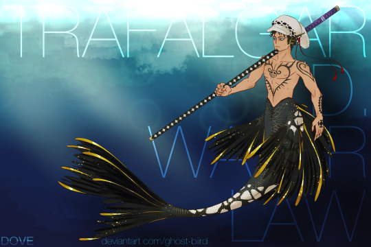
ahh your name is so awkward to put in a background aaaa
at least i avoided the very common “TRA GAR” name background
#one piece#trafalgar law#mermay#Three Captains#supernovas#i created two new csp brushes specifically for this drawing#and now i can put law spots on anythign and everything >:)#forreal tho the pattern is surprisingly versatile and kinda useful?#now that ive had it for like a month#since i forgot to post this earlier lmao
20 notes
·
View notes
Text
Devlog #39 - Teal's Art Pt.1 - A Dark Place
Okay lovely people, this blog had a little summer break but we’re back with content! (ノ゚▽゚)ノ Actually with a little back log of content. In this post Pectin shows how he worked on a painting!
Our last devlog on tumblr was #36. We’re jumping over #37 and #38 and get right to #39 ‘cause #37 & #38 were announcements that aren’t relevant anymore. (They are on our homepage tho. We always cry about them on twitter first!).
This devlog has been written by @pekuchin on one specific artwork that appears in //TODO: today. More from him now:
“Now that introductions are made, a few notes: First, the artwork I'm discussing has been created in July 2017. So there're minor details I'm not sure of anymore - like brush settings. Second, I used Clip Studio Paint and Photoshop (only the default round brushes). And third, I hope you can take something away from this and enjoy the read. <3
What for?
Like every asset I make for any project I have to be sure of the context in which it'll be used or appear. I've revealed before that this piece was supposed to be shown in the game as "Teal's art"
It appears to represent Teal's artistic style
and the player will see four stages of the picture as they're involved in the making of it.
In the story, Teal would make this piece for a competition hosted by the fictional games company "Naughty Cat". The competition asked artists to draw anything related to "Titan Watch Online", a MMORPG Teal loves to play:
The setting is a dystopian future
and characters have classes and skills reminiscent of popular fantasy MMORPGs.
Teal plays as a character that combines elements of a rogue and a healer.
All of these points are on my checklist of what we needed of the artwork in the game.
Expressing Teal's Mind
Based on my assumption that experience, personality and mood shape the artstyle, I thought about what kind of artstyle Teal would have. Because Teal already has been an artist in their past, I thought it sensible that they had a good grasp of basics like colours/light, composition and contrasts, etc.. So I focused on the workflow and visual expressions they would use. Here I browsed for artists and their work online to find inspiration too. While I had the checklist I also came up with new ideas as I tried things out on the canvas.
Stage One
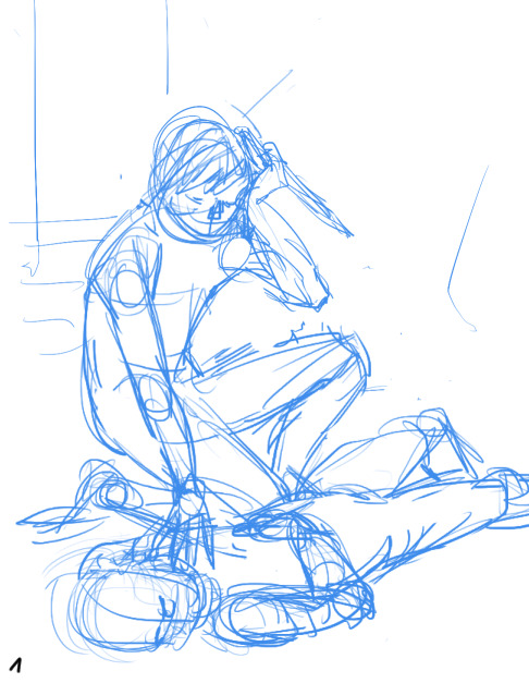
Teal wasn't at peace with themself back then. So the motif of inner conflict came to me. We also concluded that Teal would most likely paint their own avatar. Like I mentioned before the character was kind of a healer and rogue hybrid.
I struggled to find a cool pose and ended up having the main character of the illustration sit as if to heal a wounded ally. To make it more interesting I gave him a dagger. Like this, it's unclear if the character hurt the other or helps them. I liked this ambiguity in relation to Teal's situation. This sketch was done in Clip Studio Paint because I like making anything line-related in CSP best.
Stage Two
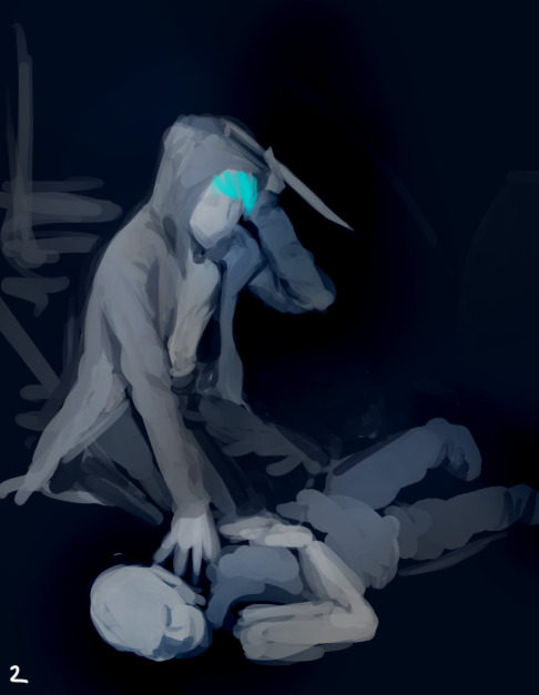
Here I switched to Photoshop and began putting colours on top a black canvas. I got a feeling of how I wanted the lighting to be at this stage as well.
Although Joyce helped Teal pick up the pen again, Teal was basically depressed at that point in the story so they likely felt more comfortable using darker colours and motifs. I chose this for the symbolical meanings of darkness and the related emotions as well. Also I don't want to generalize and believe that depression comes in all kinds of colours. (ノ~o~)ノ
To keep myself from getting lost in details I decided to paint everything on one layer and only duplicated the layer to document the progress.
Stage Three
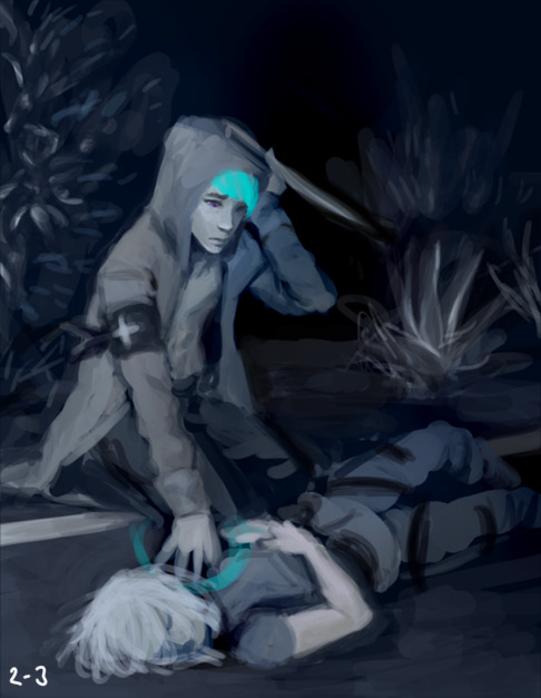
The ugly phase. Every painting I do has an ugly phase which immediately occurs after I seriously start messing around. ( ・ิ,_ゝ・ิ) This one isn't in the game as an asset and I'm glad for it. The number of pieces that appeared in the game depended on the instances in //TODO: today when Teal actually sat down to paint. And back then we considered having 5 instances but settled on 4 in the end.
I was pretty proud of the background, which was intended to be a dark back alley but accidentally turned into a roadside at night. :'3 Because everything was on one layer, I finished the background first before I began painting the character "on top".
Stage Four

From stage three I really got into "the zone" while shaping out the characters. Because I mostly work with lines and flat colours, I noticed how "3 dimensional" painting feels to me. It's quite fun! (ノ゜▽゜)
Back when I did the character concept designs for Teal I also imagined them to be kind of sloppy. Hence an artstyle without immaculately drawn lines, but blocky shapes where you can still see the paint strokes would fit. (I was also under time-pressure and didn't want to over-complicate things.)
At this point one could declare the painting as finished. So after the player bothered to sit down with Teal and Joyce to work on the Naughty Cat competition artwork they would be rewarded with this illustration (which was hopefully satisfying for your eyes).
Stage Five

And for the really motivated artists who went a step further this one was the glammed up version of the preliminary stage. The last 10-5% that make the illustration a bit more eye-catching. Here I played around with "Overlay" layers to balance the composition, shift the focus on the readability of painting (character > long arm > healing hand > unconscious person), added some magenta blood and added Teal's official artist signature.
I thought it would be interesting for the avatar to have some kind of resemblance to Teal. Did you spot the similarities? (^0^)
Altogether I did the painting on two evenings. And I believe in three sessions, which is my usual way to go when I don't have time for more breaks.
1st Session: OKAY imma do the art!! And I only need to make 3 sketches this time...promise!
2nd Session: OH GODS it so ugly. I have to stand up and walk away to give my eyes a break from this thing I created.
3rd Session: I've returned to my ugly child with new insights into live and fresh eyes that actually spot mistakes! Time to fix things up!
And that's all of it today. I hope you liked the extra info on my work and have a nice [week]! (๑ ́ᄇ`๑)”
This devlog was originally posted on the 13th June 2019 :3
#indie#game#development#Indiegame#otome game#todo today#todotoday#visual novel#devlog#indiedev#gameart#art#tutorial
6 notes
·
View notes
Text
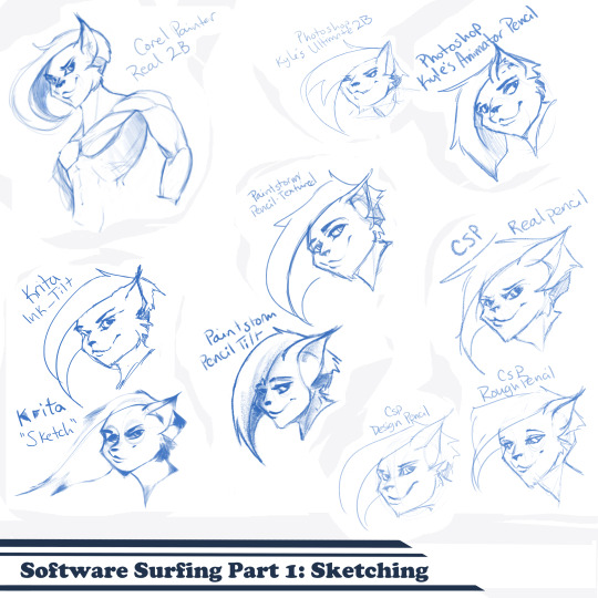
Artist’s Software Surfing P1 - Sketching
SSSo recently, after finishing (an admittedly long-overdue) a piece, I decided to download a trial of the new Corel Painter 2019. I hadn’t used Painter since my old DeviantArt days (circa 2005) and wanted to see how it felt with more digital art-veteran hands. Loaded it up, started sketching my default doodle-muse and wow, that “Real 2B” pencil feels great. I loved it so much, and wondered why.
That’s the story that is spawning this weird personal series of Software Surfing. I wanted to write little notes to future-me on how it felt using my favorite sketching tools in each program I have, and after the sixth one I thought it might be a good idea to check out inking, colouring, painting, etc. and writing those down as well.
So I’m writing this series for myself, but making it available in case anyone else can benefit as well. Thanks for sticking with the intro, let’s get into it.
Artist’s Software Surfing P1 - Sketching
Artist’s Software Surfing P2 - Inking
Artist’s Software Surfing P3 - Colouring
Artist’s Software Surfing P4 - Painting
There are many ways to sketch, but this is specifically the classic “pencil” or “drawing” form using the tools with the program’s default settings.
As an introduction, this is my doodle-muse, Cloey. She was my first original character, and though I don’t usually share my anthro art on here (I know that’s not everyone’s thing) I do have a separate blog for that stuff that you can find here if you’re so inclined. If you’re familiar with Artgerm (and you should be), she’s basically my Pepper.
Corel Painter’s “Real 2B”:
The one that started it all. The pencil just GLIDES, and I’ve always loved when you can tilt a pencil tool and it will shade just like tilting a real-life pencil. The only thing I want from a program now is to be able to bind touch to blenders so I can use my finger to smudge-blend the scribbling. (I tried drawing that fist so many times /fume)
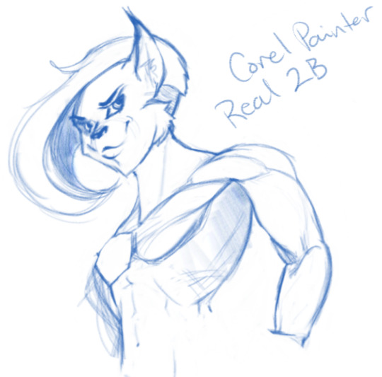
Likes: Tilt functionality, line width variance, stroke speed, eraser
Dislikes: Rebinding Rotate Canvas tool was a pain. I like Shift+Space, and that key combo is reflected in the shortcut panel, but it just continued to pan. Never worked for me, and rotating or flipping the page quickly is crucial for my sketching process. Also sometimes if I quickly resize the eraser and mash it down to use, it won’t detect any input.
Photoshop, Kyle Webster’s “2B” & “Animator Pencil”:
**Disclaimer** Firstly, I’ve used Photoshop for over 15 years now, and it’s a great digital art tool, but for drawing and painting I find it’s sorely lacking. It’s slow, expensive, and unintuitive. That being said, there are some things this program does exclusive to others so I’m still clinging to it (desperately) and while I would definitely recommend something else for budding digital artists, I have to supplement my misgivings by purchasing additional plugins and tools, such as the famed Kyle T Webster’s Ultimate Megapack for Photoshop (
which is now complementary with Photoshop CC, damnit
). Unless otherwise noted, all the brushes I use in Photoshop will be from that pack. **End Disclaimer**
Following off the heels of Corel, I remembered messing around with another “2B” (which btw is my personal favorite traditional pencil to sketch with) in Kyle Webster’s Drawing Box in Photoshop. It felt a bit similar, but with no tilt functionality and it really lacked the chunky-thickness (a scientific term) I enjoyed with Painter’s pencil. I switched to my favorite (and the favorite of MANY digital artists btw) his “Animator’s Pencil”. So chunky, but the ability to shade lightly... It’s really a fun brush to use for sketching digitally. Still one of my absolute favorites.

Animator Pencil Likes: Line width variance, texture fills in and scales perfectly
Dislikes: It’s a photoshop exclusive, a program that for some reason you can’t bind shortcuts to whatever you please, takes forever to load, and WAY too often suffers input lag while drawing. Also no tilt shading, :’( aw
Paintstorm’s “Textured Pencil” & “Pencil Tilt”
As a bit of an aside, I love Paintstorm, Paintstorm is what got me back into digital drawing and painting after doing 3D and game design for 7 years. I bought it for the very low price of entry (2 licenses for $30) and was impressed by its ability to customize literally anything in the program. You can create your own tool/brush boxes, bind any shortcut to any key combination, and every single brush tool adjustment comes with the most customization control of any program I’ve come across since Photoshop set the bar way back in the day. Out of the box a lot of the basic brushes have that old OpenCanvas or PaintTool Sai feel, but more recently they’ve added some very textured default brushes you can play around with. It’s also hands-down the FASTEST program I’ve ever worked in. I highly recommend giving it a try, it’s great for learning and experimentation. I grew a lot working in Paintstorm.

The Textured Pencil is a fun sketching brush, you can get as think or thick as you’d want and it keeps a clean outline. The Pencil Tilt really blew my mind the first time I used it. YOU CAN SHADE! It was the first time I had ever seen a program do that. The tilt has a great texture, fantastic control, and gets just as dark as you’d need. I’d recommend using them both, the Textured Pencil for a cleaner sketch, and the Pencil Tilt for something more expressive or loose.
Krita’s Ink-Tilt & “Sketch”:
I’ll be honest, I have almost no experience in Krita despite having downloaded and given it a try back in 2014. It was a hell of a time to figure out how to rebind my usual shortcuts (flip horz, rotate canvas). I couldn’t even rebind colour grab/eyedropper. Yikes. I opened up the “Sketching” brush box and there were only two options, made worse as one was a sketch pen... That lacked the flexibility of ballpoint.
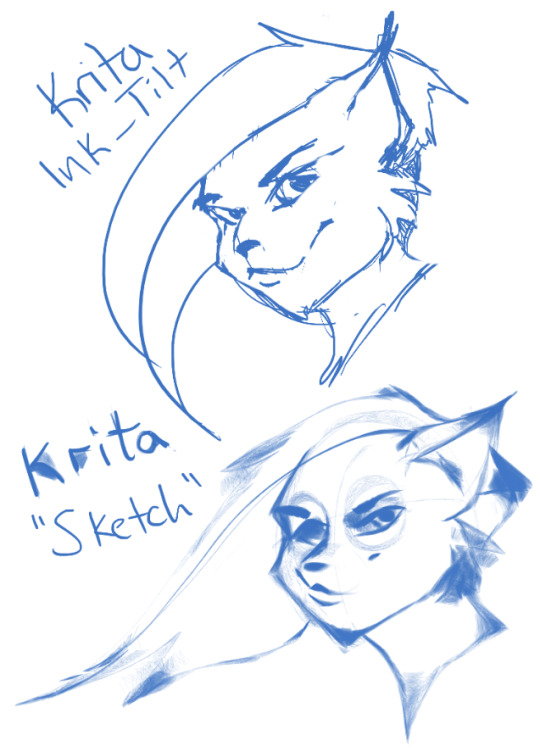
First I grabbed the pencil dubbed “Sketch” and was bewildered why the size of the circle was so large compared to the mark it made. Very confusing. Feeling intimidated, I abandoned it immediately to try out the “ink_tilt” (which by the way there’s no tilt functionality??) and hated it. I reluctantly went back to the pencil and just started trying to make marks. Wow. It’s weird, but surprisingly fun. You have to be willing to relinquish a LOT of control, but the shapes the brush makes while moving and tilting during a stroke can yield some really interesting and suggestive shapes. I would say great for early concepting or making something really loose and expressive. Fun to play with, but not really practical.
Clip Studio Paint’s Real Pencil & Rough Pencil
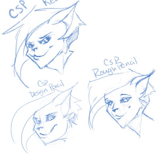
I’ve been wholly immersed in CSP since I purchased the program back in late 2016. It goes on sale often, so you can pick up a nice fully featured program for ~$35. I’d had my eye on it for a while and still really want to get into self-publishing comics, so I picked it up, bought a couple of brush packs for it (it’s pretty lacking in default painting tools) and I’ve been illustrating in it ever since. The brush creation isn’t as fun as Paintstorm, but brushes are quite customizable. I usually like to use the “Rough Pencil” if I want just a little texture and line variance, or the “Darker Pencil” for something cleaner. Trying to be different, I just jotted out a couple heads in ones I don’t normally use, the Real Pencil and Design Pencil. The Real Pencil has a lot of texture, but for some reason in CSP the textures don’t seem to scale with the brush, so I tend to avoid using it in most cases. I hate the design pencil, I just could never get dark enough. I guess that’s probably the point, though.
Well, that definitely wraps this digest up. I feel refreshed after trying out a lot of new digital sketching brushes. I was really reminded of how much I enjoyed drawing in Paintstorm. I hope someone other than me found this useful or otherwise inspiring! Sometimes, especially if you’re stuck in some art blockage, it’s a good idea to try something new, and for me digitally that’s hopping programs and trying new brushes.
I’m thinking about doing inks, colours, and painting at some point. Let me know if anyone’s interested in those! I’m planning on doing some for myself eventually, but I might expedite a post if anyone is interested. o/ Take it easy, y’all.
Artist’s Software Surfing P1 - Sketching
Artist’s Software Surfing P2 - Inking
Artist’s Software Surfing P3 - Colouring
Artist’s Software Surfing P4 - Painting
6 notes
·
View notes
Last Seen Blogs

wishful-outsider
The Milf In Your Area

rouserhouse
Chat Webcam Girl

kuyhnim
Lee Minhyuk

solar-eclipsed
Simply Jesting

ottacon
"Trying to draw some armoredgirls"