#i do have colour comics graphic novels i like . . like through the woods and the silver darlings and adrian tomine and jane the fox and me
Text
day 12392780 of wishing the cr origin comics where in greyscale or vry limited colour (like ghost world with the green or something) bc no offense to the colourist but the colours are jus not very nice in the jes and caleb comics and also especially print badly.. like too high saturation and not enough contrast so they just look messy and kinda, low res ?? somehow?. please i just want black and white comics.. i want to see the inking properly..... .
#sometimes colour comics are good but only if the colours rly help it out and are done well#also black and white comics usually means u get more pages bc its cheaper than colour .. . so . T_ T#kiddo say#i do have colour comics graphic novels i like . . like through the woods and the silver darlings and adrian tomine and jane the fox and me#and kingdom and the nao of brown and isabel greenberg stuff#but sm of my faves are just ink
36 notes
·
View notes
Text
FMP - artists + relevant projects research
I was a bit stuck with how to position my project so I had to do some more research on similar projects, especially graphic novels and comics that are illustration centred and that they have a theme around mental health in young people or a theme that has to do with creating various characters and escaping through them.
1.Debbie Tung
First I was looking at the work of Debbie Tung, a Birmingham based illustrator that creates graphic novels based on her own experiences and difficulties an how she gets through them. Something that I like about her work is that even if she deals with quite hard themes sometimes, she manages to give it a fun twist, which makes it more lighthearted and enjoyable without diminishing her messages. This is something that I would like to achieve with my project as I don't want it to become too sad and depressing for the reader.


2. Sarah Andersen
I then looked at the work of Sarah Andersen, an American comic book author and illustrator. Her work is mostly about everyday struggles of young adults, especially girls. Her illustration style is not my favourite but I like how she has managed to keep her work fun, relatable and engaging for a young audience. I enjoy how she has managed to turn insecurities and issues with self perception into fun comics that don’t give off the negative feeling that sometimes comes with those subjects to youth. Conceptually I would like to achieve something similar to that with my work.


3. Tarah Booth
I also found a very interesting article about the work of Tarah Booth. Once again the illustration style is not my favourite but the concept of her work is very close to what I want to create. She uses her art to illustrate her hopes and dreams for the future and to find balance within herself. Similarly I have always seen my character and their universe as a safe space that I can take my mind whenever I am feeling sad or lonely. Booth, in her book “ The Cabin in the Woods” she has illustrated her a dreamy scenario of herself leaving the city and finding peace in nature living with two dogs. She also states that she likes putting her anxieties on paper for others to relate to. I feel the same when I illustrate my character and I find it very cathartic. I hope to create something that others will be able to understand my feelings when I was in the process of making it because my character is my way to put on paper things that I can’t put in words.
4. Aisha Franz
Moreover I discovered the work of Aisha Franz and more specifically her graphic novel “Earthling”. Earthling is about a mom and her two daughters that each one of them escapes into imaginary worlds to cope with or avoid the struggles of everyday life. Even if the story is dealing with slightly darker themes , it is presented in a fun and humorous way and the illustrations stay positive by having a bright colour palette. I think this is one of the closest projects that relates to my current work and I hope that I could apply a similar approach to my project.
links:
1. https://debbietung.com/books
2. https://sarahcandersenshop.com
3. https://www.itsnicethat.com/articles/tara-booth-cabin-in-the-woods-illustration-160719
4. https://www.itsnicethat.com/articles/aisha-franz-earthling
0 notes
Note
Assumption: you’d be willing to share your top graphic novel reads. Also do you read any written in French? I’d die for those titles too!
lmao i see what you're doing anon. prepare for a long post (no french unfortunately; i've mostly just read bd-style stuff, so asterix and tintin and schtroumpfs kinda vibe... not much else. my faves are franquin’s spirou et fantasio tho)
gonna have 3 categories in this list: 1. select favourites 2. other favourites that i shouldn't have to explain (better-known stuff) 3. haven't read but i already know
select favourites, in no particular order:
emily carroll, through the woods

through the woods probably doesn’t need me to wax poetic about it because you should hear the name emily carroll and already know it’s going to blow your socks off, make you insane, and be gorgeous. this one is an anthology of spooky stories set at various times in the past, and you’ve probably seen a slice or two from it on tumblr already. her use of values? of black and white? creative panelling? i’m insane
brandon dayton, green monk
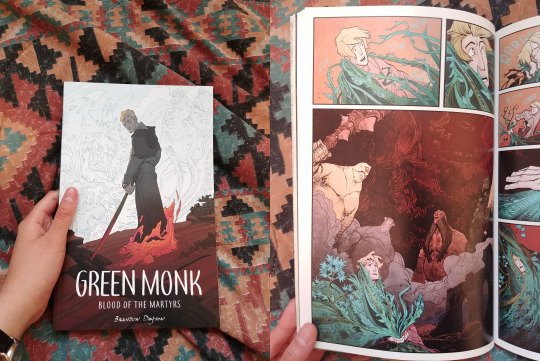
this is one i read a while ago and i’m still deeply upset that mr dayton hasn’t made volume 2. a gorgeously-drawn introduction to a Chosen One in fantasy russia, raised by monks and haunted by weird heroic dreams where he battles monsters. mr dayton where is volume 2.
simon spurrier and matias bergara, coda

i have three words for you: post-apocalyptic fantasy. i have two more words: Big Wife. a few more words: this thing is gorgeous, with psychedelic colours and detailed linework, and i like it a whole lot. did i mention big wife. did i mention big warrior wife with a sword. yeah.
molly mendoza, skip

again, don’t feel the need to say anything. molly mendoza’s art is some of the most breathtaking i’ve ever seen in a graphic novel and it made me insane. post-apocalyptic, but subtle. no one has a gender. a lot of dimension-skipping and you’d better believe the art absolutely goes off the shits every time but ultimately it’s about being true to yourself, and friendship
james tynion iv and michael dialynas, wynd
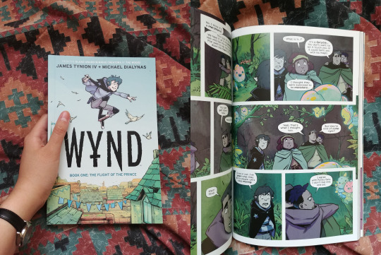
most recent read! it deceived me in the comic book store: the back said the main character was gay, and it looked like YA or K-12 so i was like aight cool some light reading. nope. it gets dark. the characters are young but the world they live in is fraught with war and genocide and it gets Dark. not overly dark but people die. love it tho. 2 of the main four are confirmed mlm in the book which is fun to see in a fantasy!
more favourites that require no explanation
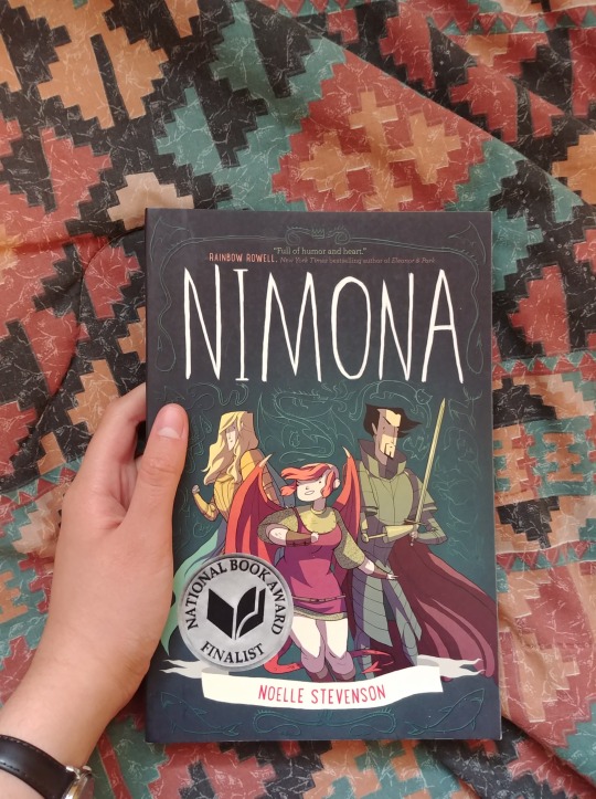
noelle stevenson, nimona, aka extremely fun fantasy, hilarious, but also hits in the feels. also noelle stevenson, so you already know it’s good
alice oseman, heartstopper, aka the softest romance i’ve ever read. i screamed a lot.

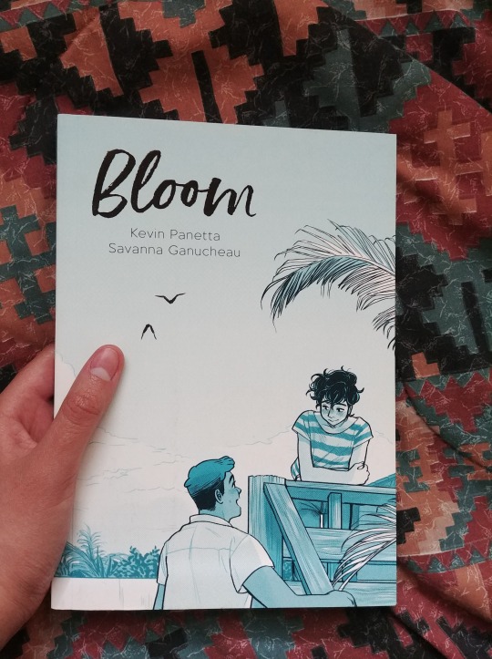
kevin panetta and savanna ganucheau, bloom, aka messy gays on the cusp of adulthood, toxic friends, and a gorgeously-illustrated love letter to baking
future-favourites
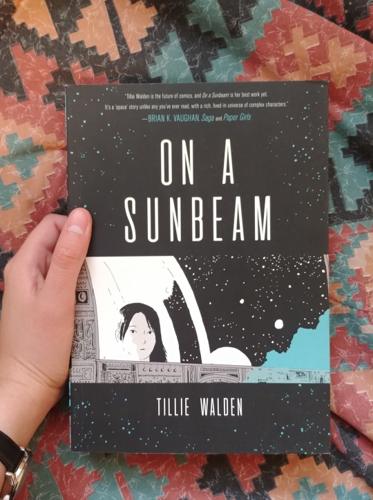
tillie walden, on a sunbeam
trung le nguyen, the magic fish

839 notes
·
View notes
Text
I discovered the graphic novel tag on Libby a few days ago and have just been motoring through a whole pile of random ebook graphic novels that looked interesting to me, mostly not even pausing long enough between reading them to write down any thoughts. So here's a collection of very haphazard short reviews of a bunch of graphic novels! Yes most of these ARE middle grade, I love middle grade fiction and I super gravitated towards those when wandering through the options.
Witches of Brooklyn, and Witches of Brooklyn: What the Hex?!, by Sophie Escabasse
These are cute middle grade graphic novels about an orphan girl who lives with her aunts, discovers she's a witch, and learns about friendship and magic and being who you are. Quick and charming reads!
The Fire Never Goes Out, by Noelle Stevenson
A collection of Stevenson's biographical comics they wrote each year since 2011, along with other art and notes. It's a glimpse into a young person growing up and discovering who they are and how to live with mental illness and trying to figure out their identity, but all written in a very distancing and non-specific way (understandable, as much of this was written while the author was actively struggling with these things), so although it was interesting, it didn't fully capture me.
Be Prepared, by Vera Brosgol
A story about a girl with Russian immigrant parents who always feels like an outsider among her peers, and then learns about RUSSIAN SUMMER CAMP! Unfortunately, camp is not everything she dreamed. I loved this book, the art and the writing work so well together to capture the main character's experiences, and I loved that it was a book about camp where the conclusion actually was "hey it turns out camp's not for everyone and that's okay."
They Called Us Enemy, by George Takei, Justin Eisinger, Steven Scott, and Harmony Becker
A memoir of Takei's experiences as a child in Japanese internment camps in WWII. Really powerfully done. I loved the way the book manages to show both how genuinely hard it was, and also how much child-him was oblivious to the real seriousness of what was happening to him and his family.
Snapdragon, by Kat Leyh
Delightfully queer story about a girl who feels like an outsider, an old butch lesbian witch who lives in the woods and articulates roadkill skeletons, and a lot of ghosts. I loved it!
Heartstopper (volume 1), by Alice Oseman
This is really just the first part of a multi-part story, but volumes 2 and 3 are checked out and I have to wait for my holds to come in to be able to actually finish! Alas. Anyway this is a gay high school love story between two boys, and I enjoyed it, but the art made it really hard for me to tell the new love interest Nick apart from the mean ex Ben, which was an ongoing problem.
The Magic Fish, by Trung Le Nguyen
Wow, this was incredible! The weaving together of the stories of a young Vietnamese teen trying to come to terms with his gay identity and how to tell his parents, and his mother's experience of being a Vietnamese immigrant who left her family behind and being caught between the world of her mother and the world of her son, and the fairy tales they read to each other that allow them to connect and communicate with each other. The three elements dip in and out of each other constantly, but each is monochromatic in a different colour, allowing you to easily follow how everything's connected without feeling lost. It also does a good job of making the art speak without words, which is something I don't always do a good job of following, but it really works for me here. The whole book is about different ways of communicating, and it uses its own form to enhance that theme. SUPER good.
Operatic, by Kyo Maclear
I see what it was going for, and I liked the bones of it, but it didn't quite all gel together for me, unfortunately.
How Mirka Got Her Sword, by Barry Deutsch
A perfectly fine story about a Jewish girl who wants to fight monsters. Nothing wrong with it, but it didn't excite me either.
Jane, the Fox and Me, by Fanny Britt & Isabelle Arsenault
The main theme of the book appears to be fatphobia -- but the art depicts the main character as being just as skinny as anyone else in the book, and nobody is in fact noticeably fat? So the theme of the art and the theme of the story end up being in tension with each other in a way that really detracted from what it was trying to say. Also the fatphobia the main character experiences doesn't actually ever really....get dealt with or addressed much. She finds a friend and then she feels better about everything, including her weight. (And, in a much pettier complaint, the fox of the title hardly shows up at all!!)
#book thoughts#witches of brooklyn#sophie escabasse#the fire never goes out#noelle stevenson#be prepared#vera brosgol#they called us enemy#george takei#snapdragon#kat leyh#heartstopper#alice oseman#the magic fish#trung le nguyen#operatic#kyo maclear#how mirka got her sword#barry deutsch#jane the fox and me#fanny britt
5 notes
·
View notes
Text
55. Through the Woods, by Emily Carroll

Owned: Yes
Page count: Unknown/not numbered
My summary: Five short horror stories by Emily Carroll. Girls left alone in their house are visited by a stranger. A woman hears whispers from her new husband’s walls. A man kills his brother only to have him return from the woods. A girl and her friend fake seeing ghosts, until something comes for real. And a young woman realises there’s something deeply wrong with her brother’s partner.
My rating: 5/5
My commentary:
Emily Carroll is a master of horror illustration and graphic novels. Go check out her website here, where she has some illustrations and short webcomics up that’ll give you a great idea of her work. I read His Face All Read, which is included in this collection, and immediately wanted more. Her work is so moody and mysterious and interesting and I love it.
Unlike most collections I talk about, I’m gonna give a short reaction to every single one of these comics let’s go let’s gooooooo!
Our Neighbour’s House is the first main story of this collection, about three girls whose father disappears and are visited by a stranger. What I like about this one is that, even in the limited format, the three sisters feel very real and well-characterised. The use of colour in this story is striking - it’s very muted, the almost monochrome cabin contrasted with the dull colours of the girls’ faces and clothes. It creates a very bleak, washed-out landscape that seems to brim with terror. One thing I love about Carroll’s writing in general is how ambiguous it all is - rarely are there easy answers or neat conclusions, and this one in particular is chilling.
A Lady’s Hands Are Cold is about a woman who marries a wealthy man, and hears the song of his murdered first wife in the walls. It’s a pretty standard fairytale setup, very Bluebeard, but executed brilliantly. In contrast to the previous story, this one is all bold reds and blues, and the pale corpse-flesh of the first wife when she is found is so unnerving and creepy. It’s also a good example of using the fairytale structure to tell a surprising story - you might think that finding the murdered wife would be a good thing to do, proving the protagonist is a good-hearted heroine, but you would be deadly wrong.
His Face All Red is, as mentioned, one that you can go read for yourself right now! I love the subtleties of the relationship between the narrator and his brother, his obvious jealousies masked by short, factual statements that are dripping with scorn and envy. Carroll’s writing style tends towards these short but evocative statements that beautifully compliment her art, and it works so well for this type of horror.
My Friend Janna is about two young girls who fake séances, but seem to later be haunted by a real ghost. Again, the ambiguity in this one is key. Never do we learn the details of what’s going on, and it’s all the more chilling for it. The art is again almost monochrome but for the striking red, and it makes a horrific contrast.
The Nesting Place is the last full story, about a young woman named Bell who goes to live with her brother in the school holidays after her mother’s death, and her strange encounters with his fiancee. I feel like a broken record here, but this is some greatly effective horror. The nature of Carroll’s monsters is so weird and viscerally upsetting without being a mess of blood and bone for pure shock value. The art of the monster once it is revealed is genuinely horrifying in a way that can only really be captured through illustration. Bell, a moody and introverted teenager, is an interesting protagonist, and her interactions with Rebecca are chilling even before you realise what’s going on. And, once again, the ending is immensely satisfying while still be utterly creepy and horrific.
There are also shorts, labelled, An Introduction and In Conclusion at the start and the end of the book. An Introduction works to set the tone well, a creepy little mood-setter. In Conclusion is just perfect to send a chill up your spine as you finish the book. They’re both very effective and I love them.
Phew. That’s all for this time - next up, one of the most challenging books I’ve read so far this year.
6 notes
·
View notes
Text
Comic Series to Read (Pt4)
+REDLANDS by Tom King, Vanessa Del Rey & Jordie Bellaire

A mysterious and bloodthirsty matriarchal force runs the town of Redlands, Florida, and in order to stay on top, sacrifices must be made. Someone is intent on removing these women from the top of the food chain, and he's ready to unleash their darkest secret but has seriously underestimated the lengths the townspeople will go to protect the new order of things.
So this is pretty fucking dark, like it’s fascinating and you do want to know what’ll happen next but... it’s dark. It really is worth the read, unless such things stress you out, in which case try another item on the list!
[POC/WOC protagonists, witchcraft, nsfw, sex scenes, murder, human sacrifice, nudity, violence, slavery/prostitution, possession, alcohol/drugs, etc.]
.
+NAILBITER by Joshua Williamson, Mike Henderson & Adam Guzowski
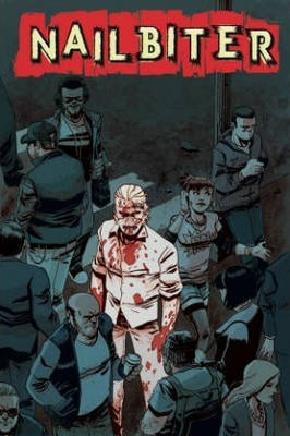
"Where do serial killers come from?" and why has Buckaroo, Oregon given
birth to sixteen of the most vile serial killers in the world? NSA Agent
Nicholas Finch needs to solve that mystery in order to save his friend, and
he'll have to team up with the infamous Edward "Nailbiter" Warren to do it.
Joshua Williamson and Mike Henderson deliver a mystery that mixes Twin
Peaks with the horror of Se7en!
It will repulse you, it’s meant to. The mass-murderer-who-went-free is the titular nailbiter, he has a thing for chewing people’s nails off, before/after death, which was yikes. Turns out he’s from a town where there’s been a metric fucktonne of serial killers, all with highly specific ways of killing, like weird ways.
People have been trying to capitalise on that. Except now people are dying, and while a copycat is suspected, when the protagonist’s friend goes missing looking for answers, he has to step in and find out wtf is happening.
[POC protag, serial killers/murder, body horror and gore, violence, animal cruelty, blood, swearing, lynch mobs, etc.]
.
+RAT QUEENS by Kurtis J Wiebe & Ron Upchurch
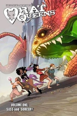
Who are the Rat Queens? A pack of booze-guzzling, death-dealing battle
maidens-for-hire, and they're in the business of killing all god's creatures for
profit.
It's also a darkly comedic sass-and-sorcery series starring Hannah the
Rockabilly Elven Mage, Violet the Hipster Dwarven Fighter, Dee the Atheist Human Cleric and Betty the Hippy Smidgen Thief. This modern spin on an old school genre is a violent monster-killing epic that is like Buffy meets Tank Girl in a Lord of the Rings world on crack!
An instant favourite, honestly. You can’t NOT love these fucking disaster babes, no matter what happens they find a way to fuck up and then fix it. Re-readable a million times over, can’t wait for the next book to be honest.
[LGBPTA+, nudity, sex, alcohol, drinking, violence, magic, dark magic, crazy bullshit and stoned smidgens]
.
+ELFQUEST by Richard & Wendy Pini
If you don’t know what elfquest is, google it people, I love it. It’s like 40years old at this point, and you can read MOST of it online (the original coloured books/graphic novels are expensive and rare, but the black and white omnibuses are for sale).
If you like it, Elfquest: The Final Quest has just been written/finished. That was a fucking emotional rollercoaster i tell you what.
LGBPTA+, poly families, violence, killing, humans are assholes, affections, family, magic, nudity, sex but like... tastefully, mostly... etc.
Read book 3 in the library when I was beginning high school, never looked back, fucking loved them.
.
+MOONSTRUCK by Grace Ellis, Kate Leth & Shae Beagle
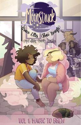
Werewolf barista Julie and her new girlfriend go on a date to a close-up magic show, but all heck breaks loose when the magician casts a horrible spell on their friend Chet. Now it's up to the team of mythical pals to stop the illicit illusionist before it's too late.
Reading it right now, very cute and easy to relate to. Love the artstyle, it suits the story really well; and the plot is just WHAAAAAAAAAAT, and chaotic. Hard to put down. Awkward wlw werewolves, love them.
[LGBPTA+, nonbinary centaur, gay werewolves, chaos, magic, etc.]
.
+BABYTEETH by Donny Cates, Garry Brown & Mike Marts

Sadie Ritter is sixteen years old, nine months pregnant, and scared out of her sweet nerdy mind. Having a baby that young is tough. But with the support of her loving family behind her, everything should be okay. OH YEAH, and also her baby is the antichrist and it's going to break open the barriers between the earthly and demonic planes and unleash eternal suffering to all of humankind. Other than that, though...should be fine.
Don’t own the series yet, but have read a lot of it. Turns out being the mother of the antichrist really, really sucks and your family can be your greatest ally... or craziest cultist bullshit enemy. So hard to put down, I really loved it.
[Violence, antichrist, demons, gore, murder, kidnapping, child-stealing, demon raccoons, etc.]
.
+THE WOODS by James Tynion & Michael Dialynas

On October 16, 2013, 437 students, 52 teachers, and 24 additional staff from Bay Point Preparatory High School in suburban Milwaukee, WI vanished without a trace. Countless light years away, far outside the bounds of the charted universe, 513 people find themselves in the middle of an ancient, primordial wilderness. Where are they? Why are they there? The answers will prove stranger than anyone could possibly imagine.
Just got this, haven’t yet had a chance to read it (bc Moonstruck), but very excited to!
.
Will put up additional posts when I can afford to get through the other like 6 fucking pages of my graphic novel wishlist, lmao.
If you have a suggestion, let me know or add it on.
26 notes
·
View notes
Photo
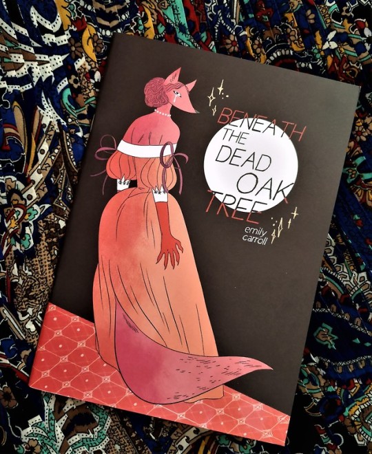
Beneath the Dead Oak Tree by Emily Carroll - Comic REVIEW
Loved Through the Woods and wanted another story to give your head a spin? We have wolves and foxy character all in elegant dress wear and to seal the deal a bloody torn up corpse in a Dead Oak Tree? I’ve definitely got the perfect comic for you!
So, following the utter love I had for Emily Carroll graphic novel “Through the Woods” I decided to get my hands on this small comic/zine she released as I loved the art style and new character designs. Carroll has a strong sense of design, that cover caught my eye straight off the bat without me even knowing it was her work at first. Having a quick look at the preview, I just knew I needed my hand on this short comic! It has such bright colourful pages that reflect on the style of Carroll’s short story from the Through the Woods graphic novel “A Lady’s Hands are Cold” that I was like yes, I’m ready for another creepy story as long as it’s beautifully illustrated.
Fair warning from here this post will contain SPOILERS
I loved it! I had to re-read it like three times to get the full impact cause my mind was like gosh this is a reflection on inner jealously and out right crazy. We’ve got a young foxy character who torments herself on not being chosen to be eaten by her future husband. Girl you’re meant to be creeped out by the fact he ate someone else not be obsessed with the fact he didn’t decide to wait for you to walk up to the Dead Oak tree to eat you. Like seriously! Why would you focus on the very negative side instead of the fact he chose to be with you and not eat you.
It was so nicely planted; it reflects on the same torture the girl goes through when hearing the voice in the night in “A Lady’s Hands are Cold” yet the result of it is a lot more bloodshed. I feel sorry for the sorrow she keeps but not at the fact it’s from the pain of not being chosen, she didn’t matter to her that her husband committed such a crime but for the fact he decided she wasn’t of the same value to kill and leave buried in the hollow of the Dead Oak Tree. At the end she lets that be the things to lash her anger out at him, he received the punishment he deserved.
If you don’t get your hands on this copy, please do yourself a favour and look at the beautiful pages of art Emily Carroll has created for this short story. I honestly would love to see a whole graphic novel which revolves around these character designs and style.
I’m in love with this short comic and I am so glad I made my purchase, to get your hands on your own copy or find something that might be more up your street go to ShortBox who have a great selection of short comics to purchase from.
Rating 5/5 ***** Story and Art because ah I loved it!
0 notes
Photo

S
panning Kensington Market is not just a market, but a vibrant, living community, home to numerous waves of immigrants over the years.When visiting, I was struck by how many different people from all walks of life gather here to work, eat, live and play. With so many cultures and generations all layered on top of each other, the whole place has a DIY feel you don’t really find anywhere else.
As a destination for art, global street food and community events, there is so much life tucked into every corner of this bustling neighbourhood. It’s nearly impossible to take it all in at once… so, where to start?
Make the Most of Kensington Market
Golden Patty
Eat your way through a world of food
Although Kensington Market has some finer dining establishments such as Grey Gardens, more casual spots that only specialize in one or two items are really where it’s at. True to the market’s immigrant roots, you’ll find mom and pop restaurants serving quick street food and authentically cooked meals that bring a taste of their home countries to you.
Seven Lives is a neighbourhood favourite for getting Baja-style tacos, and they’re in demand. This cash only counter has mouthwatering tacos loaded with all the right toppings, and lots of hot sauce options to pick from. Another popular street food, empanadas, are perfect for a quick and affordable snack. At Jumbo Empanada, you can get a taste of Chile for as little as $1.75 for one of their mini pastries.
Fish and Chips from Fresco’s
As a Montrealer I also have to mention NU Bügel. They serve classic Montreal bagels wood fired to perfection and topped with the works, if you wish. Fresco’s Fish and Chips has meanwhile mastered and upgraded a British classic with an optional extra crispy batter made from Miss Vickie’s “crisps.” Then, Golden Patty will deliver on all your flaky, spicy, delicious, beefy needs.
Kensington Market also has a lot of options for vegetarian and vegan eats. Options like Urban Herbivore, Hibiscus and King’s Cafe are sure to make your little plant-based hearts sing.
Kensington Market & Chinatown Toronto Food Tour exploring the back alleys
Take the Kensington Market and Chinatown Toronto Food Tour
If you’re new in the area or want to get to know it from a different perspective, taking a tour can be the perfect way to connect with the place. You’ll get to know the stories and the history that helped make Kensington Market the way it is today, and get a taste of what a community like this really means. Plus, it’s clear there’s a lot to taste in this high density foodie destination.
Food samples on the Kensington Market & Chinatown Toronto Food Tour
On the Kensington Market & Chinatown Toronto Food Tour, you’ll have the chance to visit 7+ different food stops to taste delicacies that are inspired by global cuisines, and yet take root at a small local business, each with its own story. No single restaurant could bring you a seven course meal this diverse! You’ll definitely get plenty to eat, but you’ll also be enriched by the guide’s insider knowledge as they take you to explore off the main streets and into the real heart of Kensington Market. Have a look at Local Toronto Food Tours.
Outside FIKA
Take it easy at a local cafe
You might need some extra energy to soak in as much as you can of Kensington Market, so why not treat yourself to a delicious cup of coffee, and maybe a scone?
My favourite place to refresh as I explore the market is Moonbean. The locally owned coffee shop and roastery brings the streets’ energy inside with a sprawling chalkboard menu, loose leaf teas lining the walls, and a cozy art-filled room in the back. They also have two patios, front and back, plentiful baked goods, and just about every drink you can think of, even smoothies. Plus, if you need to make another kind of rest stop, you’ll find kind messages from strangers scrawled all over the bathroom walls.
Another great coffee shop is FIKA, a bright and stylish Sweden-inspired spot that’s a favourite for studying, reading a book, or simply taking it easy. They serve specialty drinks such as a spiced cardamom latte, lavender white hot chocolate, and a mean iced coffee, too – perfect for enjoying on their airy patio in the summer.
Other local favourites include famed Toronto chain Jimmy’s Coffee as well as i deal coffee, Cafe Pamenar and Livelihood Cafe.
Exploring the alleyways of Kensington Pl.
See where creativity spills onto the streets
Music, street performances, murals and more fill the streets of Kensington Market with endless inspiration and photo opportunities. With so many artists around, you’ll be pressed to find wall space that doesn’t boast even a speck of paint. They’ve truly made Kensington their own.
Some of my favourite murals are a photo collage on Kensington Ave off St Andrew and a huge Alphonse Mucha inspired mural at Augusta and Oxford. Parked in front the latter, you’ll also find Yvonne Bambrick’s infamous Garden Car, a teeny tiny city park/community art project which has been sprouting in the same spot each summer since ’07. Make sure you keep your eyes up as you explore hidden corners and back alleys, you never know what else you’ll find!
Street performers
While street performers and pop-up concerts may be a little harder to track, if the sun is out you’re sure to stumble upon some talented buskers at Bellevue Square Park. To increase your odds, come by for Pedestrian Sundays. The whole market is blocked off from traffic on the last Sunday of every summer month, opening it up for people and their experimentations. Support artists directly, too, by checking out the Kensington Market Art Fair.
The Winter Solstice Festival also takes over the market annually on December 21st, lighting up the longest night of the year with creativity and passion.
Lanterns on display at Dancing Days
Shop around for locally made goods
Naturally, the storefronts in Kensington Market sell products by people just as diverse as its residents. Creativity is concentrated at a few charming stores offering handmade and locally produced goods that range from artwork to accessories to home decor, and more.
First off, Kid Icarus is a sweet, stylish screen printing studio and gift shop all in one. They focus on paper products like greeting cards and stationary, but you’ll find pins, soap and other creative crafts, too. Everything in store is made by Canadian artists and artisans, and it’s irresistibly cute.
Painted house
Outside of Dancing Days
Another good place to pick up Canadian-made gifts is The Blue Banana Market. The giant store is practically a warehouse for locally made goods and novelty items from around the globe. Then, for comic book lovers, manga fans, and graphic novel enthusiasts, there’s The Beguiling. You’ll find the famed comic book store just a couple steps from the market on College Ave. Even if you weren’t looking for any of those, there’s something about it that just draws you in.
Finally, if you’re looking for some unique jewellery, you’re in luck. One Love is one man’s tiny storefront selling handcrafted goods and jewellery, with a smile. You can also find other similarly handmade pieces displayed on tabletops around the market. Follow your instinct as you stroll the streets and see what speaks to you!
One of Kensington Market’s many fruit stands
Pick up some specialty ingredients
Grocery shopping might be an underrated form of entertainment, but one of the big draw-ins of Kensington Market is its high density of specialty grocers. There’s nothing better than treating yourself to some of the freshest ingredients you can get. Whether you’re cooking up a special meal or just having a snack, you’ll see the difference that freshness makes.
Even if you don’t have a kitchen at your disposal, these spots can help you feel right at home. There’s nothing better than fresh bread from Toronto’s favourite Blackbird Baking Co. topped with your favourite creamy delight from the Global Cheese Shoppe just around the corner.
Global Cheese
For carnivores, Sanagan’s Meat Locker is your local go-to. They emphasize building relationships with farmers, meaning you can trace everything in store back to its source. All that’s left to do is let the helpful staff guide you to picking the perfect cut. Next, you’ll find fruit and vegetable stands all around the market to add a little colour to your meal, while House of Spice will help bring the flavour. You’re sure to discover something new while you’re in there, too.
If you’re looking for place to shop that’s a little better rounded, 4 Life Natural Foods has it all when it comes to organic goods. With spacious aisles, wooden shelves and so many ethically sourced food options, the whole experience of being there is simply a pleasure.
Kensington Mall
Discover the wonder of thrift shops
Kensington Market is truly a haven for lovers of vintage. With shops selling unique finds around every corner, its no wonder the area’s residents all look so cool. Plus, buying secondhand clothes is a simple way to take it easy on Mother Earth.
Perhaps the most well-known vintage shop in the area is Courage My Love, a cozy and colourful store perfect for finding cashmere pieces, theatrical accessories, beads, buttons and other DIY necessities, as well as the perfect pair of cowboy boots. Another favourite is Sub Rosa Vintage just next door, which boasts a hand picked selection of clothes more in line with today’s fashion trends. Meanwhile, Vintage Depot has top tier threads in just about any shape or colour, including some designer finds, Exile delivers on the costume department and Bungalow mixes the old with the new making it a one-stop shop for any lover of retro style.
If you’re in the mood for a little shopping spree, you’ll find the highest concentration of other vintage shops on Kensington Ave around Courage My Love and Sub Rosa.
CN Tower seen from Chinatown
Explore neighbouring Chinatown
A mere block away from the heart of Kensington Market is another bustling urban community. Chinatown is full of family-owned business of all sorts, but the main attraction is definitely the food. While the number of restaurants serving different variations on the same cuisine was a little overwhelming at first, after a little exploring I’ve narrowed down my favourite spots, depending on what you’re looking for.
Chefs working at Mother’s Dumplings
Dumplings? Try Mother’s Dumplings, and watch the little bundles of flavour be made right in front of your eyes. Noodles? Despite the name, Chinese Traditional Buns serves some awesome Dan Dan Noodles, without the frills. Soup? Phở Hưng has all you could want, and more. Sandwich? Banh Mi Nguyen Huong serves Banh Mi that’s quick, cheap and most of all delicious. Buns? Now, those are top-tier at Mashion Bakery.
The post What to Do and See in Toronto’s Kensington Market appeared first on To Europe And Beyond.
0 notes
Text
Creating a Year Art Book
After the brief, I get started in writing notes of what projects I’ve done in my first year at university, including some of my own artwork in my spare time.
Digital Magazine Designs
My Own Comic Designs
Learning How to Make a Video
Project Old School
Art Requests
Workshop Designs
Christmas Drawings For My Family
Art Assessments
Bottle-cape Designs
Perspective Drawing
Creating My Own Book Cover
Creating My Own CD Cover
Live-Drawing Sessions
Typography
Logo/Packaging Designs
These are the titles I’ve written from the all the projects I did this year. Next I go to word document to write down the notes in full sentences of what I made in these projects and my own artwork.
My Artwork of My First at University of Cumbria
contents
Contents
Introduction-
Digital Magazine Designs-
My Own Comic Designs-
Art Requests-
Project Old School-
Learning How to Make a Video-
Workshop Designs-
Christmas Drawings For My Family-
Art Assessments-
Bottle-cape Designs-
Perspective Drawing-
Creating My Own Book Cover-
Creation My Own CD Cover-
Live-Drawing sessions-
Typography-
Logo/Package Designs-
Introduction
Introduction
My name is William Jackson, this is my first year at University. I was born in Blackpool, and raised by a good mother, father and brother growing up and living in pubs and hotels my father has owned since I was born.
Before going to university I spent 3 years of college studying art and design, learning lots of new things in the course, drawing, printing, photoshop and ceramics. Now I am now at university, I’ve be learning new art techniques and skills to become a better artist in the future.
Digital Magazine Designs
Digital Magazine Designs
In the start of my first year at university, I made a couple of digital magazine designs in one or two projects.
One magazine was about my trip to Keswick with all of the classmates that are in the same course that I am.
The other magazine was about how the pyramids of Egypt were built in ancient Egypt.
I did the magazine designs by creating some drawings of my own (comic characters and artefacts), some images I’ve taking from the internet or taking photos from places I’ve been or seen to. I made these magazines in that kind of mixture, because I enjoy reading books since I was a little boy and I have been into comics since I was 10 or 12 years old.
What I hope to do next year is make some more magazine/comic designs and make better written work in them.
https://issuu.com/grillustdropbox/docs/my_visit_to_keswick
https://issuu.com/grillustdropbox/docs/how_were_pyramids_built_
My Own Comic Designs
My Own Comic Designs
During my spare time in college and in university, I’ve been working on comic designs of my own.
The other year at college, I did a small comic strip based on the classic novel “Moby Dick”. How I did the work, was in a mixed media set of pen, pencil, dry-point printing (etching) and photoshop (on the computer) each art material I did them in order with one picture after the other with another mixture of cartridge paper, parcel paper and sugar paper to get a little historic effect in the artwork, they work really well.
The first comic design I’ve made of my own is based on the game trailer Assassin’s Creed Rogue, and the Second comic I’ve made is based from the movie Armageddon. The name of the comics are called “the hunter” it is short story about man walking through a dark background killing his fellow knights and friends in his path, the second comic is called “Armageddon” a story about how an asteroid had crashed into the earth during the time of the dinosaurs.
I did the comic design in drawing, photoshop and indesign, to make it into a successful comic design. I’m already working in third comic design and more after that.
That is something I’m wanting to do in the future, to be a comic artist.
https://issuu.com/grillustdropbox/docs/the_hunter
https://issuu.com/grillustdropbox/docs/comic-_armageddon
Learning How to Make a Video
Learning How to Make a Video
During my first year at, there were a couple projects that were in video designs. Planning the video is one thing, making the video is another thing.
One video was a stop-animation of a pack of Haribos curling into a ball, then a phoenix emerges in the centre and flies away.
The other was working with one of classmates and partner Lily of a short thriller film of ourselves in old book shop, where Lily walking around the shelves for a book, till I attack and kill her with a book in hand, then later on a friend of mine is walking around town till he finds Lily’s body by the water fountain.
The videos didn’t go exactly the way I wanted them to be in, but I did my best I can in them. The problem was, in the project I had use these computer apps Premiere Pro and After Effects, and learning how to use these apps was really difficult, because I have used them before. What I’m planning to do next year is learn more of how to use these apps to make some videos and how to get some sound effect in, and for some of my own artwork, because I think it might come in handy and I have a friend who could teach me some things in creating videos.
When it comes to computers, create art in them is more difficult than drawing them in paper.
https://www.youtube.com/watch?v=8gUbMquGArI
https://www.youtube.com/watch?v=-KCDkkMrUvA
Workshop Designs
Workshop Designs
In the first term my group and I go into some workshop to learn new things for illustration and graphic design, text-style, print-making, wood-making, photography and metal-making.
I enjoyed going to them. The workshop were in six sets...
Wood
Metal
Photography
Print
Silkscreen
Embroidery
Here is what I enjoyed most is...
1. Metal- Going to the metal workshop was the first time I’ve ever been in any art course I been to, what I made in there was a metal sculpture of a dragon and took home as a Christmas present for my brother, he loved that a lot. I haven’t done any sculpting since I was thirteen, I use to do small paper sculptures dinosaurs and thunderbirds in my spare time when I was in secondary school.
2. Photography- Going to photography was the first workshop my group and I went to, so using a camera and (if we wanted to) using Lightroom for adjustments was another thing I’m familiar with and of course there is the darkroom I’m familiar with, I did some of these in a few projects when I in college. The darkroom photos I enjoyed the most, because there is some mystery of the object is without any detail or colour. I also learned how to use ultraviolet photography which was fun do to, I would like to do that again next year.
3. Print- Doing some prints is very familiar, when I was in college I did lots of printing making (lino-printing and Dry-point printing/etching). Now at university I did some more of that and learnt how to do etching on metal plates, which I kind of enjoyed doing, because I used other materials to get some shading or tonal effect, when I the plate printed it a good texture and composition.
Next year I’m planning more of these prints for one or two of my own comic designs.
4. Wood- I made wood before, when I was in secondary school, so wood-making is very familiar as well, the fun bit was making a couple of business card-holders for my brother and my dad, then doing some small drawings on them. They were both happy for what I made when I gave it to them on Christmas.
5. Silkscreen- Learning how to use silkscreen printing is different than lino-printing or dry-pointing printing (etching), but it was very interesting, because I could a couple of colours in one print but I think I can put in some more colours in other prints with some more learning.
6. Embroidery- Using the sowing was a little tricky with, but with some practise and patience, from the digital magazine of the pyramids I did a bit of artwork of the pyramids and the equipment and materials of how they were built. I might get better at other things in text-style in time.
Project Old School
Project Old School
In the first term at university, I was in my second project after the first project (the digital magazine designs).
The project was about creating eighteen to twenty-one task from a set of instructions on paper:
OLD SCHOOL
Two weeks of exciting and challenging manual tasks where only perfection is good enough!
Tasks 18-21 should be started immediately and progressed while you are working on the shorter exercises. As time management and organization are just as important as creativity it is crucial you complete all the tasks within the allocated two-week period.
BOOKS
TASK ONE (30 minutes):
Create an A5, portrait format, saddle-stitched book. It should contain 20 pages of white paper.
The cover should be made of a thin, coloured card. The front should feature a decorative motif of four, 5mm diameter holes cut through to reveal the white page below. The holes should run vertically along the right-hand edge: inset by 12-14mm (hole centres) with a spacing between each hole of 40.5mm (centre to centre).
Any page creep should be carefully trimmed.
TASK TWO (60 minutes):
Create an A5, landscape format, stab-stitched book.
It should contain 12 sheets of A5 paper and 2 sheets of thin, A5 card to act as a cover.
The holes for stitching should be placed at 15mm and 10mm from the left-hand edge.
The interior sheets should have a cut, decorative motif achieved as follows:
Sheet one contains a 50mm square hole (centered at 95mm from the right-hand edge and 74 mm from the top edge).
All subsequent sheets (apart from the last) should also feature a square hole that uses the same centre as above but diminishes in increments of 4mm per sheet (i.e. 46mm sheet two, 42mm sheet three
Any page creep should be carefully trimmed.
TASK THREE (45 Minutes):
Create an A5, landscape format, perfect bound book.
The cover should be made from a thin card.
The spine should be at least 5mm wide.
The first 20 pages should be vertically perforated 50mm from the right- hand edge. The final two pages should fold out (by an additional 40mm). Any page creep should be carefully trimmed.
Presentation
TASK FOUR (10 minutes):
Window mount a postcard behind an A4 sheet of mounting card. The mount should be hinged to a backboard.
The hole should be cut with a 45-degree bevel.
TASK FIVE (10 minutes):
Surface mount six postcards (all in the same orientation) on a mid-grey sheet of thin card
TASK SIX (10 minutes):
Using a pen draw the outline of a perfect, 47 mm square in the middle of a sheet of A4 layout paper. This should be presented in pristine condition, the only marks on the paper being the ink outline of the square.
TASK SEVEN (10 minutes):
Take an A4 piece of thin card. Using a compass draw a circle with a 50 mm radius, centered on the sheet.
Using a scalpel or craft knife cut out a perfect circle. Both pieces should be retained and presented.
The curve should be continuous and smooth (no corners)!
TASK EIGHT (20 minutes):
Emboss a circle, square and equilateral triangle onto a sheet of white, A4 cartridge paper. The shapes should be 45mm high, share a baseline and be centered (landscape) on the sheet.
TASK NINE (30 minutes):
Cut the word SHOP out of black paper and mount it on an A3 sheet
of white cartridge paper. The word should be set in uppercase letters 90mm high, be carefully spaced (kerned) and sit on a common baseline. You should use the font Rockwell Extra Bold.
As with all the tasks, no glue or construction marks should be visible.
The Third DimensionTASK TEN (30 minutes):
Using thick paper/thin card, create a perfect, white cube. Each side of the cube should be 90mm long.
TASK ELEVEN (60 minutes):
Using black, thick paper/thin card create a three-dimensional capital letter ‘R’.
You should use Rockwell Extra Bold and the letter should be 150mm high and 40mm deep. It should appear solid when viewed from any direction like this…
TASK TWELVE (10 minutes):
Create a full-size; first angle orthographic projection of your 3D letter R.
All construction lines should be in pencil with the actual projection rendered in black ink.
TASK THIRTEEN (10 minutes):
Create a full-size oblique projection of your 3D letter R.
All construction lines should be in pencil with the actual projection rendered in black ink.
TASK FOURTEEN (10 minutes):
Create a full-size isometric projection of your 3D letter R.
All construction lines should be in pencil with the actual projection rendered in black ink.
Colour and ToneTASK FIFTEEN (90 minutes):
On a stretched sheet of A3 cartridge paper, using red, blue and yellow
paint create a colour wheel that looks like the one to the right (omit the text).
The diameter of the wheel should be 200mm.
TASK SIXTEEN (30 minutes):
On the same sheet of stretched cartridge paper and using black and white paint, create a sixteen step Grey Scale that looks like this >>>
Dimensions: 240mm high X 50mm wide
TASK SEVENTEEN (30 minutes):
Using the same format as above, select one of the secondary colours you mixed earlier and position it in its correct position on the Grey Scale. Now create a tone scale for the colour by adding black to darken it and white to lighten. The scale should be positioned 15mm to the right of the Grey Scale. When complete, each step should be tonally identical to each of theGrey Scale steps that lay along side.
Squint your eyes to accurately judge tone!
A Parting of the Ways…
Tasks for Graphic Design StudentsTASK EIGHTEEN (60 minutes):
Print out the above document – Type Rendering.pdf.
On good quality tracing paper and using a sharp 2H pencil, carefully render all the copy at actual size. No construction marks should be visible on the tracing paper.
TASK NINETEEN (90 minutes):
Following the instructions (Constructed R Instructions) draw this letter to fill an A2 sheet (landscape format).
All construction lines should be included (either pencil or fine line pen). The finished R should be solidly inked in with… … ink!
TASK TWENTY (3 hours):
This is a poster designed by a German poster artist Erich Gruner. The original is painted in gouache (poster paint).
Using paint, create a perfect copy on a sheet of A3 paper. All colours and textures should be identical to the original.
We will be looking for accuracy of colour, tone and edge quality.
TASK TWENTYONE (4 hours):
A series of exercises to develop a feeling for curves…
Print out these three sheets (Exercise 1-3) at actual size (A4) and complete each design. You should use a pen for 1 & 2 and a brush for number 3.
Most of the designs are symmetrical but please note; a few are asymmetrical.
They come from a Victorian book of instruction for school children.
Print out these two sheets (Exercise 4-5) at actual size (A4).
Using brushes and black ink copy them at approximately the same size
on an A3 sheet of cartridge paper.
This is the only exercise where no preliminary drawing or tracing is allowed – all drawing should be done with the brush.
Tasks for Illustration StudentsTASK EIGHTEEN (60 minutes):
This portrait of a Breton boy by Henry Lamb is a pencil drawing on cartridge paper.
You are asked to make an accurate copy of it using the appropriate grades of pencil – as with all these tasks you can base it on a tracing.
The drawing should be approximately 150mm mm high.
TASK NINETEEN A (2 hours):
This is a dip pen and ink illustration by Mervyn Peake.
Make an accurate copy of it using the original media and techniques
The image size should be approximately 140 mm high.
TASK NINETEEN B (3 hours):
TASK TWENTY (3 hours):
This is a wood engraving by Clare Leighton
Produce an accurate copy of it using scraperboard.
The image should be approximately 180 mm tall.
This is a watercolour by Arthur Melville.
Reproduce it at the size of 300mm high on stretched watercolour paper.
TASK TWENTYONE (2 hours):
This illustration by Brad Holland is painted in Acrylics on canvas.
Paint an accurate copy of it 250mm high.
When I started doing the tasks, they all seemed simple enough to do, making small (A5) sketchbooks, creating 3D paper models and making some drawings in the artists’ style.
I didn't finish all the task, but when I presented my work, along with everyone else artwork with same tasks I had in the project to my tutors, they told me I had almost succeed everything, there were some that didn’t go the way they should be, either I didn’t follow the instructions properly or I didn’t read the brief more.
What I need to do in the future, I need to read briefs of the project a bit more carefully and if I need to ask for help on what I need to do, I’ll go to the tutors.
Art Requests
Art Requests
Before I started going to university, some people have been asking for some of my drawings, from friends of mine and local people from places I use to work.
Six people from The strictland Arms, have asked me for my artwork (a local restaurant and bar) during my time in college.
Graham- a former manager who has asked to do a drawing of favourite Car as a goodbye present.
Miles- a former assistant manager who has asked me to do drawings of all the Dinosaurs of Jurassic Park.
Olivia- a Staff member, who asked me to do a drawing of herself before her baby would be born.
Chris- A former pot-washer and chef, who asked me to do drawings of a couple gorgeous woman in 50 pin-ups and the same drawings I did for Miles, all the Dinosaurs of Jurassic Park.
Lee- A chef who has asked to do drawings of his dog and cat and a copy of my first comic design (The Hunter).
Ethan and Abi- Former staff members and best friends since primary school who have asked me to do drawings of themselves in their childhood.
A couple of tutors from Kendal College, I gave you some of my artwork as a thank you for teaching me.
Mike and Amy- Tutors of mine during college, I gave them a copy of my “Moby Dick” comic strip. A large drawing based on a museum fossil of a big shark tooth Megalodon with small drawings and facts about this extinct shark.
Amanda- A supporting tutor of mine when I need help, I gave her a photoshop design based on a song I have decided to use in a art project, (Take That- Rule the World).
At university I did some birthday drawings for my friends who share the same flat with me in the halls residence. Each of them in comic poster designs.
Euan- Of us in character designs at his side in Scotland.
Freddie- Of her and her dragons as Queen.
Micheal (Freddie’s boyfriend)- Of him and her as King and Queen of the dragons.
Jules- Of him a travelling wizard.
I also did some more drawing them as goodbye present
Myself (illustration and graphic design)- As “King of the Beasts”.
Euan (Filming)- As “King of the Scottish”.
Freddie (Fine Art)- As “Queen of the Dragons”.
Jules (Creative Writing)- As “The Travelling wizard of England”.
Lucy (Policing)- As “Captain of the Seven Seas”.
Chloe (Dancing)- As “Actress of Carlisle”.
Flat 250 (the flattop the halls residence we’re staying in)- As “The Gang of Flat 250”.
Everyone was happy of the work I made for them. There will be more art requests soon and I’m happy to make time to do them.
Christmas Drawings For My Family
Christmas Drawings For My Family
Near the end of the first term, for the Christmas holidays, I did some drawings for my family as Christmas presents. I did loads of poster-like-comic designs for nearly everyone during the holidays, there were two or three people I didn’t get drawing for them because they have just been invited into the family or didn’t know what draw for them.
My parents (Matt and Sarah)- A business card-holder, for my dad’s card in his office and a drawing of Grandma to remember her by.
My brother (David)- A business card-holder for his cards at work, a drawing of Grandma to remember and a metal sculpture of a Dragon I made from university.
My cousins (Ryan, Sophie, Oliver and Alice)- Small A5 books, each created in different sets for Sophie, Oliver and Alice and a comic poster of my Cousin Ryan.
My Uncle (Steve)- A drawing of my Grandma to remember her by.
My Aunt (Nicky)-A drawing of my Grandma to remember her by.
Family Friends (Mike, Linda, James and Emma)- A Christmas card for Mike and Linda and comic poster design for the twins James and Emma.
My Aunt’s boyfriend (Gary)- A Christmas card for him.
My Grandparents (John and Mary)- A Christmas card for them.
My Grandfather and Step Grandmother (Bill and Lee)- A Christmas card for them and an old drawing of his car.
My uncle’s Girlfriend (Olivia)- A poster drawing of her favourite singer Lady Reshurr.
My Aunt and Uncle (Mark and Nicky)- A Christmas card for them
My Aunt and Uncle (Tishe and Kent)- A Christmas card for them.
My Godfather (Will)- A Christmas card for them.
I am very proud of doing these drawings, next Christmas I’m planning to do some new drawings for my family.
Art Assessments
Art Assessments
From the other projects me and everyone in the course are doing, in the first term we have been doing some art assessments from one of the tutors.
The assessment is about working in a small group of four or five, of designing our characters in any decade and country we’ve been given and then creating a video together. The decade and country we have given for the assessment is the 1960s British.
What I enjoyed doing the most was creating my own character design. The did a character of my brother David, when I was at Secondary school I was making comic drawings based on the classic novel “The lost World” where there is a secret land full of Dinosaurs, my brother asked me to him in the story, so with a few others who have asked if they can be in the comic story. The funniest bit is when he asked was “Do not kill me in the story” and I said “Maybe”, so from looking through all the other design characters I’d drawn, I thought for this assessment I could the character design of my brother again. I did another character of a lizard man, but everyone in the group like my brother better.
For something like that, I hope to do some more character designs of my own next year.
Bottle-Cape Designs
Bottle-Cape Designs
Sometime around February, I made some more spare-time making sone new designs of my own.
Back at home me, my brother and my parents have been doing some bottle-cape collecting, placing them in a glass jar, since my Father owns the Brewery in Lancaster. When I start my first year at university and later on my job at the bar and hotel (Gosling Bridge) in Carlisle I do my own bottle-cape collecting. So around February I use the bottle-capes to create new designs for my Dad and the brewery.
During my time in secondary school I did a drawing of the brewery when it was built in Lancaster for my Father and other staff members, they then use it to display it on the pump-clips, posters, on bottles and on the brewery vans... this is something that has made me really happy to see.
What I did for the bottle-capes is stuck them in a large plank of wood and then paint over what I want to paint. So far I have made three bottle-cape designs a rose flower of Lancaster, the title or “Lancaster the Brewery”, and third design is about putting quotes from the bottle-capes I collected from the brewery, so far only my parents and my brother and my friends know I have made these designs, and soon the staff members of the brewery will be surprised of what I made.
Perspective Drawing
Perspective Drawings
Around October (Halloween), I did a project of perspective drawing.
There are other kinds of perspectives from whatever the eye is seeing.
Bird’s eye view- a bird seeing what’s below on the ground when flying.
Human’s eye view- when someone is seeing a view from a distance.
Worm’s eye view- a worm seeing what’s above in the sky when crawling through the floor.
The first thing I did was do some practise drawing of perspective
set of cubes or cuboids, one or two chessboards, and one or two
objects.
Next I did some more perspective drawing with a couple of
backgrounds. A chess set in a human/worm’s eye view at once, a steam
train of the famous Flying Scotsman, then the last perspective
drawings I did were of a deer park with sheep at a distance with my
family’s dog in close-up and a tunnel with one of my flatmates
(Freddie) at the other side to the entrance.
When I presented my work to my tutors, they were impressed that I
understood the meaning of perspective, the drawings weren’t exactly
they asked for the drawings they asked was of a dark alley street
with a cat in the centre.
This is another reason why I need to read the brief of the projects
a bit more. Look on the bright side, at least I tried.
Creating My Own Book Cover
creating My Own Book Cover
Before I went home for the Christmas holidays, I was given an other
project about creating a book cover in the artist’s style. But First
I need to do some research on the artist I was given in the project.
The artist I researched was Rockwell Kent, an illustrator who has
done his drawings in a mixture of drawing pen, painting and
printing. Seeing some of his artwork is a little like going back in
time, due to some of the book covers and pictures he has made like
Moby
Moby Dick
Mary Poppins
Bridget Jones’s Diary
Heart of Darkness
The Damned United
Pride and Prejudice
1984
Gorky Park
Tom’s Midnight Garden
The Right Stuff
Murder on the Orient Express
Midnight’s Children
The Tin Drum
Cold Comfort Farm
Under Milk Wood
Macbeth
Fahrenheit 451
The Motorcycle Diaries
Germinal
Pies and Prejudice
These were the chooses I needed to make, to create my own book cover. At first I wanted to do a book cover of Moby Dick, but since I’ve designed a comic strip of it I decide to do something else. I chose to do the Murder on the Orient Express. I chose this because I’m trying to do something different, plus my grandfather enjoy trains before I was born then I enjoy trains as well.
I made lots of drawings and prints of trains, the weapons from the murder (knife and gun). They were okay but weren’t exactly the style from the artist I was given in the project, eventually I did the artist’s style, made a couple of more drawing and decided which is the best one.
What I think could improve to develop if I were to do is add a tiny touch of red (blood) to make it a bit more of a murder.
Creating My Own Record Cover
Creating My Own Record Cover
After the Christmas holidays I started on the next project straight away at university.
My group and I were asked to create a CD/record cover based on the bands and the songs we were given from our tutors. The band and song I was given were...
The Joy Formidable- This Ladder is Ours!
Thomas Dolby- Cloudburst at Shingle Street
The Tornados- The Telstar
Doing some research and listening/watching the songs, I chose to do the Formidable Joy- This Ladder is ours! Looking at the video and reading the lyrics of the song, I then think of something I did when I was in college last year. I was working on one or two songs I (Take That- Rule the World or Tinie Tempah- Wirtten in the stars), using a couple of lines from the lyrics and designing a portrait of the song. This was something I did for a record cover of the Formidable Joy, doing some drawings, lino-prints and Photoshop designs I have the work printed from the computer and carefully cut and stick the design together, to the size and shape the record cover should be in. Presenting the design to my tutors, they tell me they record capture the imagination and energy from the pictures and quotes from the song.
If I was asked to create another record, for another song, I would chose the song I like to do.
Live-Drawing Sessions
Live-Drawing Sessions
After the Christmas holidays were done, in the second term, me and any of my group that were interested go to live-drawing sessions. When I was in college there were some live-drawing sessions going a few times, but I never went to any of them, it was for the older students to go to them, this year is the first time I went to any of them. Every week we were given a spot with a stand, board and A1 paper and the models we use for our artwork taking turns every week and every week we use different art materials to try out new things this year (trying to get us out of our comfort zone). The models was a man named Nick and a woman named Helen.
The materials we used for our drawings were...
Pen
Pencil
Charcoal crayon (Black, white and red)
Writing Ink (Using some water for tonal/shading)
Coloured Paint (oil paint, water colour paint or acrylic paint)
Most of the drawings I did of the models I’m quite proud, there are some drawings I think I could a lot better, what I need to do to make better drawing next year for live-drawings is practise by looking at the drawing with one eye and looking at the subject or object with the other eye.
Typography Projects
Typography Projects
What was a little more challenging and a little frustrating was the typography projects.One project was about creating an article I was given and write in a few sets
Square format- 140mm x 140mm
Portrait format- 245mm x 100mm
Landscape format- 115mm x 207mm
The article I was given was...
The Sun: Living with Our Star
Discover the story of humanity’s ever-changing relationship with our nearest star - the Sun - through hands-on expe- riences, unique objects, and stunning imagery in our latest exhibition. Set at the centre of our solar system, the Sun’s brilliant light shapes our sense of time, our health and our environment. People have tried to harness its power and uncover its secrets since the dawn of civilisation. From 3,000-year-old artefacts to upcoming space missions and even a nuclear fusion reactor, our new exhibition takes you on a visual, action-packed journey that brings the science of the Sun to life. Bask in sunlight on an indoor beach, try on historic sunglasses in a digital mirror, and watch the Sun rise around the world on a huge illuminated display as you explore the fascinating story of humankind’s relationship with our closest star. During the exhibition there will also be a screening of the absorbing documentary ‘Let There Be Light’. The screening is followed by a discussion—and most likely no shortage of lively debate—about the viability of nuclear fusion and solar energy as the answers to reducing our reliance on fossil fuels.
6 October 2018 – 8 May 2019
Tickets £16, under 16s free, other concessions available
Special Exhibition Gallery, Level 1, Science Museum, Exhibition Road, South Kensington, London, SW7 2DD
www.sciencemuseum.org.uk
Doing this was a little frustrating because I needed to get them...
one typeface in as many sizes as you see necessaryt
wo typefaces, each in two sizes
one typeface and its related bold, in one size only.
And get the titles and sentences a good composition sets was difficult to do, because from all of that this is first time I created a type of article. But when I got it all printed out and set in A1 grey card paper, the tutors have told me I made some good and strong composition in them and getting all the word in the same size as I’ve made them in.
In the other typography project, was about creating a poster for a on-coming festival about creative typography, so me and my group needed to create our own posters and the tutor can decide which is the best to have. I wish they took my design despite it too have a strong composition and good information about the festival but somehow I got the information a bit big than the last typography project it is a bit disappointing, but the bright side is that I get to enjoy doing some artwork experiments on drawing, colouring, painting and cutting typography fonts A to Z.
If I were to do it again was, only get the information a bit smaller, but create some more colourful and creative fonts.
Logo/Packaging Designs
Logo/Packaging Designs
Then the last project was about creating a logo design of my own, inspired by other logos that have been made around the world like Pepsi, Shell, Snickers, etc.... In this project, I was to work with someone (a partner) to suggest work kind of logo design we could do, the partner I was with is a young girl named Katelyn (Kate for short).
The Logos we needed to inspired by are...
New antique furniture
A portable anvil
Mirrors that make you look thin
Nylon stockings for men
Cardboard houses
An irritable Sat-nav
Yorkshire Swiss roll
A straw based breakfast cereal
A clockwork car
Fashionable shoes for dogs
Fizzy yoghurt
Thermal bras
Cuboid footballs
Heated toilet seats
A cheese fountain (for parties)
A cactus with rubber spines
Concrete mattresses
Radioactive hair dye
Hats for horses
Self-cleaning dustbins
Wool burning stoves
Pop-up self-assembly furniture
Emulsion paint for Goths
Celebrity pasta shapes
I did a lot of drawings and photoshop designs of logo names my partner written, I can’t remember what exactly each were, but those I like, I used creating the logo ideas, along with a few drawn pictures at the side. The best design and final piece I did was an antique logo design, with my dad owning a brewery in Lancaster, there is an antique shop (warehouse) next door to it, whenever I go to visit the brewery I would sometimes go the antique shop to see what they have in there (one time I went and bought an old comic for me to read with).
My partner worked on a presentation, of a logo she has worked on, when we showed to designs to the tutors, but when I tried to email the presentation to them it somehow couldn’t send, but my partner how managed to make to presentation later on.
If we were to do this project again, we would discuss some more ideas, logo designs and work on a presentation together.
Thank you for Reading...
Thank You For Reading...
Being at university has been different and challenging than it is at home and college. I came to university not only to learn more art and design, but to learn how to live with by myself away from my parents and family. This has been a good year. Doing some new artwork and skills has not only been challenging (driving me out of my comfort zone), but has made me learn new things in the course.
Maybe these new skills will let me do them again, to help me become a better artist in the next two years at university. Who knows?... Maybe you’ll do something like I have done too in the future.
After I write the notes and wrote it down on Word Document I use one of my sketchbooks that I haven’t used yet and get the writing printed and cut-out where they need to be in the book, next I took some images to go with the idea of what I made and designs at university.


But I had to get them in photoshop and get them printed, when that was done I cut out the images and stick them from where they need to be in and the last thing I do is write tiny notes around the images of my artwork so when someone reads what I did they’ll which is which with the notes at their side.


When I come for university next year (and hopefully a successful year) I would like to create another book of what I made both art projects and my own artwork to make it more exciting for people to see.
0 notes
Text
Hylophobia Response:
In this blog post, I will be responding to the research I did on Hylophobia and it’s connection to witchcraft.
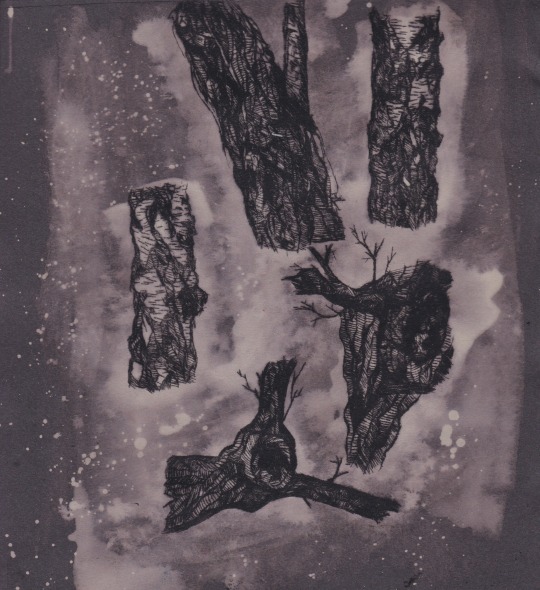
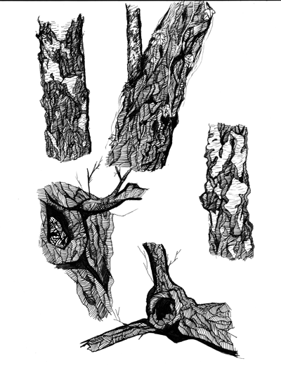
Developing from my comic panels and exploring work done by Jamie Hewlett, I went down to the local woods in my area and drew observational drawings of trees using a fineliner.

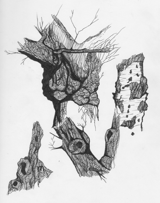
Following Hewlett’s drawing style of creating the rough texture of the tree trucks via repeated patterns and mark making. By doing this my drawings are given more definition and look more 3D. The overall look of these trees is illustrative and they have a fantasy element to them due to the graphic hand rendered approach.
Dry Point

In the past I have used Dry-point print as a method of illustration due to its raw hand rendered results. Starting by etching my observational drawings of trees into the silicone, I then inked the plate which resulted in the image below. The overall composition is interesting and I’m pleased that this method has picked up the detail of the trees texture. The appearance is very mystical and creepy and I feel the dry point printing process has given it an atmosphere of mystery. Even the marks made by left over ink on the palette has given it a fog like texture.

Satisfied with the results I then began to experiment with them to see what outcomes could be developed. I first copied the image onto black sugar paper and then poured bleach over the image which chemically reacted with the paper turning it white but it didn’t react to the printing marks which allowed the detail to be seen easily. This method created tone in my work and also created a nice contrast to the rawness of the dry-point and the looseness of the bleach effect.
Animation
Taking inspiration from our Avatar artist, Lilli Carre, I decided to develop my observational drawings into a 2D animated gif. Looking at the shapes of the trees I imagined the circular patterns to open up like eyes and found that eyes have a common relationship to witchcraft and spiritual practice (e.g. the third eye).
Any problems?
I decided to use the 2D drawing, animation method to contrast with the hand rendered drawing style of the trees which was a slow process and I found difficulty in lining up each frame due to the amount of detail in the texture. This can be seen with the tree in the right hand corner which isn’t as sharp and clean as the one above it, however, I find this shows individuality as it gives them different personalities. With the drypoint, I struggled due to my lack of understanding of tools and processes but after producing these outcomes I now feel more experienced in this field.
Will I use these methods in the future of this project?
I found my gif to be successful as it’s very illustrative and also creates a fantasy like atmosphere. It also allows me to create more hand rendered work that I can develop into 4D work. My drypoint created illustrative designs as well and I wouldn’t mind converting it also into a 4D design but that would take time to etch out each frame so for this project that is highly unlikely. I would like to attempt to create some more witch inspired work so I should look into how witches and witchcraft has been recorded in art through history.
Response to Hylophobia:
Whilst reading about forests and their connection to witchcraft, I came across the Aokigahara forest in Japan, just North of Mt. Fuji, also known as the sea of trees due to its thick forage and is one of the highest recorded places for people to commit suicide in.

Above is a photo of said forest, as you can see its very dense and green and as it is 35km squared in size, many become easily lost if they stray from the path.
Japan has always had a relationship with suicide and mental health and has one of the highest recorded suicide rates in the world particularly with men. That being said, it is peculiar that many Japanese citizens choose to travel miles away from their homes to commit suicide in this specific forest.

Sitting at the base of Mt. Fuji, the forest was chosen as a setting in 1960′s tragic romance novel Kuroi Jukai by Seichō Matsumoto for the main character to commit suicide. This seemed to start a sinister trend in Japanese culture and was also dubbed as the “perfect place to die” in the 1993 novel The Complete Suicide Manual by Wataru Tsurumi; the book is commonly found with suicide victims in the forest. The novel was written to describe the stress of living in Japanese society due to the pressure of working, isolation and lack of support for those suffering from depression.
However, before the novel was published, the Japanese were known for performing honourable suicides, like when Samurai’s would commit “seppuku” or kamikaze pilots. In terms of religion, Christianity didn’t have too much of a big effect on Japanese culture so suicide was never seen as a sin but a more honourable death as many see it as a way of taking responsibility. Euthanasia was also a common practice (although some believe this is just a folklore) which is where families would abandon their elderly women. Some also believe this might be the reason the forest is haunted with yurei, vengeful spirits and ghosts who lure saddened victims to their deaths. This believe was explored in the 2016 movie The Forest by Jason Zada.

The movie plays on themes and symbols of the forest, such as the use of tents and ribbon trails which visitors leave when unsure if they want to commit suicide.
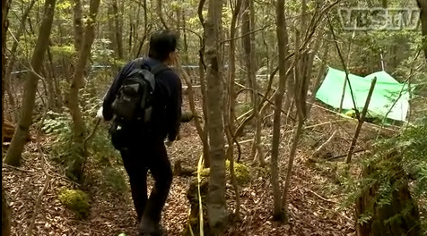
Japans Relationship with Nature
In the industrial cities of Tokyo, nature is hard to find as every inch of land is covered in concrete and has a modern building built on top of it. That being said, Japan has always had a harmonious relationship with nature as it plays a major role in their religion and landscape. Although technology has drifted them away from nature, they still protect and engage in it with activities such as forest bathing which is where you actively immerse yourself in a forest environment as it is proven to lower heart rate and blood pressure to relax you and release positive hormones. Nature is also continuously presented in traditional Japanese art, textiles and even architecture.
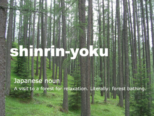
Japan’s relationship with mental health:
Up until the 90′s, Mental health in Japan wasn’t heard of outside of Psychiatric circles and depression was considered a physical condition rather than a mental one. Even today with the increase of mental health awareness in Japan, mental health is still not discussed and men are of high risk of suicide due to pressures of work and loneliness.

Menhara-chan designed by artist Bisuko
Yami Kawai (translates to sickly cute in english) is a Harajuku street style subculture from Japan promoting mental health awareness within their clothing and motifs. The Harajuku clothing style is very popular in Japan due to its use of bright childlike clothing and over use of accessaries and Yami Kawai dresses in a similar way mainly with the colour scheme of black and pastel pink. Their clothes are also covered in motifs that reference suicide and depressed feelings. The mascot of the subculture, Menhera-Chan designed by artist Bisuko created the character to be a stereotypical cute anime girl with undertones of suicide and self harm references in her design.
Yurei

A yurei’s appearance often differs depending on the circumstances on their death but they appear much like they did in their human life, retaining the features and the clothing they wore when they died or were buried, in most cases, white burial kimono’s or uniforms of fallen warriors. They also sometimes wear a white triangle on their head but this isn’t a very popular perception anymore. Occasionally they have bloody wounds indicative of the way they died and their hair is usually long if they are female. They are translucent and only very faintly visible, and in most cases they are so faint that they appear to have no feet.
They only haunt one particular place or person. In the case of a place it is often where they died or are buried and in the case of a person it is often their killer, or sometimes their loved ones. Yūrei only exist to haunt, and they remain “stuck” in this world until they can be put to rest. Some yūrei are so reluctant to accept their deaths that they haunt their living family, bringing misfortune and unhappiness for the rest of their family members’ lives.

Above is an interpretation from the 2002 Japanese horror film Ju-on; The Grudge, of a yurei.
Japanese spirits and supernatural creatures
List of potential Japanese spirits to explore:
Abura-akago – An infant ghost who licks the oil out of andon lamps.
Akateko – A red hand dangling out of a tree.
Arikura-no-baba – An old woman with magical powers.
Datsue-ba – An old woman in the Underworld who removes clothes (or skin if unclothed) of the dead.
(Above)Futakuchi-onna – The two-mouthed woman.

(Above)Gashadokuro – A giant skeleton that is the spirit of the unburied dead. Also known as Gaikotsu.
Hanako-san – A spirit of a young World War II–era girl who haunts school restrooms.

(Above)Hannya – A noh mask representing a jealous female demon.
Hyakki Yakō – The demons night parade.
Jikininki – Ghosts that eats human corpses.
Jorōgumo – A spider-woman.
Jubokko – A vampiric tree.
Kodama – A spirit that lives in a tree.
Kubikajiri – Female corpse-chewing graveyard spirit.

(Above)Kuchisake-onna – The slit-mouthed woman.
Oiwa – The ghost of a woman with a distorted face who was murdered by her husband.
Onryō – A vengeful ghost formed from powerful feelings like rage or sorrow.


(1st picture is a representation of the creature, second image is a monster from movie Pan’s Labyrinth that’s appearance is similar to the first)Te-no-me – A ghost of a blind man with his eyes on his hands.


(Accurate representation above and a scene from 2005 film Memoirs of a Geisha. In this scene, the main character performs a dance that tells the story of a woman who suspects her husband of infidelity and waits outside in the snow to catch her husband leaving his mistress; unfortunately a blizzard sweeps over the land and she succumbs to the elements.) Yuki-onna- A ghostly woman who appears in snowfall.
Yama Uba/ mountain witch- an old crone who lives and hunts in the mountains and eats anyone who is unfortunate enough to cross her path.
Whilst exploring Japanese folklores and mythical creatures, I found many of them were represented as female. Unlike witches from European folklores, Japan doesn’t really have witches. They do have female Priestess’s/ shamans in the Shinto religion and Japans first ruler was a female shaman called Himiko.
What can I take away from this?
I was hoping to find some form of ghost related to suicide/ sorrow/ nature but sadly I didn’t find this. The reason I wanted to find some kind of forrest creature was so I could relate it back to the Aokigahara forest, but I only found different types of ghosts and spirits, none relating back to nature. However, I can look at this as an opportunity to use elements from Japanese spirits appearance and mix it with nature.
Artists who have explored Japanese Folklore and Mythology
Junji Ito
Japanese horror mangakas, Junji Ito, writes and illustrates short surreal, horror and gory comics with intricate panels and designs.

Inspired by the works of Kazuo Umezo, author of the violent and disturbing “God’s left hand, Devils Right”, and Koga Shinichi, whose work centres around Satanic worship and morbid depictions of the occults, Ito eventually developed his own unique style of writing and drawing of “in-escapable horror” (meaning the characters in his stories encounter entities completely by chance).


Ito’s work explores the manipulation and degradation of the human body, often distorting and deforming the form to become a mutated malevolent force. Working in pen and ink, the composition of his panels creates suspense with the use of the “page turn” where the last panel on a page is used as a cliff hanger so to warn the viewer that there will be something truly terrifying on the next.
He also explores the use of composition by arranging his characters in a specific manner. Like the above image, if you used the rule of thirds you can see that the main character, the one the audience are being forced to look at, is in the centre of the shot. However, she is smaller than the surrounding characters, meaning they have dominance over her and she is feeling vulnerable to them.


Uzumaki, is a three-volume manga by Jung Ito in which a village becomes haunted, not by ghosts however, but the geometric shape, the spiral. There is nothing frightening about a spiral, but Ito manages to create a threatening concept around it in which the shape begins to appear around the town and it eventually becomes the destruction of said place.
Work by Kazuo Umezo
Work by Koga Shinichi
In comparison to his inspired artists, Ito’s work is more intense and although equally gory, he presents it in a more subtle and creepy manner. The art styles are also different, even though they are both manga, Ito chooses to not exaggerate his characters by giving them large exaggerated eyes and gives them a more plain appearance.
destroyraccoon/ Helena Smołka
Polish illustrator and animator, Helena Smotka is inspired by Asian urban legends which she interprets with her psychedelic cartoon character designs and short videos.
Like Junji Ito, Smotke creates an intense style of work that, although is less gruesome than Ito’s, is still heavily exaggerated to the point of scary with sharp and stretched limbs and facial expressions that are clown like and creepy.
Inspired by urban legends and creatures like the two mouthed woman, Smotke creates short animations using a monochrome, black and white colour scheme with touches of red to create an uneasy and tense atmosphere. Although the touches of red don’t always symbolise a certain object of suspicion, it is used in a way that allows you to slowly become used to the red to put the viewer in a false sense of comfort before using the colour to show/ represent the monstrous creature entirely.
Mau Lencinas
Argentinian artist and illustrator, Mau Lencinas creates a mashup of traditional Japanese ghost symbology, hip-hop retro-futurism, and urban street couture to create illustrations, character designs and 2D animations. Mostly inspired by animated movie, Akira, creator Katsuhiro Otomo and the urban style of our nascent neo-modern era, Lencinas creates a series of demonic gangsters bearing kanji symbols, and crews of demon hunters adapted from Japanese traditional folklore.
Lencinas draws his characters from the idea of a dystopia Tokyo, he dresses his characters in fashionable street wear before arming them with Samurai swords and ninja weaponry, adding traditional Japanese masks to their clothing and having them battle demons from Japanese folklore. He works in bright saturated colours with little 3D dimension to add to the playful nature and the youth of the characters and works in digital software which creates a neat finish which he wouldn’t have gotten from a hand rendered process.
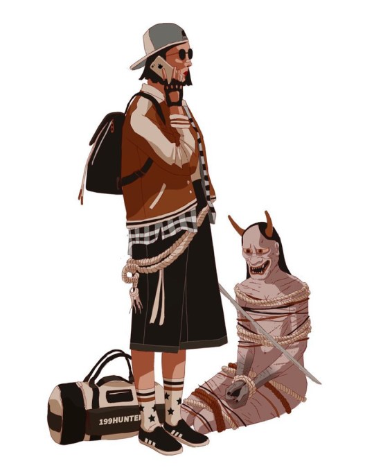

Unlike the artists I explored above, Lencinas’ work isn’t horror related but he explores the process of mixing too themes together to create unique character designs. I want to attempt to design a ghost to represent the Aokigahara forest so I will be mixing the use of nature with the traditional appearance of a Japanese ghost. Lencinas, also incorporates street fashion and traditional Japanese clothing to dress his characters, which is perhaps something I try to include by exploring Geishas and kabuki theatre.
Reflection
Pleased with the development I have made with my observational drawings, I want to continue to develop them into characters or witches, however, now that I have looked at the Aokigahara forest and yureis, I’m inspired to mix the two subjects together to create a spiritual forest being. I can use the observational sketches as a template for these designs and as I want to set them in Japan I should look into the culture such as traditional art and clothing. As I am still keen to progress on my subject of witchcraft, I will try to create my forest spirit with witch like elements or look at other female creatures that lure or cast spells.
Actions
1. Look at how witchcraft has been documented in art in history
2. Use drypoint to create more illustrative pieces
3. Look at 4D processes like stop motion and explore artists related to the process
4. Explore Japanese culture through traditional art and clothing
5. Begin to create designs for my forest spirit/ witch
6. ADDRESS AUDIENCE AND CREATE A QUESTIONNAIRE TO SEE WHAT THEY WOULD LIKE FROM MY DESIGNS
Sources
Websites
Mental Floss, 10 Horrifying Demons and Spirits from Japanese Folklore, http://mentalfloss.com/article/59737/10-horrifying-demons-and-spirits-japanese-folklore accessed on 30.4.18
Mental Floss, 15 Eerie Things About Japan's Suicide Forest, http://mentalfloss.com/article/73288/15-eerie-things-about-japans-suicide-forest accessed on 30.4.18
BBC, Why does Japan have such a high suicide rate?, http://www.bbc.co.uk/news/world-33362387 accessed on 30.4.18
Creators, Streetwear Illustrations Dive into a Dystopian World of Demon Hunters, https://creators.vice.com/en_au/article/jpvy98/japanese-streetwear-demon-hunters-gangs-drawings accessed on 30.4.18
Behance, Helena Smotka, https://www.behance.net/hsmolka accessed on 30.4.18
Youtube, destroyraccoon, https://www.youtube.com/channel/UCQvfxe-hQUarvVfhzh3tCFQ accessed on 30.4.18
BBC News, How Japan came to believe in depression, http://www.bbc.co.uk/news/magazine-36824927 accessed on 3.5.18
Youtube
VICE (2012), Suicide Forest in Japan, https://www.youtube.com/watch?v=4FDSdg09df8 accessed on 30.4.18
Super Eyepatch Wolf (2016), How Media Scares Us: The Work of Jung Ito, https://www.youtube.com/watch?v=lIIA6QDgl2M accessed on 30.4.18
Super Eyepatch Wolf (2018), The Jung Ito Collection is Disappointing Garbage, https://www.youtube.com/watch?v=DAYFi6bLSfs&t=488s accessed on 30.4.18
Refinery29 (2018), The Dark Side Of Harajuku Style You Haven't Seen Yet | Style Out There | Refinery29, https://www.youtube.com/watch?v=1Wsk3Oa_3F8 accessed on 3.5.18
0 notes
Photo

Make A Living Making Art facilitator Rihkee Strapp conducted an interview with writer and artist Darin Corbiere last fall. Darin is aformer participant in Make A Living Making Art workshops, and recipient of the Ontario Arts Council’s Northern Arts Grant to begin work on his graphic novel GIIWEDANONG.
Rihkee: Tawnshi Darin, it’s great to be meeting with you today. Let us start by hearing more about your artwork, and what you do:
Darin: I am, first of all, a teacher at White Pines in Sault Ste. Marie, and I have created a graphic novel. I completed the manuscript in 2008, and I’ve been shopping around for an illustrator and some advice as to how to get it published. I actually sent portions of it to different publishers, and the response that I received from those whom have been kind enough to reply have suggested improving the artwork. That’s why I have been searching for an illustrator, and that’s when I ran into Darren Emond.
Rihkee: How did you meet Darren Emond?
Darin: I don’t know whether to chalk it up to fate or just some good luck. My wife one day woke me up one morning and said, “Hey let’s go to the Mill Market,” it was a Saturday morning and I don’t know, I just thought “Let’s check it out.” Checked it out, and the very last person we ran into, way down at the end of the market, was Darren Emond with his comics on display. We got to talking and found out that he would be interested in collaborating and doing illustration work. From there we have been corresponding back and forth, talking about things. He is the one who has the industry expertise, so it works out well. I have the idea, the script and he has the background.
Rihkee: I understand you both recently received funding support your Graphic Novel project through the Northern Arts granting stream from the Ontario Arts Council (OAC). Can you tell us more about that experience?
Darin: I am really grateful first of all, part of the requirement is that I have to acknowledge the OAC but even if they didn’t ask me to I would be acknowledging them because I’m very grateful for receiving this grant. We applied for the grant back in May, with some help from my friend Rihkee Strapp, who gave me some advice on finishing up the application. I went and I did a video submission, and I was expecting not to hear anything until after Sept 17, I think was the closing date. Two weeks ago, Darren Emond called me up one morning and said “Hey a congratulations are in order. We got the grant!” and I didn’t know. I had not seen anything in the mail, and I had to see it to believe it. So I called him and I said “What do you mean we got the grant?” He talked about how he got a letter from the OAC. He received his portion of the grant of $6500. According to his letter I also received $6500. I was waiting for this letter to come in. Three days passed, so I called the OAC and confirmed everything. I did in fact receive a grant for that amount. I was ecstatic. Right now I’m still not over the excitement, I’m really looking forward to invest some money to completing a big chunk of this graphic novel. I have four of them on the go. GIIWEDANONG is the name of the first graphic novel, it’s 300 pages long. I’ve printed T-shirts, I’ve printed my own comic under that name, only 1 issue only 100 copies, but it is the creation story and it sets the foundation for the rest of the story to follow. I actually teach that story in school, and the teachers they love it. It’s a great story.
Rihkee: How did you hear about the Northern Arts grant?
Darin: Darren Emond went to an OAC outreach event that was set up at the Art Gallery of Algoma. He spoke to a woman by the name of Darlene Naponse, the Northeastern representative for the OAC. He collected her contact information, and passed that onto me. I talked to her. I began the application process, then I got stuck. Then Rihkee Strapp came along and helped out with some advice at one of their Make A Living Making Art workshops that I attended. They provided me with the information I needed in order to complete the application. After that everything just fell into place, just “boom boom boom,” and like I said I am really happy to get the award.
Rihkee: So you spoke with Ontario Arts Council officers as well?
Darin: I did, I emailed Christine. We talked she told me I was successful. Out of the 50 people who had applied I was one of 20 that were selected. I think that is impressive. In the letter she indicated that we could get feedback from the jury. The jury made recommendations on the grant and we could get feedback on their process and deliberations. In a nut shell, the jury liked what I was doing. It wasn’t a one off kind of thing. They liked that it took years of work to come to this point. They liked that it wasn’t just the one story, but many stories over a longer period of time. I sent copies of my comic, as support material. The comic that just contains my artwork, and they said that they liked it! Which is a far cry from the publishers who said that they didn’t care for it much. When the jurors came back, they said they liked my art style. I was even more pleased, probably even more satisfied with the fact that these highly qualified people are saying “I like your stuff!” That really adds some validation to the work I’ve been doing, because it didn’t seem to go over with the publishers. Now with Darren Emond as an illustrator, we can work with the publishers, and I will also be able to have a smaller niche crowd that I could sell comics and stories in their raw form. That is what the jurors liked, the raw form.
Rihkee: Have you received any awards or funding for your art before?
Darin: No, that’s why I guess I’m shocked. Pleasantly surprised because this is my first time applying for a grant and it was accepted. I’m just like holy smokes!
Rihkee: How long have you been working on GIIWEDANONG ?
Darin: Back in the summer of 2007, I was doing some teaching down in Lansing, Michigan. I went out shopping with my sister, well she dragged me out. We went to Target and I found this big thick cardboard paged book, and I use that as the manuscript and I still have it, it’s in my classroom. I was done November 2008 and then I rewrote it, single sided. The manuscript is 300 pages long. To me the artwork isn’t that bad, but compared to Spiderman, Superman everything isn’t in proportion.
Rihkee: What do you think about the term art?
Darin: I guess to each their own. Art comes in different forms. I’ve been doing some healing work, I guess if you want to call it that. Part of my healing work is through drawing. It has nothing to do with the graphic novel series. I have several colourings, I call them . Last year I bought some ash wood and was going to build a boat. That could be art. It didn’t work out so I ended up taking some of those pieces of ash and I began just drawing on them using whatever resources I had available, so mostly markers and highlighters. A lot of people like that style. I teach at a school where they have a specialist high skills major in Arts & Culture. Art is expressed in so many ways, through music through drama, spoken word, dancing, drawing, and culinary arts. I operated a business called “Sugar Daddies” this summer. I made butter tarts, and people tell me my butter tarts are absolutely amazing. You know that’s a form of artistic expression as well, when you’re actually creating. It’s mindfulness, thoughtfulness. A lot of good positive energy goes into all these things I’m focused on creating. To me, I think that is essential to the definition of art, that you have to have that goodness, that positive energy flowing into it.
Rihkee: Chi Miigwetch for your time today Darin, and I wish the best of luck to you and Darren on your graphic novel GIIWEDANONG.
Follow Darin Corbiere on facebook: DED-C comics @Giiwedanong
Authentic and Original Aboriginal stories in Graphic Novel format. Giiwedanong is the first of four epic graphic novels based on Ojibwa legends. Written and illustrated by Darin Corbiere and Darren Emond.
Or get a copy of the first book illustrated by Darin Corbiere on Amazon.com
#business#graphic novel#graphic novels#nativeart#GIIWEDANONG#artist#writer#culinary#make a living making art#DarrenEmond#comics#northern ontario#sault Ste Marie
0 notes
Last Seen Blogs

quadrantmodelquotes
Quadrant Model Quotes from 2013 Lectures

hazmat0
Bad Decisions
furbocious
a blog for my furbies
s-a-h-a-r-a
Sahara

stokester
Untitled