#i do still want to incorporate the cuff links but i did end up ordering a new black shirt for that
Text
lem2 moment (finished most of the little adjustments i wanted to do this weekend!)
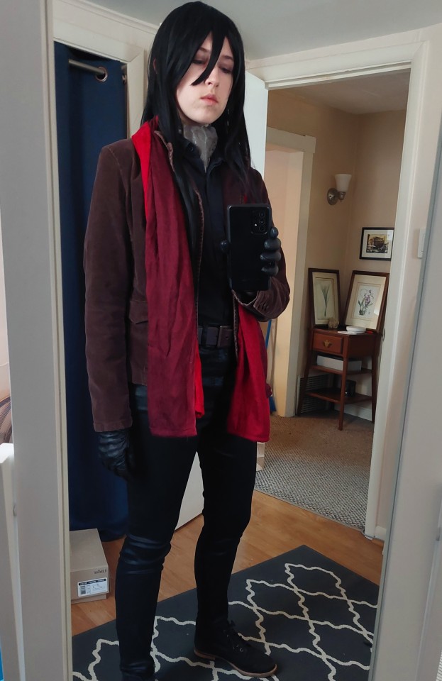
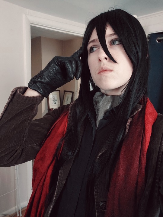
#tragically this did not help my writers block#pretty pleased though. i was worried i would start to hate the jacket bc it definitely has a women's cut but i think it works ok#also it was $4.99 so.#i feel like i'm going to start doing herlock poses by accident lol. two very different detectives.#should i tag this i kind of want to tag this even though it's selfies..#waver velvet#not much else going on in that tag anyway lmao#i do still want to incorporate the cuff links but i did end up ordering a new black shirt for that#the sleeves are too short on this one and both of my black shirts have been through way too many days of klav gav cosplaying
15 notes
·
View notes
Text
www.InkIt&SinkIt.com
@lin-rinku
Alright, I’ve finished one drabble request.
This is your Soulmates and Online Dating, hope you have fun!
When Ink It & Sink It went online at first many thought it to be an extreme invasion of privacy. People were paid money based on either the amount of common, unique soulmate markings they found, or they were paid larger sums for more desired celebrities. Politicians, actors, the wealthy, anyone who normally didn’t display their marks to anyone.
Now, the website was a more welcomed relief to many who browsed the hundreds of thousands of photos daily to try and find themselves on someone’s arm.
Many things could be found in the ink-like markings that stained people’s skin. Preferred patterns, interests, hobbies, favorite shapes, anything related to who the individual was meant to be with. It was a seemingly unnatural event that began before anyone could remember. Since there had been people… there were markings. It was discovered in the last 50 years that humans had an octopus-like, muscular pigment reaction they had little control over. What linked them, and what caused them to produce patterns like they did in one main area was still a mystery.
All markings had stages to inform their wearers just how close, far, or bonded with their soulmates they were.
So when Oswald noticed one evening his simple inner forearm markings had wrapped around his forearm completely, all in a smokey grey, he was horrified. He’d met his soulmate that day at some point, but because of his suit and layers he’d never noticed when it was that the sides and back of his forearm became littered in precise stains.
It started out with a small set of question marks on his inner wrist, four of them in total with two upwards and two upside-down, one after the other. He was as confused as the markings were and 19 at the time. That was the time his soulmate was somewhere in his city.
After that, the closest he’d ever gone to his soulmate was between 7 to 12 blocks away when odd pixel characters and what might have been spacecraft appeared up his forearm with several more question marks. His markings were a mess of splayed interests.
Now though, now he had markings wrapped around his forearm entirely, different angular patterns and something that looked like a kind of science or math thing. To be honest, it was far beyond his wheelhouse.
Whoever was his supposed soulmate was probably some lanky, young, 20-something that played games all day. Anything from couriers to informants could be his soulmate… luckily, it was decidedly someone new. And if they were his soulmate then he’d end up loving them no matter what they looked like… It was all some sort of trap, he hated it.
He had a criminal underground to run.
He had no time for these games.
Unfortunately for Oswald, his curiosity was a downfall.
If his soulmate was the kind of social outcast he expected them to be, he knew they’d post their markings online in order to find their match. It was going to be all too easy to find himself in their desperation. And when he knew what they looked like, he could officially reject them in his mind and move on. He bet he’d hate them. His markings wouldn’t darken at all because he didn’t care.
And he never would.
Four days later and still nothing in the new postings looked like him.
How could someone not want to find him? Him! Of all people! He was powerful, wealthy, influential, handsome, why wouldn’t someone post their markings if not to at least brag to the public about who they matched with.
Unless…
Unless they were dead.
Unless something happened to his soulmate that was beyond their control and they hadn’t been able to post about him. That had to have been it. Otherwise someone should have been knocking on his door.
For the time being, Oswald had been covering his markings with different foundations and concealers, attempting to have his markings stay hidden. Even if his sleeve rolled up, if he shook hands, or raised his arms. He didn’t want a peek of his markings getting out.
He’d shove them in his soulmate’s face first and demand to know who they were and why he shouldn’t kill them on the spot. That would leave an impression that hopefully would run them off.
Oswald would be able to live his life burden free once more. And maybe if he got them scared of him or hating him then perhaps he could get the markings to fade to nothing? It was worth a shot.
Markings could change, in very rare cases, but he was a rare kind of person. He could have nature itself bend the rules for him just this once.
The next three days were spent with Oswald’s soulmate in mind, taking stops to the same places he went the day his markings expanded his arm, but either no one showed the markings or he didn’t want to ask strangers who had him for fear of what he might find.
Well.
Desperate times called for desperate measures.
That night, one week from the day that his markings expanded, he took a picture of his freshly washed markings, posting them online anonymously. He kept his name and status as far away from the site as he could, trying to be the regular Joe Blow trying to find his match.
Within two hours, he had a message to a dummy email account he made mentioning someone was sending him a private connection through the site. Not to seem too excited, he let it sit for a couple hours, checking the message he got before he went to bed.
‘Hi. I am reasonably sure, beyond a doubt in fact, that you have me on your arm. And if this looks like you, I believe we are matched.’
It was mostly to the point, the message coming with an attached picture of what was seemingly a lean forearm, a sweater pushed up to the elbow, hand appearing long with the thin fingers spread.
Along the skin were soft grey lines, some standing on their own and others thatched together. What looked to be rubber-stamp styled penguins occupied his arm, though there were only two. One larger and one smaller. Along with it an umbrella that looked suspiciously like the ones he had embroidered on his shirt cuffs. What appeared to be musical bars across the man’s inner wrist and bands of lace taking up filler areas.
He had seen faked markings before, ones meant to be for him. Usually incorporating murder, crime, some sort of knife display. Those were what people saw, these… no one would associate him with lace.
He never touched it, never had it around in public eye. Even in his manor, there was no lace in sight. And he knew the pattern on the forearm in the picture. That was from the one thing of his mother’s that he refused to get rid of after her death. A lace shawl she wore on breezy summer days.
Something never connected to him, but he loved it.
That was too personal for this to be fake.
‘I would say that, yes, that does look remarkably like what I’d identify with. Who are you?’
‘If you don’t mind I’d like to remain nameless for now. I know who you are though, Mr. Penguin. And I’m keeping things secret for… security reasons.’
Security reasons?
‘What is so important that you can’t tell me who you are?’
‘I might be… in some way, connected to something involving you and I don’t want to get too close just yet. Soon, I promise! Give me another week?’
‘I don’t seem to have much choice until then, do I?’
‘I’m afraid not. I have to go, busy day ahead of me tomorrow, but… could we talk again?’
‘It seems that we’re destined to, so I imagine I can make time.’
‘Wonderful! Okay, we will exchange pleasantries then. Goodnight, Mr. Penguin.’
Oswald didn’t bother to return the sentiment, leaving his computer with a confused scowl. This was ridiculous, he was acting so inappropriately for his position. Here was some, likely, civilian at his doorstep, claiming to be his partner and he was in no place to be taking some bright-eyed Gothamite into his realm of underground activity.
And still, the next night, he sat in waiting at his computer. His anticipation was through the roof for when the other would message him again. When the ding went off, he couldn’t help but scramble for the mouse, nearly knocking over a glass of whiskey close by himself.
‘How was your day, Mr. Penguin?’
How was his day…? How was his day? This person was honestly asking how his day was?
‘Are you sure you’re allowed to answer that without getting too close?’
‘...’
‘Just how much criminal activity is in your day that you can’t answer how it went?’
‘I can guarantee my day was full of much less criminal activity than one might believe.’
‘It went well, this is my first chance to relax today so I’m taking advantage of it.’
‘Sounds like you try to run a tight ship.’
‘Oh, I do. There is little room for error in my business.’
What did he do? Was he giving preferential treatment because he knew? Was he approaching this differently than he would with another because of the markings?
Who was he kidding, of course he was. This was the natural reaction, he was going to be taken in by the thought, the romance of finding a partner. Drat… No problem. He was aware of what he was doing and why, he could curb that behavior quickly.
‘Thank you for asking, few people do. How was your day?’
Damn it.
‘Trust me, I know how you feel. And you’re welcome, it’s the little things that can make a difference. :)’
‘My day was full, I can’t speak too much about it. Criminal activity and all. What I can say though, is that I find it fascinating how many ways you can crack a human skull with something as small as the right force and a quarter.’
‘Excuse me?’
‘You’d be surprised the kind of damage simple pocket change can do in the right hands. Or in a crack in flooring or a sidewalk. Very few times is it lethal though. People can have things impaled in their brain and still function as they had or with only minor impairment.’
‘Is this the kind of conversation you always hold with new partners?’
‘I must say, it depends on the time of year. From late spring to early fall there is quite the boost in tourism in Gotham, and anything from gift shops to street vendors become so much more common. Even little things like Scout cookies. It produces a lot of opportunity for pocket change, and that gets a brain thinking.’
Oswald leaned back in his chair, seeing how the other didn’t seem to understand that a regular person wouldn’t begin a conversation like that. Let alone carry on with it when it was pointed out. He was… defending that this was his topic of focus?
‘What can I call you?’
‘Mr. E.’
Mr. E. Mister E. Mistery. Mystery…
Damn it.
‘I am not calling you Mr. E. That is to say that you’re a mystery and I refuse to walk into that word play.’
‘That disappoints me a little, but unsurprising. You can call me Ed.’
There a name. Even made up, he could work with that and not a stupid alias. And especially not an even more stupid name like a super villain from 1953.
‘Well, Ed… Tell me all that you can about cracking a human skull with pocket change.’
To Oswald’s surprise, the Ed he was talking to had a surprising amount of ways to maim a man with a nickel. Ed had a lot of anatomical knowledge in general, or just general knowledge, he seemed to be well read.
Well read. Smart. Criminal activity…
Either he was someone’s informant, accountant, specialized torturer, something like what he had with Mr. Penn or the Dentist respectively. Or he was one odd civilian. It could really go either way. The night though, was overall enjoyable, Oswald staying up until Ed had to part himself from the chat, heading to bed in order to sleep before work several hours later.
Ed told him about how to browse the mobile site, where to go for messages and how it worked. Ed also seemed to be quite technically capable.
Oswald didn’t expect half way through his day in the morning to get a picture of a cadaver with several pieces of long grass sticking out from wounds he had. He looked like a bruised and broken mess. Even from only the waist up.
‘A dead man is found in the middle of a field, no footprints on scene. He had an unopened package with him. How did he die?’
A question? A scenario? A… riddle?
Oswald set his phone back down, focusing on the meeting he was in with several other men large in the Gotham underground. They were all sat around a circular table in a restaurant Downtown, business nearly concluded with the more frequent personal stories that were being shared.
Where would Ed have gotten a body? That didn’t look like an average picture on the internet, that looked like an actual picture. One he took on his own phone and sent. When business was finished, Oswald took out his phone, typing a message and claiming it to be to a lackey.
‘Ed. Is that an actual body?’
He had to wait, but eventually a reply came eight minutes later.
‘...’
‘No?’
‘Don’t lie to me, I know what a body looks like, Ed. Where did you find that?’
‘Do you give up on the riddle?’
So it was a riddle.
‘I don’t know. Fell?’
‘In a field?’
‘I don’t know what buildings are in a field, I’m not a farmer. Are there tire treads?’
‘What?’
‘Tire treads. Did someone kill him for his package and dumped him from a vehicle?’
‘No… Do you give up?’
‘Then I don’t know. A plane? Helicopter? Some flying device? He fell from one of those.’
‘You are close! Parachuting incident. His parachute didn’t open and he hit the ground. Quite the brain teaser, don’t you think? :)’
‘Also, I borrowed the body from work. I’ve waited some time for the right one to come in for this, though this foliage isn’t correct for a field crop… I assumed that this was the closest I’d be able to find naturally.’
Ed was… so, so odd. He borrowed a body? Where did one borrow a body? Was this a service he could buy in on?
Sometimes one needed a body.
‘Naturally? You were willing to stage a body with leaves from a field crop to be able to fulfill your visual for your riddle?’
‘Well… yes. Accuracy is key in most riddle descriptions so it can be solved.’
It seemed so obvious to Ed, of course that’s how things worked. Why would you not go for 100% authenticity? Why not have a body on hand in order to fully express one’s wishes? And use a corpse to ask a riddle, of all things…? He was an oddball.
Intriguing though.
“Penguin? Penguin, what’s your take on this?”
Oswald was taken back to reality by one of the large men asking him a question to something he knew Oswald hadn’t heard. The smallest of the group rolled his eyes with annoyance, tossing a hand up to give a dramatic, unsure gesture. “Have you tried strangling?”
“For… the dinner my mother-in-law insists on?”
“If she’s rowdy it might help calm her briefly. I don’t judge the methods if the results bring the desired outcome.”
‘How was your day?’
‘After your… interesting afternoon surprise, uneventful. A party to attend in a few days’ time. Nothing extravagant, a birthday gathering. And yours?’
‘My coworker did not understand my riddle setup like you had.’
‘Whaaat? ...Now, how could that be?’
Why would anyone understand that completely? It made sense why someone would question that, even in his line of work. Though different questions, there’d be questions.
‘I don’t get it either, I thought I made it quite clear. ...Maybe I need to be more obvious? Maybe I need a new approach?’
‘Maybe you need to think twice before you try to use a corpse as a quiz towards everyday citizens that don’t understand a morbid twist on an interesting game?’
‘You thought it was interesting?’
‘It was at the very least… a surprise. Intriguing. It certainly spiced up my lunch meeting.’
There was an awkwardly long pause, Oswald staring at his screen for over ten minutes before a reply came back. Whatever the pause was for, he supposed he could wait, but he had other things he could be attending to. Ed was just… a special case.
He was doing it again…
‘We can’t yet, but when possible… Would you be interested in meeting for coffee or tea somewhere? There’s a cafe Downtown that boast they have the most comfortable chairs and it plays live lounge jazz on Wednesday afternoons. They’re actually quite good.’
Oswald leaned back in his seat, thinking of the offer. Who knew when that thing would be finished. It could be weeks from then. Special treatment or not… it had been some time since he went out casually. And if Ed didn’t want anything from him it would be a rare occasion to not deal with grubby hands trying to pry his money or power from him. Hm.
‘I will have one of my men accompany me, as you may understand, but he will be by an exit. Overall, it sounds agreeable.’
‘You’ll go? Oh. Okay, then yes, your man should have no issue finding a space for himself to watch, I… Good! I hope we finish this soon!’
‘I hope you do not disappoint me. I look forward to this, Ed.’
Oswald, covered in layers still, unable to witness the slightly darker shade his markings took, the two forming a connection over the anticipated meetup. He wouldn’t notice until he got prepared for bed, taking off his suit and shirt to see the darkened stain more obviously on his pale skin.
Drat…
Although they had just over a week to wait, the messages continued each night. The amount depending on when Oswald finished his business for the day and when Ed had to pack it up for sleep. Still, they exchanged words regardless of the amount.
They made plans to meet using one of the mystery man’s days off in order to have time on the appropriate day to hear the music play that Ed suggested. Oswald still didn’t know what it was Ed exactly did, but somehow he could be involved at this point.
He had ideas of what the other did, but no confirmation.
Oswald waited in the cafe on one of the seats, that truly was as comfortable as advertised, one of his men sitting in the corner with a paper in his hands to blend in better. The underground boss checked his watch, having arrived early to be polite, but even as the time ticked to their agreed upon meeting hour… no one approached him. He still didn’t know what Ed looked like in order to pick him out of the crowd, but Ed knew who he was. Mr. Penguin. He was waiting for anyone to call him such.
As ten minutes ticked by, he wanted to be upset, though a glance to his phone and the site had confirmed Ed sent a warning he’d be late. For what reason, he didn’t specify, but that he’d be late. It was proper warning before they were to meet so… he supposed he could let that slide.
Twenty three minutes late, but truly who was counting, the door was pushed open by a man with an armload of items. He seemed to struggle somewhat between his balancing act and the door, but managed to slide his way into the cafe with only slight troubles. Oswald ignored the noises, sat back to the door as he didn’t need to be anxiously staring at every person that walked in.
Footsteps by his chair, however, got his attention. Oswald’s eyes stealing a glance from as far as they could see without him moving his head, noting the well polished, well worn, brown leather shoes that stopped next to his chair.
“Mr. Penguin?”
The name drew Oswald’s attention upwards, following long legs covered by reasonable khakis. A working class set of pants. Eventually the pants were covered at the waist by a faded, green sweater over a white dress shirt, black tie barely peeking over the collar of the sweater. He was tall. Not outrageously thin, but he was slender and tall. In one arm he must have held four or five boxes. Long fingers clasped around several objects to help steady them against his chest.
A long neck attached to a square jaw, cheekbones that could cut glass, large glasses that fit his face well. Brown, chestnut hair parted off center and combed into place with what looked to be extreme care and precision. Hmm.
“Ed?”
The tall man lit up with a smile, trying to extend a hand to shake, but nearly dropped his payload on the floor. He smiled with some embarrassment, instead putting everything on the table in front of Oswald’s seat and sat across from the crime lord. “Uh… Hi! I’m Edward. Edward Nygma.” He offered his hand with much more success now, somewhat out of breath, though glowed with an ease and cheer that Oswald couldn’t deny was pleasant to see.
Not infectious, but pleasing.
Oswald met the handshake, never minding a formal introduction. “Oswald Cobblepot, it’s a pleasure to finally meet you face-to-face, Ed.” He took in the table with curiosity, raising a brow before his attention returned to the man across from him. “So what is all this?”
“These are… well they are meant to be for you, but… I wasn’t sure what to get. And then I thought about it, and decided against one thing for another, but I didn’t have time to go back to the apartment and get rid of the first thing. So then I carried two, but then came across something else, and…” Ed gestured to the table with a heavy sigh. “I didn’t want to be more late, so I took them all with me.”
Oswald snickered with some amusement, leaning forward in his chair with elbows resting on his thighs. “Well, let’s see what you brought. Display it all.”
Two different bouquets, a teddy bear, and a knife later, but Oswald had to say that he was relatively surprised by the gesture. Normally that was not something someone tried to do for him. Though he didn’t need any of it, he could at least show appreciation for the effort.
The meetup went as well for a first physical meeting, both men having at least two cups of tea while they were in the cafe. They spoke vaguely of life, Oswald unable to describe of many things he actually did, but Ed still listened carefully. He asked questions, but took them back if he wasn’t able to find out about the answer.
The two took in Edward’s markings, the man allowing Oswald to look at every detail of it in person, though the stain was reaching a stage of dark grey, surprising both men at its color. It made Oswald peek under his sleeve, his slightly lighter, but it too was darker than that morning.
Oswald kept his markings hidden, not wanting to have them exposed at all in public. He didn’t want anyone else catching an eye and snapping pictures, relating him to the post already made online. And Ed understood that, the two continuing conversation until Oswald had to leave.
The man reading the paper in the corner walked over, collecting what Ed had brought to take to the car parked outside, leaving the two alone to say their parting words.
“Well, Edward, this was surprisingly positive.” Oswald spoke, standing up from his chair and supporting himself with his cane. “You’ve changed my perspective on these… connections.” He described as he raised his marked arm, twisting it under his visual judgement, staring hard at his sleeve covered limb.
“I’m glad it turned out as it has.” Edward returned the sentiment, standing as well with his hands joined in front of himself. “Should we… do this again at a future date?”
Oswald nodded, walking away from his chair. “We should.” He agreed, getting halfway to the door with his guard coming back to walk him from the building to the vehicle. “Only next time, Edward… Don’t be late.”
#drabble#side fic#lin-rinku#gotham fic#nygmobblepot#soulmate#soulmarks#online dating#fic request#oswald cobblepot#edward nygma#A classic AU of soulmates and markings but with a modern invasive twist#InkIt&SinkIt#The site name basically meaning you have the ink and you are going to sink a date#one of those promised to match sites#though this one logs and categorizes markings to help others find their matches#it wasn't so innocent at first#but everyone's making it work
70 notes
·
View notes
Text
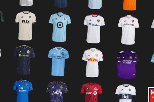
The best and worst of the 2021 MLS kits
footyheadlines.com
We have some good, some bad, and a lot of ugly.
With the dawn of a new MLS season comes the promise of new beginnings and new opportunities. New fans can discover the game for the first time, new memories and magical moments will be made, all of them with the crest of your team donning the athletes.
Since 2005, Adidas, one of the biggest names in global soccer apparel, has been outfitting each MLS team with their jerseys. The investment Adidas has made in the North American game has had a significant impact on the growth of the sport in the U.S. After signing on, Adidas’s reputation in America grew and their array of products have dazzled fans from the beginning.
Which is why we have been confused and disappointed by Adidas over the past few years.
What we have seen is that for some reason, Adidas has decided to recycle old templates from their European clients and dump them to MLS. Beyond that, there have been a slew of white away jerseys that seem to never end.
Last season, teams like Houston, Minnesota, Nashville, NYCFC, and New York Red Bulls launched away kits that didn’t use a white base. However, with the addition of the white home kit for LA Galaxy, the teams in Atlanta, Portland, San Jose and Orlando got the white washed treatment (with Montreal and Toronto getting a white adjacent treatment in gray).
This trend was immediately noticed. Fans were not happy with the results. With Adidas feeling the pressure, the company announced their intentions to launch less white jerseys this year, and explore alternative away jersey colors.
Well if Adidas’s goal was to cut down on white-looking shirts, they failed.
Despite their promise, Adidas released seven new jerseys using either grey or white, bringing the number of jerseys using those colors up to 14.
Some of the white jerseys are not bad. Some teams, like in the case of NYRB or LA Galaxy, use white in their traditional home kit. But this is a continuing problem that we - and many other MLS fans - have noticed. There seems to be a consistent lack of desire for creativity among MLS kits. If it was there, then we wouldn’t be seeing re-used templates, the same colors, or jerseys that look like they slapped logos on t-shirts.
We want to see Adidas do better. We hope Adidas does better. Otherwise, we hope MLS goes to a new model of letting each club sign their own contracts with kit suppliers. We might finally get some diverse and exciting results that way.
With that being said, we’ve compiled a tier list of the best and worst kits in MLS. Here’s what each tier represents:
The BEST: pretty self explanatory, the best kit made this year
A: among the best kits in the league, deserving of full acclaim
B: a unique, creative effort was put forth and seemed to have payed off
C: Kits that are creative and bold, but seem to be missing something
D: Either the details added don’t work, there’s something missing, it’s bland or all of the above
Delete This: The most bland and uninspired kits of the bunch
And while they are clustered in tiers, these are ranked from our favorites to least favorites in order.
Let’s plunge right into this starting at the top.
The Best: LA Galaxy away

footyheadlines.com
This shirt managed to make Adidas’s horrible, stupid, no good, very bad shoulder stripe template look like a part of the shirt that’s meant to be there. That in itself is commendable, but mix in the color combination and the gold tracing the stripes and you have a classic, which is very rare to do in MLS.
A Tier
FC Cincinnati home

footyheadlines.com
The alternating blue and orange pinstripes atop a base of deep blue is a really solid look. It doesn’t have the gorgeous color combo of the Galaxy kit, but it does manage to also incorporate the template elements well, and in a way that actually complements the overall design.
Vancouver Whitecaps FC away
footyheadlines.com
Yes, we did go on a rant about how we dislike the white away kits. However, in this case, Vancouver’s white away kit is a classic and a throwback to an original Whitecaps jersey. The logo that fits perfectly in that blue band in the middle, the sleeves with great cuffs, and the clean collar wrap up this kit which should just be Vancouver’s permanent jersey.
B Tier
New York City FC home
footyheadlines.com
This one has grown on us from the beginning. The mini NYC’s in the stripes seemed tacky at first, but after sitting on it for a while, we’ve grown to love them. Add to it the solid white accents and this is a kit fans of The Pigeons should be proud of.
Seattle Sounders FC away

footyheadlines.com
We allowed ourselves one rant each in an effort to cut down on how long this article was and while we both thought this was a good kit, one of us had an especially strong opinion: “I was fine with this kit being wacky and fun before I saw the release video linking it to Jimi Hendrix. If you’re gonna do a legend, do a legend right. And to me, linking this to Jimi Hendrix, whose style and flair is so much more extravagant than this kit, ruined it for me. If it was called the ‘Purple Haze’ kit, I’d feel better, but they didn’t, and so I must protect Jimi because such a legend deserves better.”
Toronto FC home
In this list, we decided to reward teams that had creative elements that worked well together. Considering Toronto’s away kit has stripes that are similar to this one, we put this in the B tier. Fitting the theme works well for TFC and overall, this kit is one that stands out.
C Tier
Orlando City SC Home
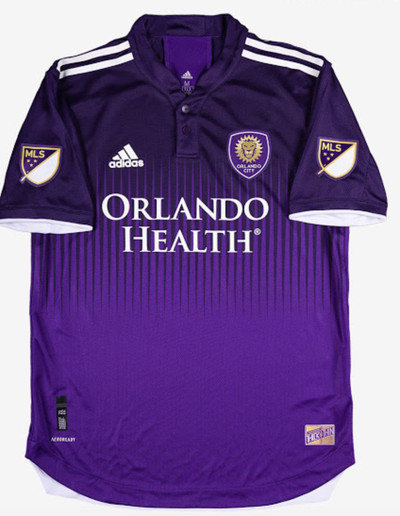
footyheadlines.com
All in all, this is not a bad shirt. We’re not massive fans of gradients unless there’s a design element used to assist the transition and this kit accomplishes that. It’s not fancy or a classic, but it’s still good. The main question we have is why the MLS logo is on both sleeves. While this is a great kit, it’s nothing compared to the effort released by their NWSL sister club, Orlando Pride SC (also, yes, NWSL jerseys being better will be a common and accurate theme on this list):

footyheadlines.com
CF Montreal home
footyheadlines.com
We can debate the rebrand and take points off for it (we will later), but not on this kit. It’s clean, the accents are nice, and the sublimated club logo is bold enough that viewers at home will most likely be able to see it. However, they lose points here for the lack of blue which we’ve come to expect from previous Montreal Impact kits.
Chicago Fire away

It’s a good kit. As ugly as the Fire crest is, the monocolor badge doesn’t look nearly as bad here. The sublimated Chicago stars are a fantastic idea and addition, but they lack red. In fact, this whole kit is sorely missing the color red. Therefore, it’s only the second best soccer kit in Chicago. If you want to see a Chicago flag kit done right, look at the NWSL’s Red Stars:

footyheadlines.com
Portland Timbers FC home
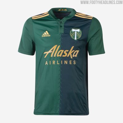
footyheadlines.com
We both really liked the promise this jersey brought, but thought they messed up the execution. The stitch motif down the middle is unique, but the too-chunky collar disrupts it. We also found it weird to include dark green on half the front of the kit, but not on the sleeves. If this went back to the drawing board, we think it’d be a B at minimum.
Atlanta United FC home
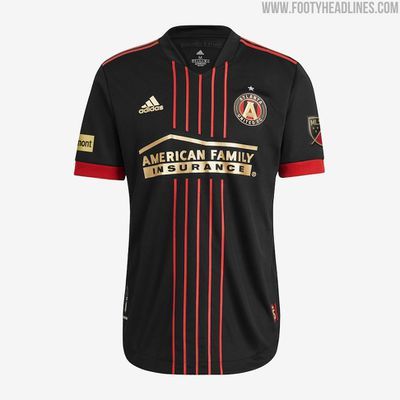
footyheadlines.com
This one reminds us of the time Inter Milan decided to ditch their iconic blue and black stripes for a black kit and light blue pinstripes around it. The Five Stripes stuck to their nickname as close as you could, and while this is a great shirt, it seems like it would be much better served as a third kit.
Philadelphia Union away

footyheadlines.com
It’s...unique. The design is wild and gives us 90’s flashbacks. The color of blue and lightning bolt design is wacky in a fun way. However, a darker shade of yellow would have improved this jersey a lot because we can barely see the stripes, league logo, club badge and sponsor in these pictures. We can’t imagine how invisible they will look during a day game.
Chicago Fire home
footyheadlines.com
This shirt makes us sad because they were so close! Imagine just one other complementary design element laid on this shirt. Even a thin red cheesy oversized outline of a flame would have made this shirt so much better given that the base design is so solid.
D Tier
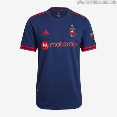
FC Dallas away
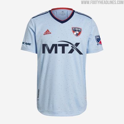
footyheadlines.com
This seems eerily reminiscent of Chelsea’s away kit from this season in terms of the pattern. It’s missing solid red elements we’ve come to expect from FC Dallas. But the one major detractor has to be the size of the MTX logo on the front. It just seems way too big and makes this feel tacky.
Real Salt Lake away
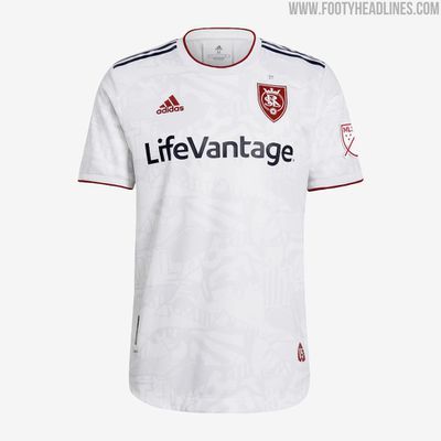
footyheadlines.com
This kit gets a few things right: the red monocolor crest, the red Adidas logo, the red MLS logo, and even the red on the sleeves. The blue sponsor and shoulder stripes look good as well. However, we think it’d be hard for a viewing audience to see the designs and adding a red outline to the sublimated graphics would have helped. Did we mention we liked the red in this kit?
Sporting Kansas City away

footyheadlines.com
This kit gives us the same vibes as this year’s West Ham United away kit. If we’re being honest, it just seems like something is missing. If some small piping stripes in either white or silver were at the top and bottom of the navy bands here, we think SKC has a much better kit.
Nashville SC away

footyheadlines.com
We liked these initially when it appeared to be black and yellow, but once we noticed it was navy our shoulders slumped. Navy and yellow is a wonderful color combination, but navy so navy it looks black doesn’t lend itself to that classic palette. If the navy was more vivid, this shirt would have been very high up the list, but instead it’s this, which is bad – therefore it’s bad.
New York Red Bulls home

footyheadlines.com
The problem with every Red Bull team’s shirt is that the logos are so massive, so intense and such a striking contrast of colors that it’s becoming difficult for any of their teams to have a decent shirt. This jersey is no exception. The base is much too simple and doesn’t include design elements that complement the kit. Also, the small Red Bull logo in the crest just above the big Red Bulls logo is goofy and unnecessary. If you’re going to be your own team and sponsor, please find a way to be more creative.
Austin FC home

footyheadlines.com
A club in its inaugural year should come in much stronger than this. It’s your first season, capitalizing on that energy and giving your supporters a dope shirt is important. It’s unlikely you’re going to have much more success beyond that, so it’s really disappointing to start the season with a non-memorable shirt. (Side note: Again, another team outdone by the NWSL. Racing Louisville is a new NWSL expansion team and dropped this beauty.)
footyheadlines.com
Minnesota United FC home

footyheadlines.com
This is how our conversation went for this jersey:
“I feel nothing toward this kit. It’s not ugly, it just seems like a light blue adidas shirt. D tier.”
“Yep, I’m good with that.”
~End of conversation~
Colorado Rapids away
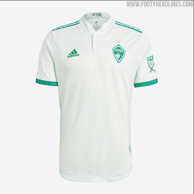
footyheadlines.com
This kit has a lot of unique design elements. Unfortunately, no one will see them in action on the field and they are hard to notice if you don’t buy the jersey. The kit is a light green color (but it looks white) and you can barely notice the silver star above the crest. The biggest disappointment is the really cool embedded topographical line design paying homage to some of the high peaks of Colorado. Sadly, it’s the same color as the kit so you won’t be able to see it on your screen. For a look at a better crack at this idea, look at Kelme’s effort on the away kit for Spanish side SD Huesca.
D.C. United away
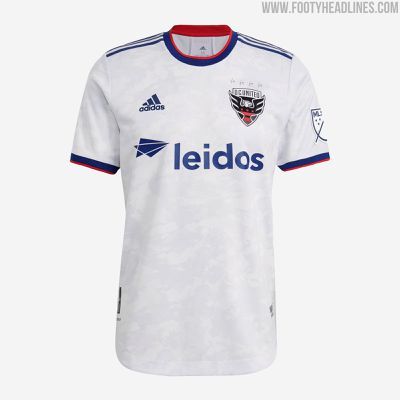
footyheadlines.com
Obnoxiously patriotic symbolism. DC is more vivid and interesting than cheap American iconography. The marble pattern is much too light and the red, white and blue is annoying. It looks too similar to the current US National Team jersey. DC, real DC, is a magnificent place, and we swear to God if DC doesn’t give us a Cherry Blossom shirt we’re gonna go mad.
Delete This Tier
Houston Dynamo FC home
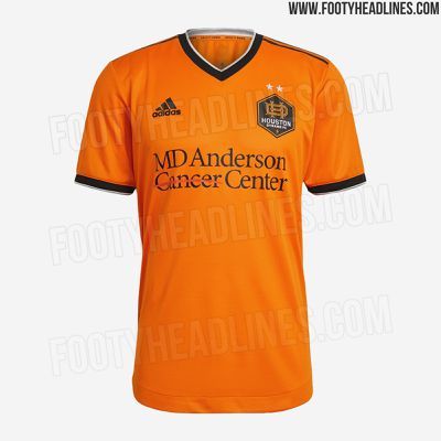
footyheadlines.com
This shirt is actually fine. Perfectly fine. It’s OK. It’s not disgustingly memorable, or classically memorable. It’ll be forgotten as soon as the team stops wearing it and moves onto something else. But for now, today, it’s fine. I’m not sure that’s what they were going for but it’s difficult to see any other intent given the extreme lack of, anything. (Once again, a MLS team outdone by an NWSL counterpart. They look similar, but there’s no sublimated graphic for the Dynamo. Meanwhile, the Dash have this cool hexagon pattern)

footyheadlines.com
San Jose Earthquakes home
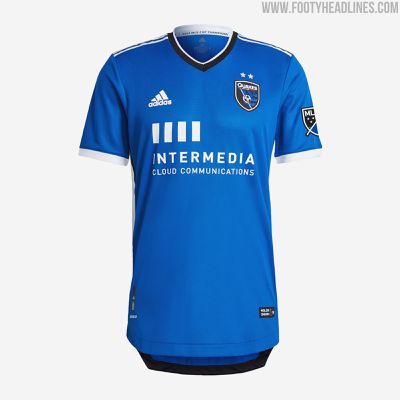
footyheadlines.com
We like the collar and the cuffs of the sleeves. Even the sponsor logo seems like a good size and a good color. But outside of that, we see nothing but a light blue t-shirt. We get that it’s your home kit, but you couldn’t have added anything else to it?
CF Montreal away

footyheadlines.com
Yes, this is the same kit as last year. Yes, we didn’t like it then. But, this is where we punish CF Montreal for their rebrand. It seems unnecessary to blow up a well established brand for the sake of making things more European. The Impact had a unique name and a fanbase that loved it. It’s sad to see it go. Also, if you’re going full rebrand, then Adidas should’ve given you a new away kit - so this ranking is as much on them as it is on CFM.
Los Angeles FC away
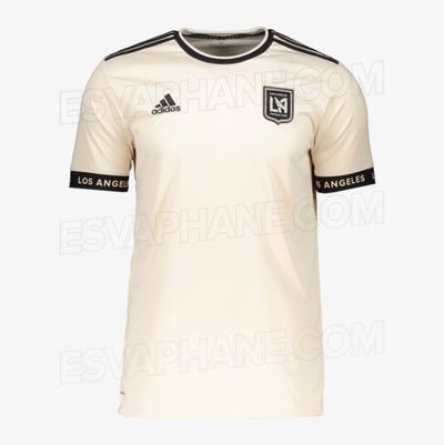
footyheadlines.com
LAFC’s Roma impression is hilarious. Like that old meme of a woman trying to hair flip rising out of water:

The base color is much less in the vintage category and extremely in the dirty socks category.
Inter Miami CF away
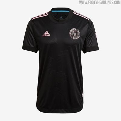
footyheadlines.com
Fashion icon David Beckham continues to be disappointing in an area in which he should never be disappointing. Not only is the kit bland and basic, and the Miami design is hidden in black, but it’s not Miami at all! The biggest problem here is that anyone who has never been to Miami could produce a more Miami shirt, and that is embarrassing. ADD. MORE. PINK.
Austin FC away

footyheadlines.com
See Austin’s other kit, but also the worst thing you can do is make no effort and sell a shirt at MLS shirt prices anyway. If you want to buy this shirt with a name and number on the back you’re going to pay $119.99, and that’s just criminal.
Columbus Crew SC away
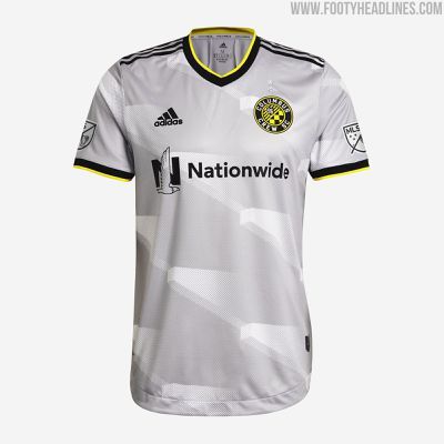
This shirt is so bad it’s funny. It makes no sense and it’s hideous. The best part of this kit is that it’s just the setup to the punchline: the full kit.
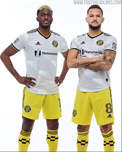
footyheadlines.com
The Worst: New England Revolution away
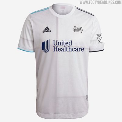
footyheadlines.com
Cue the other rant:
“This has to be one of the most lazy and confused kits I have ever seen - made worse by the descriptions of the design elements. I’m from New England, and a lot of these design elements don’t make any sense at all.
“The one positive comes from dedicating the jersey to “The Fort”, a supporters section of the Revolution at Gillette Stadium. A logo on the lower left side lists the sections the group stands in, and overall, that’s the most unique thing about this jersey.
“The description of the design elements say the stripes on the shoulders represent “the colors of the water and the sky that surround the war-era forts throughout New England” and the lines on the main body of the kit represent “the blockwork of American Revolution Era war forts.”
“So let’s tackle each of these. The colors on this kit are confusing. While they claim the left shoulder stripes are navy, it looks closer to black in multiple pictures. In addition, the club crest and Adidas logo look black, leaving the United Healthcare sponsorship as the only navy thing on the jersey. As for the light blue, the messaging is wrong if they think that’s representative of the sea. The waters of New England are not that light. If it’s representative of the sky, they got that wrong too. The skies of New England are not turquoise.
“But, more importantly, the line design on the shirt itself doesn’t represent what they aimed for. A majority of the major forts in New England left over from the Revolutionary War are either: a) made of wood, not stone blockwork or b) pentagonal in shape, not square.
“All of this is just distraction from the main problem with this kit: it’s a template. The design is taken directly from the kit Spain will wear to the Euros in 2021.
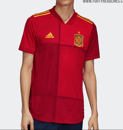
footyheadlines.com
“Overall, this kit is a representation of everything wrong with Adidas’s MLS kit rollouts. The Revs deserve better.”
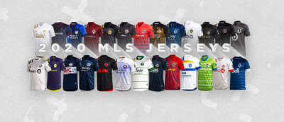
Finally, here’s our full tier list visualized:

Let us know what you think! Were we right? Were we wrong? Did we put too many in the C, D, and Delete This column? Leave a comment down below.
0 notes
Last Seen Blogs

shadow-the-puppy
Shadow
Chand-Tate

colemullen
The Blogging of Paul 281
multianime
Multianime

un-chica-cool
eres un soplo de aire fresco...🖤

your-hard-cousin
Very Close Family